Search the Community
Showing results for tags 'pilot justus 95'.
Found 2 results
-
I got a used Pilot Justus 95 with a medium nib in the mail a few days back because I've wanted to try one for some time now. I've always been fascinated by the Doric's adjustable nibs, and now having a small collection of them in all their different sizes (except for #6 and #10) I was eager to compare the old, somewhat fragile Doric nib to the newer Justus nib. Now, there's the obvious difference between the two nibs in that the Doric is a fantastic example of vintage flexibility (my example of the #5 model is one of the wettest noodles to ever wet noodled) and the Justus is a soft modern nib (less flexible even than my cast of Pilot Falcons). And a quick but important aside: THIS IS NOT A THREAD COMPARING VINTAGE AND MODERN FLEX NIBS. Please don't devolve this thread into that trite bickering. This thread is about the philosophy, design, and usability of a nib that allows the adjustability of its line variation, regardless of the quality of the variation. The first time I inked up the Justus and tried out the faux overfeed doohickey I immediately noticed that there was very little difference between the feeling of writing in the "H" setting and the "S" setting. Both were very soft and offered very little feedback, like the suspension of a late 80s Town Car. When switching the settings on an old Doric the effect is immediate, day and night almost. But the Justus went from squishy ("S") to squishy with a slightly discernible bottom ("H"). And in terms of the line variation the Justus offers between the two extremes of its settings, I could immediately tell that there was very little of a difference between applying the same amount of pressure to each. So I decided to use a technique I've been using for vintage nibs for a while now: carbon copy paper. With carbon paper, the effects of different types of inks (wet, dry, feather-prone, etc.) and the wetness of the pen (whether it writes dry or is on the gushy side) is nil. All you see on the carbon copy is the direct line variation of the nib you're using. The advantage of bypassing the inks' quirks is invaluable for this comparison. So let's talk vintage first. I have four adjustable nib'd Dorics, sizes #3, #5, #7, and #9 (I'm missing #6 & #10). All of the sliding adjusters are of the hollow design (see pictures) rather than the solid design. With all four Dorics, the difference between max flexibility and max rigidity is staggering. Click the slider forward and you're writing with what nearly feels as solid as a nail. Click the slider all the way back and (depending on the individual nibs) you have a gorgeously responsive flex nib. Th two extremes are worlds apart. But with the Justus things are different. You twist the dial at the end of the section to switch between maximum flexibility (denoted by an "S" on the dial) and maximum stiffness (denoted by an "H" on the dial), which unfortunately feel nearly the same. There is more resistance on the "H" setting, but it only comes after you flex quite a bit. The only real effect the different modes have on the page is that script written with a heavy hand in the "H" setting is wetter than if you write the same thing with the same pressure in "S" mode. "S" mode does give you a bit more ink shading, but it also lets the feed run dry when you flex for more than a few words. In the end, I feel that the Pilot Justus' flexibility adjustments are about as effective as Delta's asinine Fusion nib. There's a slight difference in nib feel between the two modes, but on the page there's barely a difference. And to prove it, I used the aforementioned carbon paper. Pictures will be in the following posts.
-
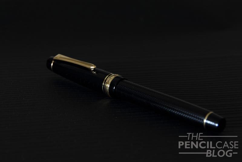
-This review is an adapted version of the one that can be found on my personal blog (www.pencilcaseblog.com). Visit my blog for more pictures, a copy of the written review and of course many other pen, pencil, paper and ink reviews. Enjoy the review! (Pilot Justus 95 review: http://www.pencilcaseblog.com/2014/10/pilot-justus-95.html )- The Pilot Justus 95 is what looks like a pretty simple, typical Japanese fountain pen. The design can be found -more or less- on a couple of other Japanese pens, such as the Sailor Pro-Gear. Or at least, that's what it looks like at first! Take a closer look, and you'll see that this Japanese beauty is far from mainstream! Not only are there a few design elements that really stand out, what's found under the cap is like nothing I've seen before! The overall shape is pretty much exactly the same as the previously mentioned Sailor Pro-gear. But the barrel and cap feature a very nice, classic-looking engraved pattern, something you'd expect on a vintage pen. The pattern is fairly subtle, you won't notice it from afar, but look closely and you'll see how intricate the line pattern is! The Justus is a pretty big pen, coming close to what I would call oversized! The nib is very narrow, but long, I guess it can be categorised as a number six size. It's also quite a well-weighted pen, though this time it's not the cap that takes care of the weight. The section seems to be the heaviest part, it has metal threads, so I guess most of it is metal, with a resin layer on top. The weighted section makes it very well-balanced, even when posted (which makes it ridiculously long) it stays perfectly balanced and very comfortable to use! The Justus is incredibly well-built and feels very solid. I know this sounds vague, but some resin pens feel brittle and cheap. This one definitely doesn't! I couldn't find any seams at all, which deserves a thumbs up! Yay! I really like the design of this pen, I actually even like the gold trims (Which I normally never do!). The pen has a retro feeling to it, due to the engraved barrel and cap, so the gold accents fit the overall style perfectly! But enough about the design, because let's face it: you won't buy this one for the looks! The main attraction is the 14k gold adjustable nib. The general principle is to have a nib that acts both as a non-flex and as a semi-flex writer. The desired effect is created by twisting the ring in the grip section to the left or the right. The small clip-like piece of metal will either extend or retract into the section. In extended position, it pushes down on the tines of the nib, giving it a bit more rigidity. On paper, it all looks very promising. But you shouldn't expect a whole lot of difference between the two options. In fact, there's no real difference at all! The semi-flex nib doesn't actually get stiffer, it just requires a bit more pressure to flex. The writing performance does change ever so slightly though, mainly the flow is affected. It writes a hair wetter when in 'flex mode', which also results in a slightly thicker line width (even without any pressure! You can probably see the difference in the written review, where the first few lines of the 'overall' paragraph are written in 'flex mode') In flex mode, you can get quite a decent amount of line width variation, however in my eyes the Pilot Falcon (Another pen that can be considered semi-flex) has a bit more springyness to it. Other than that, the nib is very enjoyable to write with, it's smooth, though with a noticeable amount of feedback. The flow is excellent, not as wet as I expected, but still capable of keeping up with ease. It never skipped or had a hard start. The line width of the medium nib seems to be comparable to western mediums, maybe even a hair thicker at times ( probably because of the soft nib). I might have preferred a fine nib because it would most likely show more line width variation, but I really can't complain as this medium performs extremely well! Is this a pen you should get? Yes! Pilot managed to deliver a very nice, extremely well-built pen with an equally nice and interesting nib. If you have the 300 Euros/ 315 USDollars to spend, this is a great way to enlighten your wallet! Dries ThePencilCaseBlog http://www.pencilcaseblog.com