Search the Community
Showing results for tags 'penmanship'.
-

cursive Of possible interest: book READ CURSIVE FAST now on Amazon
KateGladstone posted a topic in Handwriting & Handwriting Improvement
These days, more and more of us know someone who is utterly baffled by cursive handwriting. They will someday need to read something that is in cursive — but they are very unlikely to go to the trouble of learning to write cursive just for the sake of reading it. Even people who have been taught cursive as children often forget it, and find it a baffling mystery by the time they grow up. There are college entrants who’d “had” cursive in school at age 8, who can no longer read it by age 18. (Literally, as adults they cannot read their own childhood schoolwork.) What to do? Perhaps buy them a copy of READ CURSIVE FAST (reviewed in the Spring 2021 PENNANT) … Amazon link: https://www.amazon.com/dp/1735935808/ref=olp_aod_redir_impl1?_encoding=UTF8&aod=1&qid=1619952667&sr=8-1 Sample pages: http://readcursivefast.com/wp-content/uploads/2021/02/RCF_Preview-1.pdf To purchase direct from publisher: https://nationalautismresources.com/read-cursive-fast/ The book’s web-site: ReadCursiveFast.com To purchase direct from me: Readcursivefast.Com/order and https://read-cursive-fast.myshopify.com/ (The info there mentions “pre-order,” but that word will be changed to “order” this week.) If you’re buying from me and want an autographed copy, send your request to me at Kate@ReadCursiveFast.com (my e-mail for book-related business) and put the word “autograph” somewhere in the message, so I can see it when I fulfill direct orders. http://static.ideasunplugged.com/signature/s_036/t_r3LLkJ.jpg?v=69 Yours for better letters, Kate Gladstone author of READ CURSIVE FAST ReadCursiveFast.com CEO, Handwriting Repair/Handwriting That Works DIRECTOR, World Handwriting Contest 165 NORTH ALLEN STREET ―First Floor Albany, NY 12206-1706 USA landline 518-482-6763 mobile 518-928-8101 Handwriting CAN make sense. ________________________________________________________________________________________ IMG_6207.mp4 -
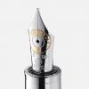
Does anyone else notice that the quality and nature of penmanship changes depending on the nib, pen, ink, and paper?? Here's a sample of my sloppy handwriting. Practice in progress. Rhodia Paper.
-
Esterbrook made millions of their flagship 048 Falcon steel pen. It was their best-selling pen for over 70 years. They're still common, relatively inexpensive and generally dismissed by those seeking the "grail pens." (they don't fit in an oblique holder, for one, so calligraphers tend to not be interested) They can vary in quality over the years, but even the worst, the most recent made (1940's) are still, in the end, a decent pen. They actually don't get the praise I think they deserve. This one is from the late 20's, but even the later ones are relatively nice. So, here's to the common, the plain, the ordinary Esterbrook 048 Falcon. Long may you be ignored by everyone but me. Andrew
-
Hello! I'm lindamarie from Kentucky, USA. I promise that I learned to write -- and used a fountain pen years ago. But as I've gotten "older", I think I need to make some adjustments! Glad to be here!
-
A product of mine is now carried by major distributor Therapro ... http://www.therapro.com/Browse-Category/New-Products/TriOn-Pencil-Grip.html A second, much older, product of mine has been produced by them for years, and is still carried by them: http://www.therapro.com/Browse-Category/Stage-Write-Raised-Line-Progressive-Writing-Series_2/Stage-Write-Raised-Line-Paper.html Another, though smaller, distributor carries three of my products and makes them searchable under my name: https://www.nationalautismresources.com/search.php?search_query=Kate+Gladstone&Search= Note that one of my products there is a (gasp) ball-point with a pull-out sheet of handwriting help info. Id like to reach anyone at FPN who could help me make a fountain pen version of this,
-

Spencerian Workshops In Tampa, Florida
thepaperseahorse posted a topic in Clubs, Meetings and Events
Hi there Fountain Pen Network, We are hosting Michael Sull in Tampa for four script workshops in February and wanted to extend the invitation to you all. He will be teaching American Cursive Handwriting (currently sold out), Beginning Spencerian, Off-Hand Flourishing, and Ornamental Penmanship. Class descriptions are here. Typically, he holds private or overseas workshops, so this is a unique opportunity for the Southeast U.S. Please see the attached flyer for more information. The Thursday-Sunday schedule in a few weeks is a great opportunity to visit Tampa and enjoy a nib-and-ink workshop with one of the foremost living penman. Spencerian is a significant facet of American history, circa 1850, as it was the de facto correspondence and legal document writing style before the typewriter came into widespread use. Mr. Sull will also be giving a lecture across the street at the Henry B. Plant Museum on Saturday February 10, which is free for workshop attendees. About Us: The Paper Seahorse is a creative studio and shop in Tampa specializing in fine stationery and paper, writing instruments (Lamy, Kaweco, Midori), greeting cards and seasonal items, vintage typewriters, tools for mindfulness, and creative classes. We’re led by Tona Bell, lifelong lover of all things analog. Please feel free to forward to anyone you think might be interested and don’t hesitate to reply with questions. -
Hi there. I have created a new blog, listing some of my favorite pens, and there is a section on how to achieve better penmanship. I would love to get some comments from the readers of the Fountain Pen Network about the pens. I would also like to have your ideas on how to achieve clearer, nicer-looking writing. You may be the first person to reply to my blog! Thank you. Bruce Leeds
-

Nakaya 17Mm Portable Cigar String Rolled Aka-Tamenuri
Dr. Joseph M. Vitolo posted a topic in Japan - Asia
My new Nakaya 17mm Portable Cigar String Rolled Aka-tamenuri with an EF nib. This is my favorite Urushi finish/color. It is also the first Aka tamenuri finish I've owned with Urushi on the threads. My previous pens had exposed Ebonite. http://www.zanerian.com/Nakaya17mmPortableCigarStringRolledAka-tamenuri01.jpg http://www.zanerian.com/Nakaya17mmPortableCigarStringRolledAka-tamenuri02.jpg -
So I was using my Penmanship with Perle Noire and thinking I was finally getting used to its extra fine nib, particularly with this ink... And with my luck of course at that very moment the !!! thing decides to burp a big drop of ink on the page. I was transcribing some notes onto a Claiefontaine notebook, it was so much ink it went through the page and stained the one behind it before I could say "where's that blotting paper?". I have to confess I was playing with it, turning the pen while holding the cap, although it didn't screw off completely. Might that have caused it? Why?
-
Hello all, I would like to ask to give me some honest feedback on my penmanship. I started exercising 3 weeks ago with Michael Sull book, American Cursive. Thank you

-
Just starting out with pens and am in the market for a nice fountain pen. What kind of features am I looking for? What should I ask? How do I know I'm not getting ripped off?? Tips and suggestions much appreciated!
-
I Designed This, And Want To Turn It Into A Fountain Pen ...
KateGladstone posted a topic in Pen Turning and Making
Would any fountain pen person want to help me transform (into a fountain pen) the handwriting instruction pen that I now purvey which is here: http://pen.guide ? This pen contains a pull-out handwriting improvement tip-sheet (by me), consultable on-the-go ... but, so far, I have only been able to get it made up in (GASP! HORRORS!) ballpoint ... therefore, I am looking for someone who can work with me to produce it in fountain-pen form with a choice of nibs. Please reach me at handwritingrepair@gmail.com with the words "Handwriting Pen" in the subject-line. -
I have taken ownership of a cache of family history-related documents and, browsing through them, have been struck by the penmanship employed on some of them. In particular, these two interment certificates from Wavertree churchyard, Liverpool caught my eye. The first is reasonably legible even to my untrained eye, but the second is almost completely opaque. The documents are dated 17 years apart, with the more legible one being the older of the two. I wonder whether the the same clerk is responsible for both, and that what we see is the refinement of his art to the point of absurdity. I can appreciate that there is skill and beauty in what the clerk(s) has produced, but I don't think anybody would accept in the present day that the art should be more highly valued than the clarity.
-
This pen has been reviewed before, but I just wanted to give anyone considering one or needing an extra fine nib another viewpoint to check out! First Impressions (5/5) The pen arrived from Jetpens in a small baggie. It is a fairly attractive pen, I got the clear demonstrator version, and came with a standard Black pilot ink cartridge. The plastic of the pen feels less brittle, and much thicker, than something like a Platinum Preppy or a Pilot Petit1. Appearance (4/5) The pen is long and thin, looking almost like a desk pen. There is a significant amount of space in the back of the barrel of the pen past the where the cartridge ends, making the pen even longer. The cap of the pen is tiny, just slightly longer than the nib, and has two small fins on it to keep the pen from rolling. The nib is simple, and steel colored, with “PILOT SUPER QUALITY JAPAN <EF>” stamped onto it. The style is very understated and utilitarian, and in a way beautiful for that. One slight problem with the Clear Cap is that ink can stick to the top of it and be visible through it. Design/Size/Weight (4/5) The pen is very light, but it’s length and ergonomic grip make it comfortable in the hand, and well balanced. The cap can post, but it is so tiny, short, and light, that you wouldn’t notice either way. The barrel of the pen is airtight, so it can be converted to an eyedropper if desired with some Silicon grease and an optional O-Ring. Nib (4.5/5) The nib is unsurprisingly, extraordinarily fine. The extra fine nib from pilot is perfect for note-taking, cheap paper, and math. The nib is not quite as smooth as some of the larger nib sizes from pilot, but for an extra fine nib I was pleasantly surprised at the smoothness and ease with which it wrote. In terms of flow, the nib is on the dry side, but it isn't something you notice when you are writing with it, if that makes any sense. I had to go back and think about it, because although being dry the nib never skips and is still exceptionally smooth for the width. One major plus of this nib is that it can be swapped into a Prera or Metropolitan if you want an Extra Fine nib in one of those pens. Filling System (5/5) Not much to say here, it’s a simple Cartridge/Converter system. The pen comes with one cartridge, and can be fitted with a Con-40 or Con-50 if you so please. The ink lasts much longer than it does in most pens because of the extreme fineness of the nib. Cost and Value (5/5) This is a great pen at a great price, and can be found in most places for $6-$8. Many people buy the pen just for the nib, to then be fitted into a Prera or Metropolitan, and it would be a steal if pilot offered just the nib for that price! Instead, you get an entire pen around it, and one that provides a very pleasant writing experience. Conclusion (28/30) I would strongly recommend this pen to anyone who needs a very fine nib on a budget. It has a great nib, perfect for swapping if you have a nice body like the Prera’s, but if you don’t the body that comes the with the Penmanship is still durable and good-looking.
-
Are the nibs on the Pilot Kakuno swappable with the other cheaper pilot pens that all swap nibs (Metropolitan, 78g, Penmanship, Plumix, etc.)? The smiles on the Kakuno nibs make me unsure, as none of the others have them, but if they are I would love to put one of the smile nibs on my Prera! Thanks, Phillieskjk
-
Let me begin this post by admitting that I am no expert in handwriting, and that my own handwriting is nothing about which to be proud. That being said, I have observed that the attribute known as "flex" seems to have assumed something of the aspect of a Holy Grail in penmanship. Certainly, I mean no offense to those who value this attribute; and certainly, in the hands of expert penmen, the ability to utilize expressive variance in line thickness evokes my profound admiration: but my worship of flex is tempered by the following considerations: 1) I have read stories of modern and antique nibs being destroyed in the attempt to achieve line-thickness variation. 2) I have seen nineteenth-century and early twentieth-century examples of utilitarian handwriting--business and personal letters and such--that show considerably less flex than one typically finds in latter-day attempts to achieve this quality with a fountain pen. 3) Based on my observations under 2), as well as my own handwriting, and that of members of my family's older generation, it is my impression that, except for calligraphy and the most exalted examples of Spencerian handwriting, flex is something that usually happens naturally, without much conscious effort on the part of the penman. Even most modern rigid-nibbed fountain pens produce a natural and subtle line variation which, while far short of Spencerian standards, is nonetheless most attractive and expressive. 4) As one who regards the fountain pen as a useful tool, as well as a thing of beauty in its own right, I am personally most interested in pens that can write rapidly and easily on a variety of papers, and which are robust enough to survive in a utilitarian environment. It is my understanding, based in part on personal experience, that the more flexible nibs tend to be harder to manage, slower, and more fussy in regard to paper. It is also my understanding that the general trend of fountain pen nibs since the 1920s has been towards rigidity, reliability, and durability--for our forebears did not regard the fountain pen as an exotic trophy, but, rather, as a practical writing instrument, as we regard the computer today. 5) My father had an incredibly beautiful handwriting; but even though he used to reminisce about the eyedropper-filled Waterman's fountain pen that he owned as a boy, which, he related, was capable of great variation in line thickness, his own handwriting, with both fountain pens and ball-point pens, showed no more than the subtle variations in thickness of line to which I have already referred. Beauty and elegance in penmanship does not necessarily require flexibility in the thickness of the line. 6) When I learned penmanship in the early 1950s, using dip pens and inkwells recessed in screwed-to-the-floor desks, my teachers said nothing about variations in line thickness as a criterion of good handwriting--even though they apparently covered everything else, and drove me half-crazy with their punctiliousness. As regards the whole matter of "flex," I am reminded of the exaggerated messa di voce that was much in fashion amongst early-music musicians in the 1970s. Although loosely based upon the writings of Quantz and other 18th-century theorists, their execution of this adornment transcended the boundaries of good taste and belonged--like so much that they did (and still do, alas) to the realm of mannerism. Without, once again, impugning those who rightly cultivate the beautiful and expressive art of flexibility of line variation, I am sensible of the need to beware of being more orthodox than the ancients themselves in this respect.
-

Handwritten Recipes For Penmen Who Like To Cook
httpmom posted a topic in Handwriting & Handwriting Improvement
Wouldn't it would be entertaining to post favorite recipes written using favorite pens and/or old handwritten recipes that came from friends and family? I am starting with a German Stuffed Turkey recipe given to me by a long ago exchange student's mother. If you are so inclined, please share your own and we can all join in two exciting obsessions! As Jacques Pepin would say, "Happy cooking!" written with my Edison Nouveau Premiere F nib
-

Questions About Pilot Decimo Vs Vanishing Point Nibs Vs Capless
civil posted a topic in Japan - Asia
Hello. I am hoping someone could answer a few questions about the VP & Decimo pens if able, for lack of seeing the pen in person before ordering, mainly about the nibs: 1-I am under the impression that the matte black VP in medium might be a lot wetter than the medium Decimo, something about the intended market. Is that correct? If so, how does the medium nib in the Decimo and the VP compare to, say, the Metropolitan medium? 2-If the VP & Decimo are different in actual nib size, are the special alloy (capless) and the Decimo 18k the same actual size? (That is, their mediums are the same, their fines same, etc) 3-Keeping the lower end Pilots in mind for comparison (Penmanship, Metropolitan, Prera), how do the extra fine and fine nibs on the VP and the Decimo compare with those (if you have tried them)? Is the VP xf the same as the Penmanship for example, or the fine Decimo the same as the Prera fine? Basically I am not sure whether to get a fine or a medium VP or Decimo, since I like my Prera with a fine nib, and my Metropolitan medium. For clarity, when I say VP I am referring to the matte black brass pen, when Decimo, to the aluminum with gold nib. -
Hi all, I wonder if one of the nibs is thinner than the other. I have VP with fine nib and Penmanship with extra fine nib. It seems the fine nib of VP is little a bit thicker than the extra fine nib of Penmanship. I like the nib size of extra fine in Penmanship and the retractable mechanism of VP. Thus, I am thinking to purchase extra fine nib for my VP, but I’m not sure if the nib size of VP ef is thinner, thicker, or same compared to the nib size of Penmanship ef. If anyone has both pens with ef nibs or experiences with these nibs, please give me some feedback. Thanks in advance.
-
http://uproxx.com/life/2015/08/master-penman-craftsman-jake-weidmann/
-
http://uproxx.com/life/2015/08/master-penman-craftsman-jake-weidmann/
-
 Hi all, In the past I posted a project where I handcopied a 2,000 year philosophy book - The Enchiridion of Epictetus. https://www.fountainpennetwork.com/forum/topic/272296-project-handcopying-a-small-book-epictetuss-enchiridion/ Thanks to everyone for their comments. I'm now in the process of reproducing this handwritten project into a book. I used 99designs to invite designers to suggest covers and would welcome the votes of the members of fpn on their favorites. Over a 100 designs were submitted and top finalists are here for your review - http://99designs.com/other-packaging-label-design/vote-bnsjlm. For the first ten responders who vote and private message me, I'll send a free copy of the book when done. I look forward to the discerning views of fpn members. Thank you.
 -
Kate Gladstone on TV ...
-
Hello. I wanted to see what everyone thinks about the quadrupod grip. My girlfriend and I, who are discovering fountain pens together, was a bit slow to jump onto the bandwagon because she has a quadrupod grip and hated writing with my Lamy Safari (my first fountain pen). After reading what I can find here on FPN, and scouring the internet, I have come to the conclusion that everyone will never do anything the same. Especially when it comes to writing. I have read articles that advocate correcting the problem at a young age, and I have read that some consider it a legitimate "normal" grip. And at the end of the day, all that matters is how comfortable you are and how legible your handwriting is. My girlfriend swears that when she was being taught to write (cursive especially) she was told that the quadrupod grip was the correct way. I can't believe that this is correct since most older people have told me they had much more strict handwriting lessons (even so far as changing from left to right hands in my grandparents cases) and that the tripod grip was how everyone was instructed. Granted, I know here in the U.S. Handwriting and cursive penmanship has fallen by the wayside. She very well could have been taught incorrectly by someone who had no formal training in teaching proper penmanship. I read a statistic that less than 12% of teachers in the U.S. has had such training. So, here's my questions: What are the causes of the quadrupod grip? What are its origins? If you had a quadrupod grip and changed to a tripod, does it feel better, or did you only change because of how you were taught in school? Or to alleviate discomfort? Also, if you have the opportunity to see a lot of handwriting styles like I do( I'm a notary public), do you think having the quadrupod grip occurs more in men or women? In lefties or righties? And do you find it varies, or correlates, to a certain age group? Thank you. I look forward to hearing what everyone thinks.
-
http://i1128.photobucket.com/albums/m496/gclef1114/Tutuguans/0212151616a-1.jpg