Search the Community
Showing results for tags 'papier plume'.
-

Papier Plume To Release A New Batch Of The Chicago 2017 Inks
Jackokun posted a topic in Inky Thoughts
Hello there, just a quick note to those that could interested: tomorrow (thursday), Papier Plume will release a new batch of the 2017 Chicago pen show inks: Ivy 108 (a darker green) and Lake Michigan (a Teal). I'm not sure about the time but it will be noted on their newsletter, then facebook page My understanding is that they will have 60 bottles or so of each. Cheers! Jack -
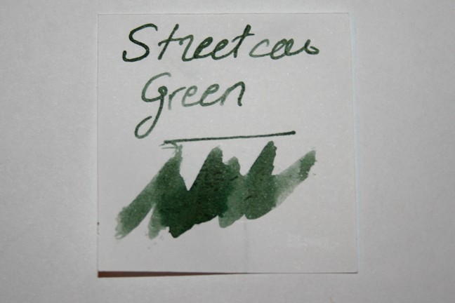
Papier Plume - Streetcar Green (New Orleans Collection) Papier Plume is a stationary shop in New Orleans, that’s been getting some attention lately on this forum with their "New Orleans Inks", that celebrate the rich colours and history of the city. One of their inks in this series is Streetcar Green, a grey-green with a unique personality. Fellow member ManofKent was so kind to send me a sample to play around with – thank you Richard! Be sure to check out his excellent review, and also the reviews of visvamitra and Jackokun. Highly recommended! Streetcar Green is a grey-green ink that really attracted me. For one - it is a subtle and understated colour, easy on the eye, with a dusty old feeling. For another - it is an ink that shades really well, in an aesthetically pleasing way. The shading is really noticeable, but it works great with not too much of a contrast between the light and darker parts. Personally I find this ink's appearance really attractive. Nicely executed! I do find the ink to be a bit undersaturated - this is clearly visible in swabs, which turn out to be very light on most papers. It's also apparent in finer nibs, where I find that the contrast with the paper is not strong enough. This is an ink that loves broad or wet nibs, that result in a more saturated line, bringing out the best in this ink. Below you'll find a writing sample with my drier Safari M and B nib, and the wet golden M-nib of a Pelikan M400. It's obvious that Streetcar Green prefers the broad & wet nibs. On the smudge test - rubbing text with a moist Q-tip cotton swab - this Papier Plume ink behaved perfectly with no apparent smearing. Water resistance is also remarkably good! A 15-minute droplet test left almost all the ink in place. And even with running tap water an easily legible residue of the text remains. The ink's water resistance is demonstrated clearly in the chromatography, which shows that the ink's grey components remain in place when coming into contact with water. If you need a water-resistant ink, Streetcar Green won't disappoint. I've tested the ink on a wide variety of paper - from crappy Moleskine to high-end Tomoe River. On each scrap of paper I show you: An ink swab, made with a cotton Q-tip1-2-3 pass swab, to show increasing saturationAn ink scribble made with an M-nib fountain penThe name of the paper used, written with a B-nibA small text sample, written with an M-nibDrying times of the ink on the paper (with the M-nib)Streetcar Green behaved perfectly on most of the papers I used, only with Moleskine there was a tiny amount of feathering. Be aware that the ink doesn't look too good on yellowish paper (green ink on yellow paper is not a good combination in my opinion). There are also some papers where the ink looks extra nice, a.o. OCM cotton paper, Paperblanks & Tomoe River paper. The ink dries quickly - in the 5 to 10 second range - making it a good ink to use at the office. At the end of the review, I also show the back-side of the different paper types, in the same order. The ink behaved superbly on most papers. Only with Moleskine and Graf von Faber Castell, significant show-through and some bleed-through were present. Streetcar Green is a well-behaving ink. Conclusion Streetcar Green from Papier Plume is a charming green-grey ink - dusty and understated, with a vintage feel to it. For me, the colour is right up my alley, although I would have preferred a bit more saturation. Be sure to use a broad or wet nib to bring out the personality of this ink. Being water-resistant and fast-drying, Streetcar Green is also well placed for use in an office environment. Overall, I find it to be an excellent ink, that scores well on both looks and performance. Recommended! Technical test results on Rhodia N° 16 notepad paper, written with Lamy Safari, M-nib Backside of writing samples on different paper types
-
Papier Plume is s stationery shop situated in the heart of the French Quarter in New Orleans. The company began its business in 2001 however the shop was opened in 2007. From what I see on google maps the shop looks quite nice. source Some time ago the company started to offer fountain pen inks. They're supposed to be hand poured and bottled right in the shop. The inks are water based and described as french inks (imported? anyone knows french private label maker?). At the moment the inks are available in 15 colors and are sold in three bottles: small (15 ml), medium (30 ml), big (50 ml): source I've received sample of Streetcar Green from ManofKent who's done excellent review of this ink. Thank you for sending me ink samples Be sure to check Jackokun review of this ink as well. Together with mine they should give good image of what to expect from this interesting ink. It's not crazily saturated. I would say it's rather subdued and subtle. The color goes between green, green-grey and greyish. The ink is well and flowes nicely from the pens I filled with it (Platinum Preppy, Hero 5028, Jinhao 922) but it lacks lubrication a little bit. It will shade nicely on some papers, not so much on other. There's no sheen. The ink is fairly water resistant. Accidental spill won't blur the text. I would say it's nice, wet-flowing ink that's easy on the eyes. Drops of ink on kitchen towel Software ID Rhodia, Jinhao 922, fine nib Leuchtturm 1917, Jinhao 922, fine nib Linen paper, Hero 5028, stub 1.9 Water resistance (after 24 hours of soaking in the water - it was supposed to be 15 minutes but I forgot L had left the paper in the water)
-
Papier Plume is s stationery shop situated in the heart of the French Quarter in New Orleans. The company began its business in 2001 however the shop was opened in 2007. From what I see on google maps the shop looks quite nice. source Some time ago the company started to offer fountain pen inks. They're supposed to be hand poured and bottled right in the shop. The inks are water based and described as french inks (imported? anyone knows french private label maker?). At the moment the inks are available in 15 colors and are sold in three bottles: small (15 ml), medium (30 ml), big (50 ml): source I've received samples of fourteen colors and I'll review them soon. The full line consists of: Black Burgundy Carmel Denim Forest Green Forget-me-not Blue Lover's Red Ivy Green Midnight Blue Moss Green Oyster Grey Peacock Blue Pecan Red VioletLover's red is somewhere in between reddish brown and brownish red. Quite nice. Drops of ink on kitchen towel Software ID Tomoe River, Kaweco Classic Sport, B Leuchtturm 1917, Kaweco Classic Sport, B Comparison
-
Papier Plume is s stationery shop situated in the heart of the French Quarter in New Orleans. The company began its business in 2001 however the shop was opened in 2007. From what I see on google maps the shop looks quite nice. source Some time ago the company started to offer fountain pen inks. They're supposed to be hand poured and bottled right in the shop. The inks are water based and described as french inks (imported? anyone knows french private label maker?). At the moment the inks are available in 15 colors and are sold in three bottles: small (15 ml), medium (30 ml), big (50 ml): source I've received samples of fourteen colors and I'll review them soon. The full line consists of: Black Burgundy Denim Forest Green Forget-me-not Blue Lover's Red Ivy Green Midnight Blue Moss Green Oyster Grey Peacock Blue Pecan Red VioletCaramel isn't the best ink in the line. It has no water resistance, the saturation is average. It looks good when used ib broad/wet nibs on absorbent papers (Leuchtturm) and on Tomoe (everything looks good on Tomoe) but in finer nibs and on optic papers the line is flat and boring. If, like me, you use mainly broader nibs you'll enjoy the ink and the shading though Drops of ink on kitchen towel Software ID Tomoe River, Kaweco Classic Sport, B Leuchtturm 1917, Kaweco Classic Sport, B
-
So it doesn't get lost in our Pen Show thread, we wanted to make sure we posted here that this year's Chicago Pen Show is going to feature three exclusive inks. There is KWZ Chicago Blue, a dynamic blue that shades and sheens, commissioned by the pen show and hand-made by our friends at KWZ Ink. Also, and limited to only 60 bottles each, are two gorgeous inks mixed up by our friends Papier Plume of New Orleans: Ivy 108 (another Cubs tribute) and Lake Michigan Blue (think C d'A Caribbean Sea, moved just a little north). Images of all three inks are up on @chicagopenshow on Instagram, on the fountainpenfollies.com blog and Instagram, and on Chicago Pen Show Twitter. We'll have pens at the pen show, too, of course. At last count we have 109 vendors coming, filling all 164 tables. Plus three days of seminars, workshops and demonstrations; see chicagopenshow.com for the complete schedule. We hope to see you there!
-
Papier Plume is s stationery shop situated in the heart of the French Quarter in New Orleans. The company began its business in 2001 however the shop was opened in 2007. From what I see on google maps the shop looks quite nice. source Some time ago the company started to offer fountain pen inks. They're supposed to be hand poured and bottled right in the shop. The inks are water based and described as french inks (imported? anyone knows french private label maker?). At the moment the inks are available in 15 colors and are sold in three bottles: small (15 ml), medium (30 ml), big (50 ml): source I've received samples of fourteen colors and I'll review them soon. The full line consists of: Black Burgundy Carmel Denim Forest Green Forget-me-not Blue Lover's Red Ivy Green Midnight Blue Moss Green Oyster Grey Peacock Blue Pecan Red VioletMoss Green is wonderfully complex shade of brownish green. When I write the wet line looks more brown than green but after drying it turns into murky green. I like this one a lot. Drops of ink on kitchen towel Software ID Tomoe River, Kaweco Classic Sport, B Leuchtturm 1917, Kaweco Classic Sport, B Oxford, Gama Airborne, M Comparison
-
Papier Plume is s stationery shop situated in the heart of the French Quarter in New Orleans. The company began its business in 2001 however the shop was opened in 2007. From what I see on google maps the shop looks quite nice. source Some time ago the company started to offer fountain pen inks. They're supposed to be hand poured and bottled right in the shop. The inks are water based and described as french inks (imported? anyone knows french private label maker?). At the moment the inks are available in 15 colors and are sold in three bottles: small (15 ml), medium (30 ml), big (50 ml): source I've received samples of fourteen colors and I'll review them soon. The full line consists of: Black Burgundy Carmel Denim Forest Green Forget-me-not Blue Lover's Red Ivy Green Midnight Blue Moss Green Oyster Grey Peacock Blue Pecan Red VioletPapier Plume's Red isn't most interesting red on the market. It leans toward pink and is rather pale. Drops of ink on kitchen towel Software ID Tomoe River, Kaweco Classic Sport, B Leuchtturm 1917, Kaweco Classic Sport, B
-
Papier Plume is s stationery shop situated in the heart of the French Quarter in New Orleans. The company began its business in 2001 however the shop was opened in 2007. From what I see on google maps the shop looks quite nice. source Some time ago the company started to offer fountain pen inks. They're supposed to be hand poured and bottled right in the shop. The inks are water based and described as french inks (imported? anyone knows french private label maker?). At the moment the inks are available in 15 colors and are sold in three bottles: small (15 ml), medium (30 ml), big (50 ml): source I've received samples of fourteen colors and I'll review them soon. The full line consists of: Black Burgundy Carmel Denim Forest Green Forget-me-not Blue Lover's Red Ivy Green Midnight Blue Moss Green Oyster Grey Peacock Blue Pecan Red VioletForget-me-not Blue is enjoyable blue ink. Drops of ink on kitchen towel Software ID Tomoe River, Kaweco Classic Sport, B Leuchtturm 1917, Kaweco Classic Sport, B Comparison
-
Papier Plume is s stationery shop situated in the heart of the French Quarter in New Orleans. The company began its business in 2001 however the shop was opened in 2007. From what I see on google maps the shop looks quite nice. source Some time ago the company started to offer fountain pen inks. They're supposed to be hand poured and bottled right in the shop. The inks are water based and described as french inks (imported? anyone knows french private label maker?). At the moment the inks are available in 15 colors and are sold in three bottles: small (15 ml), medium (30 ml), big (50 ml): source I've received samples of fourteen colors and I'll review them soon. The full line consists of: Black Burgundy Carmel Denim Forest Green Forget-me-not Blue Lover's Red Ivy Green Midnight Blue Moss Green Oyster Grey Peacock Blue Pecan Red VioletPecan can be described as nice earthy brown. It shows some water resistance. Saturation is medium. Flow is nice and I haven't observed any bleedthrough or feathering. Drops of ink on kitchen towel Software ID Tomoe River, Kaweco Classic Sport, B Leuchtturm 1917, Kaweco Classic Sport, B Comparison
-
Papier Plume's Upcoming Limited Ink - Garden District Azalea
Jackokun posted a topic in Inky Thoughts
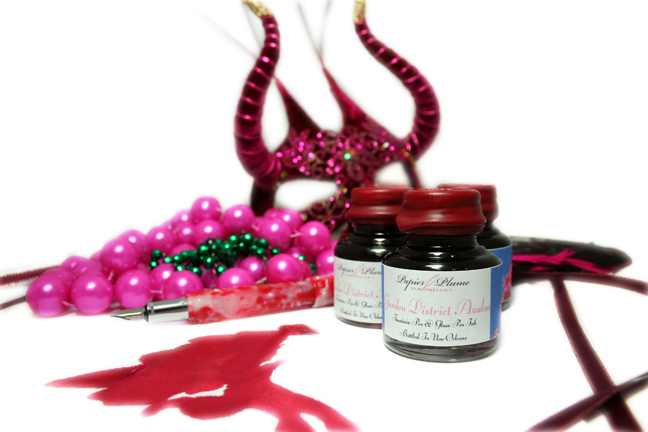
Quick shout: Papier Plume will be releasing the last of the ink in the Homage to New Orleans series this friday. The ink is called Garden District Azalea and it is a pink ink. I got a sample of the ink for (re)view purposes and that will be coming up soon, but wanted to give everyone a heads up - I happen to have just a handful of pink inks - mostly because they don't match my eyes Here is a swab of the ink Here is the official bottle / ink shot And this will be the link when the ink goes live: https://www.papierplume.com/product-catalogue/inks/inks-bottled/papier-plume-new-orleans-collection-fountain-pen-ink-garden-district-azalea.html Expect release at 11am CST on Friday the 16th. - They will have a limited run 60 bottles to sell online. I'll be posting a more formal view tomorrow, hoped for today, but I dont think it will be ready. Also Papier Plume notifies the ink availability and other news through their newsletter first, then Instagram, then Facebook, and finally twitter (in that order). Jack
-
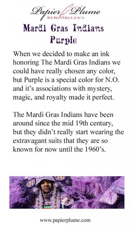
Papier Plume will be releasing their new ink in the Homage to New Orleans line tomorrow the ink is called Mardi Gras Indians Purple and will have a limited run of 60 bottles to sell online. I was hoping to get a sample and a view of the ink before the launch, but for those (like me ) that love ink and like PP inks this is a quick heads up Here is the official bottle / ink shot And the Official Card This will be the link when the ink goes live: https://www.papierplume.com/product-catalogue/inks/inks-bottled/papier-plume-new-orleans-collection-fountain-pen-ink-mardi-gras-indians-purple.html Also Papier Plume will their ink availability and other news through their newsletter first, then Instagram, then Facebook, and finally twitter (in that order). As soon as I get the sample I will be posting a (re)view of this - I really looking forward to it. Seems like the year for purple Jack
-
Papier Plume is s stationery shop situated in the heart of the French Quarter in New Orleans. The company began its business in 2001 however the shop was opened in 2007. From what I see on google maps the shop looks quite nice. source Some time ago the company started to offer fountain pen inks. They're supposed to be hand poured and bottled right in the shop. The inks are water based and described as french inks (imported? anyone knows french private label maker?). At the moment the inks are available in 15 colors and are sold in three bottles: small (15 ml), medium (30 ml), big (50 ml): source I've received samples of fourteen colors and I'll review them soon. The full line consists of: Black Burgundy Carmel Denim Forest Green Forget-me-not Blue Lover's Red Ivy Green Midnight Blue Moss Green Oyster Grey Peacock Blue Pecan Red VioletBurgundy is nice ink but it's not typical - it leans strongly toward purple. Nice color. Drops of ink on kitchen towel Software ID Tomoe River, Kaweco Classic Sport, B Leuchtturm 1917, Kaweco Classic Sport, B
-
Ink View - Sazerac: Papier Plume's Homage To New Orleans Official (Dr)Ink!
Jackokun posted a topic in Ink Reviews
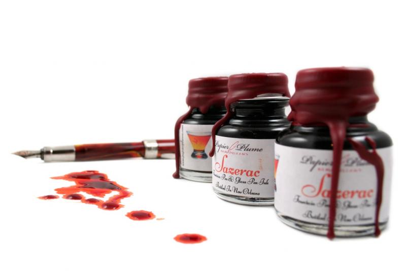
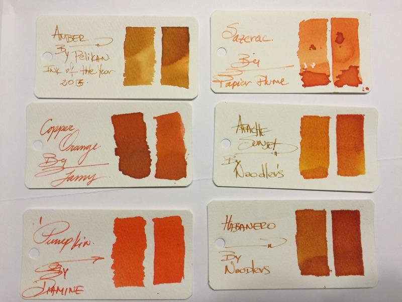
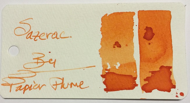
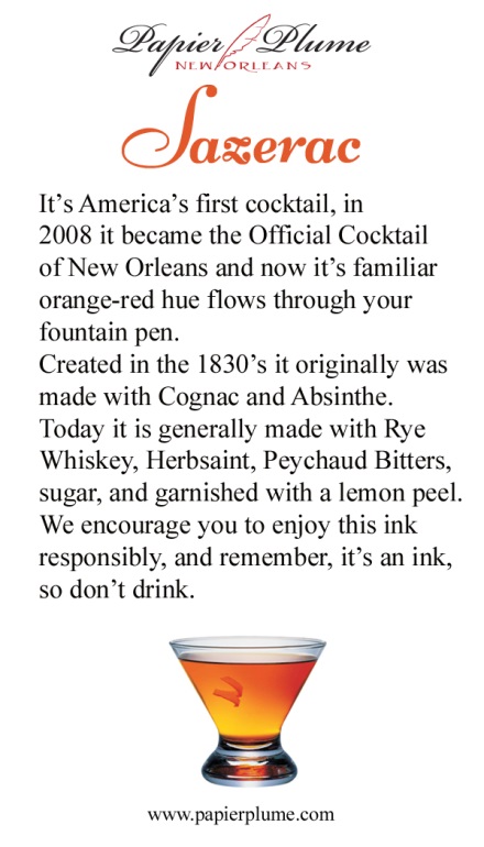
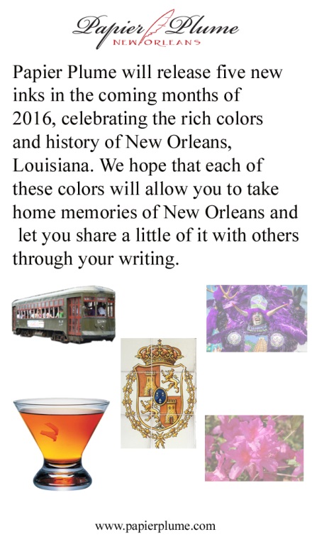
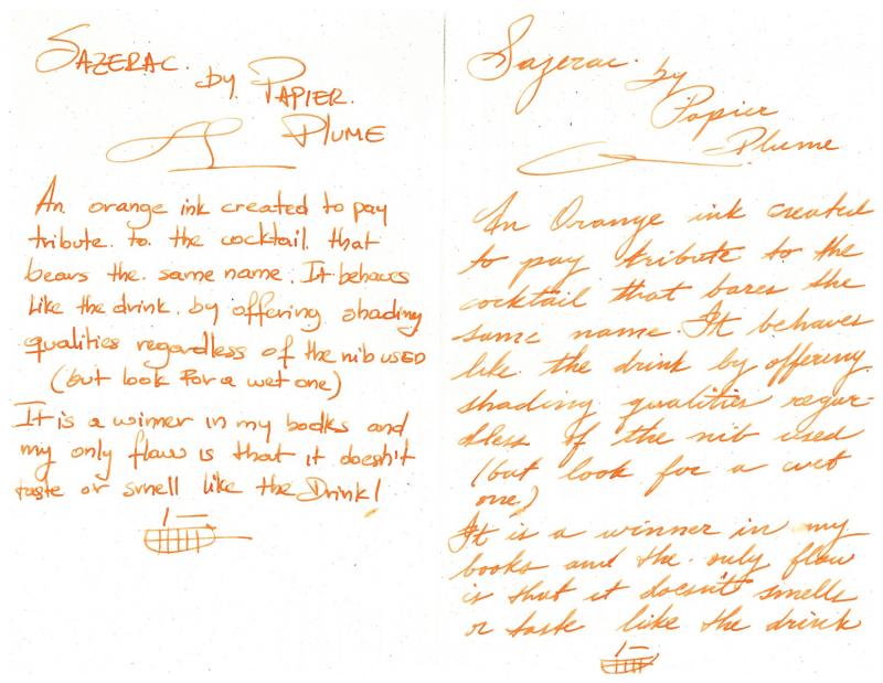
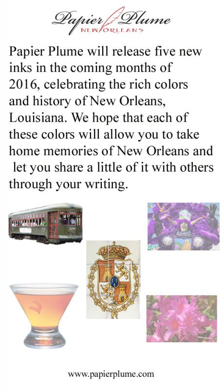
Ink View: Sazerac: Papier Plume’s homage to New Orleans official (dr)ink! Before we go any further. I wanted to apologize as my initial goal was to get this out to you before the ink was out for sale or sold out, but some unforeseen delays (mail system - mainly -) got me the sample too late to provide a meaningful view . I also want to thank Papier Plume for sending me a sample of this ink. and to Lapis for the earlier announcement. Now that that’s out of the way, I hope you enjoy this ink view as much as I enjoyed writing it. Sazerac, the drink and the (dr)ink. The Drink To start, you cannot talk about an ink about a drink, without talking about the said drink J (the rhyme was NOT on purpose). Sazerac is NOLA’s official cocktail drink. A heritage drink that dates back to the 19th century, with some arguing that it was created in the mid 1800s and others in the late 1800s. Others will consider Sazerac America’s first cocktail. What is unanimous, is that the drink was recorded (written) at the beginning of 20th century and that the name was derived from the liquor used in the original recipe: a Cognac produced by the Sazerac de Forge et Fils house (expensive, expensive), and that one of the more characteristic ingredients is peychaud’s bitters, produced by Peychaud’s apothecary (the bitters are now own by the sazerac company). Now again, some also say that it was Peychaud the one that had the recipe and shared the drink with his friends. But it wasn’t until the Sazerac bar (a bar that offered sazerac based drinks) that this drink was offered to a broader audience. Regardless , it’s a drink that had survived alterations (instead of Cognac using Rye Whiskey, addition to absinthe), changing times (different owner’s) and prohibitions(alcohol prohibitions including absinthe). It might not be in every cocktail menu in NOLA, but can surely be ordered off the menu (if asked politely ). As of 2008 The Sazerac became the official cocktail of New Orleans. So how do you prepare a Sazerac? - not the topic of this view but here is a good link for those that are curious. Now, let’s talk about the (dr)ink. The Ink Here is a shot of the bottles: (Quick trivia what is the pen on the background ? – answer at the end ) This (ink) is the third installment in Papier Plume’s (PP) homage to its native city, the first two being Street Car Green and Calle real. As with their previous inks, the hues are inspired on what they are looking to pay tribute to, in this case the drink itself. And as Papier Plume: “The drink varies from red to a golden orange depending on the hand of the bartender.” So, did the ink managed to achieve that? I think so, golden orange yes, red ? not to a deep red, but reddish tones. The shading is definitely there and it is strong. I’d say this before going any further – it does not smell or taste like the drink – shame! Let’s see the swab in the Mnemosyne card: This is definitely an orange family ink, it has yellow and redish tones depending on where and how much of the ink pools, my first impressions was how light it went on the paper. I let a few drops fall on the swab to see how it behaved and also to get a feeling about the drying time (definitely not quick). It also gave me some idea that this would be a good shading ink; however it requires a somewhat wet pen to truly bring out its properties. So on to the tools: Pens: Visconti HS Bronze – Medium, Van Graf FB – Sand – Medium, FC 02 Italian Glass - Broad Stub AND Twsbi Vac 700 Fine. Paper: Tomoe River, Rhodia, Rhodia R, Clairefountaine Thriomphe (CF), traditional copy paper and laid paper. Tests: Flow, saturation, shading, sheen, bleed-through, see-through/show-through, feathering and pooling. With other tests such as water, bleach and alcohol and dry times. Sometimes it will be a yes/no answer, sometimes 1-5 (1 being poor, 5 being excellent) CrossOver Card This is an idea I came about with my last ink view, it allows me to see all the papers and how the ink behaves across . You can see that each column is representative of the paper used. Thoughts on the ink-paper behavior Flow: Flow is good, very fluid, consistent across all papers and pens usedSaturation: Medium, sometimes it looked more saturated depending on the paper, but it was within my expectations if I was looking for good shading.Sheen: None, Zip, nada.Shade: This is where this SHINES. Yes, this ink shades. I was able to get shading across the papers used. And all nib types (thumbs up)Bleed-through: None, not even on copy paper, under normal writing circumstances. That being said I did let a fair amount of ink pool and let it dry to see the result and under those circumstances it did bleed on most papers.Show-through: There is some slight, very slight on all papers with the exception of Rhodia R and Laid . However it is not enough (IMHO) to not be able to write on both sides.Feathering: Now I did experience some tiny (and I’m being picky) feathering using a very wet nib, on all papers but tomoe. Now to be fair this was a very wet nib that I was using to see how far I could take it. Please take note that you the paper you are using is sensitive to the oils of your hand this ink will feather where the oils mix with the paper.Pooling: (This is not the shading but more on the pooling on the edges of the letters, I enjoy when the inks provide this). There was none that I could observe in any of the papersWater Resistance: The tests shown on the card were done using an eyedropper, leaving it a few seconds then using a tissue paper to retrieve the excess. But offline I did a more smear/spread test. Tests show that the ink was not waterproof, but you could potentially recover some of the writing if need to be. Big shout to Tomoe river as the ink just held on to the paper, for a paper that rejects ink by nature it is a bit odd. Alcohol Resistance: Very consistent across. You would be able to recover from this one – almost no effect.Bleach Resistance: None, Zip , nada.Dry Times: As noted this is a wet ink and the drying times were there to support it with drying times that were around the 20sec mark and on some papers longer than that. One thing I had not mentioned before it is how easy is to clean any of PP’s inks from the pens I have used them, I would attribute this to the fact that they are not meant to be waterproof, as well as that they are not viscose and not too saturated. Here are some other inks for comparison, From the top and then left to right: Ink NameMakerOverall notesAmberPelikanThis is a more yellow golden ink with great shadingSazeracPapier PlumeN/ACopper OrangeLamyLooks dark compared to Sazerac, not a lot of shading and more saturatedApache SunsetNoodlersDarker than Sazerac and renowned for its shading properties PumpkinDiamineNo shading, super bright almost no hint of brownHabaneroNoodlersApache’s darker shade or tanned brother haha! And here is a quick sketch of the Sazerac to draw Sazerac ! Here is some Cursive and Block writing for reference. Opinion Personally: I am a fan of oranges, I am. So I would say I like this ink. Objectively: this ink is not the easiest to have on a work environment, but everywhere else it would be a fun ink. This is an ink with great shading properties and it doesn’t completely washes away if by accident some water gets poured on to the paper. It is pleasant to read but it is a wet ink so you might be looking a slightly more than average dry times, again it all depends on the paper and how wet you nib is. I mentioned before that it goes lighter on the paper than any of the other inks I have, but that doesn’t mean there are others out there that could be in the same range and I don’t have or I have never tried (Caran d’ache saffron?, MB ink of Joy?, iroshizuku yu-yake?). I’m very happy to have this ink as part of my orange repertoire Availability As noted at the beginning of this view this is now sold out. For this release Papier Plume increased the production from 30 to 55 1 Oz / 30ml bottles, but sadly it was sold out within the hour of its release. I would say this, if you can get a change to try it, I strongly recommend it. For those that made it this far: what is the pen on the background of the bottle picture? The Answer : Visconti Van Gogh Room in Arles J In addition, as with all the inks in this collection Papier Plume includes nice double side card with the history of what the ink pays respect to and a list/teaser of all the inks on the collection, they don't come with samples though, but 2 more to go! Papier Plume notifies their ink availability through their newsletter first, then Instagram, then Facebook, and finally twitter (in that order). Thank you for keeping up with me up to this point !
-
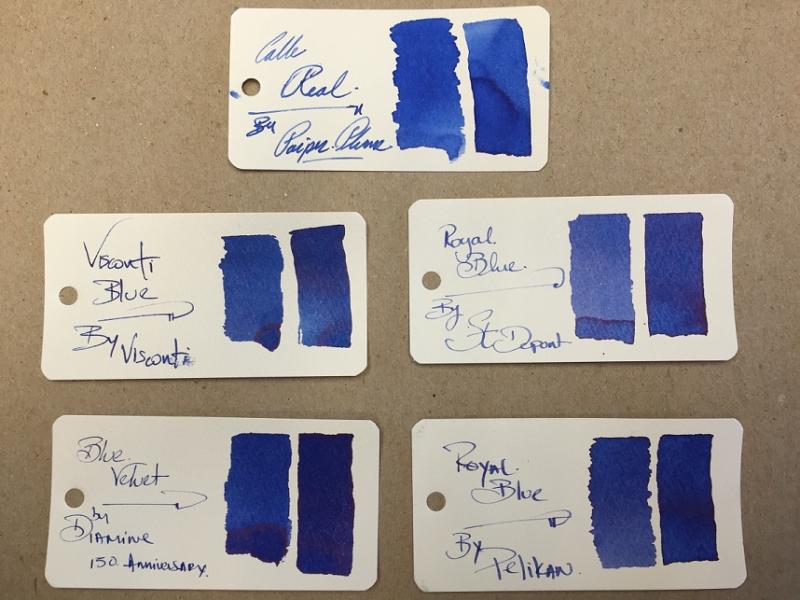
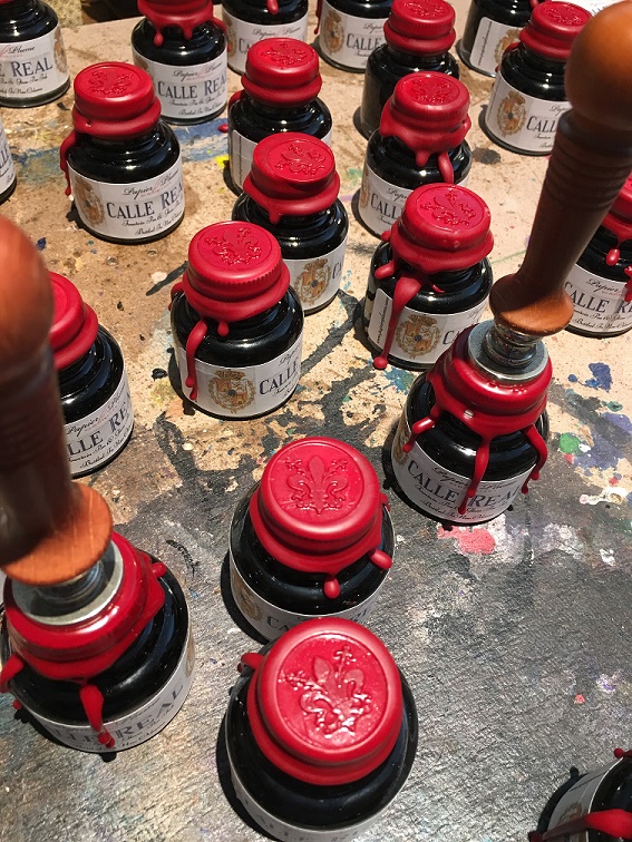
Ink View: Calle Real: Papier Plume’S Next In The History Of New Orleans Inspired Inks
Jackokun posted a topic in Ink Reviews
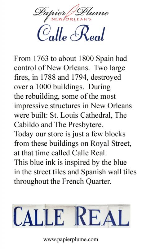
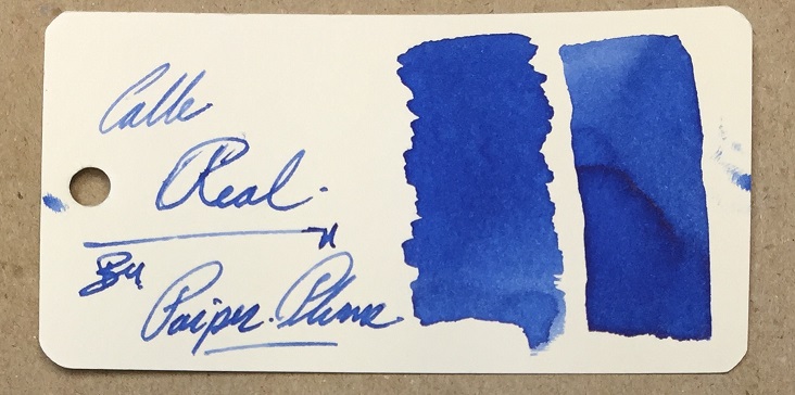
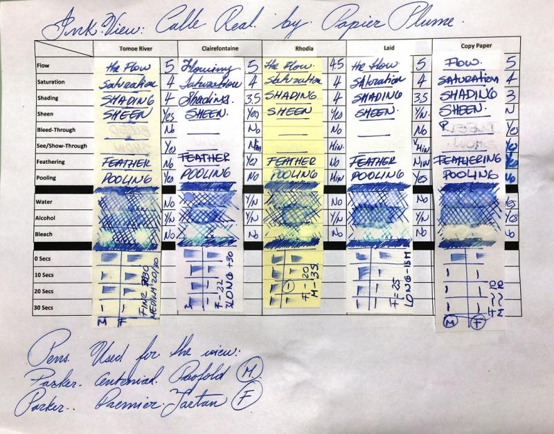
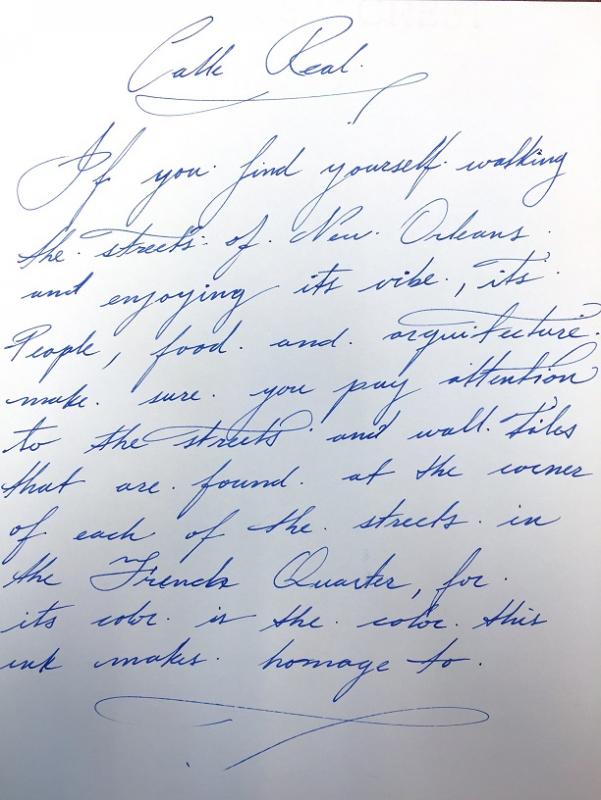
I got a nice surprise from Papier Plume when they sent me a sample of the next upcoming ink. The first one, Street Car Green(SCG), was one that I got by chance and Papier Plumes generosity. I used SCG for my first ink (re)View. The ink is Calle Real (Spanish for Royal Street), an ink that follows the theme of historic New Orleans, where each ink released is meant to evoke some portion of the city's history. With each ink bottle there is a brief history of the ink and what it evokes, including a teaser of the next releases (here is the hint, the inks to be released are NOT highlighted, ). All this information is well presented in nice card The Card Front/Back: So what is the actual Calle Real? (I know a few may have diferent opinions and thoughts on the matter, so please bear with me if I'm saying something that is not true or completely accurate ). Calle Real according to history is what Royal Street used to be called when Spain had control over New Orleans. It is one of the oldest streets in the city (dating back to when it was a French colony then Rue Royale ) and one of the best known streets in NOLA. At some point during the late 1800s and early 1900s the city designated the streets using tiles, one letter per tile (tiles are 4x 6x 3/4and the letter 5) and they were placed on each corner of every block. Now, when you walk New Orleans you will notice that there are wall tiles and street tiles. Yes! But the wall tiles are a way for the city to commemorate the street names as they were known then. The Original tiles are actually the street tiles. Here is a picture of one of the wall tiles: Here is a picture of the street tiles: And here a little more on facts: the tiles used are called Encaustic tiles. These are unglazed and the designs and colors are not painted using dyes or minerals, but come from different colors of clay using inlaid patters and then baked. The tiles made through this process are stronger and more resistant to wear/tear. ( from what I could find encaustic is not the right term in theory-, but it is how is commonly known ). The process for creating these types of tiles is costly and time consuming, but the city, per my understanding, makes the effort to maintain the tiles even during renovations. Over the years the tiles remain both as a historic reference and as a characteristic trait of the French Quarter. Royal Street is much, much more, located just one block away from the Bourbon Street; Royal Street is no less famous than his street relative. While Bourbon Street is known for its endless bars and nighttime entertainment, Royal Street is the home of multitude of shops and galleries, where you can appreciate during daytime the citys culture and art, street musicians and performers, great for-every-budget restaurants, some upscale lodging, the haunted LaLaurie House (for those that like some good ghost stories) and of course Papier Plume A well suited start for a commemorative ink. So here is New Orleans inspired inks Take 2! Calle Real As per Paiper Plume, Calle Real is inspired in the color of the wall tiles, yes some might argue that the color changes from tile to tile depending on the wear and tear and general passing of time, but as per my understanding the ink is based on the more consistent color on the wall tiles. As you can guess, Calle Real is a blue ink within the Royal Blue Family, which is a nice play on the Royal name of the street. Ha! (disclaimer: I'm still working out the kinks on picture vs. scan to have the most truer representation so it is a work in progress) Here is what the swab looks like in the Mnemosyne card After spending some time writing with ink, tossing it on medium and fine pens both wet and dry, and testing it using different papers, I would classify this as a mid-Royal Blue, not too dark and not too light, with a good flow and medium saturation (I personally medium to be a great setting of saturation if you are looking for shading in an ink), and very consistent in terms of properties with the other Papier Plumes inks I have. Now on my first review I used 2 kinds of paper. To be both consistent and a little more thorough this time, I used 5 types of paper, Tomoe River, Rhodia, Clairefountaine Thriomphe (CF), traditional copy paper and laid paper. The pens used for writing were Parker pens: A Parker Premier Tartan in Fine and Parker Duofold Centennial in Medium. The medium Duofold has a wetter nib, and was the one used for most of the comparisons. I looked into the following: Flow, saturation, shading, sheen, bleed-through, see-through/show-through, feathering and pooling. With other tests such as water, bleach and alcohol and dry times. Sometimes it will be a yes/no answer, sometimes 1-5 (1 being poor, 5 being excellent) I also came up with the following overview card, thought to be more practical than having fuill sheets of paper and you can also see the comparison right there. Here are some of the results in the crossover overview card You can see that each column is representative of the paper used. Flow: Flow is really good, very fluid, and constant across all papers and pens used (not just the ones on this view. feels like you are using water, which is something to say since the ink has some waterproof properties. Saturation: I found Calle Real to be a little more saturated, this did not compromised in the shading as much as I would thought, but on the plus side made the ink more vibrant and less subject to the texture of the paper giving it a an even spread.Sheen: This ink has some hints of sheen, they can really be seen in the Tomoe River paper, but depending on the wetness of the pen used it can also show in CF and Rhodia (as did in my experience)Bleed-through: None for the most part with the exception of the traditional copy paper who sucked in the ink like a spongeShow-through: There is some slight, very slight on the CF, more noticeable on the Tomoe River and the copy paper. But not enough to not be able to write on both sides (if the copy paper didnt bleed as it did this will also be true for it).Feathering: For the most part Calle real held its ground here. Some minimal feathering with CF and the laid paper (although this last one we can argue is the papers texture). The big fail was on the copy paper not surprising Pooling: This is not the shading but more on the pooling on the edges of the letters, I enjoy when the inks provide this, and I could see some of this pooling on Tomoe, CF and RhodiaWater Resistance: The tests shown on the card were done using an eyedropper, leaving it a few seconds then using a tissue paper to retrieve the excess. But offline I did a more smear/spread test. Tests show that the ink was not really waterproof, but you could potentially recover some of the writing if need to be. One exception was the copy paper, which absorbed the ink and held on to it. I know Im surprised as well.Alcohol Resistance: Very consistent across you, would be able to recover from this oneBleach Resistance: None, Zip , nada.Dry Times: They were very consistent across all but the copy paper (who was record breaking of less than 10 seconds). Now, keep in mind that I was using a wetter nib, the fine nib did better across. As for comparison, here are the closest blues I could find from the bottles that I have. From the top and then left to right: Ink NameMakerOverall notesCalle RealPapier PlumeN/ABlueViscontiDarker , some shading , sheen when it pools, more saturated. Royal BlueS.T. DupontThe lightest of the bunch, less saturated, has sheen, and a purpler hint than the rest, good shading.Blue VelvetDiamine (150th Collection)The darkest of the bunch, More saturated, darker, more sheen, slight shadingRoyal BluePelikanLighter, some shading, some sheen when it pools And here is a quick sketch of the Royal Street using Calle Real ! but imagine that the street is a very well transited street, in fact it becomes a pedestrian street during the afternoons. Here is some Cursive and Block writing for reference. Opinion I find blue one of the most personal colors when it comes to what you prefer. I know the same can be said for other colors, but I find blue one of the most extensive out there. That being said, in comparison of what I have experience with, and what I have, I find really good properties on Calle Real, the slightly more saturation allows for more solid lay down of the ink which makes it vibrant (more so than the ones I compare it to), while it also maintains shading properties across all types of paper used. It is work appropriate and fits right in the middle of the inks I have. There is some draw backs in terms of resistance to water, alcohol or bleach, but that is not a deal-breaker. A nice ink that it is pleasant to look at . Release So, hopefully you have stuck with me until this point. If you like this ink, note that there will only be 30 bottles for sale. From what I understand the first ink released in this collection (Street Car Green) was sold out in less than an hour. The ink will be sold in 1 Oz / 30 ml bottles and will look like this: If someone is interested my understanding is that will be up for grabs this Friday (June 17, 2016)/ or Monday at the latest. Availability will be noted through their newsletter first, then Instagram, then Facebook, and finally twitter (in that order). you can get this and more other goodies at https://www.papierplume.com/ Thank you for sticking with this view until the end
-
For anyone interested, Papier Plume is now selling Street Car Green in store and through their website https://www.papierpl...-car-green.html Per the description, the ink will be a limited production, with a run of 30 of 1Oz bottles this time around They also have a more nicer description of the ink background that I've could have done in my review
-
Papier Plume is s stationery shop situated in the heart of the French Quarter in New Orleans. The company began its business in 2001 however the shop was opened in 2007. From what I see on google maps the shop looks quite nice. source Some time ago the company started to offer fountain pen inks. They're supposed to be hand poured and bottled right in the shop. The inks are water based and described as french inks (imported? anyone knows french private label maker?). At the moment the inks are available in 15 colors and are sold in three bottles: small (15 ml), medium (30 ml), big (50 ml): source I've received samples of fourteen colors and I'll review them soon. The full line consists of: Black Burgundy Denim Forest Green Forget-me-not Blue Lover's Red Ivy Green Midnight Blue Moss Green Oyster Grey Peacock Blue Pecan Red VioletI'll start with Black that isn't particularly thrilling as it's black. The ink behaves well, it dries rather fast and is fairly water resistant. Lubrication is average but the inks flow well. Software ID Tomoe River, Kaweco Classic Sport, B Leuchtturm 1917, Kaweco Classic Sport, B Oxford, Kaweco Classic Sport, B Comparison
-
Papier Plume is s stationery shop situated in the heart of the French Quarter in New Orleans. The company began its business in 2001 however the shop was opened in 2007. From what I see on google maps the shop looks quite nice. source Some time ago the company started to offer fountain pen inks. They're supposed to be hand poured and bottled right in the shop. The inks are water based and described as french inks (imported? anyone knows french private label maker?). At the moment the inks are available in 15 colors and are sold in three bottles: small (15 ml), medium (30 ml), big (50 ml): source I've received samples of fourteen colors and I'll review them soon. The full line consists of: Black Burgundy Carmel Denim Forest Green Forget-me-not Blue Lover's Red Ivy Green Midnight Blue Moss Green Oyster Grey Peacock Blue Pecan Red VioletMidnight Blue isn't a typical blue-black I expected. It's better and more complex. Kind of Evening Blue? It has nice flow and offers some water resistance. Drying time is reasonable. Drops of ink on kitchen towel Software ID Tomoe River, Kaweco Classic Sport, B Leuchtturm 1917, Kaweco Classic Sport, B Oxford, Lamy Al-Star, B Comparison
-
Papier Plume is s stationery shop situated in the heart of the French Quarter in New Orleans. The company began its business in 2001 however the shop was opened in 2007. From what I see on google maps the shop looks quite nice. source Some time ago the company started to offer fountain pen inks. They're supposed to be hand poured and bottled right in the shop. The inks are water based and described as french inks (imported? anyone knows french private label maker?). At the moment the inks are available in 15 colors and are sold in three bottles: small (15 ml), medium (30 ml), big (50 ml): source I've received samples of fourteen colors and I'll review them soon. The full line consists of: Black Burgundy Carmel Denim Forest Green Forget-me-not Blue Lover's Red Ivy Green Midnight Blue Moss Green Oyster Grey Peacock Blue Pecan Red VioletIvy Green is well behaverd ink (no feathering / bleedthrough / other misbehaviour). Personally I dislike this color. Drops of ink on kitchen towel Software ID Tomoe River, Kaweco Classic Sport, B Leuchtturm 1917, Kaweco Classic Sport, B
-
Papier Plume is s stationery shop situated in the heart of the French Quarter in New Orleans. The company began its business in 2001 however the shop was opened in 2007. From what I see on google maps the shop looks quite nice. source Some time ago the company started to offer fountain pen inks. They're supposed to be hand poured and bottled right in the shop. The inks are water based and described as french inks (imported? anyone knows french private label maker?). At the moment the inks are available in 15 colors and are sold in three bottles: small (15 ml), medium (30 ml), big (50 ml): source I've received samples of fourteen colors and I'll review them soon. The full line consists of: Black Burgundy Carmel Denim Forest Green Forget-me-not Blue Lover's Red Ivy Green Midnight Blue Moss Green Oyster Grey Peacock Blue Pecan Red VioletViolet is nice, well behaved ink. No issues with it. Drops of ink on kitchen towel Software ID Tomoe River, Kaweco Classic Sport, B Leuchtturm 1917, Kaweco Classic Sport, B Comparison
-
Papier Plume is s stationery shop situated in the heart of the French Quarter in New Orleans. The company began its business in 2001 however the shop was opened in 2007. From what I see on google maps the shop looks quite nice. source Some time ago the company started to offer fountain pen inks. They're supposed to be hand poured and bottled right in the shop. The inks are water based and described as french inks (imported? anyone knows french private label maker?). At the moment the inks are available in 15 colors and are sold in three bottles: small (15 ml), medium (30 ml), big (50 ml): source I've received samples of fourteen colors and I'll review them soon. The full line consists of: Black Burgundy Denim Forest Green Forget-me-not Blue Lover's Red Ivy Green Midnight Blue Moss Green Oyster Grey Peacock Blue Pecan Red VioletPeacock Blue can be described as bright blue turquoise that doesn't lean too much toward green. I don't have a sample of legendary Sheaffer's peacock Blue but I think it would be interesting to compare the two. The ink behaves well on variety of papers, even on MOleskine that - to me - is a synonime of bad quality, FP unfriendly paper Drops of ink on kitchen towel Software ID Tomoe River, Kaweco Classic Sport, B Leuchtturm 1917, Kaweco Classic Sport, B Moleskine (=bad quality paper), Waterman Carene, F Comparison
-
Papier Plume is s stationery shop situated in the heart of the French Quarter in New Orleans. The company began its business in 2001 however the shop was opened in 2007. From what I see on google maps the shop looks quite nice. source Some time ago the company started to offer fountain pen inks. They're supposed to be hand poured and bottled right in the shop. The inks are water based and described as french inks (imported? anyone knows french private label maker?). At the moment the inks are available in 15 colors and are sold in three bottles: small (15 ml), medium (30 ml), big (50 ml): source I've received samples of fourteen colors and I'll review them soon. The full line consists of: Black Burgundy Carmel Denim Forest Green Forget-me-not Blue Lover's Red Ivy Green Midnight Blue Moss Green Oyster Grey Peacock Blue Pecan Red VioletForest Green is rather nicely saturated greem with good flow and some water resistance. I like it. Drops of ink on kitchen towel Software ID Tomoe River, Kaweco Classic Sport, B Leuchtturm 1917, Kaweco Classic Sport, B Oxford, Kaweco Classic Sport, B Comparison
-
I received a three samples of the custom inks for Papier Plume. I like this one, the Moss Green, the best. This ink is fairly close in color to Sailor's Shouiakan "Deep in the Mountains", and slightly greener than Sailor Bungbox 88 Green Tea. Obviously, not as wet as those inks, but if made a little wetter and a bit more dye load, it could match those inks pretty well. As it is, a very good ink. In the sample vial the ink looked more brown than green, and I thought perhaps there might have been a mixup. So the ink goes down brown and turns to green. It's kind of neat to see. Sorry, but I didn't do a water droplet on paper towel test with this ink.
-
My review sheets simply call this "brown", but it may be "chestnut brown". I'm not exactly sure which ink was sent, and the original picture of the bottles doesn't show the name on the brown ink. So perhaps someone can correct me and indicate the correct name. Anyway, an FPN member sent some samples out and I agreed to review three: the blue, the brown, and the green. This is the brown (obviously). I'll say this is a light cinnamon color. The water droplet test shows a single dye ink, and it's not super concentrated. The ink handled perfectly OK, was fairly fast drying. I think the ink is relatively inexpensive, say $8/30 ml bottle. So not a bad ink at all, but not really anything special to my way of writing. I tested this on Mohawk via linen (MvL), and Hammermill 28 lb inkjet papers. It's possible this is the most boring image of ink droplets on a wet paper towel ever presented to FPN.
-
First review. This is of Papier Plume's hand-bottled ink, Burgundy, which can be found at papierplume.com or in their shop in New Orleans. It's a nice ink that performs well in italic or flex nibs. My review was color-corrected to represent an accurate scan of the ink. Feathering of the ink is actually zero to very minimal, but my image resolution makes it look a little higher, unfortunately.