Search the Community
Showing results for tags 'paperblanks'.
Found 7 results
-

The Paper Plane : Paperblanks Embellished Manuscript
namrehsnoom posted a topic in Paper & Pen Paraphernalia Reviews and Articles
The Paper Plane : Paperblanks Embellished Manuscripts I've been enjoying this little corner of the web for some time now, mainly focusing on inks and pens. But these are more or less useless without the humble paper or notebook that will let you capture your thoughts. So here comes the "Paper Plane", where I review some of the paper and notebooks that I've enjoyed using over the years. Today's guest is the Paperblanks Embellished Manuscripts journal, and more specifically the Ultra variant of this nice piece of stationary. The Paperblanks company was founded in 1992 in Vancouver, Canada, by Victor L. Marks. As stated on their website paperblanks.com, he was driven by his passion for beautiful journals: "The joy for me is in making beautiful books that people use as a creative tool in their personal lives." No kiddin' - this is a really spot-on characterization of these notebooks. Paperblanks journals have beautiful cover designs, and even more importantly, they are quite suited for writing with a fountain pen. My own favourite of the Paperblanks variants is the Embellished Manuscript style with the magnetic wrap closure and 144 pages of ivory-coloured paper. And I always choose the Ultra size with blank pages, which is more or less an A5-size. For me, this is the ultimate tool for personal journaling. A beautiful piece of stationary, that invites you to slow down your life a bit, and share some daily thoughts with the paper. These journals come in a huge variety of cover designs, so you're sure to find some that are to your liking. Each Embellished Manuscript journal models its design on a manuscript page from a well-known personality - a writer, composer, inventor, scientist, ... Attention to detail is amazing. The front cover typically shows an embossed page from the author's manuscript. In the sample above, I show the front cover of the Bram Stoker journal, based on the Dracula novel. The colour palette follows the topic ... in this case the pale white of the vampire, with the red blood splotches. The author's name in his/her own handwriting is embossed on the magnetic wrap closure. The back cover continues the theme and gives the author's dates of birth and dead, and the name of the work from which the cover design is taken. At the back of the journal, you'll find more extensive biographical information about the author and her/his work. You'll also find a back pocket for storing some memorabilia. I really appreciate the attention that is given to all these details. For a fountain pen user, the most important part of a journal is undoubtedly its paper. Let's have a closer look to see if it's fountain pen friendly. Paperblanks paper has a nice off-white ivory colour, that is gentle on the eyes in any lighting conditions. It's also acid-free paper, making it very durable - your notebooks will easily survive for centuries when proper care is taken. The paper for the Embellished Manuscripts journals is on average 120 gsm, with some slight variability due to the production process. Technically, it is "laid paper", which gives it a nice textured surface. It follows the traditional laid pattern with a series of wide-spaces lines (chain lines) parallel to the shorter side of the paper, and more narrowly spaced lines (laid lines) at 90 degrees to the chain lines. For more detail have a look at Wikipedia (search on "laid paper") for lots of interesting details. Suffice it to say that the result is a nicely textured writing surface. The paper takes fountain pen ink really well - typically without feathering, see-through or bleed-through (although I must confess that I occasionally encounter an ink with some slight see-through - but that's really the exception). Conclusion The Paperblanks Embellished Manuscript notebooks are my personal favourite for daily journaling. I really like the practical design with the magnetic wrap closure, and of course the multitude of simply gorgeous cover choices. And the ivory paper with its textured tactile feel works really well with fountain pens, and can take almost all inks without glitches (no feathering, no see-through or bleed-through). At about 22 EUR, they are certainly good value for money. I've been enjoying these journals for about 5 years now, and will most certainly continue using them. Highly recommended ! -
Paperblanks makes beautiful notebooks and diaries with off-white paper. I've used various Paperblanks notebooks for journaling and found the paper to be of good quality. Not overly smooth (i.e. not coated), but well-behaved with all but the wettest fountain pens and with a nostalgic feel, like old paper. Having been so encouraged, I bought a 2019 diary from Paperblanks, in the expectation that the paper would be the same. Guess what? it isn't. At first glance and first feel, the paper appears to be the same as that used in their notebooks but in fact it responds totally different to fountain pen inks. I decided to do a quick test and got interesting results. On the positive side, this paper (despite being off-white) really brings out the colour of the ink. The colours are a joy to look at. Also the paper has a pleasantly "grainy" writing feel, a sort of texture that offers lots of control while still being pleasantly smooth. No fibers, no plasticy feel as with some coated papers, just a really nice writing experience. The degree of control also makes it easy to jot readable notes when on the move (cars, buses, trains, planes). On the negative side... As you can see, there's a profound "mottling effect" that's caused by the ink being absorbed into the paper in some spots, which leads to colour differences. The inks that mottle most also cause the most bleedthrough and are pretty much unusable. The Herbin inks fall in this category, which surprised me a bit because I consider Herbin inks to be extremely well-behaved. But not on this paper... The best-behaved inks on this paper, i.e. the ones with only very little mottling or no mottling at all, are Sailor Kiwa-Guro (bottom line in above image) and Platinum Blue-Black. Both are pigment inks. By far the wettest writing sample is from an '80s Sheaffer Targa M with Platinum Blue-Black: There's a ton of Platinum ink on the page, but zero mottling, zero showthrough, zero bleedthrough. Remarkable. The only non-pigment ink that comes close is Pelikan 4001 Blue-Black, which also doesn't mottle or absorb. Diamine Ancient Copper is also well-behaved on this 'difficult' paper. The purpose of this comparison is not to burn down Paperblanks diary paper, but to show how much inks differ from each other in how they interact with paper. Their properties really vary widely. The amount of ink deposited on the page (wetness) is *not* the deciding factor, it's really all about the chemical composition of the ink and how the paper responds to that.
-
About a year ago a colleague turned me on to Oxford notebooks, having used Rhodia and Clairefontaine for a long time before that. I love Rhodia, not just the paper but also the design in that wonderful golden yellow. It took me a while to get hooked on Oxford, but once the hook sank in... Some reasons why I've come to prefer Oxford: -significantly lower price compared to Rhodia and Clairefontaine (for example: three thick, 100-page A4 spiralbound notebooks can be had for 8 euros) -huge range of products -every Oxford notebook has margins (except the ones with blank paper), whereas Rhodia and Clairefontaine often do not have vertical lines (which annoys me greatly) -Oxford usually uses 90 g/m^2 paper whereas Rhodia uses 80 g/m^2 (don't know about Clairefontaine), which translates into "more paper, less coating". This is the main selling point for me. It doesn't feel like writing on plastic at all; Oxford paper is soft, organic and smooth and all of my pens love it, whereas some of my pens really don't like Clairefontaine -in terms of feathering (none), bleedthrough (none) and showthrough (same as other good brands), Oxford is at least on the level of other brands -Rhodia can feel very different on both sides of the same page; the front side of a page is sometimes a bit rough and makes pens look dry, whereas the backside will be smooth and wet. In short, Oxford offers more for less and I honestly cannot find a single quality of Rhoda or Clairefontaine that Oxford doesn't match. I haven't tried Tomoe River yet, but that's probably too expensive for my huge daily turnover at work.
-
Ah, Paperblanks... Suitability for fp can sometimes be dodgy but evidently I cannot resist the covers: haulage below. I maybe, quite possibly, have a problem. Nah. Anyone else? P.S. Apologies, the one below the Safavid (which is under the blue Monet mini) is actually a Peter Pauper Press, not Paperblanks. (I'm not affiliated with either company.)
-
I might have missed it, but I don't think that Paperblanks gets a mention here too often. No affiliation, just a little shout out for a brand that I use very regularly and am very happy with. I know that the early ones could be slightly dodgy with fountain pens, but that is now thankfully corrected. I love the look and feel of them and have never had any show through or bleed issues, but I was wondering if they are only available in Europe (hence the lack of mention here)?
-
I am nearing the end of a Paperblanks notebook that was a gift. The decorative cover is quite appealing, but for my next journal, I'm hoping to get something that is better on a few functional points. Love these kinds of covers: http://images.utrechtart.com/products/optionLarge/Paperblanks/Paperblanks-Ventaglio-Rosso-64024_lg.jpg http://i.walmartimages.com/i/p/97/81/44/13/10/9781441310415_500X500.jpg http://www.lecadeauartistique.com/im/articles/carnet-paperblanks-safavide-ultra-details.jpg http://ecx.images-amazon.com/images/I/61s9N0-poCL._SY300_.jpg http://images.utrechtart.com/products/optionRegular/Paperblanks/karakusa_X.jpg The notebook I'm finishing up has a magnetic flap closure, which adds a lot of useless weight and bulk—a pain when traveling. The paper is decent, works with some inks and not others, shows no shading, but dries fast. The line spacing is also a bit wide. Some of the Peter Pauper notebooks have beautiful covers, but the lines are absurdly wide for my handwriting. 90% of my writing is with EF western nibs. On the paper, a little ghosting is fine, but bleed-through is not acceptable. If the paper is very thin, I'm good with writing on just one side, but it had better make up the difference with a good page count. Don't like add-ons in notebooks: maps, historical notes, holidays, pockets, weight and measure conversion tables. They just and weight and bulk. Ribbon bookmark are nice, but I'm not going to say "no" to a notebook that doesn't have one but is otherwise good. So, in sum: Ornate, decorative cover—but not cartoony or girlishLined, with a narrow ruling, preferably around 6mm5x7 to 7x9 inches or something in the A5, B6, A6 rangeLays flat or close to flatCream/off-white paperHardcoverNot more than 1 inch thick, preferably less than 3/4Not full of extrasAny suggestions for notebooks that fit these requirements?
-
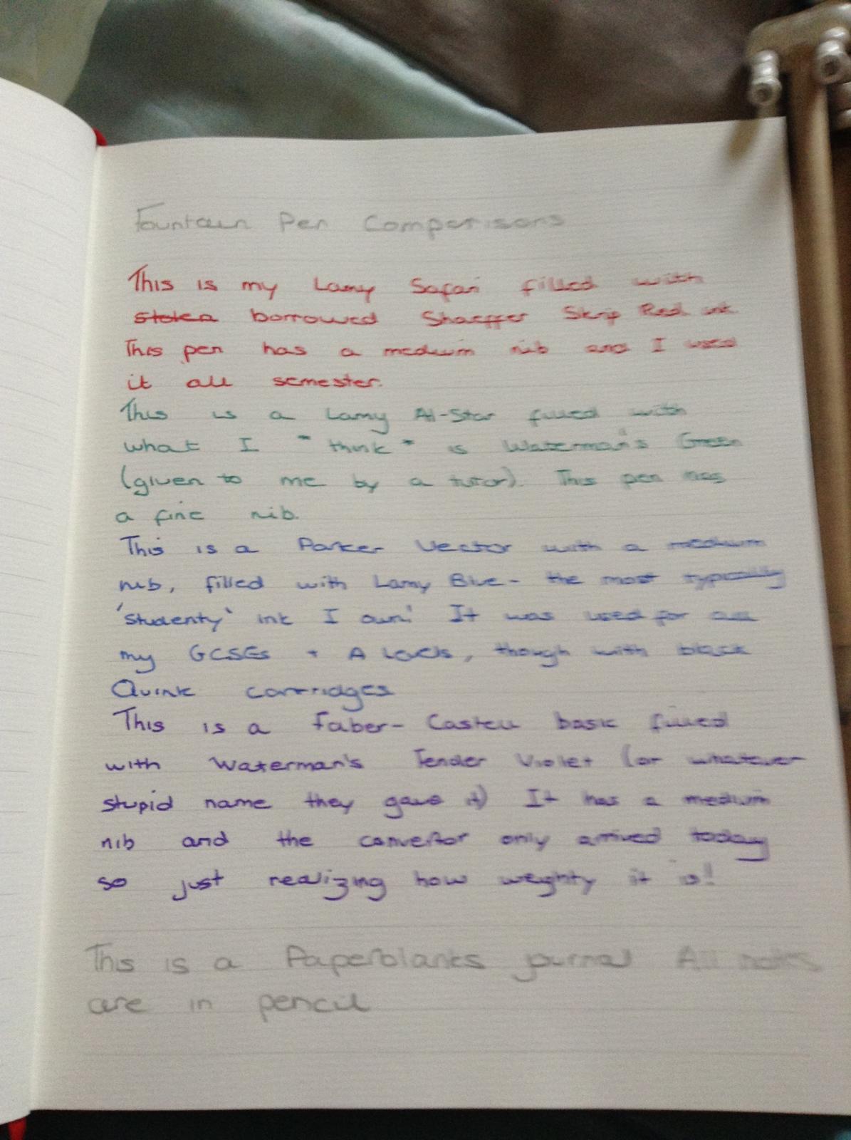
Before we start - I know that there's a topic for this, but this was also done for a couple of friends, so I wanted to make it easy for them to find the post! The convertor for my Faber-Castell finally arrived today which finally allowed me to compare all four of my pens and all four of my inks, compared to before when I was always limited to three, I decided to upload the pictures here for your input / enjoyment / etc. I also felt that this showed how nice the newer PaperBlanks journals are as I had no problems at all writing in my 'Bronte, Jane Eyre' Midi. I apologise for the slightly shoddy images, I was using my iPod camera. The first image is a sample of writing, the second shows my pens. The third is the reverse of the page I wrote on.