Search the Community
Showing results for tags 'oster'.
Found 20 results
-
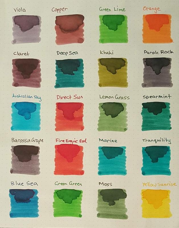
I've just photographed a bunch of Col-O-Ring cards with darker blue-green inks, while comparing them to a custom-mixed ink discussed in Inky Recipes: https://www.fountainpennetwork.com/forum/topic/334121-masques-mix-black-swan-in-icelandic/ I thought I'd share the photographs here, in case they will be helpful for anyone. Since display calibration and general accuracy of representation varies, the main value of these is comparative between the shades. Though I did try to make the colors appear as I see them in person (at least on my devices). I think Fire& Ice should be slightly more saturated and a tad more green. Turquoise and Eau de Nil should be a bit less saturated, more matte. Diamine Asa Blue is a slightly turquoise medium blue. Birmingham Pen Co. Fountain Turquoise is a pale greenish turquoise. Lamy Petrol is similar to Noodler's Aircorp Blue Black in regular writing: both are quite green blue-blacks. ACBB has no sheen, Petrol has unique rose gold sheen. Sailor's Yama Dori was a disappointment to me: it's a dark teal-black that's got a kind of matte washed out appearance. Granted it does sheen easily, but I just didn't care for the lackluster base color. Robert Oster Fire & Ice: ranges from dark blue-teal to very vivid glowing turquoise, depending on the pen used (dry or wet). Sheen is pretty minimal unless you let the ink concentrate sitting in a pen for a few days. Diamine Eau de Nil: nice muted blue-teal, darker, not too vivid Robert Oster Tranquility: this is a green-teal Robert Oster Aqua: more green than Fire & Ice J. Herbin Emerald of Chivor: similar to Aqua in base color. Sheen and shimmer can be hit or miss, depending on paper and concentration Organics Studio Walden Pond "Blue" : definitely a misnomer, there is almost nothing blue about it. It's strongly green, though on the bluer green side. Sheens a vivid metallic magenta so easily, it can take over the whole writing. If you use a dip pen with it and low absorbent paper like Clairefontaine or greeting cards, the metallic sheen completely covers up the green-black, and the letters look like you wrote them with a metallic magenta ink.
-
-
-
-
-
-
-
-
-
-
ORANGE ZEST Robert Oster Singature Ink My first review here I really like Robert's inks. I like them in particular for a wide palette of colors, good price and good qualities. Robert is also a very nice guy Bottle is plastic, quite modest but I like her design. Its capacity is 50ml. Rhodia dotpad The color is well saturated, with a hint of red. It works perfectly in thin lines as well as in wider. Here I use it in nibs: Sailor H-M and Bexley's stub. Shading present in a broader line. Without shining. Properties good. The drying time is about 12 seconds od Rhodia dotpad, on other papers shorter. Good flow.Some Oster's inks are a little dry, but Orange zest not.Ink works well in fountain pens, I had the opportunity to use it for a long time. It's safe. Here's a sample on various papers. On Clairefontaine with Noodlers Apache. Filofax notebook. Oxford notebook in hard cover. I like Orange Zest. I can recommend it. Oster has many other interesting oranges. Below the sample. The card has a few months already, so you can see if the color loses its intensity over time.
-

More Availability Of Robert Oster Ink - Now In The U.k And On Goulet Pens
R531 posted a topic in Inky Thoughts
Robert Oster inks are now available on eBay in the U.K. For £11 per bottle with free shipping from a seller called kir.d41. I ordered a bottle of Tranquility and it arrived the next day. Pretty impressed ! I also see in the U.S that Goulet is now carrying Robert Oster although they won't have it till the New Year. Happy New Year -

Robert Oster Inks Now Available In The Uk - Add To Our First Shipment Now!
Royvdbb posted a topic in The Mall
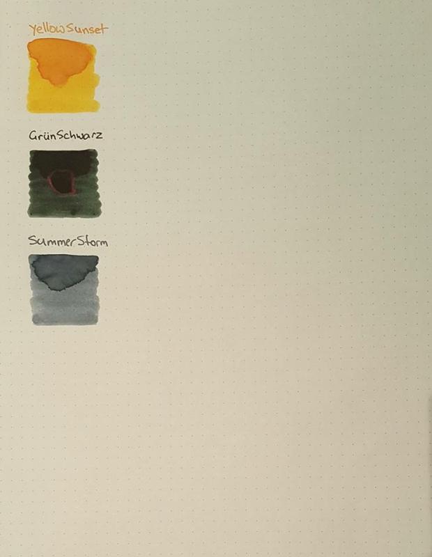
Hello All, On this particularly sunny day, we're delighted to announce that we've now been officially unveiled as an Authorised Retailer for the wonderful Robert Oster inks. We're working furiously on a new website, which will allow you to order online, but for now here's an FPN special. For the first time, they'll be available directly from us in the UK (EU customers welcome too)! Our first stock of inks will be arriving in the next couple of weeks and the initial colour selection is listed below... but here's what we thought, how about we give the wonderful people of FPN the chance to add whatever they want to our shipment. Our official stock of colours will be as follows, drum roll please... Blue seaSummer stormGrun SchwartzEmeraldBlue BlackClaretBarossa GrapeDirect sunDeep SeaJade Price will be £14.95 per 50ml bottle + shipping (detailed below). So, what we'll do is up until the end of Thursday, if you send us a message with your requirements (colour swatches below), we'll then add them to the shipment and send them on to you once they've arrived with us. We would ask for pre-payment (via paypal or bank transfer). To keep it really simple for you, here's the shipping charges for this initial 'add whatever you like' order... UK 1-4 Bottles: £5.45 5-9 Bottles: £8.95 10 Plus Bottles: Free of Charge EU Countries 1 - 4 Bottles: £12.50 5 - 14 Bottles: £16.00 15 Plus Bottles: Free of Charge We're really delighted to be involved with Rob and the wonderful inks that he produces... more exciting news to come soon. Until then, have a good day. Roy
-
I recently got in an order of Robert Oster inks and decided to try out the new Summer Storm. I don't know much about it other than it was given to some Australian FP users as an "Unnamed Blue-Grey" for them to come up with a name. "Summer Storm" definitely evokes images of stormy rain clouds, but whether they appear only in Summer, I'm not sure Here is a quick writing sample using a Pelikan M800 B on white Tomoe River: http://imgur.com/TIbxco3.jpg Here on Maruman Report Pad paper and on Rhodia Dotgrid paper: http://imgur.com/wTk6Cg5.jpg The shading is good, and the ink is quite light and reminiscent of Iro Fuyu-Syogun. Lubrication is not the greatest, it feathers some on Maruman and Rhodia, but has nice shading. I like the look of it most on Tomoe River compared to the other 2 papers. It goes down leaning more towards blue, but as it dries a tinge of lilac comes out. Overall, I feel this is a nice ink, but not a must have. I'm a much bigger fan of some of the other inks from this line. As for blue-greys, I prefer other inks to this as well. This is my first review, apologies if it is lacking
-
Robert Oster Signature Inks are a new line coming out of South Australia and are making enthusiasts sit up and take notice! They are very competitively priced too. So, I acquired a handful of these, thus: Moss Emerald Green Deep Sea Bondi Blue Fire Engine Red Yellow SunsetIn the following short reviews the writing samples are created using an Osmiroid B4 italic nib and an Esterbrook 2048 fitted to a standard XT Esterbrook dip-less pen holder. All writing is by dipping. More time is needed to discover how these inks behave in cartridges, converters or eyedroppers. Swabs and comparisons with other inks will be provided later in the week – I’m all out of Q-tips! Ah, it's the end of another summer's day... Some nice shading here, though I am not sure if it has the range or depth of Noodler's Apache Sunset - the comparison is inevitable. Average dry times on my Rhodia pad. As I was writing the script I was wondering if this was really my thing. After it was on the page for a while I find I quite like it. It will be interesting to try it on off-white or other coloured papers. And of course there is Tomoe River to think of!
-
Robert Oster Signature Inks are a new line coming out of South Australia and are making enthusiasts sit up and take notice! They are very competitively priced too. So, I acquired a handful of these, thus: Moss Emerald Green Deep Sea Bondi Blue Fire Engine Red Yellow SunsetIn the following short reviews the writing samples are created using an Osmiroid B4 italic nib and an Esterbrook 2048 fitted to a standard XT Esterbrook dip-less pen holder. All writing is by dipping. More time is needed to discover how these inks behave in cartridges, converters or eyedroppers. Swabs and comparisons with other inks will be provided later in the week – I’m all out of Q-tips! Call 911 (or whatever your country's equivalent is) there's a fire on the board! That's a bright and brisk red, a good solid colour. No shading or sheen. Reasonable dry times on Rhodia paper. I like this one, I like it a lot. It's lighter than Diamine Reds Dragon, but it pops more because of this.
-
Robert Oster Signature Inks are a new line coming out of South Australia and are making enthusiasts sit up and take notice! They are very competitively priced too. So, I acquired a handful of these, thus: Moss Emerald Green Deep Sea Bondi Blue Fire Engine Red Yellow SunsetIn the following short reviews the writing samples are created using an Osmiroid B4 italic nib and an Esterbrook 2048 fitted to a standard XT Esterbrook dip-less pen holder. All writing is by dipping. More time is needed to discover how these inks behave in cartridges, converters or eyedroppers. Swabs for comparison with other inks will be provided later in the week – I’m all out of Q-tips! So, it's off to the beach and the clear blue skies... This is a bright blue quite reminiscent of Diamine Asa blue. Not a great deal of shading (no sheen either), but quite pleasant overall. Probably a little too light for my purposes, though I may find a use for it yet! Dry time is similar to Deep Sea - perhaps it's a coastal air thing! Paper is, of course, Rhodia.
-
Robert Oster Signature Inks are a new line coming out of South Australia and are making enthusiasts sit up and take notice! They are very competitively priced too. So, I acquired a handful of these, thus: Moss Emerald Green Deep Sea Bondi Blue Fire Engine Red Yellow SunsetIn the following short reviews the writing samples are created using an Osmiroid B4 italic nib and an Esterbrook 2048 fitted to a standard XT Esterbrook dip-less pen holder. All writing is by dipping. More time is needed to discover how these inks behave in cartridges, converters or eyedroppers. Swabs and comparisons with other inks will be provided later in the week – I’m all out of Q-tips! Time to brave the deep, deep oceans with... Simply lovely! The seas around New Zealand often adopt this exact colour. This is very much a blue-green. Some very decent shading but again no noticeable sheen. Others are seeing sheen so perhaps it may simply be a lighting problem here. Drying times were better with this one, completely dry somewhere between 10 and 20 seconds. Paper is again Rhodia.
-
Robert Oster Signature Inks are a new line coming out of South Australia and are making enthusiasts sit up and take notice! They are very competitively priced too. So, I acquired a handful of these, thus: Moss Emerald Green Deep Sea Bondi Blue Fire Engine Red Yellow SunsetIn the following short reviews the writing samples are created using an Osmiroid B4 italic nib and an Esterbrook 2048 fitted to a standard XT Esterbrook dip-less pen holder. All writing is by dipping. More time is needed to discover how these inks behave in cartridges, converters or eyedroppers. Swabs and comparisons with other inks will be provided later in the week – I’m all out of Q-tips! Okay, here we go, Emerald Wow! Look at the richness of that colour! Again, plenty of shading but no obvious sheen. It's a grey, rainy day here so perhaps with a bit of sunshine the sheen - if any - will show. Dry times were about the same as for the Moss ink. Paper is Rhodia, as it is my usual choice. Love the colour. Never thought I would be a fan of greens but these inks are turning my head for sure!
-
Robert Oster Signature Inks are a new line coming out of South Australia and are making enthusiasts sit up and take notice! They are very competitively priced too. So, I acquired a handful of these, thus: Moss Emerald Green Deep Sea Bondi Blue Fire Engine Red Yellow SunsetIn the following short reviews the writing samples are created using an Osmiroid B4 italic nib and an Esterbrook 2048 fitted to a standard XT Esterbrook dip-less pen holder. All writing is by dipping. More time is needed to discover how these inks behave in cartridges, converters or eyedroppers. Swabs for comparison with other inks will be provided later in the week – I’m all out of Q-tips! First up, Moss The ink laid down with good wetness from both nibs. Colour is nicely saturated and is very reminiscent of moss, as it should be! Drying times were relatively slow on Rhodia paper, though not that different from other saturated inks. There is plenty of shading and a kind of velvet look to it, but I cannot see much by way of sheen. However, this is a beautiful colour, and one that I am going to really enjoy using in personal correspondence.