Search the Community
Showing results for tags 'organics studio'.
-
As most of you know Organics Studio will be coming back with some of their inks. Aristotle didn't make it and won't be resurrected. A pity, because it's quite unique grey, greenish/yellow one. Sadly I lost Ink Splash of this one. I have like 80-90 reviews to scan. Text is in the Oxford notebook but ink splashes and drops of inks weren't stored as safely and I just can't find them anywhere. So there'll be ink splash / kitchen towel gaps in some of the reviews I'll post. A pity, cause I remember Aristotle splash to look funky. Sample's long gone as the ink itself. DROPS OF INK ON KITCHEN TOWEL http://imageshack.com/a/img540/6816/3wRzeg.jpg SOFTWARE IDENTIFICATION / COLOR RANGE http://imageshack.com/a/img661/5526/Jmvjrg.jpg http://imageshack.com/a/img538/386/0u50RM.jpg Oxford Recycled, Kaweco Sport Classic, B http://imageshack.com/a/img538/953/rhlX4f.jpg http://imageshack.com/a/img538/3987/ZsxRZ6.jpg http://imageshack.com/a/img673/8579/MTDbkm.jpg http://imageshack.com/a/img537/1492/snMMLA.jpg Comparison http://imageshack.com/a/img540/8611/rnYo4x.jpg
-

"blue Merle" - Organics Studio Masters Of Writing Volume No. 9 Ernest's Vintage Writing Fluid
Michael R. posted a topic in Ink Reviews
http://4.bp.blogspot.com/-_6AhkszhrR8/VMSnUsyYXlI/AAAAAAAAAiY/dd_QYQaCW4U/s1600/P1240999a.jpg http://1.bp.blogspot.com/-aMf_kFT8HCs/VMTBUsDsqbI/AAAAAAAAAio/4vMcbGMwdQs/s1600/Untitled-2.jpg Blue Merle is a recreation of a vintage Carter's ink. The color is somewhere in between a dark grey and dark blue. It has more blue tones compared to a typical gray ink but also it is less blue compared to most blue-black inks. So far this ink has proven to write very well with good ink flow and has a nice antique look. http://1.bp.blogspot.com/-vXFZuRCJGoc/VMTB387Pn9I/AAAAAAAAAi4/pbKgzL_cjg0/s1600/BlueMerle.jpg Blue Merle shows a little bit of shading, depending on the ink flow of the used pen. Since there is no true look-alike ink available this unique ink could become a highly sought after ink - especially after Tyler Thompson announced to stop producing ink for the moment in September 2014. Luckily another announcement was made in January 2015 that production of few selected inks might continue. http://3.bp.blogspot.com/-JtApALsAeyw/VMTBf6Oy_RI/AAAAAAAAAiw/KkaC_6n3D4o/s1600/BlueBlack.jpg -
Organics Studio Masters Of Science Volume # 4 Gregor Mendel Pigmented Pea Green
Michael R. posted a topic in Ink Reviews
http://2.bp.blogspot.com/-SgBKC7r0dyA/VKlZgB_f-kI/AAAAAAAAAfg/P3lW5q1w5F0/s1600/MendelLabel.jpg http://2.bp.blogspot.com/-tRAPsTFzUn8/VKlaq0-nQXI/AAAAAAAAAgI/Jzi6Bk2P8Rk/s1600/MendelGreeb1.jpg http://3.bp.blogspot.com/-k6k5cJOAZU8/VKlaYpOrXqI/AAAAAAAAAgA/a4cx1hhwPyU/s1600/MendelGreen2.jpg http://3.bp.blogspot.com/-DEUoos0nHzo/VKlZogJOqnI/AAAAAAAAAfw/uMWCcGKHbJo/s1600/MendelGreens.jpg ...unfortunately discontinued (like all other Organics Studio inks); get yours while supplies last! Just loving the minty smell :-) Cheers Michael -

Giving Away 4 Jinhao 599 Demonstrators And 6 Organics Studio White Label Samples
OdinsMusings posted a topic in Pay It Forward, Loaner Programs & Group Buys
Hey all! Hope you are having a fantastic end to the year! I am celebrating 100 subs on my YouTube channel, and I am giving away 4 Jinhaos with samples of Organics Studios White Label inks to one winner. http://40.media.tumblr.com/5763b3daed526ed205eb6568d0430343/tumblr_ng0s9sb20f1rg83ymo1_500.jpg http://41.media.tumblr.com/c0295ff2132fcff1c267d0653ee1463a/tumblr_ng0shq94la1rg83ymo1_500.jpg I made a silly video with the full rules down below: https://www.youtube.com/watch?v=JmoGmudvobo However, there is a super secret bonus entry for FPN members: PM me with an email address, then comment on this thread so I can manually enter an extra entry for you! Also, if you would like to do the handwritten entry option, I can also PM you the postal address for that. -
This is one of the White Box inks. I think there are a few bottles left at Anderson Pens. Still no scanner, so you get bad photos instead. Genghis is a strange ink. It is wetter than the other White Box inks, thank goodness, though the flow was uneven - if I paused, the next word was way darker. The color is a kind of a weathered coral-rose color that is weird. I keep going back and forth on whether I like it. If you drip a little in water, it doesn't disperse normally. Instead it forms little filamentous drops. These don't seem to be actually filaments, nor did I have any trouble washing it out of my nib. That color. I keep going back to it. It does have a gold sheen to it. I am terrible at finding sheen, even with classically sheeny inks on sheeny paper, so it must be pretty strong. It isn't a Stormy Grey-style glitter, but an old-school sheen. I like that part, though I am not sure how well it accompanies the main shade. It washes pretty. I think I would love a softer version of this color, and a bold, deep version. Like many of Organics Studio's inks, I wonder if I did something wrong. I expected a bold red-red. (Didn't you?) This is more of a old-sweater-washed-80,000-times red, or a weather-beaten barn red, or a yarn-dyed-with-natural-roots red. I do like it better tonight than last night, for sure. Like most inks, it has zero water resistance.

-
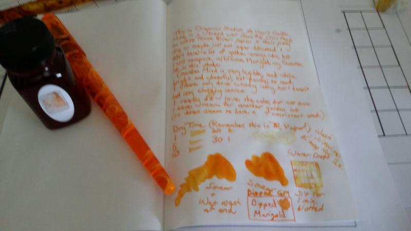
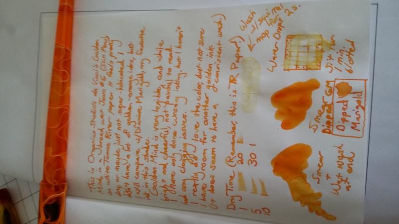
Golden Mind is one of the White Box inks, and is available from Anderson Pens in a very limited quantity. In case you're on the fence, here is a quick look. In summary, I really like the color. If you like dryish ink, take a look. It doesn't feel wet enough for me, but I prefer wet pens and wet inks. It's a dead ringer for Diamine Marigold, and has zero water resistance. It washes as a uniform color, so might be useful for a wash. Sorry for the photos. I didn't want to wait until I got my new scanner, in case anyone was on the fence. Text of review: This is Organics Studio da Vinci's Golden Mind in a broad wet Jowo #6 (Scr. Pens) on white Tomoe River paper. It feels pretty dry, or maybe just not super lubricated. I don't have a lot of golden-orange inks, but I will compare with Diamine Marigold, my favorite ink in this shade. Golden Mind is very legible, and while bright and cheerful, not painful to read. I have only done cursory testing, but haven't encountered any clogging issues. I really do love the color, but not sure I have room for another golden ink. (It does have a consistent wash.) ---- The water drips show more residue than I see. I don't think this is resistant at all.
-
Anderson Pens just blogged they got one last shipment of inks from Organics Studio. I've made my purchase now the rest of you can go on a feeding frenzy. Alas, no Blue Merle
-
It's a pity Organics Studio is on hiatus. I hope Tyler will be beack one day. Nitrogen is great and intense blue ink. Simply great. INFO Producer: Organics Studio Color: Nitrogen Saturation: massive Flow: very good in all pens I've ever filled with it INK SPLASH http://imageshack.com/a/img540/7259/znEBj9.jpg DROP OF INK http://imageshack.com/a/img540/3439/FqLDhY.jpg SOFTWARE IDENTIFICATION http://imageshack.com/a/img673/2374/kh8moe.jpg Calendar - Kaigelu 358 http://imageshack.com/a/img540/9120/5hfW2k.jpg http://imageshack.com/a/img537/2850/djdZwa.jpg http://imageshack.com/a/img673/6562/5gEuKT.jpg http://imageshack.com/a/img538/8789/SNsNg6.jpg http://imageshack.com/a/img910/6343/Gj05b3.jpg
-
Blue mMerle is supposed to be Blue / Black. For me it's more Grey / Blue. Anyway I like the vintage feel about this ink. I read that Organics Studio owner tried to recreate some old Carter's recipe. He's named the ink after - I believe - his dog Ernest (called after his favourite writer - Ernest Hemingway). INK SPLASH http://imagizer.imageshack.us/v2/640x480q90/538/a6Iwsn.jpg DROPS OF INK ON KITCHEN TOWEL http://imageshack.com/a/img674/2158/9sjHo3.jpg CHROMATOGRAPHY http://imagizer.imageshack.us/v2/640x480q90/913/VsyoJK.jpg SOFTWARE IDENTIFICATION / COLOR RANGE http://imageshack.com/a/img746/4238/eNgo9L.jpg http://imageshack.com/a/img912/6963/b6WgIW.jpg http://imageshack.com/a/img674/9751/Sypbft.jpg http://imageshack.com/a/img538/3436/uuRKKF.jpg http://imageshack.com/a/img661/5418/raqAgK.jpg Jinhao X750 in calendar http://imageshack.com/a/img902/5462/oC4Q7E.jpg http://imageshack.com/a/img661/9568/WqF4rf.jpg Oxford Paper http://imageshack.com/a/img537/4336/NnpP46.jpg http://imageshack.com/a/img743/8105/6ZH0gw.jpg DRY TIME http://imageshack.com/a/img661/7372/cS0o0Y.jpg
-
Hi FPN'ers, Just wanted to let you all know that Organics Studio is discontinued. Tyler (the creator) has decided to take a break from ink manufacturing to focus on his graduate studies. We know it was a hard decision, and we certainly wish him the best! That said, all Organics Studio inks are now on closeout here at Goulet Pens. We were fortunate to snag the last remaining stock, so what we have is all that's left.
-
I’m trying out a new format for doing ink reviews. I like this because I feel like it’s a bit more thorough and well organized, without losing individuality. Let me know what you think… Don’t worry if some of that is too small to read, I’ll be posting close ups of each section. This is another ink that falls in the category of “like, but don’t love.” The color definitely looks like a washed out Black Swan in English Roses, which is not necessarily a bad thing. If I had to choose between the two, I would actually take this one because it’s slightly less morbid. I also enjoy the additional shading that you get because it’s not as saturated of a color. Flow was not awful, but not great either. I suspect it’s because of the separation issues I observed in my sample - there is definitely particulate matter coating the sides of the vial. I don’t want to suggest that this is a widespread problem with this ink since I have only seen my one sample, but it is something to watch out for. Water resistance was okay. In the soak test you can definitely still see what was written, but the drip test was a little less clear. I would still trust my daily writings to this ink, because it seems that it will at least leave behind something for you to have later if your paper gets wet. It also played very well with all the papers I tried it on. The Miquelruis notebook I used for the body of the review has very smooth paper but seems prone to bleeding and I did not see any on the back of the page. The cheap paper (from a little notepad I have) is notorious for feathering and I see none there as well. It also highlighted well and, of course, was a delight on Tomoe River paper. Overall, this is a nice ink that might have some flow issues, depending on how consistently the dye stays in suspension and how wet your pen is. Otherwise it performed well and would be a good candidate if you have to do a lot of writing on sub-optimal paper. The ink is not too expensive, at ~$14/55 mL and I’m a sucker for supporting fledgling business ventures, so there’s that. Let me know how you feel about this review style. Better, worse, too much going on, something you would like to see added? I figure I’ll play around with it for a while, tweak a few things, and eventually find a good default. This ink was purchased with my own money and I am not being compensated for this review in any way. All opinions above are my own and you are free to disagree with them if you like.
-
I must admit I'm surprised. I've just done some serious googling and haven't found any review of Organics Studio's FS Fitzgerald ink. Why? It's wonderful, vintage looking orange, one of nicest and pen-friendly oranges I know. OK - the swabs seen in web shops doesn't look exciting but reality is much more interesting than them. I would say it's my 4th favourite orange ink. Maybe third - maybe I'll give it Toucan Orange;s third place in my ranking. I hope my review will be helpful. If you like orange inks you may as well take a look at my comparison of 32 orange inks. Take a look: INK SPLASH http://imageshack.com/a/img902/7678/gXNO6X.jpg DROPS OF INK ON KITCHEN TOWEL http://imagizer.imageshack.us/v2/640x480q90/905/4ehMUG.jpg CHROMATOGRAPHY http://imageshack.com/a/img909/5724/t1zwe6.jpg SOFTWARE IDENTIFICATION / COLOR RANGE http://imageshack.com/a/img538/8025/cXiWJk.jpg COLOR RANGE (gradient tool in PS) http://imageshack.com/a/img904/6568/CxOuaT.jpg The name of the ink is inspired by work of well-known writer F. Scott Fitzgerald. Here's one quotastion from his work. (Hero 5028 1,9 stub on copy paper) http://imageshack.com/a/img537/5885/sED4Gu.jpg http://imageshack.com/a/img742/6526/uTuoZL.jpg http://imageshack.com/a/img674/2521/MwF3wY.jpg http://imageshack.com/a/img537/1440/Ovs8fy.jpg Jinhao 599 on Oxford paper http://imageshack.com/a/img673/2893/JghFse.jpg http://imageshack.com/a/img902/5762/tVufii.jpg Haolilai 908 in calendar http://imageshack.com/a/img674/6237/z6p59D.jpg http://imageshack.com/a/img537/6546/UuPXGj.jpg DRY TIME http://imageshack.com/a/img912/739/UYqRid.jpg
-
Well, I like earthy green-brown colors. I was sure I would like this ink in the moment I first saw a swab somewhere in internet. It took me quite some time to get a sample and it didn't disappoint me. The color is quite ubique and it blends green, brown and yellow in a unique way. I was disappointed by many Organics Studio inks but this one rocks. Take a look: INK SPLASH http://imagizer.imageshack.us/v2/1024x768q90/673/EUhgOs.jpg DROPS OF INK ON KITCHEN TOWEL http://imageshack.com/a/img538/838/pQpmn9.jpg CHROMATOGRAPHY http://imageshack.com/a/img746/7110/lwvCJ0.jpg SOFTWARE IDENTIFICATION / COLOR RANGE http://imageshack.com/a/img902/3481/SHpGvm.jpg http://imageshack.com/a/img909/4884/KLGFNZ.jpg The name Leaves of Grass is inspired by Walt Whitman's book Leaves of Grass. I've decided to write few verses of Leaves of Grass with Leaves of Grass. Surprising, isn't i? (Hero 5028 1,9 stub on copy paper) http://imageshack.com/a/img540/2209/WVFEgd.jpg http://imageshack.com/a/img673/9716/3If1gD.jpg Kaigelu 316 on Oxford paper http://imageshack.com/a/img540/2863/oXAN7A.jpg http://imageshack.com/a/img674/96/NbvmDE.jpg http://imageshack.com/a/img745/7161/V4XbFn.jpg Kaigelu 316 in calendar http://imageshack.com/a/img661/1471/o3zgy2.jpg http://imageshack.com/a/img745/6153/LFcJjF.jpg DRY TIME http://imageshack.com/a/img742/7002/oht0Qd.jpg
-
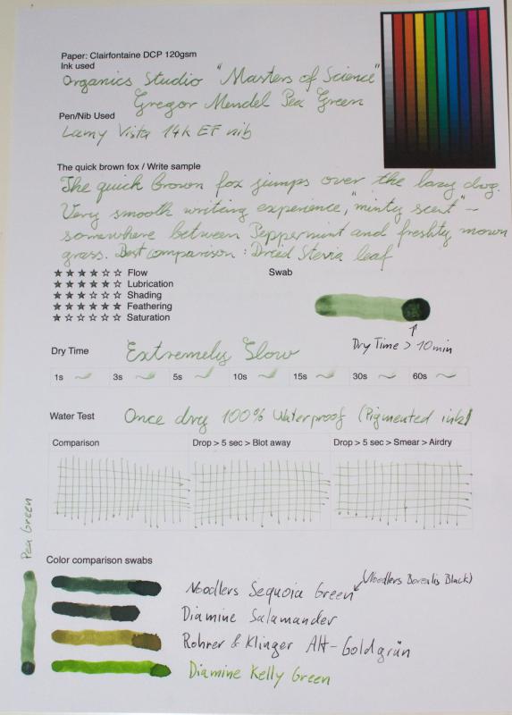
Alright, this is an ink that I meant to review long ago and then because of some sad tech confusion it didn’t happen. But, now it’s ready, perhaps a bit too late. Yesterday there was a post on the Organics Studio Facebook page saying that they are discontinuing Gregor Mendel, so all that’s left is what’s out there… This ink is really neat. It’s colored using chlorophyll, which is the same thing that makes plants green. It’s also a pigmented ink, which makes it very water resistant, as you can see above. On the other hand, this is a far less saturated ink than some other modern ones, but I still find it readable enough for daily use, especially if you are using it in a broad or stub nib. Flow was good, it was easy to clean, and I really can’t think of a single downside to this ink. It even smells good, with a slight minty scent that’s a refreshing change from the chemical-y smell we are all probably familiar with at this point. Like I said, this ink is now available in pretty limited quantities, so I would say that if you want it, get it now. I can’t quite decide if I would use it enough to justify buying a full bottle or not, but I’m sure that if I wait a few more days the decision will probably make itself for me. This ink was purchased with my own money and I am not being compensated for this review in any way. All opinions expressed above are my own and you are free to disagree with them if you wish.
-
This is the second round of ink testing that I am doing - the first is already three months in and you can find those posts on my blog. I figured that for this one I would start from the beginning on here and post updates as I go along. Eek! I am so excited about this. After taking nearly a month to fill up a new page full of inks (partly because I went on vacation for a week), it’s finally ready: As with my first epic ink test, I will have four tests running in parallel: a control which will be kept in a plastic sleeve in a notebook, an ambient light test which will hang on my fridge, a water test, and a sunlight test which will hang in my bedroom window. The ambient and sunlight tests are already in place, so let’s meet our contenders for this round, shall we? Just in case you cannot easily read my handwriting, here are the inks that will be tested: Pilot Varsity disposable pen in black Diamine Salamander Noodler’s Black Swan in Australian Roses Pelikan Edelstein Aventurine Iroshizuku Tsutsuji Private Reserve Shoreline Gold Paradise Pen Turquoise Iroshizuku Ku-Jaku Fisher Space Pen, black ink Yoobi gel pen Organics Studio Gregor Mendel Diamine Poppy Red Standard Sharpie marker Noodler’s Sequoia Green Organics Studio Edgar Allen Poe Noodler’s El Lawrence Pilot G2 in purple Sharpie pen in purple *The test indicator was written in a black sharpie pen* This is sad because it also shows you just how far behind I am on posting reviews. I will eventually post reviews for all of these inks except probably the Sharpies… Anyway, I am very interested in seeing how these inks perform because a lot of them are not marketed as being “bulletproof” or “archival” or “eternal” - they are just regular inks. The paper used is Staples bright white 24 lb inkjet paper and the pens were mostly a mix of M and B nibs. Right away I can share the results of the water test: To do this test I submerged the paper in a bowl of cool tap water and let it soak for a few minutes. I then pulled it out, gently blotted off the excess water with a paper towel, and allowed it to air dry on a metal rack. I would say the following inks “passed” my water test, in that they would be easily still readable by someone who did not do the original writing: Pilot VarsityDiamine Salamander (this is weird, because as I noted in my review I saw some water resistance there but then retested on different paper and it was not there, but this is the same paper I used in the review so…?)Noodler’s BSiAR and El LawrenceIroshizuku Ku-Jaku (I saw similar performance on the water test which will accompany my review)Fisher Space Pen and Yoobi gel penOS Gregor Mendel and Edgar Allen PoeBoth Sharpies The rest of the inks I would say are not terribly water resistant. Obviously this is my opinion and you might feel differently, but a lot of them washed out just a bit too much for me to write anything that needs to be permanent. So, that’s where I will leave this for now. In a month I’ll update on how the other two tests are coming along and in the mean time I’ll start working on the page for round 3! :-)
-
These are my first ink reviews so I'd like to hear all suggestions how to improve them. I've got quite some inks in my collection already (most of them are samples but it's a start) and I will review some more in the future.
-
Hi, I'd like to present you another review that I've made for polish fountain pen forum - that's why the text is not written in english. I'd love to prepare new scans (in english this time) but I don't have time. Anyway, I hope at least some of you will find it useful even tough you won't - probably - understand the text as polish is not the most popular language to learn But then I believe the colors have language of their own. I've received Arsenic sample from Cyber6. Yhank you very much. INK SPLASH ON CHEAP COPY PAPER http://imageshack.com/a/img602/187/08e830.jpg FEW FROPS OF INK ON KITCHEN TOWEL http://imageshack.com/a/img672/6590/9acaba.jpg ELIPSE CUT FROM SCAN http://imageshack.com/a/img819/8784/yuywe.jpg MY PHOTOSHOP DEFINES THIS COLOR AS FOLLOWS: http://imageshack.com/a/img850/4384/d093.jpg INFORMATIONS Producet: Organics Studio Color: Arsenic Saturation: strong Flow: nice Shading: yes Dry Time http://imageshack.com/a/img81/4896/6d1987.jpg Waterproof http://imageshack.com/a/img942/6475/e994ae.jpg SCANS: calendar http://imageshack.com/a/img754/3186/4de40d.jpg http://imageshack.com/a/img33/154/6d9ee5.jpg http://imageshack.com/a/img251/5197/3aa762.jpg http://imageshack.com/a/img37/7312/025fc0.jpg http://imageshack.com/a/img198/3233/04d192.jpg RHODIA http://imageshack.com/a/img621/5994/be571c.jpg http://imageshack.com/a/img194/9615/7e80ea.jpg http://imageshack.com/a/img133/7448/354d45.jpg COMPARISON WITH OTHER GREYS http://imageshack.com/a/img850/3149/nudi8.jpg
-
Time to give a bit of love to a small ink manufacturer, Organics Studio. From what I can tell, it’s a bit of a one man band, and I do so love supporting smaller businesses when I can. I tried another OS ink as well, but that was when my computer was broken and I didn’t get a scan before doing a water test and somehow I lost the picture I took of the original page, so I will have to just redo that one later. I think I still have enough left in my sample to fill a pen… Anyway, Join or Die is part of the “Sepia” line of inks, and I suppose I would be willing to call it a greenish sort of sepia. It reminds me of olive drab, which could be good or bad depending on how you feel about that color. I read somewhere that it only has like five ingredients, though I have no idea where I would have read that. You can find a little introduction from the maker here, as well as a bigger writing sample. That scan looks more yellow than mine did, but it could just be some variation between batches or image processing. This ink had great shading and flow, as well as a decent degree of water resistance. I had absolutely no trouble getting it cleaned out of my pen either. I really wish I could like the color of this ink! It’s so nice otherwise, but the color started to wear on me after about a day and I just couldn’t keep it in my pen. If you do not have my strange aversion to olive shades of ink, I highly recommend it. In the States it’s not too pricy (~$14/55 mL) and you get to support someone starting out in the pen world from the very bottom. What’s more fun than that? This ink was purchased with my own money and I am in no way being compensated for this review. All opinions expressed above are my own and you can feel free to disagree with them if you like.
-
I test my inks in a notebook using a dip pen. But now I'm realizing that I need to also test them in pens before I jump in and buy some. I bought a fine black Preppy at the Chicago Pen Show and decided to fill it with Organics Studio's HMS Beagle. Bad decision. Right away the lines it was making were very wide and the pen was leaking ink practically onto the paper. Of course I have a whole bottle of it. Obviously the Preppy was the wrong pen for it. I turned around 180* and cleaned and filled the Preppy with Noodlers KTC. So far it's behaving itself quite well, but give it time. Now I have to figure out what pen I have can handle the HMS Beagle. Maybe something will come in the mail that will need a free flowing ink like that. I have some Chinese pens winging its way to me.
-
Has anyone else gotten a bottle or sample of this. I was so smitten by the name and swap I didn't get a sample first (gasp). [attachment=251456:13890258362_be83b79859_z.jpg] I'm hoping the picture shows....this time...
-
Inker's note: When I say 'about' I mean 'this is a guesstimate'. I've just gotten my ink experimentation supplies in, so I want to put up my attempts to create a smoother, low-shading version of OS Manganate. Hopefully this is helpful or interesting to someone, or at the very least means other people don't need to repeat so many tries. 1st try, more !!SCIENCE!! than scientific; 1 drop of Cascade Rinse Agent in about 3 mL of Manganate. Turned out much darker, looked beautiful, but also had a stupidly long dry time. 2nd try: Added about 2 mL to the earlier experiment. Ink now looks like old Manganate, but is smoother and has a bit less shading, possibly because more ink is getting on to the page in general. Upcoming: 3rd try: 1 drop of PhotoFlo & 1 drop of Phenol to 4 mL of Manganate
-
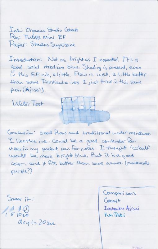
I had expected this ink to be just a little brighter, based on the name. Maybe more like Kon Peki. (Yes, I know I'm obsessed with comparing inks to that one. I just keep hoping to find a replacement for that one that's cheaper ) But this is a good color. I like it. It's what I might call, 'dark cobalt'. It's still a fairly bright, medium blue color, with some good depth. I actually really like this ink. Behaves well in my little pocket pen for taking notes.
-
I think the current name is Manganese, instead of Manganate. Is an ink with two names twice as interesting? I like this one. Very similar in depth and saturation to my De Atramentis Sherlock Holmes ink, which is just a little bit more vibrant blue hue. This one flows well, really smooth. Has a bit of shading, but it's pretty dark so it's not going to show in a fine nib. Dry time is on the long side of average.
-
Ok. This is another really good one. I officially like all four of the Pendleton's inks series. Good shading, wet flow. Really nice colors. This one is a dark purple color with nice shading. A purple-black. I wish I had Diamine Eclipse to compare it to. Looks like I really dig dark purple inks. Much more than lighter violet colors. This is going to join my top inks in regular rotation.
-
Here's another pretty new ink from Organics Studio's Writer's Series. It's a dark, earthy green color. Looks good for serious writing, or a sepia sort of color. Good flow, some water resistance. This is different from my other greens right now. I imagine Noodler's Sequoia or Zhivago, or Private Reserve Avocado is in the ballpark. I have still to try this on cream colored paper, but I think it'd be really nice