Search the Community
Showing results for tags 'orange'.
-
http://i900.photobucket.com/albums/ac209/jasonchickerson/_FUJ0618.jpg First, I'd like to curse thank fireant for sending me a sample of this wonderful ink. Alas, it is discontinued or I'd buy a bottle today. It likely wouldn't spend much time in my pen, but I'd put it to good use sketching and it is wonderful straight out of the bottle for pointed pen calligraphy. Here's an overworked persimmon. http://i900.photobucket.com/albums/ac209/jasonchickerson/_FUJ0612.jpg Sailor Hachimitsu and Cigar on Strathmore watercolor paper. http://i900.photobucket.com/albums/ac209/jasonchickerson/_FUJ0609.jpg Hachimitsu with Zebra "G" nib on Original Crown Mill Pure Cotton paper. Reasonable care was taken to ensure color accuracy, but with an ink this complex and fluorescent, perfection is impossible. If anyone has an unwanted bottle of this ink, I will gladly buy it from you.
-

Ranga Model 5 Or Varuna Gajendra Premium Ebonite Pens- 10 Colours-3 In 1 C/c Filling Mechansim
mpkandan posted a topic in Market Watch
Dear FPN'ers, We are introducing our RANGA MODEL 5 (VARUNA GAJENDRA) with German JOWO/SCHMIDT Screw in Nib and Converter in Premium Ebonite in 10 Beautiful colours.We also introduce these Models in Eyedropper Models too.These can be used as (3 IN 1 FILLING MECHANISM). It is 18.75MM DIA thickness with seamless Cap and Body.The length of the capped pen is 7 Inches. The Pens are really huge and Giant in Size and Performance.It is Clipless beautiful Cigar shaped Pen. THE COLOURS ARE VERY UNIQUE AND RARE. These would be treat to Fountain pen lovers and Collectors. It is also a visual stunner.The available colours are 1.SOLID BLUE 2. YELLOW/BLACK, 3. BLUE/PINK, 4. SOLID GREEN,5. WHITE/BLUE, 6.RED OR PINK/ BLACK, 7. GREEN/ YELLOW 8. SOLID PINK,9. BLUE /GREEN /ORANGE, 10. SOLID ORANGE, All the pens are avaialble in Mirror finish or Bakul finish. All the Ranga Pens are completely handmade. We don't even use Lathes to make pens.This is in practice only in Japan now. NIB Options:------------------Jowo Nibs:---------------Gold Colour - Fine , Medium , Broad PointsTwo tone Colour - Extra Fine, Fine , Medium , Broad, Calligraphy PointsWhite Colour -Fine , Medium , Broad Points Schmidt Nibs:-----------------Gold Colour -Fine , Medium , Broad PointsWhite colour- -Fine , Medium , Broad Points Converter: ----------------Schmidt K5 Converter Price- 108$ 2. EYEDROPPER MODELS: We are introducing MODEL 5 (VARUNA GAJENDRA) in Eyedropper Models also.These pens comes with 35mm Ambitious Gold coloured Fine Mdeium nib.The nibs can be upgraded to 35mm White Bock in Medium /Broad nib with 9$ extra.PRICE : 70$ Thanks all for your continuous support. 1. RANGA MODEL 5 (VARUNA GAJENDRA)- Premium ebonite with German JOWO/SCHMIDT Screw in Nib and Converter Pen pictures. http://i1189.photobucket.com/albums/z437/mpkandan/CRod%20Ebonite%20Gajendra/DSC04753-1_zpsmxs9svz4.jpghttp://i1189.photobucket.com/albums/z437/mpkandan/CRod%20Ebonite%20Gajendra/DSC04804-1_zps34n2beyd.jpghttp://i1189.photobucket.com/albums/z437/mpkandan/CRod%20Ebonite%20Gajendra/DSC04801-1_zpsf5on8507.jpghttp://i1189.photobucket.com/albums/z437/mpkandan/CRod%20Ebonite%20Gajendra/DSC04805-1_zps65yaek67.jpg http://i1189.photobucket.com/albums/z437/mpkandan/CRod%20Ebonite%20Gajendra/DSC04755-1_zpslkp14ruy.jpghttp://i1189.photobucket.com/albums/z437/mpkandan/CRod%20Ebonite%20Gajendra/DSC04785-1_zpss8bn7xja.jpghttp://i1189.photobucket.com/albums/z437/mpkandan/CRod%20Ebonite%20Gajendra/DSC04786-1_zpsf7werarc.jpghttp://i1189.photobucket.com/albums/z437/mpkandan/CRod%20Ebonite%20Gajendra/DSC04787-1_zpsddgsymfo.jpghttp://i1189.photobucket.com/albums/z437/mpkandan/CRod%20Ebonite%20Gajendra/DSC04788-1_zpsrivietab.jpghttp://i1189.photobucket.com/albums/z437/mpkandan/CRod%20Ebonite%20Gajendra/DSC04789-1_zpswenqrxun.jpghttp://i1189.photobucket.com/albums/z437/mpkandan/CRod%20Ebonite%20Gajendra/DSC04791-1_zpsxdxg1iw5.jpghttp://i1189.photobucket.com/albums/z437/mpkandan/CRod%20Ebonite%20Gajendra/DSC04792-1_zpsflot2weo.jpghttp://i1189.photobucket.com/albums/z437/mpkandan/CRod%20Ebonite%20Gajendra/DSC04794-1_zps3odcikqr.jpghttp://i1189.photobucket.com/albums/z437/mpkandan/CRod%20Ebonite%20Gajendra/DSC04795-1_zpszah73erv.jpghttp://i1189.photobucket.com/albums/z437/mpkandan/CRod%20Ebonite%20Gajendra/DSC04799-1_zpsw6yvwy39.jpg2. RANGA MODEL 5 (VARUNA GAJENDRA)- PREMIUM EBONITE - EYEDROPPER MODELhttp://i1189.photobucket.com/albums/z437/mpkandan/CRod%20Ebonite%20Gajendra/DSC04760-1_zpst52jz0mt.jpghttp://i1189.photobucket.com/albums/z437/mpkandan/CRod%20Ebonite%20Gajendra/DSC04783-1_zpszae6e6fm.jpghttp://i1189.photobucket.com/albums/z437/mpkandan/CRod%20Ebonite%20Gajendra/DSC04758-1_zpspbtamxf9.jpg Regards, Kandan.M.P Ranga Pen Company -
Well said, from the Omas web site, here: OMAS is pleased to introduce the 360 SOLETERRE, a special creation realized in limited and numbered 360 pieces only, made to support education rights of children in Morocco, Ivory Coast and San Salvador, thanks to SOLETERRE.org For every 360 SOLETERRE purchased, OMAS will donate its profits to Soleterre and finance together the “education rights”. Buy your 360 SOLETERRE before October, 31st and receive your fountain pen at no delivery charge and with an ink bottle free of charge. The 360 SOLETERRE is available on OMAS.com exclusively with an Extra Fine 14carat gold nib. One of our own FPN members, Newton Pens, supports students with pen sales, and it is great to see Omas doing even a little bit, globally Free global shipping through 10/31 and what appears to be a pretty orange ink, too. I'm a big fan of demonstrators and the 360 line, and wish our dealers carried it (I checked first with Chatterly, where I've had the finest service). It's available direct only. Here's some pictures, enjoy!
-
The Ondoro is another of my Faber-Castell Design (FCD) pens. These FCD steel nibs are common across the entire design product range - Basic, Loom, Ambition, Ondoro & e-motion and have been impeccable in my experience. My first pen from the design series was an Ambition. I feel that the Ondoro is structurally a much better pen, though it might lack a bit of aesthetic flair prevalent to the Ambition. Below is a link to this review on my blog: Faber-Castell Ondoro Review The Ondoro line comes with a fountain pen (with 4 different nib widths), a roller ball, a propelling pencil (0.7mm) and a ballpoint pen across three coloured resins - Orange, Black & White (now discontinued) and a wooden one (smoked oak) priced substantially higher. PRESENTATION The Ondoro along with the included converter was hand-delivered at my workplace by A.W Faber Castell India personnel, encased inside this moss-green cardboard box. This colour always reminds me of the Australian Baggy Green Caps. The box has a slider where the pen is placed beneath a fabric band on a felted bed, along with a warranty card and a cartridge. Like the pen, the box does portray certain elements of minimalism. http://1.bp.blogspot.com/-Fc0XQgBbg8g/VeHlxofp3nI/AAAAAAAAFVQ/cm40PCnSoYs/s1600/box.jpg DESIGN - HEXAGON & CHROME (6/6) The pen seems to have an affair with geometry, structurally constituted of two overlapping hexagonal prisms - one orange and other chrome, with domed ends. Bold and minimalistic both in terms of convergence and functionality. The barrel is glossy while the cap is shiny chrome plated metal. Unfortunately the mirror finishes have a magnetic attraction for fingerprints. Faber-Castell calls the barrel material precious resin and it does feel qualitatively substantial. http://1.bp.blogspot.com/-jwgZbMNod34/VeHl7XF8PlI/AAAAAAAAFVY/ozpam9geDiw/s1600/DSC_5717.jpg The metallic cap snaps on and off the barrel with audible clicks. While putting the cap on, the hexagonal facets of the cap need to be aligned with the ones on the barrel. There is some metal at the end of the grip which actually is part of an insert for the nib unit. And there rests the shiny FCD nib. The barrel is designed to converge with the section subtly initiating a concave taper at the end of its hexagonal facets, leading to a comfortably concave grip section. http://2.bp.blogspot.com/-UwY4iHyWtyo/VeHmMQG5zdI/AAAAAAAAFVo/_bxi6lwZDgE/s1600/DSC_5725.jpg The finials at either end have smooth and convex domes, the one at the end of a barrel carries a engraved circle or an ‘O’. http://2.bp.blogspot.com/-2bRPeFtLQrY/VeHmHqEzhMI/AAAAAAAAFVg/gflyaBVtiwU/s1600/DSC_5726.jpg A mirror finish on the hexagonal chromed cap will attract your attention while you keep resisting your instant urges to polish off finger-prints, even after the slightest touch. The dome like finial is etched with Faber-Castell logo of two jousting knights and embossed there is a traditional statement preserving antiquity - Since 1761. The spring loaded clip is shaped like an arc with a concave end. It’s engraved with GERMANY on one side of its loading point. A plastic insert inside the cap gives the snap-on friction. http://3.bp.blogspot.com/-PZkfeOy0kTQ/VeHlwGjb_LI/AAAAAAAAFVI/RXHG6CgwqS8/s1600/cap.jpg FILLING SYSTEM (6/6) The rather small resinous concavity at the end of the barrel unscrews from the barrel with seven turns and it disengages the section containing the nib and CC filling system. There is a mention of e3 on the metallic thread insert, it’s apparently a reference to their old manufacturing plants. http://2.bp.blogspot.com/-r54us3mfHlU/VeHmXs1aUxI/AAAAAAAAFVw/ccQWq8h8GSY/s1600/DSC_5755.jpg The insert for the section threads with the metallic insert in the resin barrel. http://1.bp.blogspot.com/-qscoJSXp5Ls/VeHmkJikquI/AAAAAAAAFV4/l343kFQhwS8/s1600/DSC_5757.jpg The converter says SCHMIDT on the piston along with the brand imprint of FABER-CASTELL Germany on the metallic sleeve. It has a reasonably high capacity of around 1 mL, and the ink does last for quite a while! I usually am biased towards piston fillers, but I like the capacity offered by Faber-Castell or Schmidt converters. In case of GvFC Converters, there is no mention of Schmidt on the converters themselves. This converter will snugly fit many other pens. http://2.bp.blogspot.com/-NSOno4o5b_g/VeHmlIAnTaI/AAAAAAAAFWI/lWTl-pFgC5k/s1600/DSC_5763.jpg NIB - ALL THAT MATTERS (6/6) The nib is made of stainless steel alloy with an iridium tip. The initially available nib sizes featured F, M and B nibs, though an EF was made available later. I went with an F sized nib. Right out of the box, this was a very smooth nib. The nib has a perforated imprint of dots which cover a third of its surface area. There is a subtle absence of any breather hole. The nib-size is embossed above the traditional Faber-Castell Design logo of two jousting knights near the tail. http://3.bp.blogspot.com/-GuGepiLE0h8/VeHmk2nj1EI/AAAAAAAAFWE/zimurJDHyqs/s1600/DSC_5776.jpg The feed is standard grey plastic, with a big filler hole for ink suction, which incidentally is used across the GvFC Intuition & Classic Series. http://2.bp.blogspot.com/-fDBSCfLAAE0/VeHmvEJDeYI/AAAAAAAAFWQ/PTA5tgQflgM/s1600/DSC_5778.jpg Faber-Castell Design (steel) nibs are sourced from JoWo whereas the GvFC nibs (18k except Tamitio) are made by Bock. PHYSICS OF IT (5/6) – RELATIVELY SPEAKING Sans the cap, the pen measures around 12.4 cm, which is quite comfortable for me given the wide girth. The cap can be posted easily. While the posted pen exceeds a 15 cm scale, a steel cap of 17g does make it top-heavy. Uncapped Length ~ 12.4 cm Capped Length ~ 12.8 cm Posted Length ~ 16 cm Nib Leverage ~ 1.9 cm Overall Weight ~ 32 g (Cap Weight ~ 17 g) Some capped, uncapped & posted references with a few pens like GvFC Intuition, Pelikan m205 and TWSBI 580 run below for your reference. Terracotta is much redder than the orange in an Ondoro http://2.bp.blogspot.com/-jVgRyXwdBG4/VeHm9LFmMQI/AAAAAAAAFWY/Dtwhl79Buqw/s1600/DSC_5787.jpg Uncapped the Ondoro almost matches a TWSBI 580 http://1.bp.blogspot.com/-HH2u5rSS3kI/VeHm_94vbnI/AAAAAAAAFWg/IKajNkSc5vE/s1600/DSC_5804.jpg Not really posted! http://2.bp.blogspot.com/-ZWsHc5_wH_I/VeHnGAQDFMI/AAAAAAAAFWo/3qO8OdWoej0/s1600/DSC_5815.jpg ECONOMIC VALUE (5/6) The Ondoro resin versions retail at around USD 125. I purchased it with a good discount, directly from A.W Faber Castell India, as there were some warranty issues with my other Faber Castell pen. I believe it’s a good value for money pen given such a beautiful nib, which can defeat any other. OVERALL (5.6/6) This nib is moderately wet, runs fine and smooth. There is absence of any line variation among horizontals & verticals. The nib has got some spring and a touch of softness. I find the grip very comfortable to hold the pen, you might say a little bit of barrel weight could have blessed this one. I will definitely recommend this pen to you, if you are looking at the Faber Castell Design Series. Being a moderately wet writer out of the box, the Fine nib puts a decent fine line (finer than TWSBI F) which takes around 15 seconds to dry a wet MB Toffee brown ink on MD Paper. http://1.bp.blogspot.com/-LtLB1WGbtKs/VeHnQe4ukTI/AAAAAAAAFWw/rHcuB7G_a0w/s1600/DSC_5837.jpg REFERENCES Faber Castell Ambition GvFC Intuition Faber Castell History Bock Clientele Thank you for going through the review. You can find some more pen and paraphernalia reviews here.
-
Morning All, Just a quick comparison of the two fountain pens I use for work on a daily basis. Two similarly sized pens, both from quite different price points. The Pelikan M200 Cafe Creme and the Montblanc Hommage a Frederic Chopin: Although both write very smoothly, but you can feel the difference in the Montblanc; partly in its extra smoothness and definitely in its extra weight. It is the better finished of the two, with nice touches like metal threads when you separate the pen's body. They both start instantly, and only suffer the occasional an small skip if I'm writing very quicky. The Pelikan is the smoother reverse writer. I like fine nibs for the amount of writing I do (+/- 20 pages a day during meetings), but of course there is less line variation available from these. The Montblanc Royal Blue ink is a lovely classic blue colour which flows well. The Cult Pens Deep Dark Orange is very deep, almost red, and great for highlighting points or writing stand-out notes and points. Being similarly sized they are a great pair to use together as it's easy to swap between them when I need to change colour. The 145 gets the most use, and if filled in the morning it gets me through the day just fine. Hope that was of interest. Thanks for reading.

-
Much has been written about the Delta Dolce Vita Oversize. The look quite similar, but may appeal to different sets of people. Here, I attempt to give a quick review of the DV medium and highlight some of the differences. The first difference is of course the price point, with the oversize about GBP 100 more than the medium. I went for the medium because the oversize is too broad for my hand (like I said, they may appeal to a different set of people). The medium is the perfect size for me, presented in a very nice and substantial felt-covered box. The box contains some literature on Delta and the nib, a small box of delta cartridges, and the pen itself. The pen is a beauty-if you think orange is not your thing, take a look at this one. It is distinctive without being too flashy. I went for the vermeil trim, and I am not complaining. The detailing of the Pompeii relief on the central band is quite meticulous. Also, the small rolling wheel at the end of the clip is a nice touch. Unlike the oversize model, this pen doesn't have a ink-window. Personally, I am not a big fan of ink windows (with the exception of the one in Lamy 2000)-so this is not a deal breaker for me. The filling system is a normal C/C-and not the piston fill or eyedropper as in the Oversize. I found the filling system quite efficient. However, the girth of DV, even on the medium is quite wide-it didn't get into my bottle of J Herbin 1670 Anniversary Edition inks. This was a bit annoying. So I can only guess that the Oversize might not fit into some more ink vials. Finally, I managed to fill it with Herbin's Orange Indien-I know, I know, that's one orange too many! This pen needs to break into your hand. The first few strokes mayn't be smooth enough, I ended up with an ink blob on my paper. But after that boy, does it write well! The 14k-585 nib is buttery smooth, with some flex in it. I went for the Fine grind, and it produces consistent lines every time without ever being scratchy. I got this baby for a steal from martemodena (no affiliations) and hence it is wonderful value for money. If you want a distinctive pen, that writes like a dream, reminds of a summer well spent in Italy, and doesn't burn a hole in your pocket-the Dolce Vita medium might just be it. Thanks for reading.
-

Bung Box (Sailor) - Fresh Oranges Of Lake Hamana (Lots Of Pictures)
webgeckos posted a topic in Ink Reviews
This is a review of the Bung Box (Sailor) color Fresh Oranges of Lake Hamana. Papers: This review was done on HP 32 pound Prem. Laser paper, printed using a laser printer. I also include writing and printing samples on Tomoe River cream and white, and Rhodia white dot pad. Pens: TWSBI 580 (orange) with a Medium nib. Pilot Metropolitan with a Medium Plumix Italic nib. Esterbrook J with a Esterbrook 9788-M nib This review includes both scans and photo. Observations about interaction of nibs and ink: The TWSBI wrote nice and wet with this ink. It was darker with little shading in a wet pen. The Pilot felt (and was) extremely dry - which surprised me, but it might be from swapping nibs.The ink appeared much lighter in hue using this pen. More pronounced shading. The Estie laid this down beautifully and seemed the best balanced between a very wet vs dry pen. My review is as follows (Photo): http://i296.photobucket.com/albums/mm186/webgecko1webgeckos/full%20review%20photo_zps5buybssf.jpg Additionally, please find this sheet of Tomoe River White, with writing and printing by all three pens. (Scanned image): http://i296.photobucket.com/albums/mm186/webgecko1webgeckos/tomerealwhite_zpsuom5wc9e.gif I did do a writing sample on Tomoe Cream but the gamma was really off and showed green around the edges :/ Finally, a scan of the writing samples on Rhodia dot paper: http://i296.photobucket.com/albums/mm186/webgecko1webgeckos/Rhodia_zpsv9dde2h2.gif This is a lovely ink and it shades beautifully in the right nib and pen. Last night I didn't put in a shading score, as I wanted to see it in sunlight, having done this, I would say shading is an 8/10. In conclusion, although this is a tad bright for me, I found I really liked how vibrant and lush the color was. ETA I can't believe I typoed the name lol -
My fellow FPNers, I need some quick advice on my next ink. I want it to be lighter than brown - in color but not intensity. I use a MB toffee brown, sailor red grenade (both dark shades) and I am currently looking for a lighter shade [in red spectrum]. I use Fine to Medium (both Asian & European) nibbed pens + a few italic ones Could short list a few inks: (Want to go for a orangish - amber shade) 1) Pelikan Edelstein Amber 2) Diamine Orange 3) Diamine Amber (Does it lack intensity) 4) Sailor Apricot (A few old pieces might be left with my old shop) 5) J. Herbin Orange Indien I am leaving the iroshizuku inks for now (as shipping will take some time).. I will appreciate your experience with these inks (both bad (first) and good ) Best, Sonik
-
I'm looking at/for an orange that is almost red: how does Pelikan Edelstein Mandarine compare to, say, Mont Blanc Ink of Joy, or Ghandi? Any suggestions? (Am in the UK) Alex
-
Humble as opposed to the epic comparos found here! Still, might be of use to someone. Paper: HP laser 32lb, which is as nice as I read it would be. Iroshizuku fuyu gaki in Platinum Cool M nib.J Herbin orange indien in Parker sonnet with a beat up F nib. Deserves a better home.Pelikan Edelstein mandarin in Lamy Vista M nib.Diamine poppy red in Muji F nib.J Herbin 1670 rouge hematite in Lamy Vista F nib (over flowing with crud but hey, it flows). It looks darker and less red than on clairefontaine paper, more tyrian purple than blood. Colours look faithful at least on a macbook pro retina 13 except for Mandarin. Mandarin looks more like this: They are all distinct from each other and beautiful; I was worried fuyu gaki might be pink which I can't stand but it's definitely an orange with red undertones.
-
http://inks.pencyklopedia.pl/wp-content/uploads/Diamine-Amber-nazwa.png Manufacturer: Diamine Series, colour: Amber Pen: Waterman Hemisphere "F" Paper: Image Volume 80 g / cm2 Specifications: Flow rate: weak Lubrication: good Bleed through: unnoticeable Shading: noticeable Feathering: unnoticeable Saturation: good A drop of ink smeared with a nib http://inks.pencyklopedia.pl/wp-content/uploads/Diamine-Amber-kleks.jpg The ink smudged with a cotton pad http://inks.pencyklopedia.pl/wp-content/uploads/Diamine-Amber-wacik.jpg Lines http://inks.pencyklopedia.pl/wp-content/uploads/Diamine-Amber-kreski.jpg Water Resistance http://inks.pencyklopedia.pl/wp-content/uploads/Diamine-Amber-woda.jpg Sample text http://inks.pencyklopedia.pl/wp-content/uploads/Diamine-Amber-txt.jpg Ink drying time ca. 5 sec. Other tests carried out: Sample text in an Oxford notebook http://inks.pencyklopedia.pl/wp-content/uploads/Diamine-Amber-Oxford.jpg Sample letters in a Rhodia notebook http://inks.pencyklopedia.pl/wp-content/uploads/Diamine-Amber-Rhodia.jpg Ink drops on a handkerchief http://inks.pencyklopedia.pl/wp-content/uploads/Diamine-Amber-chromatografia1.jpg Chromatography http://inks.pencyklopedia.pl/wp-content/uploads/Diamine-Amber-chromatografia2.jpg
-
You may have gathered from the title that I am not that fussed on Edelstein's Mandarin. When I first saw it I thought, 'Oh, a truly popping orange', but that thought was rapidly replaced with a retina burning headache. I tend to like reds and oranges, but I like them to have a little subtlety about them and not quite 'true' in their colour spectrum (if that makes sense). Iro's Yu-yake, the Fuyu-gaki, Noodler's Apache Sunset, couple of the Diamine oranges, Herbin's Orange Indien; you get the idea, I like reds and oranges. Mandarin seemed like a great choice, but in a very short time I grew to truly loathe it. I even contemplated throwing it down the sink just so I could use the bottle for something else. Then I had a brain wave. Why don't I add a few drops of Edelstein's Onyx Black? So, three small drops later and with dip pen in hand I tested it. It's a little similar to Apache Sunset. Now bear in mind I tested this with a dip pen on highly absorbent paper. At first it was extremely similar to the Noodler's, but as it dried the shading disappeared (not unexpected with this ink). Dried and unshaded you are left with a rich orange saffron with a noticeable red aspect. It still 'pops', but it isn't headache inducing and it has left me with an ink that I can now happily use. I will try and get a pick uploaded later. Just thought I would let you all know in case, like me, you had contemplated ditching the ink, or wondered how on earth you might ever use it.
-

Iroshizuku - Fuyu-Gaki (Winter Persimmon) - Crv - Group Review - 2015-01
Lou Erickson posted a topic in Co-Razy-Views
http://www.rdwarf.com/users/wwonko/images/fpn/iro/04-Fuyu-gaki-header.jpg Iroshizuku - Fuyu-gaki (Winter Persimmon) - CRV - Group Review - 2015-01 The Iroshizuku Group Review color for January 2015 is Fuyu-gaki ”Winter Persimmon”. It is a vibrant, saturated orange, closely resembling the flesh of the sweet fruit it is named for. Please post your reviews and scans of the ink in this thread. If you want to a partner for a Co-Razy View (CRV) of this ink, please write it up and mail it to Lou Erickson. (PM for the address.) If you want to do a Co-Razy View on your own, please do! Other reviews are welcome, too. NOTE: I have a new address as of January! If you have sent me things in the past, please PM for the new address - the old one will stop forwarding eventually. You can look at the full description of the Iroshizuku Group Review to see how this should work and what we’re doing.http://www.rdwarf.com/users/wwonko/images/fpn/iro/04-Fuyu-gaki-product.jpgThanks to Rachel Goulet, who gave permission to me to use their beautiful product photo and swab.More thanks to Amberlea who gives so much of her time to herding these inky kittens. Please PM me with any questions. I look forward to seeing everyone's results! -

Orange Jinhao 159 On Alibaba.com, Where Can I Purchase Single Item ?
fabian3194 posted a topic in China, Korea and Others (Far East, Asia)
Hello, There's an orange Jinhao 159 fountain pen for sale on alibaba.com here: http://qiangu.en.alibaba.com/product/522615743-200212693/fat_fountain_pen.html The problem is the minimum purchase is 1000 pieces whereas I only want one piece. (The seller has a supply ability of 300000 pieces each month !!) Would any members here know of alternative methods of purchasing, such as via an indigenous Chinese webportal ? -
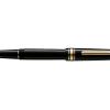
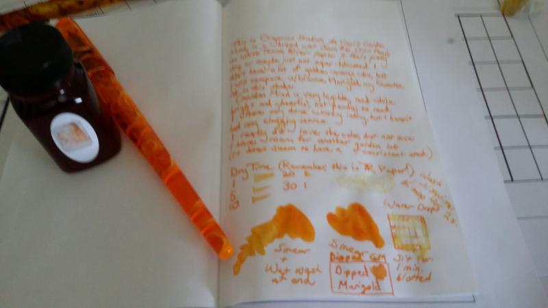
Golden Mind is one of the White Box inks, and is available from Anderson Pens in a very limited quantity. In case you're on the fence, here is a quick look. In summary, I really like the color. If you like dryish ink, take a look. It doesn't feel wet enough for me, but I prefer wet pens and wet inks. It's a dead ringer for Diamine Marigold, and has zero water resistance. It washes as a uniform color, so might be useful for a wash. Sorry for the photos. I didn't want to wait until I got my new scanner, in case anyone was on the fence. Text of review: This is Organics Studio da Vinci's Golden Mind in a broad wet Jowo #6 (Scr. Pens) on white Tomoe River paper. It feels pretty dry, or maybe just not super lubricated. I don't have a lot of golden-orange inks, but I will compare with Diamine Marigold, my favorite ink in this shade. Golden Mind is very legible, and while bright and cheerful, not painful to read. I have only done cursory testing, but haven't encountered any clogging issues. I really do love the color, but not sure I have room for another golden ink. (It does have a consistent wash.) ---- The water drips show more residue than I see. I don't think this is resistant at all.
-
http://sheismylawyer.com/She_Thinks_In_Ink/2014-Inklings/2014-Ink_2171.jpg
-
http://sheismylawyer.com/She_Thinks_In_Ink/2014-Inklings/2014-Ink_2154.jpg
-
I just bought this pack of 40 cartridges on ebay, has anyone here tried them? Are they any good? (To be honest I just bought them because I needed empty cartridges ). Thanks! This is the link to the ebay listing: http://www.ebay.com/itm/40-Fountain-Pen-Ink-Cartridge-Refills-ORANGE-GIFT-/230384913830?pt=LH_DefaultDomain_0&hash=item35a402cda6
-
I have a bottle of Diamine Orange that has flecks of something in it. These flecks are about the size of very coarse pepper - the largest ones are about 1/32 of an inch. They do not dissolve when I shake the bottle, and they are heavy - they fall quickly (within a second) to the bottom of the bottle. Any idea what this is? I'm pretty sure I don't want it in my pens. Thanks, Jon
-
http://www.rdwarf.com/users/wwonko/images/fpn/iro/02-Yu-yake-Sunset-header.jpg Yu-yake (Sunset) - CRV - Group Review - 2014-11 The Iroshizuku Group Review color for November 2014 is Yu-yake ”Sunset”. It is a rich orange, which fades between light and somewhat dark, depending on how much ink the nib is laying down. Please post your reviews and scans of the ink in this thread. If you want to a partner for a Co-Razy View (CRV) of this ink, please write it up and mail it to Lou Erickson. (PM for the address.) If you want to do a Co-Razy View on your own, please do! Other reviews are welcome, too. You can look at the full description of the Iroshizuku Group Review to see how this should work and what we’re doing.http://www.rdwarf.com/users/wwonko/images/fpn/iro/02-Yu-yake-product.jpgThanks to Rachel Goulet, who gave permission to me to use their beautiful product photo and swab.More thanks to Amberlea who is always such an inky enabler. Please PM me with any questions. I look forward to seeing everyone's results!
-
This is one of those inks that is legendary in the FP world. I don’t know that I’ve ever heard of someone who absolutely hates it, and I don’t know that I’ve heard that much about people who are relatively indifferent to it. I wish I could be one of those people, but sorrynotsorry, this is going to be another gushing review for this ink. Like I said above, at first I didn’t see what all the hoopla was about. Then I switched to the notebook I have started using for my ink reviews and the beautiful shading really started to show itself. In case you are super new to fountain pens or have been living under a rock for, like, ever, Apache Sunset is known for being an ink that has some serious shading. And I love shading, so this was a wonderful treat to write with. As I expected, this ink does not have a ton in the way of water resistance. Which usually irks me, but then again this ink is not something that I would be using for writing important messages. While it is definitely dark enough to stay readable, I would never use this as my all-purpose daily user. However it would be fun to have loaded up for marking up a document or just writing for the sake of writing. This ink worked well on all the papers I tested it on, but I found that it performed the best on the notebook paper making up the bulk of the review. Nice bright white to bring out the color, smooth for a good writing experience, and no troubles with bleeding or feathering. Overall, I would definitely recommend this ink. I will be getting a full bottle once my finances recover a bit from some recent ink buying binges. The nice thing is that, as a Noodler’s ink, you can get a lot of it for not too much money - roughly $13/100 mL here in the States. How can you say no to that? This ink was provided for review by a generous reader. I am not being compensated for this review in any way. All opinions expressed above are my own and you are free to disagree with them if you like. The full page scan of the review, in case anyone was curious:
-
Hey there. I just bought my first fountain pen (Lamy Vista with a fine nib) and haven't invested in my first bottled ink yet. I would need some suggestions on buying inks. I'm a middle school math teacher. I plan to use my fountain pen to grade papers. I'm looking for inks that are suitable to write on office copy paper or regular school notebook paper, doesn't bleed through too much, and affordable since I'll using a lot daily. I'm looking in the range of turquoise, purple, green and orange. I usually don't like grading in red ink. Does anyone or any teachers here have some good suggestions for me? Or maybe other colors that are not red? Thank you so much.
-
My first attempt at a review, and it's self-evident that I have no idea what I'm doing. But just to be clear: Disclaimer: I have no idea what I'm doing.
-
I've seen all these colors when visiting the Grand Canyon except the one ink named Grand Canyon. Oh, this is a Co-Written - Crazy - Comparison - Review. http://sheismylawyer.com/She_Thinks_In_Ink/2014-Inklings/slides/2014-Ink_523.jpg
-
Another Co-written Comparison and Review or a Co-Razy-View. http://sheismylawyer.com/She_Thinks_In_Ink/2014-Inklings/slides/2014-Ink_530.jpghttp://sheismylawyer.com/She_Thinks_In_Ink/2014-Inklings/slides/2014-Ink_530b.jpg