Search the Community
Showing results for tags 'orange'.
-
I just bought this pack of 40 cartridges on ebay, has anyone here tried them? Are they any good? (To be honest I just bought them because I needed empty cartridges ). Thanks! This is the link to the ebay listing: http://www.ebay.com/itm/40-Fountain-Pen-Ink-Cartridge-Refills-ORANGE-GIFT-/230384913830?pt=LH_DefaultDomain_0&hash=item35a402cda6
-
Introduction:The inception of this pen began with my curiosity of Titanium Nibs and I was able to put together this "customized" pen from my purchases made over a brief visit to the United States. Having read many reviews and opinions about Titanium Nibs online,being a different writing experience from Gold and Steels nibs, I started looking for an An American Vendor for titanium nibs. While doing my research I came to know that they are available in #8 size too. So as everyone knows, "Bigger IS better", I asked around for a #8 Bock Titanium Nib.Thanks to Shawn Newton who pointed me to Karas Kustoms and I was able to order one from them quickly. [bock #6 Gold, Bock #8 Titanium] Next step was to decide on the pen material. Being an Orange Fanatic I always wanted to have an Orange Ebonite Pen. I found some on the ExoticBlanks.com website and ordered 2 rods.They were pretty expensive and there is some uncertainty as to the Country of origin of these Blanks *cough* India *cough*. This pen was made from a single 10 inch rod. Having obtained the nib and blanks, I had to decide on a pen model and the pen manufacturer. The nib being a #8,the pen had to be an oversized pen and the first Indian oversize pen that comes to (my) mind was the A.S.A Galactic. Which I had owned for a while but sold off as it was too big for my grip and was too back heavy.Being a Happy multiple repeat customer of A.S.A Pens in Chennai,India I started looking at other A.S.A Models and found the Popsicle to be of much "manageable" proportions. After a brief chat with Mr. Subramaniam,the owner of A.S.A Pens I was told that the Popsicle could be customized. So to maximize the usage of my "expensive" Orange Ebonite blanks I asked an A.S.A Popsicle to be made but with Flat Ends which I have christened "FlatSicle". I have been using the Flatsicle for almost a month now and here is my review. [Montblanc 149, A.S.A Flatsicle, A.S.A Nauka] Construction:The material feels,and smells, like most of the Indian Ebonite I have handled. Smooth,hard and warm to the touch but ofcourse I have not been able to source Indian Ebonite in Orange Color.The ends have flat polished surfaces.The Clip is pretty basic and can be customised on demand.I went for a chrome clip.The cap has a very minimal step down,of about 1mm,to the barrel which tapers by about 3 mm towards the end of the barrel.The cap takes 3 turns to uncap.The #8 Nib looks well proportionate to the pen body. The section has a very prominent lip towards the nib and tapers up towards the Cap threads and barrel.The step up from section to barrel is about 1mm and not noticable, allowing you to grip the pen higher up,even over the step up.The uncapped pen has the highest diameter at the exact middle of the pen which lends to an almost middle centre of gravity.The section unscrews from the barrel in 10 turns.This is kept so high because this pen can be used an an Eye Dropper (with some Silicone grease) where it holds a massive 5ml of Ink! The pen also takes standard converters for about 1ml of ink. I enjoy the "ritual" of filling ink so I prefer C/C pens over the huge capacity E.D mode.The Pen can be used posted but becomes unwieldy and comical. Some Dimentions of the Pen:Capped Length: 170mmUncapped Length: 128mmPosted Length: 175mmMax Cap Diameter: 17mmMax Barrel Diameter: 16mmMin Barrel Diameter: 13mmSection Diameter: 11-14mm [A.S.A Flatsicle, TWSBI Vac700, A.S.A Nauka, Pelikan Twist, Lamy Al-Star, Parker Duofold Centennial, Caran d'Ache 849, Pilot Metropolitan] Writing Experience:Having used the #8 Titanium nib for almost a month I can see what the fuss is about. It is definitely a very different and unique experience from a Gold or Steel nib. The first thought I got was how similar the "feedback" was to a Mike Masuyama Needle point I got to try at a Pen Show,almost "like a Pencil". This "feedback" I feel to be very dependent on the type of paper used. Another quality of Titanium nibs has been its "soft" nature and to experience just this I got mine in an Extra Fine grade which is a departure from my preference of Medium to Broad Nibs. During regular writing,the nib is soft enough to impart some line variation to almost resemble a Western Medium. Keeping in mind the tendency of titanium nibs to spring, the nib can be pushed to give a Broad Line. I would recommend spending a lot of time getting to know the Point of Spring Back of your nib before attempting any serious "flex". But the general users should be more than satisfied with the "casual" line variation due to the soft nature of the nib. The ebonite feed of the Nib Unit has kept up perfectly with the my extensive Flexy Loopy Loop tests in C/C Mode,I think it would be the same,if not better in E.D Mode. Balance in my hands is right inbetween my finger grip and the web of my hand where the pen rests letter me grip the section at the perfect distance from the lip so that the large nib is right on the paper. In Comparisson to my Montblanc 149,to get the perfect balance,I need to grip the pen over the Cap threads and that can get uncomfortable over time.If I hold the pen at the most comfortable area of the section,the pen gets angeled to a steep degree and making the pen back heavy. So I find the Flatsicle more comfortable than the 149!Compared to the Visconti Casanova, I find the Visconti Very back heavy and honestly I bought it only because I got it for a steal!If only I could compare the Flatsicle with a Popsicle. The Little Things:This Pen is a Monster! Be prepared to get a lot of queries about it and attract a lot of attention.The Orange Ebonite can appear different hues under different Lights and is difficult to Photograph.Nib creep on the Titanium Nib looks very nice (for those who ar'nt O.C.D about it)No,I have not sprung the tines during my Loopy Loop tests.The softness of the Nib allows it to go from an Extra Fine to a Broad line width comfortably.The pen will be a tight fit when clipped in to shallow shirt pockets and tend to "stick out".No issues in Jeans Pockets or Clipped onto the middle of the shirt (between buttons). Conclusion:What started as a curious experiment turned out to be one of my most Enjoyable Pen. Obtaining a #8 Titanium Nib in the U.S seems to be a bit difficult so I would like to thank Shawn Newton for pointing me in the right direction.Thanks to Mr. Subramaniam of A.S.A Pens for letting me "customize" one of his most popular models and doing a good job on working with the Bock #8 Nib. Nibs of this size ar'nt common in India and I'm happy mine was in good hands. As I progress through my Fountain Pen journey I find myself gravitating towards specific models,which have mostly been slim pens or pens with tapered sections and having sold off most of my oversize pens, the A.S.A Flatsicle was a very pleasant surprise as I found it very comfortable for use considering its dimensions. Its pens like these that make you stick around in a hobby.
-
Hi Everyone, I'm an orange guy. It is my favorite color. I have orange clothes. I have orange shoes. My daily driver is an orange car. I have 20+ orange pens. I have 15+ orange inks. Now here's the kicker: I do about 90% of my writing on orange index cards. I've used them for years, and I'm never without a handful in my pocket. Orange index cards are only a small step down in importance to pens in my pocket when I leave in the morning. But, with so many great orange inks, and mostly using orange paper, I'm really limiting myself. I've resigned myself to using my orange inks in contexts where I'm writing on white or cream paper, but what about the cards tho? Can you suggest inks that would look good when used on an orange index card? I know nothing about color theory, so I don't know what colors might look better/ worse when overlaid on orange. Usually, I just go with a black or dark blue for readability, but have been trying out some sheening inks too. Thanks for any suggestions! greg
-
L'Artisan Pastellier Callifolio - Itzamna L’Artisan Pastellier is a small company in southern France that specialises in natural pigments, and offers customers authentic and reliable products in beautiful colours based on mineral or vegetable pigments. In a collaboration with Loic Rainouard from Styloplume.net, the chemist Didier Boinnard from L’Artisan Pastellier created the line of Callifolio fountain pen inks. These pastel-coloured inks are traditionally crafted, and can be freely mixed and matched. Overall these inks are only moderately saturated, and have low water-resistance. The inks were specifically designed to work well with all types of paper, and all types of fountain pens. Being pastel-tinted, these inks have a watercolour-like appearance, and are not only fine inks for journaling, but are also really excellent inks for doodling & drawing. I only recently discovered them, and they are already the inks I gravitate towards for personal journaling. In this review I take a closer look at Itzamna, one of several ochre-coloured inks in the Callifolio series. In Maya mythology, Itzamna is the name of an upper god and creator deity thought to reside in the sky. An interesting name for a fountain pen ink – let’s see whether the ink is as great as its name suggests. I started with my usual Lamy Safari pens (M and B nib), which are fairly dry writers – with these pens Itzamna was not fun at all … very dry and scratchy. Ugh! Time to switch to wetter pens, in my case a TWSBI Vac Mini (M-nib) and a Pelikan M400 with M-nib. With these wetter pens, Itzamna wrote much better, and presented itself as a beautiful writing ink. Callifolio Itzamna is a kind of orange-brown that shades nicely, and has just enough contrast on the paper to be easily readable. But remember – you have to use wet pens to get a good experience. Not an ink for the workplace, but a splendid ink for journaling. The ink is also a great choice for drawing, with a colour palette that ranges from orange-brown all the way to a much more saturated brown. To show you the impact of saturation on the ink’s look & feel on paper, I made some scribbles where I really saturated portions of the paper with ink. This gives you a good idea of what the ink is capable of in terms of colour range. On the smudge test – rubbing text with a moist Q-tip cotton swab – Itzamna behaved perfectly. There is hardly any smudging visible. Water resistance is also quite good – even after longer exposures to water, the text remains perfectly readable. This is clearly apparent from the bottom part of the chromatography. I’ve tested the ink on a wide variety of paper – from crappy Moleskine to high-end Tomoe River. For the Callifolio reviews, I’m using a new format to show you the ink’s appearance and behaviour on many different paper types. On every small band of paper I show you:An ink swab, made with a cotton Q-tip1-2-3 pass swab, to show increasing saturationAn ink scribble made with an M-nib fountain pen (TWSBI Vac Mini)The name of the paper used, written with a broader pen (Pelikan M400 M-nib)A small text sample, written with theTWSBI Vac Mini M-nibDrying times of the ink on the paper (with TWSBI Vac Mini M-nib)Itzamna behaved perfectly on all the paper types, with no apparent feathering even on the lower quality papers in my test set. The only exception is the Moleskine paper, where the ink looks really ugly, and exhibits noticeable show-through and bleed-through. Drying times are mostly around the 5 to 10 second mark, so this is a quick-drying ink. At the end of the review, I also show the back-side of the different paper types, in the same order. Conclusion Callifolio Itzamna is a nice orange-brown ink, that is a great choice for personal journaling. I really like the ink’s gorgeous colour. For a Callifolio ink, water resistance is astonishingly good – a pity this is not a business-type colour you can use in the workplace. A real bummer is that this ink requires wet pens, so you have to be selective about the pens you ink up with this. This costs the ink some points in my score-book! If you can live with this, Itzamna is a real good-looking ink that is a pleasure to use. Technical test results on Rhodia N° 16 notepad paper, written with Lamy Safari Back-side of writing samples on different paper types
-
I finally ordered some of this ink and made a short video attempting to show the change in colour. It's not great, but I'm not shooting it again! Sorry about the breathing.
-
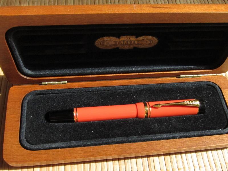
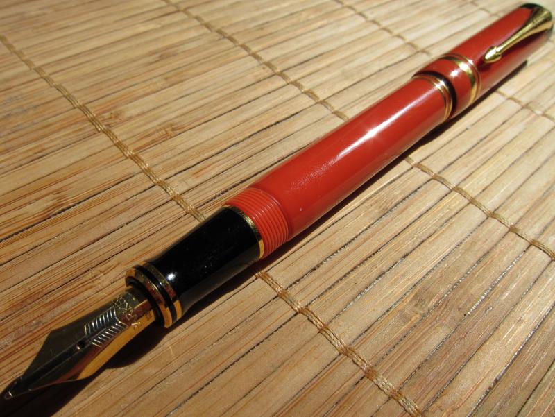
Parker Duofold Centennial Special Edition Orange, Big Red
Karmastars posted a topic in Fountain Pen Reviews
This Orange Parker Duofold Centennial Special Edition is what I would call a reasonably priced collectors pen. Somewhere between sane & insane. If you take a close look, it's a lot, but it's not much. Is it plain? -yes. Is it simple? -yes. Are there any other pens like it? -yes. Are there any other pens exactly like it? -no. Would I buy a pen if it was a homage? -no. Would I get a MacArthur Limited Edition for 4 times more? -no. Does it compliment my Japanese Pilot Maki-e theme? -no, yes & maybe. But if I close my eyes & think Parker, I imagine Orange Vulcanite or Orange Permanite. How would I picture the most perfect Parker? Pilot Custom 845 Ebonite Urushi, from Parker, in Orange, with 3 thin rings; 1 medium & 1 thin ring; or 1 medium ring. A 2 tone nib, in a maple wood box. The only thing I know that is worse than fountain pens are leather pen cases. Probably my lack of knowledge, but the only one I've seen that I liked was Maxwell Scott, The Pienza in Chestnut Tan or Dark Chocolate Brown. -so if you know better, please tell me. We don't have fountain pen shops or a fountain pen culture where I live. The only place I know where they can seriously markup fountain pens, only sell Montblanc in their physical shop & their shop is older than me. So what about Parker Maki-e? -if you can't get away with more than Pilot could get away with in 1979, I'm still unsure about getting a Pilot Taka (although, they're SUPER NICE), so anything beyond what a Montblanc 149 costs, is like getting a Painting. As I said before, my theme is supposed to be Pilot Maki-e & I already have too many non-Pilot Maki-e. If this hobby is to last me a lifetime & I can't get a decent price, or be bothered with the risks involved in selling used pens. I better choose carefully the pens that I want to collect, for the sole purpose of admiring them, every now & then. I wanted to do this with watches, but servicing an expensive watch every 3 to 5 years, feels like punishment. If I start from the bottom & slowly work myself up, I might enjoy & understand the value & workmanship. It's only expensive because we believe that it has value. Otherwise it's Supply & Demand. A Rich, Dead, Artist, who can't Authenticate his own work. Or a Poor, Unappreciated, Artist, who can't get paid or sell anything.
-
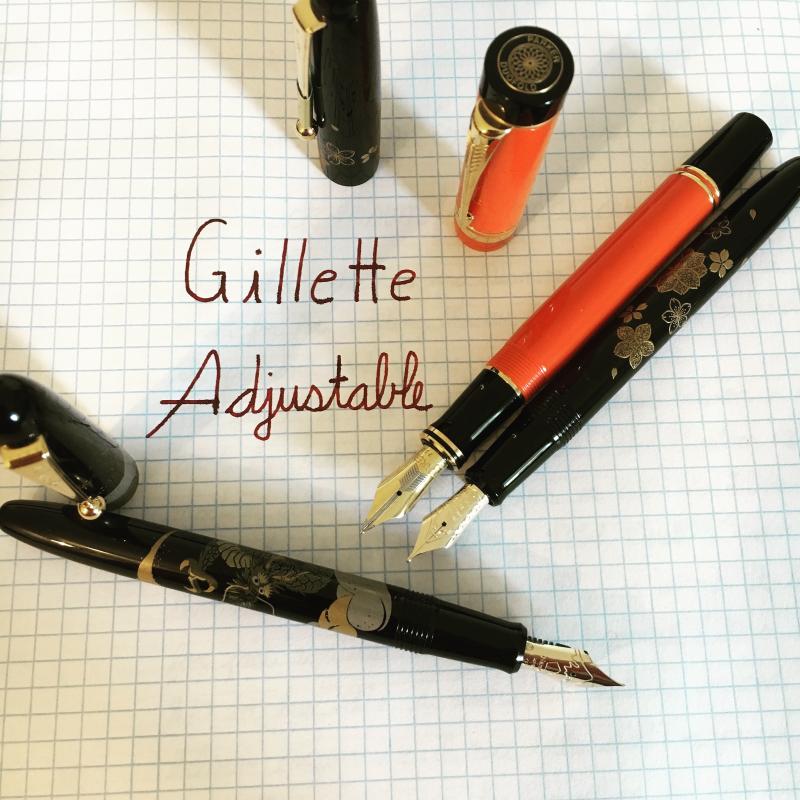
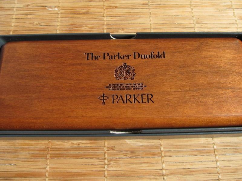
Introduction I recently had an opportunity to act as an enabler by helping a colleague and friend of mine acquire a special custom fountain pen. This particular gentlemen has a very fine collection of writing equipments including models from almost all premier brands and certainly a few Parkers. But his heart was set on acquiring a classic all ebonite Duofold in glorious orange hues but with a contemporary filling system. Since such a chimera doesn't exist in the real world, we set about creating a pen that looks and behaves like a modern Duofold Centennial but with an orange ebonite cap and barrel with black finials. We approached Mr. Manoj Deshmukh of Fosforpens who was willing to take up the challenge. Since this pen was meant for someone else. I didn't dip it or ink it to test the nib. Hence I wont call it a full review in the true sense of the term. Instead, let us consider this a pictorial essay of the pen that was finally created. Design The Duofold is a classic design and has spawned innumerable variants and knock-offs for over ninety years ever since it first appeared in the scene circa 1921. Any fountain pen enthusiast is well aware of the design and words cannot express its simplistic but sophisticated elegance. So instead of subjecting my limited vocabulary to unnecessary stress, I will let the pictures do the talking. http://i1097.photobucket.com/albums/g346/prithwijitchakiPrithwijit/Fountain%20Pen%20Reviews/Fosfor%20Duofold/IMGP5199_zps2pvd355h.jpg http://i1097.photobucket.com/albums/g346/prithwijitchakiPrithwijit/Fountain%20Pen%20Reviews/Fosfor%20Duofold/IMGP5200_zpscyiraq2a.jpg Size and Balance At 137mm capped, the Duofold would be considered a mid-sized pen by contemporary standards. Being made of ebonite makes the delightfully light and easy to handle. It is superbly balanced and comfortable to write for extended periods. Even with the cap posted, the pen retains its balance and is a breeze to write with. For those of you who may seek a size reference, here is a side by side image with the Kaigelu 316 which is a clone of the Duofold Centennial. http://i1097.photobucket.com/albums/g346/prithwijitchakiPrithwijit/Fountain%20Pen%20Reviews/Fosfor%20Duofold/IMGP5210_zps6kjouwpd.jpg Nib Since the gentleman in question already had access to other Duofolds, we didn't bother about getting an original nib for the pen. Instead he opted for a 18K Jowo #6 pen in rose gold finish with his initials engraved on the nib. This technique is different from the laser engraving I had done on my Rajendran and arguably better if the limited typeface options available do not bother you. http://i1097.photobucket.com/albums/g346/prithwijitchakiPrithwijit/Fountain%20Pen%20Reviews/Fosfor%20Duofold/IMGP5201_zpsazxbejmk.jpg Filling Mechanism The pen uses the standard international cartridge converter mechanism with a Schmidt converter paired with the WIN/Jowo nib unit. The section itself was custom made by Manoj. The pen can accept any bottled ink as well as cartridges from a host of brands. http://i1097.photobucket.com/albums/g346/prithwijitchakiPrithwijit/Fountain%20Pen%20Reviews/Fosfor%20Duofold/IMGP5205_zpsltn81ktm.jpg Build Quality Manoj is synonymous with quality and he amply demonstrated that in this pen as well. All critical aspects of the pen such as the shape, fit, threading, buffing/polishing and the finish are impeccable and gives the overall impression of a high quality product. Specifications The measurements have not been taken with any precision instrument or laboratory techniques and should be considered as indicative only . Length (capped) – 137 mm Length (uncapped) – 130 mm Length (cap) – 63 mm Length (section) – 20 mm Maximum width – 13.5 mm Maximum section width – 10.5 mm Minimum section width – 9 mm Conclusion I found the idea of this pen pretty intriguing. In one broad brush we have covered 96 years of Duofold legacy from its ebonite origins, big red lineage to contemporary evolution and amenities. The final product has certainly been able to fulfil its design brief. It is a classic mid-sized comfortable and well balanced writing instrument. The SEM ebonite and silver trims are wonderful thing to have and Fosfor quality and finishing comes through. Useful Links Very good orange ebonite blanks can be sourced from http://www.ebonite-arts.de/en/index.php Jowo nibs of your choice can be sourced from www.asapens.in Pen is made by www.fosforpens.com
-

Sailor Kingdom Note "crustacean Series" Macrocheira Kampferi
white_lotus posted a topic in Ink Reviews
Sailor Kingdom Note "Crustacean series" Macrocheira kampferi (Japanese Spider Crab) Thanks to an inky friend in Japan I've received a sample of this ink from the Kingdom Notes' Crustacean series. Most English-speaking people refer to this ink as "Japanese Spider Crab," but the label actually uses the scientific name given above. Regardless of the name, this is a muted orange ink, and somewhat desaturated as are many of the inks in this Crustacean series. It is drier than the inks in the previous Bird and Insect series, but that's just by comparison. I doubt anyone would actually say this ink is "dry" though I presume if you have a dry pen, this might not be the best ink choice. Most of the orange inks I have are either the bright, retina-searing kind (Sailor Kin-mokusei), the dark blood orange kind (Cult Pens Deep Dark Orange), and a couple others that might be more normal (KWZ Orange, KWZ Grapefruit). This ink is somewhat between KWZ Orange and Sailor Style Dee Delta Sonezaki Orange, being a little closer to the latter. If you don't know the Sonezaki Orange, it's similar to Cult Deeps Deep Dark Orange, but a bit lighter. The ink is drier than some of the super wet Sailor inks; this was common with the Crustacean series as was their less saturated color. But that doesn't mean the inks were light such as certain S-K inks, just that they were more normal in their saturation, especially compared with the others. Pen: Edison Premiere (M-steel) Papers: MvL=Mohawk via Linen, TR=Tomoe River, Hij=Hammermill 28 lb inkjet, Rhodia=Rhodia 90g ivory. Camera: iPhone 7 The problem I see with the images is they didn't really capture the muted orange character of the ink. They all look too red to me, and don't have that "chalky" appearance, they look too saturated compared to the actual writing. The Waterfastness test actually seems pretty decent representative of the color, though perhaps a little too pink. This is closer to the "chalky" appearance the ink has, but perhaps with too much pink. I don't know what happened on the one droplet with the weird circles, maybe some flaw in the paper towel composition. -
Sailor Style Dee Delta “Water City” Sonezaki Toutou (Sonezaki Orange) Recently one of our Japanese FPN members pointed out some Sailor bespoke inks from a shop called STYLE DEE in Osaka with a brand called DELTA Original Ink. I was confused because there is also an Italian pen maker called Delta with a few inks available. But these are real Sailor inks. The inks seem to go along with an inexpensive demonstrator pen ¥4,300, and unfortunately I didn’t put one in my shopping cart. There were originally four inks, based on the seasons of Osaka. “Water City” Umeda Yasei (Umeda Night Blue, a deep blue, perhaps a blue-violet) “Water City” Doujima Ryokkin (Doujima Green-gold) “Water City” Nakanoshima Shunryoku (Nakanoshima spring green) “Mizuho” Kitashinchi Beniya (Kitashinchi Red Sea, a burgundy or wine hue) The two latest inks released August 2016 are “Water City” Sonezaki Teuteu (Sonezaki Orange, a burnt orange) “Water City” Tsuyuten Murashime (Purple Rain, a purple or violet) Recently I was able to obtain three of these inks: the burnt orange, the purple, and the green-gold. I was very lucky with the Doujima as the shop said this ink was sold out, but when the purchaser went to buy the inks, there was one available. I don’t know the availability of the earlier inks, so there’s no guarantee that any of them are available, but I think the two latest inks released may be available. These inks are the same price as other standard Sailor bespoke inks at ¥2,160 per bottle, which is about $19.10 US as of today (2/11/2017). This price doesn't include shipping to the destination or any charges incurred using a forwarding service. Each person is limited to purchasing one bottle of each ink. I'm really happy with this ink. I've learned that this kind of orange, what some might call burnt orange, really is quite delightful. Typically it's a bit deeper in value than many oranges, not so bright, so it's quite readable. This particular ink is in between Diamine's Cult Pens Deep Dark Orange and the Kyoto TAG Kyo-iro 04 Higashiyama Moonlight. I'm finding it to be really yummy; it's a nice rich color; very shady. Pen: Edison Premiere (M-steel) Papers: MvL=Mohawk via Linen, TR=Tomoe River, Hij=Hammermill 28 lb inkjet, Rhodia=Rhodia 90g ivory. Camera: iPhone 7
-
Nearly everyone know of Sailor, the Japanese pen and and ink company. Perhaps almost as many people have heard of Bungubox, often just called Bungbox here in the US, the Japanese stationary, pen, and ink shop in Hamamatsu, Japan. Here is a nice google map for you to locate it when you travel to this area of Japan to see the Hamamatsu Castle. https://www.google.com/maps/place/BUNGUBOX/@34.7061243,137.7291498,13z/data=!4m5!3m4!1s0x0:0x97450230eab367e4!8m2!3d34.7061243!4d137.7291498 The have an extensive line of inks made for them by Sailor, and during the craze for Sailor Japanese store-exclusive inks Bungbox became very popular and with that the price went up, and up. Even in Japan they are much more expensive than other store-exclusive inks. Vanness actually have the Bungubox inks available, but you will but up $43 for a 50 ml bottle. For some, this price is worth it, for the inks are exceptional. I have a number of their inks from before the craze, and a few I got as prices were rising, but so far I have resisted the current nose-bleed prices. Though Sweet Potato Purple was very tempting. But Fresh Oranges is somewhat legendary among the chasers and collectors as a great orange. Perhaps along the lines of Sailor's Apricot. I've never tried the latter so I cannot say. And I must admit that orange inks are nice, but I often find them to be a little light in value, and therefore, harder for me to read. But they can be very inks especially for cards, notes to friends and family, and your journal writing. Orange is a happy color and one that will never bring you down. I received a nice sample of this ink awhile back when I first got involved with orange inks. Thank you inky friend! Many orange inks seem to have flow issues compared with other inks. I think part of that is their lightness, and if you want any other quality you can't have a gusher of an inks. BB Fresh Oranges is very good in that regard. It has great shading. It's a very nice orange ink, not flat. But it is very close to Sailor's Kin-mokusei. They are different, but only you can decide whether you want to spend $18 or $43. Others will probably be able to explain more on how this ink is, and how it differs from others, and why they love it. Pens: Edison Premiere (M-steel), Pelikan M400 (F) Papers: MvL=Mohawk via Linen, TR=Tomoe River, Hij=Hammermill 28 lb inkjet, Rhodia=Rhodia 90g ivory. Camera: iPhone 7 And in comparison with Sailor Jentle Four Seasons Kin-mokusei (2016 edition) On Rhodia: left, Kin-mokusei, right Fresh Oranges On more absorbent MvL
-
An inky friend sent this sample a while back and now I've gotten to a review. This is from the Diamine Flowers set, which seems to be difficult to find now in the US. Anderson seems to have this ink in small bottles. Several UK sites seem to sell 30 ml refills, so if this is an ink you like, it is possible to get more. The ink didn't do well in my Edison Premiere, while not feeling dry, the flow wasn't good enough to get decent color. I'd have to slow down my writing to do so. In a Pelikan with a broad nib, that few of my inks can tame, this one fit the bill. I got a rich orange line. So the old saw of matching pen and ink applies here. Still a bit of a light color, but sometimes delicacy is called for. Not water resistant at all. Pens: Edison Premiere (M-steel), Pelikan M205 (B-steel) Papers: MvL=Mohawk via Linen, TR=Tomoe River, Hij=Hammermill 28 lb inkjet, Rhodia=Rhodia 90g ivory. Camera: iPhone 7
-
You may have gathered from the title that I am not that fussed on Edelstein's Mandarin. When I first saw it I thought, 'Oh, a truly popping orange', but that thought was rapidly replaced with a retina burning headache. I tend to like reds and oranges, but I like them to have a little subtlety about them and not quite 'true' in their colour spectrum (if that makes sense). Iro's Yu-yake, the Fuyu-gaki, Noodler's Apache Sunset, couple of the Diamine oranges, Herbin's Orange Indien; you get the idea, I like reds and oranges. Mandarin seemed like a great choice, but in a very short time I grew to truly loathe it. I even contemplated throwing it down the sink just so I could use the bottle for something else. Then I had a brain wave. Why don't I add a few drops of Edelstein's Onyx Black? So, three small drops later and with dip pen in hand I tested it. It's a little similar to Apache Sunset. Now bear in mind I tested this with a dip pen on highly absorbent paper. At first it was extremely similar to the Noodler's, but as it dried the shading disappeared (not unexpected with this ink). Dried and unshaded you are left with a rich orange saffron with a noticeable red aspect. It still 'pops', but it isn't headache inducing and it has left me with an ink that I can now happily use. I will try and get a pick uploaded later. Just thought I would let you all know in case, like me, you had contemplated ditching the ink, or wondered how on earth you might ever use it.
-
Another of the inks from the Kyoto TAG company, now also carried by Vanness in the US. I'd call this ink an earth orange color, and a number of existing reviews say the ink is "dry". I didn't find that to be the case. I don't know if there have been formulation changes or simply a different pen. Pen: Edison Premiere (M-steel) Papers: MvL=Mohawk via Linen, TR=Tomoe River, Hij=Hammermill 28 lb inkjet, Rhodia=Rhodia 90g ivory. Camera: iPhone 7 The shading on Tomoe River was especially nice.
-
Pif - J. Herbin Orange Indien Ink Giveaway
ErrantSmudge posted a topic in Pay It Forward, Loaner Programs & Group Buys
It's time for another Ink Giveaway PIF! I am giving away a nearly full bottle of J. Herbin Orange Indien ink. This ink is similar to the OMAS Orange I gave away in an earlier PIF, but is a little less saturated. Here are the rules: 1) United States only. 2) Winners of my previous PIFs (Levenger and OMAS inks) are not eligible for this PIF. 3) Everyone who posts on this thread saying they want the ink through Tuesday, January 3, 2017 is eligible. 4) On January 4, 2017 I'll post here to close the PIF and everyone ahead of me in the thread will be entered. I'll select a winner using the random number generator at random.org. I'll list the winner here, and contact them via PM to set up shipment. 5) You can enter as many of my PIFs as you want, but you can win only one. In the event the same FPN member wins two PIFs, I'll ask you to choose which you want. I'll draw another name to win the other prize. 6) I will ship to the winner for free, in exchange for a letter or postcard from you containing handwritten samples of your five favorite ink colors. Or, you can pay for shipping, whichever you prefer. (I will ship via USPS). 7) Winners who don't respond to my PM within three days after close of the PIF will forfeit their winning. I'll draw again to find another winner. Here is a writing sample of the ink. -
Lamy - Copper Orange was released some time ago in 2015 as a part of the Copper Orange Special Edition Lamy Al-Star fountain pen. I have reviewed all of the standard line of Lamy inks on my blog earlier this year, but with this particular colour I catch up recently thanks to Mishka from BureauDirect, UK (thanks) who sent me a box of sample cartridges. Despite the fact that this is a special edition ink and sooner or later it will extinct, but it is still available here and there, so I decided to test it my way because I found it very interesting. The colour of Lamy - Copper Orange is as name says - orange which is not that bright as Diamine Pumpkin but more like Diamine Autumn Oak, J. Herbin – Orange Indien or Kaweco Sunrise orange. Is much lighter than Diamine Ancient Copper. Because it has yellow component there is some similarities to a famous Noodler's Apache Sunset, however Noodler's ink has much more of yellow which is resulting in superb shading. Lamy's ink shaded too, but obviously less than Apache Sunset, which for many is a benchmark, I believe. The cool thing about Lamy Copper Orange, which separates it out from the orange crowd is the way it shines once it dries completely. The ink has an interesting light green/yellow-gold sheen but also something which reminiscences suspended tiny particles which mimic metallic feel. This is not exactly the same thing as you have seen in Diamine Shimmering inks. The effect is more subtle and it results in rusty look, which I really enjoy. Here are some examples. For much more please check my short review on my blog . Enjoy! http://www.clumsypenman.com/wp-content/fpngallery/lamy-copper-orange/untitled-58.jpg http://www.clumsypenman.com/wp-content/fpngallery/lamy-copper-orange/untitled-22.jpg http://www.clumsypenman.com/wp-content/fpngallery/lamy-copper-orange/untitled-39.jpg http://www.clumsypenman.com/wp-content/fpngallery/lamy-copper-orange/untitled-18.jpg http://www.clumsypenman.com/wp-content/fpngallery/lamy-copper-orange/untitled-5.jpg http://www.clumsypenman.com/wp-content/fpngallery/lamy-copper-orange/untitled-53.jpg http://www.clumsypenman.com/wp-content/fpngallery/lamy-copper-orange/untitled-25.jpg http://www.clumsypenman.com/wp-content/fpngallery/lamy-copper-orange/untitled-34.jpg http://www.clumsypenman.com/wp-content/fpngallery/lamy-copper-orange/untitled-45.jpg
-
My guess is that Cult Pens has quite a cult following in the UK. They apparently stock nearly everything they can get their hands on in the way of pens of all kinds, many inks. I have a feeling that if I spent much time on their website I'd end up with a fairly expensive cart of booty. Well they have Cult Pens ink made by Diamine. These are the "Deep Dark" inks, and they are not rebranded standard Diamine inks. The Deep Dark Brown has been rated by those in the know as the closest to the long-discontinued Parker Penman Mocha. But I personally could never justify to myself to order just a couple bottles of ink given the exchange rate, and added shipping costs. Thankfully an FPN friend sent out some samples of a couple of these inks. This is the Deep Dark Orange. And I will tell you that at $1.23/£1 an 80 ml bottle of Diamine retails for £4.92, about $6, compared to nearly $15 in the US. I'm not sure there'll be nearly $9/bottle of shipping charges. So some bargains may be had for the adventuresome inky pirate. I love the color of this ink, it reminds me of blood orange. The color is really nice and rich, not bright, deep and not thin. There's nice shading. Excellent handling, with very good flow and lubrication. There could be some sheen on Tomoe River, but you might need a wide nib to really bring that out. I'm not normally an orange or red ink fan, but for some reason this ink makes me go oo la la. This probably wouldn't become an everyday ink, but would be a joy to use whenever brought into rotation. If you live in the UK, you are one lucky person. The only downside is it's not very waterproof. Pen: Edison Nouvelle Premiere (M-steel) Papers: MvL=Mohawk via Linen, TR=Tomoe River, Hij=Hammermill 28 lb inkjet
-
OK, I've posted enough reviews about KWZ inks you'd think I was Polish. I'm American, but my ancestors (great grandparents or earlier) were from somewhere in Poland, though my grandparents always claimed they were German. So perhaps this is why I'm so attracted to these inks, or maybe it's because they typically have very good handling qualities and are very good colors. Orange was not a color that interested me for the longest time. I thought it might be naturally too bright. I prefer browns, blues, murky greens. But orange can be nice and I've found a few that I like. KWZ Orange is a relatively pure orange, fairly bright, but not retina-searing, not overly saturated so you get some nice shading especially on Tomoe River, Rhodia, etc. I would probably use this more for markup rather than writing many pages, but that's my personal preference. I'm sure there are those that enjoy the happy color of a good orange and will write whole chapters with it. Pen: Pelikan M200 (M-steel) Papers: MvL=Mohawk via Linen, TR=Tomoe River, Hij=Hammermill 28 lb inkjet. One thing I found difficult with the images was trying to capture that bright, pure quality of the inks' color. I don't think I've done it at all. It simply appears more muted, more toned down, and more saturated rather than bright. But this isn't an orange ink that goes down orange and dries to brown or burnt siena. It goes down orange and dries orange. Not water resistant at all. Mostly lifts off the page when blotted and washes away otherwise. But any kind of water resistance wasn't expected. A bright single dye.
-
My eyes! My eyes! OMG my eyes! It burns!!! Aggggggghhhhhhhhhh!!!!! If you like retina-searing orange inks, you'll love this ink. This ink is really bright, almost fluorescent. The handling was perfectly fine on the paper I used. I think Anderson Pens carries this brand in the US, which originates from Australia. This is not a color I would ever use, but if you have a need for a great markup ink, this one will fit the bill. I was so traumatized by this ink that I was only able to use one page for review and could not bring myself to do the rest of the review. I know I'm not worthy like Visvamitra. Pen: Edison Nouvelle Premiere (F-steel) Papers: MvL=Mohawk via Linen, TR=Tomoe River, Hij=Hammermill 28 lb inkjet. Do not be deceived by the image here. It's a really florescent orange, very pure in hue and bright. You have been warned!
-
Here is an ink nearly everyone can buy! KWZ Grapefruit is a brilliant, bright reddish-orange. It is fabulous as a markup color. It's a very deep orange. The handling is excellent. The color is really beautiful. But you have to like these bright colors. For me their use is fine occasionally, but I'm not a regular user of such colors. But I would still recommend it. Totally not water resistant at all however. The usual papers: MvL=Mohawk via Linen, TR=Tomoe River, Hij=Hammermill 28 lb inkjet.
-
Well, every now and then there are LE inks reasonably available to normal folks. The Fontoplumo pen shop in The Netherlands has a custom Conid fountain pen, and KWZ was commissioned to create an ink matching the color of this pen. The shipping for this ink to the US was fairly expensive, so I joined with a few like-minded ink fanatics to obtain this ink. I believe visvamitra and LGsoltek have both provided reviews as the ink is more readily available in the EU, however their results were quite different. So there was some consternation regarding what kind of ink we would receive. The ink is not a bright orange, but a muted one, more like a deep ochre, but not brown. None of my writing with the pen I used produced brown ink on the page. I wouldn't even call it burnt orange. Just deep, but muted, orange was the darkest I obtained. The ink shades very well, especially on TR. The usual papers for me: MvL=Mohawk via Linen, Hij=Hammermill 28 lb inkjet, TR=Tomoe River. To some pictures. The ink is not water resistant, but that wasn't expected. An interesting color drop.
-

A Brief Comparison Of Super5 Delhi And Noodler's Apache Sunset
truthpil posted a topic in Ink Comparisons
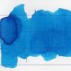
Hi Everyone, This is just a quick comparison I made of two shading orange inks: Super5 Delhi and Noodler's Apache Sunset. I was surprised at how similar they can look and the shading with both is impressive. The huge advantage, for some at least, of Delhi is that it's completely waterproof once dry! If you've been hoping for a waterproof version of Apache Sunset, Super5 Delhi may be close enough to fit the bill. My only complaint with Delhi as far as behavior goes is that it left pink stains in my TWSBI demonstrator that I still haven't been able to get out. Here's what these two oranges look like on a cheap legal pad: Some close-ups: And on 80gsm Rhodia: Rhodia close-ups: I hope this is useful for someone! -

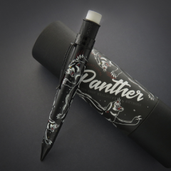
Project Monsoon- A New Way To Interact With Our Customers
Karas Kustoms posted a blog entry in Karas Kustoms' Blog
We hope everyone is having a great summer so far. Here in Arizona we are on the cusp of the monsoon season where we have hot, sunny temperatures mixed with dark clouds, and lightning filled thunderstorms. You can be getting sunburned one minute, and drenched in rain the next. It makes for some beautiful scenery and once you experience it, you will never forget it. This yearly seasonal weather pattern has inspired our latest experiment in pen-making. We have been experimenting for a while with different materials and finishes and have come up with some pretty cool results. This new pen represents the Arizona monsoon season, but in pen form. The orange body represents the heat/sun, the grey cap represent the storm clouds and silver grip sections represent the lightning that so often comes during our monsoon season. So, to celebrate some of the success we have had with some of the new finishes, we are going to try something new. Instead of our usual method of product testing, we are going to include more community members to give us feedback on our latest endeavors. Here is how it works. We are going to, through different means, give (yes, give) away a small number of this pen to gain feedback on materials and finishes. We want to hear it all. The good, and even the bad. The point of this is to be more in touch with our customer base and their wants and needs. So, if you are interested in getting your hands on one of these “Monsoon” pens to review, here is how to do it: Choose from the following options: Write us a short original essay on the topic “Made in America” and email it to us with the subject line “Monsoon Essay”. You don’t have to be a great writer, just tell us a story. Create original artwork inspired by “Made in America” and share it with us via email(subject line “Monsoon Artwork”) or Instagram (#monsoonreview). Please create something new, nobody says it has to be fancy, but don’t reuse old artwork. Artwork from all ages, including children, is encouraged. Take an original photo or video depicting what “Made in America” means to you and post it on Instagram with the hashtag #monsoonreview and tag @karaskustoms and @karaspenco. We can’t wait to see what you come up with. We will be choosing 3 people per category in a completely biased method based on our tastes and preferences. This is not a contest, we will pick our favorites in each category and that is who will win. Each category will be judged by a different employee, so you can enter each category to increase your chances of winning. Enter as many times as you want, but each entry must be unique. We will post the winners and their entries on this blog (http://blog.karaskustoms.com/). We will announce the winners on August 12th, 2016. You will have 48 hours to respond before we choose another winner. We are asking all winners of this giveaway to provide us with a review of the Monsoon pen. This can be as simple or as complicated as you wish, we just want to hear your thoughts. Good and bad, it doesn’t matter, but we want to hear from you. We obviously can’t make you review this pen if you are chosen, but it would be awesome if you did. Once again, we will choose the winners on Friday, August 12th. Good luck! -
About a year ago I spent some time working in Turin and every day, along the usual journey from home to the workplace, I catched a glimpse to a stationery shop window which had this unknown brand of inks : Columbus. Afterwards, I discovered that Columbus is an Italian pen manufacturer, part of the Santara group, which is also the Italian distributor for Ballograph and Sheaffer. I was kinda attracted by the brand, because it’s actually one of the few that sells orange ink in a standard ink line (a Pelikan-ish 30ml bottle costs around 5€ ). http://s11.postimg.org/5f2c5ye2b/OVERVIEW.jpg Orange inks, and in general bright inks, have always been a little problematic. In my experience, especially cheap ones, tend to have really low saturation and to be quite watery, behaving poorly almost everytime. When I first tried it I really didn’t know what to expect, but actually I’m quite pleased by this ink. Columbus Orange has a very light tone that tends to become a little darker when it dries (especially on cheap copy paper) becoming a little more visible. It has a good flow, doesn’t show any feathering (!!!), really really little bleedthrough and reasonable drying times (6 seconds on copy paper) Keep away from water! kinda dissolves if touched by liquids. The real problem on this ink is the colour, it’s too light and even if it shows some shading, it seems to be impossible to darken it more than a certain amount, even layering on generous swabs of ink. Is Columbus Orange a good ink? The answer is quite simple: when you spend 5 euros for a bottle of ink, you surely do not expect to have the “Grail ink”, and this is just a pleasant one with good price/value. Good for everyday use or for extensively writing? Not really, I think this might be put in good use for highlighting, taking some bright notes or drawing. COPY PAPER http://s14.postimg.org/qc0eg1fk1/COPYPAPER.jpg SCHIZZA & STRAPPA PAPER http://s14.postimg.org/sj4n3yku9/SCHIZZASTRAPPA.jpg TRACING PAPER http://s14.postimg.org/lty3nxzi9/TRACING_PAPER.jpg CROMATOGRAPHY http://s14.postimg.org/tk4vt31tt/CROMATOGRAPHY.jpg INKDROP http://s14.postimg.org/n3vx2zta9/BLOTCH.jpg PS: Keep in mind that this ink looks lighter than on monitor!
-
Some time last year Kingdom Note came out with two new lineups of bespoke inks from Sailor. They were the "Jellyfish" and "Crustaceans" lines and these pretty much replaced their previous collections of "Wild Birds," "Mushrooms," and "Insects". This was at a time when obtaining these Sailor inks became difficult for even those living in Japan. Some stores discontinued selling online, or even began limiting purchasers to just one or two bottles of ink, and another chose to raise prices over 100%. Kingdom Note is not one of those stores, but availability of their inks has been quite limited, and some have simply remained "SOLD OUT", perhaps seemingly forever. That's the way the sushi roll falls apart. The five inks in the "Jellyfish" series were/are: Chrysaora helvola "Yanagikurage" — an orange ink Porpita porpita — a blue ink Thysanostoma thysanura "Purple jellyfish" — a purple/red-violet ink Mastigias papua "Kite jellyfish"— a pink ink Aequorea victoria — a light green ink Recently I decided to check the Kingdom Note site, and found a few of these inks and their Crustacean cousins available. The writing samples shown there are decidedly unimpressive, seemingly using a XF nib. This would probably be fine if you were going to write Japanese characters, but many chasers of ink seem to want to use it in medium to broad to stub nibs and go to town with it. So there were few takers here when they came out. But I decided to take the plunge. The orange, blue, and purple inks were available. This is a review of the orange ink, my first orange! Just fyi, the stash of this ink KN had is sold out, but it is listed as "in negotiations". Perhaps that means they're trying to have Sailor make more. One can always hope so. The ink now comes in a standard Sailor Jentle box with a custom sticker pasted on the front. The bottle is standard Sailor Jentle with the dumb insert. The images of the box and bottle taken with iPhone4. As always, I test inks on papers I use and these are Mohawk via Linen=MvL, Hammermill 28 lb inkjet paper=Hij, and Tomoe River=TR. The images of the reviews taken with a Nikon Coolpix P50, so a bit dated, but it seems to do better than the iPhone in representing the ink color. My basic view is I liked this ink. I'd stayed away from orange inks fearing they would be overly bright or too light. This ink definitely was neither. This ink didn't seem to be "less saturated" per se than other Sailor inks. It's certainly a very reasonable good ink with very good flow and lubrication, some shading from light to darker orange. A bit slow drying on the MvL, but quite fast on the inkjet paper. I didn't notice any problems with hard starts, and the like, and it cleaned out of the syringe-filler pen I used quite easily. So I'm glad I got this ink and am not disappointed. ps I forgot to do a waterfastness test on this ink. Sorry. The poem here is from Robert Burns. From the ink drop on a paper towel it appears that the ink is made up of an orange and either a yellow, or a very light yellow-green. It's quite hard to tell. I think a yellow even though in the picture you could imagine it's yellow-green.
-
Newly listed to our eBay store, the Conway Stewart Churchill is fashioned in a brilliant orange with gold accents. Equipped with an 18k gold monotone nib, Medium in size and uses cartridge/converter (converter included). Limited Edition #0252/500 The pen is brand new, unused and comes packaged in its original Churchill presentation box accompanied by a Churchill cigar, a bottle of orange Conway Stewart ink, and a book of famous Churchill quotes. Does not come with the outer box. Currently on eBay for $1,500 Special price for all FPN members $1,200 Call 855-565-1818 or email orders@airlineintl.com