Search the Community
Showing results for tags 'onyx'.
Found 8 results
-
Ink Mix – Murky Waters 3 parts : Pelikan Edelstein Jade 2 parts : Pelikan Edelstein Onyx I have a bottle of Pelikan Edelstein Jade, that turned out to be of a colour that's not really my thing (to put it mildly - I simply cannot stomach it). From the Platinum Classic Black series, I got the idea of darkening up the ink... maybe that could be a way to salvage my bottle. I tried a number of different proportions of Edelstein Jade and Onyx (documented here on the forum), to come up with a combination that I liked - Murky Waters. "Murky Waters" is brewed by mixing 3 parts of Edelstein Jade with 2 parts of Edelstein Onyx. The resulting mix gives a really dark grean-leaning teal colour, that is quite stable. This new ink writes wet and well-lubricated in my dry Safari test pens. Contrast with the paper is excellent, even with EF nibs. The ink also exhibits aesthetically pleasing soft shading. To show you the impact of saturation on the ink's look & feel on paper, I made some scribbles where I really saturated portions of the Tomoe River paper with ink. This gives you a good idea of what the ink is capable of in terms of colour range. Murky Waters has a narrow tonal range, and is definitely a well-saturated ink. The limited colour span explains the soft shading that is apparent in writing. The resulting mix is also fairly water-resistant. Short exposures to water flush away the Jade components of the ink, but the black remains, and is still very readable. This is also clear from the chromatography: at the bottom part, the black dye remains well fixed to the paper. This makes it a good candidate for use at the office. I have tested the ink on a variety of paper - from crappy Moleskine to high-end Tomoe River. Below I show you the ink's appearance and behaviour on different paper types. On every small band of paper, I show you: An ink swab, made with a cotton Q-tip 1-2-3 pass swab, to show increasing saturation An ink scribble made with an M-nib fountain pen The name of the paper used, written with a B-nib A small text sample, written with an M-nib Drying times of the ink on the paper (with the M-nib) Murky Waters behaved perfectly on most of the paper types I used, with only a tiny bit of feathering on the lower quality papers. Bleed-through was only very present with the Moleskine paper, but even there it was not too bad. Drying times with the M-nib are paper-dependent ranging from 5-10 seconds on absorbent paper to 15-20 seconds on paper with a hard surface. I quite enjoy the way it looks on the Paperblanks paper, which is what I use for daily journaling. Related inks To compare this mix with related inks, I use my nine-grid format with the currently reviewed ink at the center. This format shows the name of related inks, a saturation sample, a 1-2-3 swab and a water resistance test - all in a very compact format. Inkxperiment - a fistful of flowers I always enjoy doing a small drawing using only the ink I'm reviewing. For this inkxperiment, I started with a piece of 300 gsm rough watercolour paper that I thoroughly wetted with water. I then added some drops of Murky Waters to start the flowers. Once dried to the point of dampness, I added a bit of bleach, and ten minutes later again a tiny bit of Murky Waters to the flower heart. I then painted in the background with a Q-tip and heavily water-diluted ink. Finally I drew in the flower stems, completing the drawing. Conclusion Murky Waters is an ink mix that I like, and that definitely saved my bottle of Jade. A nice dark green-leaning teal that works well with fine nibs, and that is fairly water resistant. This is an ink that will get used in my EDC pens that I carry with me to the office. All in all a successful mixing experiment. Technical test results on Rhodia N° 16 notepad paper, written with Lamy Safari, M-nib Back-side of writing samples on different paper types
-
InkShift – Pelikan Edelstein Jade to Onyx Pelikan Edelstein Jade is one of the few inks that I really hate – I simply cannot stomach its colour. So time to get creative and try to salvage my bottle. The Platinum Classic Black series gave me the idea to darken up the ink by adding some black. So I set out to try different ratios of two Edelstein inks: Jade and Onyx, shifting from one to the other. Below is a set of progressive mixes I used while looking for an interesting combination. Works great, and this is a technique I will surely use more often in the future. I liked the 1:1 and 2:1 Jade/Onyx mixes most, and finally added a final one in between with a ratio of 3 parts Jade and 2 parts Onyx. That became my favourite – a dirty dark blue-green - and I have named it “Murky Waters”. I will do a more comprehensive test of it in the coming days, which I will post here on this forum.
-
I have an old, pre-reformulation glass bottle of Diamine Blue-Black, and a pre-reformulation glass bottle of Diamine Onyx Black. Both of these inks were purchased around 2010 and have been used periodically since then, but not very often as I don't particularly like the purple undertone of the black, and the teal undertone of the blue-black. Recently, I have noticed that both inks are drying out in multiple different pens' feeds after they have been unused for a day or so. If the pen is shaken then some ink enters the feed and a dozen or so words can be squeezed out before the pen runs totally dry again. Even then, ink flow is much reduced and proper flow can only be restored by priming the feed. For many years these inks flowed perfectly. I wonder if perhaps the inks have thickened, so to speak, as air has evaporated. Or perhaps they have just chemically degraded. I have noticed that the blue black appears to have some small solids that are adhering to the inside of the glass, even through the ink itself looks perfectly liquid otherwise. Both have been stored in a dark and relatively humid closet with a stable environment. Does anyone else have experience of inks degrading over time like these Diamines? Is this, perhaps in part, why they were reformulated?
-
This box set had the delicious idea to be waiting for me under the Christmas tree! I don’t think I saw a review of the whole set or of all of these here so I thought I’d take a quick shot at it (sorry no lovely splash or real water test). The Gemstone set comes in a cardboard box that closes with a magnet. Fairly common for ink sets; no overwhelming, exclusive package, not much wow… Each ink comes in the standard 30ml bottle and plastic wrapping Now for the inks: (dipped pens, Tomoe River paper. Picture taken around a week after it was made) We’ll (almost) follow the order of the bottles in the box (only bringing Amethyst from right to left, with its fellow cold hues). So we start with Sapphire and Charoite, a dark royal blue and a blue purple. Nice, bright colours, nothing wrong to say about these inks, but just not really my kind of colours. I guess I’ll leave further comments and comparisons to blue and purple lovers. Amethyst is more for me; It’s another purple, but a little more pinkish and lighter than Charoite. It seems to be made of bright pink and bright blue stuff trying to run away from each other at every opportunity. There is definitely something lavender in Amethyst, but unlike other ‘lavender’ inks, it does not fade or lean towards grey. I like it Notes: - I struggled with taking a decent photo of the purples. This is as close as I got to the real thing. - There IS a small difference between Charoite and Amethyst, I swear. But; enough to justify having both in the same set? - I saw photos of Sapphire, Charoite and Amethyst showing sheen. I didn’t hunt for it here and didn’t get any yet. In Olivine there is ‘olive’, but while some ‘olive’ inks shade from neon yellow/green to dark khaki, sometimes looking like actual olive oil or even borderline radioactive, Olivine is a more composed, slightly muted army green. An olive-ish ink without the drama. (even if I do like some drama in my inks. See: FireOpal). Olivine still has nice shading: Erinite is an interesting colour, and I have to say I had fun using it. It’s a bright green, but it feels different, not just another green. It must be a little more yellow or more blue than just green, maybe like a ‘reverse turquoise’ (as in a green with a drop of blue). I don’t know enough inks to claim it’s unique, but whatever it does, it does it well, it’s fresh, and to me it would make a great spring ink. I would probably call Topaz a medium, balanced orange; not overly red or yellow, not too light when writing (disclaimer: dipped. I have not tried it in a pen yet), not too bright or hard on the eyes either. I find it rather nice –a bit subdued - and probably easily usable. I don’t have other oranges to compare with and not a lot more to say about it (paging HalloweenHJB) It’s easy to see why Fireopal is the ink that got the most buzz in this series. I guess my only comment could be that; An ink that goes that much distance (between dark red to bright orange) in just one touch of a nib or brush - no special effect, no dilution, no artsy touch – an ink which has not just a lovely colour but several lovely colours in it and which does THAT SHADING is a winner, a queen in my books. It seems to look fairly similar to Diamine Ancient Copper in some pictures found online, but I don’t have that one. I nicknamed FireOpal ‘Liquid Fire’ I love it. I think it goes straight into my top 5 fave inks. I want to buy litres, gallons, tankers of it. (that was childish) Zoom (did I mention the shading?) Ruby is a deep, slightly dark red, not eye searing. Another rich colour in which you can find some reddish orange and some cherry red. I wouldn’t call this one a pure red, but I’m not one who’ll have lots of red inks, so this one may be my main if not only red for a while. Garnet is in that sweet Yama Budo/Magenta/ grapey/ fuchsia spot – or whatever that colour is actually called. It’s slightly reddish than YB. The comparison below will make more sense than words. I think I still prefer Yama Budo but Garnet is certainly very nice. I’m not a connoisseur of black inks, and can only compare Onyx to the few blacks I have. It’s the blackest of my blacks, and still looks pretty ‘neutral’ (as in not overly blue or purple) when diluted. My new favourite among my very few blacks. To sum up; a really nice set of inks. Nothing wrong to flag in terms of any ink overly fading, being dry or watery. We all love/ dislike different colours, so I'll just note that the set covers quite a broad array; there should be something for everyone in there. I would have loved to get Emerald and Moonstone in that set – instead of having 2 quite similar purples for example. So I will try to get them.
-
Dear All This thread is group buy for Onyx. If interested put your names here.. Mesu will give more details here...
-
You may have gathered from the title that I am not that fussed on Edelstein's Mandarin. When I first saw it I thought, 'Oh, a truly popping orange', but that thought was rapidly replaced with a retina burning headache. I tend to like reds and oranges, but I like them to have a little subtlety about them and not quite 'true' in their colour spectrum (if that makes sense). Iro's Yu-yake, the Fuyu-gaki, Noodler's Apache Sunset, couple of the Diamine oranges, Herbin's Orange Indien; you get the idea, I like reds and oranges. Mandarin seemed like a great choice, but in a very short time I grew to truly loathe it. I even contemplated throwing it down the sink just so I could use the bottle for something else. Then I had a brain wave. Why don't I add a few drops of Edelstein's Onyx Black? So, three small drops later and with dip pen in hand I tested it. It's a little similar to Apache Sunset. Now bear in mind I tested this with a dip pen on highly absorbent paper. At first it was extremely similar to the Noodler's, but as it dried the shading disappeared (not unexpected with this ink). Dried and unshaded you are left with a rich orange saffron with a noticeable red aspect. It still 'pops', but it isn't headache inducing and it has left me with an ink that I can now happily use. I will try and get a pick uploaded later. Just thought I would let you all know in case, like me, you had contemplated ditching the ink, or wondered how on earth you might ever use it.
-
I have often commented about black inks in general but though it was time for a little comparison of the ones I actually own. Also, I've started using the Pelikan 4001 again and still quite enjoy it, I'm ashamed to say. However, the recent post on here about Aurora v Pelikan made me try the Aurora one out and I'm impressed. Along with the Aurora Blue, their Black is great in my Moleskines - I use F or EF/XF nibs generally - and they both make a nice change from my customary use of 'The Master' - Pelikan 4001 Blue Black. So here are my inks. All written on my usual Rhodia 80gsm pad using Lamy Safari pens, dipped, amd M nibs. The following soak tests are on the usual pads of (probably) 80 or 90gsm paper but the quality isn't very good. The 'wet' ones were soaked for 30 minutes or so and then given a final rinse before drying. I'm impressed with the Aurora and always knew that the Pelikan was going to be OK. Skrip has a good outcome too and the Namiki is pretty well-known for this quality. Lastly no real surprises from the Waterman and Parker. I shall await any comments with interest!
-
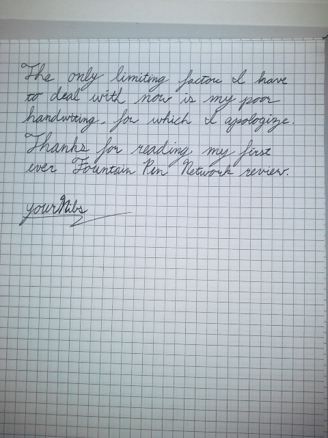
Hey, everybody, take a look at my first handwritten review: