Search the Community
Showing results for tags 'ocean'.
Found 4 results
-
desaturated.thumb.gif.5cb70ef1e977aa313d11eea3616aba7d.gif)
First-release colours of the HongDian model 1843
A Smug Dill posted a gallery image in FPN Image Albums
From the album: Chinese pens
In answer to an inquiry about the colourways' respective names.© HongDian / Zhejiang Lishui Lantian Pen Industrial Co.
- 0 B
- x
-
When visiting Amsterdam today to buy a wooden pen case, I tried to ignore the wonderful Sailor display in the store - and failed. My three Sailor-nibbed pens (a Pro Gear Slim, a 1911 Standard and a Cross Peerless 125) all have M nibs. Not that they're even remotely the same in terms of feel and line width - they're quite different from each other. A Japanese F is too fine/narrow for me; my handwriting is not compatible with such a needle-thin line. I tried a MF and was hooked. Contrary to Sailor's M and B nibs, which tend to have a built-in "rotation police" thanks to their intricate, multi-faceted geometry, the MF is more forgiving. But it has the typical pencil-like feedback that sets Sailor apart. It's a Japanese MF, which is a lot narrower than a Western MF. It's line width is even less than that of my old Sheaffer Targa Slim XF. Still, the nib is smooth. It's feedback, not scratchiness, big difference. I've never used a nib this fine yet this pleasant. It's a joy to write with, if I take my time - which (for me) is the whole point of Sailor: take your time and concentrate on your writing. Given that it's an Ocean, naturally I'l use it with Blackstone Sydney Harbour Blue. This is a very saturated ink and I often dilute it when I use it in other pens, but in this MF Sailor, Sydney Harbour Blue shines in its pure form. There are many Sailor Pro Gear reviews here on FPN, so I won't go too deeply into this pen. Suffice it to say that if you love Sailor M nibs, give the MF a try as well. Apologies for the poor pictures.
-
My favourite of the demonstrators. Below is the link to my blog post: Pelikan Souverän M605 Marine Blue So, here goes my review of the m605. The M4XX/6XX are usually considered to be next steps to an M2XX. As with the model numbers, there is a general increase in nib size & specs, in addition to overall dimensions, when you move from M4XX to M1XXX. Brass piston fittings in 8XX/1XXX series, render additional weight to these pens. The designs of the striped 400/600/800/1000 are pretty linearly recurring over the entire writing range except for several special editions. 405/605/805/1005s refer to the similar pens with silver accents, plated with noble metals (like Palladium or Rhodium), unless it’s a special or demonstrator model. The other model numbers refer to special/limited editions like the one reviewed here which is the m605 Marine Blue Special Edition. Another such alluring model is Souverän M 625 with sterling silver fittings (Ag 92.5%). DESIGN - THE MARINE TRANSPARENCY (6/6) Light and dark can play very differently with this pen. The m605 marine has a darker hue of blue which is as elegant as the deep blue ocean and it’s capable of refracting even a tiny shimmer of light with the palladium coated silver loops dazzling in utter consonance. Absence of light makes it adorn an almost blackish blue hue. http://1.bp.blogspot.com/-EbGwVJGZXLA/Vd2hwV8nyBI/AAAAAAAAFN0/mkuC89g9HMw/s1600/DSC_5582.jpg The blue is remarkably darker than the blue shade of a Pilot Custom Heritage 92. http://4.bp.blogspot.com/-0tVz2wn40wI/Vd2hukVg4dI/AAAAAAAAFNs/QqDdHt8JJxI/s1600/DSC_5590.jpg The entire pen gleams with a revealing blue and silver with ambient light and these effects do proliferate with sunlight. The radiance is matched throughout the pen starting with a silver gleam from the famed finial and the pelican beak (clip) through the concentric bands in the cap before finally converging with the piston rings. http://4.bp.blogspot.com/-DrS42sX2yDc/Vd2hs3IgvXI/AAAAAAAAFNk/iecshy1EKOE/s1600/DSC_5588.jpg The cap feels light and unscrews with a single turn, revealing a dazzling rhodium plated nib. The grip reveals another knot of glitter, towards the nib end. The transparency does reveal the inside works of its piston mechanism. http://4.bp.blogspot.com/-e1PvVXxR0ck/Vd2h5_AmgfI/AAAAAAAAFOM/dUefKi-PrYg/s1600/DSC_5600.jpg Two concentric palladium plated bands with a dazzling silver crown embossed with the pelikan logo, adorn the cap with a signature pelican beak-shaped clip. The thicker one carries the usual brand imprint of PELIKAN SOUVERÄN GERMANY. The logo on the finial is the one embraced by Pelikan post 2003, that of a mother pelican and its chick, gleaming in brushed palladium. You can see the distinct outlines of the cap insert here. The bands have an intrinsic association with the design rather than just differentiating the aesthetics element. http://2.bp.blogspot.com/-xN1Kc33fuI4/Vd2iBapyplI/AAAAAAAAFOk/6VIsqP5pdqM/s1600/cap.jpg FILLING SYSTEM (6/6) A piston filler with a sturdy knob is embellished with two concentric silver loops. Apart from their enchanting looks, like any other pelikan, it's an easy and hassle-free mechanism. The piston end unscrews with three to four rotations and ink is sucked in, with quite a gush, once the piston is screwed back on. And of course, you can observe the entire thing in action. A plastic spindle connector in the m4XX/6XX limits overall weight. M6XX fills upto 1.75 mL of ink. However, given the wet flow of the flock, it does not last for a long time. http://3.bp.blogspot.com/-zUjch5SlNPs/Vd2h7Rtsa2I/AAAAAAAAFOU/uoRgn3z9SkI/s1600/DSC_5603.jpg One thing to note here is that these piston mechanisms for M4XX/M6XX are not supposed to be dismantled as they are friction fit under heat. In case of problems other than lubricating the piston seal, it’s better to send the pen to Pelikan Germany/Country Authorized Service Center. Pelikan does have an excellent customer service. NIB - ALL THAT MATTERS (6/6) The nib comes in a rhodiated 14k design across four stock widths - EF, F, M & B. It has the standard pelikan scrollwork with the usual convenience of a screw-fit section. Like all its cousins, the nib is exquisite and efficient. With a standard m6xx feed, the nib-section is an ensemble of efficiency as well as art. And this monotone rhodiated finish does converge with the palladium coated trims in terms of both glitter and glimmer. The tail end specifies the nib-width and composition (14 C, 58.5% Au) of the gold-alloy used. Three arabesques diverge along the shoulders of the nib with two of them converging near the circular breather hole. The third curve runs across the tines towards the shoulders ending with the tail end of the nib. There is of-course the dazzling mother-baby pelikan logo, resting above the tail. This one in the picture is a Fine nib and writes smooth and wet out of the box. http://4.bp.blogspot.com/-2VTl4bu_hs0/Vd2h5MrKedI/AAAAAAAAFOE/2WVWKksH5mw/s1600/DSC_5643.jpg A standard black plastic feed (earlier ones had ebonite feeds) ensures a good ink buffer for the promised wetness and prevents hard starts. http://2.bp.blogspot.com/-xDXXzk82WrA/Vd2h8WPlGYI/AAAAAAAAFOc/ARajTx329A4/s1600/DSC_5654.jpg PHYSICS OF IT (6/6) – RELATIVELY SPEAKING For me, this pen is quite comfortable to write continuously, while posted.. The overall capped length is around 13.3 cm. The total weight of m605 has a third of contribution from the cap and it feels light without posting the cap. The pen does get some heft from the ink inside the barrel. Uncapped Length ~ 12.4 cmPosted Length ~ 15.4 cmNib Leverage ~ 2.3 cmOverall Weight ~ 18 g (without ink)Capped, uncapped and posted comparisons with its cousins - m400 and a m805 go below for your reference. http://3.bp.blogspot.com/-Szlbwi8JT7U/VatxFBpMP8I/AAAAAAAAE6A/WI3MKqTWTYQ/s1600/DSC_4556.jpghttp://1.bp.blogspot.com/-MKRvVUnJtLo/VatxdhNisxI/AAAAAAAAE6Q/yAypHzfnwZc/s1600/DSC_4574.jpghttp://1.bp.blogspot.com/-YpU6_6F8m_M/Vatxb2Ic7tI/AAAAAAAAE6I/jH4ohE7Ic7s/s1600/DSC_4568.jpg ECONOMIC VALUE (4/6) The m605 Marine retails at around USD 595, it does sound like a rather crazy spend. I have found it frequently auctioned on the bay with the final price dropping to 60% of RRP or even less. You can get a Pilot Custom Heritage 92 for USD 130 or less, although it will lack the finesse of a pelikan. I do consider the pen as a dependable workhorse. OVERALL (5.6/6) These 14k nibs are extremely smooth and have a very wet flow. The nibs are stiff & I absolutely love these nibs since I find myself quite ill equipped for flexible nibs. With a slight bit of spring and softness in them, there is absence of any noticeable line variation. Being extremely wet writers out of the box, the Fine nib puts a line which takes around 20 seconds to dry GvFC Moss Green ink on MD Paper. http://2.bp.blogspot.com/-nSAMdt3eHqQ/Vd2iCdiHHTI/AAAAAAAAFOs/2w7h7D_vrUA/s1600/DSC_5660.jpg REFERENCES Pelikan M4XX Nib Adjustment Pelikan M625 Patent Piston mechanisms Ink Capacities Pilot Custom Heritage 92 Thank you for going through the review. You can find some more pen and paraphernalia reviews here.
-
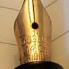
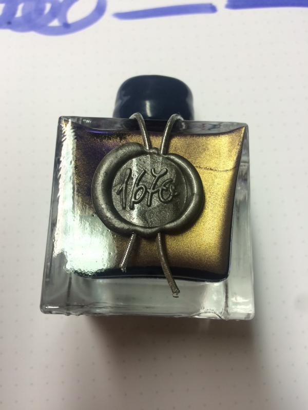
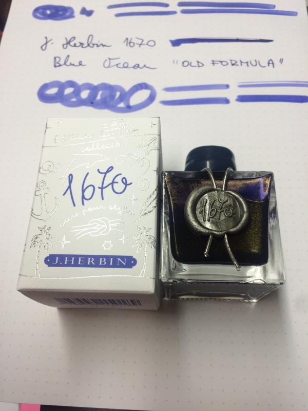
Hi folks, I don't know about you, but I have heard some rumours that J Herbin was reformulating Ocean Blue ink...must have been Stormy Grey's success So, I was expecting blue ink with silver particles...but it looks like they have opted out for gold... No indication on the bottle (of course) Here are few quick snaps of their very last batch: