Search the Community
Showing results for tags 'noodlers'.
-
Has anyone had issues with Noodler's Black Swan in Australian Roses not shading? I recently purchased my first bottle and loaded it into a pen with Goulet stub nib that worked wonderfully with other shading inks, but Black Swan looks dull and flat with very little shading. It also feels dry coming out of the pen. Yes, I fully cleaned it before filling it. And yes I've tried it on quality paper, including Rhodia, Mnemosyne, Fabriano, Midori and HP Premium Laser - no distinct shading on any of them. I also dip tested with a bold nib and had the same result. Any thoughts?
-
I really like music nibs. I have the Platinum 3776 Music Nib, the Pilot 742 Music Nib, Franklin Christoph Music Nib, the Ackerman Pump Pen Music Nib and the Noodler's Neponset Music Nib. But the thing I find odd about the Noodler's is that it isn't a stub like the rest. Sure, it has 3 tines, but it has no stub whatsoever. So my question is: has anyone tried to grind one of these into a stub? What were the results? Was it still flexible? I know that it's possible to by Nib Creeper and Ahab replacement nibs. But, to my knowledge, it is not yet possible to buy just the Neponset nib without the pen. So, this is a really risky project. Let me know if you guys have tried. Thanks.
-
Hi all, I do a lot of creative writing/journaling and used to use those multi-colored gel pen packs until I switched to fountain pens (My EDC is a Safari EF). I am looking for suggestions of ink with the following properties: Not blue nor black. Easy on the eyes for long writing seasons. Behaves well with little feathering or bleed-through on mid-grade paper (i,e, better than a composition book, not as good as Rhodia). Inexpensive (Noodler's price range).One of the main draws to fountain pens is the ability to use interesting colors and switch them whenever I like, but the platinum violet hurts my eyes and J. Herbin Terre de Feu isn't artistic enough for me (though I do love the shading). I prefer rich colors to dusty/pastels. Thanks for your help!
-
I've had a Volex for about a year, and it writes well. I also have a bottle of Noodler's Bad Blue Heron that I would like to use in this pen. I'm hesitant because it's a tough ink to get out. I've been using it for several years and learned how to clean it out of normal pens. It's the pens with unusual feed designs that can be a real problem (like that fiber wick feed in the Pilot Petit1). I've seen teardown instructions for a Pilot Elite. The Elite has a little sponge looking thing in it. That little sponge is why I don't run BBH through my Elite. It doesn't seem like it would ever all come out, and possibly permanently clog it. Because the Volex is the same manufacturer and era as the Elite, I'm concerned they might have similar designs. So here's the question. Does the Volex have a similar feed design or is it conventional? If it's conventional, I'm confident I can clean the pen sufficiently. If it's similar, I'll stick to the cartridges I've been using. Thanks for your input. JS
-

Proper Vintage Flex On The Cheap (Noodlers Konrad, Ranga Feed, Zebra Nib)
Honeybadgers posted a topic in Of Nibs & Tines
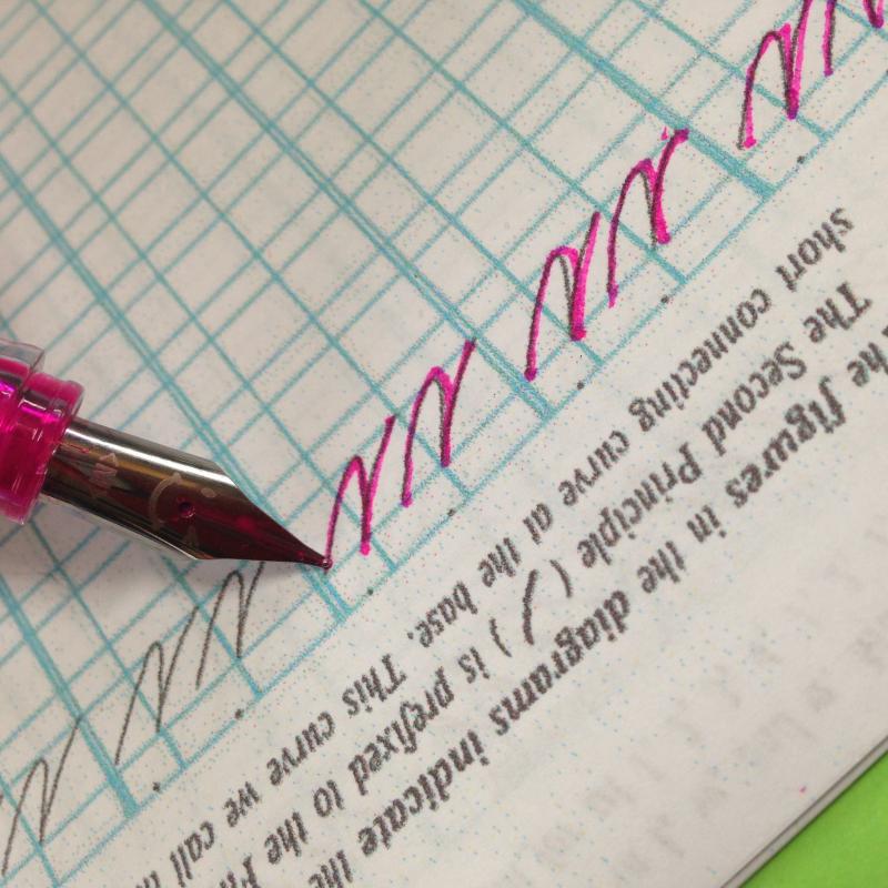
All of these railroad/dry sections aren't there with a better ink (I am trying to get rid of the remainder of a visconti green ink sample I got to try with my divina metropolitan. I hate this stuff, it writes horribly. Waterman green and robert oster peppermint are far superior performers.) Also lease excuse my fast, nasty chickenscratch writing sample. If you want to write bigger (to the absolute max flex) and faster, simply put a piece of scotch tape over the nib and trim it to fit, and it'll overfeed the thing into low earth orbit. Completely unmodified ranga feed. Even a chewed out noodlers feed simply doesn't flow this nicely. When I bought a ranga 3c from Mr. Ranga on ebay, I got a spare feed with the pen for free, so that was awesome! Essentially this does cost about $60 total, because you need to buy a konrad, a box of zebra comic G nibs, and a ranga pen of some sort, but you do get two pens out of it (and the ranga pens are really fun on their own) The feed does extend a hair into the ink chamber of the noodlers konrad, but that may actually be why this thing just flows so well. It only loses maybe 5% of its ink capacity and nothing is harmed in the filling. It does fit with the konrad inner cap, but I use this thing so often that I don't need it, and I hated the ink behind the cap, so I removed it. No drying out issues when used daily. The only thing that you have to "modify" is very, very easily done with lots of room for error. Take a pair of wide pliers (not needlenose, wide enough to fit the whole base of the nib in the flat of the plier) and squeeze just hard enough until you feel it "give". A little more than that is just fine, but I find that as soon as I feel it "smoosh" the back of the nib the barest amount, it fits happily. While it is possible to simply jam the two in together, it makes fitment way more obnoxious and you actually save a lot of effort doing it this way. Then line it all up as normal, I find it's easiest to insert by lining the nib and feed up with the gap of the nib lined up with the third slot on the feed, insert it until the nib bottoms out in the slot, and then gently slide the feed down until the first or second (really makes no difference) fin lines up with the slot on the nib. I really quite like this nib, even for everyday writing. It lays down a lot of ink, so you can't really flex it wide if you need to change pages quickly, and some inks like noodlers golden brown can take TWENTY minutes to dry. Personally, I find the sailor jentle inks (souten, oku-yama, and yama-dori are my favorite) to have incredibly quick dry times along with a heavy amount of sheen that this pen REALLY showcases. Line variation is insane, needlepoint (0.1) to 3mm, no risk of springing it unless you're literally trying to fold the nib in half, you get a box of 10 nibs for $10 so there's plenty of room for mistakes. It's also great for sketching and drawing. People say the nibs can rust. I have done that once, and it was only because I cleaned the pen and put it away without completely drying the nib and feed. With ink, I honestly haven't seen the nib rust yet, and the one in there has been daily writing for three months without a spot of rust. With the noodlers feed, I've heard a lot of people having flow troubles, having to widen the channel and risk ruining the feed, needing to prime it regularly (I never have to prime this one, though when I used the nib in a jinhao x750 I did need to prime it every half page or so) Also, one thing I haven't tried, but would suggest for that extra insurance against corrosion, is to just drop the money on the somewhat more expensive coated zebra comic G nibs. They do last longer in dip nibs, but I didn't have any to try in this application. I take this pen with me wherever I go, it's an incredibly fun pen to scrawl with, puts fun, pretty headers on pages at the beginning of class or new chapters in my notes, and has never failed to perform. Again, in this writing sample, disregard the railroading and dry spots, Visconti green is absolutely the wrong ink for this application. (also don't even think about trying noodlers polar colors, they will eat right through the paper with how heavy this pen lays it down!) http://i26.photobucket.com/albums/c101/popnsplat/20170423_183418_zpsxbrkzi5f.jpg http://i26.photobucket.com/albums/c101/popnsplat/20170423_185242_zpsaez4pte9.jpg http://i26.photobucket.com/albums/c101/popnsplat/20170423_183509_zps2ft5tjrq.jpg http://i26.photobucket.com/albums/c101/popnsplat/20170423_183434_zpsdqum7ato.jpg -
I'm a fan of Noodler's Kung Te-Cheng. Great colour as it is or diluted and great performance on cheap paper. Gosh darn permanent too. I am, however, not blind to its mischievous character. I posted here before asking if anyone's tried it on a TWSBI. I ended up passing because I was (am still) thinking of selling the pen further down the road. I've used it on some pens with no problems. The nib dries up if you don't use it for a week, but a 10 second rinse under a tap and it's good to go. There are, of course, some pens where it doesn't work. It kept clogging my Metro and I unimaginatively used it on a 78G. Ink turned to sludge. What pens do you use with KTC?
-
Recently, I became obsessed with light blue inks especially if they are turquoise, whatever that means. Turquoise is described as greenish blue but most inks with that name are basically blue with one or very few dyes. Chromatography with these inks is not very exciting. Many of them are, however, very beautiful (to me at least) and have uncommonly good writing properties perhaps because of their simplicity and relatively low dye content. Sheen is possible with some of these ink, at least on Tomoe River paper, but water resistance is uniformly not good. That said Pelikan 4001 Turkis Turquoise, Noodler's Midway Blue (ok, not a turquoise for sure), Noodler's American Eel Turquoise, and of course, KWZ IG (iron gall) Turquoise hold up surprisingly well to water. Diamine Shimmertastic Tropical Glow, Diamine Marine, and Noodler's Turquoise are probably closest to dictionary greenish blues strictly considered turquoise. Noodler's Turquoise is a little over saturated to have much fun with though. Both Shimmertastic inks are really fabulous inks to write with and look incredible. The glitter really does not seem to hamper performance nor harm the pen. Amazing inks even if not shaken to get max glitter effect. Would love to see glitter free versions of these inks made available. Some standouts at this time for me are Pelikan 4001 Turkis Turquoise for its beautiful color, versatility, sheen potential, and moderate water resistance. Lamy Turquoise is great too, good writing performance, some shading, and maybe some sheen. J. Herbin Bleu Pervenche is really nice too. I need more time to really study these inks....the differences between many are subtle. Platinum Mix Free Aqua Blue is really pure cerulean - ish blue. It's also somewhat dilute and I really did not like it at first but now I kinda like it some. Levenger Blue Bahama looks quite nice but feathers some on everything but Tomoe River paper. Let me know your thoughts. From top to bottom: Pelikan 4001 Turkis Turquoise Noodler's Midway Blue Levenger Blue Bahama KWZ IG Turquoise Diamine Turquoise J. Herbin Bleu Pervenche Diamine Havasu Turquoise Diamine Marine Robert Oster Signature Australian Sky Blue Diamine Eau de Nil Diamine Shimmertastic Blue Lighting De Atramentis Forget-me-not Diamine Aqua Blue Noodler's American Eel Turquoise Lamy Turquoise Noodler's Turquoise Platinum Mix Free Aqua Blue Noodler's Navajo Turquoise Diamine Shimmertastic Tropical Glow Sailor Jentle Ink Sky High Sailor Jentle Ink Souten Paper is Tomoe River Turquoise inks reduced size by Jon Andresen, on Flickr Turquoise inks wash reduced size by Jon Andresen, on Flickr
-
Noodler's Qin Shi Huang Review & Election Week Giveaway Note: Note: this review is also available on my personal reviews site with more pictures and better formatting. If you'd like to take a look, click here. The giveaway is also only available through that site. Click here for more details. Red inks are a peculiar bunch. They come in all sorts of shades—from dark maroon all the way to candy red. Noodler’s Inks is no stranger to this as they have 16 different shades of red available themselves. One of these inks I have to review today: Noodler’s Qin Shi Huang Red (pronounced Chin-Shi Huang). The ink is quite fantastic as it is a bright, popping red ink that is not too painful to look at, and has a professional, teacher’s-red hue. The ink is named after the first Emperor of China: Qin Shi Huang, later named Qin Shi Huangdi, after he unified China and proclaimed himself the first emperor in 221BC. (He is also famous for having the Terracotta Warrior Mausoleum, which he had created for himself). The bottle and box are standard Noodler’s three ounce set; and, while polarizing to some people, I like the bottle quite a bit. The bottle is slightly tinted, allowing for good storage, and is very functional in its shape, allowing for the most ink in as small a package as possible. It is also very easy to organize in a collection thanks to its cubical form. The label of the ink is something quite interesting. Unlike most inks, the name of the ink is neither in English, nor is it front and center of the label. Instead, the name ‘Qin Shi Huang’ is in Mandarin Chinese, written as ‘秦始皇.’ The label, instead, is dominated by a painting of Emperor Qin’s boat, sailing to find immortality. I also believe that the label is an original painting, done by Noodler’s Founder Nathan Tardiff. The paining is, honestly, quite striking, and a beauty to look at. The bottle is exceptional, and I always appreciate the effort Noodler’s puts in towards having both wonderful form and fantastic function. The Qin Shi Huang ink has a very pleasing color. It is, to quote Noodler’s founder Nathan Tardiff, “A very red red ink,” and while somewhat confusing in terms of vocabulary, this sentiment runs true. The ink could never be mistaken for a pink, or a brown, or an orange, or anything but red itself. It’s a very red ink. However, despite the ink’s hue, it is not eye-gougingly bright or annoying to look at; it is actually quite pleasant. However, this ink is not serene, as it calls attention to itself on a page the way a teacher’s red pen may. The ink is also quite saturated—however, it does not have much sheening or shading to speak of (it is quite constant in color). The ink is also quite water-resistant. Even though it is not an ‘immortal’ ink, it is quite water resistant whilst maintaining relative ease of cleaning. It is a slow drier, however, taking about 50 seconds to dry thoroughly. However, it does not feather or bleed, unless it is only less expensive paper, where it will absorb immediately while feathering and bleeding like crazy. This is also one of the Noodler’s inks which also happens to be a weak acid (with a pH around 4.5 or 5). This means that it does not mix well with other inks, so it should only be used alone, as a reaction might occur when used in concert with other inks that may end up ruining your pen. So, please, use it alone (for the sake of your pens). The ink also has one quite cool property: it fluoresces under UV lights (also known as black lights). While not glow-in-the-dark per se, it does have a lighter, extra dimension, so to speak, when underneath a UV light. Noodler’s Qin Shi Huang Red is a very nice, well-behaved red ink with a few tricks up its sleeve. And, even though it is a red ink, it is not eye-popping or annoying to look at for long periods of time. It could even be used, albeit rather more dramatically than blue or black ink, for professional use. Regardless, I’d recommend you give it a try. It is available on Goulet for $12.50 and on Amazon for $13.50 with Prime Shipping (most of the time)—(this link is not an affiliate link). Hope you enjoyed this review, if you did, please consider subscribing—it helps a great deal. Plus, as a special for the 2016 American Elections, once you subscribe, you will be eligible to win a new bottle of one of the inks reviewed today. All subscribing requires is your email, and I promise not to spam your inbox.

-

Noodler's Vs Twisby For Sketching / Lineart
PaperRabbit posted a topic in Fountain & Dip Pens - First Stop
(( Please feel free to guide me to a different post if necessary, I'm an FPN forum newbie C': )) So here's my dilemma, I have no way of trying any of the aforementioned pens. So I hope based on my preferences you guys can guide me to what you think would be best for me. I currently own only two pens, a Lamy Safari and a Pilot Metropolitan. I love how lightweight the lamy is, but definitely prefer that gelpen-like feel the metropolitan provides as well as the size, the lamy sometimes feels like a large pen in my hand regardless of the weight, and took a bit of getting used to. I use both pens for writing, however, have decided to add a third one for sketching, and sometimes doing the lineart on my drawings. I should mention now that I do not get along with dip pens, I tried them and hate the scratchiness and the constant dipping on the ink bottle (also having to travel with an ink bottle). This is why I'm resorting to fountain pens, I love writing with them, and that super smooth feel. Which brings me to what I think are my affordable options in that regard. Noddler's Nib Creaper Noodler's Konrad Noodler's Ahab Twisby Eco I'm mostly considering Noodler's because of the flex nibs that would help me provide a bit of line weight to my drawings. However, the Eco with a fine nib, would give me a have large ink capacity and I know will work right out of the box, unlike Noodler's which I've read can have some issues :/. Also consider that I would mostly be using permanent inks on these, do any of these pens work better or are known to have issues with permanent inks? I'm really confused as to what to choose, I've been taking pens in and out of my cart for a week. Mostly because regardless of my choice, for now I can only afford one. Or do you have any other recommendations around that price range? Thanks for reading through all of that! I hope you can help me! -
Can anyone tell me what kind of nib comes on a Charlie pen from Noodler's???
-
In December 2014, the Fountain Pen Network contributor "Masque" offered a recipe for a highly shading teal ink that he named "Black Swan in Icelandic Minty Bathwater." The mix is composed of three Noodler's Inks: Navajo Turquoise, Massachusetts 54th, and Old Manhattan Blackest Black (an exclusive to Fountain Pen Hospital). I enjoy Nathan Tardif's Black Swan inks, both the Australian Roses and English Roses versions, which embed a mysterious black shadow in a subtle, lovely color, as well as another mix by the FPN contributor "crunchmaster," called "Black Swan in North African Violets." It's entertaining and unexpectedly educational to watch Tardif incorporate economic and historical concepts within ink, of all things -- in this case, how economies and organizations should consider the dramatic and always unexpected impact of "unknown unknowns," described in Nassim Taleb's book, The Black Swan. Realizing recently that I owned each of these three inks, I mixed Masque's recipe. His proportions -- 15 parts Navajo Turquoise, 3 parts Massachusetts 54th and 1 part Old Manhattan Blackest Black -- produce a gorgeous, reliable, highly shading teal ink. A comparison with other inks reveals similarity with Sailor Jentle Yama Dori, though without the sheening properties. Other FPN ink mix developers in the "Icelandic Mint" thread attempted blends with other versions of black, with varying degrees of success. Masque's recipe is highly successful, as is another by the FPN contributor "Intellidepth," composed of 2.5mL Noodler's Navajo Turquoise, 2 drops Noodler's Yellow, and 2 drops Noodler's Black (bulletproof). With black swan versions of red, violet, and teal, likely next candidates include blue and brown. Black Swan in Chocolate Pansies? Black Swan in Blue Sage?
-
Noodler’s Konrad 1820 Essex- Long Term Review As some of you may remember, back in June I posted the following thread: https://www.fountainpennetwork.com/forum/topic/309845-earned-25-want-to-spend-it-on-a-new-pen/page-1 asking for advice on a pen purchase. In the end, I went with a Noodler’s Konrad in 1820 Essex, and I have used it as one of my main everyday writers since then. After five months of nearly daily use, I am finally ready to present my long-term opinions on the pen. ______________________________________________________________________ 1. Appearance & Design (8/10) – Classic semi-transparent design When I first received the Konrad in the mail, I have to admit I was a bit underwhelmed. The pen was slightly smaller than I had anticipated, slightly duller than I had anticipated, and slightly plainer than I had anticipated. But the design has grown on me. What I once saw as slightly dull I now see as understated elegance and beauty. The pen’s body is transparent, tinted the color of seafoam green. The cap and the blind cap are both an opaque white/sliver acrylic that gives the appearance of pearl. The clip is plain but sturdy and effective, stamped with “NOODLERS INK” and has the unique distinction of being in my opinion the best clip I’ve ever used. The nib is a plain looking steel nib, stamped with “NOODLERS INK CO” and with a slit running down all the way to the feed. The piston in the back of then pen is visible through the transparent body, in my opinion adding to the beauty of the pen. 2. Construction & Quality (9/10) – Solid all around, and an incredible Clip The Konrad is constructed almost entirely from acrylic, except for the clip, the small metal accent on the cap, the nib, and the ebonite feed. The papers that come with the pen claim the acrylic is biodegradable, but to me it feels like it’d last to the end of time. If I dropped my pen capped from any reasonable height, I wouldn’t be excessively concerned. It is well made and well-constructed, and feels sturdy enough. The clip warrants its own statement however. The clip is quite possibly the best clip on any fountain pen I’ve ever used. It isn’t the prettiest, it isn’t the shiniest, it isn’t the thickest, it isn’t the anything-est for that matter, but it just works. I use my pen clips quite often, and they are regularly clipped to the outside part of my pocket. This clip is the easiest to clip on, the easiest to grab off, the sturdiest, and the strongest-seeming clip I’ve ever had the -pleasure to use. The cap and blind cap both unscrew smoothly and easily, and the piston mechanism is smooth turning and feels sturdy. My one complaint about build quality would be that my pen had a quite noticeable imperfection in the acrylic in the cap of the pen, but it adds character to the design in the end and I’ve grown to like it. Another important thing to note is that the entire pen can be taken apart and put back together with no special tooling, making it a very easy pen to repair, service, or modify, should you ever need or want to. … 3. Weight & Dimensions (7/10) – Light, but not too light The pen weighs 15g capped and 11g without the cap, and in my opinion the experience feels most balanced when posted. The pen is on the light end, but not too light. It weighs around the same as a Pilot Custom 74, if that helps any of you picture it. … 4. Nib & Performance (10/10) – Wow. Just Wow. This is the part of the review where I go full on crazy. The nib on my Noodler’s Konrad is the best nib I have ever used. It is glassy smooth, lays down a wet yet controllable line, and, being a flex nib, has a ton of line variation. In terms of the line variation, I cannot claim to know what true vintage flex feels like, I can just say that the Konrad does it pretty gosh darn well. For the first two months or so, the nib was really only semi-flex, which is where I think a lot of the talk about the Noodler’s pens not being real flex comes from. After that however, I’ve been able to get consistent line variation with minimal pressure. The nib is truly a joy to write with. I should also say that upon arrival the nib was also not quite so smooth, and I adjusted it to my liking with micromesh and Mylar paper of 1.0 and 0.3 micron grits. The level of smoothness I get with my Konrad is paralleled in my experience only by complete nails, so to have the combination of the smoothness with exceptional line variation makes the Konrad something special. The ebonite feed keeps up with flow extremely well, and the pen writes with a consistent moderately wet flow, even when being flexed. I have heard complaints about inconsistent flow on other people’s Konrad’s, however, so if you do have flow issues I believe the best option would be to heat-set your feed. I have never had to do this with my Konrad, but it’s nice to know it’s an option if I ever have to thanks to the Ebonite feed. The nibs and feeds can both be easily replaced if you manage to mess them up, replacement flex nibs (tipped) are $5 and replacement feeds are $4. I would be wary to replace my nib, however, because as I said before it took about two months of daily use to truly “break in” the flex in the nib. … 5. Filling System & Maintenance (9/10) – Complete fill every time- worked like a charm for 4 months of daily use so far The Konrad is a piston filler, and has worked reliably for me through all four months I’ve been using this pen. The piston is a plastic nob under a blind cap at the back of the pen. One slight issue I found with the filler is that on a few occasions if I screwed the blind cap on too tightly I would unscrew the entire piston mechanism from the pen rather than the blind cap. The piston turns smoothly and comes pre-greased, but you can always add silicon grease to the piston threads if they ever become “squeaky”. … 6. Cost & Value (8/10) – Fairly cheap, but you might need to buy some stuff to go with it The pen costs $20, and is in my opinion well worth the price. It should be noted, however, that if you aren’t already slightly invested in the pen world it may not be worth the cost to you. For instance, if I didn’t have the micromesh and Mylar paper to smooth my nib, or the silicon grease to regrease my piston three months into use, I probably would not enjoy my pen as much as I do. These are not substantial costs, though, and many pen enthusiasts probably already have them around the house. … 7. Conclusion (8.5/10) – A great, unique pen at a great price, my new daily writer After using this pen for the past several months, I can say with great confidence that it will likely be my most used pen for many more months to come. I have prettier pens, I have more expensive pens, I have pens that feel slightly better in the hand, and I have pens with shiny golden nibs, but none of these pens compare to the simple pleasure that is the Noodler’s Konrad. It has the greatest nib I’ve ever had the pleasure to use, looks good, has great ink capacity, and is incredibly sturdy. What more could you want? All pictures are taken from www.gouletpens.com , the website where I purchased my Konrad. The shipping was quick, and the customer service was excellent. If you are considering the Konrad, I would highly recommend ordering from the Goulet’s.
-
I have a slight pink problem. I have little girls, let's blame it on them. This ink performed really well. It dries really fast, is super saturated, and is surprisingly water resistant for a red. Also, it is seriously solid - really no feathering to speak of even on really poor copy paper. It's in my oldest's Pilot Kaküno so I snagged it for my second ever review - be gentle. First image is a scan, second two are iPhone photos of samples on Rhodia and (bleep) copy paper. http://images4-b.ravelrycache.com/uploads/MrsDrG/440308846/_medium2.jpeg
-
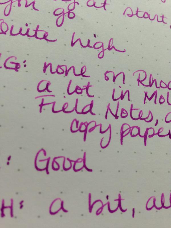
I've been lurking here for a long time but joined today as I saw Noodler's Tchaikovsky and Rachmaninov did not have ink reviews but are both in my possession. I love looking at ink reviews, even the rubbish ones, so I was inspired to make my own modest contribution. This ink is probably not a good choice for lefties, as it takes a really long time to dry (still smearing at 20 seconds), it's also not a good choice for non-FP papers as it feathers like a beast. BUT - it is oh, so, so very pretty. It shades so incredibly richly - like Apache Sunset where it's one colour at the top of a stroke, a completely different one at the base - and my pen seems to really like it. Also, it is freakishly water resistant. Even after 15 seconds and rubbing, the q-tip sample stayed squarely intact. Full page is a scan, close-ups are iPhone photos in natural light on Rhodia dotpad and Field Notes. You guys, the shading. http://images4-e.ravelrycache.com/uploads/MrsDrG/440305860/_medium2.jpeg
-
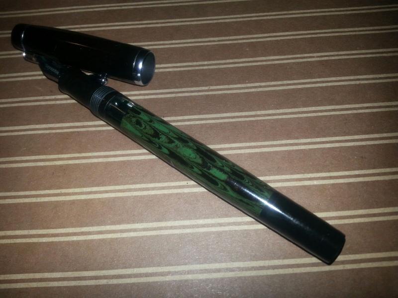
Laying in bed, procrastinating, knowing I ought to be putting my pens and paper into boxes to be packed up for the new house, instead I chose to write out the attached review of the Noodler's Konrad Ebonite flex fountain pen. This is my first review so please be gentle. And remember, my handwriting is lousy but particularly so today because the paper's balanced on my knee, as I'm writing in bed. Having had and lost a couple of fountain pens a couple decades ago, my collection really started with this pen. Aside from a couple of inexpensive Jinhao pens, I didn't have any fountain pens until this Noodler's Konrad. And not knocking the Jinhaos, this was the first pen I bought with the intention of holding onto it, using it, and eventually passing it along to one of my children one day. A very, very long time from now. The ebonite Konrad, in my mind, is refined, elegant, with a restricted, pulled-in beauty. It's not glittery nor dazzling, it's completely unflamboyant, yet entirely gorgeous to me. The Dixie #10 Jade has a medium to dark green- about a Sherwood green, and black ebonite swirled together in a pretty rippled pattern on the barrel. It's got a black blind cap and black section. The section sits about 3/4 cm below the barrel, between which, a clear acrylic window sits, with which one can view the ink swishing around inside the pen. When one has shimmery gold particles swirling about amidst the ink, each time one catches a glimpse of the sparkle, it's a little bit of a day brightener. Even without the glitter, seeing ink ebb and flow across the window is an awesome sight. I guess that's why I like demonstrators so much. That's just not something normal people see everyday - inky pools rollicking about inside their pens. Unless one happens to be a member of The Fountain Pen Network, of course. The black ebonite cap has a silver clip with a little teardrop shaped ball on the end, kinda like if you took the quintessential Parker ball and smooshed it with your finger a little. It's proportioned nicely against the cap and the bottom silver cap ring. Under the blind cap is the knob you twist to fill the pen. Directly below the knob, flush against the distal end of the barrel, is the part where the piston unscrews from the rest of the pen. In theory, the pen can be taken apart and the inner workings of the piston given a full cleaning and lubricating if necessary. (I swear! I've seen it on YouTube so it must be true) But I have not been able to remove it, and am not interested enough to risk scratching my pen to try using more force than just my fingers. Perhaps one day, I'll grab a pair of section pliers from the spark plug aisle of the auto repair store, and give it a go. But cleaning the pen by removing the nib and feed has worked plenty well for me thusfar. And being able to remove the nib and feed is the best thing about the Noodler's Konrad. I am a tinkerer by nature and truly appreciate that Nathan Tardiff, the sole proprietor of Noodler's Inks (and pens) has released this pen with that in mind. The feed, being made of ebonite, can be carved for greater ink flow, heat set against the nib, for optimal flow, and replacement feeds can be easily and inexpensively purchased. The nib is a #6 size, which is also #35 by some manufacturer's nib sizing code, which means there's a plethora of other manufacturer's nibs available for experimenting. So far, I have only put in a dip pen nib, as that's actually what had drawn me back to fountain pens this time around, and it fits a Zebra G nib nicely, and because the feeds are available, I have a dedicated feed for when the pointed pen flex nib is installed, and for most other times, I have the regular #6 nib and regular feed in it. Since the section is also made of ebonite, that can be heated to really tighten down the nib and feed if necessary, but I'd say that's something for more advanced users, unlike playing around with carving the feed- anybody with the will to do it, can do. The only reason being is that replacement feeds are readily available. If the section gets really screwed up, well, that pen owner is also screwed. Speaking of being screwed, the price point does not screw you. It's a fantastic price, especially for a piston fill, especially for an ebonite piston fill. Did I miss anything? It's getting late and I should go pack at least 1 box up before getting up to start my day in ummmm, 2 hours. This accounts for the gradual drop in writing quality in this review, mind. Oh yes, the Konrad Ebonite fountain pen is 140mm capped, about 160mm posted and weighs a total of 18gm with the cap on and about 1/3 filled with ink. The paper used in the review is my favorite, Tomoe River 54gsm, and the wonderful ink is DeAtrementis Pearlescent in Heliogen Green with Gold sparkly bits. In my written review, I flexed the bleep out of the pen so the ink would really gush out for you guys. And in hindsight, I probably should have written in larger letters for that because the broad letters are terrible to read at that size. My apologies, but I did warn you, this is my first review. The second half of the review, I wrote more like I normally do, and the writing is a little bit more legible, if not very pretty. My new year's resolution this year is to improve my handwriting, and god willing, let us hope i don't have to make that same resolution next year, although at this rate, i may have to. Editorializing aside, i think I'm done. And I'll sign off with something I've been telling myself and rarely ever heed (do as i say, not as i do, hmm? Alrighty) ciao Choose your words wisely, because they are powerful and your word matters. EagleLobes Edited for ease of reading and some grammarly stuff
-
Noodler’s is one of the companies that don’t need any introductions. Nathan Tardiff is a legend and his work is well known by fountain pen and ink afficionados. Not everyone is crazy about Noodler’s inks but I enjoy most of the ones I’ve tried so far. Bernanke Blue is famous for it's almost instant drying time. This feature makes this ink valid choice for left-handed writers. Sadly this ink has a lot of drawbacks. It feathers like crazy on cheaper papers. It causes strong bleedthrough. After some time spent in a pen it may clog it. Yes it can dry in two seconds, but frankly, it's not enough to cover styrong misbehaviour on cheaper papers. This simply isn't a good ink. I would never buy a bottle of this stuff. Thank you Fabri00 for sending me the sample. Drops of ink on kitchen towel Color ID Color range Maruman, Kaweco Classic Sport, broad nib Leuchtturm1917, Kaweco Classic Sport, broad nib Oxford Optic, Kaweco Classic Sport, broad nib
-
Hey All, If this question should be in the Ink Recipe section, please let me know! My question is rather simple though: How do I make an ink slightly darker than it is? I figured that mixing it with some black ink would do the trick, but HOW MUCH BLACK should I add to change the color only a little? The ink that I want to make darker is a beautiful brown, Noodler's Kiowa Pecan that I recently received in a great trade. The black that I am thinking mixing with it is Noodler's Zhivago. They're both from Noodler's and have similar flow characteristics. I thought about taking a 1oz sample of the Kiowa Pecan and slowly adding some of the Zhivago, testing each time, until I get the shade I'm looking for, but I think it's really easy to over do it and go too dark! Any advice?
-
The third of the 2016 Commonwealth Pen Show Noodler's special, limited edition inks. This one is another waterproof ink, well nearly so, with just a little smearing. Similar to BB Espresso or Sailor Doyou in being a very dark brown, a rich earth color. In the images I couldn't get the brown, the contrast was too much and the camera just took it as black. But it's not black! It's deep brown. Trust me. The especially wonderful thing about this ink is DOES NOT wash red. It washes brown, like Parker Penman Mocha. Unfortunately, another unobtanium ink. There may be a few bottles left at GoldSpot, or perhaps not. If any are available, once gone, will be gone forever as the ink was made with a unique dye that Noodler's can't get. Since I received a generous sample I won't need a bottle. But I'd love to have an ink this color, regularly available, that washed brown like this, and was a cool brown. Things like this will get me attending the 2017 Commonwealth Pen Show. Pen: Edison Premiere (M-steel) Papers: MvL=Mohawk via Linen, TR=Tomoe River, Hij=Hammermill 28 lb inkjet, Rhodia=Rhodia 90g ivory. Camera: iPhone 7 Waterproof. Just a tiny amount of ink washes away, and none lifts. In the little halo areas where you see a light red, while drying that at first had an orange and a yellow. Very unique.
-

Noodler’S Prime Of The Commons And Air-Corp Blue-Black Comparison
truthpil posted a topic in Ink Comparisons
This was something I worked on a few months ago when trying to decide which blue-black ink to convince my wife to let me get myself for Christmas. I’ll let the images speak for themselves, but there are definite advantages to both inks. In the end, I got a bottle of Air-Corp and put Prime of the Commons at the top of my wishlist for the next time someone asks me what I want for a present. I prefer the color of ACBB, but also the absolute waterproofness of PotC. The main reason PotC came out second was its tendency to feather on most paper. Another major factor is that PotC costs about double the price of ACBB once shipping from the UK is taken into consideration. Third, my wife’s adverse reaction to the color (“It’s just blue”) also helped move PotC to the backseat. I spent a lot of time comparing these inks and didn’t put all my thoughts or photos in this post, so if there’s anything you want to know about them that I haven’t included please don’t hesitate to ask in the comments. J Pen Used: Pilot Plumix <--This is a dry writer, so both inks turned out lighter and with more shading than they would have in wetter pens. For all images, Prime of the Commons is on the left and Air-Corp Blue-Black is on the right. Cheap Legal Pad Rhodia 80gsm (Due to PotC’s tendency to feather and be hard to clean, I tried a 20% dilution [4 parts ink : 1 part water] and included it under the undiluted example.) Writing Sample (Legal Pad) Color Comparison (Rhodia) (From the top: lines 1, 3, 5 = PotC; lines 2, 4 = ACBB) Water Resistance 1. Drip test 5 minutes after writing 2. Soak test 30 minutes after writing 3. Soak test 24 hours after writing Of course a few weeks after doing all this I discovered Pelikan 4001 Blue-Black and was surprised to find myself preferring the traditional color over the funky tealish inks I had been so into previously. Pelikan BB has since duly fulfilled my quest for a perfect Blue-Black. Go figure. -
Hi all, I've had quite a lot of time free at the moment and so have finally got around to making my first review - of the Jinhao 159 pen. It's a pen that has been reviewed before, but as I've been using the pen for over a year now thought it good to share some of my experiences. And so... Introduction: After failing to find a Montblanc 149 at a price I could afford I decided to try to look for alternatives, allowing me to try out the apporximate feel of the giant without leaving such a hole in my wallet. Many brilliant reviews pointed me the way of the Jinhao 159 and so after finding a reputable looking seller on that online auction site I purchased one from china for £7 (a rather handy sum as it's below the value on which import goods are taxed entering the UK). Around two weeks later the pen arrived in red corrugated cardboard box. Not a brilliant nor beautiful box box but considering the price rag, very welcome. Opening the box by lifting the lid reveals the pen... (the box has disappeared into the ether so unfortunately can't photo it!) Appearance and design (6/10): The Jinhao 159 is a large black cigar sharped pen with chrome accents. The pen is styled after the already mentioned Montblanc 149. The clip is steel and is chrome plated. It caries the somewhat gaudy Jinhao Chariot motif in a shield. The cap band is a single ring of what feels to be plastic. Jinhao on one side... 159 on the other... The nib is large and attractive and displays the same chariot design as the of the clip albeit in a more tasteful fashion. The size, shape and overall appearance of the nib fits well with the design of the pen. The black finish leans more towards gloss and is well presented. I've had the pen for over a year now and despite trips out and about without a pen case I can tell of no scratches or rub wear degrading the finish. At the end of the pen there's a faux blind cap ring highlighted by a chrome ring. Construction and quality (7/10): The pen has an excellent feel in the hand. The pen is fairly heavy although I don't have any scales with me for reference. Uncapped it is a tad lighter than that of my Sheaffer Legacy Heritage. This weight largely comes from the inner brass construction of the barrel which gives it a nice heft. The fit and finish of the pen is acceptable for the price point. The barrels brass components could practically be used as a club, they seem so sturdy, but the plastic fittings at the cartridge/converter mechanism feel a little flimsy. As previously mentioned I have had the pen for over a year and haven't found any wear to the finish of the pen, wether it be at the chrome or black lacquer. Weight/Dimensions (9/10): The pens measurements are below. For comparison I've also stated those of its expensive basis the 149, gathered from Richard Binders site (a most useful and otherwise brilliant site). MB149: Length Posted; 170mm Length Capped; 149mm Length Uncapped; 133mm Barrel Diameter; 15.2 mm Jinhao 159: Catagories as above; 164mm, 148mm, 128mm, 150mm I've tried writing posted only a few times with this pen, due to its large size I find posting makes it a little clumsy, but the cap posts securely without seeming to mar the finish. As a note the cap is rather heavy and as such moves the balance rather far back when writing. Nib and Performance (7/10): One of the things that initially attracted me to the pen apart from the size was that it was advertised as available (only as far as I'm aware) with a broad nib. The nib I received performs to my mind as a wet, smooth Medium nib. This of course is a welcome change from the vast majority of chinese budget pens bieng available with fine/extra fine nibs. I was surprised on receiving the pen how well it wrote and am still surprised how well it writes today. Line width is constant with minor variation possible if pushed hard. The nib is labelled 18K GP. I believe I heard on a video review that it has been tested and found incorrect. Regardless the steel nib performs reasonably well and has plenty of tipping material if you're partial to tinkering. The nib performs well on a variety of different papers from regular copier/inkjet stuff to Rhodia and G.Lalo. Good nib for a cheap pen. I'm lead to believe these nibs are friction fit and as such should be easy to clean out, I however just just usually soak the section etc. Filling system and Maintenance (5/10): Filling is by the boring c/c filler mechanism. I got a converter included with mine on purchase. Frankly the converter is actually quite good. Also fits waterman pens as well. The converter is branded Jinhao - again with the ubiquitous chariot logo. I don't have a measuring cylinder with me at the moment but I believe the capacity to be around 0.8ml. Cost and Value (10/10): As mentioned earlier I paid £7 for the pen shipped last year off of eBay. It's damn good value for a 149 mimmic. In fact it's the best value pen I own. I've other cheap chinese pens by Jinhao and Hero but they tend to have significant issues that I won't go into for this review. Conclusion (44/:60) 7.3 When purchasing I expected a well sized pen with an OK nib. In fact it is an excellent tool that I now incorporate into the rotation of pens I take out and about. The nibs are attractive, nice and wet. The pen is well balanced and fairly well built and costs shipped less that a round of drinks (considerable less actually...). My only concern with recommending the pen is that Quality control has been highlighted as an issue. I've heard reports of bad nibs, rubbish feeds and cracking inner caps. Maybe I got lucky but my advice would be to give one a go. If it doesn't cut it as a pen you can use it as a truncheon!
-
Noodler's Proctor's Ledge Ink Review Limited edition ink produced for the 2016 Commonwealth Pen Show, Boston I prefer boring inks. But I also think a dark suit should be punctuated with a splashy tie, which doesn’t seem to make a lot of sense. Inks, though, should be boring, business boring. There shouldn’t be a lot of color, sparkle or sheen. It shouldn’t draw attention to itself or make the reader lose focus. I once purchased an ink the color of bilious regurgitation, which probably reflects the prose more than I realized. My favorite business ink is Private Reserve 2004 DC Supershow Blue. It makes a statement without trying to look like it’s making a statement. I’m looking for an ink like that; splashy in a dark suit and bright tie sort of way. I don’t like obtuse. I want simple. I’m not planning to journal in my bathtub. I just want an ink that flows well from the pen, doesn’t feather or bleed through the paper. http://i303.photobucket.com/albums/nn130/ToasterPastryphoto/ProctorsLedgeInkBottle.jpg I purchased this ink from Goldspot Pens via eBay. The ink was originally produced by Nathan Tardif as a limited edition ink for the Commonwealth Pen Show in Boston on September 25, 2016. There was a limited supply available of this ink, along with North Star Liberator (a sky blue), and Suffragette Carmine (a deep pink). Apparently there are no further quantities of the other inks available, and a limited supply of Proctor’s Ledge. The ink is available directly from Goldspot Pens. Proctor’s Ledge Ink is a memorial tribute to the 19 people hanged at the site Aug. 19, 1692 during the Salem Witch Trials. It was a dark time in colonial American history when people turned on each other, representing one of the most notable cases of mass hysteria. Researchers earlier this year confirmed the site of the hanging, most likely from a large tree on this rocky hill. The site is located in Salem, Massachusetts. It’s a wooded patch surrounded by houses and a Walgreens drug store. The ink is bottled in the traditional Noodler’s 3-ounce glass bottle, with ink filled right to the brim, a Noodler’s hallmark. The label features a large tree with four figures, probably women, being hanged by the neck. In the foreground is a cauldron with 19 skulls, representing the 19 people hanged on that day. How does it write? I loaded the ink into two pens. John Donne’s ‘Holy Sonnet 14’ was written with a 1930’s Gold Bond fountain pen (pictured). This is probably a Wahl Oxford rebranded for retail at Montgomery Ward. It looks just like an Oxford, thus I can assume Wahl Eversharp, and not National Pen made it. It once belonged to Verna L. Young, because the pen told me so. (Verna, I have your pen.) The nib is a slight left oblique medium stub. Although I’m certain Verna wrote lovely letters weekly to her nephew Lyle in Davenport, Iowa, it’s not one of my daily users. I also loaded the ink into a Platinum Preppy, which has been my daily user for the past two years. I decided to give it a much-needed vacation from continued daily use with Private Reserve’s DC Supershow Blue. I used this pen to write the other sample waterproof test. Most of my pens I place into and out of rotation, but the Preppy with PR’s ink has been in nearly continuous use. Once you find a pen and ink combination, it’s best not to upset the balance. http://i303.photobucket.com/albums/nn130/ToasterPastryphoto/ProctorsLedgeInkSample.jpg http://i303.photobucket.com/albums/nn130/ToasterPastryphoto/GoldBondPen.jpg Flow Compared to DC Supershow Blue in the same Platinum Preppy the Proctor’s Ledge was significantly drier, almost scratchy, but not chalky like some others of the Noodler’s line. On one occasion I had trouble starting the pen. With Verna’s Gold Bond, the flow was much better, but not ideal. Color This was perhaps the most disappointing. The color is somewhere between a very dark purple, and brown, resembling a very deep aubergine. On some paper and lighting it appears brown, on others it appears purple. Let’s call it mud, because when all is said and done, it looks fairly black. To be fair, I’ve mixed some of my own inks, and this would be a color I’d probably reject and dump the results down the sink. There is some red dye component within the ink. This has a slightly different flow characteristic. If you use a vivid black light, or a vivid imagination, you may be able to see these pink highlights. Another trick is to smear the ink onto the paper with a knife blade, or drop the ink onto a wet paper towel. Unfortunately, I don’t write with a knife blade, nor do I write onto a wet paper towel. Also, I don’t own a black light, nor do I enjoy spending much time around one. Drying time The dry time is almost instantaneous. This ink is very well suited for left-handed writers. Waterproof This ink is very waterproof. Once dried, there is almost no ink loss from the paper. http://i303.photobucket.com/albums/nn130/ToasterPastryphoto/ProctorsLedgeInkSample2.jpg Feathering and Bleeding I’m impressed: almost no feathering or bleeding with this ink. I tried it on various paper grades at home and work, and found this ink to be true to the page. Conclusion The dry time and resistance to water may be desirable features for some, especially in an ink that resists feathering and bleeding. However, I was a bit turned off by the muddy color and especially disappointed with the dry feel of the ink with writing. This ink is probably better for pens with medium or broad nibs.
-
Nib Pairing For Lamy Al-Star And Noodler's Bad Blue Heron.
mpennxr posted a topic in Fountain & Dip Pens - First Stop
Hello everyone, So I have tried inking my Lamy Al-Star (EF) with Noodler's Bad Blue Heron ink, and I have been running into what I can only describe as some flow problems. What I am experiencing is ink drying or perhaps congealing at the tip of the nib, and it makes it so that the pen needs to be stroked a few times before the ink starts to flow again. And even after I start writing the ink seems hard to get out and flowing easily. I am new to fountain pens and I would like some advice on whether or not I need to get a larger nib or do something about the ink to remedy this issue. Thanks a lot, MPenn P.S. And if anyone has had experience with how Bad Blue Heron flows and works in a Pilot Metropolitan (F) I would love to hear about it as well! -
I am certain that this has been discussed here, but I am new here, so I will appreciate if someone can tell me or even guide to an earlier discussion - Is Noodler's ink available in India (except through import)? If not, what is the typical landed price for a 3 oz bottle? Thanks Sanjay
-
I LOVE Noodler's Baystate Blue. In my humble opinion, it is the best color of blue for fountain pens. My only complaints about it are: It is not fully bulletproof.It might not be eternal meaning it might not archival nor fade resistant.It bleeds through most of my papers I use including my checks.Rectifying the above are very important to me. I would not be ashamed to try a different brand of ink, but I do really like Noodler's products so I guess I am a Noodler's fanboy I am thinking about ordering a bottle of Noodler's Bad Blue Heron which appears to have what Baystate Blue is missing above other than it is not quite the same color. Noodler's Upper Ganges also might be an alternative, but it does not appear to be as bright as Bad Blue Heron. Noodler's Luxury Blue looks just like Upper Ganges to me, but will glow under UV light which I find kind of cool, but it is not important to me. Noodler's Periwinkle does what Luxury Blue does and kind of looks brighter, but the stock image on the Noodler's Ink website makes it hard to tell. Noodler's Polar Blue looks like Bad Blue Heron with the added possible benefits of being freeze-resistant and lubing piston-fill pens. So my question is what comes close to Baystate Blue that is bulletproof. eternal, and doesn't bleed through most papers? I did a search and found this thread about this subject, but it lists alternatives which are not really pertinent to my question above and things have changed in 6 years: https://www.fountainpennetwork.com/forum/topic/185947-baystate-blue-alternative/ THANKS!
-
Hey, I'm new to FP's so go easy if i get any lingo wrong. I cant decide between Noodler's Liberty Elysium, or Noodler's Baystate Blue. I will be using the ink in a Lamy Al-Star with a fine nib, and i will primarily be using it for school. I will usually be using cheaper/thinner paper so i need to know which ink has the best bleed through, and dry-time. I've heard the Baystate Blue stains pens alot but I'm not sure if i should worry about that since it will be one of the only ink's i use in the pen. I guess i could order some samples from Goulet, but i want to know some fellow fountain pen enthusiast's opinions first. Thanks Mutton