Search the Community
Showing results for tags 'noodlers'.
-
Noodler's Ottoman Azure Ink Review Note: This review is also available on my personal reviews site, with better formatting. If you would like to take a look, please click here. Anyway, I hope you enjoy the review. Noodler's Ottoman Azure is definitely one of my go-to blue inks. It has incredible color and saturation, and, with a thick nib, brilliant shading from blue to navy. On the label of ink is a photo of the Sultan Ahmed Mosque (Also knows as 'The Blue Mosque' due to its interior color). And, like many Noodler's inks, the bottle has its particular style, with the WordArt logos and text, which—albeit not incredible design—gets the point across quite well. The ink comes in the 3 ounce (89 mL) Noodler's bottle, with the ink filled to the brim (watch out when opening it up!). Some people love the Noodler's bottle, and others aren't crazy about it. Personally, I find myself in the former category: it has a wide neck, black coating for storage, and a no-nonsense cubical shape makes it brilliant for organized storage. It also comes with a lot of ink, so you won't get to the bottom for a while. However, the name of this ink "Ottoman Azure" is a bit misleading. Azure, according to the Cambridge Dictionary, means "having the bright blue colour of the sky on a clear day." This ink, following that definition, is a quite far off. The color is a rather dark and deep blue, similar to that of Diamine Majestic Blue (and Iroshizuku Asa-gao to a lesser extent). If I could match it to a natural color, it would be much more similar to the Arctic Ocean. It is a deep, incredibly saturated, and (personally) pleasing color. It looks best in stub and medium broad nibs (I love it in a JoWo 1.1 Stub), as in more narrow nibs, the shading is less obvious and the ink becomes more like navy. That being said, the ink does have some peculiarities, although unlike some Noodler's inks, it is not bulletproof, waterproof, or anything similar. It does, however, take a very long time to dry—up to 45 second on Clairefontaine 90gsm paper. It also has poor water resistance and smudges easily for about an hour after being on paper. However, it flows very well, and it has incredibly beautiful shading and an equally beautiful color. It is also quite easy to clean from pens and does not take much time to flush. Although, it will stay on skin for a while (as I learned performing the smudge test), so try your best to keep it off of your hands. Aside from its picky peculiar qualities, Noodler's Ottoman Azure is a wonderful ink with a spectacular color, which easily makes up for its shortcomings, and I recommend it highly. It retails for $12.50 on Goulet Pens, and for $12.99 on Amazon with Prime Shipping (this is not an affiliate link). If you liked this review, please consider going to my website and subscribing. Each subscription helps immensely, and I promise not to spam your inbox. -Caleb

-

Which One Is Closer To Your Bottle Of Noodler's La Couleur Royale?
antichresis posted a topic in Inky Thoughts
-

A Brief Comparison Of Super5 Delhi And Noodler's Apache Sunset
truthpil posted a topic in Ink Comparisons
Hi Everyone, This is just a quick comparison I made of two shading orange inks: Super5 Delhi and Noodler's Apache Sunset. I was surprised at how similar they can look and the shading with both is impressive. The huge advantage, for some at least, of Delhi is that it's completely waterproof once dry! If you've been hoping for a waterproof version of Apache Sunset, Super5 Delhi may be close enough to fit the bill. My only complaint with Delhi as far as behavior goes is that it left pink stains in my TWSBI demonstrator that I still haven't been able to get out. Here's what these two oranges look like on a cheap legal pad: Some close-ups: And on 80gsm Rhodia: Rhodia close-ups: I hope this is useful for someone! -
Noodler's is one of the companies that don't need any introductions. Nathan Tardiff is a legend and his work is well known by fountain pen and ink afficionados. Not everyone is crazy about Noodler's inks but I enjoy most of the ones I've tried so far. Manhattan Blue used to be produced exclusively for Arthur Brown shop. When it went out of business, Fountain Pen Hospital managed to carry the ink. Now it's called Blue Manhattan but I believe it's the same ink. The ink look rather nice and is decently behaved. Lubrication could be better, flow could be better but still the ink is enjoyable even in drier pens. It may cause some feathering on bad quality paper. It's not really water resistant, however after accidentally soaking it with water, you'll be able to read the text. As for use in vintage pens - I don't know. I haven't tried it in a pen with a sac. Drops of ink on kitchen towel Software ID Color range Tomoe River, Lamy Al-Star, B Leuchtturm 1917, Kaweco Classic Sport, B Fantastic Paper, Lamy Al-Star, B
-
Thank you everyone for being here reading my new ink review about Noodler’s Blue Ghost. http://s16.postimg.org/h86itr5b9/Bottle.jpg This ink is indeed a particular one on many aspects. I suspect that the original intent by Noodler’s was to create an ink invisible to normal light, which shines and stands out the paper only under UV light, without being the already seen highlighter colours. The result in my opinion is a partial success, because it’s visibility under UV light is strictly dependant to the paper you’re writing on. On 80 gsm cheap copy paper, and on Favini’s Schizza & Strappa paper, due to the particularly white finish, under UV light it’s likely to shine as much as the ink, making a real mess in trying to discern normal size words from the background. On the other side, on differently coloured paper, this ink is an absolute beauty. I’ve tried it on tracing paper and it was a great success, the glows really comes out in a light blue ghostly colour, which I enjoy a lot (I’ll keep that in mind for Halloween!). I suppose that, for the particular composition of the ink, this could be a great choice for writing on black cardboard, to create particular drawings or similar, I should give it a try). Coming back to the most usual features, this is quite a wet ink, takes ages to dry but flows without problems through my Lamy Safari and keeps up writing from the finer nib to the broadest. It’s really hard to see in my photos, but against all odds, this ink actually has a little shading, giving much more luminous points where the pen stops or slows down while writing. Another thing that has to be said, this ink behaves very well in terms of waterproofness. If soaked in the water the lines remains as brighter as before without fading. In the end, is this ink worth a try? This question is difficult to answer. It depends. If, like me, you like to spend some time on drawing, toying around with pens, if you have about any other colour of the visible spectrum, well, this ink can really be something different to experiment because it’s a lot of fun, especially on demonstrator pens. Is this ink something I really needed? Not really. It’s not an ink I’m going to bring at work, and it’s not going to be in my everyday carry so often. Probably, if you’re the kind of people who likes to buy work safe inks, but you still want to experiment a little of “UV friendly Inks” you can just get a Pilot Parallel fill it up with Pelikan Duo ink (Yellow or Green) and in this manner you’ll have a rechargeable highlighter which works fantastic even under the UV bulb. Hope you enjoyed, sorry for the bad photos (this ink is not scanner-friendly), and for any further questions on this ink, I’m ready to give you any answer you may need. FABRIANO COPY PAPER http://s16.postimg.org/cc2w2255x/Faviano.jpg FAVINI SCHIZZA & STRAPPA PAPER http://s16.postimg.org/ogi7cj6lh/Schizza_strappa.jpg TRACING PAPER http://s16.postimg.org/xhwqq54it/Tracing_paper.jpg WATER RESISTANCE ON TRACING PAPER http://s16.postimg.org/4410ak1t1/waterproof.jpg DROP OF INK ON KITCHEN TOWEL http://s16.postimg.org/ul9nwda5h/Blotch.jpg CROMATOGRAPHY http://s17.postimg.org/vbi4vn4nz/Cromatography.jpg http://s16.postimg.org/7brnovvdx/Artwork.jpg
-
Noodler’s is one man show. The company was created in 2004 (?) by Nathan Tardiff who single-handedly sustain all company’s operations. I admire his creativity and willingness to experiment, innovate offer things other producers won’t. I’ve received a sample of this ink from Lord Epic (thank you!). I’ll try to review it well but bear in mind I have mixed feelings about this one. Let’s start with the name and concept behind the ink. The ink was prepared for SF Pen Show. Here’s the link to reddit post in which one of redditors shares Nathan Tardiff email describing the ink in following words: Dear San Francisco, August 25, 2016 “Pacific Dawn at the Golden Gate” is an attempt to depict San Francisco Bay in a fountain pen ink. The bay is often a deep and dark blue, and briefly is surrounded by the red of the dawn which is enhanced by the color of the bay bridge. At the paper fiber level one can see the boarders of the line and many high points of the paper structure that are red, and in a more explicit demonstration the red has migrated with the flow of water in a paper towel to show the ink’s “bridge”. (see photos of both attached) The written line is a very conservative royal blue with only an occasional hint of red when used with italic and flex nibs on some paper grades. Most of the time it is just fine for any contract or serious business application, yet within it can be released an unexpected bi-color effect in certain circumstances. It is hoped those attending the San Francisco Pen Show might find this ink both quietly entertaining in its properties and utilitarian in its durability. Nathan Tardif, CEO and Founder Noodler’s Ink Co., LLC Massachusetts” The man has its way with words, that’s sure So basically this ink doesn’t want to be purple but wants to include red component into blue base. I’m not sure if it’s done in a succesfull way. In sample vial and on the nib the ink looks blueish: On paper however it fastly turns into Blue/Black or Blueeish-grey or greyishblue with some reddish acents. I’m not sure I enjoy the result. The ink is extremelly wet. It simply gushes out of pen. On most papers it behaves decently but it can cause strong feathering on absorbent ones (Leuchtturm 1997). It’s water resistant. After soaking in water blue/black mask is washed out and what stays on the page is blueish. Ink splash Drops of ink on kitchen towel Software ID Tomoe River, Kaweco Classic, B Leuchtturm 1917, Kaweco Classic, B Oxford, Jinhao 599, M
-
Before exploring my first ink review, I’d like to explain my review method. After reading several reviews I’ve decided to try to pick some features here and there, and put them together in a sort of “hybrid review”. I use three kinds of paper: Fabriano copy paper : Nothing fancy, just standard inkjet printer 80 gr/mq paper. Behaver poorly in any occasion, a fantastic stress test for detemine if an ink is suitable for daily use purposes. Favini “Schizza & Strappa” paper : It’s a drawing purpose paper, at the touch feels like Rhodia paper, but it’s a lot lighter, just 55gr/mq. Behaves much better than normal copy paper and on this support it’s more likely to bring out some shading and, if you’re lucky, some sheen. It has also a really good cost/value rate. Tracing Paper : Everyone knows what tracing paper is and how it behaves, quite trasparente, almost waterproof, takes ages in drying times, but really brings out everything from the ink you’re using. This support is the last chance for an ink to show shading or sheen. Obviously is a very unfriendly paper for left handed pen user like me. I’m always using the same Lamy Safari pen with 4 different nibs : Fine, Medium, Broad , 1.9 Stub. In the future I’m looking to improve my reviews with implementing a fifth tipe of nib: a Broad nib grinded to Architect. I feel also that Is interesting examine how an ink behaves on towels and on a cromatography test, just because I’m a really curious guy and I really like trying to understand how an ink is made and wich dyes and tones composes the final colour. So let’s begin my first review! --------------------------------------------------------------------------- The ink I’m going to examine is one of my usual choice on work : Noodler’s Air-Corp Blue Black. As you may notice from the picture below, even if it’s called blue black, it feels more like a greeny dark teal ink. It’s a really wet ink, with a fantastic flow (wich is thing I really enjoy), without losing performance on the feathering and bleeding side even on cheap paper. On the other side I’ve to say that this ink on cheap paper appears a little flat, with almost no shading. Using it on more “fountain pen friendly” paper this ink really gives is best with a wider range of shades. It does not show any sheen on any kind of paper. As you may notice from the cromatography and from the water drop test, this ink is absolutely waterproof, and leaves a nice dark grey line if soaked in the water. COPY PAPER http://s11.postimg.org/rqmznmky7/COPY_PAPER.jpg SCHIZZA & STRAPPA PAPER http://s11.postimg.org/asnz1sbkf/SCHIZZA_E_STRAPPA.jpg TRACING PAPERhttp://s11.postimg.org/43hflrq8f/TRACING_PAPER.jpg ABSORBENT PAPER & CROMATOGRAPHYhttp://s11.postimg.org/v7p1qlk0f/BLOTCH.jpghttp://s11.postimg.org/g2sxt2vtb/CROMATOGRAPHY.jpg We’re usually defining low cost – high performance – durable fountain pens as workhorses, in my opinion there are some inks that can have the same definition in terms of work appropriate colour – waterproofness – indelible over time – cleaning easiness – cost per bottle. This ink for me belongs this category and I find a plus not being the usual standard royal blue or blue black, but a particular tone absolutely usable, even on official or business documents, without looking odd, but just interesting. P.S. As this is my first review, please feel free to give me any advice to improve the others coming next! Thanks!
-
Noodler's isn't a brand that needs an introduction. One of the first of the "new" ink brands, Mr. Nathan Tardiff produces an almost dizzying array of inks, many with specialized applications (non-freezing Polar inks) and unique qualities (bulletproof and security inks) or incredible dye load and saturation (the Baystate colors) as well as regular old good inks. The labels for his inks are equally noted for their wit and creativity, and sometimes you just have to have a bottle of one of his inks just because the label is so cool or outrageous even though you know you'll never use that color. Be that as it may, Kiowa Pecan is a lovely golden brown ink. Many ink brands have a brown ink, but the golden browns are much more rare. Sailor has some in their store-exclusive line, and I'm sure there must be something in the extensive Diamine and DeAtramentis lines, but I'm not so familiar with their inks, which is probably my loss. The ink shades well, dries fairly fast, and is quite water resistant, but not waterproof. On Tomoe River the shading is wonderful. I can only imagine what calligraphic beauty flex nib lovers can create with this ink. No staining on the converter at all but because the ink is mostly waterproof, you do need extra effort to fully clean the feed. Definitely a good ink to have in your repertory if the color is to your fancy. Now my only issue is that the swabs and samples on the web show very different inks. This ink was purchased from Anderson Pens in February of this year. And the color here looks like what I see in their sample and swab. But other online shops show a much darker color and swab. So you may want to check if that's important to you. The usual papers here: Mohawk via Linen=MvL, Tomoe River=TR, Hammermill 28 ln inkjet=Hij. A very unusual mixture of dyes to produce this ink. For those doing ink washes and the like you may get some interesting separations.
-
Well hello, and welcome to this review of Noodler's American Aristocracy ink. This ink was recently released in the UK and the US, apparently at just two shops: PurePens in the UK and Goulet Pen Company in the US. The Goulet shop is sold out. Apparently the Brits weren't too keen on the ink as PurePens seems to have it in stock. I was one of those brave enough to take a chance on the ink. I'm quite happy that I did as I like the ink, though honestly I couldn't tell you which of the three "flavors" it could possibly be. But then again, I couldn't tell the different between Madeira, sherry, or port either. In appearance, the inks is a muted burgundy. When I compare it directly against a brown ink, you can clearly see it's not brown. So I didn't get one of the purple bottles. But that's OK as it didn't matter to me which I received. The ink does dry quickly due to sinking into the paper and that can be a problem on absorbent papers, such as the inkjet paper used as one test case. The paper is too absorbent and you get quite a bit of showthrough, and ghosts of bleedthrough. But on better paper there was no problem. I tested on my usual papers Mohawk via Linen (MvL), Tomoe River (TR), and Hammermill 28 lb inkjet (Hij). The ink is somewhat water resistant since it gets into the paper so quickly. Washing 4 ounces of water over the writing left a solid ghost that was easily legible. The bottle/label which I did get ink on due to the bottle being so full. But that is a Noodler's benefit. The ink can easily appear brownish, muted red-violet, or muted purple/violet depending on paper and lighting. And it has a pleasant vintage look to it. So definitely not a supersaturated ink. My fiddling with the color adjustment probably made this appear too purple-y. The drops on a wet paper towel show red, green, and black dyes. Didn't expand so much and that could be due to the quick-drying ingredient. This should be a little more muted looking here, but you get the idea. And here you get an idea of the showthrough and bleedthrough on the inkjet paper. And here is a close-up.
-
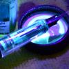
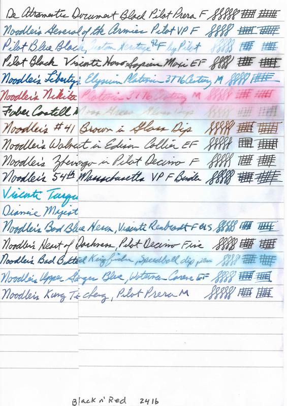
I use my fountain pens at work daily. I've had too many encounters with spills and drips on my notes to make me wary of what ink I use. One event, in particular, stands out for me when I wrote something down on a piece of paper for someone to refer to. Later, I saw the note on his desk. He had dripped some water on it, and the ink had run all over the place, not even legible! Embarrassing. It's one thing to be retro and insist on using my fountain pens at the office, but it's another when it affects the quality of the work product. So, I've been on a quest to find inks I can use reliably for work and not worry about accidents happening to destroy the writing. I have quite a lot of inks in my collection. with even more samples. I selected some inks that I've been using lately along with a couple I like, but have had bad experiences with their lack of water resistance. I use a lot of Black n' Red notebooks at the office, along with copy paper. I also wanted to compare performance with a premium paper, so I selected Rhodia. The tests consisted of generating a baseline for the three papers and 18 inks. I scanned the images at 600 dpi into jpeg files. They were later down-converted to lower quality jpeg to come in under 1 MB file size. I cut each sheet into two pieces - a control and a test side. After each test, they were scanned with the control and the test side together to provide a good comparison. The first test consisted of pouring a stream of water over the paper for a few seconds and then allowing the paper to dry without touching it. This simulated a spill at work and represents my biggest concern. The second test was for permanence. It was an 8 hour soaking in a water bath with some agitation to slough off any loose ink to see what actually remained behind on the paper. I'm posting the two test results and not the original because each test has its own control side to compare with. There are several ink brands that make water resistant inks. I've posted scans of some others previously (including Platinum). These are the inks I've been using lately as I've narrowed my preferences. One factor I've been looking for is quick drying inks so I can write and quickly turn a page without it transferring to the contacting sheet. A lot of permanent inks tend to dry slowing. The fastest drying permanent inks I've found are the DeAtramentis Document series of inks. The negative to these are that they soak in fast and feather a lot on cheaper paper. It's always a trade-off between dry time, permanence, saturation, and smearing. That's why I have so many inks. No one ink solves all problems. If I had to pick one ink to use exclusively, it would be Noodler's 54th Massachusetts. It drys relatively quickly, doesn't smear after a few minutes drying, and is really permanent with no wash off in spills. It's also a nice blue-black color. A close runner-up is Pilot Black. Dries really fast, well-behaved in all pens, and after a light wash off, leaves behind a very permanent residue. Papers tested: 24 lb Black n' Red, Rhodia 80 gsm dot pad, Xerox 24 lb copy Inks tested: DeAtramentis Document Black Diamine Majestic Blue Faber Castell Moss Green Pilot Black Pilot Blue Black Noodler's General of the Armies Noodler's Liberty's Elysium Noodler's Nikita Noodler's #41 Brown Noodler's Walnut Noodler's Zhivago Noodler's 54th Massachusetts Noodler's Bad Blue Heron Noodler's Heart of Darkness Noodler's Bad Belted Kingfisher Noodler's Upper Ganges Blue Noodler's King Te cheng Visconti Turquoise Black n Red after simulated spill: Rhodia 80 gsm after simulated spill: Xerox 24 lb copy after simulated spill: Black n Red 24 lb after 8 hour soak: Rhodia 80 gsm after 8 hour soak: Xerox 24 lb copy after 8 hour soak:
-
Noodler’s Ink is introducing a new 308 refillable ink cartridge. It fits both the Noodler’s Ahab and Neponset (with the white section insert). The cartridges will be available in a 10 pack, MSRP $10.00. Nathan has a video with the details and it includes a brief history of the ink cartridge. Who knew its roots traced back to the American Civil War, some 150 years ago?
-
Another UK exclusive from Noodler's - BREXIT! Available from Niche Pens/Pure Pens here in the UK. A smashing bullet-proof ink which is a deep/royal blue, possible with slight purple undertones. It reminds me a little of a 'dark' Diamine Imperial Blue or J Herbin's Bleu Nuit. Here's what Ross and his team say: New and exclusive Royal Blue/Purple Bulletproof Ink in 3 oz glass bottle (Approx 90ml) Nathan Tardif is a follower of world politics and current affairs, with a soft spot for the United Kindom. When the UK made the momentous decision and voted to leave the European Union, Nathan had the idea of making an ink to mark this event. A tongue-in-cheek label suggests that the UK have come around to the idea of independence from a sovereign ruler in another country, much like their own former colony did a couple of hundred years before! Incidentally, there's a lovely little story on the label which I'll type here. 'An Apology to His Majesty, King George III of The United Kingdom. We humbly regret that at long last we have come to agree with the rebels in the colony of Massachusetts that liberty is worth the risk of defiance to all the powers of the sovereign (particularly the bureaucrats in Brussels). So humbly and regretfully sorry about this, but we do send good wishes. The ink is royal purple, eternally bulletproof and pH neutral so as not to risk further offence to His Majesty.' Note: not my political views, one way or another - just what's written on the label! It's a nice ink but a little prone to a bit of feathering on some papers. As usual. the written review is on Rhodia 80g/m2 and the soak tests are on 'indifferent' paper. Soak test before... ...and after: 30 minutes soak followed by a rinse. I like this ink more than Monkey Hanger, as it is a deeper colour. It will make a nice change to Prime of the Commons!
-
Another new Noodler's ink, exclusive to Pure Pens, in the UK. I won't go into great depth but see my review here. It's a nice ink and well worth considering. I've yet to see the Brexit or Britannia's Blue Waves, but I'll review these when I can.
-
Announcing one of the new Noodler's inks - Monkey Hanger! Also exclusive to Pure Pens in the UK. It's the first of the ones that I've seen 'in the flesh' but hope to get the others on due course. Ross and the team do a far better job of describing the reasons for the name than I could so here is what they say. New and exclusive Bright Blue Bulletproof Ink in 3 oz glass bottle (Approx 90ml) In October 2015, Ross and his father Ray, visited Nathan in Massachusetts to see where Noodler's is made and the man behind the brand. Over lunch, with Nathan's parents, who help with the ink production and packaging, we discussed a new Bulletproof Blue ink for the UK to compliment the best selling Bulletproof Black and exclusive Prime of the Commons Dark Blue ink. We tried colours that would give the right characteristics and loved the bright Blue that has become Monkey Hanger. The name... Nathan is a history buff and loves a story behind a name - You may have seen the great names behind some Noodler's inks and pens with a their historical, political and local links to his home town area. An unusal story came up, which occured in Hartlepool in the North East of England during the Napoleonic Wars. A french ship was wrecked off the coast and all the crew were lost (or fled). When the local fishermen boarded the ship, they found a monkey in a naval uniform, dressed as such for the amusement of the French crew. Because England was at war with France and because the fishermen had never seen a Frenchman, or a monkey apparently, they took the 'French Spy' into custody and arranged an impromptu criminal trial on the beach. Extremely unfortunately for the monkey, the locals found it guilty and sentenced it to... well, the name gives the end of the story away. A very sad casualty of war, but it is unfair to criticise the ignorant locals from a different time in history. The story is so unusal that it ignited Nathan's interest and he began imagining label designs almost immediately. A few short months later, the ink arrived and is available now! And here are my scans, in my usual, basic style. As you can see, a slightly finer line makes quite a difference, even though they are the same nib width - Fine - in theory, by the same manufacturer. Personally, I prefer the 580 F over the Vac 700, but that's by the by. There's a bit of feathering with the wider nib but as the back view shows; the only real bleed-through was from Baystate Blue. Now for the soak tests. Firstly; before. And now, after 30 minutes soaking and then a rinse. I was actually surprised at the excellent result from Diamine Asa Blue! Of course, Noodler's Midway Blue is not designated 'bulletproof' as such, but doesn't do too badly. All in all, a very satisfying ink and I'm sure I'll enjoy the Brexit and Britannia's Blue Waves, when I get some.
-
This one I might get... like the dusty purple... don't care for the Fast Drying properties.. You can find it at PurePens.co.uk.... Don't know if it is exclusive to them. http://purepens.co.uk/acatalog/AmericanAristocracy.jpg
-
Another Blue... Exclusive to PurePens.co.uk !!!!!! This one is BulletProof to boot.. http://purepens.co.uk/acatalog/Brexit.jpg
-
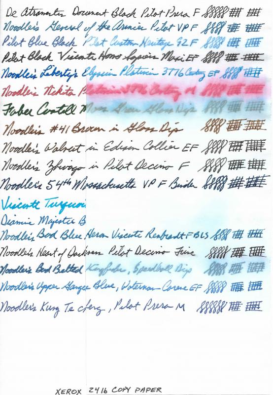
Hello! Craig here from Orange County California! I am extremely new to the world of fountain pens but I found it in a really cool way. When I was young, I had a family friend who gave me unique Christmas and birthday gifts. I received a LeBoeuf pencil one year and the next was a sterling silver dip pen. Unfortunately, he passed away in 2008 from a long battle with lung cancer. He was a world traveler, and hailed originally from Portugal. Now 8 years later we are still finding things he collected. Digging around in an old box, I pulled out 3 pens. A green Celluloid Pelikan 400 from the 50s, an all stainless French made Waterman, and a mid-70s Sheaffer. This was on July 25th. Now just a few weeks later, I have a TWSBI Mini, a Noodler's Konrad, a Vintage Conklin Glider, and have just picked up a Waterman's 52 1/2 V! I feel like I am just getting started and at 28 years old, I have tons more collecting to do! I look forward to learning as much as I can from this community! Attached is all of my pens/pencils. The 1935 Mickey Mouse pencil was also in that box! Hope everyone has a great August! Cheers! -Craig
-
We just got in 5 new Noodlers Neponset ebonite colors: https://www.penchalet.com/fine_pens/fountain_pens/noodlers_acrylic_neponset_fountain_pen.html Battle of the Wilderness ~~~~~~~~~~~~~~~~~~~~~~~~~~~~~~~~~~~~~~~~~~ Chickamauga ~~~~~~~~~~~~~~~~~~~~~~~~~~~~~~~~~~~~~~~~~~ Manassas ~~~~~~~~~~~~~~~~~~~~~~~~~~~~~~~~~~~~~~~~~~ Seven Pines ~~~~~~~~~~~~~~~~~~~~~~~~~~~~~~~~~~~~~~~~~~ Shiloh
-
Hi All, Fountain pen newbie here with some questions on ink. I am experiencing bleeding on inks that most people do not have bleeding problems with. Specifically, Diamine Majestic Blue, De Atramentis Magenta Violet and Rohrer & Klingner Cassia. I am using a Leuchtturm 1917. I have read different articles about dilution but several ink reviews for these inks do not mention any bleeding problems. I have added a photo of the reverse side of a Majestic Blue list and a ink sample page. When I first started using Noodler's Black, I had problems with "ink transfer" (not sure if there is a term for this). Dried ink on one page A would transfer to another page B (Page A and B are faces of a notebook A|B where | is the spine) when I wrote on the reverse side of page B. A little dilution got rid of this problem but the problem comes back when the ink starts to dry. Using ink seems pretty intuitive... Take ink from bottle, put in pen, write. Am I doing this wrong? Why am I having so many problems? Should I be diluting all of these inks? I know Rhodia paper handles ink better but I would like to find a solution that works with the Leuchtturm -- which should still be able to handle fountain pens! Thank you!!!
-
Noodler’s is one of the companies that don’t need any introductions. Nathan Tardiff is a legend and his work is well known by fountain pen and ink afficionados. Not everyone is crazy about Noodler’s inks but I enjoy most of the ones I’ve tried so far. Dragon Napalm is one of the inks with greatest names ever (first place goes im my ranking to J. Herbin’s Poussiere de Lune). When it comes to ink it’s quite peculiar. Retailers classify it as orange but if it’s orange it’s one of the strangest oranges I’ve ever seen. It leans strongly toward pink but it’s not pink. To my eyes it’s not orange either. It’s something strange and unspoken in between. Sure thing is it’s not the kind of color you would expect a Lawyer to use in his everyday work – it’s bold, saturated and vibrant. Also the sample I’ve received contains some kind of “metallic” chunks I’m not able to identify. They’re visible on Ink Splash. The ink behaves wellon good quality papers, on cheaper ones it can cause moderate geathering and show-through. Drying times are rather reasonable – 3 -10 seconds depending on the pen / nib / paper you use. There’s now such issues on good papers (Rhodia, Clairefontaine, Leuchtturm1917, even on Lyreco Budget 60 mgsm which is surprisingly nice paper). Ink Splash Software ID Tomoe River, Kaweco Classic Sport, Broad nib Leuchtturm 1917, Kaweco Classic Sport, Broad nib Oxford, Hero 5028, stub 1,9
-
Noodler's Air Corp has long been one of my daily use inks for work. I love everything about it, except that it is just slightly too green for my taste. Then I noticed that when flushing my pens, the flushed-out waste water with diluted ink in it looks bluer. Hence, I would like to try diluting it. My question is: To what extent can Noodler's Air Corp be diluted before its behavior (flow, wetness, lubricity, tendency to bleed or feather, etc.) changes noticeably? Can I go to a 1:1 ratio of water to ink and still get good performance from it? Can I go even more dilute than that? And a side question - I have heard reports that recent batches of Air Corp are noticeably bluer than batches from previous years. Is this true? The bottle I'm currently using is from an old ink-hoard I bought and stored since mid-2014. If the current year's production is bluer than the 2014 batch, maybe I'll like it even more
-
New and exclusive Bright Blue Bulletproof Ink in 3 oz glass bottle (Approx 90ml) at PUREPENS.CO.UK !!! In October 2015, Ross and his father Ray, visited Nathan in Massachusetts to see where Noodler's is made and the man behind the brand. Over lunch, with Nathan's parents, who help with the ink production and packaging, we discussed a new Bulletproof Blue ink for the UK to compliment the best selling Bulletproof Black and exclusive Prime of the Commons Dark Blue ink. We tried colours that would give the right characteristics and loved the bright Blue that has become Monkey Hanger. The name... Nathan is a history buff and loves a story behind a name - You may have seen the great names behind some Noodler's inks and pens with a their historical, political and local links to his home town area. An unusal story came up, which occured in Hartlepool in the North East of England during the Napoleonic Wars. A french ship was wrecked off the coast and all the crew were lost (or fled). When the local fishermen boarded the ship, they found a monkey in a naval uniform, dressed as such for the amusement of the French crew. Because England was at war with France and because the fishermen had never seen a Frenchman, or a monkey apparently, they took the 'French Spy' into custody and arranged an impromptu criminal trial on the beach. Extremely unfortunately for the monkey, the locals found it guilty and sentenced it to... well, the name gives the end of the story away. A very sad casualty of war, but it is unfair to criticise the ignorant locals from a different time in history. The story is so unusal that it ignited Nathan's interest and he began imagining label designs almost immediately. A few short months later, the ink arrived and is available now! Love me some NEW ink..
-
Noodler's is one of the companies that don't need introductions. Nathan's Tardiff work is unimaginable. The guy must be a vampire who doesn't sleep and feeds on developing ideas: new inks, new pens. Rachmaninoff is part of Russian inks series. I've received the sample some time ago from Amberlea but I was afraid to try it - retina searing pink tried to scary me every time I reached for the sample. Recently though I've finished almost all my samples. Among the few left there was this crazy intense pink. I've decided that it was time and filled my Kaweco with it. In the beginning the ink wrote nicely, but after some time in the pen it caused clogging and Kaweco wouldn't start at all. I checked the nib and feed ant they were coated with a filmy layer of pink. This ink wasn't created for use with good pens - if you - for some unimaginable reason - enjoy the color and need permanent pink (permanent pink - why would anyone need that?) use it with Platinum preppy. Ink Splash Drops of ink on kitchen towel Software ID Tomoe River, Kaweco Classic Sport, B Leuchtturm 1917, Kaweco Classic Sport, B
-
One of my all time favorite colors is Red/Black (dark maroon) so when I saw this Rattler Red online I had to pick up a bottle. It's pretty close in color to Diamine Red Dragon but the rattler has more "black" in it than the red dragon. The printer paper I used for the form didn't allow for as fast of a dry time as some of the paper I use more regularly so I'll update a paper comparison later on. My only complaint about this ink is how it dries in the pen fairly quickly, so it's definitely an ink you would want to use in a daily pen. http://imgur.com/F0f6PEL
-
Do you ever visit those inks that you have hidden away in some drawer for a long time? Has your opinion changed? I have traveled back to my home after been gone for many months, and have been reunited with my ink collection here. I had forgotten, however, my ink sample collection here. I decided to fill my fountain pens with the ink samples that I had left here and compare my thoughts recorded in my "ink journal" from the first time I sampled the ink with my thoughts today. For the sake of brevity, I will omit pens and papers used, since they are the same for both samples. I also rate my inks on a scale of 1 to 10, with 10 being the best. For my first batch, I compared five J. Herbin inks: J. Herbin Bleu Pervenche: First Sample: April 2013: Wonderful ink with fantastic flow in all pens used. Moderate drying time. Little water resistance. Great shading and has a lovely red sheen to it. Love the color! Rating: 7 Today's Sample: Wonderful flow in this medium point on both papers. The color is very nice and is definitely one of my favorites. I love the shading and sheen, especially on Tomoe River paper. I am ordering a bottle today! Rating: 8 J. Herbin Rose Cyclamen: First Sample: February 2015: Vibrant but pretty pink. Flows nicely. Moderate dry time, no water resistance. Doesn't shade much. Rating: 7 Today's Sample: Nice flow in this medium point on both papers. The purply-pink is almost eye searing, and would be great for markups and writing cards. I have other inks near this shade so I don't need a bottle of this now, but will consider for the future. Rating: 7 J. Herbin Eclat de Saphir: First Sample: February 2015: Nice blue with a purple tone - definately my kind of blue. Moderate dry time, no water resistance. Rating: 8 Today's Sample: How have I overlooked this ink? I love it! The color is brilliant, yet elegant. While I have other blues in this shade, I am ordering a bottle of this today! Rating: 9 J. Herbin Rouge Bourgogne: First Sample: August 2014: Nice red with blue undertone. It dries fairly fast, with no smearing. I like the way it shades. It flows well through this nib. Rating: 7 Today's Sample: Nice red with lovely shading. No sheen, however. While I like the red, I have others that I prefer but I may reconsider when I buy my next red. Ratiing: 7 J. Herbin Terre de Feu: First Sample: June 2015: Fascinating color - fire earth. Love the rusty brown hue. Has some shading, but no sheen. I do like the way this flows through my pen. I'm not a huge brown fan, but I like this. Rating: 8 Today's Sample: Wow! I had forgotten all about this ink. This is an unusual color with a warm feel to it. I like the way it writes best, though. Most browns are a bit dry, but this seems to flow easily through my nib. I don't need a brown in this shade right now, but this one will top the list for my next brown. Rating: 8 More to come!