Search the Community
Showing results for tags 'namiki'.
-
Love beautiful Maki-e writing instruments? So do we! Sign up to receive our latest blast which includes all our available Maki-e writing instruments from Classic Pens to Vintage Pilot-Namiki. You will also be notified when a rare limited edition is available! Let us help you find the next addition to your collection! All you have to do is email orders@airlineintl.com, let us know you would like to sign up for our Blast lists and we'll send you our latest one! If you have any questions please feel free to contact us directly on our toll free # 855-565-1818.
-
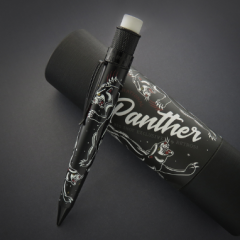
Chinkin is a technique where a special set of very fine chisels are used to carve a pattern or design into layers or urushi (lacquer). The indentations are then rubbed with sticky urushi and gold powder or foils are placed over it to fill in the marks made by the chisels. Sometimes colored urushi powders might be used instead of gold. Once they are applied the pen is often cleaned by a Japanese paper called washi. Traditionally much of this art originated in Waijima starting around the 13th century, but today it is produced in many Japanese prefectures and even other countries like China. As this is a carving technique at its heart, there is little room for error so quality work often takes many focused hours to complete. Doing some research, I came across the Danitrio website that lists 5 chinkin techniques: 1. Ten-bori (carving by point): The size of points could be as small as only 0.1mm, and it is the only way to make the surface for the design by chiseling points one by one. 2. Ten-bori no Bokashi (Gradation of point carving): Reducing the chisel points and changing the space between the points to make the design with gradation. 3. Ten-bori no Henka (Variation of point carving): To push (Tsuki-nomi) or draw (Hiki-nomi) the chisel from a point to carve various short lines in a small space. 4. Suji-bori (Line carving): Short or long, straight or curved lines can be carved by skillful craftsmen. 5. Katagiri-bori (Carving sharp curved or angle lines): Use a special chisel to carve strong contrasting lines. I find any of these techniques can yield some very stunning results. I would like for anyone with pens decorated with the chinkin to post some photos in this thread and share any thoughts on the art form – whether you like it or not. If you can add more nuances to the history of the art, please do so and we can make this thread into a learning opportunity.
-
I have three Pilot Bamboos -- silver, black, and maroon (if that's what they call it.) I've noticed on two of them, the nib reads "Pilot," but on the third "Namiki" (I can't remember which of the pens it came from, as I switched the nibs around a little many years ago when I got them.) The nib/feed/sections are identical on all three except for the names engraved on the nibs -- in fact, the Namiki nib and one of the Pilots are both F, so you can't get closer than that. The caps on all three pens read "PILOT." Obviously, Pilot and Namiki are the same company, but this seems very curious to me. Thoughts? I confess part of this is my wondering if I'll have a problem with the value of one if I want to sell them all someday, but mostly I'm just interested -- including for future reference if and as more Pilots might come my way. Thanks!
-
Hi Guys, I have a question about Japanese design, i.e., what do Japanese people actually like in a pen? I'm getting more and more interested in Japanese design and from what I can see, there seems to be a certain "dicothomy" in design styles, not just in terms of pens. In a way, it seems to me that there is something that we "Westerners" like and associate with Japanese design, namely, the minimalist-looking, Zen-ish stuff such as this, this, or, to stay in the field of pens, this, or, more broadly speaking, this kind of aesthetics. This seems to be reflected in a lot of high-end Japanese pens, such as Nakayas, Hakase, the Namiki Emperor series, the Sailor King of Pens, and pretty much everything that is urushi-coated or maki-e: very minimalistic design, maybe with highly elaborated decorations, but on very plain background. We're all quite familiar with this kind of aesthetics from movies, books, and of course, drooling over pictures of amazing urushi pens that most of us probably cannot afford. I'll call this the "Samurai" tendency. However, my theory is that this is probably not what Japanese people really like/want/seek. This is because if one looks at what Japanese companies offer in terms of mid-to-high-range pens (i.e., below the level of things like the Sailor KOP or the Namiki Emperor, but within the range of what most people can probably afford), it's hard to stumble across anything minimalistic/Zen-ish: look at the range of Pilot customs, or Sailor's pens. Everywhere one sees a lot of gold hardware, a clear reference to Western pen design, re-interpreted in a form that remains rather unique, without the ostentatious design of, say, a MB 149, an Omas or a Pelikan M800: Japanese pens tend to be smaller (probably only the larger Pilot Customs or the Platinum President can compete with the MB 149 in length), very rarely show off their logos, and sometimes have rather "kitsch" details (such as the new clips on Sailor pens or the clip of the Platinum President, or the cap band on the Sailor king professional gear) or use colour combinations that are either long out-of-fashion in the West, or are of questionable taste to say the least. I'll call this the "Businessman" tendency. So, considering that... - The current Japanese aesthetic seems to be more oriented towards the post-modern (and the Kawaii) style than the traditional styles usually associated to Japan; - There are probably 1.000 "businessman" Pro Gear with their kitsch cap band sold for every super-elegant minimalistic "samurai" Namiki Emperor Urushi, even though... - ... minimalist/"Zen" design is not necessarily more expensive (quite the opposite: look at LAMY!) and could therefore be easily used on mid-to-high-range-end pens; urushi is not always needed, after all; - There seems to be a lot more variety in the design of mid-to-high-range pens, looking at least at the experiments done by Sailor on their Sapporo/Pro Gear lines; - Maki-e coated pens were initially popularized by Dunhill for the Western market; - Companies such as Danitrio and Nakaya that clearly target primarily the non-Japanese market specialize in "Samurai" design; - The pens in maki-e and urushi seem to have boomed in the period of the Japanese economic stagnation after 1991, when the internal market contracted and manufacturers had to look for alternatives; ...I tend to believe that a Japanese person would probably prefer something like a Pilot 845, with its 6 (six!) gold rings, than a plain Sailor KOP, regardless of the price, and probably sees our beloved "Samurai" pens as something that "only foreigners like". I'm talking here of what people like, not what people can afford. After all, if the "Samurai" style really were the "best" in terms of tastes in Japan, shouldn't we see a lot more pens being offered in minimalist designs? Shouldn't we see Platinum, Sailor and Pilot behave more like Lamy or Faber Castell, with their cheaper, affordable Studio or Ondoro lines? Maybe I'm just talking nonsense, but I'd love to hear what you think about this (especially if you are Japanese or live there). Cheers, Fabio
-
Working with my Namiki SM Falcon and getting into the mindset for my next short story. http://imgur.com/SCysc4s I so love these pens
-
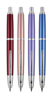
Hello everyone, After a long wait Pilot is now bring the Decimo to the US This is so exciting!!! We will be taking pre orders to place your pre order by sending us an email or give us a call. Support@penboutique.com 1800-263-2736 or 410-992-3272 The Vanishing Point Decimo brings a new level of contemporary artistry to the Vanishing Point family. Redesigned and refined with a slimmer and lighter weight barrel, this fountain pen features brushed metallic lacquer finishes in combination with the classic Vanishing Point elements. The new line features four stunning finishes available in Burgundy, Champagne, Purple and Light Blue. Immerse yourself in a svelte and luxurious writing experience. Comes with an 18k nib and the point sizes available will be exfine ,fine and medium.

-

Seeking Reputable, Cost Effective Repair Of Namiki Vp Nibs
aliasmissferkit posted a topic in Repair Q&A
Hi, all, I'm new to this site, having lurked for years...not finding a way to search the forum archives, so forgive my starting a new thread on a topic likely answered before. I have 3 Namiki Vanishing Point nibs, tines in varying degrees of bent-ness, all victims of my ceramic tile floor (and my clumsy fingers). Pilot informs me that they do not repair bent nibs, and cannot refer me. New nibs are $70. So: whom would you recommend for reputable, cost-effective repair? Thanks in advance! -

Vanishing Point Question: Vp Xf 18K Nib Vs Fine Special Alloy Nib
civil posted a topic in Japan - Asia
Vanishing point question: anybody tried/owns an extra fine 18k nib and fine special alloy nib? How do they compare in terns of small writing and scratchiness/smoothness? Some people discouraged me from getting an alloy pen as being too dry compared to the 18k, but the fine nib 18k seems a bit too wet for some uses, after initially being rather dry for a week or two. Since the alloy fine has been described as rather dry, I was wondering whether it might be better than an extra fine 18k for my purposes (smoother yet smaller writing is the goal). A wet writer defeats that purpose. -
Hello my name is jonas I live in Paris and I am looking to buy a namiki yukari or a namiki emperor in black or vermillion. The pen nib is not important. If anyone want to sell, please contact me. Thanks ! Jonas
-

The New Namiki Metropolitan Retro Pop Line Will Be Here In November!
PenBoutique posted a topic in The Mall
The new very colorful Pilot Namiki Metropolitan Retro Pop line will be here in November!! This line includes Fountain, ballpoint, and rollerball pens!!!
-
Fountain Pen Survivor: The Quest For The Perfect Every Day Carry Pens Under $100
Betweenthelines posted a topic in Fountain Pen Reviews
Introduction My journey began on a fateful day a few months back when I finally hit my limit with using crappy pens. I was so fed up, in fact, that I began an obsessive quest to find the "perfect pen" to accompany me through the rest of graduate school, a job that requires progress notes, journaling and (hopefully when I have time to breathe) letter writing. This search inevitably landed me in your midst, where I was confronted with a well of pen knowledge I had hardly fathomed, and a den of insidious enablers who would spurn a new addiction. (I'm looking at YOU) And addiction it became. As I researched and learned and spiraled into the fountain pen abyss, my ebay account began blowing up and my bank account swiftly drained. I wanted to find the best starter/every day carry pen for me, so of course the logical thing to do was to buy all of them! And once the dust had settled and I sobered up enough to clear the kitchen table of pen paraphernalia and scrub the ink off my fingers, I had to make sense of it all. Yes, I thought, perhaps there are those who can learn from this experience. OK. Melodrama aside, I figured that perhaps I could contribute a little something to this community for those who also have OCD and are new to "the scene" and are looking for the "perfect" EDC pen. Of course, it all comes down to personal preference and fit, so in the end everyone must embark on their own journey down fountain pen lane. And then there's the unfortunate fact that "perfect" is an illusion and that every time you think you've bought your last pen there's another one right around the corner, waiting in the shadows, ready to sabotage your delusion of fiscal responsibility, and the cycle continues until you find yourself drawing spirals in the ground of a padded cell muttering to yourself.... but hey, at least the spirals have some nice flex to them! I digress. Bottom line: maybe I can help folks narrow down their choices. Bear in mind this is not meant to be all inclusive by any means, more so just a random smattering of pens that fell into my lap before I found a few I really liked, which I will briefly compare here. My Criteria 1. Under $100 · This wasn't really premeditated, it just ended up this way. Somehow I justified spending hundreds on pens as long as each individual pen didn't go over $100. Ok then! At least my strong sense of denial is satisfied! This includes used prices. 2. Suitable for Every Day Carry · This one was really difficult to stick to. I caught the "collecting" and "vintage" bugs very quickly and had to stage an intervention on myself to stop. I reminded myself that a: I'm a broke grad student who really just needs “on the go” utilitarian pens, and student loans are not, in fact, monopoly money, and b: I am going to be traveling and not settling down any time soon, so starting a collection of pens that will sit in a storage unit is silly at this point in my life, and the ones I keep need to be able to travel with me. 3. Larger and/or Heavier Pens · This also wasn't premeditated, but ended up being the result of me figuring out exactly what I like and don't like in pens. I have large hands with long fingers, so small and/or light pens don't settle well in my grip. There have been exceptions (especially in the "light" category) but overall these preferences might differentiate me from many readers. The Pens Modern Pens 1. Lamy Safari Appearance: 7 Nib & Performance: Variable – 7 for my EF, 9 for my F, 10 for my 1.1 Design: 10 Filling System & Maintenance: 7 (with converter) Construction & Quality: 8 Cost & Value: 10 Weight & Dimensions: 9 Conclusion: 9.5 What can be said about the Safari that hasn’t already been said? Between the easily swappable, butter-smooth nibs, the intuitive design that results in a light, comfortable writer that never skips and always flows even when left uncapped, and a durable and no-brainer maintenance pen, what’s there not to like? OK, some folks don’t like being put into a box when it comes to the grip section, and I personally prefer the more classic look when it comes to fountain pens so the Safari isn’t what I’d call a “beautiful” pen, but it gets the job done. Makes the EDC cut? YES I was originally planning on grabbing an Al Star, but really liked the texture of the matte black Safari – has that satisfying rough-but-smooth feel to it that lends aid to gripping it. While this pen is certainly light, it is rather large and long, and fits and balances nicely in my hand. The converter is a must to open up the world of bottled inks, and with that and a range of nibs – there’s really no reason to not have one of these lying around. Of note – the 1.1 nib in particular is amazing – utterly smooth and transformed my writing for the better with some nice line variation and expression. I take this pen with me every day and am never worried about whether it will write well or if I’m going to damage it by banging it around. My only gripe besides the QC on their nibs is the small capacity of the Safari converter, but it’s a minor gripe. Call me converted to the cult of Safari/Al Star. 2. Pilot Metropolitan Appearance: 8 Nib & Performance: 9 Design: 8.5 Filling System & Maintenance: 7 (with converter) Construction & Quality: 8 Cost & Value: 10 Weight & Dimensions: 8 Conclusion: 9 The Pilot Metro is the pen I would give to someone as an all around representation of a quality entry-level fountain pen. It’s got a subtle, classic design, an incredibly smooth and wet nib, a lovely balance and weight, and it just feels high quality despite its dirt-cheap price. Pilot certainly could have charged a lot more for this pen and I would have been happy to pay. The downside is the pilot converter situation with its small capacity, and the fact that it only comes in one size (M) with little room to customize unless you swap nibs from other pens. Makes the EDC cut? YES I love the Metro. I recommend it to pretty much everyone. It’s just a great pen at an amazing price level. The nib is buttery smooth and produces a consistent, wet line, it’s got some heft to it so it sits well in my hand, and it’s just a pleasure to write with. I have found, however, that I’m not as drawn to write with it as I am the Safari and it often sits unused in my briefcase. It’s just not as interesting of a pen as the Safari, and I like the grip and length of the Safari and the finer nib sizes and stubs. I will be purchasing a Plumix to swap its stub nib onto the Metro, and see if I can work it back into my regular rotation. 3. TWSBI Mini Classic Appearance: 9 Nib & Performance: 7 Design: 9 Filling System & Maintenance: 9 Construction & Quality: 8 Cost & Value: 8 Weight & Dimensions: 6 (for me) Conclusion: 8 This pen is a little badass. TWSBI has become associated with a big bang for your buck, and for good reason. A solid piston filler with swappable nibs and easy customization that will fit in your pocket and is nicely posted that costs around $50? Awesome. I LOVE the look and design of this pen. It’s just so freaking cool and NIFTY. My main gripe besides the fit is that the fine nib I had did not impress me. It wasn’t bad, but it wasn’t anything to write home about either. I would definitely recommend some custom nib work or a nib change. The other gripe and the deal breaker for me, which I realize is a personal issue as a lot of folks love this pen, is the balance and weight did not work well for me. I have also heard about issues around the quality of materials and the plastic cracking, though I did not own mine long enough to experience those. Makes the EDC cut? NO I really really wanted this pen to work for me. So much so that no matter how sure I was it wouldn’t work for me I kept coming back to try it again. However, I have very large hands with long fingers, and the bottom line was it just didn’t fit well for me. It didn’t balance well in my hand, and because of that, the lightness of it made it slip around in my grip. I found that I had to grip tighter and tighter to hold on to it which led to sweaty fingers and even more slippage. Just wasn’t a pleasant writing experience. A little too small and too light for my tastes. I think for many, though, this can be the EDC pen. You’ll just have to try it for yourself. 4. Namiki / Pilot Vanishing Point (used) Appearance: 9 Nib & Performance: 9 (for my F) 10+ (custom ground) Design: 10 Filling System & Maintenance: 7 Construction & Quality: 10 Cost & Value: 9 Weight & Dimensions: 9.5 (for me) Conclusion: 9.5 Ah the illustrious VP. OK, so yes, this is cheating as the VP exceeds the $100 price mark (at least the versions with the 18K nib), but I picked up a VP on a whim used for $75. Honestly, I wasn’t expecting much. The whole capless click fountain pen thing seemed like it could be a big gimmick. Oh how I was mistaken. More and more I am finding that Pilot = consistently high quality. This pen is really “all that” and more. An incredibly innovative design that works and works well without sacrificing any quality in materials, a very nice nib (as pilot’s tend to be), wonderful weight and dimensions (for me – I love the extra heft, and the clip location I like as a grip aid and guide for keeping the point straight)… if you like modern fountain pens at all, you just gotta try this pen at some point. The filling system is a little lacking, using either a pilot converter or refilling cartridges by syringe, but hey, you can’t have –everything- in one pen… (or can you?). I will say though that I wrote a long letter to a friend and started to feel the pen’s weight as a possible detractor for the first time, so if you tend towards light pens this may not be for you. Makes the EDC cut? YES The ability to click a pen and have a lovely fountain nib come out might seem trivial, until you carry it around with you and use it in action. You can’t really beat this as an “on the go” fountain pen, whether for signatures or for impromptu longer writing sessions. Add a custom ground nib by a reputable nibmeister and you’ll be hard pressed to be wanting for anything in your pen. This pen balances very well for me in my large hands, and again I really like the weight of it. I love the Fine nib that came with my VP – a true Japanese fine that's finer than western EF's – with the preciseness of the point and those thin lines it just feels… tantalizing. However, I wanted a more versatile nib in addition and I took my VP to the next level after installing a custom ground Medium stub-italic by Pendleton. I now have a full on love affair with this pen. So much so that I’ve bought another (this time matte black), and will be putting a Binder CI in it this time! Modern Flex 5. Noodler's Konrad Appearance: 7 Nib & Performance: 8 (when it works) Design: 6 Filling System & Maintenance: 7 Construction & Quality: 2 Cost & Value: 7 Weight & Dimensions: 7 Conclusion: 4 What I will say about the Konrad is – great idea, poor execution. A modern flex pen that –really- flexes that’s cheap and customizeable? Yes please! I recognize that this pen was “made to be tinkered with”, but there is a fine line between “needs tinkering” and “bash my head against a wall in frustration”. When I first took it out and attempted to pull the back cap off to access the twist nob for the filling system, the cap, nob, and stem that leads down to the plunger came with it. Looking closely at the internals, I could tell right away that this was a CHEAPLY made pen. Also, a pen should work. Mine dripped from the feed and I could not, or perhaps I simply did not have the patience to, remedy it. Makes the EDC cut? NO Bottom line: I love Noodler’s ink, and I love the idea behind this pen, but I found the reality of it to be an incredibly low quality, frustrating pen that smells like vomit (yes, vomit), and not worth my time. Even if it worked perfectly the smell alone made me want to toss it. Back to the drawing board with this one. Vintage Pens 6. Parker 45 Appearance: 9 Nib & Performance: Variable, overall 8 Design: 9 Filling System & Maintenance: 8 Construction & Quality: 8 Cost & Value: 9 Weight & Dimensions: 8 Conclusion: 8.5 I have a huge soft spot for the 45. It’s a classic, it’s my favorite thin pen, and one of my favorite vintage pens. It’s not fancy by any means, but I just love their look and design. I binged on collecting a number of these very quickly right off the bat. Each one has had its own personality, and the nibs have been variable in their writing, but overall if I had my druthers I’d own about 50 of these. They’re light, well balanced, durable, easy to clean and maintain, as well as swap nibs, and like most Parkers, they just work! The squeeze filler is.. well... let’s just say it’s “classic” as well. I didn’t have a heart to rate it low because it really does its job well for this small but mighty pen. Makes the EDC cut? NO (barely) The 45 is a perfect pocket carry vintage pen. I have, however, sold off all of my 45’s save for the first one I bought. The reason being? I just don’t see this pen being in rotation as my EDC when I have my other modern pens as options. This is partly because of the fit, it being a thinner pen than I like, but also because, to be honest, functionality-wise, as well as quality of materials-wise, my modern pens offer more, with better quality plastics and metals, easily gained nib sizes (especially stubs and CI’s, which I am obsessed with now), higher ink capacity, and an overall more comfortable writing experience. But, again, I love the 45. And having a vintage 45 in one’s shirt pocket is so much cooler than having a modern (save for maybe the VP). 7. Parker 21 Appearance: 7 Nib & Performance: 9 Design: 8 Filling System & Maintenance: 8 Construction & Quality: 7 Cost & Value: 9 Weight & Dimensions: 7.5 Conclusion: 7 I know the 21 is the red-headed stepchild of the Parker line, but this was a $4 pickup at the flea market and I’ll be damned if wasn’t one of the most buttery writers I have ever experienced. It seems to me this is the cheaper version of the legendary 51, and I gotta say, cheap or no this pen writes and works great! Quality may be a little lacking (I’ve heard about issues in cracking), and it was a bit too light for my tastes, but it’s still a fine writer, and that’s the most important part, eh? No need (or really ability) to dissemble, piece of cake to clean and maintain, simple squeeze filler. Parkers are really no-brainers that do their job well. Makes the EDC cut? NO “I’m just not that into you” would be phrase here. This pen could make a great EDC. It never skipped or had trouble starting (the hooded nib does wonders for functionality), wrote buttery smooth, no leaking issues, and was light as a feather. However it just didn’t jive with me, felt a bit too cheap, and to be honest (and I know I’m in the minority), I don’t like the look of the P21 and 51’s hooded nib style. 8. Sheaffer's Sovereign Snorkel Appearance: 8 Nib & Performance: 8 Design: 10 Filling System & Maintenance: 10 / 3 (awesome but complex) Construction & Quality: 8.5 Cost & Value: 8 Weight & Dimensions: 8 Conclusion: 8.5 Snorkels are pretty standard buys when it comes to quality vintage pens. It can be a standoff between these and P51’s (I think "both" is the correct answer here) and for me it came down to the fact that I preferred the look of the Snorkels better, plus who doesn’t want to try out that rad filling system!? I rated the system and maintenance 10/3 because its complexity comes at a price – it is not the type of vintage pen that you can feel comfortable with just picking up used and filling – restoration is almost a requirement before use to make sure you don’t gum up its works. This, to me, is a significant detractor for those who are not well schooled in restoration work or don't want to have to ship their pen off to be restored. However, restored and in working condition, these pens are fantastic – smooth, high quality gold nibs, an nice weight and balance, and overall some serious style points. Makes the EDC cut? NO I opted not to keep this puppy because I found it too thin for my tastes, as well as a little on the light side. Also the complexity of its filling system can border on being a boon if the pump malfunctions or the seals give out, and this system did seem a little fragile to me. Again, this comes back to my personal preferences and criteria as listed at the beginning of this post. I recognize that Snorkels are spectacular pens, and would be well suited for many as EDC pens. Just not for me. 9 & 10 Waterman Laureat & Pro Graduate Appearance: 9 Nib & Performance: TBD Design: 8 Filling System & Maintenance: 7.5 (converter) Construction & Quality: 8 Cost & Value: 7 Weight & Dimensions: 7 Conclusion: TBD Some of you Waterman folks may have a fit, but I am going to lump these two pens together for convenience, as they are similar (to me) both in design and in quality, with the Lareat edging the Pro Graduate. Overall, I find these thin waterman pens (laureate, pro graduate, executive, etc.) to be very pleasing to the eye, and they are pretty high quality too, with a nice weight to them and gold or gold plated nibs and 23K gold accents. I can’t yet speak to performance (which I realize is the most important factor), as one arrived new and I wished to keep it that way once I decided I wasn’t going to keep it, and the other arrived with a bent nib. I will update this with performance once I receive the new nib for the pro graduate in the mail. However, while I love their looks and their weight and balance, and I like their grip sections, they are simply far too thin for me to use comfortably. Makes the EDC cut? NO (see above) Vintage Semi-Flex 11. Eversharp Slim Ventura Appearance: 7.5 Nib & Performance: 7 (needed adjustment) Design: 8.5 Filling System & Maintenance: 8 Construction & Quality: 8.5 Cost & Value: 8 Weight & Dimensions: 8 Conclusion: 8 This was a chance pickup at the flea market that turned out to be a little piece of gold. A sterling silver and gold cap, a nice 14K semi-flex nib, and a quality design made for a cool vintage semi-flex pen. The filling system was a squeeze filler with a large bladder. Overall this pen didn’t make the cut because of its thinness (hence slim), and because this pen’s nib was very toothy. Looking back it clearly needed some work to write smoothly, and if performed, I think it would make an excellent keeper. Makes the EDC cut? NO (see above) 12. Garant Alkor Appearance: 9 Nib & Performance: 9.5 (nib) 7 (feed prior to work) Design: 8.5 Filling System & Maintenance: 9 Construction & Quality: 8 Cost & Value: 8 for what I paid (rare) Weight & Dimensions: 9 Conclusion: 8.5 This was another chance pickup, this time on ebay. And wow what a catch! A rare pen from East Germany, this is a sharp looking piston-filler with an ink window, a huge ink capacity, and a sweet buttery smooth and semi-flexible 14K gold nib. It’s a solid design with a wonderful weight and balance and a surprisingly high quality. I am convinced this buy was a steal. The one issue I’m having is the feed is not keeping up with the nib when flexing. I have not had the time to do a thorough soaking and/or adjustment of the feed yet, and if it came down to it, this pen is so rad that I would definitely send it to a ‘meister to have the feed adjusted professionally. Makes the EDC cut? YES This was a surprise joy. I really like this pen – its looks and style, its incredibly smooth and silky nib, its flexibility, its piston filler and large ink capacity, its weight and balance, and I gotta say, I like knowing that I’m one of the only folks on the block with this pen. A keeper for me, though I will most likely be sending it in for some work, before filling it with some Diamine ancient copper and having some fun! Conclusion So of course I couldn’t choose just one. I wholeheartedly believe that that is simply impossible when it comes to fountain pens, and to force oneself to do so is a form of masochism. I had a fun little journey exploring pens on my quest to have a solid lineup worthy of EDC, and it was very hard to narrow it down and “get real” about which pens would really be used and travel with me, and which pens I wanted to keep from a collector’s standpoint. I still haven’t completely gotten “real” in this regard and may unload more pens before I travel, but hey, it’s a start. Needless to say the journey is not over. I am still purchasing custom nibs for my keeper pens (I am in love with stubs and CI’s), and admittedly still considering adding a few more to my collection, because it ain’t a proper addiction without a relapse! But nonetheless, here is my current lineup that survived the trials: And the winners are..... #1 #2 #3 #4 A note about EDC Ink: By far the best and most obvious EDC ink I've sampled would be Noodler's Black for its bulletproof, fast dry, and well behaved qualities in every pen I've put it in. It is the ink best suited for every every use and all conditions you might find yourself using a FP. However, leaving it at that is boring, so I'm going to add Iroshizuku Shin-Kai as my second EDC ink for a wonderful and well behaved blue black. I am still on the lookout for other "bulletproof" blue's and blue blacks, and have not ventured very far into the ink world as of yet. Untested Honorable Mentions / Wish List 1. Parker 51 Yes yes YES! I hear you! I realize the P51 is perhaps the biggest gap in my sample, and even though I’m not a fan of the look of the hooded nib, I still would like to give one a try. I looked around for a 51 for a long while, but fate simply didn’t deliver one for me. Having liked the 21, if the 51 is as big a step up from the 21 as I understand it to be, I can see why folks love this pen. Some day, perhaps. 2. Chinese Pens There a ton of quality Chinese pens out there that can offer a great EDC writing experience. However, as a personal preference I steered clear of them. 3. TWSBI 580 I would have liked, and still would like, to try a 580. I am thinking that perhaps with it being a larger pen, I would have a different experience in regards to the fit problems I was having with the mini. However it is not on the top of my priority list at this point, the main reason being I’m afraid I’ll have the same issues around weight and grip (it’s actually lighter than the mini unposted), and I really prefer to post my pens. 4. Parker Vacumatic I absolutely love the look of this pen. It has been on my wish list for a while, but I am hesitant to pull the trigger on one, simply because I am going more for utility and subtle looks now considering I would like to be able to bring my pens to foreign countries without worry of them being stolen. I think if I purchased a restored Vacumatic, I would inevitably have nib work done on it to make it the perfect pen, then I would never take it out because I would be too protective of it. First-world problems, eh? 5. Lamy Al Star It’s a Safari, except aluminum and a bit heavier. Like I said in the Safari review, I was originally planning on an Al Star but really liked the texture of the matte Safari. An Al Star, either Blue or Purple, is currently at the top of my wish list, and will most likely be swiftly purchased considering its affordability. 6. Lamy 2000 I tried a 2000 at a pen shop, and was put off by its lightness, but am now leaning back toward giving it another chance, especially after I found the VP to be a bit heavy in longer writing sessions. With its low key looks, its excellent design, and perhaps most notably its huge ink compacity, the 2000 is a prime candidate for EDC. I can’t say I’ve really done my homework without at least giving it a shot. My plan is to purchase one, give it a trial run for a couple weeks, and if I end up liking it enough, having the nib reground by Pendleton. The end (for now..)
-
Someone is selling this beautiful limited edition pen on eBay for US $178,888.00 In 2010 one was sold by Bonhams for US$ 13,420 inc. premium. Does anyone think they will actually find someone who will overpay this pen for 160.000 dollars? If the answer is yes and there really are idiots like that around I may just take a punt and put one of my P51 on eBay for $4,888.00. I am interested in what you think.
-
Hello. I plan on buying an 18k VP (probably a Decimo) in the near future, and I am considering alternating between nib assemblies rather than whole pens because of high cost, since apparently it is easy to keep an inked nib assembly from drying out, ready to switch quickly, unlike with most nib switching in other pens. Anybody knows about good prices on VP nib assemblies? A not so recent review suggested they can be had for about $35, but I have not found anything for less than about $61, which is not far from a whole capless steel nib pen, and waiting patiently for some big discounts on a whole 18k pen seems persuasive considering current prices of the nib assembly. Any and all tips on better prices (lower than $61) much appreciated.
-
Hi guys I was wondering if the Pilot inks and Namiki inks are exactly the same or not. Specifically I am interested in these blue/black cartridges: 1) Pilot Blue/Black http://www.amazon.com/Pilot-fountain-cartridge-blue-black-IRF-12S-BB/dp/B00G43SY1E/ref=sr_1_4?s=office-products&ie=UTF8&qid=1444087537&sr=1-4&keywords=pilot+blueblack 2) Namiki Blue/Black http://www.amazon.com/Pilot-Fountain-Cartridge-Cartridges-69102/dp/B005XLFKCO/ref=pd_sim_229_6?ie=UTF8&refRID=15KQG82GGA8YZ20DMDVS&dpID=51O4I%2BkTTlL&dpSrc=sims&preST=_AC_UL160_SR155%2C160_ There also bottled versions of these ink. Anybody can shed some light on this? Thanks
-
This is a picture of the tines of my new Namiki falcon. I am having some flow issues in that the ink stops flowing, skips, and railroads like crazy after a few minutes of flex writing. I am not an expert on tines and how to solve issues concerning them. Is this the correct amount of spacing or too much? Is there not enough taper or is it correct? I am in the process of cleaning it too to see if it helps. in the meantime, if anyone can shed some light on this nib and tell me if it is fine or if it need adjusting that would be awesome. Thanks. Brandon
-
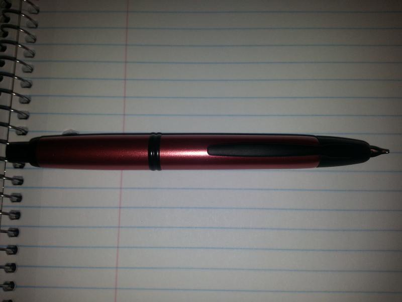
Now available at Pen Boutique the red and black bamboo vanishing points!
-
Hello FPNners! I have a question regarding Namiki Blue. I am buying a TWSBI 580 and want to make this my everyday ink. However, I was wondering if it would stain it. Also if so, has anyone tried bleach/ammonia solutions on it? I really don't want to permanently stain my pen. Thank you!
-
Hi Guys, I have a question about Japanese design, i.e., what do Japanese people actually like in a pen? I'm getting more and more interested in Japanese design and from what I can see, there seems to be a certain "dicothomy" in design styles, not just in terms of pens. In a way, it seems to me that there is something that we "Westerners" like and associate with Japanese design, namely, the minimalist-looking, Zen-ish stuff such as this, this, or, to stay in the field of pens, this, or, more broadly speaking, this kind of aesthetics. This seems to be reflected in a lot of high-end Japanese pens, such as Nakayas, Hakase, the Namiki Emperor series, the Sailor King of Pens, and pretty much everything that is urushi-coated or maki-e: very minimalistic design, maybe with highly elaborated decorations, but on very plain background. We're all quite familiar with this kind of aesthetics from movies, books, and of course, drooling over pictures of amazing urushi pens that most of us probably cannot afford. I'll call this the "Samurai" tendency. However, my theory is that this is probably not what Japanese people really like/want/seek. This is because if one looks at what Japanese companies offer in terms of mid-to-high-range pens (i.e., below the level of things like the Sailor KOP or the Namiki Emperor, but within the range of what most people can probably afford), it's hard to stumble across anything minimalistic/Zen-ish: look at the range of Pilot customs, or Sailor's pens. Everywhere one sees a lot of gold hardware, a clear reference to Western pen design, re-interpreted in a form that remains rather unique, without the ostentatious design of, say, a MB 149, an Omas or a Pelikan M800: Japanese pens tend to be smaller (probably only the larger Pilot Customs or the Platinum President can compete with the MB 149 in length), very rarely show off their logos, and sometimes have rather "kitsch" details (such as the new clips on Sailor pens or the clip of the Platinum President, or the cap band on the Sailor king professional gear) or use colour combinations that are either long out-of-fashion in the West, or are of questionable taste to say the least. I'll call this the "Businessman" tendency. So, considering that... - The current Japanese aesthetic seems to be more oriented towards the post-modern (and the Kawaii) style than the traditional styles usually associated to Japan; - There are probably 1.000 "businessman" Pro Gear with their kitsch cap band sold for every super-elegant minimalistic "samurai" Namiki Emperor Urushi, even though... - ... minimalist/"Zen" design is not necessarily more expensive (quite the opposite: look at LAMY!) and could therefore be easily used on mid-to-high-range-end pens; urushi is not always needed, after all; - There seems to be a lot more variety in the design of mid-to-high-range pens, looking at least at the experiments done by Sailor on their Sapporo/Pro Gear lines; - Maki-e coated pens were initially popularized by Dunhill for the Western market; - Companies such as Danitrio and Nakaya that clearly target primarily the non-Japanese market specialize in "Samurai" design; - The pens in maki-e and urushi seem to have boomed in the period of the Japanese economic stagnation after 1991, when the internal market contracted and manufacturers had to look for alternatives; ...I tend to believe that a Japanese person would probably prefer something like a Pilot 845, with its 6 (six!) gold rings, than a plain Sailor KOP, regardless of the price, and probably sees our beloved "Samurai" pens as something that "only foreigners like". I'm talking here of what people like, not what people can afford. After all, if the "Samurai" style really were the "best" in terms of tastes in Japan, shouldn't we see a lot more pens being offered in minimalist designs? Shouldn't we see Platinum, Sailor and Pilot behave more like Lamy or Faber Castell, with their cheaper, affordable Studio or Ondoro lines? Maybe I'm just talking nonsense, but I'd love to hear what you think about this (especially if you are Japanese or live there). Cheers, Fabio
-
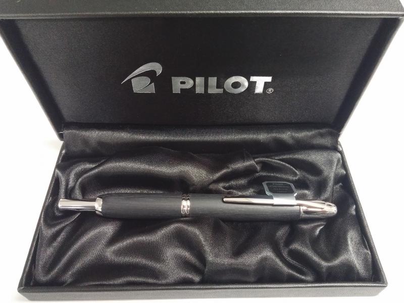
A Review Of The Pilot Namiki Vanishing Point
JamesPenBoutique posted a topic in Fountain Pen Reviews
I had mixed feelings about this one originally. I really liked the idea of a vanishing point and the hood feature, but I was unsure about the clip being placed where I hold the instrument. I was afraid it would feel awkward but instead it ended up allowing me to hold it with a little more control. Aesthetics: I like the look of this pen even though it seems reversed with the clip being where it is. In this case the metallic copper red with the black trim definitely drew my attention. An 8 out of 10 Build: The construction of this writing instrument seems very sleek, sound, and the hood portion built in to protect the nib from all sorts of drops or mishandlings seems to be a very innovative idea. An 8 out of 10 Balance: The weight is decent. Not too heavy and not too light for my tastes. I also like that the clip did not really add any extra weight to the barrel. An 8 out of 10 Nib: I tried a broad nib while giving this a test run. I had not yet used a broad nib but it seemed closer to a medium to me. The durability of it seems and feels sound. A 7 out of 10 Maintenance: You can use either a cartridge or a converter as your ink dispenser. Personal preference comes in to play in that regard but cleaning the nib itself seems easy enough. The nib is smaller due to the hood feature but I was able to clean it without any issues arising. A 9 out of 10 Cost: The price tag is around the $175.00 mark which I do not have any issue with. Seems like a fair price for a writing instrument that I truly enjoyed and had no true problems with. A 7 out of 10 Total: 47 out of 60
-
After discussions with a fellow fountain pen enthusiast about the problems with loose and spare nib units for Pilot/Namiki Vanishing Point/Capless pens a solution has been found. I was asked to assist with the design and testing of a custom made cap to fit over the end of the nib unit to protect it from damage, make them easier to transport, and keep them from rolling off tables. Many prototypes have been tested and now a final working product is available. Here are those caps in use: http://i.imgur.com/oDkM3hW.jpg They are available through my friend's Shapeways store: http://www.shapeways.com/designer/ArmillarySphere. They are 3D-printed with a Selective Laser Sintering machine and come in 2 varieties: smooth that match the diameter of the nib unit and fluted to keep the nib unit from rolling. I personally tested them on over 25 VP nib units and they fit every one made from the year 2000 to the present. Earlier nib units have more variation in diameter and fit can not be guaranteed. Check these out. I am glad to be able to help develop this useful VP accessory and I hope that others find as I useful as I do. Note that the 6 packs of caps available are printed together as one piece with small bridges of plastic connecting them together at the ends. This makes them much less expensive per unit. They will need to be cut apart and lightly sanded. The individual caps are ready to use as-is.
-

Reinsterting Converter Into Namiki/pilot Vp: What Am I Doing Wrong?
Friend of Pens posted a topic in Japan - Asia
I'm the very happy owner of a VP that came with a twist-style converter, and I've been using it for some months. When I got the pen, the converter was very firmly fastened in to the end of the nib and didn't want to come out, so I left it alone and have been writing and refilling with no problems. I recently had a reason to temporary put the converter on another Pilot pen, and to my surprise, it removed easily from the VP with just a light tug. It worked great in the Pilot, and now it's time to go back... ...except I can't figure out how to do it. There's something preventing the converter from seating all the way in, so it's just lightly resting inside the barrel of the nib assembly, instead of fitting snugly around the interior as I know Pilot carts and converters do. As it stands now, it's certainly not ink-tight. Is there some secret to re-attaching these that I don't know about? I'm thinking that whatever held the converter in place with such force back when the pen was new is now preventing the re-insertion. The converter is fine, and it's back on the other pen for the time being, where it fits fine and snugly. Any tips? Of course the business end of the converter is out of sight inside the nib unit, so I can't tell what's going on in there. I suspect gremlins. -
An Introduction And Review Of The Pilot Namiki Metropolitan From 2 Perspectives
JamesPenBoutique posted a topic in Fountain Pen Reviews
An introduction into fountain pens and Lokta journals for my Nephew Recently my nephew had a birthday and he turned 15. I got him a Pilot Namiki MR Metropolitan collection Fountain Pen in silver and a Monk Paper Belt Style Buffalo Leather Lokta Small Journal. I was a little unsure as to what to get for him as his first introduction into fountain pens. It turns out this was a perfect fit for him as was the buffalo leather lokta journal. The journal is just beautifully crafted and an excellent source for your jotting of notes, drawing, or keeping track of life events. The Metropolitan line is very smooth and consistent. The pen itself is sleek and well balanced with great lines. I also like the option of cartridge or converter. Which of course he chose cartridge. I know it was perfect for him because shortly after receiving it he called me and told me it was the best present he had ever received (and he was very sincere)! If you have ever been around a teenager you know that for him to say that to me was a big deal. He has since began sketching with his pen and loves the precise lines he is able to get as well as only needing to gently, lightly guide the pen to create a line. In conclusion I believe this writing instrument is great as an introduction into the world of Fountain pens or just to write with in general and the evidence is now in my nephews sketch book/journal. -
Pilot "cheap" Maki-E: What Amount Of Manual Work Is In There?
TassoBarbasso posted a topic in Japan - Asia
Hi Guys, I've recently bought a Pilot with narcissus decoration in hiramaki-e (One of these) and I find it to be very beautiful. I'm aware that there's a debate as to whether hiramaki-e is a "real" maki-e (whatever that may mean), or just a cheap form. What I would like to know is, what are exactly the manual steps involved in the making of these Pilot pens? My understanding (based on this article from the Encyclopaedia Britannica) is that it's actually a mostly manual work: "The pattern is first outlined on a sheet of paper with brush and ink. It is then traced on the reverse side of the paper with a mixture of heated wet lacquer and (usually red) pigment. The artist transfers the pattern directly to the desired surface by rubbing with the fingertips, a process called okime." Frankly speaking, to me this looks like a purely manual work, not something "industrial", as I sometimes read online. If the procedure followed by Pilot was exactly this, for me this would be more than enough to consider this as a little piece of art, even if it's not as sophisticated as other maki-e tecniques. But I have my doubts that Pilot actually follows this procedure. Hiramaki-e implies manual drawing, then transferred on the pen body, but the pen I have has really neat and precise lines, which I don't believe can be achieved with manual drawing. Any ideas? best, Fabio -
I own a beautiful Pilot/ Namiki "Capless" Vanishing Point pen- it's a Decimo, which is slightly slimmer and lighter than the regular VP pens, but takes the same nib- and I LOVE it. I have heard that the nibs for these pens are not well standardized. A few weeks after getting my pen, I broke the nib and had to replace it (rather a costly accident, but nevertheless). The nib size of my pen was, and is, a Fine; but I notice the new nib does not write quite as fine a 'Fine' line as the previous, original nib did. I liked the thinner line (didn't want to go to "Extra Fine", because I thought an EF nib might be too delicate- requires a light hand,) Is there a way I can have the nib adjusted? Would it cost as much, or nearly, as buying a whole new nib again? Any thoughts? thanks! - M
-

Penficionado: Set Of Namiki-Dunhill Pens Sells At Auction For Over $300,000
penficionado posted a topic in Fountain & Dip Pens - First Stop
Hi everyone, Check the results of the Bonhams Fine Writing Instruments. Set of Namiki-Dunhill makes over $300.000: http://www.penficionado.com/index.php/2015/06/set-of-pens-sells-at-auction-for-over-300000/ Warm regards, Iunal