Search the Community
Showing results for tags 'montblanc'.
-

2020 11 13 Montblanc 114 142 149 comp closed.jpg
JulieParadise posted a gallery image in FPN Image Albums
-
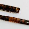
Greetings! I have recently stumbled upon a montblanc 146 with gold trimming for sale for 150 euros (2nd hand). I am not sure about the date of purchase yet, but if I get that info I'll write it below later. The pen seems to be in good condition despite a small crack on the piston knob. Below are some pictures of this pen. What are your opinions on this pen and is this a good price for one? Thank you very much for your help! Kind regards

-
Hello everyone, This is my first post back after being away from FPN for a very, very long time and I come seeking your help. I need a new blue ink. I was in love with Montblanc Meisterstuck Diamond Blue ink (see review here: https://www.fountainpennetwork.com/forum/topic/225885-montblanc-meisterstuck-diamond/) and I am drawing to the end of my supply. I liked its' subdued colouring and how it shaded. In a way it sort of reminded me of old recipe Sheaffer Blue. So I now seek your collective knowledge and help. What blue do you suggest I use that either: 1. comes close in appearance/replicating the beloved Diamond; or 2. New colour blue but has good shading and lubrication qualities. Thanks for your help, P
-
Loose cap is a pretty common issue on Montblanc Noblesse, as for many other pens with a plastic snap inner cap. Plastic inner caps usually have a shorter life than the ones with metal mechanism, as they become loose over years of use by the friction of capping and uncapping. Fixing this issue can be not so easy. A fast search in the web gave back a range of proposed solutions: a single layer of electrical tape around the bottom of the inner cap, as it could pull back the inner cap in shape; a layer of Teflon tape on the clutch ring on the section (with an high risk of inner cap cracking); a little piece of cellophane tape inside the cap (with or without silicon grease to increase the adhesion); a thin layer of superglue or epoxy inside the bottom of the inner cap (a dangerous no-return method, in my opinion) in order to increase the grip coupling; a drop of boiling water into the cap, in order to soften and re-shaping the inner cap. Discarding the #4 because irreversible, and the #5 because too uncertain, I applied all the first three methods, but without success. So I planned to experiment a personal appoach, which brings together some of the theoretical assumptions of the methods #1 to #3. After unscrewing the topper with the MB star, I released the inner cap and clip (figure #1). Then I put a ring of a thermo-shrinkable tube (5 mm in height, 9.7 mm in diameter) around the bottom of the inner cap (figure #2). Using a lighter, I quickly heated the inner cap together with the thermo-shrinkable ring. The heat softened the inner cap plastic and at the same time shrank the ring (figure #3), reshaping the inner cap. Then I gently removed the shrunk ring (figure #4) and finally put the reshaped inner cap into the cap, screwing on the MB star cap top. The cap clicks nicely and firmly, now. Sincerely, I cannot predict how long the reshaping will last, but surely I will report the long term outcome of this matter.
-
When listing a pen on an auction site or when selling pens on other platforms, words such as ‘not working’ and ‘broken’ have a tendency to make buyers deeply hesitant. Sometimes though, it is worth the risk. The flip side of course is that it isn’t worth the risk at all and you end up crying over a steaming pile of junk and the money you wasted on it. Luckily the Carbon Fibre Solitaire that came to me from southern Spain was worth the risk even though the seller was honest enough to let me know that the piston mechanism was broken and the pen was not working. It had been well used by its previous owners but one owner had put some rather peculiar ink in it and then allowed it to dry out. Much soaking, flushing and meticulous cleaning (over about three months) got the piston moving and the pen into a working state again. As I said, it had been well used and came with plenty of war wounds. How or when these were acquired I do not know so I can’t really speak for the robustness of the finish on the barrel. Be warned, it's a finger-print magnet as can be seen in these pictures. The Carbon Fibre looks and feels like the sort of workhorse fountain pen that should sit in with the tools in the toolbox – maybe that is the life this one had at one point. Its broad nib is as smooth as butter, wet and has a nice yet subtle stub aspect. It has a screw cap and is a piston filler (now clean of ink and working nicely). The pen posts securely and the inner, almost waxy cap liner stops any possibility of marking the barrel. The tactile barrel is a high polished steel and although I can’t be certain, from the marks and scratches on this one, I’d presume that it might mark easily if you don’t in some respects baby your pen. The marks aren’t that severe, but you notice them more when it’s in strong sunlight. The cap is steel, layered over with a carbon fibre weave and a clear acrylic. The snow peak is in a black domed top at the tip of the cap. The carbon fibre weave is rather difficult to photograph. My phone camera couldn’t decide if it should focus on the surface of the clear acrylic or on the depth of the fibre weave. In many pictures it appears black, or at least a charcoal grey, but it is actually a somewhat peculiar colour – a sort of deep teal-leaning green. For something so industrial it’s actually very attractive with quite a strong sense of depth. Posted, the pen has a surprisingly good balance and doesn’t feel overly back weighted. Unposted it still has a good weight and length and I found the pen to be lighter than I thought it would be. The cap weighs 16g, the pen uncapped weighs 26g and capped it weighs 42g. Unposted the pen is 130mm and posted the pen is 158mm and capped the pen is 145mm. It takes two turns to screw and unscrew the cap. When I picked this up I was looking for a Montblanc with a broad nib that I didn’t have to worry about war wounds with. This pen already having lived seemed like a suitable punt. I wasn’t expecting much of it but it did surprise me in how much I liked it once it was up and running again. It’s a bit of a sober offering from Montblanc despite that high polish; the sort of pen that wouldn’t be out of place in an engineers office. The black plastic grip (with striped ink window) makes it easy to use without the worry of a slippery steel section. To buy one new and have it scratch up easily would be disappointing and I didn’t personally want to go down that route or have such a significant spend. Maybe others who own this can add their own experience of how robust the finish is. It could well be that the previous owners of this one were simply careless. Nevertheless, I think it’s a very attractive pen and if you like the more restrained and sleek look it is a good handling and pleasing writer.
-
I've been using this MB 144 for the past year or so. It wrote well for the first 6 months, and then developed an issue with ink flow. This is a 1990s 144 with the snap on cap and stiffer nib. I can write about 20-30 lines on an A4 sheet before it stops flowing. I have to then either shake the pen hard or unscrew the barrel and twist the converter each time to get ink back to the nib. I really dunno what to do about it. I'm not sure whether the feed is clogged or an entirely different issue. Some people on FPN were able to pull off the nib-feed assembly without any tools, but it seems very tightly fixed in my case, and I'm not confident enough to try too hard lest I damage something. What would y'all suggest I do? Is there a way I could solve the problem myself, or should I simply have it serviced by Montblanc?
-
Fellow FPN lovers, I do not know if this is the place to ask a question about Montblanc 146. I am considering ordering my first ever Montblanc fountain pen 146 Le Grand EF from Appleboom pens. I see that the price quote is Euros 479.34 plus shipping, about $567(https://appelboom.com/montblanc-germany/meisterstuck/?sort=p.price&order=ASC&fa27=Fountain%20pen). A quick question to you is if this prie incudes VAT that is about 20% of the price or it is without VAT? I checked fr the same pen in our US MB site and it is about $705 +10% tax here in CA (https://www.montblanc.com/en-us/fountain-pens_cod22527730565448096.html). So it will be about $770 locally. The problem is I need an EF nib. Local MB only has M and F nibs. The question is has anyone purchased from the Appleboom store. I am not afraid but I have been saving for the past two years to purchase my first MB. Do you have any advice for me? Also, I am failing to understand the large price difference? Maybe I am reading the information incorrectly? Or should I just get a used MB from local dealers in California like Penguin Pen co. or others online dealers like Endless pens. So many choices but price point and authenticity are of concern. Any help you can provide/ insight/ advice to me will be appreciated. Thank you.
-
This might come as a strange admission on a set of threads about solitaires but I’ve never been one to enjoy metal pens; in fact, I usually avoid(ed) them. Over the years pens with metal sections crept into use and I discovered to my surprise that they didn’t really bother me at all. I expected to have problems with the ‘slippery’ grip that is so often mentioned but found most to be fine and solid silver sections to be very pleasingly tactile and free of slippery menace. As I started to use other pens and had the opportunity to use pens owned by others I began to realise that the additional weight was really not the problem I had imagined it to be (a large factor in my avoidance of metal pens) and in fact, at times it aided the writing experience. So, slowly but surely my defences were broken down and over a number of years solitaires of one kind or another have crept into my pen collection and become very enjoyable pens. This thread – or perhaps more accurately, these threads (the label of ‘part one’ was the hint there)- will hopefully provide useful information on a number of Montblanc solitaires. I’ve stuck with Montblanc for the moment but may include others at the end. In truth, there are only two others that are not Montblanc. I’m not entirely sure of the meaning in the use of the word solitaire in regards to pens. I’m taking it to mean a metal or partially metal pen that is a ‘jewel’ – in some sense a little unusual and different from normal (not in the usual line-up of black resin pens). I’m sure someone will quickly correct me if I am far off the mark. This first offering is the Montblanc Pinstripe Solitaire in solid silver with gold plated rings and gold plated clip. Let’s get some of the detail out of the way first. The pen weighs 50gs capped and inked, 26gs uncapped and inked, measures 149mm capped, 130mm uncapped and 156mm posted. It is based on the 146 model and when I bought this second had it came with a somewhat unpleasant medium nib that was swapped out for a broad nib that is a little softer and considerably wetter. The cap is stamped near the base with the silver hallmarks and the section girth is 11mm. The ‘true’ Pinstripe Solitaire model was a pen that attracted me for many years, but fears of too heavy a weight put me off. The price also frightened me. They come in at around €1,500 - €1, 750. That – for me at least - makes for an exorbitantly expensive pen. I like silver, but I was also aware that it can mark very easily. I really didn’t like the idea of getting a pen at that price point and having to watch it slowly gather its war wounds as I used it; even if those war wounds would be largely minor scratches. I decided to watch auction sites and hope. Things may have changed now, but back when I was making an effort to watch places like ebay, Solitaire Pinstripes seemed to be holding significant resale value and appeared to be selling for around €1000; a price I still personally considered too high. I essentially gave up the chase. It's funny how something you want can appear when you stop looking. I stumbled across a Pinstripe at what I felt was a reasonable price. The seller was honest about the nib being a bit dry and not altogether good. Even factoring in the cost of a nib swap I was making a purchase at less than ebay’s asking and auction prices, so I leapt at it. The pen has a black resin section, so slippery metal sections were not a concern. This also provides the addition of an ink window – something that not all of the solitaire models have. The cap is a screw cap, taking much less turns to open and close (about half a turn), but it does cap very securely (and rather stiffly to be honest). The cap also posts and the plastic inner of the cap protects the barrel of the pen from being marked. You don’t have to force it down firmly for it to get a proper and secure grip. It’s a piston filler and feels secure and robust. The cap has a blank section, lacking pinstripes, where you can engrave a name or whatever you desire. Mine is left blank. The snow peak sits in a domed top of black resin on the cap and the rings and clip are picked out in gold plate and the nib is a two-tone nib. I find the writing experience with it to be very pleasing. As I mentioned, this pen came with a medium nib originally. It was unusually firm and very dry. I attempted to make it a little wetter but was not entirely successful. In the end I opted for a broad nib. By this stage I had realised just how much I liked this pen so ensuring a writing experience I liked seemed sensible. I had considered a double broad (my favoured nib) but my local B&M had a broad they could fit at considerably less than sending off for a new nib with MB. This meant I got the old nib back. I usually enjoy extra-fine and fine nibs too, but with a pen of this weight I thought it might be more comfortable and more enjoyable with the larger nib. I write with the pen posted and find it very comfortable, not too back weighted as to effect how I write and the nib glides over the page like a skate on ice with a little softness but no flex. I know some dislike that but it’s what I tend to look for in nibs. The broad nib has a slight stub aspect which isn’t always apparent in pictures but is easily noticed with the naked eye. This does mean that if you are prone to ‘rolling’ the nib you may see issues of what looks like slight skipping. Each MB nib tends to be a little different so some may be fine while others will have a more pronounced stub aspect. The broad is a wet writer and I do find I refill ink more regularly but not as regularly as I thought I would. In the writing sample given the pen is filled with Sailor Studio 837; a rather nice rust orange with subtle flow issues, but writes quite nicely in this pen. In finer nibs this ink can have a heavy sense of drag due to being a touch dry. The Pinstripe Solitaire is a very beautifully made pen. It holds comfortably in the hand and writes well but it’s the design that makes it that little bit more special. It has a resemblance to some kind of steam punk mechanical blimp and has a strong whiff of art deco styling – perhaps more than just a strong whiff. It wasn’t the first solitaire pen that I acquired but was certainly the first that tempted me all those years ago. Its acquisition has been a very long road but it’s a pen I thoroughly enjoy using. You may think me mad but silver often has a buttery quality about its touch to me and more than once I’ve found myself enjoying this tactile aspect as I polish it with my thumb. It’s a shame it is so expensive, and given the softness of silver I don’t think I’d buy new, but with patience second hand ones can be had at reasonable prices and at a reasonable price it is a remarkable pen and a pleasure to own and use. If buying second hand always remember to ask if the pen has any dents. I always asked this on ebay, for instance, and was somewhat shocked at the number of times I had replies of ‘yes’ for pen sales with no mention of dents and no visible dents in pictures. It’s a classic design that I’m sure won’t go out of style and it reminds me very much of the film Metropolis for some reason. Maybe it was all those hours I had to work to afford it.
-
Hello everyone, I'm from Portugal and I'm looking for a clip for Montblanc 244, whoever has it for sale or exchange, I would really appreciate it, thank you all
-
Hey everyone, happy Friday! simple question today, will a MB 146 nib fit the Bock housing in this pen: https://www.schondsgn.com/collections/fountain-pens/products/fountain-pens I am selling a nib of mine that I have in a Bock (250?) housing, the housing that fits a Conid Minimalistica or Regular. I am by no means an expert in anything Montblanc, or Bock, so I am just looking for some assistance here. thank you in advance, and info helps. have yourselves a great weekend!
-
Hello everyone, hope your weeks are off to a fine start. I come to you today with a very specific question: is my Montblanc 146 nib scraping its shoulders on the inside of my Conid Minimalistica’s cap? I usually use my Minimalisticas with Sailor nibs, but I have a lovely 146 nib, which I’ve had ground to a CSI, that I occasionally swap in. My question springs from the slightest scraping sensation I can feel when capping the pen fitted with the aforementioned nib. Now, both of my Conid’s are the all Delrin AVDA Phi versions, so I am unable to actually see if the nib and the inner cap are indeed making contact. I would hate to damage such a fine nib, so I am hoping someone out there with a clear capped Minimalistica is using a 146 nib and could answer my question. Thank you in advance. All the best to you and yours, Eli
-
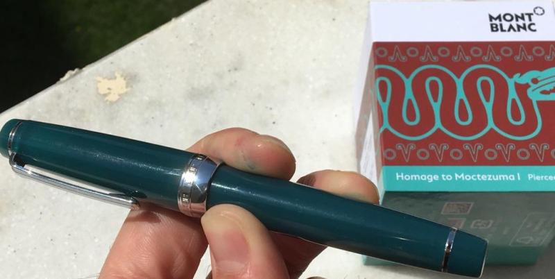
Montblanc Summer, 2020 Event Montblanc — The Collections Summer, 2020 Montblanc Event ~ After consulting FPN Montblanc Forum Moderator Kalessin for guidance as to what might be appropriate to post, this small thread is added for all to read. The ongoing Covid-19 public health event has adversely affected Montblanc's marketing plans for major 2020 releases. Prohibitions or severe restrictions on public gatherings in most areas of the globe have resulted in an altered introduction format. As the situation in southern China, just above the northern border with Hong Kong, has attained a moderately stable equilibrium, Montblanc held a special event yesterday. VIP collectors were invited to visit during assigned time slots. Although no photography was allowed, they were fortunate to see and handle the latest fountain pen creations from Hamburg. While I'm not even remotely in their ilk, Montblanc China graciously offered me the first time slot at 10 am. I accepted, honored to have such a rare opportunity. With the South China Regional Marketing Director, I was seated in a secluded alcove. Black silk gloves were provided for handling the pieces introduced. Superb graphics mounted on boards explained specific design motif inspiration, which was especially valuable. The pieces shown were those typically never shown on Montblanc international Web sites. They were the Limited Editions of 888 or 88 or 8, depending on the model. As several models have not yet been officially announced on any Montblanc Web site, it's necessary to describe them in an oblique manner, leaving details to their release in the coming months. Others have been officially released, therefore such indirectness isn't necessary. Please pardon the lack of explicit details in certain cases, which I wish might be provided. First, the Moctezuma LE 888 is very impressive, due to the detailed turquoise lapidary work. The texture is smooth, with only the slightest sense of it consisting of separate pieces. The slender red pen slips out almost as an afterthought. The pen is all about the immense cap with a spear-like clip like few others. The tiny nib size was a surprise…almost smaller than a Classique nib. The Aztec heart motif on the nib was readily discernible when looking through a loupe. It required several tries before I became used to the special technique used to take the small pen out of the cap on all three models shown to me. Second, the Victor Hugo LE 83 and Victor Hugo 8 are similar. The finish and materials of the most limited edition are as expected. The great surprise was the Victor Hugo LE 83. When initially handling it (wearing the black silk gloves provided) I was impressed by the detailing. The superb design graphics on boards educated me as to why certain design choices had been made. Seeing the rose window from Notre Dame on it was a pleasant surprise. What I didn’t realize until the South China Regional Marketing Director showed me, was the nature of the cap. She turned on a light beam in her smartphone, then placed the cap on it. Voilà! The light shines out through blue transparent material through the skeletonized cap. The effect is stunning. Montblanc needs to show that in a video. If they do so, they’ll rapidly sell every one. Not only that, the pen barrel also shows light through blue. It’s elegant and tasteful. A lovely design which I hadn’t anticipated. Third there was a Dragon model intended for East Asian collectors. One of a series, it is decorated with diamond highlights. The barrel is decorated in lacquer with a tastefully restrained image related to the theme. Fourth, it's no secret that Montblanc will follow-up on 2019's Calligraphy Flex Nib models with something different but comparable. Having handled that model, and written with the nib, it's apparent that the next iteration is likely to be very well received. The Limited Edition pen itself, and the specially crafted nib constitute a tour-de-force. The exquisitely hand decorated pen exceeds in quality of detail nearly any other Montblanc fountain pen I've handled. Having worked in East Asia for decades, I've gradually come to appreciate refined techniques, especially when very well executed. In the case of the pen that I handled, looking through the loupe was ravishing, due to the wealth of detail in tasteful colors. When the cap goes on, the design is lined up with gorgeous precision. The colors are subtle yet eye-catching. 2020's very special nib has a lovely, simple design on it for the Limited Edition. A regular black 146 travels with the show, enabling invited guests to write with the special nib, which features the same surface motif as last year's Flex Nib. Inked in Mystery Black, it’s effortless to use. To me it seemed much more responsive than 2019’s Flex Nib. Playing with the nib for 7 or 8 minutes, the number of types of strokes, from OBB to EF, were impressive. A buyer using such a nib for several hours would likely find it to be a deft sketching tool, a tool for writing Asian characters, or an unconventional handwriting instrument. Fifth, and finally, I was shown the most extraordinary Montblanc fountain pen that I've ever seen or read about. As it's not yet been officially announced, although it has been discussed in a speculative FPN thread, it's essential to remain frustratingly vague as to specific details. In this case, that's quite a challenge, as the pen in question has dazzling craftsmanship and the single greatest surprise I've ever encountered in any writing instrument. Nonetheless, no spoilers. The Very Limited Edition pen is wholly unlike the two versions based on the same theme which will soon be available in boutiques or from the usual trusted resellers. After leaving the Montblanc Event this morning, I thought to myself that the Hamburg design team must’ve had a great time designing this one-of-a-kind pen. When first shown to me, I was dazzled. The finish, the discreetly placed small gemstones, the sophisticated overall aesthetic balance are as good as it gets. At the outset, the pen seemed like the heaviest fountain pen that I’ve ever picked up. It’s ultra-bulky, or so I thought. But the absolute shocker is the culture-specific design motif on the pen. Those crazy Hamburg gnomes have exactly duplicated, stone for stone, an ancient design from an ornament recovered from a well-preserved tomb. If it were possible, what a joy it would be to describe the semi-precious stones of considerable size which are mounted in an exact facsimile of long ago artistry. It’s a shocker to see and handle. There’s no two ways about it. In a large collection of pens, it would easily stand out above others. Yet while admiring the work through the loupe, I was asking myself where the pen was, as there was no trace of it, aside from a slender clip. HUGE SURPRISE! I'm unable to write more, as that would spoil the surprise for all. There's much to say, including my own sense of delight, but it's best left until this model and its companions are released. I was dumbfounded by the overall artistry. The time and care which went into it are a magnificent example of Montblanc’s continuing commitment to high craftsmanship. Again, please do pardon me for writing in a coy style which leaves more questions than it answers. I respect Montblanc's determination to manage the marketing of their own creations. Please know that in 2020 there are yet lovely wonders to be released from Hamburg. There are inks associated with most of these models, but at the event, the inks had not yet arrived. Tom K.
-
Hello everyone, I am thinking about getting a James Dean LE because its whole look is very appealing to me. The pen is made with quiet a lot of silver parts. Now I wonder if the beautiful look will disappear after some days when tarnishing begins. Does anyone have any experience with how badly this pen tarnishes over days, weeks or months? How would you handle it? I found It very annoying that Agatha Christies snake clip went black after some time. I know, that polishing helps but I would prefer the pencil to stay as beautiful on its own as it was on the first day. And is this pen more prone to scratches or finger prints than other pens because of its silver body? Best regards Mick
-
Does anyone know what happened to the Montblanc Calligraphy ink - red version? I've seen a few photos. I've seen listings at stores that were then taken down. I've seen no writing samples, no one saying they have purchased it. Was this ink ever actually released? Does it exist?
-
I would like to help a friend repair her Montblanc 221, black. It has a hairline crack on the plastic nib holder of the hooded nib. I dont have photo yet but the problem described to me seems a common problem of this model. My question is: must I use MEK, or is Loctite 480 sufficient? I havent been able to buy MEK where I am, but I found Loctite 480 online in Switzerland. I plan to leave the pen for 2 weeks after the glue gets into the crack. Not too optimistic about repairing cracks, but I must try at least. Otherwise her pen is a leaky unusable pen. The leak might not just come from the crack, but that would be the first suspicion. I much appreciate any suggestions.
-
So about 10 years ago I thought montblanc ink was the best, although back then I had no idea what makes an ink "good" or "bad", overall the 8 or so inks I have performed well and i had no complaints but pretty much never use them since the colors are not my taste anymore. Fast forward to today, my most recent MB ink purchase is royal blue which I think is a fantastic blue and performs very well in the pen; the problem I am noticing is that is smudges DAYS after being laid down on paper. As a very primitive control, Pilot Blue Black ink, on the same papers, dries to be completely smudge proof in 30-60 seconds max. Has anyone observed this about mb ink? What exactly causes this? How much does the ambient temp and humidity affect this property of inks? thanks for reading
-
How should I deal with MB blueblack IG ink in unopened bottles dated 2013? Sealed and stored at room temperature.
-
Review: Montblanc John F. Kennedy Special Edition Fountain Pen
DrDebG posted a topic in Fountain Pen Reviews
Montblanc Great Characters John F. Kennedy Special Edition Fountain Pen in Navy Blue: “Change is the law of life. And those who look only to the past or present are certain to miss the future.” - John F. Kennedy I recently acquired this beautiful pen from the Fritz Schimpf online store. The pen arrived packaged extremely well. It took awhile to arrive likely due to delays caused by Covid-19. I have using this pen almost non-stop since it arrived a month ago. My review below, deviates somewhat from the standard review. I do give a final review at the end. The pen comes in a large, navy blue box, along with a very informative book about John F. Kennedy and the specific details of the pen which commemorate his life, with warranty certification on the back page. The pen comes in two color variations – Navy Blue and Burgundy precious resin. The Navy Blue was manufactured first and comes with platinum detailing which perfectly accent the deep blue. The pen is crowned with the Montblanc snowflake logo. As is typical, Montblanc recently announced they would no longer be making the Navy Blue color variation. John F. Kennedy was the 35th President of the United States. He was the youngest man elected to that office, at the age of 43. He came from a wealthy and powerful family, but forged his own way. He was not a great student, but graduated from Harvard University. The Burgundy color represents this achievement. After graduating, John entered the U.S. Navy, which the Navy Blue commemorates, and was stationed in the South Pacific during World War II. Although seriously injured, John survived the war but his older brother Joseph did not. The 3 rings on the cap of the pen commemorate the 3 brothers – John, Robert and Joseph. John’s initials are engraved in the clip. JFK’s dream was to put a man on the moon. The “moon lander” is engraved in the nib, which commemorates that final descent upon the surface of the moon. Summary: 1. Appearance & Design: 10 Strong, clear navy blue resin finished with brilliant platinum accents. Well-proportioned with attention to detail. 2. Construction & Quality: 10 Everything about this pen exudes a high quality of construction and beauty. 3. Weight and Dimensions: 10 This is a pen with some weight to it but is very nicely balanced. The cap, however, does not post. Weight: 56.81 g Length: 14.5 cm Length, uncapped: 12.5 cm 4. Nib and Performance: 10 The nib is a BB (double broad), and is exquisite! It is very smooth and is moderately wet. It wrote perfectly out of the box. I have not written through 3 fills of ink and it is performs flawlessly. 5. Filling System and Maintenance: 10 This is a piston filler and performs fantastic. As mentioned above I have filled this pen 3 times (with typical flushing in between): the first time with Waterman Serenity Blue (my standard for new pens), the second time with Montblanc JFK navy blue ink, and this third time with Sailor Manyo Sumire. The pen cleans nicely between fills and the piston works well. 6. Cost & Value: 10 The Navy Blue color is no longer shown on Montblanc’s website. The retail price of the burgundy color is $1,035.00. For the quality of this pen, I think this is a reasonable price. The attention to detail and overall balance exceed the other Montblancs that I have had. 7. Conclusion: 60 out of 60 = A perfect 10!* This pen has great meaning to me. It is a reminder of a very special time in the life of my family. As a result, I saved and purchased this pen for reasons that revolve around my father mainly. My father also served in the Navy in the South Pacific (as well as in Europe) during WWII. And he worked in the space program as a director throughout the 1960’s and early 1970’s, which included all the Apollo missions to the moon. My father-in-law worked as a director at NASA during this time. So this pen has special meaning to me, especially the blue color variation. I had heard that Montblanc has stopped making the navy blue color. So, when I approached Sebastian at Fritz Schimpf, I did not expect that he would be able to find one for me. But Montblanc has just a few left, and he was able to get one and have BB nib put on it directly from the factory. What was really great is that Fritz Schimpf sold it to me for a great price! They also included a bottle of Montblanc JFK ink as well as Fritz Schimpf Fritzrot – both are fantastic inks. The JFK is a bit dry but has is a great color with a reddish-coppery sheen. The Fritzrot is a luscious burgundy red - like a great pinot noir - and is moderately wet. On top of all of this, Sebastian monitored the entire shipping process from the store to my home. He would email me with updates each week, and when it appeared to be lost, he was able to track it down and move it on to me. But, he informed me that if the shipping company could not find, he would order a new one with a new nib and send it out overnight. What customer service! I can not say enough good things about Fritz Schimpf! In conclusion, this is an exquisite pen – truly a grail pen for me! Yes, it has special meaning, but the pen itself far exceeds my expectations and is superior to any other pen I own. IMHO, Montblanc has created a masterpiece here. *For those that know me, I am a bit of a perfectionist and rarely give high marks. So, for me to rate a pen this high is very unusual. While I wish that the cap would post, I knew that it did not when I purchased the pen – the website was very clear about this. So I could not take a point off for that. Disclaimers: I am not affiliated with Fritz Schimpf. I purchased the pen from them, but all opinions are my own. While I love this pen, any opinion I may hold of John F. Kennedy as a politician or any decision he made, is not given, included nor intended in this review. -
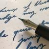
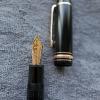
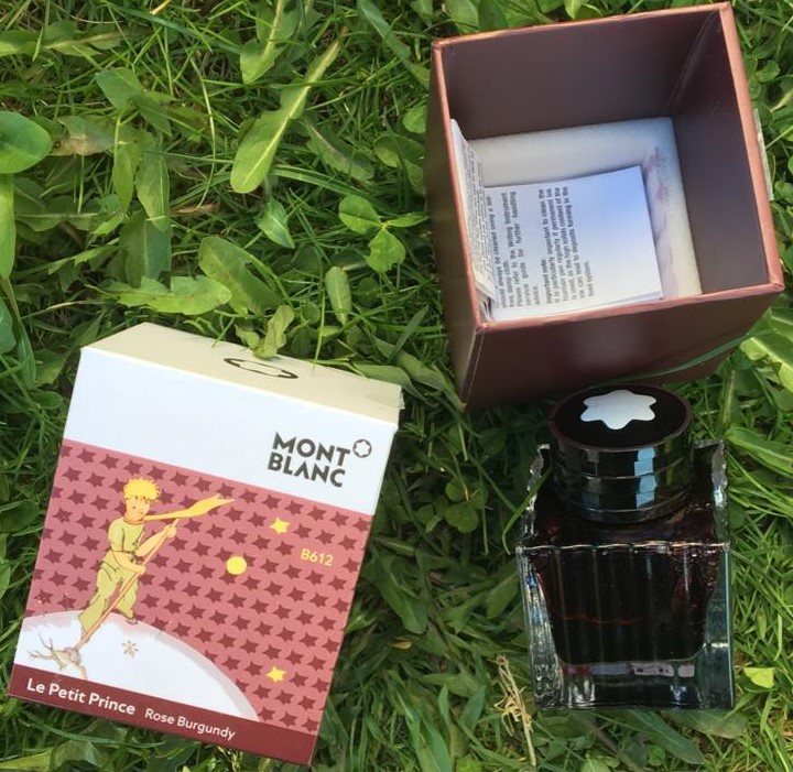
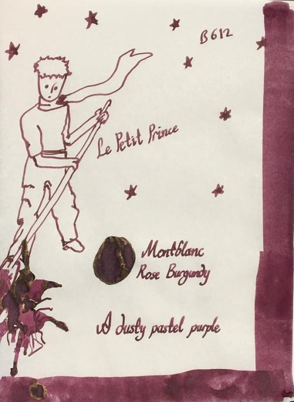
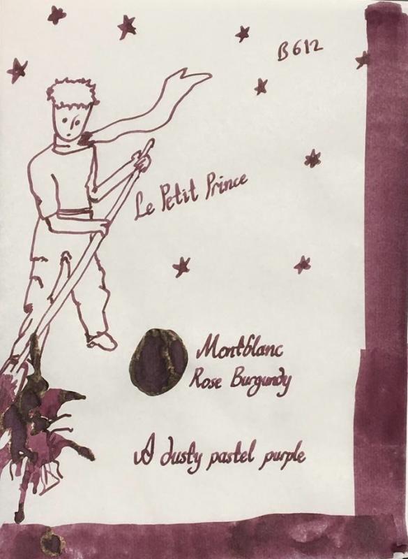
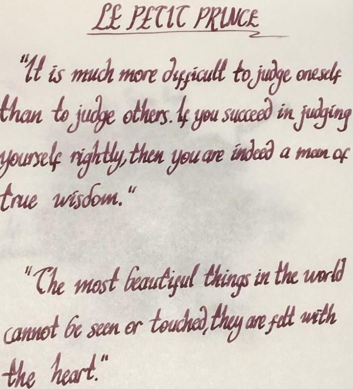
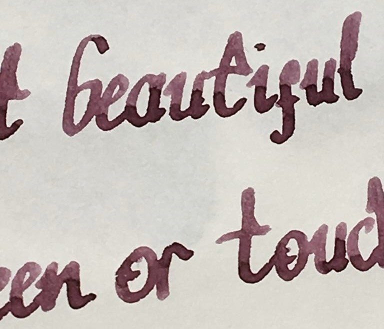
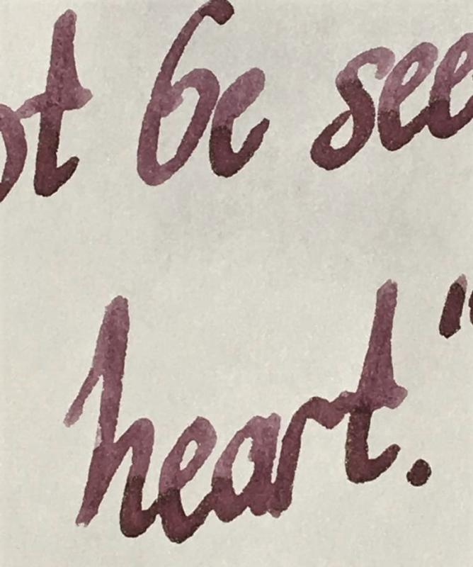
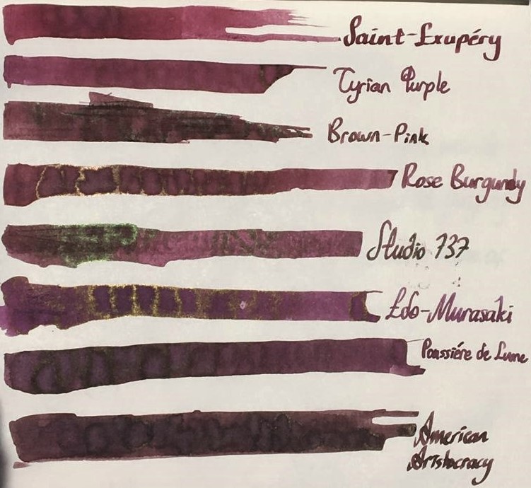
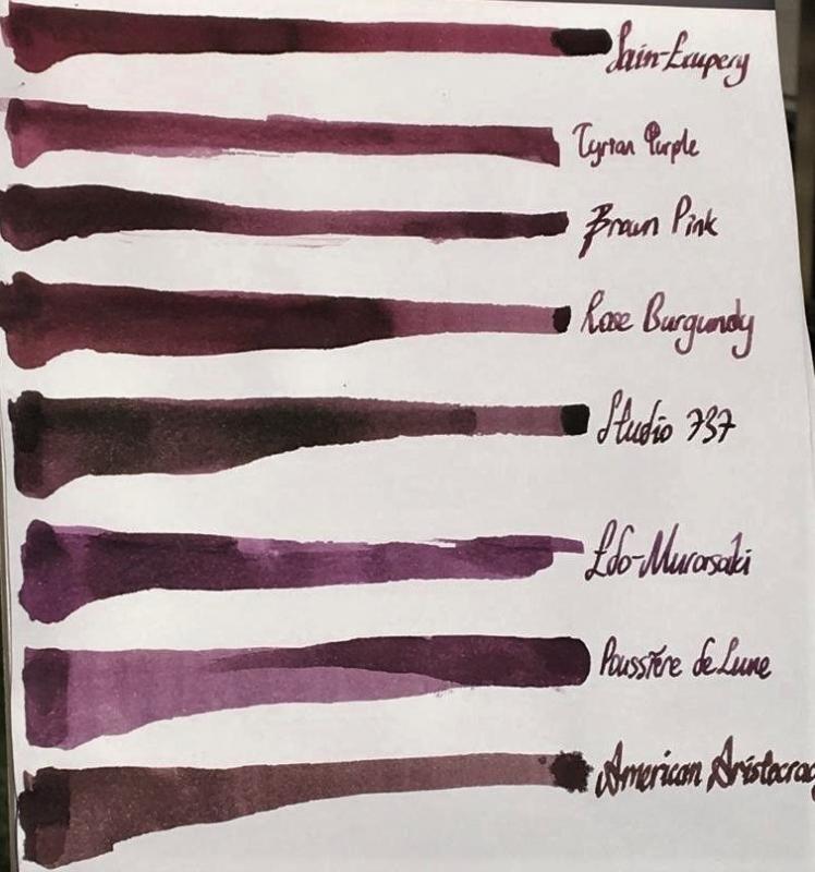
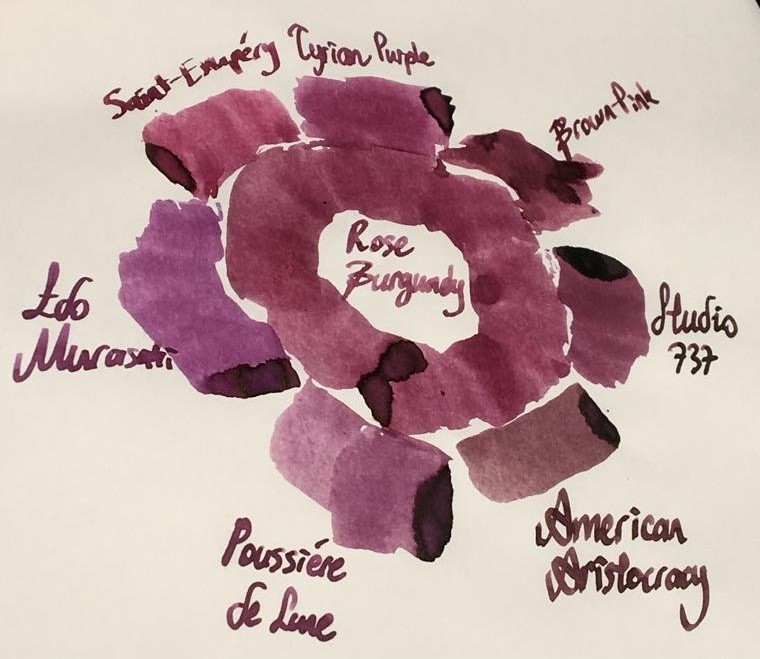
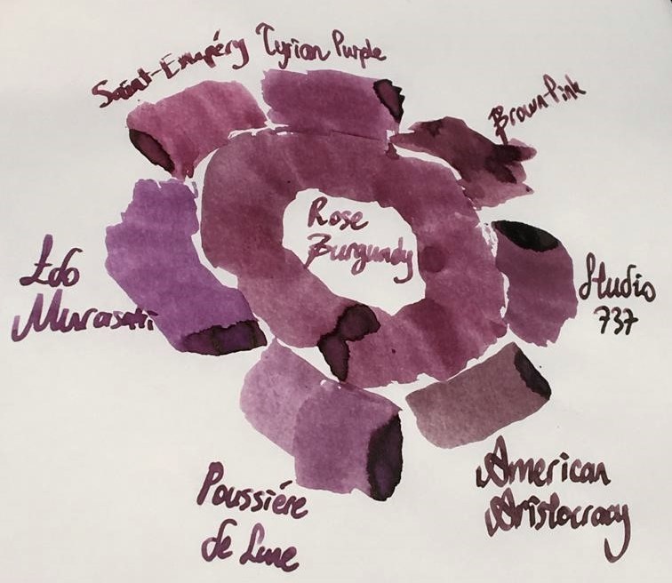
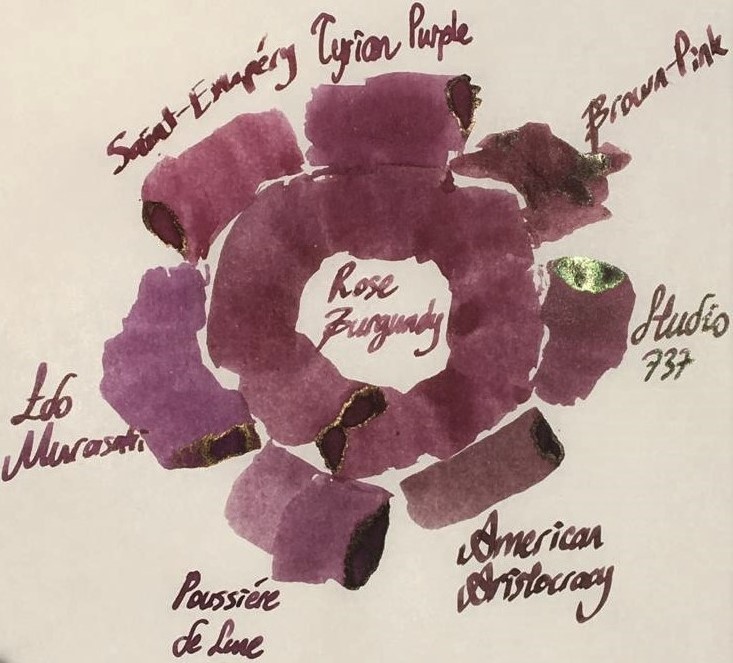
Hello dear FPNers, We have a common enemy. An enemy who is obsessive to take out what we have in our bank accounts or even what we got in our purses. A decisive, a talented, a perfectionist, a world wide known enemy who keeps releasing some magnificent items which we really don't need to but have to buy. Please welcome, Montblanc Le Petit Prince The Planet - Rose Burgundy: It is part of Le Petit Prince The Planet collection. It has the standard 50 ml cube-shaped bottle of Montblanc. It is freshly released. As far as I see, it is not claimed to be "limited edition", but it seems like. Don't know. The colour is a dusty burgundy red with hints of brown: I specifically did not filter this photo. Note that the photo is taken in a very bright time of day. The ink seems to be more vivid and more red than it really is. Actually, above version is what most people would expect to see when reading the name of the ink, I think. However, the colour seems to be more realistic in this tuned photo below: Yes, it is a bit brownish, maybe a litte bit greyish than what a burgundy red name recalls. This ink does not have an exact match of colour in ink literature as far as I know, but KWZ Brown-Pink is the closest one I suppose, which is a bit brighter, more vivid ink. Here are some writings with two lovely quotes from the book: Some close-up shots: Lovely shading, isn't it.. Note that, before moving on to ink properties, the pen I chose for this review is a Pelikan M605 in red: This pen normally comes with a 14k nib, but I found an 18k BB nib on Ebay and upgraded (!) it. Really, upgrade? It is a debate issue. Some likes 14k more since they are likely to be more springy. Of course it is also related to nib shape and the other contributors of alloy. Whatever, this nib is not a nail like my Aurora 88's 18k nib, but not amazingy soft either. It just has a small cushioning, that's all. I tuned its wetness and worked on the tip so that it is a wet stub now: Lovely. Saturation: Rose Burgundy has medium saturation. It is partially a washed out colour, but it cannot be said that it has low saturation I think. Sheen: Very little. Shows a distinct bronze sheen when you pour over huge amounts on Tomoe, but during normal writing, you will probably not see any sheen. Shading: Has a lovely shading. I loved it. Not the most shading ink, though.. But still above average. Shimmer: None. Wetness: Rose Burgundy is a dry ink, just like most Montblanc inks. I had specifically chosen a wet BB nib to compansate the potential dryness of this ink before I got the ink. But still, with very light pressure, this pen made some skippings on smooth Clairefontaine paper. Ink makes you really feel it is dry; not as dry as a Pelikan 4001, but still a dry ink. Feathering: Not detected, not likely to feather. In this term, quite a well behaved ink. The back page of Tomoe: Bleeding: Not detected, not likely to bleed. In this term, quite a well behaved ink. Showthrough: Some distinct showthrough on Tomoe but every ink has a showthrough on Tomoe, so it shouldn't be a criteria I think. So I tried it on 80 gr white Rhodia paper: And the back page is: An acceptable level of showthrough. If you zoom in at a sunny day outside, every ink will showthrough a little bit. So I can say this ink has a low amount of showthrough, like many other Montblanc inks. Water Resistance: I made a water test on Tomoe only: Let's see: Veeery little water resistance, nearly none. If you were about to find the equation of travelling in speed of light and if a cup of coffee spills over your papers, humanity would probably lost a few decades until some other person finds it. For me, it is nice. I love inks with low water resistance because they are cleaned easily. Similar Colours: As stated above, I think the closest ink in terms of colour is KWZ Brown-Pink. But there are some other powerful candidates: Diamine Tyrian PurpleMontblanc Antoine de Saint-Exupery, Encre du DesertJ. Herbin Poussiere de LuneSailor Studio 737I know it is not a very matching colour, but I wanted to compare it with Iroshizuku Edo-Murasaki also. Because Edo-Murasaki has the similar slightly washed out pastel characteristic of Rose Burgundy, except the former is a purple, not a burgundy brown. Another weak candidate is Noodler's American Aristocracy. It is not a very similar colour to Rose Burgundy, but I wanted to show the answer of question "What would happen if this ink was a bit browner?", so I added this one. Here are the swabs on Tomoe: And on Rhodia: I thought a rose of colour on Tomoe would help in exact comparison of Rose Burgundy with others. Again, I thought providing both the unfiltered and filtered versions would give some insight about the true colour. Unfiltered shot, slightly taken from side: Too bright, too warm, colours are more vivid than they used to be. Rose Burgundy is not this red normally. So here is filtered version: which suits better to reality I think. Another shot from a more perpendicular angle, which shows some sheen, again unfiltered first: And filtered version: Well, this last picture summarizes the results in terms of colour pretty well. Compared to Rose Burgundy: American Aristocracy is too brown, they seem like irrelevant. But with naked eye, American Aristocracy has some purple or burgundy red tones. If both inks are written with wet vintages, I think they will be likely to seem similar.Studio 737's base colour is much more pinkish, but it has high amount of green dye in it, making it a more complex, a darker colour with brilliant green sheen. Note that 737 is my favourite purple.Poussiere de Lune is closest in terms of being dustiness, but it is much more purpler and a bit greyish compared to Rose Burgundy. Besides, Poussiere de Lune gives green sheen whereas Rose Burgundy gives bronze sheen, which is of course valid when poured over Tomoe paper at high amounts for both inks.Edo-Murasaki is the most magenta ink out of all mentioned candidates. It does not have a vivid pinkish structure as much as 737 does, less greyish than Poussiere de Lune and it has definitely a more magenta undertone than Poussiere de Lune. It is pinker than what a medium purple should be. It has similar dusty characteristic evoking the Rose Burgundy.Saint-Exupery is the most red ink in this comparison. It is much redder than dusty Rose Burgundy, and definitely a more vivid colour.Tyrian Purple is a close colour to Rose Burgundy, but a bit pinker than it. It is a bit more "burgundy red" than Rose Burgundy, actually. Also, Tyrian Purple is more vivid, though being not a very saturated colour, it shows its colour better than Rose Burgundy.This part is a bit tricky. I said KWZ Brown-Pink is the closest colour I have in my inventory. Note that I am responsible of my own samples and pictures I provided you. I made a literature research on Brown-Pink's colour, and saw veeery different tones. Compared to those photos of KWZ on internet, Brown-Pink's colour provided by me is not that purplish, but rather a dusty pink with some chestnut hints. Actually, I think, base colour of Brown-Pink is lighter than Rose Burgundy, but Brown-Pink includes a considerable amount of green dye, making it a darker, a more vivid colour. CONCLUDING REMARKSThis is a dusty brownish burgundy red. A "unique colour" description would not be very wrong. This is a pale pastel colour with high shading.If you want saturated, vivid lines of colour, this ink doesn't seem to satisfy you.If you are on the train of sheen-craziness like me, this ink is not for you.There is no shimmer. It has a medium saturation I can tell. Doesn't deserve to be called "lowly saturated".It has nearly no water resistance. Didn't try yet but seems like it will be cleaned from pen very easily.It's kind of a dry ink. Try using it in wet nibs, even gushers or vintage pens, to get the maximum of it.Price is about 35 Euros, same as Montblanc Petrol Blue. It is definitely not a cheap ink, but not the most expensive one either. I am not sure if it deserves this price. I would buy it anyway since I am an ink nerd. There are cheaper alternatives in terms of colour, but not the exact same. Right now, I am suspicious that I will buy another bottle, because the colour seems to be a bit pale for my taste. But it is a unique colour, and it has the potential to be the ink of serious writings in moody days with a wet, unproblematic, reliable pen. If I start to enjoy the colour much more by putting it in my vintage Pelikan M400 with OBB nib, I may continue to buy this ink. Hope you enjoyed. Thank you..
-
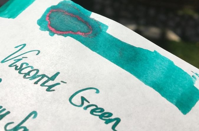
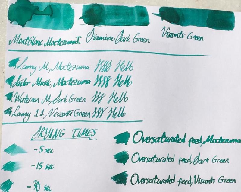
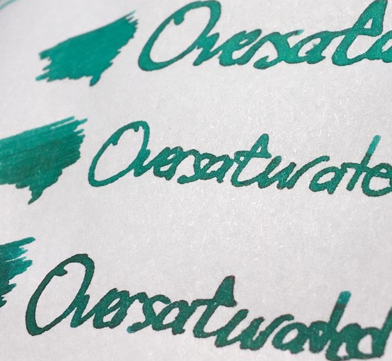
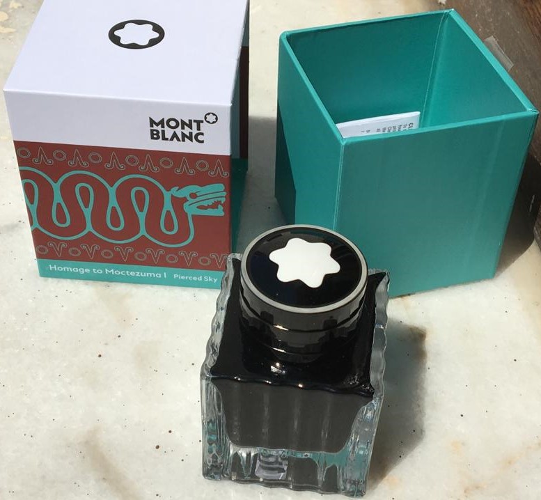
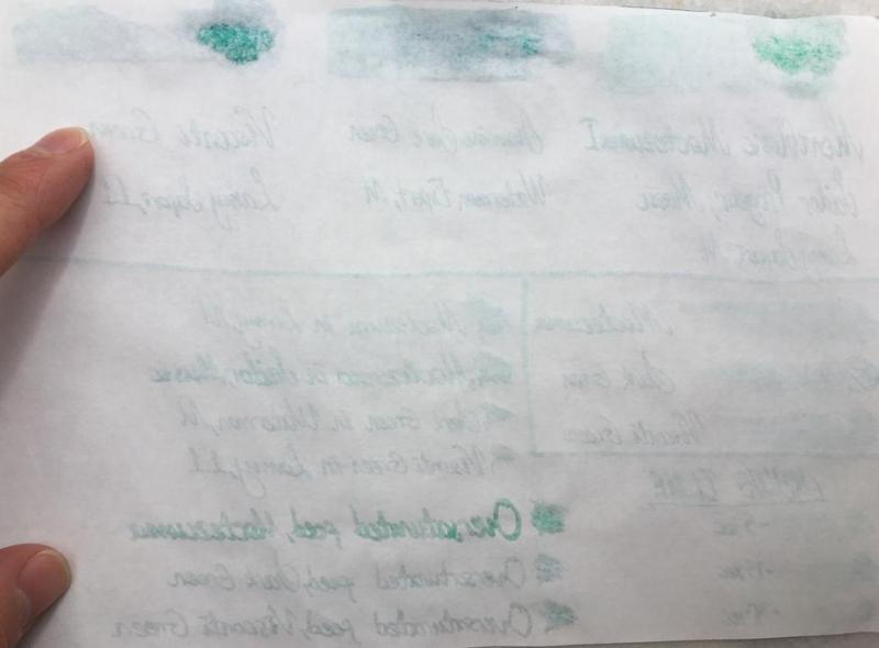
Hello dear FPNers, Today I have something new, something German, something menthol green for you: Moctezuma 1 Pierced Sky is one of the most recent inks released by Montblanc. This ink is a complementary part of new Patron of the Art series: Homage to Moctezuma 1. It is a limited edition ink, and it has a 50 ml cube shaped bottle, which is a pretty standard bottle shape of Montblanc. I suppose this ink is very close to J. Herbin Vert Reseda, but a tad darker than it. Another similar ink is Edelstein Jade. Unfortunately, I have neither of them, because this cannot be called as my favourite shade of turquoise. However, I have Diamine Dark Green and Visconti Green, both of which are also pretty close to Moctezuma, I suppose. Here is a comparison of three inks on white Tomoe paper: They are very close indeed. But before describing the differences between 3 inks' colours, maybe I should mention about some important ink properties: Saturation: Moctezuma has a medium-to-low saturation. It is not as washed out as Herbin Vert Reseda, but still lacks some saturation in my opinion. Sheen: There is definitely no sheen with this ink. Maybe only if you pour down huge amounts on Tomoe, you may see a little bit of sheen. Shading: It has a high shading capacity, I loved it. Obviously not as much as a KWZ Honey, but still very nice shading. Wetness: Moctezuma is a dry ink, as most of you could easily guess, because most Montblanc inks tend to be so (except Elixir line, they are the wettest inks I have ever seen). It is not the driest ink in the world either; not as dry as a Pelikan 4001, but definitely on the dry side of the spectrum. Unless you have a vintage pen with an ebonite feed, or a modern pen which is tuned to write wet, most people wouldn't like this dryness combined with medium-to-low saturation in EF/F nibs I suppose. Check this out again: Lamy Safari M nib's output is not amazingly washed out, but not very legible either. I am more of a BB/OBB guy. I don't use fine nibs very often, but if I do, personally I would like to see a bit darker, or brighter line. The colour choice is already dangerous: it is a pastel menthol green, not most people's first choice of colour to easily read the written, so at least it should have been a bit more saturation in my opinion. About dryness of ink: I suppose both Montblanc and Pelikan specifically keep their nibs' tippings wide, to have them larger surface area when in contact with paper, which makes them smoother. And then they need to adjust their own inks to be a bit more viscous than a regular ink to make it flow slowly through the tines, compensating the thick tipping material's large surface and making the pen write narrower, so keeping the promise of theoretical nib size. I don't know. It is a choice of company. Pilot succeeds in having narrower tippings be smooth, maybe not as smooth as their German counterparts but still quite smooth. And they see no problem in producing a much wetter ink. I suppose most people would trust in Iroshizuku line's fluid properties more than they do for Montblanc inks or Edelstein inks in an indefinite case of which ink to use in an unfamiliar pen. I remember having hard times with some Montblanc and Pelikan inks in my EF/F nibs. Whatever. Note that the pen I used for Moctezuma is Sailor Progear Ocean with 21k Music nib: Mr John Mottishaw cut its tip into a beauuuutiful cursive italic, smooth and crisp, and tuned it to be quite a wet nib: So the wetness of nib would be able to balance the dryness of ink, I thought. Same triple comparison is also done on 80 gr white Rhodia paper, which is the industrial standard of pen world, I suppose.. Let's see the differences between 3 inks above. Here are some close shots of them on Tomoe again: Moctezuma is the lightest of them. Diamine Dark Green is a bit greener than Moctezuma, with a bit more red dye, and it is more saturated. Visconti Green actually has a very similar green-blue ratio compared to Moctezuma, but it is much more saturated. And the red dye content is definitely higher in Visconti, as a result it seems darker with some nice sheen. Sometimes I love writing with over-saturated feeds. They show the full potential of an ink. Also, if you have a moderately wet nib, it gives a clue about how the colour would be seen with a wet nib, especially with a vintage nib. A close shot of writings made with over-saturated feed on Tomoe: Lovely sheen with Visconti Green to be noted. Same thing for Rhodia: It can be said that Moctezuma gives a nice colour with a very wet nib, preferably a vintage one. Some other ink properties: Feathering: Not detected, not likely to feather. In this term, quite a well behaved ink. Bleeding: Not detected, not likely to bleed. In this term, quite a well behaved ink. Showthrough: Some distinct showthrough on Tomoe but every ink has a showthrough on Tomoe, so it shouldn't be a criteria I think: On Rhodia, it has minimal showthrough. Quite well: Note that heavy swabs or parts written with over-saturated feed will of course have showthrough, and even bleedthrough. It is normal. The concentration on normal writing should be the way in judging showthrough/bleedthrough. Water Resistance: Meh. Not so much, but who cares?? Not me, definitely.. Before water test on Tomoe: And after water test: It cannot be said that the writings have gone completely, but they are not legible either. But this situation does not bother me. Actually, I like inks which are not resistant to water. In my experience, they are much easier to clean than water-proof inks. And considering that I am obsessive while cleaning pens until water comes out completely crystal clear, this ink is a nice choice for me. I haven't tried to clean it from my pens, but I am sure it will be cleaned quite fast. CONCLUDING REMARKS If you are into menthol green colour, you will definitely like this ink. Note that it is a bit pale, pastel colour, not very vivid.With very wet nibs, it has a lovely hue of an exotic lagoon at its best. I live in an inland location, but I felt like I am in Maldives.Doesn't have sheen or shimmer, but has a nice shading.Montblanc Moctezuma 1 is not the most unique colour in the world. There are some similar colours like J. Herbin Vert Reseda, Pelikan Edelstein Jade, Diamine Dark Green, Visconti Green, etc.. You may consider them also.Price is about 35 Euros, same as Montblanc Petrol Blue. It is definitely not a cheap ink, but not the most expensive one either. I am not sure if it deserves this price. I would buy it anyway since I am an ink nerd, but I may not buy the second bottle. Besides, alternatives are much cheaper, and this ink does not have amazing specifications in terms of colour.With over-saturated feed, it provides a much more distinct, vivid colour, which means if you are likely to buy it, consider using it in your wet pens, preferably gushers or vintage pens. No need to afraid of cleaning from vintage pens. Hope you enjoyed. Thank you..
-
I just received a MB 149 platinum body with no nib and feeder since I already had those two items. The collar was already inserted. The feed goes in until it hits the bottom and the horizontal notch on the nib is just above the barrel. The nib goes in very quickly and when it hits the bottom of the collar, the feeder is the same if not little longer that the nib. I have 4 other MBs and changed nib/feeder with the MB platinum resulting in the same situation: the nib/feeder is too loose for the platinum collar. Questions: Do I need to get a different nib or a feeder (I have plastic feeder similar to the pictures of Platinum on websites)? do I need to get a different feeder? if so will it fit into the Platinum? Thank you for considering my questions. Hal
-
Seemingly a simple task, swap the nibs between two regular black 264 models, but too many questions already. Sorry, I tried looking on the Web and in the forums, but just did not get lucky this time. Before I could cause some permanent damage, could anyone please instruct me how to safely remove the nibs? Everything else seems in order, except the fact that it looks as if both have never even been cleaned. Thank in advance!
-
Hello my friends: I hope you are all managing well during this very difficult time in our lives. The photos are of a pen I bought on ebay several years ago. The pen was about $31 and even though I knew that it was a knock-off at that price, I bought it because it looked nice. Anyway, in comparing it to pictures of the real Montblanc Solitaire 925 STERLING Silver 164 Ballpoint Pen MASTERPIECE DESIGN, I can't tell the differences between my pen and the real one. So I am curious about this and wanted to pass it by you experts. Thanks.
-
Hello, I have this doubt, is it possible to disassemble only the star at the end of the cap? I mean, just the white, separating from the rest. This part has a screw that goes to the rest of the cap, but I don't see anything that hooks the star, maybe it's stuck?
-
Hi y'all! I have a Montblanc 310 that has quite a gap between the nib and the feed and am not sure of what to do, as I'm not sure whether the gap is the result of the nib being bent upwards or the feed being bent downwards. There's a video showing this pen's tear-down here: https://youtu.be/H57t0ZLfs1Y?t=42 but no the clear piece that joins the section to the barrel on mine just won't budge. Any ideas? I would like to take it apart, so I can either fix the nib properly or apply hot air or water to the feed to bend it upward to have it touch the nib's underside. The pen writes well, but has issues starting after not using it for a day because the ink that fills that gap evaporates. Thanks!!! alex