Search the Community
Showing results for tags 'montblanc'.
-
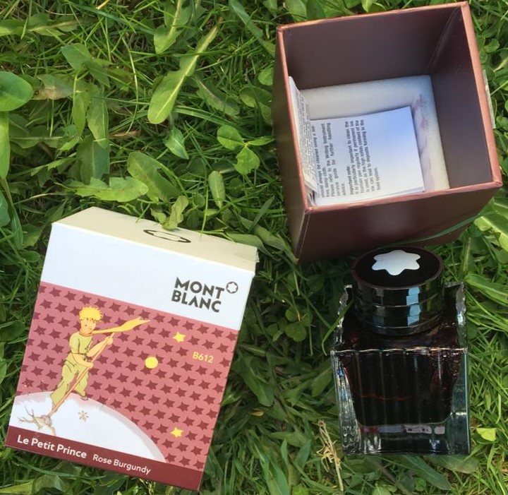
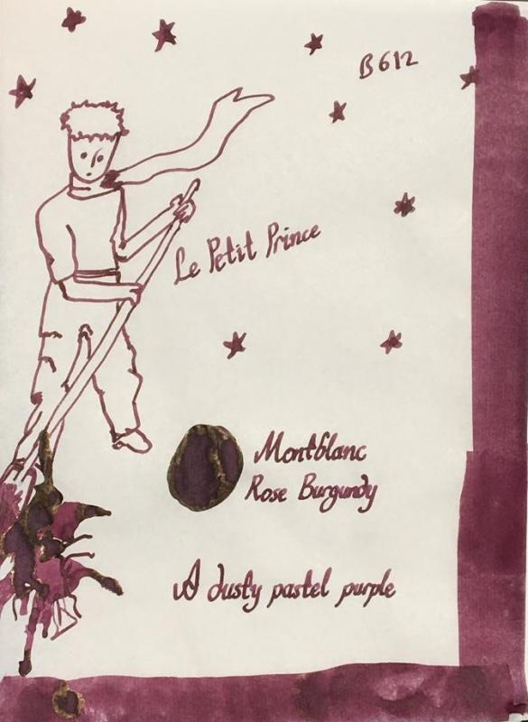
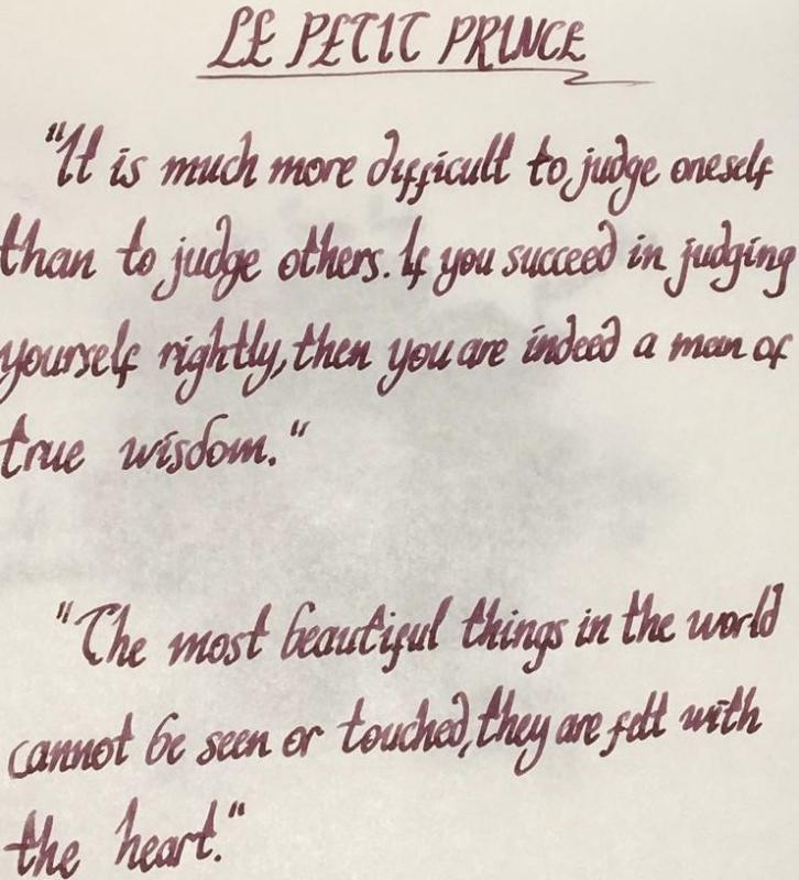
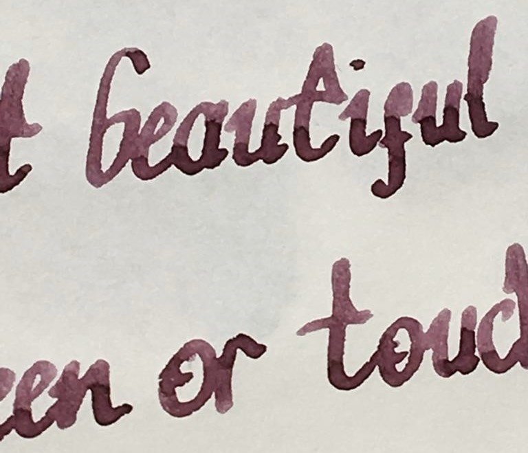
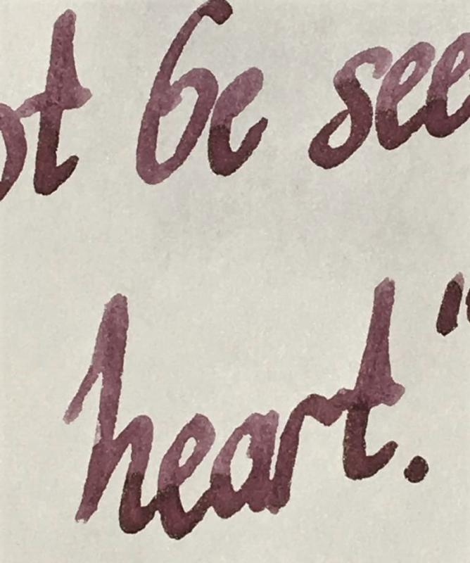
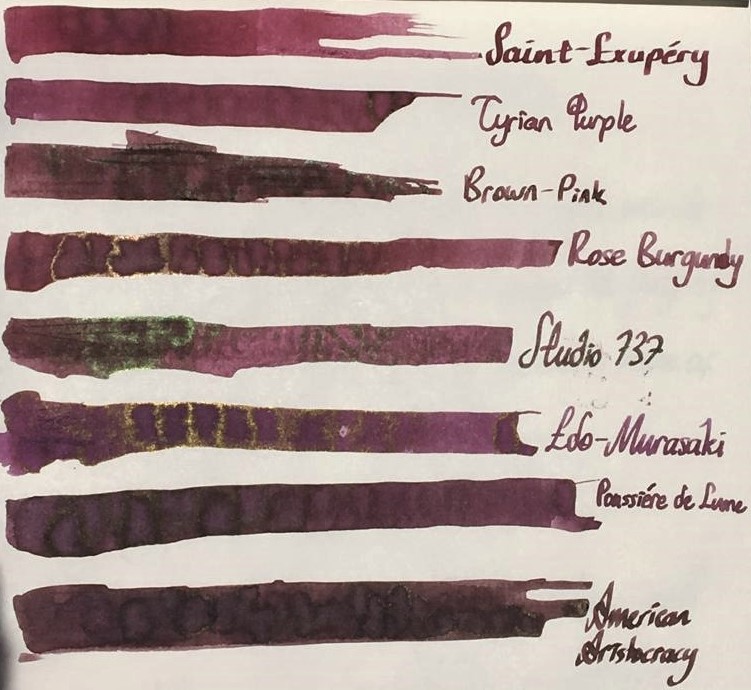
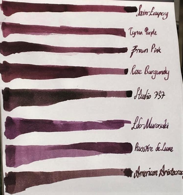
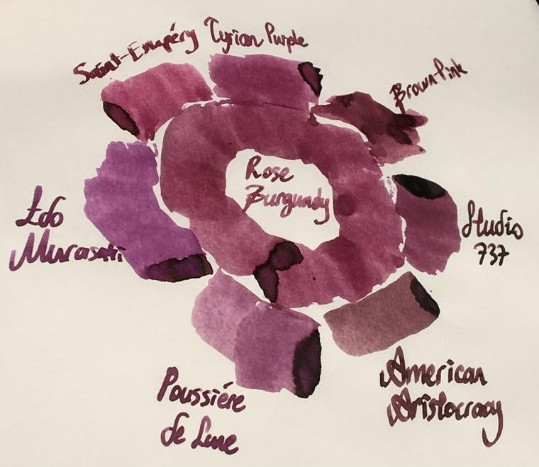
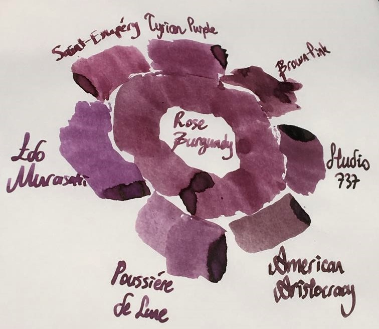
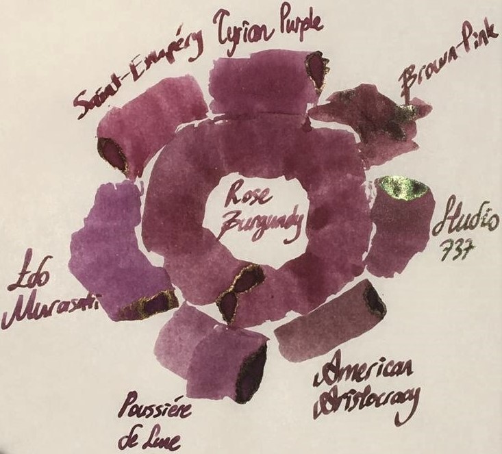
Hello dear FPNers, We have a common enemy. An enemy who is obsessive to take out what we have in our bank accounts or even what we got in our purses. A decisive, a talented, a perfectionist, a world wide known enemy who keeps releasing some magnificent items which we really don't need to but have to buy. Please welcome, Montblanc Le Petit Prince The Planet - Rose Burgundy: It is part of Le Petit Prince The Planet collection. It has the standard 50 ml cube-shaped bottle of Montblanc. It is freshly released. As far as I see, it is not claimed to be "limited edition", but it seems like. Don't know. The colour is a dusty burgundy red with hints of brown: I specifically did not filter this photo. Note that the photo is taken in a very bright time of day. The ink seems to be more vivid and more red than it really is. Actually, above version is what most people would expect to see when reading the name of the ink, I think. However, the colour seems to be more realistic in this tuned photo below: Yes, it is a bit brownish, maybe a litte bit greyish than what a burgundy red name recalls. This ink does not have an exact match of colour in ink literature as far as I know, but KWZ Brown-Pink is the closest one I suppose, which is a bit brighter, more vivid ink. Here are some writings with two lovely quotes from the book: Some close-up shots: Lovely shading, isn't it.. Note that, before moving on to ink properties, the pen I chose for this review is a Pelikan M605 in red: This pen normally comes with a 14k nib, but I found an 18k BB nib on Ebay and upgraded (!) it. Really, upgrade? It is a debate issue. Some likes 14k more since they are likely to be more springy. Of course it is also related to nib shape and the other contributors of alloy. Whatever, this nib is not a nail like my Aurora 88's 18k nib, but not amazingy soft either. It just has a small cushioning, that's all. I tuned its wetness and worked on the tip so that it is a wet stub now: Lovely. Saturation: Rose Burgundy has medium saturation. It is partially a washed out colour, but it cannot be said that it has low saturation I think. Sheen: Very little. Shows a distinct bronze sheen when you pour over huge amounts on Tomoe, but during normal writing, you will probably not see any sheen. Shading: Has a lovely shading. I loved it. Not the most shading ink, though.. But still above average. Shimmer: None. Wetness: Rose Burgundy is a dry ink, just like most Montblanc inks. I had specifically chosen a wet BB nib to compansate the potential dryness of this ink before I got the ink. But still, with very light pressure, this pen made some skippings on smooth Clairefontaine paper. Ink makes you really feel it is dry; not as dry as a Pelikan 4001, but still a dry ink. Feathering: Not detected, not likely to feather. In this term, quite a well behaved ink. The back page of Tomoe: Bleeding: Not detected, not likely to bleed. In this term, quite a well behaved ink. Showthrough: Some distinct showthrough on Tomoe but every ink has a showthrough on Tomoe, so it shouldn't be a criteria I think. So I tried it on 80 gr white Rhodia paper: And the back page is: An acceptable level of showthrough. If you zoom in at a sunny day outside, every ink will showthrough a little bit. So I can say this ink has a low amount of showthrough, like many other Montblanc inks. Water Resistance: I made a water test on Tomoe only: Let's see: Veeery little water resistance, nearly none. If you were about to find the equation of travelling in speed of light and if a cup of coffee spills over your papers, humanity would probably lost a few decades until some other person finds it. For me, it is nice. I love inks with low water resistance because they are cleaned easily. Similar Colours: As stated above, I think the closest ink in terms of colour is KWZ Brown-Pink. But there are some other powerful candidates: Diamine Tyrian PurpleMontblanc Antoine de Saint-Exupery, Encre du DesertJ. Herbin Poussiere de LuneSailor Studio 737I know it is not a very matching colour, but I wanted to compare it with Iroshizuku Edo-Murasaki also. Because Edo-Murasaki has the similar slightly washed out pastel characteristic of Rose Burgundy, except the former is a purple, not a burgundy brown. Another weak candidate is Noodler's American Aristocracy. It is not a very similar colour to Rose Burgundy, but I wanted to show the answer of question "What would happen if this ink was a bit browner?", so I added this one. Here are the swabs on Tomoe: And on Rhodia: I thought a rose of colour on Tomoe would help in exact comparison of Rose Burgundy with others. Again, I thought providing both the unfiltered and filtered versions would give some insight about the true colour. Unfiltered shot, slightly taken from side: Too bright, too warm, colours are more vivid than they used to be. Rose Burgundy is not this red normally. So here is filtered version: which suits better to reality I think. Another shot from a more perpendicular angle, which shows some sheen, again unfiltered first: And filtered version: Well, this last picture summarizes the results in terms of colour pretty well. Compared to Rose Burgundy: American Aristocracy is too brown, they seem like irrelevant. But with naked eye, American Aristocracy has some purple or burgundy red tones. If both inks are written with wet vintages, I think they will be likely to seem similar.Studio 737's base colour is much more pinkish, but it has high amount of green dye in it, making it a more complex, a darker colour with brilliant green sheen. Note that 737 is my favourite purple.Poussiere de Lune is closest in terms of being dustiness, but it is much more purpler and a bit greyish compared to Rose Burgundy. Besides, Poussiere de Lune gives green sheen whereas Rose Burgundy gives bronze sheen, which is of course valid when poured over Tomoe paper at high amounts for both inks.Edo-Murasaki is the most magenta ink out of all mentioned candidates. It does not have a vivid pinkish structure as much as 737 does, less greyish than Poussiere de Lune and it has definitely a more magenta undertone than Poussiere de Lune. It is pinker than what a medium purple should be. It has similar dusty characteristic evoking the Rose Burgundy.Saint-Exupery is the most red ink in this comparison. It is much redder than dusty Rose Burgundy, and definitely a more vivid colour.Tyrian Purple is a close colour to Rose Burgundy, but a bit pinker than it. It is a bit more "burgundy red" than Rose Burgundy, actually. Also, Tyrian Purple is more vivid, though being not a very saturated colour, it shows its colour better than Rose Burgundy.This part is a bit tricky. I said KWZ Brown-Pink is the closest colour I have in my inventory. Note that I am responsible of my own samples and pictures I provided you. I made a literature research on Brown-Pink's colour, and saw veeery different tones. Compared to those photos of KWZ on internet, Brown-Pink's colour provided by me is not that purplish, but rather a dusty pink with some chestnut hints. Actually, I think, base colour of Brown-Pink is lighter than Rose Burgundy, but Brown-Pink includes a considerable amount of green dye, making it a darker, a more vivid colour. CONCLUDING REMARKSThis is a dusty brownish burgundy red. A "unique colour" description would not be very wrong. This is a pale pastel colour with high shading.If you want saturated, vivid lines of colour, this ink doesn't seem to satisfy you.If you are on the train of sheen-craziness like me, this ink is not for you.There is no shimmer. It has a medium saturation I can tell. Doesn't deserve to be called "lowly saturated".It has nearly no water resistance. Didn't try yet but seems like it will be cleaned from pen very easily.It's kind of a dry ink. Try using it in wet nibs, even gushers or vintage pens, to get the maximum of it.Price is about 35 Euros, same as Montblanc Petrol Blue. It is definitely not a cheap ink, but not the most expensive one either. I am not sure if it deserves this price. I would buy it anyway since I am an ink nerd. There are cheaper alternatives in terms of colour, but not the exact same. Right now, I am suspicious that I will buy another bottle, because the colour seems to be a bit pale for my taste. But it is a unique colour, and it has the potential to be the ink of serious writings in moody days with a wet, unproblematic, reliable pen. If I start to enjoy the colour much more by putting it in my vintage Pelikan M400 with OBB nib, I may continue to buy this ink. Hope you enjoyed. Thank you..

-
Rigidity Index of the new Meisterstück Calligraphy 149 Expression Nib In September 2019 Montblanc introduced to the market a new collection of fountain pens called “Calligraphy” that have as their central core a flexible nib called “Expression”. In this presentation, we briefly discuss the new Meisterstück 149 equipped with an Expression nib made of 18kt yellow gold. This version is called "Montblanc Calligraphy Flexible Nib Special Edition". The base is the famous 149 made of black resin and with yellow gold trims. The pen has a total weight of 33.1 grams with ink (22.3 grams, without cap and with ink) and a closed length of 15 cm and 13.5 cm without cap. All of its elements are the same as the standard 149 pen, including the ABS plastic feeder. The Montblanc Calligraphy 149 has a very fine nib, EF-type nib if written without pressure, with a line width of 0.3 mm. When applying pressure, the flexibility of the tines is felt and a stroke up to 1.4 mm wide can be generated, according to the official press release. In our tests we have untroubledly achieved strokes of 1.2 mm width. We have also achieved almost 2 mm strokes with formation of "railroads" in many cases (this depends on the fluidity of the ink used). All this performance without excessive pressure and with a complete recovery of the nib when the effort ceases. Due to our support angle we have not experienced feeder friction on paper in our tests. The bending capacity of the Flexible Nib Expression is excellent and applying the methodology of characterization of the Rigidity Index (see link below), that allows us an objective assessment, we obtained the following measured data (237-217-261-271-256-253-268-245-265-289-282), with an average value obtained of 284.4. This value characterizes this nib like an IR2/FLEXIBLE. So it is a flexible nib that offers the feeling of being writing with a dip pen but with the cleanliness, softness and touch of a high-end fountain pen with the best performance. Only we can propose an improvement to this wonder with a traditional ebonite feeder, which would certainly improved the ink flow in major openings (this is something that can be solved at the buyer's own risk). Thanks for reading and best regards. Thanks to ValenSpain for special contribution in the realization of this analysis. References. Press Release: “The Fusion of Art and Writing: Montblanc Meisterstück Calligraphy Collection, a Tribute to the Beauty of Handwritten Self-Expression”. https://www.fountainpennetwork.com/forum/topic/343637-mb-149-expression-nib-calligraphy/ https://www.montblanc.com/en-shop/collection/writing-instruments/meisterstueck/119700-meisterstueck-sol-gold-leaf-flex-nib-fountain-pen.html https://www.relojes-especiales.com/foros/estilograficas/indice-de-rigidez-metodo-sencillo-para-valorar-flexibilidad-de-plumin-368039/ https://www.fountainpennetwork.com/forum/topic/291773-rigidity-index-a-simple-method-to-evaluate-the-flexibility-of-a-nib/ http://estilograficas.mforos.com/2126518/12874704-metodo-sencillo-para-cuantificar-la-flexibilidad-de-un-plumin-indice-de-rigidez/ http://vintagepensblog.blogspot.com.es/2015/07/measuring-nib-flexibility.html https://fountainpendesign.wordpress.com/fountain-pen-nib/flex-nibs-experience/flex-nib-quantitative-classification/
-
Seemingly a simple task, swap the nibs between two regular black 264 models, but too many questions already. Sorry, I tried looking on the Web and in the forums, but just did not get lucky this time. Before I could cause some permanent damage, could anyone please instruct me how to safely remove the nibs? Everything else seems in order, except the fact that it looks as if both have never even been cleaned. Thank in advance!
-
Hello my friends: I hope you are all managing well during this very difficult time in our lives. The photos are of a pen I bought on ebay several years ago. The pen was about $31 and even though I knew that it was a knock-off at that price, I bought it because it looked nice. Anyway, in comparing it to pictures of the real Montblanc Solitaire 925 STERLING Silver 164 Ballpoint Pen MASTERPIECE DESIGN, I can't tell the differences between my pen and the real one. So I am curious about this and wanted to pass it by you experts. Thanks.
-
Hello, everyone! Turns out I've been a member of this forum since 2009, back when my father gave me a red and gold Parker Sonnet. Forgot my password, but now I'm back! Since then a few pens have been through my hands (and was fortunate to have a few degrees have been added to my name), with the most recent acquisition being a Montblanc Classique 145 Platinum. 👌🏻 Have been using fountain pens since I was 10 years old, eventually it became part of my character. Nothing much to say for now, aside from I'm also a forum moderator at Windows Central. ✌🏻 Here are some photos of a Montblanc Meisterstück Solitaire Tribute To The Montblanc Hommage À W. A. Mozart, which I handed over to my mother, and my Montblanc Meisterstuck Classique Platinum 145, featuring a few entries from my journal. Glad to be back, and I won't forget my password this time! Cheers! 😁
-
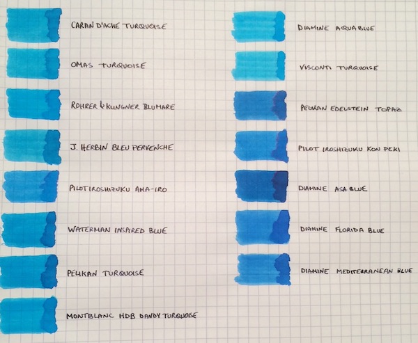
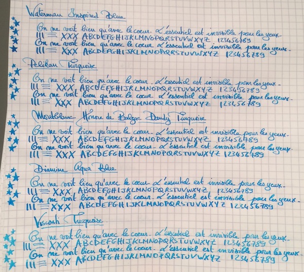
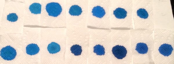
I don’t know if it’s the warm and sunny weather that just hit the northeast after a cold spell, but, more than ever, I’m not ready for summer to end! So to keep the summery vibe going, I thought why not do a comparison of turquoise and “beachy blue" inks. This is by no means a comprehensive review, because I’m missing some great turquoise inks, such as Sheaffer and Lamy Turquoise, but I saw a post come up on the boards with questions about turquoises, so I wanted to share samples of the ones I have. The 15 inks tested are: Caran d’Ache Turquoise, Omas Turquoise, Rohrer & Klingner Blu Mare, J. Herbin Bleu Pervenche, Pilot Iroshizuku Ama-Iro, Waterman Inspired Blue, Pelikan Turquoise, Montblanc Honore de Balzac Dandy Turquoise, Diamine Aqua Blue, Visconti Turquoise, Pelikan Edelstein Topaz, Pilot Iroshizuku Kon-Peki, Diamine Asa Blue, Diamine Florida Blue and Diamine Mediterranean Blue. The writing samples were done using a 1950s 146 and a Pilot Custom 74 B nib ground down to a smooth stub by Mike Masuyama. All samples were tested on Rhodia paper. Ink Swabs: Ink on Paper Towel: Top Row: Caran d’Ache Turquoise, Omas Turquoise, Rohrer & Klingner Blu Mare, J. Herbin Bleu Pervenche, Pilot Iroshizuku Ama-Iro, Waterman Inspired Blue, Pelikan Turquoise Bottom Row: Montblanc Honore de Balzac Dandy Turquoise, Diamine Aqua Blue, Visconti Turquoise, Pelikan Edelstein Topaz, Pilot Iroshizuku Kon-Peki, Diamine Asa Blue, Diamine Florida Blue and Diamine Mediterranean Blue Best Flow and Smoothness: J. Herbin Bleu Pervenche Bleu Pervenche wins hands down for me in this category and is miles ahead of every other ink in this review. With that said, although it has an excellent flow, l wish Bleu Pervenche felt a little smoother (to match the smoothness of my favorite inks). However, this is the only turquoise with a regular spot in my ink rotation. Best Turquoise Color: Rohrer & Klingner Blu Mare This is by far my favorite shade of turquoise. It offers a nice mix of blue and green that leans more towards the blue side (which I prefer). In a wet nib, it is the most vibrant of the turquoise inks tested - so vibrant in fact that it makes me want to pull out a pair of sunglasses . The ink has a good flow (though not as high as Bleu Pervenche) but is missing the high level of smoothness I look for in a go-to ink. However, I love the color so much that I did get a bottle. Best Beachy Blue Color: Pilot Iroshizuku Ama-Iro and Diamine Florida Blue (Tie) I love the color of both of these inks, but I do not own bottles of either. I consider Ama-Iro to a "beachy blue" rather than a turquoise because it needs a little more green to be a true turquoise. I really love its bright, light blue color, which screams summer fun, but didn't enjoy the feeling of writing with the ink enough in the flexy 146 to buy a full bottle especially given its higher price point. I should note that I may have been especially tough on Ama-Iro because I was expecting a higher level of smoothness from an Iroshizuku ink. Florida Blue and Mediterranean Blue are close enough in color that someone looking to keep their ink spending to a minimum wouldn't need to own both. Florida Blue has a better flow, and, since I like wetter inks, I wouldn't think twice about using it over Mediterranean Blue. (Mediterranean blue is not a dry ink but someone looking for less wetness might prefer it; it is also a little lighter and exhibits slightly more shading than its Floridian counterpart.) Highest Sheening Ink (on Rhodia): Pilot Iroshizuku Kon-Peki Kon-Peki is not a monster sheener on Rhodia (like some of the Sailor inks I’ve recently tried) but still offers a subtle and beautiful pink shimmering halo around its blue letters. Some posts have asked how it compares to Edelstein Topaz and, as others have noted, both inks are similar in that they are cerulean blues with pink sheen. (I've noticed that Topaz sheens tremendously on Tomoe River Paper, but in this comparison it barely showed any sheen around the letters.) If I had to choose only one of the two inks, it would be Kon-Peki. The color is brighter and the ink has a better flow. Lowest Performer: Caran d’Ache Turquoise I really did not like this ink and was expecting more from a $30+ ink. It was so thin that it took the fun out of writing with my favorite pen (and I almost stopped the review to change writers). Other notable mentions: Light Turquoise: Visconti and Omas Turquoise (tie) Both inks are on the lighter end of the turquoise spectrum and could be a good option for someone looking for such a shade. I prefer the flow of the Omas but like the color of the Visconti better. (I would have liked for the Visconti to perform more like its brother ink, Visconti Blue, which offers a smoother writing experience.) Dark Beachy Blue: Diamine Asa Blue Asa Blue is a beautiful and interesting color in that it is paradoxically both dark and beachy. It has a good flow but an ok smoothness. Montblanc Dandy Turquoise Alternative: Pelikan Turquoise I love this shade of turquoise and have found that with the right pen and paper combination it can offer wonderful color variation. (I've noticed much more color variation using a Visconti HS.) For anyone who was not able to get a bottle during its limited run, I think that Pelikan Turquoise is a pretty close alternative.
-
Hi, I have read a lot of articles on FPN because it is a tremendous source of information, but this is my first topic ever. I have a pen that I cannot find any information about and therefore I am reaching out to you. I have had quite a lot of Montblanc pen's, including several Monte Rosa's but I recently bought a few pen's including a Montblanc Astoria. I have checked the great Collectible Stars resource, and I have seen a lot of Astoria's through Google Images but the only thing I have found is a Monte Rosa that has the same color and ink window but obviously has a different cap and writing. Does anyone have an idea which model this is?
-
Scented Inks — Encre Parfumée
-
Just got a new 146 AND my first MB in the mail! it is great, got it off classifieds. Just wanted to show it off a bit here. It is a '80-'90 146 with a full ink window (now really visible in pictures because of the ink inside) and a soft monotone fine nib. My apologies for the terrible photography (and sideways picture it seems... how to change that, I'm not sure) The only issues are some skipping problems and hard starting, which is unfortunately quite frequent, but I will try to solve that. If anyone has any suggestions I would love to hear them.
-
Among Montblanc collectors there are different opinions on the origin of the white star logo which was introduced by Montblanc in 1913. Holten/Lund introduce a new theory in their book Montblanc in Denmark 1914-1992 - The Untold Story: "The origin of the star logo has been discussed among pen collectors for many years. Though no solid proof the authors of the book believe it is no coincidence that the Montblanc headquarters from 1908 was situated in the Hamburg borough "STERNSCHANZE". The word "STERN" is "STAR" in English - STERNSCHANZE means STARFORTIFICATION (a fortification with the shape of a STAR)." The old fortification "Sternschanze" was situated only a few hundred meters from the Montblanc headquarters in Bartelstrasse/Schanzenstrasse. Shops and restaurangs used (and still uses) a white star as symbol of the district of Schanzenstern. The old Sternschanze fortification is long gone - today there is a beautifull hotel situated on the place - an old watertower rebuild to Hotel Mövenpick am Wasserthurm. When visiting Hamburg (Traditional Hamburg Penshow Oct. 3rd) I always order a room with a viev to the old Montblanc factory.
-
Hello, I have this doubt, is it possible to disassemble only the star at the end of the cap? I mean, just the white, separating from the rest. This part has a screw that goes to the rest of the cap, but I don't see anything that hooks the star, maybe it's stuck?
-
It all started on a very warm summer's day in July of 2016. I was working out of Shanghai at that time, and was going to a mall close by to meet a friend for lunch. It so happened that there was a promotion by Montblanc of their heritage rouge et noir line right on the main atrium on the ground floor of the mall which I completely chanced into. While waiting for my friend, I was browsing around their exhibits and lo and behold, spotted the famous, or rather infamous Axel, Montblanc's resident nib guru. I recognized him by face because Tom K at that time shared his experience getting a bespoke nib. At that time, he was about to finish his one on one sessions which you had to sign up for, and was preparing to head to the airport. I started to just chat with him about various MB nibs and expressed my dream of one day owning their calligraphy nib. He proceeded to invite me to sit down and chat. I started to pull out my notebook and when I showed him some of my writings, he immediately started to show me some of the nibs he could make. Long story short, I ended up with not one, but 2 bespoke nibs that day. One calligraphy nib, and one italic nib. I have seen and tried both the signature nib and calligraphy nib before when Montblanc first rolled out this service. That was at my local boutique in NYC with no guidance from a nib expert about a couple year back. It was super fun to use these nibs, but the bar of entry was high. Not just with the price, but also the process. They had to test you!!! I have always entertained the idea of getting one of these mythical nibs, but the idea of putting a deposit of such a HUGE sum of money sight unseen was not very reassuring. However, this time, with the ability to work with Axel in person, and his guidance, I decided to bite the bullet and commit. I went for the calligraphy nib, and I have to say it was a very good choice. The wait however, was not fun. When I finally got said pens in hand, it's February 2017. The calligraphy nib is nothing short of amazing. There is nothing in my 150+ collection of pens that come even close to it's width and special abilities. The closest I have is the 2.4 Pilot Parallel. It's actually even wider than the 2.4 as Axel called it 3.0 width. Unlike a lot of other very wide fountain pen calligraphy nibs, this nib does not have starting or starvation issues. It writes immediately when you touch the nib to paper. The other very special thing about the nib is it can still work when you lift the nib and write with the corner for thinner flourishes. This unique ability is something other VERY wide fountain pen nibs can't do. That's because this nib has extra channels cut into the corners of the nib that deliver ink to the entire width of the writing surface. Because this is a bespoke nib, I had an option to engrave my name to the nib. I find the idea of a nib with my name so strange because I have always intend to use this pen as a functional tool. I never wanted to get it as a significant occasion pen, which I guess most people do. So I decided to engrave the function purpose of the nib onto the side. Montblanc found this VERY unusual and asked many times whether the words I chose was correct:) I did say I had another nib made. Which was an italic. Perhaps I was caught up in the moment, and thought it might be very special to also get a Montblanc italic nib. On hindsight, it's definitely not as special as this calligraphy nib. In fact other pen makers make italic nibs that are much better without the high price and wait. If I were to do it again, I would only get calligraphy nib. Definitely stratospheric in price, but recommended wholeheartedly!
-
Hello. I'm thinking of buying a Montblanc Mozart, and I found one for about 190$. Is this a goodprice for a presumably new pen, the regular edition with gold trims. I'm asking this because I found them on ebay at sold auction listings as low as 130$. Is this the usual price this pen goes for? Is it possible that a listing on ebay ends and the seller decides to relist it because it didn't meet his price expectations, so is the old listing still shown in the sold section with that low price? Because I feel like 130-140$ for this pen is a little low. Thats the price of a pelikan m200 and it doesn't even have a gold nib.
-
Formerly known here as "handlebar", my new name is more apropos as Celticshaman. After many years away from the pen world and all that entails, I have slowly been working my way back. Work, life, my business (photography ...Dragon Digital Photography) and other interests crept in and stole away most of my time. And, the industry was changing, not for the better. Coming back now, I see a LOT has changed!! I still have some penpals (always looking for new ones if interested!) and getting back into pens,ink,paper and the history of writing. I reopened my once archived Omas group on Facebook for anyone interested. https://www.facebook.com/groups/200590740889/ I look forward to getting caught up !! Seumas Dòmhnal Ross
-
I believe Montblanc company doesn't need introduction here. Each year Montblanc offers few LE inks. Their evil-minded marketing team creates interesting colors that soon become unavailable. Not all of them are great but almost all of LE ink become sought after after they're gone and are sold for outrageous prices. Personally I have mixed feelings about idea of LE inks but I enjoy some of them a lot. Some Montblanc LE red inks were great (Winter Glow can easily concur with Maruzen Nihombashi Akane; it's not the same and but still amazing). Newest one is quite nice. I have to confess I never liked Antoine de Saint-Exupéry books. Even as a child. When an ink dedicated to him was announced I wasn't impressed. On the other hand I wanted to try new Montblanc bottle. Finally I got the ink. The bottle is nice, the packaging is great. Price not so much. Montblanc changed volume of their inks and made a bold move: while increasing ink volume by 66,7 % they increased the price by 37 % (price per 1 ml - prices from La Couronne du Comte). I can't say I'm thrilled by MB move. Encre du Desert behaves well. It has good flow, with no feathering or bleedthrough. It’s quite saturated ink. Dry times vary depending on the paper, but can reach even 25-30 seconds on some papers. Shading is moderate and clean up is easy and fast. While this isn’t waterproof, it was easy to read the writing ever after the water test. Drops of ink on kitchen towel Software ID Color range Tomoe River, Caran d'Ache 849, medium nib Leuchtturm 1917, Caran d'Ache 849, medium nib Rhodia, Caran d'Ache 849, medium nib Maruman, Lamy Al-Star, broad nib Mini-Comparison on Tomoe River paper Water resistance
-
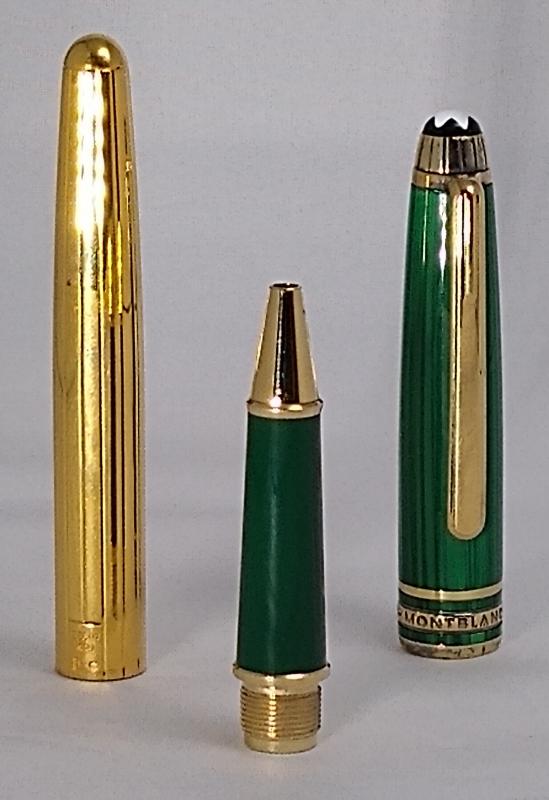
hi all bought this pen some 20 years ago in singapore at montblanc boutique and no longer have the box and tags. i've tried to get help identifying and getting the specs but cannot get much other than some contradictory info online. montblanc hasnt been very helpful, unfortunately. does anyone know about this pen? any info and/or background on this pen would be greatly appreciated. thx and cheers!
-
It's a hot, sunny Sunday here in Auckland, New Zealand. The palms are rustling in the garden and the paddling pool is set up on the deck. It sure feels like we're in for a long summer. I've only just gone back to work after my longest holiday in four years - a full three weeks! - and escapism has already been tempting my mind away again. Hence, two new pens recently arrived after days of enjoyable reading, watching reviews, considering comparisons, weighing options, and finally hunting for the perfect specimen at the right price. That process, and my thorough enjoyment of it, made me realise just what a wonderful resource the Fountain Pen Network is. I've been a member for only a few months, and before that made casual use of the forums and reviews which popped up in Google searches. Now, I feel it's time to repay the use I've made of the knowledge compiled here by adding to it, if I can do so helpfully and modestly. I am hardly any kind of expert. The opposite in fact! I have always loved to write, but I'm not sure I had even touched a fountain pen up until a year ago. As a student, either at the start of the year or around exam time, I would go through a buzz of stationery purchases, in eagerness or desperation. The right coloured notebook or pen can set you up for a perfect semester... or prop up a feverish, last-ditch attempt to cram - right? But I never connected this fondness for smooth writers and cheerful bindings with fountain pens. I had always found fountain pens to be beautiful, but they were an object of prestige and mystique, something a bit niche or for the initiated. Like cigars and champagne; a thing I saw in movies, not in real life. Fast forward a few years to the middle of 2019 when I have a steady job (and income) and a partner who uses his grandfather's fountain pen at work. I get to see one up close. Boom. My interest began to grow, and I've had a challenge reining it in since. Now I have six pens. Some are European, some are Japanese. All are from different makers. They are of varying nib widths. Four are vintage and two were bought new. They are all of reasonably high quality and from known brands (thanks mainly to knowledge gleaned from this very site), except one which was a case of mistaken identity and a good lesson in caution when buying pens online. I have been thinking that I would love to do a post about my small collection so far, but given the diversity of it, does anyone have any pointers on where it should go? I was thinking of doing each pen with photos and writing samples. Not quite full reviews, but with commentary on how I find them to use for sure. I tend to go for good examples from good makers, and have a thing for unusual and beautiful design, materials or nibs. My pens are: - Lamy 2000, new (I'm sure plenty has been said already about this pen!) - Sailor Pro Gear, new (again, plenty said I'm sure) - Pilot Custom, vintage, maple. An unusual model from I assume the 1980s, with the inset nib found on some other pilot pens but not on the Custom anymore. It's design is also different to the current pilot design, more slender. It is also made of solid maple. It's a really interesting and beautiful pen, and I was only able to find one or two other references to this particular version online. - Sheaffer Targa, vintage, sterling silver. Not an uncommon pen, but it was my first and it remains my favourite. It has a fluted design that is beautiful to look at and hold. - Montblanc No. 32, vintage, presumed 1960s. This is the variant with the partially hooded nib, giving a wing-like shape which I find particularly beautiful. It's a fantastic writer, and I love its more minimal, sleek design compared to their top shelf pens and the more modern Montblancs. - Aurora Marco Polo, supposedly vintage. This was my mistake pen. When I was starting out, I saw this advertised as an Aurora Hastil on Etsy, and my research into the Hastil made me incredibly interested to own one. So I bought it, and later, after more research and comparing images, realised that it is NOT a Hastil. I feel like a real fool about this, even though the seller refunded half my money when I pointed out the mistake. If the pen were nice to use, this would have restored it to a place of honour in my eyes, but... well let me know if you'd like a proper post about my pens! If I do write a post about my collection, where should it go? Would it be better split up into individual posts about each pen? Let me know what you think. Thanks for having me! Doug
-
So I went through some old boxes on the weekend and discovered a bottle of Montblanc ink in with papers. No box, just the bottle marked with the little blue dot. I know it was purchased in the early-mid 1990s as the papers it was stored with date it to that period. Expecting it to be royal blue, I inked it up. Goes down blue black. Odd, I thought. Perhaps it is just the effect of the passing years. I certainly don't remember buying a blue black, but perhaps that is why I put it away and forgot about it. Intrigued, I dropped some water on it. Nothing! Rubbing the page dry after 3 minutes and there was some barely perceptible shift around the 'k' in Miwok, otherwise completely colour fast. So this means I have a 3/4 full bottle of the original MB Iron Gall ink?
-
Dear fellow fountain pen lovers, I was recently happy enough to find an early 90s Montblanc 149 online, great condition with the box, papers and original ink bottle for a very reasonable price from a reputable seller. The pen arrived the day after I ordered it and was as promised, except for a nib that seems to be a little quirky. It seems to really struggle with some ink starvation (some skipping but more often startup issues). The tines seem to be a tiny bit out of alignment, though not much because it doesn't feel terribly scratchy (a little perhaps, going left to right). Most of the time though, once it gets going, the pen writes ok. It was sold to me as a medium (it is what it says on the box so I don't blame the seller), but looking at it really makes me suspect it is actually some sort of oblique. I have written with these kinds of nibs before with nu issues so I don't think that I'm using it wrong. I was wondering if someone around here happens to have some experience with these issues and knows what my next step should be. I love the pen and want to use it often, but it just doesn't perform as I want it to. Should I try to find a nibmeister in Europe to have a look at it? If so, any suggestions for one in Belgium/the Netherlands? Should I send it to Montblanc to have the nib exchanged or looked at? Is there anything I can do myself? Thank you very much for any tips!
-
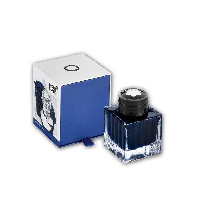
Yesterday we have received two new special edition inks by Montblanc: Montblanc Heritage Spider Metamorphosis Web Grey ink and Homer Greek Blue. As we could not resist to give these inks a quick test, we would like to share our first impression of these interesting colors. The Montblanc Heritage Spider Metamorphosis Web Grey is exactly as its name suggests. It has a spider web silver/grey color and behaves quite nicely in the pens we have tried. It offers some shading: The Homer Greek Blue ink at first glance reminded us of the Pelikan 4001 Royal Blue and we were a bit disappointed. But after drying it turns out lighter and of a different hue than Royal Blue. On the second day it is starting to capture us. Please judge for yourself: Both inks come in the 50ml glass bottles and cost € 35.-. To order, please follow these links: https://www.fritz-schimpf.de/Neuheiten/Montblanc-Heritage-Spider-Metamorphosis-Web-Grey-Tintenfass.html https://www.fritz-schimpf.de/Neuheiten/Montblanc-Homer-Greek-Blue-Tintenfass.html Best regards
-
Hello! I'm just wondering if anyone can help me with something. I just bought 2 Montblanc Rollerballs from the new Pix collection, new pens, from a private seller. They seem original to me, the boxes have stickers, they have different serial numbers on the stickers and on the pens, EXEPT that I read in another thread the serial on the pens should have the first two letters and then numbers, but mine are not like that one has MBMK1YBB1, and the other MBMK5C472. Does anyone have a Pix collection instrument with a serial number like that?
-
I have just purchased by first MB FP and about to purchase a couple more (Im afraid Ive caught the FP bug). I work in a profession where its common to mark up documents with red ink. This may be a dumb question, but how do most of you handle this? Do you have a designated red FP? I would prefer to avoid changing the ink color in each pen and instead just assign an ink color to each FP and stick with it. Is this common? Any thoughts would be appreciated.
-

Montblanc - Meisterstück Le Petit Prince & Fox Classique Ballpoint Pen - Is It Real?
MontBlancWorld posted a topic in Fountain Pen Reviews
Hello, I wanted to buy this Meisterstück Le Petit Prince & Fox Classique Ballpoint Pen for a while. It's my first ever Mont Blanc pen. I am new to the high end pen world and have limited budget... I found it on Amazon sold by RD Brands, came shipped from Israel and was about 150$ below MSRP. I decided to buy it there... After some readings, I now doubt I have a fake / replica product... I have the box that looks authentic, a serial number starting with "MBL...", Made in Germany / METAL inscription, I also weighted it and appears spot on. I emailed the vendor, they say it's authentic as well, they procure in bulk from an authorized seller, not being an authorized seller of their own. What do you all think? Real or Fake? Thank you so much!
-
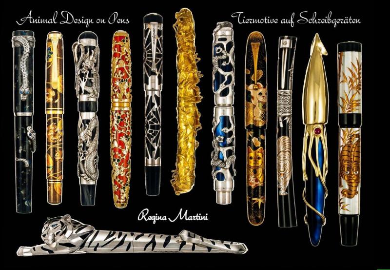
Dear forum members, I would like to introduce my new book to you. It shows in word and picture over 550 pens, all in connection to the animal kingdom. You will find pens from 80 companies. The book weighs over 1.5 kilo, has more than 200 pages. The attached pages show how the book is structured. Described is also a number of pens that are not shown. Also 100 pens that were sold by well-known auction houses. The book price is USD 150; (euro 124) including shipping. Many thanks for your interest. We do accept paypal (regina.martini@t-online.de). best regards Regina Martini
-
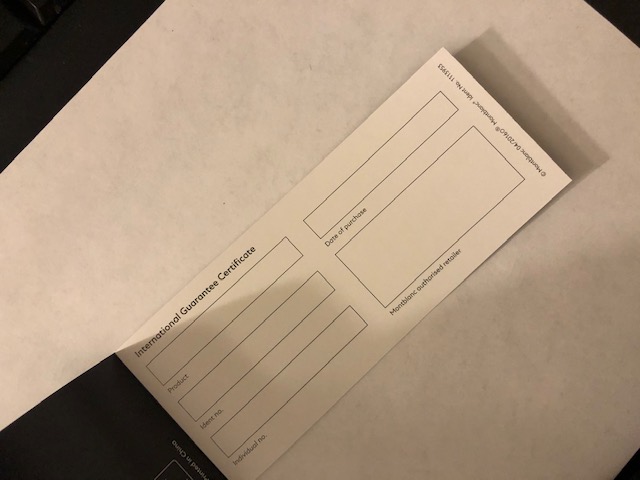
Attached please is Montblanc 146 925. The top and bottom of pen seems changed and the nib is 14k instead of 18k which is supposed to be in these pens. Kindly provide ur views about the authenticity of it