Search the Community
Showing results for tags 'montblanc'.
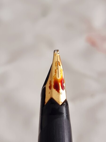
-
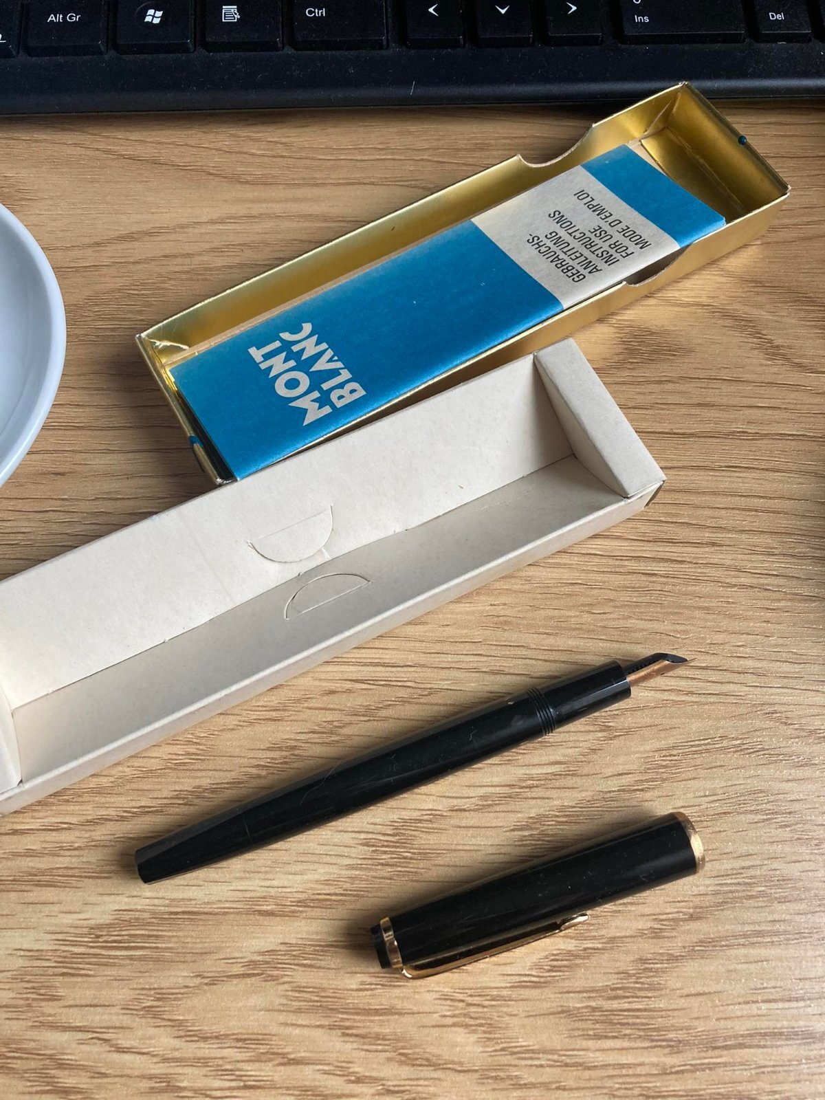
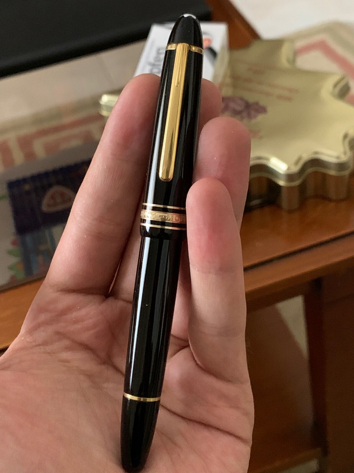
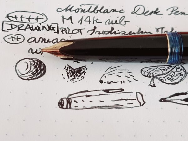
From the album: OldTravelingShoe's Random Pics of European Fountain Pens
© (c) 2022 by OldTravelingShoe. All rights reserved.
- 0 B
- x
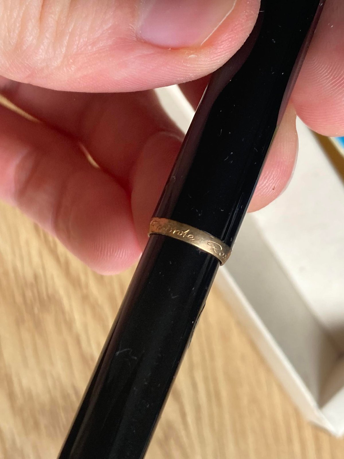
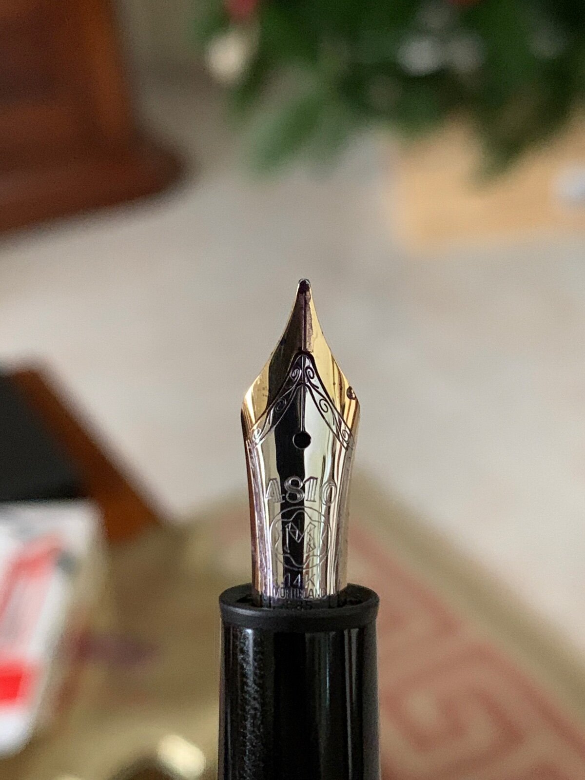
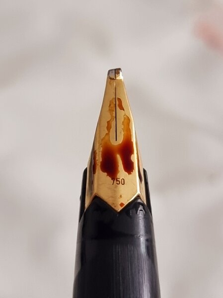
-
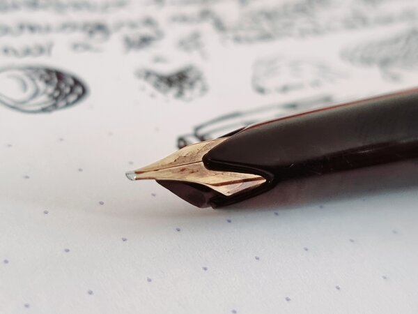
From the album: OldTravelingShoe's Random Pics of European Fountain Pens
© (c) 2022 by OldTravelingShoe. All rights reserved.
- 0 B
- x
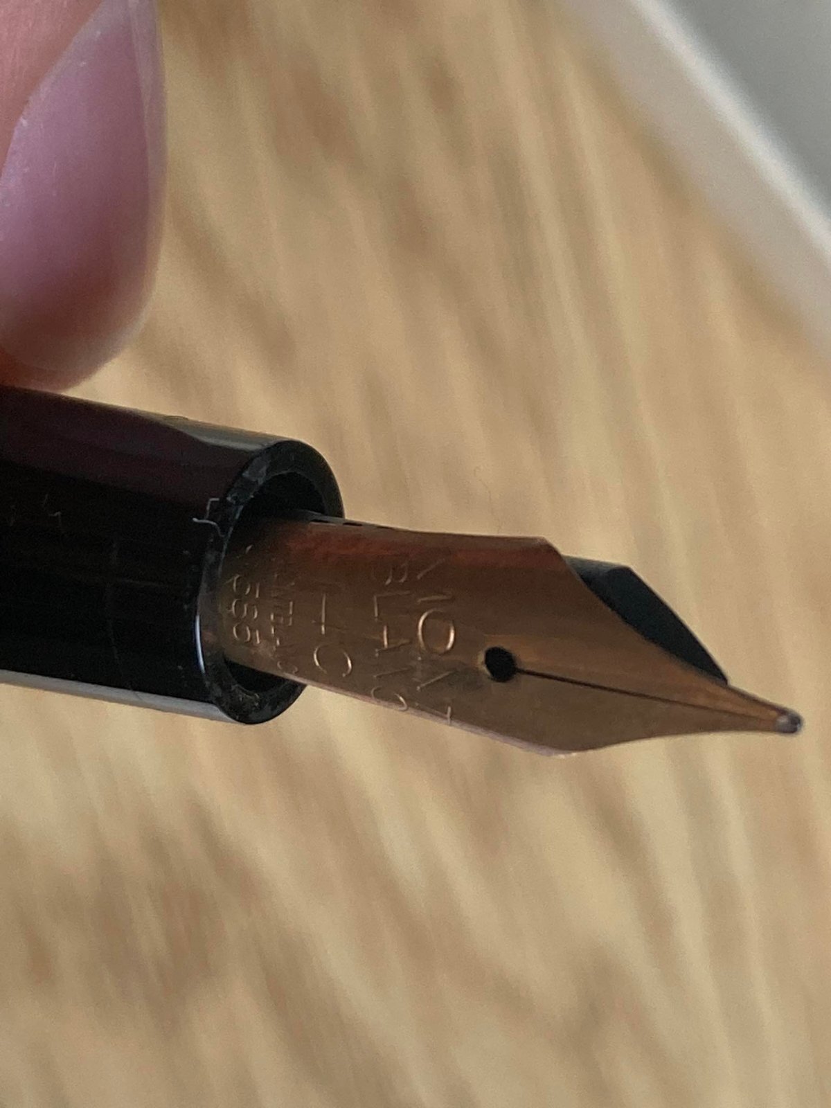
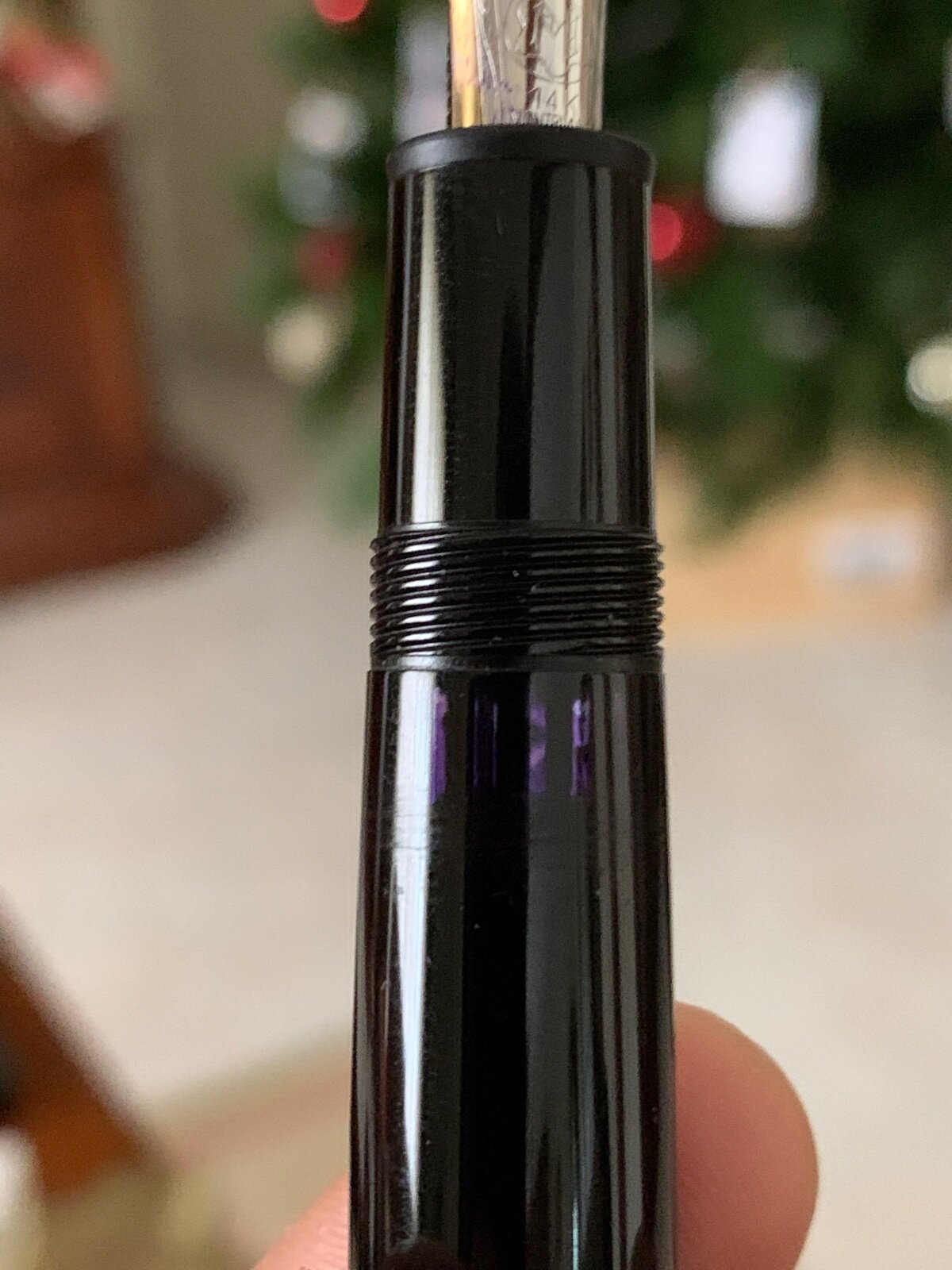
-
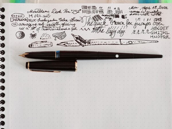
From the album: OldTravelingShoe's Random Pics of European Fountain Pens
© (c) 2022 by OldTravelingShoe. All rights reserved.
- 0 B
- x
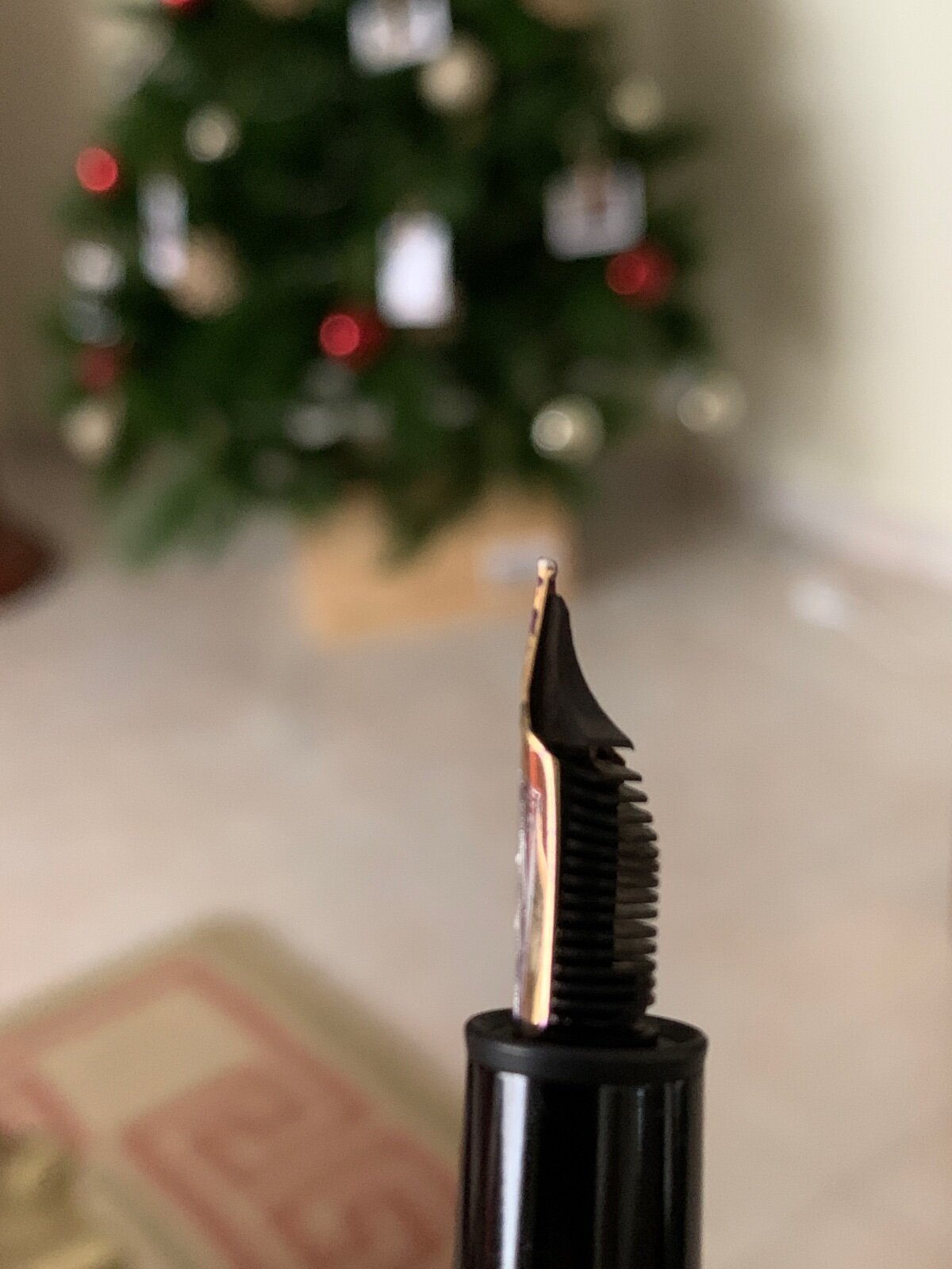
-
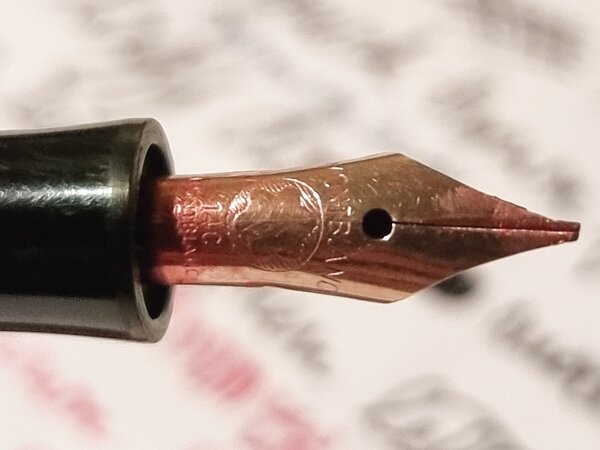
From the album: OldTravelingShoe's Random Pics of European Fountain Pens
© (c) 2022 by OldTravelingShoe. All rights reserved.
- 0 B
- x
-

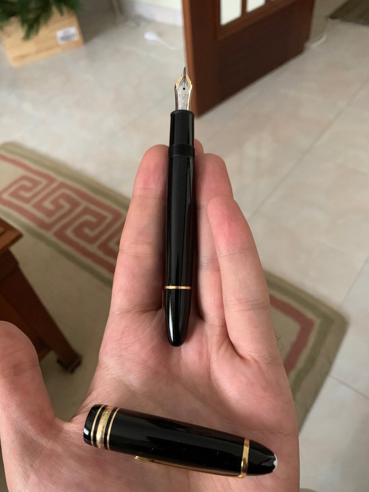
First experience (brand new) Montblanc 149 - a bit dissapointing
DD26 posted a topic in Fountain & Dip Pens - First Stop
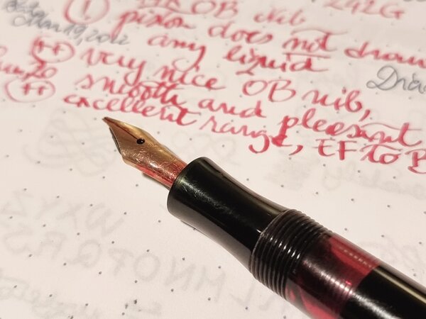
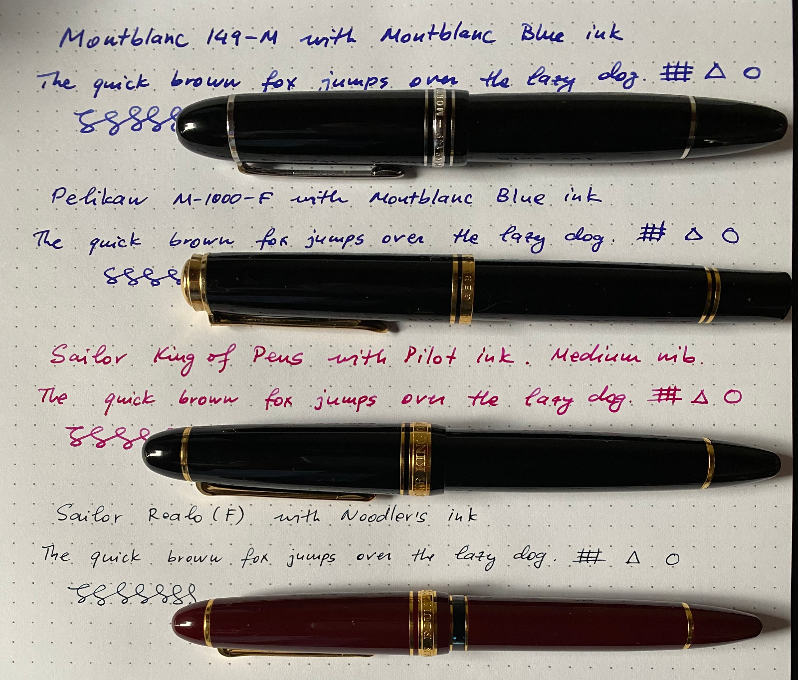
After many years of thinking and trying Montblancs, I have finally decided to get one. I have selected 149 Platinum with medium nib. I normally prefer narrower nibs but occasionally use wider nibs (e.g. in my Sailor KOP). After I got home, I washed the pen following recommendations from Montblanc (using only distilled water, flush 5-6 times), then filled it in with Montblanc black ink and tried it out. I was very surprised that it was very-very wet and "messy". By messy, I mean that the flow seems to be a bit inconsistent letter to letter. It feels just as if there is a tiny hair stuck in the nib (I inspected the tines and there is nothing wrong). I used the pen to write around 10 letter-sized pages with not much improvement. It does not skip. The start seems fine but this MB is the wettest pen I have (even wetter than Pelikan M-1000) and surprisingly introduces feathering even on a good quality paper (tried a few brands of paper). I used it like this for a couple days and then decided to switch to a different montblanc inc (blue this time). I flushed the pen thoroughly with distilled water and inked it up. The blue ink behaves a tiny bit better but not too much. I can still see slight feathering. I am going to use it like this for a few days and then probably switch the nib to extra-fine. Alternatively I am considering sending the pen to Mike and have him grind to italic but with the new pen, I am more inclined to contact Montblanc and try their nib-switching service. Anyway, just wanted to share this. I am also attaching a sample of the writing (Montblanc on the top, then Pelikan M-100 with the same ink, followed by Sailor KOP and Sailor Realo). Other than the writing, MB 149 looks quite beautiful and feels very solid with good-looking nib.
-
-
From the album: OldTravelingShoe's Random Pics of Fountain Pens
© (c) 2022 OldTravelingShoe. All rights reserved.
- 0 B
- x
-
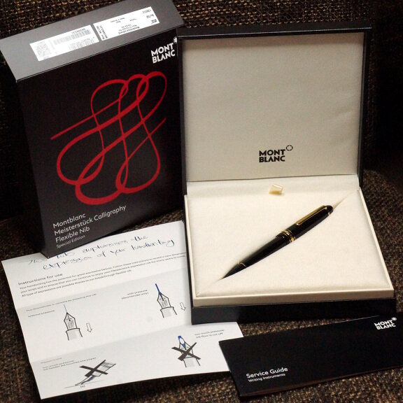
From the album: First look
I know I said I wouldn't get this, if for no other reason that it's a Montblanc.© A Smug Dill
- 0 B
- x
-
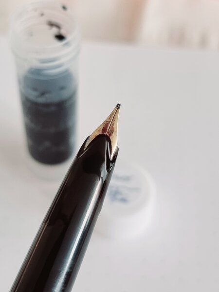
Hi y'all! I have a Montblanc 310 that has quite a gap between the nib and the feed and am not sure of what to do, as I'm not sure whether the gap is the result of the nib being bent upwards or the feed being bent downwards. There's a video showing this pen's tear-down here: https://youtu.be/H57t0ZLfs1Y?t=42 but no the clear piece that joins the section to the barrel on mine just won't budge. Any ideas? I would like to take it apart, so I can either fix the nib properly or apply hot air or water to the feed to bend it upward to have it touch the nib's underside. The pen writes well, but has issues starting after not using it for a day because the ink that fills that gap evaporates. Thanks!!! alex
-
Hi, I am a long time lurker on this forum but this is only my second post, so apologies in advance for starting off with this topic. Today, I received a newsletter from Iguanasell stating that they have Monbtlanc Chopin pen in stock. 'Wow, a NOS Hommage a Chopin pen', I thought. However when I opened the link, I saw that Montblanc has actually released a new Donation series pen in honour of Frederick Chopin. There is just one word to describe the pen: understated. It has a blue ink window, a piano hammer as the clip, his verses on the clip ring, signature on the cap and his face on the nib (weird in my opinion). I feel that the Donation series is underrated here and elsewhere on the internet (compare the number of Donation pen reviews as compared to the Writers pen reviews). I honestly adore the Donation series of Montblanc as they feature nice understated pens with some features to distinguish themselves from the common 146. This all used to be available (more on this later) at a relatively affordable price and definitely cheaper than the Writer's series (that series has honestly ventured into too much gaudiness at this point). Then I looked at the price.... 900 USD!! Before someone points out that 'It is a Montblanc, it IS supposed to be overpriced', let me list down the pens from the same brand which can be bought at this price: 1) A new Steel Solitaire 146 2) A used (or lightly used/ mint if you are lucky) Sterling Silver Solitaire 146 3) A new 75th Anniversary SE 146 4) 40 - 50% of the Writers Edition series (this also includes some of the non gaudy pens) 5) MANY special edition pens 6) Heck, most of the Donation series pens can be obtained new/ mint between 550 and 700 USD (if you know where to look) The saddest part about this for me personally is that I had started collecting the Donation series pens (and have bought the Karajan as my first pen at a slightly overpriced 700 USD, some others are cheaper) as I thought I could use the pens without raising too much eyebrows in the office (other than the folks who notice the snow star). But at this price range, I am really not sure. The series used to occupy a niche of being an understated series of beautiful pens with subtle things (the keyboard clip ring of Karajan, the red signature of Solti to name a few) to pay homage to the musician and show that it is something more than a common 146, all at a relatively lower cost. I realize that with the increase in price of the standard pens, the Donation series pens are supposed to be dearer too. But in this economic logic, has the series lost its niche as compared to other Montblanc pens? Other than fans of the musician who is being paid a homage, will anybody else buy this pen?
-
From the album: OldTravelingShoe's Random Pics of European Fountain Pens
© (c) 2022 OldTravelingShoe
- 0 B
- x
-
From the album: OldTravelingShoe's Random Pics of European Fountain Pens
© (c) 2022 OldTravelingShoe
- 0 B
- x
-
From the album: OldTravelingShoe's Random Pics of European Fountain Pens
© (c) 2022 OldTravelingShoe
- 0 B
- x
-
From the album: OldTravelingShoe's Random Pics of European Fountain Pens
© (c) 2022 OldTravelingShoe
- 0 B
- x
-
From the album: OldTravelingShoe's Random Pics of European Fountain Pens
© (c) 2022 OldTravelingShoe
- 0 B
- x
-
-
-
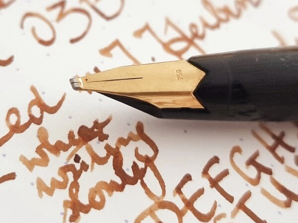
A Note About My Ink Reviews: All of the images in my reviews are scanned at 1200dpi on a Brother MFC-J6720DW in TIFF format, converted to A4 at 300DPI in Photoshop CC, and saved as a compressed JPEG. All scans were edited on a color calibrated ASUS PA248Q with aΔE<3 to ensure maximum color accuracy. TL;DR: The colors should be as accurate as is possible. Not having a suitable green (well, any green at all) in my ink collection, and not having any Montblanc ink to speak of, I decided to pull the trigger on a full bottle of Irish Green from Amazon. Rarely do I ever feel like buying a full bottle sight unseen (aside from such reviews as I can find on the internet), but in this case I liked the color enough and the price wasn't awful, so I bought it, along with Lavender Purple (also Montblanc) at the same time. I usually prefer blues to anything else, with my go-to being Diamine ASA blue, with the backup of Noodler's Midway Blue for the times I need something more water resistant. I have a single black, Noodler's X-Feather, and then Noodler's Apache Sunset, J.Herbin Stormy Grey, and Diamine Oxblood, and those have been my only inks for ~18 months, and I felt like I needed something new and more exciting. Enter Irish Green. So let me delve into the properties of this ink for a moment. Scores, where applicable, are represented on a 10-point scale, with 10 being better/larger than 1. Flow: When I tested this in my Edison 1.1 Stub, which is quite the wet pen, I found the flow to be wet, as expected, but not so wet that I found it difficult to use on lesser papers. What I did find, however, on lesser paper, is that the ink loses some of this flow and becomes a bit dryer when writing, and this is a noticeable difference, but should not be troublesome to most potential users. 7.5/10 Saturation: This ink is what I'd describe as a very saturated shader, but this could be due to the properties of the test pen. Stubs (at the very least the ones which I have had the pleasure of using) seem to have both a darker, more saturated output, but also seem to encourage shading. Lubrication: Better than most of the ink I own, but I have tried a sample of the Noodler's eel series and can say that it is similar. Very smooth, very much like glass, but not uncontrollable like some I've tried in a stub. Show-through: Virtually none on any of the Clairefontaine paper's I've tried, but quite a lot (as expected in a wet stub) on cheaper paper. Rhodia 90gsm as well as 80gsm Rhodia and CF Triomphe etc. handle it very well. Copy paper (which is what I did the review on) shows significant show-through, and the back of cheaper papers is simply not usable. Shading: It varies with the nibs used (also tried this ink in a Visconti Rembrandt M, and got almost no shading), but is usually enough to be noticed, but not enough to qualify it as one of those inks that is nothing but shading. Also varies with the paper used, CF and Rhodia papers which are less absorbent exhibit more shading. Bleed-through: None, even on cheap papers. Spread: None noticed on any of the tested papers. (Rhodia, CF, and #22 copy paper) Smear (dry): None on any of the tested papers. (Rhodia, CF, and #22 copy paper) Feathering: Extremely slight (not noticeable unless you look for it) on less-than-FP friendly paper, but none on higher quality papers. Water resistance: While it wasn't sold to me as water proof or resistant, and I fully expected it to wash off the page, I could not get it to rinse off. *Dry time for the water test was roughly 12 hours after it was applied to the paper, if immediate water resistance is your primary concern. (In which case I recommend X-Feather, from personal experience.) Other: The color is nice, but not so vibrant to be in your face and scream at you, but rather it is more of a muted plant green. It reminds me of foliage, to be honest, which isn't a bad thing, but it isn't light like Gruene Cactus Eel or dark like Diamine Sherwood green. It has quickly become one of my favorite inks for annotations and some general notes, but I don't think it fits for general writing, simply due to the fact that it is green. I have experienced no startup issues or nib creep. On another note, I really like the bottles, as they are both a significant design departure from Noodler's, Diamine, and J.Herbin bottles that I've owned. Overall, I am highly impressed by my first Montblanc ink, Irish Green.
-
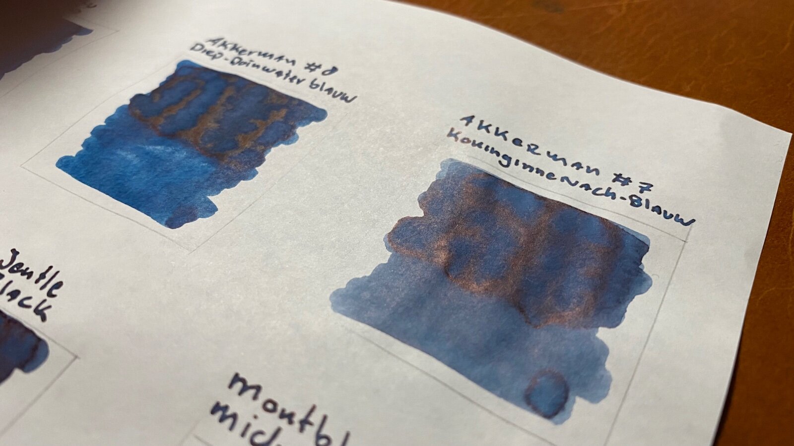
Here are 10 blue-black(ish) inks and two “true” blue inks as a comparison. Just for the fun of it. I scanned the sheet and with that most of the inks don’t show their sheen (or it’s not that obvious in the scan) so here are some photos of the inks to showoff some sheen: And for those of you who care about water resistance of inks, here are the inks after 15 seconds water bath:
-
Hey everyone! I inked up a pen with one of my last cartridges of MB Toffee Brown to see if I wanted to purchase a full bottle of it before the price hike / packaging switch / potential reformulation or discontinuation. The answer turned out to be no, but then I had a pen full of ink to get rid of. What better way to do that than a review amirite? This one is not as entertaining as my previous review. Blame the ink. It's not an entertaining ink! I also stopped halfway through the review because I had the bright idea to search for a solution to the Wateman Kultur nib dryout problem, and lo and behold, FPN answered (with "glue"). So I dropped everything, glued up my pen, and came back to this review two days later, hence the page break, and perhaps the slightly darker ink after the page break. n.B.: Lamy Safari caps fit on Waterman Kultur pens, in case you need to seal an inked pen in a pinch. This is the water test:
-
I found this new old stock fountainpen at home with the original box. As far as I can tell, it was never used and it's in completely mint condition except for the box. Can anyone tell me is it worth anything?
-
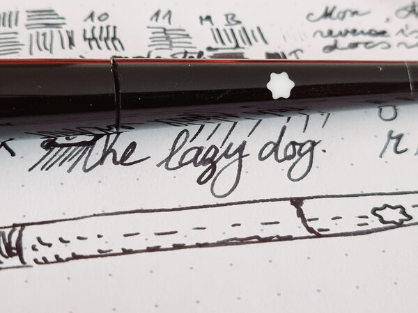
Montblanc James Purdey & Sons Meisterstück Great Masters Rollerball Pen some photos + a question for you!
christianch posted a topic in Montblanc
Hello everyone! It has been a while since my last post but I wanted to share some quick photos of the Montblanc James Purdey & Sons Meisterstück Great Masters Rollerball Pen that I receive today. The photos are not great but I hope would still be of interest. In the past I have bought several Montblanc LE fountain pens but I have now realized that the Rollerball is a great option for me for everyday use. This special edition (not limited but I don't think they made many of these pieces) was released in 2019 yet I was able to found, as it is often the case for limited or special editions, the rollerball but not the fountain pen. So here is my question: are fountain pens LE more popular than the rollerball because of wider choice of ink, more fun in using them or .... Since the price difference between the roller (which obviously has no gold nib 😁) and the rollerball is not that substantial I was just intrigued to hear from other enthusiast why the fountain pen is often the first choice for these limited or special editions ? Are collectors/enthusiast only interested in the fountain pens and not the rollerball versions ? Sorry if it sounds too obvious but I just enjoy the writing experience of the rollerball (in this case mistery black LeGrand, I think there are only 2 colors for the LeGrand roller refills, right?) has been outstanding and very pleasant. Dare I say even better than many fountain pens I own Thanks for letting me know! Christian
-
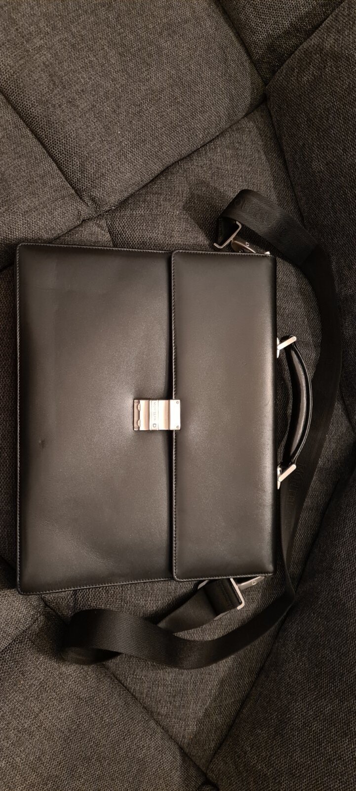
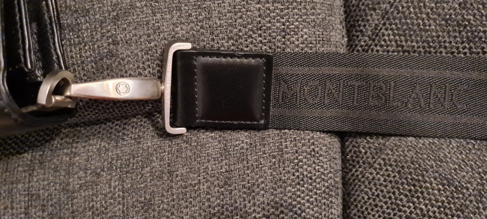
Hi, Is anyone please able to help me authenticate this briefcase or point me in the direction of someone who can please? I've attached some images but please let me know what else may be helpful to see. Thanks, Anthony.
-
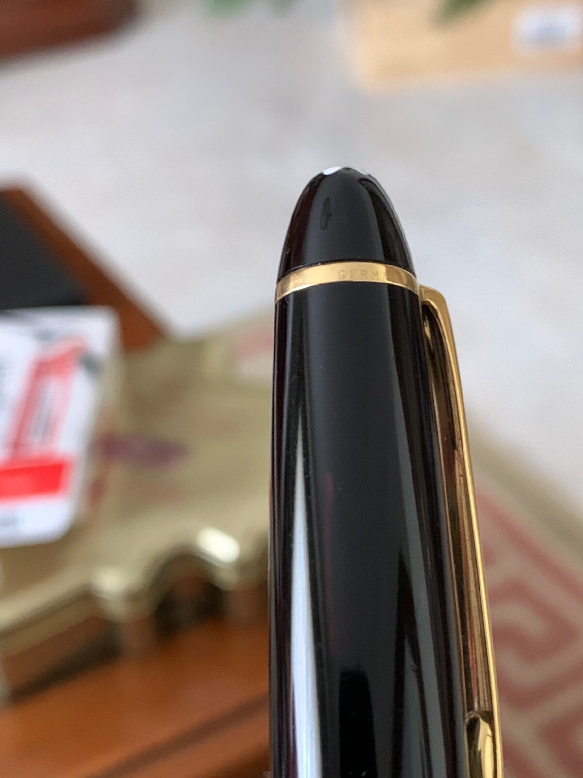
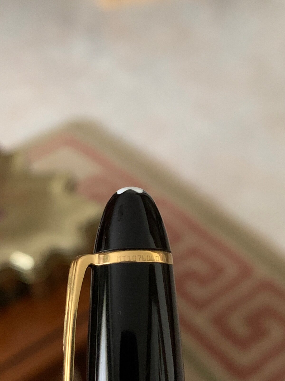
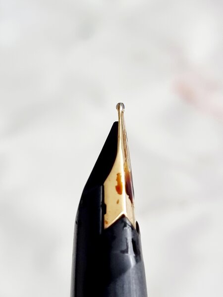
Hello guys, I just bought a Montblanc pen (original i hope), used, for 200€. My pen has serial number and germany on top ring. On cap ring it has only “montblanc meisterstuck”: no pix neither n.° 146. I hope some of you guys can help me identify the year of this fountain pen (and if it is original). Thanks and happy new year!
-
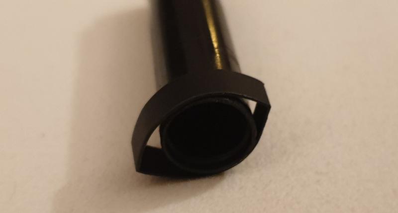
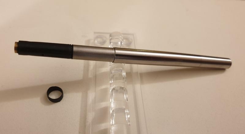
Loose cap is a pretty common issue on Montblanc Noblesse, as for many other pens with a plastic snap inner cap. Plastic inner caps usually have a shorter life than the ones with metal mechanism, as they become loose over years of use by the friction of capping and uncapping. Fixing this issue can be not so easy. A fast search in the web gave back a range of proposed solutions: a single layer of electrical tape around the bottom of the inner cap, as it could pull back the inner cap in shape; a layer of Teflon tape on the clutch ring on the section (with an high risk of inner cap cracking); a little piece of cellophane tape inside the cap (with or without silicon grease to increase the adhesion); a thin layer of superglue or epoxy inside the bottom of the inner cap (a dangerous no-return method, in my opinion) in order to increase the grip coupling; a drop of boiling water into the cap, in order to soften and re-shaping the inner cap. Discarding the #4 because irreversible, and the #5 because too uncertain, I applied all the first three methods, but without success. So I planned to experiment a personal appoach, which brings together some of the theoretical assumptions of the methods #1 to #3. After unscrewing the topper with the MB star, I released the inner cap and clip (figure #1). Then I put a ring of a thermo-shrinkable tube (5 mm in height, 9.7 mm in diameter) around the bottom of the inner cap (figure #2). Using a lighter, I quickly heated the inner cap together with the thermo-shrinkable ring. The heat softened the inner cap plastic and at the same time shrank the ring (figure #3), reshaping the inner cap. Then I gently removed the shrunk ring (figure #4) and finally put the reshaped inner cap into the cap, screwing on the MB star cap top. The cap clicks nicely and firmly, now. Sincerely, I cannot predict how long the reshaping will last, but surely I will report the long term outcome of this matter.
desaturated.thumb.gif.5cb70ef1e977aa313d11eea3616aba7d.gif)


.jpg.583aeca57067122c9b17709e990391b0.jpg)