Search the Community
Showing results for tags 'montblanc'.
-
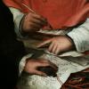
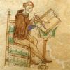
This video shows How they do quality control on every nibs they house them on to a Pen.
-
Hi guys, I'm thinking of buying this pen, but the seller doesn't know what nib he has. It looks like an older 14c MB149 nib, but its a bit slanted it seems. Is this an oblique nib? If so, can you speculate which size it could be? Thanks!

-
The Rock has this Instagram post today but I couldnt make out the Mb model. Any ideas?
-
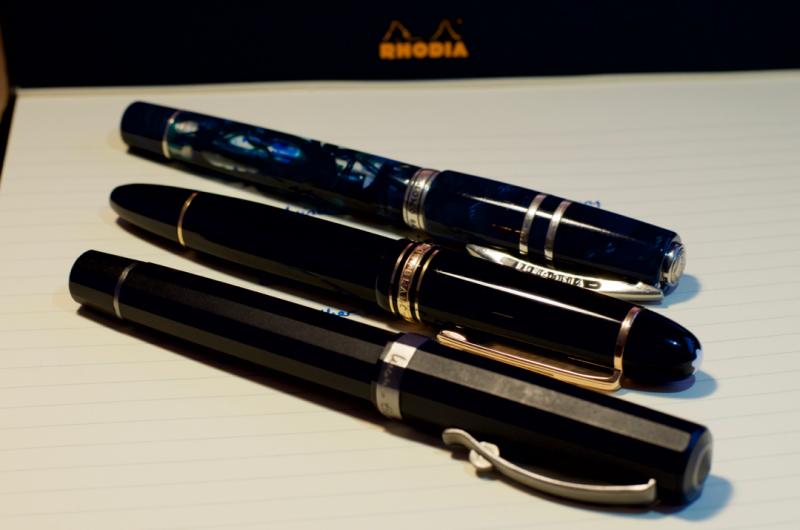
Its a classic for sure but Im debating adding one to my collection mostly due to cost. I only have one other Montblanc fountain pen, a Starwalker Midnight extreme. Also have a Starwalker Midnight ballpoint. The ballpoint was my first fine pen. Ill never forget the experience of calling up World Lux (now defunct) and placing the order. I even remember the sunlight coming through the window in the morning as I was calling. The call was very short and easy but the aftermath of I spent THAT much on a pen!? I will never forget. Really, the call was only about 5 minutes max. I even got a great deal honestly! Its funny the things that youll never forget and the reasons why. I mean, I remember all the details of that call. I even got up early to make sure I made the sale in time. It was very significant in my pen collection. Well, it was my first fine pen many many years ago and Im now bumping up against 100 pens. I rarely use either Montblanc these days but neither are really a classic Montblanc design. I have a high regard for the brand despite not really owning a significant Montblanc. I kind of feel like I should add a 149 to get the full effect. In FPNs opinion, is it worth picking up a modern 149 for the noted reasons? Is it really a worthy pen? The 149 I would use for sure. The Starwalker extreme is down because of a scratch in the finale plating. The other I rarely use because ballpoint even though its a great pen. The 149 though, I would rock that pen regularly. For my purposes the size is not a concern. I can get away with using unposted Kaweco Liliputs as well as 100g Jinhao dragon pens in the same day so Im not worried about the size of the pen. Im more or less buying the pen for what it is, I guess, but it still has to be a good writer for short sessions.
-
Good evening all! I recently aquired a 1972-75 Montblanc 149 and started to flush it through. I have noticed that the nib and feed are loose - loose enough that with small pressure, I can actually rotate them. I'm wondering, how do I tighten the nib and feed from rotating? Secondly, who is a good place I can send my pen to be properly cleaned/polished? I'm in Australia. Thank you!
-
Greetings for fellow FPN members here, This is my first post in the Montblanc sub-forum and am asking for your help / advice on a product I just procured. I just bought a bottle of a claimed to be Montblanc Racing Green. The seller only said Montblanc Green but when I saw the ad photo showing it to be racing green on the box I decided to take a punt for it. Now, based on the photos do you think that the ink is legit or is there a chance that this is a fake? Photos below: Any inputs are appreciated!
-
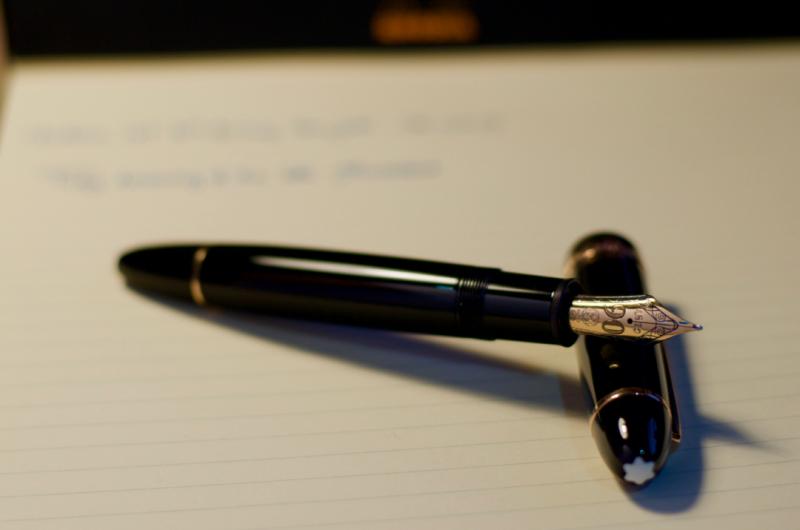
Hello again! This is my review of the 90th Anniversary Edition limited release of the Montblanc Meisterstuck 149 with a medium nib. I this was the third pen I purchased as part of my birthday splurge, and is also the third Montblanc that I own (second 149). Conventionally, I would never dream of buying a 149 in-store, as Montblanc decrees that no lower price than their dictated one be displayed on their new products. However, I was wandering around my local shopping centre, and saw a 149 with a sale tag on it in the window of Ernest Jones. Due to the lack of a box and it being a display piece, the price listed was but 40% of the usual list price for the pen, so I simply couldn't resist! As an aside, the images got butchered by the uploader somehow, so if you wish to see the intended images, I have a Flickr link at the end with the highest quality versions. Dimensions Presentation and appearance Fit and finish Filling system Ergonomics Nib performance Closing thoughts and conclusion Dimensions Length capped - 144mm Length uncapped - 130mm Nib length - 28mm Section length - 16mm Section diameter lo - 13.3mm Section diameter hi - 12.8mm Presentation and Appearance Having not come with the original box, I can't fully comment on this aspect of the pen (they gave me a standard 149 box for the pen to take it home). From what I have seen though, the 90th AE packaging is merely a standard 149 clamshell presentation box, but with a completely redone graphic set on the cardboard outer sleeve. Perhaps somewhat dissatisfying considering the price and significance of the pen, but it seems that sometimes 149s come with the large square box with an ink bottle, and others with the smaller-than-Pelikan's snap close box, so no comment there... I am sure you have all seen a 149 image before, and the majority of you will likely have watched a video or read about them somewhere, so forgive me if you have read this before (you are free to skip if you feel as though it sounds like a less catchy marketing dossier). In my opinion, and that of a great number of others, the 149 exudes 'presence', in that whilst it is not necessarily my largest pen (that goes to the OMAS Paragon) nor my most outwardly flashy pen (probably a title taken by the Homo Sapiens Crystal), but it is the one that you are aware is there, and more often than not the eye is drawn to. Whatever your opinion on the 149's appearance, whether you like it or loathe it, you will likely be hard-pressed to argue that it isn't a classic design, and at that, one which has remained so since its conception and will probably last long after this current peak in fountain pen interest we seem to have found ourselves in. There are three words that my friends and colleagues generally use to describe the pen; classy, elegant and stylish - even to the uninitiated this pen has an impact, moreso than others. Whilst I was not initially a huge fan of the 149 style, over the past year of owning my 149, then 146 Pt Line, and now this one, I have found myself increasingly appreciating the aesthetics and styling on the pen. To me it just looks right!? The 90th Anniversary Edition features a significantly different nib imprint to that of the usual 149 line. Instead of the bi-colour or tri-colour finish, the nib is wholly rose gold, and a large '90' dominates the surface, with the MB logo and 4810 being shifted down and up respectively to make way. The 90 is filled with tiny stipples, which really highlights the number, and works exceptionally well with the rest of the pen. Something that I believe is a major feature of the Montblanc design is their attention to detail. The subtle hatching in the letters of the cap band. The precise spacing of the gold bands. The stippling within the 90 on the nib to accentuate it. All these little things combine to form a beautifully well executed package. (My attempt at showing the difference between the standard yellow gold on the left and the anniversary rose gold on the right. Even in optimal conditions it is very difficult to fully capture) The key highlight of the pen which really differentiates it from the main line of Montblanc is the rose gold trim. Now, I would like to take a moment to say that I firmly believe this to be the best application of rose gold I have seen. Period. It is subdued without being overly subtle. It is still identifiable as gold without being garish. Lately, companies across all industries have been using 'rose gold' in their lineups, Apple probably being the main offender here. In many cases, the finish is almost pink, for whatever reason, and the result is a colour that looks more like a random pink metal than gold at all. Here though, the difference is very slight. The colour almost looks as though one has turned the shadows and exposure level down to 25% in a photo-editing suite. This has been the first pen where I feel the colour combination truly speaks to me, as opposed to just 'working well together'. I find myself toying with the pen in my hand and turning it around idly, admiring the 'muted' tones of the trim and its relationship with the main body. Although I wouldn't go so far as to say it is a work of art, I will say that it is about as close to perfection as I think I will find when it comes to matching two colours for impact, contrast and aesthetic appeal / draw. Fit and Finish As you might expect from a pen of this price range, the fit and finish is exemplary, with every edge and seam lining up perfectly and running flush against their respective face. The cap requires 1.5 rotations to be detached, and the threads are smooth with only marginal wiggle room. The piston knob sits fully flush with the barrel when totally done up, and is very easy to screw and unscrew, no hitches or sticking here! The only minor grip I have with the pen is that the snow cap on the finial is perhaps 20deg off from lining up with the clip, but this is something that isn't intended to fully line up (afaik), nor is it apparent enough to notice most of the time. Overall, I have nothing to complain about here. My experience with Montblanc and German pen brands in general has always been one living up to the joke about Ze Germanz and their manufacturing standards. Although there are exceptions, I will go out on a limb and say that compared to many other countries, these exceptions are few and far between when compared to some other regions...who we all know and love... Filling System Yeah, its another piston filler. For those of you who are returning to read my review having read my others (for which I am extremely grateful), you will be aware of my preference for pistons. I won't delve into that debate here, as countless others have covered it before. Suffice it to say, the 149's piston performs excellently; smooth, even and just 'the right' amount of resistance to ensure a pleasant operation. The ink window lies a fraction of a millimetre beneath the cap band when it is capped, which is another nice touch in my opinion, and being clear is very easy to tell remaining ink level. I have always preferred the Montblanc implementation of an ink window outside of demonstrators, as I think that the 50% clear 50% obscured effect they have keeps it out of sight when you want it, and easy to gauge when you need it. I am sure some care more than others about this, and there are likely those of you who couldn't care less, but its the little thing ya know! Ergonomics The 149 is famed for being a gigantic pen, whose size and power doth crush the will of lesser pens, Goliath himself wielded a 149 to reduce the armies of David to nothi- oh wait...yeah...nevermind. The 149 is large. Yes. Is it the largest? Not by a long shot. Length wise it is bested by the OMAS Paragon, Visconti Homo Sapiens, Sailor King of Pens, Custom 823 Demo, and many others I won't name. Girth wise, it is definitely up there, but again, probably not deserving of the belief that it is too big for a mortal to use comfortably for casual writing. Personally, I love the size. I have a quadropod grip, which is likely the reason for my enjoyment of the pen's size, but even when I force a 3 finger grip, it is still definitely usable. The length is very comfortable and sits very nicely against the webbing of the hand. Regarding threads, a factor that I am forced to consider more and more after ultimately having to sell the M805 because of this, the threads are not at all sharp, so even if you hold the pen highly, you will probably find this a non-issue. Balance wise, it is definitely biased toward the back end, though not at all uncomfortably, with the balance point being perhaps 2/3 of the way toward the piston end of the barrel. It feels as though you don't need to push with the pen, just guide it and it is capable of writing under its own weight. I never tend to post my pens, but you can definitely do it here, although should you wish to, you might find a shallow relaxed writing angle preferable due to the ungainly shift in weight introduced by the cap. Overall, whilst not my definitive most comfortable pen to use, it is definitely a tied second favourite for comfort and balance, switching places with the Homo Sapiens depending on my mood and preference on that given day. Aaaas usual, the YMMV disclaimer holds true, and this pen more than most should really be tried out in a store before committing to the purchase if you can do this. Nib Performance The nib is a very very nice 18k rose gold medium. Out of the box, the nib was pretty much exactly how it should be; tines aligned and converging at the tip without being too tight. I did flex the nib a teeny weeny bit at first to get the ink flowing just a tad more, but this was more a personal preference than a flaw. Someone mentioned once that Montblanc now polishes their nibs somewhat similarly to Aurora and Pilot; they are smooth, but with definite feedback. This nib is no exception. Being a medium I kind of expected a glass-like level of feedback -so basically none- but instead was given a pencil like experience. It is still smooth as silk with no hitches at all, but you feel every single change in direction and movement, something I am now strangely fond of. The line it puts down is what I would call a perfect 5 in wetness, making it ideal for any writing paper I am likely to encounter in my daily life. Flow is stunning, an area only my Japanese pens have ever managed to be truly up there in (maybe my OMAS as well?) and I can put the pen to paper after any break for it to work immediately. I have every confidence in this pen performing every time I go to use it, just as it should be. Closing Thoughts and Conclusion If you have lasted this long throughout all my rambling, my thanks. I went in with the intention of reducing the words used, but here I found I simply could not to fully convey my opinion. With this pen I have found myself in the fortunate / unfortunate position of seemingly having found my end game in pens. I have recently been able to try a KoP, Aurora, M1000, Divina Elegance and some other flagship pens in a shop, but each time I tried them I knew instantly that they were not for me, or were immediately uncomfortable to use for one reason or another (though it pained me greatly for the Divina and Sailor especially...maybe in time...). I might find myself getting a CONID or something customised eventually after this point, but as far as I can see it, I can't really go up from here. Though my dream pen is a 149 Blue Hour Skeleton, this is something I likely will never be able to reasonably afford, and similarly, other pens I have interest in, or lust for also fall into this category. Thus, for the first time since starting my collection, I find myself utterly content with that which I have. I paid £340 for this pen (I am pretty sure...), which is an absolute steal considering what I got; limited release of a flagship high end pen, months after it was discontinued. Would I have paid full price for it? No I would not, but if I had known how much pleasure it would bring me later down the line? Definitely yes. Is it worth the price? Again, for what I paid I think it is very difficult to argue that it wasn't, compared too the alternatives. Would it have been worth full price? Perhaps, but it depends on your ability to spend and whether you would value paying for the brand name as a significant portion of the price on top of a special edition. In this price range, there are many alternative purchases; M800 special editions, Pelikan M1000 if you are lucky, Sailor KoP editions, Homo Sapiens, etc. Given that this is a limited release special edition pen, for a not insignificant anniversary of one of the most famous of the pen companies, contesting the value of this pen over another in the price I paid is challenging, especially considering potential resale value down the line. At full listed price, you get into the Nakaya and special KoP range, where the workmanship and artisan value of the final piece is often much higher than a Montblanc, once more we find ourselves considering the point of whether it is worth paying the extra for the Montblanc due to the streetcred it gets, or whether you would rather buy it second hand for closer to its actual comparative value. With the unfortunate demise of my M805 and it passing on into the afterlife of another person's collection, after finally concluding that the discomfort in use just wasn't worth owning it, I found myself rotating less and less into my rotation. It got to the point where I was almost every day, for months, carrying this and the two other pens I have reviewed (HS Crystal and Paragon). I now operate two sets of 3 as my carries; my favourites, consisting of the aforementioned offenders, and my 'not-favourite-but-I-still-really-like' group, made of my Opera Elements, vintage Paragon, 146, L2k Stainless and M400 vintage tortoise. If I am not packing a bag, that trio is the set I will reach for each and every time no exception. Although it has taken a while, and many buys, sells and returns, I believe I have found my favourite three pens in these. Higher quality link: https://flic.kr/s/aHskATRPeG My Personal 'Grand Triad'
-
Lavender Purple - Deep rich purple with great tonal depth. Gold reaction with bleach. Lovely ink flow through nib. No chromatic behaviour. Irish Green - Cool rich green with great tonal depth and very subtle evidence of chromatography with feint blues in evidence. Dull gold reaction with bleach. Lovely ink flow through nib. Golden Yellow - Rich yellow with great tonal depth. Gold reaction with bleach. Lovely ink flow through nib. No chromatic behaviour. Toffee Brown - Deep rich reddish brown with great tonal depth and very subtle evidence of chromatography with feint greys in evidence. Bright gold reaction with bleach. Lovely ink flow through nib. Burgundy Red - Deep red with great tonal depth and very subtle evidence of chromatography with feint pinks in evidence. White gold reaction with bleach. Lovely ink flow through nib. Corn Poppy Red - A bright red with great tonal depth and very subtle evidence of chromatography with feint pinks in evidence. Limited reaction with bleach. Slightly dry ink flow through nib. Royal Blue - A classic blue with no evidence of chromatography. White gold reaction with bleach. Lovely ink flow through nib. Leo Tolstoy - A dark sea blue with great tonal depth and evidence of chromatography with bright turquoise in evidence. Dull gold reaction with bleach. Lovely ink flow through nib. Miles Davis - A very light and thin blue with no evidence of chromatography. Neon white reaction with bleach. Lovely ink flow through nib. Not sure whether 'Miles Davis' would better suit a darker blue? As you'd expect, these are quality inks, although a little on the pricey side, you do get a unique and very chunky looking paperweight of a bottle to boot. From a chromatography and serendipity angle, not a lot going on here, but they do react well with bleach. The colours are rich and flow well through a nib and they do look good. All tests on Bockingford Rough 200lb watercolour paper with handwriting using a Noodler's Creeper pen.
-
https://youtu.be/IP-TdORaibs Hey Folks. J. from Carpe Pluma with another review video. This time we look at the Montblanc Starwalker. Time stamps included if you want to jump around. Check it out if you get the chance. Thanks!
-
The new Montblanc Swan Illusion Plume ink bottles have arrived and we are trying to put a name to this color. Is it brown, grey, ocre, sepia? As we have not reached a conclusion we just do not name the color of this ink. The Swan Illusion Plume ink has a warm and discreet color. Shading is minimal and the ink flow good. The color reminds us of the feathers of young swans. The ink comes in a 50ml glass bottle and costs € 35.- at our shop. Here is the link: https://www.fritz-schimpf.de/Schreibgeraete/Tinte/Montblanc-Swan-Illusion-Plume-Tinte-im-Glas.html Regards Fritz Schimpf
-
Foreword: For some inexplicable reason, Montblanc's "traditional" piston-filler pens do not interest me in the least: for the brief time I owned a 146, I found it unutterably boring, and the 149 is just too stodgy (and stogie) and pompous for me -- I own its Made-In-Germany knockoff the Senator President (suggested names for LEs: "JFK" and "Obama"), which is less showy but has seen almost no use from me either. On the other hand, something about Montblanc's cartridge-fillers appeals to me: I have all three Bohemes (all without that gaudy bauble on the clip -- take that, bling aficionados!), a Starwalker, and now both versions of the M. In fact, with the exception of the midsized Boheme, all of these pens are supposed to use cartridges exclusively -- this lack of flexibility ought to count as an annoyance, yet I cheerfully overlook it for these pens, and only for these pens, in my collection. I say all this in advance of my review, because my criticism of the two M models may sound harsh, but the fact is that I own them both and like them, warts and all. With that out of the way, let's get to the review. The Montblanc M and the M Ultra Black, which I shall refer to in this review as the Newson Twins after their parent (designer), Marc Newson, have evoked very polarized responses from the moment the M was introduced in 2015. Here's an amalgamation of the criticism that has been leveled at it, with the hyperbole turned up to 11, as befits modern internet style: What does the "M" stand for? Montblanc? Marc (Newson)? Millennial? Mediocrity? Monstrosity? Money-grab? From the cribbed-from-Lamy-Safari ($35) clip, to the flattened barrel that doesn't accommodate a converter, to the cap that won't post even in the revised-edition Ultra Black (though the cap on the rollerball version of the Ultra Black does post), this ugly-duckling design just proves that Newson has (a) never used a fountain pen and (b ) delegated this project to the junior most intern in his studio. And the price! Sure, it's built to the very tightest of tolerances and the highest of standards, but at $575, Montblanc has gilded a you-know-what and is selling it as a gold brick! My response to the above rant(s) would be to ask the ranter, "Have you ever written with one?" Yes, there is an annoying step in the section. Yes, you cannot post the cap. Yes, the nib looks ugly too, at least the early ones that had Newson's initials on them -- the later nibs with an "M" inside Montblanc's snowflake design look better. But ultimately it's the way the nib writes that matters, and the nib delivers. It looks like a modified version of the nib on the Starwalker, but it writes differently and feels different, in a way that I cannot quite describe [then what am I doing writing this "review"?]. I expect that the M line was designed primarily to sell rollerballs and ballpoints to millennials (or maybe Gen Y-ers -- millennials probably aren't earning enough yet to throw $450+ at a pen), and the fountain pen version of the M was an afterthought. Yet credit is due to Montblanc for putting in the resources and effort required to design a new nib for this line, and for executing it so well. A word on the difference between the two models: the original M came in a shiny finish, while the later M Ultra Black came in a matte finish with a distinctive thin red band visible when the pen is uncapped. It is a striking and eye-catching flourish and gives the pen a bit of flair that I think is missing from the original. However, the very shininess of the cap and barrel on the original M gives it a certain spartan appeal as well. I, for one, am delighted to have both. By the way, I would never buy them for list price or anywhere close to list price. However, they are not easy to find on the used market either -- maybe they sell in small numbers to begin with, or those who do buy them know what they are getting and tend to hold on to them. Fortunately, I managed to buy them both used in mint condition a month or two apart, both at a substantial savings off list. In short, the Montblanc M: dumb name, hit-or-miss design, but the nib hits it out of the park. Sure, if you want a modern pen made by a designer better known for furniture, the $75 Lamy Aion by Jasper Morrison is far better value (it even has a different nib from the rest of the Lamy models!), but I am nevertheless happy that Montblanc used its profits to fund this project!
-
It's been awhile since I've written a review, my last one being 3 years ago. Of late, I've been making it a habit to rotate my pens, to the tune of every 2-4 weeks. One of the Montblanc Writer's Edition receiving less love than their peers is certainly the Kafka. Hence my choice today Price: I bought this at the London WES in 2013 from a dealer for 450 GBP/560 Euros, being told it was 'mint' but anyone who's bought a pen or two could tell that wasn't true, from the number of micro scratches found on the pens which you would get with use. But the condition was good, the nib acceptable to write with on paper , so I took a leap and was rewarded. Design: The Kafka is a long pen - in length, the main reason I've not used it as frequently as the rest of my pens, simply because it doesn't fit into my shirt pocket, which is a pity, since it actually has a clip that would make Goldilocks proud. Most fountain pens don't anyway, but this one really sticks out as shown. So it's mostly a pen I use for writing out study notes, or in my journal. It's not a pen I would post. The clips stems off the top of the cap, and is neither too tight to the point of frustration or too loose for comfort. Haven't used the pen in awhile, hence the dull silver, but I think it lends character ! After all it is a 2004 pen, a great way of tracking how old your pens are, when it's engraved on the nib directly ! From top to bottom; Kafka, Pelikan M1000, Pelikan M600, Parker 75 The nib is an 18k gold nib, with the familiar 4810m and Montblanc snowflake symbol engraved on the upper half, and a cockroach to represent one of Kafka's most famous publicly known works, Metamorphosis, where the main character well...not to spoil the story...turns into a cockroach. The nib is not particularly stiff, nor does it have any amount of flex to it, as most modern nibs do. As this is a medium, it doesn't have the 'stub' feel you may get with the broader Montblanc nibs. It was a dream to write with, and the feed keeps up very well, I never had to adjust the cartridge converter mid way ,as you would get with some pens. The sometimes misunderstood, maligned and yet reliable cartridge converter. It seems tightly sealed, so I've not tried seeing what happened if I tugged harder. It's not removable from the pen unit. The choice of colour for the body and cap is a dark ruby red, which at most angles, seem to be a deep and dark black. The body and cap of the pen isn't very reflective for all purposes, so even shining a light directly on to the pen doesn't bring out the reds in a more pleasing manner, as seen in the photo with flash below. Glimmers of red, mostly at the tips. It somehow shuns the light and displays its colours best in a dimly lit room, much like the terror of a flying cockroach landing on your face when the power goes out. Not a finger print magnet, which is a huge plus as well. Why red ? I haven't read enough Kafka, but I can only guess that the term Kafkaesque is frequently applied to the bureaucratic red tape we all find ourselves entangled in on a daily basis . Back to the pen, it's mostly seen at both ends of the pen, where the innards of the pen end at. The bottom end of the pen is tapered off with a piece of sterling silver, which you will see is rectangular in shape, but that transits into a the circular shape which we are all familiar with for most pens. Difficult to capture on camera. but the reflection of light of its surface tells you it changes along the way. Running your fingers along them and you'll find a seamless transition of the shapes. Why wasn't this pen more popular ? My guesses: 1) regarded as being cheaper due to the cartridge converter filling mechanism. I've noticed many FP users here regard having non cc's as being more 'premium', so this was probably seen as Montblanc going cheap on a writer's edition. In my opinion cc's are great, much easier to maintain and less of a hassle to repair. (walking into a minefield here..) 2) less trimmings: The entire body of the pen is mostly 'precious resin, aka plastic' besides the silver trimmings, compared to other pens which had more ornately decorated caps, bodies, nib sections etc. 3) simple design: well some of the writer editions can simply be...quite garish. I've a George Bernard Shaw as well, and it can be, sometimes, a bit ostentatious and invites unwanted conversations and attempts to try it... Overall, it's a design I find very pleasing, simple but elegantly done. I was happy to pay the price for a 2nd hand pen. As I slowly move away from broad nibs, but not yet to fine ones, I think this pen will feature more frequently in my daily pens. Hopefully I've convinced you that this is a wonderful pen ! I didn't score the pen out of a 10, because pens are like watches, love them or hate them, someones 10 maybe someone elses 3.75. I'm always taking suggestions for red fountain pens !
-

Montblanc 146 With Detached Collar - Need Repair And/or Restorer
shawnee posted a topic in Repair Q&A
Some of you may have already seen this over in the Montblanc forum, but I have a 1995 MB 146 that I recently purchased and *was* in pristine condition until the collar became attached. I do NOT want to send it back to Montblanc because I'm paranoid that they will either remove the nib and feed and put it in a brand new pen or god forbid, they send a whole new pen altogether. I love this pen, I love how it writes, I want it repaired and not replaced. Do any of my MB family have recommendations for someone who can repair it? I've seen a couple of names bandied around as I've done some searches, but I'd like to get some consensus on someone who can help me, if possible, in the US. I'm not keen to send it overseas. You can also feel free to message me privately if you prefer. shawnee
-
Hello! Does anyone know of pen bodies that will hold the Artfineliner refill (other than the Artfineliner pen, that is)? The barrel is too wide for it to fit in just about any pen. I frankensteined a Noodler's Ahab with the business end of a Sharpie, and it totally worked. Just wondering if there are other options K
-
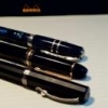
My friend is new to fountain pens and was given this Montblanc from a family friend. I know I have seen this model before, but for the life of me I cannot recall what it is. Can anyone ID it for me? Thank you in advance.
-

A Tale Of The Lesser Flagship Of Montblanc : The Meisterstück 146
sannidh posted a topic in Fountain Pen Reviews
Loved the MB's flagship pen review by Betweenthelines. And then realized, I was yet to post a review on FPN for the lesser one, the 146. As for me, I came across a real Montblanc pretty much later in life, though used to love a pen called Camlin Premier during school days. It came with a 1-pen leather pouch, an additional screw-fit nib and it did have those striped ink windows. I say I loved it, but never wrote with it since it belonged to my dad and I was a small kid. Back in 1999-2000, it cost around USD 5.00 and it was a hefty price tag for any locally made fountain pen. Later I did realize that it was yet another MB 146 inspiration, when I went to a pen store in Calcutta. So here goes my review @ blogger too with some more pics: A Tale of the lesser flagship of Montblanc : The Meisterstück 146 A BRIEFER HISTORY IN TIME MONT BLANC As most of you would know, Montblanc was started in 1906 a Hamburg banker, Alfred Nehemias, and a Berlin engineer, August Eberstein as Simplizissimus-Füllhalter which means Simplistic Fountain pens, after they learnt about fountain pens with ink tanks from the US. By 1908, three other people by the name of Wilhelm Dziambor, Christian Lausen and later Claus Johannes Voss had taken over the business and the company took the name “Simplo Filler Pen Co.” which referred to a fountain pen design with a built-in ink-tank. In 1909, a safety fountain pen made up of hard rubber called “Rouge et Noir” was launched, which actually means Red and Black. The pen consisted of a red cap and a black body, perhaps inspired from a card-game. You can also find a limited edition of the same. In 1910, the company became Mont Blanc, inspired by the highest peak of the Alps (4810 m) and a pen called Montblanc was introduced with a white tip (which would later evolve into a white star in 1913). In 1926, the Meisterstück was launched. By 1929, the nibs were engraved with 4810, the official height of Mont Blanc peak, as an allusion to supreme quality and craftsmanship. The flagship Meisterstück 149 was launched in 1952, evolving from celluloid & brass mechanism to resin & plastic mechanism over the years. For the Meisterstück 146, the ink windows were modified to striped version somewhere around the 1970s from clear blue window and the the two-tone nib was introduced in 1993-94. As far as the model numbers XYZ (146) are concerned, MB did traditionally follow a naming convention, albeit in a rather loose mannerX or 1: Tier of pen, 1 - Top class or Meisterstück 2 - Medium range & 3 - EconomyY or 4: 0 - Safety filler, 2 - Button Filler, 3/4 - Piston FillerZ or 6: Nib size, 9 being the largest MB eventually stopped production of all economy pens in 1992. DESIGN (5/6) The pen is made of glossy 'precious resin' (a custom variant of Polymethyl methacrylateaka PMMA) and is adorned plated rings and bands. Glistening golden with the subtle shine of black preserve a culture while adding a modern luxurious touch. This specific cigar shape was later copied around the world by many leading pen makers, over decades till date. The cigar shape was invented by Sheaffer Balance in 1928. The 146 also comes with platinum plated trims. The resin does feel substantial to hold, but it's also prone to scratches, if due care is not exercised. http://2.bp.blogspot.com/-Bdf5EwHxYco/VaEdqGTo-GI/AAAAAAAAEw0/d-mgo1330LE/s1600/DSC_1786.jpgWith a minimalist piece of design, the clip does start with a tiny piece of elevated ramp. The cap bands and the rings follow the same equation till a ring separating the piston end concludes both dazzle and design. The clip is tension fit and carries a serial number and GERMANY along the ring. On its underside it may or may not carry the engraving of Pix, depending upon the year of manufacture. Montblanc included the trademark post 1997. There are a lot of Chinese fakes flooding both online and offline channels, which is why Montblanc has to come up with newer and innovative trademarks with every model. http://2.bp.blogspot.com/-NRQ0HCyiSbE/VaEdpgbgWkI/AAAAAAAAEww/t6HaP1PAD-I/s1600/DSC_4304.jpgThe cap unscrews with a single turn revealing a dazzling two tone nib along with a striped ink window. I like the ink-windows very much. http://2.bp.blogspot.com/-JDI6YLg1mQs/VaEeC3KPgeI/AAAAAAAAExI/PpEzAndAV40/s1600/DSC_4322.jpg The cap does mention MONTBLANC - MEISTERSTÜCK etched across the broader of the concentric golden bands, in a cross-hatched font while two thinner bands above and below render the differential aesthetics. The finial carries the white-star.http://4.bp.blogspot.com/-t_EFEBqFTIg/VaEdWzZ1XtI/AAAAAAAAEwg/tn6K260KlYI/s1600/CapC.jpg FILLING SYSTEM (6/6) The piston is distinguished by a golden band and has an easy and a hassle-free mechanism. The piston end unscrews with less than three rotations and as the white piston head moves along the ink-windows, ink gushes into the barrel. A brass connector gives the necessary weight to the barrel.http://2.bp.blogspot.com/-OOGMOsyTrIg/VaEd-CQOqHI/AAAAAAAAExA/0Y8dcje74k4/s1600/DSC_4323.jpg NIB - ALL THAT MATTERS (6/6) The dazzling two-two nib is tested by hand, and it comes in eight different widths including the common widths of EF, F, M & B. And this silvery rhodium finish provides both glitter and glamour. A golden decor runs along the shoulders of the nib and it converges across the outer tines onto an iridium tip, while the rhodium silvery finish diverges from the breather hole across the inside of the tines and over to the tail. A bounded layer of arabesques & curves segregates the rhodium and gold decors. Then, there is a dazzling white M logo resting inside the encircled star, above which rest the height of Mont Blanc peak, 4810 (m). This one is a fine nib and writes quite wet and smooth. The tail end specifies the composition (58.5% Au) of the gold-alloy used. Above it rest the specification 14K and brandname of MONTBLANC. There is no width specified on the nib itself, unlike others.http://2.bp.blogspot.com/-15f8N4cwztg/Vf0EnKnBu6I/AAAAAAAAFhM/Yve04cKG-ns/s1600/DSC_6351.jpgA standard black plastic feed with finely spaced fins (earlier ones had ebonite feeds) ensures a good ink buffer for the awesome wetness and prevents hard starts. By the way, I just love the ink windows.http://3.bp.blogspot.com/-tRJBu8G6-gw/Vf0Et4j5lZI/AAAAAAAAFhY/ffaTbAgFWvs/s1600/DSC_6360.jpg PHYSICS OF RELATIVITY (6/6) It does give a comfortable feel to write with the pen without posting the cap. The overall capped length is around 14.2 cm. The pen can be used posted without any feeling of top-heaviness as the weight of the cap is less than a third of the total weight, with a comfortable grip of 1.2 cm.Uncapped Length ~ 12.4 cmPosted Length ~ 15.6 cmNib Leverage ~ 2.4 cmOverall Weight ~ 31 g (Cap Weight ~ 9 g)Below are the pictures along with a Pelikan m805 and a Pilot Custom 823 for your reference. http://2.bp.blogspot.com/-9cEZUiQx1Ow/VaEeVgzlMiI/AAAAAAAAExQ/ebKpXBCOoak/s1600/DSC_4360.jpghttp://4.bp.blogspot.com/-b4ug3mQy5cY/VaEee7RkPyI/AAAAAAAAExg/JKVrY2iUfOc/s1600/DSC_4379.jpghttp://2.bp.blogspot.com/-IXL8Je6WvTI/VaEeZFRv8GI/AAAAAAAAExY/zsBQQ5L1UUM/s1600/DSC_4371.jpgECONOMIC VALUE (3/6) This one defies both logic & gravity and the pen retails at more than USD 750. The price puts most of the fountain pen people off, while getting a pre-owned one from your uncles (well nothing like that! or buying it at a good discount) can save some money. You can also get hold of a MB boutique sales person selling off some older generation demo pens at a good discount. When it comes to the internet, one has to be careful regarding the abundance of fakes in the online marketplaces and the best fakes are costly and are quite difficult to identify without experience. Value for money? I doubt. Heritage Value? High. You can probably pass on the pen to your next generation and they would still recognise it as a brand. Can I pass on the same emotional value with a say, Pilot Custom 845, outside of Japan? I doubt. This will probably need some internet searches, before one realizes the true value of the pen. OVERALL (5.2/6) The writing experience is amazing although I do find the pilot custom 823 and m805 being equally good when it comes to nibs of similar size and constituency. There is a hint of spring and softness in the nib and an absence of any line variation between the horizontal and vertical strokes. The lines dry relatively quickly with a MB Toffee Brown ink taking around 25 seconds on MD Paper. And you get a nice shading too!http://1.bp.blogspot.com/-dDdiKKFeJ94/Vf0ExcEcTAI/AAAAAAAAFhk/gsIvnhXgG20/s1600/DSC_6286.jpgComparatively, a custom 823 with a medium nib, draws a line, thinner than both 146 and m805 fine points and dries quickly. On a smooth MD paper with stock pelikan 4001 inks, it took more than 30 seconds to dry the dots put by the 146 (as well as the m805). Final Toffee Posehttp://2.bp.blogspot.com/-aFyTIagg_s4/Vf0EyWgzXJI/AAAAAAAAFho/-d2kcXs6_UU/s1600/DSC_6304.jpg REFERENCES Montblanc WebsiteGentleman's GazetteForbes Article Model Numbers Thank you for going through the review. You can find some more pen and paraphernalia reviews here. -
PRELUDE I was looking to gift my dad with a Montblanc pen for a long time. And it had to be a new one. Personally, I had bought a pre-owned MB 146 (the only pre-owned in my small collection), and I am more or less happy with it. It’s kind of ineffable but the right shape with the right balance, encompassed within a classical look seemed missing in some luxury pens, which I own. Personally, I feel that any pen above $ 100 is never a VFM and it’s rather a self-indulgence in fooling myself when I order one more expensive pen. May be it’s just applying theory of brand relativity when I try to convince myself that a Pilot 823 or a m800 is a VFM pen. You are invited to read the review live on my blog (linked below), where you can find reviews of my other pens: A Montblanc Meisterstück 149 in Red Gold Back to the pen and it’s acquisition, the phenomenon was popularly known as the Apshankar hand wave within our small fountain pen group on the Telegram app. Actually, Kapil & Pradeep are the two main agents for urban poverty for many people including Vaibhav and me. Jokes apart, both are really fine people who are passionate about pens & paraphernalia and real good friends. Pradeep was kind enough to place an order for me from LCC & the pen travelled across the Atlantic Ocean with Kapil to finally land in my hand. While I was a bit unsure of the Red Gold trim, aesthetic opinions from both Kapil & Dennis (of LCC) helped me finalise on my choice. HISTORICALLY SPEAKING As most of you would know, Montblanc was started as Simplizissimus-Füllhalter in 1906 by a Hamburg banker, Alfred Nehemias, and a Berlin engineer, August Eberstein. Simplizissimus-Füllhalter means Simplistic Fountain pens and the founders had learnt about fountain pens with ink tanks from the US. By 1908, three other people by the name of Wilhelm Dziambor, Christian Lausen and later Claus Johannes Voss had taken over the business and the company took the name “Simplo Filler Pen Co.” which referred to a fountain pen design with a built-in ink-tank. In 1909, a safety fountain pen made up of hard rubber called “Rouge et Noir” was launched, which actually translates into Red and Black. The pen consisted of a red cap and a black body, perhaps inspired from the card-game. You can also find a limited edition of the same. In 1910, the company became Mont Blanc, inspired by the highest peak of the Alps (4810 m) and a pen called Montblanc was introduced with a white tip (which would later evolve into the classical white star in 1913). In 1926, the Meisterstück was launched. By 1929, the nibs were engraved with 4810, the official height of Mont Blanc peak, as an allusion to superior quality and craftsmanship. The flagship Meisterstück 149 was launched in 1952, evolving from celluloid & brass mechanism to resin & plastic mechanism over the years. The 149 was reintroduced with a triple tone 18k nib (they are 2 colours really) somewhere around 1995. For the conventions of MB, as far as the model numbers XYZ (149) are concerned, it did traditionally follow a naming convention, albeit in a rather loose manner X or 1: Tier of pen, 1 - Top class or Meisterstück 2 - Medium range & 3 - EconomyY or 4: 0 - Safety filler, 2 - Button Filler, 3/4 - Piston FillerZ or 9: Nib size, 9 being the largestMB has eventually stopped production of all economy pens in 1992. PRESENTATION (6/6) The pen came inside a luxury gift box, with an user manual cum warranty card and a 60 mL bottle of Montblanc Mystery Black Ink. I hope that the pictures below will be able to do a justice, especially when you are gifting the pen to someone dear. I am someway bound to appreciate this presentation with a full rating. http://4.bp.blogspot.com/-ILer5LGc6Fk/VlbWZ_KW1MI/AAAAAAAAFm0/btdPkChRufE/s1600/DSC_6563.jpg http://4.bp.blogspot.com/-7Pfr15tN7mM/VlbWhoj_LaI/AAAAAAAAFnM/LRzbJEWeA7U/s1600/DSC_6581.jpghttp://1.bp.blogspot.com/-TLj6oKpSMgM/VlbWbNloW3I/AAAAAAAAFm4/L80AC4al4ZQ/s1600/DSC_6597.jpg DESIGN - THE CLASSIC CIGAR (6/6) Glistening with red gold with a non pretentious shine of black preserves a culture, while simultaneously adding a touch of modern luxury. While Red gold, Rose Gold & Pink Gold are often used interchangeably, 18k Red Gold is actually made of 75% gold and 25% copper, Rose & Pink gold add up 2.5% to 5% of silver which balances out the copper. The 149 is available in three delightful trims - Gold, Red-Gold and Platinum. The pen along resting against the shoe shaped ink bottle looks awesome to me. http://4.bp.blogspot.com/-OO0Flnfv644/VlbWsfFJiGI/AAAAAAAAFng/sUm98vzYaS8/s1600/DSC_6603.jpg While the pen does not look or feel hefty, it has the semblance of an oversized pen. The clip starts with a tiny piece of elevated ramp preserving tradition. The thin and thick cap bands along with the piston rings complete the minimalistic design of the pen with grace. The clip is tension fit and carries a serial number and GERMANY along the ring. On its underside carries multiple engravings this day, however the engravings could be completely dependant upon the year of manufacture. There are a lot of Chinese fakes flooding both online and offline channels, which is why Montblanc has to come up with newer and innovative hallmarks with every model. http://3.bp.blogspot.com/-aaAG0DFBxvY/VlbW0dX4hUI/AAAAAAAAFn4/52mXlVMyESA/s1600/DSC_6604.jpg A quick pose with its smaller cousin 146 in gold trims. Red Gold vs Gold. http://4.bp.blogspot.com/-HFdgO8sHgSk/VlbW0BakqmI/AAAAAAAAFn0/CW8eBma91ms/s1600/DSC_6607.jpg It is oversize but I almost never feel the heft while I hold the pen. The cap unscrews with a single turn revealing a red gold nib with a rhodium inlay. It also reveals the beautiful striped ink windows just above the section threads. The attention to details is kind of amazing. The section ends up with a little bump with a rougher loop of resin, before the mind delves into the dazzle of the rhodium inlaid red-gold nib. http://4.bp.blogspot.com/-mQpOklcxwfQ/VlbW3bo2McI/AAAAAAAAFoM/gGWGNuZOKc0/s1600/DSC_6609.jpg The cap does mention MONTBLANC - MEISTERSTÜCK No 149 etched across the broader of the parallel cap bands in cross-hatched characters, while two thinner bands subtly play along with it. The finial of course carries the white-star. There is a tiny hole in the cap meant to equalise the ambient pressure and avoid inking of the cap. I think it could be a very recent modification. Some of the earlier 149s don't have it. There are some hallmarks including metal written on the underside of the clip to preserve MB’s product authenticity. http://2.bp.blogspot.com/-thyYhUwt278/VlbWhmWSrwI/AAAAAAAAFnI/teMm2XlYIaM/s1600/cap.jpg FILLING SYSTEM (6/6) The piston is distinguished by a red gold band and is very convenient to operate. The piston end unscrews with less than three rotations and as the white piston head moves along the ink-windows. Once screwed back inside the bottle, ink gushes inside the barrel. The brass connector renders some weight to the barrel. The feeder hole assists in efficient ink intake for an oversize nib. The manual carries graphical steps for filling the pen in case your are using a piston filler for the first time. The ink windows still rule my thoughts. http://2.bp.blogspot.com/-jsnUzfWCyUs/VlbW327fG4I/AAAAAAAAFoU/JMwK28JAZGI/s1600/DSC_6613.jpg NIB - ALL THAT MATTERS (6/6) The dazzling triple-tone nib is tested by hand, and comes in eight different widths including EF, F, M, OM, OB, OBB, B & BB and a signature replacement width of O3B. And of course it looks awesome given its size and glamor content. The size and spread of the nib are just gorgeous. http://4.bp.blogspot.com/-gwKtkYQvubs/VlbW3PUqihI/AAAAAAAAFoI/mdyR1ldQdKE/s1600/DSC_6615.jpg A bounded layer of spiral galaxies rest within the rhodium inlay while red gold defines the decors in the outer tines as well as the inner body. Then, there is a dazzling red gold M logo resting inside the encircled star, above which rest the height of Mont Blanc peak, 4810 (m). This one is a fine nib and lays a smooth wet line. The tail end specifies the composition Au750 of the gold-alloy and the brandname of MONTBLANC rests above the tail. Between those there is a hallmark of StOD inside a crossed ellipse. There is no mention of width on the nib per se, while a sticker at the piston end of the barrel says it all. http://4.bp.blogspot.com/--FAGKaOnLSg/VlbW4q8VLtI/AAAAAAAAFoY/4KYxjHgQB2A/s1600/DSC_6622.jpg A black plastic feed (earlier ones had ebonite feeds) with a feeder hole improves ink suction while closely spaced horizontal fins ensure a good ink buffer and promise wet and smooth starts. Even with a dipped nib section, it can a few paragraphs. http://1.bp.blogspot.com/-VjDqzClHuT0/VlbW7JURE0I/AAAAAAAAFog/MbEnimU7NdQ/s1600/DSC_6657.jpg PHYSICS OF IT (6/6) – RELATIVELY SPEAKING The overall capped length is around 14.8 cm. I would prefer to use the pen unposted as both weight and balancing seem perfect with an awesome nib leverage. The section has a comfortable grip of around 1.3 cm. I feel it’s a very comfortable from an overall perspective balancing amazingly well for an oversized nib. Uncapped Length ~ 13.3 cmPosted Length ~ 16.8 cmExposed Nib Leverage ~ 2.8 cm Overall Weight ~ 32 g (without ink, cap weight~10 g)Below are the pictures along with a MB146, Visconti HS Maxi and a Pelikan m805 for your reference. http://3.bp.blogspot.com/-SoYa2kCUFqs/VlbW8ygEEII/AAAAAAAAFoo/KJScsu0hVXg/s1600/DSC_6661.jpghttp://1.bp.blogspot.com/-KwFTSxJvUME/VlbW_B55utI/AAAAAAAAFo4/bH3TcB2_DwE/s1600/DSC_6669.jpg ECONOMIC VALUE (3/6) An expensive retail price of above USD 900 puts off people, while getting a pre-owned does save some money, while you keep the charm of writing with a 149. When it comes to the internet, one has to be careful regarding the abundance of fakes in the online marketplaces and the best fakes are costly and are quite difficult to identify without experience. I am not going to discuss the pricing, but I had more than a reasonable discount, thanks to Kapil. And for me it’s a gift (although I could end up using it ) and the price didn’t matter. Although personally speaking, I would have preferred a pre-owned 149 in a great shape. OVERALL (5.5/6) The writing experience is as amazing as the nib looks, with just the kind of control which you would require from a superb nib. Both Kapil & Dennis had tested it before packing. There is spring and softness in the nib and an absence of any line variation between the horizontal and vertical strokes. The lines dry in 30 seconds with a MB Mystery Black ink running on MD Paper. With other inks the width is good enough to reflect some shading too. The best part perhaps is the balance that Montblanc could find with an oversize nib, so that it does not feel unwieldy. I initially had my own doubts regarding the size but I did try the 149 in a MB boutique then Pradeep’s 149, to be certain. The nib never skips and always lays a wet line, and seems to be one of the best oversized nibs in my small collection. I am sorry I couldn't gather the courage to put some pressure and try flexing some characters out from this one. http://2.bp.blogspot.com/-8jcp0ekeOKA/VlbW_Lcs50I/AAAAAAAAFo0/etpyrbHZrzo/s1600/DSC_6645.jpg REFERENCES Montblanc Website Gentleman's Gazette Model Numbers StOD Hallmark Thank you for going through the review. You can find some more pen and paraphernalia reviews here.
-
Hi gang, It's time once again for PBA Galleries' Fine Pens auction. The upcoming sale is huge, with almost 600 lots of outstanding modern and vintage pens. The sale includes almost all of the Montblanc Writers Series and Patron of Art 4810 Series fountain pens, as well as hundreds of excellent Parker pens from the Dr. Anthony S. Tavill Collection, a selection of Namiki and other Japanese pens, OMAS, Montegrappa, Pelikan, Loiminchay, Stipula, Visconti and other makers. The online catalogue can be viewed here: https://www.pbagalleries.com/view-auctions/info/id/472/ If you'd like to register to bid in the sale, or you'd like to consign to the next sale, please contact: Ivan Briggs Director, Fine Pens, Watches and Comics PBA Galleries, San Francisco ivan@pbagalleries.com
-
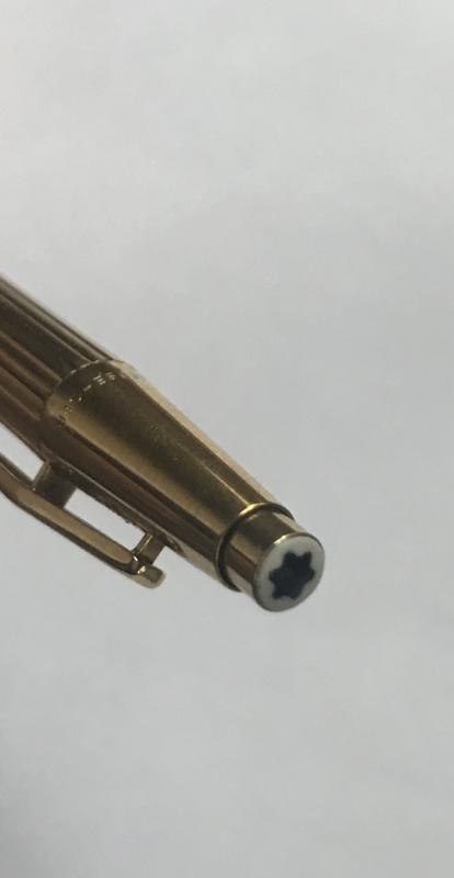
hello greetings from Finland. I call me mustekyna (fountain pen in finnish!) I have a problem with my Montblanc 144 I bought a Montblanc from Germany (a used one) and noticed that the part in the pen end (marked yellow) has a crack. So I would need this part to be changed. Then my daily friend would be in excellent condition. I asked for a price for this change and it was 200 € and I would need to send my fountain pen to Denmark. My pen is in wonderful condition and wrotes lovely and costed 240 €. Am I able to change the end part? How do you call this part, in picture painted yellow?. Do you think I could find an old spare part, this part, somewhere. best regards mustekyna
-
It took me some time to finish this comparison but here it is. Not flawless, not pefect, but it has plenty of colors to see. To be honest I've never been violet fan. I always liked dark purples but disliked most of violets. It's hanged with time. At the moment I'm quite keen on these hues. I've included 60-63 inks here (the number differs on different papers, I didn't have enough samples of some inks, I've forgotten about one or two inks and haven't included them everywhere). There are some odd-looking inks here that aren't violet/purple like KWZI Blue L51 (I just had a small sample so I included it here). Kung Te-Cheng, Potassium, Purpillusion are more blue than purple. Alt-Bordeaux and Deepwater Obsession can be regarded as burgundy but as I'm not planning (yet) to compare burgunds / bordeaux I've included them here as well. I need to thank Cyber6 here for A LOT of samples. You trully are Ink Smuggler Extraordinaire Ink Splashes http://imagizer.imageshack.us/v2/1024x768q90/674/D57Iib.jpg http://imageshack.com/a/img911/9309/XMowa7.jpg http://imageshack.com/a/img905/9462/Dzf3fY.jpg http://imageshack.com/a/img537/121/srURhs.jpg http://imageshack.com/a/img901/3985/xcEDod.jpg http://imageshack.com/a/img537/4492/NtfODA.jpg http://imageshack.com/a/img538/2685/q8cIq7.jpg http://imageshack.com/a/img673/1967/EnAfQy.jpg http://imageshack.com/a/img674/4319/WdEf3j.jpg http://imageshack.com/a/img631/7922/1S4blW.jpg http://imageshack.com/a/img673/9114/raVPLz.jpg http://imageshack.com/a/img674/3466/vK8xaM.jpg http://imageshack.com/a/img538/7629/ivb3lB.jpg http://imageshack.com/a/img538/2456/dhwe19.jpg http://imageshack.com/a/img745/7901/pw9g05.jpg http://imageshack.com/a/img674/6609/m4k036.jpg GEMS (they were cut from photos taken on a sunny day, you may find the colors bizarre but I like to show them this way even though most of the times we're not writing in a direct sunlight) http://imageshack.com/a/img910/3417/UZX0cP.jpg http://imageshack.com/a/img674/7610/4sDPbR.jpg http://imageshack.com/a/img538/8730/osVcHA.jpg http://imageshack.com/a/img912/9997/NAgsqc.jpg
-
From my father's pen collection - Montblanc Noblesse Mechanical Pencil. It has a push-button mechanism and uses 0.9mm leads. Can someone help me with the model # and date? Also, how do I tell the K of gold used? I understand it is rare due to black star on pusher. Is that true?
-
Granada; once the great province of the Nazrid dynasty which still houses the magnificent Alhambra palaces and the royal chapel and grave of the warrior queen Isabella and her side-kick, Ferdinand along with many other treasures, has, in a street covered with stone arches a small and unassuming Montblanc store which houses many treasures waiting to snare the unwary traveler. In forty degrees heat and after far, far too many coffees in a deli that had at least thirty pigs worth of cured hams hanging off the ceiling, I must surely have been suffering heat stroke when I drooled over a choice of two pens. The odd thing was, one wasn't originally on the menu, but became a surprising little addition. By the end of the summer of 2018 I had in my possession two pens ready for a great grail face-off! They were the Montblanc Blue Hour with a double broad nib and the Montblanc Petit Prince Special Edition with a fine nib. There are very subtle differences to these pens which makes them an interesting comparison, and I don't mean by way of the obvious appearance. To my eye both are very beautifully made pens. At the time of purchase I had intended only to nab the Blue Hour, but the pretty sales lady batted her eyelids and kept showing me the Petit Prince SE and spoke in a lilting, llispy Spanish until all my defences crumbled before me. I'd seen pictures online of the Petit Prince SE and the yellow star on the clip really put me off it. On the normal edition, even in the flesh, it sits uncomfortably to my eye and detracts from the pen. On the SE, in the flesh, it works significantly better, but as they say - your mileage may vary. Seeing it in the flesh revealed it to be a very beautiful, yet also a kind of fun pen. I'll go through some of the comparisons. the technical specs and hopefully some manner of conclusion at the end. Appearance To the eye both pens appear to be the same model with different finishes. The Blue Hour has a faceted deep blue (ever so slightly green) colour. It's somewhat difficult to describe, but to the eye it gives the appearance of lots of little angled triangles under a resin lacquer that catch the light giving the pen a curious sparkling appearance of deep blue mixed with light blue in a regimented pattern. Oddly, side by side, the pattern on the Blue Hour gives it the appearance of being slightly fatter that the Petit Prince, but I think this is merely an optical illusion (having no way to measure this accurately). The Petit Prince has a really rich blue lacquer with engraved fox heads (from the book illustrations) running up the barrel and cap in gold outline. The blue is actually over a brushed metal and you can see this when you look very closely. the brushed metal creates a very vivid sheen in parallel lines which is almost impossible to photograph but it makes for a very attractive effect. Both pens have a white metal grip (which I haven't found to be slippery), piston nob and housing for the standard snow peak. It's a shame these pens don't sport the mother of pearl stars as they both deserve them. The yellow star on the clip of the Petit Prince is enameled in yellow and again, also from the original drawings. Montblanc must have paid an king's ransom for the rights. Nibs Both pens have nibs that are engraved. In the case of the Blue Hour the nib is monotone white metal over gold engraved with a diamond pattern. The Petit Prince is a gold dual toned nib to highlight the Little Prince standing beside the fox curled at his feet and all with stars around them. It's a very pretty nib. My nib preferences are at two extremes; extra-fine and fine and stubs and double broads. In this instance the Blue Hour has a double broad nib and the Petit Prince has a fine nib. I have no complaints about either. They are both perfectly smooth, perfect flow and while firm nibs they don't feel like nails - exactly what I've come to expect from Montblanc. Technical Specs Both pens are piston fillers. Both pens post securely and have screw caps and posting will not mark or scratch the piston nob. Both caps have a double ring that looks like ceramic (I was told elsewhere that this is a Montblanc anti-forgery thing and it certainly seems to work as I haven't seen the usual fakes that appear out of the east of pens that have this) but is some kind of treated or sandblasted metal. The usual Montblanc engraving is on the cap rings The two notable differences with the Petit Prince SE are the enameled star on the clip and the engraving at the top of the cap near the snow peak which reads, 'To me, you are the most precious thing in all the world', in French.....or some-such as my French isn't honestly up to much. It's a quote from the book. Both pens have engraved nibs but the Petit Prince is dual toned. Both are metal bodied pens. The Petit Prince SE weighs 68g (filled) and the Blue Hour weighs 64g (filled) The Petit Prince is 5.75 inches capped, 6.25 inches posted and 5 inches unposted. The Blue Hour is 5.75 inches capped, 6.45 inches posted and 5 inches unposted. Both have quite long grips of around an inch, maybe a touch more. Pictures often given the impression of a somewhat severe step. In reality, it's a trick of the light as the very slight step is angled. It's where my fingers rest when I write with it and neither it nor the threads bother me. the threads aren't sharp. The Great Grail Face-Off Conclusion! It's hard to choose a favourite between two pens, one of which I knew I had to have the moment it was released and the other of which surprised me enough in the flesh to buy even though I disliked it from the online pictures. Both are very good to write with and both are pretty stunning to look at. The attention to detail is nothing short of remarkable and even though I would normally steer clear of heavy metal bodied pens, I've found writing with these over the last four months to be an absolute joy. So, in essence it comes down to very small nit-picky things that probably wouldn't bother a normal, sane individual, but I guess it must be done. Both pens stumble over two similar issues. the first relates to the white metal grip on both pens. It's a real finger print magnet and your finger prints become very easily visible when using it. If that kind of thing bothers you, I guess it might be a factor to consider - these aren't exactly cheap pens after all, so when you shell out so much, some expect perfection and a match to all their various whims and wishes. The second thing is related to it's piston mechanism. It works perfectly well and is remarkably smooth. It's so smooth and so easily turned you might think the pen hasn't filled. That might sound like an odd thing to say, but it's fooled me more than once. For some I guess it might be a minor irritation, so perhaps worth mentioning. For me, it comes down to one thing, which edges the Blue Hour out in front as the more satisfactory grail buy. I guess you could make an argument that the overall design of the Petit Prince SE is a little frivilous for such an expensive pen, but I'm kind of endeared by it and it still does have a classic element of design that steers it well away from the realms of expensive gee-gaw and gaudiness. The strange thing is that the extended length of the Blue Hour when posted along with the expunging of four grammes somewhere in the design makes the Blue Hour nudge into first place as the better writer. It feels like it has a much better balance, while the Petit Prince (posted) feels like the cap is just a tiny, tiny touch heavy. Just as I finish up, winter's brief blue hour has descended. Seems fitting.
-
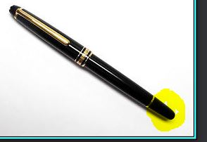
Fellow FPNers, I recently had a terrible experience with the Montblanc nib replacement service. I purchased a F nib Montblanc 1912 and sent for a nib replacement, I left a note and confirmed with the Montblanc operator that I would like to have an extra fine nib. 10 weeks later, I finally got the pen back, to my surprise, Montbalnc got me a Oblique Medium nib instead. The current nib looks like a snow shuffle, the tipping is just flat, I wonder how can any one call that an extra fine.
-
Just saw the display of the Heritage 1914 in a Hong Kong MB boutique. Both the 333 version (orange) and 1,000 version (black). Staff are so nice to let me take photos on them. They are huge !!! Will try to get another photo with the 149 for comparison. http://www.sampanel.com/Hobby/Writing-Instrument/Montblanc-Heritage-1914/i-x2SCmTQ/0/X2/800_7448-X2.jpg http://www.sampanel.com/Hobby/Writing-Instrument/Montblanc-Heritage-1914/i-LRWSvWs/0/X2/800_7447-X2.jpg http://www.sampanel.com/Hobby/Writing-Instrument/Montblanc-Heritage-1914/i-Z8nLGb6/0/X2/800_7446-X2.jpg http://www.sampanel.com/Hobby/Writing-Instrument/Montblanc-Heritage-1914/i-QPKM4ZT/0/XL/800_7451-XL.jpg http://www.sampanel.com/Hobby/Writing-Instrument/Montblanc-Heritage-1914/i-8PZFpWJ/0/X2/800_7449-X2.jpg http://www.sampanel.com/Hobby/Writing-Instrument/Montblanc-Heritage-1914/i-Q4WsPfM/0/X2/800_7452-X2.jpg
-
I'm thinking of getting a Montblanc Le Grande (146) and am wondering about the nib sizes. Let's say I like a modern Pelikan M400 F nib, then what nib size would I use with Montblanc. I know the modern Pelikan nibs run a bit wide, how about the Montblanc nibs? Thanks in advance.