Search the Community
Showing results for tags 'mixing'.
-
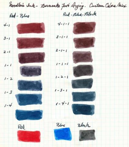
Greetings. For the office and use on cheap photocopy paper I like the quick drying properties of Noodler's Bernanke inks. Color selection is limited to red, blue or black. Here is my go at mixing the three colors to get new options including purple (1 part red to 1 part blue) and my general go-to color: blue-black or midnight blue. Drying time seems to remain the same and not changed by mixing (but will leave it to others to test and confirm). I've read mixing inks made by different companies can be problematic. My assumption (right or wrong?) is mixing inks within the Noodler's Bernanke family should be okay. (Tests done on old (1940s-1950s) good stock graph paper)
-
Any one mixed Platinum Pigmented inks to get a nice dusky or voilet purple? Thinking 2:1 Rose Red and Blue. But know subtle hues can throw off color to a gray. Wanting to research before spending 40 (or 60 if need add Carbon Black to darken) plus dollars. Thanks, Madak
-
Is anyone aware of recipes for inks! I really like the idea of making up your own ink but can't really find anything (like a recipe) online.
-
You may have gathered from the title that I am not that fussed on Edelstein's Mandarin. When I first saw it I thought, 'Oh, a truly popping orange', but that thought was rapidly replaced with a retina burning headache. I tend to like reds and oranges, but I like them to have a little subtlety about them and not quite 'true' in their colour spectrum (if that makes sense). Iro's Yu-yake, the Fuyu-gaki, Noodler's Apache Sunset, couple of the Diamine oranges, Herbin's Orange Indien; you get the idea, I like reds and oranges. Mandarin seemed like a great choice, but in a very short time I grew to truly loathe it. I even contemplated throwing it down the sink just so I could use the bottle for something else. Then I had a brain wave. Why don't I add a few drops of Edelstein's Onyx Black? So, three small drops later and with dip pen in hand I tested it. It's a little similar to Apache Sunset. Now bear in mind I tested this with a dip pen on highly absorbent paper. At first it was extremely similar to the Noodler's, but as it dried the shading disappeared (not unexpected with this ink). Dried and unshaded you are left with a rich orange saffron with a noticeable red aspect. It still 'pops', but it isn't headache inducing and it has left me with an ink that I can now happily use. I will try and get a pick uploaded later. Just thought I would let you all know in case, like me, you had contemplated ditching the ink, or wondered how on earth you might ever use it.
-
When the color you bought is just not perfect... what ink do you use to fix it? What does this ink do to improve the not-so-perfect ink? Does it darken the color? Make it lighter? Brighter? Tones it down a bit? Etc. If you wish to divulge your super-duper top-secret inky-mixing ratios and combinations, please do so in the INKY RECIPES thread.
- 22 replies
-
- absolutely must have
- go to ink
- (and 5 more)
-
http://i.imgur.com/cbxj88r.jpg?2
-
I guess we've all done it (I hope!). Not quite flushed through a darker ink before filling up with a lighter one. My dear little brass Wearever was in need of an outing so I cleaned him out - he's a squeeze bar filler, so no fiddling - and decided to give him a run with my newly acquired Apache Sunset. He's quite broad and firm but smooth and wet so I was curious to see what he'd make of it. Needless to say, he hadn't finished with the Diamine Salamander he was carrying before and the resulting mixture makes my eyes squirm. You'd think I'd get a pretty sludgy brown from the mix but not at all. It's a strange greeny orange with bright yellow highlights! Has anyone else come across a similar Frankencolour, unintentionally created?
- 3 replies
-
- salamander
- apache sunset
-
(and 1 more)
Tagged with:
-
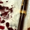
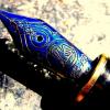
My first ink mixing efforts of note are above. After a very exciting couple of weeks after orderingI recently received the FPN Galileo Manuscript Brown (there was a little surprise sample with it - thanks Amber! - but I'll leave a review of that for another day). After reading the reviews of the FPN Galileo Manuscript Brown I was expecting it to be on the red side, but I was a little disappointed to see that for me it was more red than brown. I found it almost similar in look to Diamine Oxblood or even Ancient Copper, but not as dark. It is lighter than the picture indicates. While it is a very well behaved ink with excellent properties I just couldn't see myself using such a light reddish colour as a daily writer. After reading all of the reviews and seeing that someone suggested adding black, I tried a bit of mixing. My first was 3:1:1 Brown:Black:Water and as you can see above was quite dark - a little too dark for my taste. The second effort was 5:1/2:1 Brown:Black:Water. I used Noodler's Black because I felt it was best to stick to the Noodler's bulletproof to minimise the chance of any adverse reactions. I have added added a few ink colours down the side for comparison purposes. Pictures are from a camera phone with indoor lighting. I've been using it for a day now and am very pleased with the result. It writes very well from my Pilot Custom 823 with a very lubricated and quite wet line with no evident feathering or bleed through on the papers I have tired. It does feather on Staples Sticky notes but then, pretty well everything else (apart from Noodler's Black and Iron Gall Inks) does too. I love the colour and the shading and I am very happy that I am able to tailor the colour quite easily by the addition of black in various ratios. The added bonus is I have now effectively extended the life of my bottle of FPN Manuscript Brown. Below are a couple of pictures showing my tryouts on Tomoe River cream paper and a picture of the pen.
-
Hi, after being indoctrinated by LindaMedley into Noodler's CMYK mixing, I'm going to venture into Iroshizuku as well. Obviously, Iroshizuku don't offer a pure black nor a yellow. For yellow, I can get away with orange Yu Yake down the magenta end of the spectrum, and green Chiku-Rin down the cyan. Kon Peki will be my cyan, and Tsutsuji my magenta. Along the black lines, Take Sumi will be adequate for most mixes down the cyan line, however my sample appeared to have a touch of yellow in it which gave Kon Peki a touch of green when blended. I have ordered a bottle of Take Sumi, I'll see what that's like. However, Iroshizuku have no deep blacks down the Magenta line. Are there any pure black inks or black with magenta overtones in chromatography that I may be able to safely mix with Iroshizuku inks? I do have Noodler's bulletproof black which I haven't tried yet, but I'm hoping someone's tried something else with Iroshizuku that they know works. Thanks!
- 3 replies
-
- iroshizuku
- blend
- (and 4 more)
-
I have Montblanc's Royal Blue and Mystery Black. I've been using the blue for about a week now and I quite liked it to begin with, but now I find I'm bored of it - it's a little flat (for me). I like blue/blacks and was wondering if I could mix it with Mystery Black to create something a little interesting. Has anyone done this with good results, and if so, what are the proportions of the mix?
-
I've just received a bottle of J Herbin Rose Cyclamen from fleabay. I wanted this ink for mixing a purple, but I was looking at the box and read: "Never mix two different inks." !!! Are they just covering themselves? Or is this an ink which shouldn't be mixed?
-
Hey all, just a few questions: What exactly is 'pH'? To my knowledge it is how acidic an ink is or something? What does it mean if an ink is 'pH neutral'? How does the 'pH' level affect my FP? What is the difference between Iron-Gall and Dye-Based inks' 'pH' levels? And lastly; Can IG inks be mixed with standard (dye-based) inks, just something like Diamine or Waterman? I've seen R&K inks can, but I've also seen many posts about Diamine's Registrar's turning cloggy, even if mixed with less than a drop of other ink. Sorry for the "few" questions, but I am still quite a novice. Thanks, Tom.
-

Ideas For Objective Ways To Measure Cheaply Measure Surface Tension?
vossad01 posted a topic in Inky Thoughts
In most cases you can dilute an ink as much as you want with something like Noodler's Blue Ghost and still maintain a usable flow for a fountain pen. The same cannot be said for distilled water. I have a surfactant (Kodak Photo Flo) which I can use to reduce the surface tension thus making the ink wetter or flow better. I want to mix the surfactant with water to achieve a solution that could be used to dilute an ink while still maintaining good/usable flow (similar to how Blue Ghost can be used). The obvious solution is trial and error of mixing concentrations, diluting some inks, and writing with them until I find a surfactant concentration that I feel writes well. However, that is tedious and subjective. Does anyone have ideas on how to do this more efficiently or objectively? Edit: Note: I fail at titles.- 2 replies
-
- dilution
- surfactant
-
(and 1 more)
Tagged with:
-

Does Whiteness Of The Whale Matter For Achieving Color Mixes?
vossad01 posted a topic in Inky Thoughts
I bought Noodler's Whiteness of the Whale (WotW) because I was not sure whether it would make a difference in trying to mix colors, but read some indications suggesting it would. Below are the results of an experiment to try to answer the question. Strathmore Writing (25% cotton, natural white, wove, 24lb): Georgia Pacific Multipurpose Paper (20 lb, bright white, Walmart): Unless otherwise indicated the writing is from a dipped Jinhao X750. I learned more definitively the things I did wrong in the above and things I should have done differently than actually answering the question. From the above my current inclination is that the answer is either "inconclusive" or "no". The inks definitely behave very differently: the WotW mix is "chalky" and does not shade as much and ink diluted with water to that degree has too much surface tension to be consistent when dipping as I was. With respect to color I am not sure there is any difference that cannot be explained by the different behavior of the ink. There is some slight variation in color (more visible in the scan I think), but it is such that I am not sure I can say it is significant given the other sources or error in my method. I think I will need to actually load them in a FP and write with them for a time to see if I learn anything more. I suspect one of the big behavior differences to be when the ink starts to dry on the nib, I know the water dilution will darken; but I suspect that will be less the case with the WotW mix. Though I think the WotW mix would dry-out/clog more quickly in the same situation. Currently I am using a pen loaded with the 1:20 Distilled water mixture after adding some Photo Flo to bring the surface tension down to a usable level. I maybe will make another post on that after a time because amazingly the ink is rather usable after being diluted 20x (!) and the color looks to me to be very similar to Diamine Beau Blue from this Month's ink drop (probably a little less red than Beau Blue). I thought i was going to try this experiment with a few inks to show the various results, but after not finding anything interesting here and knowing how much time this took probably won't bother. The WotW mix definitely looks cooler though, especially if you will be putting it in a demonstrator: Hopefully this is helpful to someone. I would be interested in knowing whether others have experience that corroborates or refutes my findings.- 6 replies
-
- noodlers
- whiteness of the whale
-
(and 2 more)
Tagged with:
-
My suitemate kind of got me interested into fountain pens about a month ago. So I caught the buying virus and after getting a few inks and some fountain pens in a month, I decided to spend my weekend mixing some inks together. I think my first try turned out decent right? I'd love to hear any tips and pointers for future mixing http://imgur.com/wsmXYKR (I posted it on Reddit first) So I took that picture on HDR mode on my Nexus 5, so it's probably not as accurate as a scan. But I can do some if people really want. I'm just interested to see if this color resembles anything? I'm not sure as I don't really have purple ink and I found this purple to be pretty satisfactory for me.


