Search the Community
Showing results for tags 'midi'.
-
Visconti Hs Lava Steel Midi F (Expanding Long Term Review)
TheDutchGuy posted a topic in Fountain Pen Reviews
Why now? I'm several years late to the party, because until now I did not dare to join the party. I've been in love with the design of the HS Lava pens since I first laid eyes on them, but there were too many horror stories about overpolished nibs, overly wet pens, ink seeping through the pen, parts coming off of pens and a plethora of other faults. And the ones that I tried thus far were too smooth, too wet and too devoid of control for me. Based on helpful comments in this discussion, I felt like giving them another shot so I walked over to Appelboom today and tried three pens: a Midi F, a full-size bronze F and a full-size bronze EF (M and B are not my cup of tea). I bought the Midi, for reasons explained below. Evolving long-term review I'll try to turn this into an evolving review, from first impressions to long-haul user experiences. In most cases, my initial feelings towards a pen changed over time. Sometimes a little, sometimes a lot. We'll see how the HS fares. Choosing the size and the nib My eyes lusted after the full-size bronze pens. The HS Lava Bronze is the most beautiful fountain pen I've seen thus far, by far, ever. My hands told a different story. Surprisingly, the significantly smaller nib of the Midi was _way_ softer and bouncier than the full-size nibs. The difference wasn't subtle, it was really really noticeable. The full-size EF really was an EF: narrow. It was also feedbacky to the point of being somewhat scratchy and it didn't feel bouncy at all. The full-size F seemed excellent, until I changed to the Midi F. In comparison, the full-sized F was much more rigid and less refined than the Midi F. To their credit, all three nibs wrote problem-free: no skipping, no hard starting, no baby's bottom, and no rivers of ink. In terms of size, the Midi fits my hand a little better than the full-sized pens. The Midi is one of the few pens that allow me to write with a totally relaxed hand and wrist. I have many pens that I adore in terms of feedback and writing sensation, but very often my hand and wrist get tired after a while. Not so with the HS Midi. It's a perfect pen for me in terms of ergonomics. Last but not least, I got a really good deal on this pen, so I took the plunge. Construction My pen seems to be well built, no flaws, no issues, first impression after careful inspection is that the pen is immaculately built. Its colour is much more grey-ish than most Lava pens. This put me off initially, but it's growing on me fast. It's a unique colour and a pleasant deviation from all-black. Filling and writing No instructions whatsoever come with the pen. None. You're on your own with this one. As expected, the filial unscrews and it does so in a confident and well-engineerd way. The rising filial hints at a plunger filler and even though own all the common filling systems to be found in fountain pens, I was fooled for a minute in trying to pull out the plunger. I silently wonder if somewhere, someone damaged his pen this way for lack of instructions. The pen contains about 1.0 mL of ink, which is comparable with most converters found in C/C pens. As first ink, I chose Waterman Mysterious Blue, a well-behaved, medium-wet ink that can show nice shading in the right pen. After a couple of lines of writing, the feed emptied of excess ink and the pen reached equilibrium. Its wetness is, well, ideal. It's certainly not the gusher that so many reviews warn of. There is nice shading and drying time is manageable for most writing purposes. The nib is fantastic. It's soft and bouncy and responsive. And it's _not_ overly smooth. There is feedback, very subtle, the right kind in the right amount. The only other pen that I have that rivals the feel of this Visconti is an old 1957 Montblanc 342 with semi-flex nib. As many before me have said: if you get a good one, the HS is perfection. Very true. Let's see how I feel about it after a solid week of writing!- 49 replies
-
- visconti
- homo sapiens
-
(and 2 more)
Tagged with:
-
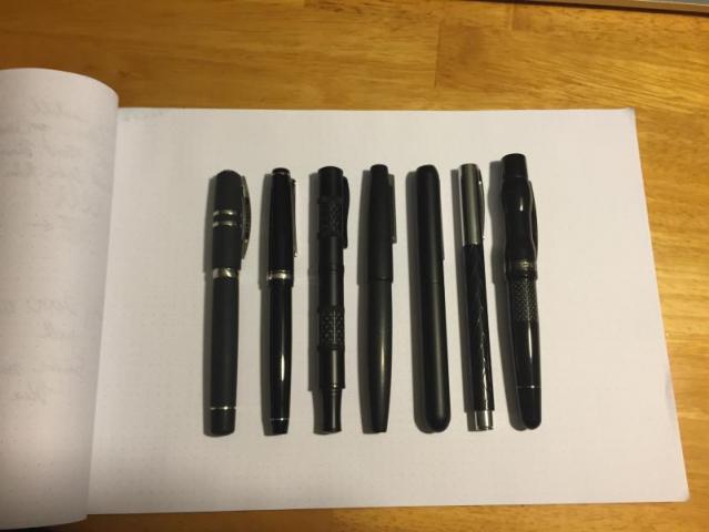
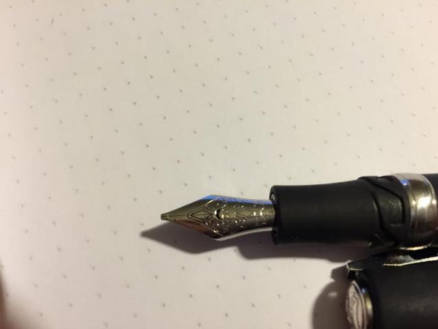
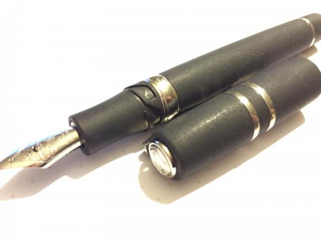
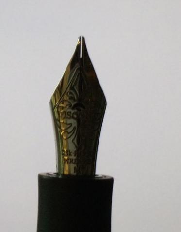
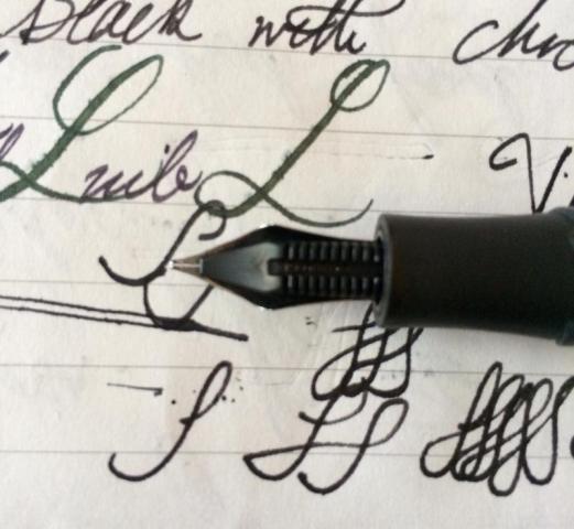
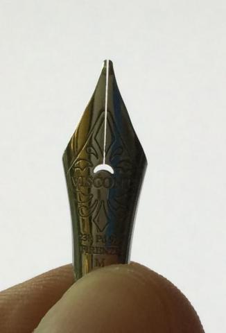
Hello Everyone, I recently purchased a Visconti Homo Sapiens Steel (Midi) Fountain pen in Broad. The Homo Sapiens (Steel) fountain pens come in two sizes: Midi and Maxi. I chose midi, because it fits my hands better, and there's no reason to hold a heavier pen if I don't need it. I chose the Broad nib because I tend to write in a larger font, and I love wet pens. This pen delivers on all fronts, and then some! I highly recommend it. Below I will support my enthusiasm. Unboxing I'm going to give a quick review of my thoughts concerning the pen. Before I do, I'd like to share my unboxing video: http://youtu.be/i_AoUKQiZyk The pen comes in a relatively large leather-covered box. There's a small sliding shelf in the side of the box. It contains a mini catalog of their other fountain pens. There's nothing else in the box other than the pen, itself. The pen came covered in a plastic sleeve. Personally, I didn't like that Visconti covered this piece of art in plastic, but it's not a big deal. Metrics The pen is about average size for a medium sized pen. Below I have a lineup of my black pens. It's about the same length as the Pilot Falcon. The pen is reasonably heavy. It's not as heavy as a fully metal pen like the Lamy Dialog 3 or Monteverde Regatta, but shares the same weight class as the Lamy 2000. Overall, the size and weight are near perfect for me. I can write comfortably with the pen without posting. The Body This pen is beautiful! The body, section, and cap are all made of a special resin containing lava rock. This material is very smooth; it feels like hard rubber. It's a matte color, but still glitters in the light. It's also a water-absorbant material, so with sweaty hands, I don't feel uncomfortable writing with this pen for an extended time. This pen is in the Homo Sapiens 'Steel' family, so the trim is made of steel. The piston turning nob, the center band, two smaller bands on the cap, the clip, and the finial (top of the pen) are all made of steel. I think the black and steel elements give the pen a very classy look. The Cap The cap is fastened to the pen in a unique way. This pen is neither a screw-on, nor a snap on. It's a sort of hybrid. In the above photo you can see what appears to be gaelic knot symbols right below the section, and rectangular hooks in the cap. To remove the cap, push the cap in, and then turn the cap about 90 degrees counter-clockwise ( from the prospective of looking directly at the finial). The hooks in the cap will disengage from the grooves, and release the cap! This is a great system. Not only do you get the quick deployment of a snap cap, but you get the security of a screw-on. There is no way this cap will come off (under normal use) without intentional disengagement. Honestly, wonderful cap! The Clip The clip is the typical Visconti 'bridge clip'. It is spring-loaded, and has very little lateral give (like the Lamy 2000). It is designed to allow the pen to be held deeply in your pocket, regardless of the thickness of your pants. One of my complaints with the Lamy Dialog 3 is that there is very little clip stand-off, meaning the clip won't slide very deeply in your pocket if the pocket is made of thick material. This is not a problem with the Visconti. I have no complaints with the clip. The Nib Honestly, my favorite part of this pen is the nib. What a beauty! The nib is made of 23k Palladium. Sure, it looks like a steel nib, but it has the semi-flex that you'd expect with a Gold nib. The nib is a broad, and it puts down an incredibly wet, broad line. Push the nib a bit, and I can easily double the line thickness. This gives my handwriting some personality, while not requiring me to cut into the paper fibers (see Noodler's steel nibs, Pilot Falcon F or smaller). This pen REALLY dumps the ink on your paper. In its current state, there's no way I'm going to write on cheap copier paper with it. It'll soak throat at least the first sheet, might leave some marks on the next. Honestly, this does not bother me. Visconti Blue dries in a reasonable amount of time, and I appreciate the dark line it puts down. I'm willing to wait the 2 or so minutes until my puddle of blue dries. **One important note** The pen came to me with the nib not fully balanced on the feed; the feed was slightly off-centered The nib also had fingerprints on the nib, which leads me to believe that my eBay purchase was a store demo pen. I pulled the nib and feed from the section, aligned them and reinserted the pair before inking the pen. I cannot give any comments about how it would have written with the misalignment. **Note** Gmax correctly pointed out that this nib is a stub! The picture below shows the line variations when writing in various configurations. The nib says 'B' on it, so either Visconti uses stubs instead of broads, or this was a returned pen. In either case, I'm a happy camper. I appreciate the line variation. The Feed If there was one part of the pen that I had to complain about, its the feed. Not because of its functionality; this feed keeps up with the fastest writing I can throw at it. I just don't like the plastic look. These plastic feeds are made using an injection mold, and you can still see the taps where the hot plastic was pushed in. Honestly, I would have expected Visconti to clean the nib up a bit, or make it from ebonite. These are minor gripes. Filling Upon removing the pen, I inked it up; I have a short video of me doing that here: http://youtu.be/rgWku8e5-f8 The Homo Sapiens Steel fountain pen is a piston filler. Because the barrel is made of an absorbent material, I read that the designers used a captured-converter nested in the barrel. I don't think this feature subtracts from the quality of the pen. The converter is _incredibly_ smooth. Twisting the cap of the pen moves the piston up and down, allowing the pen to pull up ink. For my review, I chose to use Visconti's own Blue ink. It's a fairly wet ink that is easy to clean and looks great. It's a dark, saturated blue with a red sheen. I highly recommend this ink. My only complaint with Visconti Inks is concerning the bottle. The bottle design is great, but they are made of plastic. Personally, bringing back the glass would be much appreciated. Writing On to the writing. I chose a lineup of pens for easy comparison. The video and writing samples have been recorded in my video: http://youtu.be/JPVTGvOtvNs What should be apparent from the video is that the Homo Sapiens pen is _incredibly_ wet and a smooth writer. Although the audio might pick up a scratching sound, there is no feedback whatsoever from this pen. I can honestly say that this pen stands out above the rest. Of course, it also costs more than the rest, but I would consider this pen to have a high bang/buck ratio. The Cost In terms of cost, this pen MSRPs for around $450, but it's not uncommon to run into it for around $350. If you're looking for a first-class pen in the ~$350 range, I highly recommend this pen. Conclusion I would like to conclude my review with two simple questions that I usually ask myself before I purchase a pen: Where would I use this pen? Is it a reasonable EDC? For the first question: I would use this pen at my desk at work or at home. I will store it in a safe place, and never let anyone I do not trust borrow this pen. This pen delivers a writing experience like none of my other pens can, but I cannot afford to have this one walking away from me. For the second question: This pen is far too wet to be my EDC pen. I need to write on receipts, write my signature on cheap paper, and take notes quickly with no time to wait between page flips. The Lamy Dialog 3 or Lamy 2000 will remain my EDCs. This pen will rule my desk.
- 5 replies
-
- visconti
- homo sapiens
-
(and 2 more)
Tagged with:
-
Yesterday after UPS taking a week for my pen to travel across the country I finally got my Visconti Medici Midi with Medium nib. I was blown away by the looks. It's very similar in size to my Pelikan M605 that I enjoy. The nib wrote perfectly out of the box with a 0.65mm line width. That is the same width as my Pelikan M805's M nib. It's a very smooth and wet writer without being a gusher. It's just the way I like it. I did have to wash the converter to get it to flow properly but I had to do that with each of the Visconti converters I have. They all flowed perfectly after that. It seems every converter no matter which brand could use a wash with a drop of dish soap or in these cases pen wash. The material has a lot of depth in the sparkles and swirls of color. It's amazing to look in person. It's hard to capture in pictures. I was not so sure about a brown pen but I love it. I selected the midi size to be an easier carry they my Homo Sapiens which I also love. I had thought about getting the midi sized HS but those having a captured converter would be harder to maintain then this pen with it's screw in standard converter. It's also nice to be able to unscrew the body and check ink level. I feel safe with this pen lasting the test of time even if Visconti for some reason goes they way of Omas. On the nitpick side, the metal ring at the end of the body where a filling knob would be is not flush with the material. For this price I would have liked to see it feel seamless, but it's not a big deal. Another issue is the laser cut center band details could be a little smoother. Other then that everything is great. The things people normally worry about with Visconti were not an issue on this pen. The M nib works nicely without putting down a B sized line. It starts ever time it touches paper. Is smooth without baby's bottom. It has a nice spring to the nib. I am very happy I bought this pen while it was still available. Here is a quick picture http://driften.dragonsightsoftware.com/images/ViscontiMedici-1.png
-
Hi guys, I was wondering if you could help me figure out whether my HS Steel Age Midi would be able to accept a gold nib. I have been looking for an EF nib for it after not really liking the M nib it came with, but couldn't really find one. I have, however, found the 14/18K gold nibs in EF. I can't figure out, however, as to whether they'll fit my pen. (I can pull out then nib+feed by hand, if that helps clear things up) http://www.penbox.co.uk/visconti.pen.nibs.htm
- 2 replies
-
- visconti
- homo sapiens
-
(and 3 more)
Tagged with:
-
Hello FPN, I've discovered the source of the flow issues I've been having with my HS Steel Age fountain pen. Namely, the tines are spread too far apart. I've tried pushing them together and pressing upside down, but the nib material is too springy and just reverts to the original position. Anyone have any ideas on closing this massive tine gap? Thanks in advance!
- 8 replies
-
- visconti
- homo sapiens
- (and 5 more)


