Search the Community
Showing results for tags 'limited edition'.
-
Hi folks, Sorry if this question has been raised before-- I can't find the answer. Why did Omas make their Alba limited editions in runs of 327? My guess-- they were founded in March 1927??? Thanks! Ralf
-

Visconti Homo Sapiens Corsani 90 Limited Edition, Broad Nib
MCWB posted a topic in Fountain Pen Reviews
Visconti Homo Sapiens Corsani 90 limited edition, broad nib Stylograph Corsani is an Italian shop selling pens, watches, leather goods and accessories since 1924. For their 90th anniversary in 2014, they commissioned Visconti to make a limited edition of 79 fountain pens (corresponding to the shop's street number) and 11 rollerballs (to make 90 pens in total). These pens are based on the Homo Sapiens, using the grey stacked celluloid as used in the Wall Street (and others). The Visconti Homo Sapiens probably needs no introduction for many people here, and if it does there are many reviews in this forum alone, so I will try to focus on things particular to my pen and gloss over things that are common to other Homo Sapiens models. I purchased this pen in June 2016. I had certainly seen it before and contemplated buying one, but given its rarity and the time since it was first offered for sale, I just presumed that it would have long since sold out. To my surprise, an email from Stefano Senatore at Stylograph Corsani revealed that this was not the case! 1. Appearance & Design (10/10) I am a massive sucker for the Visconti stacked celluloid, and it goes beautifully with the Homo Sapiens design. A functional bonus of using this material is that it is partially transparent, so you get a very subtle ink window through which you can inspect the remaining ink level (unlike the lava Homo Sapiens, which doesn't have an ink window). The trim ring just above the section has "Corsani 1924-2014" instead of the usual "Homo Sapiens", which is a nice touch. Instead of the normal Visconti logo, Stefano personalised the pen with my initials on the end of the cap (at no charge, using the Visconti MyPen system). He also included the normal Visconti logo with the pen; this can be easily swapped in or out using a magnet. This is a nice additional personal touch. 2. Construction & Quality (10/10) Not much to say here, everything works as expected and the cap latch system ensures that the reflective surfaces in the celluloid all line up when you cap the pen in a particular orientation. This is excellent attention to detail and is certainly not always the case with pens made from these stacked celluloids. 3. Weight & Dimensions (10/10) Like the Homo Sapiens, this is not a tiny pen but it's not ridiculously big and heavy either. For a size comparison, from top to bottom: Homo Sapiens Corsani 90 LE, Wall Street LE, Opera Master LE, Skeleton (titanium). 4. Nib & Performance (6/10) This pen comes with Visconti's 23 K Pd "Dreamtouch" nib. It's a dual tone nib, which is fine, but I think an all-rhodium nib might have suited this pen better asthetically. Not a massive deal either way though. Nibs are where Visconti falls down far too often IMO. I asked Stefano if he had this pen with a broad nib that didn't have a case of baby's bottom (as I have had on other Visconti B and BB nibs). He tested 3 (!) for me, and reported that he had found one that didn't hard start. Fantastic customer service, but says a bit about Visconti's QC! When the pen arrived, it indeed did not hard start, but it was quite scratchy. A quick investigation revealed that the tines were misaligned. I am confident enough with adjusting tine alignment, so I sorted the problem out myself (took me about an hour all up, over a couple of days). It now writes very well, but at this price point I don't think that's really good enough. The other thing I didn't expect about this nib is that for a broad Visconti nib it's actually very stubby (in the writing sample below, compare the figure 8s against the WSLE 18K B nib). I like writing with stubs so don't mind this but if I was expecting a rounded broad nib (and I was) then it's something a bit unexpected and potentially undesirable. Again, it doesn't exactly inspire confidence in Visconti's nib QC procedures. 5. Filling System & Maintenance (9/10) Visconti's Double Reservoir Power Filler has been discussed at length elsewhere; I like it overall. It certainly allows a lot of ink to be taken up in one fill (especially if you push out the air remaining in the barrel after the first fill and fill a second time), but it can be a bit of a pain to clean out. Great if you need to cut the ink supply off from the nib (e.g. if you're flying). 6. Cost & Value (9/10) As mentioned, Stefano included my initials on the cap using the Visconti MyPen system for no charge; he also included a Markiaro leather pen case as a gift (unbeknownst to me). Added to the excellent customer service already mentioned, I think these add some value to the experience. As a non-EU customer, I paid € 483.61 for this pen. This is certainly not a cheap pen by any stretch of the imagination, but for a rare and attractive pen I think it's fair, especially considering the normal cost of Homo Sapiens LEs. Shipping to Australia was by DHL Express and cost € 45. Again this is certainly not cheap, but I finalised payment on Tuesday night Australian time and had the pen in my hands on Friday afternoon, which is seriously impressive. 7. Conclusion The Homo Sapiens line includes quite a few different limited edition materials, including the Crystal, Florentine Hills and London Fog. Pairing up the Homo Sapiens body with the beautiful stacked celluloid is genius. If this pen also came in the blue, green and red celluloids I would be seriously tempted to buy all of them! After a bit of work the nib is now to my liking, so there's now nothing I don't like about this pen. Expensive? Yes. Worth it? Absolutely.
-

Visconti Millionaire L.e. Marble Empire Honey Review
ICantEvenDecideAMajor posted a topic in Fountain Pen Reviews
Hi all! Glad to be here to share with you all my new pen, the Visconti Millionaire Marble Empire in the honey finish. This cool pen from Visconti is by all means a looker with its 2 tone palladium nib, beautiful ivory resin and the stunning marble finish (actual marble). First Impressions: Visconti Millionaire by Kevin Guo, on Flickr The pen comes in the standard higher end Visconti lacquered box (which I heard is wood underneath but not sure at all) that is very heavy and feels nicely made. I use these boxes as display boxes and they work perfectly. Bravo Visconti! Appearance and Design: Visconti Millionaire by Kevin Guo, on Flickr Just look at this beautiful marble. Feels cold and solid yet durable, it's got a greenish-grey background with red, yellow, orange green, blue-ish green and some white streaks going all over the place. And every pen is different! There are four different kinds of finishes; I personally like the black one the most but there's a special reason why I bought the honey finish... (to be unveiled later!). Visconti Millionaire by Kevin Guo, on Flickr The cap has a large gold coloured top which I think is brass. Because this is much larger and wide than the caps compatible with the my pen system, I'm quite sure that it's not removable (nothing you can replace it with even if you remove it). Pretty good nonetheless. The Visconti clip is filled with a off-white enamel of the same colour, a rather thoughtful touch. I was rather upset when the Florentine Hills had only a black enamel. Visconti Millionaire by Kevin Guo, on Flickr The section, cap top and barrel end are made of the best feeling resin I've ever held. White resins are tricky -- they're very likely to feel cheap if not top quality. But this Visconti ivory resin is just glorious: it's a little off-white, the colour feels rich and even the slightest shade of rose colour. Just beautiful. The nib is of course the Visconti 2 tone palladium nib, which in my opinion is only second to the Pelikan two tones when it comes to beauty. Visconti Millionaire by Kevin Guo, on Flickr Now here comes the most amazing part of the pen --- THE WHITE FEED!!! Isn't it just beautiful? I tried it briefly with Lamy turquoise and Waterman green (both very reliable inks famous for NOT staining), and it washes right off. And boy does it look good with ink on it! The versions with black resins have black feed, thus less interesting in my opinion. (side note: my dream pen is the modern Wahl Eversharp Decoband with the gorgeous red feed like Louboutin shoes; you can tell I'm a sucker for coloured feeds). Dimensions and Weight The pen is about as long as a Delta Dolcevita oversize, but the grip is much more usable. I don't have a scale but I'm guessing the pen is around a little over 40g, with probably half the weight in the cap, so the pen body itself is surprisingly light. It is postable but super top heavy and it doesn't seat too deeply. Suitable for hands large and small despite the look of it being magnanimous. It should be around 140mm roughly estimated by me Nib Performance Visconti Millionaire by Kevin Guo, on Flickr Nothing to see here. We all know Visconti palladium nibs. Mine wrote just as expected: smooth, overpolished, skips a lot. I'm going to have mine sent to Dan Smith for a tuning. (Hence why I cleaned it out and couldn't provide a writing sample, sorry). But it was a little skippy on Leuchtturm and skips a LOT on Clairefontaine. But I actually quite like the feel of this medium nib; it's wet, juicy, and very soft velvety feeling without being mushy. I think I'm going to love this pen once it's back from Dan! Filling System Visconti Millionaire by Kevin Guo, on Flickr The filling system is pure genius. And I am NOT be sarcastic. Whoever decided to use this filling system on this pen deserves a Nobel Peace Prize for making my life easy. It's a....... Plunger! To ink, you unscrew the barrel and pull the plunger out; to expel, you push it in. Like a syringe. It's so simple yet effective; acceptable ink capacity (about the same as a C/C), literally no risk of malfunction. My only grudge is that the converter joints don't seem to be the tightest in the world; after inking with Waterman green, you can kind of see a green tint on the joints of the converter; nothing to worry about but definitely less than perfect. Cost: I bought this pen for $550 brand new, without the roller ball convert. To collectors this is probably an issue, but a roller ball section worth at most two dollars to me. I couldn't care less! For five hundred dollars, this is a steal. Pure steal. Buy it in a heart beat. Even with the costs of getting it adjusted by Dan, it's still a steal. But for its most often seen price of $1500 - goodness-knows-what retail.... ugh... I can see how it's worth that, and it is rational to buy one for that. But personally with $1500 I'd probably get myself a Divina AND a Decoband.... (yes it can be done if you shop smartly), All in all, it's a good pen; I'll have a hard time choosing between this and the Divina, but not if a Divina is half the price. And that's it for my review! As always I'm happy to know your feelings reactions feedbacks emotions rants criticisms opinions and whatever you have to say! *Edit Added a section on weight and dimensions -
Starting from mid October 2016 Pelikan will ship the new Limited Edition "The Statue of Zeus". Limited to 300 pieces, this pen pays tribute to the statue of Zeus, one of the seven world wonders of the anciant world. It is a quite stunning pen which plays nicely with another Pelikan design element. For more information and pictures please visit our website: http://www.fritz-schimpf.de/Schreibgeraete/Fuellhalter/Pelikan-Limited-Edition-The-Statue-of-Zeus-Kolbenfuellhalter.html The price of this pen is € 1.900.-, including the German VAT of 19%, which is not applicable for shipments outside the European Union (price without VAT € 1.596,64). Best regards Fritz Schimpf
-
Now In Stock! Graf Von Faber-Castell Heritage Alexander & Ottilie
Iguana Sell posted a topic in The Mall
We are glad to announce the new collection which homages the Counts Ottilie and Alexander von Faber-Castell is now in stock. These masterpieces are created with excellent craftsmanship and precious materials: all the metallic parts are silver plated and show a bicolor 18K, hand-engraved nib. The letters A,O,F and C - the initials of Ottilie, Alexander and their shared Family's name- are engraved on the cap of the pens, the edition is limited to 1898 pieces. In stock in F and M nib, choose your favourite and enjoy shipping within 24 hours! Discover every detail: https://www.iguanasell.com/search?type=product&q=Graf+von+Faber+Castell+Heritage Should you need additional information please do not hesitate but contact us through info@iguanasell.com -

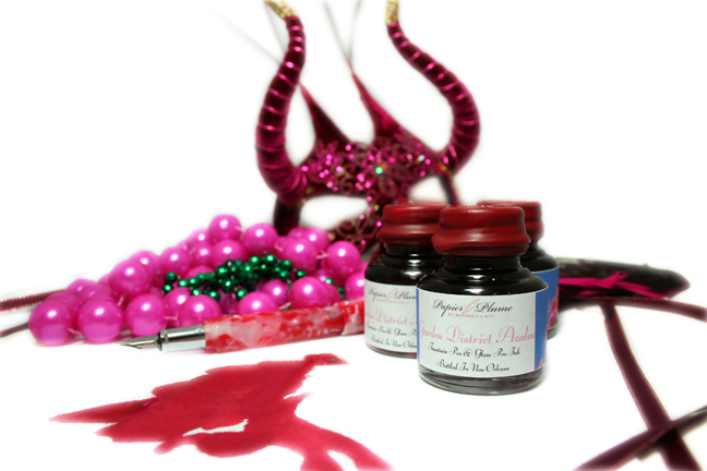
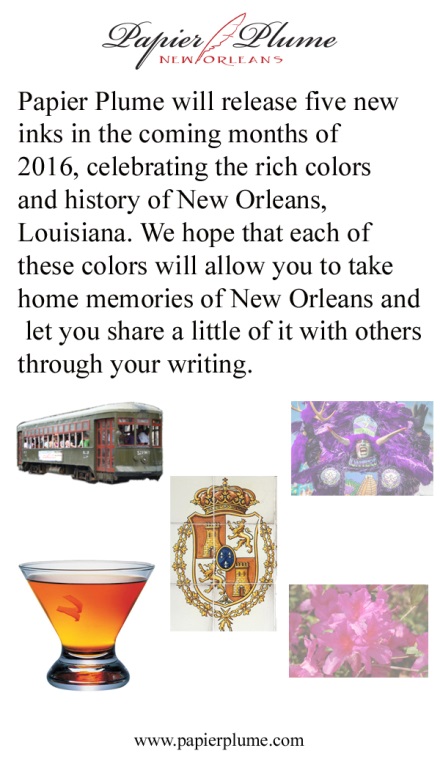
Papier Plume's Upcoming Limited Ink - Garden District Azalea
Jackokun posted a topic in Inky Thoughts
Quick shout: Papier Plume will be releasing the last of the ink in the Homage to New Orleans series this friday. The ink is called Garden District Azalea and it is a pink ink. I got a sample of the ink for (re)view purposes and that will be coming up soon, but wanted to give everyone a heads up - I happen to have just a handful of pink inks - mostly because they don't match my eyes Here is a swab of the ink Here is the official bottle / ink shot And this will be the link when the ink goes live: https://www.papierplume.com/product-catalogue/inks/inks-bottled/papier-plume-new-orleans-collection-fountain-pen-ink-garden-district-azalea.html Expect release at 11am CST on Friday the 16th. - They will have a limited run 60 bottles to sell online. I'll be posting a more formal view tomorrow, hoped for today, but I dont think it will be ready. Also Papier Plume notifies the ink availability and other news through their newsletter first, then Instagram, then Facebook, and finally twitter (in that order). Jack
-
We have the Monteverde Regatta Limited Edition Fountain Pen on a group buy starting at 50% but may go as low as $49.99. Stunning pen with alternating rose gold metal and carbon fiber sections. The pen has a magnetic catch on the cap and uses a cartridge converter fill system. Only 999 of the pens made and each pen is individually numbered. Join the group: https://www.penchalet.com/fine_pens/fountain_pens/monteverde_regatta_sport_fountain_pen.html
-
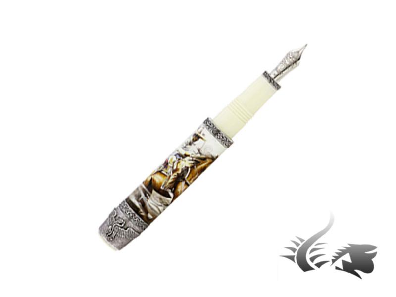
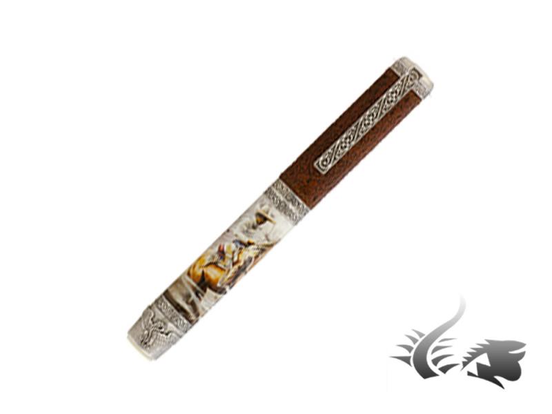
American West lovers, these pieces have been made just for you! Visconti launches a new Limited Edition bringing the Wild West back. The writing instruments' ivory coloured barrel feature a scrimshaw engraved cowboy. Trims in antique sterling silver are adorned with six shooters and the clip displays Visconti's name in the style of an old saloon sign. The cap is covered in hand-crafted leather giving the finishing touch to these pens full of history and dreams! Both Limited Edition bring a special packaging in hand-crafted leather and walnut. Available in fountain pen or rollerball the edition is limited to 388 pieces. The fountain pen's nib is in 23K palladium and is available in EF-F-M. Fountain pen: https://www.iguanasell.com/products/visconti-wild-west-fountain-pen-925-silver-limited-ed-vi754st52m Rollerball: https://www.iguanasell.com/products/visconti-wild-west-rollerball-pen-leather-925-silver-limited-ed-754rl52 For further information do not hesitate to contact us via info@iguanasell.com Enjoy some pictures of the wildest Limited Edition below!
-
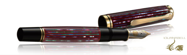
Visconti launches a brand new and amazing Limited Edition: Meet the new Visconti Charreria. The figure known as "El charro" became famous in Mexico due to their work as land-owner and horse-rider in the old Mexico. Honouring this traditional figure, which was really significant in the evolution of power and wealth, Visconti has created yet again a precious masterpiece. The body in ivory coloured resin is inspired by artist Emilio Garcia's masterpiece "Charreria". The Charro figure has been carefully put into each fountain pen by the famous italian artist Claudio Mazzi with airbrush pens and rollers. Cap, rings and trims are made of sterling silver customised with Charreria motifs. The nib, available in F, M and B, is 23K palladium dreamtouch and the fountain pen features Visconti's Vacuum Power Filler filling system. The edition brings a Limited Edition packaging in wood with a cloth embroidered with floral motifs. Only 149 pieces of this amazing masterpiece are available all over the world. For further information do not hesitate to contact us via info@iguanasell.com Enjoy a sneak peak at the new Visconti Charreria below!
-
http://i900.photobucket.com/albums/ac209/jasonchickerson/_FUJ0043-Edit.jpg http://i900.photobucket.com/albums/ac209/jasonchickerson/_FUJ0041-Edit-Edit.jpg Original Crown Mill Pure Cotton Paper, dipped (top) and Lamy 2000 F/M (bottom) http://i900.photobucket.com/albums/ac209/jasonchickerson/_FUJ0046.jpg Quick wash on Original Crown Mill Classic Laid Paper (envelope) This is the brown I've been looking for. Cigar is not perfect. It looks its best on high quality, absorbent paper and looks flat and everything else, including high-end vellum (sorry, Clairfontaine Triomphe lovers). It behaves perfectly in a dip pen, but it's dark enough to lack depth. I'll stick with Tokiwa-matsu for my go-to dipped green. This is such a strangely complex color. It is a dark, unsaturated (in the chroma sense) green with a unique satiny sheen that makes it appear brown. This has the result on aborbent paper of being both green and brown at once. Fantastic. FPN member Sandy might call this one indecisive. That's OK with me. It works so well with my new sketching brown (Yama-guri), and washes so beautifully, I think it may be my new sketch-worthy green, too. Time will tell. Because of the cost of importing this ink from Japan, I attempted to mix my own. I came very close with a 2:5 mix of Sailor Tokiwa-matsu and Iroshizuku Yama-guri. You can see from the first pass (q-tip/earbud) that the subdued green is similar. However, more ink gives red sheen that causes the ink to look brown in the Cigar, while no sheen arises with the faux Cigar. Strange, as Tokiwa-matsu and Yama-guri each have a nice red sheen on their own. So while I could mimick the color of the ink, the effect is not the same. This is special stuff. I will be buying two bottles. http://i900.photobucket.com/albums/ac209/jasonchickerson/_FUJ0044.jpg http://i900.photobucket.com/albums/ac209/jasonchickerson/_FUJ0056-2.jpg Iroshizuku Yama-guri (top), Sailor Cigar (middle), Sailor Tokiwa-matsu (bottom) http://i900.photobucket.com/albums/ac209/jasonchickerson/_FUJ0051.jpg For the sheen lovers, clockwise from left: Cigar, Sailor Oku-yama (sheen king), R&K Alt-Goldgrün, Sailor Tokiwa-matsu and Iroshikuzu Yama-budo (center) As always, reasonable care has been taken to ensure color accuracy. However, this is a complex ink, impossible to represent fully in photographs. If you can get a sample and try it for yourself, do it. A big THANK YOU to FPNer fire ant for providing me with this sample!
-

New 2016 Pilot Limited Edition Guilloche Vanishing Point Fountain Pen
PenChalet posted a topic in The Mall
Coming in September, the Pilot Limited Edition Guilloche Vanishing Point Fountain Pen. We are taking pre-orders and quantities are very limited. https://www.penchalet.com/fine_pens/fountain_pens/pilot_limited_edition_vanishing_point_fountain_pen.html Product Description: Add more style and sophistication to your writing with the new Vanishing Point 2016 Limited Edition fountain pen, the Guilloche. The sleek, head-turning Guilloche inspired graphic details are distinguished by intricate, paired lines flowing in precise, interwoven curves. This delivers a super smooth, textured and luxurious feel to the Vanishing Point’s premium black barrel. The superbly-crafted barrel design is further enhanced by the pen’s flawless rhodium accents and rhodium plated 18-karat gold retractable nib. Presented in a strikingly accented gift box, the highly sought-after 2016 Vanishing Point Limited Edition fountain pen is Pilot’s newest indispensable writing companion designed to capture the texture and detail of life’s stunning array of handwritten moments. PRODUCT SPECIFICATIONS:o Medium Nibo Converter & blue ink cartridge included -
New Montegrappa Hemingway "the Soldier" Limited Edition
Iguana Sell posted a topic in Italy - Europe
The new Montegrappa Hemingway Limited Edition is out! Montegrappa plays tribute to the American author and journalist Ernest Hemingway. The collection is composed by three different editions that reflect the novelist's life and journey. The first of the editions "The Soldier" is already available at Iguana Sell. Its green celluloid body creates the perfect contrast with sterling silver trims. The 18K nib shows Hemingway's signature while cap and clip are decorated with engraved details of the author's life. This edition is available in fountain pen, F-M-B, limited to only 100 pieces! Fountain pen: https://www.iguanasell.com/products/montegrappa-hemingway-the-soldier-fountain-pen-925-silver Should you need additional information please do not hesitate but contact us through info@iguanasell.com Enjoy more pictures of this piece, which is perfect for collectors and novel lovers, in our site.
-
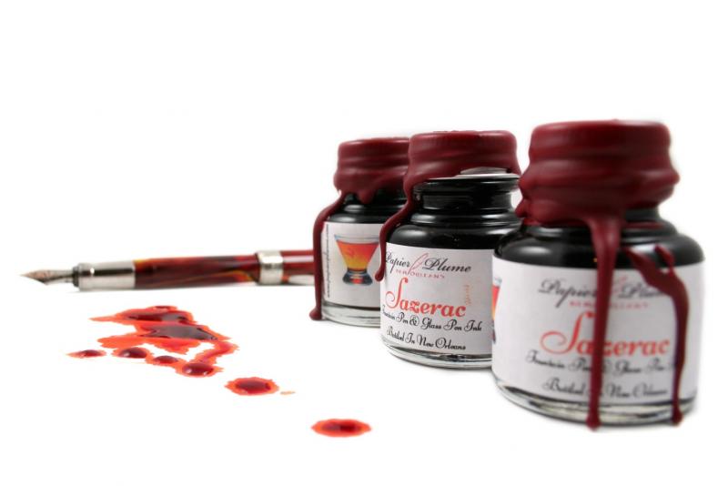
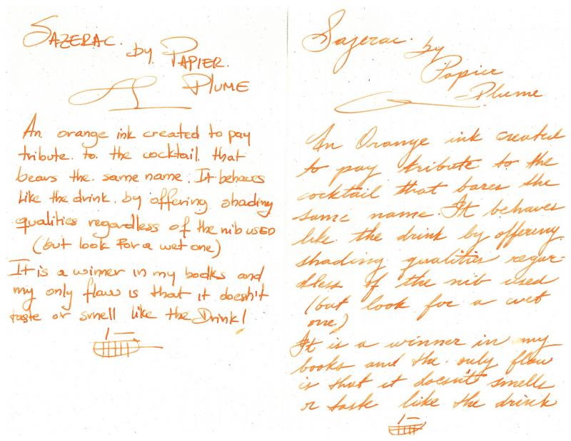
Ink View - Sazerac: Papier Plume's Homage To New Orleans Official (Dr)Ink!
Jackokun posted a topic in Ink Reviews
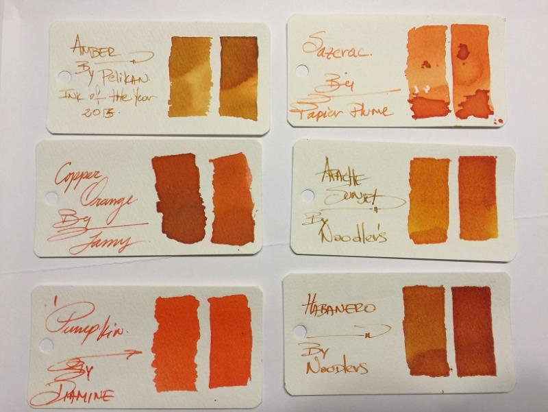
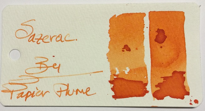
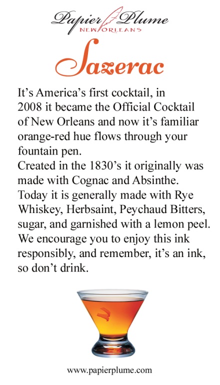
Ink View: Sazerac: Papier Plume’s homage to New Orleans official (dr)ink! Before we go any further. I wanted to apologize as my initial goal was to get this out to you before the ink was out for sale or sold out, but some unforeseen delays (mail system - mainly -) got me the sample too late to provide a meaningful view . I also want to thank Papier Plume for sending me a sample of this ink. and to Lapis for the earlier announcement. Now that that’s out of the way, I hope you enjoy this ink view as much as I enjoyed writing it. Sazerac, the drink and the (dr)ink. The Drink To start, you cannot talk about an ink about a drink, without talking about the said drink J (the rhyme was NOT on purpose). Sazerac is NOLA’s official cocktail drink. A heritage drink that dates back to the 19th century, with some arguing that it was created in the mid 1800s and others in the late 1800s. Others will consider Sazerac America’s first cocktail. What is unanimous, is that the drink was recorded (written) at the beginning of 20th century and that the name was derived from the liquor used in the original recipe: a Cognac produced by the Sazerac de Forge et Fils house (expensive, expensive), and that one of the more characteristic ingredients is peychaud’s bitters, produced by Peychaud’s apothecary (the bitters are now own by the sazerac company). Now again, some also say that it was Peychaud the one that had the recipe and shared the drink with his friends. But it wasn’t until the Sazerac bar (a bar that offered sazerac based drinks) that this drink was offered to a broader audience. Regardless , it’s a drink that had survived alterations (instead of Cognac using Rye Whiskey, addition to absinthe), changing times (different owner’s) and prohibitions(alcohol prohibitions including absinthe). It might not be in every cocktail menu in NOLA, but can surely be ordered off the menu (if asked politely ). As of 2008 The Sazerac became the official cocktail of New Orleans. So how do you prepare a Sazerac? - not the topic of this view but here is a good link for those that are curious. Now, let’s talk about the (dr)ink. The Ink Here is a shot of the bottles: (Quick trivia what is the pen on the background ? – answer at the end ) This (ink) is the third installment in Papier Plume’s (PP) homage to its native city, the first two being Street Car Green and Calle real. As with their previous inks, the hues are inspired on what they are looking to pay tribute to, in this case the drink itself. And as Papier Plume: “The drink varies from red to a golden orange depending on the hand of the bartender.” So, did the ink managed to achieve that? I think so, golden orange yes, red ? not to a deep red, but reddish tones. The shading is definitely there and it is strong. I’d say this before going any further – it does not smell or taste like the drink – shame! Let’s see the swab in the Mnemosyne card: This is definitely an orange family ink, it has yellow and redish tones depending on where and how much of the ink pools, my first impressions was how light it went on the paper. I let a few drops fall on the swab to see how it behaved and also to get a feeling about the drying time (definitely not quick). It also gave me some idea that this would be a good shading ink; however it requires a somewhat wet pen to truly bring out its properties. So on to the tools: Pens: Visconti HS Bronze – Medium, Van Graf FB – Sand – Medium, FC 02 Italian Glass - Broad Stub AND Twsbi Vac 700 Fine. Paper: Tomoe River, Rhodia, Rhodia R, Clairefountaine Thriomphe (CF), traditional copy paper and laid paper. Tests: Flow, saturation, shading, sheen, bleed-through, see-through/show-through, feathering and pooling. With other tests such as water, bleach and alcohol and dry times. Sometimes it will be a yes/no answer, sometimes 1-5 (1 being poor, 5 being excellent) CrossOver Card This is an idea I came about with my last ink view, it allows me to see all the papers and how the ink behaves across . You can see that each column is representative of the paper used. Thoughts on the ink-paper behavior Flow: Flow is good, very fluid, consistent across all papers and pens usedSaturation: Medium, sometimes it looked more saturated depending on the paper, but it was within my expectations if I was looking for good shading.Sheen: None, Zip, nada.Shade: This is where this SHINES. Yes, this ink shades. I was able to get shading across the papers used. And all nib types (thumbs up)Bleed-through: None, not even on copy paper, under normal writing circumstances. That being said I did let a fair amount of ink pool and let it dry to see the result and under those circumstances it did bleed on most papers.Show-through: There is some slight, very slight on all papers with the exception of Rhodia R and Laid . However it is not enough (IMHO) to not be able to write on both sides.Feathering: Now I did experience some tiny (and I’m being picky) feathering using a very wet nib, on all papers but tomoe. Now to be fair this was a very wet nib that I was using to see how far I could take it. Please take note that you the paper you are using is sensitive to the oils of your hand this ink will feather where the oils mix with the paper.Pooling: (This is not the shading but more on the pooling on the edges of the letters, I enjoy when the inks provide this). There was none that I could observe in any of the papersWater Resistance: The tests shown on the card were done using an eyedropper, leaving it a few seconds then using a tissue paper to retrieve the excess. But offline I did a more smear/spread test. Tests show that the ink was not waterproof, but you could potentially recover some of the writing if need to be. Big shout to Tomoe river as the ink just held on to the paper, for a paper that rejects ink by nature it is a bit odd. Alcohol Resistance: Very consistent across. You would be able to recover from this one – almost no effect.Bleach Resistance: None, Zip , nada.Dry Times: As noted this is a wet ink and the drying times were there to support it with drying times that were around the 20sec mark and on some papers longer than that. One thing I had not mentioned before it is how easy is to clean any of PP’s inks from the pens I have used them, I would attribute this to the fact that they are not meant to be waterproof, as well as that they are not viscose and not too saturated. Here are some other inks for comparison, From the top and then left to right: Ink NameMakerOverall notesAmberPelikanThis is a more yellow golden ink with great shadingSazeracPapier PlumeN/ACopper OrangeLamyLooks dark compared to Sazerac, not a lot of shading and more saturatedApache SunsetNoodlersDarker than Sazerac and renowned for its shading properties PumpkinDiamineNo shading, super bright almost no hint of brownHabaneroNoodlersApache’s darker shade or tanned brother haha! And here is a quick sketch of the Sazerac to draw Sazerac ! Here is some Cursive and Block writing for reference. Opinion Personally: I am a fan of oranges, I am. So I would say I like this ink. Objectively: this ink is not the easiest to have on a work environment, but everywhere else it would be a fun ink. This is an ink with great shading properties and it doesn’t completely washes away if by accident some water gets poured on to the paper. It is pleasant to read but it is a wet ink so you might be looking a slightly more than average dry times, again it all depends on the paper and how wet you nib is. I mentioned before that it goes lighter on the paper than any of the other inks I have, but that doesn’t mean there are others out there that could be in the same range and I don’t have or I have never tried (Caran d’ache saffron?, MB ink of Joy?, iroshizuku yu-yake?). I’m very happy to have this ink as part of my orange repertoire Availability As noted at the beginning of this view this is now sold out. For this release Papier Plume increased the production from 30 to 55 1 Oz / 30ml bottles, but sadly it was sold out within the hour of its release. I would say this, if you can get a change to try it, I strongly recommend it. For those that made it this far: what is the pen on the background of the bottle picture? The Answer : Visconti Van Gogh Room in Arles J In addition, as with all the inks in this collection Papier Plume includes nice double side card with the history of what the ink pays respect to and a list/teaser of all the inks on the collection, they don't come with samples though, but 2 more to go! Papier Plume notifies their ink availability through their newsletter first, then Instagram, then Facebook, and finally twitter (in that order). Thank you for keeping up with me up to this point !
-
We are really glad to announce the new Visconti Watermark Demo Limited Edition is finally in stock! This masterpiece needs at least 20 manual operations per fountain pen. The body is made by cutting sterling silver form a tube, leaving the user to see the ink level of their fountain pen. The numbered Limited Edition features a double reservoir of ink charge and comes in a special packaging. In stock in EF-F-M-B nib, choose your favourite and enjoy shipping in 24 hours! Discover every detail: https://www.iguanasell.com/products/visconti-watermark-demo-silver-fountain-pen-silver-925-limited-ed Should you need additional information please do not hesitate but contact us through info@iguanasell.com
-
I was gifted this pen by my father. I have one other fountain pen, which i don't use often. This specific fountain i've been doing a lot of research on because i feel it would be in better use with someone else. The only problem is I cannot find a price for it. Through the research I have found it to be a "Cartier Limited Edition Louis Cartier 100 Years in America Centennial Fountain Pen" that sounds like quite the pen to me. I unfortunately don't use it and neither does my father. So I am here trying to see how much these go for, since it was so hard to find out about it in the first place, i figured its a pricey pen. So i don't want to just send it off to any random person. I would want it to go to the right person. If someone out there could provide more information for me, I'd be very appreciative of the help.
-
As you may know Lamy is celebrating their 50th anniversary and wants to share this moment with all of us launching a very special new Limited Edition. Lamy 2000 Black Amber Limited Edition, with only 5000 pieces worldwide! Awarded for an excellent design, the barrel of this fountain pen is made of blasted stainless steel, with a special warm silk galvanic finish. The nib is made of rhodium plated gold and keeps the shape of other pieces in the Lamy 2000 collection. Plus, this Limited Edition comes in a special packaging gifting a 50ml bottle of ink. Available this upcoming September, the price will be approximately 500€. You can already pre-order your Lamy by reaching us through info@iguanasell.com Discover much more of this Limited Edition in this video: For further information do not hesitate to contact us via info@iguanasell.com
-
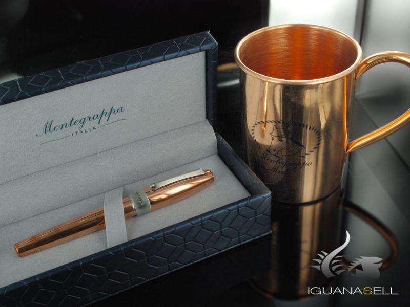
The moment has finally arrived! The Montegrappa Mule fountain pen is back in stock in F, M and B nib. The full copper fountain pen inspired in the well known vodka cocktail, the Moscow Mule, is back in stock. With a 1912 engraved in the cap, honouring the year when Montegrappa started creating the fountain pen has a special filigree patterned nib. All of the Montegrappa Mule fountain pens come in a special packaging, and once again the Limited Edition copper cup is available. This time, get your Limited Edition fountain pen and mug before they are over! Fountain pen: https://www.iguanasell.com/products/montegrappa-mule-limited-edition-fountain-pen-copper-isfoh-cu Should you need further information do not hesitate but contact us through info@iguanasell.com Enjoy a picture of this masterpiece below!
-
A bunch of Omas that were offered at significantly (IMHO of course) reduced prices, have landed on my desk. I can afford to keep 3, so the rest would need to go back. The wish, of course is to keep all of them, but my banker vehemently disagrees. Do note that all of them were offered around the same price around 375 Euro equivalent, except for the c/c filler which is reduced further. All of them new/un-used/un-inked The question is : Which of these would you send back and why #1 Paragon - Art Deco Limited Edition - Piston fill - Gold Trim - Stub #2 Paragon - Art Deco Limited Edition - Piston fill -Gold Trim -Broad #3 Paragon - Art Deco Limited Edition - Piston fill -Gold Trim -Medium #4 Milord Dark Ebony Wood - Arte Italiana - Piston fill -Silver Trim - Stub #5 Paragon - Arte Italiana - Piston fill - HT trim - EF #6 Milord - Arte Italiana"mother of pearl maroon"/Bordeaux - C/C fill - Ruthenium Trim - Broad I've got a week to decide and I love ALL of em
-
Dear friends! At Iguana Sell we are ready to share with you the latest news of Pelikan! Here we are, presenting you the new product that will be released by the brand this summer of 2016: THE fountain pen Pelikan Souverän M1000 Raden Sunrise Red The Raden Collection is a traditional Japanese decorative craft used for lacquer and woodwork. The fountain pen Raden Sunrise Red is coloured using the special Japanese lacquer called urushi. Moreover, in order to make it's raden stripes Pelikan applies the following technique: First, an abalone shell is placed on the ground, flattened with a hard stone into very thin sheets and then cut into narrow strips. Finally it is affixed to the lacquer coating. Crafted with the Maki technique traditionally addressed to the Japanese Royalty as a symbol of power and wealth, this unique writing instrument,made of refined Urushi lacquer combined with vivid raden stripes, emulates the burst of color that occurs in the sky as day breaks. This masterpiece is available with a M nib. Of course, Pelikan will keep its quality with its finely-chased 18 carat gold nibs. Also the pen is presented in a traditional Japanese gift box made by Paulownia wood. Watch out! Just 333 pieces will be produced worldwide and each of them will include its number. If you need any further information about price or availability, do not hesitate to contact us. We'll be delighted to help you! Please contact us to info@iguanasell.com or at +34 91 441 50 41. Have a great day! Kind regards, Alessia Iguana Sell
-
Hey guys, Just wanted to gather the Middle East and GCC region Collectors and what are you latest purchases for 2016 Montblanc Writing Instrument Cheers
-
Coming this June, exclusive the the US distributor, is the Limited Edition Montegrappa Rosso Veneziano Fountain Pen. The pen is called the Rosso Veneziano after the red that is spotted in every corner of Venice. This beautiful red celluloid fountain pen has a piston filling system and 18kt gold nib with sterling silver trims and is available in EF, F, M and B. The SRP is $795. There will be 100 units. As will believe these pens will be sold out very quickly we suggest you place your orders immediately. If you are interested pre-order now https://www.penchalet.com/blog/montegrappa-rosso-veneziano-fountain-pen/
-
Has anyone used / does anyone have impressions of the Stipula Israel 65th anniversary LE? I can only find a single passing reference to it on FPN. Also, if anyone's used it, does it have an interchangeable nib?
-
The new limited edition Conklin Ambrosia Celluloid Mark Twain Crescent Fountain Pen is now available while they last. Only 99 pens made 14k Gold nib Handmade in Italy Translucent cap and barrel with sparkling amber particles Crescent filler mechanism https://www.penchalet.com/fine_pens/fountain_pens/conklin_mark_twain_crescent_ambrosia_celluloid_fountain_pen.html
-
Visconti has just introduced a new limited pen inspired by New York made with a variegated resin in a beautiful black and orange Magma color. This pen comes in a fountain pen, rollerball pen, and a ball point pen. Available the end of April 2016. Pre-order these pens today: Fountain pen: https://www.penchalet.com/fine_pens/fountain_pens/visconti_manhattan_magma_fountain_pen.html Rollerball pen: https://www.penchalet.com/fine_pens/rollerball_pens/visconti_manhattan_magma_rollerball_pen.html Ballpoint pen: https://www.penchalet.com/fine_pens/ballpoint_pens/visconti_manhattan_magma_ballpoint_pen.html In 2003, Visconti created the Wall Street, a pen inspired by the square shape of New Yorks buildings and the Vetruvian Man. Even earlier in 1994, 20 years on, we are in an era of great stylistic makeover and modern architecture, and so Visconti reworked the old project with refined forms and a more stylistic design. The fountain pen features the Visconti 23kt palladium Dreamtouch nib, and fills with the Visconti high power vacuum filling system. Also available in rollerball and ballpoint. Product Specifications Item codes and retail price #60173 -Fountain Pen $595#60273 -Rollerball $395#60073 -Ballpoint $350Edition: Production Limited to 500 pens in each writing typeFountain Nib:23kt palladium Dreamtouch nib: XF,F,M,BFilling System: High Vacuum Power Filler Material:Variegated resin Magma colorTrims:Palladium plated steelLock System:Screw
-
Dear Friends, I'm really onoured to introduce you Mezzanotte, our Limited Edition collection of only 100 pieces, built fur us by Delta and dedicated to the night and its elegange. Made from solid bars of fine resinturned by hand, enhanced with rhodium plated trimmings features a steel clip with small wheel to facilitate insertion into the pocket. Fitted with a 14 ct. gold nib and piston filler, offers un exploratory window to check the ink level and an extra smooth brass mechanism. Everything in this pen is designed to ensure superior writing experience and a long life, backed by theManufacturer’s lifetime warranty. Sober and elegant in his black livery, the pen is embellished with a sculptured ring in burnishedsilver portraying a laurel wreath and a "Saunion", the tip of the spear of the Samnite warrior. These two symbols taken from an ancient coin found in the grounds where Goldpen was born, the Samnium (territory between Abbruzzo, Molise, Puglia and Campania). The name Mezzanotte, not only wants to indicate the beginning of a new day, the point at which today becomes yesterday and tomorrow becomes the present, but the night as a whole. Intriguing, fascinating, mysterious, dark, midnight is that moment when the boundaries of the possible spread out and get lost. In the dark everything can happen in one way and also its opposite: you enter into agreements and wear betrayals, unions are born and ancient alliancesdie. The night of lust and sin. The night of sleep that brings advice, inspiration, new blood to leave a mark in history. The worldly darkness, the night of writing, the study of thought, of inventions to human progress. This pen, black as night, is dedicated to all those who, day after day and night after night, want to leave a mark in history. Mezzanotte is offered exclusively as a fountainpen fitted with either a 14ct solid gold nib or a Fusion nib, features Delta’s own piston filling system. http://www.goldpen.it/index.php?page=shop.product_details&flypage=flypage.tpl&product_id=1435&category_id=192&option=com_virtuemart&Itemid=37 Buona serata Laura www.goldpen.it