Search the Community
Showing results for tags 'king of pen'.
Found 24 results
-
Have the opportunity to get this pen SH... Nearly unused. I have some smaller sailors pro gear and other similar pens pilot VP, 74, 912 etc, lamy 2000 SS. I love the sailor nibs but the question is about Urushi Lacquer on this pen and how hardy it is regarding wear etc. Pens normally in case or inside book I'm using ... It's a big purchase so want to make sure and be warned of any issues. Thanks
-
Sailor King of Pen Battle of Itsukushima LE pen and box details
jandrese posted a topic in Japan - Asia
This is the incredible Sailor King of Pen Battle of Itsukushima LE in full focus stacked macro glory. The artist is Ikki Moroiki and the total number of pens is 33. The presentation box is also incredible in black lacquer and maki-e. Details of the maki-e on the box are shown below. 8E7EBA7F-D2BE-4748-B5AF-EFB645A9EBC9 by Ja Ja, on Flickr 4FDBB95A-F8C8-4497-8026-D63CF7B90898 by Ja Ja, on Flickr 358CEAD5-FDD5-4C92-9B49-AE9CCEC83717 by Ja Ja, on Flickr -
Sailor Bespoke King of Pen Ebonite Nagintata Togi 2022 LE Ryokko (and friends)
jandrese posted a topic in Japan - Asia
Featured here is the Sailor Bespoke King of Pen Ebonite Naginata Togi 2022 LE Ryokko or Green Echo. The design is based on a picture set in the Miskaka Pond of Shinshu, Nagano. The pen is rather attractive. The Green Echo was preceded by the Solar Prominence (Kouen) in 2021 and the Blue Wave (Kaiha) in 2020. All are excellent writers. ryokko by itself focus stacked yes logo by Ja Ja, on Flickr trio capped focus stacked yes logo by Ja Ja, on Flickr nib trio underside yes logo by Ja Ja, on Flickr nib trio topside yes logo by Ja Ja, on Flickr _SON6700 trio nibs out caps up b side by Ja Ja, on Flickr trio capped yes logo b side by Ja Ja, on Flickr -
This is the new LE from Sailor, the Bespoke Maki-e King of of Pen Shika to Gekkou or Deer in Moonlight. The artwork is amazing and emotive. Feast your eyes on this focus stacked macro capture of a wonder. Untitled-1 watermarked by Ja Ja, on Flickr
-
I photographed these Sailor King of Pen pens for Dromgooles. Very interesting and unique urushi technique that I did not appreciate until I was able to study them. I especially like the color range in the green version. together yes logo by Ja Ja, on Flickr texture zoom crop yes logo by Ja Ja, on Flickr
-
Wise old Sailor Bespoke KOP Chikin Owl--incredible pen and more incredible box
jandrese posted a topic in Japan - Asia
I shot this for Dromgooles. Gorgeous chinkin work on the pen but the box is superlative. Expensive but worth every penny. uncapped pen at rest yes logo by Ja Ja, on Flickr Owl pen closeup yes logo by Ja Ja, on Flickr Full capped yes logo 1st choice by Ja Ja, on Flickr box owl yes logo by Ja Ja, on Flickr box yes logo by Ja Ja, on Flickr -
Here are pics of my latest pen, the Sailor King of Pen with Sakura Nagare maki-e. Lots of raden and gold dust. My 6 year old daughter really likes it. I really like it. Has a broad nib. Writes okay if I give it some pressure at a lower angle than what is natural for me. Need to work it myself or perhaps seek out a nib meister although usually do my own nib work for the past decade or so. While the writing performance is not ideal for me the pen is still a stunner and after adjustment should make for an excellent pen because the KOP is an excellent pen. Packaging is premium and everything about the pen is just luxurious. One cool thing is that the raden is raised up and also wet looking. This is all very poetic what with the images of freshly fallen cherry blossoms floating downstream. I've never seen that but I'm sure it's beautiful. This pen is bit louder than my other KOP pens, ha ha, but feels right at home with my Pelikan M1000 Raden Green Ray. IMG_5162 by Ja Ja, on Flickr IMG_5163 by Ja Ja, on Flickr IMG_5164 by Ja Ja, on Flickr IMG_5165 by Ja Ja, on Flickr IMG_5166 by Ja Ja, on Flickr IMG_5167 by Ja Ja, on Flickr IMG_5168 by Ja Ja, on Flickr IMG_5169 by Ja Ja, on Flickr IMG_5170 by Ja Ja, on Flickr IMG_5171 by Ja Ja, on Flickr IMG_5172 by Ja Ja, on Flickr IMG_5173 by Ja Ja, on Flickr IMG_5174 by Ja Ja, on Flickr IMG_5177 by Ja Ja, on Flickr
-
Hello everyone! I'm new to Fountain Pen Network, and what has drawn me here is the expertise of the members who frequent the forums here. I would like to participate more in the future, but I do have an immediate question of the community. Please tell me if I've included anything in this post that are against the rules. I recently acquired this Sailor 1911 King of Pen from England. The seller informed me that her father (its previous owner) died recently and that he was an avid pen collector. She is slowly selling the collection apparently because none of the family is that interested in the pens. The only thing she could tell me was that she thinks the body + cap are ebonite due to the smell, which she described as burning tires. My primary concern is to determine if the pen is real, and to know more about its history. I would appreciate any information you might have. I've asked around a little, and the best guess from a trusted source is that it could be a very early King of Pen model, possibly 2005. I've compared this pen to the other 5 Sailor pens I have (all very modern models). There are three things about the pen that cause me to question its authenticity: 1) The underside of the clip, the bump, is folded differently than the clips on my other Sailor pens. This could be because the pen is an older model. 2) The nib is missing the gold hallmark '875' below the '21K' that's present in every other Sailor nib I have 3) The body + cap material appears to be ebonite, but I'm unsure. I haven't been able to find any information on a 1911 KoP made of ebonite, just the large bespoke KoP that does not look like a 1911. Video showing the material characteristics: Sailor 1911 KoP w/ Sound Here are the pictures I've taken; I captured what I thought were all the relevant details. Please let me know if I should upload more of specific areas. Showing the cap engraving of 'KING' and 'SAILOR': Trying to show the material of the cap and barrel: Nib close-ups: misaligned tines (since corrected): Section assembly: Back of clip (notice the back of the bump):

-
Normally, I go in for urushi pens these days but when I saw this one in person, and more importantly, wrote with it I had to have it. This is an all ebonite King of Pen in a unique pattern they call Blue Wave. The included card says that it is coated three times with urushi but it still smells of ebonite so who knows. A press release also said the grip section was PMMA, which is extremely unlikely to be the case. Anyway, this is a King of Pen and as such has the large 21k nib, the giant feed, and the small converter. As I've said before it really is a perfect pen. This one, however, is more perfect. The naginata-togi nib is sublime. This is a limited edition pen and only 400 were made. These nibs are said to be some of the last produced by Sailor's resident nibmeister, Yukio Nagahara, before he leaves Sailor in early 2020. I don't know about that but nib is insane. Horizontal line width depends on the writing angle but the smoothness and ink flow are superior, even for a KOP. KOP packaging, pretty standard from what I've seen, for an upper end KOP that is. IMG_3781 by Ja Ja, on Flickr IMG_3782 by Ja Ja, on Flickr Just look at this beauty! Trust me, in person it's even better. Clearly a well made luxury pen. IMG_3767 by Ja Ja, on Flickr IMG_3771 by Ja Ja, on Flickr That nib! Seriously amazing. IMG_3773 by Ja Ja, on Flickr IMG_3772 by Ja Ja, on Flickr IMG_3769 by Ja Ja, on Flickr Gold plated Sailor logo finial. My urushi KOP models are rounded at the ends in the familiar cigar shape. This one is squared off some at the ends. The cap is interchangeable with my other KOP pens so dimensions are very similar. IMG_3775 by Ja Ja, on Flickr The inside of the cap is beautifully machined and has various liners for doing things. IMG_3774 by Ja Ja, on Flickr The LE number is indicated on the rear of the cap. IMG_3776 by Ja Ja, on Flickr IMG_3778 by Ja Ja, on Flickr A joy to write with. blue wave by Ja Ja, on Flickr If you run across one I highly suggest you pick one up. Dromgooles in Houston probably still has some more.
-
I have an ebonite King of Pen I love. Anybody know if I could swap its section (the section, itself, is plastic) with a Pro Gear King of Pen? I'm thinking if I were to get another King of Pen down the road, I would probably want a Pro Gear since the ebonite model looks just about like the 1911 KOP. It seems logical to me that all the KOP sections would be identical (except for color, etc.) Thanks!
-
Because I adore the nib in my King of Pen more than any other nib I've had and because I can't seem to shake the craving for another one (as if, had I a second one, I could write with one in each hand, a double pleasure), I have been looking at Sailor's urushi Kings of Pen. For weeks and weeks I thought about the green one (https://www.nibs.com/pens/sailor/sailor-king-pen-green-urushi ). Then, hearing that in certain lights the green showed shades I wouldn't necessarily like (a cold, grayish teal or a greenish yellow), I began thinking about the blue instead. Googling around, I see the blue sometimes like navy (as in https://www.nibs.com/pens/sailor/sailor-king-pen-blue-urushi-gold, which I am not keen on) and sometimes as cobalt (as in http://www.pensinasia.com/kings_of_pens_urushi_blue_gold_plated_clip_fp___sailor.htm, which I like a lot). But photos and screens are both unreliable. In fact I don't know what either one really looks like. I wonder if anyone has a KOP in either of these colors and can tell me what the urushi looks like. Edited to add links.
-

Need Help Identifying This Sailor Sakura Pen!
Roppleton posted a topic in Fountain & Dip Pens - First Stop
Hey Guys! I need some help identifying the model of a pen that I recently purchased. Here's what I know: this is a 2010 Sailor Prime Minister Sakura Nagare commissioned by the prime minister for unpensioned WWII veterans. I need some help identifying what model it is. It was listed as a Profit, but I dont believe the seller knew exactly what model it was. I have found that others like this are the King of Pen model, but I believe I have also seen other sizes. I would also love to hear any other information (ie how many were made, how many different sizes there were, etc etc). Any help identifying exactly what I have would be greatly appreciated!
-
Battle of the Big Reds http://farm6.staticflickr.com/5480/11931434345_5ea0b7cbff_b.jpg From top to bottom: Sailor King of Pen in Crimson Urushi, Namiki Emperor in Vermilion Urushi, Namiki Yukari Royale in Vermilion Urushi. They are resting on a Nakaya three-pen pillow in Kuro-Tamenuri Urushi. Introduction In his excellent comparative review of four black urushi pens, rhk had shared with us his opinion of the Namiki Yukari Royale versus the Sailor King of Pen. In yet another great review, rubyeyespenlover had waxed lyrical about the beauty of the Namiki Emperor. Yours truly has reviewed the Sailor King of Pen here. Other great reviews of the King of Pen and the Yukari Royale can be found on FPN as well. But since these three pens have never been considered together in a single review, I thought it would be fun to write this comparative review (as well as give myself an excuse to snap more pictures of these gorgeous pens). Some history behind these three pens, paraphrased from Fountain Pens of Japan by Andreas Lambrou and Masamichi Sunami (2012) - the reference text for fans of Japanese fountain pens:- The Namiki Emperor (also known as Pilot #50 FFK fountain pen or Pilot #50 Jumbo) was first introduced in the 1930s but later discontinued. When Pilot decided to reintroduce its Namiki #50 Jumbo model in 1985, it commissioned the famed Japanese pen craftsman Eisuke Sakai (also known as "Ban-Ei", meaning "Eisuke the sawman") to make a prototype with the balance, shape and size of its vintage jumbo pen, and the result was outstanding. A variation of this jumbo pen design exists ("vest-type #50 fountain pen") and was first introduced in 2005 in the form of the celebrated Dunhill-Namiki Sakura-Rose pen (and you can see pictures of it here and here and read a short discussion on FPN about the pen here). I was fortunate enough to handle another vest-type Dunhill-Namiki pen, the Turtle pen, and it is truly a magnificent work of art. Current Emperor models using the vest-type pen design include the Goldfish and the Crane, as well as Chinkin models and other limited edition pens. The Yukari Royale design derives from a Balance model first used for the principal pen series (out of four) made to commemorate Pilot's 80th anniversary in 1998. It was smaller than the Namiki Emperor but larger than the Yukari, and you can see a review of the original Pilot 80th anniversary pen by RLD here. Perusing old Pilot catalogues from the 1930s gives the impression that the Yukari Royale design ultimately derives from vintage balanced-form maki-e pens that Pilot used to produce. The Sailor King of Pen [sic] (often abbreviated as KOP) has the shortest history of these three pens, having only been introduced in 2003. It was Sailor's first truly oversized pen targeted at the export market. In the first year, the KOP was made of lacquered black hard rubber with gold trimming and wide cap lip band a la Montblanc 149. In subsequent years, the pen was produced in PMMA resin, as well as a variety of materials and finishes including mosaic acrylic, plain and mottled wood grain ebonite, as well as urushi-lacquered ebonite and maki-e models. A rare piston-filler version of the KOP ("Realo") was produced to commemorate Sailor's 95th anniversary, and you can read Rokurinpapa's review of the KOP Realo here. Notable is the lack of trim on all KOP models (when capped) except for the PMMA versions. http://farm8.staticflickr.com/7363/11931711953_5d75962d4a_b.jpg The pens uncapped. Pen construction, urushi finish and ownership experience Namiki Emperor The Namiki Emperor is huge by any standard. It dwarves all other pens placed next to it, except maybe the Danitrio Yokuzuna, Genkai or Mikado models. Capped, this pen is about 46 g and 30 g uncapped (all measurements taken with the pen uninked). Dimensions of this pen: 173 mm capped, with a barrel diameter of 17 mm and cap diameter of 20 mm. Section diameter is about 14 mm. Despite its enormous size, it is comparatively light and well-balanced because of its all-ebonite body. Personally I find it quite comfortable to use, although at times I feel that I am painting rather than writing words on paper with this pen. Because very few pen cases can accommodate this size of fountain pen, I bought a custom pen case from Maison Takuya for this pen. In case you were wondering about a pen chest with slots wide enough to fit this pen, I have found that the 24-pen chest from Vox Luxury works. Quality of construction on this pen is very high - it looks machine-made. The urushi lacquer is flawless and very durable. I have had no problems with the lacquer finish throughout these five years of ownership. Its enormous size does not lend itself to portability, and hence this pen remains as a desk pen to be used at home. As may not be apparent from my photos, this pen is an eyedropper, specifically a Japanese eyedropper. Ron Dutcher wrote an authoritative article about Japanese eyedropper pens a while ago. Briefly, a Japanese eyedropper includes a plunger rod linked to a blind cap at the end of the barrel, and the whole point of the plunger is to plug the section so that no ink can leak out of the barrel once the blind cap is screwed all the way in. To use the pen, one simply unscrews the blind cap a couple of turns (roughly 1/4") to allow ink from the barrel to flow through the section to the nib. The Pilot Custom 823 pen also uses this plunger system to seal the pen against leaks, except that it's a plunger-filler rather than an eyedropper. The eyedropper system works well in use, but requires periodic maintenance. Vintage Japanese eyedroppers usually have stiff plunger rods as well as leaky seals at the barrel end that require repair. In fact, the blind cap on my own Emperor actually came off the plunger rod while I was washing it out one day, necessitating two lengthy trips to Pilot USA to get the pen repaired. Ink capacity of the pen is ginormous - I routinely fill it with 4 to 5 ml of my favourite ink blend (~1:1 ratio of Iroshizuku Kon-Peki to Yama-Budo). Needless to say, I have never run out of ink during a writing session. As far as I know, the Emperor nib (size #50) has been produced in three variations. From kmpn's blog, the oldest is the 14K version with text, followed by an 18K version with text (also pictured below). The current variation is the "Mount Fuji" nib, similar to but larger than the one in the Yukari Royale pictured below. On maki-e Emperor pens, the "Mount Fuji" motif is rhodium-plated to give the nib a two-tone finish. Currently, three nib sizes are offered, FM, M and B. My Emperor pen first came to me with a "Mount Fuji" nib in medium size. This nib never wrote well (skipping and hard-starting), however, so early last year I sent it to Pilot USA for a nib exchange to broad size. The pen came back with an 18K text version nib, which to me is the most desirable version of the Emperor nib. This broad nib writes well and is a little springy. Namiki Yukari Royale I own two versions of this pen, one in Black urushi and the other in Vermilion urushi. Also see my review where I compared the Yukari Royale to the Pilot Custom 845 for detailed photos and impressions of the Yukari Royale. When completely filled, this pen weighs 46 g capped/29 g uncapped. Dimensions of the pen are 150 mm capped/ 134 mm uncapped/ 179 mm posted, with a cap diameter of about 15 mm and a barrel diameter of approximately 14 mm. This pen is made of brass and has very good balance in the hand. Most people would probably find it a comfortable pen to use. As would be expected from Namiki, the urushi lacquer is shiny and perfect. The pen uses the CON-70 converter which has a capacity of about 1.9 ml - sufficient for most people. Regular Pilot ink tends to stain the urushi section but can be cleaned off with some rubbing. Iroshizuku ink, on the other hand, does not cause any staining. The Yukari Royale uses the Namiki #20 size nib. My Black urushi version of this pen is perfect with its medium nib. This nib is extremely wet, springy and responsive, and is my favourite pen out of my thirty-odd pen collection. In fact, I liked this pen so much that I decided to get another Yukari Royale in Vermilion urushi with a broad nib last year. In comparison to the medium nib, I find that the broad nib is rigid and not as responsive. My Vermilion Yukari Royale came with several problems as well. First, it wrote very dryly with Pilot Iroshizuku but did much better with regular Pilot ink. In addition, the pen tended to stop writing in the middle of sentences, sometimes even stopping just after being uncapped. These interruptions in ink flow were rare, but extremely frustrating when they occurred. A hard-starting issue has lessened after I had the nib professionally adjusted. Finally, one of the starts for the internal (female) thread inside the cap does not engage perfectly with the external (male) thread on the barrel, causing occasional thread seizure when I try to cap the pen. Over time this might cause premature wear of the urushi on the threads. For the price and pedigree of this pen, I feel that these problems are unacceptable. Currently, I am in contact with Pilot to try to get my pen replaced with a fine-nibbed version. Sailor King of Pen This pen has an ebonite base covered with twelve layers of the most exquisite crimson urushi lacquer. Hard-rubber KOPs are hand-lathed and then polished, or sent to Ms. Kato Seishou, a famous maki-e artist in Japan, for hand-application of urushi lacquer. Nine different colours of urushi lacquer are offered on the KOP: black, ivory, crimson red, orange, yellow, green, blue, purple and lilac. Maki-e models are occasionally offered as well. A non-exhaustive listing of KOP models can be seen here. The urushi finish and unusual shape of this pen were the two main reasons why I purchased this pen in the first place. In fact, the shape of this pen has inspired homages, most notably the Herald and Herald Grande models from the Edison Pen Company. The KOP is large but very comfortable in the hand. It is 153 mm capped/ 134 mm uncapped and has a cap diameter of 17 mm and a section diameter of 12 mm. My pen weighs 35 g capped and 22 g uncapped. Unlike the ebonite barrel and cap, the pen section is made of urushi-lacquered PMMA resin with a enormous brass converter/cartridge holder, which helps direct the pen weight toward the nib. Hence I find that this pen is more comfortable to use than, say, the Montblanc 149 and Pelikan M800 pens which are weighted more towards the end of the pen barrel. As can be seen from the pictures below, the nib on this pen is big and beautiful. My pen originally came with a medium nib, which wrote lusciously with Aurora Black after being adjusted. Last year I managed to get the medium nib exchanged to a Crosspoint nib, one of the specialty Nagahara nibs that Sailor is known for. Most people here probably know how these Nagahara nibs work: the line they put down gets broader the more acute the angle is against paper. The versatility of the Crosspoint nib in making different line widths has made this one of the best writing pens in my collection. I have occasionally toyed with the idea of getting another KOP in Black urushi, but my experience above with the Yukari Royale suggests that perfection might be hard to beat. For my detailed review and more photos of the KOP, go here. Some thoughts and concluding remarks All three pens reviewed here are definitely "grail" pens for most people. I have owned these pens long enough (four to five years) so that any post-purchase rationalization has long been overcome, hence this comparative review tends to be more logical rather than emotional. In terms of practicality, I find that the Yukari Royale and KOP pens are always inked and in my pen holder. The Emperor, however, has not been inked for a while and will likely remain that way for the near future. The final verdict? Expensive pens are not always better, but do offer one a greater chance of obtaining the ultimate writing experience. My Yukari Royale in Black urushi will remain my favourite pen until the next "grail" comes along. Hakase, anyone??? Anyway, I hope you had fun reading this review! http://farm3.staticflickr.com/2861/11932284706_41976b55b3_b.jpg The nibs exposed. http://farm8.staticflickr.com/7352/11931712733_b9990d28d1_b.jpg Side-profiles of the nibs. http://farm4.staticflickr.com/3727/11931887804_28f55fdbbb_b.jpg Comparison of the feeds and nib tippings. I believe the Emperor's feed is made of urushi-lacquered ebonite while the Yukari Royale's and KOP's feeds are made of plastic.
-
It happened during a seemingly innocuous totally normal visit to my pen AD. There were a bunch of pens in front of me for evaluation. Armando Simoni, Danitrio, Wahl Eversharp, AP Limited, Sailor King of Pen in black resin, etc. Then, out of the blue, come three boxes holding none other than the Sailor King of Pen in urushi. Two were in Bordeaux urushi and one was in red. All had medium nibs as I recall. It was like manna from heaven. When I saw the red one it was all over. I did not even dip test the nib or pass go. I’ll take it and ink it up with Pilot Iroshizuku Take-sumi please. **please ignore the fingerprints! There are no imperfections** Word on the street is that Sailor won’t be shipping any more new urushi King of Pen until late 2019. These are rare anyway but dang Sailor. The issue is with the nibs. Only one guy does the nibs and he can only do ~50 per day. For the longest time I’ve wanted to see an urushi King of Pen in person and all of a sudden I had a chance to buy one. Umm, yes! This pen has been reviewed before so what can I add? I want to address the little details that lend support to the lofty name. This pen is about design perfection and flawless execution. There are so many little refinements that add up to something so effortlessly ideal they get individually lost. It also takes a trained eye to spot and appreciate some the finer details. Their perfection sometimes only stands out in comparison to other otherwise fantastic pens that fall short of the King. Also, at the start I wanted to mention a misstep in delivery of my particular pen. The urushi was (is) not fully cured and it gave me a rash. In the store, in my excitement I did not notice. But when I got home I noticed the unmistakable odor of uncured urushi. I know because I’ve worked with urushi myself lacquering scabbards (saya) for Japanese swords. I’ve gotten urushi rashes before so I’m sensitized to getting them easier in future and the smell of wet or uncured urushi consequently freaks me out. The rashes are bad. Urushi is, in essence, concentrated poison ivy and causes your immune system to attack self. Urushi is nasty. I’m not blaming Sailor, although probably the urushi craftsman should have waited for a full cure, but I wanted to share my one disappointment about the pen. It hurt me. It actually caused me physical injury simply by touching it. That’s not necessarily normal for pens ha ha. It will fully cure in time and become non-reactive but dagnabbit, that kinda sucked. Packaging: The box is nice heavy wood and the lid (embossed “The King of Pen”!!!) lifts off entirely to reveal the pen and a bottle of Sailor black ink. The pen is sealed in plastic sleeve and unlike some urushi pens it does not come with a bag (bukuro) as I recall. Bag, not kimono folks, although it might be made of similar fabric. The box is nice and substantial but what I expected was a simple paulownia wood box. Lots of fancy Japanese pens come in paulownia wood boxes, for example, almost all Danitrio pens for some time now. I’m not knocking the Sailor KOP box, it’s just different than expected. I’ve got tons of those paulownia boxes around for pens and sword fittings but somehow never get tired of them. The pen: Clean lines, sleek body, precision, smooth and flawless finish. This is design perfection. This pen looks fresh today and will look fresh forever. That kind of design need not be liked but it does command respect. Take the Porsche 911, it looks very similar today as when it was first hand hammered in a barn in Germany. Clean, sleek, and flowing. The clip is more or less Sailor standard but it’s length looks right and functions well, the pen sits snugly in a pocket. The threads and section are lacquered red and there is a narrow silver ring separating the threads from the section. The ring is unobtrusive to the appearance and is a functional element of the ink feed system-it forms a buttress for the O-ring. Nib & Feed: The nib is huge (but not gargantuan like a Namiki #50) being long and wide. It’s a medium Japanese nib so pretty squarely a Western fine in size. That makes the nib tip look pointy compared to the overall size of the nib; appears smaller than it actually is. The feed is plastic and it swells to fill the underside of the nib completely. I reckon a lot of ink is trapped inside that thing. Seems like a small thing but the nib and feed are so large and so well mated it reflects intentionality. Sure, it is made to impress but also to function. This pen writes flawlessly with a light touch and a wet but not too wet line. You can tell that there is a large and well-regulated ink reservoir on tap at the ready, always. Any pen, let alone one this expensive, should write unquestionably. This one does with extreme confidence. Ink reservoir: Ok, yeah, it’s a cartridge converter pen. Call it a piston filler to make yourself happier. Should a pen at this price range have a CC mechanism? If it is the best CC mechanism ever made than, yes, perhaps it should. The whole apparatus is oversize, robust, and precision made with intentionality. It is clearly made to securely hold the ink chamber and ensure the delivery of ink in the best way possible at all times under all conditions. Does it need to be so overbuilt? Not if you don’t mind it ever breaking or not working properly as a unit to supply ink to the nib. So, yeah, if you want it done absolutely right it does need to look like this. Notice the long fine threads, the O-ring, and the ink window. Finely machined threads like these indicate quality. The O-ring, what is that doing there? I reckon it not only secures the section from twisting but also seals the pen body giving a stable environment for the ink chamber. I think those guys at Sailor thought of everything. Materials: Ebonite body is light and classic. Urushi is traditional, classic, classy, and requires an industry built on quality to deliver results as perfect as these. The finish on this pen exudes quality so effortlessly it seems overlooked. I’ve dozens of urushi pens and only one or two others match the perfection of this finish. The only concession to evidence of human hands is at the opening of the pen body. You can see there some uneven lacquer on the very edge that only stands out in comparison to the edge of the cap, which is smooth and perfect, a delicate detail not lost on me. Lacquering sharp edges isn’t easy to achieve a uniform finish. Machining: I don’t know if this pen is turned by hand, but it is obviously precision made with no wiggle room, no extra space, and no unnecessary material. The pen body is not just a hollow space. There are at least three diameters of drills used to mate the body as closely as possible to the CC mechanism. Kind of impressive actually. The threads are fine and reminiscent of threads on overengineered quality custom metal machining. If handmade there is a competent and proud machinist working at Sailor. The inside of the cap is a nicely made and furthermore has at least two plastic inserts. One is designed to seal the nib section from the environment so the nib does not dry out or leak. The other is a collar that appears to softly grip the section while the cap is screwed onto the body. This enables stable, predictable, precise, and firm capping of the pen. This cap does not wiggle or catch a thread wrong. It works, perfectly, every time. Fit and finish: Perfect from stem to stern. The parts fit so precisely it all flows together feeling solid without being heavy. IMHO the artist should sign this urushi. Gloss finishes are much more difficult than would otherwise be predicted. There can be no mistakes or deficiencies at any step or else they will show up in the end no question. A steady, patient, and skilled hand lacquered this pen. Maybe easy if you are professional. I’m in wonder. Is the KOP appropriately named? Sure, why not? There is no part of this pen that cannot stand up to challenge. It has no weaknesses. It may or may not do much for you but there is no question it is made to be the best. Sailor nibs tuned by the Master, pleassse. Luxury materials totally expertly finished? Check. As a whole or in part if there are better, more functional, designs that will last longer let me know, I’ll buy it immediately like I did with this pen. I love color of this red urushi. At this point I’ve plain gloss (roiro-migaki) red (shu) pens from Danitrio and Sailor. Gotta find me a Namiki Emperor in red fo’ sho’! FYI pictured against this KOP is a Danitrio Junikaku (12 rectangles) shu-dame tame-nuri painted by Kosetsu (Tatsuya Todo) with medium #8 size nib. The Dani is a colossus of a pen, a good writer, and it has a gorgeous urushi finish. As a pen, however, it is not as totally carefree, consistent, nor a predictable as the KOP. All hail the King!
-
Hey everybody! I've been a long time user, but first time ever posting anything on FPN. You guys are all great resources. Anyway, I've recently bought a Sailor King of Pen Ebonite (still not here yet), and I wondering what's the best way to maintain the pen so it doesn't discolor or smell, and the usual do's and dont's of having an ebonite pen. Thanks for all your help so far! Katsoccer92
-
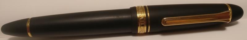
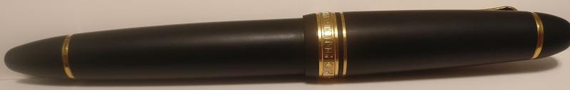
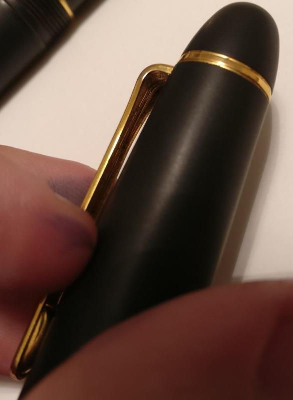
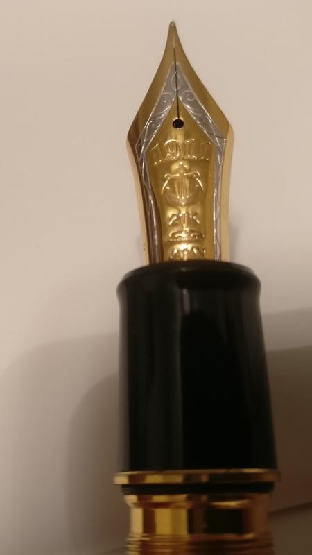
Sailor King of Pen PROFIT Sailor fountain pens owe their company name to an American sailor who first showed his fountain pen to the company’s founder. A lovely story whose reliability I have not confirmed. As Sailor is the name of the FP brand, I would have thought a maritime rank would be a more suitable name for the company’s flagship pen. For example, instead of the King, what about the Sailor Admiral? Regarding the regal title, King of Pen, the name makes me cringe. On Sailor’s website, this line of pens is titled ‘The King of Pens’. Yet the pen is engraved with ‘The King of Pen’. Grammatically, this results in a visceral reaction from even the most liberal grammar national socialist German worker’s party member. The ‘Sailor King of Pens’ sounds more refined, and is what Sailor ought to have engraved on the cap band on their flagship. They could easily have left off the ‘THE’ on the band for the inclusion of the ‘s’ and the end of ‘pen’. The ‘King of Pen’ grates my nerves to a Parmesan cheese dust as effectively as sentences such as: ‘They are all lovely gentleman.’ ‘Our chicken is fresh and responsibility sourced.’ That said, or at least, written, the Sailor KOP is a satisfying acronym, as is SKOP. Within a week. The SKOP has assumed leadership of the populace of my other writing instruments. I think it is worthy of the praise sung by the peasantry who have applauded it prior to this review. First impressions of the SKOP Profit: It’s a very nicely weighted pen. I don’t know how many units, measured in metric or imperial quantities correspond to ‘nice’, yet the pen is pleasantly balanced. It’s almost exactly a larger version of the 1911 Sailor fountain pen; the key differences being the heavier section, flexible nib, and a superfluous ‘ink window’. Olfactory Impressions: The box stank of Urushi, like the Urushi King of Pen(s) that I tried in a local pen store a few weeks before I bought my SKOP Profit. The Urushi scent is not unlike tired tyres. Fortunately the PROFIT is scentless. Given that the box reeks of Urushi, I assume Sailor’s factories must also stink of it, and that someone ought to tell Urushi to wear deodorant. The SKOP Nib: The nib is broad shouldered, two-toned, (the two tones being b-flat and g-sharp) gold and rhodium-plated piece of art. It compliments the size of the SKOP. It is the shiniest nib I own, the debossed lettering on the nib contributing to the glossy, glassy reflection of the gold and rhodium. The gloss may be attributed to the few litres of transparent grease that the pen feed and section were filled with when it left the factory; there was as much grease in the pen as there is in the business ‘invaginations’ of life-size Japanese coitus robots that, as collectibles, make us pen-o-philes seem positively mundane and sensible. Transported to our hero via aeroplane, I think that the pressure changes the pen was exposed to may have sucked a lot of the grease out of the nib and section and into the inner cap. When I unscrewed the pen for the first time, or unthreaded it, for it lacks any screws, the grease formed a seal that held the cap to the pen even though the cap was spinning in my hands as I continued to ‘unthread’ it. There are still a few viscous droplets in the inner cap, which makes me think the nib may be coated in the stuff. The broad nib writes like a Western F-M. It’s very smooth, with much less feedback on the paper then the B 1911 midsize, and the Z 1911 full size nibs. The nib is NOT as smooth as writing with butter on a hot pane of liquid mercury held in suspension by an electromagnetic field. Of the reviewers who describe pens as writing ‘like butter on hot glass’ I challenge them to a) actually write with butter on hot glass, c) under go a drug test, and c) the third letter of the alphabet. The SKOP nib is as smooth as a plastic computer stylus when I write on Rhodia paper, and smoother still on the sheeny sheets of Clairefontaine. It has enough flex to have character, though I’m limited to the 26 characters of the English alphabet, and the line it produces when unflexed is thin enough that it could be used for everyday writing. That is, if you are wealthy enough to be able to risk taking such a pen to work daily. The nib is moderately wet. All my Sailors, and all my Sailor pens, write smoothly with a wet line- whilst this is the wettest of all three. The feed is almost as large as the nib, ½ the size of the distal phalanx of my smallest finger, halved in the coronal plane when standing in the anatomical position. Section: Like all the other sailor Profit pens (if you don’t have one, this description is tremendously helpful), only larger. Or so it seems! The section, internally (internally to the barrel) is very long. And ornate. It resembles a rotor mechanism on a miniature steampunk rendition of a submarine. It’s also very heavy due to the addition of metal to the otherwise plastic component. Having decorations inside the pen is not quite as bad for your health as drinking cocktails laced with precious stones, but equally superfluous. At the height of superfluousness is the ‘ink window’ inside the section; a tic-tac shaped hiatus that enables one to view the ink supply remaining in the pen. Provided that you remove the section from the barrel, and have not depressed the plunger less than 50%. In which case (and in which section), you would know that the pen is otherwise practically full of ink, and the remaining ink volume doesn’t require checking. Filling System: Plunge nib and section into a bottle of ink and screw the converter plunger upwards. That’s the system of filling required to fill this pen, unless you are a blasphemous fiend who is so unimaginative as to only use Sailor ink in Sailor ink cartridges. I feel that Sailor have missed the boat with this filling system. Indeed, I think they have missed all boats by not naming their pen lines after various ships and maritime technology, but I dig the ress. Incidentally, at this point in the first draft of my review that I was writing with my SKOP, the ink ran out. After writing only four A4 pages. Thus emphasising the point that I was about to make; that Sailor have missed the opportunity to make this a truly incredible pen by endowing it with a jumbo converter. A large wet nib, with a feed that could easily feed a small nation, it REQUIRES a large converter. The extra space in the barrel is not utilised, nor is the opportunity to make the pen weightier. This makes the larger ink capacities of the Pelikan M1000 and Mont Blanc 149 much more attractive in the same price bracket. And the Lamy 2000 unmissable in a lower price bracket. Threads: Are what you are currently reading as you try to decide which pen to purchase with that little bit of extra income you pretend you can afford to spend on pens. The threads on this pen are what I have come to expect from Sailor. Fine, smooth to touch (when writing with this pen, the threads feel like another gold band around the section, rather than the terrain where JEEP would film an advertisement for their shoddy vehicles). When threading the cap onto the pen, there is a reassuring ‘grabbiness’ at the end of the thread ‘coil’. Unlike the M1000 that abruptly stops after 1.5 full rotations of the cap, and which 1/10 of a rotation in the reverse direction will sufficiently loosen the cap. Cap: A very large cap that posts as efficiently as the Australia Post company does; it can post, but why bother? It’s fraught with disaster. I have more faith that a letter will reach my correspondent if I set it alight and flush it down the toilet than if I affix a stamp to it and place it in an Auspost box. The SKOP cap perches on the end of the pen, the inner cap just fitting the tip of the pen, and the slightest pressure from the abducens policis (the flesh pad or muscle that secures your thumb to your first metacarpal and allows you to adduct your thumb as you do when holding a pen) will knock it off. The pen is absurdly large with the cap (barely) posted, although it doesn’t seem to affect the weight of the pen when I’m writing with it. Fortunately it’s such a large pen that it’s not necessary to post it. Clip: For the pen with the highest royal ranking, or title of King, the clip is as ordinary and common as Henry the VIII’s carnal desires. The Sailor’s traditional three tiered clip is featured on this pen. Whilst it looks the same as the clips on the other pens, it’s much springier. Not spring loaded, but with more flex at the angle where the clip bends and runs parallel to the shaft of the cap. It’s so springy that I had to double check, for the sake of this review, and triple check, to ensure my ocular organs were functioning, to confirm that the clip wasn’t spring loaded. It’s a suitably broad clip that I would trust it in a suit’s breast pocket, but unlike the Lamy Safari’s clip, I wouldn’t trust it to hold the pen in the back pocket of my jeans whilst skateboarding. My criticism of the clip is that, for the price, and for their flagship, I think that Sailor could have designed a more attractive, more regal clip. Even if it were more angular at the tip, so as to denote the angles of a royal crown (I don’t suggest they make the clip as kitschy as stamping a golden crown to the clip). I simply, or complexly, think it could be made more impressive. Barrel: A large, broad shape like the eponymous cousin of the cigarette and distant relative of the ever more popular VAPE device. The cigar shape is more bulbous than the Midsize and Large 1911 pens I own, which in turn makes the ends of the pen blunter rather than pointed. The blunter tips of the pen make the pen seem larger than it is, and strengthens the association between size, design, and higher quality of the more expensive flagship. The plastic is the same high quality plastic of all Sailor pens (all the plastic ones, that is) in the 1911 series. It’s light, but doesn’t feel too thin, and doesn’t feel tacky like the ABS plastic from which Lamy Safari’s are made (Lamy lovers can put down their base ball bats and pistols; I still love Lamy Safari’s and have a lot of them, I use the adjective tacky to describe the feel, and not the quality of the Safari, which remains one of the toughest FP’s I own). The only negative I have noticed with the Sailor plastic is that the threads tend to collect skin and oils from my hands, and this accumulates as a clay coloured jam in the sulci. Perhaps it’s simply that the plastic is so shiny it’s more noticeable. Not at all significant or a problem, but collectors who obsess over keeping their pens as clean and polished as onyx mirrors may find they are required to give their Sailors more happy-endings than their other FPs. This is a beautiful, subtle flagship of a pen. I chose the profit SKOP because it was the cheapest of the SKOP f-ships available online. If I was to invest a significant sum of money into an Urushi pen, I would rather buy a Nakayama or Namiki Urushi pen, for I think that these are more attractive and unique than the Sailor KOP Urushi’s. For the price, I think the pen is excellent. It’s very comfortable to write with, the nib performance is as profound, and not as short-lived as Heath Ledger’s JOKER in Batman the Dark Knight. The only improvement Sailor could make would be to their clip designs (at least, on their URUSHI line), and to create a larger converter for this pen (surely that isn’t too hard to do? If there is a Sailor representative out there reading this, please consider this for the sake of the overly invested fountain pen collector who actually uses flagship pens to write with!) The KOP is a worthy addition I can see myself using lots, and see myself in the barrel’s reflection, and keeps my Pelikan M1000 from monopolising my collection, forcing it to play other board games with pens of lesser value in my collection. If you can afford one, they are brilliant pens. If you can’t, the 1911 Large, and 1911 Mid-size are excellent pens also. For my reviews of the pens compared in this review, the Pelikan M400, Pilot Custom 823, and Lamy 2000, and Laban Mento, please see the links below: Lamy 2000 https://www.fountainpennetwork.com/forum/topic/191060-lamy-2000-story-review/?hl=%2Blamy+%2B2000+%2Breview Pelikan m400 https://www.fountainpennetwork.com/forum/topic/190262-pelikan-m400-review/?hl=pelikan Custom 823 https://www.fountainpennetwork.com/forum/topic/189405-pilot-custom-823-rantview/ Laban Mento https://www.fountainpennetwork.com/forum/topic/189668-laban-mento-electric-yellow/
-
Sailor King of Pen in Crimson Urushi http://farm3.staticflickr.com/2835/9594362537_0c4578f4c5_b.jpg Sailor King of Pen resting on a Nakaya three-pen pillow in Kuro-Tamenuri. Lacquered tamenuri ink bottle rest is from Nagasawa Pen Style Den in Kobe, Japan. Writing pad is from Midori. Having owned this particular pen for four years already, I thought it was high time that I reviewed it. Since many great reviews of the Sailor KOP have already been written, I'll just focus on the aspects of this pen that make it special for me. Introduction Back in 2009, like many fellow FPN-ers I was swept up by the great Nakaya wave, especially after the inaugural Nakaya fountain pen clinic in the Aesthetic Bay shop of Singapore. I bought way too many tamenuri-lacquered Nakaya pens and became enamoured of urushi in general. Then I saw the Sailor KOP in Aesthetic Bay. It was love at first sight - the size, shape and balance of the pen was just perfect. And the crimson urushi was simply sumptuous...! But the price was quite untenable. After dreaming of the pen for a few weeks, I managed to purchase the pen off Tay's Pensinasia.com website for a much better price. My pen originally came with a medium nib. It did not write well out of the box (skipping, hard-starting etc.), so I sent it to John Mottishaw for adjustment. He did his usual nib wizardry and it came back writing much better. Now I could enjoy the pen! Writing Experience (Medium nib) After testing a few inks in this pen, I quickly found Aurora Black to be my favourite ink with the medium nib. With this ink, I would describe the writing experience as being bouncy and forgiving, similar to riding in a Mercedes-Benz rather than in a sports car with very rigid suspension. On certain types of paper (Kokuyo, Rhodia, Clairefontaine), the nib is close to glassy-smooth for me. Although the pen is large by any standard, it is so well-proportioned that it never feels uncomfortable to hold, even for extended writing sessions. The ink capacity provided by the Sailor converter is adequate for my usage. Writing Experience (Crosspoint nib) The medium nib provided a great writing experience, but after a few years I became slightly bored with the predictability of its performance and the fixed width of the line it put down. I thought about selling the pen, but then I had a brain wave! I contacted nibs.com and for a small fee and the cost of the nib John Mottishaw agreed to exchange my medium nib to a Crosspoint nib. Now I had the best of both worlds - the flagship of the Sailor pens, together with one of their legendary nibs! It took a while for me to get used to writing with this nib, but after the learning curve I fell in love with this pen again. Most people here probably know how the special Nagahara nibs work: the line they put down gets broader the more acute the angle is against the paper. At my normal writing angle, the nib writes a medium-to-broad line, just right for my needs. Should I need to highlight something or use my pen like a Sharpie marker, I just write with the nib at a lower angle. Flipping the nib upside-down yields an extra-fine line, perfect for marginalia in scientific papers or very fine corrections in the manuscripts I edit occasionally. After a while, positioning the nib to get a desired line width becomes second nature, much like shifting gears on a bicycle to get to the sweet spot between pedal cadence and effort. I have tested a few inks in this pen and now I prefer to use Sailor Blue-Black with the Crosspoint nib. Performance is no longer glassy-smooth with this ink but I actually prefer having more control over the nib on paper. Crimson urushi finish and pen construction The main reason why I bought this pen was because of the exquisite crimson urushi finish. Having owned several other lacquered/maki-e pens (Nakaya, Namiki, Danitrio, S.T. Dupont), I can confidently say that the urushi lacquer on this pen is of top-notch quality. The fact that Kato Seishou, a famous maki-e artist in Japan, hand-lacquers each pen with twelve layers of urushi lacquer probably adds to the quality of the finish as well. To be slightly more provocative, subjectively I feel that the Sailor urushi finish is slightly superior to that used for Namiki pens. I am by no means an expert on urushi lacquering, but I would describe the urushi finish on this pen as being thicker and more grippy, which gives it a very pleasant feeling in the hand. After four years of ownership the lacquer finish remains as flawless and perfect as the day I bought it, a testimony to the durability of urushi. Moving beyond the finish, overall construction of the pen is beyond reproach. The base material of the pen is ebonite, and the lathe work is excellent. Everything fits together perfectly. One thing I really appreciate about this pen is the inner sleeve within the pen cap. This inner sleeve rotates together with the nib section as the pen is capped in order to ensure an air-tight seal, minimising ink evaporation from the nib. Conclusions Since I bought this pen, it has remained inked and travels with me wherever I go in the world. The fact that I still own it after four years probably means that it will stay in my collection for a long time - much like a treasured companion which I can depend on everyday. It will be interesting to review this pen again after another few years to see how much of the above remains the same. Anyway, I hope you have enjoyed reading this review! http://farm4.staticflickr.com/3777/9597307152_fb05fcd0ff_b.jpg Unveiling the exquisite Crosspoint nib, contrasted against the beautiful depth of the crimson urushi lacquer finish. http://farm4.staticflickr.com/3669/9594516099_93e6544f36_b.jpg Closeup of the Crosspoint nib. http://farm8.staticflickr.com/7454/9597307370_1c53fe3ec3_b.jpg Side profile of the Crosspoint nib. http://farm4.staticflickr.com/3735/9597154920_65b6ef42b2_b.jpg Upside-down view of the Crosspoint nib. Note the "hammered" indentations and rough finishing on the reverse side of the nib. I have speculated on the existence of these indentations and think that it might be to promote ink flow to the tip. Any thoughts? http://farm8.staticflickr.com/7388/9594362445_37fc23f2f2_b.jpg Superlative finish of the Crosspoint nib. I love the cross slit! http://farm3.staticflickr.com/2865/9594516197_8a48a6f142_b.jpg The obligatory writing sample from the Crosspoint nib. Ink is Sailor Blue-Black, paper is Kokuyo Campus. From left to right, the Chinese characters on the bottom read: extra-fine, medium, broad, extra-broad. http://farm4.staticflickr.com/3750/9619554104_43e6bd1a92_b.jpg The Sailor KOP in Crimson Urushi juxtaposed with the Namiki Yukari Royale in Black Urushi.
-

Two Classic Pens Lb5 Nagahara Cross Point Reviews
Ebonite And Ivory posted a topic in Fountain Pen Reviews
Hello friends. Up for review today are two Classic Pens LB5 fountain pens with Sailor Nagahara Cross Point nibs. The two finishes are Kouseki (Metal Ore) in Diamond Brown and Tairiku (Continent) in Amethyst Mauve. There have been a lot of words exchanged as of late regarding these pens so I decided to offer my own thoughts, too, which hopefully will provide additional context and perspective. Stephen Brown (Hey there!), Matt Armstrong from the Pen Habit (we met at DC 2016 and he's a cool guy), David from Figboot On Pens, and many others have already weighed in on these pens--some expressing that these pens are "perfection." Perhaps I will take up video reviews myself, but until then, being camera shy, here we go... Appearance & Design: 9 (with Bio): As you may know, the LB5 pen is modeled after the Sailor King Of Pen ST (KOP) King Profit line. Andreas Lambrou (a Classic Pens founder and well-respected pen expert) partnered with long-term friend and Sailor executive Kunio Ishizaki to bring this project to life. If Andreas' name sounds familiar to you it may be due to seeing one of his many encyclopedia style printed volumes--"Fountain Pens Of Japan" and "Fountain Pens of the World" are my two favorites. Being a special project, only 50 numbered pens shall be produced in each of the 6 colors (300 total, world-wide). A major factor with the finish of the LB5s (whether one cares for it or not) is the diffusion bonded acrylic process/product that is used for the body of the pen. Supposedly, these materials can cost 20-70x what standard acrylic blanks cost to produce for turning. This special bonding process and, I think, a cutting of the material more vertically instead of horizontally yield the fascinatingly deep color tones that seem to dance across these pens. I formally submit these process-oriented comments as lightly-researched speculation and hearsay, but I think I've got the right idea. If pushed to reduce my comments, the word custom would truly be the biggest takeaway I could offer. The size is different than the KOP, the materials used are different in both substance and color from the KOP, the pen caps are numbered (up to 50), and, in my case, each pen came with a matching special edition volume of "Fountain Pens Of Japan" (a book also numbered to correspond with the specific finish and number of the pen I received). FYI, the only things special edition about the book are that the standard cover-jacket has been replaced with a picture of all 6 LB5 "Nature" pens and then, of course, an interior page bears the same number and pen model as each LB5 pen (hand-written and signed by Andreas, which is a nice touch--photos below). I submit all these points as a respectful pushback against those who have posted comments like, "It's a little bigger than the KOP and a different color...that does not justify the extra expense." More on that matter to come... In the photos section I have included comparison photos of the Classic LB5s (LB5s) next to the standard KOP Profit and the KOP Professional gear (demonstrator). This should be helpful. The LB5 is a large pen. It's 5cm longer than the "already bigger than the Mb149" standard KOP Profit series. This gives the LB5 a great presence and a bigger canvas to display the specialty finish. The LB5 section is also .02mm wider than the KOP which makes a positive difference for someone with medium large hands. However, if you have small hands, or if you prefer understated pens, this may not be the pen for you. For example, admittedly, the cap band is quite elaborate and hefty, approaching gaudy, but I like it as is. Theres lots of information on the gold cap band to display so I think it deserves some extra heft since it is, after all, a special edition. (The words Sailor, # of 50, LB5, and the Japanese finish name all appear on the cap band.) FYI, there is only one finish with a white (rhodium) finish for the nib, band, clip, et. all, and thats the Tensui, which is blue. And then finally, we come to the appearance of the cross point nib...I mean, wow! The double-layered nib provides a spectacular site to behold every time the pen cap is removed. The base layer is, of course, the same as the KOP, a beautiful 21kt soft nib (don't think flex!) that bears the Sailor anchor design as well as the labeling NAG on the right side (after the acclaimed nibmeister and designer Mr. Nagahara who has since retired from Sailor but whose legacy lives on). But it is the top layer of the nib (causing the cross point) that really makes the nib visually pop, and I really enjoy viewing the extra pair of shoulders every time I unscrew the cap. Construction & Quality: 8 I totally fear what would happen to this pen if I dropped it on a hard surface. It doesn't feel like a tank. I have dropped a Visconti Homo Sapiens and a Delta Dolce Vita onto asphalt and both were (somehow) unscathed. This pen might shatter. It might not be fair to say this as the only way to test this is to actually drop it....not gonna happen! I believe the bonded acrylic is probably high quality, perhaps even durable; I just am scared to use it in places where there is not carpet under my feet. In all fairness, part of this hesitancy is due to the price, which isn't a quality issue. The clip is tight, but not too tight to slip over a pocket; and, most importantly, the clip nob that touches the pen cap is quite snugly pressurized and pointed. Translation: this is a better clip than Visconti offers with its visually appealing but functionally destitute "bridge design" that makes a smooth/flat contact with the pen cap ensuring that whatever the clip latches onto slips off with ease onto the floor when bending over. Nothing is loose on this pen. The finish is well-polished with zero micro-scratches upon delivery. Regarding the filling system quality, the LB5 and Sailor KOP (much like Waterman Edson pens) have an extended metal piece under the barrel to provide more support and even a viewing window for the CC filler. This is a nice touch and brought the quality score from a 7 to an 8. If a company is going to "go converter" they should at least be intentional about it and purposeful with the design execution. This pen does not have just a wobbly converter under the barrel that's ready to fall out at any moment. So, well-done Sailor. Photo provided. Weight And Dimensions: 8 I think this pen is just a little big for what I want to do with it. But I subjectively scored this high because I love huge pens (see my FPN Namiki Vermillon "Emperor" review for proof), and for the price, I do not expect or want a small pen. That being said, because of the incredible abilities of the cross-point nib, I desire something a little more nimble and precise in the hand to help guide precision writing. Without the cross point nib in place I would probably score this as a 9 since it's well-balanced, not silly light or silly heavy, and there's zero cramping with writing. Bear in mind, though, that if there were no cross-point nib on this pen the score would go up here but drop substantially under the nib performance section, the appearance section, and the value section. Measurements: Length (capped): 155.0 mm/6.10″ Length (uncapped): 137.6 mm/5.41″ Length (posted): 174.1 mm/6.89″ Diameter (barrel): 13.2 15.2 mm/0.52″ 0.59″ Diameter (section): 12.4 12.9 mm/0.48″ 0.50″ Weight (all): 44 g Weight (cap): 16 g Weight (body): 28 g (Source Of Measurements: Stephen Brown's Website & YouTube Review) Nib & Performance: 11 Perfection (or as close as is humanly possible) describes the nib and feed experience. Sorry. I gave it an 11. Deal with it! For context, I am quite familiar with the standard KOP 21kt nibs. They are very nice, precise, soft nibs (no flex) that perform extremely well with sometimes just a hint of feedback; I would rate those KOP nibs a 7 or a 7.5. On the two LB5s, both Nagahara cross point nibs perform as smooth as butter (zero feedback, which is what I like). They write under their own weight (zero pressure needed), and are perfectly tuned out of the box, which makes me suspect that Andreas and/or Kunio place a special eye on all these before they go out to customers. Again, being custom and limited to only 50 pens each, LB5s are not mass-produced. They also bear individuals' real names instead of just a brand name, a point not to be glossed over. It's easier to allow mediocrity to pass through one's desk if he or she is simply one cog in a large wheel where responsibility for quality control can be diffused. If a Classic Pens LB5 experience stinks, all eyes go to Andreas. So he delivers quality (at least he did for me). This nib offers a range of EEF lines up through BB or BBB lines (pending if you're using a European scale or Japanese scale of evaluation) with zero pressure. This is not a flex pen so please don't try to flex it. Line variation is determined by how one holds the pen; more specifically, the angle at which one holds the pen is what yields different results. The higher the pen is held, the finer the line. The lower the pen is held, the broader the line. Examining the cross-point nib photo close up can help explain this. If one writes more vertically (perpendicular to the page) then only the top of the two nibs is being used, but if one writes more parallel to the page then both nibs are hitting the paper at once and the marker is unleashed! The feed has not failed to keep up even once. There are no hard starts, but it's also not an uncontrollable wet noodle whose lines take 5 minutes to dry. This is the best writing experience I have ever had, and I am an avid collector of fine writing instruments. For this reason, I need to find a way to experience the Sailor King Cobra nib to see if its three stacked nibs furthers this joy or if it somehow it provides too much of a good thing (so to speak). If you have a King Cobra nib, please post a writing sample in response to go along with my cross-point writing sample! Filling system & Maintenance: 5 On an instinctual level I strongly believe a pen at this price should have a piston filler or some other nifty gadget on it. I have become a huge fan of pneumatic (or even touchdown style) fillers such as those used on the Visconti Opera Crystal; also, I love the rudimentary (but highly efficient) plunger-style eyedropper fillers (think Danitrio Genkai and Namiki Emporer). A cartridge/converter setup on a pen like this makes me feel like Lebron James dribbled impressively down the whole court simply to miss a layup. So close, yet so far! This would have been an awesome opportunity for Sailor to bring back their somewhat rare Realo/piston filling system, especially at this price point. That being said, the longer I enjoy (and endure) the fountain pen passion the more I have come to appreciate the CC system. In defense of this filling system I have only two thoughts. One, Sailor does not typically offer a non-CC system, and, after all, the LB5 is a collaboration with Sailor (not a totally new pen from the ground up). And two, Andreas Lambrou isn't an idiot. The more gadgets a pen has, the more things can break. Also, with an ink-sucking nib like the Nagahara Cross Point, it is nice to be able to very quickly flush the pen and change or refill inks without having to twist a piston nob carefully back and forth 20-50x. I am becoming less "piston snobby" and more practical as a result. I mean no offense, of course, to those who are "piston only!" What is less up for debate, however, is the fact that the CC simply has too small of an ink capacity for a nib that can write this wet. 0.7ml is not enough ink for this pen. This is a Sailor issue. However, I am curious what, if anything, Andreas said or thought on this matter. One solution (though at this price a work-around shouldn't be needed) is to use a 1.2ml Sailor cartridge. The cartridge has almost double the ink capacity of the converter and can be refilled with different color inks using ink syringes. The one positive thing about this CC system is that the Sailor KOP line (and the LB5) offers a metal ink window and an all around beefier presentation/support system for these pens than the average CC pen. Photo provided above. This brings the score to a 5 instead of a 2. Cost / Value: 8 I wrestled with this category the longest. These pens are expensive to the point that one could have 2-3 other high-end pens for the price of an LB5, whether with or without a cross point nib. IMHO, LB5s are currently overpriced. I say "currently" because in the past new LB5s (with and without cross point nibs) were being sold by certain sellers (I personally verified this claim) for about $600 less than today's direct price from Andreas. I'm not going to name names. In defense of this, however, supply and demand is a real force. There are fewer pens available today than in 2012-2013 when I believe this LB5 "Nature" series hit the scene, so the retail price (market value price?) is what one must pay. Why would any seller drop his or her price on something desirable that's in scarcity? But, concerning an LB5 with a standard KOP nib, for my money, at full retail prices, I sympathize (but do not fully agree) with those who say things like, "There's not enough special here to justify the extra price above the standard KOP." Put another way, I would take an LB5 in trade for my standard KOP any day (even if I had to pay more to make the trade happen); but, I would not: 1) make the trade if the amount of extra money I had to pay amounted to the full retail value of the LB5, nor 2) purchase an LB5 without a cross point nib at full retail instead of a KOP at full retail. So, why the score of an 8 instead of a 5? Well, in my case, I do have the Nagahara cross point nibs on my pens. While there are cheaper ways to put together something like this (i.e., buying a KOP with a cross point nib for about $500 less than an LB5 w/cross point), the total package of the amazingly vivid LB5 acrylic colors, the extra 5mm size, the limited edition factor (not everyone has them), the cool special edition large book that comes with it, exceptional direct service from Andreas, and a flawless writing experience make this a pen I cannot stop reaching for and must keep inked up at all times. This is why, despite the current market prices, I believe these pens are actually worth the money. I believe something can be overpriced and still worth the money. Being overly dramatic by way of example, one might pay too much money for the last loaf of bread on Earth, but it'd be worth it. On value, I suppose only time will truly tell, for the way I will ultimately answer this question is whether or not I choose to sell these pens. I would like to have the money back in my bank account; however, offer me a check for one of them at the price I paid and I don't think I'll take it. Seriously, message me if you want to buy one with an offer. Just be prepared for me to probably say, No! This might be a far better gauge of value than a 1-10 scale. These pens invoke emotion. (Though, it's still just an earthly possession--something to remember...) Conclusion/Average Score: 8.16 I like these LB5 pens. I have nothing more to add here by way of conclusion so please provide comments and engage one another (and me!) in a discussion about these pens. Respectfully yours, Ebonite And Ivory For the record: All the below photographs were uploaded with the correct orientation and upon posting a few of them turned horizontally. Apologies. Also, I couldn't underline or italicize the book titles or my headings. And, some of my words "rantogether" when I pasted my text into the FPN window from my Word doc so I had to manually space out many of my words a second time. Then, some punctuation (like all apostrophes and ellipses and dashes) disappeared during the copy and paste to this window. I also couldn't indent paragraphs. FPN is such a blessing, but the posting process isn't always seamless. So please pardon any typos and thank you for reading my review! Here are two photos of the standard KOP Profit between the two LB5s: Here is a photo displaying the LB5s with some other very large pens for context. Left to right: YOL Viceroy Grand Victorian, Waterman Edson, Pelikan M1000, Visconti Homo Sapiens Maxi, Sailor KOP Professional Gear Demonstrator, Sailor KOP Profit, LB5 Diamond Brown, LB5 Amethyst Mauve, Namiki Vermillion Urushi "Emperor." Under the hood... Here is a close-up shot of the business-end of the LB5's Nagahara cross-point nib: Here's a shot of the massive book. I have two of these, one for each pen, but included is just shots of one book and the corresponding numbering system that matches the numbered pens: -
Appearance & Design (10) – Large, simple, and elegant. Beautiful contrast between mirror finish on the ebonite and the rhodium plating on the simple section ring, nib, and clip. Construction & Quality (10) – Well constructed. Wonderfully smooth threading between section and barrel. O-ring on section gives a confident tight connection when threading in section to barrel. Flawless polished finish on the ebonite that looks to be at least a mile deep. The ebonite has excellent hand feel - warm to the touch - begs to be used (this is even before one considers the nib). Weight & Dimensions (8) – Large pen (See comparison to Mont Blanc 149, Pelikan M1000). Surprisingly light for the size. Excellent dimensions for those enjoying larger pens (length and girth). Nib & Performance (10) – This #9 21k Sailor Nib is ridiculous. Same size nib as the 149 though the 21k vs. 18k, tine length, and adjustments to the nib make for the most amazing writing experience on fountain pen friendly paper and cheap paper alike. The nib glides across the paper while also seemingly grabbing the paper just enough to let you know you are using a fountain pen. The description of feedback similar to writing with an old-school #2 pencil is apt. The nib does allow for line variation with regular writing without stressing the nib to any significant degree. Works with all inks trialled thus far: Sailor, Noodler's BBKF, Iroshizuku, J. Herbin. This is an amazing nib - worth the price of admission. Filling System & Maintenance (5) - For the price one expects to have some technology and effort put into the filling system - not so much with this pen. The converter holds an acceptable amount of ink for routine business or school work x a few days. For travel one would need to bring additional ink. Upside is the easy of cleaning and maintenance. If adjusts could be made to make this an eyedropper - that would be most excellent. Cost & Value (8) – Expensive pen ~$550.00. As stated above, the nib is worth the price of admission. Conclusion (Final score, 8.5) - I truly enjoy using this pen - daily. I would buy it again and plan to get one with the Naginata Togi nib (another amazing Sailor nib that I enjoy on the 1911). Sailor KOP Ebonite, Visconti HS Bronze, Pelikan M1000, MB 149, Sailor 1911, Platinum 3776, ASA Porus Sailor KOP Ebonite, Visconti HS Bronze, Pelikan M1000, MB 149, Sailor 1911, Platinum 3776, ASA Porus Sailor KOP Ebonite, MB 149, Pelikan M1000 Sailor KOP Ebonite, MB 149, Pelikan M1000 Brothers from another mother - Sailor KOP Ebonite and MB 149 #9 Nibs
-
Hello, I placed an order for what would have been my grail pen (OMAS Brown Arco Milord with a broad nib); however, it is looking like the retailer is going to be unable to fulfill it (RIP OMAS). As they were unable to fill it, they have offered to refund the purchase price, or replace the pen in the order. I find myself drawn to the Sailor King of Pen Pro Gear Sky Blue; however, there does not seem to be a lot of information about the KOP Pro Gear on FPN. I am a bit hesitant to order though, mostly due to the size of the pen. I am worried that it will not be long enough to use unposted (as I do not generally post my pens). So far, the ideal pen for me has been the Pelikan M800/M805. It has a nice heft to it, and is long enough for me to use it unposted. I'm curious as to how the length of the KOP Pro Gear compares to the M800. Any pictures comparing the KOP Pro Gear to an M800would be extremely helpful. All the best, ncc82602
-
Just a quick poll. Have a couple extra dollars that I fell into and am considering these two pens. Which would you go for and why?
-
Here is my contribution to the thread, a few pictures I took last week. You will find more on my boutique 123stylo.com, opening 1st of October :-) Any comments are really welcome! I'm trying my best to capture the pens beauty, without photoshop editing. Cheers from Switzerland! http://i1078.photobucket.com/albums/w499/123chrono/IMG_2607%20-%20copie_zpspo41piza.png http://i1078.photobucket.com/albums/w499/123chrono/IMG_2540%20-%20copie_zps5vfu5spl.png http://i1078.photobucket.com/albums/w499/123chrono/IMG_2668%20-%20copie_zpsmuhx8uk3.png http://i1078.photobucket.com/albums/w499/123chrono/IMG_2248%20-%20copie_zpsue1uvznr.png http://i1078.photobucket.com/albums/w499/123chrono/IMG_2238%20-%20copie_zps5hpbsiwc.png http://i1078.photobucket.com/albums/w499/123chrono/IMG_2434%20-%20copie_zpsz1dvwcdt.png http://i1078.photobucket.com/albums/w499/123chrono/IMG_2436%20-%20copie_zpsmttaiqby.png
-

Is The Resin With Gold Trim (Similar To Mb 149) Sailor King Of Pen Really Discontinued?
DevrimJan posted a topic in Japan - Asia
I have heard very conflicting things about this. Some say that the resin with gold trim KOP was the old version, and that this was updated to the ebonite trim less model after Montblanc threatened Sailor with legal action. However, on Sailor's website the resin with gold trim KOP is still listed, and I saw on one particular website a Sailor ebonite with gold trim KOP which was listed as discontinued, with a separate resin version still being displayed. -
Hello FPN! I firmly believe that to enjoy your new pen, you have to have a good range of approved inks for coupling. There are certain inks that I believe "works" and "not-work" through a purely aesthetic judgement... With that said, new to my stable is a Sailor KOP - black ebonite. I am having a very difficult time finding an ink colour that goes well with this big black pen! I want to ask you...What ink(s) do you have in your black pen? (pictures with both the ink/pen combo will give you bonus brownies points!) Thanks everyone!