Search the Community
Showing results for tags 'kaweco'.
-
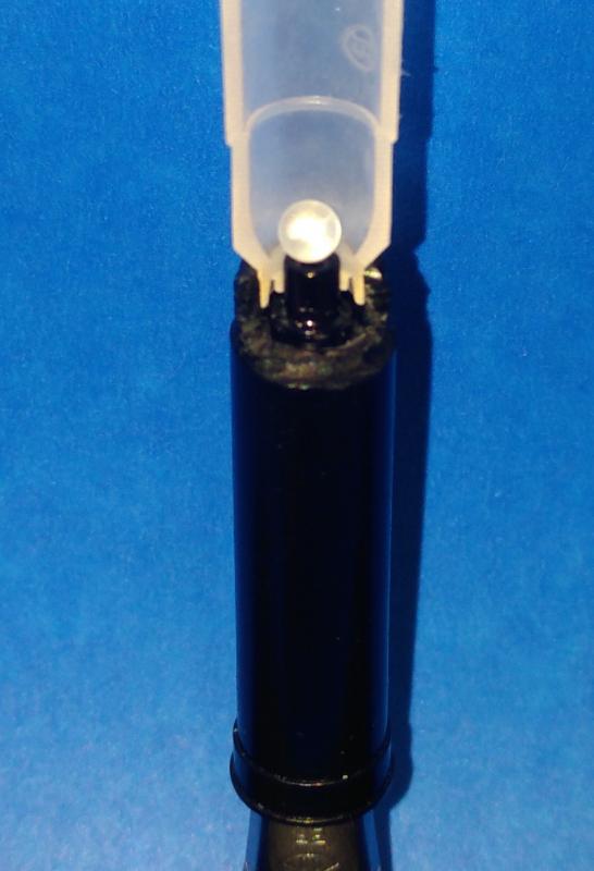
I really like Kaweco Liliput pocket pens – they are simple, robust and beautifully machined fountain pens. However, the Liliput’s small size mandates that ink cartridges need to used instead of a cartridge converter. I became frustrated with what I perceived as ink starvation when writing for extended periods of time with the pen, so I decided to look into this phenomenon in more detail. The picture below shows a cross-section view of the interface between the ink cartridge and the Kaweco (Bock) 060 nib. This 060 nib is used on all Kaweco fountain pens, except the Elite and Supra models. It shows that the plastic ball that originally sealed the ink cartridge sits nicely on top of the feed tube when the pen is orientated upright – which is the opposite of what’s desirable from an ink flow perspective. The feed tube length for the Kaweco (Bock) 250 nib (used on the Elite and Supra pens) extends about twice as far into the ink cartridge, so the mechanism for the plastic ball to obstruct the feed tube is largely mitigated for this design. My solution to this perceived problem is to prevent the plastic ball from being pushed into the cartridge. I use crimp pliers (i.e. smooth jaws) to squeeze the cartridge and eject the plastic ball from a new ink cartridge. Its a bit messy, but only needs to done when a replacement cartridge is required. I empty the cartridge and dry it out – then fill it with my favorite (Monblanc permanent blue) ink using a 0.2ml disposable transfer pipette. A photo of a (truly) empty ink cartridge and pipette is shown below. The 0.2ml pipette is small enough to be inserted into the ink cartridge, and represents a very compact and inexpensive approach to fill cartridges. I reuse the pipettes numerous times, so I have a lifetime supply from the minimum quantity of 200 that I bought from Amazon for about $20. If you find that you’ve experienced similar ink flow problems with your Kaweco cartridge pens, you may wish to consider the above approach to hacking the Kaweco cartridge interface.

-

Kaweco Sport Nibs: Vintage Models As An Alternative?
Kalikrates posted a topic in Other Brands - Europe
I have a problem with Kaweco Sport: I love their design (both in terms of looks and functionality - size, weight, robustness, etc.) but I hate their nibs. I bought one whose nib was just unusable, then I got a replacement nib and it works fine - but still, its feel is just not very good. I have looked at some posts about the possibility of finding compatible nibs from different brands ( https://www.fountainpennetwork.com/forum/topic/325830-kaweco-sport-alternative-nib/ ) but there doesn't seem to be any option that one can just plug in as if it were a Kaweco nib, without being somewhat versed in DIY. I'm not good at DIY at all, and it's not something I want to devote time to. Then I found out that the Kaweco Sport is a very old design, and that Kaweco used to be a different company - so I assume the nibs in vintage models are different. And I suppose they are better, because honestly, I don't think I have tried worse nibs than the current Kaweco ones (even €5 Chinese pens seem to be better in this respect). So I am hatching the plan to buy a vintage model, to see if I can obtain the design I like with a better nib. My question is: am I right in assuming that vintage Kawecos have better nibs, without the problems of the current models? And, since I have observed that they get more expensive the oldest they are, what time period should I aim at to get a decent nib? When exactly did they change from their previous nibs to their current, unreliable ones? -
Kaweco Dia2 Dual Review My friend Laura and I thought it would be fun to do a dual review of a fountain pen. Kaweco loaned each of us a Dia2 with chrome trim. Laura used a steel EF nib, and a 14ct gold BB nib. I used a steel M nib. I also tested it with a steel 1.1mm nib and a 14ct gold F nib. We posted the full review, with more thoughts and pictures, on Laura's blog here but we also want to show you highlights from our review here on FPN. We hope you enjoy reading it. 1. Appearance and Design. Laura: It’s based on a traditional design from the 1930s. I love the chrome-colored trim, the shiny black resin and the knurled rings on the end of the cap and barrel that date from the original Dia. And the shape of the clip is gorgeous. Chris: The Dia2 is a full length pen based on a classic 1930’s Art Deco design. It comes with either chrome or gold trim. The cap has 2 decorative inlaid chrome bands at the base. 2. Construction and Quality. Laura: The Dia2 feels very nicely built. The barrel screws firmly onto the section and a spring-loaded feature inside assures you that the cartridges are firmly in place. Chris: Everything about the Dia2 suggests a high quality pen. It is not a flimsy, lightweight, pen in your hand, as the barrel has inner brass screw threads that give it a good balanced feel. The highly polished black CNC acrylic has cleanly cut and smooth screw threads. You insert one cartridge into the section, and a spare inside the barrel. The spring loading is reassurance that the cartridge won’t fall out. 3. Weight and Dimensions. Weight of pen capped: 27.8 grams (inked with cartridge). Weight of body only: 18.6 grams (inked). Length: Body only, unposted: 12.5 cm or about 5 inches. Posted: 16 cm or just over 6¼ inches. Capped and closed: almost 13.5 cm or 5¼ inches. Laura: I used the Dia2 unposted, and found it to be a nice full sized pen, that feels balanced and comfortable in the hand, even for longer writing sessions. Chris: I only used it unposted, and it felt comfortable in my hand. It might feel slightly unbalanced if posted. 4. Nib and Performance. Laura: The Dia2 uses the same nib units as used on the AL-Sport. The steel EF is smooth, with a touch of feedback, and no flex, but it doesn’t feel stiff. It’s excellent for fast writing and just how I like a nib. I tried the gold BB nib, but didn’t find that improved the writing experience for me. I think the Kaweco steel nibs give a lot of bang for the buck, and I’m very happy with them. Chris: You can choose from threaded steel calligraphy nibs, black steel nibs, or gold nibs. I found my M steel nib had a dry flow. When I swapped in the gold F nib I found the flow was much better with a softer writing experience. I found the nib size looked slightly small in the pen, and I felt it could easily have handled a slightly larger nib, but it didn’t make that much difference to me. 5. Filling System and Maintenance. Laura: I used the Dia2 extensively, but with cartridges only because I did not have a converter that fits. I like cartridges but would have liked a converter as well. Chris: I used cartridges in the Dia2, because I have been using them in the Sport pens that I’ve been reviewing. However, Kaweco also sent me a KW23846 converter that fits it, as none of my International sized converters would stay in properly. The twist action converter that fits the Dia2 is different to the squeeze converter that fits the Sport pens. 6. Cost and Value. Laura: This is the only rub for me. In the US, the Dia2 in chrome sells for about $100, which puts it up in the highest range among steel-nib pens. The converter that fits the Dia2 is an additional $4. That is around the same price as a Pelikan M200, which is a similar steel-nib German pen. I think the Dia2 looks like more of a premium pen. It has much nicer trim, it feels more solid and it’s a bigger pen. The Dia2 feels like a grown-up’s pen. Chris: In the UK, Cult Pens sell the Dia2 Chrome for £72 and the Dia2 Gold for £92. You also need to add £3 for the converter. Pelikan M205’s cost £90 and the M200 costs £120. If you wanted to have the Dia2 with a gold nib then you are adding at least a further £99 to the UK price. So the price would then be comparable with the Lamy 2000 Makrolon FP. I actually prefer the shiny black classic and more traditional finish of the Dia2, and feel that it is a higher quality pen overall. 7. Conclusion. Laura: I really liked this pen. It’s a full-size pen with traditional looks, that feels very well-made. I’m a big fan of the steel EF nib. The Dia2’s only drawback, for me, is that it’s on the expensive side. And I think it should come with a converter. Chris: I like it’s size and high quality, as well as it’s looks and performance. However, I wouldn’t be able to live with the chrome pen fitted with a yellow gold nib, and the gold trim version or the two-tone gold nib make it significantly more expensive. I also think Kaweco need to include a converter with the pen for the sake of the insignificant additional price. N.B. Kaweco kindly sent me the two-tone 14ct gold nib to try it with, and I think it looks much better than the monotone gold nib. I'm adding a couple of pictures to show this nib.
-
Since I use my Kaweco Dia2 mostly with a full-size converter, I'd like to remove the spring from the barrel (reason: when removing the barrel, the spring empties the converter). The filial appears to be screwed on, but it won't budge. Any suggestions on how to safely remove this spring? Thanks!
-
I am thinking that a while back I found a posting (probably here) that alluded to there being some sort of relationship between Kaweco and Mont Blanc back in the old days? If it was here I am not finding it. Can anyone help? Thanks Michael Little
-
I Made A Kaweco Liliput In Fireblue Today
sub_bluesy posted a topic in Fountain & Dip Pens - First Stop
I think it came out a little better actually than oem but only because I polished the pen first. Mostly it came out about the same as it does when Kaweco fires the pen. Firing this pen was very different than firing the Steel Sport. I had to really lay into this one and I think it took longer than the Steel Sport despite no real disassembly required with the Liliput. I didnt fire it with machining oil on it as Kaweco does. The results are very similar though. Theres no plastic in this pen so its pretty straight forward to fire. The big challenge was to get the polishing compound out of the threads. I used a sonicare toothbrush with an expired brush head to do that. Optimally would be an ultra sonic cleaner. I figure it took an hour start to finish if anyone is interested in doing this at home. Overall I do like the finish better on the polished pen vs the original Kaweco Fireblue but I can see why Kaweco doesnt go that route. Just the cleaning would add an hour to production for each pen. Original Fireblue on the left and mine on the right.
-
I'm quite interested in vintage Kawecos and recently found something I've never seen before. It is a small black model (not surprising) with a dark green ink window and a duo-tone 14 k gold nib. It is a piston filler with a blind cap and the piston mechanism is screwed in with a narrow ring the diameter of the barrel, just like old (pre-war) Dia models. I'm not sure but I think that the material might be celluloid. The barrel shows a clear golden imprint of the "Kaweco" logo and a faint imprint saying "Sonderklasse". Given these indications I would think it's a pre-war model but I've never heard of this line of Kawecos. Does anybody here know something about these models? I couldn't find anything anywhere. Thanks in advance, Peter
-
Hello everyone, Today I just want to write an opinionated post about what I consider German fountain pens quality control. Please take note, this is my view, my opinion, and thus is highly subjective. I don't claim to write here about absolute truths, incontestable facts and scientific observations. Thanks. Over the years I have purchased dozens of nibs for Lamy as well as Kaweco and Pelikan. The rate of success was less than 20% overall. Maybe I am the most unlucky man on earth, but let me explain. I like EF nibs and not a single EF Lamy nib that I bought was smooth. They were all more or less scratchy, misaligned or toothy. I could live with that if I wasn't able to straighen them out and smoothen them with lapping film myself. Something I paid Lamy to do for me but they shamefully didn't and sold me a half finished product. Next, Kaweco. Now these other guys decided to go in the other extreme. They make all their nibs so smooth that they practically don't write. Yes. You buy a fountain pen just to look at it. Everybody complains all over the internet about Kaweco nibs having baby bottom and yet Kaweco completely ignores the problem. All my Kaweco nibs have this problem. Does every fountain pen customer have to become a nibmeister himself? Is this what the world of fountain pens is turning into? Then I spent a ton of money on Pelikans and found that the only nibs that write legible for me without writting just 30 words per page are the EF nibs. But all of them have flow issues and if you even try to adjust the flow, the smoothness is gone, the nib is ruined and again ... back to grinding and smoothing. I've found Japanese pens to be the highest quality of them all, but also the least attractive. While the Europeans are extremely expensive pieces of art that cannot write but look gorgeous and like true fountain pens should (at least in my personal opinion), the Japanese ones are of superb quality but ... I know that you can't make a fountain pen nib that can satisfy everybody, and I know that many people might actually not be bothered by a scratchy nib or a nib that skips a little every 3 words. The world is a vast place and there are many individuals in it, for sure. Some might even like writing with absolutely whatever writing tool they find on a desk, for them being more important what you write than how you write it. And some may exclusively type. But even so, I strongly believe that is is pretty common sense and has been established for a long time how a nib should write and it's only a matter of additional effort to bring it there. It's possible and I think it's better if manufacturers did it instead of their customers, just like going to a dentist shouldn't require that you fix your filling after you return home. I apologize to the readers that have German pens that write like a dream. And I tell them to cherish those pens even more now after they've read my opinions. I am sure there are many such pens out there.
-

Does Anyone Else Try To Match Specific Inks To Specific Papers?
Arielle Finberg posted a topic in Inky Thoughts
Some of you like to match specific inks to specific pens. And I do that myself, sometimes. But do any of you try to match specific inks to specific papers? I really love Kaweco Paradise Blue but recently discovered that the strokes of ink form a weird greasy-looking halo, plus bleed-through, apparently only on cream-colored Rhodia paper after several months. I checked back in my Leuchtturm 1917 notebook where I had used the ink about a year or two ago with no such problems showing up (just a tiny bit of bleed-through). And some inks look dulled on off-white paper, while others look richer. Right now I am trying to find a good A5 notebook match for J. Herbin Cacao Du Brésil, my all time favorite ink. I was using it in my Bullet Journals but the color visually made the dot grid on my journal pages look extremely prominent, causing each page to look like a crazy Svengali hypnotic pattern (i.e. hard to read)! I’ve been trying lighter dot-grids than what is in the Rhodia “goalbook,” but I may have to move to a lined or blank journal if I want to use my favorite ink. What inks and papers do you like to use together? -
There are plentiful of reviews of this pen available online so I will skip the technical details like dimensions and weigh and go straight to my experiences of using it (for the record I'm owner of transparent version with fine nib). As in title, story that could be true love (especially for the aluminium versions ) if the pen could be only few mm longer, ends as total disappointment. The extra length would allow to fit a international cartridge or proper converter giving a decent supply of ink to go though the day and would help to use the pen unposted for quick note taking. Then manufacturer decided to tie customers to either stick to limited color pallet of cartridge ink or get ready to fill pen anytime as converter capacity is super small. I'm aware that you can fill used cartridges or convert the pen to the eyedropper but I don't find it a viable solution as this way pen is more prone to leakage which of course needs to avoided in pocket carry pen (just imagine cracked body and 2ml of ink in your pants). Also when filing from bottle there was waiting an unpleasant surprise to be discovered. The nib section connection to grip is not airtight and after submerge in ink gets: a) inside grip, into cap, c) between plastic insert and cap, d) and some onto the grip staining fingers for some time after fill. So say goodbye to nice clean demonstrator look, say hello to cheap plastic look. For me Kaweco Sport definitely didn't live up to legend, but I would still recommend this pen if you indent to use it as cartridge only pocket pen, or for eyedropper conversion. The Good: Pocketability - Kaweco sport is made to be carry in your pocket, in keep loose inside a bag - short and light. Due to it's fat cap with disincentive hexagonal shape it's easy to locate fish out of even most cluttered bag. Screw on Cap( ~1 turn) - Some protection against ink stains. Very good writing experience - When posted it's a full size pen. Nib give a good feedback although is quite stiff, no start problems, no skipping, not drying out when not capped for a few minutes. Reasonable price tag. The Bad: Transparent plastic feels and look extremely cheep - More like 20 cent ballpoint then fine writing instrument. Converter capacity (piston) is pitiful. We are taking like a drop more then half of standard short cartridge. Body don't accept long cartridges. A bit too short for use unposted. Nib unit mount is not airtight - Yay ink stains visible through grip section. and The Ugly: Clip sold separately - Seriously, company expect you to buy clip! Well at least you don't need to buy nib separately.
-
Lazarus like, I appear on the board to ask the question... ...Have we got a thread like the one I started for the Lamy Safari (https://www.fountainpennetwork.com/forum/topic/22180-lamy-safari-colours/page-1) that similarly catalogues and brings together all of the known variants of the Kaweco Sport? I have previously owned and enjoyed a vintage (since lost on a trip to HMS Belfast) variant called the 'Ranger' which was a sort of 'Army Green' colour. I was inspired to ask the question having seen this on my Instagram feed: https://milligram.com/milligram-kaweco-collaboration-skyline-fine-sage I will add some pics of my own (rather vanilla) collection of Kaweco Sports later (when I can work out how to do it again). But in the meantime, please add away below if you have interesting colours to show off... With warm regards to my old friends, Chris p.s. Mods - if such a thread already exists and I have missed it, please feel free to take this down.
-
There are already a few Supra Brass reviews on FPN, be sure to check those out. At the end of this review I've copied my thoughts (originally from https://www.fountainpennetwork.com/forum/topic/337221-kaweco-sport-10mm-short-of-love/) about often-heard complaints about Kaweco, which I feel are worth repeating. ^--This photo shows the pen as well as text written with the fine nib (in purple), as well as comparisons with some other pens. This Supra Brass was an impulsive buy. I was saving up to buy a Platinum instead. My son tried it at our local brick and mortar pen store and he handed it to me to try as well. It had a broad nib (didn't have a broad yet), felt great in the hand and wrote really well. I bought it and the Platinum will have to wait a while. As for the design and the material: you either love it or hate it, and I love it. There's just something about brass that I like (you can get the Supra in other metals as well). The design is at once understated, refined and, well, different. Aesthetically, the large #6 nib fits the pen really well and overall it's just beautiful. A totally unique feature is the removable extender piece, which can be used to shorten the pen significantly. Ergonomically, the pen is right for me. But it will be the wrong pen for many people, simply because it is very heavy. Brass is heavy. I have large hands and it doesn't bother me at all. If you require a light pen, then don't consider the Supra. In terms of how well it handles and sits in the hand: brass is smooth but not slippery. Pens with stainless steel sections, such as my Visconi van Gogh, feel very slippery to me and make my fingertips sweaty, with the result that I'm always struggling a bit with my grip. Not so with the Supra: the brass just feels great, it's not slippery at all and long sessions are comfortable. The diameter and the taper of the section are just right for me, and I expect these dimensions will be about right for most people. With the extender section in place, the pen can (and should) be used unposted. Posting it with the extender will make the pen too long, too heavy as well as too back-heavy. If you want a small pocket pen, remove the extender and what remains is something not much larger than a lipstick tube. In this mode, posting is essential and you can screw the cap on the back of the barrel. Posted without the extender, the pen is noticeably less heavy than it is unposted with the extender in place. So the extender not only gives you a size option, but also a weight option. A totally unique feature, that some (like me) will adore, but others might perceive it as a gimmick. Ink capacity depends on the use of the extender. It's a cartridge/converter pen. Without the extender, only a regular standard international cartridge will fit. Even the hyper-small, adorable Kaweco mini-converter (probably the most hated converter ever) won't fit, unless you stop extending the piston at 75%. With the extender piece in place, the pen accommodates all standard international cartridges (both short and tall) as well as full-size converters. Nib and writing. I bought this pen with a broad nib and also ordered a spare fine nib (a spare nib+feed for a Supra costs €26 full retail). Kaweco nibs are relatively cheap and nib swapping is quite literally a 1-minute job with Kaweco pens, which in my view is one of their more attractive features. The nib is #6 size, fairly large, and its size perfectly fits the rest of the pen. The engravings are stylish. The feed is one of the larger feeds I've seen, with a lot of big fins. ^---What it's all about: the F and B nibs of the Supra. Out of the box, the broad defined the word 'smooth'. I can't remember ever having used a smoother nib. To me, smoothness is not the holy grail. I prefer some feedback and character. The broad immediately performed well with Sailor Jentle Blue: wet enough for comfortable writing (including fast writing and signatures) but dry enough to show nice shading. A nice balance. Since I prefer some feedback and just a bit more wetness, I tuned this broad nib a little and quickly got it working exactly according to my personal preferences. But again: out of the box, it was already a very, very good steel nib. ^--This photo shows text written with the broad nib. Then, the fine. In general I prefer nibs ranging from Japanese fine to Western fine, so the broad would probably would not be used that much. It's wonderful for things like postcards, quick note taking, sketching and people with large, flowery handwriting. The fine, however, now that's right up my alley. This is one of the very few nibs that performed perfectly right out of the box, with zero need for any kind of adjustment or tuning. It immediately performed very well with J. Herbin Bleu Nuit and with Sailor Jentle Blue, but I settled on Montblanc Lavender Purple. In terms of feel, this is the best steel nib I own. And although I like the small nibs in my Kaweco AL Sport and Classic Sport pens, the Supra nib is in a totally different league. Smooth but with loads of feeling and character. It's tough stainless steel, yet if you want it to it will give you considerable line variation with very little effort - and it will never, ever scratch, no matter how hard you press down. Line width is surprisingly narrow; check the photo for comparisons with my Pilot Custom 823 F, which is a Japansese fine... In terms of writing sensation, this nib is pure joy. Yes, the pencil-like feedback of my Sailors is still unmatched, but if you'd ask me if the nib of my Custom 823 F is nicer than this steel Supra nib, I'd have to think about it. Really. Also, consider this. If you order an 823 from Japan and the nib is a dud, what are you going to do? With Kaweco, you return a faulty nib under warranty and get a new one. Screw it in and off you go. If you damage it, you pay €26 for a new one and you're back in business. At this price point, the Supra nibs are unbeatable. At any price point, I can't think of a better steel nib. Conclusion. With a street price of about €95 and an extra nib retailing at €26, this indestructible and distinctive pen punches way above its class. People who like line variation but want a pocket pen sturdy enough to derail a train, the Supra is your ticket. Do not dismiss the Supra if you dislike the AL Sport or the Classic Sport - please judge this pen on its own, because the nibs are in a totally different class. This is a pen you'll have to pry out of my cold dead hands. In closing, a brief pros and cons (as I see them) of Kaweco pocket pens such as the AL Sport and the Classic Sport (originally from this topic: https://www.fountainpennetwork.com/forum/topic/337221-kaweco-sport-10mm-short-of-love/), many points of which also translate to the larger Supra: Pro: IndestructibleAwesome designDependable (but see below)As steel nibs go, the price/performance ratio go these nibs is awesome (but see below)Every part can be renewed easily and economically (a new Classic Sport nib+feed costs less than 10 euros)You can use various nibs in the same pen, takes 30 seconds to changeNeutral: It's a pocket pen! Don't buy it if you require 2 mL of your own hyper-special home-brewed ink mixture in a pen.It's a steel-nibbed pen, the nibs are cheap (in terms of price) and are mass-produced by Bock. If you expect it to write better OOTB than your vintage Montblanc 149, then don't buy one. Having said that, personally I really like these nibs. Con: Some new Kaweco nibs are too dry. I'm not making excuses for that, but it's a fact. Accept it, or don't buy one. The dryness will pass. The more you use it, the faster it will pass. Once the pen plateaus out, the flow will be very nice and even on the wet side. If you can't live with the dryness, there are non-invasive tricks you can use or you can seek help from a nibmeister (but note that most of these pens *will* get wetter over time, so if you tune the nib early-on, you might have to re-tune it later). In general, thoroughly and repeatedly flush the nib+feed. After that (not before that!), it will help a lot if you unscrew the nib+feed and put it in a bottle of the ink you intend to use for 12 hours or so. Take it out, clean off with a rag, screw back into the section, pop in a cartridge of the same ink, and you will have accelerated the plateau-ing out process a lot.Some new Kaweco nibs have baby's bottom; if you get one, get another one on warranty (same as with any other new pen) or get a nibmeister to fix it for you
-
Hi all. I fancy a new Kaweco, having both a Classic and Skyline Sport and being pretty impressed with them. To be honest, I think I prefer the looks to the writing experience but the latter certainly isn't bad. I also like the portability and durability of the pens, so am thinking of adding another to my collection. I'm torn between the black stonewashed AL Sport and one of the eco brass Liliputs. http://d15bv9e9f3al6i.cloudfront.net/imgs/products/cp/950_constW/KW30868-ZZZ~Kaweco-AL-Sport-Fountain-Pen-Black-Stonewashed_P1.jpg http://d15bv9e9f3al6i.cloudfront.net/imgs/products/cp/950_constW/KW41940-ZZZ~Kaweco-Liliput-Fountain-Pen-Eco-Brass_P1.jpg http://d15bv9e9f3al6i.cloudfront.net/imgs/products/cp/950_constW/KW41946-ZZZ~Kaweco-Liliput-Fountain-Pen-Eco-Brass-Wave_P1.jpg I love this description from Cult Pens: And I also like this idea: But the the stonewashed AL Sport just looks badass from the off, although the idea of a brass Liliput that is totally unique due to my own filthy hand oils and pocket dirt is possibly even more badass. But which of the two to choose? And, to make things worse, both pens are £62.99 (is this a thing in the USA too? Why the hell do they not round up to the nearest pound?) on Cult Pens and have the same nibs. I like the copper Liliput best of all: http://d15bv9e9f3al6i.cloudfront.net/imgs/products/cp/950_constW/KW40964-ZZZ~Kaweco-Liliput-Fountain-Pen-Copper_P1.jpg But that's £89.99, which is officially 'silly money' for a pen with a steel nib.
-
Hi guys, I am in a confusion regarding my next purchase. I want a full metallic fountain pen and the Kaweco AL sport and the lilliput caught my attention. A month ago I bought my first Kaweco Skyline Sport and I am really impressed with Kaweco Fountain Pen. Those who own any of these two pens or any one of them please suggest me which one should I buy and state your reasons. My sole intention is to buy a full metallic robust pen that would last a long time. Thanks in advance.
-
Hi, I have bought a Skyline sport a few weeks back and I love the pen. Next, I would like to buy a metallic version of a Kaweco Fountain pen. I saw that there is the Al Sport and the Lilliput. Please suggest me which one will be the best one to buy because I want to use it for a long long time. I love full metallic fountain pens as they last for a life time.
-
Hi, I have bought a Skyline sport a few weeks back and I love the pen. I would like to buy a metallic version of Kaweco Fountain pen. I saw that there is the Al Sport and the Lilliput. Please suggest me which one will be the best one to buy because I want to use it for a long long time. I love full metallic fountain pens as they last a lifetime.
-
This is not a review, nor anything that resembles it. These are only personal impressions, the result of the comparison between a series of orange inks that I have collected over the years. The excuse to put them (roughly) in comparison came from a Christmas gift from my daughters, who made me find a bottle of Hiroshizuku yu-yake under the tree, a beautiful gift and a wonderful surprise. Here is the comparison: Of the five orange inks, the two Montblanc are the most saturated, with a margin of advantage for the beautiful Mahatma Gandhi, who is also the lightest of the group. It is an ink that almost does not present any shading, not even with a wide pen like the one used in the script (italic 1.9 mm), but with an excellent flow. It is lively, very cheerful, closer to a "clementine" (Citrus x clementina) color than a true orange. When I open the bottle cap, along the glass lip of the bottle I can see a certain deposit of a bright orange powder. I'm not sure what it is, but it makes me think of a pigment in suspension in the ink. For this reason, I never leave any pen loaded with this ink. I use it, then I wash the pen and put it back. The bottle is the classic 50ml Montblanc and it is now really hard to find, if not at an unreasonable price (on eBay, bottles have been sold for over 120 dollars, ie 2.4 $/ml). Following is the Lamy Special Edition 2015 Copper Orange, launched a couple of years ago together with the beautiful Al-Star pen in aluminum of the same color. As the name well says, it is an ink closer to copper than orange, a sober, rather "dark" color, with beautiful shading even with a nib of average generosity (like the Italic 1.1 of the Lamy Al-Star Copper Orange, which I used in the sample). It has a good flow, but it is not excessively liquid. I had the Lamy Copper Orange loaded with this ink for almost a year, without any problem of deposits. Of the whole group, it is the only ink that was available only in cartridges of the type T10, 1.2 ml. The box of 5 is worth around 7.00 dollars (1.4 $/ml). Kaweco Sunrise Orange. It is a dark "orange", a few steps from an orangish hazelnut. It is an extremely matte ink, of an opacity that in a certain way resembles that of a tempera, almost without any shading. Of consistency slightly denser than that of the other inks tested, it behaves very well with nibs with abundant flow, a little less with the drier ones. Kaweco offers it in a very traditional 30 mm bottle, at about 12.00 dollars (0.4 $/ml). The "Chanel" of inks, Iroshizuku yu-yake ("sunset"). It is an ink with a medium-high flow, with excellent contrast on the paper and extraordinary shading, warm but not excessively saturated (a feature that I prefer in every type of ink) and sufficiently "dark" to be easily read on a page of text. Among other things, it will be my new ink for proofreading of our scientific journal. Pilot proposes it in a beautiful, sober, essential and practically perfect 50 ml bottle (it even has a small conical recess on the bottom of the bottle to insert the tip of the nib so that it does not slip while loading). On Ebay, it costs from 30.00 to 40.00 dollars, depending on the seller (0.6-0.8 $/ml). Montblanc Ink of Joy. As well as Mahatma Gandhi, Ink of Joy is also a vivid and clear orange (just a darker shade), with medium flow and good shading, also visible with a medium nib, and very saturated. It is, for my taste, a little light to be used for normal writing, and I usually reserve it for short notes or greeting cards, where it makes an excellent figure. It leaves a dense, intense orange powder on the edge of the bottle when I remove the cap, and I suppose it is a pigment originally suspended in the ink. Ink of Joy therefore enters my pens exclusively to the need. What I do not use it, I empty it again in the bottle and wash the pen. Fortunately, I was in Italy when this ink came out and I bought it in a Montblanc boutique for 18.00 dollars (0.6 $/ml). The last time I saw it, it was on eBay where a “lucky” buyer bought a used bottle for only 125 dollars (about 4,1 $/ml)! That's all. I'll go back to my pens and inks ...
-
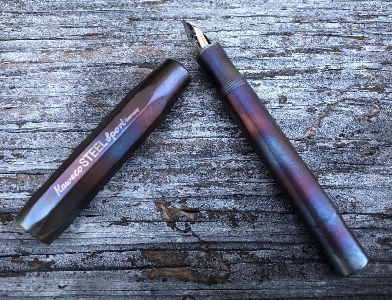
No Kaweco Steel Sport Fireblue? Now There Is!
sub_bluesy posted a topic in Fountain & Dip Pens - First Stop
I love this finish on the Liliput but was a little disappointed it wasnt offered on the Steel Sport so I decided to make my own! Getting the pen dissembled was a little tricky. I actually had to order a second pen because of a mess up dissembling the cap on the first pen. Its a little different color than the Liliput but finishes look to be all over the place on that pen due to the process. Also the brushed finish on the Steel Sport is a little different than the smoother Liliput. I might polish my second Steel Sport a little and then fire it to match a little closer.
-
Hello All, I've bought a Kaweco Perkeo when they came out since they perfect daily pens (full size, good nib, nice retro colors, etc.), however the pen's nib tines are visibly out of alignment. I noticed that the nib is also not aligned on the feed and I aligned it by holding from sides with a cloth. This alignment equalized the nib more or less, but it's not perfect. I can still see some difference even with naked eye, however the pen is writing much more smoothly now. I also tried to align the nibs by nudging by my nail, but since it's both a daily driver and a lower end pen aimed to beginners, the nib is very springy. It retains its tine positions very well. Did anyone experienced a similar issue? How can I fix the issue? Thanks in advance, Hakan
-
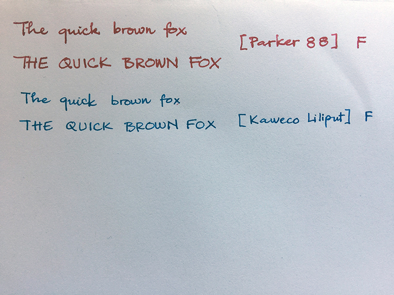
Hi, I've been lurking around for a while and this is my first post I recently acquired a NOS Parker 88 (I believe it's a 88 though it was listed as a Rialto) and while there is an "F" stamped on the plastic feeder, it writes like a Broad to me. I have just got into FP so this is the only Parker I have. I'm not sure if my observation is correct but it feels like it has a B nib on an F feeder, is it possible that the nib has been swapped or is it just typical Parker F nib? I'd like your opinion on this. Another thing is it writes very wet, more so than I'd like, is there a way to decrease ink flow? I included some photos of the nib and a writing sample here (J. Herbin Rouge Opera ink). Thanks for your time!
-
Kaweco AL Sport F and Dia2 GT F Though I’ve always been drawn to fountain pens, I never used to bond with them. I’ve tried many Shaeffers, Parkers, a Cross… after some time I always gave them away - they’d either be leaky, or scratchy, or have starting issues, or they’d be skippy, or roll of my table, or fall from my shirt pocket… it’s always been kind of a fight. I’ve still got the Cross, a rather nice Townsend Medalist with M nib, but I’ve never really bonded with that pen, either. It’s a leaky pen, always gives me blue fingers and it’s too big and heavy to carry it around in my shirt. Two 2 years ago I fell for the design of Kaweco pens. I loved their stonewashed AL Sport fountain pens from the moment I laid eyes on them. I got myself a blue one with an F nib and it literally has not left my side since. For 2 years, I’ve averaged about 6 densely scribbled A5 pages a day (I rather write a lot) and the pen is always in my shirt pocket. I’ve never even cleaned it. It has never leaked, it’s always worked flawlessly and it writes beautifully. You can see the underside of the nib on the photo (the chrome-coloured nib) - all the writing definitely changed its shape, but it’s perfect for me. No feathering, no showthrough, super-smooth. You can also write upside down with it, for small scribbling in the sideline (thanks Wim, for learning me this trick!). It’s a rather dry nib so I use Schneider Königsblau, a lovely-coloured wet ink that costs next to nothing (never had much luck with Kaweco ink). This pen works for me because of a variety of reasons. First, the screw-on cap means no pressure pop when releasing the cap, so no leakage, nothing, never, not even a little bit, not even when the pen falls on the floor. Awesome. That Cross will leak if I so much as look at it. Second, it’s absolutely indestructible. Third, how can a nib this good cost just 10 euros? It’s so smooth and pleasant. Fourth, it’s a very small pen when not in use and it makes for a great ‘take-it-everywhere-except-the-shower’ pen. Fifth, you can’t write with it unless the cap is posted. And the cap is ridged. Meaning, if you put down the pen for a second, it will not roll, not even on a moderately angled surface. Meaning it will not fall. Yet if it should fall, the cap is the heaviest part, so it never hits the ground nib-first. The only downside for me is the clip. it’s a mystery why Kaweco used a slide-on clip, so to speak. The pen is aluminium, i.e. rather soft. The clip seems to be stainless steel, i.e. tough as nails. The clip moves, thereby gradually eroding the ridges of the cap. And if you put the pen in a pocket, there’s a good chance the pen will go in while the clip will slide off. Many times I’ve gone back to conference rooms to look for the clip. Not good. As a writing instrument, this is my all-time favorite pen. It’s part of me. It beats my Cross hands-down, even though a nibmeister from FPN was kind enough to optimize the Cross’s nib for me. The Kaweco still wins! (I still use the Cross at home from time to time, as a desk pen it’s rather nice). At some point I acquired a cheaper, plastic Kaweco Sport F to use with a different colour, in this case Schneider Grün (that green is just so lush and rich!). I use it for underlining, annotations and the like. Same nib, same great writing experience, costs all of 20 euros. How do they do it? This weekend I went out to buy another pen, not because I need one but because it’s nice to change it up a little and to be able to give my trusty blue AL Sport a little breather from time to time. My criteria were as follows: -screw-on cap -fixed clip -understated, timeless design (preferably Art Deco), not too much shiny metal, not too many fancy colours -under 120 euros (hey, if the AL Sport can be this good for under 70 euros, then why pay more?) -F nib (I have show-through issues with heavier nibs) -good results on a variety of paper -smooth nib, no scratchiness -no ink flow issues, not at start-up, not skipping -no leakage whatsoever -must fit in shirt pocket and must not fall out (i.e. a good, strong clip) -must be well-made and built-to-last I tried a few TWSBI models and I liked them. Nice pens. But a little bit too gadget-y for me, with that see-through plastic and that mechanism in there. Clever, contemporary, nice nib. I’ll get one, one day, just for fun. I tried some Lamy’s. Well-made. Good value. Didn’t bond with the design (too modern), nor with the nibs (they’re good, but not for me - I have bad handwriting and need a certain kind of nib to write well). Long story short, though I kind of intended to buy another brand for the sake of variety, I ended up with a Kaweco Dia2 GT F. It meets all my criteria, and then some. What a beautiful, classic pen. And so well-made. Same nib as my trusty AL Sport, only faux-gold-plated. See photo - the gold-coloured nib is the Dia2 GT. Feels different, though. Slightly more feedback, but not scratchy at all. Just a slight sense of “smooth resistance”, for lack of a better description. I wonder how this nib will feel a year down the line. In daily use, I intend to alternate between the AL Sport and the Dia2 - let’s see what happens once the Dia2’s nib settles in. I do 90% of my writing away from home, mostly on trains, buses and at the office. I move around a lot. The Kaweco’s are exceptional pens for that lifestyle. The Cross? That Townsend Medalist is a rather fickle pen, more of a desk pen, a luxury item where class and looks take a backseat to dependability. Treat it gingerly, and it’s a true pleasure to write with it. But it’s not an all-day, every-day pen and in almost every aspect it the Kaweco’s are better pens. To finish off, my wish list is short. I’ve good things about the super-affordable Pilot Metropolitan, but I’ve yet to find one in a pen shop. There will be a TWSBI one day. That’s about it. I don’t collect pens, instead I write them into the ground :-). Best regards, Oscar
-
This is my first Kaweco and I really dont know why I waited so long. Im really happy with this pen even as a daily writer despite the ultra small size. I went against all better judgement and ordered a double broad nib on a pocket pen and boy am I glad I did! It writes like a very nice stub nib with about a 1mm line width. This may be common knowledge with Kawecos but it was news to me. My only complaint about the nib is that it was on the bleeding edge of babys bottom and actually showed mild hard starts on the first letter. This was easily fixed with a short polish with 4K micromesh and then a few runs on 6k to get rid of the squeakyness. It writes very well after a small amount of work. The cartridge seems to last about as long as it does in a standard stub nib pen so far. I plan to refill it with a syringe of which is extremely easy. I would say even easier than a converter actually. The Fireblue finish is awesome! Every angle of the pen is interesting. Theres always something new. There is a very high premium paid for it though. Not sure if its worth it to everyone but it does look cool. The Fireblue finish cost me an extra $40 over raw stainless with a deep massdrop discount. I just bought a raw stainless version as well so Ill see how close I can come to Fireblue with a mapp gas torch and some cutting oil. I suppose youre partly paying for the story behind the process with the CEO of Kaweco personally torching each pen and matching the caps to pen bodies. Thats kind of cool and worth the extra cost to me. It adds a little something special to the pen regardless even if I can replicate the finish on a raw stainless pen myself for much less. The form factor is very convenient. Its super small and makes my Montegrappa Micra look like a full size pen. I can barely use the Liliput unposted. It fits mid web between my thumb and pointer finger. I wear a medium glove for reference. For quick writing it can be used effectively with average sized hands. For anything longer than a few sentences, the pen should be posted for stability. My only gripe here is I wish Kaweco would have not threaded the pen body all the way to the full radius at the top. Theres only one entrance to the threads capping the pen and posting. Many times you need to hunt and peck to post the pen since theres no staging area to align the cap to the body before you get to the threads. Also with only one thread entrance, you will need to rotated the cap almost 360 deg around before it will catch a thread many times, thus rolling off the body. Its a little annoying in a hurry. Overall this is an extremely unique pen and can perform as well as a full size pen when posted. Its ridiculously small of which is great. You can opt for a double broad/stub nib in basically the smallest fountain pen on the market with just a standard international cartridge?! I salute you Kaweco for making it possible for me to indulge in my insane pen specifications on this one! Its a completely crazy pen in this configuration but just awesome! Im very happy with it and its never dull or boring! Ive been writing with it all week and its not even gotten close to old. The kicker is, I believe the Karas Kustoms K titanium Bock nib will fit this pen. Im going to order a nib and report back. A semi flex pocket pen?!! You got to be kidding me! Thats just a good time right there! No one will see that one coming.
-
I just looked at nibs.com/ classic pens and found the tiny plastic steel nibbed Kaweco sport for about 180 USD! Whats that extra $150 for? Any Ideas?
-
Can anyone tell me how the Liliput nibs compared to, say, a Lamy safari style nib in widths? Im going to pick up a Liliput in Fireblue but this is my first Kaweco. Is it standard European line widths? I like a Lamy medium nib width BUT a micro pen in double broad does have a crazy appeal to it! I cant believe Ive made it this long without a Kaweco but nows the time! I want to expand the micro fountain pen segment of my collection. My only other right now is a Montegrappa Micra and I really like that pen. Cheers!