Search the Community
Showing results for tags 'jowo'.
-
Ranga Pens Featured In Times Of India (India's Leading Daily Newspaper)
mpkandan posted a topic in India & Subcontinent (Asia)
Dear FPN'ers, We are very happy to share you that we (Ranga Pens) have been featured in India's No 1 Daily English Newspaper Times of India on 14th June-17. Dedicating this to FPN and FPN'ers. Thanks all for your perennial support . Elink of the newspaper: http://epaperbeta.timesofindia.com/Article.aspx?eid=31807&articlexml=Meet-the-family-that-keeps-ink-pens-relevant-14062017008030 http://i1189.photobucket.com/albums/z437/mpkandan/TOI/DSC06877_zpsaegiah5i.jpg Regards, Kandan.M.P Ranga Pen Company -
Has anyone tried putting a Jowo no.6 nib in a Bock housing?
-
Greetings All, I've been searching a while and can't find a list of pens that take JoWo #5 nibs. If you could say which pens you have successfully put these nibs in without any adjustments or violence to the pen or nib, I believe many on here would be very appreciative. Plenty has been said about #6 nibs, but not so much on #5s. Note: I'm specifically referring to #5 nibs made by JoWo alone and just the nibs themselves, not feeds or housings. I also mean nib-pen combinations that have actually been tried successfully, not theoretical possibilities based on measurements (I've found that nib thickness and other variants have been the undoing of many alleged claims to swappability). Thanks for your help!
- 58 replies
-
- nib
- interchangeable
-
(and 6 more)
Tagged with:
-
Introduction I recently had an opportunity to act as an enabler by helping a colleague and friend of mine acquire a special custom fountain pen. This particular gentlemen has a very fine collection of writing equipments including models from almost all premier brands and certainly a few Parkers. But his heart was set on acquiring a classic all ebonite Duofold in glorious orange hues but with a contemporary filling system. Since such a chimera doesn't exist in the real world, we set about creating a pen that looks and behaves like a modern Duofold Centennial but with an orange ebonite cap and barrel with black finials. We approached Mr. Manoj Deshmukh of Fosforpens who was willing to take up the challenge. Since this pen was meant for someone else. I didn't dip it or ink it to test the nib. Hence I wont call it a full review in the true sense of the term. Instead, let us consider this a pictorial essay of the pen that was finally created. Design The Duofold is a classic design and has spawned innumerable variants and knock-offs for over ninety years ever since it first appeared in the scene circa 1921. Any fountain pen enthusiast is well aware of the design and words cannot express its simplistic but sophisticated elegance. So instead of subjecting my limited vocabulary to unnecessary stress, I will let the pictures do the talking. http://i1097.photobucket.com/albums/g346/prithwijitchakiPrithwijit/Fountain%20Pen%20Reviews/Fosfor%20Duofold/IMGP5199_zps2pvd355h.jpg http://i1097.photobucket.com/albums/g346/prithwijitchakiPrithwijit/Fountain%20Pen%20Reviews/Fosfor%20Duofold/IMGP5200_zpscyiraq2a.jpg Size and Balance At 137mm capped, the Duofold would be considered a mid-sized pen by contemporary standards. Being made of ebonite makes the delightfully light and easy to handle. It is superbly balanced and comfortable to write for extended periods. Even with the cap posted, the pen retains its balance and is a breeze to write with. For those of you who may seek a size reference, here is a side by side image with the Kaigelu 316 which is a clone of the Duofold Centennial. http://i1097.photobucket.com/albums/g346/prithwijitchakiPrithwijit/Fountain%20Pen%20Reviews/Fosfor%20Duofold/IMGP5210_zps6kjouwpd.jpg Nib Since the gentleman in question already had access to other Duofolds, we didn't bother about getting an original nib for the pen. Instead he opted for a 18K Jowo #6 pen in rose gold finish with his initials engraved on the nib. This technique is different from the laser engraving I had done on my Rajendran and arguably better if the limited typeface options available do not bother you. http://i1097.photobucket.com/albums/g346/prithwijitchakiPrithwijit/Fountain%20Pen%20Reviews/Fosfor%20Duofold/IMGP5201_zpsazxbejmk.jpg Filling Mechanism The pen uses the standard international cartridge converter mechanism with a Schmidt converter paired with the WIN/Jowo nib unit. The section itself was custom made by Manoj. The pen can accept any bottled ink as well as cartridges from a host of brands. http://i1097.photobucket.com/albums/g346/prithwijitchakiPrithwijit/Fountain%20Pen%20Reviews/Fosfor%20Duofold/IMGP5205_zpsltn81ktm.jpg Build Quality Manoj is synonymous with quality and he amply demonstrated that in this pen as well. All critical aspects of the pen such as the shape, fit, threading, buffing/polishing and the finish are impeccable and gives the overall impression of a high quality product. Specifications The measurements have not been taken with any precision instrument or laboratory techniques and should be considered as indicative only . Length (capped) – 137 mm Length (uncapped) – 130 mm Length (cap) – 63 mm Length (section) – 20 mm Maximum width – 13.5 mm Maximum section width – 10.5 mm Minimum section width – 9 mm Conclusion I found the idea of this pen pretty intriguing. In one broad brush we have covered 96 years of Duofold legacy from its ebonite origins, big red lineage to contemporary evolution and amenities. The final product has certainly been able to fulfil its design brief. It is a classic mid-sized comfortable and well balanced writing instrument. The SEM ebonite and silver trims are wonderful thing to have and Fosfor quality and finishing comes through. Useful Links Very good orange ebonite blanks can be sourced from http://www.ebonite-arts.de/en/index.php Jowo nibs of your choice can be sourced from www.asapens.in Pen is made by www.fosforpens.com
- 19 replies
-
- prithwijit
- review
-
(and 8 more)
Tagged with:
-
The Ranga Model 2C, An Excellent Pen And An Excellent Value
phillieskjk posted a topic in Fountain Pen Reviews
This review and others can also be found at my website: www.pensinksandpaper.com The Indian fountain pen market is an interesting dichotomy between cheap, largely unreliable pens, and gorgeous handmade pieces of ebonite that are a joy to write with. This pen falls firmly into the latter category. Appearance & Design (9/10) – The Ranga is absolutely gorgeous in a way no picture I could take will ever convey. There’s something about rippled ebonite that even the most experienced pen photographers (one of which I am most decidedly not) cannot convey in their work. If you have never seen a pen made from rippled ebonite in real life before, go buy one now. I promise you it will not disappoint. The size is perfect for what I was looking for, and Mr. Kandan (the pen turner who created this masterpiece) was very cooperative in making sure the design was perfectly made to my tastes. There was a slight communication error in ordering a color, but it was a happy accident; I love the color I have now more than I think I would’ve liked the other and Mr. Kandan helped to rectify the situation almost immediately with a partial refund. (Which I naturally used to help fund another Ranga… I couldn’t help myself.) The only flaw in the design of the pen is the cap posting. It does post, but not very securely, and the pen feels awkwardly long when posted. Otherwise, the design is flawless; this is a truly gorgeous pen. Construction & Quality (10/10) – You can’t beat handmade. The pen was obviously crafted with great care, and there is an undeniable beauty to having a pen made from a single piece of material with no seams or manufacturing nicks to be found. Although the 2C is the lightest and smallest Ranga available, about the length of a Lamy Safari and a bit thinner, it feels solidly made, and the ebonite of the pen is smooth and well finished. Handmade pens are always special in my opinion, and this one is no exception. They are made with special care and attention that no mass-produced pen can be, and the results are magnificent. Nib & Performance – The nib section of this review is where my experience may vary from that of others who use this pen, so I will refrain from giving a numbered score in this section. I set the stock nib aside almost as soon as I received the pen, and had replaced it before I inked it up for the first time. I did this because I use this pen for small annotations and Calculus, so I replaced the nib with an Extra Fine from JOWO of Germany. The 2C fits a number five nib perfectly as a replacement for its original nib. This is different from most Rangas, which accept number six nibs. The nib I swapped in was purchased from fpnibs.com, who also provide excellent service as well as a variety of affordable nib services. Filling System & Maintenance – The 2C is an eyedropper filler, so for a small pen it has a significant ink capacity, around 2-2.5 mL. This becomes especially significant (and useful) when you use an extra fine nib. I have not experienced any issues with burping, and the pen is relatively easy to clean. Cost & Value (10/10) – A handmade ebonite pen for $18 is unbeatable value. Mine came to a total cost of $28, including shipping, if you factor in the JOWO nib, but when you think about it that is an incredibly low price. It’s a handmade ebonite pen with a very nice German nib used in much more expensive pens smoothed by a nibmeister for the same price as a Kaweco Sport. (I have nothing against the Kaweco, it just happened to be the same price and a good comparison) At that price, the Ranga 2C represents an incredible value and I’m glad I purchased one. Conclusion (9.67/10) – The Ranga Model 2C is both a gorgeous pen and a fantastic value. Mr. Kandan is pleasant to work with, and happy to answer any questions. Should anything go wrong, he rectifies the situation almost immediately. The pen itself writes beautifully, and is both reliable and well made. It has been one of my daily writers since it arrived, and I can’t see it stopping in the near future. -
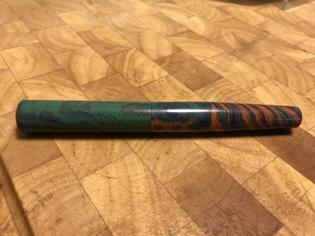
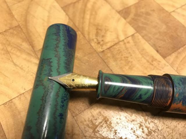
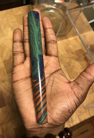
Hey everyone! Toyin here! I am excited, because I got my first custom fountain pen. It is a Ranga clipless cigar style fountain pen. Pardon me, as this is my first fountain pen review. I ordered a Ranga fountain pen from eBay, but the design I wanted was no longer available. I was able to talk with Kandan.M.P, and I had one with a similar design/color scheme made just for me. When I received it yesterday, I was blown away by the weight, feel, and polish on the pen. Let me get into more of the specifics: - this pen can be used with the included Schmidt converter cartridge or as an eyedropper pen - this has a two-toned Jowo #5 fine point nib - the pen is made out of premium ebonite - the size of the pen when capped is 7 inches - it writes extremely smooth, even when writing in script and fast - the pen feels perfect when not posted, and it still has a good weight when posted(I wouldn't recommend using it when posted, because of the length) My handwriting is more for speed than beauty. Yet, I included a little bit of a writing example, as well. Since this is a regular fine point nib, there is little line variation/little to no flex, but you can essentially write with it from any angle. Even writing with it in reverse(nib upside down) works. I paid $107 for this premium ebonite pen. The pen feels excellent, and the quality of the craftsmanship is great! I definitely recommend getting a Ranga fountain pen, if you don't already have one!
-
Greetings everyone, I'm new to the fountain pen world and just joined this forum. I recently purchased a Blackstone Maxim Heavy Metal Pen that was shipped from Australia (I'm not aware of any US dealers). http://justwrite.com.au/fountain-pens/Blackstone-Fountain-Pens/Maxim-Heavy-Metal-Fountain-Pens/copper-fountain-pen I'd like to get another nib assembly, but don't want to pay the international shipping. Does anyone know if other nib assemblies would be interchangeable? Here's a link to the nib assemblies they sell. http://justwrite.com.au/fountain-pens/Blackstone-Fountain-Pens/Maxim-Nib-Assemblies Nib Size: #5 (5mm) Thanks in advance for any help.
-
I have seen many forums on steel vs gold nibs. Article by Brian Gray helps a lot in taking the right decision. Can someone tell me the difference between JoWo 14k nib and 18k nib? I am talking about stock nibs and not the ones tweaked by the meister.
-
I just found these ebonite feed JOWO nibs for sale, does anyone know if they will fit pens that use the plastic units? Does anyone have experience with fpnibs.com?
-
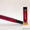
Review Of Fosfor Rajendran (Aka Desi Kop) With Jowo #8 Gold Nib
Prithwijit posted a topic in Fountain Pen Reviews
Introduction During the early phases of my renewed fascination for all things fountain pens there was one model that reigned supreme amongst my list for grail pens and that was the Sailor King of Pens. Everything about it seemed to be just about perfect – the torpedo shape, the ebonite material and the large sized fabulous Sailor nibs. It was just a matter of time before I got one for myself. Two sailor pens and their less than perfect nibs later, my enthusiasm for the KOP started to wane a bit. I had realized that the tip shape and design of the stock sailor nibs (Naginata Togi or Nagahara special nibs excepted) was something that just didn’t suit my grip. The relatively small sweet spot meant that I quickly ended up in the scratchy zone and calling it feedback wasn’t about to change my opinion. I had also realised that the KOP actually wasn’t a full ebonite what with its plastic feed, plastic section and the section-barrel joint made of metal. When fellow FPNer Sudhir allowed me to write with his stock Broad nibbed Sailor KOP, I seized the opportunity to assess my purchase decision. I decided that while I may still go for a special nib KOP later, right now I would not enjoy a KOP with any stock nib. While that decision was made, I was not about to give up so easily on getting my grail pen even if that meant getting one made to my specs and sourcing everything myself. With unwavering focus, I started procuring everything to get the pen of my dreams – I scoured for the best possible ebonite material available for pen-making and zeroed down on some vintage Italian mottled reddish-brown ebonite from a source in the Europe. For some time I toyed with the idea of going with SEM Cumberland or Eboya, but this one just seemed better.I decided to go with a Jowo #8 nib in western medium with a hand cut ebonite feed from WIN. Rather than going for the stock motifs, I decided to source an absolute plain one so that I can have my own design engraved on it.I wanted a roller clip like on my Omas or Delta rather than the stock KOP clip design. Luckily my pen-maker arranged for gold plated roller clips.In order to make the pen I approached Mr. Manoj Deshmukh of Fosforpens. He had made a few pens for me before and was willing to take up the challenge. I decided to call the pen Rajendran which means King in Sanskrit as a homage to original KOP which inspired it. Design The KOP design is a classic and all of you are well aware of it. So instead of wasting any time typing about it, I will let the pictures do the talking. http://i1097.photobucket.com/albums/g346/prithwijitchakiPrithwijit/Fountain%20Pen%20Reviews/Fosfor%20Rajendran%20Review/IMGP2148_zpsv4kcczjn.jpg http://i1097.photobucket.com/albums/g346/prithwijitchakiPrithwijit/Fountain%20Pen%20Reviews/Fosfor%20Rajendran%20Review/IMGP2142_zpsem9s8tav.jpg Size and Balance At 155mm capped, the KOP/Rajendran is the leader of the oversized pens club. But the ebonite build and absence of metal anywhere other than in the nib and the clip means that the pen is delightfully light. It is nicely balanced and is very comfortable to write for extended periods. Writing with the pen makes you completely forget it’s considerable length and the customized section design adds considerably to the comfort quotient. I don’t write with the cap posted, but it can be done if so desired. But posting such a large pen does result in a slight rearward weight bias. Nib I had looked around for a nib that would be similar in size and stature to the large Sailor nibs used in KOP and finally decided on a #8 sized Jowo nib made of 18K gold material with medium tip. The complete nib unit is sold by WIN through their distributors (Fpnibs and Asapens) and comes with a nicely finned ebonite feed. Unlike most nibs which comes with pre-embossed or engraved motifs, I actively scouted around for a nib that would be absolutely plain with no design. This allowed me to engrave on the nib a small monogram of my own. The design is one that I made myself and it is essentially my initials enclosed inside a tiny shield akin to the coat of arms of yore. http://i1097.photobucket.com/albums/g346/prithwijitchakiPrithwijit/Fountain%20Pen%20Reviews/Fosfor%20Rajendran%20Review/PC20Logo200120JPG_zpsbayvjecq.jpg Image: Monogram design – Initials enclosed inside a shield Manoj doesn’t do engraving himself, but he actually looked around for people who do so and was able to replicate my exact design on the nib. Needless to say, I am elated that my dream has finally been realized and the gamble (of a plain nib) has paid off. http://i1097.photobucket.com/albums/g346/prithwijitchakiPrithwijit/Fountain%20Pen%20Reviews/Fosfor%20Rajendran%20Review/IMGP2138_zpse1q5xpao.jpg Image: Monogram design successfully replicated on the nib – the ultimate customization Filling Mechanism I love cartridge converter pens and that is one of the reasons I like the original KOP as well. The Rajendran beats the stock KOP in this regard by using the standard international system for cartridges and compatible convertors rather than proprietary ones. I like this system better than the original because of the wide compatibility, system life longevity, value and convenience. The ebonite feed of this pen is paired with a Schmidt K5 converter to use bottled inks and it can also accept cartridges from a host of brands. http://i1097.photobucket.com/albums/g346/prithwijitchakiPrithwijit/Fountain%20Pen%20Reviews/Fosfor%20Rajendran%20Review/IMGP2147_zpsiv2mfcoa.jpg Build Quality Manoj has built a reputation for himself as a craftsman with unparalleled focus on quality. He has demonstrated that in all my pens, but has somehow managed to simply surpass all his previous endeavours with this pen. The shape, the fit, the threading, buffing/polishing and the finish are impeccable for a handmade pen. The allowance to tolerances have been kept to a bare minimum and it is obvious that the pen has been made with considerable care to ensure a very high quality product. http://i1097.photobucket.com/albums/g346/prithwijitchakiPrithwijit/Fountain%20Pen%20Reviews/Fosfor%20Rajendran%20Review/IMGP2145_zpsdnklgzno.jpg Writing Experience This where the rubber hits the road. I have always been very happy with Jowo nibs and quite naturally the expectations from this nib was pretty high. I am happy to say that the nib has met its potential and then some. This is a tad wider than #6 Jowo medium nibs but still can comfortably be considered a medium nib. It is smooth, wet and lays down a nice wet line without any skips or false starts. The pen is a superb writer and a better performer than the stock Sailor nibs as far as my grip is concerned. I have been using this pen with Waterman serenity blue for about six weeks now and six fills later, I can safely recommend it to anyone who might be interested. The ebonite feed in this pen was a revelation. There is something about good ebonite feeds that just adds magic to your pens. This feed is very much like those of OMAS and is super wet without being a gusher. The extra lubrication afforded by it makes the writing experience that much more enjoyable. I particularly like the sheen that ebonite feeds seem to exhibit as ink droplets percolate into the fins. The only drawback is that the feed isn’t flight safe like the plastic Jowo feeds and there is some leakage on high altitude flights. Price and Value The Fosfor Rajendran is not a cheap pen. No expenses were spared in procuring the best material, the best nib and the best workmanship and all of this adds to the pens price. I could have bought a few very nice and expensive branded pens for the price I paid for it. But none of them would have been able to offer me the satisfaction and the value that this pens offers. So it is only fair that I make a clear distinction between the value proposition of the pen as made by Fosfor versus the cost of materials that I have procured myself. As a standalone pen shaped like the classic KOP, it is incredibly VFM. I am aware of no other pen maker in India who offers this level of quality and individualization at this price point other than Manoj and Mr. L Subramaniam of ASA Pens. In this particular case, Manoj was simply outstanding in hearing me out, understanding my needs and wishes and what is likely to give me the sense of satisfaction and pleasure. He even went out of his way to procure taps and dies for my special nib. That must have cost him more than what I paid him for4 this pen. Such service and customer orientation remains imprinted in your mind long after the cost is forgotten. Specifications The measurements in this section have not been taken with any precision instrument or laboratory techniques but should suffice to give you a fair idea of the size of the instrument. Length (capped) – 152.5 mm Length (uncapped) – 131 mm Length (cap) – 73.5 mm Length (section) – 20 mm Maximum width – 17.5 mm Maximum section width – 13.7 mm Minimum section width – 12 mm Conclusion Not everyone can understand why I paid substantial amounts on getting a KOP made to my specs rather than getting a stock one. I guess to me the importance of the attributes of the pen far exceeded any brand name it carried. As I look back as to what I have gained over a stock pen by going the custom route, I can safely tabulate quite a few pros - True vintage Italian reddish-brown mottled ebonite rather than stock black or expensive Urushi coated models.A wonderfully wet and nicely finned ebonite feed rather than a plastic one (this may not very important in the overall scheme of things, but would certainly be useful if I ever have to do any heat setting).Complete ebonite body with no plastic or metal parts. This means the pen is very lightweight and supremely balanced despite being oversized.A section that has been designed and sculptured based on my preferences.A nice oversized and dependable (to me) western nib.The “PC Shield” that would not be possible in a normal nib.A nice and smooth roller clip.International standard cartridges and converters instead of proprietary ones.To summarize, I have certainly been able to fulfill my objectives with this pen. It is nice oversized but comfortable and well balanced torpedo shaped pen. The writing is super smooth thanks to the beautiful Jowo nib paired with the wonderful ebonite feed. The roller clip is a wonderful thing to have and Fosfor quality and finishing comes through. This is certainly the right pen for me. Whether it will be the pen for you will depend on what you value in a pen. If you would love a Sailor KOP as a brand then you should certainly go for that instead of this. But of you value your personalization and writing comfort (in such cases where it is applicable), then you can certainly evaluate this option. Useful Links Very good Woodgrain ebonite blanks can be sourced from www.theturnersworkshop.co.uk German nibs of your choice can be sourced from www.beaufortink.co.uk or www.asapens.in Pen made by www.fosforpens.com -
Hello everyone. ASA pens from Chennai is making all the right noises these days, with their beautiful and unique Nauka and Trans-nauka making the rounds and getting praise from everyone. Today I am going to review the first ebonite pen that I bought from ASA, the ‘Writer’, which gets somewhat less attention than their other offerings. My concern before buying any pens from ASA was the size of their pens, most of which are pretty large for my preference. And so one fine day I messaged Mr. Subramanium and he suggested either ‘Writer’ or ‘Genius’ and I settled for the former. I chose ‘Writer’ because this pen has the cap flushed with the body of the pen. This particular design feature seemed appealing to me. The ASA Writer, note the cap flushed with the body and the name inscription lining with ASA branding I didn’t have any idea about ebonite pens before buying this pen and Mr. Subramanium helped a lot in deciding the particulars like the nib, the finish, filling system and the site of inscription. I bought a matte/bakul finish of black ebonite with a German made medium nib-feed unit branded as ‘Versace’. I was very impressed with the pen after I received it and since then it has been one of my most reliable writers. 1. Appearance & Design (9/10): ASA Writer is a beautiful traditional cigar shaped pen with gentle tapering towards the lower end of body. The section also tapers in a smooth fashion. The cap is flushed with the body. The clip is a standard ASA ball end clip with good fit and springiness. The design feature I don’t like is the cap taking almost three turns to open. For a person who continually caps and uncaps his pen, this pen requires much effort in this respect. I have my name inscribed on the cap and that name inscription is in line with the branding just at the top end of the body. That’s a nice little bit of detailing. There is a small ring like protrusion at the top of section, just beneath the nib which probably seals the section to the cap when closed. This doesn’t pose problem while gripping. The matte/bakul finish is very attractive over the body and cap. The section is glossy ebonite. I have been using this pen for long, but the glossy section has not got many scratches. This is a light weight and well balanced pen. No pungent smell from the pen. The Writer, note the glossy section and the ring like structure near the top end of section 2. Construction & Quality (9/10): The ebonite is of good quality. The nib and ebonite feed also feels very well built. I ordered the pen with a schmidt converter which again looks solid. The cap looks thin at the border, and there is no end ring to support it. But it seems very unlikely that the cap will break with regular usage. One negative point is that the threads over section is bound to accumulate some dirt over use. I don't know foe sure, but this may have to do with static electricity formed on ebonite. 3. Weight & Dimensions (7/10): It’s a light weight pen. The dimensions are as follows Pen Length Capped 145 mm Pen Length Uncapped 130 cm. Pen Length Posted 150 mm Average Barrel diameter 14 mm at the section base & 12 mm at taper end Average Section diameter 12 mm at Base and 11mm near Lip Average Cap diameter 15 mm This pen feels very comfortable and well balanced unposted, while it becomes too large and awkward after posting. I never use any of my pen posted except the miniature pens like Pilot petit mini, so that is not an issue for me. it slips easily into hand and writes right away. From left : Sheaffer No nonsense, Waterman Hemisphere deluxe, Waterman Harley Davidson free wheels, ASA writer (all capped) From left : Sheaffer No nonsense, Waterman Hemisphere deluxe, Waterman Harley Davidson free wheels, ASA writer (all posted) 4. Nib & Performance (9/10): The #5 versace nib-feed combo that came with this pen is amazing. It is smooth with very generous flow and good line consistency. I was so impressed with this nib that I ordered my ASA Rainbow Acrylic pen with the same nib and once again I was bowled over by its performance. Later I swapped the nib with a JoWo 1.1 stub nib bought from ASA. This JoWo nib is a beautiful writer as well with perfect smoothness and flow. No feathering or blotting or burping, ink and paper remaining the same as other pens. Both nibs have very little flex. Line variations with 1.1 nib is good. There is no edginess or catching the paper at turns while writing with this stub, even at a high speed. 5. Filling System & Maintenance (10/10): This pen is 3-in-1, which means one can use it as either eyedropper, with a schmidt converter or with standard international cartridges. I have always used this pen with converter as it offers quick hassle free filling and keeps the barrel clean. No burping or any leakage noted when I tried it as an eyedropper. As mentioned earlier, the converter is of very good quality, can be disassembled and cleaned easily and fits perfectly with the body. The cap and clip 6. Cost & Value (9/10): This pen is valued at INR 1500 (38$ ). It’s a pretty impressive considering the beautiful features and 3-in-1 filling system. This has the potential to become one of the daily workhorse of any fountain pen user with little maintenance. Conclusion (Final score, 53/60): I ordered this pen as my first ebonite pen and it turned out pretty good. This pen from ASA has got little recognition, when by all standards it is one of the best pens they have to offer. You can order this pen from their website. Be sure to discuss any doubts with Mr. Subramanium before placing an order. Writing sample Have a nice day. Good bye.
-
I was looking to buy eleven number five loose nibs. Does anybody have a list of all the people who sell such nibs? Also, is there any way to get #5 JOWO nibs without the feed? Thanks, Phillieskjk
- 8 replies
-
- replacement nib
- jowo
- (and 8 more)
-
Hello! I would like to exchange the JoWo nib unit on my ASA Nauka with another different JoWo nib unit (of the same size), but I have been neither able to unscrew it from the pen section nor pull out the nib & feed from it. Please, does anyone know whether it's possible or not? And, if possible, how should I do it? I understand that JoWo units are screwed on the pen section, so I have tried to unscrew it... but I have exerted quite a force without it moving any millimetre! It seems to be glued or "fused" to the section... Thank you!
-
Hi guys! I have an ECO EF but would like to fit it with an xxf. FPnibs sells and grinds jowo steel stock #5 nibs, but they don't know if it fits the ECO.... I think it does, but has anyone tried to fit a stock jowo nib on the ECO? Tks!
-
Introduction I had always wanted a Bamboo/Sugarcane shaped pen and had stocked up on materials that represent the colour of green and ripened sugarcane material. When fellow FPNer Sanjay Ramaswamy (@Sanjay13leo) got to know of my desire, he proactively reached out to Mr.Kandan of Ranga Pens to commission two pens – one for each of us. I had never dealt with Mr. Kandan before while Sanjay already had their standard bamboo pen. A big thank you to him for having made this pen possible. Design The design of the pen is supposed to mimic a small section of the sugarcane stem. Sugarcane belongs to the grass family Poaceae that also includes bamboo in its lineage. Like Bamboo, sugarcane grows as long, then stems with nodes at regular intervals. The inter-nodal regions of the stem are slightly convex with smooth undulations. In real life, these are stout jointed fibrous stalks that are rich in the sugar sucrose, which accumulates in the stalk internodes. The body of the pen is around 145mm long and mimics two nodes and the stalk area between and around them. One of the nodes is near the top of the cap representing the end finial and the other one in the barrel. The two end finials are characterized by two small holes shaped like simple annular cylinders that represent the hollow stalk between the nodes. All in all, the shape is exactly like a small piece of susutake. As the images will stand testament to, Ranga has managed to deliver exactly what was being sought. This is especially commendable given the blank we had used for getting the ripe sugarcane colour is especially difficult to work on since it is not meant for kitless pens. Ranga however had persevered and despite much pain, managed to deliver a work of art that accurately represents the design brief. http://i1097.photobucket.com/albums/g346/prithwijitchakiPrithwijit/Fountain%20Pen%20Reviews/Ranga%20Sugarcane%20Review/IMGP2034_zpsgfzm31ct.jpg http://i1097.photobucket.com/albums/g346/prithwijitchakiPrithwijit/Fountain%20Pen%20Reviews/Ranga%20Sugarcane%20Review/IMGP2036_zpskl7hzttt.jpg http://i1097.photobucket.com/albums/g346/prithwijitchakiPrithwijit/Fountain%20Pen%20Reviews/Ranga%20Sugarcane%20Review/IMGP2035_zpsec3iuj4n.jpg http://i1097.photobucket.com/albums/g346/prithwijitchakiPrithwijit/Fountain%20Pen%20Reviews/Ranga%20Sugarcane%20Review/IMGP2045_zpsvcqejbms.jpg Size and Balance At 144.5mm capped, this is a regular sized pen. Had it not been for the absence of a clip, it would have fit in squarely into the definition of an EDC (Every Day Carry) pen. There is no metal used anywhere except for the nib and that makes this an incredibly light and comfortable pen to use for extended periods. The weight distribution, the slim section design and the light weight of the polyester briar material all contribute to the comfort. I was initially concerned that the faux node design on the barrel may impact the writing experience, but in real life usage such apprehensions have been soundly negated because the diameter of the barrel even at the thickest point in the node is only 14mm and the smooth undulations don’t even let you feel its presence. Nib Based on my request, Ranga got the pen ready to accept WIN/Jowo #6 nib units. I decided to put on a Dual Tone EF nib unit from WIN/Jowo paired with a Schmidt K5 convertor. The nib was sourced from Mr. Subramaniam of ASApens.in . http://i1097.photobucket.com/albums/g346/prithwijitchakiPrithwijit/Fountain%20Pen%20Reviews/Ranga%20Sugarcane%20Review/IMGP2052_zpsn8mgtwur.jpg http://i1097.photobucket.com/albums/g346/prithwijitchakiPrithwijit/Fountain%20Pen%20Reviews/Ranga%20Sugarcane%20Review/IMGP2054_zpsv9eq8qky.jpg Filling Mechanism It’s a plain vanilla cartridge-convertor system that accepts standard international cartridges and compatible convertors. While it may be vanilla, it remains my favourite flavour for providing the best proposition around value, system longevity, convenience and widespread compatibility. Build Quality To summarize, this pen has impeccable build quality all around with one major flaw or oversight. The seams are well aligned, the threads are smooth and the finish is superlative. The polish on this pen is astounding and beats all expectations. The attention to detail all around is impressive except for the two cylindrical holes at the two ends which have not been polished properly. They still show lathe marks and are an eyesore in an otherwise fabulously finished pen. http://i1097.photobucket.com/albums/g346/prithwijitchakiPrithwijit/Fountain%20Pen%20Reviews/Ranga%20Sugarcane%20Review/IMGP2046_zpsg6nbpu0p.jpg Writing Experience I am normally not an EF nib user. I prefer Medium nibs for the smoothness and larger sweet spot they typically offer. So I may not be the best person to judge an EF nib. I did however find the nib on this pen rather smooth and comfortable to use so long as you use it within its sweet spot. I did in fact like it better than the Hero 100 fine nib or Schmidt fine nib. For the inaugural use, I had loaded the pen with Sheaffer brown ink. Though it doesn’t have the reputation of being a wet ink or a shading ink, I did notice some element of shading in my writings with this nib. So that tells me that it is a fairly wet nib for an EF and that makes me a happy camper. While I won’t become an EF user because of this one time experience, I would not mind using and recommending this nib to others who prefer F / EF nibs. Price and Value The Sugarcane is not yet a standard model for Ranga and there is no standard price for it. The pen was made by Mr. Kandan as a one off special request from Sanjay and myself. The remuneration they took is modest and equivalent to the cost of any of their standard pens. Nib and blanks were sourced by me on my own and costs for these were obviously extra. Overall, I find this great value because not many pen makers sell custom pens at regular pen prices. Specifications Please find below the measurements of the pen made using non precision instruments and approach. Given that these are handmade pens and there are small piece to piece variations anyway, the measurements should give you a fair enough indication of what to expect from the pen. Length (capped) – 144.5 mm Length (uncapped) – 137 mm Length (cap) – 61.5 mm Length (section) – 20 mm Maximum width (Cap) – 14 mm Minimum width (Barrel) – 11.5 mm Maximum section width – 9 mm Minimum section width – 7.5 mm Conclusion To draw a conclusion with regards to this pen is a bit tricky. If I were to look at the pen dispassionately and judge it by its merits and aesthetics alone, the pen looks superb and a definite buy. Ranga has clearly delivered and has created a masterpiece. However, I cannot help but acknowledge the fact that the design is not very different from Ken Carver’s Bamboo design. Once you realise that, then it makes more sense to opt for the original rather than go through the pains of making a custom pen which is not very different from a pre-existing model. There is one final point I wanted to make before I sign off. The material used for this pen is is a new type of poly-resin called Polyester Briar. This was a fairly new type of material for Ranga who did indeed find this a tad tricky material to use especially when using their traditional tools and methods. This was validated by two other independent pen-makers as well. Given these challenges, it’s doubly commendable on behalf of Ranga to have produced such a stunningly beautiful instrument with such a material. I do applaud them for that.
- 68 replies
-
Introduction The sniper is a pen with very interesting history and one that has very close ties with FPN. The pen was launched as a group buy back in February 2015 by as a collaboration between ASApens and Vaibhav (@Mehandiratta) as just a concept without any drawing or prototype. Many enthusiastic FPNers rallied behind the concept of a hooded nib hand-made pen and the momentum was formed. We got to see the initial prototypes and the evolution of the design till the final shape took place and the pen was launched as a product. So in many ways this is a pen that has been conceived in, laboured within and delivered from the womb of FPN. Because of a variety of reasons the principal of which being my ignorance, I had not got the pen at the time. I had been meaning to remedy this for quite some time and when the opportunity arose earlier this year, I decided to go for it and get one sniper for myself. Design Much has already been written about the Sniper’s Lamy 2000 inspired design already. The key USP of this pen is a semi hooded/covered nib that looks strikingly similar to the way Lamy 2000’s nib is covered. Beyond this superficial similarity however, the pens are very different. It doesn’t use a proprietary and model specific nib like the Lamy and instead is designed to accommodate any Jowo/Win #5 open nib. This gives us a range of nib tips to choose from (EF, F, M, B, 1.1 and 1.4 italics) as well an option to have gold nibs instead of steel ones should your wallet so allow. For my personal pen, I opted to use a pair of purple twist blanks obtained from theturnersworkshop.co.uk to add a touch of exclusivity to my pen. Besides, I already had most of the standard ebonite colours in my other pens and wanted something different. Size and Balance At 152.5mm capped, this is clearly a full-sized / oversized pen. Normally such pens tend to be heavy and are meant for signing or occasional brief use for their heft. Thankfully the Sniper is not a heavy pen that imposes such restrictions on regular usage. Part of this lightness bonanza comes from it’s miserly usage of metal in it’s construction. It is a completely kitless pen with no metal other than in the nib and the clip. The pen overall is nicely balanced and the section design is sublime which adds to the comfort factor. The pen can be written both posted and unposted, but I prefer to use the pen unposted since posting does add a small element of rearward weight bias. To summarize this is a nicely balanced and light writing instrument designed to provide comfortable writing for extended periods. Nib The pen is designed to accept Jowo/Win #5 nib units. I believe the right SKU number is either 5-42 or 5-11. Since I have already have a small collection of Jowo nib units including everything from EF to 1.5mm italic nibs, I opted to get the one nib which I didn’t have, which is the 1.4mm italic nib. It’s a polished steel nib which is largely hidden from view by the hood of the section, except for the tines and the tip which obviously need to be exposed. Filling Mechanism It’s a cartridge converter pen that accepts standard international cartridges and compatible convertors. In my opinion, this is the best possible filling system and gives the best proposition around value, system longevity, convenience and widespread compatibility. Build Quality Being the current flagship model from ASApens, the pen obvious exudes the finest in quality that the marque has to offer. The general fit and finish and the tolerances are impeccable for a handmade pen and the joints are seamless. Attention has evidently been put into polishing and buffing to ensure a very high quality of the finish. Keep in mind however that this is an entirely hand-made pen and there is likely to be some fine trace marks under minute inspections. There was one small finishing issue on my pen however and that is the alignment of the nib with the hood. For whatever reasons, the alignment is just off by a couple of degrees and the result irritates my obsessive compulsive nature. I fully intend to reach out to ASA and request them to rectify this. Writing Experience By design, Italic nibs are supposed to have sharp edges and tricky to use unless you have the absolute right grip and hold the pen at the exact angle. Thankfully, this nib isn’t one of those cursive italic nibs and despite having no tipping, it is quite smooth. More than any technical aspect, what I would like stress upon is the fun aspect of writing with it. It gives your penmanship (or in my case lack of it) a flair that just begs to be experienced. You would smile after writing with this nib and it will encourage you to write more as you keep getting surprised how your own handwriting looks like. Beyond such simple pleasures, this is a highly competent calligraphic pen that helps in a host of writing styles such as Italic and Gothic. I am however not competent in any form of calligraphy and I would leave it to the experts to weigh in with their thoughts and opinions. Price and Value The Sniper is the current flagship of ASApens’ stellar collection. I find this entire series priced very attractively since the entire ASA line is such an affordable manner. The price is fully justified given the effort that goes into making each pen and that no compromises were made in using components within the constraints of what’s available in Chennai especially the nib which is the most important component. To summarize, the pen represents great value at an affordable price point. Specifications My usual disclaimer applies. The measurements in this section have not been taken with any precision instrument or laboratory techniques but should suffice to give you a fair idea of the size of the instrument. Length (capped) – 152.5 mm Length (uncapped) – 134.5 mm Length (cap) – 66 mm Length (section) – 37 mm Maximum width – 13 mm Minimum width – 8.5 mm Maximum section width – 5.5 mm (at the root of the exposed part of the feed) Minimum section width – 8.25 mm Conclusion The sniper is a beautiful looking handmade pen that exhibits a unique design. It is very light, comfortable and comes with a fabulous nib with a wide choice of tipping options. There is very little not to like in this pen and the price is just right. No wonder then that I strongly recommend this model to other connoisseurs of handmade fountain pens. Useful Links Purple Twist blanks from www.theturnersworkshop.co.uk Pen made by www.asapens.in
-

Franklin-Christoph 02 Intrinsic - Pen Chalet Special Edition
tony1000 posted a topic in USA - North America
Full review with pictures here: http://thefrugalfountainpen.blogspot.com/2016/03/franklin-christoph-02-intrinsic-pen.html I have been checking out Franklin-Christoph fountain pens lately and decided it was time to own one. I am impressed that they are made in the USA, are CNC machined out of resin, and are very attractive with a somewhat understated appearance. I contacted my friends at Pen Chalet and they were kind enough to assist with providing a pen for this review. As a result, I now am the owner of the Franklin-Christoph Model 02 Intrinsic Pen Chalet Special edition fountain pen. That certainly is a mouthful! The pen has a smoke brown translucent demonstrator finish with an inside that appears to be covered by a thin sheet of ice. The body of the pen tapers towards the end, allowing for the cap to post very deeply. So deeply, in fact, that the posted length is almost identical to the capped length (5.75" capped vs. 5.85" posted including the nib). The body width varies from .55" to .445" as it tapers. The cap diameter is .61" and the section is .44" at its narrowest point. And, speaking of the section, there are no sharp threads to deal with. The wide section thread has been moved to the bottom of the section near the nib so that it is completely out of the way when you are writing. A brilliant design! The cap is easy and quick to remove and requires less than two turns. The pen is surprisingly light, weighing in at less than an ounce, and I found it very comfortable to hold either capped or uncapped (I have large hands). The clip is somewhat light but very springy. As for filling options, the pen ships with a typical Schmidt-type international converter, but you can also use cartridges or add some silicone grease to the threads and use it as an eyedropper if you need plenty of ink. As it is translucent, you will be able to see the ink sloshing around and that always adds to the "fun factor" of owning such a pen. I specified an extra-fine steel nib and the nib wrote perfectly out of the box without any tuning or smoothing. A very nice writing experience. Kudos to Franklin-Christoph! One nice thing about the pen is that it uses a #6 Jowo nib unit that can be changed out easily with other Franklin Christoph nibs, including their custom music nib, gold nibs and Mike Matsuyama custom ground nibs. The pen also comes with a lifetime mechanical warranty. All and all, I am very pleased with the pen and it is nice and comfortable enough to be an everyday writer. The attention to detail is clearly evident and its design and versatility makes it worth the price. Thanks to Pen Chalet for their remarkably quick service in getting the pen into my hand!- 1 reply
-
- franklin-christoph
- jowo
-
(and 1 more)
Tagged with:
-
I'd appreciate any insights/feedback about cost-effective German replacement nibs... I've purchased about a dozen Jinhao x750 and x450 pens and have enjoyed swapping out the stock medium nibs for fine. I was going to buy some Goulet nibs from Jowo but then found Knox and Nemosine nibs for half the price. They are also German-made and I have been pleased with how they write. I've also read about Bock nibs but haven't tried any. Does anyone have experience with these various brands/makers of nibs and how they compare? Thanks! Najeeb
-
I am looking to buy a new 1.1mm nib for my Aldo Domani two tone pen. I had a Knox nib in there, but have since switched that nib out to a Jinhao X750, leaving my poor Aldo Domani with its plain old factory nib. I'm having a difficult time choosing a new nib for this pen...most of the available nibs are made by JoWo (Franklin-Christoph, Gouet Pens, Anderson Pens, Edison Pens, Monteverde) and are likely more or less the same (although I do wonder if the nibs made for F-C or Edison might be made to more exacting standards or with slightly different specs than the standard JoWo nibs), so I am not sure that spending more for a nicer looking version of the same basic nib is really worth it. Bock and Knox are another option, but the only Bock retailers that I have found are overseas and Knox nibs are a little less crisp than I would ideally like. Ideally what I want is a fairly crisp, smooth, true 1.1mm nib that also looks nice. The JoWo made nibs that I have come across are fairly crisp and smooth, but overly broad. Bock nibs are VERY smooth and crisp, but all of the ones that I have come across are overly broad (even more so than Goulet/Anderson Pens JoWo made nibs). Monteverde JoWo made nibs and Knox nibs are nice and smooth, thin writers, but not as crisp as I would like. I'm not bad at grinding and could grind a nib myself, but I am still getting this skill down, so I usually prefer a factory made stub/italic. I could also get a nib professionally ground, but I really don't want to pay $40-$50 for a nib. So, here are the nibs that I am looking at: --Goulet/Anderson Pens 1.1mm Pros: Inexpensive, nice looking, smooth Cons: overly broad (more like a 1.3mm) --Knox 1.1mm Pros: Least expensive, consistent, smooth Cons: not as crisp, only available in brushed steel --Franklin-Christoph/Edison Pens 1.1mm Pros: Nice looking, reportedly smooth and reliable, comes with nib unit Cons: more expensive, possibly overly broad --Bock 1.1mm Pros: Crisp, smoothest that I have used Cons: longer wait for delivery, only available in brushed steel, overly broad --Monteverde 1.1mm Pros: cool looking, consistent Cons: not as crisp, more expensive Any opinions on my current options or suggestions for other options that I am overlooking would be greatly appreciated. Here are some pics of my Aldo Domani (with a Nemosine 0.8mm nib)
- 10 replies
-
- nib
- franklin-christoph
-
(and 3 more)
Tagged with:
-
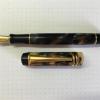
Kaigelu 316 Modification (250 #6 Bock Nib / Beaufort Ink Converter)
Frank66 posted a topic in Of Nibs & Tines
1. TITLE Modification of Kaigelu 316 fountain pen using Bock type 250 nib unit (EF, stainless steel, 2-tone) and Beaufort Ink premium Ink Converter. 2. INTRODUCTION Recently, I acquired two Kaigelu 316 fountain pens which I adore, one is ivory or pearl colored with black swirls and the other is brownish colored with orange waves. The pens seem to be imitations of the more expensive Parker Duofold fountain pens. I bought them without their box from an ebay store in China, for under 20euros each (1). Figs 1a-1b 3. OBJECTIVE However, I was a little disappointed by the nib of the Kaigelu pens, which although smooth, write too broad for my liking. My one option would be to grind the pen nib, which I am currently learning how to improve at, however I am not adept at it yet. My other option would be to find a high quality replacement nib. A little web search proved that it has been difficult to find a replacement nib for this pen.(2-4) It would be great if I could fit an extra fine (EF) Bock or Jowo nib into my Kaigelu 316. 4. METHODS AND MATERIALS Unfortunately, I was unsuccessful in seperating the nib from the feed in my Kaigelu, however in trying to do so, I managed to completely remove the nib housing from the inside of the pen barrel. Please note that the Kaigelu 316 nib housing does not have any threads on its outer surface, the nib housing and the section are actually held together by friction-fit. Interestingly enough, the Kaigelu pen section does have internal threads at approximately 10mm from its nib-end, which, alas, are not engaged with the nib housing at all. It could have been that I accidentally have torn the housing threads myself, in my attempt to remove it from the pen section, but there appears to be no remnants of torn threads on the external surface of the Kaigelu nib housing at all. For owners of other Kaigelu pens, which have the nib housings attached firmly in the pen sections, it is recommended to place the pens in hot water for 4-5 minutes, and then to attempt to unscrew or remove the two pieces apart. Fig 2a-2d After measuring the nib housing dimensions, I contacted both Jowo and Bock companies. The Jowo nib housing dimensions (7.5mm in diameter) differed significantly from the Kaigelu one as pictured in the Fpnibs website (5), I was finally referred to Phil at Beaufort Ink (6), which is the Bock representative in UK (no affiliation, just a happy customer). Phil suggested that the Bock type 250 nib housing (8 mm in diameter), with a stainless steel, 2-tone nib, could perhaps fit this pen's barrel. He even emailed me a diagram with the dimensions of this nib unit which proved that this might be a good replacement option to try. Fig 3a-3c. I ordered two Bock units type 250, in EF and F nib size, in stainless steel and 2-tone color. Furthermore, I ordered the Beaufort Ink's own-marketed ink converter, which in retrospect proved very thoughtful, as the Kaigelu screw-type ink converter dimensions would not match the Bock housing's ink inlet. When the package arrived, I saw that Phil was kind enough to include some other Bock housings so I could experiment in other pen modifications too. Fig 4a-4d. Side by side comparison of the nib housings reveals that the original Kaigelu units are slightly shorter than the Bock ones. However, I was able to insert the Bock nib unit into the Kaigelu pen barrel, where it would fit perfectly. Even though the nib housing's and the barrel's threads did not engage at all, the two parts would be retained by friction fit in an excellent manner. Although Phil had suggested that I could use transparent nail polish to retrievably attach the nib housing to the pen barrel, I was amazed to find that the pen was secure enough to be used only with the two parts retained snugly together with friction fit. Alternatively, I guess I could have used shellac too, but I did not find this necessary, as it allowed me to change nib units at my own will. As far as the ink converter is concerned, it was also retained by friction-fit inside the top of the pen section in a perfect manner. The Beaufort Ink premium ink converter was not screw-retained as the original Kaigelu ink converter used to be, but it was tight enough and matched perfectly in size, so that I did not have any problem with ink leakage whatsoever. Although I am sure they had not intended on purpose, it seems as if the Beaufort Ink premium Ink Converter was perfectly crafted for this Kaigelu pen, I feel so lucky! Fig 5a-5f. 5. DISCUSSION It might also be interesting to note that the Bock nib can easily be removed from the its housing and occasionally be replaced with a Jowo EF or any other size Jowo nib, if one so desires. Here is the same Kaigelu pen with a EF Jowo nib purchased from Anderson Pens (7) in Milwalkee (no affiliation, just a happy customer). I could easily interchange the Jowo nib taken from the pictured Jinhao x450 and transfer it, back and forth, to the Kaigelu 316. Fig 6a-6b. In my experience, both EF and F Bock nibs write 'buttery' smooth, however the Jowo nib pleasantly gives a little more feedback which I personally like. This is consistent with similar findings by other fountain pen users on Fountain Pen Network (FPN) threads (8). One can write ever so slightly finer lines with the EF Jowo nib compared to the EF Bock one, using the same ink and paper, at least with the Bock and Jowo nibs at my hands. One explanation for why a Jowo nib writes a little crisper than a Bock nib might be the slightly different nib geometry at their tips. Under magnification, the Bock EF seems to have a slightly broader nib-paper contact area than the Jowo. However, if it wasn't for the Bock housing, no other high quality nib could be substituted for this pen. According to my personal experience, I can write easier with the Bock EF nib on plain paper, compared to the Jowo EF nib which somewhat “catches” on cheaper paper, and seems to write smoother on better quality paper only. Here are writing samples with the Kaigelu pen with EF and F Bock nibs and also with the Kaigelu original nib. I only wish I had a better macro lens so I could take better closeup shots of both Bock and Jowo nibs, the nib on the left is the Bock, the one on the right is the Jowo. Fig 7a-7b. Finally, other users have described the Kaigelu 316 as a heavy pen, however, I personally do not find it cumbersome to hold, as it fits my style of writing perfectly. However, if one does want to modify the weight of the Kaigelu, richardandtracy's thread on finial replacement at FPN discussing this matter might be useful.(9) The modified Kaigelu pen also seems to be 1.5 to 2 mm longer with the Bock nib compared with the original nib but this, combined with the fact that the pen is slightly back-heavy, helps with the pen's weight balance more so than not. Fig 8.1-2 Here are a quick writing sample with the Kaigelu 316 with Bock 250 EF nib, please excuse my terrible handwriting... Fig 9 6. SUMMARY A 250 Bock nib housing could be fitted inside the Kaigelu 316 fountain pen section and a Bock or Jowo nib could used alternatively, along with a Beaufort Ink premium ink converter. I have been using my modified Kaigelu 316 for three weeks now without any issues. Now that the Bock or Jowo nibs has been proven that can be fitted into this pen, other high quality #6 nibs like Edison, Goulet, Anderson, Monteverde or Franklin-Christoph could potentially be fitted successfully into this pen. I hope this was useful to other pen enthousiasts possessing or interested in acquiring a Kaigelu 316 pen. 7. DISCLAIMER As quality control varies with chinese pens in general, no warranty is given that results can exactly be reproduced with all other Kaigelu 316 fountain pens. The techniques described above are given as a guideline and can be replilcated at each one's own discretion and responsibility. There is no commercial relation or affiliation with the pen brands / stores mentioned in this article. My respects goes to all pen enthusiasts, both professional and amateur, who have toiled for the improvement of the fountain pen experience. Regards, Photios 8. REFERENCES (1) ebay store jewelry mathematics http://www.ebay.com/usr/jewelrymathematics (2) Matt Armstrong / The Pen Habit http://penhabit.com/2014/06/04/pen-review-kaigelu-316 (3) Matt Armstrong / youtube https://www.youtube.com/watch?v=5cDfBdjSaN8 (4) Stephen Brown / Writing with the Kaigelu Century Star 316, youtube https://www.youtube.com/watch?v=X_kZKo-8Pyw (5) FPNibs, Official Jowo representative in Spain, diagram with dimensions of #6 Jowo Nib Unit, and #6 EF Jowo Nib Unit, http://www.fpnibs.com/en/size-6-jowo/85-plumin-de-acero-tamano-5.html (6) Phil at Beaufort Ink / Bock UK representative, http://www.beaufortink.co.uk (7) Anderson Pens, 10 E. College Ave. Suite 112A, Appleton, WI 54911 http://www.andersonpens.com/ (8) dsolmei at FPN thread, Jowo Vs Bock - Which Do You Think Is Better And Why? https://www.fountainpennetwork.com/forum/topic/252283-jowo-vs-bock-which-do-you-think-is-better-and-why/ (9) richardandtracy's thread on FPN- https://www.fountainpennetwork.com/forum/topic/245065-kaigelu-316-acrylic-barrel-finial/- 138 replies
-
- kaigelu 316
- jowo
-
(and 6 more)
Tagged with:
-
The Ranga Pen Model 4C Spurred by the excellent reviews that FPN member Vaibhav Mehandiratta has provided of various handmade Ranga pens, Empty of Clouds took the decision to acquire at least one Indian ebonite pen, and it turned out to be a model 4C. Here is a far poorer quality review by a man with no talent for either words or photography. Please forgive. The 4C is a big pen by the standards of early to mid 20th century pens, and is a classic cigar shape. Measurements (approx.) Capped length – 15 cm Nib tip to barrel end – 13.5 cm Maximum diameter – 16 mm Most of the pens EoC has owned up until this point have been vintage, so to give a comparison an Esterbrook J is around 12.6 cm long (capped), 11.2 cm uncapped and 12 mm at the widest barrel point. The Esterbrook is unusable by EoC when uncapped. The Ranga 4C however is not! Here is an ugly picture of an ageing hand holding the Ranga. For those interested in numbers, EoC’s hand measures 21.5 cm from tip of 2nd finger to fold of wrist – so, quite a big hand really, and yet the pen is quite comfortably supported. Build Quality As many know the Ranga pens are handmade from ebonite turned on a lathe. The premium orange ebonite used for this pen, while finished well, still retains several inconsistencies in the material. Most notably these show up as dark flecks or a kind of very faint patterning. Whether this is tool artefact or a property of the material itself is hard to determine. This may be of concern to those whose experience thus far has been restricted to flawless expanses of resin or acrylic. Despite this issue on the finish the pen feels super smooth in the hand. It is light but by no means insubstantial. The threading throughout is tight and smooth. The cap takes just over 2.5 turns to remove, while the section requires just shy of 10 turns! There is a step between the barrel and the threads for the cap, but it is small enough to have not presented EoC any issues with use or comfort. The Nib Not really much to say here. This pen came fitted – by request – with a 1.5 mm Jowo #6 stub, which simply screws into the section. This is the same standard nib unit used by many of the custom pen makers (Franklin Christoph and Scriptorium spring to mind), so those who have pens from those sources can swap their nibs around with the Ranga should they so wish. The nib is very smooth, and far crisper than expected for a stub. It has thus far proven to be a joy to use. Here is EoC’s very first outing with the nib. Paper is Rhodia, Ink is Diamine Delamere Green. Fill ‘er Up! As with many Ranga models that employ the Jowo nib units, this pen comes fitted with a Schmidt converter. Fairly standard, well known to many, and so far reliable. For those going for the real Indian pen experience, the converter can be left out and the pen can be used as an eyedropper. EoC has not tried this yet, but when he spoke into the open end of the barrel there was an echo! So expect it to take a goodly amount of your favourite writing fluids. Speaking of eyedroppers, the section threads came pre-greased and those 10 turns mentioned earlier should give reassurance that leaks are probably unlikely to occur around the section threads. Value for Money and Communication As with many things in life value has a very personal aspect to it. This pen is not in the cheaper range for Ranga pens, or indeed any other Indian maker’s pens. However, it is a significantly better price than some of the established Western makers. EDIT: There was an ordering problem that has since been resolved. Concluding thoughts. This is a big pen, and a good one too. So far it has proven to be exceptionally comfortable to use. Although EoC is very partial to pointed dip pens, he has found the 1.5 mm stub on the Ranga 4C to be a joy to use in an everyday setting. The imperfections in the material, considering the way it is made, add a certain degree of character perhaps, but it is not the glossy perfect finish that others may have alluded to. The only downside was the final cost, coming in at US $100. It is early days for EoC and the Big Orange Pen, but it's looking very promising right now! The above represents an honest review. EoC has tried to fairly represent what was liked and what could have been better.
-

Review Of Fosfor Islander In Conway Stewart Flecked Amethyst
Prithwijit posted a topic in Fountain Pen Reviews
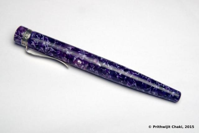
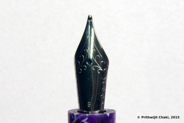
Introduction Manoj Deshmukh of Fosfor pens (http://www.fosforpens.com) is a master pen turner and I always wanted a pen made by him. Given that the Islander model is considered the flagship of his line, it is only natural that I would like to have one of those in my modest collection. Normally Islanders are made of exotic wood burls or hand cast resin that Manoj personally prepares based on individual preferences. Personally, I am not a big fan of wooden pens and didn’t have much faith in my aesthetic abilities in specifying the right colours to cast the resin. Instead I opted to use Conway Stewart Flecked Amethyst blanks that I had got from Vince Coates (http://www.theturnersworkshop.co.uk). I had always thought that the Flecked Amethyst material would be complemented nicely by the silver trims used in the Islander and decided to round off the look with a solid steel polished Jowo #6 nib in broad tipping. Design The Islander design is quite unique and distinct amongs't the India pen models. The cap portion is cylindrical while the barrel has a cigar like tapering towards the end filial. Both the cap and the barrel are ends are flat and polished. The body of the barrel and the cap are polished smooth and shiny. The cap is flushed with the barrel with no step down where the cap and barrel meet. The most important design element of the Islander and the raison d'être of this pen in my collection is the beautiful hand crafted silver band and clip combination. It is an artisanal product and I am not aware of any other pen with such and unique clip/band combination. The clip is springy and it is curved with a raised bottom for easy clipping. There is intricate hand-made design in the band above the clip and it is made of pure silver. One of the joys of getting a Fosfor pen is the customization in terms of section design that Manoj allows you to do to best suit your preferences and comfort. I opted for modified hourglass design which has proved to be extremely comfortable. In hindsight however, the design may have benefited is the edge at the end of the section was rounded off a bit. Size and Balance At 150mm capped, this is not a small pen. Despite it’s length, it is nicely balanced and can easily provide comfortable writing for extended periods. While the cap can be posted with some effort, I use it unposted as I find the length to be too long when you post the cap. The acrylic material is light and yet strong and hence the pen despite being oversize doesn’t compromise on weight or balance. Nib The standard Islander comes with a choice of Schmidt #6 nibs (Model FH 452) in either F/M/B. Schmidt nibs come with their logo embossed and I wanted a cleaner look on my pen. So I decided to go for a Jowo #6 polished steel nib instead which was devoid of any logo. Since I have many nibs with medium tipping, I opted for a broad tipping on this pen. Filling Mechanism My Islander is a non-proprietary cartridge/converter pen that accepts standard international cartridges and compatible converters and it comes with a Schmidt K5 converter out of the box. As I have mentioned in many of my earlier reviews, this is my favourite filling system since in my opinion it represent the optimum combination of value, system longevity, convenience and widespread compatibility. Build Quality Manoj has a reputation for focusing on the details and the pen clearly benefits from his focus and the resultant build quality is impeccable. One can easily appreciate that the pen has been made with care and a considerable amount of time has gone into producing it. Writing Experience Jowo is generally considered as being amongs't the top two or top three western nib OEMs and their nibs are widely used on a variety of pen brands. Their popularity itself is a testament to their general quality. Needless to say, I have been very satisfied with Jowo nibs in general and have quite a collection of them in different tipping. It is little surprise then that I am very happy with how the Islander performs. The broad Jowo unit is super smooth and glides over the paper laying down a nice wet line. There are no skips or false starts and overall the pen is a superb writer. Price and Value Currently as of December 2015, Islander pens are listed for a price that ranges between $75 and $99 based on the type of wood being used. These prices however are for pens with Schmidt nib units. If you opt for Jowo, then there is a slight price premium. I am not aware of any other custom pen-makers who offer this level of quality and individualization at this price point other than Manoj and Mr. L Subramaniam of ASA Pens. Needless to say, these pens are incredible value and the quality lingers in your hand long after the cost has left your mind. Specifications The measurements in this section have been taken with a simple ruler and may not be precise being subject to some amount of parallax error. Length (capped) – 156 mm Length (uncapped) – 141 mm Length (cap) – 70 mm Length (section) – 24 mm Maximum width – 16 mm Minimum width – 10 mm Maximum section width – 12.5 mm Minimum section width – 10.5 mm Conclusion This is my first Fosfor pen and I am very happy with what I have received. It is very comfortable, well balanced and an excellent writer thanks to its Broad tipped Jowo nib. The silver clip and band is unique and adds a touch of exclusivity. I have no hesitation in recommending this model to others.- 21 replies
-
- prithwijit
- review
-
(and 4 more)
Tagged with:
-
Hi! I was wondering if anyone knows if the Jowo spare nibs, coming with feeder to screw in the section, are compatible with Edison pens? I understand Edison uses these nibs, so it might not be out of the realm of possibilities. An example of Jowo spare nib: http://www.fpnibs.com/en/size-6-jowo/52-14k-nib-unit.html#/acabado-two_tone
-
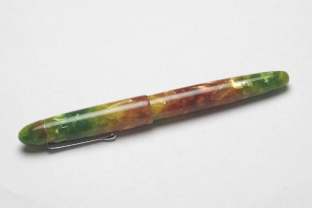
Introduction Halwa / Halva (Bengali: হালুয়া) is a famous and traditional sweet of India which is slightly gelatinous and made from grain flour, typically semolina. The primary ingredients are clarified butter, flour, and sugar. So why would anyone name a pen after a confectionary item? The story behind this is really funny. It starts with me acquiring my first set of acrylic pen blanks called “Seasons” and sending a photograph of them to Mr. Subramaniam of ASA pens. Image: Seasons acrylic pen blanks Imagine my shock when he replied that the picture reminded him of Halwa. At first I was a bit miffed but then he shared a picture of a pack of Halwa and I found out more pictures of Halwa’s ready to be devoured. Image: Box pack of Halwa’s Image: Halwa’s ready to be devoured I couldn’t help but notice a certain degree of similarity in the colour themes and was amazed at the connection between the two. Ever since then, we kept on referring to these blanks as Halwa blanks and the pen that was made naturally inherited the title. Design The design brief I gave ASA for the Halwa was quite simple. I wanted it to be based on the ASA Popsicle but having ASA Daily size with an ASA I-Can section. For those of you who may not be familiar with the ASA catalogue, this essentially means that I wanted a simple and classic cigar shaped pen with the external dimensions of an ASA daily white still taking #6 nibs like that of ASA Popsicle (a larger cigar shaped pen in the ASA line up) with a section that is designed like ASA I-Can / I-Will which in my experience is extremely comfortable. The section gradually tapers from the barrel towards the nib before starting to flare out about 7mm to 8mm before it ends. As the images will stand testament to, ASA managed in delivering to me exactly what I wanted. The shape of the pen is a classic cigar shape with gradual tapering of the barrel and the cap towards the end filial. The entire pen is beautifully polished smooth and shines brilliantly. The pen comes with a chrome plated teardrop shaped clip which is similar to the one used in the ASA Daily. I wanted to see the impact of the beautiful material and contrasting colours and thus deliberately kept the design simple. As you can see, the colour combination has indeed come out very nicely. Whether posted or unposted, the interplay of the colours comes out clearly. The only fly in the ointment is the slight mismatch in colours between the cap filial and the cap itself. I reckon it has happened due to paucity of material of similar colour being available, but nevertheless wish this could be avoided somehow. Size and Balance The Halwa is a full sized pen comparable in length to the ASA Daily, MB 149, Sailor 1911 L, etc. Despite being a full sized pen, the Halwa is quite light has an amazing weight distribution making it extremely well balanced. The writing comfort is incredible and it promises hours of stress free writing experience. The light material and the cigar shape both contribute to the comfort negating any apprehensions that might be there due to the length and the diameter of the barrel. Nib The pen was paired with a Jowo/WIN #6 steel nib with Ruthenium plated finish with a medium tip. The nib is smooth and lays down a consistent medium width line on the paper. Filling Mechanism I prefer pens that accept standard international cartridges and compatible convertors. I find them to provide the best proposition around value, system longevity, convenience and widespread compatibility. The Halwa has the aforesaid filling mechanism and comes with a Schmidt K5 convertor out of the box. Build Quality As is usually the case with ASA, the fit and finish of the pen was superlative. The final polish and the attention to detail in obtaining the desired finish is impressive. It is however a hand-made pen, so there is likely to be some fine traces or quirks if one inspects very minutely. They are not visible to me with naked eye. The only area where there is still some likely room for improvement is where the cap filial meets the rest of the cap. Apart from the slight colour coordination issues I mentioned earlier, the clip ring is not flush fitting with the rest of the cap (About 0.5mm difference in diameter) and ASA can look into bettering this aspect of the design. Writing Experience The combination of the Jowo nib with WIN feeds and sleeves is very well known within the community and is usually considered a winner. The pen is smooth laying down an acceptable line of medium width. Where I found this nib a bit lacking was on the flow and it seems a bit dry to me. This is quite surprising since I have a lot of other Jowo/WIN nibs and I have generally found them to be excellent wet writers out of the box. I haven’t done any tweaking or tuning yet, but might do some simple stuff to try and increase the flow just a bit. Price and Value The Halwa was not sold as such to me like a commercial sale. Rather Mr. Subramaniam took a modest remuneration akin to cost of any pen in the ASA Stellar collection towards getting the pen made. Nib and blank costs were obviously extra. This is a great value because I am not aware of anyone else giving one off custom pens at regular pen prices and that too at the value end of the spectrum. Specifications I will put in my usual disclaimers here. I don’t have access to precision measurement instruments such as Vernier calliper and you would have to settle for the approximate measurements I made using a normal ruler and my eyes which means there might be a little bit of deviation due to parallax effect. However, given these pens are handmade and there are small piece to piece variations anyway, the measurements I am providing should give you a clear indication of what to expect from the pen. Length (capped) – 157 mm Length (uncapped) – 140 mm Length (cap) – 75 mm Length (section) – 25 mm Maximum width (Cap) – 15.5 mm Minimum width (Barrel) – 14 mm Maximum section width – 13 mm Minimum section width – 10 mm Conclusion This is the first pen I should have reviewed given that this was my first custom / semi-custom commissioned pen done from ASA. Needless to say that I am thrilled with it. Both as a writing instrument as well as a visual object or art it is superlative. Friends who have got a chance to play with my pen have commented positively on its balance, comfort and overall writing experience. Postscript Ever since getting this pen made, I have been pestering Mr. Subramaniam to release it as a regular product. I am happy to let you all know that he has finally agreed to make a small set of limited edition pens (approx. 10 to 15 pieces) using similar rainbow themed acrylic blanks. The design will be an updated/modified version of Halwa and the product is getting a proper name called “Santulan”. Let’s hope he can releases it before Christmas.
-
Hi everyone, this is my first attempt at a fountain pen review and I have decided to review the ASA Bheeshma which is a custom design that ASA pens has made based on my request. Since this is my first effort, please go easy on the brickbats. Constructive criticisms however are always welcome. Introduction The story of Bheeshma has to start with the discussion one day that we were having in the “Fountain Pen Pals India” WhatsApp group when someone introduced me to a picture of a Scriptorium pen in Lava Explosion blank. I was stunned as to how amazingly pretty the material was and how beautiful the pen looked. Without knowing it then, I was smitten and hooked. Days passed and my urge to possess one went up in leaps and bounds. Unable to resist any further, I reached out to Eugene Soto of muttblanks.com to enquire about blanks in larger than five inch sizes for kitless pens. He suggested using two five inch blanks or he could make seven inch blanks as a custom order. I am not sure why, but I chose the second option. Maybe, in my mind I thought since I am venturing into something new then why not stretch the envelope. Anyways, after 3 excruciating weeks of waiting, the blanks finally managed to pass through the hoops of transatlantic flight and customs clearance to land up in my mailbox. The next challenge was what pen to design for the blanks. Given that I had opted for small seven inch blanks, a large pen with clips and all paraphernalia was out of question since we simply didn’t have enough material. Fellow group members and FPNers Vaibhav (@mehandiratta) and Pradeep (@pdg84) chipped in and we decided to make an adaptation of the Onyx design that Pradeep had but with some modifications to the specifications. Vaibhav was kind enough to make a CAD based on the design ideas and the outline of the pen was ready. He even christened the concept Bheeshma based on the powerful thespian from the epic Mahabharata. When it came to the question of the pen being made, there was nobody else I could think of other than Mr. Subramaniam of ASA Pens. Not only had he helped me gain knowledge on all pen related matters, but I knew I could trust him to look after my dream and nurture it like as if it is his own. So off went the blocks to him to get turned (pun intended) into a pen. Design The design is inspired by the Onyx which in itself is inspired by the classic Nakaya Piccolo design. This is a classical design that starts as a cigar shape, tapering down towards the end filial and terminates with small conical end pieces at each side. The cap is flushed with the barrel with a small step down design where the cap and barrel meet. The section design has been patterned on the ASA I-Can / I-Will which in my experience is extremely comfortable. The section gradually tapers from the barrel towards the nib before starting to flare out about 7mm to 8mm before it ends. The design is clipless, i.e., doesn’t have a clip to put in your pocket and is also designed to be used unposted. This allows for a better control over determining the balance point and is set to provide comfortable writing for everyone. Without further ado, I will let the pictures do the talking about the design. . . . . Size and Balance By classical norms this is a large sized pen at 147mm capped. But those of you are familiar with Indian handmade pens would recognize the fact that it can almost be passed off as a medium sized pen amongst its peers. Since the material used is very light, the barrel could be made a bit thicker and stronger without compromising on the weight or balance. The pen is extremely well balanced and can easily provide comfortable writing for extended periods. The section design is the best in the business from ASA and that only adds to the pleasurable writing experience. Please note that the pen has been designed to be used uncapped and that is exactly how I have used it. Nib Originally the pen was designed to accommodate a #5 Jowo nib. But once it was made Mr. Subramaniam insisted that a #6 Jowo/WIN unit would be best fit for it. I am a sucker for large nibs and happily agreed to the recommendation. We finally paired the pen with a dual tone #6 Jowo steel nib with Medium tip. Filling Mechanism I am committed to using pens that accept standard international cartridges and compatible convertors. I find them to provide the best proposition around value, system longevity, convenience and widespread compatibility. Unless there is a compelling justification to do things differently, all my pens tend to have the cartridge convertor mechanism. The ASA Bheeshma is no exception to this rule and has the aforesaid filling mechanism. Build Quality The build quality of this pen is impeccable. The quality of polish is excellent. Given that it is a handmade pen, there are some fine traces of tool marks but they are only visible under minute inspection and the overall build is not much different from a normal injection moulded pen. I am given to understand that normally Lava Explosion or similar aluminite material benefits from a lacquer coating to highlight the shine. I had requested for no such coating and yet I am very happy with the lustre which is evident in the pictures. Writing Experience Mr Subramaniam doesn’t profess to be a nibmeister but on ample occasions he has given ample hints that he does tune some nibs. I am not sure what he has done here but this nib is magic. It is incredibly smooth yet not glassy and leaves a nice wet line on the paper. I had inked the pen with Bril Violet ink to match the ink colour with the pen colour and the combination has worked real well. There are no skips or false starts and the impression it leaves on the paper is of a nice smooth medium line rich in ink. Overall, a superb writer and amongst the better Jowo nibs that I have in my collection. Price and Value Since I had procured the blanks myself, Mr Subramaniam charged me just for the nib and for making the pen. The cost is comparable to the prices of recently launched pens of the ASA Stellar collection. Personally, I found that incredible value since he had to disrupt his normal production schedule and incur significant downtime to get this pen made. Specifications This section is for those of you who thrive on hard numbers. Unfortunately I do not have access to a Vernier calliper or other precision instruments. You would have to settle for the approximate measurements I made using a normal rules and my (admittedly weak) eyes. Length (capped) – 147 mm Length (uncapped) – 143 mm Length (cap) – 62 mm Length (section) – 27 mm Maximum width – 15.5 mm Minimum width – 12.5 mm Maximum section width – 12.5 mm Minimum section width – 9.5 mm Conclusion I am extremely happy with this pen. I started with an abstract desire and my friends and ASA have given it a concrete and excellent shape. Everybody who have written with it have only been impressed with it. It is an excellent design that is very balanced, comfortable, light and ideal for long writing sessions. It would be great if ASA considers bringing it to the market as a regular product.

