Search the Community
Showing results for tags 'j.herbin'.
-
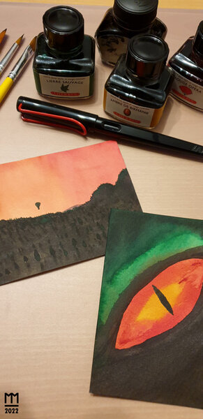
From the album: Stuff by Astronymus
Two ink watercolor pictures I painted today.© astronymus.net
- 0 B
- x
-
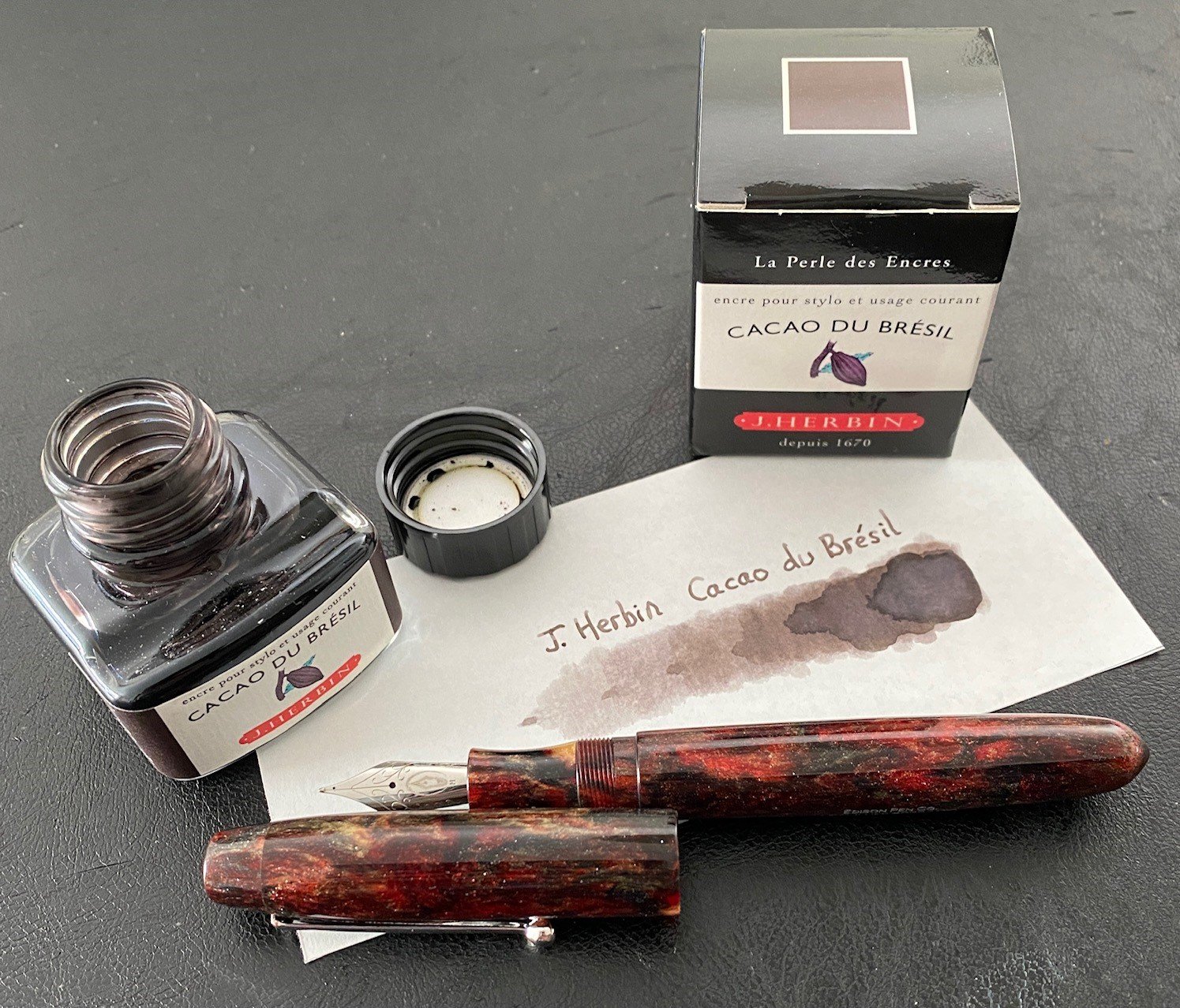
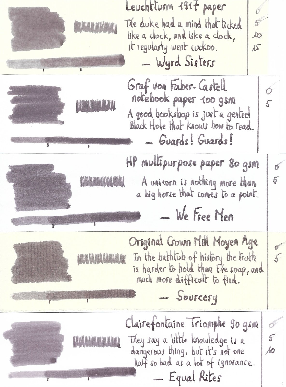
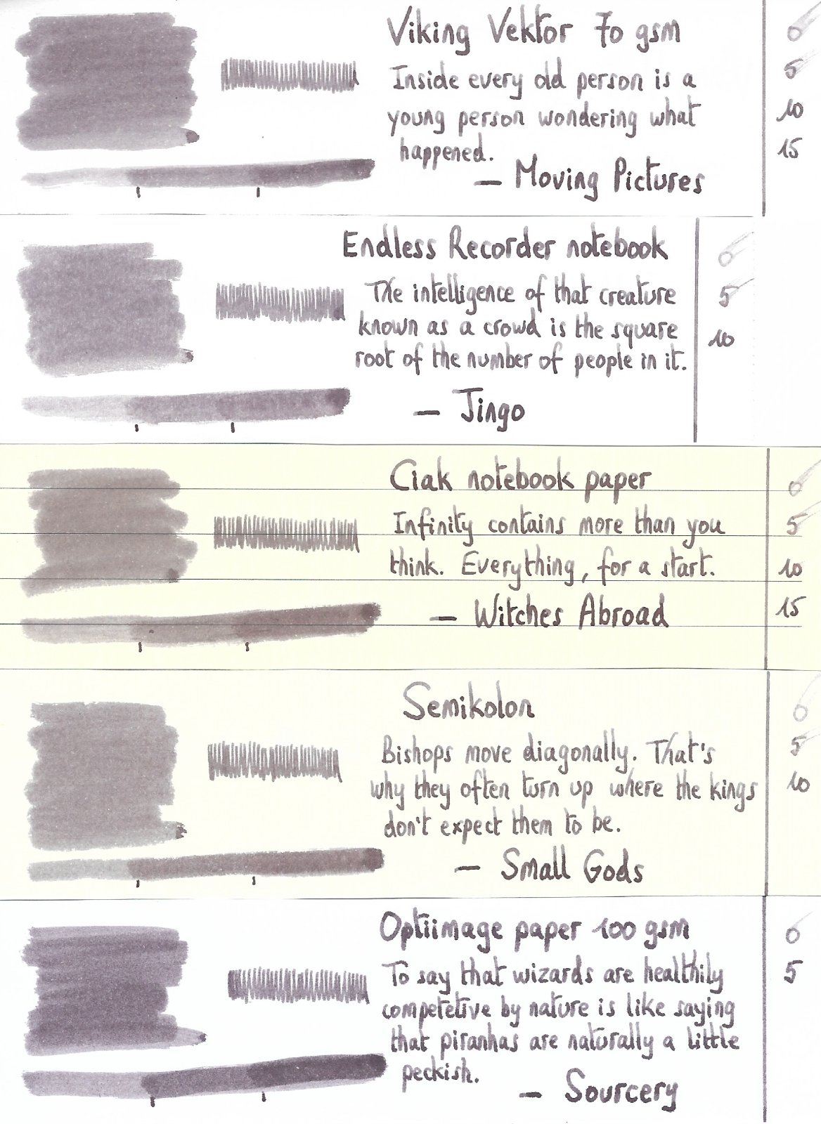
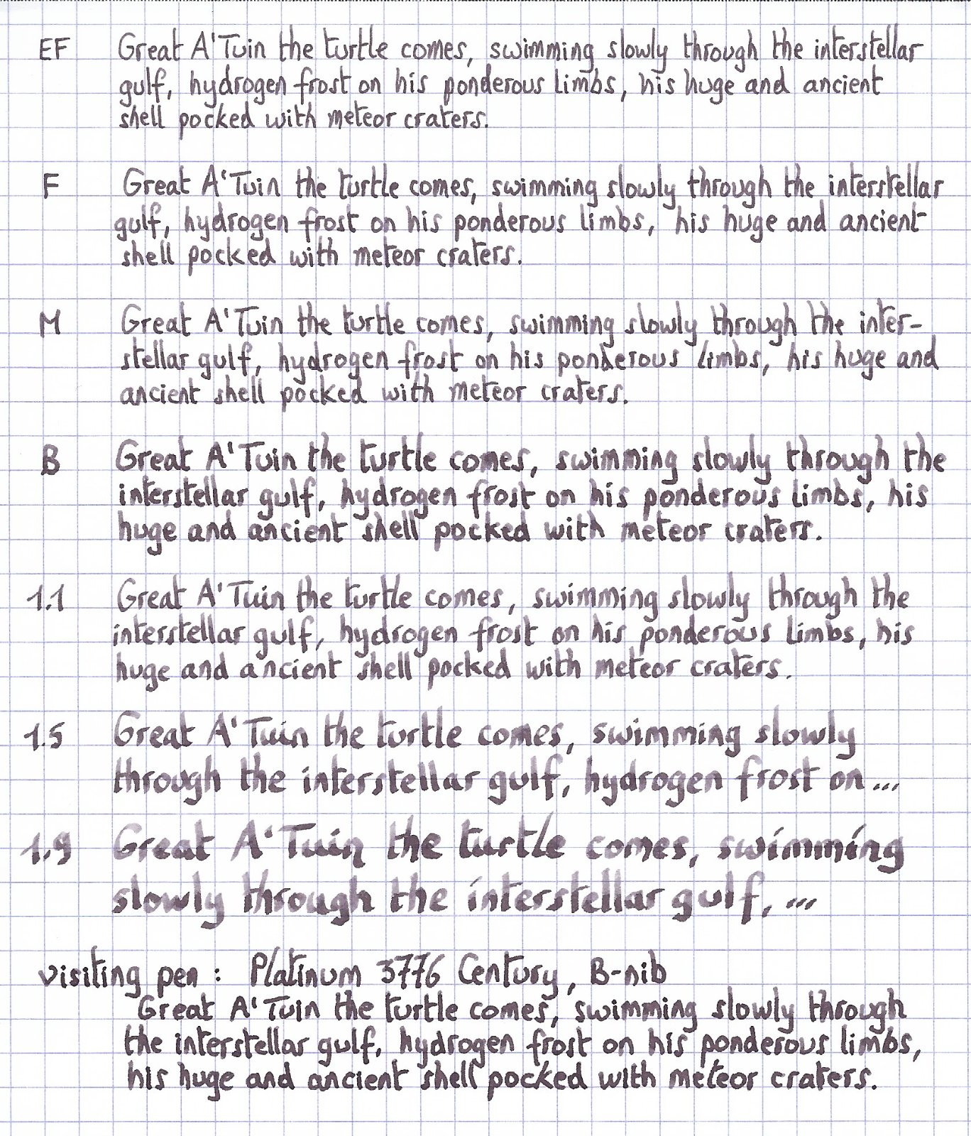
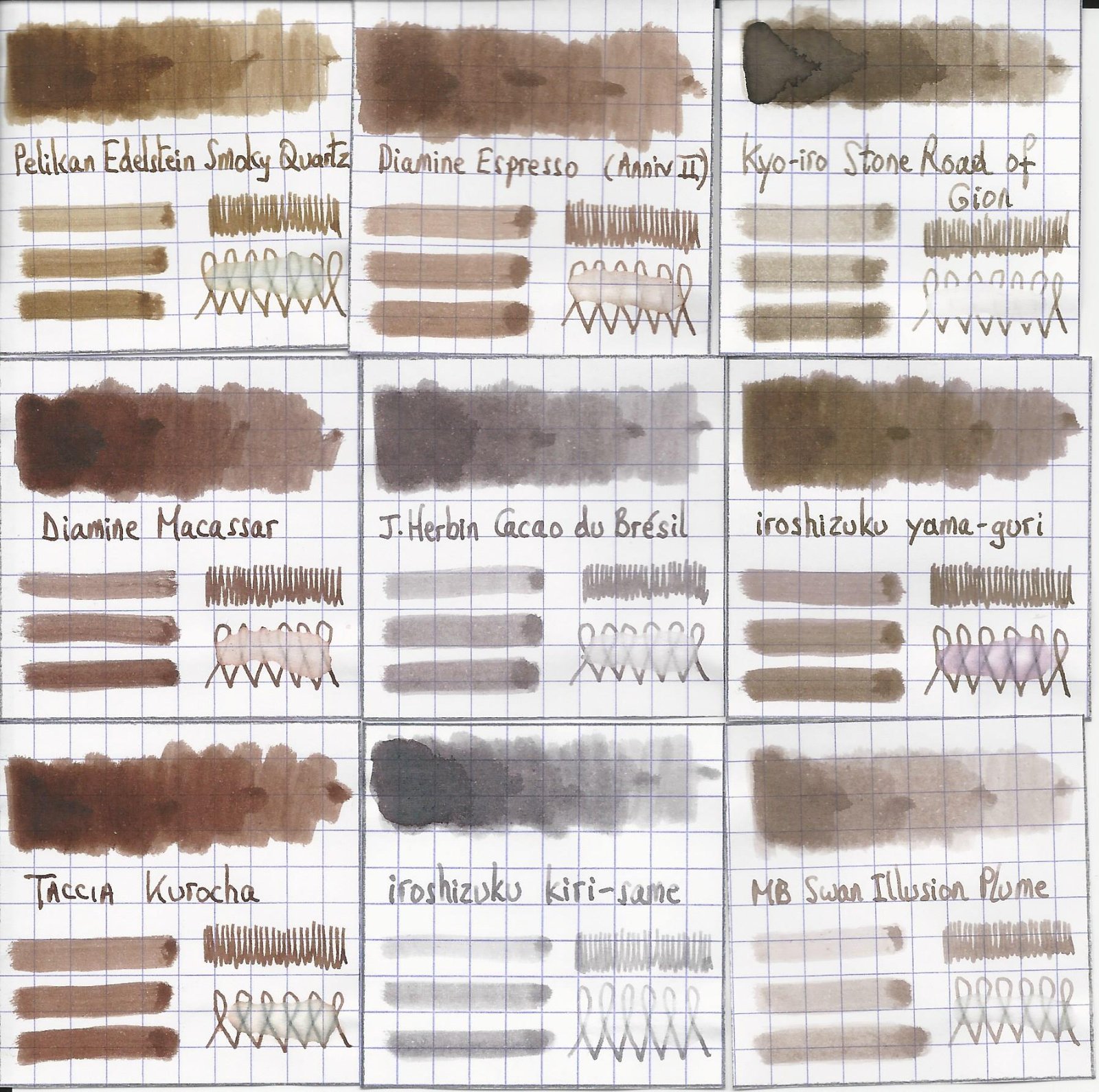
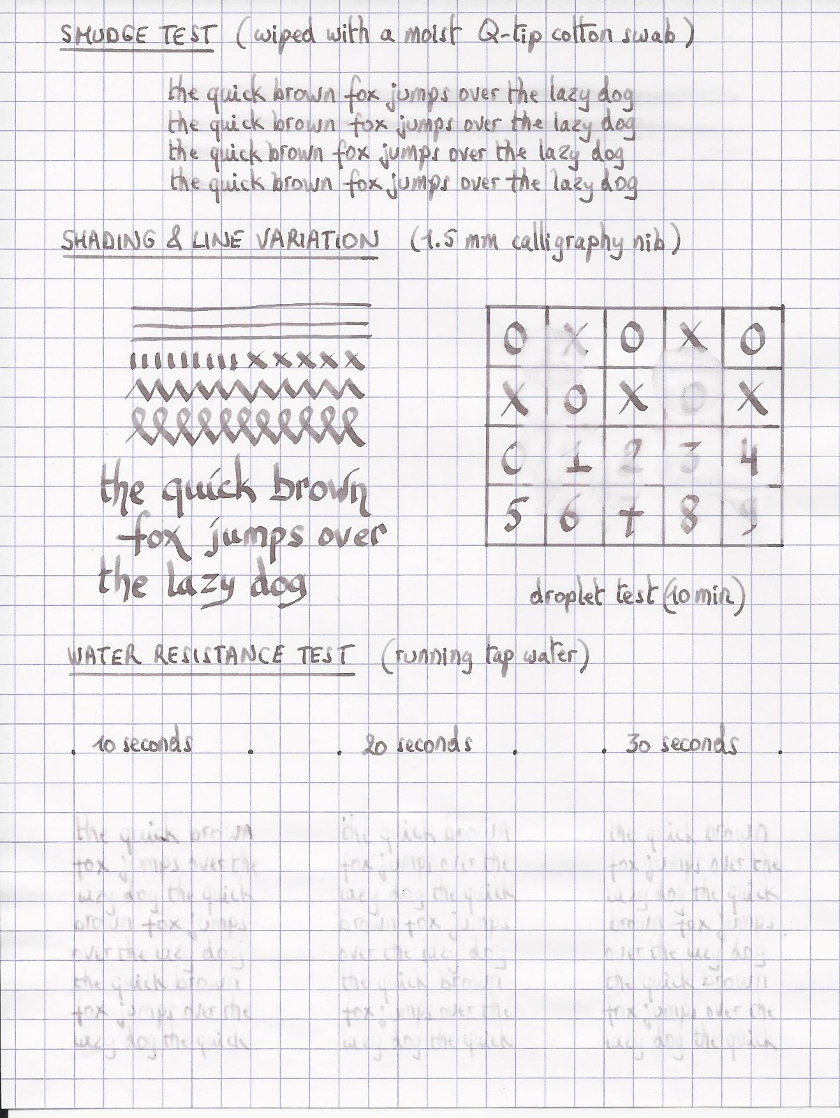
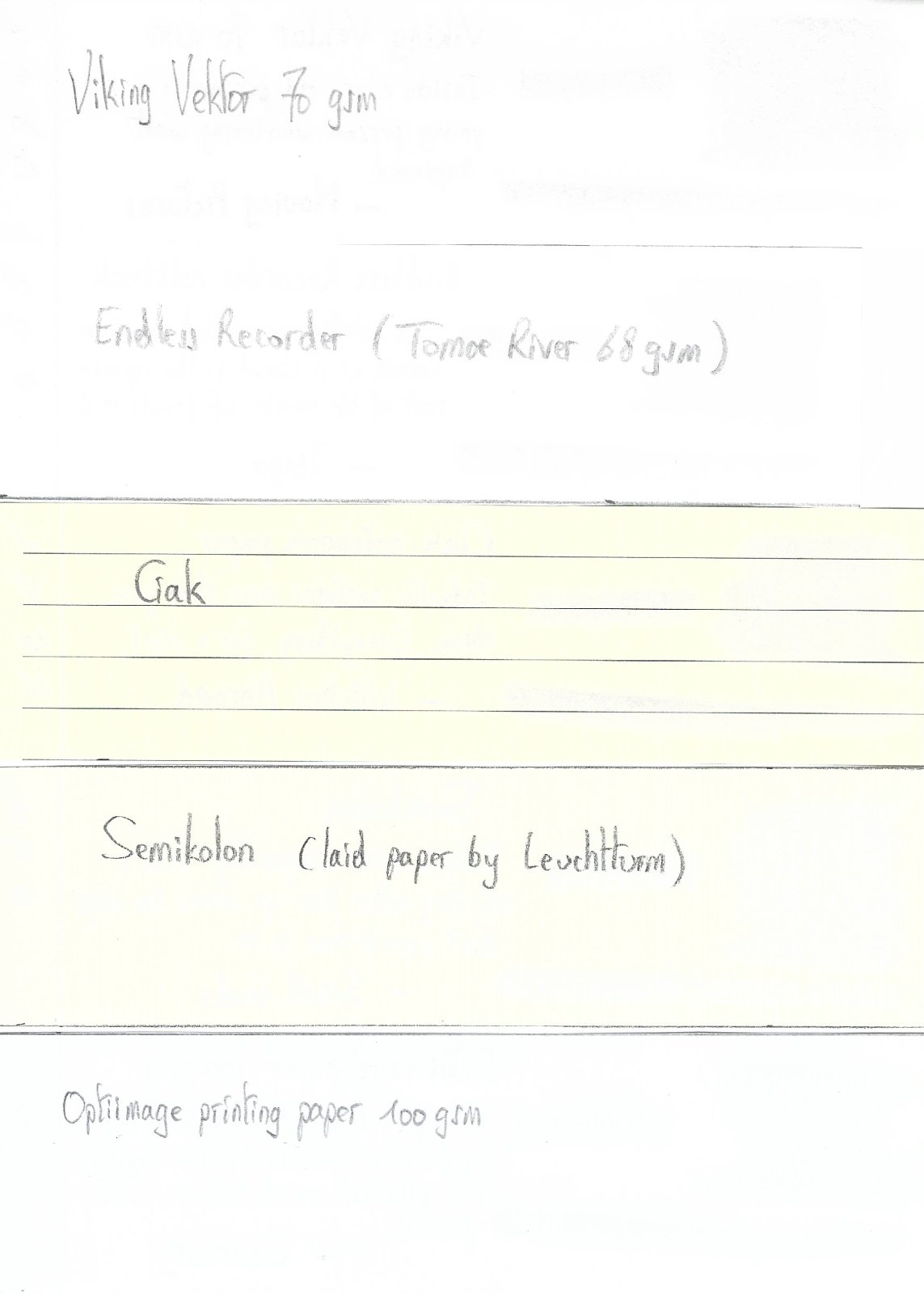
J. Herbin - Cacao du Brésil This is my first review after the "Fall" - the November 2020 outage of FPN. I wanted to take this opportunity to express a heartfelt thank you for the huge amount of effort by Wim and the FPN Admin team to bring our favourite forum back online. You guys rock! La Société Herbin, Maître Cirier à Paris, was established in 1670. This makes J. Herbin probably the oldest name among European ink makers. Today, Herbin produces a range of beautiful fountain pen and calligraphy inks, writing instruments, gift sets and accessories. Herbin inks are made in France, and the finishing touches on the bottles are still done by hand in Paris. J. Herbin is probably best known for their inks in the “La Perle des Encres” series. In this review, the spotlight shines on Cacao du Brésil, which is one of the stars in this line-up. This ink immediately managed to seduce me — it’s simply a superb writing ink, a gorgeous cool grey-brown colour with excellent saturation even in the finer nibs. Also tons of elegant shading, that starts to appear with F nibs, and really delivers with broads. Definitely my type of ink, and — in my opinion — one of Herbin’s best! J. Herbin inks come packaged in simple 30 ml bottles. These bottles are merely adequate, and not really well-suited for piston-fillers — they are not very deep, and piston-filling from a half-empty bottle can be a challenge. My trick is to fill an ink-sample vial with ink, and piston-fill my pen that way. Cacao du Brésil makes a great match for my Edison Collier Red Dragon, which is the beauty in the pic below. Cacao du Brésil writes a saturated line with quite satisfactory lubrication, even in drier pens like my Lamy Safari. With wetter pens the ink leaves a deeply saturated grey-brown line, and loses a bit of its prominent shading. To illustrate the colour span of Cacao du Brésil, I did a swab on Tomoe River paper where I totally saturated portions of the paper with ink. This J. Herbin ink shows a medium colour range, without too harsh a contrast between light and darker parts. This translates to elegant shading when writing. On the smudge test — rubbing text with a moist Q-tip cotton swab — the ink behaved perfectly, with only minimal smearing. Water resistance is quite good — the ink survives even longer exposures to water, leaving a light grey residue on the paper which remains very readable. This is also apparent from the lower part of the chromatography. This makes Cacao du Brésil an ink that is perfectly usable at the office. Drying times for this ink are in the 5-15 second range, depending on the type of paper (with the Lamy Safari M-nib). With the more absorbent copy paper that you’ll find at the office, it’s close to 5 seconds. With less absorbent paper, drying times are more in the 10-15 second range. I’ve tested the ink on a wide variety of paper — from crappy Moleskine to high-end Tomoe River. On each scrap of paper I show you: An ink swab, made with a cotton Q-tip 1-2-3 pass swab, to show increasing saturation An ink scribble made with a Lamy Safari M-nib fountain pen The name of the paper used, written with a Lamy Safari B-nib A small text sample, written with the Lamy Safari M-nib Source of the quote, written with a Platinum 3776 Century B-nib Drying times of the ink on the paper (with the M-nib Safari) Cacao du Brésil looks great on both white and more yellowish paper. I didn’t detect any noticeable feathering, just a hint on the notoriously bad Moleskine paper. With Moleskine and GvFC paper, there is some show-through and a tiny bit of bleed-through — but nothing too bad. Overall, Cacao du Brésil behaves exceptionally well. Writing with different nib sizes The picture below shows the effect of nib sizes on the writing. All samples were written with a Lamy Safari, which is typically a dry pen. I also added a visiting pen — a wet-writing Platinum 3776 Century with a broad nib. Here the ink leaves a very saturated line, which leans towards black-brown, taking away some of the more prominent shading you get in drier pens. Related inks To compare Cacao du Brésil with related inks, I use my nine-grid format with the currently reviewed ink at the centre. This format shows the name of related inks, a saturation sample, a 1-2-3 swab and a water resistance test — all in a very compact format. I don’t really have any close matches to this grey-brown in my collection though. Iroshizuku kiri-same — a grey ink with brown undertones — appears to be a distant cousin. My other browns are just … more brown. Inkxperiment – The Fall (Last Leaf Standing) As a personal challenge, I try to create interesting drawings using only the ink I’m reviewing. I find this to be a fun extension of the hobby, and these single-ink drawings often present a real challenge. These inkxperiments allow me to explore the colour-range nuances that are present in the ink. I love doing them! The grey-brown tones of Cacao du Brésil match perfectly with the autumn season in my part of the world. No need to look any further for inspiration. Dark-brown earth, glistening wetly from yesterday’s rain, and on the trees a last leaf clinging to the branch. I started with a piece of 300 gsm watercolour paper, that I thoroughly wetted with water to which I added a bit of ink. I then used a broad brush to draw in the outline of the field and the sky. Next I drew in the tree with the last leaf standing. To complete the drawing, I used a fine brush to add the striped pattern that adds texture to the earthen field. The end result gives you a good idea of the colour range that can be achieved when using Cacao du Brésil in a more artistic context. Conclusion J. Herbin Cacao du Brésil is a great ink: a really special cool grey-brown, that works with all nib sizes and on all types of paper. The ink is also fairly water-resistant, and well suited for the workplace. And it shows some beautiful shading that really gives that extra oomph to your writing. This is an ink that really gives me pleasure — heartily recommended! Technical test results on Rhodia N° 16 notepad paper, written with Lamy Safari, M-nib Backside of writing samples on different paper types

-
J.Herbin - Orange Indien La Société Herbin, Maître Cirier à Paris, was established in 1670. This makes J. Herbin probably the oldest name among European ink makers. Today, Herbin produces a range of beautiful fountain pen and calligraphy inks, writing instruments, gift sets and accessories. Herbin inks are made in France, and the finishing touches on the bottles are still done by hand in Paris. Recently, I’ve been looking into Herbin's "La Perle des Encres" series. The subject of this review is "Orange Indien" - an ink for which I had high hopes. On first impression, I liked the colour a lot: a muted orange that leans a bit towards the brown. I like my inks non-vibrant, so in this area Orange Indien did not disappoint. One thing I quickly noticed: it's almost impossible to capture this ink's colour with my scanner. It always turns out too brown. So in this review, I mostly use pictures to show off the ink, since these match much more precisely the colour I see with the naked eye. The tranquil character of this ink appealed to me - this is an ink that is quite pleasant to use for personal journaling. For writing, you do need wet pens to fully enjoy the ink. With dry pens, like the Lamy Safari, the ink feels too unlubricated and doesn't produce a line with sufficient saturation. When combined with a wet pen (e.g. a Pelikan), the ink looks great even in finer nibs. Orange Indien has a moderate colour span, with not too much of a difference between light and fully saturated parts. To illustrate this, I did a swab on Tomoe River paper where I really saturated portions of the paper with ink. This accurately illustrates the ink's colour range. The moderate colour span indicates that this is a soft-shading ink. The ink shades nicely, but without too much contrast between the light and dark parts. On the smudge test - rubbing text with a moist Q-tip cotton swab - the ink behaved perfectly, with almost no smearing. Water resistance is non-existent though - some brown-orange smudges remain, but what is left on the paper is no longer readable (well - if you're a forensics expert, you can probably reconstruct the original words, but for daily use Orange Indien should be kept away from water or other liquids). Orange Indien dries relatively quickly in my Safari test pen (M-nib), taking about 5-10 seconds to dry. I've tested the ink on a wide variety of paper - from crappy Moleskine to high-end Tomoe River. On each scrap of paper I show you: An ink swab, made with a cotton Q-tip 1-2-3 pass swab, to show increasing saturation An ink scribble made with a Lamy Safari M-nib fountain pen The name of the paper used, written with a Lamy Safari B-nib A small text sample, written with an M-nib Drying times of the ink on the paper (with the M-nib) With this test, Orange Indien shows its weakness. It is prone to feathering, even on papers where this is almost never a problem. I noticed slight feathering on Moleskine (no surprise there) and printing papers, but also on Paperblanks Paper. The latter is a bummer for me personally, since I use Paperblanks Embellished Manuscripts as my daily journals. On other papers, feathering didn't seem to be a problem. Writing with different nib sizes The picture below shows the effect of nib sizes on the writing. All samples were written with a Lamy Safari, which is typically a dry pen. I also added a visiting pen - a wet Pelikan M101N Bright Red with an F-nib. With this wet pen, the ink wrote smoothly and with much better saturation. Orange Indien loves to be combined with wetter pens and broader nibs. Nice looking ink! Related inks To allow for a good comparison with related inks, I employ a nine-grid format, with the currently reviewed ink at the center. Each grid cell shows the name of the ink, a saturation sample, a 1-2-3 swab and a water resistance test - all in a very compact format. Inkxperiment – portrait of a blushing lady With each review, I try to create an interesting drawing using only the ink I'm reviewing. This is often quite challenging, but it has the advantage of showing the ink's colour range in a more artistic setting. I enjoy doing these little drawings immensely - it's quite a fun extension of the ink hobby. For this inkxperiment, I really lacked inspiration. So I employed the random-line technique: draw some random lines on the paper, and see if some topic drifts to the foreground. I started out with HP Premium Photo Paper, and drew some random lines using a Q-tip dipped in Orange Indien with the paper completely submerged in water. This gives soft lines, and colours the background of the paper. I then lifted the image of a lady from the randomness, and painted it in with different ratios of water-diluted ink. For her hair, I used pure Orange Indien. Here the ink bled out a bit on the face, creating the blushing effect. So instead of a lady, you get the portrait of a blushing lady ;-) The end result gives you a good idea of the colour span that can be obtained with Orange Indien. Conclusion Orange Indien is a nice-looking non-vibrant orange, that looks quite well on paper. You should pair this ink with wet pens to get a nice writing experiende. The ink has a tendency to light feathering on a number of papers in my test set. Unfortunately for me, this also happens on Paperblanks paper. Personally, I really like the ink's colour, but the feathering on my daily-use paper kills this ink for me (at least as a writing ink). Technical test results on Rhodia N° 16 notepad paper, written with Lamy Safari, M-nib Backside of writing samples on different paper types
-
J.Herbin - Vert Empire La Société Herbin, Maître Cirier à Paris, was established in 1670. This makes J. Herbin probably the oldest name among European ink makers. Today, Herbin produces a range of beautiful fountain pen and calligraphy inks, writing instruments, gift sets and accessories. Herbin inks are made in France, and the finishing touches on the bottles are still done by hand in Paris. Recently, I've been looking into Herbin's "La Perle des Encres" series. I've had my eye on "Vert Empire" for some time now, and decided it's time for a review of this ink. Vert Empire is a terrific grey-green ink, that's right up my alley. Muted, subdued, greyish... yummy! The ink's colour has to be seen to be fully appreciated - the scans in this review don't do it full justice. This ink has the cunning ability to change character with the available lighting: sometimes showing off a more yellow-green hue (under artificial light), and at other times appearing almost as a pure grey. The scans in this review capture reasonably well the way the ink appears in normal daylight. This is an ink that immediately appealed to me. A tranquil colour, full of character, and with heavy grey undertones that give the ink a vintage vibe. The ink looks beautiful on all paper types, with good contrast even with finer nibs. Shading is very present even in finer nibs, but remains aesthetically elegant. I really like the looks of this ink - a prime candidate for my top three of 2019. The ink has quite satisfactory lubrication, even in drier pens like my Lamy Safari. With my wetter Pelikan pens the ink is very well saturated, and writes like a dream. Vert Empire also has a broad colour span. To illustrate this, I did a swab on Tomoe River paper where I really saturated portions of the paper with ink. This beautifully illustrates the ink's wide colour range. This J. Herbin ink moves effortlessly from a very light grey-green to a very dark, almost black green. On the smudge test - rubbing text with a moist Q-tip cotton swab - the ink behaved perfectly with almost no smearing. Water resistance is a bit disappointing though. The ink loses all colour, but still leaves behind a perfectly readable light-grey ghost image of your writing. Not great, but your writings will be recoverable. This is also apparent from the lower part of the chromatography, which shows that the grey components of the ink remain on the paper. This is an ink that might still be at home in the workplace. Vert Empire is also a fast-drying ink - with typical drying times in the 5-10 second range with my Lamy Safari (M-nib). I was surprised at this, because it totally feels like a really wet ink. As such, this ink might also be suitable for lefties. I've tested the ink on a wide variety of paper - from crappy Moleskine to high-end Tomoe River. On each scrap of paper I show you: An ink swab, made with a cotton Q-tip 1-2-3 pass swab, to show increasing saturation An ink scribble made with a Lamy Safari M-nib fountain pen The name of the paper used, written with a Lamy Safari B-nib A small text sample, written with an M-nib Drying times of the ink on the paper (with the M-nib) Vert Empire looks really nice on both white and more yellowish papers. On low-quality paper (yes that's you, Moleskine) it exhibits a small amount of feathering, but all-in-all not too bad. With Moleskine paper, there is significant show-through and a bit of bleed-through - not unexpected for this fountain-pen unfriendly paper. Writing with different nib sizes The picture below shows the effect of nib sizes on the writing. All samples were written with a Lamy Safari, which is typically a dry pen. I also added a visiting pen - a wet Pelikan M120 with an M-nib. Here the ink leaves a very saturated line. As you can see, Vert Empire manages to look really nice in all nib sizes, with great contrast and elegant shading. Nice. Related inks To allow for a good comparison with related inks, I employ a nine-grid format, with the currently reviewed ink at the center. Each grid cell shows the name of the ink, a saturation sample, a 1-2-3 swab and a water resistance test - all in a very compact format. Inkxperiment - Mining Tower As a personal challenge, I try to create interesting drawings using only the ink I'm reviewing. I find this to be a fun extension of the hobby, and these single-ink drawings often present a real challenge. It also gives you an idea of what the ink is capable of in a more artistic setting. For this drawing I used 300 gsm rough watercolour paper. For my topic, I went back to the industrial heritage of my home town (Genk, Belgium), where the last coal-mine shut down in 1988. The mining tower is now the centerpiece of a lively cultural complex. I started off with heavily water-diluted ink to paint in the background. I then used mildly diluted Vert Empire to draw the mining tower and foreground. Final highlights were added with a broad-nibbed fountain pen filled with Vert Empire. The end result gives you a good idea of the colour span that Vert Empire is capable of. Conclusion J. Herbin Vert Empire is a truly great ink, that pleasantly surprised me on all fronts: georgeous grey-leaning green colour, beautiful shading, good saturation - and all this even in finer nibs. Even better, the ink is relatively fast-drying and works well with all paper types. Combine all this, and you've got a winner. This ink went straight to my top three for 2019 ! I heartily recommend it. Technical test results on Rhodia N° 16 notepad paper, written with Lamy Safari, M-nib Backside of writing samples on different paper types
-

Ink Shoot-Out : J.herbin Vert De Gris Vs Callifolio Olifants
namrehsnoom posted a topic in Ink Comparisons
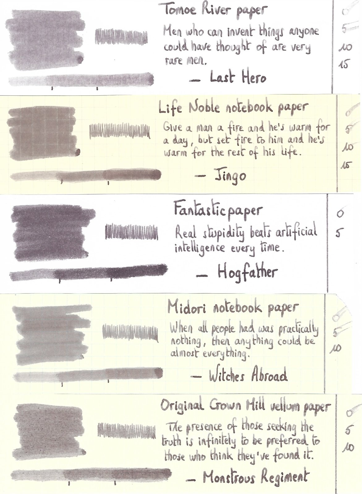
Ink Shoot-Out : J.Herbin Vert de Gris vs L'Artisan Pastellier Callifolio Olifants In 2018, J. Herbin released a number of new inks in their "Perle des Encres" series. The one I fell in love with is Vert de Gris, a terrific grey-green-blue ink that rightfully deserved a spot in my favourite inks of the year short-list. Recently I accidentally discovered that Callifolio Olifants has a very similar hue... in fact, these inks are really close matches. Time to do a detailed comparison and find out which of these inks I like the most. Enter... the Ink Shoot-Out. A brutal fight spanning five rounds, where two inks engage in fierce battle to determine who is the winner. And today truly is a special fight - our French champions are masters in the art of Savate - also known as French kick-boxing. In the left corner, the deadly weapon from Paris - J. Herbin Vert de Gris aka the "Grey Reaper". In the right corner, from southern France, the steel-footed "Elephant Kicker" – L'Artisan Pastellier Callifolio Olifants. The champions enter the ring! The crowd is roaring! The bell rings and the first round begins... may the best ink win! Round 1 – First Impressions These French inks are well matched, and make a great first impression. They show a muted grey-green-blue colour, that really appeals to me. The colour contrasts nicely with the Rhodia N°16 paper in my Lamy Safari M-nib. The inks show character, with nice shading even in finer nibs. I especially like their dusty appearance. These inks are definitely teals, but also lean towards the grey, giving them a vintage appearance. I really like what I see here. Both inks look very much alike, but there are some differences: Vert de Gris is more saturated, and leaves a wetter line on the page. In contrast, Olifants is a much drier ink, which feels less lubricated. This is especially noticeable in finer nibs. Olifants has a bit more blue in it, which is most obvious in swatches. Both inks make a great first impression. In the looks department, they are well matched. But Vert de Gris feels nicer in the pen due to its superior lubrication. A small difference, but the first kick goes to the Grey Reaper. Just enough for a win on points. Round 2 – Writing Sample The writing sample was done on Rhodia N°16 Notepad with 80 gsm paper. Both inks behaved flawlessly, with no feathering and no show-through or bleed-through. With the EF nib, the better saturation of Vert de Gris comes into play, resulting in more contrast-rich writing. With broad nibs though, Vert de Gris becomes a bit too saturated and loses some of its character. Here the drier Olifants looks more pleasing to me. Colourwise both inks look very similar in writing. Both inks also shade nicely, without too much contrast between light and dark parts. This aesthetically pleasing shading gives more character to your writing, and shows up even with the finer nibs. For this round, the focus is on writing, and here both inks are strong performers. Vert de Gris works a bit better in EF/F nibs, producing a more saturated line. On the other hand, Vert de Gris tends to oversaturate in broader nibs. Here the drier Callifolio Olifants manages to gain the upper hand in the looks department. But both inks are jewels, that are really on par with each other. Some nice punches, some good kicks, but neither ink gets the upper hand. As such, this round ends in a draw. Round 3 – Pen on Paper This round allows the batlling inks to show how they behave on a range of fine writing papers. From top to bottom, we have : FantasticPaper, Life Noble, Tomoe River and Original Crown Mill cotton paper. All scribbling and writing was done with a Lamy Safari M-nib. Both champions did well, with no show-through nor bleed-through. But this round is not about technicalities, it is about aesthetics and beauty. Are the fighters able to make the paper shine ? One thing is immediately apparent: these inks are at home on a wide range of papers, both white and off-white ones. On more absorbent paper like Fantasticpaper (top), the drier Olifants makes the best of the paper. But on less absorbent paper, the roles are reversed - due to its better saturation, Vert de Gris definitely looks better in these circumstances. The inks both consistently produce great-looking writing on all the papers I tested them with. Swatch saturation varies across paper types (depending on absorption and roughness of the paper), but for writing these inks manage to produce consistently contrast-rich lines on the page. Both champions move with lightning speed - throwing kicks and punches - but neither champion gives ground. As such, round 3 also finishes with a draw. The crowd is going nuts... what a fight! These inks show no weakness! Awesome! Round 4 – Ink Properties Both inks have drying times in the 15-20 second range on the Rhodia paper. But... oh my god... look! ... the Grey Reaper explodes in a flurry of kicks, and finally punches through the defenses of the Elephant Kicker. In the smudge resistance test - rubbing the text with a moist Q-tip cotton swab - Vert de Gris shows itself to be less prone to smudging. This better water resistance also shows up in the droplet test, where I drip water on the grid and let it sit there for 15 minutes. Vert de Gris definitely shows better water resistance, losing colour but showing a crisp greyish residue that remains very readable. Olifants behaves quite well on itself, but can't reach the level of water resistance shown by Vert de Gris. What a spectacle! J. Herbin Vert de Gris pulled some kicks and punches worthy of Jean-Claude van Damme, the Muscles from Brussels. Callifolio Olifants totally caved! The crowd is cheering... More! More! More! There is no doubt... this round is a solid win for Vert de Gris. Round 5 – The Fun Factor Welcome to the final round. Here I give you a purely personal impression of both inks, where I judge which of them I like the most when doing some fun stuff like doodling and drawing. Both inks do well, and show off a broad colour spectrum, ranging from very light greyish-blue to a really dark teal. I really enjoyed using them. Personally I prefer the greyer looks of Vert de Gris. This ink shows a bit more character, and provides more of a gloomy feel that I really like. The accompanying drawing was done on HP photo paper, and on this medium Callifolio Olifants definitely shows its blue-er nature. For this round, both champions are again well matched. They both look beautiful, but this judge prefers the greyer gloominess of Vert de Gris over the more bluish tones of Olifants. A personal judgement, but still... this round goes to Vert de Gris on points. The Verdict Both inks are real jewels, that look beautiful on all types of paper. And it took a while to notice some worthwhile differences. But in the end, round 4 is the decisive one : Vert de Gris clearly dominates when water resistance comes into play. It also wins on points in some of the other rounds - but that's more of a personal impression of the judge. Both J.Herbin Vert de Gris and Callifolio Olifants are top quality inks. But put them next to each other, and the result is clear: Vert de Gris throws the better kicks and punches, and is the definite winner of this exciting fight. -
J. Herbin - Lie de Thé La Société Herbin, Maître Cirier à Paris, was established in 1670. This makes J. Herbin probably the oldest name among European ink makers. Today, Herbin produces a range of beautiful fountain pen and calligraphy inks, writing instruments, gift sets and accessories. Herbin inks are made in France, and the finishing touches on the bottles are still done by hand in Paris. J. Herbin is probably best known for their inks in the "La Perle des Encres" series. In this review, the spotlight shines on one of the stars in this line-up: the gorgeous golden-brown Lie de Thé. This ink immediately grabs the attention with its wonderful colour - a golden brown with yellow-orange undertones. This is a soft brown with tons of character and a tremendous colour range, ranging from a whispy sepia-tone to almost black-brown when fully saturated. The ink looks great on most paper types (Moleskine excepted), and exhibits elegant shading without too much contrast between the light and darker parts. J.Herbin truly scored a winner with this one. The ink has quite satisfactory lubrication, even in drier pens like my Lamy Safari. With wetter pens like my Pelikan Smoky Quartz with B-nib, the ink leaves a very saturated brown line, and loses a bit of its golden qualities. To illustrate the broad colour span of Lie de Thé, I did a swab on Tomoe River paper where I really saturated portions of the paper with ink. This beautifully illustrates the ink's broad colour range. This J. Herbin ink moves effortlessly from a very light sepia to a very dark, almost black brown. On the smudge test - rubbing text with a moist Q-tip cotton swab - the ink behaved perfectly, with only minimal smearing. Water resistance is amazing - the ink effortlessly survived even longer exposures to water. Really well executed! This is also apparent from the lower part of the chromatography, which shows that the grey components of the ink remain on the paper. If you need a water-resistant ink, Lie de Thé certainly fits the bill. This is an ink that will be at home in the workplace. Lie de Thé dries relatively fast on more absorbent papers (5-10 second range), but takes significantly longer on less absorbent paper. On Tomoe River e.g. the drying time is about 25 seconds with my relatively dry Lamy Safari with M-nib. I've tested the ink on a wide variety of paper - from crappy Moleskine to high-end Tomoe River. On each scrap of paper I show you:An ink swab, made with a cotton Q-tip1-2-3 pass swab, to show increasing saturationAn ink scribble made with a Lamy Safari M-nib fountain penThe name of the paper used, written with a Lamy Safari B-nibA small text sample, written with an M-nibDrying times of the ink on the paper (with the M-nib)Lie de Thé looks great on both white and more yellowish paper. I didn't detect any noticeable feathering, not even on the notoriously bad Moleskine paper. With Moleskine paper, there is however significant show-through and bleed-through - not unexpected for this fountain-pen unfriendly paper. Writing with different nib sizesThe picture below shows the effect of nib sizes on the writing. All samples were written with a Lamy Safari, which is typically a dry pen. I also added a visiting pen - my very wet Pelikan M200 Smoky Quartz with a B-nib. Here the ink leaves a very saturated line, which leans towards black-brown, unfortunately taking away some of the golden-brown beauty that appears with less wet pens. Related inksTo compare Lie de Thé with related inks, I use a nine-grid format with the currently reviewed ink at the center. This format shows the name of related inks, a saturation sample, a 1-2-3 swab and a water resistance test - all in a very compact format. I hope that you'll find this way of presenting related inks useful. It's a bit more work, but in my opinion worth the effort for the extra information you gain. Inkxperiment – Autumn VillageAs a personal challenge, I try to create interesting drawings using only the ink I'm reviewing. I find this to be a fun extension of the hobby, and these single-ink drawings often present a real challenge. It also gives you an idea of what the ink is capable of in a more artistic setting. For this abstract autumn village, I got my inspiration from some pics I found on Pinterest. The drawing was done on 200 gsm cold-pressed watercolour paper. To create the different tones in the picture, I used different ink-water ratios (from 1:20 for the really light parts, to 1:2 for the darker parts). The rooftops were done with pure Lie de Thé. The end result gives you a good idea of what Lie de Thé is capable of in a more artistic setting. ConclusionJ. Herbin Lie de Thé is a gorgeous golden-brown ink, that pleasantly surprised me on all fronts: a beautiful colour, great shading, good saturation - and all this even in finer nibs. The ink also has great water resistance, which is a plus if you want to use it in the workplace. This is an ink that deserves a place in anybody's ink collection - recommended! Technical test results on Rhodia N° 16 notepad paper, written with Lamy Safari, M-nib Backside of writing samples on different paper types
-
J. Herbin - Vert de Gris La Société Herbin, Maître Cirier à Paris, was established in 1670. This makes J. Herbin probably the oldest name among European ink makers. Today, Herbin produces a range of beautiful fountain pen and calligraphy inks, writing instruments, gift sets and accessories. Herbin inks are made in France, and the finishing touches on the bottles are still done by hand in Paris. In 2018, J. Herbin introduced some new inks in their “La Perle des Encres” series. The one that caught my eye - thanks to visvamitra's review in this forum - is Vert de Gris. This ink looks to be right up my alley - a nice dark grey-leaning teal. This was later confirmed by one of Tas's famous ink ramblings. Vert de Gris is an ink that definitely deserves a place in my collection, so I went ahead and ordered a bottle. Upon arrival, I immediately started experimenting with the ink, and it really lived up to my high expectations. Vert de Gris has a gorgeous colour, definitely a dark teal, but with heavy grey undertones. This is an ink that's brewed for me! The ink looks beautiful on all types of paper, and is well saturated. As such it works great in the finer nibs I typically use. And it gets only better... even with fine nibs, there's tons of elegant shading present. You just have to love this ink! It went straight to my top three for 2018, just behind MB Swan Illusion Plume. The ink has quite satisfactory lubrication, even in drier pens like my Lamy Safari. With my wetter Pelikan pens the ink is heavily saturated, and writes like a dream. My only problem here is that I need to adapt my handwriting, and write a bit larger than the tiny scribbles I'm used to. Vert de Gris also has a wonderfully dynamic colour span. To illustrate this, I did a swab on Tomoe River paper where I really saturated portions of the paper with ink. This beautifully illustrates the ink's broad colour range. This J. Herbin ink moves effortlessly from a very light teal-grey to a very dark, almost black teal. On the smudge test - rubbing text with a moist Q-tip cotton swab - the ink behaved perfectly, with only minimal smearing. Water resistance is amazing - the ink effortlessly survived even longer exposures to water. Really well executed! This is also apparent from the lower part of the chromatography, which shows that the grey components of the ink remain on the paper. If you need a water-resistant ink, Vert de Gris certainly fits the bill. This is an ink that will be at home in the workplace. Vert de Gris is also a fast-drying ink - with typical drying times in the 5-10 second range with my Lamy Safari (M-nib). I was surprised at this, because it totally feels like a really wet ink. As such, this ink is also suitable for lefties. I've tested the ink on a wide variety of paper - from crappy Moleskine to high-end Tomoe River. On each scrap of paper I show you:An ink swab, made with a cotton Q-tip1-2-3 pass swab, to show increasing saturationAn ink scribble made with a Lamy Safari M-nib fountain penThe name of the paper used, written with a Lamy Safari B-nibA small text sample, written with an M-nibDrying times of the ink on the paper (with the M-nib)Vert de Gris looks really nice on both white and more yellow papers. On low-quality paper it exhibits a small amount of feathering, but all-in-all not too bad. With Moleskine paper, there is significant show-through and bleed-through - not unexpected for this fountain-pen unfriendly paper. Writing with different nib sizesThe picture below shows the effect of nib size on your writing. All samples were written with a Lamy Safari, which is typically a dry pen. I also added a visiting pen - my very wet Pelikan M101N Lizard with an M-nib that writes like a broad. Here the ink leaves a very saturated line (and I really need to write a few font-sizes bigger with this pen ;-) Related inksWith this review, I have changed my format for presenting related inks. My earlier presentations of related inks lacked enough information to be really useful. I therefore changed to a nine-grid format, with the currently reviewed ink at the center. The new format shows the name of related inks, a saturation sample, a 1-2-3 swab and a water resistance test - all in a very compact format. I hope that you'll find this way of presenting related inks more useful. It's a bit more work, but in my opinion worth the effort for the extra information you gain. Inkxperiment - Walk in the WoodsAs a personal challenge, I try to create interesting drawings using only the ink I'm reviewing. I find this to be a fun extension of the hobby, and these single-ink drawings often present a real challenge. It also gives you an idea of what the ink is capable of in a more artistic setting. For this drawing I used 300 gsm rough watercolour paper. For some reason, grey-leaning inks inspire me to draw winter landscapes, so that's what you get here. I started off with heavily water-diluted ink for the lighter tones, gradually adding more ink for the darker parts. For the horizon line, the main tree and the walking couple, I used pure Vert de Gris, heavily saturating these subjects. The end result gives you a good idea of the colour span that Vert de Gris is capable of. ConclusionJ. Herbin Vert de Gris is a wonderful ink, that pleasantly surprised me on all fronts: georgeous colour, beautiful shading, good saturation - and all this even in finer nibs. Even better, the ink is relatively fast-drying and shows great water resistance. Combine all this, and you've got a winner. This ink went straight to my top three for 2018 ! I heartily recommend it. Technical test results on Rhodia N° 16 notepad paper, written with Lamy Safari, M-nib Backside of writing samples on different paper types
-
As a huge fan of J. Herbin inks, I was thrilled to learn about five new standard inks introduced in 2018. Additionally, there's new 1798 ink called Cornaline d'Egypte. It comes in an elegant glass bottle that contains 50 ml of the writing fluid. Ink splash The ocher tint of Carnelian of Egypt, inspired by gemstones, is nice. i like this kind of muted oranges. It brings warmth to the writing. Because the ink contains glittering particles it should be approached as a high-mainenance ink. Sounds scary, but if you won't leave a pen filled with it in a drawer for a year I wouldn't expect any trouble. Drops of ink on kitchen towel Color ID Color range Fabriano, TWSBI 580, stub 1.1 Copy paper, TWSBI 580, stub 1.1 Tomoe River, TWSBI 580, stub 1.1 Water resistance
-
As a huge fan of J. Herbin inks, I was thrilled to learn about five new standard inks introduced in 2018. I've got the bottles and I'll review them shortly. New inks come in standard J. Herbin glass bottles that contain 30 ml of the writing fluid. Ink splash CdT is a decent, moderately saturated ink. I dislike the color, but appreciate the behaviour. I won't judge you if you buy a bottle. Drops of ink on kitchen towel Color ID Color range Fabriano, Kaweco Classic Sport, BB Tomoe River, Kaweco Classic Sport, BB Maruman, Kaweco Classic Sport, BB Water resistance
-
As a huge fan of J. Herbin inks, I was thrilled to learn about five new standard inks introduced in 2018. I've got the bottles and I'll review them shortly. New inks come in standard J. Herbin glass bottles that contain 30 ml of the writing fluid. Ink splash BdP is great. I like bb inks, especially when they're more complex and this one fills the bill. It's saturated, it flows very well and has reasonable amount of lubrication (although it's nowhere near Sailor inks in this regard). Overall, it's a keeper. Drops of ink on kitchen towel Color ID Color range Fabriano, Lamy Al-Star, medium nib Tomoe River, Lamy Al-Star, medium nib Copy paper, Lamy Al-Star, medium nib Maruman, Hero 616, fine (?) nib Water resistance
-
As a huge fan of J. Herbin inks, I was thrilled to learn about five new standard inks introduced in 2018. I've got the bottles and I'll review them shortly. New inks come in standard J. Herbin glass bottles that contain 30 ml of the writing fluid. Ink splash Vert de Gris is great. I like grey inks, especially when they're more complex and tis one fills the bill. It's saturated enough to read it easily, it flows very well and has reasonable amount of lubrication (although it's nowhere near Sailor inks in this regard). Overall, it's a keeper. Drops of ink on kitchen towel Color ID Color range Fabriano, Lamy Al-Star, medium nib Tomoe River, Lamy Al-Star, medium nib Copy paper, Lamy Al-Star, medium nib Maruman, Hero 616, fine (?) nib Water resistance
-
Amethyste De L'Oural is the first ink in the new Jacques Herbin 1798 Inks Collection. 1798 commemorates a special year in the history of Herbin, and a turning point in the history of France. At the moment, there's plenty of shimmering inks on the market. Generally, I don't like them. Glitter irritates me. Marketingwise, though, J. Herbin still reigns. The story behind the inks, packaging anc choice of colors are first class. Neither Diamine nor De Atramentis are close. The ink comes in nice and quite comfortable glass bottle. What's not to like? A deep rich purple with quite good behavior. The ink shimmers. However I did my best to hide the glimmer. It was easy. I just let the ink sit for a day and it seems most of the particles went down. Some glitter can be seen but it's tolerable and allows me to enjoy ink color. The flow is good and so far I haven't experienced any clogging or dry starts. The ink feels wet and in broader nibs it behaves like a gusher. The ink is well saturated and has some water resistance to it - text is still visible after spending fifteen minutes in water. It's feels well-lubricated. It's rather slow to dry on Rhodia paper. Very mild feathering (there might be more with a wider/wetter nib) can be observed on bad quality paper. Drops of ink on kitchen towel Color ID Color range Fabriano, Lamy Al-Star, broad nib Tomoe River, Lamy Al-Star, broad nib Rhodia, Lamy Al-Star, broad nib Water resistance
-
Ink Shoot-Out : J. Herbin Poussière De Lune Vs Callifolio Bourgogne
namrehsnoom posted a topic in Ink Comparisons
Ink Shoot-Out : J.Herbin Poussière de Lune vs L'Artisan Pastellier Callifolio Bourgogne Over the course of the past few years I have developed a taste for dusty, murky inks. Excellent colours for gloomy autumns and dark winter evenings... Two of the inks I love very much are J. Herbin’s Poussière de Lune and L’Artisan Pastellier Callifolio’s Bourgogne. Both are nice dusty purples that fit very well with the autumn season. A perfect time to do a detailed comparison, and find out which of these inks I like the most. Enter... the Ink Shoot-Out. A brutal fight spanning five rounds, where heavyweight inks do battle to determine who is the winner. In the left corner - the well-known J. Herbin champion – Poussière de Lune. In the right corner, also from France, the challenger from L’Artisan Pastellier – Bourgogne. Which champion will remain standing at the end of the fight ? Let's find out... Round 1 - First Impressions Both inks are wonderful murky purples. These are dark and moody inks, well suited to writing on gloomy autumn evenings. Count Vladimir Dracula would have loved them both, and so do I. There are some differences though: Poussière de Lune is much more saturated and lubricated – the pen flows over the paper and leaves a very well saturated line. Bourgogne writes drier with noticeable feedback from the paper. As a result, Bourgogne leaves a finer line with less saturation.Bourgogne is a darker purple with more grey-black undertones. This is a matter of personal taste, but I definitely prefer the darker purple of Bourgogne.Both inks appeal to me. Poussière de Lune is technically the better ink for writing, but colour-wise I really consider Bourgogne to have the edge. For this round, both champions are on par with each other. Let’s call it a draw. Round 2 - Writing Sample The writing sample was done on Rhodia N°16 Notepad with 80 gsm paper. Both inks behaved flawlessly, with no feathering and no show-through or bleed-through. J. Herbin’s Poussière de Lune wrote wonderfully, with very good ink-flow, and leaving a well saturated line. In contrast, Callifolio Bourgogne is much less lubricated, and leaves a consistenly thinner line on the paper. With normal writing, the colour difference between both inks is less apparent. Although Callifolio has more grey-black undertones, in everyday writing this is not immediately obvious. You need to look carefully to see the difference. Both inks also exhibit an aesthetically pleasing shading. Being dark inks, the shading is not very prominent – from dark to darker purple – but it is there, and gives extra character to the writing. For this round, Poussière de Lune clearly has the upper hand, and showed the best technique. A clear and definite win. Round 3 - Pen on Paper I added this round to indicate how the battling inks behave on a range of fine writing papers. From top to bottom, we have : FantasticPaper, Life Noble, Tomoe River and Original Crown Mill cotton paper. All scribbling and writing was done with a Lamy Safari M-nib. Both champions did well, with no show-through nor bleed-through. But this round is not about technicalities, it is about aesthetics and beauty. Are the fighters able to make the paper shine ? In my opinion, Callifolio Bourgogne is the more able of the champions – It’s dustier and murkier on a wider variety of paper. The only exception is with Tomoe River paper, where I like the result of Poussière de Lune better. For this round, Bourgogne gets the upper hand and gets a win on points. Round 4 - Ink Properties Both inks have drying times in the 15-20 second range on the Rhodia paper. Both inks also do fine on the smudge test, where a moist Q-tip cotton swab is drawn across the text lines. There is some smearing, but the text remains perfectly legible. For the droplet test, I dripped water onto the grid and let it sit there for 15 minutes, after which I removed the water droplets with a paper kitchen towel. Neither of the champions exhibits good water resistance – although with some patience you might be able to reconstruct the written word. Also Poussière de Lune leaves more of a purple mess on the page. The chromatography shows that both inks leave a greyish residue, with Poussière de Lune leaving more purple smearing. You can also see that Bourgogne is the darker of the two, with more grey-black undertones in the ink. Overall though – the chroma’s look very similar. In this round, both inks show more or less the same behavior, resulting in a draw. Round 5 - The Fun Factor Welcome to the final round. Here I give you a purely personal impression of both inks, where I judge which of them I like most when doing some fun stuff like doodling and drawing. Both inks do well, and the lack of water resistance allows for nice effects when using a water brush. But I must admit that I like L’Artisan Pastellier Callifolio Bourgogne a lot better than J. Herbin Poussière de Lune. Bourgogne is much nicer to draw with, and has a much more pleasing dark dusty purple colour. The dark grey in this ink is what really makes it shine. In comparison, Poussière de Lune is too purple in appearance. This is of course a personal decision, but it is the judge’s conclusion that this round is clearly won by the more artistic ink – Callifolio Bourgogne. The Verdict Both inks find a proud place in my collection, and both are suitably gloomy inks for the dark autumn season. If you are in search of some dusty dark purples – no need to look any further. But counting the points, I find that L’Artisan Pastellier Callifolio Bourgogne has a slight edge over J. Herbin Poussière de Lune. A fight needs a winner, and in this fight I grant the victory to Callifolio Bourgogne. -
We currently have the latest ink from J. Herbin "Caroube de Chypre" in stock. Its a gorgeous heavily saturated ink with a mixture of dark brown and red hues completed with a sparkling gold effect. Make sure to shake the ink well before filling your pen and consider using a type of paper that is not too absorbent, to get the most out of this beautiful ink. Retail: $26 Call: 855-565-1818 email: orders@airlineintl.com Order Online
-
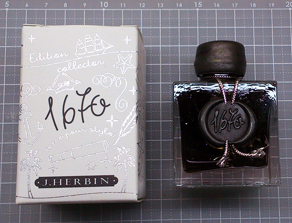
Goulet just put out a sale for the J. Herbin Anniversary 1670 inks. All 5 bottles for $117.00. http://www.gouletpens.com/package-set-jherbin-1670-anniversary-inks/p/Package-JH1670?utm_source=The+Goulet+Pen+Company+Newsletter&utm_campaign=a2f556f044-Thursday_News_08252016&utm_medium=email&utm_term=0_a48958906c-a2f556f044-303798425&mc_cid=a2f556f044&mc_eid=cd57effb34
-
It's that time of year again! Time to "stock up" on your Back to School needs! We offer Notebooks and Journals from Clairefontaine: http://www.federalistpensonline.com/-Clairfontaine-Products_c_81.html Rhodia Pads in all types (Lined, Plain, Grid, Dot): http://www.federalistpensonline.com/-Rhodia-Pads_c_32.html Filofax Refillable Notebooks: http://www.federalistpensonline.com/Fiolofax-A5-Model-Notebook_p_52.html Check Out Our "Pens for Under $25" Tab under Pen Specials! FP Models from Regal, Diplomat, and J. Herbin! http://www.federalistpensonline.com/Pens-25-and-Under_c_105.html Receive and additional 5% Discount with code FPN at Checkout! Authorized Dealer of All New Brands Listed Frank Federalist Pens 866-746-4900
-
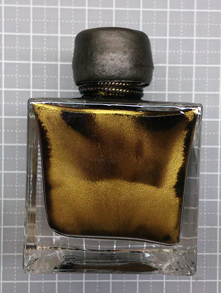
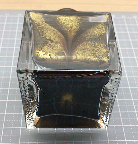
With the demand for certain brands and colors at the DC Show, we had a sell out on most of these items! (We were the only Dealer for Robert Oster Inks at the DC Show- Thank You to Robert Oster for helping to have them rushed to the states in time for the show! Reviews should be coming soon (If not already posted!)- look for them at Fountain Pen Day, and The Well Appointed Desk whom were among first to acquire this ink...) NOW Back In Stock- Robert Oster Signature Ink (US Dealer- 20 Colors in Stock) $18 Each! We carry almost half of the Oster Ink Line- Browse/Buy here http://www.federalis...Inks_c_107.html http://fountainpenclassifieds.com/uploads/monthly_08_2016/post-52-0-51485100-1471717932.jpg Pelikan Edelstein Aquamarine- This is the 2016 Ink of The Year for Edelstein! $25 Each- Everyday! We carry most of the everyday colors, and this LE Ink for this year! Browse/Buy here http://www.federalis...50ml_p_217.html http://fountainpenclassifieds.com/uploads/monthly_08_2016/post-52-0-02828200-1471717893.jpg J. Herbin 1670 (Brown) Caroube de Chypre- The latest color from J. Herbin's Anniversary Line went fast! $25 Each- Everyday! All 1670 Anniversary Inks In Stock now! Browse/Buy here http://www.federalis...Inks_p_182.html (we also stock J. Herbin Inks in the famous 30ml "D" Bottles! Only $12 Each) http://fountainpenclassifieds.com/uploads/monthly_08_2016/post-52-0-81437700-1471717910.png Authorized Dealer
-
As most of you already know in two months J. Herbin will introduce new ink in 1670 glittery line - Caroube de Chypre. That's great. I was afraid that after Diamine Shimmertastic inks mass introduction J. Herbin will have hard time engineering some new color. They've decided to go with brown with goldish particles and named this ink Caroube de Chypre. Mishka from Bureaudirect sent me a sample and I'd like to present some photos and thoughts on the ink. Tghe color can be described as reddish brown. The flow is nice alythough some particles always stay in the feed. Happily they're easy to clean. I'm not crazy about the color but let's be honest 1670 line isn't 100 % about unique color, it's more about beautiful bottle and color / glitter combo. And Caroube de Chypre shines like crazy. Also I'm impressed by J. Herbin marketing - they make people wonder whether they'll see another ink in 1670 line, make them wait impatiently. To be honest it's much better than introducing a lot of special inks at once. Personally I dislike shimering inks and I lack motivation to review all Diamine line. However I'm always eager to try new J. Herbin ink (or Pelikan Edelstein Ink of the Year) because they make me feel it'll be something special. It never is but I wait impatientluy to try it nevertheless Enough talking. Let's take a look at some pictures. Sample vial Ink splashes Drops of ink on kitychen towel Software ID Tomoe River, Kaweco Classic Sport, B Leuchtturm 1917, Kaweco Classic Sport, B Oxford, Hero 5028, stub 1,9 Mini-comparison
-
J. Herbin is a French ink brand, whose history claims to date back to 1670. Besides their shimmery 1670 series and some other special editions, they also have a regular line of 30 colors. All though I'm not a big fan of J. Herbin inks, I actually quite like how they design and sell their products--- the idea is clear and the image depicted is exquisite. All J.Herbin inks are revolving around one theme: a reminiscence of 17th-19th Europe/France. There are inks for the Age of Discovery--- some named after the goods from exotic lands, such as Ambre de Birmanie, Cacao du Bresil, Orange Indien, Lie de The, Cafe de Iles, Terre du Feu, Rouge Caroubier...., and some reflecting on a sailors naval life, such as Gris Nuage, Bleu Azur, Bleu Nuit, Poussiere de lune, Rouille d'Ancre. There are also inks showing the elegant lifestyle of bourgeoisie--- Diabolo Menthe, Bouquet d'antan, Rouge Opera, and some hinting the glorious days of revolution--- Vert Empire, Violette Pensee, Larme de Cassis. And all these inks go with a specially designed bottle and package! http://i.imgur.com/j3AKcGi.jpg Each ink has its own lovely illustration. In Diabolo Menthe's case, it's a glass of diabolo menthe-- a peppermint softdrink which is popular among French students during 19th century. http://i.imgur.com/jZcBYZ8.jpg The shape of the ink bottle is similar to those that navigators use on a ship: flat, in order to stand firmly on the desk even during a storm, and with a groove(?) to hold the pen. Like this. http://i.imgur.com/CW2kP2c.jpg Diabolo Menthe, like its name and package suggest, is a VERY BRIGHT mint blue/green color. For some reason I don't know, this impractical color seems to be popular among Taiwanese FP users, and I have always thought about trying a sample some day. Recently I just received a whole bottle from my sister as a surprise gift! Yay! So here are some writing samples. ***Kind reminder: In order to protect your eyes from burning, a pair of sunglasses is highly recommended. 1. dip pen on white paper http://i.imgur.com/BjXHZxr.jpg 2. dip pen on creamy paper http://i.imgur.com/gWBxGET.jpg 3. dip pen on yellow paper(ROSSI) http://i.imgur.com/TV7qbjd.jpg 4. Dauer Feder on MUJI paper http://i.imgur.com/khpH4K5.jpg droplet on tissue paper http://i.imgur.com/zsrlrQ8.jpg Overview: Color: birght and watery, low saturation. Shading: almost none. Sheen: none. Feathering: some. Bleed-through: almost none. Show-through: none. Flow: dry, not lubricant. Water resistance: none. Conclusion: A color for summer. Probably a nice choice for marking or painting, but PLEASE REFRAIN FROM writing a whole page with this ink, let alone on exam papers/ proposals/ essays/ love letters. I'm glad I didn't pay for this bottle....
-
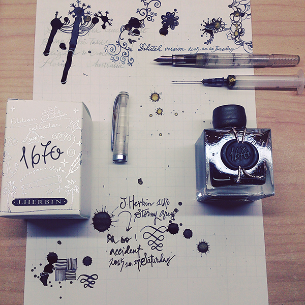
Sorry that the pictures of my last two posts had some problems showing.... This time I'm trying the "Attach files" function and photobucket, hope they both work! (they seem fine in preview, though...) ---------------------------------------------------------------------------------------------------------- J. Herbin 1670 Stormy Grey A grey ink with gold flakes, released in late 2014 by J. Herbin. This is my first bottle of shimmering ink, and I'm sure it will stay on my fascination list for a while. Look at the box and bottle design---even if you are not actually using the ink, it makes perfect decoration on the desk. It's said that the 1670 bottles are handmade, thus imperfectly shaped. I love this. (and I accidentally cracked the seal) There is a thick layer of gold flakes. I tried to take a picture of it but it sank really fast.... ....and formed an interesting pattern.... On cheap calculating paper, with Noodler's Creaper: http://i651.photobucket.com/albums/uu239/chingdamosaic/1670storm08_zpshyqjzjqq.jpg the color is a pure and clean grey, comfortable to read. When it dries, it gets a little brownish or purplish, depends on the paper you use. I didn't give it enough shake, so there weren't a lot of gold flakes here. Only visible at certain angles, http://i651.photobucket.com/albums/uu239/chingdamosaic/1670storm10_zpsbs4vm1rx.jpg or under sun light: http://i651.photobucket.com/albums/uu239/chingdamosaic/1670storm09_zpseoitpgrr.jpg And here is what it looks like if you get too many gold flakes: (with dip pen, on sketch paper) http://i651.photobucket.com/albums/uu239/chingdamosaic/1670storm11_zpsmb6npe2m.jpg You get a thick layer of gold shimmer..... and the grey ink vanishes. BTW, the bottom line is a diluted version; kind of looks purplish. And on another grid paper, with Noodler's Creaper again: http://i651.photobucket.com/albums/uu239/chingdamosaic/1670storm12_zpser4abb8j.jpg close-up 1: the shades http://i651.photobucket.com/albums/uu239/chingdamosaic/1670storm14_zps70ci3zed.jpg close-up 2: shimmer shows when tilting the paper. http://i651.photobucket.com/albums/uu239/chingdamosaic/1670storm15_zpsepobt7qx.jpg close-up 3: more shimmering http://i651.photobucket.com/albums/uu239/chingdamosaic/1670storm16_zpsyzxr4wtn.jpg Water resistance test, on MUJI grid paper with dip pen: http://i651.photobucket.com/albums/uu239/chingdamosaic/1670storm13_zpsovc5rkjo.jpg Unintentional ink drops: http://i651.photobucket.com/albums/uu239/chingdamosaic/1670storm17_zps1o2xdwkp.jpg Doodle with syringe, water, and Noodler's Creaper: http://i651.photobucket.com/albums/uu239/chingdamosaic/1670storm18_zpsfag4kzkd.jpg http://i651.photobucket.com/albums/uu239/chingdamosaic/1670storm20_zps9yair86e.jpg http://i651.photobucket.com/albums/uu239/chingdamosaic/1670storm19_zpsmkwkgzis.jpg http://i651.photobucket.com/albums/uu239/chingdamosaic/1670storm21_zpsnpfbyf37.jpg http://i651.photobucket.com/albums/uu239/chingdamosaic/1670storm22_zpsrnblcjmi.jpg AAAAAND notice the brown/bronze sheen!! (Not gold flakes) I love it but it doesn't appear all the time. And on tissue paper: http://i651.photobucket.com/albums/uu239/chingdamosaic/1670storm23_zpstjul6iae.jpg I'm surprised at the blue and violet hue, because so far these two colors never show on any pen/paper I try with. Conclusion: Very nice ink, with good flow, practical color and beautiful shimmer. Not very hard to clean from the pen. Great decoration on the desk. Recommend!! BUT if you are specifically looking for a "grey ink with gold shimmer," maybe you should check out Diamine Sparkling Shadows first, because I've seen more than one review states that its flow and flakes perform better than J.Herbin Stormy Grey. Thanks for watching this photo-heavy review! I'll end this with an Instagram-filtered pic: For more detailed Chinese review: http://chingdamosaic.blog.fc2.com/blog-entry-55.html
-
http://imageshack.com/a/img909/898/oFbkCv.jpg J. Herbin was established in 1670. M. Herbin was a sailor, and from his many journeys to India he brought back to Paris formulas for manufacturing sealing wax. His special lacquer formula improved the quality of the seals in adhesion and neatness, helping him to become famous throughout the kingdom. J. Herbin is also the oldest name in ink production in the world. By 1700, the company was producing “l’Encre de la Tete Noire,” followed by “Perle des Encres,” (The Jewel of Inks) and “l’Encre des Vaisseaux” (The Ink of Ships). J. Herbin made ink for Louis XIV, and a black ink for the sole use of Victor Hugo, author of The Hunchback of Notre Dame and Les Miserables. These formulas still reside in our company headquarters in Paris. At the moment company belongs to Exaclair Inc, that has rights to brands like Clairefontaine, Rhodia, Brause or G. Lalo. J. Herbin offers 30 standard colors: http://imageshack.com/a/img910/1839/N2gPxp.jpg Additionally every year J. Herbin offers 1670 ink: Rouge Hematite Ocean Blue Stormy GreyThe inks collected in the series have great bottles and contain "goldish" particles. Emeraud de Chivor is quite intriguing. I was sure I wouldn't like it. People would try to talk me into it but I and teals / dark turquoises don't go well together. Surprisingly I find it quite elegant and what I like about my bottle is the fact it seems to contain less "goldish" particles than Bleu Ocean or Rouge Hematite. I haven't shaken the bottle so you won't see amazing effects in my review. But I prefer it this way. Bottle http://imageshack.com/a/img631/967/ArKiYO.jpg http://imageshack.com/a/img631/9510/Y7EqMt.jpg http://imageshack.com/a/img905/9793/XSnKeR.jpg Ink splash http://imageshack.com/a/img633/447/upJ5Jc.jpg Drops of ink on kitchen towel http://imageshack.com/a/img910/8497/qS661F.jpg Software Id http://imageshack.com/a/img903/3489/xa9ysi.jpg Color Range http://imageshack.com/a/img911/2803/NHZrUq.jpg Water resistance http://imageshack.com/a/img911/9955/T17RkP.jpg Tomoe River, TWSBI 580, stub 1,1 http://imageshack.com/a/img901/7350/FhOB1y.jpg http://imageshack.com/a/img905/5708/1m8INF.jpg Rhodia, Hero 5028, stub 1,9 + 1,5 + 1,1 http://imageshack.com/a/img633/6073/6j14Zu.jpg http://imageshack.com/a/img901/7461/78I8nc.jpg Michael R. - a venerable ink enthusiast and enabler's sent me some samples recently. He added a note written with Montblanc Meisterstuck 134 from 1930's. I hope he won't mind I reproduce this part of his note but I find it fascinating how different effects we can have depending on the pen / ink / paper combo. http://imageshack.com/a/img909/1217/Ue835I.jpg http://imageshack.com/a/img912/1235/A787X6.jpg And to finish a photo of the sheen. I took it with some old smartphone, so there's no white balance but you'll see it does shine even while used without stirring the fluid. http://imageshack.com/a/img912/1687/Bi0xiU.jpg
-
Thank you Mishka for sending me this sample:) http://www.jherbin.com/images/logo_ship.jpg J. Herbin is known to be the oldest name in ink production in the world, and their inks 'l'Encre de la Tete Noire", "Perle des Encres," (The Jewel of Inks) and "l'Encre des Vaisseaux" (The Ink of Ships) were produced as early as 1700. M. Herbin was a sailor, and from his many journeys to India he brought back to Paris formulas for manufacturing sealing wax. His special lacquer formula improved the quality of the seals in adhesion and neatness, helping him to become famous throughout the kingdom. J. Herbin is also the oldest name in ink production in the world. By 1700, the company was producing “l’Encre de la Tete Noire,” followed by “Perle des Encres,” (The Jewel of Inks) and “l’Encre des Vaisseaux” (The Ink of Ships). J. Herbin made ink for Louis XIV, and a black ink for the sole use of Victor Hugo, author of The Hunchback of Notre Dame and Les Miserables. These formulas still reside in our company headquarters in Paris. At the moment company belongs to Exaclair Inc, that has rights to brands like Clairefontaine, Rhodia, Brause or G. Lalo. J. Herbin offers 30 standard colors: http://www.zany.co.nz/Images/Assets/2555912/6/J+Herbin+Fountain+Pen+Ink++Available+in+30+Colours.jpg Ambre de Birmanie Bleu Azur Bleu Myosotis Bleu Nuit Bleu Pervenche Bouquet d'Antan Bouton d'Or Cacao du Bresil Cafe des Iles Diabolo Menthe Eclat de Saphir Gris Nuage Larmes de Cassis Lie de The Lierre Sauvage Orange Indien Perle Noire Poussiere de Lune Rose Cyclamen Rose Tendresse Rouge Bourgogne Rouge Caroubier Rouge Opera Rouille d'Ancre Terre de Feu Vert Empire Vert Olive Vert Pre Vert Reseda Violette Pensee Rose Tendresse wasn't made for me. Sorry guys I won't elaborate on this one Ink splash http://imageshack.com/a/img538/5382/g1CeBl.jpg Drops of ink on kitchen towel http://imageshack.com/a/img913/2818/cOINgQ.jpg CIAK, Kaweco AL Sport, B http://imageshack.com/a/img907/6827/p2OkVN.jpg http://imageshack.com/a/img538/2843/mP1au5.jpg Calendar, Jinhao x750 http://imageshack.com/a/img661/9392/c7DYE1.jpg http://imageshack.com/a/img673/3085/5FQM65.jpg Copy paper, Jinhao x750 http://imageshack.com/a/img537/5812/mG7SmB.jpg http://imageshack.com/a/img901/8471/tmwWy4.jpg
-
Thank you Mishka for sending me this sample:) http://www.jherbin.com/images/logo_ship.jpg J. Herbin is known to be the oldest name in ink production in the world, and their inks 'l'Encre de la Tete Noire", "Perle des Encres," (The Jewel of Inks) and "l'Encre des Vaisseaux" (The Ink of Ships) were produced as early as 1700. M. Herbin was a sailor, and from his many journeys to India he brought back to Paris formulas for manufacturing sealing wax. His special lacquer formula improved the quality of the seals in adhesion and neatness, helping him to become famous throughout the kingdom. J. Herbin is also the oldest name in ink production in the world. By 1700, the company was producing “l’Encre de la Tete Noire,” followed by “Perle des Encres,” (The Jewel of Inks) and “l’Encre des Vaisseaux” (The Ink of Ships). J. Herbin made ink for Louis XIV, and a black ink for the sole use of Victor Hugo, author of The Hunchback of Notre Dame and Les Miserables. These formulas still reside in our company headquarters in Paris. At the moment company belongs to Exaclair Inc, that has rights to brands like Clairefontaine, Rhodia, Brause or G. Lalo. J. Herbin offers 30 standard colors: http://www.zany.co.nz/Images/Assets/2555912/6/J+Herbin+Fountain+Pen+Ink++Available+in+30+Colours.jpg Ambre de Birmanie Bleu Azur Bleu Myosotis Bleu Nuit Bleu Pervenche Bouquet d'Antan Bouton d'Or Cacao du Bresil Cafe des Iles Diabolo Menthe Eclat de Saphir Gris Nuage Larmes de Cassis Lie de The Lierre Sauvage Orange Indien Perle Noire Poussiere de Lune Rose Cyclamen Rose Tendresse Rouge Bourgogne Rouge Caroubier Rouge Opera Rouille d'Ancre Terre de Feu Vert Empire Vert Olive Vert Pre Vert Reseda Violette Pensee It will be one of my shortest reviews. Gris Nuage is one of the worst inks I've ever tries. It simply wasn't made for writing. Ink splash http://imageshack.com/a/img856/3299/sxt5.jpg Drops of ink on kitchen towel http://imageshack.com/a/img841/5715/i3ho8.jpg CIAK, Kaweco AL Sport, B http://imageshack.com/a/img909/7138/b4nlCK.jpg http://imageshack.com/a/img540/2396/nA0WxG.jpg http://imageshack.com/a/img909/2254/kGHuJd.jpg
-
Thank you Mishka for sending me this sample:) http://www.jherbin.com/images/logo_ship.jpg J. Herbin is known to be the oldest name in ink production in the world, and their inks 'l'Encre de la Tete Noire", "Perle des Encres," (The Jewel of Inks) and "l'Encre des Vaisseaux" (The Ink of Ships) were produced as early as 1700. M. Herbin was a sailor, and from his many journeys to India he brought back to Paris formulas for manufacturing sealing wax. His special lacquer formula improved the quality of the seals in adhesion and neatness, helping him to become famous throughout the kingdom. J. Herbin is also the oldest name in ink production in the world. By 1700, the company was producing “l’Encre de la Tete Noire,” followed by “Perle des Encres,” (The Jewel of Inks) and “l’Encre des Vaisseaux” (The Ink of Ships). J. Herbin made ink for Louis XIV, and a black ink for the sole use of Victor Hugo, author of The Hunchback of Notre Dame and Les Miserables. These formulas still reside in our company headquarters in Paris. At the moment company belongs to Exaclair Inc, that has rights to brands like Clairefontaine, Rhodia, Brause or G. Lalo. J. Herbin offers 30 standard colors: http://www.zany.co.nz/Images/Assets/2555912/6/J+Herbin+Fountain+Pen+Ink++Available+in+30+Colours.jpg Ambre de Birmanie Bleu Azur Bleu Myosotis Bleu Nuit Bleu Pervenche Bouquet d'Antan Bouton d'Or Cacao du Bresil Cafe des Iles Diabolo Menthe Eclat de Saphir Gris Nuage Larmes de Cassis Lie de The Lierre Sauvage Orange Indien Perle Noire Poussiere de Lune Rose Cyclamen Rose Tendresse Rouge Bourgogne Rouge Caroubier Rouge Opera Rouille d'Ancre Terre de Feu Vert Empire Vert Olive Vert Pre Vert Reseda Violette PenseeI know many people find J. Herbin inks too muted and boring but I enjoy most of them. I believe J. Herbin makes amazing and unique ink, however I don't like some of their colors. Bouquet d'Antan is strange color. It's sort of subtle, vintage pink. I don't like it but I don't hate it Ink splash http://imageshack.com/a/img538/3954/cnMBMH.jpg Drops of ink on kitchen towel http://imageshack.com/a/img540/7271/RGxADb.jpg Software ID http://imageshack.com/a/img673/1269/L2Ve2R.jpg Waterproofness Oxford notebook, Visconti Van Gogh, F http://imageshack.com/a/img661/3430/gNAfNT.jpg http://imageshack.com/a/img661/5671/SG2U9R.jpg http://imageshack.com/a/img540/226/eU85eh.jpg Copy paper, Visconti Van Gogh, F http://imageshack.com/a/img673/1232/5nWCGU.jpg http://imageshack.com/a/img908/1639/eLc4eE.jpg http://imageshack.com/a/img538/4139/V4Stl7.jpg Midori, Visconti Van Gogh, F http://imageshack.com/a/img540/9933/pZTMq0.jpg http://imageshack.com/a/img540/3463/R9DeHT.jpg http://imageshack.com/a/img540/5696/KpxRFi.jpg CIAK, Visconti van Gogh, F http://imageshack.com/a/img537/4676/3vBW4H.jpg http://imageshack.com/a/img673/4820/DkhtP4.jpg http://imageshack.com/a/img537/6523/LNdqSk.jpg
-
http://www.jherbin.com/images/logo_ship.jpg J. Herbin is known to be the oldest name in ink production in the world, and their inks 'l'Encre de la Tete Noire", "Perle des Encres," (The Jewel of Inks) and "l'Encre des Vaisseaux" (The Ink of Ships) were produced as early as 1700. M. Herbin was a sailor, and from his many journeys to India he brought back to Paris formulas for manufacturing sealing wax. His special lacquer formula improved the quality of the seals in adhesion and neatness, helping him to become famous throughout the kingdom. J. Herbin is also the oldest name in ink production in the world. By 1700, the company was producing “l’Encre de la Tete Noire,” followed by “Perle des Encres,” (The Jewel of Inks) and “l’Encre des Vaisseaux” (The Ink of Ships). J. Herbin made ink for Louis XIV, and a black ink for the sole use of Victor Hugo, author of The Hunchback of Notre Dame and Les Miserables. These formulas still reside in our company headquarters in Paris. At the moment company belongs to Exaclair Inc, that has rights to brands like Clairefontaine, Rhodia, Brause or G. Lalo. J. Herbin offers 30 standard colors: http://www.zany.co.nz/Images/Assets/2555912/6/J+Herbin+Fountain+Pen+Ink++Available+in+30+Colours.jpg Ambre de Birmanie Bleu Azur Bleu Myosotis Bleu Nuit Bleu Pervenche Bouquet d'Antan Bouton d'Or Cacao du Bresil Cafe des Iles Diabolo Menthe Eclat de Saphir Gris Nuage Larmes de Cassis Lie de The Lierre Sauvage Orange Indien Perle Noire Poussiere de Lune Rose Cyclamen Rose Tendresse Rouge Bourgogne Rouge Caroubier Rouge Opera Rouille d'Ancre Terre de Feu Vert Empire Vert Olive Vert Pre Vert Reseda Violette PenseeI know many people find J. Herbin inks too muted and boring but I enjoy most of them. I believe J. Herbin makes amazing and unique ink. What can I say abnout Diabolo Menthe? Well, I hate everything about it. Bright turquoise is my least favourite color. No. It's much more. It's the color that hunts me in my nightmares. For me Diabolo Menthe is the incarnation of ugliness. Not only it's similar in color to Triton's palace floor but it's also weakly saturated and pastel. Take it away from me. Please. Someone really evil-minded has offered me the bottle. Some people are like that. http://imageshack.com/a/img540/8674/E6cOeq.jpg Ink splash http://imageshack.com/a/img537/2176/00c89o.jpg Drops of ink on kitchen towel http://imageshack.com/a/img673/7491/j0Fl81.jpg Software ID http://imageshack.com/a/img673/4002/DouOXC.jpg Waterproofness http://imageshack.com/a/img911/6913/WMUH06.jpg Clairefontaine, Kaweco Sport Classic, B nib http://imageshack.com/a/img673/8758/LxpBpY.jpg http://imageshack.com/a/img673/5818/JpfHGc.jpg Semikolon, Kaweco Sport Classic, B It looks greener on absorbent cream paper http://imageshack.com/a/img910/3087/WYanfP.jpg http://imageshack.com/a/img912/9452/iDPVOn.jpg http://imageshack.com/a/img538/7637/29m3su.jpg Drawing http://imageshack.com/a/img540/8761/X3a3V8.jpg