Search the Community
Showing results for tags 'j herbin'.
-
To follow on from the amazing Emerald de Chivor was always going to be a challenge but J Herbin haven’t done a bad job. It’s a lovely bark brown, the gold works well and there’s a wonderful metallic green sheen in the heavier inked areas. When blended with water the colour breaks down into a salmon pink with hints of beige at the outer edges. When subjected to bleach, there is a reaction in the very light patches but nothing happening in the darker areas. The J Herbin 1670 Caroube de Chypre is a good addition to the 1670 range but in my opinion it doesn’t trump Emerald de Chivor. If J Herbin are looking for another colour to add, might I suggest a magenta/purple as this could be a fantastic complimentary colour for the Emerald de Chivor. And just imagine how visually exciting the combination could be? Many thanks to Sam Bell at Exaclair for sending me a bottle of the new J Herbin 1670 Caroube de Chypre. Test conducted on Bockingford watercolour paper. For image click: https://quinkandbleach.wordpress.com/2016/06/08/j-herbin-1670-caroube-de-chypre-ink-test/
-
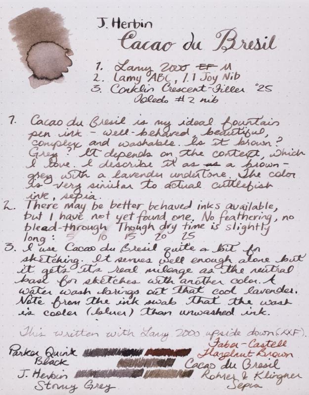
Forgive my reviewing an ink that has been reviewed thoroughly before. This is my first review and I wanted to start with an ink that I have a lot of experience with. The written review was done in the Rhodia dotpad. The Titmouse sketch was done with J. Herbin's Terre de Feu and Cacao du Bresil in a Stillman & Birn Gamma Series sketchbook. Edited to add color wash detail, which I previously forgot to upload. Reasonable care was taken to ensure color accuracy.

-
Hi folks, we just got back from London Stationery Show and got some amazing news for you J Herbin have announced the new colour for 1670 Anniversary range: Caroube de Chypre Here is the short info we were given by lovely people from J Herbin: "It is said that J. Herbin was very fond of dried carob pods and that is the reason he lived so long!As the other merchants sailing the Mediterranean sea, he would pick them up in Cyprus, on his way back home.The carob bean is the fruit of the carob tree and was cultivated in the Mediterranean countries since ancient times..Carob pods are known for their great therapeutic properties and were marketed throughout Europe as the “black gold of Cyprus”.This new Anniversary ink is called “Caroube de Chypre” because of its intense and deep brown with a hint of red, and of course its gold specks". The official launch date is 14th of July 2016. J Herbin have a very solid brown line-up, so creating a red-brown with gold specs sounds amazing!!!! What do you think? All the best, Mishka
-
I have decided to review some of my many inks. These aren't necessarily in any particular order. This one is J Herbin Terre de feu Terre de feu (Tierra Del Fuego or Land of Fire): Land of Fire (Tierra del Fuego in Spanish) is the name of an archipelago off the southernmost tip of the South American mainland. Divided between Argentina and Chile, the main island is known as Land of Fire and also composed of a group of smaller islands. This brown ink has a red tone a reminder of the burnt lands and vast deserts where nothing ever grows. This isn't a waterproof or an archival inkBearing in mind the paper I use is very smooth, this ink took 13-16 secs to dry.It flows well and lubricates the nib quite well.It is currently available in sampling packs of 4 x 10ml mini glass bottles and 30ml D bottles. Each bottle of 30 ml has an integrated pen rest. They are known as “D bottle pen inks. The “D” refers to the old French unit of measure “la Demi Courtine”.It's available from many B&M shops and online retailers worldwide. J. Herbin is the oldest name in pen inks in the world. M. Herbin created “The Jewel of Inks” in his shop on the Rue des Fosses Saint-Germain in Paris in 1700. Herbin uses all natural dyes in their fountain pen inks. This natural composition is reflected in the very neutral pH of the inks. From the beginning, J. Herbin distinguished itself from its competitors by offering a wide range of colors for the fountain pen inks. In 2007, 4 new colors were introduced which brought a total of 30 references of various colors. The names chosen for each color are very poetic to preserve the originality of the brand and as a French tradition.
-
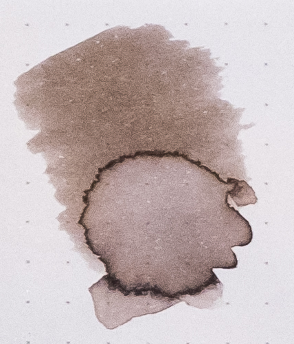
Cacao du Bresil is my most used ink. I keep it in my daily carry pen 90% of the time. It is so versatile, understated and beautiful. If you can't tell, I quite like it. Warbler sketch was done with Cacao du Bresil, J. Herbin Terre de Feu and Rohrer & Klingner Alt-goldgrun in a Stilman and Birn Gamma Series sketchbook. Reasonable care was taken to ensure color accuracy.
-
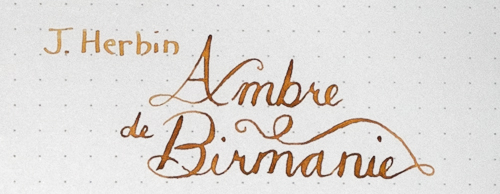
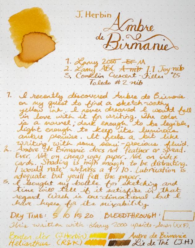
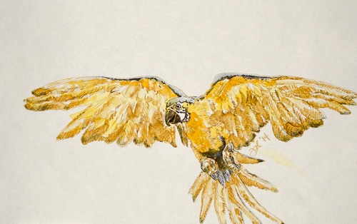
I am seriously in love with this ink. It will be in my daily carry pen for a while. Or at least until my bottle of Shin-kai arrives. This ink loves a dip pen, too. Forgive my heavy-handed example above, but perhaps you can see the promise. In better hands, this would be remarkable dipped. Sketch was done with Ambre de Birmanie, J. Herbin Bouton d'Or (the most useless ink I've ever put in a pen) and a touch of Iroshizuku Shin-kai. Not a success but that is hopefully more my total lack of experience with these three inks than anything else. I still have hope. Reasonable care was taken to ensure color accuracy.
-
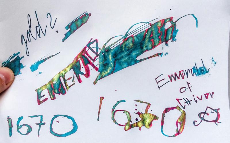
Recently, I stumbled across something called Emerald of Chivor by J. Herbin. media source: http://edjelley.com/2015/06/24/j-herbin-1670-emerald-of-chivor-ink-review-video/ Apparently this ink had a bluish base with a gold and red sheen (but seems to dry blue. correct me if im wrong about the drying) I have never used any ink like this (but I have the Sakura Gelly Roll Dual Color, which performs the same) http://56.media.tumblr.com/4a1b7c1c338b96a62e06398dbc2de56b/tumblr_o00tz27BCX1s6de78o1_1280.jpg This image is Pilot Iroshizuku Momiji, which I didn't know had a sheen. I'm curious about knowing how many of inks of this type are out there. If you know of a sheen ink, list it below! If you have any of them, how do they perform? Do you have a favorite?
-
So my best friend gifted me with a most beautiful bottle of J Herbin 1670 stormy gray and I haven't a clue as to how to open the wax seal and then how to cap it afterward. I did a search and came up with nothing. Does anyone know the trick? I almost hate to use it for fear of butchering it.
-
Disclaimer A: This is most likely the wrong section. Moderators, if you feel this belongs in chatter please move it! Disclaimer B: This is most likely going to sound like pure meaningless gushing. Sorry. As a high school student, I am definitely in the minority of pen type. Luckily, my friends tolerate my fountain pen obsession (it entertains them). I've even tried to convert a couple of them to fountain pens (to no avail). Today, a day before Christmas break, we were exchanging our Christmas gifts with each other. My girlfriend presented me with a small, heavy box. I was thoroughly confused. The box was quite heavy for such a small size. As I quizzically unwrapped it, my eyes began to glow. She got me a bottle of Emerald of Chivor!!! I had been meaning to get some for myself, but I impulsively bought a Kindle Fire with my pen budget, which, being a high school student, is quite low. The ink is amazing, and I'm super happy that she took the time to track it down. I had mentioned a "green ink with gold sparkles." This one's a keeper! Edited because I had typed ones instead of one's and it was bothering me.
-
http://i900.photobucket.com/albums/ac209/jasonchickerson/_FUJ0651.jpg http://i900.photobucket.com/albums/ac209/jasonchickerson/_FUJ0651-2.jpg http://i900.photobucket.com/albums/ac209/jasonchickerson/_FUJ0650.jpg http://i900.photobucket.com/albums/ac209/jasonchickerson/_FUJ0650%20copy.jpg http://i900.photobucket.com/albums/ac209/jasonchickerson/_FUJ6440_1.jpg Valentine Card, Rouge Hematite with R&K Alt-goldgrün Card is OCM Pure Cotton paper, Envelopes are OCM Classic Laid paper In expectation of my bottle of Emeraude de Chivor arriving in the mail, I decided it was past time to review its sister, Rouge Hematite. Rouge Hematite is a really interesting ink that I use almost exclusively for card-making. It simply dips better than any other ink out there and the green-gold sheen looks magical when you lay down a lot of ink. It is very staining, though, and ink gets on fingers and transfers back to paper terribly easily. I've ruined more than a few attempts through smudgery. As mentioned in the review, it smears, too. I kept it in my daily carry Lamy 2000 for a few days while writing this review. Thankfully, the gold glitter does not come across strongly in that pen, so it can be used as any other red ink, and does a fine job at that. I have not had any problems with clogging. While I don't really enjoy using red on a daily basis, the performance of this one is quite good. Care was taken to ensure color accuracy, but with an ink like this, where view angle and light source matter a great deal (see second and third pics), what you see may not be what you get when you try it for yourself. EDIT TO ADD: I should point out that my bottle is the fourth iteration of Rouge Hematite, purchased from Goulet Pens toward the end of 2014.
-
http://i900.photobucket.com/albums/ac209/jasonchickerson/_FUJ0628.jpg http://i900.photobucket.com/albums/ac209/jasonchickerson/_FUJ0628-3.jpg http://i900.photobucket.com/albums/ac209/jasonchickerson/_FUJ0628-4.jpg http://i900.photobucket.com/albums/ac209/jasonchickerson/_FUJ0628-2.jpg http://i900.photobucket.com/albums/ac209/jasonchickerson/_FUJ0635-Edit.jpg Vert Olive (and Sailor Cigar) with Zebra "G" nib on Original Crown Mill Pure Cotton paper This one has it all. Beautiful, in the sweet spot for wetness, great behavior on all paper, and it dips and draws well. The only drawback to Vert Olive is that you must use it in a broad/wet pen for legibility. My Lamy 2000, which is a 5/10 for wetness and has a custom polished M nib, doesn't make the cut for legibility. Holy smokes, look at that "Vert Olive" in the title. My heart races. Olive drawing is kinda crappy, not due to a flaw in the ink, but because I pushed the limit on the number of washes the OCM Pure Cotton paper can handle. Sailor Cigar was used only for the very darkest of shadows. Care was taken to ensure color accuracy, etc.
-
Here's my review of the new version of J. Herbin Bleu Ocean 1670 that contains the long awaited gold pigment. As far as appearances go, the new version looks worlds better just with the inclusion of the gold, but it's still nowhere near as well behaved as Rouge Hematite. But it's definitely worth the money just based on its uniqueness! Here's my review of the original Bleu Ocean 1670 formula (please scroll all the way down for a more recent scan as the old scan has a horrible magenta color cast and isn't accurate), here's my review of the related Stormy Grey 1670, and here's my review of Rouge Hematite 1670 (the original formula—the most recent is the fourth version). I'll be adding some more pictures tomorrow. http://imagizer.imageshack.us/v2/xq90/537/GssLXb.jpg http://imagizer.imageshack.us/v2/xq90/540/mjHiMP.jpg http://imagizer.imageshack.us/v2/xq90/661/gn252A.jpg
-
I have been fortunate enough to receive a bottle of J Herbin 1670 Emerald of Chivor to review. It's my understanding that it's due to be released in August. So I'm going to write with it over several days and post my experiences on this thread. I have filled my Pilot Custom 74 M nib with it so far, so this is the pen I'm using today. However, I can easily change that M nib to a F one from my CH92, so I plan to do that as a comparison. Then I will use a different pen and nib type. First things first, this ink oozes quality. It feels beautifully smooth and lubricated from the pen. It is very saturated and shows lots of different shading, as well as it's sheen. In my opinion it isn't what I would call an emerald colour, as I think of emeralds as a vibrant green. This ink is teal blue-green. When I started writing with it I thought I must compare the colour to that of Sailor Yama-dori, so that's something I will add over the course of the next few days. I've now edited this to include a short comparison with sailor Yama-dori, plus I've attempted to show the fabulous sheen.
-
We just got another shipment of J Herbin 1670 Emerald of Chivor ink and it is now back in Stock! Get it while it lasts
-

Final Hours For Massdrop J Herbin Cartridges + Rollerball Pens
stevesurf posted a topic in Market Watch
Hi folks, I know this is short notice, but I just saw this drop, very unique combination of J Herbin Ink cartridges + J Herbin rollerballs and an option for those tiny Monteverde mini cartridge converters. Sometimes you need a rollerball https://www.massdrop.com/r/KVSFPP -
Well have a look at this beauty, Available in August. http://1.bp.blogspot.com/-pP-o-d-1okY/VYL99b8o5bI/AAAAAAAACHw/V-b16sJEVAs/s1600/jherbin-1670-emerald.jpg
-

J Herbin Emerald Chivor In Stock At Goulet
accusedofhavinaricholdmanhobby posted a topic in Market Watch
In stock at Goulet Pens! no affiliation -

J Herbin 1670 Emerald Of Chivor Ink Is Now Available For Pre-Order
bureaudirect posted a topic in The Mall
Dear FPN friends, we have some fantastic news for you!!!! J Herbin's latest ink from 1670 Anniversary range: Emerald of Chivor is due in about a week (August 2015). We are taking pre-orders here and will ship as soon as the ink comes in Mishka
-
J HERBIN’S LIE DE THE J HERBIN’S LIE DE THE. Bottled ink. Bought from Pen’s Avenue. 30 ml 695 Rs. A good source for imported inks in India. No affiliations, happy customer. The review goes like this. The bottle is simple. Square base, low height. Stable bottom. Less chance to get spill over. Convenient on busy tables. The slot for keeping a pen,a nice thought. INTRODUCTION Well, I find that all J Herbin’s inks are based on a theme. Here the theme ( I believe) is coffee mug. There are some similarities between coffee and this ink – both are ADDICTIVE!. Addictive by COLOR, addictive by SHADING. COLOR Probably the nicest brown I have seen. I am not saying that Ancient Copper is bad.But unlike Ancient Copper, there is no crusting seen on nibs, so this naturally becomes my favorite brown. SHADING See the beautiful shading especially with broader nibs. COLOR ANALYSIS This is the swab to analyse. The color is an Orange on darker side. Consists of more Red, least Blue and Green in between. A simple chromatography shows that ink is made of 3 dye components, one Black, one Orange and probably one Yellow also. Diluted with water From Left to Right Lesser concentration of ink shows yellowish shade, as the concentration increases it becomes more darkish and coffee like. COLOR ON PAPER FINE NIB ( Notice shading) MEDIUM NIB. BROAD NIB. PROPERTIES IN PEN. This is a reasonably saturated ink having good lubricating properties. The flow may be some where in between that of well flowing inks and moderately flowing inks. Compared to Chelpark Crimson Violet which itself is a well flowing but lesser saturated ink. Same paper, same italic nib, same pen – I find the JH- LDT is a tad thinner on paper. But easy on hands, though saturated, it’s more lubricated. Camlin Trinity, Fine nib. Lamy safari, medium nib. KIM, Medium CI nib. No staining on the White Lamy I am using, No nib creeps. Worked well with a variety of Indian eyedroppers, Pilot Capless, Platinum balance, Heros, Pelikan m 200. No issue happened in a single pen. PROPERTIES ON PAPER SHADING PROBABLY THE MOST IMPORTANT PROPERTY OF THIS INK. Shades beautifully on papers. DRYING Reasonably fast drying. No complaints here. FEATHERING No practical feathering. This is a magnified image. Ink has with stood many cheap A4 and cheaper papers. BLEEDING I have to say that bleeding is seen to an extend ( called as ghosting?) in even Jk Excel Bond paper, which is supposed to be a good paper. This may be the only real negative property associated with this ink. WATER RESISTANCE Sample shown under flowing water for 10 seconds with in one hour after writing. Sample just wetted with one drop of water with in one hour after writing. The ink can not be called as water resistant. Though all components are not washed off, especially the dark dye component. Thanks SK.
-
This ink makes me go om nom nom. Such a unique shade of brown, fairly (and superficially) comparable to Noodler's Whaleman's Sepia, it's a dusky, ashen brown with a lot of personality. http://imagizer.imageshack.us/v2/xq90/901/WPmJjs.jpg
-
I have decided to review some of my many inks. These aren't necessarily in any particular order. This one is J Herbin Eclat de saphir (Sapphire blue): Eclat de saphir (Sapphire blue): Sapphire is a gemstone. The terminology probably comes from 2 origins: the Greek with “sappheiros” (a stone of blue color) or from the Hebrew “sappir” (the most beautiful thing). This color is a reminder of J. Herbin and his work at the most prestigious royal courts of Europe. From the beginning, J. Herbin distinguished itself from its competitors by offering a wide range of colors for the fountain pen inks. In 2007, 4 new colors were introduced which brought a total of 30 references of various colors. The names chosen for each color are very poetic to preserve the originality of the brand and as a French tradition. This isn't a waterproof or an archival inkBearing in mind the paper I use is very smooth, this ink took 13-16 secs to dry.It flows well and lubricates the nib quite well.It is currently available in sampling packs of 4 x 10ml mini glass bottles and 30ml D bottles. Each bottle of 30 ml has an integrated pen rest. They are known as “D bottle pen inks. The “D” refers to the old French unit of measure “la Demi Courtine”.It's available from many B&M shops and online retailers worldwide. J. Herbin is the oldest name in pen inks in the world. M. Herbin created “The Jewel of Inks” in his shop on the Rue des Fosses Saint-Germain in Paris in 1700. Herbin uses all natural dyes in their fountain pen inks. This natural composition is reflected in the very neutral pH of the inks.
-
I have decided to review some of my inks. These aren't necessarily in any particular order. This is a particular favourite. It has many fans, and rightly so, it's a lovely ink to use and to look at. This one is J Herbin Poussiere de lune (Moondust Purple) J. Herbin is the oldest name in pen inks in the world. M. Herbin created “The Jewel of Inks” in his shop on the Rue des Fosses Saint-Germain in Paris in 1700. Herbin uses all natural dyes in their fountain pen inks. This natural composition is reflected in the very neutral pH of the inks. Each bottle of 30 ml/1 oz ink is elegantly labeled and has a pen rest. They are known as “D bottle pen inks.” The “D” refers to the old French unit of measure “la Demi Courtine.” "Poussière de lune (Moondust purple): A very poetic name, the color of the night when only the crescent moon is glowing in the dark." I'm not sure that I have seen that many night skies that are this lovely purple colour. I shall just wish. http://fpgeeks.com/forum/images/smilies/smile.png This isn't a waterproof or archival ink.Bearing in mind the paper I use is very smooth, and the nib was a medium round, this ink took 16-17 secs to dryIt flows slightly wet. I feel that lubrication was OK because of the paper. However, I noticed a little feedback with the pen.It is currently available in 10ml sample glass bottles and 30ml glass D bottles.It is widely available from many B&M shops and online retailers worldwide.
-
Water Resistance Tests On Blue Paper, Noodler's Iroshizuku Herbin Pr
Intellidepth posted a topic in Inky Thoughts
Water resistance tests on Reflex Blue copy paper (ie not white). 1 minute under running tap water. Selection of currently inked pens and personally preferred ink blends written with dip nib. Mostly Noodlers CMYK blends, a few Iroshizuku, one Private Reserve (Ebony Purple), and couple of J Herbins. Interesting outcome for one commercial ink and for a couple of blends. Noodler's Yellow: check out the paper bleaching after 1 minute rinse (third link below). Unexpected. Wouldn't have shown up if I had used white paper. While damp, I held the paper to the light to check it out, and the bleached areas appeared semi-translucent. The other Noodler's colours didn't have this effect and showed the regular type of behaviour I expected to see (Shah's Rose, Navajo Turquoise, and Bulletproof Black). My Noodler's 'random blend' (first link below) with black, navajo turquoise, shah's rose, xanthan, and titanium white luster was also a surprise. This was the dregs of a few xanthan x luster experiments, and had a much higher proportion of Bulletproof Black in it than any of my other CMYK blends shown in these water tests. There was a *lot* of luster in this ink as can be seen on the unrinsed side - the base ink is actually a very dark purple when wet, and it dries up to that very pale purple due to luster coverage. After rinsing, the lustre still adhered quite solidly in some areas; even in the faded areas an equivalent amount of 'faded' luster still adhered. Will post a close up shot later in the xanthan thread. I'm curious about this behaviour. Summer Lustre: Another ink blend with xanthan x titanium white luster, however did not behave in the same way as the 'random blend' with bulletproof - so there appears to be an interaction of some sort that occurred between bulletproof, xanthan, and luster, or maybe just bulletproof and luster in the 'random' blend. (FYI The plain ink version of Summer Lustre is shown just above and is called 'Sunset'.) If a blend interests you let me know and I'll post up the specifics. However as these tests are all on blue paper, they'll look different on white paper. Someday I'll get around to posting examples and ratios on white (ink cards are in the making). These are big image files. https://www.fountainpennetwork.com/forum/uploads/imgs/fpn_1429165382__image.jpg https://www.fountainpennetwork.com/forum/uploads/imgs/fpn_1429165539__image.jpg https://www.fountainpennetwork.com/forum/uploads/imgs/fpn_1429165639__image.jpg -
I found a stash of old reviews that got misplaced during a house move, so this one's a bit old. Still a great ink though! http://imagizer.imageshack.us/v2/xq90/913/XQv830.jpg
-
I haven't written a review or posted a new review in a while, so I thought I'd go a little beyond what I used to do (and enjoy my new scanner I got for digitizing old Kodachrome slides, which happens to also scan about ten times faster than my old one …) http://imagizer.imageshack.us/v2/xq90/540/MtlGRx.jpg http://imagizer.imageshack.us/v2/xq90/537/BJ12xk.jpg http://imagizer.imageshack.us/v2/xq90/537/n7rYOT.jpg http://imagizer.imageshack.us/v2/xq90/909/MkBNqA.jpg http://imagizer.imageshack.us/v2/xq90/909/LhjoI7.jpg http://imagizer.imageshack.us/v2/xq90/661/wlUIP3.jpg http://imagizer.imageshack.us/v2/xq90/673/sjqrfx.jpg http://imagizer.imageshack.us/v2/xq90/540/OLx2q3.jpg http://imagizer.imageshack.us/v2/xq90/901/xZdVPz.jpg http://imagizer.imageshack.us/v2/xq90/674/Q7jTQe.jpg http://imagizer.imageshack.us/v2/xq90/674/D6K2gp.jpg http://imagizer.imageshack.us/v2/xq90/661/DhlZpO.jpg http://imagizer.imageshack.us/v2/xq90/538/lFZXhg.jpg http://imagizer.imageshack.us/v2/xq90/661/681l3g.jpg http://imagizer.imageshack.us/v2/xq90/661/kSPDNA.jpg http://imagizer.imageshack.us/v2/xq90/540/vVifeI.jpg http://imagizer.imageshack.us/v2/xq90/540/hGpCZO.jpg http://imagizer.imageshack.us/v2/xq90/674/cSdJfx.jpg http://imagizer.imageshack.us/v2/xq90/661/7S4aKx.jpg And some obligatory bottle shots. http://imagizer.imageshack.us/v2/xq90/631/WeE0Tx.jpg http://imagizer.imageshack.us/v2/xq90/538/K69BjR.jpg Stormy Grey's metallic component is much more mobile in the bottle, and as a consequence takes much less time to fully integrate by shaking the bottle. http://imagizer.imageshack.us/v2/xq90/746/ofYoGc.jpg http://imagizer.imageshack.us/v2/xq90/540/xWriyB.jpg http://imagizer.imageshack.us/v2/xq90/631/brfiaX.jpg http://imagizer.imageshack.us/v2/xq90/901/NXRtia.jpg There is some buildup in pens, but after a week of testing I haven't encountered one clog. http://imagizer.imageshack.us/v2/xq90/673/0lyll0.jpg http://imagizer.imageshack.us/v2/xq90/537/N9wYoS.jpg http://imagizer.imageshack.us/v2/xq90/538/ASpqS4.jpg While I think I still like Rouge Hematite more, this ink is a must buy. Well done to J. Herbin for making up for the disapopointment that was Bleu Ocean.