Search the Community
Showing results for tags 'j herbin'.
-
-
Hello, I got a sample of J. Herbin Rouge Hematite 1670 recently and I just love the color. It's the perfect red! The problem is the gold flecks in the ink clog my pens pretty terribly. I don't really think the ink is improved by the gold since the red is perfect as it is (to me at least). I was wondering if anyone could suggest a similar red (sans gold flecks) that might behave better in my pens. Thanks!
-
I've long wanted to do a quick review of Myosotis, it's one of my oldest inks but it never looked quite how I thought it could, it came out pale and boring as in most reviews, close to Ajisai but without its vibrancy. I finally spread the tines a little, which usually ends in tears but this time worked: still dusky but looks a lot darker, a lighter, duskier cousin to Pelikan's Königsblau. The comparison with other purplish blues might be on interest: Asa Gao, Ajisai, Tsuyu Kusa; the latter doesn't look purplish at all until you put it in turn next to greenish blues... As a bonus this ink seems to make its Lamy Vista write smoother than most of its six other siblings.
-
My Lamy Vista with J Herbin Rouge Hematite refused to start even though I filled it recenlty, but had not used it since; it's not a big drama this time as I've come to expect this ink clogging the pen. After cleaning it and getting stained in loud pink remains, I realized the bottle is 2/3 gone, and I haven't really used this ink, I've managed to write a paragraph here and there before moving on to another one. I believe in only buying something to be used but this ink makes me a gear hoarder (the horror); but what's worse I'm already thinking of buying it again, in spite of the high maintenance, the random variations on the same page, which makes me feel this is some sort of Stockholm syndrome, with me as the hostage to this terrorist ink. It even seems to have a mind of its own: here it decided "whom" should look different from every other word on the page... How did I get here?? Anyone else being derailed by their medium of choice? No disrespect intended to ink collectors.
-
-
-
I found a stash of old reviews that got misplaced during a house move, so this one's a bit old. Rouille D'ancre is one of my favorite "not for everyday use" inks. It's a bit dry when writing, but this color is completely unique. http://imagizer.imageshack.us/v2/xq90/673/93tSKo.jpg
-
-
-
-
-
Close but not the same. Look at the chromo's! J Herbin Vert Pre Diamine Spring Green
-
-
-
I'd been meaning to do this comparison for some time, but either didn't have the time, some pens wouldn't cooperate, or the inks wouldn't come out as I thought they should. Missing are Vert Empire and Perle Noire, orphaned by an uncooperating Kaweco Sport and a Penmanship's converter I gave away. I have learned a lot on these forums so I hope this also helps others, particularly when comparing specific inks, like blue greens, blue purples, reds and oranges. The paper is HP 32 lbs, which all pens glide on, except for the Waterman le Man 100 with Mandarin which doesn't like this paper and sometimes stops flowing - there is always one! Oh and a Platinum Cool only starts reliably upside down, on any paper, I thought I'd cured it but nope. The differences between Souten, Kon Peki and Équinoxe 6 are subtle, and depend greatly on the nib and paper, and even on the pen and the time of day, as evaporation will change their colour drastically; but to my eye they clearly go from more blue to more green; they are all spectacular, Souten does have a funky smell, luckily I have a cold so I can't smell it as much right now, none of my other inks smell of anything. Some inks just make their pens glide, particularly Verde Muschiato and Verdigris. Some inks took a long time to show their true tone, like Myosotis (can look too dark, turns into a blue black), Lie de Thé (can look like milk chocolate), Orange Indien looks spectacular in this nib, a lot more boring with finer.
-

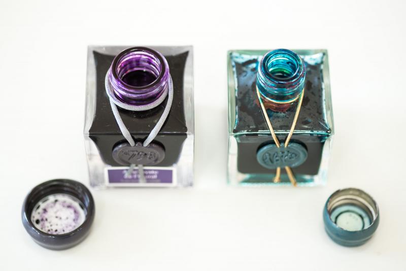
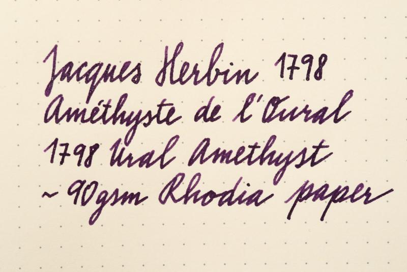
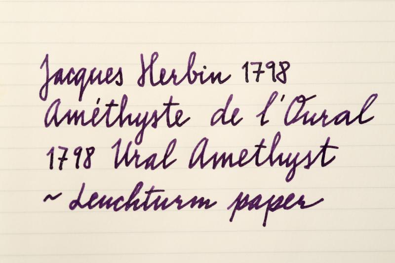
Jacques Herbin 1798 Amethyste De L'oural / Ural Amethyst
bureaudirect posted a topic in Inky Thoughts
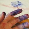
Hi folks, It's 2nd of August and we can finally talk about this amazing new anniversary ink I'll start it all off with official info first: The box is now a smart grey with purple label and white writing. It does stand out nicely on plain background. Overall design looks more mature and reminds me of perfume bottle packaging. Capacity stays the same - 50ml of silver sheen enhanced ink aka superink. J Herbin listened to feedback and changed the bottle neck - it has new, wider, 2cm opening. Thumbs up! The new bottle is slightly bigger, but the shape remains the same. Cap is covered in purple wax. A shiny looking scarf goes around the bottle neck and suits it very well. I wonder if Jacques himself was so lavishly dressed! On the front there's the 1798 stamp which ties up the scarf and a colour label underneath with the ink name - Améthyste de l'Oural. To finish it all off, the glass on the bottom of the bottle is embossed with Jacques Herbin and his mighty ship. ....And now for the ink itself Colour of Ural Amethyst is everything we wanted - regal, majestic, dark, mysterious purple. This is the first time J Herbin used silver particles - previous 1670 range of inks used only gold. The ink is amazing - the more I use it, the more I love it. I have left it in the pen for a week or so - there were no hard starts, pen started writing immediately. The particles move quickly and distribute very well. That said, the bottle needs shaking before inking (as usual) and turning the pen in hand before writing will make a huge difference to the shimmer. Now to the main point, how it writes... I did some comparisons with other purple inks and paper from Rhodia, Leuchtturm and Tomoe River. You will hardly notice the green sheen, that is mainly just eye candy from using special paper. As always, the shine does depend on the viewing angle and light source etc but the silver effect is superb though - highlighting the dark tones of the deep purple body beautifully. I think I've fallen in love again... Official release day is 1st September 2017. What do you think? Will this ink top the popularity of Emerald of Chivor?? Enjoy
-
The work shown is all achieved using fountain pen inks and bleach. If you'd like to know more about my project and processes please visit my profile page where you find links to my social media sites and my main blog site: https://quinkandbleach.wordpress.com Just for your info - J Herbin are now known as Herbin. The new brand roll out is apparently in progress. Just saying.
-
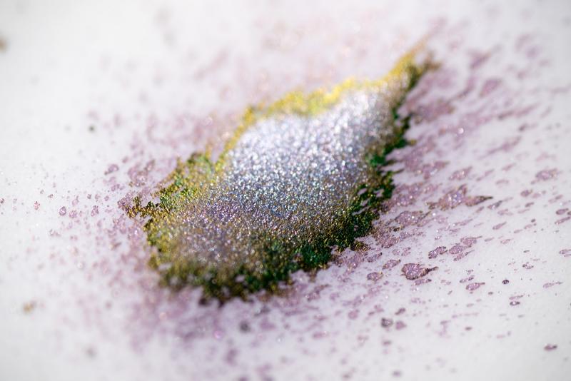
Just a little fun with a macro lens... I cleaned that pen with Rouge Hematite on the left a few days ago. The other one's got Diamine Poppy red.
-
I thought I would do something a little different and review the J Herbin scented ink sample set as one main review. I have the sample set of 5 x 10ml bottles, but these 5 scented inks can be purchased separately in 30ml bottles This is what J Herbin say about them on their web-site: "These exquisitely charming inks, lightly scented and presented in elegant semi-frosted bottles, are perfect for fountain pens since they are naturally scented and do not contain pigments. J. Herbin scented inks are made from floral water (hydrosols) of rose, orange, lavender, apple and violets. The hydrosols used by J. Herbin come from Grasse, France, a Provencal town long associated with the perfume industry, and famous for its floral scents. Scented Fountain Pen Ink Sampler Fashioned with great care, scented inks are inspired by a tradition that began in Italy in the 19th century. J. Herbin and other manufacturers used to collect different scents from the perfume industry and add them to their inks. Known as “Les Subtiles” (The Subtle), each ink matches fragrance and color: bleu/parfum lavande/10; vert/parfum pomme/34; amber/parfum orange/41; rouge/parfum rose/68; and violet/parfum violette/77" Some of these inks are the same as inks in the standard collection, but have added fragrances: Amber/parfum orange/41 is "Ambre de Birmanie", Rouge/parfum rose/68 is "Rouge Opera", and Violette/parfum violette/77 is "Violette Pensee". Unusually I found that my sample of Rose scented ink has more of a pink tinge to it than my sample bottle of Rouge Opera does. The fact that I have already reviewed the first two of those inks was also a factor in selecting to review these scented inks together. I used my pilot Plumix pen with it's steel stub nib. It seems to have had the effect of making some of these inks dry more quickly than when I did the previous reviews with my Lamy Nexx M nib. None of these inks are meant to be waterproof, but I noticed that both Rose and Violette are quite resistant.
-
Got in my Emerald of Chivor yesterday from GouletPens (lucky lucky), and I immediately shook it up, stuck a syringe way to the bottom to get the most out of the sparkles (which settles very quickly), filled the cartridge and went to town. In a Lamy Al-Star w/ 1.5mm Stub nib on Rhodia No. 16 Dot Paper. http://i.imgur.com/4mkbAaE.png A lot less sparkly and oily-red sheen than photos online, perhaps it's my paper or pen? I don't know, would I need something like Tomoe? http://i.imgur.com/Y0u5OTy.jpg http://i.imgur.com/gWHgYxq.jpg Don't get me wrong I enjoy this ink's color alone and will write in my Master Leuchtturm 1917 lovingly as such, but I'm really curious on getting the most out of this ink's properties. Thoughts? Also later on I should be getting a TWSBI 1.1 mm nib for my Diamond 580, if not the sparkles flow from that at least I can see them swirl in the tank yeh? - GlennPen Update [8.29.2015 2:07 PM]: Does extremely well on L!FE brand paper. http://i.imgur.com/keyIrZB.png http://i.imgur.com/hDmTxUH.png And here's an upclose shot: http://i.imgur.com/6FCKS10.png and lovingly in the sun.http://i.imgur.com/djCoWo0.png Seems to me that Japanese paper is more likely to bring out the full vibrance of this ink!
-
I recently ordered a sample of the J. Herbin Rouge Hematite. I have heard though that they did a reformulation due to clogging of the nib. I have the old formulation. How does it compare to the new one. Is there more gold sheen? Less? Thanks!!!
-
http://i900.photobucket.com/albums/ac209/jasonchickerson/20160830_0007.jpg Emeraude on Rhodia Dotpad no. 16. Title drawn with a 1.5mm Brause no. 180 nib and plenty of gum arabic. http://i900.photobucket.com/albums/ac209/jasonchickerson/20160830_0008.jpg http://i900.photobucket.com/albums/ac209/jasonchickerson/20160830_0011.jpg Undiluted (left) and diluted (50%, right) splotches. http://i900.photobucket.com/albums/ac209/jasonchickerson/20160828_0001-2.jpg http://i900.photobucket.com/albums/ac209/jasonchickerson/20160828_0001.jpg Peacock painted with Emeraude de Chivor, Sailor Souten, and a hint of J. Herbin Cacao du Brésil on Stillman & Birn Gamma Series paper. This is a review that I thought I had already done. When I set out to do it again, I realized why I never finished the first time round. Emeraude de Chivor is one difficult ink. It is oversaturated, much too wet, stains everything, and threatens to clog my pen. It also refuses to work with a dipped without plenty of gum arabic, which removes the sheen (but adds gloss). Is anyone actually writing with this ink? I'll admit Emeraude looks pretty good coming out of my wife's mint Kaweco Sport, but I won't be putting it in any of my pens any time soon. Too staining, too clogging, and it smears when dry a la Rouge Hematite. So what on earth could I ever use this for? Well, that peacock looks pretty nice, for one. I love the way three distinct colors can be gotten through dilution: gold/red/black when laid down really thick, a dark emerald green at full volume, a brilliant turquoise when diluted. And it looks great alongside the pink-sheening Souten. Looks like this one is permanently relegated to the art shelf. Now I just have to find some subject matter that requires a glittery teal...
-
http://i900.photobucket.com/albums/ac209/jasonchickerson/image_3.jpeg http://i900.photobucket.com/albums/ac209/jasonchickerson/image_2.jpeg http://i900.photobucket.com/albums/ac209/jasonchickerson/image_5.jpeg http://i900.photobucket.com/albums/ac209/jasonchickerson/image_4.jpeg This is an ink I did not expect to like or get much use. I primarily use the 1670 inks as watercolors when painting with my daughter. She likes the gold flecks, and they do make for some interesting effects, so I purchased all of the line save Stormy Grey (which is one of the worst inks I have every personally tried) for this purpose. I put it in my daily carry pen to test for this review and it didn't come out for two weeks. So, not too bad. The gold shows up readily on high quality paper and almost not at all on the cheap stuff, so I didn't get any questions at work about my sparkly ink. Hue is identical to Herbin's own Terre de Feu, but Caroube is much wetter and a bit darker. In the end, I like it quite a bit. While not as exciting as Rouge Hematite or Emeraude de Chivor, it is much better behaved and much more useable on a daily basis. In case you missed it in the written review, I left the cap off my pen for four hours with Caroube inside and it started right up again. Cleaning it out of the pen took about three flushes. Brilliant. Paper is Rhodia dotpad no. 16. An attempt was made toward color accuracy.
-
Register to get a bottle of the new J Herbin 1670 Caroube de Chypre Anniversary Ink coming this July. This brown with gold specks is the 5th edition of the 1670 Anniversary ink following Rouge Hermatite, Bleu Ocean, Stormy Grey, and Emeraude de Chivor. It comes in the same style packaing and square glass 50ml ink bottle. https://www.penchalet.com/ink_refills/fountain_pen_ink/j-herbin_1670_caroube_de_chypre_ink.html
-
Here's one I found interesting. I've only played with J. Herbin's 1670 series of inks, so it was nice to try something a bit more conventional. I had bought an empty bottle just for the style. I'm surprised I was able to get so much leftover ink out of it.