Search the Community
Showing results for tags 'j herbin'.
-
J Herbin Bleu Myosotis (Cartridge) Thanks for @Lithium466 for the sample. After reviewing the complex Kobe #56 ink, it was difficult to warm up to this ink. There’s nothing inherently wrong about it, but the name! It doesn’t correspond to the sky-blue colour of forget-me-nots, unless in France the flowers are blurple or blue-black I think Herbin would have been better off exchanging this one with Bleu Pervenche. 😛 I had some problem with the cartridge and the flow. I pressed the cartridge, several times to prime the feed and finally, I realized I had managed to puncture ever so slightly the cartridge, a first. However, afterwards the pen wrote perfectly fine. The ink writes purple and dries to a muted blue-black. I didn’t bother to ink up a flex nib for this one. Also, the Japanese Ef line was created through reverse writing. In retrospect the colour looks like a nice blue-black on white Tomoe River paper, but I still can't warm to it. Let's start with the chroma: Writing Samples: Photo: Comparison: The R&K is Königsblau Water test: Ink is more water resistant than Éclat de Saphir and finally an artwork, Forget me Not on Fabriano Watercolour paper Other inks used are: J Herbin Bouton d'or De Atramentis Document Red SketchInk Klara + Marlene Noodler's Pasternak · Pens used: Kaweco (EF/F/M/B, BB) · What I liked: Putting my water brush in the cartridge and drawing with it · What I did not like: The name not corresponding to the colour 😛 · What some might not like: My review · Shading: It shades · Ghosting: Yes, on cheap paper. · Bleed through: Yes, on cheap paper. · Flow Rate: It didn’t gorge the feed like some inks do. · Lubrication: A bit on the dry side · Nib Dry-out: Did not notice. · Start-up: Ok · Saturation: Pastel · Shading Potential: Nice. · Sheen: No. · Spread / Feathering / Woolly Line: Did not notice. · Nib Creep / “Crud”: Did not notice. · Staining (pen): No. · Clogging: Did not notice. · Cleaning: Easy · Water resistance: Ok, better than Éclat de Saphir. · Availability: cartridges, 10 ml, 30 ml bottles. Please don't hesitate to share your experience, writing samples or any other comments. The more the merrier
-
J Herbin Éclat de Saphir (Cartridge) Thanks to @Lithium466 for the cartridge. It’s difficult to review an ink which leaves your indifferent, when writing with. However, I truly enjoyed drawing and doing washes with it. It’s an happy blue It’s like most Herbin inks, it doesn’t like copy paper. I didn’t bother to ink up a flex nib for this one, and @LizEf has done an excellent review of this ink for a Japanese Ef nib. Let's start with the lovely chroma: Writing Samples: Photo: Comparison: Water test: and finally an artwork, Loving Blue The background is Éclat de Saphir, the darker blue is J Herbin Bleu Myosotis, and the outlines are done with Noodler's Polar Brown. and this one was done in homage of @LizEF new kitten, Smoke: the other inks are: Sailor Kiwa guro (Cats J Herbin Bleu Myosotis (Water) J Herbin Éclat de Saphir (Bathtub) J Herbin Bouton d'or Noodler's Polar Brown · Pens used: Kaweco (EF/F/M/B, BB) · What I liked: Chroma, Doing washes. · What I did not like: Writing with it. · What some might not like: The colour · Shading: I didn’t see much. · Ghosting: Yes, on cheap paper. · Bleed through: Yes, on cheap paper. · Flow Rate: Wet · Lubrication: A bit on the dry side · Nib Dry-out: Did not notice. · Start-up: Ok · Saturation: Pastel royal blue · Shading Potential: Nope. · Sheen: No. · Spread / Feathering / Woolly Line: Did not notice. · Nib Creep / “Crud”: Did not notice. · Staining (pen): No. · Clogging: Did not notice. · Cleaning: Easy · Water resistance: Ok · Availability: cartridges, 10 ml, 30 ml bottles. Please don't hesitate to share your experience, writing samples or any other comments. The more the merrier
-
J Herbin Bleu Pervenche This is one of my oldest bottles of inks and a favorite. It’s a happy turquoise, wet, with below average lubrication. It doesn’t like copy paper, like most Herbins. If you want a turquoise with better lubrication, Monteverde Caribbean Blue is good option. I enjoyed it most with my wettish soft, Ef Japanese nib, and fine to broad nobs in Kaweco. With the TWSBI 580 Stub, it was unpleasant (So wet that I changed the nib to a medium), with the wet noodle flex nib it was not so pleasant flexing. A note about the name. I'm a bit perplexed about the name. Pervenche, which is named after Vinca or Periwinkle is a lilac colour. The dictionary describes the colour, as: Bleu clair tirant sur le mauve. Light Blue on the mauve side.... Let’s start with the chroma: Writing samples: Note the TWSBI is a very wet pen, so was the flex nib, hence the colour change. The colour is a true turquoise and there's no hint of green to the naked eye. Like most Herbins it doesn't like copy Paper. Photo: Comparison: Water test and finally a few artworks, a snowflake: and this little piece is entitled Elf, part of the inktober yearly challenge: Inks used: Brush pen: J Herbin Perle Noire + Bleu Nuit mix Fountain pen: De Atramentis Document Red J Herbin Bleu Pervenche Platinum Carbon Black · Pens used: Pilot F3A Ef, Kaweco (EF/F/M/B), TWSBI 580 Stub 1.1, and Unic vintage flex (wet noodle) · What I liked: Looking forward to emptying all my pens right away. Easy cleaning · What I did not like: Let’s say almost everything. · What some might not like: Dryness. · Shading: I didn’t see anything. · Ghosting: Doesn’t like copy paper very much. · Bleed through: Same as above · Flow Rate: Wet · Lubrication: Below average · Nib Dry-out: Did not notice. · Start-up: Did not notice. · Saturation: Watery coral red. · Shading Potential: Dismal. · Sheen: Faint · Spread / Feathering / Woolly Line: Did not notice. · Nib Creep / “Crud”: Did not notice. · Staining (pen): Did not notice. · Clogging: No. · Cleaning: Easy · Water resistance: Non-existent. · Availability: cartridges, 10 ml, 30 ml bottles. Please don't hesitate to share your experience, writing samples or any other comments. The more the merrier
-
J Herbin Violette Pensée (Violet pansy) This is one of my oldest ink bottles (10-15 years old) and nearing the end. Pansy is derived from the French word Pensée (Viola × wittrockiana) There’s nothing much I can say about this ink. It’s wet ink, doesn't likes copy paper and like most purple inks it might stain, so bear that in mind, if using it in a transparent pen. Let's start with the chroma: Writing Samples: Photo: Comparison: Water test: and finally and ink art. I had lots of fun doing this going on a purple madness. I used some bleach to emphasis the mustaches. Note the sheen where excess ink has been put. As @InesF pointed out in this thread, the ink is set, but not dry · Pens used: Pilot F3A Ef, Lamy (EF/F/M/B, 1.1), Noodler’s Nibcreaper semi-flex · What I liked: A pleasure to write with. · What I did not like: Not waterproof. · What some might not like: It might stain. · Shading: I didn’t see much. · Ghosting: Yes, on copy paper. · Bleed through: Yes, on copy paper. · Flow Rate: Wet · Lubrication: Decent. · Nib Dry-out: Did not notice · Start-up: No problems. · Saturation: Decently saturated. · Shading Potential: Not much. · Sheen: No. · Spread / Feathering / Woolly Line: Did not notice. · Nib Creep / “Crud”: Did not notice. · Staining (pen): It might. · Clogging: Did not notice. · Cleaning: I used only water. · Water resistance: Ok, but don't bank on it · Availability: cartridge, 10 ml, 30 ml bottles. Please don't hesitate to share your experience, writing samples or any other comments. The more the merrier
-
J Herbin Rouge Caroubier I got this on a whim, knowing full well the colour is not the type I would appreciate. I couldn’t find anything redeeming about it, maybe you can 😛 It’s watery ink and lacks in the lubrication department especially if you use dryish pens and scratchy nibs. I was surprised that the other reviewers mentioned quick dry times, in my experience it wasn’t the case. I'm assuming that the colour is named after the Carob tree flower. If I was to get a colour in this shade, I would go for Octopus Koala Red. Let’s start with the boring chroma: Writing samples: I went for humorous Christmas quotes. The colour doesn't seem right here Photo: (artificial light) Comparison: Water test And finally, an "artwork", a quick sketch doodle in a lined notebook. Poor Kitty looks more like a cooked lobster · Pens used: Pilot F3A Ef, Lamy Safari(EF/F/M/B/Stub 1.1), Soennecken semiflex · What I liked: Looking forward to emptying all my pens right away. Easy cleaning 😛 · What I did not like: Let’s say almost everything. · What some might not like: Dryness. · Shading: I didn’t see anything. · Ghosting: Doesn’t like copy paper very much. · Bleed through: Same as above · Flow Rate: Wet · Lubrication: Below average · Nib Dry-out: Did not notice. · Start-up: Did not notice. · Saturation: Watery coral red. · Shading Potential: Dismal. · Sheen: No. · Spread / Feathering / Woolly Line: Did not notice. · Nib Creep / “Crud”: Did not notice. · Staining (pen): Did not notice. · Clogging: No. · Cleaning: Easy · Water resistance: Non-existent. · Availability: cartridges, 10 ml, 30 ml bottles. Please don't hesitate to share your experience, writing samples or any other comments. The more the merrier
-
J Herbin Vert Empire I was intrigued by the beautiful green-grey colour of this Herbin ink and I was not disappointed. For me it's an artist ink, mysterious, complex great for washes and very pleasant for writing. Ink is wet, with below average lubrication, massive shading that loves water. Though, like most Herbin inks, it doesn’t like copy paper. Let’s start with the complex chroma: Writing samples: The text is from Pierre Corneille's Le Cid, 1637 tragedy. I've added a link for an English translation for those interested. It doesn't like copy paper as you can see. Photo: Comparison: Water test And finally, an artwork. I’m assuming that Vert Empire is a reference to Napoleon III, hence using his emperorship portrait as a model The red ink is Red Koala by Octopus · Pens used: Pilot F3 Ef, Kaweco Sport (EF/F/M/B/Stub 1.9), Conway Stewart 330 with a oblique flex nib · What I liked: Gorgeous color, shading, drawing and doing washes. · What I did not like: Lack of waterproofness. · What some might not like: Slight dryness. · Shading: Excellent · Ghosting: Doesn’t like copy paper very much. · Bleed through: Same as above · Flow Rate: Wet · Lubrication: Slightly below average · Nib Dry-out: Did not notice. · Start-up: Did not notice. · Saturation: Nope. · Shading Potential: Excellent. · Sheen: No. · Spread / Feathering / Woolly Line: Did not notice. · Nib Creep / “Crud”: Did not notice. · Staining (pen): Did not notice. · Clogging: No. · Cleaning: Easy · Water resistance: Measly. · Availability: cartridges, 10 ml, 30 ml bottles. Please don't hesitate to share your experience, writing samples or any other comments. The more the merrier
-
J Herbin Bleu Nuit (Night blue) Is wet, when wet a blurple with low lubrication, transforming into a washed-out denim colour. The colour doesn’t remind me of night but maybe dusk. Ink shades and does not like copy paper. It has some water resistance and is easy to clean. It is one of my first bottles of inks (is over 10 years old), and while not my favorite, I’ve found a new life for it in my Kuretake brush pen to do artwork. It also can be mixed with Perle Noire, to convert it to delicious looking blue blacks. Let's start with the the complex chroma: Writing Samples: There are two texts which I've casually translated: The first, by the French surrealist poet Louis Aragon (1897 – 1982) When I speak of love, my love irritates you, When I say the weather is lovely, you shout "it rains", You say my meadows have too many daisies, and too many stars in my nights, and too much sky in my blue sky... The 2nd is from Pierrot, or the secrets of the night, by the French novelist Michel Tournier (1924-2016) Listen to a marvellous secret: my night is not not black, it is blue. A blue that one can breath... my oven is not black, it's golden, a gold one can eat.... Photo: Comparison: Watertest: and finally a whimsical artwork, named the Red Penguin musing at night. I was reviewing Octopus Brown Penguin and was practicing my penguins Inks used: J Herbin Blue nuit mix with Perle Noire (sky) J Herbin Blue nuit (sea) Octopus Brown Colibri (land) and De Atramentis Document Red Pens used: Pilot 3A Ef, Lamy Safari (EF/F/M/B, 1.1), Conway Stewart 330 What I liked: Using it with a brush pen, mixing it. Easy cleaning, What I did not like: Dryness, the colour. What some might not like: Same as above, plus it doesn’t like copy paper. Shading: Yes. Ghosting: Yes, on copy paper. Bleed through: Yes, on copy paper. Flow Rate: Wet Lubrication: Low Nib Dry-out: In between nib changes. Start-up: No. Saturation: Low. Shading Potential: Yes, but not dramatic. Sheen: No. Spread / Feathering / Woolly Line: Did not notice. Nib Creep / “Crud”: No. Staining (pen): No. Clogging: No Cleaning: Easy-peasy Water resistance: decent Availability: 6 pack cartridges, 10 ml, 30 ml bottles. Please don't hesitate to share your experience, writing samples or any other comments. The more the merrier
-
J Herbin Ambre de Birmanie This is a gorgeuos golden honey, warm and legible ink. It made my heart sing in happiness writing with it, despite its idiosyncrasies. It’s a dryish ink with a confusing flow. Let me explain, it was wet, very wet when I filled the pen, but over time the flow was dry. I never thought to say that about a Herbin ink, but it needs a well-sealed pen, otherwise it might have start-up issues, and it doesn't like copy paper at all. It has decent water resistance as you can see. Despite all the shortcomings it's an ink I'm glad I tried and have a 10 ml bottle of. Let's start with the intriguing chroma: Writing samples: It doesn't like copy paper: Photo: Comparison: Water test (24 hr minimum left to dry. I held the left side under running water for 10 seconds) and finally a tiny sketch, I entitled joy: · Pens used: Pilot Kakuno Ef, Lamy Safari (EF/F/M/B/Stub 1.1), Waterman W2 · What I liked: Color · What I did not like: Very long dry times on Japanese papers, inconsistent flow. · What some might not like: Same as above, feathering on copy paper, dryness · Shading: It’s there. · Ghosting: Yes, on copy paper · Bleed through: Surprisingly yes, on copy paper · Flow Rate: Very wet / Very dry, go figure · Lubrication: Lower than average. · Nib Dry-out: No. · Start-up: Sluggish. · Saturation: Nope · Shading Potential: It’s there. · Sheen: No. · Spread / Feathering / Woolly Line: Surprisingly yes on copy paper. · Nib Creep / “Crud”: Did not notice. · Staining (pen): No. · Clogging: No. · Cleaning: Easy · Water resistance: · Availability: cartridges, 10 ml, 30 ml. Please don't hesitate to share your experience, writing samples or any other comments. The more the merrier
-
J Herbin Rouge Grenat (Garnet Red) I made a mistake between the words Grenade and Grenat (Pomegranate vs Garnet). You'll see a lot of pomegranates in my sketches,.Typical me. Sorry for the confusion. I corrected it, thanks to @Lithium466. I decided to put back the photo: It's kind of cool and the garnets resemble the pomegranate seeds As much as I love the colour in real life, it does not sing to me. Maybe I don’t like red inks and that is it. Let's start with the chroma: Writing samples: As you can see there's a bit of ghost & blood with Hammermill Photo (Tomoe River Paper) Comparison: Water test (After 24 hours) And finally an artwork, not my best, but it's to showcase the range of the ink. and a more humorous one for Inktober 2023 (Dodge) Octopus Fox Grey / Noodler's Bad Green Gator · Pens used: Pilot Kakuno Ef, Stub, Kaweco Sport (EF/F/M/B), Osmiroid Copperplate nib · What I liked: Really nice with wider nibs, a pleasure to write with. · What I did not like: I thought this would be my colour but alas it isn’t. I'm looking forward to emptying my pens. · Shading: Yes · Ghosting: Yes, on thin copy paper · Bleed through: Same as above. · Flow Rate: Nice. · Lubrication: Good, but finer the nib, scratchy it’ll be. · Nib Dry-out: Not noticed. · Start-up: Not noticed. · Saturation: Yes. · Shading Potential: With wider nibs. · Sheen: No. · Spread / Feathering / Woolly Line: No · Nib Creep / “Crud”: No. · Staining (pen): It can stain your transparent section. · Clogging: No. · Cleaning: Not bad for a red ink. · Water resistance: Not bad after 10 seconds under running water. · Availability: 30ml/ 10ml Bottle/6-Pack Cartridges Please don't hesitate to share your experience, writing samples or any other comments. The more the merrier
-
I got this one on a whim, thinking I might need a yellow. It's not suitable for writing as you cannot see what you're doing and while the scan and photos make it legible, I cannot read the page, over powered by this arguably bright yellow. It's a dry ink and wrote awful in the Soennecken. And it was awful to see the colour through the ink window, it looked like golden pee. Yuck! I believe it's only suitable for art work, or mixing to create murky greens for ex. (you know who you are) I'm not sure if you can use it as a highlighter, as it's not waterproof and loves soaking up cheap paper, meaning it'll bleed through. Oh and where sunglasses, you'll be blinded. 😎 Let's start with the Chroma: Writing samples: While it looks legible, it is not. I could not read what I was writing, hence my illegible handwriting. Hammermill 20lb back. This ink hates cheap paper Photos: Comparaison: Watertest: I was so frustrated with this ink that mixed the Lamy convertors of the pen filled with Herbin Perle Noire with this one. I also added a few drops of Perle Noire in the convertor of the Kakuna, and created a nice murky green. I did a writing sample on cheap Hammermill 20lb paper, and chromas of the different mixes: Note the blue in the first one, and fi And finally the only reason to have this ink: to draw the Minions and bananas Inks used: J Herbin Bouton d'or (yellow), Noodler's Apache Sunset A mix of Herbin Perle Noire + Bouton d'or (Murky green) Platinum Carbon Black Ink for the pants: Akkerman Delfts Blauw and water colour and pastel. · Pens used: Pilot Kakuna Ef, Lamy Safari (EF/F/M/B), Soennecken school pen semi-flex, Jinhao 450 fude · What I liked: For drawing the Minions and bananas , mixing · What I did not like: Illegible, not water resistant and ugly through the ink window. · What some might not like: Illegible It doesn’t like cheap papers. · Shading: Are you kidding me? · Ghosting: On cheap paper · Bleed through: Same as above. · Flow Rate: Wet · Lubrication: Dry · Nib Dry-out: None · Start-up: None · Saturation: Unsaturated · Shading Potential: You can’t see, so what’s the point? · Sheen: None · Spread / Feathering / Woolly Line: No · Nib Creep / “Crud”: No. · Staining (pen): No · Clogging: No · Cleaning: Ok · Water resistance: It doesn’t really make a difference does it? · Availability: 10/30 ml bottles, cartridges. I hope it's doesn't exist in 500 ml bottles Please don't hesitate to share your experience, writing samples or any other comments. The more the merrier
-
J Herbin Perle Noire (Black Pearl) My go to black inks for sketching and writing are Platinum Carbon Black and Sailor Kiwaguro. But I wanted to do some artwork and got this on a whim. I had forgotten how wonderful sometimes a shiny black ink can be (much like Japanese Sumi ink, or lamp black inks) and this one delivers. The chroma is unexciting, but there seems to be hint of yellow.... But this was the first ink that tamed the Ef Kakuna steel nib pleasurable. I also enjoyed using it with the Osmiroid with Copperplate nib but paradoxically less in Lamy Safari or the Jinhao with fude nib. Still I managed to use half of the 10 ml bottle. Writing samples: I used quotes by Josephine Baker, inspired by Perle Noire: Meditations for Joséphine, a tribute to her. Note the yellow in the smudging: It doesn't like Hammermill very much.. Ghosting and bleed through.... What was surprising was how easy it was to clean, despite being a very respectable water-resistant ink. Watertest: Comparaison And now a bit of artwork. The orange ink is Noodler's Apache Sunset. What is interesting is that it turns into gold when in contact with bleach. You can see the bleach/ gold reaction in this piece inspired by @LizEF Adventures of Quin & Makhabesh. (And a huge thanks for giving me permission to do so) The lower part of the page is all done with Herbin Perle Noir. The female Egyptian cat (Noodletitti ) , the little kitten and the lower background (diluted). The gold was created by a glass nib dipped in bleach. (other inks red: Organics Studio, Oscar's Copper, Dark Brown of the staff, and purple sphinx aka Makhabesh PIlot Yamaguri, Background dark brown (right) is Gutenberg Urkundentinte G10, and left is home made pomegranate ink) · Pens used: Pilot Kakuna Ef, Lamy Safari (EF/F/M/B), Osmiroid Copperplate, Jinhao 450 fude · What I liked: Delicious black, reminds me of sumi ink, great for art, amazing lubrication. · What I did not like: You might have Startup issues if the pen is left uncapped. · What some might not like: It doesn’t like cheap papers. · Shading: No · Ghosting: On cheap paper · Bleed through: Same as above. · Flow Rate: Wet · Lubrication: Excellent · Nib Dry-out: None · Start-up: None · Saturation: Beautiful shiny black · Shading Potential: Why would you want a black ink to shade? · Sheen: None · Spread / Feathering / Woolly Line: No · Nib Creep / “Crud”: No. · Staining (pen): No · Clogging: No · Cleaning: Very easy · Water resistance: Very good · Availability: 10/30/500 ml bottles, cartridges. Please don't hesitate to share your experience, writing samples or any other comments. The more the merrier
-
A couple of years ago I bought a bottle of J Herbin Cacao du Bresil ink because a wanted a greyish brown ink. It turned out to be bluish grey. Have any of you bought this ink recently? What colour did it have? I am thinking of ordering another bottle but want the brown version.
-
Larmes de Cassis, translates to tears of blackcurrant, a poetic way of describing, crème de cassis, I assume, a liqueur added to white wine (kir) or champagne (kir royal). Note that in French, only the first letter of the title is capitalized only (Larmes de cassis). Writing samples: All quotes are by French authors, noblesse oblige Photo: Ink is on the dry side, wet, watery with low lubrication and is surprisingly water resistant. Left side was held under running water for 10 seconds. I enjoyed writing with it. I won’t recommend it for thin, absorbent paper, unless you have a light touch and use a finer nib. This is a Hammermill copy paper: First line is a medium nib. 2nd fude, third reverse fude, to create a fine line, quite a bit of ghost and bleeding.... Comparaison: And finally an art work. I participate in the yearly inktober. Here is a play on Giant and Tear: There are too many inks too name, but the giant tear is Larmes dec Cassis · Pens used: Lamy Safari (Ef/F/M/B), Conway Steward 330 (Vintage flex oblique), Jinhao 450, (Fude nib) · What I liked: beautiful colour, good water resistance, and poetic name. Easy cleaning. · What I did not like: Very long dry times, watery ink. · Shading: None · Ghosting: Not on good paper. · Bleed through: Not on good paper. · Flow Rate: Wet · Lubrication: On the dry side. · Nib Dry-out: None · Start-up: None · Saturation: Nice · Shading Potential: Dismal · Sheen: No. · Spread / Feathering / Woolly Line: Not noticed. · Nib Creep / “Crud”: No. · Staining (pen): No · Clogging: No. · Cleaning: Easy. A midnight soak for Safari and it was clean as a whistle. The vintage pen was a bit more time consuming. · Water resistance: Quite good. The more absorbent the paper, the better the water resistance. · Availability: 10 ml / 30 ml bottles/cartridges. Please don't hesitate to share your experience, writing samples or any other comments. The more the merrier
-
desaturated.thumb.gif.5cb70ef1e977aa313d11eea3616aba7d.gif)
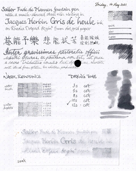
Jacques Herbin Gris de Houle review sheet overview
A Smug Dill posted a gallery image in FPN Image Albums
-

From the album: Ink review
On Rhodia Dotpad 80g/m² paper, using a Sailor Fude de Mannen pen with a bent nib.© A Smug Dill
- 0 B
- x
-
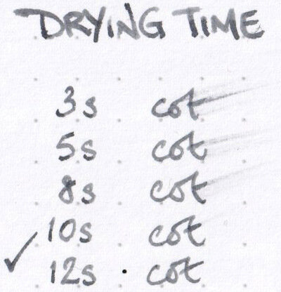
Drying time for Jacques Herbin Gris de Houle ink
A Smug Dill posted a gallery image in FPN Image Albums
-
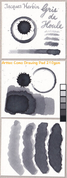
Water resistance of Jacques Herbin Gris de Houle
A Smug Dill posted a gallery image in FPN Image Albums

-
From the album: Ink review
On Arttec Como Drawing Pad 210gsm paper for mixed media art.© A Smug Dill
- 0 B
- x
-
I have decided to review some of my inks. These aren't necessarily in any particular order. This one is J Herbin Bleu nuit (Midnight blue) This is what J Herbin say about it: "Bleu nuit (Midnight blue): this is the darkest color after « perle noire » ink. A color symbol of the sky at night when bursting with stars in the summertime." "From the beginning, J. Herbin distinguished itself from its competitors by offering a wide range of colors for the fountain pen inks. In 2007, 4 new colors were introduced which brought a total of 30 references of various colors. The names chosen for each color are very poetic to preserve the originality of the brand and as a French tradition." This isn't a waterproof or an archival inkBearing in mind the paper I use is very smooth, this ink took 10-12 secs to dry. Quite quick.It flows well and lubricates the nib quite well.It is currently available in sampling packs of 4 x 10ml mini glass bottles and 30ml D bottles. Each bottle of 30 ml has an integrated pen rest. They are known as “D bottle pen inks. The “D” refers to the old French unit of measure “la Demi Courtine”.It's available from many B&M shops and online retailers worldwide. I didn't find this ink to be as dark a blue as I expected. It's less dark than it looks in the bottle, and maybe less dark than you might expect a shade called Midnight blue to be. It's nowhere near as dark as Montblanc Midnight or Diamine Midnight for example.
-
From the Jacques Herbin site: "To celebrate the 350th anniversary of Jacques Herbin’s original brand, we are letting the people who know us best, our fans, choose the new colour of our next anniversary ink. This will form part of the official Jacques Herbin collection. Our ink experts have designed four very distinct shades. The range varies from pastel to dark, soft to flamboyant and tender to lively, each with shimmering and radiant reflections. Each one unique. And to mark this vintage in an even more spectacular way, we decided to create a unique Jacques Herbin ink with both silver and gold glitter that will add sparkle to your writing! So what do you need to do? You have until 16th March to vote and let us know your favourite below. The result will then be verified, and we will reveal the results by email in early April. As if you needed more of a reason to vote, the Jacques Herbin team will then randomly select FIVE voters to exclusively preview the new ink in the luxury of their own home. The winning ink will be available from selected stationery retailers, ink specialists and boutiques for purchase from September 2020." https://www.jacquesherbin.com/en/new-anniversary-ink-survey.html
-
I have decided to review some of my inks. These aren't necessarily in any particular order. This one is J.Herbin Rouge Bourgogne. This isn't a waterproof or an archival inkBearing in mind the paper I use is very smooth, this ink took 10-12 secs to dry.It flows reasonably dry but lubricates the nib quite well.It is currently available in packs of 4 x 10ml small glass bottles and 30ml glass bottles.It's available from many B&M shops and online retailers worldwide.
-
J Herbin 350th Anniversary Inks Perle Noir Blue Myosotys Rouge Caroubier Vert Reseda Violette Pensee Also available in 10ml https://www.stilografica.it/refills/ink-bottles/j-herbin-350th-inks-inchiostri-500-ml-650.htm
-
Since J. Herbin released the beautiful Rouge Hematite as the first in their the-new 1670 Anniversary line it has been through several iterations. The first release was, in my eyes, as close to perfection as Rouge Hematite could ever be; deep and rich without being dark or dull, shimmery and sparkly without being garish or gaudy. The ink's sheen was not simply caused by what we're all familiar with, which is sheen induced by (according to Nathan Tardif) drying ink crystalizing. Rouge Hematite had its sheeny component resting at the bottom of the gorgeous bottle waiting to be shaken—a minutes-long process with the bottom new and full. It looked not gold or red, but almost like a maroon-tinted wax (until shaken). And then, from the inky shadows (see what I did there?), came the whiners. The ones who know not how to maintain a good hygiene schedule for their pens. And with their ignorance came the clogging. With the clogging, complaints. So J. Herbin, listening to their customers (which is usually a good thing), took a good portion of the heavily-sheening component out. The second formulation still has the same type of sheeny bits, but just way less than the original. But since haters gonna hate hate hate, the third iteration of the once-perfect ink came soon after, with barely any of the gold-inducing sediment at all. This, as Henry Hill once said, is the bad time. The third iteration was sheen-less. The third iteration was boring. The third iteration was wrong. And thankfully, J. Herbin heard RH's faithfuls' complaints. They made the announcement that they re-instituted the sheening component to match the good ol' days. Or did they?… Yes. Well, sort of. But first, I'll backtrack. When the company released the second ink in the Anniversary series, Bleu Ocean, a lot of people, including myself, were disappointed that the ink lacked any sort of sheen. Many had wished it would be given a similar, but silver-colored, sheen component. When I tried it I couldn't even coax any good old crystal-based sheen from it. It was a nice shade of blue, but without the signature sheen, and coupled with the fact that it wasn't half as well behaved as Rouge Hematite—RH can be used with a flex nib on cheap paper and still retain its sheen and shading—it was a bust for many. More recently, us sheenoholics have praised the release of J. Herbin's Stormy Grey 1670. In contrast to the earlier Rouge Hematite, Stormy Grey has a blatantly golden pigment component to impart its sheen. With the original RH, once the sediment was shaken and integrated into the ink the only difference was that the ink took on a bit of a chalky look in the bottle; it also took quite a while for the sheen component to settle back down to the bottom of the bottle. Stormy Grey's golden component, whatever it really is, is very consistent and exceedingly easy to see as it swirls around in the ink after shaking it. It also settles back to the bottom MUCH quicker. Now, back to the most recently released Rouge Hematite version (what I dub the fourth version). The fourth version of RH seems to have the same sheening component in it as Stormy Grey. It's obviously metallic when it's at the bottom of the bottle (not waxy looking, like the original), and it settles very quickly like Stormy Grey. Instead of the original formulation's smooth "fog" of gold/green sheen that would settle over the red ink when spread with a q-tip, the newest version has star-like "pinpoints" of gold spread fairly evenly over the entire q-tip sample. I'm not going to say it's inferior to the original version (mainly because I haven't even done a writing sample with it yet), but it is different, and I think people buying it with the understanding from the company that the original formula is back need to know the differences. I'll be doing a new review of the most recent version in the next few days. When it's out I'll link to it from this thread. Now for the comparison pictures! Left to right: Original version, Second version, Fourth version: http://imagizer.imageshack.us/v2/xq90/538/1GzS1a.jpg http://imagizer.imageshack.us/v2/xq90/661/7vDUYL.jpg Original Version: http://imagizer.imageshack.us/v2/xq90/661/2RoPFk.jpg Second Version: http://imagizer.imageshack.us/v2/xq90/537/ujBGrt.jpg Fourth Version: http://imagizer.imageshack.us/v2/xq90/673/ovuTGg.jpg Left to right: Original version, Second version, Fourth version: http://imagizer.imageshack.us/v2/xq90/673/rorNxl.jpg Original Version: http://imagizer.imageshack.us/v2/xq90/661/dZq7Ha.jpg Second Version: http://imagizer.imageshack.us/v2/xq90/661/4iJYeo.jpg Fourth Version: http://imagizer.imageshack.us/v2/xq90/538/xs7Eq2.jpg Original Version: http://imagizer.imageshack.us/v2/xq90/905/8O3cbM.jpg Fourth Version: http://imagizer.imageshack.us/v2/xq90/673/q6ILau.jpg http://imagizer.imageshack.us/v2/xq90/673/XSNAOZ.jpg Here's what Stormy Grey's sediment looks like: http://imagizer.imageshack.us/v2/xq90/746/ofYoGc.jpg And now on the page: http://imagizer.imageshack.us/v2/xq90/908/GYZE0R.jpg Left to right: Fourth version, Second version, Original version: http://imagizer.imageshack.us/v2/xq90/661/I7UZzn.jpg Again, this comparison is just about the inks' properties in general; I still haven't filled a pen with the newest version yet. I'll post back when I have some more to say about the most recent version.
-
"HERE IT IS: The Kyanite du Népal from our exclusive 1798 Anniversary Ink Collection available 06/21 [21st June] About the ink: Kyanite is bright blue and pulling toward turquoise. It is magnified thanks to a cloud of silver glitter for a powerful and elegant writing. Since the discovery of the famous mining region of Nepal, Kali Gandaki, Kyanite has been recognized as a noble mineral because of its similarities with the rich tones of sapphire." https://www.instagram.com/p/BxPo8LxDyiC/ And see here https://www.reddit.com/r/fountainpens/comments/bmajwk/this_years_j_herbin_1798_ink_kyanite_du_n%C3%A9pal/
-