Search the Community
Showing results for tags 'italy'.
-
Hello, I'm considering an Aurora BB nib, and would love to heard from anyone with experience of using them. I am hoping for something stubbish, giving some line variation but not quite as much as a true stub, since the narrower line width does not suit my forward-slanting writing, particularly as the Aurora stub has no tipping material! Can anyone please confirm if current Aurora BB nibs are stubbish? A writing sample would be fabulous, especially one comparing stub and BB writing
-
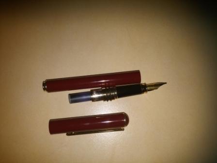
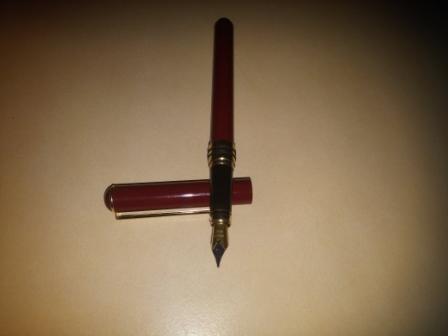
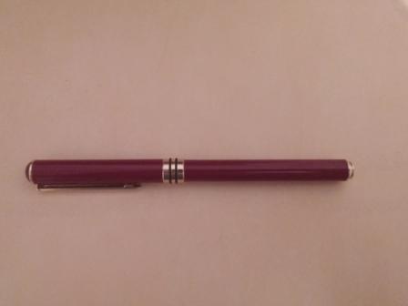
So, I acquired this nice looking pen. To my surprise, I am very satisfied with the way it writes. It is very smooth. The pen is on the heavy side, since it is made of some kind of metal (cant really identify the metal). Anyway, the reason I turned to the help of the fountain pen network is to identify it. At first I thought it was a chinese pen, but then I realized it had "ITALY" engraved on top of the clip. Therefore I hope you can help me to identify it (although I believe it will be some kind of entry level pen, since it has iridium point engraved on the nib). Thank you in advance, and here are few photos. P.S. Since I was forced to compress pictures, I doubt you will be able to see the "ITALY" on top of the clip.
- 3 replies
-
- italian
- fountainpen
-
(and 5 more)
Tagged with:
-
New Here & Looking For A New Pen.. I'd Love Some Opinions!
7heDaniel posted a topic in Introductions
Hey guys. I have been given money from my father to purchase a pen for my 18th birthday last September; I have a budget of £500 (but I want to save some money so that I can purchase a few inks along with the pen). I have narrowed it down to two pens: Montegrappa Nerouno Linea - Rose GoldOmas Milord I am fond of the black/gold look; I have a watch and ring that are these colours, and I like how my EDC items all complement each other. I love the design of both the Montegrappa and the Omas. One is more exciting, while the other is more conservative. I like that on both pens. With the Montegrappa, however, I don't know how I feel about the 1912 or the aesthetics of the nib. But I love everything else about the pen, so it's making my decision so so so so so very difficult. I am looking for a C/C pen. I know most people would be looking for a piston filling mechanism in this price range, but for some reason, as an 18th, I feel drawn towards a C/C pen. So.. Could anyone give me some pointers on what direction I should go?- 9 replies
-
- montegrappaomas
- italian pens
-
(and 1 more)
Tagged with:
-
Hi everybody, I've just seen the new video of PenChalet.com and I love the new NEFERTITI-QUEEN OF EGYPT limited edition by DELTA. 388 pens in the USA. What do you think about that? I just love this pen! https://www.youtube.com/watch?v=rZMdbdJGTH0 http://i.ebayimg.com/00/s/MTIwMFgxNjAw/z/HOgAAOSw3ydVy1j~/$_57.JPGhttp://i.ebayimg.com/00/s/MTIwMFgxNjAw/z/rF4AAOSw~gRVy1kI/$_57.JPG
- 1 reply
-
- delta
- fountainpen
- (and 4 more)
-

Aurora Optima Plain Green Resin - Ruthless Review!
TassoBarbasso posted a topic in Fountain Pen Reviews
Here comes a new "ruthless review". These have a few peculiar features: Concise;Very strict. If a pen costs hundred of euros, no faults are allowed. - A good pen gets a 60/100, - A great pen an 80/100, - An almost perfect one a 90/100. - Only a divine pen can have above 90.Don't care about the box,Add a few peculiar criteria:Nib appearance;Usability in shirt pockets;Out-of-the-boxness, meaning to what extent a nib was perfect right after leaving the seller.Aurora Optima Plain Green Resin, gold trims Super-classic design from Aurora, in plain green resin (not the marbled auroloide, but the deep forest green that was used some years ago). Like this one. 1. Appearance and design: 10/10 This is one of the designs. It's classy Italian style at its best, elegant, smooth, subdued. How can I not give it a 10? 2. Construction: 6/10 Almost perfectly assembled, but one of the o-rings rotates in its place. Unacceptable on a EUR 300 pen! 3. Quality of materials: 7/10 Everything is really high-quality, but the plastic sounds a bit cheap. 4. Weight and dimensions: 10/10 Absolutely perfect. Thick enough to be handled comfortably, but short enough not to be cumbersome. Great section shape, too! 5. Nib performance: not rated I will not rate this because this is the typical Aurora "toothy" nib: I personally love it, but some people don't like this. If you're into nibs with a bit of feedback, this gets a 10/10. If you like "buttery smooth" stuff, stay the hell away from this. 6. Nib appearance: 10/10 Typical bit 14k Aurora nib. Some people don't like the design: barbarians! 7. "Out-of-the-boxness": 5/10 The pen couldn't write well before a thorough cleaning. Also, not acceptable, but easily fixable. 8. Filling system and maintenance: 10/10 Aurora's piston filling. Absolutely perfect in smoothness and capacity. 9. Clip and usability with shirts: 8/10 Perfect measure, fits in all shirt pockets. A bit too short for some jacket pockets, though. 10. Cost and value: 8/10 Minus 2 points for that o-ring issue and the out-of-the-boxness weakness, but overall, very good price-quality ratio. Final mark: - If you like nibs with feedback, this gets 84/100, which in my rating means really great. - If you like smooth nibs, it's still a 74/100, which is very good. But then, you wouldn't buy it due to the toothy feeling, so... My suggestion: get one even if you don't like toothy nibs. With time you'll start appreciating them as well -
Since the acquisition of a Dolce Vita few weeks back, I have been enamoured by Delta pens. So when an attractive offer came up, I didn't hesitate to acquire the 2nd Delta pen in my collection-Delta Kristal. There seems to be very little literature out there on this series of pens (I wonder why!) and I am distracted from work on a Friday afternoon-so here goes: First Impressions (08/10) The Kristal comes in a cardboard box with a motif imprinted on it-I guess it is the design from the central ring of the Dolce Vitas. Inside the box is some literature on Delta, and two further boxes with the pen and some cartridges. The packaging is nowhere near as nice as that of the DVs. Even for a functional packaging, it is not in the Lamy 2000 league. I do care a bit about packaging, and this is certainly not the best of what I have come across so far. Design and Built (09/10) The pen itself is nicely built, and is nestled in a spongy bed. It is made of high quality resin with rhodium trims. The one I have got is in black colour scheme. The cap is turned from a solid bar of black resin, whilst the body is translucent with black design. The translucent acrylic has some nice depth to it. The central ring is similar to that of the DV and is probably made of sterling silver. Unlike the DVs, the cap is missing the small wheel at the end, and there is no cap rings. Overall, this is a nice looking pen-quintessentially Delta. Nib (09/10) The pen comes with a steel nib. The nib had some skipping issues in the first few strokes but has been smooth since then. As with all steel nibs, there is no flex, but lays down nice wet line. I have also attached pictures of the Kristal with its more celebrated cousin. Enjoy!
-
Fabriano Accademia 200Gsm
amastronardi posted a topic in Paper & Pen Paraphernalia Reviews and Articles
Find attached my review of the Fabriano Accademia paper: Forgot to mention that Fabriano produces the Venezia Book (journal) with this paper, in the following sizes: 4x6, 6x9 and 9x12. A lovely journal! Some tests using other pens and inks: Back of the paper to show bleed-through/show-through: These are the pens I used for this review: -
Fabriano Disegno 4 160Gsm Rough
amastronardi posted a topic in Paper & Pen Paraphernalia Reviews and Articles
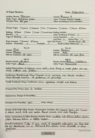
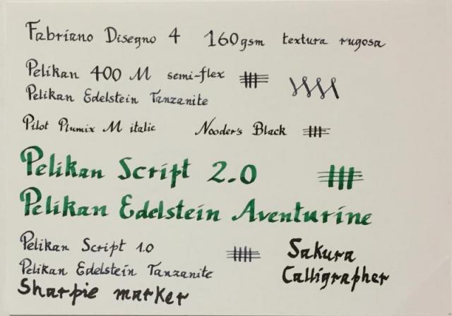
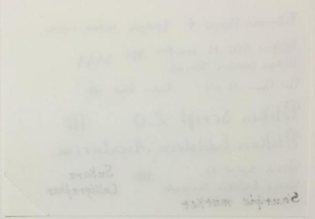
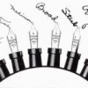
Find attached my review of the Fabriano Disegno 4 paper: Some tests using other pens and inks: Back of the paper to show bleed-through/show-through: These are the pens I used for this review: -
Fabriano Disegno 4 130Gsm Smooth
amastronardi posted a topic in Paper & Pen Paraphernalia Reviews and Articles
Find attached my review of the Fabriano Disegno 4 paper: Some tests using other pens and inks: Back of the paper to show bleed-through/show-through: These are the pens I used for this review: -
Does anyone knows web page or email of Enrico Lenas pen shop in Trieste, Italy? It is small, only pens shop on Piazza della Borsa in Trieste. Thank you!
-
Hi All, I guess the heading says it all, can I swap the nibs between 2 delta dolce vita pens? Any thoughts or tips gratefully received Thanks Craig
- 2 replies
-
- delta
- dolce vita
-
(and 2 more)
Tagged with:
-
Renzetti 1909 is a small Italian company that stands out for their expertise in the medieval technique of Guilloché engraving of precious metals, such as gold, silver, platinum and steel. Renzetti, that has been mastering this decoration technique since 1909, few years ago launched their own pens collection, dedicated to the city of Milan. The most of their pens are named after a street of Milan and embodies the spirit of its people, its personality and history. I posted a nice article in my Blog regarding the links between Renzetti and Milano: "Pens, sales, Expo and Giardino Blu - here's your perfect holiday in Milan" but now I want to introduce a special sale I'm running about the old Via Meravigli: It's a smallish pen, made in variegated/dotted celluloid, with rhodium cap and trims. The cap is carefully engraved with Guillochè technique. http://blog.giardino.it/wp-content/uploads/2015/01/viaMeravigli.jpg There are two colors of celluloid: - red, with dark (brown/green/black) dots, and - turtle, in amber/brown/black tones. Both colors are available as ballpen or fountain pen (only one nib, unique size, approx Medium), separately and also in a Set. The fountain pen is so small that it can't hold a converter, just a cartridge. The cap posted back makes it a normal size pen, but the barrel alone is short. The series -unfortunately- is discontinued, and I got all the last pieces with a special discount, that I'm glad to transfer to my customers. Therefore, you can buy Via Meravigli (fountain pens, ballpens, Sets) at 65-70% off. The Set (fountain pen + ballpen) costs only Euro 45, instead of 150. Don't wait too long! The currency rate (Euro/Dollar) is also very good, now. It's a double deal...
-

Kartos Floral Stationery
Tessy Moon posted a topic in Paper & Pen Paraphernalia Reviews and Articles
Pink Roses Floral Stationery Portfolio I discovered this lovely stationery folio at Barnes & Noble this weekend. I couldn't resist the beautiful roses in pink and purple; so entirely perfect, as though they were made just for me. http://media-cache-ak0.pinimg.com/736x/f8/a3/bc/f8a3bc5c40443c4920f9f1fc5cdf48a6.jpg This folio includes 10 cards and 10 envelopes. They are decorated with roses. Even the inside of the envelopes have the beautiful rose design on the inside. The folios were $9 each. http://media-cache-ak0.pinimg.com/736x/c2/dd/59/c2dd5911191a3786dc3056fec033c9f9.jpg There were only two of these sets at my local B&N, and I had to get them both. I asked one of the clerks if they had these restocked often, and he confirmed my suspicions that they are unique and the stock is infrequent. http://media-cache-ak0.pinimg.com/736x/6e/70/9f/6e709f8ef27cb4bf159a527100d00602.jpg I was so excited to bring them home and test it out, but at the same time knowing I only have 20, I also want to cherish them and to savor each precious card and envelope! I inked up my TWSBI Mini Rose Gold & White with a broad Pendleton Butter-Line-Stub with Mont Blanc Lavender Purple ink. I think the dark purple ink coordinates well to the darker colors in the rose design. http://media-cache-ak0.pinimg.com/736x/85/f0/34/85f0345e3cba7af006732ba830aacf24.jpg I wrote down verse one and verse three from an old hymn called "Jesus, I Am Resting, Resting." It is currently one of my favorite hymns and the words lift up my soul in beauty and peace! So I know the big question - Is it Fountain Pen Friendly? http://media-cache-ak0.pinimg.com/736x/3c/3b/30/3c3b3048e35e0b30eb3c71e31f3add6c.jpg And the answer is YES! I did notice a tiny bit of feathering where the ink was laid down really wet, but I had just freshly inked my pen so there was a lot of ink in the feed - more than in an ordinary writing session. No bleed through, no show through. The paper is a bit thick, I am not sure of the weight as none is listed, but by my guess it is thicker than 32lb but not as thick as 65 lb. Again just my guess! The ink color looked absolutely gorgeous on the cream colored paper! Swoon worthy! I don't know if this would do well with something extreme like an Ahab flex, but for finer nibs/drier inks to moderately wet it appears fine from my one sample. As I use more through time and try different inks and nibs I will get a better feel for what this paper can handle. Here is the photo from the B&N website: http://img1.imagesbn.com/p/9780641699634_p0_v2_s260x420.jpg Over all I am very well pleased! My only regret is that I may never be able to find it again. I did with some searching find it on the B&N website, although it is sold in stores only and all stores near me (within a 3 hour radius) are sold out. Here is the link to the product on B&N website: http://www.barnesandnoble.com/p/home-gift-pink-roses-floral-large-stationery-portfolio-s-10/12604445?ean=9780641699634&itm=1&usri=9780641699634 If I ever come across more of this gorgeousness I will definitely be indulging in purchasing more of it! Has anyone else tried any papers by the brand Kartos? The label also says San Lorenzo Italy. Please share your experiences and thoughts! And to leave us with a last image of those gorgeous roses... http://media-cache-ec0.pinimg.com/736x/cb/9e/c6/cb9ec6fc91109b4b441ea8cedb823e06.jpg- 23 replies
-
- kartos
- san lorenzo
-
(and 8 more)
Tagged with:
-
Hi there! In the aftermath of my fountain pens sickness I decided to jump in here, as I know this is the right clinic for me. I'm from Milan, Italy and my work is about the digital marketing for an italian pharmaceutical company. That said, it is pretty obvious that I use to spend most of my time paperlessly, but the only things keeping me glued to the real, physical world of writing, are the fountain pens. Ciao!
-
-This review is an adapted version of the one that can be found on my personal blog (www.pencilcaseblog.com). Visit my blog for more pictures, a copy of the written review and of course many other pen, pencil, paper and ink reviews. Enjoy the review! (Full Delta Journal review: http://www.pencilcaseblog.com/2014/10/delta-journal-fusion-stub-nib.html )- I often say I hate brightly colored pens, which is easily noticeable because about 90 percent of my collection consists of black or grey pens. However, things have changed recently! There's been a few non-black pens recently that just caught my attention right away. One of these pens is the Delta 'The Journal' in Pearl red. The moment I saw it in real life (Which was also the first time I heard of the 'journal' collection from Delta!), it was just desitined to become mine! I got mine at a pretty good price from Fontoplumo while I was at the Tilburg pen show. Surprisingly enough, Fontoplumo is -for now at least- the only european retailer I know that sells these. This is the first Delta in my collection, and I'm thoroughly impressed with the design, the performance, the packaging... everything really! The rather large dimensions (long, but especially wide. Something that can be seen more often with Deltas offerings!) Are also part of the WOW-factor with this pen. It's not ridiculous, but it starts to lean towards oversized. A bit like the E-motion from Faber-Castell, it's big, and it feels big, but it doesn't bother me the least! The grip section too is fairly wide, though perfectly shaped (You guessed it: concave-shaped!) I can't help but think concave-shaped grip sections are the best! I can't be the only one who thinks that, right?! The build quality is -almost- spot on, with two imperfections that slightly bothered me. First of all, the decorative ring at the top of the section, just above the threads, rotates. It's strange though, it rotates, but it doesn't move up or down at all! Now I can live with that, because it really isn't noticeably when using the pen. The second issue is a bit more frustrating: the gold part of the nib (the 'fusion' part if you will.) is scuffed quite badly. And the fact that the metal part (the nib itself) is perfectly polished makes it even more obvious to the eye! If i had to put a score on build quality, these two small flaws would make me rate it 6 or 7 out of 10, which is a shame because I'm one-hundred percent sure Delta can do better!The rest of the pen is pretty much flawless. Fit and finish is spot on, except for the ever so slightly noticeable 'bump' where the blind cap meets the barrel - no big deal though. All parts are perfectly polished, and seem to be quite scratch-resistant! As I mentioned, I absolutely love the color scheme! The red is vibrant, though not over the top, and the pearlescent silver flecks give the material a lot of depth. Together with the subtle ruthenium-plated hardware, this is one very good looking pen! The Journal has a very satisfying and well-balanced weight. It's by no means heavy, it just feels right (I'm sorry if that's the most vague description you ever heard!). The cap doesn't hold much weight on its own, so posting is actually surprisingly comfortable as well. A small and almost not noticeable detail I really like about it, is the subtly engraved Delta logo and pen number on the back of the cap (It's a numbered edition, not limited!). It's the only branding on the outside of the pen, and it looks just right! As I mentioned, this pen comes with a cartridge converter, though it's a semi-integrated one. This basically means the pen can be filled like a traditional piston-filler by unscrewing the blind cap, which reveals the piston knob. It comes packaged with a small bottle of Delta blue ink, so everything is included to get started! Now for the 'magic and unicorns' part of the review. Or as most people would call it: the nib! The Fusion nib is often mocked for being wasted money and a load of nonsense! And I can't but agree with those opinions! Yes, it's an expensive nib, especially because you're still writing with steel, the gold addition doesn't physcally do anything, except for making the nib stiff as a nail! The fact that they put a piece of gold on top of a piece of steel is nothing more than a Fashion statement at most! But you won't hear me complain about it, because nonsense or not, this nib is GOOD! It's a broad 1.5mm stub, and it's the best I have (compared to a lamy 1.5 and a pretty solid second: the TWSBI 1.5 stub!). It's very smooth, the flow is spot on, wet and consistent enough to deal with every situation (I encountered absolutely NO skipping at all!) and the amount of shading that can be achieved is awesome! I too was, or rather, am skeptical about the actual use of the gold layer, but man! This nib is pretty darn awesome! Easily one of the best steel nibs I ever used! The great performance shouldn't be a surprise, because for a steel-nibbed pen, it's pretty expensive! It can be bought with a normal steel nib for around 150 EUR/ 200 USD, while the Fusion version goes for a quite hefty 250 EUR/ 350 USD! It doesn't feel overpriced though, I absolutely love the way it looks, and apart from some small particular issues, it's very well-made. If you're really not keen on the red pearl finish, there are other beautiful acrylics available as well as different trim options!
-
Next February 22, ACPS (Italian Pen Collectors Association) will held its first 2014 Pen Show in Milan. The event will open at 11.00 AM and close at 6.30 PM. The show will be at the AC Marriot Hotel, Via Tazzoli 2, Milan Italy (http://www.marriott.com/hotels/travel/milmi-ac-hotel-milano/) Regards Simone

