Search the Community
Showing results for tags 'italic'.
-
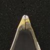
Hello, I would like to pick a Pen from F-C and I have doubts between Medium Italic vs Stub in steel from Meister Masuyama. I would like to know your feedback if you have tried both. I would pick up an italic because it is supposed to have more line variation. But I am afraid it to be very scratchy, I don't mind if it has a bit of feedback, like a sailor or so, but not too much that it is bothering. Would an italic from Masuyama be smooth or scratchy? Or something in between? I am used to write in cursive, since in Spain print script it is not taught in school. Also it would be great to see writing samples. I have seen the white on black samples from the F-C site but they are not very clear to me. Thank you FPN people.
-
Hey Everyone, I've just sent back my Franklin-Christoph medium S.I.G grind in order to exchange for a broad Masuyama italic. Don't get me wrong: the SIG nib was great to write with and I liked it very much; but, since you can't buy Masuyama grinds separately like you can a sig, I've opted for the CI. I'm also interested in learning an italic handwriting script some time, so this makes sense long-term. Now, however, I'm hearing that Masuyama italic grinds are dry writers. One post I've come across was particularly bothersome in that the OP said their f-c Masuyama italic required loads of pressure to write with until they eventually sent it back for a flow adjustment. Moreover, the nib wasn't said to be defective by the F-C team, they just tuned it to what they'd call "wet". I'd imagine that an italic tuned on the drier side would maximize line variation and the integrity of the cross-stroke-- are there any other practical reasons for a CI to write dry? I'm particularly interested in hearing from those who regularly write with any form of italic or own steel F-C Masuyama italics. Have yours been dry compared to others? Do they write under their own weight? Having said all that, I'm really not too fond of nibs that are very dry, especially if they're broad. On the other hand, perhaps I should leave this to the expert Mr. Masuyama -- it is, after all, my first hand-ground cursive italic. Sorry for the long post and thanks in advance.
-
So I was going through my father's desk at his office on the occasion of his retirement and found this set. I cleaned it and inked it up with one of the nib units that isn't cracked (3 of 5 are, I might tape them and try them anyway, don't know if they will just leak everywhere) and I have a couple of questions. The pen cape doesn't meet the body when screwed on, might there be a missing ferrule or metal ring? And, The set is left-foot oblique, but labeled "left-handed" although I am a righty. I can write with it just fine since I have a tendency to rotate my pens counterclockwise anyway, but then I get really funky lettering because the fattest part of the line is at the horizontal, and the skinniest at the vertical. You can see the result in my handwriting sample. So, if I don't rotate, the nib doesn't work at all, and if I do rotate, I get weirdness. Any suggestions?
-
Received a newsletter by email this morning from Fritz Schimpf promoting a special edition MB 146 with what appears to be an italic nib. Interesting writing samples. https://www.fritz-schimpf.de/Schreibgeraete/Fuellhalter/Montblanc-x-Fritz-Schimpf-Sonderedition-Italic-100-Kolbenfuellhalter.html?utm_source=CleverReach&utm_medium=email&utm_campaign=Newsletter+Herbst%2FWinter+2017&utm_content=Mailing_10553580
-
I'm ready to try my luck at line variation. So I'm looking at mr. Pen's Italix range. Seems they have a lot of options to choose from. It was all a bit confusing to me, so I've made a list. Hopefully it's useful for someone.

-
I used to do multi colored notes with my uni ball vision pens. my friend showed me a stub pen and I absolutely love it. I cant go back to normal tips now. So i bought a lamy alstar with a 1.5 nib. I love it alot but I have a problem with it writing too big. I looked at amazon and got a nice 1.1 manuscript fountain pen. I think this one writes so much nicer and I can put more words in a page with this on. I tend to write for about 4-8 hours at a time small breaks every 2 hours but the manuscript really hurts my arm after writing with it for long periods of time. My lamy doesn't do that. plusthis pen hurts my finger as I hold the pen high. So while I want to buy a bunch of multi colored lamy pens I found that some of the colors I like are the special edition and I don't plan on paying about 100$ to get them. Do note one thing, I have used a jinhao x450 before I hold the pen too high and end up holding the nib. I saw the wing sung 6395 which is a lamy al star copy and that I can swap my lamy nibs into that pen. So I can buy a few 1.1mm and throw a small grind on them? I have yet to use the lamy 1.1 but I heard its basically round. Does anyone else have some suggestions cause i'm all out of ideas, and I dont really know what else I can do without spending over 200$ I want the colors dark purple, a nice teal, dark red and finally a black. I'm looking at a orange and a green.
-
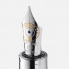
Platinum un Nice Pur lim edition with a crisp Italic Hello FPN! It’s been a while since I wrote a review, but I think this pen demands one. I love italics, almost as much as flexible nibs. Therefore I own a bunch of italic nibs in all the spectra of smoothness, but only one customized by a nibmeister ( a B cursive italic by Mike Masuyama I bought from Franklin Christoph, wich is one of my favorite nibs of all time) so I have been looking around for another custom grind. I love my CI but wanted to try a crisp italic, because I prefer as big a contrast between thick/thin lines as possible. Another one of my passions are demonstrator pens. And one more are japanese pens. So, when Browsing nibs.com a nice day I found a Platinun nice pur with a nicely discounted price I jumped on it, and ordered a extra broad ( C nib )with a crisp italic grind and an inkflow of about 7/10. After a very brief waiting time for the grind the pen was shipped. Then came nearly a month at customs and 60% in taxes ( gotta love brazillian customs)... and it finally arrived at my hands. Nice box but nothing fancy. Then the pen... it looks like a beautiful demonstrator with silver details. Nice, but not spectacular. But as soon as I picked it up I fell in love with it. It has a kind of satiny texture thats feels gorgeous in hand. This pen is a delight to hold. And the writing experience... WOW, it is better than I thought. It is a really crisp italic but still smooth enough to write cursive, with an awesome line variation. And to my surprise, the reverse side is a juicy stub!!!! How cool is that??? So, to sum it up: Beautiful demonstrator with rhodium trims Delicious texture AWESOME NIB!!! My highest praise to Platinum for making this pen and the nice folk at nibs.com for the great costumer service and outstanding work. Bye!
-

Pen With Line Variation For Note Taking/everyday Use
Andr posted a topic in Fountain & Dip Pens - First Stop
I'm looking for a pen with line variation that I can use for taking notes.I want it to write fine and preferably not very wet I have a small budget ~$35. The only pens I've seen that I've seen that fit the criteria are Noodler's Ahab/Konrad, Nemosine Singularity and Pilot Plumix, which of these would be the best for note taking and are there any other pens that fit the criteria. -

My Attempt To Regrind A Nib From M To An Fine/extrafine, And To A Fine Italic
searchworlds posted a topic in Repair Q&A
This is my first attempt to regrind a nib and i wanted to share it with you. I have always had difficulties finding a really fine nib that would suit my need and taste. The western fine nibs are more like a medium to me, and the japanese fine nib i bought ( pilot 78g) is not fine enough. To solve this issue i searched for a very low cost pen, but with a nice look, and i discovered the Dollar 717i fountain pen that has a medium nib. It is a really nice demonstrator pen, with piston filling mechanism that hold 1,2 milliliters of ink, and i bought about 20 pens for 18€ on a lot sale on ebay. I had only sandpaper available for this attempt, in particular 1200 grit paper, i know it is not the right one, is too heavy, but i wanted to give it a try. Armed with patience and after watching this online guide, i started grinding the italic nib and i ended with a result nicer than i would have expected. After that result i was inspired to try to grind the medium nib of the dollar pen to a fine/extra-fine, i used the same starting tecnique for the italic nib, but later i went by inspiration, and adjustment by adjustment i obtained what i consider a nice fine nib how i like it. I am waiting to receive a package with a 40x magnifier to better see what i am doing when i will try to grind some more nibs the next time. I still need to smooth better the nibs , in particular the fine/extrafine, because they are not scratchy, but give more feedback than i like! What can i use to smooth the nibs without changing them? If someone know material largely available in italy or at least in europe, and cheap, it would be great! I found that i really love the fine italic nib Here are some picture of the pens and a writing sample: Black pen= Original Dollar pen with no modifications to the Nib Red Pen= Dollar pen with Fine/extrafine grinded Nib Blue Pen= Dollar pen with Fine italic grinded Nib For scale the square's side is 5 millimeters long http://s25.postimg.org/g4cutvce7/IMG_20140222_152634.jpg http://s25.postimg.org/yz8lkacfz/IMG_20140222_151952.jpg http://s25.postimg.org/46bafz8n3/IMG_20140222_152042.jpg http://s25.postimg.org/rhze52mwv/IMG_20140222_152319.jpg -
Hi, Can someone explain to me the difference between an italic and an oblique nib?
-
So, I bought a Delta Y2K Carbon Fibre special edition off of the 'Bay with an 18k broad nib. Pen came in today, I busted out the loupe to take a look at the nib, and... Seemingly an attempt to grind an oblique italic and it looks more like the nib was dragged down the road behind a car for a couple of kilometres. This is why you practice on cheap pens, kiddies.
-
I bought a Pilot Plumix a while ago as my first stub nib pen. Though initially I had a bit of fun with it, I find I don't use it much - even while I use my flex nibs quite a lot. I thought it was a little bit of money wasted, until today when i found out I could use it as a flat-head screwdriver. With reborn purpose, I think I'll be using this pen a lot more now. Has anyone else found alternative uses of/for stub nibs, or am I the sole madman here? (Embracing for hatemail. Don't worry, I do take proper care of my other pens.)
-
For several months I have been attempting to learn cursive italic - or maybe what Tom Gourdie would have called simple modern hand - well enough to use as an everyday script. I am becoming increasingly frustrated because I can't seem to master the basic hand and arm motion, or even figure out what those are. Skating along on the tips of the fingers for business hand is so relaxing and sustainable, but I can't find an analogous movement for italic - or at least not one that doesn't generate a very narrow and spiky hand. Lloyd Reynolds in his videos is scornful of the business hand technique, but as far as I've watched the series, the camera never seems to pull out enough for me to see how his own hand and arm move. Is there a video or description anywhere that would let me see or understand how to write a fluid, everyday italic at speed without planting my hand and/or tiring quickly? Jenny
-
I recently bought this Omas ogiva - beautiful pen. It seems that the nib was customised to write as and italic from the original nib marking (medium). The customisation looks like it was made by grinding or clipping the top of the nib off including the tipping which means that when I use this to write I will be writing directly with the gold part onto the surface of the paper. Given how soft these nibs are, I am not quite comfortable with that. So before I go spending 100s of Euros/Pounds on getting this one retipped and reground to an italic or cursive italic does anyone have any thoughts? EDIT: Another option might be to just get a replacement nib, so if anyone has any suggestions along those lines please let me know.
-
Sharing a transcription of a poem by Chuang Tzu, translated by Thomas Merton.
-

New To The Ink Life, Need Some Advise To Get Off On The Right Strokes.
Tnpenman posted a topic in Pointed Pen Calligraphy
OK, I bought the old Speedball Caligraphy Collectors Set, and the Spencerian Penmanship Mott Media about a year ago maybe? And I set it aside after just a couple of uses. Now I am going to give it another go and I was wondering about a few things. The ink is dry, is there a way to fix this or should I just buy new ink and cleaner? It came with the really small bottles anyway. I also read in another thread here where italic was recommended before moving on to Spencerian. I do not have any issues with this if it would be best. At this point handwriting skill is level ZERO. Can/Should I get a fountain pen to practice with? Or just stick with a dip pen? Also is an oblique holder a must for Spencerian and other scripts? I have no problems with learning it. I was just wondering. I am usually a pro lurker... but maybe this place will bring me more out of my shell. Talk to you soon! Michael -
I have heard numerous rumors that major makers, e.g., Montblanc, Pelikan, Parker, will no longer produce very broad or other specialty nibs, the type that a nibmeister can use for a good custom grind. Does anyone know the details of what is or is not going to be available? I have ordered a BB for my Pelikan M1000 that I intend to send to Pendleton Brown, but I would like to know what else may be in short supply. Thanks!
-

Italic Lower Case: How Many 2 Stroke Letters Do You Use?
jbutle04 posted a topic in Calligraphy Discussions
For written (now drawn) italic—I'm talking about everyday script, but we can exclude post-it notes and such—I think there's room for disagreement on whether the following letters are better written with 1 or 2 strokes: d, e, p, and w. I find myself going back-and-forth, especially on e and p, and I'd like to finally settle on either 1 stroke or 2, and not have to think about it anymore. So, I'm curious what's most common among the FPN crowd (this sub-forum, anyway). I feel like the sources I tend to look at for Italic ductus and exemplars, etc., are pretty evenly split on d and p. But there seems to be a consensus among Italic experts in favor of 2 stroke e, with the middle bar joining to the next letter. I've always been rather incredulous about that formation—it's hard for me to imagine that there are any benefits to 2 stroke e over 1 stroke—but maybe people here can convince me otherwise? Same goes for the d ascender. Perusing the Society for Italic Handwriting site, it looks like there's a preference for 2 stroke d (bowl + ascender) even in everyday cursive Italic. But I'm definitely in the opposing camp on that one. So I guess, generally speaking, I just wanted to ask for thoughts and advice on the topic of 1 versus 2 stroke lowercase Italic letters in everyday script. Thanks, guys! -

Thirty Minutes On Handwriting With Susan Wirth
bobje posted a topic in Broad (or Edged) Pen Calligraphy
This is 30 minutes on a variety of subjects with Susan Wirth, mostly about the value of italic handwriting and pens that create it. But touching on many other fascinating subjects. Produced by Lisa Vanness (vannesspen) with Brad Dowdy at the Chicago 2016 pen show. -
Hello all! This would be my first post here on the FPN, and my registration happily coincides my receipt of this pen. So, not finding very many reviews of it, I think I'll make one now to help others who are interested in this model. Pen: Nemosine Singularity 0.6mm italic stub demonstrator. Length: 136mm capped, 124mm uncapped, 145mm posted. Price: 14.99USD from xfountainpens.com Ink used: Unknown brand, reddish copper color. Paper used: National graph paper. First, some pictures! http://i.imgur.com/7WaqTNB.jpghttp://i.imgur.com/k95UkNk.jpghttp://i.imgur.com/35w3iXq.jpghttp://i.imgur.com/aVOebvW.jpg I think this is an attractive pen. Now, as far as demonstrators, there are certainly nicer pens; if you have the money, go a tier up and get a TWSBI Diamond. But this is still a good pen. The nib is a steel Bülow, and proudly declares that it is "Made in Germany", underneath that lovely etched design that resembles a butterfly. It's large, as Bülow nibs often are, and looks very nice. It's not THE nicest steel nib I've seen, but it looks good enough to fool someone into thinking that this is a better pen than it really it is, so if you're on a budget and trying to impress at work, that's a plus. While it is a plastic pen, the steel bands that serve to reinforce it keep it from looking like a cheap plastic pen, again making this a nice looking instrument for those who don't want to spend too much. But enough about the looks, they're for naught if it doesn't write well. After all, that's what a pen is really for, right? Let's talk pen. Pen is good. Here's a few samples of writing.http://i.imgur.com/EGa1CQJ.jpghttp://i.imgur.com/gr1sAlL.jpg Pardon my cursive, still learning. The paper is a National brand graph notebook dug out of an attic. I'm afraid it's no longer in production. The ink was a gift, and unfortunately the bottle has no branding on it, so I have no idea where to buy it. However, the color is not quite the same as these pictures, and I think that in person it very much resembles Diamine Ancient Copper. Apologies for the blue seeping through from the other side, I'm conservative with paper and didn't want to start a new page yet. As you can see, the stub adds a little bit of flair. Not a great deal of line variation, but enough that you can tell it's an italic if you look. I imagine the 0.8mm of the same line would provide a more dramatic effect. It's a bit scratchy and dry, so be prepared to modify it a bit. The scratching proved to be a bit of a problem, as this usually well-behaved paper began to feather due to the nib causing tiny tears as I wrote. It's not as bad with a light hand (which you should be using!) and roman scripts, but see here on this text where I have to pull down often: http://i.imgur.com/H6c9bZX.jpg?1 Gets pretty bad here, huh? I'm going to get out my 1200 grit Arkansas stone and have at it later, but I figured the review should be about as it is straight from the box. Speaking of out of the box, I commend the packaging. It's just a cardboard rectangle that fits the dimensions of the pen, nothing special, but the contents are above standard. It comes with a booklet on how to clean the pen, advising that one should do so before first use and when changing inks, as well as instructions on loading it with both cartridges and the included converter. Now this was not news to me, as I have already had pens before this one, and I'm sure it isn't news to most of you reading. But if this went to a newbie to fountain pens, the included info would be helpful. It comes with six (six!) of these black Jinhao cartridges (For those of you unaware, Bülow/Nemosine/Knox/Jinhao are all related companies and use parts from the same manufacturers), which was a shame because I do not use cartridges. I did however give these to my mother, who owns a Jinhao which these fit and prefers cartridges, so they did not go to waste. The converter was a nice surprise in terms of appearance. I expected the cheap international converters that come with Jinhao pens, but the Singularity's converter is sturdier. It has a very smooth plunger mechanism secured to the tube with a broad steel band. It tapers slightly towards the section, but it still has a decent ink volume at approximately 0.75ccs. The suction is not superb right off, I recommend adding some grease to this one. I realize that's standard for some of you, but you should still know that this is not a perfect converter in that regard. My verdict? I'd rate this at six out of ten. It's not a bad pen. On the contrary, if you're up for a few standard tweaks (open the tines, smooth the tip, grease the converter) for this price I recommend it. But it's not tip-top. It's pretty and it feels sturdy, so I'd carry it with me, but it's not a very enjoyable writing experience without changing the pen first. I hope this helped. Again, this is my first review, so if there's anything I should add or any questions about the pen, do tell!
-
Hi, folks! I just joined here and decided to make a small post which might act as an introduction. A month ago I finished off with my undergraduate studies and didn't have much to do before I go abroad for my Master's studies next January. My handwriting, which has always been cursive needed some serious improvement and hence I decided to do just that. The shop near my place had a pretty cheap fountain pen, the Flair Inky Executive which cost me Rs 50 ($ 0.75). It came with two cartridges and I decided to make the most out of them before trying out any other ink. As soon as I started writing, I realized the pen had a medium nib and my handwriting was never legible unless written with an extra fine nib. I couldn't return the pen so I decided to play along with it for a while. I tried to follow some of the rules of the Spencer script which resulted in a minor improvement in my handwriting. In my pursuit to improve my writing, I came to know about italic nibs and the line variations they have to offer. After a lot of fooling around on the internet, I decided that I should grind my round-nibbed Inky to an italic nib. I had a small block of granite laying around and began grinding the tip of the nib. I never really expected any results but it turns out, that I did manage to do something to the nib. Now as it stands, it's not an italic nib, but one could argue it's almost a stub and surprisingly enough, it isn't as scratchy as I imagined it would become. A stub nibbed FP here in my city would cost me around 4 times the cost of the Flair Inky that I used. I observed that after grinding, the lines have become much finer and I do get a bit of line variation. I am still trying to improve my handwriting every day (been at it for 4 days now). I am posting some images of the pen and a sample of my writing in it. This is the nib after grinding, not sure one can make out much of it since I took the pictures with my phone camera. Finally here is a sample of my ugly handwriting using the grounded nib. Comments, views and suggestions are most welcome! Cheers!
-
Cool Pictures Of Handwriting For A Presentation?
TheYellowHobbit posted a topic in Handwriting & Handwriting Improvement
http://i.imgur.com/oxU3VRy.jpg http://i.imgur.com/BoTlQ1O.jpg P.S. Sorry for the bad lighting and hugeness of pictures. -
Which pens do you have that use the most ink? Which pens do you have to refill the most often? Also, the inverse. Which pens do you have that use the least amount of ink? For me, the answers would be a VERY wet Jinhao X450 for the most ink using pen, and a Platinum Standard PTL-5000a XF for my most efficent pen.
-
Greetings, all. I just got a DF nib the other day for my 140 and after some tweaking it has become completely wonderful. I have two questions for those more knowledgeable: 1) Are these nibs mildly italic? 2) Why are there two breather holes? Thank you in advance.
-
Suggestions For Fine Italic Nib (With A Width Less Than 1Mm)
sakayume posted a topic in Of Nibs & Tines
As the topic title says, I'm looking for a pen with an italic nib (not a stub! it will be used for writing italic) with a width less than 1mm. I usually write italic in my notebook with an x-height of about 3mm (8mm line spacing means that any larger looks very odd if I don't skip lines) and recently, perusing Benson's The First Writing Book has me convinced that my current nib, a Prera CM, is much too fat for the x-height I use. Hence, are there any factory italic nibs that come in narrower widths? I'm aware of Aurora, but it seems like that one would be similar in width to the Prera CM. The 1.1 nibs of Lamy etc are wider than Prera's CM, so they're not in consideration at all. I'm not really interested in a custom ground nib at the moment as it seems like it would be an expensive proposition for something I don't write regularly. I also have an old Platignum lettering set I appropriated from my mother, who in turn seems to have had it from a brother, but some of the nib collars have cracked and the squeeze filler doesn't seem to take up much ink. I've thought about using dip pens, but I'd rather not if there are other options as a fountain pen is much more convenient as I don't write long passages at a time, and decent calligraphy supplies are hard to come by here. Thanks in advance.