Search the Community
Showing results for tags 'italic nib'.
-
The Model 02 "Instrinsic" can be ordered with a number of finished. This is black with a "Cherry" finial. The unusual tapering of the barrel can be seen better when the pen is un-capped ... With an average-sized hand (mine) and a normal pen grip (mine), the thin portion of the barrel rests in the web between thumb and index finger. It is comfortable to hold and write with, although my personal preference would be for a thicker barrel. (A Model 19 may be in my future.) Where the rational for this shape becomes clear is when the pen is posted ... Now you see that the pen posts deeply, and, in this configuration, it is the thicker cap of the pen that rests in the web between thumb and index finger, which is much more comfortable. What cannot be seen but should be appreciated is that this shape also determines that the pen is equally well-balenced (in my opinion) both when un-posted and when posted. I purchased this pen with a JoWo Steel 1.1 mm Italic nib as well as the 1.9 mm music nib. Both nibs write very smoothly - almost too smoothly for optimal control. I have been using this pen for a couple weeks now, and am accommodating to its smoothness. It should be noted for those not aware of it already that the #6 and #5 JoWo nibs can be shared between Franklin-Christoph, Edison and, I believe, some other makes of pens that use them. So, for example, I have a couple Edison nibs in other widths (Fine and 1.5 mm Italic) which I could use on the F-C nib. Likewise, I could use the F-C Music nib on one of my Edison pens. I see that as a very positive benefit. This pen is quite light but looks and feels like a high quality writing instrument. I can find no fault in the fit or finish. I would not hesitate to recommend it to some one moving beyond entry-level pens but not yet ready to spend 4, 5, 6 hundred dollars or more on a fountain pen. And, as the asking prices for some of my own favorite, top tier pens approach ridiculous heights, pens like the Edisons and Franklin-Christophs become even more attractive options. David
- 12 replies
-
- franklin-christoph
- music nib
-
(and 2 more)
Tagged with:
-

Practical Difference Between Stub Nib & Italic Nib?
SomethingWicked posted a topic in Of Nibs & Tines
Please forgive the newbie question, but when I saw an Italicized nib, I thought it looked like a better version of a stub nib. Am I correct? Or does the stub create the kind of design that is more pronounced than an Italicized nib. Does someone have a photo posted at FPN of the different writing styles? -

Italic Nib Review: Franklin-Christoph Music Nib
dms525 posted a topic in Broad (or Edged) Pen Calligraphy
FYI, I have posted a review in the FP Review forum of a pen with a nib that may be of interest to participants in this forum. See Franklin-Christoph Model 02 Intrinsic With Music Nib and enjoy! David- 3 replies
-
- franklin-christoph
- italic nib
-
(and 2 more)
Tagged with:
-
New-style, bi-color 18 Kt gold nib. A Medium, custom ground to a crisp cursive italic by Oxonian Not so incidentally, the new style nib has basically the same writing characteristics as the old style nibs. It is pleasantly springy. The size, however, seems very slightly larger than my other CS #6 nibs. This nib has been custom-ground and tuned, of course, but it writes very smoothly with just enough feedback and medium ink flow. The fine lines are actually even finer than they appear in the document scans, above, and this is with an ink that is generally regarded as "wet" (although I don't find it so). Nebula meets of couple CS Belliver siblings - Red, White & Blue and Shingle (left to right) I did not perform a quantitative rating for this review. I really haven't found any reasons to deduct even fractions of points. So, assume a "perfect" score. Note that that is not the same as a "best" score. And now, a moment of silence for the Conway Stewart Belliver. I hope it comes back. It's been a terrific model, in my opinion. Happy writing! David
- 18 replies
-
- cs
- conway stewart
-
(and 5 more)
Tagged with:
-

Stipula Facetted Etruria In Champagne Celluloid With An Italic Nib
dms525 posted a topic in Fountain Pen Reviews
Introduction I got into fountain pens initially via my interest in italic calligraphy. So, while I have become enamored of pens that are visually beautiful, my principal focus has been on how they write, particularly, italic script. This has required that I have most of my pens’ nibs custom ground. I have found relatively few that can be had with usable stock italic nibs. Most of these are at the low end of the beauty spectrum, to my eye, for example Osmiroids and the wider Lamy italic nibs. In recent months, I have acquired a few Italian Pens which can be had with stock italic nibs. My latest, which arrived by today’s mail, is the subject of this review. I had recently acquired two Stipula Etrurias. Both are piston fillers and from Limited Editions - A “Casa Mila” with a fine nib and a “Tuscany Dreams” in brown woodgrain. I sent the Tuscany Dreams off to Yafa for a nib swap to a 14Kt gold 1.1 mm italic nib. The process was a bit of an ordeal and took three months, but this pen with the factory italic nib is a marvelous writer. Both these pens, while large (but not “over-size”) and weighty, are very comfortable to hold and write with. The italic nib had perfect ink flow for me and very acceptable thick/thin line variation. It is only the second high-end pen I have that has a factory italic nib I do not feel needs further customization. (The other is a Conway Stewart Wellington with a IB nib.) This positive writing experience led to my buying a second Stipula Etruria, but this time already fitted with an italic nib. 1. Appearance & Design (9.5) The photos of this pen on the Chatterly Luxeries/Pentime web site were attractive, but it was not a surprise to find the pen much more beautiful in person. The “Champagne” celluloid is a rich amber background with embedded clear, iridescent highlights and wandering veins of deep, dark blue. I find the shape to be more graceful than the rather bloated appearance of the Tuscany Dreams, for example. The facetted cap and barrel not only make the pen more slender but also keep it from rolling. Since the section is round, the facets have little if any impact on how you hold the pen. The section has a gentle concavity. I find this very comfortable. I prefer pens to have easily changeable nibs, like Pelikans and Auroras. Stipulas have friction-fit nibs that I don’t have the courage to mess with. 2. Construction & Quality (9.5) The pen has a generally high-quality appearance and feel to the materials and construction. The cap screws on and off easily and feels secure when on. The piston works from the blind cap. It is unconventional in that it is turned counter-clockwise to suck up ink. The barrel and blind cap do not fit perfectly smoothly, and the vein pattern in the celluloid does not line up perfectly between the cap and barrel or between the barrel and the blind cap. I regard this as being imperfect but of no functional significance. Top to bottom: Stipula Etruria Tuscany Dreams; Stipula Facetted Etruria in Champagne; Pelikan M620 Piazza Navona 3. Weight & Dimensions (10) This is a hefty pen. Full of ink, it weighs 42g. For comparison, a fully inked Pelikan M800 weighs 31g. I find it comfortable to write with. When carrying it in a shirt pocket, the weightiness is noticeable. Capped, the Etruria is 5 mm or so longer than an M800, but both are essentially of equal length uncapped. It works for me. The barrel diameter and section diameter may be a hair less than those of an M800. This is of no consequence for their ergonomics, in my judgement. 4. Nib & Performance (10) The nib is 14Kt gold. It has a silver appearance. I do not know if it is white gold or is plated to match the sterling silver clip and rings on the cap. The nib is large. It is pretty stiff. It writes almost butter-smooth. The line differentiation is excellent. The ink flow is very nice - I would call it 7 on a scale of 10. Actually, if I could give the nib a score of 11, I would. 5. Filling System & Maintenance (10) The pen is a piston filler. It works smoothly and appears to suck up more ink than a M800, but I have not measured it. I have not used the pen long enough to fairly judge any “maintenance” issues, but I have no reason to expect problems in this area. 6. Cost & Value (9) This is an expensive pen, even with the very substantial discount from the recommended retail price. I think that, in this class of pens, “value” is very subjective and very individual. Each of the pen lines with which the Etruria might be compared has unique features in design and, often, in materials, that create more value to some than to others. The cost of this pen to me was enough to inhibit further purchases of similar pens…. somewhat. I certainly am happy to have this one. In fact, I expect it to be among my favorites and expect to use it frequently. It’s value is greater (to me) than that of a great many pens that carry higher prices. 7. Conclusion (Final score: 58/60 = 9.7) The Stipula Facetted Etruria in Champagne Celluloid is a beautiful pen, and it writes like a dream. In my on-going quest for the “best” pen for italic writing, this one is a strong contender. Its only real competition is from a few of my best pens with custom-ground nibs, and those are pretty terrific. It is an exceptional pleasure to get such a gorgeous pen that also functions so well in every respect right out of the box. It’s not a proper part of a “pen review,” I suppose, but I have to add a word about what a pleasure it has been to deal with Bryant Greer again. I’m a fan. David -
This is my first Lamy italic nib and I must be doing something wrong. I received a letter from a pen pal with writing samples of different pens and this was the one of a Lamy Safari with the 1.1 italic nib. So, I ordered a new Safari and a 1.1 italic nib, but this is what my attempts look like. I actually used the back of the letter (I apologize if you are the pen pal and are reading this :-) ) so it would be on the same paper - apples to apples, if you will. It's not even close! It doesn't matter which angle I hold the pen, I can't get the same result. The stroke is much wider than I expected and I am rather disappointed. Is it me or is it the nib, or a combination of both?
-
Greetings followers! We are glad to introduce the new Pelikan Classic 200 Cognac Special Edition. http://cdn.shopify.com/s/files/1/0204/1770/files/Sales_Folder_Classic_M200_Cognac-1.jpghttp://cdn.shopify.com/s/files/1/0204/1770/files/Sales_Folder_Classic_M200_Cognac-6.jpg Not only it has a new shiny colour, which is transparent cognac, but also its harmonic structure, made of high-quality resin and gold plated trims. This is reinforced with its stainless steel nib, also gold plated. It is available in 5 different sizes, including the very popular italic nib. http://cdn.shopify.com/s/files/1/0204/1770/files/Sales_Folder_Classic_M200_Cognac-3.jpg http://cdn.shopify.com/s/files/1/0204/1770/files/Sales_Folder_Classic_M200_Cognac-4.jpg If you have any doubts or you wish to know something more about this new special edition, please do not hesitate and contact us! www.iguanasell.com info@iguanasell.com
- 17 replies
-
- pelikan
- fountain pen
-
(and 5 more)
Tagged with:
-
Kaweco Italic Replacement Nibs In Al Sport And Sport
davdj0nsn posted a topic in Other Brands - Europe
I have a Kaweco Sport and a Kaweco AL Sport, and I'd like to put italic replacement nibs on both of them. Is that going to work? I think I read somewhere that the replacement italic nibs cannot be put into an AL Sport. I notice that the Kaweco replacement nibs come with a section. Can you take the feed and nib out of this section and put them into the section that comes with your pen? How do you do that? Thanks David.- 7 replies
-
- kaweco
- kaweco al sport
-
(and 2 more)
Tagged with:
-
hello everybody, i am new to both fountain pens and the forum. i have considerable experience w technical drafting pens--but i'm now free to play with the fun pens! i've made a pretty big beginners mistake i think. half measures or moderation has never been a strength. i bought 4 Pilot Namiki falcon II in the enameled metal. i love the way the ink flows, the converter seems to keep the ink under pressure (?) and it always simply flows out beautifully. i'd wanted them to improve my writing because i'm loosing some hand dexterity due to spinal issues (thus for mostly lowercase typing), but am not enjoying the pressure one has to use on the flexible nibs. my dexterity is just not up to that anymore. so i bought a set of Lamy pens and absolutely love the stiff italic nibs. however, i am constantly having to open them up after a few sentences and screw down the plunger to get the ink flowing correctly again. i have 3 of them and am having the same issue w all three. is there a way to put in a converter like the one in the pilot namiki into the Lamy pens? i'm sure it will be some work, but after having to retire exceptionally early from architecture for health issues, this is very important to me. i have an art studio and use written pages in my paintings, but also simply love to have a comfortable pen. i've also been doing quite a bit of writing of late--i feel i need to get everything written down before the hand no longer works! the metal Falcon II and Lamy Studio pens are a perfect diameter and fit for my hand. the italic nibs also cover the shakiness of my writing that is starting to show when using a regular F, M, or even B nib. i'd thought about having the Falcon's nibs reground to italics, but am a little afraid of having a flexible italic nib. (any thoughts on that wld be welcome) i've been using Pilot Namiki Iroshizuku inks. if there are other options or ideas/advice, i would love to hear those as well. admittedly, i was a little cocky when buying these pens after years of using, disassembling, cleaning, and reasembeling technical pens. pens are pens...right? i'm finding there's quite a lot more involved with fountain pens than i ever imagined! thank you for your time. kim
- 1 reply
-
- converters
- newby
-
(and 3 more)
Tagged with:
-
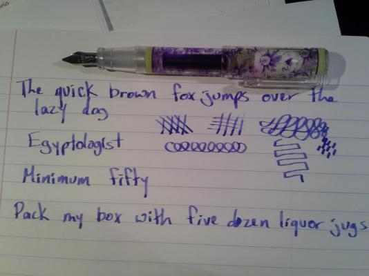
I recently returned to my happy life of writing with my fountain pens, and as these things go, the tipping on one of my favorite everyday writers pops off. I then put together this post about my first salvage regrind, and FPN goes down for several weeks. The pen in question is an Inoxcrom Daisy pen. It's an inexpensive plastic bodied pen I bought at a bookshop in Boston several years ago. Before the "incident" this tip was on the extra-fine side of fine. A nice steady, smooth writer that occasionally dried up if left uncapped for a long time, but usually very reliable.It was one of my favorite pens, and I was not willing to let it go. And in my haste to try and save it, I did not take any pictures of the process. First, I found Ludwig Tan's article on nib grinding at www.marcuslink.com. While I did not have all the requisite supplies, I thought I could improvise. The first thing I did was take a pair of wire cutters and clip the other half of the tipping off the other tine. The reshaping step of the regrind happened on the third step of my three-step knife sharpening stone. http://www.harborfreight.com/3-in-1-sharpening-stone-94396.html The first thing I noticed was how soft the steel on the nib was. I accidentally wore down a little more of the remaining nib than I expected the first few passes. The shaping had to be done VERY gently, and no more than what it took to get the tines level and square. I then deburred the edges with the grey side of a micro-mesh 3-way buff stick from richardspens.com http://www.richardspens.com/?page=accessories/smoothing_kits.htm Again, being surprised by how fast the metal was responding to the abrasives. Not having anything to polish the nib further, I burnished it using the smooth insides of my ceramic sink. For a hasty, panicy job, I'm quite happy with the result. I usually like fine nibs, but the expressiveness of this line, and the smooth, soft ride as it writes is really growing on me. It writes better than any italic nib I owned that was purchased as an italic. Here is a picture of the finished regrind, next to an Inoxcrom Jordi Labanda pen, which until a last week, had an identical nib. The writing sample is pelican 4001 blue on clairefontaine notebook paper. And I'm left handed.
- 1 reply
-
- inoxcrom
- nib regrind
-
(and 2 more)
Tagged with:


