Search the Community
Showing results for tags 'iroshizuku'.
-
Below is a written review of Pilot Iroshizuku Tsuki-Yo. The name stands for 'Moonlight' and is a teal leaning deep blue. I quite like this pen for work related writing (little though that is); but it is a tad unsaturated in quite a few of my pen, so not quite a favorite - I'd rather it was a tad darker - the Krishna Sea at night is a similar teal leaning blue, but one with lot more sheen and leans the other way on the saturation spectrum - the color is dense! I find it works best in a wet fine nib, though for this review I used a Sailor Sapporo with a B nib, to highlight the beautiful shading.
-
I'm on a quest to find the perfect ink for each of many different color and other categories. Here's what I have for greens thus far For greens, I'm looking for two different types of greens: Light green - a beautiful vibrant light tea green with lots of shading.Green - a solid green with some shading and/or sheen, not too blue or yellow, and not dark or olive green. For this review, I've done a comparison of the following inks thus far: Diamine - Emerald Ink sample vialNagasawa Kobe - #19 Minatogawa Lime Ink sample vialVinta Inks - Sea Kelp Leyte 1944 Ink sample vialColorverse - Albert Ink sample vialPenBBS - #159 Bitter Herb Ink sample vialPilot Iroshizuku - Chiku-rin 15 mL ink bottleDiamine Inkvent - Mistletoe 7 mL ink bottleColorverse - Sea of Tranquility Ink sample vialMonteverde - Olivine Ink sample vialI'll update with PenBBS Forgive Green, Diamine Elf, Diamine Holly, and Diamine Sherwood Green once I get all of those inked up in every pen. For each ink, I test on CD Apica notebook, Life Noble notebook, Rhodia dot paper, Tomoe River paper, and HP Premium32 paper. I accidentally bought the cream-colored Life Noble Notebook to use for this, so the colors come out different on that. The pens I'm using are a flex pen (Waterman or Noodler's Creaper with a Waterman nib), Pilot Metropolitan, Lamy Safari, and 2 Nemosine stub pens. Please ignore my "Green" and "Light Green" headings for pages. That was to help me space out the ink samples in my notebooks, but I didn't always categorize inks properly based on what color I guessed they'd be. I also had to start over on the Chiku-rin because I didn't clean the pen out properly, which made it come out way more yellow than the ink actually is. There are also a few drips and smears from other inks because I'm not super careful about stacking paper. I'm not particularly concerned with water resistance in general, so I didn't intentionally review that aspect of any ink. I accidentally spilled some water on Diamine Emerald on TR. As you can see, it's not super water resistant, lol. I had a hard time taking images that looked properly lit and accurately captured the ink colors. Mad props to all those lovely reviews on FPN with beautiful images. If anyone has any tips/suggestions about how they do their ink review photos and uploads, please let me know.
-
I'm sure there have been several discussions of my question, but my searching hasn't turned up a definitive thread yet, so I'd like to ask here: What are the safest and most dangerous inks for pens with rubber ink sacs? And also for Parker Vacumatic diaphragms? I have a bunch of samples of Pilot Iroshizuku inks I've been using, and I assumed these would be safe inks due to their generally excellent reputation, but in a thread here, post #45, https://www.fountainpennetwork.com/forum/topic/351582-a-review-of-the-wahl-eversharp-decoband-in-rosewood/page-3 there is reference to a claim that PI and other Japanese inks are relatively alkaline and that this is bad for latex rubber. I'd like to know if I should remove these inks from any sac pens or Vacs I own and use other inks in those pens henceforward. All experience-based observations on these or other inks will be welcome. TIA, J
-
Disclaimer: I enjoy doing mini ink reviews for my personal reference, and I'd like to share them with others if they might be of help to gain an insight into the ink's appearance and performance. I generally don't have time to put together super comprehensive reviews, like some of our fantastic reviewers here do (thank you so much for your hard work!), but hopefully these mini reviews will still be useful as another point of reference. Pilot Iroshizuku Tsuki-Yo Much has been written about Pilot Iroshizuku inks. It is a highly popular line of Japanese inks that comes in [mostly] vibrant and saturated colors, with rather wet-flowing consistency, some translucence, a good deal of unobtrusive sheen for some colors, and generally some water resistance. Tsuki-Yo is a popular blue-black, and I probably won't add more than what's already been written and photographed, but better more than less information for prospective buyers. This is a rather vibrant blue-black. As opposed to more muted and vintage looking blue-blacks such as Sailor Jentle Blue-Black. There is a good deal of teal in this ink, but it's not necessarily jumping out at you from the page if you use bright white paper. Some paper makes it look less teal and more navy, and some paper enhances the green notes. I personally prefer the more teal look and like it on ivory toned paper more than on more neutral white paper. There is magenta-red sheen around the edges of wetter writing on good paper. The ink has some water resistance: a slightly fuzzy blue line remains and the text is still legible after dabbing a wet page with a paper towel. Water resistance increases slightly with time. In my experience, Iroshizuku Syo-Ro has the best water resistance and legibility of the three tealy Iroshizuku inks: Syo-Ro > Tsuki-Yo > Ku-Jaku. In terms of saturation and vibrance, Tsuki-Yo sits in between Ku-Jaku and Syo-Ro. Ku-Jaku dries a more bright turquoise-teal with red sheen, Tsuki-Yo has some gray and muted tinge to it but still saturated, and Syo-Ro is more green and even more muted and grayed than Tsuki-Yo. Because of how free-flowing Iroshizuku inks are, they might feather on some paper--even on fountain-pen-friendly paper if they are left to sit in a pen and concentrate. They will increase line thickness and will not give the finest hairlines. But they do provide pleasantly gliding experience for lower fatigue in long writing sessions. Tsuki-Yo is not a particularly exciting ink to use with a water brush. It's fairly monochromatic in practice. Papers used in this review are: Fabriano Bioprima 4mm dot grid - a kind of ivory color, lightly textured, uncoated Kokuyo Campus A5 lined - white Japanese paper, could be lightly coated as it's quite smooth Nakabayashi Logical Prime notebook - coated and super smooth ivory-toned Japanese paper, shows things like sheen and hue variation pretty well Nakabayashi Logical Swing "A" B5 paper - lightly coated(?) ivory-toned paper which shows sheen and hue variation pretty well but is also quite soft Photographs: Scans: Ivory toned Fabriano Bioprima: Kokuyo Loose Leaf A5: Nakabayashi Logical Prime A5 notebook: Nakabayashi Logical Prime A5 notebook: Further comparison with Syo-Ro and Ku-Jaku:
-

Different Color In The Last Bit Of Ink Sitting At The Bottom Of A Bottle?
Cursive Child posted a topic in Inky Thoughts
I've had this bottle of Iroshizuku Ku-Jaku for about 8-9 years. Finally getting to the bottom of the bottle. Noticing that the color is quite different on paper than it was a few fills ago. It's bluer and darker, even in the same pen. I know the original color used to dry to a greenish blue - Pelikan M605 Medium nib on Staples sugarcane paper. Why? Is it because the ink at the bottom wasn't shaken or stirred, and somehow, the bluer color was heavier? I didn't notice anything, but frankly never looked and it's a dark ink anyway. I've forgotten my high school chemistry, but if it's a dye based ink, why would it do that? I don't use much ink, so each bottle lasts for years. Anyone else have this happen to them with a bottle? -
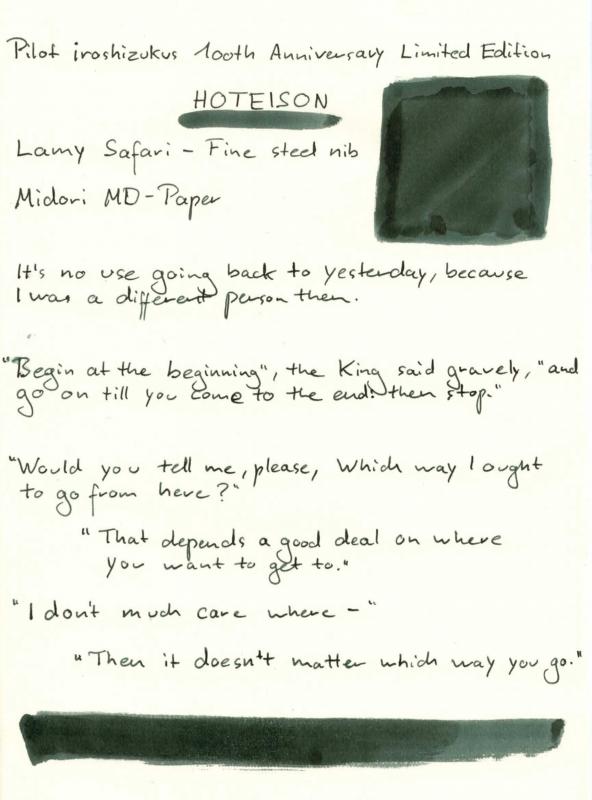
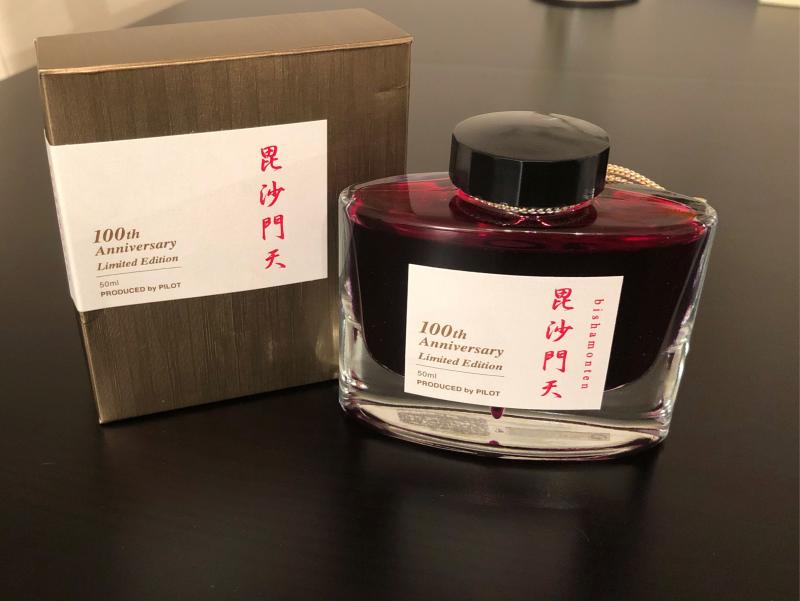
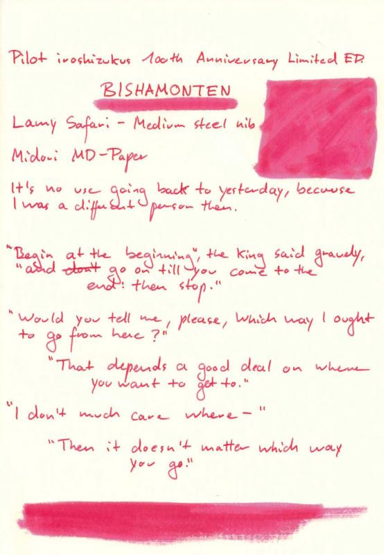
Hello there! I thought it might be helpful to share pictures of the new Iroshizuku 100th Anniversary inks. I got my hands on Hoteison, Jurojin, Benzaiten and Bishamonten. I'm waiting for the other inks of this line to arrive (should take around 2 weeks) and will then - if you're interested in it - upload other pictures. Hoteison Jurojin Benzaiten Bishamonten -------- Hope this helps some of you since when I ordered them I didn't really find too much pictures! If you have any questions regarding the inks please ask. Regards

-
Hey guys, I'm looking for recommendations about Iroshizuku sheeners. I've got take-sumi and yama-guri that are working wonders on tomoe river (dark copper and vibrant green sheen respectively) and would like to know your experience with other colors from the same lineup. What are the best sheeners in your opinion? Fiddling with the idea of trying a few more colours and would gladly take your input TiA!
-
This is my first go at an ink review, and my first entry in my ink journal, so please be gentle. Also, sorry for iPhone photo.
-
In December 2007 Pilot's created exclusive line of inks called Iroshizuku. I believe they may well be the most well known fountain pen inks in pen world. These inks are supposed to work in any pen with any nib on any paper and in any situation. I haven't tried all of them but so far the Iroshizuku inks I've tried were behaving flawlessly. The colors were created by Kiyomi Hasegawa who after fifteen years of working in a stationary shop and communicating with Clients come to conclusion that not all fountain pen users are willing to write in black and blue. Wise woman. The bottles are stunning although they have their issues: if the ink is left unused for some time the cap tends to stick and break when you try to twist it open. It happened to my bottle of Shin-Ryoku. Anyway Iroshizuku line of inks counts 24 "standard" colors. Three inks were made some time ago for Tokyo stores: Edo-Murasaki, Fukagawa-Nezu and Shimbashi-Iro.After seeing the scans over blogosphere I wish these three were accesible, because they look interesting. Edo - Murasaki looks cool while Murasaki - Shikibu is of no interest to me. Even though I kind of like Fuyu-Syogun I find Fukagawa-Nezu more compelling. Nothing indicates Pilot plans on extending the official line any time soon (if ever) so let's take a look at what's possible to obtain from dealers and online shops. http://imageshack.com/a/img538/1595/lYAayJ.jpg I don't have all of the inks but sooner or later I'll try to check them all. With time I'll review all of them (hopefully). Ajisai Ama-Iro Asa-Gao Chiku-Rin Fuyu-Gaki Fuyu-Syogun Ina-Ho Kiri-Same Kon-Peki Kosumosu Ku-Jaku Momiji Murasaki-Shikibu Shin-Kai Shin-Ryoku Syo-Ro Take-Sumi Tsuki-Yo Tsukushi Tsutsuji Tsuyu-Kusa Yama-Budo Yama-Guri Yu-Yake Kiri-same is decent grey ink, not really thrilling, but not bad either. It is waterproof top some extent: dye is washed out but the text stays legible. http://imageshack.com/a/img911/6236/NulELX.jpg Chromatography isn't exciting: http://imageshack.com/a/img661/9597/f7JX9V.jpg Ink Splash http://imageshack.com/a/img538/8839/R5G6A2.jpg Drops of ink on kitchen towel http://imageshack.com/a/img661/3928/cywVmR.jpg Software ID http://imageshack.com/a/img538/4097/8GnGwl.jpg Oxford Recycled ( 90g), Kaweco Classic Sport używany jako zakraplacz, B http://imageshack.com/a/img673/6065/2zKsA0.jpg http://imageshack.com/a/img540/9449/uYzDEU.jpg http://imageshack.com/a/img901/2603/BYf5gU.jpg http://imageshack.com/a/img537/8587/tew81h.jpg Calendar http://imageshack.com/a/img909/5150/kuXr46.jpg http://imageshack.com/a/img540/6757/IjVqnU.jpg Comparison http://imageshack.com/a/img540/1058/fQzOoV.jpg
-
Hi, I'll be going to college in a few weeks and I want to keep using my fountain pens; but I don't want to bring the easy to break fragile glass bottles that most inks come in into the chaos of college life. Is there a more durable way to store my ink?
-
http://inks.pencyklopedia.pl/wp-content/uploads/Pilot-Iroshizuku-Momiji-nazwa.png Manufacturer: Pilot Series, colour: Iroshizuku Momiji Pen: Waterman Hemisphere "F" Paper: Image Volume 80 g / cm2 Specifications: Flow rate: good Lubrication: good Bleed through: possible point (copy paper) Shading: noticeable Feathering: unnoticeable Saturation: good A drop of ink smeared with a nib http://inks.pencyklopedia.pl/wp-content/uploads/Pilot-Iroshizuku-Momiji-kleks.jpg The ink smudged with a cotton pad http://inks.pencyklopedia.pl/wp-content/uploads/Pilot-Iroshizuku-Momiji-wacik.jpg Lines http://inks.pencyklopedia.pl/wp-content/uploads/Pilot-Iroshizuku-Momiji-kreski.jpg Water Resistance http://inks.pencyklopedia.pl/wp-content/uploads/Pilot-Iroshizuku-Momiji-woda.jpg Sample text http://inks.pencyklopedia.pl/wp-content/uploads/Pilot-Iroshizuku-Momiji-txt.jpg Ink drying time http://inks.pencyklopedia.pl/wp-content/uploads/Pilot-Iroshizuku-Momiji-wysychanie.jpg Other tests carried out: Sample text in an Oxford notebook http://inks.pencyklopedia.pl/wp-content/uploads/Pilot-Iroshizuku-Momiji-Oxford.jpg Sample letters in a Rhodia notebook http://inks.pencyklopedia.pl/wp-content/uploads/Pilot-Iroshizuku-Momiji-Rhodia.jpg Ink drops on a handkerchief http://inks.pencyklopedia.pl/wp-content/uploads/Pilot-Iroshizuku-Momiji-chromatografia1.jpg Chromatography http://inks.pencyklopedia.pl/wp-content/uploads/Pilot-Iroshizuku-Momiji-chromatografia2.jpg
-
http://inks.pencyklopedia.pl/wp-content/uploads/Pilot-Iroshizuku-Shin-Ryoku-nazwa.png Manufacturer: Pilot Series, colour: Iroshizuku Shin-Ryoku Pen: Waterman Hemisphere "F" Paper: Image Volume 80 g / cm2 Specifications: Flow rate: good Lubrication: good Bleed through: unnoticeable Shading: noticeable Feathering: unnoticeable Saturation: good A drop of ink smeared with a nib http://inks.pencyklopedia.pl/wp-content/uploads/Pilot-Iroshizuku-Shin-Ryoku-kleks.jpg The ink smudged with a cotton pad http://inks.pencyklopedia.pl/wp-content/uploads/Pilot-Iroshizuku-Shin-Ryoku-wacik.jpg Lines http://inks.pencyklopedia.pl/wp-content/uploads/Pilot-Iroshizuku-Shin-Ryoku-kreski.jpg Water Resistance http://inks.pencyklopedia.pl/wp-content/uploads/Pilot-Iroshizuku-Shin-Ryoku-woda.jpg Sample text http://inks.pencyklopedia.pl/wp-content/uploads/Pilot-Iroshizuku-Shin-Ryoku-txt.jpg Ink drying time http://inks.pencyklopedia.pl/wp-content/uploads/Pilot-Iroshizuku-Shin-Ryoku-wysychanie.jpg Other tests carried out: Sample text in an Oxford notebook http://inks.pencyklopedia.pl/wp-content/uploads/Pilot-Iroshizuku-Shin-Ryoku-Oxford.jpg Sample letters in a Rhodia notebook http://inks.pencyklopedia.pl/wp-content/uploads/Pilot-Iroshizuku-Shin-Ryoku-Rhodia.jpg Ink drops on a handkerchief http://inks.pencyklopedia.pl/wp-content/uploads/Pilot-Iroshizuku-Shin-Ryoku-chromatografia1.jpg Chromatography http://inks.pencyklopedia.pl/wp-content/uploads/Pilot-Iroshizuku-Shin-Ryoku-chromatografia2.jpg
-
I found a stash of old reviews that got misplaced during a house move, so a belated thank you goes out to Terminal, who sent me this and two other Iroshizuku inks to test drive for a review. http://imagizer.imageshack.us/v2/xq90/537/pNbi3R.jpg
-
Iroshizuku is a well known line of inks from Pilot-Namiki with a broad range of colors. I have a number of different bottles yet have reviewed only a few. Hopefully I'll be able to keep my hand off my other inks for a little while, but I can't count on that. There are a couple browns in the line. I used the following papers along with the codes: MvL=Mohawk via Linen, Hij=Hammermill 28lb inkjet, TR=Tomoe River. And also Moleskine. The pen I used was a Pelikan M201 with a B nib, so a bit of a stress test for this ink, since I usually prefer M and F nibs. Since I only have the iPhone 4 as a camera the photos are not as great as they could be. Typically the ink shows as darker than it is in real life. You can always check the swabs and the samples are the various online vendors, as well as other reviews here at FPN and other places on the web. Moleskine is well known to deaden an ink and rob it of its color. But the Yama-guri held up reasonable well, and given the kind of nib, did not produce much bleed through at all, just a few stops. I'd consider that very good behavior. Reasonably water resistant with some reddish wash, leaving behind some brown. The water drop chromatography is somewhat unusual being mostly orange, violet, and the indeterminate brown.
-
Dear fountain pen friends, a friend of a friend of mine is currently staying in Tokyo. Do you know good places where to buy inks in Tokyo for a good price? I'm thinking about Sailor and Iroshizuku inks. Any other advice what to get in Tokyo stationery-wise? Thank you!
-
http://inks.pencyklopedia.pl/wp-content/uploads/Pilot-Iroshizuku-Fuyu-Gaki-nazwa.png Manufacturer: Pilot Series, colour: Iroshizuku Fuyu-Gaki Pen: Waterman Hemisphere "F" Paper: Image Volume 80 g / cm2 Specifications: Flow rate: very good Lubrication: good Bleed through: possible point (copy paper) Shading: noticeable Feathering: may be present (copy paper) Saturation: very good A drop of ink smeared with a nib http://inks.pencyklopedia.pl/wp-content/uploads/Pilot-Iroshizuku-Fuyu-Gaki-kleks.jpg The ink smudged with a cotton pad http://inks.pencyklopedia.pl/wp-content/uploads/Pilot-Iroshizuku-Fuyu-Gaki-wacik.jpg Lines http://inks.pencyklopedia.pl/wp-content/uploads/Pilot-Iroshizuku-Fuyu-Gaki-kreski.jpg Water Resistance http://inks.pencyklopedia.pl/wp-content/uploads/Pilot-Iroshizuku-Fuyu-Gaki-woda.jpg Sample text http://inks.pencyklopedia.pl/wp-content/uploads/Pilot-Iroshizuku-Fuyu-Gaki-txt.jpg Ink drying time http://inks.pencyklopedia.pl/wp-content/uploads/Pilot-Iroshizuku-Fuyu-Gaki-wysychanie.jpg Other tests carried out: Sample text in an Oxford notebook http://inks.pencyklopedia.pl/wp-content/uploads/Pilot-Iroshizuku-Fuyu-Gaki-Oxford.jpg Sample letters in a Rhodia notebook http://inks.pencyklopedia.pl/wp-content/uploads/Pilot-Iroshizuku-Fuyu-Gaki-Rhodia.jpg Ink drops on a handkerchief http://inks.pencyklopedia.pl/wp-content/uploads/Pilot-Iroshizuku-Fuyu-Gaki-chromatografia1.jpg Chromatography http://inks.pencyklopedia.pl/wp-content/uploads/Pilot-Iroshizuku-Fuyu-Gaki-chromatografia2.jpg
-
http://inks.pencyklopedia.pl/wp-content/uploads/Pilot-Iroshizuku-Murasaki-Shikibu-nazwa.png Manufacturer: Pilot Series, colour: Iroshizuku Murasaki-Shikibu Pen: Waterman Hemisphere "F" Paper: Image Volume 80 g / cm2 Specifications: Flow rate: very good Lubrication: good Bleed through: possible point (copy paper) Shading: noticeable Feathering: unnoticeable Saturation: average A drop of ink smeared with a nib http://inks.pencyklopedia.pl/wp-content/uploads/Pilot-Iroshizuku-Murasaki-Shikibu-kleks.jpg The ink smudged with a cotton pad http://inks.pencyklopedia.pl/wp-content/uploads/Pilot-Iroshizuku-Murasaki-Shikibu-wacik.jpg Lines http://inks.pencyklopedia.pl/wp-content/uploads/Pilot-Iroshizuku-Murasaki-Shikibu-kreski.jpg Water Resistance http://inks.pencyklopedia.pl/wp-content/uploads/Pilot-Iroshizuku-Murasaki-Shikibu-woda.jpg Sample text http://inks.pencyklopedia.pl/wp-content/uploads/Pilot-Iroshizuku-Murasaki-Shikibu-txt.jpg Ink drying time ca. 5 sec. Other tests carried out: Sample text in an Oxford notebook http://inks.pencyklopedia.pl/wp-content/uploads/Pilot-Iroshizuku-Murasaki-Shikibu-Oxford.jpg Sample letters in a Rhodia notebook http://inks.pencyklopedia.pl/wp-content/uploads/Pilot-Iroshizuku-Murasaki-Shikibu-Rhodia.jpg Ink drops on a handkerchief http://inks.pencyklopedia.pl/wp-content/uploads/Pilot-Iroshizuku-Murasaki-Shikibu-chromatografia1.jpg Chromatography http://inks.pencyklopedia.pl/wp-content/uploads/Pilot-Iroshizuku-Murasaki-Shikibu-chromatografia2.jpg
-
Yama Guri found its home in an Imperial Blue Lamy Studio, with a really smooth fine nib that lays a fat line; it seems to evaporate less than in other pens, which lets you see the subtle yellow and grey nuances. First by itself on two papers; Fabriano Traccia brings out more nuances than Rhodia's pad n. 8, in good sun light. Next a comparison with other colours on Rhodia: First row of other colours: Chiku Rin, Vert Empire, Verde Muschiato, Ina Ho, Inti, Lie de Thé, Perle Noire, Verdigris. Second row: Mandarin, Ama Iro, Kon Peki, Souten, Équinoxe 6, Tsuyu Kusa, Asa Gao, Myosotis. Third: Fuyu Gaki, Orange Indien, Ancient Copper, Rouge Hematite, Diamine Poppy Red, Perle Noire, Ajisai. And then on Fabriano Traccia:
-
Another ink that required a specific pen to shine through: m600 old style, with an f nib; i.e. less wet than others, like Platinum Cool in M. Row 1 of the other colours: Chiku Rin, Vert Empire, Verde Muschiato, Ina Ho, Inti, Lie de Thé, Yama Guri, Perle Noire. Row 2: Ama Iro, Kon Peki, Équinoxe 6, Souten, Tsuyu Kusa, Myosotis, Ajisai, Verdigris. Row 3: Mandarin, Fuyu Gaki, Orange Indien, Ancient Copper, Rouge Hematite, Diamine Poppy Red, Perle Noire. And just for fun: sheen from the flash.
-
Tsuyu Kusa was my first expensive ink, and while I liked it, it seemed a little underwhelming; all that changed with a wet Sailor Pro Gear in medium, if I had to choose just one ink, this would be it. Row 1 of the other colours: Chiku Rin, Vert Empire, Verde Muschiato, Ina Ho, Inti, Lie de Thé, Yama Guri, Perle Noire. Row 2: Ama Iro, Kon Peki, Équinoxe 6, Souten, Asa Gao, Myosotis, Ajisai, Verdigris. Row 3: Mandarin, Fuyu Gaki, Orange Indien, Ancient Copper, Rouge Hematite, Diamine Poppy Red, Perle Noire. Souten comes close but is a tad more green, on a dry medium Metropolitan; on a wetter pen it comes out a lot closer to Kon Peki.
-
It took me a long time to find the right pen for Kon Peki (Platinum Cool, medium nib), I had not realized my expectations were different from reality, I really like it when it happens to come out lighter, closer to Ama Iro, but it always goes back to its true self, which is a medium green blue. Row 1 of the other colours: Mandarin, Fuyu Gaki, Orange Indien, Ancient Copper, Rouge Hematite, Diamine Poppy Red, Perle Noire. Row 2: Chiku Rin, Vert Empire, Verde Muschiato, Ina Ho, Inti, Yama Guri, Perle Noire. Row 3: Ama Iro, Équinoxe 6, Souten, Tsuyu Kusa, Asa Gao, Lie de Thé, Verdigris. Row 4: Fuyu Gaki x 4 (checking for consistency on a notorious evaporator Sonnet), Myosotis, Ajisai. To me Chiku Rin is the inveterate fun ink, Fuyu Gaki is just wild; I just got Inti, it might give Chiku Rin a run for its money. Note the left side of this pic is brighter than the right one, to give an idea of the effect of sunlight on this ink.
-
I've long wanted to make this comparison but only recently found a pen in which it came out as I thought it should, a Lamy Studio in extra fine. Row 1: Ama Iro, Kon Peki, Équinoxe 6, Souten, Tsuyu Kusa, Asa Gao, Myosotis. Row 2: Chiku Rin, Vert Empire, Verde Muschiato, Ina Ho, Lie de Thé, Yama Guri, Perle Noire, Perle Noire. Row 3: Mandarin, Fuyu Gaki, Orange Indien, Ancient Copper, Rouge Hematite, Poppy Red, Verdigris, Inti. I really like this ink but for some reason it doesn't look good next to just any others, it seems fine next to browns or other purplish blues. It also looks very close to the ink used on grids, lines and séyès by Rhodia and Clairefontaine. It looks awful to me with yellow lighting. In this picture they all look quite accurate, poppy red and Yama Guri are coming out darker than usual, Équinoxe 6 is doing its initial impression of a purplish blue but a few paragraphs later veers towards a greenish blue. Paper: Rhodia n. 8 pad.
-
Hello fellow FP geeks! I am a returnee to the fountain pen world. A couple of months ago, I picked up a Pilot Varsity and loved it. Then I ended up ordering three Lamys from Amazon - a Lx, an Al-Star, and a Vista. I also ordered a bottle of Shin-Kai ink and bought two different Noodler's inks (one of which being the infamous Bay State Blue) from a local shop that sold it. I got back into the FP world because I am studying for a tech cert and wanted to do handwritten notes. I am a believer in the science that handwritten notetaking vastly improves understanding and retention of the subject you are studying. I am also getting into bullet journalling - my BuJo is a Leuchtturm1917 Master. It's huge and I'm a bit disappointed with how much the BSB shows through the pages, but it's only enough to be mildly annoying. BSB really bleeds through my cert notebook, a Moleskine. Hindsight being 20/20, I would have stuck with the Iroshizuku ink and Rhodia or Leuchtturm1917 notebooks (more on the ink in another post.) My next pen(s) will likely be (a) Lamy Studio. Well, that's my short intro. Any tips or advice would be greatly appreciated.
-

Ink Shoot-Out : Iroshizuku Tsuki-Yo Vs Callifolio Oconto
namrehsnoom posted a topic in Ink Comparisons
Ink Shoot-Out : iroshizuku tsuki-yo vs Callifolio Oconto Over the past few years I've acquired a taste for dusty, murky and quirky inks - perfect for personal journaling, but not always suited for a more formal setting. Blue-blacks are a staple for use at the office, and always a safe choice. But when you want something a bit more daring, you just might reach for blue inks with a little bit of a green undertone. Two inks in this category are Pilot iroshizuku tsuki-yo and L'Artisan Pastellier Callifolio Oconto. Tsuki-yo is my go-to ink in this category, but recently I noticed that Oconto is another player on this field. Time do to a detailed comparison, and find out which of these inks I like the most. Enter... the Ink Shoot-Out. A brutal fight spanning five rounds, where heavyweight inks do battle to determine who is the winner. In the left corner - the Japanese king of the ring: Pilot iroshizuku tsuki-yo. In the right corner, the challenger from southern France, L'Artisan Pastellier Callifolio Oconto. Which champion will remain standing at the end of the fight ? Let's find out... Round 1 - First Impressions Both inks certainly are attractive liquids, that are quite a home in a more formal business setting. Both are also just slightly off-blue, with a tiny bit of a green undertone. In writing, they look quite similar, but there are some differences:Tsuki-yo is a bit greener than Oconto, which is quite evident in swabs, but less so in normal writing.Oconto is definitely less lubricated than the Japanese ink, it writes a bit on the dry side with noticeable feeback from the paper.Tsuki-yo is a bit more saturated than the French ink. This is also most apparent in the swabs.On first impression I preferred the slightly less green appearance of Callifolio Oconto. On the other hand, the Japanese ink clearly is the better writer with superior lubrication and saturation. In a sense - I was torn between the two, and found myself wishing for the best aspects of the two: the colour of Oconto, and the lubrication/saturation of tsuki-yo. As such, this round ends in a draw. No clear winner emerges. Round 2 - Writing Sample The writing sample was done on Rhodia N°16 Notepad with 80 gsm paper. Both inks behaved flawlessly, with no feathering and no show-through or bleed-through. Iroshizuku tsuki-yo wrote like a dream, with very good ink flow and lubrication, and leaving a well saturated line. In contrast, Callifolio Oconto is much less lubricated, and feels much drier. This is especially noticeable with the EF nib. The Callifolio ink needs broader nibs for a satisfying writing experience. Colourwise both inks look very similar in writing, although there is definitely more of a green undertone in the iroshizuku ink. Both inks also shade nicely, without too much contrast between light and dark parts. This aesthetically pleasing shading gives more character to your writing. For this round, the focus is on writing, and here the Japanese ink clearly has the upper hand, with undeniably superior flow, lubrication and saturation. A solid win for Pilot iroshizuku tsuki-yo. Round 3 - Pen on Paper This round allows the batlling inks to show how they behave on a range of fine writing papers. From top to bottom, we have : FantasticPaper, Life Noble, Tomoe River and Original Crown Mill cotton paper. All scribbling and writing was done with a Lamy Safari M-nib.Both champions did well, with no show-through nor bleed-through. But this round is not about technicalities, it is about aesthetics and beauty. Are the fighters able to make the paper shine ? For this judge, the choice is clear. Tsuki-yo has a very consistent look and feel across the paper types. In comparison, Oconto looks much more washed-out and undersaturated. I really like how tsuki-yo makes the most of the paper, and manages to look good no matter which paper you use. Callifolio Oconto tries its best, but cannot compete. Being much less saturated, it has trouble to make the paper shine. So for this round, tsuki-yo clearly has the upper hand and is granted the victory. Round 4 - Ink Properties Both inks have drying times at around the 10 second mark on the Rhodia paper. But at this point, the similarity ends. On the smudge test, where a moist Q-tip cotton swab is drawn across the text lines, the Japanese ink clearly shows its lack of water resistance with significant smudging of the text. This gets confirmed in the droplet test. I dripped water onto the grid and let it sit there for 15 minutes, after which I removed the water with a paper kitchen towel. With iroshizuku, a blue mess results, with barely reconstructible writing. Oconto on the other hand shows itself to be a very water-resistant ink ! This is an ink you can take down the trenches. The Japanese opponent is completely obliterated (figuratively speaking, but also quite literally). The chromatography shows that tsuki-yo leaves a bluish residue that is almost indistinguishable from the smudges that detach from the paper. Oconto on the other hand leaves a firm blue fingerprint of your text - only the more greenish undertones of the inks get flushed away when coming into contact with water. For this round, the Callifolio ink is clearly the superior, and delivers a resounding knock-out to its Japanese opponent. The crowds are cheering! Round 5 - The Fun Factor Welcome to the final round. Here I give you a purely personal impression of both inks, where I judge which of them I like most when doing some fun stuff like doodling and drawing. Both inks do well, and allow for some nice effects when using a water brush. I really enjoyed using them.For drawing, iroshizuku tsuki-yo has the advantage though. For one, the more greenish undertones make it the more interesting ink for drawing. And its low water resistance makes it a really great ink when used with a water brush to obtain watercolour-like effects. Callifolio Oconto also looks good, but for drawing, its strong water resistance is more a drawback than an advantage. This is of course a purely personal judgement, but for this round the Japanese ink gets the judge's favour, and is granted victory. The Verdict Both inks are beautiful, slightly off-blue inks that are a great choice for a more formal setting. I love them both. But counting the points, the story is clear: iroshizuku tsuki-yo wins three rounds, while its French opponent manages only one win. This fight clearly has a definite winner : iroshizuku tsuki-yo remains the king of the ring ! -
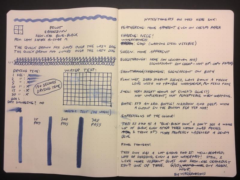
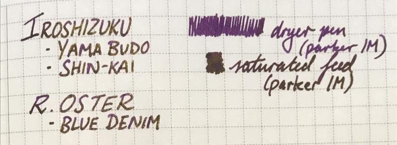
A saturated, slightly dusty purple with strong gold sheen(the writing samples below were from a fairly dry pen). Not much shading but diluting with water and using a wetter pen may bring it out. I've had it in my pen for 2 days and the ink doesn't seem to be doing anything strange, not too sure about staining but none of the inks used in the mix usually stains much. I don't have the exact ratio but it's mostly pilot iroshizuku Yama budo with some shin-Kai and blue denim(Robert oster), possibly 4:1:1. Lubrication:4/5 Flow:4/5 Dry time:4/5 Water resistance:3/5(runs but definitely readable) No bleedthrough or feathering, slight show through on the copier paper. Sorry for the sloppy photos, I did try to take them in different lighting situations. I might try diluting it or playing with the ratio if anyone's interested. 😊