Search the Community
Showing results for tags 'inks'.
-
Came across these on ebay: https://www.ebay.com/itm/5280-Fountain-Pen-Ink-Bottle-Set-Features-11-Different-Colors/273032430865?hash=item3f92004511:g:c5kAAOSwDVtaYhcg Some of the colors look interesting, was wondering if anyone has tried them.
-
An interesting blog on using fountain pens and ink from an artists perspective http://www.lizsteel.com/fountain-pen-sketching-part-4-choosing-a-fountain-pen/
-
Pure Pens based in Newport, south Wales, have launched a series of their own branded and 'Bottled in Wales' inks and this short comment features just two of the series, which arrived in the post this morning. There are far more details on their website and no doubt, there will be many more reviews and comparisons in the coming months but I just wanted to show a couple of images. I just wanted two colours at the moment - Celtic Sea and Saltire. I also purchased one of the TWSBI Eco T pens from them - blue to use with the Celtic Sea one but more about that on another occasion. Celtic Sea is a lovely colour, with tones of a relatively light blue/green that really do make me think of the sea. Very pleasant to use and it flows well. Saltire is wonderful. Just my sort of colour and even with the F nib on a TWSBI 580, there is a definite red sheen which isn't always easy to see on a scanned image. Judging by comments made on Twitter and Instagram, there will be more colours available, which is very exciting. I don't know where the inks are made but based on the slight aroma of one of them, I have my suspicions. A great new product range to ad to PP's extensive arsenal and I can only see them being firm favourites. Especially if a blue-black shade is offered sometime!
-
Hello! I am a long-time member here but have been lurking more than contributing... in fact, not quite contributing much either, to my embarrassment. I see a lot of wonderful reviews here and am a little overwhelmed sometimes. It's a really great forum and a great resource for fountain pen users out there. Some of you might know me by my username, which is also the name of my blog. I come from Singapore and am left-handed. I love beautiful pens and colourful inks. Recently I received a request from one of the members here, @OCArt, to share my series of Iroshizuku Ink reviews. I have done reviews for the whole series of 24 inks, split into 4 different blog posts. They contain some description, translation, and interpretation of the ink names, as well as my experience with swabbing and my own version of "chromatography" work. I include the links in the photos below, so you can click any photo to be taken to that particular series of inks (I made 6 mini ink reviews per blog post). Hopefully this can be interesting or useful to some of you! Feedback is always welcome. (Also, drop me a note if this post should not belong here! Thank you!)
-
I recently purchased the Pineider limited edition Key of Heaven pen from Bryant at Chatterley. It comes with two small bottles of ink: one appears to be a brown and the other a yellow/gold. Does anyone know any details about the manufacturer or name of these inks. They are not labeled. Also included is a stack of small gold colored cards that do not look like they would take fountain pen ink at all, but I haven't tried them yet (I have a lot of new pens and nibs to try over the holidays). The pen itself is most impressive--larger than I expected. It's only available with a medium nib.
-
I'll be in New Orleans later this week and plan to stop by this store. It just looks too cool to pass up. I have been using Iroshizuku almost exclusively and am in love with them. I've sampled Edelstein as well and liked them. I write with Pelikan 800s a a fine nib. Although this PP collection is noted as limited supply i am hoping to find some of this collection esp the Indian purple. Does anyone have thoughts, opinions, hearsay or gossip?
-
First Impressions. We have already seen the colours but here is one of my 'first impression' reviews, including written examples. As usual, all of my written tests have been done using a Sailor Sapporo pen with B nib, so roughly equivalent to a Western M, and the standard Rhodia 80gsm white grid paper. I chose the Sailor for the simple reason that the pen is very easy to clean out, even taking the nib apart should it become necessary. It wasn't! Although I used a rubber bulb to speed up the flushing process between colours (just for time's sake) all the inks were easy to remove from the pen by simply using the converter for a relatively short period of time. Firstly I used cotton wool buds to give an example of just the colours. I let the bottles stand for a while and hopefully didn't have as many particles in those samples. Obviously, the bottles need to be agitated before filling a pen and to keep the suspension 'going' a gentle shake while writing is recommended. Firstly I sampled the inks with the gold particles: Firefly, Wine Divine, Cobalt Jazz and Golden Ivy. They are a very pleasant set of colours and I’m sure they will be very popular. Although hues like Firefly are not generally in my list of favourites, I’m actually quite ‘warming’ to this ink! Next, here come the written samples. I’m impressed with the whole of the ‘golden’ range and will definitely be buying Cobalt Jazz and Golden Ivy. Now, the inks with the silver particles: Citrus Ice, Electric Pink, Frosted Orchid, Arabian Nights, Arctic Blue and Spearmint Diva. I like almost all of these as well. Citrus Ice could be a little pale for some; Electric Pink just isn’t my colour(!) and Spearmint Diva is also a little pale. The colours are good though. And the written samples. Again, I’m impressed with most of the range and will be getting Arctic Blue. To sum up, this is another range that will contain favourites for many of you. Likewise, some that people will not like, but that’s the nature of the ink business. AND - it's 14th October in Helsinki!
-
Lgsoltek suggested earlier a CRV to compare some of our inks. There is a fear that some might been mislabeled in the past. Let's try to get to the bottom together. My samples of Bleu Méditerranée, Atlantique and Equinoxe 6 on Leuchtturm and Clairefountaine with relatively similar broad and wet nibs. The colours are consistent with the samples I received earlier. On Clairefountaine it's somehow hard to tell the difference between the BM and BA, but I can assure you that in reality the differences are striking. Now I can understand my constant fear that I filled a pen with the wrong ink whenever I reach for the Méditerranée. These are relatively fresh samples and I noticed there is some colour shift while the inks mature on paper. ORF RAW exported through the Lightroom, no adjustments.
-
Does anyone know if there is a good reason not to use Sailor and Iroshizuku inks in vintage Parker 51 pens. I would really hate to damage or destroy one of my beautiful "senior" citizens. My most beloved pens! I know both of these inks a highly saturated and can be a royal pain to clean out of regular piston filling pens. Most of the time I use them in either Sailor or Pelikan pens. I'm sure they would/will be just are difficult or most so, in the older 51's. I just want to make sure they will not damage them, especially if I used one are the only ink in the pen going forward. Your wisdom and advise is highly sought after. Thanks in advance.
-
Hello, I'm recently moved to Jakarta, and I wanna know where are the best places to buy stationery items (fountain pens and inks). Actually I want know if Jakarta have a active community of fountain pens aficionados.....
-
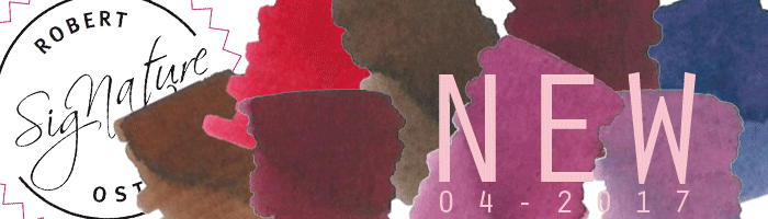
As you will have already seen, Diamine have brought out another eight new inks for their 150th Anniversary range. Great colours and I'm just posting a quick note showing them. They should be available in about three weeks. Just simple notes and my usual method - Rhodia 80gsm dot paper and Lamy Vista M nib. My favourites are Tudor Blue, Purple Dream, Dark Forest, Lilac Night and Espresso, BUT Burgundy Royale and Blood Orange could have their uses! Enjoy.
-
All Robert Oster Signature inks restocked plus eight new colours extra ! http://www.sakurafountainpengallery.com/en/boutique/robert-oster-signature-inkt-amp-vullingen Cheers Catherine !

-

Do You Know Which Colour Is The Favourite Colour Of Your Beloved Ones?
inkotheque posted a topic in Inky Thoughts
My youngest dougther birthday is approaching and I'd like to write a letter to tell her how much I'm happy she is how she is. I also thought that would be nice to write this letter using her preferred colour but... I just realised I've no clue which is her favourite colour. I'll try to fix this in time but I'm just wondering if you know which colour is the favourite colour of your beloved ones? -
I am certain that this has been discussed here, but I am new here, so I will appreciate if someone can tell me or even guide to an earlier discussion - Is Noodler's ink available in India (except through import)? If not, what is the typical landed price for a 3 oz bottle? Thanks Sanjay
-
I recently purchased a few bottles of Sailor's Kiwa-Guro Nano Carbon Ink and absolutely love the stuff in my fountain pens. Even the smell is awesome. I'm curious though if there's a downside to using an ink like this for dip pens? How well does this ink work relative to the Iron Gall and Oak Gall inks that so many calligraphers use with their dip pens? Anyone? http://www.scriptorius.net/sailor_black.jpg
-
A fantastic write-up by the people at NoteMaker (an Australian Stationary with products as unique as you are..). It finally answers the question we have been asking ourselves.. Who is Robert Oster? http://blog.notemaker.com.au/meet-designer-robert-oster-signature-inks/ C.
-
I really enjoy grey inks and this one is my favorite. I think it works great with cheaper copy paper which I use everyday at work. it's work friendly which is a bonus when I need to leave notes for the boss. Following are how it looks on different paper. I hope you enjoy. Rhodia Copy Paper 90g Copy Paper 75g
-
I am just curious! There should be a poll, I hope you can see it in the preview I am not able to do.
-
I bought several inks when I bought my first several pens so I had a little bit to sample from. Here are the inks I initially bought: Noodler's Eternal Polar Blue. (Bought it with my Lamy Safari at store and was the only blue available.) Pilot Iroshizuku Ku-Jaku Boxed Set (Bought it for Kon-Peki) Pilot Iroshizuku Kon-Peki Pilot Iroshizuku Momiji Pilot Iroshizuku Yu-Yake I've been happy with all the colors above in all my pens except I don't like the Noodler's Eternal Polar Blue all the much; I especially don't like it in my Lamy Safari. I've put all those inks in my Safari over this last week and the Iroshizuku inks seem to flow better in the Safari. The Noodler's Polar Blue seems to make my Safari have slow starts. Anyways it has seeped in my mind that the nib on my Safari may be out of alignment which I plan on looking at as soon as I pick up a good loupe. I have a magnifying glass, but it just doesn't have a high enough magnification to really get a good look at it. Has anyone else noticed issues with Noodler's inks? Someone else had a thread recently about Noodler's Elysium not working well in there Safari. I would like to try some other Noodler's blues, turquoises, and other colors; but now I am afraid that I'll have similar issues as with the polar blue. As I mentioned above The Iroshizuku inks seem to flow significantly better in the Safari. I plan on buying some more inks to try, but there is so much out there would like to hear from people on what they think are the "Staple" or "Must Have" inks that all newcomers should get / try. I tend to lean more towards the blues and turquoises, and greens. Having said that I recently stumbled upon some reds like Sailor Oku-Yama and Diamine Ancient Cooper and purples like De Atramentis Aubergine and Sailor Shigure that looks really cool and may pick them up so really I am open to all color suggestions.
-

Robert Oster Inks Now Available In The Uk - Add To Our First Shipment Now!
Royvdbb posted a topic in The Mall
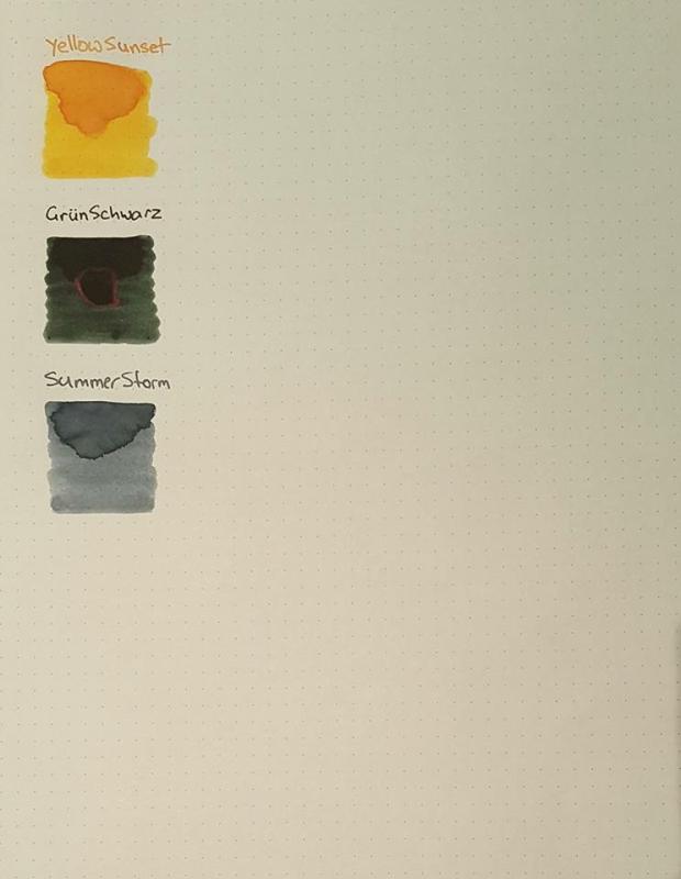
Hello All, On this particularly sunny day, we're delighted to announce that we've now been officially unveiled as an Authorised Retailer for the wonderful Robert Oster inks. We're working furiously on a new website, which will allow you to order online, but for now here's an FPN special. For the first time, they'll be available directly from us in the UK (EU customers welcome too)! Our first stock of inks will be arriving in the next couple of weeks and the initial colour selection is listed below... but here's what we thought, how about we give the wonderful people of FPN the chance to add whatever they want to our shipment. Our official stock of colours will be as follows, drum roll please... Blue seaSummer stormGrun SchwartzEmeraldBlue BlackClaretBarossa GrapeDirect sunDeep SeaJade Price will be £14.95 per 50ml bottle + shipping (detailed below). So, what we'll do is up until the end of Thursday, if you send us a message with your requirements (colour swatches below), we'll then add them to the shipment and send them on to you once they've arrived with us. We would ask for pre-payment (via paypal or bank transfer). To keep it really simple for you, here's the shipping charges for this initial 'add whatever you like' order... UK 1-4 Bottles: £5.45 5-9 Bottles: £8.95 10 Plus Bottles: Free of Charge EU Countries 1 - 4 Bottles: £12.50 5 - 14 Bottles: £16.00 15 Plus Bottles: Free of Charge We're really delighted to be involved with Rob and the wonderful inks that he produces... more exciting news to come soon. Until then, have a good day. Roy
-
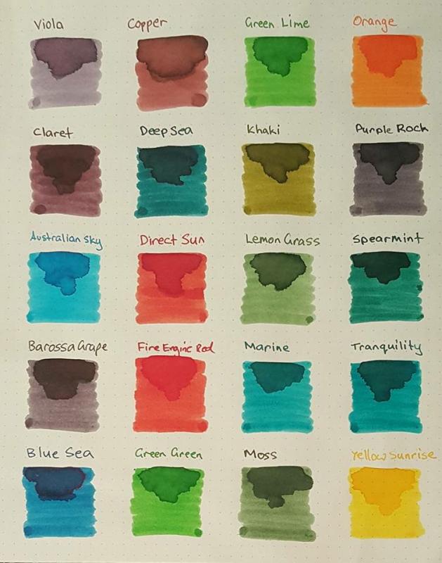
Robert Oster Signature Inks - Quick review of 7 lovely inks You can find Part 1 here. You can find Part 2 here. You can find Part 4 here. I AM BAAACK !!!!!!!!!!!!!!.. And I have some more Robert Oster Inks for your pleasure… If this is the first time you are reading about Robert Oster Signature Inks, he is a lovely Australian gentleman and produces high quality Fountain Pen Ink. You can find it in eBay-AU: http://www.ebay.com.au/usr/osteralia For international orders, please use his email: Signature@RobertOster.com You can find more reviews of his inks in the links provided above. (Part 1 and Part 2) On Part 3, the list of inks reviewed will be: · Barosa Grape · Pinky · Peach · Ever Green · Spearmint · Tranquility · Dark Chocolate I have never mentioned the packaging... The inks come in wrapped in a gold foil paper... like the treasure they are. Is fun to remove the wrapping and unveiled the jewel inside. Now to the inks... BLACK nRED These inks flowed quite well on this paper… They get along quite well… no bleed thru, no show thru and no feathering whatsoever.. I use a wet flex broad, my pen dumps a bunch of ink and the behavior was flawless. Barosa Grape: (don’t confuse with Barbosa) LOL. Gorgeous Purple. A must have to any purple lover.. Shading, Sheen, … on a wet pen it looks like Ink of Witch.. very dark, Pinky: You can’t call me a pink lover….. but Pinky is really the kind of pink I don’t mind. Is not retina-searing (which I dislike) and it has a vintage look without being chalky. A lovely pink. Peach: Similar to Pinky, as in a more subdue color… with a vintage feel. Is not in your face Orange.. Is so soft and delicate, you almost want to touch the “fuzz”… Ever Green: This bright green will please all straight green lovers… (I am more of a “murky” green lover) .. reminds me of MB Irish Green. Bright and cheery. Spearmint: This one surprised me… I don’t know why I was expecting a more delicate green (you can tell I am no gardener..lol)…. Is a lovely green and more in my style of “dark” greens. Sheen is amazing on this one. Tranquility: YAY!!... Deep Sea younger sister…. Lol. The hue is the same, but this one is more delicate. The darker areas might look the same.. but Tranquility is lighter and you can tell in the lighter areas. The shading is spectacular. The sheen is not too shabby either… Dark Chocolate: Is very interesting… Is a chocolate with mauve undertones. I remember finding Rober Oster Chocolate with pink undertones… so not surprised this one (Dark Chocolate) has also some other tones. I personally love when ink looks different with different lighting. Nothing wrong with that. This makes it a lovely ink for sketching. RHODIA DOT PAD No bleed thru, no show thru and no feathering. TOMOE RIVER No bleed thru, no show thru and no feathering. MUJI Notebook No bleed thru, no show thru and no feathering. Please note, not all MUJI paper is fountain pen friendly. This one is the “black cover” notebook. They do quite well with ink, wet pens and they do show sheen. Summary What can I say, I am still very impressed with Robert Oster Signature Inks. Can’t say I am head over heels with all his colors, he still needs a DEEP RED… and a straight BROWN.. but the range and quality of Blues and Greens is just MAGNIFICENT…. I personally like his purples, oranges, amber… and odd colors (Copper for example) I’ve been told there is an exclusive Red (exclusive to SAKURA) .. and I am trying to get a sample of that for comparison sake. So, hopefully I am not done with Robert Oster anytime soon. Hope you guys have enjoyed another quick trip through Robert Oster Signature Ink heaven.. Disclaimer: Not affiliated to Robert Oster.. yadda yadda…. C. .
-
Someone will be smacking me over the head with something.... My lovely friend, gave me samples of pretty much the whole line (I am missing three, I believe).. That was almost 6 weeks ago !!!!!... I did sample/review them approx 5 weeks ago, but I keep forgetting to post them.. I am a horrible friend... (Plus, I've been busy with Robert Oster Signature Inks.. but don't tell her that) In any case... here it goes.. Intro.. I had the pleasure to play with the following: Spanish BlueBlue 72 (What an odd name)Noir et BlueTenebris Purpuratum (what an AWESOME name)Midnight EmeraldLodenTerra FirmaDark ChocolateBlack CherryClassic Black I believe I am missing: Red 187, Emerald 357 and Brown 732…. What’s up with those names??… To start, you can call me a snob… I don’t care much for overpriced ink … those where the damn bottle seems to be more unique that the ink that is inside.. (I am looking at you Caran D’ache). So, I was quite pleased with these affordable inks… (more affordable to the US audience.. shipping is quite dear for me and anyone outside the US).... But honestly, here is perfect example that great ink with very lovely colors don’t have to be expensive. I should add a disclaimer…. I like my dark and murky colors… and this line seem to have been made for me…. They are nicely saturated and on the dark side.. All of them have sheen.. (on Tomoe of course) and they all shade beautifully. I almost can’t pick a favorite… :wub: Here you go… Red and Black Rhodia Tomoe River Conclusion.. They are not waterproof, they dry in a reasonable amount of time. Lubrication is fair… in summary they are all well behave inks. Spanish Blue: Nice fair blue. Lovely sheen. Blue 72: Too purple for my liking, but I know tons of people who like this type of blue. Noir et Blue: Ahhh YES!!!... This is a lovely blue black with a purple undertone. On wet pen it looks almost black Tenebris Purpuratum: Beautiful dark purple… if your like your purple to look almost black.. this one is for you. Midnight Emerald: Don’t bother getting the Pelikan Aquamarine… this one is as good.. and maybe even better. I will have to compare side by side. Loden: One of my all-time favorites. Is not a replacement for Olde Emerald… but is nice and dark. It reminds me of KWZI Foggy Green (which I adore!!) Terra Firma: LOVE IT LOVE IT… let me say it again… LOVE IT!!! – Is an odd dark terracotta… but is lovely… Dark Chocolate: Oh yes.. yes… come to mama… I love my dark browns. This one has no undertones. Looks black out of a wet pen. Black Cherry: Another lovely dark color. This one is darker with a tad more red than Tenebris P.… looks black out of a wet pen. Classic Black: You all know I don’t care about Black inks.. but this one is interesting. It has a mauve undertone… I don’t have Pussiere de Lune, and I wonder if this is more like a very dark Pussiere? Disclaimer: Not affiliated with Franklin-Christoph .. yadda yadda… C.
-
Here are the sketches I did using the FPN exclusive inks, used each ink to draw the person it was named after, hope you all like it. Best regards. Voltaire Candide Vermilion. Galileo Manuscript Brown. Dumas Tulipe Noire. Van Gogh Starry Night Blue.
-
Robert Oster Signature Inks - Quick review of 7 lovely inks You can find Part 1 here. You can find Part 3 here. You can find Part 4 here. So I am back with some more Robert Oster Signature Inks !!!.. Yeah, Yeah.. I can’t seem to get enough of his inks… Those lucky Ozzies.. between Robert Oster and BlackStone… why would you buy anything else…. If this is the first time you are reading about Robert Oster Signature Inks, he is a lovely Australian gentleman and produces high quality Fountain Pen Ink. You can find it in eBay-AU: http://www.ebay.com.au/usr/osteralia For international orders, please use his email: Signature@RobertOster.com Ok so… this time I got: Blue BlackSchool BlueMossCopperOrangeClaretYeah, I totally forgot about Barossa Grape… but that one is currently on its way… Without further delay: BLACK nRED These inks flowed quite well on this paper… They get along quite well… no bleed thru, no show thru and no feathering whatsoever.. I use a wet flex broad, my pen dumps a bunch of ink and the behavior was flawless. Blue Black: This is a GORGEOUS Blue Black… Goes down wet and shiny and dries with a high saturation.. Lovely color School Blue: I like blues… I am NOT crazy about blues as most people seemed to be. I do LOVE dark blues. But Blues in general are just “Fine” by me. School Blue, is a “regular” blue that looks AMAZING on paper. The shading is quite dramatic.. and I don’t think it shows too well because of my wet pen. If you maximize the pic, you will see it goes from very light turquoise to a very dark blue (almost Blue Black). Really amazing looking color. And don’t forget the sheen. Robert Oster must have a very sheeny blue dye. All his blues sheen wonderfully. Moss Green: If you know anything about me, you know I like my greens very much. Especially the darker, mossy type… (the murkier the better). Moss green is not murky, but is a lovely “moss” green… lol. The name is quite right. I do love it. I also love that it does shift the hue depending on paper. It looks more olive on cram paper (Muji paper below) Copper: Now, this is a very interesting color. I think this is what people call “Puce”… Is brownish/pinkish.. very hard to describe. I do like it. It flows well and unless my eyes need adjusting (which I believe they do by the way.. I got my first pair of reading glasses three weeks ago) it seems to leave a “border” on each stroke. Not really sheen, but a darker border. I find this color very vintage looking and handsome. Not sure if copper is the correct name thou. Orange: NOW.. this IS ORANGE !!!... I think sometimes we think what orange is, and then this one comes an SMACK you in the face and says..” HEY .. I am the real ORANGE”.. Lol.. Honestly, I love my oranges, and this is a beautiful orange.. BRIGHT, but not NEON.. (which I dislike). Royal Red: This is a nice “subdue” red. I wish it was darker. Beside the Fire Engine Red it looks orangey. Robert.. if you are reading, we need a dark-blood-type red. Claret: OH WOW!!.. This goes down almost BLACK!!.. and dries to a WONDERFUL purplish /mauve color.. but is quite intriguing.. You need to see when is drying, it seems to change to grey/plum/purple/mauve.. Is almost like a chameleon… Amazing looking ink. RHODIA DOT PAD No bleed thru, no show thru and no feathering TOMOE RIVER No bleed thru, no show thru and no feathering MUJI Notebook No bleed thru, no show thru and no feathering. Please note, not all MUJI paper is fountain pen friendly. This one is the “black cover” notebook. They do quite well with ink, wet pens and they do show sheen. All the inks flowed well, and they seem quite wet. I am sure some are wetter than others, but in general.. they are on the wet side. While writing this, I went to his eBay site to grab the link, I just found out some newly release inks.. Blue Sea, Viola and Direct Sun !!!.. Should I go for more?... Is my birthday coming up?.. Well, yes.. in 2017.. LOL.. http://i.myniceprofile.com/478/47831.gif I guess is time to make a Toronto Posse Group Buy !!. C.
-
So I ordered a bottle of ink from Robert Oster, and this is what I received: The bottle of Barossa Grape I'd ordered A same-sized bottle of Claret Sample bottles of Burgundy, Sea Blue, Peach and something else that I can't recall A Jinhao pen A note, sealed with wax, expressing thanks for my purchase All wrapped nicely in gold foil. A beautiful package, which cost a packet to ship. If you want to have Christmas, order from this guy.