Search the Community
Showing results for tags 'ink'.
-
I have had this Diamine Sargasso Sea sample for reviewing for a while. I looked at this sample and thought how similar it looks to Diamine Blue Velvet. However, after I started writing with it, I started to see that it leans a little more towards the red end of the colour spectrum than Blue Velvet does. I like that about it, and I would happily live with both colours. Notably though, Blue Velvet is more expensive because it's one of the 150th Anniversary inks. This is an excellent dark to medium blue type. It varies according to the type of nib used, and looks darker when written with a F nib than it does when written with a stub or wider nib. It could be used as an every day blue ink. It's an excellent performer. I'm not 100% happy with my Pilot CH92 F nib, because I find I get much more feedback from it than I do from my other F nibs. However, it loved this ink. It felt well lubricated and flowed across the page beautifully. I could have carried on writing with it for ages, but wanted to look at the writing with the stub nib too. I was surprised how different the colour looked between these 2 nibs. This was a slow-drying ink and exhibited much show through and bleed though on my thick 100g/sm paper. If you are content with that then I can recommend it.The water test on the review form shows this isn't a waterproof ink, but there is some water resistance.Bearing in mind the paper I use is thick with a shiny surface, and I used a 1.1 and a F nib, this ink only took 17-20 secs to dry. That's common on this smooth, thick paper.It flows through the pen very well and lubricates the nib very well. I saw no skips or hard starts while I did swabs and dry time tests.It is currently available in 80ml glass bottles, 30ml plastic refill bottles or cartridges.Diamine sell it directly to end-users on their web-site.It's a reasonable price
-
Monteverde's revamped line of inks recently got my attention for their comprehensive lineup of clear, distinct hues, as well as good value. A 90ml bottle can be had for about $13-$15 USD from the better known online retailers in the United States, making it a very good deal. Monteverde touts their "ITF Technology". From Monteverde's promotional material, here's how it claims to benefit us writers: At my recent visit to the 2017 LA Pen Show, Monteverde gave a free bottle of Malibu Blue ink to all show attendees. A company representative had all their inks available for sampling with swabs, as well as show discounts. I brought home four bottles of Monteverde ink, and post-show I've purchased a few more online:Malibu BlueCapri BlueHorizon BlueSapphire BlueMonteverde also offers two blues I am missing: Caribbean Blue (turquoise), and a Blue-Black. I am posting individual reviews for each of the four Monteverde inks I have. I filled a variety of pens with these four inks, with nibs ranging from fine to double-broad stubs. Here's a snapshot from my Bullet Journal Ink Log, showing the pen/ink assignments and a writing sample from each. Monteverde Horizon Blue This is Monteverde's Parker Penman Sapphire workalike. It is similar to Diamine Blue Velvet and Visconti Blue. Here is how it appears on Clairefontaine paper. Color/Saturation Horizon Blue is a deeply saturated, "pure" blue. It doesn't lean to purple or green. Shading/Sheening Horizon Blue has a light amount of shading on Tomoe River. A little bit of red sheening can be seen in the Tomoe River sample. Flow Horizon Blue is a well-behaved ink. I had no skips or hard starts on the initial flow. Horizon Blue came in second place for flow amongst the four inks tested. In my Sheaffer Prelude with M nib (a wet pen), it comes out wet but not too wet. Lubrication Like the other Monteverde inks, Horizon Blue has good lubrication, but has some stiction at the start/stop of a pen stroke. In my Clairefontaine bullet journal, my Sheaffer Prelude squeaks as I write! Dry Time Dry time is moderate, between 25 and 30 seconds on Clairefontaine paper from the Prelude. Feathering Horizon Blue performs well in the feathering test on cheap office paper. Bleedthrough There is a medium amount of bleedthrough on the other side of the page on the cheap office paper. Water Resistance Horizon Blue probably performed best of the four Monteverde inks, but still it is not a water-resistant ink in the 10 second immersion test. Before After Comparison with Other Inks Here is a tile comparing Horizon Blue with other medium blue inks. NB: The Parker Penman Sapphire is from a diluted sample and so isn't quite true in terms of saturation.
-
Reportedly, Private Reserve is one of the companies that paved the way to the overabundance of ink colors we have now, as early on there were mostly the basic inks available, such as basic blue-black, red, green, turquoise, brown, black, and blue. PR inks come in a multitude of different hues. The original creator and owner of the ink company passed away, and the company is now under new ownership and management. I personally became very interested in Private Reserve Avocado a while ago, after seeing its fantastic color range on some others' reviews when used for drawing. Behind its very slightly olive green exterior hide many other hues! The brick-terracotta red color is one of them, and it is the most water-resistant component of this ink. So when you use a water brush over Avocado, a red color is revealed! This ink is very well-behaved in writing. The ink flow is moderate to creamy, and lubrication is good. This ink is really good for maintaining fine lines for drawing and for hairlines. It's well-saturated, but not too much. There is no sheen. Instead the ink has an attractive matte appearance that works well on all paper types. This ink is great for any nib type: from super extra fine to broad. Shading is fairly low, and the lines are solid and well-defined, dark enough even when very fine. In writing, this ink is a pleasant hue of fresh, botanical green. Very restful on the eyes and also imparts an uplifting feeling for me personally. Scan: Fabriano Bioprima 85g ivory-tooned paper with 4mm grid: Scan: Tomoe River 52g White Scan: Nakabayashi Logical Prime notebook, coated ivory-cream-toned paper: (Totally misspelled Rikyu-Cha) Close-up photographs: Look at that "chromatography"! Personally I like this ink a lot; glad I have a large bottle.
-
Reportedly, Private Reserve is one of the companies that paved the way to the overabundance of ink colors we have now, as early on there were mostly the basic inks available, such as basic blue-black, red, green, turquoise, brown, black, and blue. PR inks come in a multitude of different hues. The original creator and owner of the ink company passed away, and the company is now under new ownership and management. Ebony Blue has been on my radar for a while. I love dark teal inks, but I'm usually pretty picky about them in person. Ebony Blue is a kind of turquoise mixed with black, and possibly some other hues in between, which results in a dark but more "clean" hue teal-black. What I mean by clean is that it's not muddy, brown-tinged like, say, Sailor Jentle Miruai. Depending on pen, paper, and illumination this ink can look more blue-teal or more green-teal. The flow is one of the interesting characteristics of this ink: it feels "creamy" to write with. I like this tactility of the ink. It does not feather nor bleed through any of the decent-to-good paper I've used it with. It has pretty decent water resistance too: while it won't look neat if you splash water on your writing, a clear, dark gray line remains behind to salvage content. There is metallic magenta sheen. This ink will work in all types of nibs: from ultra extra fine to broad. Shading becomes increasingly more prominent with broader nibs. If you use broad nibs with this ink, I recommend uncoated and more absorbent paper. It's more smear-prone on Tomoe River with broad nibs. Scan: on Fabriano Bioprima 85g ivory-toned paper with 4mm dot grid Scan: on Tomoe River 52g White Scan: on a 100g A6 uncoated paper (the first GvFC Gulf Blue should read "Cobalt Blue" instead) Scan: on Tomoe River 52g Cream paper (the first GvFC Gulf Blue should read Cobalt Blue instead) Close-up photographs:
-
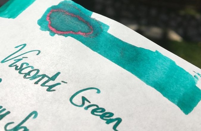
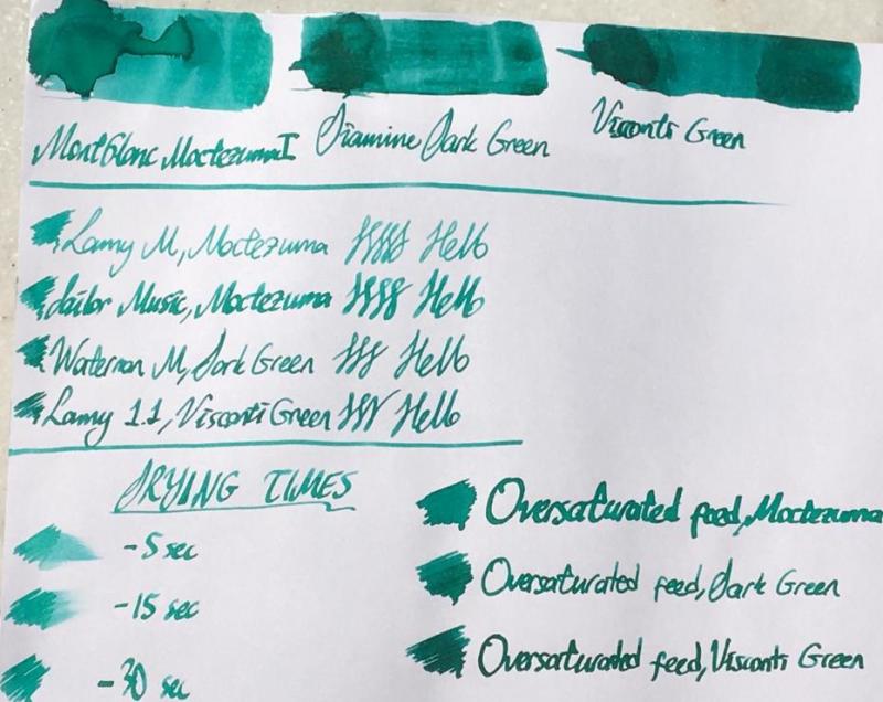
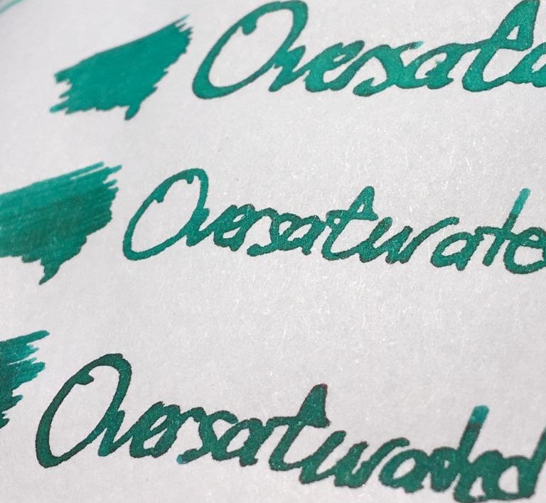
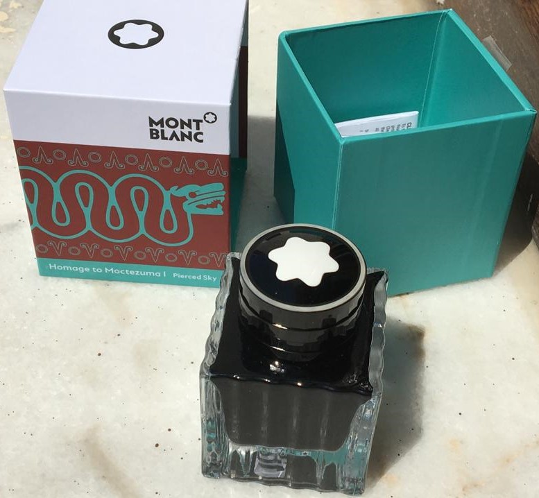
Hello dear FPNers, Today I have something new, something German, something menthol green for you: Moctezuma 1 Pierced Sky is one of the most recent inks released by Montblanc. This ink is a complementary part of new Patron of the Art series: Homage to Moctezuma 1. It is a limited edition ink, and it has a 50 ml cube shaped bottle, which is a pretty standard bottle shape of Montblanc. I suppose this ink is very close to J. Herbin Vert Reseda, but a tad darker than it. Another similar ink is Edelstein Jade. Unfortunately, I have neither of them, because this cannot be called as my favourite shade of turquoise. However, I have Diamine Dark Green and Visconti Green, both of which are also pretty close to Moctezuma, I suppose. Here is a comparison of three inks on white Tomoe paper: They are very close indeed. But before describing the differences between 3 inks' colours, maybe I should mention about some important ink properties: Saturation: Moctezuma has a medium-to-low saturation. It is not as washed out as Herbin Vert Reseda, but still lacks some saturation in my opinion. Sheen: There is definitely no sheen with this ink. Maybe only if you pour down huge amounts on Tomoe, you may see a little bit of sheen. Shading: It has a high shading capacity, I loved it. Obviously not as much as a KWZ Honey, but still very nice shading. Wetness: Moctezuma is a dry ink, as most of you could easily guess, because most Montblanc inks tend to be so (except Elixir line, they are the wettest inks I have ever seen). It is not the driest ink in the world either; not as dry as a Pelikan 4001, but definitely on the dry side of the spectrum. Unless you have a vintage pen with an ebonite feed, or a modern pen which is tuned to write wet, most people wouldn't like this dryness combined with medium-to-low saturation in EF/F nibs I suppose. Check this out again: Lamy Safari M nib's output is not amazingly washed out, but not very legible either. I am more of a BB/OBB guy. I don't use fine nibs very often, but if I do, personally I would like to see a bit darker, or brighter line. The colour choice is already dangerous: it is a pastel menthol green, not most people's first choice of colour to easily read the written, so at least it should have been a bit more saturation in my opinion. About dryness of ink: I suppose both Montblanc and Pelikan specifically keep their nibs' tippings wide, to have them larger surface area when in contact with paper, which makes them smoother. And then they need to adjust their own inks to be a bit more viscous than a regular ink to make it flow slowly through the tines, compensating the thick tipping material's large surface and making the pen write narrower, so keeping the promise of theoretical nib size. I don't know. It is a choice of company. Pilot succeeds in having narrower tippings be smooth, maybe not as smooth as their German counterparts but still quite smooth. And they see no problem in producing a much wetter ink. I suppose most people would trust in Iroshizuku line's fluid properties more than they do for Montblanc inks or Edelstein inks in an indefinite case of which ink to use in an unfamiliar pen. I remember having hard times with some Montblanc and Pelikan inks in my EF/F nibs. Whatever. Note that the pen I used for Moctezuma is Sailor Progear Ocean with 21k Music nib: Mr John Mottishaw cut its tip into a beauuuutiful cursive italic, smooth and crisp, and tuned it to be quite a wet nib: So the wetness of nib would be able to balance the dryness of ink, I thought. Same triple comparison is also done on 80 gr white Rhodia paper, which is the industrial standard of pen world, I suppose.. Let's see the differences between 3 inks above. Here are some close shots of them on Tomoe again: Moctezuma is the lightest of them. Diamine Dark Green is a bit greener than Moctezuma, with a bit more red dye, and it is more saturated. Visconti Green actually has a very similar green-blue ratio compared to Moctezuma, but it is much more saturated. And the red dye content is definitely higher in Visconti, as a result it seems darker with some nice sheen. Sometimes I love writing with over-saturated feeds. They show the full potential of an ink. Also, if you have a moderately wet nib, it gives a clue about how the colour would be seen with a wet nib, especially with a vintage nib. A close shot of writings made with over-saturated feed on Tomoe: Lovely sheen with Visconti Green to be noted. Same thing for Rhodia: It can be said that Moctezuma gives a nice colour with a very wet nib, preferably a vintage one. Some other ink properties: Feathering: Not detected, not likely to feather. In this term, quite a well behaved ink. Bleeding: Not detected, not likely to bleed. In this term, quite a well behaved ink. Showthrough: Some distinct showthrough on Tomoe but every ink has a showthrough on Tomoe, so it shouldn't be a criteria I think: On Rhodia, it has minimal showthrough. Quite well: Note that heavy swabs or parts written with over-saturated feed will of course have showthrough, and even bleedthrough. It is normal. The concentration on normal writing should be the way in judging showthrough/bleedthrough. Water Resistance: Meh. Not so much, but who cares?? Not me, definitely.. Before water test on Tomoe: And after water test: It cannot be said that the writings have gone completely, but they are not legible either. But this situation does not bother me. Actually, I like inks which are not resistant to water. In my experience, they are much easier to clean than water-proof inks. And considering that I am obsessive while cleaning pens until water comes out completely crystal clear, this ink is a nice choice for me. I haven't tried to clean it from my pens, but I am sure it will be cleaned quite fast. CONCLUDING REMARKS If you are into menthol green colour, you will definitely like this ink. Note that it is a bit pale, pastel colour, not very vivid.With very wet nibs, it has a lovely hue of an exotic lagoon at its best. I live in an inland location, but I felt like I am in Maldives.Doesn't have sheen or shimmer, but has a nice shading.Montblanc Moctezuma 1 is not the most unique colour in the world. There are some similar colours like J. Herbin Vert Reseda, Pelikan Edelstein Jade, Diamine Dark Green, Visconti Green, etc.. You may consider them also.Price is about 35 Euros, same as Montblanc Petrol Blue. It is definitely not a cheap ink, but not the most expensive one either. I am not sure if it deserves this price. I would buy it anyway since I am an ink nerd, but I may not buy the second bottle. Besides, alternatives are much cheaper, and this ink does not have amazing specifications in terms of colour.With over-saturated feed, it provides a much more distinct, vivid colour, which means if you are likely to buy it, consider using it in your wet pens, preferably gushers or vintage pens. No need to afraid of cleaning from vintage pens. Hope you enjoyed. Thank you..

-
Hey everyone, I primarily use and change inks in my Pilot Metropolitan frequently; but I've never had to rinse and re-ink within a day. Does Diamine tend to run on the dry side or did I just get a drier than usual batch? The ink in question is the shade: Soft Mint. Thank you for any input you can provide.
-
I won't add much to previous fantastic reviews of this ink, such as the ones here: https://www.fountainpennetwork.com/forum/topic/335816-gulf-blue-graf-von-faber-castell/ But I will add my subjective impressions of using this ink and some more scans and photographs. Graf von Faber-Castell makes a luxury line of inks in beautiful, heavy glass bottles that will decorate any writing desk and will draw the eye. Despite the high price, the bottles contain 75ml of ink, so price per ml is actually reasonable. Considering other brands that sell in 20-30ml bottles for lower prices, but you get 2-3 times less ink. The packaging overall is top notch quality (personal note: I love the scent of the thick paper the box is made with, or maybe it's the ink used to print the graphics on the box). In my experience with 10 colors of GvFC ink, all are a varying degree of low lubrication and dryness. Some might be "liquidy" coming off the nib, but the overall ink flow will not be high. Colors like Moss Green, Cobalt Blue, and Hazelnut Brown are more saturated and a bit more lubricated. Deep Sea Green and Gulf Blue have little to no lubrication and are very dry, and so they benefit from juicy pens with smooth nibs. Or else you will feel every imperfection of your nib and texture of the paper you write on. Recently I have come to appreciate dry inks for the look they can provide if they are made of different hues of constituent dyes. This is the same type of dry flow and lack of lubrication one might find with certain translucent, multi-hue Sailor Manyo, Sailor Ink Studio, Troublemaker, and other inks of that nature. I am guessing the lack of surfactants, low saturation, and low lubrication are necessary to achieve color separation within a line, because some dyes flow farther than others, thus separating into gradients. Graf von Faber-Castell Gulf Blue is a multi-hue powder blue ink. It reminds me of blue hydrangea flowers, with areas of pale aqua-sky blue in dry areas and shifting to lavender in more saturated areas. It has a similar idea to Troublemaker Milky Ocean, but Milky Ocean is comparatively more purple-shifted and slightly more saturated. I highly recommend broad or cursive italic/stub nibs for this ink to get the most of the color gradient effect. The wetter your pen, the better, both for the smoother writing experience and for the ink to be more prominent on paper. Here is a scan of a mini-review sheet, paper is ivory-toned Fabriano Bioprima 85g with 4mm dot grid: Graf von Faber-Castell claims their inks are indelible. You can go back and forth about the ISO standard the brand uses, but in practical terms, the ink has some but low water resistance. The purplish line remains behind if you dab the wet writing with a paper towel quickly, and you might be able to read the original writing if the lines were thick enough, as you can see on the scan above (the grid lines are very faint compared to the cursive italic writing). The ink is pale to begin with, and the remaining lines are even more so. Here's a scan of some blue-turquoise inks next to Gulf Blue on ivory-toned Nakabayashi Logical Prime notebook paper: Photographs: On Tomoe River 52g "white" in a Hobonichi Cousin planner: Fabriano Bioprima 85g, using water brushes: Comparison with Troublemaker Milky Ocean: Milky Ocean: Milky Ocean:
-
I have a bottle of the Raduga Blue & I I would like to know if people find it on the thick side for fountain pens? Or maybe it does not flow as well?
-
I like old ink (and pens) This is not a secret Why? Because when vintage ink was made, it had to WORK. Period. It wasn't boutique or eccentric. Fountain pens were PENS, not bling (ok, some were bling, but they still had to function as pens, without fail!)So badly behaving ink was an impediment to writing!People were FAR less likely to tolerate misbehaviour, be it bleeding, feathering, clogging of pens, etc. Think of it this way:What do you do when you are FORCED by circumstance to use a ballpoint, and then that ballpoint doesn't work within the first 5 seconds or so?That's right, you throw it in the freaking garbage, swear about how bad ballpoints are, and grab another one. (and maybe even another one after that...) Back in the day, ink was likely the same way. If you loaded your pen with ink, and more than once that ink let you down?...There's a pretty good chance you threw it out and bought a different ink! As such, Vintage ink was made when it HAD to work. And that brings us to today's ink Waterman's Patrician Purple (note the 's in the name) My bottle is NOS I purchased on eBay in Jun/Jul 2020 and was manufactured in Montreal. Bottle, box and Aqua/Pastel Blue Sentinel Snorkel used for testing Colour Swatch Rhodia Webnotebook (paper is slightly off white in real life) Chromatography done twice to verify resultsText is transcribed below for searchability and due to terrible handwriting 21 Jul 20Waterman's Patrician Purple 2oz bottle fromeBay Jun/Jul 2020. Bottleis NOS from the 1950's (i think)This ink is pale/washed out. I'm notsure how much of that is due to age.The flow is average/dryand the ink is wellbehaved as expected fromWaterman's. After itdries this ink seemsto grow on you withits understated nature.[Dry Times]Would buy again?Maybe/NA Waterman's Patrician PurpleEco 1.1 MMAqua Sentinel Shading: Low/MediumSaturation: LowFeathering: NilSpread: NilBleed: NilCleaning: P.I.T.A [water tests] Notes: Yes, it's that water resistant! It's alsoa PITA to clean. Onlya couple of hrs in theEco and it had started to stain/leave a residue. Clairefontaine paper (very white paper) Waterman Waterman'sTender Purple Patrician PurpleSheaffer SheafferAqua/Pastel Blue Aqua/Pastel BlueSnorkel Sentinel Snorkel Sentinel The quick brown The quick brownfox jumps over fox jumps overthe lazy dog the lazy dog1234567890 1234567890 Twsbi Eco 1.1 mm The quick brown fox jumps over the lazy dog 1234567890 The chromatography should have been a clue as to how much of a PITA this ink was going to be to clean out.(think Noodler's Rome Burning) Purple inks of course have a reputation for staining, and this one certainly lives up to that reputation.That said, I guess that was much less of a concern when the overwhelming majority of pens were NOT demonstrators. If you can't see the inside of the pen... how would you even know it was getting stained!? So that's it. That's Waterman's Patrician Purple It's hard to find, can be expensive, the colour is washed out and will somehow still stain your pen! But hey, at least it's well behaved on paper!
-
Diamine released few more inks exclusively for the German market. The five lovely warm colours are inspired by guitars - see them on this Instagram picture. I like the idea and I like the colours. Some nice packaging for the complete set would be even better. So far I know, the Fountainfeder e-shop is the only shop selling them right now. I expect this will change soon.
-
In keeping with my theme of doing things because I was told I can't... Parker Superchrome Jade Green! Yes, the slightly LESS deadly ink invented to replace Parker "51" ink! If you are not familiar with Parker "51" ink and the story behind it, please feel free to see my reviewsTunis Blue: https://www.fountainpennetwork.com/forum/topic/354212-parker-51-tunis-blue/?hl=%2Btunis+%2BbluePan American Green: https://www.fountainpennetwork.com/forum/topic/353661-parker-51-pan-american-green/?hl=%2Btunis+%2Bblue So, now that everyone knows why "51" ink had to go the way of the dinosaurs, let's take a look at its replacement!Launched around the same time as the new Aero-Metric (1948ish) version of the Parker "51" pen, the advertising for Superchrome was VERY bright and vibrantIt even went as far as to explain how this magical ink would soak into the paper and dry nearly instantly, instead of by evaporation!Here's the patent: https://patents.google.com/patent/US2528390NEAT! Ok, so what happened then? Why is this called the "slightly less deadly" ink? and why can't i find it in stores!? Because it was discontinued in 1956 ok, but WHY!? Well, Parker started getting warrantee claims on their new Aero-metric "51"s... a lot of them... seems the alkalinity of Superchrome was actually eating up breather tubes!And they were made of STERLING SILVER... eventually, replacing them starts to get expensive ya know! you can read more about "51" and Superchrome here:http://www.richardspens.com/ref/care/51_ink.htm My Bottle is a slightly later bottle, the first ones came in a cool metal tin! According to the Parker "51" book, my box was designed around 1949And was awarded an honourable mention by the Folding Box Association of America! Wow... really!? the FBAoA!? no way! Yes way! it says so on page 145 of the Parker "51" book! here is my box and bottle pictured with my green Parker "51" Special Demi There was some sedimentation in the bottle, much like the Tunis Blue bottle, but much less of it, and not stuck to the bottom of the bottle.As with the Pan American Green, don't worry, I shook the bottle excessively in order to try and get those precious dyes back into suspension (not solution)! ok, but what does it look like on paper you ask? well I'm glad you asked, cause that's the whole point of this shindig! (Typed Text follows for search-ability, and because my handwriting is atrocious!) Rhodia Webnotebook, paper is slightly off white in real life 15 Jul 20Parker Superchrome JadeGreen. Bought 3oz bottleon eBay Jun-ish 2020. Thisis the second deadliest inkin history. Only the inkit replaced (Parker "51") isworse! Meant to "dry" nearly instantly it was designedto soak into the paper. Toobad it also ate sterlingsilver breather tubes...More teal than Green, buthat may be due to the age of the bottle. Some dryout when left over night in a pen(Dry times in a Wing Sung 601 and a TWSBI Eco 1.1)Would buy Again?N/A Parker SuperchromeJade GreenEco 1.1mmWing Sung 601Shading: Good/Very GoodSaturation: GoodFeathering: NilSpread: NilBleed: NilCleaning: Easy/Medium (Water tests, dripped and dabbed vs rubbed with a wet Q-tip) Notes: Colour is very close to Diamine Marine. FlowsOK. Pan American Greenis much greener.*Leaves a white crust/residue! (On the feed and nib, Seen well after cleaning and drying the Eco. So that white residue on "51" Feeds? yeah... probably from this ink!) Clairefontaine Notebook paper, paper is VERY white Parker SuperchromeJade GreenTwsbi Eco 1.1 mm stubThe quick brown fox jumps over the lazy dog.1234567890Clairefontaine PaperDry Times 30 25 20 15 10 5 1Wing Sung 601Drytimes: 30 25 20 15 10 5 1 The quick brown fox jumps over the lazy dog1234567890 Parker SuperchromeJade GreenDiamine MarineJade Green Marine So that's it. That's Parker Superchrome Jade Green. It's a lot like Diamine Marine, except you know, super expensive, hard to find, and will kill your pen!While also leaving a weird white residue on your nib and feed... yay!
-
Hi, I have just acquired an Esterbrook in a job lot of old pens and would like to bring it into use. It currently has an empty old Esterbrook cartridge fitted. Can anyone advise what cartridges will fit? It is much longer than the 'common' cartridges you see around. Also from an environmental perspective is there a filler e.g. pistion filler I can use? Not sure what model, but if I can work out how I will post a picture in this part of the forum. Just been looking at Esterbrook.net and think it is a CX-100 model with a red barrel :-) Many thanks, Julian
-

Deciding On Whether To Get A Medium Nib Or Fine Nib On A Waterman Hemisphere?
bananaluck posted a topic in Waterman
Hi! So I have some gradual experience with fountain pens from the last time I wrote on this website. My favorite fountain pens that I have found to be a very smooth writing experience for me are the Pilot pens. I especially love the Prera and I hope that Pilot makes more of the solid-color body ones cause they are my favorite. Anyway, those pens are the ones that really work with me. I tend to use a medium nib on the Pilot fountain pens. Now I know a Japanese medium=western fine. However, I find that Western fine can be too scratchy and that Western mediums can be too broad. I want to find a fountain pen that has the same line consistency as the Pilot mediums found in the Preras, Cavaliers, and the Metropolitans that I use. Even my one Kaweco Sport that is medium is an ideal line for me. So I've been looking at Watermans because I just got a rollerball from them and absolutely loved it, but I wanted to try out their fountain pens since I heard that they are of good quality. However, I'm driving myself mad about the nib and which one I should get. Maybe I'm just overthinking things, but I don't want to get a medium with it being broad and me smearing it because I drag my pen across the paper. However, on the other hand, I don't want to get a fine in case it's too scratchy and the line isn't what I want. Please help me!!! I want to be part of the Waterman gang Also, was wondering if the Waterman, specifically the Havana Brown is fast drying or if Waterman inks are fast-drying inks in general. The Pilot inks are wonderful for me, for it never smears even if I brush my hand over it. However, Kawecos aren't really fast-drying inks which I am very surprised about. I thought they were, so I'm wondering if Waterman is fast-drying. I hope it is in my favor! thanks again for the help! looking forward to your responses! -
Is there such a thing as a fountain pen friendly iron gall *recipe*? Not a mass marketed commercial ink. I assume it would have to be without gum arabic at least.
-
Hi, What's a good ink (low or no feathering) for flex nibs? My 2 flex pens (a tweaked Ahab and a Frankenpen with a vintage Mallat nib) are firehoses and tend to feather, no matter what ink I use. I'm aware of Noodler's X_Feathering, but I don't like black, and Noodler's inks are very difficult and expensive to find in Europe.
-

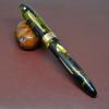
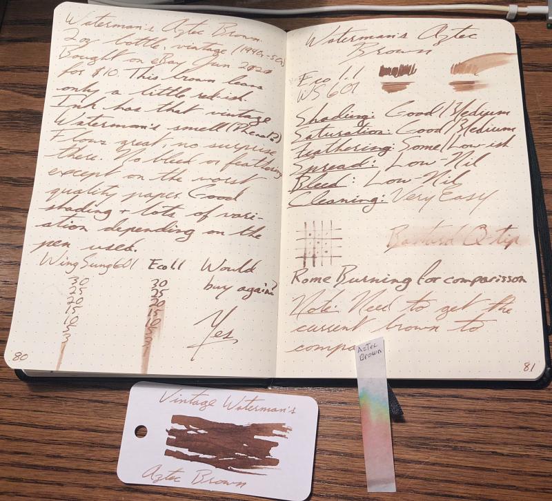
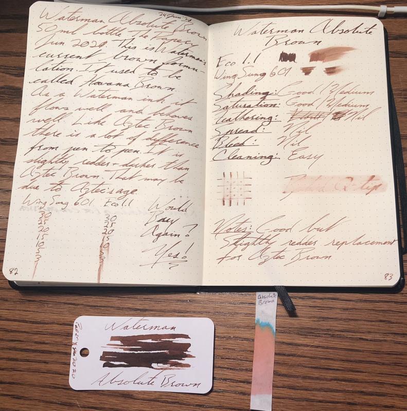
Waterman Aztec And Absolute Browns Reviews And Comparison
IThinkIHaveAProblem posted a topic in Ink Comparisons
I like vintage ink I like the idea that ink that was made in the 30s, 40s, 50s and 60s HAD TO WORK It had to be relatively trouble free and it had to perform as expected. This was after all, a time when fountain pens were simply PENS. They were expected to write and write well. On that note, I recently bought a bottle of Waterman's Aztec Brown. The bottle is almost NOS. Using it, I found that I really like it. This is a problem as the stuff is getting expensive. So, I decided to get a bottle of the current Absolute Brown and compare them to one another. Here are the results: Waterman's Aztec Brown 2oz bottle, vintage (1940s-50s)Bought on eBay Jun 2020for $10 This brown leansonly a little red-ishInk has that vintage Waterman's smell (Phenol?)Flows great, no surprisethere. No bleed or feathering except on the worst quality paper Goodshading + lots of vari-ation depending on thepen used. (Dry Times) Wouldbuy again?Yes Shading: Good/MediumSaturation: Good/MediumFeathering: Some/Low-ishSpread: Low-NilBleed: Low-NilCleaning: Very Easy Waterman Absolute Brown50ml bottle The PaperyJun 2020. This is Waterman'scurrent brown formu-lation. It used to be called Havana BrownAs a Waterman ink itflows well and behaveswell. Like Aztec Brown there is a lot of differencefrom pen to pen. It isslightly redder + darker thanAztec Brown. That may be due to Aztec's age. (Dry Times) Would Buy Again?Yes! Shading: Good/MediumSaturation: Good/MediumFeathering: NilSpread: NilBleed: NilCleaning: Easy Notes: Good butSlightly redder replacementfor Aztec Brown
-
Hi Everyone, DISCLAIMER : This is my Second Ink Review on this forum so please comment and any Suggestions are Most Welcomed. First of all, A Big Thanks to LIVTEK INDIA for providing me the sample of this lovely Teal Ink, Do check them out at the link given above , That being said This is an Honest Review and I DO NOT REPRESENT LIVTEK OR MONTEVERDE IN ANY MANNER WHATSOEVER. 1. Sample So, I received this sample in a Monteverde 30ml Ink Bottle and was immediately impressed with the lovely Teal Colour with some awesome Red Sheen. Shaking the bottle and seeing the beautiful teal colour is just awesome. I was also impressed with the amount of sheen this ink has right ON the bottle and cap 2. Comparison SO to understand the Colour profile, I have classified them to similar inks I Own:- You can see right out that the ink is quite similar to Jacques Herbin 1670 Émeraude de Chivor (Emerald of Chivor ) and the Monteverde D.C SuperShow Teal (2019 Special Edn from Monteverde). All three have the same Red sheen and this ink falls somewhere in between the above two colours. It is slightly light than the Monteverde D.C SuperShow Teal (2019 Special Edn from Monteverde) and comparable to the J. Herbin Emerald of Chivor less the Golden Sparkles. 3. Writing Samples I am using a DIP PEN this time as --> This would be a standardised in my future reviews, --> It puts out good amount of Ink on paper, --> and I can test the cleanliness and staining factors easily. You can see the ink on the nib as well as the beautiful red SHEEN on the macro shot of the nib. and after letting the nib Dry for 5-10 days, dipping it in water and swirling the nib for 3-5 sec, the nib comes out squeaky clean ONLY in ONE DIP, without any traces of stains. So, This ink is VERY EAST TO CLEAN AND DOES NOT STAIN ANYTHING. Following is how the ink performed on different papers. (a). Ink Resistant Paper:- Writes perfectly with NO BLEED THROUGH OR FEATHERING, It does not shade at all and leaves a lovely Reddish Sheen on paper clearly visible COOL. The ink is very well behaved and lubricated and has the Monteverde ITF Technology . Though I experienced Huge Dry times on such paper but it looked Beautiful and It has a Beautiful Reddish sheen as found on Jacques Herbin 1670 Émeraude de Chivor (Emerald of Chivor ) and the Monteverde D.C SuperShow Teal (2019 Special Edn from Monteverde). This Ink DOES NOT SHADE WELL. NOTE : -- > I am using a very thin paper with wax kinna coating/ lubrication on paper making the paper highly ink resistant, although you can see the text on reverse, It is NOT Bleed through but rather the thin nature of the paper. ( . FP Friendly Paper The Ink writes perfectly and does NOT BLEEDTHROUGH even after putting a lot of ink on paper. It is really Saturated and the Colour just Pops out. Dry Times are really good. I does sheen even on the copy paper. (c ). Recycled Paper Well frankly speaking this is a (beep) of a paper very close to a News paper but the ink performed really well, I won't talk about the Dry Time on this paper as It is close to ZERO. The ink is immediately absorbed by the paper and you can see huge Feathering and Bleed Through, but taking into account the paper, it performed really well and the text is clearly visible. 4. Additional Properties I am a curious guy so, I did chromatography using a Tissue paper and it was Awesome, You can clearly see the Blue poking out even before I soak the tissue wet and once I do that the Light Blue / Turquoise crawls on a tangent to the Subtle Green tones (I am very bad with colours so please correct me if I am wrong here). Water Resistance:- The ink is NOT AT ALL WATER RESISTANT and completely fades out. On the brighter side it is really easy to clean from the pen. It is Advertised as a safe ink to use and I did not face any issues while enjoying this ink.It behaves really well. Don't think of keeping the big nib saturate with this colour for longer (say > 10 Min or so), It will dry up but somehow not completely, If you touch it once it is dried, it will definitely stain your hands and everything you touch BEAWARE. This is a water Drop Test on cheep Copy paper This is a 10Sec running tap water test :- Sheen Test :- As mentioned before the ink sheens quite well here are some shorts of that:- 5. Final Thoughts So, for about 1100 INR for a 90ml bottle you are getting an enormous and a well performed ink for very Cheep. I would definitely recommend this ink for daily carry purpose (Provided you like the colour) and anyone interested in a Teal Saturated colour (More towards green) with a hint of Gorgeous Red Sheen. All in all an wonderful ink to work with. Once again I would like to Thank LIVTEK INDIA for giving me this opportunity to test the Ink. Do visit them for some more interesting Inks from various brands such as Stipula, Monteverde, Etc.. and do click their Awesome Fountain Pen Collection. Thanks a lot for making through, please do comment if you have any other opinions, Stay Safe, Keep Enjoying the FP Journey, and Stay Curious Thanks & Regards, GS Gill Attached Images
-
Hello I come to ask your opinion about the state of two vintage sheaffer skrip ink bottles possibly from the 90's. I bought two jars, one brown and one blue, the brown has the great ink well, my concern is that the brown is no longer that color, currently has a greenish color. The lid of both bottles is not rusty, if I had to describe the smell of the box and bottle, I would say that it is old or old book because of the cardboard, I suppose, when I opened both bottles they smell old like cardboard or the bottle in its exterior .The first print on the top layer of the ink looks normal and clean, with no apparent white moldy cotton or things floating around. The bottom of the blue ink bottle is without sediment or strange things, but the bottom of the brown bottle had something brown as you can see in the photo, but with a slight movement it dissolved. I ask you if in your opinion these inks are still seen to be in good condition? The smell in both is the same, smell of old, the smell does not seem rotten to me, in the past I had two inks from other brands that did smell rotten and I had to discard them. If I have to throw the ink in the trash, can I still disinfect the bottle to reuse it for other inks?It is that the ink well of the bottle looks great hahaha
-
Hi all! I did a little essay on the chemistry of fountain pen inks for extra credit in my AP Chemistry class. I thought you might enjoy reading it as well. Please feel free to let me know if anything is wrong (I don't think there's anything wrong but I know there's chemists lurking on this forum) and enjoy! The Chemistry of Fountain Pen Inks Even in today’s increasingly digital society, writing and print publications remain ubiquitous parts of our daily lives. From completing chemistry homework to reading the newspaper, we are constantly in contact with words on paper. Although the structure of the paper is mostly consistent, even with seemingly different types, the inks used vary greatly and are impressive examples of chemical engineering applied to an important part of daily life. Inks are used for countless applications, but the two most common uses are printing and writing. Printing inks, which create the vibrant pages of textbooks, newspapers, and magazines, however, represent only one part of the ink family. The other, more chemically diverse branch of this family, is writing ink. The chemical makeup of inks has incredible variation between the types of pens the inks are designed for, and even within different inks for the same type of pen. The most strikingly variant and chemically interesting group of writing inks are those designed for use in fountain pens. Due to the feed system used in fountain pens to bring ink to the tip, or nib, of the pen, fountain pen inks must be solutions rather than pigment based like many of their ballpoint peers. The inks for fountain pen use must also be water soluble, not tinctures. This requirement stems from the nature of the material that the pen bodies are made from. Many pens, especially those from the early 20th century, are made from celluloid, ebonites, or other natural plastics, which are soluble in alcohol. Any tincture inks would damage these pens. Because of the unique requirements created by a fountain pen’s feed system and the materials used to make vintage pens, many fountain pen inks are made of several fundamentally similar ingredients. First and foremost, all are made mostly of water, the solvent of the ink. A solute that occurs in nearly all fountain pen inks is a water soluble aniline dye composed of a Nitrite group bound to a phenyl group, forming a basic amine, phenylamine. Although many of these dyes are actually more soluble as tinctures, they are dissolved in water to protect the pen materials, as discussed earlier. Other common solutes are surfactants to increase ink flow, biocide compounds to prevent fungal growth in ink, and glycerin to increase ink viscosity. Despite fundamental similarities and rigid requirements to protect pens, fountain pen inks manage to present a wide range of properties to the consumer. These features include greatly decreased freezing points, total permanence on paper, scents, color changes, and decreased drying times. Inks with lowered freezing points are formed by the addition of solutes that dissolve into multiple ions or ring-based covalent hydrocarbons (in the case of polar covalent solutes). Paper permanence is achieved through the addition of solutes that bond with the cellulose of the paper, ensuring that the ink remains permanently marked on the paper and fraud-proof. Scents are the easiest of the properties to create, made by adding ester based solutes formed by the reaction of carboxylic acid and alcohols to the ink solution. Color changing inks are formed by making an ink with multiple dyes, only one of which forms the type of permanent cellulose bond described earlier. When the ink is rinsed with water, all of the dyes except that which bonds with the cellulose wash away, “changing” the color of the ink on the page. Decreased drying times are created, counterintuitively, by adding higher surfactant levels than usual and increasing flow. This allows the ink to seep into the fibers of the paper faster, and stay wet and smudge-prone for a shorter period of time. Inks remain one of the most important parts of everyday life, and will for the foreseeable future. The chemical diversity is striking across different types of inks, for different applications. For fountain pen inks however, more unites the inks than differentiates them. Yet even with this surface level chemical uniformity, the addition of trace levels of different solutes allows fountain pen inks to come in a vast rainbow of colors and an array of special properties.
-
From the Jacques Herbin site: "To celebrate the 350th anniversary of Jacques Herbin’s original brand, we are letting the people who know us best, our fans, choose the new colour of our next anniversary ink. This will form part of the official Jacques Herbin collection. Our ink experts have designed four very distinct shades. The range varies from pastel to dark, soft to flamboyant and tender to lively, each with shimmering and radiant reflections. Each one unique. And to mark this vintage in an even more spectacular way, we decided to create a unique Jacques Herbin ink with both silver and gold glitter that will add sparkle to your writing! So what do you need to do? You have until 16th March to vote and let us know your favourite below. The result will then be verified, and we will reveal the results by email in early April. As if you needed more of a reason to vote, the Jacques Herbin team will then randomly select FIVE voters to exclusively preview the new ink in the luxury of their own home. The winning ink will be available from selected stationery retailers, ink specialists and boutiques for purchase from September 2020." https://www.jacquesherbin.com/en/new-anniversary-ink-survey.html
-
I was looking for a new ink last night and found myself continuously coming back to Sailor Jentle Black. Now, I am sure that this is a fine ink, but I already have four black inks and to be honest four is about two too many. The reason that I kept coming back to Sailor was not because it is a particularly amazing black, but rather because the bottle just happened to have an ink reservoir in it. As much as I would like to try some Sailor inks I have to admit that if they did not have the reservoir in their bottles, then I would not be nearly as interested. Ink reservoirs are great little devices that help to make using bottled ink an easier process. They make filling pens less messy, they make using all of the ink in a bottle much easier, and they are just plain nifty. Ink reservoirs are great devices and should absolutely be in more bottles (I'm looking at you, J. Herbin). The very first ink bottle that I ever purchased (Pen & Ink | Sketch No-Shellac India Black) had an ink reservoir in it, and I have to admit that when I bought another ink I was pretty disappointed that it did not also come with a reservoir. Since then I have come to understand that ink reservoirs are the exception rather than the rule, and any time I find an ink with a reservoir included I become inexorably drawn to it. Which is why I found myself staring at a black ink that I would have had no real interest in otherwise. I ended up passing on the Sailor Jentle Black, but I DID buy an empty Sailor Jentle bottle from iSellpens.com (I plan on putting some of my Noodler's Heart of Darkness into it). I have never been interested in buying empty ink bottles, but it seemed like the lesser of two evils to me, and I now have very little interest in spending money on an ink that I don't really need. So, I am interested to know how many other folks out there have an obsession with ink bottles containing reservoirs. I can't be the only one. What are your favorite reservoir containing bottles? Would you ever consider one ink over another simply because one of them had a reservoir? To get things rolling here are a list of all of the inks (that I am aware of) which include reservoirs in their bottles: Akkerman Levenger Mont Blanc (the long bottles) Pen & Ink | Sketch Pilot (70ml bottles) Platinum (there three standard inks) Sailor Jentle Sheaffer Skrip (vintage bottles) TWSBI (Not an ink, but they do make a reservoir containing ink bottle) http://www.carpediemstore.com/mCustomPage/images/AAINDIAINK.jpg http://static2.jetpens.com/images/a/000/019/19851.jpg?s=0f16f7d983a13d62105460a6a912018d http://www.levimage.com/IMAGE/Web/Product/Pen_Ink/Refills/PR1420_paLEVINK_s1.jpg
-
Afternoon everyone. Lockdown and terrible sleep patterns have me at a minor stage of madness, so at 5 this morning while I was considering grabbing the air rifle & silencing some of the birds that had apparently gotten hold of megaphones to sing their dawn chorus outside my window... I decided instead to do a very unscientific test (see also: dirty) on my all time (so far) favourite ink for practicality, Sailor Sei-Boku - Pigment Blue/Black. The test was carried out as per the description on the index card, what I didn't have room to fit however, is that the index cards are cheap (more like thick paper than index cards, probably 140-160GSM and fairly porous), the degreaser in use was 151's "Elbow Grease" and the nib used to write all text on the index card was a Bock fine. I think I am most surprised by how little effect pen flush (Monteverde brand) had on it! The only thing that really did anything was the degreaser. As expected, water did absolutely nothing. Rear side confirms it, the degreaser had the most effect while actual pen flush only managed a 'flesh wound'. Until Sailor Sei-Boku starts dissolving my pens (unlikely, since it isn't an iron gall ink) I don't think I need to quest for a tougher, more well behaved ink. So far, on my journey to find a "bulletproof" ink I have tried offerings from Noodlers (massively ill-behaved, over saturated, too wet 90% of the time regardless of colour, but some are definitely worse than others! Looking at you Sun Never Sets!), KWZ (extremely well behaved & beautiful colours, but not really truly "bulletproof", 'just' iron gall) and De Atramentis (the black behaves very well, everything else I've tried in the "Document" line has had properties very similar to Noodlers). Sailor Sei-Boku (haven't tried the other two offerings yet) is by far the best (IMO). Not only is it nigh on indestructible on paper once dried, but it also has properties, yes, properties! It shades extremely nicely and even, on the right paper, has a hint of red sheen to it. Beautiful and practical, just like me! Okay, well...maybe not. On top of all that? It tames the most cheap, nasty, course paper I have (Poundland/dollar store notebooks, grey recycled toilet paper...you know the sort!), with no bleed or feather! Disclaimers - Apologies for less-than-stellar picture quality, taken with my ageing smartphone, any perceived feathering is due to that, to the naked eye I can see none.
-
I have decided to review some of my inks. These aren't necessarily in any particular order. This one is J.Herbin Rouge Bourgogne. This isn't a waterproof or an archival inkBearing in mind the paper I use is very smooth, this ink took 10-12 secs to dry.It flows reasonably dry but lubricates the nib quite well.It is currently available in packs of 4 x 10ml small glass bottles and 30ml glass bottles.It's available from many B&M shops and online retailers worldwide.
-
Left hand paper: 90gsm Oxford Optik Right hand paper: 80gsm Pukka Dry time before water test: 12h Test Pen: Jinhao x250 - 1.1mm Jinhao stub nib Opinions: I remember always hating this ink before I "got in" to fountain pens, and simply used a fountain pen to write with, but I couldn't remember why, so comes on to cracking into my bottle for the first time in probably 15-20 years (I left school in 1999 and promptly stopped "having" to write). Ahh, yes, I remember now, the greyest excuse for black there is, that's why I hated it. But, perhaps with the extra knowledge and appreciation I have gained over the past two or so years of the fountain pen hobby offers some redeeming features for Quink "Wishy-Washy" black? Well, firstly, it is very well behaved, as in it doesn't spread or feather even on the Pukka paper, which is fairly absorbent. Bleed is minimal even using the stub, 'tis a dry, dry ink! This may be to your like or dislike depending on how you like your pens to write and in what circumstance you find most of your scribbling taking place. Personally? The majority of my scribbles happen on extremely cheap & nasty copier paper, so I'm all about those dry inks at work. Dry time is also excellent even on the Optik paper (which, IMHO, is way better than Rhodia...don't throw things at me!) which usually lets ink pool for some time (doing the water test on the Optik paper? The water droplet will just sit there for anywhere up to 30-40 minutes before drying/absorbing). Now, this one surprised me. Which it shouldn't. But, there is some permanence to it. Yes I know it is called "PERMANENT Black", but somehow that slipped my mind. The black dye washes away almost instantly but the remaining, largely blue, ink is still very legible. Looking at pricing you can be paying anywhere from £5 to £7 per 57ml bottle which is, pretty reasonable. Summary Being a bit of a sucker for dry inks, I am starting to re-appreciate Quink Black, I also have a penchant for permanence in my inks, because accidents can and do happen (often!). I would say that Quink Black is actually a pretty decent, reliable "everyday" ink if you are having to suffer "less-than-optimal" papers or have a gusher of a pen. Just wish there was more black in this black!
-
I have decided to review some of my inks. These aren't necessarily in any particular order. This one is Diamine Sherwood Green. I have also reviewed Delamere Green separately, that is similar to Sherwood Green, but contains more blue. Water test on the review form shows this isn't a waterproof ink.Bearing in mind the paper I use is very smooth, and the nibs I used were a stub and a medium, this ink took 16-18 secs to dryIt flows reasonably wet, and lubricates the nib well.It is currently available in 80ml glass bottles or 30ml plastic refill bottles.Diamine sell it directly to end-users on their web-site.