Search the Community
Showing results for tags 'ink'.
-
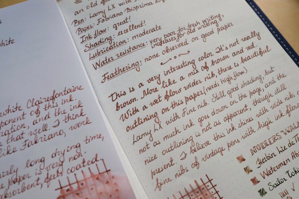
From the album: Some of Mercian’s inks
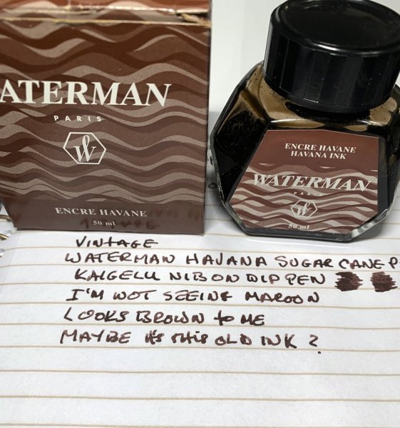
I have copied this photo from @USG, in order to compare it to a photo that I have taken of my own ‘vintage’ bottle of Waterman Havana. I bought my bottle some time between 1999 and 2004 (I strongly suspect that the purchase date was nearer 2004, but cannot remember for certain). I perceive my Havana as being so red that I regard its colour as ‘maroon’, rather than ‘brown’. That said, in this photo of the Havana owned by USG, the writing does look ‘brown’ to me. This makes me wonder whether Waterman changed the formulation of Havana some time in the late 1990s.
- 0 B
- x
-

Waterman Absolute Brown (aka Havana) from the review by Intensity.jpeg
Mercian posted a gallery image in FPN Image Albums
From the album: Some of Mercian’s inks
Waterman Havana (now known as Absolute Brown). I have taken this photo from this review of this ink that was made for FPN by Intensity. I have ‘borrowed’ it in order to illustrate how very ‘maroon’ (rather than ‘brown’) this ink can appear to be.
- 0 B
- x
-
Waterman Havana (aka Absolute Brown) ‘chromatography’.jpeg
Mercian posted a gallery image in FPN Image Albums
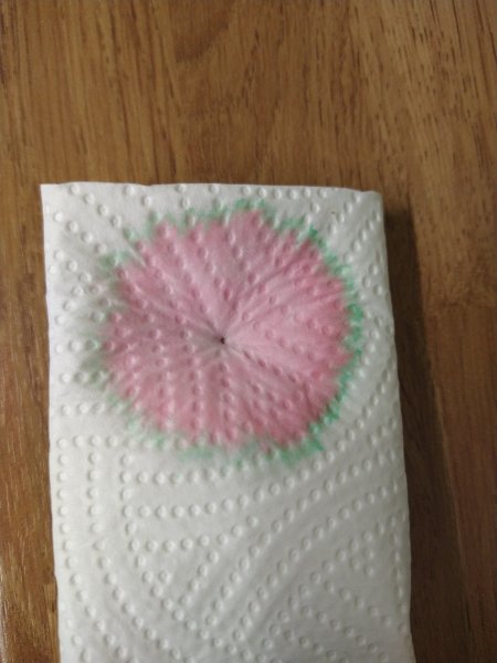
From the album: Some of Mercian’s inks
This is a photo of what was left on the kitchen towel when I was wicking plain water through a pen to try to flush out the remnants of its fill of Waterman Havana (aka Absolute Brown). This is, clearly, not an example of ‘proper’ chromatography, but it does show the preponderance of the magenta/pink dye component in this ink. I am trying to justify my description of this ink’s colour as ‘maroon’, rather than ‘brown’.
- 0 B
- x
-
Waterman Havana (aka Absolute Brown) and Diamine Chocolate Brown.jpeg
Mercian posted a gallery image in FPN Image Albums
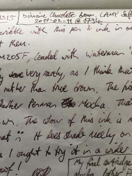
From the album: Some of Mercian’s inks
A photo of the scrawl in my ink-testing book. This is a comparison of Diamine Chocolate Brown (top) with Waterman Havana (nowadays sold as Absolute Brown) underneath. At the bottom of the frame is some text in Parker Penman Mocha. My intent in this photo is to illustrate how ‘maroon’ the Havana appears to be.
- 0 B
- x
-
Waterman Havana (now aka Absolute Brown) in comparison to Parker Penman Mocha.jpeg
Mercian posted a gallery image in FPN Image Albums
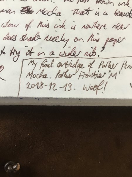
From the album: Some of Mercian’s inks
A close-up of my scrawl in my ink-testing book. The text at the top of the picture is in Waterman Havana (nowadays sold under the name ‘Absolute Brown’). The text at the bottom is in Parker Penman Mocha.
- 0 B
- x
-
Since there's a "what pen(s) are you using today?" thread, I'm surprised there isn't a similar one (at least, my search didn't turn one up) for inks. Of course, in the pens one, people often say what ink they're using in the pens but I thought it might be nice to have one just for inks, though you're welcome to include the pen it's in if you like. So I'll start: last night I used KWZ Maroon and Diamine 1864.
-

Inky T O D - Color Swatches - Blue/black - Please Post Your Pictures And Tell Us Your Thoughts
JimCouch posted a topic in Inky Thoughts
I was surprised to not find a samples topic for my favorite in color - Blue/Black. So here it is, post your Blue/Black swatches & thoughts here! -
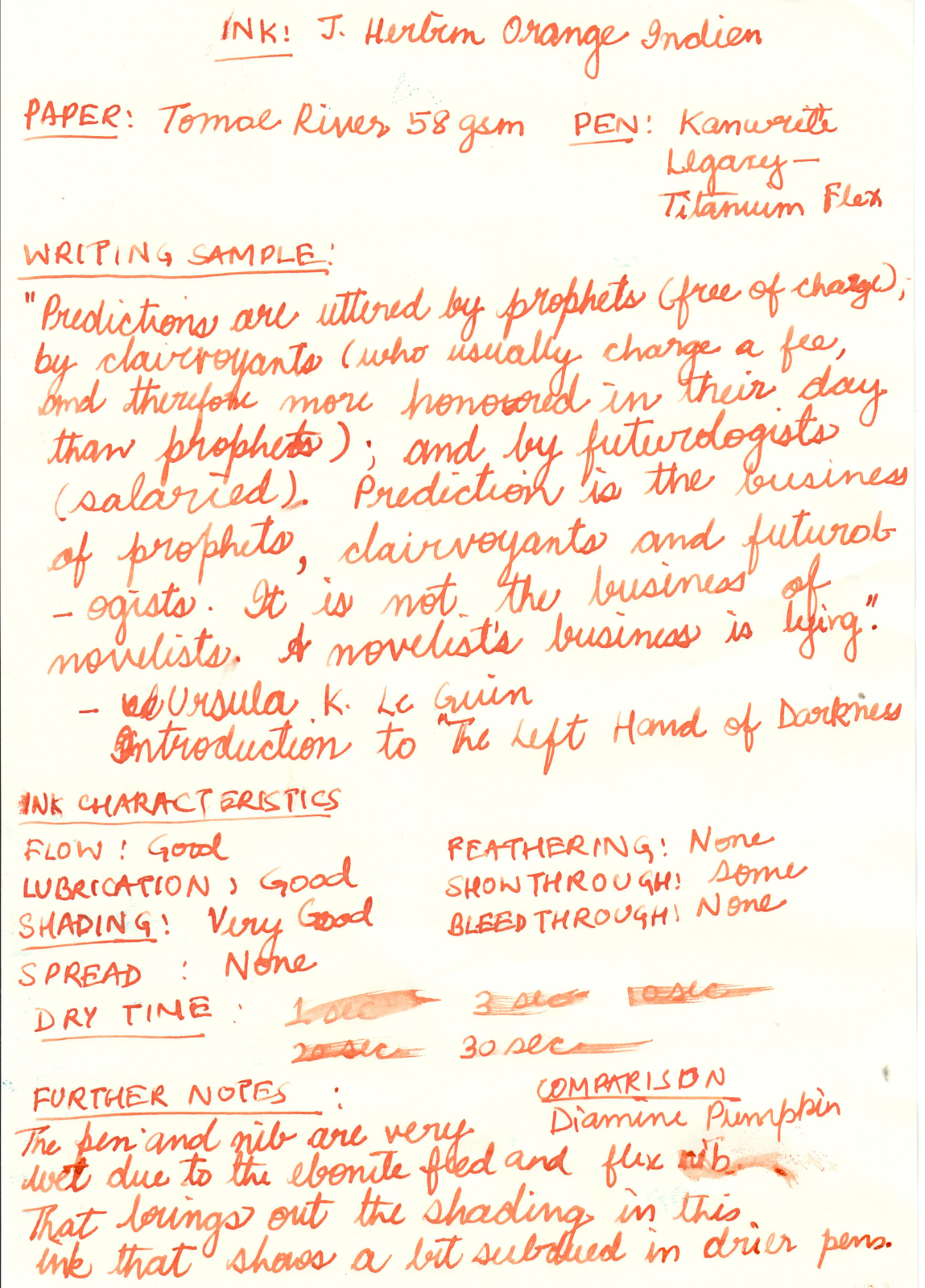
Note: The Diamine Pumpkin comparison looks very similar in the poor scan, but is actually distinct from the Orange Indien. The ink is less red and more orange in reality.

-
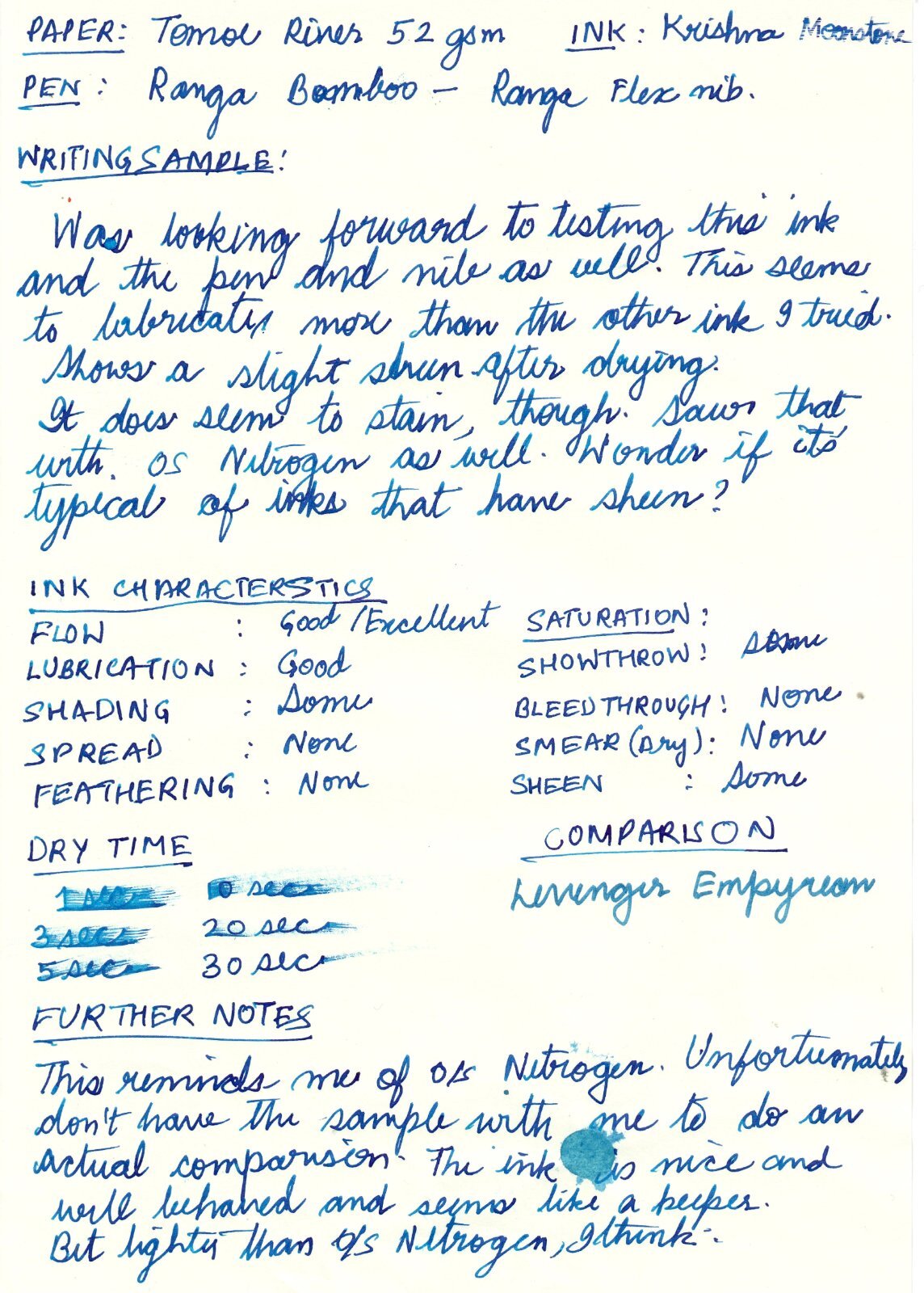
Nice ink from Kerala, India. https://krishnainks.com/ Apologies for the poor handwriting, and wrong name in the review.
-
This is a review of SKB Ink-220, what I call "Sky Blue" On my recent trip to Taiwan, I found a bottle of SKB Ink-220. SKB is one of the historic fountain pen manufacturers in Taiwan. The company was established in 1959 and at one time was one of the top 3 Taiwanese fountain pen manufacturers. While not widely known here in the US, they manufacture a wide range of fountain pens. While I am not certain if SKB produces their own fountain pen ink, they market it under their name. The ink comes in a number of colors. I was only able to obtain one - Ink-220. SKB Ink 220 comes in a very nice square glass bottle with a heavy plastic screw on cap. The bottle opening is a standard size, similar to DeAtramentis or J. Herbin bottles. The bottle is fairly deep and holds 30 mL of ink. I purchased the bottle for right around $7.00. According to one of my interpreters, SKB stands for: S = Smooth; K = Knowing; B = Beauty Here is my written review of the ink. The paper used for this review is Cambridge Executive spiral notebook paper - a reasonably smooth, less absorbent paper similar to HP copier paper: Positives: There is some water resistance, although the letters do spread as the paper dries. My sample was submerged for 5 minutes until the paper was fully saturated. The ink appears fairly resistant to water droplets or simple smearing. The ink dries fairly fast - even with a wet nib on Tomoe River paper. It cleans easily from the pen and converters without staining. Negatives: The color is too pale for EF nibs or possibly F nibs. There is some bleedthrough with broad or stub nibs on more absorbent papers. While SKB Ink 220 will likely not be in my regular rotation, it is well behaved, and will be an ink that I will use for special purposes.
-
I acquired numerous bottle of brand new Parker 51 in in Red and Green. All the bottles were unopened, but all dry. I want to figure out how to reconstitute them. Before adding distilled water, I wanted to check to see if anyone had good knowledge of the chemistry of ink. I've rescued some dry pigment into good ink, but never this much product and of this particular type. I see no reason to let this product go down the drain.
-
I inked up a pan using this ink and was very pleasantly surprised. Please see the photo for my review. The paper is Clairefontaine.
-
Introduction and Elephant in the Room KWZ inks at this point don’t really need an introduction of themselves so all I can say is about page on KWZ website is the best friend here. Bottle is dark glass bottle, good for inks. Now to elephant and well there are 2 different things that I noticed here, First the ink comes in a plastic wrap around the bottle, nice touch really as this prevent many issues that can arise. Second, is entire ink smells like vanilla and that was nice (typical of KWZ)....it made me want to eat ice-cream though so that’s bad. Jokes aside I can see some real practical benefit of inks condition and easy to spot any issue in ink if it arises (by smell) and that is a big plus for many. Each ink is handmade as mentioned by KWZ and might have some variations in them, take it as may that is a what it is. Variation are understandable if on asks me and I don’t think there will be any change in base formula or nature of ink, as comparison lets take processors, there is difference in each processors wafers when made and this has no real impact on processor itself but if you are overclocking the processor then it matters not for normal case. In short for most part, there should not be enough difference in actual ink nature of ink itself and that is the goal of this analysis. Ink review section Test papers include 75gsm sectra copy paper 70gsm and 85gsm nightingale paper 52gsm classmate copy paper (dot bleeds at end seen) 100gsm JK Cedar bond papers. Random books back sides and some unknown real cheap papers (slight bleed on cheap ones). Ink properties Bleeding/Ghosting – very slight on cheap papers. Feathering – None observed. Saturation – Good. Flow – Wet ink. Dry time – 5 sec to 20 sec approx. This above is when ink has been given 1 hrs to dry before pics were taken 10 day dry time has been given to ink. The color came out to be remarkably what it really is, very dark blue-black almost black in color. As with all the pea shooter phone camera at full works. This will serve as 1st case of testing, more below on that. Water Resistance – Very High. Although the dye tends to bleed out of page, content survive just fine and colour mostly. this is 10 day dry time given paper 1 min tap run, page has not been given time to dry but cloth was used to try removing ink using as soak for water and not rubbed. Pressed with cloth. The square lines have been soaked for 2 hrs in water and then crushed with dry cloth in attempt to remove ink. Color in these 3rd images is way off the mark, its little darker and paper is white, but dye loss is visible and that was intent, sadly due to nature of test its not possible to recreate the colors if one wants to I will perform another one but results will take 10 days at min...cos well 10 day time The ink is wet writer but very well behaved, I did not find any running issue even on wet pens of mine but all nibs I use are Fine ones so there is that, but I don’t think it will give trouble on this front. It does show very small bleed on cheap papers (in my experiment, the paper with bleed were some random 40 ish GSM pages which are very absorbent in nature and on 52 GSM classmate copy paper which showed dot bleeds) All in all a normal paper will not have any issue including copy pages. Cleaning well........will require hard work and regular interval is suggested as with all permanent inks. Ink is very dark blue-black and is on edge of black over blue. The beauty lies in it being blue at start and then quickly darkening to blue-black with inclination to blue for first 2 hrs or so while the real dark blue-black color takes another 2 days to fully show. No significant change after this.....yet. Personal take This ink has been on many people hit list and for obvious reasons of being liked in color and being an IG ink which also raises many questions on maintenance of ink and its general oxidization over time and this comes especially true for people like me who are burned by Sallix if I may be so bold as to say. While sallix tends to show signs of losing color this one it too early to say what changes will be. The main highlight for me was that it will darken as age, now I don’t think it will become black from already very dark, almost black color, but I hope to see it darker then sallix as it ages, The ink on box shows blue black and I suspect that is the final color of the ink (after properly oxidized). Lubrication is good, the last part of multiple pen test was left here and oliver used has some issues during testing. Dried ink for 1 hrs. 7 day dry for same page. below part of page came a bit wrong.....thanks pea camera lol.... This page will serve as second case. (more below about case). Reasoning behind other post of same ink Now begins the game of waiting and real reason to separate this post from other Blue black IG. Over the concern for IG ageing in time in current environment and uses, plus paper and well general skepticism of IG ink fade over time faster then most What I intend to do is simple, record the way the ink changes its color over the course of entire year with the way paper would be normally handled in normal situation. The tests will have 3 categories planned for testing on how the page is kept First- this is one where the page will not be used for any reference and will be opened for bare minimum like taking pics and observing the ink, but paper will lie outside shelf and wardrobe making it exposed to all weather paper might suffer. Second- Same as above but stored in wardrobe. Third-one small page will always be exposed to light of room and daylight abid diffused one to see general nature of inks movement. Possible due to east facing room with complete open windows, attempting to recreate a well naturally lit room. Fourth-Page opened and referred often to as notes, these are my geography notes. The first page of this will be posted along with others later. Oh and this is kept outside wardrobe...cos well its in constant use and I am too lazy. this is third case test page.
-
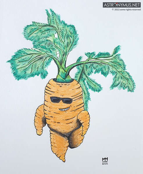
From the album: Stuff by Astronymus
When I saw a picture of a carrot with swagger by someone unknown on the internet I had to draw and paint it. This is the result: "Cool Carrot"© astronymus.net
- 0 B
- x
-
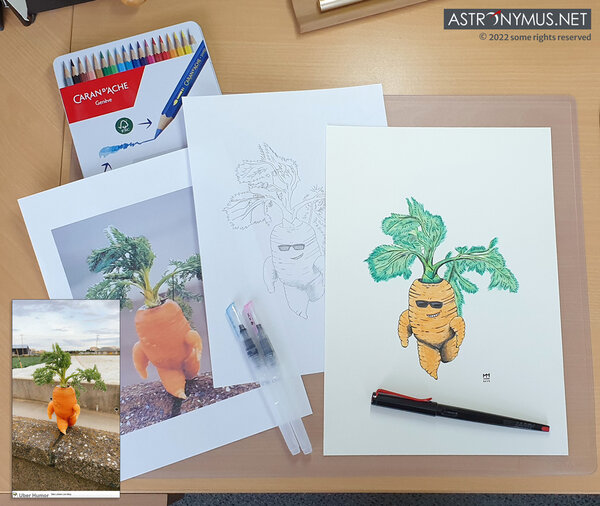
From the album: Stuff by Astronymus
When I saw a picture of a carrot with swagger photographed by someone unknown on the internet I had to draw and paint it. This is how "Cool Carrot" came to life.© astronymus.net
- 0 B
- x
-

A Comprehensive List Of Iron-Gall-Based Fountain Pen Inks
geodesigner posted a topic in Inky Thoughts
Hello fellow FPNers, I'm a longtime lurker around here, but I've only recently became a member. I'd like to make a contribution to the FP community, and I need your help. Last year I began compiling a comprehensive list of Iron-Gall-based fountain pen inks, simply because there was none. I want this list to be constantly updated so as to be as exhaustive as possible. Please contribute updates, corrections and suggestions! The list is available here: https://gdoc.pub/doc/1po8jfMHv-Uz_ioZ9-2DQzASb1FNs-RSfmkkR4GaZ23g#heading=h.vydniszftb1n Since English is not my native language, grammar and spelling suggestions are naturally welcome. I am fascinated by Iron-Gall inks, and find it baffling that so many people are scared by it to the point of not trying for themselves, and letting hearsay become their opinion. Iron-galls are fun and are a category of their own! I don't mean of course that every single FP user should love IGs, but I think it's important to try for yourself Cheers! TM -

Best Yellow- And Green-Sheening Purple Inks (Vs. Diamine Winter Miracle)?
Wistful-Ink posted a topic in Inky Thoughts
Winter Miracle was by far the standout for me from the Diamine Inkvent calendar, and now that they're going to be available in 50 mL bottles, I'm sorely tempted to buy a bottle. But I don't have many large ink bottles, and before I commit, I'd like to see if there are similar inks that are worth trying out first. I don't care that much about the blue shimmer aspect of Winter Miracle, so mostly I'm looking for recommendations for your favorite deep purple inks with crazy yellow/green sheen and, if possible, how you think they compare to Diamine Inkvent's Winter Miracle. From what I've seen online, PR Tanzanite and Waterman Tender Purple seem promising. I've tried a sample of Lamy Azurite and was fairly disappointed with the sheen. Only a little bit of sheen for a heavy swatch on Tomoe River paper, with pretty much no sheen on any of the other papers I tried. I'd love to hear your suggestions (and sample pics if you have any)! -
Saw a pic of the top of an old Skrip Permanent Red, and it says this: Sounds fantastic! Does anyone know to what this is referring, did it work, and does the modern Red Skrip still contain anything like this?!
-
In a few days I will be taking a roadtrip to the other side of the country to stay at a country house for a month. This is the first time i will be taking a fountain pen with me. Because I will be staying for a month, a travel inkwell's capacity will not suffice my writing needs so I decided to take the whole bottle with me (the pen will be empty). A Pelikan 30ml bottle. Could you give me any tips on how to prevent and contain any spillages?
-
I’ve just read a note from my wife, written using Diamine Monboddo’s Hat. It looked black to me, so we had a discussion and she is still only using Monboddo to ink that pen. Further investigation showed this: (The contrast has been heavily reduced to show the effect on-camera, but the original is merely a more intense version of this) Horizontal lines come out as purple-ish, but the vertical ones - and cursive writing - show as totally black. Is this merely an example of extreme shading? The pen is a Jinhao clone (with Arrow clip) of the Parker Sonnet Silver Fougere, with bi-tone coated steel Jinhao F nib.
-
Is there any Ink that is fountain pen compatible and does go transparent (permanently) when heated up? I've seen this crowd funding campaign: https://igg.me/at/rocketbook/x/13511842 Basically this is a notepad which comes with a smartphone app then and it is reusable by heating it in a microwave, works with the pilot frixion pens because they fade away with heat. I think the idea is really great but I wouldn't really like to use a ballpoint frixion pen to use the notepad, I'd rarther use my fountain pen... so any hints? Should be around 60°C that it goes transparent, which is the temperature when the frixion ones do turn transparent and to which the notepad is designed. Otherwise I'm probably going to buy one and then print own pages, they do provide the templates anyway.
-

inks What inks are you using in 2022
The_Beginner posted a topic in Fountain & Dip Pens - First Stop
Hiya guys, I was wondering as summer rolls in what inks have you been using lately. I personally have been using the following: 1. Diamine Twilight 2. Pilot Yana Budo 3. Diamine Ancient copper 4. Diamine Earl Grey( happy they made this from our input) 5. Diamine Yellow Sunshine (very bright yellow, it just pops) 6. Pilot Shin-kai I'm curious to see what you guys have been using and if you would recommend one highly to try, be it in your list or not! -
I’ve got three tiny (12ml !!) bottles of an old Sheaffer color. I’d like to give these away to anyone who is relatively new, an ink fiend (but who isn’t?), and new to this obscure ink. The bottle are full to the brim and the caps tighter than tight (it’s going to take a six year old body builder or a tool to uncap these), so I suspect the ink is good, apart from any color degradation from time (been in drawers and cupboards as long as I’ve had them, though). But with those spiffy new needle cartridge/converter fillers, those 12 milliliters are available without losing half of it, so out they go. The others inks aren’t available, just props. Sheaffer lavender was quite nice, as was the burgundy. Full disclosure: I didn’t like this color then or now but some certainly did. It was an unusual color in the time before Private Reserve & Diamond & Noodlers and the rainbow flood we all have access to! Happy to mail on my dime anywhere in the US. I’ll watch the thread for the first three requests. [I didn’t reread the PIF guidelines, so I hope I’m not violating any, but if I have, please let me know.)
-
Could You Suggest A Good Fp Ink Recipe Using Actual Chemicals?
trayvyz posted a topic in Inky Recipes
I have always wanted to try mixing my own ink. Right now I have access to a very large variety of chemicals including triphenylmethane dyes (methylene blue, coomassie blue, cresol dyes etc), surfactants, solvents, antimicrobials and ways to pipette/weigh them with precision. What I don't have is a reliable recipe that I could follow. Most people seem to mix already existing components to create mixtures with desired colors but I want a list of ingredients down to the chemical level. I have an idea as to what types of compounds go into an ink but I have no idea about the range of concentrations for each compound that could give good results, at least as a starting point. I have tried reading patents for famous inks but they only provide vague information, like all patents do. Does anyone have a good chemical recipe for ink? I have a background in chemistry so please DO become technical if necessary! -
I was reading on the inventor Theodor Kovacs who patented piston filler that I believe Pelikan is still using. I read then when Pelikan bought this patent they also bought patent for solid-ink fountain pens from Eduard (Slavoljub) Penkala, Slovakian engineer of Dutch-Polish-Jewish descent who became naturalised Croatian (typical central European story, if he would be more famous we would have five nations claiming him as their own). What I don't understand in this part of FP history is what is solid ink. Pardon my ignorance but how can ink be solid? Does it contain solid particles? Thanks for your answers.