Search the Community
Showing results for tags 'ink review'.
-
Monteverde's revamped line of inks recently got my attention for their comprehensive lineup of clear, distinct hues, as well as good value. A 90ml bottle can be had for about $13-$15 USD from the better known online retailers in the United States, making it a very good deal. Monteverde touts their "ITF Technology". From Monteverde's promotional material, here's how it claims to benefit us writers: At my recent visit to the 2017 LA Pen Show, Monteverde gave a free bottle of Malibu Blue ink to all show attendees. A company representative had all their inks available for sampling with swabs, as well as show discounts. I brought home four bottles of Monteverde ink, and post-show I've purchased a few more online:Malibu BlueCapri BlueHorizon BlueSapphire BlueMonteverde also offers two blues I am missing: Caribbean Blue (turquoise), and a Blue-Black. I am posting individual reviews for each of the four Monteverde inks I have. I filled a variety of pens with these four inks, with nibs ranging from fine to double-broad stubs. Here's a snapshot from my Bullet Journal Ink Log, showing the pen/ink assignments and a writing sample from each. Monteverde Capri Blue Capri Blue is a "fun" ink, the least formal of the four Monteverde blues I have tried. Here it is on Clairefontaine paper. Color/Saturation Capri Blue is a bright shade of blue that starts to veer towards turquoise, but I stop short of calling it a turquoise. To me, it is still a blue. Shading/Sheening Capri Blue does shade nicely on both Clairefontaine and Tomoe River paper, with the Pilot's broad stub nib as well as the Safari's fine nib. On the Tomoe River paper, some red sheening appears with this ink. Flow This ink does not flow as freely as some of the other Monteverde inks. With my Pilot 78G BB Italic pen, Capri Blue left the pen dry immediately after filling from the bottle! The pen wouldn't start, and even after priming the nib it wrote dry for an entire page. The 78G pen was brand new when I filled it (I pre-flushed the pen before filling), so this might be a cause. The hard start problem has not repeated itself since. I have checked back with this particular pen every few days to see if the problem reappeared. Still, this ink writes somewhat dry in my Pilot 78G BB Italic pens. My Lamy Safari has medium flow with Capri Blue. Lubrication Lubrication is also fairly good with this ink in the Safari. Dry Time Dry time is moderate, between 25 and 30 seconds on Clairefontaine paper from the Safari. Feathering Capri Blue performs well and feathers minimally on the cheap office pad paper used in this test. Bleedthrough Bleedthrough/showthrough is moderate with the the cheap office pad paper. Water Resistance Capri Blue is not a water-resistant ink in the 10 second immersion test. Before After Comparison with Other Inks Here's a comparison tile with several turquoise and light blue inks. NB: The tile labeled "Sheaffer Turquoise" is actually the discontinued Sheaffer Peacock Blue ink.
-
Platinum Classic Ink - Citrus Black (A picture heavy review.) Below are Platinum's six new inks in the Classic Line; "classic" is code for iron gall. In the press release for the new line, Platinum says that traditional ink methods are very time consuming to produce and as a result have mostly been replaced by mixing dye inks. (Note the subtle dig at other companies who use these quick, easy methods. ) This time (as opposed to all the other times, apparently), they aspired to enhance the joy of using fountain pens by focusing on the color changes and shading of the Classic Inks. Each of these inks should start out bright and then darken to black over time. Side Note - I knew these were all IG inks, but I was looking at Platinum's product site, and came across some interesting and confusing information. Under the "Quality" description, it says that the Classic Inks are "water-based pigmented ink." This the is the same description used in the known pigmented Platinum inks, such as Blue-Black, Rose Red, and Sepia. Their non-pigmented inks are described as dyestuff inks. I contacted Goulet to see if they knew anything; they said that as far as they knew, it is not pigmented, but it is a new product, so they do not have a lot of product information yet. Either way, good pen maintenance is important - be sure to clean your pen well after using an IG or pigmented ink. I had no intention of getting this ink; I saw it and thought it looked like a very dirty yellow. But in doing the other reviews, quite a few people seemed interested in it, so when I was ordering my new Midori (Yay!), I got samples of this and Forest Black. I'm such a people pleaser. (I'm also pretty sarcastic - some days I'm better at self-editing than others & today is not one of those days.) My first impression of the color has stayed true - to me, it looks like some mean person stuck a pen filled with brown ink into a perfectly nice bottle of yellow ink, swished it around, and then ran away. But, some people probably appreciate these strange colors. I happen to love blue-greens & I know there are people out there, famous ink reviewers included, who dislike them. My point is, despite my dislike of the color, I tried very hard to give this a fair shot. And, it was just not a good ink. I tried pen after pen after pen to get it to be nice; I tried different paper; I talked to it; I offered it tea; I read to it; I played it soothing music; I played it some not so soothing music in case it needed to wake up; one of my dogs took it for a brief and unexpected run in a TWSBI (bad dog!). Okay, I didn't really do all that, but the dog did get my pen. The reason for all the pictures is because I tried so many different pen and paper combinations, but in the end, I had to conclude that this is just a very dry and not well lubricating ink. A very well tuned pen that never gives you problems will help with the lubrication issues; my Pilot CH 92 felt better than the other pens, but using the 912 with the FA nib was like torture - I tried it because it is such a wet writer, but the dryness and terrible lubrication made it very unpleasant. If you are hoping to get the darker color, you'll need to use a wet pen and still probably need to prime it repeatedly. Drip Test Rhodia Writing Samples Clairefontaine Triomphe Writing Samples Tomoe River Writing Samples (I dropped a pen while I was doing one of these, so if you see splatters, it's because I'm clumsy.) Apica Premium CD Paper (uncoated 86.5g) Writing Samples Original Crown Mill Pure Cotton Writing Samples Original Crown Mill Laid Paper Writing Samples

-
Drip Test Rhodia Writing Samples Tomoe River Writing Samples Clairefontaine Triomphe Writing Samples
-
Robert Oster Signature Australian Shiraz In wine terminology Australian Shiraz is French Syrah. If you go down the wine-making rabbit hole like I did, you can get a lot of information about the differences between them (or not, depending on who is writing the article), but my understanding is that they are the same grape. The color of the ink is a bit difficult to describe. Anderson Pens describes it as a rich shade of burgundy, but I don't see much brown in it. There's some red, some purple, some pink, a little brown. It's an interesting color, but I wish that it had a little more shading to show off the complexity of the color. I mistakenly titled the review below as Shiraz instead of Australian Shiraz - the full name of the ink is Robert Oster Signature Australian Shiraz. So if you're like me and go straight to the S's when trying to find it on various seller's website's, it won't be there.
-
Monteverde's revamped line of inks recently got my attention for their comprehensive lineup of clear, distinct hues, as well as good value. A 90ml bottle can be had for about $13-$15 USD from the better known online retailers in the United States, making it a very good deal. Monteverde touts their "ITF Technology". From Monteverde's promotional material, here's how it claims to benefit us writers: Monteverde Canyon Rust I was PIF-ed this ink by Amberlea at the LA Pen Show. I think she might have noticed my budding interest in brown inks and gave this one to me to try. She gave it to me on the condition that if I did not like it, I would PIF it on to someone else. Color/Saturation Canyon Rust is a red-brown ink, to me more brown than red. The color varies highly with the pen and ink flow. From my Pilot 78G with a double-broad Italic nib, it comes out looking very much like a rust red color. My Aurora Talentum with a M regular nib gives the ink a darker, browner hue. Clairefontaine paper Shading/Sheening Canyon Rust shades well on several papers, including Clairefontaine, Fabriano and even on copy paper. I have not noticed sheening on any of the papers I have tried. Tomoe River paper Flow Though Monteverde bills their Ink Treatment Formula as a flow enhancer, their inks haven't been consistent and Canyon Rust runs somewhat to the dry side of the six Monteverde inks I have tried. Amberlea PIF-ed this ink to me for a simple reason: when she filled a pen with Canyon Rust, right out of the bottle, the pen went dry and refused to write. She rejected the ink on those grounds alone. I filled a brand-new Pilot 78G with Canyon Rust and put pen to paper. The pen refused to write for me as well. I twisted the converter to saturate the feed, and tried again. This time I got half a page in before the pen went dry. Since the 78G was a brand-new pen, I had no way of knowing if the problem was the ink or the pen, so I flushed and loaded it with Waterman Blue-Black, a known "reliable" ink. The pen had no problems. Loading the 78G a second time with Canyon Rust, I had no flow or starting issues. Over the past month, I've revisited the 78G, leaving it nib-up for days and sometimes over a week between uses. I haven't seen a repeat of the flow or starting issues. I suspect the pen simply needed a good flush because it was brand new. (And it also teaches me to use known pens for testing unknown inks, and vice-versa). I also loaded Canyon Rust into my Aurora Talentum, one of the best writers in my collection. The Aurora is about middle on the scale between dry and wet writer, and Canyon Rust works well in this pen, again with no starting or flow issues in a month of use. Lubrication Judging lubrication is a little difficult with my two test pens - the Italic nib on the 78G writes very crisply, and Aurora nibs have a characterstic "toothiness" to them that somewhat works at odds with the lubricating qualities of inks. That said, I would say that though Canyon Rust is less lubricated than the other Monteverde inks I've tried, it ranks about average compared to inks I've used in general. I have noticed the "stiction", where there's a little bit of added resistance at the beginning and end of each pen stroke. This has been characteristic of nearly all the Monteverde inks I have tried and I suspect comes from their "Ink Treatment Formula". Dry Time Dry Time for Canyon Rust is pretty quick on Clairefontaine paper, about 15 seconds . On 20 lb. copy paper, it's a bit slower than I expected, about 10 seconds. 20lb. Copy Paper Feathering Feathering is close to nonexistent on 20 lb. copy paper. On a cheap office pad, there is a mild to moderate amount of feathering. 20lb. Copy Paper Office Pad Bleedthrough There is no bleedthrough on 20 lb. copy paper. On a cheap office pad, bleedthrough is moderate, but enough so to make the back side of the page unusable. 20lb. Copy Paper Office Pad Water Resistance Canyon Rust does not have much water resistance. It practically all washed away in the 10-second immersion test. Noodler's Heart of Darkness, a waterproof ink, is used as a control. Clairefontaine paper
-
-
This is a review (full review here) of the old Monteverde Burgundy. The new bottles are not available in my country (still looking for someone visiting America who I can ship it to economically) so I cannot compare the old with the new. I bought this bottle early last year (when our currency didn't bottom-out yet against the USD) to use for annotation—I'm a law student. For this purpose it is quite good with excellent dry times paired with a Plumix and it contrasts well with black printed text. It is quite a muted colour though, so its usefulness in annotation work relies more on colour contrast than brightness. It has no problem being used to write the main text and I would have no worries using it for my notes, but I haven't yet tried. It will not pair well as an alt-colour with a bright blue or an ultramarine. It goes great with blue-black or black. Comments on how to improve the review (especially what you want to see) are quite welcome. All I know is that I need to desperately improve my handwriting.
-
Monteverde's revamped line of inks recently got my attention for their comprehensive lineup of clear, distinct hues, as well as good value. A 90ml bottle can be had for about $13-$15 USD from the better known online retailers in the United States, making it a very good deal. Monteverde touts their "ITF Technology". From Monteverde's promotional material, here's how it claims to benefit us writers: At my recent visit to the 2017 LA Pen Show, Monteverde gave a free bottle of Malibu Blue ink to all show attendees. A company representative had all their inks available for sampling with swabs, as well as show discounts. I brought home four bottles of Monteverde ink, and post-show I've purchased a few more online.Malibu BlueCapri BlueHorizon BlueSapphire BlueMonteverde also offers two blues I am missing: Caribbean Blue (turquoise), and a Blue-Black. I am posting individual reviews for each of the four Monteverde inks I have. I filled a variety of pens with these four inks, with nibs ranging from fine to double-broad stubs. Here's a snapshot from my Bullet Journal Ink Log, showing the pen/ink assignments and a writing sample from each. Monteverde Malibu Blue This is a "washable" blue ink, that is very much like the standard blue ink you see from most pen manufacturers. Monteverde sells an ink eradicator that can "erase" this ink. Monteverde gave away sample ink eradicators at the show, but I haven't tried mine yet. Clairefontaine paper sample. Color/Saturation Monteverde Malibu Blue is a light blurple, or "blue-purple" ink. This ink goes down deep and dark, and lightens considerably as it dries. The scan here is the dried writing on Clairefontaine paper. Shading/Sheening Malibu Blue has a light amount of shading on Tomoe River paper. I didn't notice any sheening. Flow This ink ranked third amongst the inks tested for flow and wetness. Loaded in my Cross ATX, wtih a super-wet, medium nib, it puts down a slightly wet line. Lubrication Malibu Blue is noticeably more lubricated than the average ink that I put into my cross ATX. Lubrication is good. This ink has some "stiction" to it - there's a little bit of resistance at the beginning and end of every pen stroke, though mid-stroke the nib feels lubricated. I've only noticed this with Monteverde inks, and it's common to them. In this review, I've noticed it with Malibu, Horizon, and Sapphire Blue. Dry Time Dry times with this ink were moderate, about 30 seconds, on Clairefontaine paper. Feathering Malibu Blue performed medium-well in the feathering test on cheap office pad paper. Some feathering is noticeable but isn't too objectionable. Bleedthrough Malibu Blue has light bleedthrough on cheap office pad paper. Water Resistance Malibu Blue is not a water-resistant ink in the 10 second water immersion test. Before After Clairefontaine paper sample.
-
-
I didn't like or dislike this ink. The color is not very exciting; it is somewhat pale and has a washed out look - I rated the saturation as medium, but I'd probably revise it to medium-low. It looks like what I imagine aged red writing would look like. I think there are other red-browns that are much more interesting. But, it performs very well. It's a little bit on the wet side and very well lubricated. I didn't see any bleed-through, and there was only a tiny bit of feathering was on Original Crown Mill Laid Paper. The dry time is impressive at about 10 seconds. So, if you want an ink that is a bit less saturated and behaves very nicely, this is a good option. If you're looking for a stand-up-and-shout ink, this is probably not for you. Also, I like that Callifolio offers both a bottle and the pouch refills. (But can someone explain why the refill is 10 mL bigger than bottle? )
-
I didn't expect to like the color of this ink as much as I did. I'm not usually a fan of pinks, but winter has me craving more lively colors. I was afraid this would have too much orange for my liking, but it is a very nice blue-pink that is moderately saturated. It performs very well & dries quickly. The flow is average, but it is a little bit drier than other KWZ inks I've used.
-
Correction added on 26 April 2017: I ordered new samples of KWZ Brown-Pink and KWZ Grey Plum and confirmed that the ink used in this review was in fact Grey Plum. Originally, the title of this review was "Review of Kwz Brown-Pink" before it was changed to "Review of Kwz Grey Plum". I posted comparison swabs in the comments to show the difference in the inks. As noted in the comments, it is possible there was a mix-up with the inks, so this could be a review of KWZ Grey Plum and not Brown-Pink. I don't have Grey Plum, but I'll get a sample soon to compare the two. In the meantime, be aware that this could be the wrong color. Here are links to Visvamitra's review of Brown-Pink and White_Lotus' review of Grey Plum. I'm going to add that KWZ has great customer service.
-
I purchased the Original Crown Mill Laid Paper after I'd done the review, so it wasn't taken into account, but there was some feathering on it.
-
Another hit from Robert Oster. As the name indicates, this is a bright red that demands attention, but it is not obnoxious - I filled several pages with it & didn't have any eye strain reading it. The flow is average, so it is a bit wetter than the other RO inks I've used. I didn't see any sheen. There is basically no water resistance. I didn't have any bleed-through or feathering & the ghosting was low. The dry time is reasonable - not exceptionally fast but not long. With the F nib, I saw a little shading but not much. But with the M nib, there was quite a bit more - except on the Tomoe River. The most shading occurred on Rhodia, which was surprising.
-
Hi, I have just posted on my blog a short review of KWZ - Maroon, which was reviewed here, but I decided to share a little my pictorial contribution to the topic. So, here it is. KWZ maroon is a nice and rewarding ink. As most KWZ inks it performs really well. The flow is pretty good and in general I have not found much problems with feathering, bleeding through and all this horrible thing which may happen on the paper. It may do a bit on very cheap and absorbing copy paper, but Rhodia, ClaireFontaine, Midori...these are all fine. Even on more generic but decent quality paper it performs very good. The colour is deep dark red with hints of magenta/purple and pink hues, which make Maroon very appealing. Is not chestnutty brown as name would suggest, KWZ maroon is definitely reddish. It reminds dark red Bordeaux wine. Is somehow close to popular some time ago Diamine Oxblood, except the purple tones. Wet looks very juicy and rich. Diluted areas show more red colours, whereas when it dries the purple tones plays larger role. This is visible on writing samples. KWZ Maroon shades a little, however due to its saturation , shading is not that pronounced. Purple and magenta tones are apparent much more on lighter strokes. On ivory toned paper KWZ maroon looks more brown. There is a little bit of sheen, visible on smooth paper. The only cons which may concern some people is characteristic to KWZ inks smell produced by one of the chemicals used in production, which the best to my knowledge will be replaced in the future and inks would be reformulated. We'll see. Additionally, is not water resistant, which depending what you do with ink may be beneficial. Otherwise KWZ Maroon is a good ink with solid colour and really good performance. For my full review please check my blog. Here are some wet, semi-dry and dry test samples as well as some writing. http://www.clumsypenman.com/wp-content/fpngallery/kwz-ink-maroon/untitled-1-3.jpg http://www.clumsypenman.com/wp-content/fpngallery/kwz-ink-maroon/untitled-22.jpg http://www.clumsypenman.com/wp-content/fpngallery/kwz-ink-maroon/untitled-5-2.jpg http://www.clumsypenman.com/wp-content/fpngallery/kwz-ink-maroon/untitled-71.jpg http://www.clumsypenman.com/wp-content/fpngallery/kwz-ink-maroon/untitled-41.jpg http://www.clumsypenman.com/wp-content/fpngallery/kwz-ink-maroon/untitled-27.jpg http://www.clumsypenman.com/wp-content/fpngallery/kwz-ink-maroon/untitled-72.jpg http://www.clumsypenman.com/wp-content/fpngallery/kwz-ink-maroon/untitled-62.jpg http://www.clumsypenman.com/wp-content/fpngallery/kwz-ink-maroon/untitled-79.jpg
-
This is one of my all time favorite blue, and I always have several pens filled with it. I think I definitely love it more now than when I wrote the review, which was over a year ago. http://imagizer.imageshack.us/v2/xq90/673/CkHYfi.jpg I do have to note, of the three bottles I have, two of them are exactly the same, but the third has a major violet shift, which I feel is even out of Nathan's regular range of making every bottle unique. It's still an awesome ink, just more violet than the other two bottles.
-
-
First off, I love this ink! It’s not going to be for everyone, but it is definitely for me. The color will put off a lot of people – it is orange & bright. I happen to like bright colors & if you like inks that really demand attention, it might be one to consider. There is no arguing that it is expensive. For me, the price is justified by how well it performs. I generally use EF nibs which often have a lot of feedback. But with this ink, there is almost no feedback – I can barely feel it on the page. It’s like I’m using a medium or broad nib or a lubricated ink (like one of Noodler’s Eel series). There is very little shading, even with broader nibs. But for me, the lack of shading is okay. There was a very small amount of bleed-through on the copy paper (spotting) but not on any of the other papers. Ghosting was apparent on the Leuchtturm and Tomoe River, as is typical, but doesn’t impede the use of the back side of the page. My review was done in a Leuchtturm1917 with a Pilot Vanishing Point EF. The writing samples are (in order): Office Copy Paper with Pilot VP EF and TWSBI 580 F Tomoe River with TWSBI Eco B Rhodia Dotpad with Pilot VP EF and TWSBI 580 F This is my first review; I hope it's useful. Sorry about the photos instead of scans; for some reason my scanner turned the orange ink red.
-
I am very excited about this ink. The color is great, plus I can get the sheen with a fine nib! The only drawback is that I did find it a bit hard to clean - I had to use cleaning solution to fully clear the pen. Otherwise, I love this ink. Here's a shot of the sheen in an ink drop. I tried to get a shot of the sheen in my writing, but it didn't work out very well. Cell phone + bad office lighting = hard to seen sheen.
-
Here is Waterman Brown (I hate the name "Absolute Brown"). It's one of my favorite brown inks. It's well behaved, has an attractive and subtle green sheen when it's laid on thick, it's cheap, and it's widely available. http://imagizer.imageshack.us/v2/xq90/661/tJhMPS.jpg
-

Ink Rambling - Dromgoole's Noodler's Texas Black Bat And Its Stablemates . . .
Tas posted a topic in Ink Reviews
http://www.taskyprianou.com/fpn_black_bat_ramble.jpg Paper: Rhodia UNI No19 (can't wait to finish the pad, I've gone off it as colour wash results are nearly always different) Inks: Noodlers's Texas Black Bat, Noodler's Heart of Darkness, Noodler's Raven, Noodler's Black. I attach my swatches as reference too - notice (typical ) how they behave differently on the watercolour paper. However, this is how tend to use the inks so the swatches are more relevant to me than the Rhodia ramble. http://www.taskyprianou.com/fpn_noodlers_four_blacks.jpg -
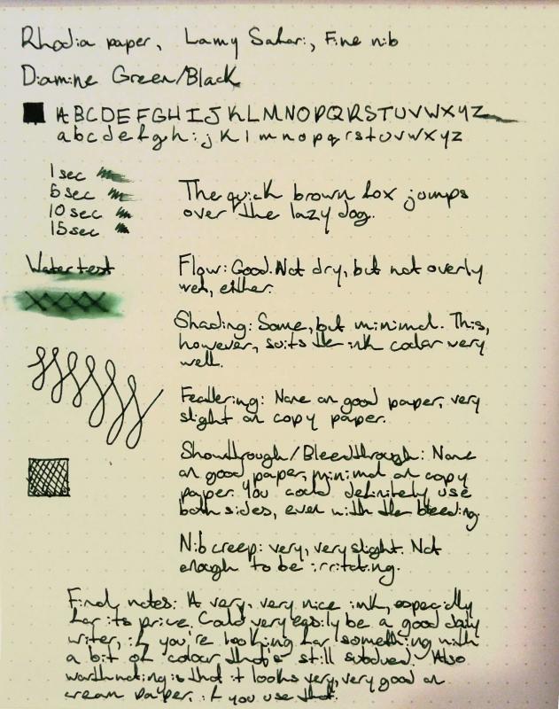
This is a brief review of Diamine Green/Black. As an aside, I love the Diamine bottles way more than I should. Edited because I forgot to attach the review, great job me.
-
Ink Sampler and Review for Dr. Ph Martin’s Ocean Edge Blue fountain pen ink: Background: Dr. Ph. Martin's artist products are manufactured by Salis International, founded in 1934. Ben Salis, the founder's son, began to work for his family's business in 1936, at the age of 16. That year, in the height of the Great Depression, he was paid just $1 per week. Ben Salis was given the honorific title of "Dr. Martin" after he invented many graphics and color products, and obtained several design patents. Although he was not a real doctor, products with the trade name of "Doctor" earned instant respectability in the patent medicine era, so the name was applied to his inventions. Dr. Ph. Martin's products are among a handful of "doctor" products that remain on the market today. Ben Salis passed away in 1996, but his business and his legacy remain, and today his children continue to manufacture Dr. Ph. Martin's inks and color products. They are the third generation in a family tradition. (excerpt from http://www.dickblick.com/brands/dr-ph-martins). Dr. Ph. Martin’s new series of brilliant Fountain Pen Inks are pigment base inks. Originally designed for TWSBI #580 & #700 fountain pens, they can be used in similar fountain pens. Dr. Ph. Martin’s claims that these are the only pigment base fountain pen ink that is lightfast and archival. These highly saturated inks are intense in color. The colors currently available are: Ocean Edge Blue Garnet Red Rose Dark Matter Black They are AP approved Non-toxic. docmar9 kindly provided samples to test these inks, which is greatly appreciated. Materials Used: Papers used: Xerox 24lb Multi-Purpose paper purchased from Costco Tomoe River-like paper in Traveler’s Notebook refill 013 Staples Notepad paper Pens used: Jinhao 250x with medium nib Jinhao 450x with Goulet 1.1 stub nib Results: 1. Drop on paper towel. 2. Writing sample on Xerox 24lb Multi-Purpose paper using Jinhao 250x: The ink flowed nicely through the medium Jinhao nib onto the page, with little to no featherly, no bleedthrough or showthrough. The color is very saturated. It dried quickly (under 10 seconds) and did not smear, as would be expected on a relatively absorbent paper. My only complaint was that the ink also dried very quickly in the nib. It did not appear to leave any precipitate, however. 3. Writing sample on Tomoe River-like paper in Traveler’s Notebook refill 013 with Jinhao 450x: In this Jinhao 450x with Goulet 1.1 stub nib, the ink flowed very well with a nice lubricated feel. On this paper, the ink nicely accented the wider lines with nice shading and some red sheening. As expected, the ink took a great deal longer to dry - over 20 seconds to thoroughly dry without smearing. Overall, I was impressed with the color and the behavior of the ink. 4. Test for water resistance: I prepared a brief writing sample on Staples Notepad paper (an unfavorable paper for fountain pens). The ink wrote very smoothly on the paper, with very little feathering and surprisingly no bleedthrough and little showthrough. I then placed this small sheet of paper into a bowl of water and left it there for 2 hours. The ink remained on the page. There was little if any fading of the writing. After 2 hours, I removed the paper from the bowl of water, blotted it and let it air dry. I expected some of the ink to remain on the blotting towel. It did not. I then compared the dried sheet to similar writing on another sheet not subjected to water. The intensity of color was the same for both. This suggests that the ink is very close to water proof. In addition, I also poured alcohol on a writing sample and ammonia on another writing sample and let them sit for several minutes. In both cases, there was some smearing of the ink when wiped with a tissue. But, the majority of the ink remained. While I would not call this completely “bulletproof”, I would consider it clearly archival. I did not test for lightfastness, however. 5. Cleaning: Following my tests, I cleaned my pens using typical cleaning methods – cool, flowing water with a tiny amount of dishwashing soap. The nibs and converters were very difficult to clean. In spite of thorough cleaning, the converters are stained. In order to clean the nibs, I had to disassemble the nibs from the feeds to remove traces of the ink. This is far beyond my normal routine of simple rinsing nibs and converters, and thus is a disappointment (although not totally unexpected). Impressions: Bottle: The ink comes in very nicely weighted, stable, round glass bottle with an accompanying eyedropper. While the eyedropper would be convenient for many, it does not serve a useful purpose for me. I fill most of my converter type fountain pens using a separate syringe, but if I were filling a piston filler fountain pen or directly through the nib, the eyedropper might be a bit of a nuisance. Color: Edge Blue is a highly saturated medium blue with a slight lean towards turquoise. It is a pleasant color, shades nicely with a wet nib, and has a slight red sheen to it on my Tomoe River-like paper. I also used the ink on Clairfontaine writing paper, and the shading and sheen are clearly evident even with a medium nib. It is, however, an average color that is eclipsed by other similar colors such as DeAtramentis Steel Blue. The advantage of Edge Blue, however, is in its archival properties. Formulation: The ink is fairly dry in flow and needs a wet nib to show its true beauty. When I used the ink with a medium nib, once started, it flowed nicely. But the ink dried quickly in the nib despite being capped. Thus, the flow was difficult to get started at the beginning of each writing session. This was not the case in my wet stub nib. Overall: Let me preface my final comments with the fact that I generally do not use pigment inks. I have never really cared for the formulation, and by and large prefer less water resistant inks. In addition, I generally prefer inks that are less saturated in color. When I received the samples kindly provided by docmar9, I was initially not impressed. They appeared to be so saturated that they were opaque. But after testing the ink on towels and using a dip pen, I began to appreciate the color more. Then, after writing with the ink, I found it to be smooth and flowed nicely. I also appreciated that it does not feather or bleed through except with my stub nib on cheap paper. But I was most impressed with the resistance of this ink to water and other substances. Clearly, this ink has archival qualities. Perhaps the only criticism I have is that it is very difficult to clean from the nib and converters using normal methods. Otherwise, I find Edge Blue to be a very nice ink indeed. In conclusion, this is a highly saturated, archival quality ink that would be an excellent choice for someone who needs a “bulletproof” ink that shows limited feathering and bleed through even on cheap papers, but still maintains nice shading and sheen qualities on qualities papers.
-
Grey Plum is one of those colors that I was most excited about in the recent Group Buy from KWZ Ink. The swab posted on the site was all I had to go by, and I admit, I wasn't thrilled by the color there. But I liked the idea of the color, and I like most of Konrad's more complex colors, so I gave it a try. Y'ALL. This is GREAT. Okay, so here's a review overview, with closeups and comparisons below: Right away, Grey Plum reminded me of one of my favorite discontinued inks, Sailor Chu-shu. There just aren't many purple-leaning greys out there. This is a swab where the inks were laid down very heavily (to try to get sheen and to see hue clearly). This means that the color is probably more intense than you'd usually see with a pen, but you see differences and similarities in a different way than writing samples. As you can see, Grey Plum is darker, greyer and cooler than Chu-shu in the swab; Chu-shu often comes off as a near-purple, while Grey Plum is a pretty definite gray. I washed the picture and swab below with water, to see what kind of behavior emerged, and got a really complex and interesting cool wash with blue to violet hues. I really like the tones, but it should be noted that the water resistance doesn't look particularly great - if you're sketching, prefer to go back over washes if needed. You might think you see sheen above, but that's a trick of the scanner. This ink is pretty matte, even on paper that encourages sheen. There's a tiny bit of something, but I don't think you'd ever see sheen under normal conditions. (I don't think you'd want it on this ink anyway.) How does it behave? Dry time is moderate. This is Tomoe River paper, so a 10-15 second dry time is decent. I didn't notice any problems with the other papers I tried. The shading is very pleasant, and great occasionally. I think someone who cared more might be able to draw out more shading (see the "s" in "so good" in the Manners section). The feel is great, just like all the other KWZI's I've tried. The flow is nice, startup is prompt, and it cleans up with no muss. (I have not left this ink in a pen for very long, though; I'll let you know if this changes at all.) The smell, unlike former KWZ inks, is hardly noticeable, on par with Diamine's normal aroma in terms of notability. It's faintly soapy or astringent - in fact, it's really familiar, and I wish I could put my finger on it. The smell of the last batch was my least favorite thing, so I'm happy it's changed. Allure is a really personal thing, but I love this ink. Dilutions is a category intended to show how ink behaves as water is added. It's very non-scientific; the first pass is pure ink, and then I briskly swish the brush for a second or two in clean water, dab it on the rim of the water jar, and make a new swash. It can reveal hidden undertones, or weird plateaus of saturation, where ink looks the same for several dilutions, even as the amount of water increases. This was not a hugely successful attempt this time, and I'm not sure why. It does show the kinds of washes you might get, and that you can probably dilute this ink down to get kind of a fun violet. As you might expect from the above picture and dilutions and swab, there's not a lot of water resistance. I usually perform a couple tests: I put drops on a grid of lines, leave them for 10 seconds, and then blot them carefully. This is the mildest form of water that writing might be exposed to - a tiny bit of condensation from a glass, say. I also write a phrase and then briskly wash it with a brush for ~5 seconds - not scrubbing exactly, but adding friction. I let it sit for 3-5 seconds, then blot. This usually erases any inks that lack water resistance. If they're resistant at this stage, I do an overnight soak. Grey Plum holds up okay to a little bit of water or alcohol, and mostly vanishes with a brush. While it may have minimal water resistance, this is not an ink I'd use for cases where I'd want to be sure of my notes. Appearance in different nib widths is good across the board. It's not overpowering in a bold nib or too wimpy in a extra-fine. I usually write a whole paragraph with each so I have an idea of what they'd look like on a page. (Ideally I'd do a page of each, but life is short, and the inks together give me a good feel for whether an ink will over or underwhelm in large quantities.) If I had to pick a favorite width, it would be broad. I did test Grey Plum on Leuchtturm and Piccadilly papers. I think it looks best on the warm to bright whites. It looks great on Leuchtturm, but Piccadilly is too warm, and it looks dull and flat. (Unfortunately, my scanner doesn't pick up warm paper tones well, so you'll have to trust me.) Fortunately, most papers are less yellow than Piccadilly. On my terrible office paper, I do see some fuzziness of line in a bold nib. Not a surprise - this is not a paper made for liquid ink of any kind. I don't see bleedthrough to the next page, just spots to the back. (No bleedthrough or feathering for either Leuchtturm or Piccadilly, though.) It's totally usable, even on the cheap paper, though it definitely has more presence on the Tomoe River seen above. Overall, I really like this ink, and hope Konrad keeps making it. It brings something new and interesting to my ink stash, and it is a real pleasure to use, too. Paper used: Tomoe River for the two-page spread above. Pens: The title is done with a 1.9mm Franklin-Christoph Music nib. As a lefty, I find italic sort of challenging, and I never practice - and yet I am always sad when things come out poorly. Oh well. The first page is written with a Goulet Jowo medium nib, fairly wet and smooth. The second page is that same medium nib (in the middle paragraph), an EF Goulet nib (top paragraph), and B Jowo from Scriptorium Pens (bottom paragraph). All are fairly wet, though I think the EF is a bit drier than the M and B. All these nibs went through the same pen and feed - I just pulled at the end of each paragraph. Brush: For washes and dilutions, I used a Isabey squirrel mop travel brush. It lays down a ton of water, and cleans up like no one's business.
-
I have stocked up lot of inks, especially inks like Chelpark, Camlin, Bril and Sulekha. All these are region specific like Chelpark is easily available in North India and Bril's availability is limited to Bangalore, Hyderabad and Chennai, and Sulekha only available in Kolkatta that too few colors against 11 colors listed on webpage and lastly Camlin is available pan India. The review is about the Bril Royal Blue Ink, which happens to be my first ink review. And before I go further I would really like to thank Visvamitra and Lgsoltek, whose ink reviews I personally like a lot and is the inspiration for the ink review. Bril inks are one of the most used and admired inks in India. Bril has been in existence since 1964 and are based out of Bangalore. Bril Royal Blue is one of the most used inks in India after Camlin Blue and it is priced at Rs. 15 (US $ 0.25) for 60 ml glass bottle. INK SPLASH Ink Splash on Bilt Matrix - 70 gsm Ink Splash on Century Copy Paper - 70 gsm Drop on Paper Napkin Color Match Writing Samples Bril Royal Blue – Writing Sample on Bilt Matrix (70 gsm) using 3 pens of varying nibs width Bril Royal Blue – Writing Sample on Camlin School Notebook using 3 pens of varying nibs width Bril Royal Blue – Writing Sample on Century Copy paper (70 gsm) using 3 pens of varying nibs width Ink Swabs Bril Royal Blue – Ink Swab Sample on Bilt Matrix (70 gsm) – 3 swabs, 2 swabs and 1 swab from Left to Right For further details and waterproof test, please visit my blog LINK