Search the Community
Showing results for tags 'ink review'.
-
Summer Storm doesn't get a lot of love, but if you're looking for a blue-grey (with a slight emphasis on the blue), you might consider it. Personally, I really enjoy it, but I like blue-greys, so I am biased in that. It behaves well, although it is on the dry side. It's dark enough to read without turning into black (a pet peeve). This isn't the perfect grey, but it's a nice color.
-
There is quite a bit of color variation between pens. I expected the flex pen to be the darkest because it is so wet, but I was surprised that the 580 was so light - it is usually wetter than the Eco. (I'm speculating, but maybe the Eco isn't sealed quite as well, so perhaps the ink has already begun oxidizing before it hits the paper?)
-
This is the third part of a series of reviews I’m doing on Chinese Boss inks. So far I’ve found this brand of ink to be the most prevalent in China, but totally unknown in the West. They are great cheap inks and all are scented as well. Boss Enterprise “Laoban” ink (not to be confused with the Boss line of inks made by Ostrich in Tianjin) is produced in Guiyang by Guizhou Boss Chemical Industry Co., Ltd. More information about the company can be found here [http://www.made-in-china.com/showroom/gzboss/companyinfo/Guizhou-Boss-Enterprise-Guiyang-Boss-Chemical-Industry-Co-Ltd-.html] and their descriptions of their inks here [http://www.made-in-china.com/showroom/gzboss/product-detailsxmJCnEToQlW/China-Handwriting-Ink.html]. Boss inks are available in the following standard colors: 1. Black 2. Carbon Black 3. Blue-Black 4. Blue 5. Red Close up of ink comparisons taken in natural light: Close up comparing Boss Carbon Black and Noodler’s Black (B = Boss, N = Noodler’s): As you can see, it's completely waterproof: Boss Carbon Black is deep, dark and permanent. It also flows well and lays an excellent line. The only drawback to this ink what's typical for carbon pigmented inks: its ability to stain refilled cartridges or converters and potential clogging if left to dry in the pen. This ink requires regular use and cleaning of whatever pen it is in. If you need a decent permanent black and can find this ink for sale, it’s worth your consideration. Boss inks are only 4 RMB (US$0.62) per 52ml bottle in China. Thanks for reading!
-
Indeed, this is a combined review of all three, pen, nib and ink, as a set. And, it is something new for me. At first there is the Pelikan M605 White White fountain pen which I bought late Autumn 2021 with a medium nib. The fountain pen has all the usual and expected features and properties: the exact size of the M600 series but M605 means silver (=rhodium) trim, unicolour white cap and piston knob, white stripes pattern at the barrel (as usual for Pelikan) with the small difference that there are transparent stripes in between the white ones which allow a nice view onto the piston and into the ink reservoir. It looks almost like a demonstrator, but isn‘t, as the opaque white stripes make it look so much more elegant: The fountain pen is already filled with Blue-Black ink. Then there is this rhodium trim mono colour nib. While it looks a bit simple compared to the usual gold bicolour nibs of the M600 series, it has the usual and expected smooth Pelikan performance and the usual and expected one or two size steps more broad line width. If there is any serious critique on Pelikan gold nibs, it is this: the imprint on the nib seems to be a random letter. I own 6 Pelikan M60X nibs and only one of the EF had the expected line width, the other 5 were „something else“, such as one M wrote B, the other BB and one F wrote BB while the other wrote M, and so on. The original M nib was, as expected, more between B and BB and far over the maximum I can handle. Less than one hour after the first test, I started to grind and customize the tip. Inspired from the shape of the MB (146) Solitär flex I re-shaped the spherical Pelikan „M-BB“ point to something flat and made the front half strictly cylindrical with slightly rounded corners. The point is now a disc, in form an proportion like an ice-hockey puck. It is not a stub and far from a cursive. It has surprising dynamic line variation and some (out of the box) micro-flexibility that results in a typical handwriting appearance which is closer to a semi-flex than it is to a stub or cursive nib result. I didn‘t expect that and was surprised and pleased by the nibs performance. By chance, it turned out simply great! Not much is left from the original globe-shaped tip. The pen is inked up, residues of the ink are adhering to the nib surface and to the engraving. My first writing test was with Pelikan 4001 Royal Blue → which was OK, but boring! So, I tried a refill with Pelikan Edelstein Tanzanite → bulls eye! The Tanzanite ink previously performed so weakly with my usual range of EF and F nibs that I had it already dedicated for sitting in a drawer until the end of all days. The generally wet Pelikan gold nib with the puck grind combines a wet but thin line resulting in a deep rich colour with some elegant shading. The fine lines are less saturated than the broader while a little pressure does increase ink flow and high colour intensity. More pressure does neither increase the line width nor the ink flow. This behaviour makes the nib suitable for writing at a desk as well as for quick note taking „on the go‟. Writing with a (very) light hand results in comparably little line variation. Gentle pressure increases the line width of the downstrokes more than that of the sidestrokes. Due to the special shape of the tip, the pen can be written with some pressure in any direction and still glides softly over the paper. Applying more pressure, the line doesn't become broader! The natural variation in writing pressure results in letter shapes with some individual character. What a surprise performance and what a pleasant set of pen, nib and ink fitting so perfectly together! Pen and ink are part of my January and February Ink Quartetts. This is my second ’perfect‘ set during 45 years of daily fountain pen use – I‘m so excited!

-
I love reading everyone's ink reviews, so I thought I would try making one too. The pens used are the Noodler's Ahab and a Muji Fine nib pen.The paper is Hilroy recycled lined - aka, cheapest stuff at Amazon.The spelling is terrible, but until they invent a pen with a spellchecker that can read dyslexic, we are just going to have to make the best of it. I'm heavily dependent on electronic aid to communicate well in writing, but I'm improving. General thoughts about this ink: The colour is lovely and dark. A rich purple-black-blue to it. It's a soothing colour for long writing sessions.It performs well on a variety of cheap papers. Very little feathering even on the stuff they use at work.The flow is just about perfect. It certainly doesn't gush out of the pen, but it comes out when I ask it and doesn't skip a beat.Dry time is moderateIt's very-not water resistant. If I get it wet enough, the writing disappears. For this reason, I'm not sure I'll be using this ink much in the future.
-
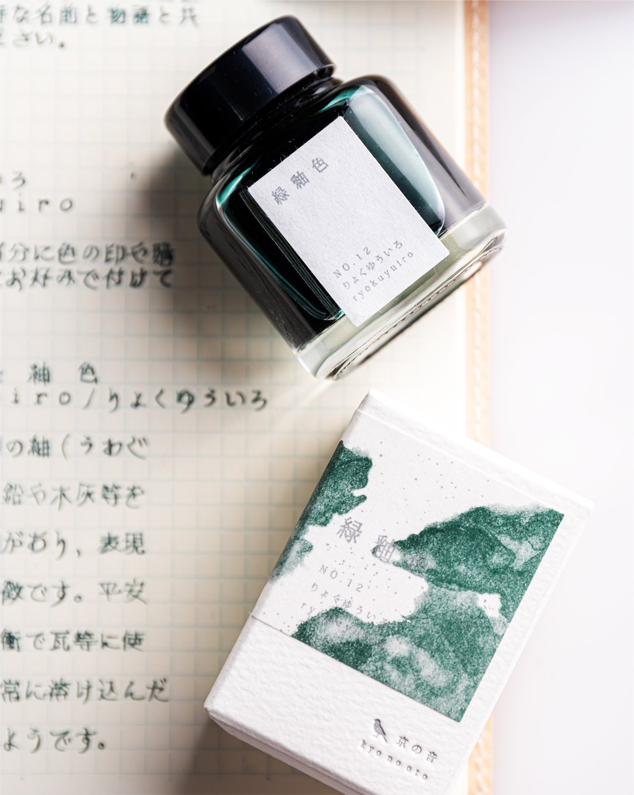
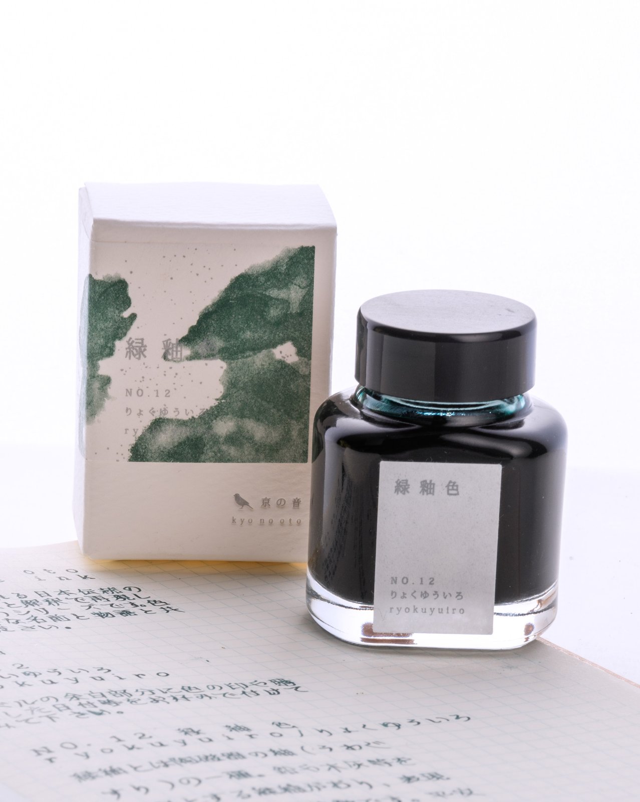
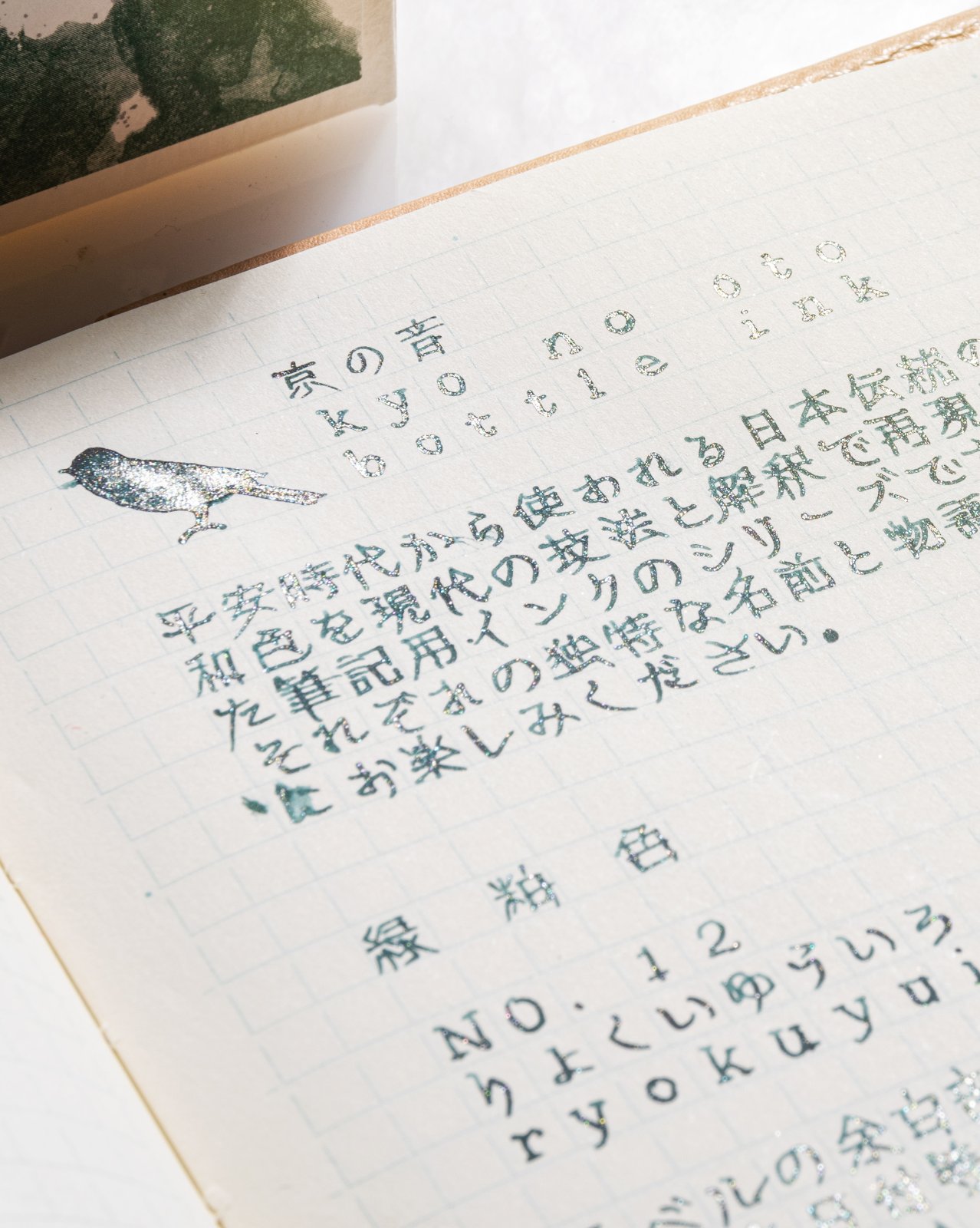
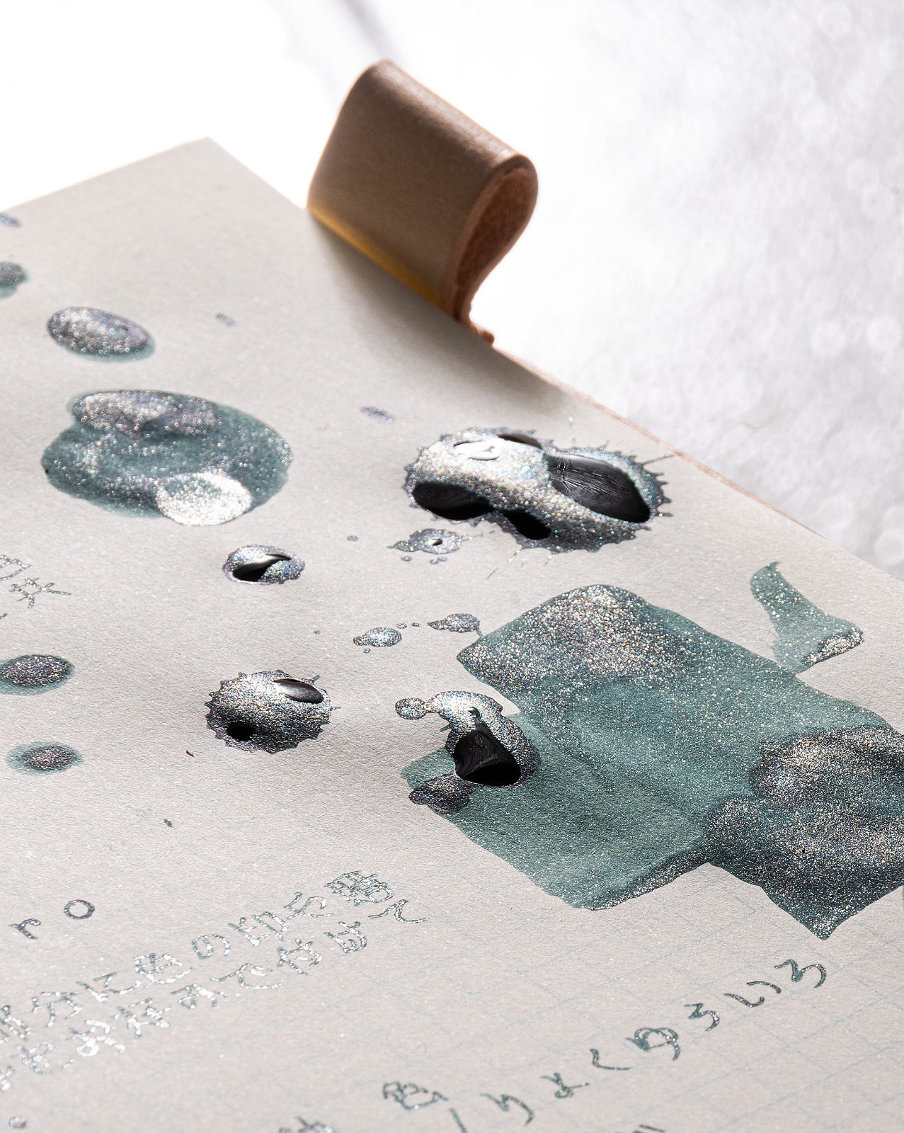
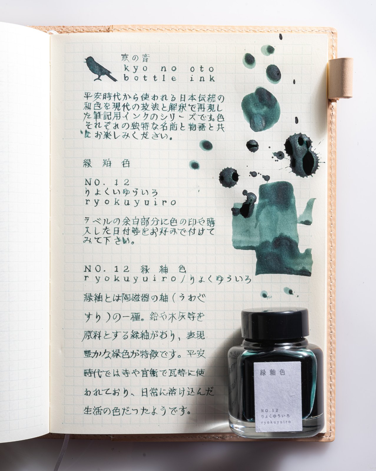
Hello Folks, First time posting here and it might not be a review as per the review standards over here (eg. all the tests and examples etc) but I promise I will make it up with great pictures to showcase the ink. I am mostly active over at reddit and some of the people here might have probably noticed my posts there. Call it a showcase instead of a review if you may. We are talking about one of TAG Stationery's two new inks for 2021 (no.11 & no.12) and I was early enough on the order to get the NO.12 Ryukuyuiro ink. Fresh arrival from Japan just a couple of days back. There is not much information about these new inks yet (atleast in the english forums) except some japanese reviews that I have seen on twitter via TAG's official twitter account. So let's get started on the pictorial journey with a beauty shot as a writing setup on the table. My tools of choice - Midori MD notebook (A5) grid pages & Pilot Custom Heritage 912 (FA nib). The packaging is same as other kyo no oto inks with a variarion of showing ink on the packaging (which has been unique to each ink). It's a shimmering ink, a first for kyo no oto range. Both their new colors are shimmering inks. This one is a deep dark green with silver shimmer. At some angles and how the light falls on the writing, sometimes it feels like there is gold & silver mix. I do not speak or understand japanese, the text written here is a copy from the info leaflet that came along in the box. The ink in its wet glory - unlike most of the kyo no oto inks have been on the drier side, this one feels reasonably wet (initial impressions), good saturation and ofcourse shimmer. I love how most of my inks look on the ivory midori paper. After the dry-down. In this picture it looks like there is silver as well as gold shimmer. Maybe an illusion. On the writing sample the silver is prominent. Jacques Herbin 350 Vert Atlantide seems to be the closest match to this ink. Hope you like my shot, quick post here and would try to make some more posts over here. Thanks for dropping by on my post and if there are any questions I would try my best to answer it here. Cheers, AJ
-
Here's one of the lesser-known Baystate inks, Baystate Cranberry. It was a really big disappointment, considering how much I like Baystate Blue. If you need a similar color that's actually brighter (punchier?), I definitely recommend Diamine Cerise. It's an all-around better ink. http://imagizer.imageshack.us/v2/xq90/537/H1E0Jp.jpg
-
Introduction and Elephant in the room First paragraph same as Taccia cha so ignore if aware (info on bottle if interested). First let me take a moment to address the elephant in the room, box and bottle. Bottle has big mouth for any pens is no issues with filling, but then when ink is low might not be easy to get last drops of ink...I can’t be sure cos I cannot see any mechanism to help here..still a nice bottle overall. Box is not paper like most inks (not 100% at least) it sure does not feel like one, more durable and stronger with inside fins designed to keep ink from moving around and requires some effort to open as the top acts like a lock (its not hard just not too easy either basically the box does what box should do protect the ink)...not bad considering my waterman came out of box during shipping. Gotta love the warning labels, only for writing purpose...makes me want to draw always, and this one is quite good for that. Ink Review Section test papers 100 GSM JK cedar 75 GSM Spectra copy paper 52 and 57 GSM classmate registers. (52 GSM showed dot bleed) 70 and 80GSM Nightingale papers Cheap random registers and papers. GSM is well suspense at best, most likely 40 ish. Nature of ink the colors are off here and they are lighter in real life, my pea shooter camera is unable to pick it, close up shots will be added for actual color reference. A close up with better look at color, golden here is quite visible and is quite accurate. Dry Time- 8 to 25 sec on some papers, not 20 sec had to clear this one. Saturation- good Bleed- very slight on cheap papers and dot bleeds on 52 GSM classmate A decent bleed when closed in, done on 52 GSM classmate paper. Its not as bad as pic might make it seem, entire 'S' and 'C' for reference is ghosting and bleed is only considerable on 'T' and 'H' corners where first line of 'H' is again ghosting. This is also area where shade is high, more on this later. Feathering- very slight wool-ish on papers with high absorbent nature, present on shade area. Smudges-none at least by finger. Lubrication-great Ghosting (show-through)- none on most papers apart from cheap guys....and where it bled... Flow- good. Wet/Dry- Its balanced ink but very close to wet nature so much so that it might feel wet to some, mostly due to shading points where ink is present on page more then usual. Shading- quite high. this pic also has better color visible for the ink. Shading is quite high here and its these parts that show any sign of bleed on real cheap papers. Water resistance- none.. Cleaning- Easy clean with water. Personal take on ink I decided to separate this part as it varies from people to people and might not be interesting for some who just need quick info on ink, I intend to do same for any review I write, whenever I write. Anyway lets go. The ink does show a very nice dark golden brown color to it and the addition of shading was very welcome for me. The test pen Lamy Safari sees no issue of flow or hard starts and I don’t think there will be any either seeing how ink behaves. The picture of wheat fields might be little too much as from what I remember wheat fields are more golden in sunlight, but depends on light really so they are sorta right....they do miss mark there. Funny part aside, ink is really great and shows great golden color with lots of shading of dark brown color which is almost black making entire write up look different in good ways. The color I feel will be liked by most, its lighter then in pics abid by very small margin. No water resistance is a bummer but again taccia themselves say there is none so no big deal for me. The bleed which I see is mostly on places where there is more ink deposit for shading that ink gives, this also means that a quick writing with no pen lift will give only golden color with no shades, not happens in real world so shade will be seen and even when speed is fallen the shades tends to give in, as seen in small write up below. Speed writing reduces the shade to some extent but do not eliminate them, all in all shade is high as seen on Fine nibs and will be visible on most cases. I tried to write in continuous flow without lifting pen, made multi strokes on same line and slow speed due to not in habit of doing so made result look more or less same as normal😅 the upper paragraph show quite accurate color of ink when written on fast pace as done above. Conclusion I have not tried it yet but using flex nibs should give some beautiful results (my flex is currently filled with waterman serenity blue ink). All in all its very nice ink and I like it both for behaviour and color. Go ahead give it a go, you will like it for sure and costs of Rs 940 or 12-ish dollars plus shipping for 40ml.
-
May I know the lightest gray/grey ink you have tried? My current is J. Herbin in the shade Gris Nuage. I'm in search of the lightest gray/grey ink.
-
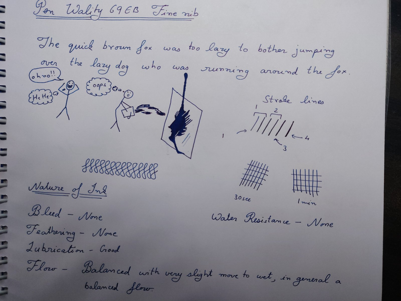
Introduction and Elephant in the room Lets take elephants out of picture. First is controversy that surrounded the bottle design which actually is a patent design of Gecko design and this was cause of issue which has been addressed since then. What happened behind the scene is of no concern to me as end result seems to be good for all. Basically ink is available to buy. Now bottle is well already quite nice looking and half of the folks (including me) would probably jump the gun for bottle over other blue ink, so before diving in ink lets clear this guy out. There are some pros and cons of this bottle design. First what the bottle was originally designed for by gecko is to be used as ink well and it works great as such, any pro and con arises from this very fact so use as you may. Ink was shipped separately outside the box to prevent mishaps during shipping so starting point is empty bottle. Pros include looks, nice design for dips and general filling of ink and well attraction factor (all those who saw the bottle ask where I got it from and if only bottle is available and if larger size is present...so yeah it attracts attention) last the separation of ink mouth and reservoir has real practical benefits when using dip pens and filling pens. There is one other from what I feel but its too vague so I won’t put here. Cons include, glass is on thinner side so be careful. There is bubble issue which happens as if reservoir has ink over channel. The issue is not really as big of deal and can be delt with by moving bottle a bit. Last is size of mouth. I have not seen problem with my pens but I have a feeling that absolute jumbo pens like ranga ganesha might not fit properly to extract the inks from mouth in respect that nib not dipping completely..can’t test it as I lack such pens. All in all its one unique bottle and sure will be liked a lot. Ink review section Paakezah in persian is a word for ‘pure’ and this ink and so the reference of ink as the complete blue on Krishna website. Ink is first in line of Krisna’s S series inks which they say is safe sheen ink for vintage pens and I agree with them on this after testing it. Test papers include 75gsm sectra copy paper 70gsm and 85gsm nightingale paper 52gsm classmate copy paper 100gsm JK Cedar bond papers. Random books back sides and some unknown real cheap papers. Ink properties Bleeding/Ghosting – None seen on any paper tested except for cheap ones. Feathering – None to minimal on very cheap ones. Saturation – Good Flow – Balanced flow with very slight tending to wet side. Dry time - varies from 12 to 20 seconds. Sheen – moderately high. Shading – Not seen as shades are pretty much sheen spots. Water Resistance – none (will not survive water). A write sample in high resolution meant to test the new limits of uploads plus general opinion of ink. The camera is pea shooter phone camera. I tried to get as accurate color as I could with phone. the image is quite accurate just tiny bit more dark then in real.... water resistance results. Paakezah shows no other color, at least in normal case I still have not tested chromatic test, other then blue and its shades. The sheen seen has metallic color and is reddish-violet. The ink show high sheen on decent papers but non-absorbing papers are preferred as with all sheen inks. I must point out though that it is by no means a sheen monster but there is enough sheen that one will not have to look for it, its simply visible on paper in all its glory when seen with naked eye and the fact that I can see such on mostly normal papers says a lot. some sheen seen in writing. The entire page has such results just hard to get photograph in one go. I feel the ink lies on darker spectrum of blue, its very blue just not light shade. All in all its interesting in respect that it manages to separate itself from usual blue lots like waterman serenity blue and lamy blue ink even without any sheen. Still sheen is the highlight and you might wanna go with decent paper on this one. screenshot if ink from Krishna inks website There were never any hard starts or skips in 3 pens that I tried with decent flow maintained in all types of writing from fast to weird. Wality 69EB, Ranga Slim Bamboo and Oliver Exam pen are 3 test lots. Now cleaning is easy and water is suffice here. As for safe..well I tried clogging the pen with the ink by letting the nib open and drying the pen for one day...still managed to clean the pens with soap water. There ware no stains left and disassembly of the pen showed no clogs or residue. So I think it should be safe for any pen. I tested these results on Oliver exam pen which is clear demonstrator and makes it easy to observe such results. other sample with full page writing. Do tell if higher resolution image is preferred over this one. All in all a nice ink even without the bottle. Conclusion For the price of Rs 949..or approx. $12.5 without delivery….its a steal especially with the bottle and by looks of it being mostly on pre-order I will say that its selling like cakes. The customer service of Krishna inks was great, all orders were placed from their website and notifications were sent via email. Any quarries and questions were replied via email and replied within 2 days. It was a pleasant experience overall. Disclaimer: entire writing seen is done on 100GSM JK cedar paper. I lack tomoe river but I am confident the ink will sheen more on that page.
-
This is the fourth and final review of four I'm posting, to showcase the new line of inks from Fountain Pen Revolution - I trust you'll forgive a little repetition! A few months ago Fountain Pen Revolution released a new line of inks under their brand - starting with three colours, though it's now expanded to six. These inks, according to their webpage, are made in the US, in partnership with "another small family business". Technically, Blue Black doesn't belong to the new range - and I'm not sure whether it's made by the same "small family business" as the others. It's a more "sober" ink, a dark strong blue, that according to my limited testing is more colourfast than the others. This ink would not look out of place in an official setting (where the Royal Flush Blue may be a little *too* cheery?), and I've had one of my pens inked with it constantly since it arrived in July. Like the other 3 inks I purchased at the time, FPR Blue Black is very reasonably priced - $8.50 for a 30ml bottle - and for those who are interested, the bottles have a wide enough mouth to accommodate the largest of pens. I don't know if FPR are planning to release this in larger bottles for the more budget-conscious - for me, though, 30ml is more than enough, given the number other inks in my drawer! A photo of the review page: A copy of the water test: All four inks on Rhodia paper: All four inks on Tomoe River paper:
-
A few months ago Fountain Pen Revolution released a new line of inks under their brand - starting with three colours, though it's now expanded to six. These inks, according to their webpage, are made in the US, in partnership with "another small family business". I ordered all three (plus their existing Blue-Black) in late May - then began the lengthy process of waiting for the ink to arrive (via Qatar and Greece!). There was a small amount of leakage along the way (hardly surprising given their circuitous, COVID-affected route) - but apart from a slight discolouration of the labels and packaging, the inks arrived intact. FPR's inks are very pleasant to write with - bright and colourful, smooth-flowing, and more water resistant than I'd expected. The inks are very reasonably priced - $8.50 for a 30ml bottle - and for those who are interested, the bottles have a wide enough mouth to accommodate the largest of pens. Firecracker Red was the first ink I tried: it's a cheerful red that skews a little towards orange (which kinda goes with the name, I think!). The review I think captures my feelings about the ink - suffice to say, I very much enjoy using it! A photo of the review page: All four inks on Rhodia paper: All four inks on Tomoe River paper:
-
This is the second of four reviews I'm posting, to showcase the new line of inks from Fountain Pen Revolution - I trust you'll forgive a little repetition! A few months ago Fountain Pen Revolution released a new line of inks under their brand - starting with three colours, though it's now expanded to six. These inks, according to their webpage, are made in the US, in partnership with "another small family business". I ordered all three (plus their existing Blue-Black) in late May - then began the lengthy process of waiting for the ink to arrive (via Qatar and Greece!). There was a small amount of leakage along the way (hardly surprising given their circuitous, COVID-affected route) - but apart from a slight discolouration of the labels and packaging, the inks arrived intact. FPR's inks are very pleasant to write with - bright and colourful, smooth-flowing, and more water resistant than I'd expected. The inks are very reasonably priced - $8.50 for a 30ml bottle - and for those who are interested, the bottles have a wide enough mouth to accommodate the largest of pens. Green With Envy is a cheekily-named but cheerful green colour - I'd describe it as a "grass green" if that weren't still too vague a designation! A little darker than J. Herbin Lierre Sauvage, but lighter than Blackstone Daintree Green or Diamine Sherwood Green (see the samples). I probably have more shades of green ink than I need - but I'll happily continue using this one, as it's easily legible without being overly dark, and flows nicely in a fine to medium pen. A photo of the review page: A copy of the water test: All four inks on Rhodia paper: All four inks on Tomoe River paper:
-
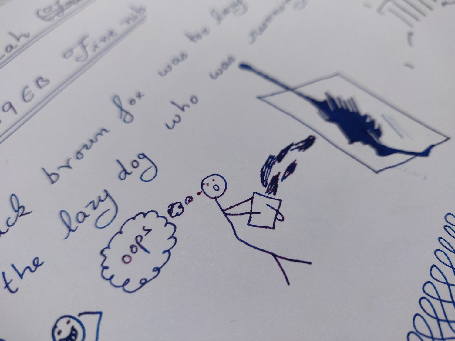
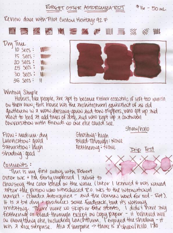
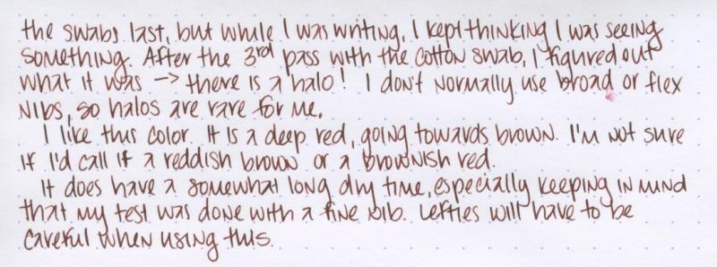
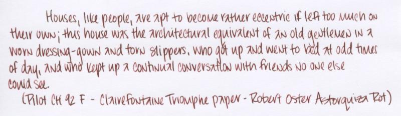
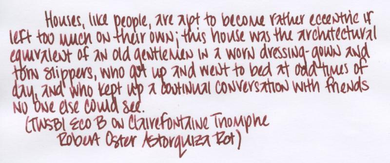
For my first Robert Oster ink, I chose Astorquiza Rot - I picked it based entirely on the name (who could resist an ink with "rot" in the name?). I quite like this ink; the color is a dark red with a lot of brown. It is a little dry but still performed well. The dry time is somewhat long, and the water resistance is low. The shading is reasonably nice for a deep red & there is a halo that would probably be more evident with a flex pen. All in all, a very nice red with an interesting name. The review is on Rhodia dotpad.
-
Monteverde's revamped line of inks recently got my attention for their comprehensive lineup of clear, distinct hues, as well as good value. A 90ml bottle can be had for about $13-$15 USD from the better known online retailers in the United States, making it a very good deal. Monteverde touts their "ITF Technology". From Monteverde's promotional material, here's how it claims to benefit us writers: At my recent visit to the 2017 LA Pen Show, Monteverde gave a free bottle of Malibu Blue ink to all show attendees. A company representative had all their inks available for sampling with swabs, as well as show discounts. I brought home four bottles of Monteverde ink, and post-show I've purchased a few more online:Malibu BlueCapri BlueHorizon BlueSapphire BlueMonteverde also offers two blues I am missing: Caribbean Blue (turquoise), and a Blue-Black. I am posting individual reviews for each of the four Monteverde inks I have. I filled a variety of pens with these four inks, with nibs ranging from fine to double-broad stubs. Here's a snapshot from my Bullet Journal Ink Log, showing the pen/ink assignments and a writing sample from each. Monteverde Horizon Blue This is Monteverde's Parker Penman Sapphire workalike. It is similar to Diamine Blue Velvet and Visconti Blue. Here is how it appears on Clairefontaine paper. Color/Saturation Horizon Blue is a deeply saturated, "pure" blue. It doesn't lean to purple or green. Shading/Sheening Horizon Blue has a light amount of shading on Tomoe River. A little bit of red sheening can be seen in the Tomoe River sample. Flow Horizon Blue is a well-behaved ink. I had no skips or hard starts on the initial flow. Horizon Blue came in second place for flow amongst the four inks tested. In my Sheaffer Prelude with M nib (a wet pen), it comes out wet but not too wet. Lubrication Like the other Monteverde inks, Horizon Blue has good lubrication, but has some stiction at the start/stop of a pen stroke. In my Clairefontaine bullet journal, my Sheaffer Prelude squeaks as I write! Dry Time Dry time is moderate, between 25 and 30 seconds on Clairefontaine paper from the Prelude. Feathering Horizon Blue performs well in the feathering test on cheap office paper. Bleedthrough There is a medium amount of bleedthrough on the other side of the page on the cheap office paper. Water Resistance Horizon Blue probably performed best of the four Monteverde inks, but still it is not a water-resistant ink in the 10 second immersion test. Before After Comparison with Other Inks Here is a tile comparing Horizon Blue with other medium blue inks. NB: The Parker Penman Sapphire is from a diluted sample and so isn't quite true in terms of saturation.
-
To be honest I don't know much about the company. Some time ago Algester posted topic about Tag Kyoto branch inks. The bottles and colors presented on their site looked nice so I've decided to try some of these inks. I've managed to buy two on Rakuten and I'll review them. The inks are made by or for Takeda Jimuki company and are available in two lines: Kyo No Oto and Kyo-Iro. Kyo no Oto inks are said to be traditional japanese colors that has been used since heian era (roughly 1000 years ago),and expressing a tinges that have been nurtured in long history and profound culture for long time. Kyonooto inks are: Aonibi Azukiiro (new ink) Imayouiro Kokeiro Nurebairo Yamabukiiro Kyo-iro inks are: Cherry Blossom of Keage Flaming Red of Fushimi Frosting of Arashiyama (new ink) Moonlight of Higashiyama Soft Snow of Ohara Stone Road of Gion As soon as I discovered that two new inks were produced I ordered them. Sadly the package went missing. When I lost hope that I would ever receive it, it appeared suddenly and from nowhere after almost three months of delay. Crazy. Anyway as some of you may know I've become huge fan of these two line opf inks. The colors aren't generic. We've seen most of them elsewhere but they offer some unexpected twist I enjoy a lot. I even like their black ink - Nurebairo (it's one of three black inks I have at home, the other two being Octopus Schwarz and J. Herbin Perle Noire). I was really curious about new colors. I hope that some of you were interested in them as well because there'll be plenty of photos. Frosting of Arashiyama can be described as rusty orange, although a lot depends on the pen you use (check writing samples on Rhodia). Arashiyama (Storm Mountain) is a district on the western outskirts of Kyoto, Japan. In wet pens this ink is a joy to use, in drier ones it doesn't feel prarticularly thrilling Drying time is reasonable and I haven't observed any feathering or bleedthrough. In dry Platinum Plaisir 0.5 mm nib the line is dry and lacks lubrication, in Kaweco Sport turned to eyedropper it becomes wet orange-brown ink that flows smoothly and looks very nice. It has no water resistance. Drops of ink on kitchen towel Software ID Color range Tomoe River, Kaweco Classic Sport, broad nib Leuchtturm 1917, Kaweco Classic Sport, B Rhodia, Kaweco Classic Sport broad nib and Platinum Plaisir 0.5 mm nib. CIAK, Kaweco Classic Sport broad nib + Platinum Plaisir 0.5 mm
-
Do you know this person? She has reviewed and tested more than 300 inks inks, for now. Her reviews are very detailed, and complete. Enjoy! https://www.youtube.com/user/VixR/playlists Edit - I Wonder if she is a member of the FPN...
-
Hi Everyone, DISCLAIMER : This is my Second Ink Review on this forum so please comment and any Suggestions are Most Welcomed. First of all, A Big Thanks to LIVTEK INDIA for providing me the sample of this lovely Teal Ink, Do check them out at the link given above , That being said This is an Honest Review and I DO NOT REPRESENT LIVTEK OR MONTEVERDE IN ANY MANNER WHATSOEVER. 1. Sample So, I received this sample in a Monteverde 30ml Ink Bottle and was immediately impressed with the lovely Teal Colour with some awesome Red Sheen. Shaking the bottle and seeing the beautiful teal colour is just awesome. I was also impressed with the amount of sheen this ink has right ON the bottle and cap 2. Comparison SO to understand the Colour profile, I have classified them to similar inks I Own:- You can see right out that the ink is quite similar to Jacques Herbin 1670 Émeraude de Chivor (Emerald of Chivor ) and the Monteverde D.C SuperShow Teal (2019 Special Edn from Monteverde). All three have the same Red sheen and this ink falls somewhere in between the above two colours. It is slightly light than the Monteverde D.C SuperShow Teal (2019 Special Edn from Monteverde) and comparable to the J. Herbin Emerald of Chivor less the Golden Sparkles. 3. Writing Samples I am using a DIP PEN this time as --> This would be a standardised in my future reviews, --> It puts out good amount of Ink on paper, --> and I can test the cleanliness and staining factors easily. You can see the ink on the nib as well as the beautiful red SHEEN on the macro shot of the nib. and after letting the nib Dry for 5-10 days, dipping it in water and swirling the nib for 3-5 sec, the nib comes out squeaky clean ONLY in ONE DIP, without any traces of stains. So, This ink is VERY EAST TO CLEAN AND DOES NOT STAIN ANYTHING. Following is how the ink performed on different papers. (a). Ink Resistant Paper:- Writes perfectly with NO BLEED THROUGH OR FEATHERING, It does not shade at all and leaves a lovely Reddish Sheen on paper clearly visible COOL. The ink is very well behaved and lubricated and has the Monteverde ITF Technology . Though I experienced Huge Dry times on such paper but it looked Beautiful and It has a Beautiful Reddish sheen as found on Jacques Herbin 1670 Émeraude de Chivor (Emerald of Chivor ) and the Monteverde D.C SuperShow Teal (2019 Special Edn from Monteverde). This Ink DOES NOT SHADE WELL. NOTE : -- > I am using a very thin paper with wax kinna coating/ lubrication on paper making the paper highly ink resistant, although you can see the text on reverse, It is NOT Bleed through but rather the thin nature of the paper. ( . FP Friendly Paper The Ink writes perfectly and does NOT BLEEDTHROUGH even after putting a lot of ink on paper. It is really Saturated and the Colour just Pops out. Dry Times are really good. I does sheen even on the copy paper. (c ). Recycled Paper Well frankly speaking this is a (beep) of a paper very close to a News paper but the ink performed really well, I won't talk about the Dry Time on this paper as It is close to ZERO. The ink is immediately absorbed by the paper and you can see huge Feathering and Bleed Through, but taking into account the paper, it performed really well and the text is clearly visible. 4. Additional Properties I am a curious guy so, I did chromatography using a Tissue paper and it was Awesome, You can clearly see the Blue poking out even before I soak the tissue wet and once I do that the Light Blue / Turquoise crawls on a tangent to the Subtle Green tones (I am very bad with colours so please correct me if I am wrong here). Water Resistance:- The ink is NOT AT ALL WATER RESISTANT and completely fades out. On the brighter side it is really easy to clean from the pen. It is Advertised as a safe ink to use and I did not face any issues while enjoying this ink.It behaves really well. Don't think of keeping the big nib saturate with this colour for longer (say > 10 Min or so), It will dry up but somehow not completely, If you touch it once it is dried, it will definitely stain your hands and everything you touch BEAWARE. This is a water Drop Test on cheep Copy paper This is a 10Sec running tap water test :- Sheen Test :- As mentioned before the ink sheens quite well here are some shorts of that:- 5. Final Thoughts So, for about 1100 INR for a 90ml bottle you are getting an enormous and a well performed ink for very Cheep. I would definitely recommend this ink for daily carry purpose (Provided you like the colour) and anyone interested in a Teal Saturated colour (More towards green) with a hint of Gorgeous Red Sheen. All in all an wonderful ink to work with. Once again I would like to Thank LIVTEK INDIA for giving me this opportunity to test the Ink. Do visit them for some more interesting Inks from various brands such as Stipula, Monteverde, Etc.. and do click their Awesome Fountain Pen Collection. Thanks a lot for making through, please do comment if you have any other opinions, Stay Safe, Keep Enjoying the FP Journey, and Stay Curious Thanks & Regards, GS Gill Attached Images
-
Recently an interesting ink landed on my desk, courtesy of an exciting PIF by Amberleadavis. This Russian ink is by Gamma from a "Raduga-2" (Rainbow-2) product series in red color. I did not know what to expect, so I opened the bottle and gave it a sniff, out of curiosity. There's a bit of a chemical smell to the ink that brought on a wave of nostalgia: it reminded me of old pigment inks I used to use as a child; when they were mixed with water, I could smell something similar. Of course it's been some long time since, so I could be wrong, but I definitely had a strong association with this scent and some paints from my early years. The nostalgia did not end there! When I first filled a fairly dry pen with the ink and wrote a few lines, I was immediately reminded of old red ballpoint ink I used to use, also in my school days. This ink makes a very convincing imitation of such an ink, particularly when used with a fine-medium round point fountain pen with conservative flow. It's not really an inspiring kind of ink with great complexity, but a fairly basic pinkish-murkyish watery red. Dry, low lubrication, flushes out easily from a pen. Water resistance is low, but some ink does remain after a water spill, though fuzzy and not very clear unless washed neatly and dabbed with a clean tissue right away. This kind of ink works really well in a flexy pen, because the dry, translucent consistency is very "buildable", resulting in more noticeable shading. Thus I switched to an FPR Himalaya fountain pen with an ultraflex nib and a high-flow ebonite feed for the bulk of images in this post. Otherwise you might expect a look such as an example on Tomoe River paper below. Color: Translucent red with some definite pink components, but also not a "clean" color. There's a note of wine red to it, with a light murky grayish-brown tinge. It will shift between more red-pink and brownish-red depending on ambient light conditions. Scan of a Fabirano Bioprima paper sheet - less pink in person: Scan, with some other inks for color context: Close-up photographs, more color-accurate than the scan: On Tomoe River: Thank you, Amberleadavis, for this curious blast from the past!
-
Red Fox is a Montblanc Limited Edition, based on their Le Petit Prince series. The ink is a dark brown orange, not unlike the fur of a fox. I wasn't sure what to expect of this ink to be honest, reviews are mixed, but in the past week I have been writing a lot with it. It's great for personal use and at the same time, despite being a dark orange, it's a color that you can easily use in an office environment to take down notes. For longer reads the color remains pleasant. The ink and its color surprised me and I must say, I really like this ink. At 35 euro for 50 ml the ink is expensive, but well worth it. It's a high quality ink. As expected, no feathering, no bleed-through on decent paper, shading is strong and excellent and the ink behaves extremely well in my Parker Duofold (medium nib). Lubrication is a bit better than most Montblanc inks I know but still, some pens have difficulties with it. TWSBI and Montblanc is not a good combination in my experience. This is a non permanent ink, water will severely damage your writing. Drying times are OK. To give an idea what the ink looks like, I have written several samples with both the Parker and a Lamy with a broad nib. The orange is very distinctive and quite different from other inks I own. At first I thought it would be closer to a red, but but the two colors that come closest are Orange Indien (J. Herbin) and Cornaline d'Egypte (Herbin 1798).
-
Since I do not own too many green inks, I cannot show very similar inks to compare. Instead I thought it would be useful to show where it lies in the spectrum between yellow/brown leaning greens like Krishna Ghat-green/ Sailor Tokiwa-Matsu and a teal leaning green like Diamine Aurora Borealis... Overall, I'd say its a pleasant color though not a very uncommon one - nothing screams out as unique or special about the colour or the ink's abilities but it is a nice pleasant green if you want only one green ink, and being Noodler's it is pretty inexpensive. Shame about the feathering though, this is not an ink which you'd pick if you write often on absorbent or average to cheap paper. Even when it doesn't quite feather, it spreads quite bit on absorbent paper. As my pic below shows - the line width of this ink coming out of my PenBBS mini-fude F is wider than even my medium Jowo, Bock or Montegrappa nibs (generally I find the mini fude to write slightly broader than a western fine on down strokes and like a western fine on side strokes). Note that probably 90% of my inks do not feather or spread on this Muji copy paper. Another picture of the feathering on cheap copy paper Note: the color variation in the 'whites' of the papers is native to the papers. I set white balance on a white card and then didn't edit for each picture - but some casts cannot be ruled out.
-
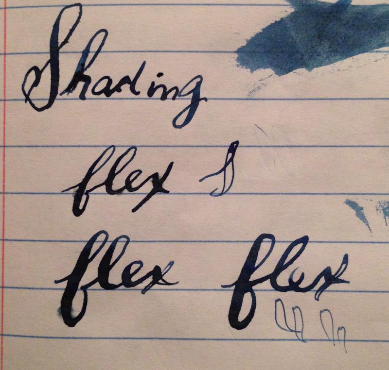
Ink Review: Noodler's Ink, Bad Blue Heron. Grade: 70.00%. Paper: Norcom Composition. Bad Blue Heron (BBH) has been an ink that I've wanted to review for a long time because of its unique properties. BBH is one of Noodler's "Warden" series of inks. It's water resistant, pH neutral, bulletproof/eternal, and UV resistant. At its core, it was designed to be an anti-forgery ink. If you are into fountain pens then you know that the ink is water based, and therefore can be more susceptible to forgery because some inks will wash away without much effort. A lot of Noodler's inks are eternal, but so far BBH takes the cake for me. You can see from the tests in the picture that I threw water, hand sanitizer and nail polish remover at BBH, and they all failed to remove it. The water did wash the ink around a little, and the nail polish remover did create this halo effect around the the drops, but I don't see any fading to the words themselves in the tests that I have done. To me, BBH is a medium to light blue-gray color. Sometimes I would call it a periwinkle, and at others, a Prussian blue. It's a moderately smooth writing ink that dries very quickly. If you leave BBH uncapped for more than a few seconds the flow may stop and you'll have to get it going again. I have also found that a lot of quick drying inks will feather on cheap paper, but I have been very impressed with BBH. You can see in the flex writing (Zebra G nib) that it barely moved at all. The same can be said for its performance in bleedthrough. Unless you pour it on the page it won't soak through the paper. I wouldn't hold out hopes for any shading. Although you can get some in large amounts of ink on the page, most of the time it will have a matte appearance. Which I honestly really like. So much so that I'm seriously considering using BBH to replace Baystate Blue as my EDC work ink. Overall, it's a great office ink. It's a nice work appropriate blue color that you can trust to be there for at least 20 to life.
-
Lavender Black is one of the six colors in Platinum's new Classic Line of iron gall inks. The press release for the Classic Line says that they placed emphasis on shading and the color change "with the aim to enhance the joy of using fountain pens." Each color is meant to start bright and then fade/darken to black over time.I didn't see a significant color change with Lavender; it does change, but it is slight and happens fairly quickly. I didn't realize it was happening at first because my hand was casting a fairly dark shadow over my writing & by the time the shadow was off, most of the color change had already happened. Over the next few days, there was a slight darkening, but it remains the color in the review. (I never saw the somewhat electric purple in the color swab under the bottle in the promotional image.)There is some fairly significant color variation between pens, which I am somewhat at a loss to account for. I know it looks like the MB on Tomoe River had water in it, but I had been using for a while before that; that combination just didn't show well. The very dry Vanishing Point also didn't seem to bring out the best in the ink.Overall, I found Lavender Black to be most pleasing on more absorbent paper, like Rhodia, with wetter and more flexible nibs. Writing Samples on Rhodia Dotpad Writing Samples on Tomoe River Writing Samples on Clairefontaine Triomphe
-
Please see the attached photo. Just a quick little review of an ink new to me -- which I love! Really enjoy this color. It's a very true grey color, but just dark enough to be more legible than other grey's I've used previously. Thank you! Edited: Forgot to mention the paper -- Original Crown Mill Pure Cotton, A5
-
I think I got this ink sample a looooonnnggg time ago, back when I was still enrolled in Ink Drop. That was before I formed my huge fondness for blue-black inks, so it sat and waited for the right time. And now, I hardcore need a bottle of this ink my life. This is a dark ink. At first you might mistake it for black, but it’s not. It’s also unlike most other blue-black inks I’ve tried in that it does not dry to some grey-blue color. It stays vibrant and crisp and dark, which I like. As you can see, this ink almost looks like a teal-black, and I have heard that this is what can happen when you mix certain types of blue with black - you get something that can look green, but in fact it is just blue+black. I don’t know if this is the case with most De Atramentis inks since the only other one I’ve used is also a quite dark color, Alexander Hamilton (purple), but in both of these inks it appears the black component is quite waterproof, which makes this an ink that would be favorable to everyday writing. Especially since I found it had really good flow and no troubles on most paper, though it did feather a bit on index cards: Overall, I really like this ink and it’ll be on my short-list of things to buy once I am at my new job and getting decent paychecks. The only bummer for me is the price. While a bottle is not that expensive (roughly $13 here in the States), you don’t get that much ink, since they are 35 mL bottles. Granted, for me that’s fine since it would be a challenge to even finish a bottle that small in a reasonable amount of time, but if you are looking for an ink that can be chewed through on a daily basis, this might not be it for you. I bought a bottle of Noodler’s Air Corps Blue-Black because the colors looked similar, but they are different enough for me to justify buying this one as well. Be on the lookout for that review coming next week or the week after… This ink was purchased with my own money and I am not being compensated for this review in any way. All opinions above are my own and you are free to disagree with them if you like. Full page scan of the review: