Search the Community
Showing results for tags 'grey'.
-
L'Artisan Pastellier Callifolio - Gris de Payne L’Artisan Pastellier is a small company in southern France that specialises in natural pigments, and offers customers authentic and reliable products in beautiful colours based on mineral or vegetable pigments. In a collaboration with Loic Rainouard from Styloplume.net, the chemist Didier Boinnard from L’Artisan Pastellier created the line of Callifolio fountain pen inks. These pastel-coloured inks are traditionally crafted, and can be freely mixed and matched. Overall these inks are only moderately saturated, and have low water-resistance. The inks were specifically designed to work well with all types of paper, and all types of fountain pens. Being pastel-tinted, these inks have a watercolor-like appearance, and are not only fine inks for journaling, but are also really excellent inks for doodling & drawing. I only recently discovered them, and they are already the inks I gravitate towards for personal journaling. In this review the center stage is taken by Gris de Payne, a classy grey ink with a teal-blue undertone. I’m quite a fan of grey inks – they are subtle and subdued, not bold and harsh like black inks. And I also enjoy the slightly off-grey variety that hints at other colours in its undertones. As such, Gris de Payne delivers. It’s a cool grey colour with teal-blue leaning undertones, which clearly show in the chromatography. Gris de Payne works well with all nib sizes, providing excellent contrast with the paper even in the finer nibs. The ink also provides impressive and aesthetically pleasing shading, without too much contrast between the light and darker parts, just as I like it. I also appreciate that this shading shows up with finer nibs – really well executed! The ink looks best on pure white paper. It’s less satisfying on more yellowish paper – in my opinion. Callifolio inks are often on the dry side, but that is not the case with this ink. It wrote very smoothly and with good lubrication in my Lamy Safari test-pens (which are dry writers). That’s another plus. To show you the impact of saturation on the ink’s look & feel on paper, I made some scribbles where I fully saturated portions of the paper with ink. This gives you a good idea of what the ink is capable of in terms of colour range. Gris de Payne shifts effortlessly from a very light blue-grey to a more deeply saturated dark-grey. Quite nice. On the smudge test – rubbing text with a moist Q-tip cotton swab – Gris de Payne behaved really well, there is smearing but this doesn’t impact the readability of the text. Water resistance is a mixed bag. Most of the ink quickly disappears, even after short exposure to water. On the plus side, a very light-grey outline of the text remains, which is still readable without too much effort (this is not immediately obvious in the scan, but trust me – in real life I had no trouble reading what is left on the paper). I’ve tested the ink on a wide variety of paper – from crappy Moleskine to high-end Tomoe River. For the Callifolio reviews, I’m using a format that shows you the ink’s appearance and behaviour on the different paper types. On every small band of paper I show you: An ink swab, made with a cotton Q-tip1-2-3 pass swab, to show increasing saturationAn ink scribble made with an M-nib Safari fountain penThe name of the paper used, written with a B-nibA small text sample, written with the M-nibDrying times of the ink on the paper (with the M-nib)Gris de Payne behaved perfectly on all the paper types, with no apparent feathering even on the lower quality papers in my test set. Drying times are in the 10 second range, except on some of the more absorbent papers. The ink looks fabulous on Paperblanks, which I use for daily journaling. In fact, it works really well with all of the white paper types in my test set. On more yellow paper, I’m not enthralled by the looks of this ink. I also show the back-side of the different paper types, in the same order. The ink behaved very good with almost all paper types. Even Moleskine paper behaved surprisingly well – there was only minimal bleed-through. All in all a really well-behaving ink. Inkxperiment – winter walk I’ve recently started to experiment with ink drawings, keeping things simple and more-or-less abstract. I find it to be a fun extension of the hobby, and have found single-ink drawings a nice challenge. It also gives you an idea of what the ink is capable of in a more artistic setting. In this drawing I used 300 gsm rough watercolour paper. I started off with Gris de Payne, heavily diluted with water to obtain a very light-gray background. I then gradually added more ink to the mix, and added darker and darker layers to the drawing. With this I obtained a broad spectrum of different shades of grey… perfect for a winter landscape. The end result gives you a good idea of what Gris de Payne is capable of when used for doodling & drawing. Conclusion Callifolio Gris de Payne from L’Artisan Pastellier is a quite beautiful and subdued blue-grey ink, that is equally at home with both writing and drawing. The ink has good contrast with the paper, and works well with all paper types. I also appreciate the fact that it shows shading even with the finer nibs (F and M) that I typically use. Overall, I’ve nothing but positive things to say about this ink. In my book, this is one of the better inks in the Callifolio line-up. Well worth your attention. Technical test results on Rhodia N° 16 notepad paper, written with Lamy Safari, M-nib Back-side of writing samples on different paper types
-
desaturated.thumb.gif.5cb70ef1e977aa313d11eea3616aba7d.gif)
Sailor Shikiori Chushu (Four Seasons - Autumn: Mid-Autumn)
A Smug Dill posted a topic in Ink Reviews
(Another quickie which is largely a by-product of my testing my desk pens...) Colour: I like it, it's a very pleasant dark grey tending towards the cooler side of the spectrum. I think it sorta fills a gap between Iroshizuku fuyu-syogun and Iroshizuku take-sumi which isn't filled by any of the colours in the Iroshizuku range (including shin-kai). On the other hand, there is nothing outstanding about it. Flow: Flows well enough, but not overly wet. That is a good thing. Drying time: Very quick with my 'Japanese fine' nibs, with basically no smearing after 5 seconds. My pen with the fude nib seems apt to leave a blob of ink at the top of my zeroes, and those are still prone to smearing after 20 seconds. Water resistance: Very good. Ghosting and bleed-through: None whatsoever observed from writing on the Rhodia paper I used. Shading: Some, but not very pronounced. Sheen: Not that I can see. -
I loved Verdigris since I got it, but haven't used it as much because its Sonnet always evaporating quickly and it came a lot darker. It finally dawned on me to use it with my new m205. Row 1 of other colours: Ama Iro, Kon Peki, Équinoxe 6, Souten, Tsuyu Kusa, Asa Gao, Myosotis, Ajisai. Row 2: Chiku Rin, Vert Empire, Verde Muschiato, Ina Ho, Inti, Lie de Thé, Yama Guri, Perle Noire. Row 3: Mandarin, Fuyu Gaki, Orange Indien, Ancient Copper, Rouge Hematite, Poppy Red, Perle Noire. I never thought I'd like a grey ink but there you have it, part of the switch to the m205 came about as I realized it's one of my favorites, and I have to confess I don't really care for Myosotis in its regular pale self, but with that pen it's inevitable it will get darker, which I actually quite like.
-
L'Artisan Pastellier Callifolio - Cassis L’Artisan Pastellier is a small company in southern France that specialises in natural pigments, and offers customers authentic and reliable products in beautiful colours based on mineral or vegetable pigments. In a collaboration with Loic Rainouard from Styloplume.net, the chemist Didier Boinnard from L’Artisan Pastellier created the line of Callifolio fountain pen inks. These pastel-colored inks are traditionally crafted, and can be freely mixed and matched. Overall these inks are only moderately saturated, and have low water-resistance. The inks were specifically designed to work well with all types of paper, and all types of fountain pens. Being pastel-tinted, these inks have a watercolor-like appearance, and are not only fine inks for journaling, but are also really excellent inks for doodling & drawing. I only recently discovered them, and they are already the inks I gravitate towards for personal journaling. In this review the spotlight is on Cassis, which presumably gets its name from the drink “Crème de Cassis” – a beverage distilled from blackcurrants, and also the favourite beverage of the famous Belgian detective Hercule Poirot. If you’ve set your sights on a dark purple colour, you’ll be disappointed. In reality, Callifolio Cassis is a nicely saturated dark grey with subtle purple undertones. Cassis is a nicely saturated ink, that works well with all nib sizes. It can live perfectly with an EF nib, laying down a well-defined line that contrasts nicely with white or cream paper. In broader nibs it additionally shows some really classy shading. Nice ! The purple undertone is there, but very subtle. With normal writing it’s barely visible, but nevertheless it gives this grey a certain panache. Personally, I really like it. Like all Callifolio inks, this one is also great for doodling & drawing. Depending on the paper used, the purple undertones will show their appearance when using a water brush. On the smudge test – rubbing text with a moist Q-tip cotton swab – Cassis behaved acceptably. There is definite smearing, but the text remains very legible. Water resistance however is almost completely non-existent. The droplet test leaves only greyish smudges with a ghost image of the original lines. The test with running tap water washes away all the colour – leaving only a barely readable residue of the original text. This is not an ink to consider if you require some measure of water resistance. When using Cassis for drawing, the lack of water resistance can be a plus. As the chromatography clearly shows, there are purple tones hidden within the ink. With waterbrushing it’s possible to bring these purple undertones to the surface in your drawings. I’ve tested the ink on a wide variety of paper – from crappy Moleskine to high-end Tomoe River. For the Callifolio reviews, I’m using a new format to show you the ink’s appearance and behaviour on the different paper types. On every small band of paper I show you: An ink swab, made with a cotton Q-tip1-2-3 pass swab, to show increasing saturationAn ink scribble made with an M-nib fountain penThe name of the paper used, written with a B-nibA small text sample, written with an M-nibDrying times of the ink on the paper (with the M-nib)Cassis behaved perfectly on all the paper types, with no apparent feathering even on the lower quality papers in my test set. Drying times with an M-nib varied from 5 to 20 seconds, depending on the paper used. Surprisingly, the ink looks consistently similar across all paper types. The purple component is really apparent in the ink swabs – here you are reminded that this is not a pure grey. When writing the purple undertones are nearly invisible, but tantalizingly present, lifting this ink above a pure neutral grey. I also show the back-side of the different paper types, in the same order. The ink behaved perfectly with almost all paper types. Only with the Moleskine paper, there was significant show-trough and some minor bleed-through. All in all a really well-behaving ink. Conclusion Callifolio Cassis is a really nice dark grey ink with subtle purple undertones. I found it a pleasure to use, both for writing and drawing. The ink works really well with finer nibs – leaving a well-defined and nicely saturated line with good contrast on the paper. I also liked the way the ink shades in the broader nibs. The barely noticeable purple undertones lift this ink above a neutral grey – personally I consider this a plus that provides some extra character to the ink. If you like grey inks, this one is certainly worth looking at. Technical test results on Rhodia N° 16 notepad paper, written with Lamy Safari, M-nib
-
Mont Blanc - Web Grey (Heritage Spider Metamorphosis) When Mont Blanc brings out a new pen, you can be sure that there is an LE ink to accompany it. With the MB Heritage Spider pen release comes the accompanying Limited Edition ink "Web Grey". The grey colour of the ink is inspired by the silvery grey of a spider's web. The ink's packaging looks lovely, with a stylized spider on the box. A light grey band at the bottom reflects the colour of the ink within. Looks promising... let’s find out whether the ink matches the aesthetics of the box... Web Grey is a rather cool neutral grey with a hint of purple-green undertones. This is especially noticeable when your writing is still wet, the ink then quickly dries to a nice neutral grey. I appreciate the colour, which has a pencil-like quality. The ink is very light though, and feels undersaturated in finer nibs. This makes it a bit difficult to comfortably read your words. You need a broad and wet pen to bring out the real character in this ink. The ink shades nicely when using M-nibs and above. With fine nibs, this lovely shading is mostly absent though. The ink lacks a bit of lubrication, especially in drier pens like my Lamy Safari. I also tested the ink with my wet Lamy Dialog 3, which mostly solved this. The colour span of this grey is wonderfully broad: it ranges from a whispy faint light-grey, to a very dark almost black grey. To illustrate this, I did a swab on Tomoe River paper where I really saturated portions of the paper with ink. This beautifully illustrates the ink's dynamic range, which is quite impressive. On the smudge test - rubbing text with a moist Q-tip cotton swab - the ink behaved perfectly. Water resistance is amazing - the ink effortlessly survived even longer exposures to water. Kudos! This is also apparent from the lower part of the chromatography, which shows that the darker components of the ink remain on the paper. If you need a water-resistant ink, Web Grey certainly fits the bill. The chromatography also shows that this is a wonderfully complex ink, with purple & green undertones. This bodes well for my inkxperiment later on in this review. Web Grey is a fast-drying ink - with typical drying times in the 5-10 second range with my Lamy Safari (M-nib). Also: fast drying times and water resistance make the ink well suited for the workplace, although it may be too light for business correspondence. This can be remediated by using a wet pen with a broad nib. I've tested the ink on a wide variety of paper - from crappy Moleskine to high-end Tomoe River. On each scrap of paper I show you:An ink swab, made with a cotton Q-tip1-2-3 pass swab, to show increasing saturationAn ink scribble made with a Lamy Safari M-nib fountain penThe name of the paper used, written with a Lamy Safari B-nibA small text sample, written with an M-nibDrying times of the ink on the paper (with the M-nib)Web Grey looks really nice on white papers, but personally I feel this grey ink is not a good match for more yellowish paper, like e.g. Life Noble notebook paper. For me, this is an ink that deserves pure white paper, where it looks real classy. With the exception of the horrific Moleskine paper, I didn't notice any feathering or bleed-through. Web Grey is a well-behaving ink. Writing with different nib sizesThe picture below shows the effect of nib sizes on the writing. All samples were written with a Lamy Safari, which is typically a dry pen. I also added a visiting pen - my wet Lamy Dialog 3 with a golden M-nib. With this pen, the ink leaves a much more saturated line. Related inksI have recently changed my format for presenting related inks. My earlier presentations of related inks lacked enough information to be really useful. I therefore changed to a nine-grid format, with the currently reviewed ink at the center. The new format shows the name of related inks, a saturation sample, a 1-2-3 swab and a water resistance test – all in a very compact format. I hope that you'll find this way of presenting related inks more useful. It's a bit more work, but in my opinion worth the effort for the extra information you gain. Inkxperiment – Rolling HillsAs a personal experiment, I try to produce interesting drawings using only the ink I'm reviewing, keeping things simple and more-or-less abstract. I find this to be a fun extension of the hobby, and have found such single-ink drawings a nice challenge. It also gives you an idea of what the ink is capable of in a more artistic setting. For this drawing I used 300 gsm rough watercolour paper. I started off with the rolling hill background, applying Web Grey after I wetted the paper with water. This lets the ink bleed out a bit, showing its beautiful purple-green undertones. I then painted in the darker accents with pure ink, and - once the paper was dry - penned in the trees with my Lamy Dialog 3 with M-nib. Web Grey is beautifully complex, and you can bring out quite nice effects when using this ink for drawing. ConclusionMont Blanc's Web Grey is a cool neutral grey ink, that looks really nice on pure white paper (but as a personal note: the ink doesn't work for me with more yellowish paper). Web Grey is a bit light when used with finer nibs, but with wet pens and broader nibs you get a beautiful ink with nice shading, that is also very water resistant. This makes it a great ink for the workplace. The real strength of this ink comes into play when you use it for more artistic purposes. The ink has a fabulous composition, with purple & green undertones that easily surface when drawing. Technical test results on Rhodia N° 16 notepad paper, written with Lamy Safari, M-nib Backside of writing samples on different paper types
-
J. Herbin - Vert de Gris La Société Herbin, Maître Cirier à Paris, was established in 1670. This makes J. Herbin probably the oldest name among European ink makers. Today, Herbin produces a range of beautiful fountain pen and calligraphy inks, writing instruments, gift sets and accessories. Herbin inks are made in France, and the finishing touches on the bottles are still done by hand in Paris. In 2018, J. Herbin introduced some new inks in their “La Perle des Encres” series. The one that caught my eye - thanks to visvamitra's review in this forum - is Vert de Gris. This ink looks to be right up my alley - a nice dark grey-leaning teal. This was later confirmed by one of Tas's famous ink ramblings. Vert de Gris is an ink that definitely deserves a place in my collection, so I went ahead and ordered a bottle. Upon arrival, I immediately started experimenting with the ink, and it really lived up to my high expectations. Vert de Gris has a gorgeous colour, definitely a dark teal, but with heavy grey undertones. This is an ink that's brewed for me! The ink looks beautiful on all types of paper, and is well saturated. As such it works great in the finer nibs I typically use. And it gets only better... even with fine nibs, there's tons of elegant shading present. You just have to love this ink! It went straight to my top three for 2018, just behind MB Swan Illusion Plume. The ink has quite satisfactory lubrication, even in drier pens like my Lamy Safari. With my wetter Pelikan pens the ink is heavily saturated, and writes like a dream. My only problem here is that I need to adapt my handwriting, and write a bit larger than the tiny scribbles I'm used to. Vert de Gris also has a wonderfully dynamic colour span. To illustrate this, I did a swab on Tomoe River paper where I really saturated portions of the paper with ink. This beautifully illustrates the ink's broad colour range. This J. Herbin ink moves effortlessly from a very light teal-grey to a very dark, almost black teal. On the smudge test - rubbing text with a moist Q-tip cotton swab - the ink behaved perfectly, with only minimal smearing. Water resistance is amazing - the ink effortlessly survived even longer exposures to water. Really well executed! This is also apparent from the lower part of the chromatography, which shows that the grey components of the ink remain on the paper. If you need a water-resistant ink, Vert de Gris certainly fits the bill. This is an ink that will be at home in the workplace. Vert de Gris is also a fast-drying ink - with typical drying times in the 5-10 second range with my Lamy Safari (M-nib). I was surprised at this, because it totally feels like a really wet ink. As such, this ink is also suitable for lefties. I've tested the ink on a wide variety of paper - from crappy Moleskine to high-end Tomoe River. On each scrap of paper I show you:An ink swab, made with a cotton Q-tip1-2-3 pass swab, to show increasing saturationAn ink scribble made with a Lamy Safari M-nib fountain penThe name of the paper used, written with a Lamy Safari B-nibA small text sample, written with an M-nibDrying times of the ink on the paper (with the M-nib)Vert de Gris looks really nice on both white and more yellow papers. On low-quality paper it exhibits a small amount of feathering, but all-in-all not too bad. With Moleskine paper, there is significant show-through and bleed-through - not unexpected for this fountain-pen unfriendly paper. Writing with different nib sizesThe picture below shows the effect of nib size on your writing. All samples were written with a Lamy Safari, which is typically a dry pen. I also added a visiting pen - my very wet Pelikan M101N Lizard with an M-nib that writes like a broad. Here the ink leaves a very saturated line (and I really need to write a few font-sizes bigger with this pen ;-) Related inksWith this review, I have changed my format for presenting related inks. My earlier presentations of related inks lacked enough information to be really useful. I therefore changed to a nine-grid format, with the currently reviewed ink at the center. The new format shows the name of related inks, a saturation sample, a 1-2-3 swab and a water resistance test - all in a very compact format. I hope that you'll find this way of presenting related inks more useful. It's a bit more work, but in my opinion worth the effort for the extra information you gain. Inkxperiment - Walk in the WoodsAs a personal challenge, I try to create interesting drawings using only the ink I'm reviewing. I find this to be a fun extension of the hobby, and these single-ink drawings often present a real challenge. It also gives you an idea of what the ink is capable of in a more artistic setting. For this drawing I used 300 gsm rough watercolour paper. For some reason, grey-leaning inks inspire me to draw winter landscapes, so that's what you get here. I started off with heavily water-diluted ink for the lighter tones, gradually adding more ink for the darker parts. For the horizon line, the main tree and the walking couple, I used pure Vert de Gris, heavily saturating these subjects. The end result gives you a good idea of the colour span that Vert de Gris is capable of. ConclusionJ. Herbin Vert de Gris is a wonderful ink, that pleasantly surprised me on all fronts: georgeous colour, beautiful shading, good saturation - and all this even in finer nibs. Even better, the ink is relatively fast-drying and shows great water resistance. Combine all this, and you've got a winner. This ink went straight to my top three for 2018 ! I heartily recommend it. Technical test results on Rhodia N° 16 notepad paper, written with Lamy Safari, M-nib Backside of writing samples on different paper types
-
This is an ink I've been scratching my head over ever since I received a bottle of it several months ago - and having just re-inked a couple of pens with it, I figured it was time to 'go public' with my confusion. This wasn't actually an ink that I chose to buy: it was sent to me (along with a couple of other inks) as a kind of apology / substitute for an ink I'd ordered online, and paid for, that my supplier didn't have in stock. I'd wanted Omas Blue - I received Noodler's Steel Blue, Noodler's General of the Armies, and this ink. The first thing I noticed was that on the box, Organics Studio Blue Merle was described as "a medium saturation blue-black ink that is perfect for business and personal use". Except that in my Pilot Vanishing Point (with F nib), it came out a kind of nondescript grey. I flushed the pen, and put this ink away - only pulling it out again last week, when I decided to try it in a pen with a broader nib. Nothing had changed, though: this ink *still* came out grey. I have to confess, I'm now puzzled. A couple of posts on FPN suggest that an earlier formulation of this ink was more of a blue-grey - and/or that the ink is prone to discolour in the bottle over time. And the box *definitely* says it's meant to be blue-black. On the other hand, my online research into Australian blue merle Shepherd dogs (for whom this ink was named) suggest that their fur is actually a dappled grey rather than either blue or black. This ink is now (I believe) discontinued - don't know if it'll be back. Not being mad keen on grey inks, I'm not sure I'll use it often - but it behaves pretty well in my pens. In any case, I thought it was worth sharing my observations and a couple of scans, given the fact that it's not been widely reviewed on FPN. So here is my written review: And here's a close-up of the Q-tip swab:

-
-
Very difficult color to "catch", scanner didn't succeed so it is a picture...
-
-
Diamine have informed me that a new ink, EARL GREY will soon be available as part of their general range, but ONLY in 80ml bottles. This will not worry me at all! By way of explanation, I've included a comment from Phil Davies at Diamine who said the following: "This ink colour was chosen by the members of r/fountainpens, a wonderful Reddit community of fountain pen enthusiasts. If you aren't a part of the community, join in - www.reddit.com/r/fountainpens! "The EARL GREY will become part of our standard line but only available in 80ml." My short review below was done using a Lamy Vista with M nib and on the usual Rhodia dot 80gsm paper. However, I think that this ink could well benefit from being used with finer nibs so I have included two other examples. A Lamy Vista with F nib and a Sailor Sapporo, also with F nib. Although never having used many grey inks, I have shown comparisons with the only other three I have. I found Earl Grey to be a nice mid to dark neutral colour, whereas Graphite has green undertones and Chopin, blue. That's of course a personal opinion. Silver Fox is too 'light' for my liking, and eyesight/legibility. It has no waterproof qualities at all. I will be using this ink as a frequent addition to my rotation, and unlike Graphite, there's no 'interesting' smell - which we all know is just a factor in the dye components of that ink. Also, Earl Grey is dark enough to be easily distinguished from some of the 'pale' black inks that are knocking about. I have no idea when it will be available but it's certainly worth considering.
-
Ink Review - KWZI IG Blue #4 KWZI inks are developed by Konrad Zurawski, a Polish chemist and fountain pen enthousiast, who started in 2012 with his own line of inks produced in an artisanal manner – i.e. handmade in small batches with lots of care & craftsmanship. The KWZI IG line consists of Iron Gall inks, that darken over time and are waterproof. Since I was looking at waterproof inks for use at work, I decided to give Konrad’s IG inks a closer look. Be advised that Iron Gall inks require more care from the fountain pen user in comparison to standard inks. Practice good pen hygiene! Update: Thanks to feedback, I learned that this was a very early KWZI ink, that has been discontinued a few years ago, because it didn't live up to its maker's expectations. This review thus refers to my specific bottle of "unobtanium", that contains an ink that oxidizes to a nice waterproof dark grey. In this review, I take a closer look at KWZI IG Blue #4 – my very first Iron Gall ink … although in reality, I would consider this a grey ink, with maybe a hint of blue in the undertones (at least in the bottle I got). But that’s exactly the reason I chose this IG Blue variant, because it is the most grey-leaning ink of his blue range of colours. I was really fascinated by the writing experience offered by these Iron Gall inks. This particular one really shows the writing chemistry. The pen lays down a pale orange-brown line, that quickly oxidizes to a nice grey-black. Fascinating ! This is top-rate chemistry at work. The chromatography of this ink is equally strange. What you see are the orange-brown components, which are most likely the IG chemicals involved in the oxidation process. And then there are the grey-blue parts that are indicative of the ink’s colour palette. Thanks to the Iron Gall chemistry miracle, IG Blue #4 ultimately produces a nice dark-grey text line, with good contrast on all types of paper. This ink works well in all nib sizes – even with EF nibs the resulting line is nicely saturated and contrast-rich. With broader nibs, the ink’s shading emerges with a fine balance between the lighter and darker parts, resulting in pleasing aesthetics. This definitely is an ink with character. To show you the impact of saturation on the ink’s look & feel on paper, I made some scribbles where I really saturated portions of the paper with ink. This gives you a good idea of what the ink is capable of in terms of colour range. With IG Blue #4 the colour ranges from a pale light-grey to almost black. The strong point of IG inks is their waterproofness. And in this area, Blue #4 definitely does not disappoint. This ink is rock solid when confronted with water – see my “water test” at the end of this review. Once dried, the ink is impervious to smudging and easily survives longer exposure to both running and still water. Even a 15 minute soak was easily survived – there is only some minor degradation of the text, which itself remains completely readable. Respect ! I’ve tested the ink on a wide variety of paper – from crappy Moleskine to high-end Tomoe River. On every small band of paper I show you:An ink swab, made with a cotton Q-tip1-2-3 pass swab, to show increasing saturationAn ink scribble made with an M-nib fountain penThe name of the paper used, written with a B-nibA small text sample, written with an M-nibDrying times of the ink on the paper (with the M-nib)Konrad’s IG Blue #4 behaved perfectly on all paper types, and even wrote surprisingly well on Moleskine paper (although with noticeable show-through and bleed-through). The ink is equally at home on both white and more yellowish paper. While writing, the ink lays down a pale wet line, that dries within the 10 to 20 second range (with an M-nib). Soon after writing, the IG oxidation process will start to visibly darken the line, reaching its almost final state after a couple of minutes. After that, the text may still get marginally darker over the next couple of days as the oxidation process tapers off. Conclusion KWZI IG Blue #4 is a good-looking grey ink with beautiful shading. And being totally waterproof, this ink is made for use at the office. If you expected a more blue ink, you’ll have to look elsewhere – to my eye this evidently is a grey ink, with a hint of blue undertones. That of course is exactly what FPN reviews are for : to give you the opportunity to find out what an ink is about before committing to a bottle. If you’re into greys, you can’t go wrong with this one. Technical test results on Rhodia N° 16 notepad paper, written with Lamy Safari, M-nib Back-side of writing samples on different paper types
-
I know many people like this ink, but I wish it was more plum and less grey. It has lots of shading. It's just I don't like grey inks. I'll take boring black over grey any day of the week. It was quite difficult to capture the color as the camera typically made the writing too dark. Pen: Pelikan M400 (M-steel) Papers: MvL=Mohawk via Linen, TR=Tomoe River, Hij=Hammermill 28 lb inkjet, Rhodia=Rhodia 90g ivory. Camera: iPhone 7
-
I was fairly excited when Sailor released eight new inks in their Four Seasons line as some were reissues of famed inks, and the others perhaps had possibilities. In the end I found only three inks to my taste. One of the three I wasn't sure about, Chu-shu, as I typically don't like grey inks. If I want a nice dark, neutral colored ink, just give me black, or a colored ink dark enough to be perceived as black. To me grey=wimpy black. The swabs and writing samples, or squiggles passed off as that, at the online retailers weren't encouraging. Nearly all of them show a grey ink. One retailer said it was a deep, muted purple. Sounds like love to me. So I ordered my new Sailor inks from them. Upon finally inking up in my color appropriate Pelikan M400 Stresemann pen, I discovered that Chu-shu is a grey ink in the cold, hard light of day, and under some artificial lighting appears with a muted purple cast. So it's not the ink I wanted it to be. But Chu-shu is a very nice Sailor ink regarding flow, lubrication, clean-out, etc. that you expect from Sailor. In my very wet medium-nibbed Pelikan you get a fairly dark grey line with ample shading. No sheen observed. The ink has a bit of water-resistance which was unexpected. If you require water-resistance then don't count on this ink, but you have more of a chance of having enough ink leftover on the page compared with some other inks. Pen: Pelikan M400 Stresemann (14kt-M, tuned by Linda Kennedy) Papers: MvL=Mohawk via Linen, TR=Tomoe River, Hij=Hammermill 28lb inkjet. You can see the purple cast in this droplet, there's just not enough of it.
-
For some reason that I cannot understand, I never wished to try Stipula inks. That was a terrible mistake. The next two inks that I'm going to review (Notturno Giannutri and Ferro dell'Elba) are two gorgeous inks, very classy and work appropriate. The ink I'm going to review now is Ferro dell'Elba (Elba's Island Iron). This ink is one of the most brilliant ink I had the pleasure to try. This inks name recalls iron rusted near the sea, and the colour of the iron rusted by the sea you get. Ferro dell'Elba is a grey ink with lovely warm rust brown undertones, that seems thinked to be absolutely work appropriate, without losing interesting details. If I've to define this ink with a single word, it would be "clever": good for the eyes of the passionate, good for the everyday use. On cheap copy paper, Ferro dell'Elba behaves just fine, a bit of feathering and bleedthrough, not particular shading, nice flow and fast drying times. The colour looks quite dark, a mix between a dark gray and sepia. On schizza e strappa this ink really begins to show it's full potential. No feathering nor bleedthrough, gorgeous shading with nice lighter grey lines that ends in darker grey brown inkpools, especially on broader nib. Inkpools and swabs look and reflects like velvet. Drying times are a little longer. On tracing paper this ink behaves just as on schizza and strappa, with a little more shading and longer drying times. Unfortunately, this ink as no water resistance. As you may notice from my soaking test, the ink simply vanishes in the water, so it's no waterproof at all (but also really easy to clean from fountain pens). Is this ink worth it? I always wanted an ink which could substitute black ink at work and after a few letters written with Ferro dell'Elba I realized that my search was over. I know it's subjective but in my opinion if you like grey inks, you should give this ink a try. For around 16€ you get a nice big 70ml bottle, and for me is worth every cent. Highly recommended! COPY PAPER SCHIZZA & STRAPPA PAPER TRACING PAPER SOAKING TEST CROMATOGRAPHY INKDROP
-

Project Monsoon- A New Way To Interact With Our Customers
Karas Kustoms posted a blog entry in Karas Kustoms' Blog
We hope everyone is having a great summer so far. Here in Arizona we are on the cusp of the monsoon season where we have hot, sunny temperatures mixed with dark clouds, and lightning filled thunderstorms. You can be getting sunburned one minute, and drenched in rain the next. It makes for some beautiful scenery and once you experience it, you will never forget it. This yearly seasonal weather pattern has inspired our latest experiment in pen-making. We have been experimenting for a while with different materials and finishes and have come up with some pretty cool results. This new pen represents the Arizona monsoon season, but in pen form. The orange body represents the heat/sun, the grey cap represent the storm clouds and silver grip sections represent the lightning that so often comes during our monsoon season. So, to celebrate some of the success we have had with some of the new finishes, we are going to try something new. Instead of our usual method of product testing, we are going to include more community members to give us feedback on our latest endeavors. Here is how it works. We are going to, through different means, give (yes, give) away a small number of this pen to gain feedback on materials and finishes. We want to hear it all. The good, and even the bad. The point of this is to be more in touch with our customer base and their wants and needs. So, if you are interested in getting your hands on one of these “Monsoon” pens to review, here is how to do it: Choose from the following options: Write us a short original essay on the topic “Made in America” and email it to us with the subject line “Monsoon Essay”. You don’t have to be a great writer, just tell us a story. Create original artwork inspired by “Made in America” and share it with us via email(subject line “Monsoon Artwork”) or Instagram (#monsoonreview). Please create something new, nobody says it has to be fancy, but don’t reuse old artwork. Artwork from all ages, including children, is encouraged. Take an original photo or video depicting what “Made in America” means to you and post it on Instagram with the hashtag #monsoonreview and tag @karaskustoms and @karaspenco. We can’t wait to see what you come up with. We will be choosing 3 people per category in a completely biased method based on our tastes and preferences. This is not a contest, we will pick our favorites in each category and that is who will win. Each category will be judged by a different employee, so you can enter each category to increase your chances of winning. Enter as many times as you want, but each entry must be unique. We will post the winners and their entries on this blog (http://blog.karaskustoms.com/). We will announce the winners on August 12th, 2016. You will have 48 hours to respond before we choose another winner. We are asking all winners of this giveaway to provide us with a review of the Monsoon pen. This can be as simple or as complicated as you wish, we just want to hear your thoughts. Good and bad, it doesn’t matter, but we want to hear from you. We obviously can’t make you review this pen if you are chosen, but it would be awesome if you did. Once again, we will choose the winners on Friday, August 12th. Good luck! -
Sometimes inks are not made for being used at work, for taking notes, for normal correspondence... but they are so gorgeous that you simply don't mind what other people could think of you and keep using them like there's no tomorrow. The review which is going to follow is the complicated love story between me and Diamine Shimmertastic Sparkling Shadows. Diamine Shimmertastic Sparkling Shadow is a interesting grey ink, dark enough to be definitely usable, with high ammount of nice shading on every paper, and lots of nice gold glitters. Like most Diamine Inks, has really good characteristics: marvellous flow (despite the presence of glitter I've never experienced cloggings), well lubricated, smooth feeling when writing with every type of nib, no feathering, not a single bleedthrough (even under the third swab test). Dry times are fairly long, and it's not waterproof. But let's sto wandering around the main thing around this ink: It's a glittery ink. Glittery inks are not made for everyday based use, it's unlikely you'd be signing a paper with this kind of ink, it feels unprofessional and not respectful in front of the person you're writing to. I definitely agree, I respect the social convention by not using it if inappropiate, but I really cannot give a look to this ink without finding it gorgeous. It's a wonderful grey ink (and it's definitely not easy find a good grey ink) that gains a sort of third dimension by the adding of extremely thin gold particles. It ends to be an ink suitable only for drawing, for other artistic purposes, for signing holiday cards or doodling around... But the pleasure you feel while writing, the shining trace of ink you leave on the paper is something I find difficult to find in other inks. Ink with such glittery particles are usually known to be difficult to clean, I've to say that this particular one it's a little more difficult to clean and needs a little more mantainance, but just a little, cleaning is not a big issue in my opinion. So, the usual final question is : It is worth it? A bottle of 50 ml of this ink costs around 12€, and you acquire a huge ammount of a extremely well ingeneered ink. It's up to you, in my opinion this ink is worth every cent, but I like using it for different and personal reasons. If you want something you're like to use every day probably this is not made for you. If in doubt, buy it, for 12 € it's worth trying. COPY PAPER SCHIZZA & STRAPPA PAPER TRACING PAPER INKDROP CROMATOGRAPHY SHIMMER CLOSEUPS
-
Grey Plum is one of those colors that I was most excited about in the recent Group Buy from KWZ Ink. The swab posted on the site was all I had to go by, and I admit, I wasn't thrilled by the color there. But I liked the idea of the color, and I like most of Konrad's more complex colors, so I gave it a try. Y'ALL. This is GREAT. Okay, so here's a review overview, with closeups and comparisons below: Right away, Grey Plum reminded me of one of my favorite discontinued inks, Sailor Chu-shu. There just aren't many purple-leaning greys out there. This is a swab where the inks were laid down very heavily (to try to get sheen and to see hue clearly). This means that the color is probably more intense than you'd usually see with a pen, but you see differences and similarities in a different way than writing samples. As you can see, Grey Plum is darker, greyer and cooler than Chu-shu in the swab; Chu-shu often comes off as a near-purple, while Grey Plum is a pretty definite gray. I washed the picture and swab below with water, to see what kind of behavior emerged, and got a really complex and interesting cool wash with blue to violet hues. I really like the tones, but it should be noted that the water resistance doesn't look particularly great - if you're sketching, prefer to go back over washes if needed. You might think you see sheen above, but that's a trick of the scanner. This ink is pretty matte, even on paper that encourages sheen. There's a tiny bit of something, but I don't think you'd ever see sheen under normal conditions. (I don't think you'd want it on this ink anyway.) How does it behave? Dry time is moderate. This is Tomoe River paper, so a 10-15 second dry time is decent. I didn't notice any problems with the other papers I tried. The shading is very pleasant, and great occasionally. I think someone who cared more might be able to draw out more shading (see the "s" in "so good" in the Manners section). The feel is great, just like all the other KWZI's I've tried. The flow is nice, startup is prompt, and it cleans up with no muss. (I have not left this ink in a pen for very long, though; I'll let you know if this changes at all.) The smell, unlike former KWZ inks, is hardly noticeable, on par with Diamine's normal aroma in terms of notability. It's faintly soapy or astringent - in fact, it's really familiar, and I wish I could put my finger on it. The smell of the last batch was my least favorite thing, so I'm happy it's changed. Allure is a really personal thing, but I love this ink. Dilutions is a category intended to show how ink behaves as water is added. It's very non-scientific; the first pass is pure ink, and then I briskly swish the brush for a second or two in clean water, dab it on the rim of the water jar, and make a new swash. It can reveal hidden undertones, or weird plateaus of saturation, where ink looks the same for several dilutions, even as the amount of water increases. This was not a hugely successful attempt this time, and I'm not sure why. It does show the kinds of washes you might get, and that you can probably dilute this ink down to get kind of a fun violet. As you might expect from the above picture and dilutions and swab, there's not a lot of water resistance. I usually perform a couple tests: I put drops on a grid of lines, leave them for 10 seconds, and then blot them carefully. This is the mildest form of water that writing might be exposed to - a tiny bit of condensation from a glass, say. I also write a phrase and then briskly wash it with a brush for ~5 seconds - not scrubbing exactly, but adding friction. I let it sit for 3-5 seconds, then blot. This usually erases any inks that lack water resistance. If they're resistant at this stage, I do an overnight soak. Grey Plum holds up okay to a little bit of water or alcohol, and mostly vanishes with a brush. While it may have minimal water resistance, this is not an ink I'd use for cases where I'd want to be sure of my notes. Appearance in different nib widths is good across the board. It's not overpowering in a bold nib or too wimpy in a extra-fine. I usually write a whole paragraph with each so I have an idea of what they'd look like on a page. (Ideally I'd do a page of each, but life is short, and the inks together give me a good feel for whether an ink will over or underwhelm in large quantities.) If I had to pick a favorite width, it would be broad. I did test Grey Plum on Leuchtturm and Piccadilly papers. I think it looks best on the warm to bright whites. It looks great on Leuchtturm, but Piccadilly is too warm, and it looks dull and flat. (Unfortunately, my scanner doesn't pick up warm paper tones well, so you'll have to trust me.) Fortunately, most papers are less yellow than Piccadilly. On my terrible office paper, I do see some fuzziness of line in a bold nib. Not a surprise - this is not a paper made for liquid ink of any kind. I don't see bleedthrough to the next page, just spots to the back. (No bleedthrough or feathering for either Leuchtturm or Piccadilly, though.) It's totally usable, even on the cheap paper, though it definitely has more presence on the Tomoe River seen above. Overall, I really like this ink, and hope Konrad keeps making it. It brings something new and interesting to my ink stash, and it is a real pleasure to use, too. Paper used: Tomoe River for the two-page spread above. Pens: The title is done with a 1.9mm Franklin-Christoph Music nib. As a lefty, I find italic sort of challenging, and I never practice - and yet I am always sad when things come out poorly. Oh well. The first page is written with a Goulet Jowo medium nib, fairly wet and smooth. The second page is that same medium nib (in the middle paragraph), an EF Goulet nib (top paragraph), and B Jowo from Scriptorium Pens (bottom paragraph). All are fairly wet, though I think the EF is a bit drier than the M and B. All these nibs went through the same pen and feed - I just pulled at the end of each paragraph. Brush: For washes and dilutions, I used a Isabey squirrel mop travel brush. It lays down a ton of water, and cleans up like no one's business.
-
I don't have many inks that are 'just' grey so I thought this one would be an interesting addition to my hoard collection. Also, I was curious about a grey colour in a series called 'chromatics'… In summary: Use this on absorbent papers, not Rhodia et al unless you are trying for a very specific look. With that caveat, this can be a useful ink for casual note taking and informal messages, even in an office setting. Your message will seem much less forceful than with a black ink, so consider it for situations where consensus-building is important, e.g. voluntary sectors. With a very wet writer (like the Platinum Century John Sorowka custom nib in the samples) you could absolutely use this for corporate signatures, especially, perhaps, if you want to subtly distance yourself from the message. Love letters seem unlikely. Review: Soak test: Rhodia No 18 dotpad again: Rhodia R paper: Stock 'cartridge' paper (apologies for the corporate branding! It was the only pad I had to hand!): Apologies again for corporate pad (but it is what I write most of my text on). (If you want to calibrate your monitor, the blue in the logo is Pantone Blue 072 U.) The Lamy nibs are both the Z50 steel nibs. Hope this is useful to someone.
-
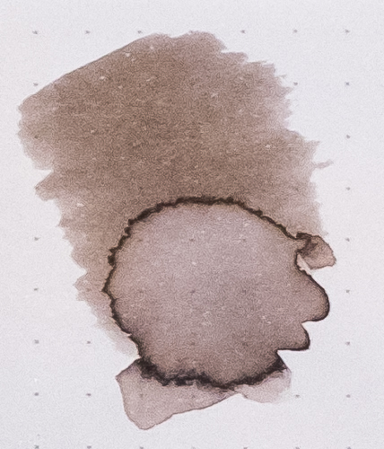
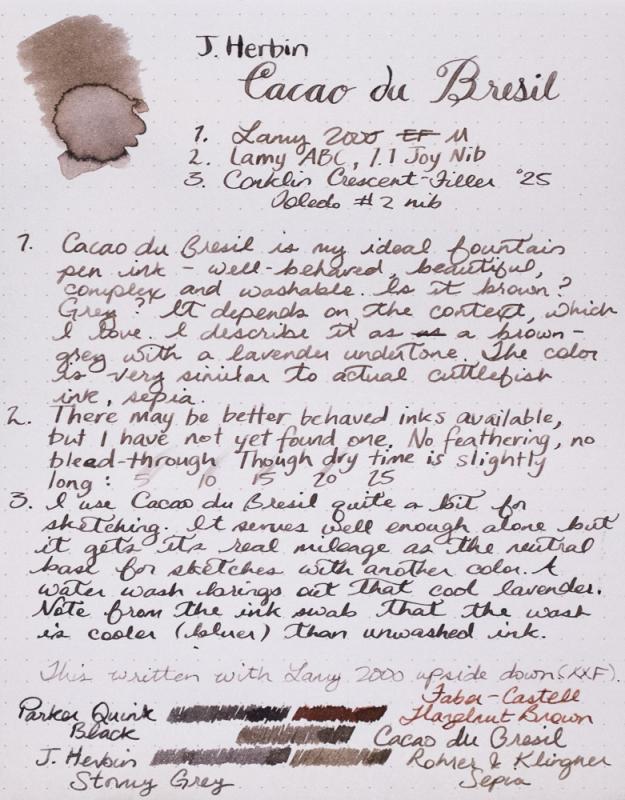
Cacao du Bresil is my most used ink. I keep it in my daily carry pen 90% of the time. It is so versatile, understated and beautiful. If you can't tell, I quite like it. Warbler sketch was done with Cacao du Bresil, J. Herbin Terre de Feu and Rohrer & Klingner Alt-goldgrun in a Stilman and Birn Gamma Series sketchbook. Reasonable care was taken to ensure color accuracy.
-
http://i.imgur.com/lHWE2Rr.jpg I mixed this a while ago; it's simple and it works great and comes out to be a greyish blue. The title in the photo most accurately represents the colour. It's my favourite mixture, please enjoy and let me know what you think
-
This is a review of the Organics Studio Carbon ink. The line is discontinued but there are one or two stores with some stock left. This is a nice dark grey ink. Not very waterfast though. Somewhat similar to Iroshizuku take-sumi, but a little lighter than that ink. The ink is a bit of a slow drier. The ink droplet shows a hint of purple that isn't really noticeable in the ink. Not very waterfast. Much of the ink lifts when blotted, and when washed it leaves a faint line.
-
As much as I love bright, cheery inks, I’m really a sucker for sort of boring colors - brown, gray, blue-black… I feel like these colors have so much potential to be really interesting with just the right twist, so they hold my interest much more than some of the neon inks. I received a sample of this ink from a friend, though he had no idea that it had also been on my wishlist of inks I wouldn’t mind getting for Christmas. Turns out, I’m quite glad that I did not get a full bottle of it because it is not one of my favorites. This is the first MontBlanc ink I’ve ever tried, and I expected it to feel a bit more… premium. Similar to Iroshizuku, in that it is a joy to put pen to paper. This ink was more troublesome than I am willing to put up with on a regular basis and I frequently had my pen run dry, something that I’ve never had happen with other inks. Granted, it could have been the pen and not the ink, but when I did my swab I found that it dried very fast and did not pucker the paper the way that I expect when paper gets wet. Which leads me to think that this is a dry ink by nature. On the plus side, it is what I would consider 100% waterproof. I promise that I did actually do a drip test on the above sample, but the ink would not budge at all. Overall, this is not an ink that I would recommend. I think that you could get a much better experience by simply diluting a waterproof Noodler’s ink, like Heart of Darkness, and then you still get all the same properties and hopefully better flow. And, when you dilute an ink yourself, you can tune it to exactly the shade of gray you prefer. Full page scan of the review here. This ink was sent to me for the purpose of review and I am not being compensated for this review in any way. All opinions above are my own and you are free to disagree with them if you like.
-
Found this grey striped Watermans lever fill fountain pen at a local flea mart for under $15. I am having a hard time figuring out the model of the pen. The pen says Watermans made in USA and has some Chinese/ Japanese characters below it. The clip also has the same characters and the clip shape is a similar shape to a Parker arrow one. The nib says 502 and other Chinese/ Japanese characters on it. (See Pictures) Any help on this pen or any information would be awesome. Thanks
-

Fuyu-Syogun (Old Man Winter) - Crv - Group Review - 2015-02
Lou Erickson posted a topic in Co-Razy-Views
http://www.rdwarf.com/users/wwonko/images/fpn/iro/05-Fuyu-syogun-header.jpg Iroshizuku - Fuyu-Syogun (Old Man Winter) - CRV - Group Review - 2015-02 The Iroshizuku Group Review color for February 2015 is Fuyu-Syogun ”Old Man Winter”. It is a cool grey, reminding me of the endless grey skies of the Seattle winters I grew up with. Please post your reviews and scans of the ink in this thread. If you want to a partner for a Co-Razy View (CRV) of this ink, please write it up and mail it to Lou Erickson. (PM for the address.) If you want to do a Co-Razy View on your own, please do! Other reviews are welcome, too. NOTE: I have a new address as of January! If you have sent me things in the past, please PM for the new address - the old one will stop forwarding eventually. You can look at the full description of the Iroshizuku Group Review to see how this should work and what we’re doing.http://www.rdwarf.com/users/wwonko/images/fpn/iro/05-Fuyu-syogun-product.jpgThanks to Rachel Goulet, who gave permission to me to use their beautiful product photo and swab.More thanks to Amberlea who gives so much of her time to herding these inky kittens. Please PM me with any questions. I'll admit this month's ink does little for me, yet I know there are people who adore it. Show me what I'm missing!