Search the Community
Showing results for tags 'green'.
-
Hi everyone, Is anyone else getting more practical with their ink choices? Although I have dozens of ink options, brands, and colors I find myself wanting to ink more with blues, blacks, greens and useable colors over the more whimsical colors like pinks, purples, reds, yellows or oranges. Don't get me wrong, I still love and use a sheen or shade (no shimmers). I just find myself wanting more suitable ink colors for day-to-day usage. Is it just me? My favorite inks to fill pens with recently are Organic Studios Nitrogen, Noodler's Heart of Darkness, Monblanc Irish Green, Diamine Salamander and Diamine Majestic Blue. I also have a Lamy Studio with a fine 14k nib filled with Baystate Blue that I use regularly. I have other pens filled with reds, browns and the purple/pinks, however, they rarely get used and I find aren't practical for everyday writing. I also happen to like Diamine Wagner that my Bordeaux LeGrand is inked with. It's a yellow-ish light/medium green (think olive) and I'd love to find more times to use it. Am I going nuts to want to resort to more basic colored inks? Like I mentioned above, I still use inks with sheen and I really like to see shading. Yet, when it come to colors and situations, the blues, blacks and greens are what I'm reaching for over the (to me) much less useful colors. Don't get me wrong, I love me some Claret and Apache Sunset. Who doesn't like a bit of Imperial Purple or a ribbon of Honey Blast? I just can't find a daily use for them. Sure, I can use them when I do some of my transcribing. But I don't feel the color when I'm doing so. A color switch would be more of a function of a change for the sake of the change. How do I make a color fit what I'm doing? Even if it's just the few times I write for pleasure. What do you think? Where are you at? Has anyone else here moved to more practical ink colors? Happy Holidays
-
Wearingeul – The Adventures of Tom Sawyer I’m sure I have more than enough inks already, but sometimes an opportunity rises to explore a new brand that wasn’t on my radar before. A couple of weeks ago Scrittura Elegante – a stationery shop from the Netherlands – announced that they would stop their business. Definitely a sad thing: this lovely little webshop carried some interesting and lesser-known brands, with Wearingeul being one of them. They started a sale to empty the warehouse, and I took this opportunity to place a final order, loading up on a couple of Wearingeul inks. Wearingeul is a stationery brand from South Korea, that gets its inspiration from arts & literature. In their own words: “We re-interpret novels and poetry with colors. You can find characteristic inks with stories and also notes/papers which are suitable for ink users.” For my very first experience with the Wearingeul brand, I decided to go with a green ink – “The Adventures of Tom Sawyer” (Mark Twain). And boy, was I pleasantly surprised! This ink’s colour is right up my alley... a muted, toned-down, pale grey-green that looks stunningly beautiful. It’s soft on the eyes, looks really delicate and shows lots of depth and complexity. Also an ink with a few quirks, that you need to get familiar with, and one that demands the right pen/nib/paper combination. For my part, I’m completely enamoured of this pale green beauty. It’s my loveliest discovery of the year! The Adventures of Tom Sawyer writes very light but is still quite readable. For me, the end-result works, with a soft & delicate look on the page. A really nice ink for personal journaling. The ink writes with fairly low lubrication in dry pens (like the Safari), and is therefore best paired with wet writers. I also enjoy it most with fine-nibbed pens: these tend to concentrate the ink on a smaller surface, making it look just a bit more saturated. You get less shading, but that’s a plus for this ink because its shading tends to be a bit too extreme and needs some taming. For this review, I had to resort exclusively to photos: my scanner greatly exaggerated the contrast between light & darker parts, and the results were definitely not what the eye sees. To illustrate the colour span of this Wearingeul ink, I did a swab on 52 gsm Tomoe River paper, where I really saturated portions of the paper with ink. The Adventures of Tom Sawyer shows a very wide saturation range, from a wispy pale grey-green up to a saturated grey-green with blue undertones. Due to this wide contrast range, the ink is a strong shader. Not really suited for dry-writing pens that lean towards the left side of the range – shading can become too extreme, with the light strokes showing insufficient contrast to their darker counterparts. For me, the ink looks best with fine-nibbed wet pens, that explore the right side of the saturation range. With these, the ink looks superb and shows great aesthetics. On the smudge test – rubbing text with a moist Q-tip cotton swab – the ink behaved perfectly. There is no visible smearing at all. Water reisistance is also remarkably good. A lot of the colour dissipates, but a light blue line remains that is still perfectly legible. Well done! That is much better than most non-waterproof inks. This is also evident from the bottom part of the chromatography. The chroma also clearly shows the complex mix of dyes that constitute this ink. Fascinating! I’ve tested the ink on a wide variety of paper – from crappy Moleskine to high-end Tomoe River. On each scrap of paper I show you: An ink swab, made with a cotton Q-tip 1-2-3 pass swab, to show increasing saturation An ink scribble made with a Lamy Safari M-nib fountain pen The name of the paper used, written with a Lamy Safari B-nib A small text sample, written with an Esterbrook Estie with Journaler nib Source of the quote, written with an Edison Collier with 1.1 nib Drying times of the ink on the paper (with the M-nib Safari) This Tom Sawyer ink writes fairly scratchy in my Safari pens with subpar lubrication. It really needs wet writers. Furthermore, I prefer the ink’s looks when paired with fine-nibbed pens – they tone down the otherwise a bit too heavy shading. This Wearingeul ink can handle all types of paper. It even writes well on Moleskine: no visible feathering, and just a touch of bleed-through. From my writing tests, I also discovered that the ink works best on rougher-surface paper. You get a thinner & sharper line! With very smooth coated paper, the ink spreads out a bit on the surface, resulting in a broader line with less defined edges, and it just doesn’t look at its best. Like I hinted at before: a quirky ink that you need to get acquainted with. I used photos for the writing samples above to get the most accurate results. In scans, the contrast gets blown up, and looks totally unrealistic – see the scan below. My scanner really messed this one up! Writing with different nib sizes The photo below shows the effect of nib sizes on the writing (written on Rhodia N°16 80 gsm paper). The initial lines were written with Lamy Safaris. The EF and F concentrated the ink, and worked remarkably well (although lubrication is quite horrible). But M and above with the dry-writing Safari result in too harsh a contrast, and mess up the inherent beauty of the ink. I therefore added a couple of wetter-writing visiting pens. This Tom Sawyer ink is definitely a tricky one – you need to hunt for the right pen/nib combination. The ink looks great in the Estie with journaler nib (basically an M-based stub), and the Collier with 1.1 nib. Searching for this goldilocks combination is definitely worth the effort though: you are rewarded with a great-looking result – pale grey-green, pastel-toned, soft and delicate. Related inks To compare this Wearingeul with related inks, I use my nine-grid format with the currently reviewed ink at the center. This format shows the name of related inks, a saturation sample, a 1-2-3 swab and a water resistance test – all in a very compact format. The Adventures of Tom Sawyer is fairly close to fumisome chorlophyll – these are definitely related. The ink is quite different from the other grey-greens in my collection. Inkxperiment – Christmas Trees As a personal challenge, I try to create interesting drawings using only the ink I’m reviewing. For me, that’s where the fun starts: experimenting with the ink to see how it behaves in a more artistic context. I love doing these little drawings – always good for a fun couple of hours. Since it’s almost Christmas, I just had to do an inkxperiment that fits this time of the year. So I decided to draw a Christmas tree. And although I can appreciate the dressed-up versions that have entered many people’s houses, I do enjoy the trees more in their natural habitat where they create an oasis of tranquility. There are some pine tree woods just around the corner from where I live, and I enjoy an evening walk there to decompress after a long day. I started with an A4 piece of HP photo paper. I drew in the background with cotton swabs, starting with heavily water-diluted ink, and gradually adding more ink to the mix. I then used a brush to draw in the trees, starting with heavily diluted ink for the background, and moving toward pure Tom Sawyer for the trees in the foreground. To complete the drawing, I added the man and his dog walking through the woods, and the couple of birds in the distance. The resulting picture shows really well what can be achieved with this Wearingeul ink in a more artistic context. A very fine ink to draw with, and one that hides a whole range of shades that can be extracted from it. Nice! Inkxpired – computational art I love experimenting with pen/ink/paper, and have added another layer as part of the hobby. I’m exploring computational art, inspired by the ink drawings I do during ink reviews. Another fun offshoot of the hobby… and all that starting with a few drops of dye-coloured water on paper. I started by using a neon filter to darken up the original scene. I then used a colour filter to add some contrast and brighten up the result a bit. This created a night-time variant of the original inkxperiment. Finally, I removed the birds from the drawing (it just felt wrong with these birds flying around at night). Conclusion Wearingeul The Adventures of Tom Sawyer is a beautiful ink – a delicate and pale grey green that looks so lovely. Not an easy ink though! Don’t expect to just plop it in a pen and get good results. No, this is an ink you need to get intimate with, learn to know it … and once you do, it rewards you with some spectacular results. A wonderful discovery, and one of the nicest inks I’ve tried this year. Technical test results on Rhodia N° 16 notepad paper, written with Lamy Safari, M-nib Backside of writing samples on different paper types
-
@Penguincollector started a Blue Pen Club thread. It was so cool to see all the blue pens. We decided that more colors of pens should get a Pen Club. Up next is green pens because it is now Spring in the Northern Hemisphere, though it might not feel like it. Green is showing up more in nature. Enter the Green Pen Club.
-
La Couronne du Comte – Marquis de Dangeau Green The Dutch pen boutique “La Couronne de Comte (LCDC)“ is a well-known player in the fountain pen world. Founded in 2008, their Tilburg shop and accompanying webshop offer a wide range of fountain pens, inks and other office paraphernalia. Recently, LCDC has released a small number of fountain pen inks. From their Nobless Oblige collection comes this Marquis de Dangeau Green. The ink’s name refers to Philippe de Courcillon, Marquess of Dangeau (1638-1720). He was a French courtier, officer and memorialist under Louis XIV. The colour of the ink is inspired by the depiction of the Marquis in a Hyacinthe Rigaud painting from 1702. This specific shade of green is present in the rich robe worn by Monsieur de Courcillon. At its heart, this is a yellow-green ink with plenty of yellow in the mix. Even though it is a lighter colour, the ink remains very readable in finer nibs. It’s also a very heavy shader – too much so for my taste. With dry pens, the combination of light colour and fairly extreme shading makes for a bad combination. I really recommend wet pens and broader nibs for this ink. Due to the more saturated line, the colour of the ink gets much more expressive and the shading becomes a lot softer. Marquis de Dangeau Green really must be matched with wet pens & broad nib. Used this way, the ink provides some wonderful aesthetics. Love it! The chromatography shows a complex mix of dyes – light-blue, yellow, and rose. And this combination of dyes works remarkably well. The chroma looks quite similar to Rohrer & Klingner’s Alt-Goldgrün, but this LCDC ink is much more yellow-leaning. From the bottom part of the chroma, you can already deduce that most dyes detach from the paper when it comes into contact with water. This is not a water-resistant ink. To show you the impact of saturation on the ink’s look & feel on paper, I made some scribbles where I really saturated portions of a piece of 52 gsm Tomoe River paper with ink. This gives you a good idea of what the ink is capable of in terms of colour range. LCDC’s Marquis de Dangeau has a fairly extreme contrast range, from wispy light green to a fairly dark yellow green. This translates to harsh shading, especially when used in dry pens that lean more towards the left side of the saturation spectrum. With wet pens, your writing moves more towards the saturated part of the spectrum, and shading becomes much softer and certainly more beautiful. With the heavy saturation, the rose undertones also rise a bit to the surface, adding some interesting complexity to the ink’s colour. Technically, the ink felt a bit dry-writing in my Lamy Safari test pens and produced too light a line, with shading that is way too heavy. This is clearly visible in the quotes below, that are written with a dry M-nib Lamy Safari. The sweet spot for this ink is the broader nib and/or wet pen – as evident in the paper names and quote source lines. In the writing samples below, I use my typical variety of different paper types. This gives you a good feel for what the ink is capable of. On each scrap of paper, I show you: An ink swab, made with a cotton Q-tip 1-2-3 pass swab, to show increasing saturation An ink scribble made with an M-nib Safari fountain pen The name of the paper used, written with a B-nib Lamy Safari A small text sample, written with the M-nib Lamy Safari Source of the quote, with a Pelikan M cursive italic nib Drying times of the ink on the paper, with the M-nib Lamy Safari I’ve also added a photo to give you another view on the ink. Scanned images and photos often capture different aspects of the ink’s colour & contrast. That’s why I present them both. In this case, the photo captures the ink's shading best, although it looks too yellow. The scan exaggerates the shading, and looks a tiny bit too green in the swabs. Marquis de Dangeau looks good on both white and cream-coloured paper. With hard-surface paper, the shading tends to be stronger, which detracts from the overall looks. This ink works best with paper of low to medium hardness. Drying times are in the 10 second range, climbing to 20 seconds on hard-surface paper. With low quality paper, there is a just-visible amount of feathering and quite some see-through. Bleed-through is limited though, and mostly there on the horrible Moleskine paper. Overall, a well-behaving ink. Writing with different nib sizes The picture below shows the effect of nib sizes on the writing. Marquis the Dangeau can handle all nib-sizes but looks at its best in broader nibs and with wet-writing pens. I love the way it looks in my Pelikan M205 Demonstrator which sports a gold M cursive italic nib. Related inks To show off related inks, I use my nine-grid format, with the currently reviewed ink at the center. This format shows the name of related inks, a saturation sample, a 1-2-3 swab and a water resistance test – all in a very compact format. This ink from La Couronne du Comte looks unlike my other yellow greens. It has some of the DNA from R&K Alt-Goldgrün, but with more yellow in the mix. Inkxperiment – Wolf Moon As a personal challenge, I try to create interesting drawings using only the ink I’m reviewing. I really enjoy these inkxperiments, that are such a fun extension of the hobby. And they are excellent for showcasing all the colour range nuances that are present in the ink. Inspiration for this inkxperiment comes from the now fast-approaching full moon of January – also known as the Wolf Moon. This full moon was named the “Wolf Moon” by Native American tribes for the wolves that would howl during winter nights, communicating with their pack and to protect their territory. The spiritual meaning of the Wolf Moon is a reminder that there is an unseen connection to your own “pack” that is worth recognizing and honoring. The inkxperiment is a direct and literal translation of the Wolf Moon concept. I started with an A4 sheet of HP photo paper and painted in the background with heavily water-diluted ink, applied through a piece of kitchen paper to create the texture. Next, I painted in the full moon, with a tiny amount of bleach added afterward. I then used multiple water/ink mixes and a triangular potato stamp to add the trees. To complete the drawing, I added the wolf silhouette, popping out from the winter woods and howling at the moon. The resulting piece shows quite well what can be achieved with this yellow-green ink in a more artistic context. Inkxpired – computational art I love experimenting with pen/ink/paper and have added another layer as part of the hobby. I’m exploring computational art, inspired by the ink drawings I do during ink reviews. Another fun offshoot of the hobby… and all that starting with a few drops of dye-coloured water on paper. For this computational derivation, I tried to create more of a winter-feel. I did a square cut-out of the inkxperiment and applied a filter that highlights the moon. Next, I used a pixel sort filter on the trees, which creates the winter woods effect. I finally changed the tone of the picture to shift to a more cold-looking green. I quite like the end result, which makes for a great New Year’s card. Conclusion La Couronne du Comte Marquies de Dangeau Green (quite a mouthful) is a really nice-looking yellow green, that works best with broad nibs and/or wet pens. A lovely colour, and one with beautiful shading (if you avoid dry pens). Also, a wonderful ink to draw with, and one that I enjoyed a lot. Technical test results on Rhodia N° 16 notepad paper, written with Lamy Safari, M-nib Back-side of writing samples on different paper types
-

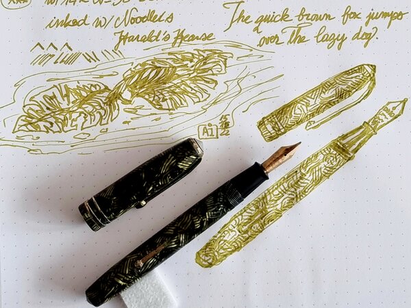
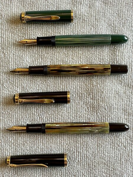
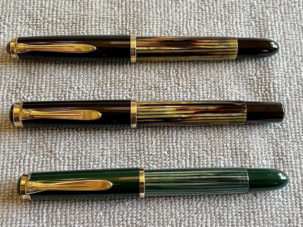
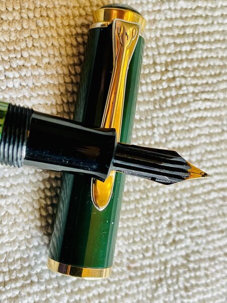
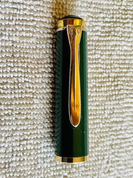
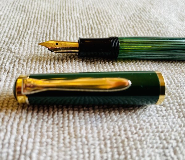
From the album: OldTravelingShoe's Random Pics of Fountain Pens
© (c) 2022 by OldTravelingShoe. All rights reserved.
- 0 B
- x
-
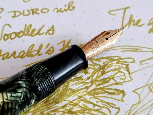
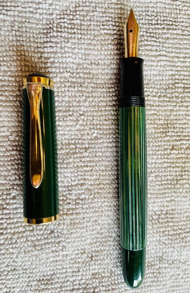
From the album: OldTravelingShoe's Random Pics of Fountain Pens
© (c) 2022 by OldTravelingShoe. All rights reserved.
- 0 B
- x
-
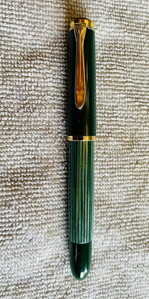
From the album: OldTravelingShoe's Random Pics of Fountain Pens
© (c) 2022 by OldTravelingShoe. All rights reserved.
- 0 B
- x
-
-
-
-
-

-
-
-
-
TACCIA Ukiyo-e Hokusai sabimidori TACCIA is a Japanese stationery company, that - as far as I know - is now part of the Nakabayashi group. They offer high-quality fountain pens, inks, pen-rolls, notebooks, etc. More specifically, TACCIA produce a line of inks, inspired by the unique look of Ukiyo-e paintings from Japan’s Edo period (17th century). Ukiyo-e prints are woodblock prints where the work of an artist is carved into wood by woodworkers, and pressed onto paper by printers. This allows the production of multiple prints of an artwork with some different colours as well. In this review, the centre stage is taken by sabimidori, a rust-green ink with a strong copper sheen, inspired by colours appearing in woodprint paintings from the Japanese artist Katsushika Hokusai (1760-1849). Hokusai is best known for his “Thirty-Six Views of Mount Fuji” series of prints, with the mountain appearing as a central theme. In this case, the rust-green colour is inspired by the colour of the tree-leaves in the painting of “the village of Sekiya on the Sumida river”. The Met museum describes the scene as: “the speed and urgency of the galloping horsemen stand in contrast to the solitary and static image of Fuji capping the horizon like an omniscient observer and marking that which is eternal. The raised road that winds into the depths of the print directs our gaze to the mountain, as do the trees that function as a framing device.” Sabimidori is not only a beautiful green-leaning teal, but also one with a number of tricks up its sleeve. Most surprisingly: the wet ink looks bright blue, but quicky dries to a muted blue-green. It’s definitely a teal, but one that leans strongly towards the green side – I really like the colour that coalesces from the bright blue liquid. Next, sabimidori – which means “rust green” – hasn’t stolen its name: the rust comes from the heavy copper sheen that the ink shows on many types of hard-surfaced paper. This TACCIA ink is also a heavy shader. Usually, I’m not a fan of heavy shading, which can look harsh and angry, but with blue-green inks the result can work really well. With sabimidori, you get an aesthetically pleasing look with blue undertones in the light parts and a green-copper look in the darker parts. These complement each other wonderfully well. As you might guess, this ink is totally to my liking and surely one of the better inks I tried this year. The ink comes in a 40 ml bottle, that is packaged in a beautiful box showing the corresponding Ukiyo-e painting. Lovely packaging for an excellent ink. To show you the impact of saturation on the ink’s look & feel on paper, I made some scribbles where I really saturated portions of a strip of 52 gsm Tomoe River paper with ink. This gives you a good idea of what the ink is capable of in terms of colour range. Sabimidori has a medium dynamic range, without too much contrast between the light and darker parts. The ink is special though: blue-leaning in the lighter part of the spectrum, and becoming greener the more it saturates. The red-copper sheen appears in the most saturated parts, and is even visible in a scan. The result is an ink that almost looks multichromatic, with really nice contrast in the shading. Shading is most obvious in wider nibs, but you already get some with the EF nib, which is quite impressive. The aesthetics are superb, and add tons of character to your writing. If you use high-sheen paper – like Tomoe River – and look at your writing from an angle, the “rust” component is very obvious. Sabimidori then looks like a blue ink, with a very prominent copper sheen. Wonderful stuff! TACCIA’s ink makers have really outdone themselves with this sabimidori. The ink’s chromatography shows a blue-heavy ink with yellow in the mix, which results in the green-looking appearance. From the chroma, I would have expected a more blue-leaning ink, not the rust-green teal that appears on paper. There definitely is some complex chemistry going on here! The bottom part of the chroma shows the bright blue that remains when water washes away the yellow dyes. This is confirmed in the water test: the ink is fairly resistant to water, and can survive an accident. A lot of the colour disappears, but a bright blue ghost of your writing remains that is quite readable, even after 30 seconds under streaming tap water. That makes sabimidori an ink you can use at the office – where it will certainly attract some well-deserved attention. I’ve tested the ink on a wide variety of paper – from crappy Moleskine to high-end Tomoe River. On every small band of paper I show you: An ink swab, made with a cotton Q-tip 1-2-3 pass swab, to show increasing saturation An ink scribble made with an M-nib Lamy Safari The name of the paper used, written with a B-nib Lamy Safari A small text sample, written with the M-nib Safari Source of the quote, written with a Pelikan M405 with cursive-italic F-nib Drying times of the ink on the paper (with the M-nib Safari) Sabimidori looks good on all types of paper, but I personally like it best on the more cream-coloured variety which enhances its green complexion. No feathering in general, just a teeny tiny bit on HP multipurpose paper. Some bleed-through on low-quality paper, but nothing too excessive. The ink expresses itself totally different, depending on the paper used – from blue- to green-leaning teal. I simply love this complexity … you get totally different experiences from a single bottle! Drying times for sabimidori are on the long side, with up to 30 seconds on hard-surface paper. I’ve also added a few photos to give you another view on the ink. Scanned images and photos often capture different aspects of the ink’s colour & contrast. That’s why I present them both. In this case, scan & photo are very close-matched, with the photo closest to what my eyes can see. One thing that I feel obliged to mention: sabimidori is not the easiest ink to clean out of your pens. It stains a lot, and needed extra effort to completely remove. It’s devilishly difficult to remove it from non-shiny plastic: I couldn’t completely clean it from re-used cartridges using only tap water: soap and hot water were needed. This is not an ink I would use in a clear demonstrator! Writing with different nib sizes The picture below shows the effect of nib sizes on the writing. The EF-nib already shows the shading that the ink is capable of. Depending on the nib, you get more blue or green, but always a good-looking result. Shading truly is a feast for the eyes – it is heavy, but the blue & green parts complement each other really well, resulting in an aesthetically pleasing look. Related inks To compare sabimidori with related inks, I use my nine-grid format with the currently reviewed ink at the center. This format shows the name of related inks, a saturation sample, a 1-2-3 swab and a water resistance test – all in a very compact format. The ink is different from other green-leaning teals in my collection. Murky Waters is a mix of my own: 3 parts Pelikan Edelstein Jade with 2 parts Edelstein Onyx. Inkxperiment – Cradle of Life With every review, I try to create a drawing using only the ink I am reviewing. These small one-ink pieces are an excellent way to show the colour-range nuances that are hidden within the ink. And I totally enjoy the fun couple of hours these inkxperiments provide me: playing around with the ink in a creative way. Not surprisingly, the inkxperiment is for me the most enjoyably part in the making of a review 😉 Inspiration for this inkxperiment comes from the namesake Lara Croft movie I revisited recently: a fun constant-action adventure movie. Definitely not a brainy movie, but the title got me thinking about the origins of life. In puddles of nutrient-rich water on infant Earth, complex molecules arose, that – given aeons of time and billions of tries – resulted in self-replicating structures, that ultimately form the building blocks of life. And from these humble beginnings come the variety of species we know today, like the majestic pine forest… For this drawing, I started with a piece of A4 HP photo paper. I first drew the land borders, drawing them with water into which I dripped pure ink. The colours are real… bright blue, bright green, teal – all this from that single sabimidori bottle. Next I created the sky for the pine forest, printing a pattern with a piece of kitchen paper dipped in ink. I then drew the spheres where the “life cooking” happened, that created the complex molecules. All that in puddles of nutrient-rich water, which I drew with Q-tips dipped in multiple water/ink ratios. Finally I used my fountain pen to draw the pine forests, and to add some texture to the water. The final picture gives you a good idea of what can be achieved with sabimidori as a drawing ink. Inkxpired – computational art I love experimenting with pen/ink/paper, and have added another layer as part of the hobby. I’m exploring computational art, inspired by the ink drawings I do during ink reviews. Another fun offshoot of the hobby… and all that starting with a few drops of dye-coloured water on paper. Conclusion TACCIA Ukiyo-e Hokusai sabimidori is a wonderful rust-green teal. An ink with unexpected complexity, that has a lot going for it. I love its looks on paper, with the great aesthetics of shading and sheen. This is one of the nicest inks I tried this year. If you like teals, you cannot go wrong with this one: highly recommended! Technical test results on Rhodia N° 16 notepad paper, written with Lamy Safari, M-nib Back-side of writing samples on different paper types
-
Ink Shoot-Out : Diamine Safari vs Super5 Dublin Green In 2014, Diamine surprised us with a series of six inks to commemorate their 150th Anniversary. Within this set, Safari is one of my favourites. Some two years ago, I discovered the Super5 inks from papierlabor.de which are waterproof inks. One of them – Dublin Green – looks very similar to Safari in written text. That of course piqued my interest … time do a detailed comparison and find out which of these inks I like the most. Enter... the Ink Shoot-Out. A brutal fight spanning five rounds, where two inks engage in all-out battle to determine who is the winner. Today the billboard announces the exciting fight between two middle-weight female fighters. In the left corner – from Liverpool, England – the reigning champion Denise “the Dancer”. In the right corner the challenger from Darmstadt, Germany: Hildegarde “the Hook”. Both champions are evenly matched, so this promises to be an exciting fight! Tension in the boxing hall is building up... when the fighters enter the arena, they are welcomed to a thunderous applause. The bell rings, signaling the start of the first round. May the best ink win… Round 1 – First Impressions Both inks make a great first impression on me: murky, dirty greyish greens with a touch of yellow. Really nice-looking on all kinds of paper. This is the type of colour that appeals to me. Even though these are muted inks, they provide excellent contrast with the paper even in the finest nibs, leaving a well-saturated line on the Rhodia N°16 notepad paper. Both inks exhibit strong and elegant shading, without too much contrast between the light and darker parts. This immediately elevates the aesthetics of your writing. The inks look nearly identical in writing, but there are some differences: Safari has a broader colour span, and shows more elegant moves. They don’t call her “the Dancer” for nothing. This is clearly illustrated in the saturation sample. Both inks shade nicely, but Dublin Green is a lot more subtle. Due to its narrower colour range, the shading is more subdued, and looks a bit more elegant to me. Dublin Green is a bit greyer, with no yellow in its dye composition. Both inks make a superb first impression – a choreography of dancing moves, circling their opponent and exchanging probing flurries of strikes and counter-strikes. And the public agrees – encouraging their champions with roaring approval and deafening applause. At the end of this first round, it really shows that these fighters are evenly matched. No clear winner emerges, and this round ends with a draw. Round 2 – Writing Sample The writing sample was done on Rhodia N°16 Notepad with 80 gsm paper. Both inks behaved flawlessly, with no feathering and no show-through or bleed-through. With the EF nib, Safari shows its strength, and looks much more saturated. Dublin Green feels less lubricated and leaves a less saturated line with the EF nib. With broader nibs, the Super5 ink no longer has lubrication issues, and both inks write equally well. Colourwise both inks look similar in writing, although there is definitely more of a grey undertone in the Dublin Green ink. Both inks also shade nicely, without too much contrast between light and dark parts. This aesthetically pleasing shading gives more character to your writing, and shows up even with the finer nibs. For this round, the focus is on writing, and here both inks are strong performers. At the beginning of the round, the Dancer from Liverpool broke through the defences of the German ink, delivering a powerful punch. But the Super5 ink recovered nicely, and for the rest of the round both champions were evenly matched. Almost a draw, but that initial punch counts, and so this round goes to Safari on points. Round 3 – Pen on Paper This round allows the batlling inks to show how they behave on a range of fine writing papers. From top to bottom, we have : Midori notebook paper, Paperblanks 120 gsm paper, Tomoe River 52 gsm, Fantasticpaper, Original Crown Mill cotton paper and Clairefontaine Triomphe 90 gsm. All scribbling and writing was done with a Lamy Safari M-nib. Both champions did really well, with no show-through nor bleed-through. But this round is not about technicalities, it is about aesthetics and beauty. Are the fighters able to make the paper shine ? One thing is immediately apparent: these inks are at home on a wide range of papers, both white and off-white ones. On white paper, Dublin Green clearly shows its greyer nature – on cream paper, both inks look more or less the same. The Diamine ink is a bit more expressive and complex-looking in the swabs. Dublin Green, on the other hand, looks more subtle in the shading. Overall, really strong inks with only minimal differences in style. Both inks are on par with each other, with neither of the champions giving any ground. Both fighters gave their all, providing quite a spectacle. The crowd is loving it! But in the end, neither ink could score a solid hit, and as such the third round ends with a draw. The tension in the hall is now going up by the minute. Are both fighters really each other’s equal ? Will one of them show some weakness ? Let’s continue the fight to find out. Round 4 – Ink Properties With the ring of the bell that announces the fourth round, Safari immediately dances to her opponent ready to bring more action to the fight. But wait… what’s happening? The German ink breaks through the defenses with a solid left hook… wham! Oh my god! Safari goes down and hits the canvas! The crowd is shocked into silence, then roars its approval! 10… 9… 8… 7… Oh no… this is a disaster… Safari is groaning, and struggles to right itself … 6… 5… finally Denise “the Dancer” scrambles to her feet, groggily shaking her head. But the round is lost! The referee rightfully grants this round to the German fighter. In this round, the biggest difference between Safari and Dublin Green emerges. The Super5 ink is designed to be water-resistant, and it shows: no smudging, and the ink effortlessly survives a 15-minute soak in water. For the smudge test, I let both inks dry for 30 seconds, and then rubbed a moist Q-tip cotton swab over the text. For the droplet test, I dripped water on the grid and let it sit there for 15 minutes. The difference is clear: Super5 Dublin Green definitely is very water-resistant, making it a good ink for use at the office. Round 5 – The Fun Factor Welcome to the final round. Here I give you a purely personal impression of both inks, where I judge which of them I like most when doing some fun stuff like doodling and drawing. Both inks do well, and show off a lovely colour spectrum, ranging from very light grey- and yellow-green to a really dark and saturated green. I really enjoyed using them. The drawing was done on a piece of 10x15cm HP photo paper. Personally I prefer the slightly greyer looks of Dublin Green. This ink also feels a bit more complex, with more character in the drawing. Safari looks soft and restrained – an ink with a joyous appearance but not too wild. Dublin Green on the other hand is more of a bad girl showing more temparement. In my opinion, the Super5 ink definitely looks better in this drawing. For this round, both champions are again well matched. But for this judge, Dublin Green showed the best moves, and wins this round on points. Mind… this is a relative comparison. Standing on its own, Diamine Safari is still a terrific ink to play around with. But side by side, I definitely prefer the Dublin Green from Super5. The Verdict Both inks are real jewels, that work on all types of paper. These are real champions, that both deserve a place in your ink collection. But counting the points, it’s clear that the challenger from Germany proved to be stronger. Even if you ignore the whopping win in round 4 (i.e. you don’t care about water resistance), Dublin Green still manages to be the slightly better ink. So for this judge, the conclusion is clear: Super5 Dublin Green is the winner of this exciting fight.
-
desaturated.thumb.gif.5cb70ef1e977aa313d11eea3616aba7d.gif)
How-to: Set, or change, personal info that others can see about me
A Smug Dill posted a blog entry in Sus Minervam docet
It helps to explore this yourself, revisiting once in a while if need be, and keep in mind where each of those personal info fields are entered. Don't leave it until the urge to change something specific to come upon you, and only then bother to ask the question! Invest the time surveying upfront, instead of waste it later waiting for an answer from nobody in particular. Most of the fields shown above are self-evident as to what they are. I think the only ones that could do with explanation are: Security and Privacy: There is only one setting under there, and that is a toggle for whether your online status (including ‘last active’ date or time) is visible to others Content View Behavior: That has nothing to do with what others can see about you, but only where you would like to start reading when accessing content Enable status updates: This toggle enables/disables the public feed on your profile page; if you disable it, then nobody (including you) can post publicly visible ‘status updates’ or any other message against your profile, but if you enable it, then anyone — friend, foe, or complete stranger — can post something there whenever, without waiting for you to initiate and then only reply to what you wrote Notification Settings have nothing to do with what others can see about you, and so is out of scope for this article, and I'm not going to delve into those right now. (You can look here, here, and here to wrap your head around how notifications work with respect to followed content.) N.B. There is a possibility that some of the above settings and data fields may not be available to Bronze members and/or Silver members, but I have no way of testing that or scoping it out. — • — Another way of getting to the Edit Profile dialog, and the way to change your profile photo (or ‘avatar’), is here: — • — Freeform, custom member titles that one enters for oneself are long gone, and have not been a thing since FPN came back from a long hiatus and platform upgrade late in 2020. -
Just a brief note on a recent comparison: a bottle of Robert Oster Signature Bronze had been lingering in my ink drawer until I decided to use it a new acquisition by Atelier Veleray (more on that in the near future). It turned out greener than I'd expected, similar to KWZ Green Gold but slightly lighter. The attached image is an unprocessed photograph hastily taken with a smartphone. Still, it comes close to what I see on paper, especially in the lower part, where Bronze and Green Gold are separated by Callifolio Olivastre. In the upper part, where the two inks are next to each other, Green Gold appears a bit too dark. The other two inks included as a kind of control in the comparison are Callifolio Olivastre (in a Diamond Point with a flexible broad nib) and Rohrer & Klingner Sepia (in a Delta Tech & Web with a stub nib). KWZ Green Gold came from a Montblanc 149 with a medium nib and the Atelier Veleray pen sported a broad nib I had from a Visconti Rembrandt. Bottom line: nice colour and a well-behaved ink. As my interest in shading increases, Bronze may replace the darker KWZ Green Gold among my favourites.

-
Diamine Dark Forest (150th Anniversary II) The ink maker from Liverpool is one of the staple brands in ink-land. They consistently produce solid inks for a very reasonable price. In 2017, Diamine released their second ink series to commemorate their 150th Anniversary. I obtained my set shortly thereafter, but more or less forgot about them when my attention drifted to Japanese inks. About time to do the reviews. Fortunately, these anniversary inks are still easily obtainable, so if you like what you see you can still get them. Diamine Dark Forest is another lovely ink in this Anniversary series. A dark & saturated green with strong blue undertones. My first reaction when seeing the ink was “definitely a dark green”. And then I got like “hmm… maybe a dark teal… lots of blue in there”. And after preparing the review material, I got to “well… not a teal yet, but going there.” I love it when inks leave the well-trodden path, and meander between the colour lines. More often then not they gain in complexity and beauty. Dark Forest is no exception – I find it to be a very interesting ink with lots of depth. This Diamine ink is very saturated and lays down a dark blue-green line when writing. With a wet-writing pen, the colour can almost turn black. Where the ink gets overly saturated, you can often glimpse a reddish sheen. I like it that the ink looks totally different, depending on the wetness of the nib/pen combination. Teal-leaning in drier pens, and going dark green to green-black in wetter pens. To illustrate the colour span of this Diamine ink, I did a swab on 52 gsm Tomoe River paper, where I really saturated portions of the paper with ink. Dark Forest has a broad colour span, with a substantial difference between the light and darker parts. This translates to strong (even harsh) shading when writing. Shading is present in all nib sizes, even the finer ones. Personally, my preferences go to soft & muted inks, and this Dark Forest is quite the opposite. But still, I like the complexity of its character. On the smudge test – rubbing text with a moist Q-tip cotton swab – the ink behaved badly. Tons of smudges, although the text itself remains very readable. Water resistance is almost zero in practice – from the bottom part of the chromatography, I had expected a better result. But no, this ink is very prone to watery accidents. This makes it - for me at least - unsuited for use in the workplace. I’ve tested the ink on a wide variety of paper – from crappy Moleskine to high-end Tomoe River. On each scrap of paper I show you: An ink swab, made with a cotton Q-tip 1-2-3 pass swab, to show increasing saturation An ink scribble made with a Lamy Safari M-nib fountain pen The name of the paper used, written with a Lamy Safari B-nib A small text sample, written with the Lamy Safari M-nib Source of the quote, written with my Yard-o-Led Viceroy Standard with F-nib Drying times of the ink on the paper (with the M-nib Safari) The multi-paper writing test shows that Dark Forest can cope with a wide range of papers. With the lower-quality papers (Moleskine, copy paper) there is just a tiny bit of feathering, and a small amount of bleed-through. Drying times are in the 10-15 second range on harder paper, and around 5 seconds on the more absorbent low-quality papers (with the Lamy Safari M-nib). This dark blue-leaning green works well with both white and creamy paper. Because scans don't always capture an ink's colour and contrast with good precision, I also add a few photos to give you an alternative look on this Diamine ink. In this case, the real colour seems to sit a bit between the two. Writing with different nib sizes The picture below shows the effect of nib sizes on the writing (written on Rhodia N°16 80 gsm paper). All samples were written with a Lamy Safari. I also added a couple of visiting pens: a wet-writing Yard-o-Led Viceroy Standard Victorian, and a Pelikan M120 (which writes quite dry for a Pelikan). As you can see, the ink can look quite different depending on nib/pen combination – almost a teal in the 1.9 calligraphy nib, almost black in the Yard-o-Led. But in all cases quite saturated and with heavy shading. Related inks To compare Diamine Dark Forest with related inks, I use my nine-grid format with the currently reviewed ink at the center. This format shows the name of related inks, a saturation sample, a 1-2-3 swab and a water resistance test – all in a very compact format. The ink that comes closest in comparison is the 2017 LE ink Lamy Petrol, which has just a touch more blue. With Lamy Petrol being unobtanium these days, this Dark Forest could be the replacement you were looking for. Inkxperiment – excalibur With each review, I try to create an interesting drawing using only the ink I’m reviewing. This is often quite challenging, but it has the advantage of showing the ink’s colour range in a more artistic setting. I enjoy doing these little drawings immensely – it’s quite a fun extension of the ink hobby. Always good for a fun couple of hours. For this inkxperiment, I had zero inspiration. So I started with word associations to get me going: English ink, dark forest… medieval woods… runes and druids… Avalon… King Arthur… Excalibur. OK - good enough to get the drawing started... I used an A4 piece of HP photo paper, that I covered with a paper towel on which I dripped water-diluted ink to create the textured background. Next I used pure Dark Forest to paint in some darker patches for the stone & sword, and as a background for the runes. With the side of a piece of cardboard dipped in ink, I added the branches of the medieval forest. Finally, I used cotton Q-tips with bleach to draw in the runes and Excalibur. The result is not a masterpiece, but it gives you an idea of what can be achieved with this Diamine ink in a more artistic context. Conclusion Diamine Dark Forest is a saturated blue-leaning dark green that can look substantially different depending on your nib/pen combination – it can span the whole range from green-leaning teal to dark green black. A heavy shader that shows a bit of a reddish sheen in heavily saturated areas. For me personally, this Dark Forest is a bit too dark & harsh, but it’s certainly a complex and interesting ink. I enjoyed playing around with it. Technical test results on Rhodia N° 16 notepad paper, written with Lamy Safari, M-nib Backside of writing samples on different paper types
-
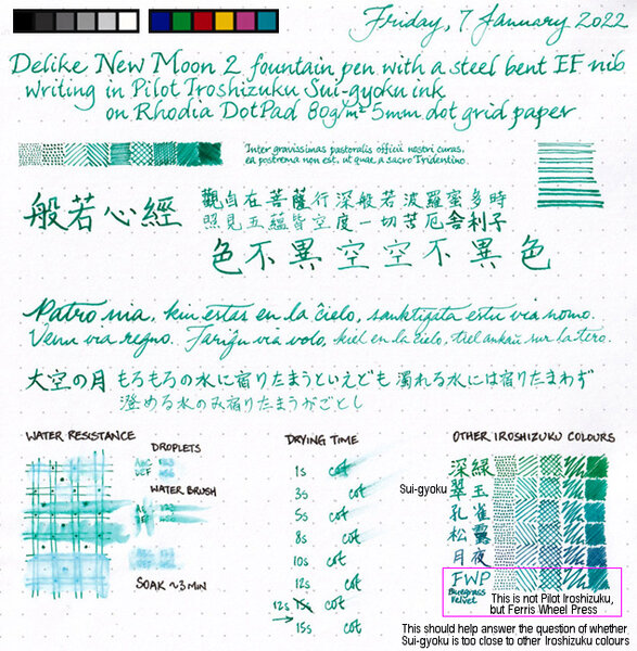
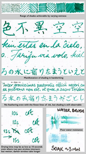
Sui-gyoku is one of three new Pilot Iroshizuku colours released late in 2021. Photo: Scan: (Some other colour comparisons can be found here.) p.s. No show-through, no bleed-through, and no sheen observed.
-
From the album: Ink review
No show-through, no bleed-through, and no sheen observed on the Rhodia DotPad 80g/m² 5mm dot grid paper used for the review sheet.© A Smug Dill
- 0 B
- x
-
From the album: Ink review
No show-through, no bleed-through, and no sheen observed on the Rhodia DotPad 80g/m² 5mm dot grid paper used for the review sheet.© A Smug Dill
- 0 B
- x
-
Robert Oster's Fizzy Lime vs. Diamine's Neon Lime:
-
TAG Kyoto kyo-no-oto ryokuyuiro TAG is a stationary shop in Kyoto (Japan) that produces some interesting soft watercolour-style inks. With the kyo-no-oto series they produce a line of inks that replicates traditional Japanese dye colours. According to available only info, the manufacturing process of the kyo-no-oto inks follows traditional dying techniques dating back to the Heian era between the years 794 and 1185. The inks come in 40 ml bottles, packaged in luxurious thick paper with a texture that feels like heavy watercolour paper. For this review, ryokuyuiro is the shimmering star in the spotlight. Like so many other ink producers recently, TAG Kyoto also jumped on the glitter-ink bandwagon. With this ink, they added some silver glitter – fortunately, they didn’t exaggerate with the glitter particles. And even more fortunately, the glimmer isn’t there to cover up for a boring ink colour. Personally, I just ignored the glitter – don’t shake the bottle before filling your pen, and all the silver dust particles remain at the bottom. Ryokuyuiro is a beautiful muted green with strong blue undertones. Not yet a teal, but definitely reaching towards blue territory. A dangerous colour spectrum to explore, but this kyo-no-oto ink manages to walk the fine line. It could easily have been a failure, but with ryokuyuiro the result is a stunning ink colour. The ink’s name is derived from the ryokuyu glaze, which produces a green colour in pottery. It is one of the oldest glazes and was already used in China in BC. In Japan, it has been produced since the Heian period and has been favoured by many aristocrats. The ink captures the colour wonderfully well – a soft pastel-like dusty dark green with that beautiful blue undertone. This colour caters perfectly to my personal taste – a great ink to start off the new year! The ink feels fairly wet and well-lubricated, especially when compared with others in the kyo-no-oto series. In fact – I would recommend using the ink with drier pens. With dry pens, ryokuyuiro looks even more dusty, and shows some really elegant & expressive shading. The ink is not without its flaws though: on more absorbent paper it has a slight tendency to feather, and with lower quality paper it definitely suffers from see-through and some bleed-through. But use this ink with good quality and hard-surface paper and you will be in writer’s heaven! To show you the impact of saturation on the ink’s look & feel on paper, I made some scribbles where I really saturated portions of a strip of 52 gsm Tomoe River paper with ink. This gives you a good idea of what the ink is capable of in terms of colour range. Ryokuyurio has a medium colour span, with a soft contrast between the light and darker parts. At the lighter end, the blue undertones are clearly visible. At the dark end, you get that yummy dusty dark green. In writing, this translates to soft and aesthetically pleasing shading that adds both character and beauty. Nicely done! Before doing the saturation sample, I stirred the bottle of ink to activate the shimmer. The silver glitter particles are present, but not in-your-face. They are mostly visible when looking at the paper from a fairly steep angle. See the picture below for some glitter in action: The ink’s chromatography shows the dusty character of the ink, and the delicate mix of yellow and blue dyes. TAG Kyoto’s ink masters balanced the dye mix extremely well, providing us with a beautiful soft & dusty blue-leaning green. Kudos! The bottom part of the chroma already suggests that this is not a water resistant ink. This is confirmed in the water test at the end of this review: ryokuyuiro cannot survive watery accidents. I’ve tested the ink on a wide variety of paper – from crappy Moleskine to high-end Tomoe River. On every small band of paper I show you: An ink swab, made with a cotton Q-tip 1-2-3 pass swab, to show increasing saturation An ink scribble made with an M-nib Lamy Safari The name of the paper used, written with a Pelikan M200 with M cursive italic nib (and with the shimmer activated) A small text sample, written with an M-nib Pelikan M120 Green-Black Source of the quote, with a B-nib Lamy Safari Drying times of the ink on the paper (with the M-nib Safari) Since this is my first review of 2022, you get a new set of quotes. This year, quotes originate from Dennis Taylor’s Bobiverse novels. Original SciFi novels with a strong humorous touch, and lots of references to the Star Trek and Star Wars universe (it helps when you know this stuff, otherwise you might miss the relevance of e.g. a reference to the Kobayashi Maru scenario). I really enjoyed reading these novels. Ryokuyuiro looks beautiful on all types of paper – it shows it muted pastel-like character really well on both white and creamy paper. The ink exhibits a small amount of feathering on lower quality paper, together with definite show-through and bleed-through. With hard-surface high-quality paper none of these shortcomings appear. Drying times with the Safari M-nib are mostly in the 5 to 10 second range. I’ve also added a few photos to give you another view on the ink. Scanned images and photos often capture different aspects of the ink’s colour & contrast. That’s why I present them both. In this case, both scan and photo capture ryokuyuiro’s colour equally well. Writing with different nib sizes The picture below shows the effect of nib sizes on the writing. Ryokuyuiro can handle the complete nib-range without any problem. It shows truly elegant and expressive shading, even with the finer nibs. The ink’s dusty character is best expressed when using drier pens like the Lamy Safari. With wetter pens you get stronger saturation, and some of that dustiness gets lost. Anyway – the ink manages to look stunning and beautiful no matter what combination of pen and nib you use. Related inks To compare the dusty-green ryokuyuiro with related inks, I use my nine-grid format with the currently reviewed ink at the center. This format shows the name of related inks, a saturation sample, a 1-2-3 swab and a water resistance test – all in a very compact format. I don’t have enough inks in this colour-range to fill the grid, so I had to add a few more distant relatives. Mont Blanc Jungle Green comes close, as does the Murky Waters ink mix (3 parts Pelikan Edelstein Jade – 2 parts Pelikan Edelstein Onyx). Inkxperiment – aboriginal lizard With every review, I add an inkxperiment using only the ink I am presenting. Such a one-ink drawing works great to show off the colour-range nuances that are present in the ink. These inkxperiments are the favourite part of my reviews: always loads of fun and a perfect way to experiment with inks using a number of different techniques. I recently viewed a documentary on Australian Aboriginal culture, where the gecko lizard represents the deity Adnoartina. Inspiration for this inkxperiment comes from an aboriginal art drawing I saw on Pinterest. I started with an A4 piece of 300 gsm watercolour paper. To paint the background, I used heavily water-diluted ink – which brings the blue undertones of ryokuyuiro to the foreground. Next I coloured in the lizard figure with my Lamy Safari B-nib fountain pen filled with pure ryokuyuiro. I finally used an old Kaweco sport filled with bleach to outline the lizard’s silhouette. Bleach reacts nicely with ryokuyuiro, producing a golden colour. As a finishing touch, I stamped in the lizard’s paw prints with a self-made rubber stamp. The resulting drawing shows what can be achieved with this soft pastel-like green in a more artistic context. Conclusion TAG Kyoto kyo-no-oto ryokuyuiro is a stunning dusty blue-leaning green, that implements this difficult colour range superbly well. It’s so easy to miss the mark here – add too much blue, and you’re in teal territory. With ryokuyuiro, the balance is perfect and results in a soft & elegant pastel-tinted green. Wonderful stuff and a great way to start off the new year! Technical test results on Rhodia N° 16 notepad paper, written with Lamy Safari, M-nib Back-side of writing samples on different paper types