Search the Community
Showing results for tags 'green'.
-
Diamine Dark Forest (150th Anniversary II) The ink maker from Liverpool is one of the staple brands in ink-land. They consistently produce solid inks for a very reasonable price. In 2017, Diamine released their second ink series to commemorate their 150th Anniversary. I obtained my set shortly thereafter, but more or less forgot about them when my attention drifted to Japanese inks. About time to do the reviews. Fortunately, these anniversary inks are still easily obtainable, so if you like what you see you can still get them. Diamine Dark Forest is another lovely ink in this Anniversary series. A dark & saturated green with strong blue undertones. My first reaction when seeing the ink was “definitely a dark green”. And then I got like “hmm… maybe a dark teal… lots of blue in there”. And after preparing the review material, I got to “well… not a teal yet, but going there.” I love it when inks leave the well-trodden path, and meander between the colour lines. More often then not they gain in complexity and beauty. Dark Forest is no exception – I find it to be a very interesting ink with lots of depth. This Diamine ink is very saturated and lays down a dark blue-green line when writing. With a wet-writing pen, the colour can almost turn black. Where the ink gets overly saturated, you can often glimpse a reddish sheen. I like it that the ink looks totally different, depending on the wetness of the nib/pen combination. Teal-leaning in drier pens, and going dark green to green-black in wetter pens. To illustrate the colour span of this Diamine ink, I did a swab on 52 gsm Tomoe River paper, where I really saturated portions of the paper with ink. Dark Forest has a broad colour span, with a substantial difference between the light and darker parts. This translates to strong (even harsh) shading when writing. Shading is present in all nib sizes, even the finer ones. Personally, my preferences go to soft & muted inks, and this Dark Forest is quite the opposite. But still, I like the complexity of its character. On the smudge test – rubbing text with a moist Q-tip cotton swab – the ink behaved badly. Tons of smudges, although the text itself remains very readable. Water resistance is almost zero in practice – from the bottom part of the chromatography, I had expected a better result. But no, this ink is very prone to watery accidents. This makes it - for me at least - unsuited for use in the workplace. I’ve tested the ink on a wide variety of paper – from crappy Moleskine to high-end Tomoe River. On each scrap of paper I show you: An ink swab, made with a cotton Q-tip 1-2-3 pass swab, to show increasing saturation An ink scribble made with a Lamy Safari M-nib fountain pen The name of the paper used, written with a Lamy Safari B-nib A small text sample, written with the Lamy Safari M-nib Source of the quote, written with my Yard-o-Led Viceroy Standard with F-nib Drying times of the ink on the paper (with the M-nib Safari) The multi-paper writing test shows that Dark Forest can cope with a wide range of papers. With the lower-quality papers (Moleskine, copy paper) there is just a tiny bit of feathering, and a small amount of bleed-through. Drying times are in the 10-15 second range on harder paper, and around 5 seconds on the more absorbent low-quality papers (with the Lamy Safari M-nib). This dark blue-leaning green works well with both white and creamy paper. Because scans don't always capture an ink's colour and contrast with good precision, I also add a few photos to give you an alternative look on this Diamine ink. In this case, the real colour seems to sit a bit between the two. Writing with different nib sizes The picture below shows the effect of nib sizes on the writing (written on Rhodia N°16 80 gsm paper). All samples were written with a Lamy Safari. I also added a couple of visiting pens: a wet-writing Yard-o-Led Viceroy Standard Victorian, and a Pelikan M120 (which writes quite dry for a Pelikan). As you can see, the ink can look quite different depending on nib/pen combination – almost a teal in the 1.9 calligraphy nib, almost black in the Yard-o-Led. But in all cases quite saturated and with heavy shading. Related inks To compare Diamine Dark Forest with related inks, I use my nine-grid format with the currently reviewed ink at the center. This format shows the name of related inks, a saturation sample, a 1-2-3 swab and a water resistance test – all in a very compact format. The ink that comes closest in comparison is the 2017 LE ink Lamy Petrol, which has just a touch more blue. With Lamy Petrol being unobtanium these days, this Dark Forest could be the replacement you were looking for. Inkxperiment – excalibur With each review, I try to create an interesting drawing using only the ink I’m reviewing. This is often quite challenging, but it has the advantage of showing the ink’s colour range in a more artistic setting. I enjoy doing these little drawings immensely – it’s quite a fun extension of the ink hobby. Always good for a fun couple of hours. For this inkxperiment, I had zero inspiration. So I started with word associations to get me going: English ink, dark forest… medieval woods… runes and druids… Avalon… King Arthur… Excalibur. OK - good enough to get the drawing started... I used an A4 piece of HP photo paper, that I covered with a paper towel on which I dripped water-diluted ink to create the textured background. Next I used pure Dark Forest to paint in some darker patches for the stone & sword, and as a background for the runes. With the side of a piece of cardboard dipped in ink, I added the branches of the medieval forest. Finally, I used cotton Q-tips with bleach to draw in the runes and Excalibur. The result is not a masterpiece, but it gives you an idea of what can be achieved with this Diamine ink in a more artistic context. Conclusion Diamine Dark Forest is a saturated blue-leaning dark green that can look substantially different depending on your nib/pen combination – it can span the whole range from green-leaning teal to dark green black. A heavy shader that shows a bit of a reddish sheen in heavily saturated areas. For me personally, this Dark Forest is a bit too dark & harsh, but it’s certainly a complex and interesting ink. I enjoyed playing around with it. Technical test results on Rhodia N° 16 notepad paper, written with Lamy Safari, M-nib Backside of writing samples on different paper types
-
A Note About My Ink Reviews: All of the images in my reviews are scanned at 1200dpi on a Brother MFC-J6720DW in TIFF format, converted to A4 at 300DPI in Photoshop CC, and saved as a compressed JPEG. All scans were edited on a color calibrated ASUS PA248Q with aΔE<3 to ensure maximum color accuracy. TL;DR: The colors should be as accurate as is possible. Not having a suitable green (well, any green at all) in my ink collection, and not having any Montblanc ink to speak of, I decided to pull the trigger on a full bottle of Irish Green from Amazon. Rarely do I ever feel like buying a full bottle sight unseen (aside from such reviews as I can find on the internet), but in this case I liked the color enough and the price wasn't awful, so I bought it, along with Lavender Purple (also Montblanc) at the same time. I usually prefer blues to anything else, with my go-to being Diamine ASA blue, with the backup of Noodler's Midway Blue for the times I need something more water resistant. I have a single black, Noodler's X-Feather, and then Noodler's Apache Sunset, J.Herbin Stormy Grey, and Diamine Oxblood, and those have been my only inks for ~18 months, and I felt like I needed something new and more exciting. Enter Irish Green. So let me delve into the properties of this ink for a moment. Scores, where applicable, are represented on a 10-point scale, with 10 being better/larger than 1. Flow: When I tested this in my Edison 1.1 Stub, which is quite the wet pen, I found the flow to be wet, as expected, but not so wet that I found it difficult to use on lesser papers. What I did find, however, on lesser paper, is that the ink loses some of this flow and becomes a bit dryer when writing, and this is a noticeable difference, but should not be troublesome to most potential users. 7.5/10 Saturation: This ink is what I'd describe as a very saturated shader, but this could be due to the properties of the test pen. Stubs (at the very least the ones which I have had the pleasure of using) seem to have both a darker, more saturated output, but also seem to encourage shading. Lubrication: Better than most of the ink I own, but I have tried a sample of the Noodler's eel series and can say that it is similar. Very smooth, very much like glass, but not uncontrollable like some I've tried in a stub. Show-through: Virtually none on any of the Clairefontaine paper's I've tried, but quite a lot (as expected in a wet stub) on cheaper paper. Rhodia 90gsm as well as 80gsm Rhodia and CF Triomphe etc. handle it very well. Copy paper (which is what I did the review on) shows significant show-through, and the back of cheaper papers is simply not usable. Shading: It varies with the nibs used (also tried this ink in a Visconti Rembrandt M, and got almost no shading), but is usually enough to be noticed, but not enough to qualify it as one of those inks that is nothing but shading. Also varies with the paper used, CF and Rhodia papers which are less absorbent exhibit more shading. Bleed-through: None, even on cheap papers. Spread: None noticed on any of the tested papers. (Rhodia, CF, and #22 copy paper) Smear (dry): None on any of the tested papers. (Rhodia, CF, and #22 copy paper) Feathering: Extremely slight (not noticeable unless you look for it) on less-than-FP friendly paper, but none on higher quality papers. Water resistance: While it wasn't sold to me as water proof or resistant, and I fully expected it to wash off the page, I could not get it to rinse off. *Dry time for the water test was roughly 12 hours after it was applied to the paper, if immediate water resistance is your primary concern. (In which case I recommend X-Feather, from personal experience.) Other: The color is nice, but not so vibrant to be in your face and scream at you, but rather it is more of a muted plant green. It reminds me of foliage, to be honest, which isn't a bad thing, but it isn't light like Gruene Cactus Eel or dark like Diamine Sherwood green. It has quickly become one of my favorite inks for annotations and some general notes, but I don't think it fits for general writing, simply due to the fact that it is green. I have experienced no startup issues or nib creep. On another note, I really like the bottles, as they are both a significant design departure from Noodler's, Diamine, and J.Herbin bottles that I've owned. Overall, I am highly impressed by my first Montblanc ink, Irish Green.

-
Taccia Uguisi Review of a sample of Taccia Uguisi received from Vanness Pens. Taccia inks are "born in California", but manufactured in Japan. Vanness calls the color "olive green". I am not sure that I would label the color that way. It is a balanced green with a strong blue component (see chromotography below). The ink is not strongly saturated but dark enough in fine nibs to be quite readable and much darker than Pilot Iroshizuku Chiku-rin. The ink flows very nicely from the nib, and is lubricated in much the same way as Sailor inks. There is a very nice reddish-copper colored sheen to the ink on Tomoe River paper, which also shows up on the ink swab as well. The ink also shades moderately well especially in medium and wider nibs. The ink dries fairly quickly and is not water resistant. It does not bleed through or show through except on very cheap paper. Pros: Excellent flow Moderately lubricating Minimal bleedthrough, showthrough, feathering Fast Drying Moderately saturated. Moderate shading. Some sheen. Cons: Not water resistant Price: In the US: $12 for 40 ml at Vanness Pens, Anderson Pens, PenChalet Overall: An Excellent ink in terms of quality and price!
-
From the album: Ink review
No show-through, no bleed-through, and no sheen observed on the Rhodia DotPad 80g/m² 5mm dot grid paper used for the review sheet.© A Smug Dill
- 0 B
- x
-
From the album: Ink review
No show-through, no bleed-through, and no sheen observed on the Rhodia DotPad 80g/m² 5mm dot grid paper used for the review sheet.© A Smug Dill
- 0 B
- x
-
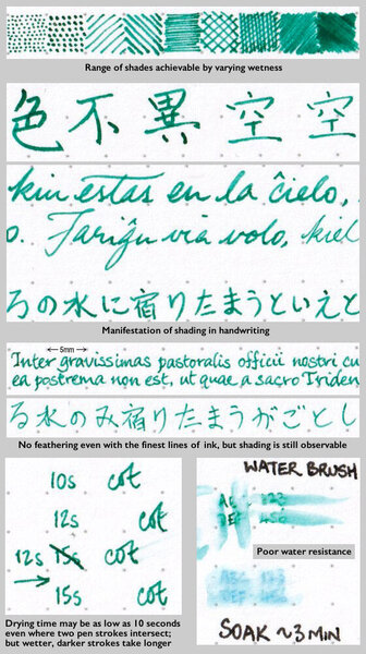
TAG Kyoto kyo-no-oto ryokuyuiro TAG is a stationary shop in Kyoto (Japan) that produces some interesting soft watercolour-style inks. With the kyo-no-oto series they produce a line of inks that replicates traditional Japanese dye colours. According to available only info, the manufacturing process of the kyo-no-oto inks follows traditional dying techniques dating back to the Heian era between the years 794 and 1185. The inks come in 40 ml bottles, packaged in luxurious thick paper with a texture that feels like heavy watercolour paper. For this review, ryokuyuiro is the shimmering star in the spotlight. Like so many other ink producers recently, TAG Kyoto also jumped on the glitter-ink bandwagon. With this ink, they added some silver glitter – fortunately, they didn’t exaggerate with the glitter particles. And even more fortunately, the glimmer isn’t there to cover up for a boring ink colour. Personally, I just ignored the glitter – don’t shake the bottle before filling your pen, and all the silver dust particles remain at the bottom. Ryokuyuiro is a beautiful muted green with strong blue undertones. Not yet a teal, but definitely reaching towards blue territory. A dangerous colour spectrum to explore, but this kyo-no-oto ink manages to walk the fine line. It could easily have been a failure, but with ryokuyuiro the result is a stunning ink colour. The ink’s name is derived from the ryokuyu glaze, which produces a green colour in pottery. It is one of the oldest glazes and was already used in China in BC. In Japan, it has been produced since the Heian period and has been favoured by many aristocrats. The ink captures the colour wonderfully well – a soft pastel-like dusty dark green with that beautiful blue undertone. This colour caters perfectly to my personal taste – a great ink to start off the new year! The ink feels fairly wet and well-lubricated, especially when compared with others in the kyo-no-oto series. In fact – I would recommend using the ink with drier pens. With dry pens, ryokuyuiro looks even more dusty, and shows some really elegant & expressive shading. The ink is not without its flaws though: on more absorbent paper it has a slight tendency to feather, and with lower quality paper it definitely suffers from see-through and some bleed-through. But use this ink with good quality and hard-surface paper and you will be in writer’s heaven! To show you the impact of saturation on the ink’s look & feel on paper, I made some scribbles where I really saturated portions of a strip of 52 gsm Tomoe River paper with ink. This gives you a good idea of what the ink is capable of in terms of colour range. Ryokuyurio has a medium colour span, with a soft contrast between the light and darker parts. At the lighter end, the blue undertones are clearly visible. At the dark end, you get that yummy dusty dark green. In writing, this translates to soft and aesthetically pleasing shading that adds both character and beauty. Nicely done! Before doing the saturation sample, I stirred the bottle of ink to activate the shimmer. The silver glitter particles are present, but not in-your-face. They are mostly visible when looking at the paper from a fairly steep angle. See the picture below for some glitter in action: The ink’s chromatography shows the dusty character of the ink, and the delicate mix of yellow and blue dyes. TAG Kyoto’s ink masters balanced the dye mix extremely well, providing us with a beautiful soft & dusty blue-leaning green. Kudos! The bottom part of the chroma already suggests that this is not a water resistant ink. This is confirmed in the water test at the end of this review: ryokuyuiro cannot survive watery accidents. I’ve tested the ink on a wide variety of paper – from crappy Moleskine to high-end Tomoe River. On every small band of paper I show you: An ink swab, made with a cotton Q-tip 1-2-3 pass swab, to show increasing saturation An ink scribble made with an M-nib Lamy Safari The name of the paper used, written with a Pelikan M200 with M cursive italic nib (and with the shimmer activated) A small text sample, written with an M-nib Pelikan M120 Green-Black Source of the quote, with a B-nib Lamy Safari Drying times of the ink on the paper (with the M-nib Safari) Since this is my first review of 2022, you get a new set of quotes. This year, quotes originate from Dennis Taylor’s Bobiverse novels. Original SciFi novels with a strong humorous touch, and lots of references to the Star Trek and Star Wars universe (it helps when you know this stuff, otherwise you might miss the relevance of e.g. a reference to the Kobayashi Maru scenario). I really enjoyed reading these novels. Ryokuyuiro looks beautiful on all types of paper – it shows it muted pastel-like character really well on both white and creamy paper. The ink exhibits a small amount of feathering on lower quality paper, together with definite show-through and bleed-through. With hard-surface high-quality paper none of these shortcomings appear. Drying times with the Safari M-nib are mostly in the 5 to 10 second range. I’ve also added a few photos to give you another view on the ink. Scanned images and photos often capture different aspects of the ink’s colour & contrast. That’s why I present them both. In this case, both scan and photo capture ryokuyuiro’s colour equally well. Writing with different nib sizes The picture below shows the effect of nib sizes on the writing. Ryokuyuiro can handle the complete nib-range without any problem. It shows truly elegant and expressive shading, even with the finer nibs. The ink’s dusty character is best expressed when using drier pens like the Lamy Safari. With wetter pens you get stronger saturation, and some of that dustiness gets lost. Anyway – the ink manages to look stunning and beautiful no matter what combination of pen and nib you use. Related inks To compare the dusty-green ryokuyuiro with related inks, I use my nine-grid format with the currently reviewed ink at the center. This format shows the name of related inks, a saturation sample, a 1-2-3 swab and a water resistance test – all in a very compact format. I don’t have enough inks in this colour-range to fill the grid, so I had to add a few more distant relatives. Mont Blanc Jungle Green comes close, as does the Murky Waters ink mix (3 parts Pelikan Edelstein Jade – 2 parts Pelikan Edelstein Onyx). Inkxperiment – aboriginal lizard With every review, I add an inkxperiment using only the ink I am presenting. Such a one-ink drawing works great to show off the colour-range nuances that are present in the ink. These inkxperiments are the favourite part of my reviews: always loads of fun and a perfect way to experiment with inks using a number of different techniques. I recently viewed a documentary on Australian Aboriginal culture, where the gecko lizard represents the deity Adnoartina. Inspiration for this inkxperiment comes from an aboriginal art drawing I saw on Pinterest. I started with an A4 piece of 300 gsm watercolour paper. To paint the background, I used heavily water-diluted ink – which brings the blue undertones of ryokuyuiro to the foreground. Next I coloured in the lizard figure with my Lamy Safari B-nib fountain pen filled with pure ryokuyuiro. I finally used an old Kaweco sport filled with bleach to outline the lizard’s silhouette. Bleach reacts nicely with ryokuyuiro, producing a golden colour. As a finishing touch, I stamped in the lizard’s paw prints with a self-made rubber stamp. The resulting drawing shows what can be achieved with this soft pastel-like green in a more artistic context. Conclusion TAG Kyoto kyo-no-oto ryokuyuiro is a stunning dusty blue-leaning green, that implements this difficult colour range superbly well. It’s so easy to miss the mark here – add too much blue, and you’re in teal territory. With ryokuyuiro, the balance is perfect and results in a soft & elegant pastel-tinted green. Wonderful stuff and a great way to start off the new year! Technical test results on Rhodia N° 16 notepad paper, written with Lamy Safari, M-nib Back-side of writing samples on different paper types
-
-
Someone requested a review of this ink since they saw that I had the Red Soil. This inspired me to get on with it, as I was very curious to see what kind of green it was. Rust green, what could that be? This is a very interesting green. Some subtle shading, enhanced by the sheen. The latter is sometimes dark, contributing to the shading, making it quite dramatic. The sheen is definitely red, but often quite dark. The camera picks up the reflection, making it look pink. But it varies depending on light, ink concentration on the paper, and the paper itself. Sometimes the sheen appeared very metallic, making the writing look like graphite pencil. The green is a somewhat neutral bluish-green. It is not bright, but it is well colored. I was a bit worried that it would be a green that I disliked, but that is not the case at all. It's a very pleasant green. It is not a murky swamp green that many people, myself included, really like. This definitely leans very blue as you can see in the backlit photo. When I first looked at the ink, in the evening, I thought maybe a mistake had been made and I was sent the wrong ink. The writing at night looking like a graphite blue if there would be such a thing. It's quite blue when wet, then turning to the green when dry. To me this is a very unique green. Maybe it isn't and I'll learn something. But a reasonable price for a Sailor ink these days. It is $0.50/ml ($20 for 40 ml bottle). The Kobe inks are $30 for 50 ml ($0.60/ml), the Sailor Ink Studio are $18 for 20 ml ($0.90/ml), the new Sailor Four Seasons and Shikiori inks are $15 for 20 ml ($0.75/ml). On Mohawk via Linen, a high quality, somewhat absorbent paper: On Tomoe River paper: Shiny sheen: Nice box! Back Nice bottle! Is this a blue ink? Not really.
-
(Another quickie review, being largely a by-product of my checking how the EF nib on a Delike Alpha performs.) Colour: I suppose the closest colour of ink I have to it is Diamine Evergreen but, at least in daylight, Monteverde Olivine is slightly more yellow (and Diamine Evergreen has an obvious red sheen). Feathering: None observed on the Rhodia paper I used. Ghosting and bleed-through: Not from normal writing, but several passes with a soaked cotton swab or a wet nib can cause some ghosting and even bleed-through. Drying time: Quick enough. No smearing after 15 seconds. Water resistance: None whatsoever. Washed clean off the page under a running tap in under 15 seconds. Shading: Some, but slightly subtle. No distinct step going from faint to dark. That's a good thing. Sheen: Not any to speak of. There is the slightest hint of a dark red outline or 'halo', if you look really hard, but that's about it.
-

Sailor Kingdom Note "green Experience" Parmotrema Tinctorum
white_lotus posted a topic in Ink Reviews
Sailor and Kingdom Note have been collaborating on inks for some time now, five years I think. This year (2017) they started a new series called "Green Experience" which like the other series such as "Insects" and "Fungi" consists of five inks. Two cover green plants from Southeast Asia, and three are based on green plants in Japan. This is a fairly broad category and could cover the many many shades of green, but it seems this line focuses on the slightly bluish greens found in nature. KN and Sailor have chosen some very interesting shades. This shade perfectly captures the color and tonality of the named lichen, Parmotrema tinctorum. So it is a bit on the lighter side of the scale. Actually a good bit on the lighter side. But it is still quite readable and in a wider, wetter nib can be quite interesting I think. It has excellent shading, and for me, this quality is so much more important than sheen. Plus this ink is waterproof, or nearly so, at least with absorbent paper. This site has a great page on Parmotrema tinctorum, and some great pics of this lichen. The ink really does caputre this very well. http://eol.org/pages/195278/overview So this is a very interesting ink, and not totally unobtanium (i.e., you must travel to Japan or have friends that live or travel there). Cost about $35 depending on exchange rates, shipping costs, etc. The simple chromatography shows how muted this ink really is, and it has lots of yellow in the mix, unlike what I said at the top of the page. Nothing lifted, nothing washed away. Impressive. -
Nicely shading, quick drying, lightish green with some dark undertones. Loved the color and sharing, and smoothness. I don't have any inks to compare to.
-
Penbbs is a Chinese online fountain pen community similar to FPN. They not only talk about inks but also produce their own inks every year. Each series consists of ten to fifteen inks and 2017 marks the release of Penbbs’ fifteenth ink series. Due to Chinese postal restrictions, these inks are virtually impossible to obtain outside of China. However, within China they are extremely affordable (21 RMB or about US$3 per 60ml bottle) and can easily be purchased through the Chinese online shopping giant Taobao. This ink up for review is from Penbbs’ twelfth series. It is named after the city of Hangzhou in eastern China. Hangzhou is famous for its beautiful scenery and is where longjing green tea is grown (a wonderful tea which I highly recommend). This tea is pan-roasted so the color is a little darker than some other green teas. I think the color of this ink is a good representation of the color of the tea leaves, although I don’t know if that’s what the ink makers were going for. What do you think? The color may just be a reference to the city’s natural scenery. The color is slightly darker and greener than the olive Penbbs ink No. 132 that I reviewed previously. This makes it more useful for daily writing. The color is certainly gentle on the eyes. This ink gives some shading on all papers with wider nibs. Its drying time is a little longer than No. 132, but it also feathers a little less. Bleed through was quite bad on Moleskine, but on other papers it was passable with wet nibs and non-existent with the Japanese fine nib. This ink is slightly water resistant as well. The darker green component remains to leave a barely legible line while the rest washes off. The interesting color and shading make this a nice ink, but as with ink No. 132, it feathers and bleeds too much for my taste. Pens used (in order): 1. Pilot 78G Fine 2. Lamy Safari Broad 3. Pilot Plumix Italic 4. Noodler’s Nib Creaper Flex 5. Hero 5028 1.9mm Stub Swab Paper Towel Drop 80gsm Rhodia 73gsm Chinese Tomoe River Wannabe (brand unknown) 70gms Deli Copy Paper Moleskine Water Resistance Mini-comparison (No. 157 is at the bottom) [My apologies that I don’t have any inks close to this color to do an adequate comparison. No. 157 mistakenly appears lighter than No. 132 on this image. ] SDG
-
TAG Kyoto - kyo-no-oto - urahairo TAG is a stationary shop in Kyoto (Japan) that produces some interesting soft watercolour-style inks. With the kyo-no-oto series they produce a line of inks that replicates traditional Japanese dye colours. According to available only info, the manufacturing process of the kyo-no-oto inks follows traditional dying techniques dating back to the Heian era between the years 794 and 1185. The inks come in 40 ml bottles, packaged in luxurious thick paper with a texture that feels like heavy watercolour paper. In this review I take a closer look at urahairo. This is a wonderful grey-green-blue ink, a beautiful subdued colour that really appeals to me. While some people might see a weak and washed-down ink, I see the softness, elegance and harmonious nature of an ink that delicately caresses the page. To remove any doubt... I love my inks soft & toned-down, and this one is right up my alley. The name urahairo comes from the words "ura" (meaning underside) and "ha" (meaning leaf). The colour reflects the pale and subdued green colour you often find on the underside of leaves. Since the Heian era when Kyoto was the capital of Japan, people loved this colour and used it for the colouring of kimonos and other textiles. The ink writes fairly dry with my standard Lamy Safari test pens. Saturation is also quite low, especially with the finer nibs. This is not an ink to use with an extra-fine. You need broader nibs and/or wetter pens to bring the best out of this TAG Kyoto ink. The colour is difficult to describe. It's definitely a green, but with a lot of blue without becoming a teal. It's also greyed down quite a bit. This mysterious blend of colours provides some extra character to the ink, and works out really well. I've tried a number of TAG Kyoto inks to date, and love them all. This line of inks really fits my taste - I'm glad I discovered them. To show you the impact of saturation on the ink's look & feel on paper, I made some scribbles where I really saturated portions of the Tomoe River paper with ink. This gives you a good idea of what the ink is capable of in terms of colour range. Urahairo has a fairly broad dynamic range, but without a harsh contrast between the light and darker parts. This translates to strong but still elegant shading. Such a broad dynamic range is often difficult to capture by scanner, and that's also true here. The scanner tends to exaggerate the contrast, making the shading a lot harsher than in reality. I've therefore added some photos to the writing samples below, to allow you to get a better feel for the ink. The ink's chromatography shows a wonderful complexity of dyes, with blue, light-blue and yellow in the mix. The bottom part of the chromatography seems to indicate a measure of water-resistance, but this is just an illusion. In reality, there's not much that remains on the paper when it comes into contact with water. Definitely not a water-resistant ink. I've tested the ink on a wide variety of paper - from crappy Moleskine to high-end Tomoe River. On every small band of paper I show you: An ink swab, made with a cotton Q-tip 1-2-3 pass swab, to show increasing saturation An ink scribble made with an M-nib Lamy Safari The name of the paper used, written with a B-nib Lamy Safari A small text sample, written with the M-nib Safari Source of the quote, with a Pelikan M200 with M cursive italic nib Drying times of the ink on the paper (with the M-nib Safari) Urahairo looks great on all my test papers, with no visible feathering. With the lower-quality papers there is just a touch of bleed-through present. Drying times were mostly in the 5 second range with the Lamy Safari M-nib. This delicate ink looks at its best on off-white or cream paper. In my opinion it loses some of its softness on pure white paper. I've also added a few photos to give another view on the ink. In the scanner samples above, the shading contrast in the written text is a bit exaggerated, making it look too harsh. The photos below show a more realistic view of the ink's shading properties. Writing with different nib sizes The picture below shows the effect of nib sizes on the writing. Kyo-no-oto urahairo is a bit too unsaturated for extra-fine nibs, and works best with M nibs and above. With broader nibs (or wetter pens) it loses its dryness and becomes much nicer to write with. Also, the ink's elegant shading needs the broader/wetter nibs to come to the front. Related inks To compare this grey-green-blue urahairo with related inks, I use my nine-grid format with the currently reviewed ink at the center. This format shows the name of related inks, a saturation sample, a 1-2-3 swab and a water resistance test - all in a very compact format. This kyo-no-oto ink is different from my other muted greens - I have no other ink that comes anywhere close. Inkxperiment – autumn With every review, I try to create an inkxperiment using only the ink I'm working on. Such a one-colour drawing is a great way to show off the saturation-range nuances that are present in the ink. These inkxperiments are the favourite part of my reviews: always great fun and a good way to stretch my creativity and drawing skills. Inspiration for this particular inkxperiment comes from the autumn season in this part of the world: the wind blowing through the trees, leaves tumbling to the ground forming a thick carpet at the tree's feet. I started with a piece of HP photo paper and a leaf I picked up outside. I used the leaf to block out the paper, and painted in the background using a piece of carpet anti-slip material. The provides the checkered background for the inkxperiment. I next painted in the tree, and added some texture to the leaf. The resulting picture shows what can be achieved with urahairo in a more artistic context. Conclusion TAG kyo-no-oto urahairo is a wonderful ink - a beautiful grey-green-blue with a unique colour that is both soft and elegant. The ink works best with broader/wetter nibs - it's a bit too dry and unsaturated for EF/F nibs. This is one ink that you really need to use with off-white or cream paper - makes it look so much better. Not an ink for everyone, but if you enjoy toned-down, pastel-like colours, urahairo delivers! I personally like it a lot. Technical test results on Rhodia N° 16 notepad paper, written with Lamy Safari, M-nib Back-side of writing samples on different paper types
-
Robert Oster 1980 – Opal Green Robert Oster is an Australian ink maker that is well-known for its unique range of colours. With this mini-series he gives us a conglomeration of colours inspired by the anything goes world of the 1980s. The inks include muted pastel-type colours along with some eye-popping disco-style hues. Definitely an interesting series. In this review I take a closer look at Opal Green - a blue-leaning mint-green. To be honest, not my type of colour. But this won't stop me from doing an objective review. The ink feels a bit dry in my Lamy Safari test pens, which is not unusual for a Robert Oster ink. Nevertheless, it still works well with all nib sizes - even the finer ones - providing good contrast with the paper. Opal Green shows excellent shading, which becomes more prominent with broader nib sizes. To show you the impact of saturation on the ink's look & feel on paper, I made some scribbles on Tomoe River where I really saturated portions of the paper with ink. This gives you a good idea of what the ink is capable of in terms of colour range. As you can see, Opal Green moves from a pastel-like mint-green to a much darker bluish green. The contrast range is rather broad, but there is no harsh contrast between the light and darker parts. This translates to soft shading, which I find aesthetically pleasing. Like most Robert Oster inks, Opal Green has zero water resistance. Short exposures to water completely obliterate the text, leaving next to nothing on the page. This is also apparent from the lower part of the chromatography. The chroma clearly shows the dominating presence of blue in this ink. It's definitely a green though and never a teal, but the blue presence is really very prominent. I've tested the ink on a wide variety of paper - from crappy Moleskine to high-end Tomoe River. On every small band of paper I show you: An ink swab, made with a cotton Q-tip 1-2-3 pass swab, to show increasing saturation An ink scribble made with an M-nib Lamy Safari fountain pen The name of the paper used, written with a B-nib Lamy Safari A small text sample, written with an M-nib Lamy Safari Origin of the quote, written with a wet Pelikan M101N with F-nib Drying times of the ink on the paper (with the M-nib Lamy) Opal Green behaves well on most paper types. You get a tiny bit of feathering on the lower quality papers (Moleskine and the copier paper). With the lower quality paper you also get some bleed-through, but never excessively so. The ink dries quickly around the 5 second mark (with the M-nib Lamy Safari). The ink shows truly elegant shading, even with finer nibs. White paper seems to work best for Opal Green - it doesn't look nearly as good on the yellowish papers in my test set. Writing with different nib sizes The picture below shows the effect of nib sizes on the writing. All samples were written with a Lamy Safari, which is typically a dry pen. I also added a visiting pen: a wet-writing Pelikan M101N Grey Blue with F-nib. As you can see, Opal Green can handle all nib sizes without a problem. With the wet pen, the ink shows a saturated bluish green, moving away from the mint-green you get with the drier pens. Related inks To compare Opal Green with related inks, I use my nine-grid format with the currently reviewed ink at the center. This format shows the name of related inks, a saturation sample, a 1-2-3 swab and a water resistance test - all in a very compact format. I specifically added Pelikan Edelstein Jade to the grid. This is another ink I don't like at all - more of a blue leaning to the green, with Opal Green being a green leaning to the blue. Neither ink colour works for me - if you want to be a teal, you should boldly go all the way, not this "I’m not sure what I am" type of colour. Inkxperiment - isolation With every review, I try to create an interesting drawing using only the ink I'm working on. Limiting myself to one ink allows me to showcase its colour-range nuances. For me, this is the fun part of every ink review. Inspiration comes from the current COVID19 crisis, which forces us to be extra careful, practice social distancing, interact online instead of in person. A side effect is a feeling of remoteness... each person an isolated bubble in the sea of humanity. For this drawing I reached once again for my favourite medium: HP photo paper. I started by drawing the bubble, and adding some texture to it (using a plastic sheet with holes, and a kitchen sponge). I then added the isolated person, and used different water/ink ratios to draw in the radial spikes outside the bubble. The resulting drawing gives a good indication of what can be achieved with this Opal Green ink. In my opinion, this Robert Oster works really well as a drawing ink. I quite like the end result. Conclusion Robert Oster 1980 Opal Green is a strongly blue-leaning green ink (definitely not a teal, more of a mint-green). The ink works well with all nib sizes, and shows really elegant shading. It has some minor feathering problems with lower quality paper, but nothing really worrisome. I really liked this ink for drawing, but as a writing ink it's definitely not my type of colour. Technical test results on Rhodia N° 16 notepad paper, written with Lamy Safari, M-nib Back-side of writing samples on different paper types
-
Manufacturer: Parker Series, colour: Quink Green Pen: Waterman Hemisphere „F” Paper: Image Volume (gramatura 80 g / m2) Specifications: Flow rate: very good Lubrication: good Bleed through: possible point Shading: noticeable Feathering: unnoticeable Saturation: good A drop of ink smeared with a nib The ink smudged with a cotton pad Lines Water resistance Ink drying time Ink drops on a handkerchief Chromatography Sample text in an Image Volume (80 g / m2) Sample text in an Oxford notebook A5 (90 g / m2) Sample letters in a Rhodia notebook No 16 (90 g / m2) Palette of shades
-
Manufacturer: Robert Oster Signature Series, colour: Verde de Rio Pen: Waterman Hemisphere F Paper: Image Volume (gramatura 80 g / m2) Specifications: Flow rate: very good Lubrication: good Bleed through: possible point Shading: noticeable Feathering: unnoticeable Saturation: very good A drop of ink smeared with a nib The ink smudged with a cotton pad Lines Water resistance Ink drying time Ink drops on a handkerchief Chromatography Sample text in an Image Volume (80 g / m2) Sample text in an Oxford notebook A5 (90 g / m2) Sample letters in a Rhodia notebook No 16 (90 g / m2) Sample letters in a Clairefontaine (120 g / m2) Palette of shades
-
Producent: Cross Seria, kolor: Green Pióro: Waterman Hemisphere „F” Papier: Image Volume (gramatura 80 g / m2) Specifications: Flow rate: very good Lubrication: good Bleed through: noticeable Shading: noticeable Feathering: unnoticeable Saturation: very good A drop of ink smeared with a nib The ink smudged with a cotton pad Lines Water resistance Ink drying time Ink drops on a handkerchief Chromatography Sample text in an Image Volume (gramatura 80 g / m2) Sample text in an Oxford notebook A5 (90 g / m2) Sample letters in a Rhodia notebook No 16 (90 g / m2) Sample letters in a Clairefontaine (gramatura 120 g / m2) Palette of shades
-
Another new winner from Diamine:
-
Reportedly, Private Reserve is one of the companies that paved the way to the overabundance of ink colors we have now, as early on there were mostly the basic inks available, such as basic blue-black, red, green, turquoise, brown, black, and blue. PR inks come in a multitude of different hues. The original creator and owner of the ink company passed away, and the company is now under new ownership and management. I personally became very interested in Private Reserve Avocado a while ago, after seeing its fantastic color range on some others' reviews when used for drawing. Behind its very slightly olive green exterior hide many other hues! The brick-terracotta red color is one of them, and it is the most water-resistant component of this ink. So when you use a water brush over Avocado, a red color is revealed! This ink is very well-behaved in writing. The ink flow is moderate to creamy, and lubrication is good. This ink is really good for maintaining fine lines for drawing and for hairlines. It's well-saturated, but not too much. There is no sheen. Instead the ink has an attractive matte appearance that works well on all paper types. This ink is great for any nib type: from super extra fine to broad. Shading is fairly low, and the lines are solid and well-defined, dark enough even when very fine. In writing, this ink is a pleasant hue of fresh, botanical green. Very restful on the eyes and also imparts an uplifting feeling for me personally. Scan: Fabriano Bioprima 85g ivory-tooned paper with 4mm grid: Scan: Tomoe River 52g White Scan: Nakabayashi Logical Prime notebook, coated ivory-cream-toned paper: (Totally misspelled Rikyu-Cha) Close-up photographs: Look at that "chromatography"! Personally I like this ink a lot; glad I have a large bottle.
-
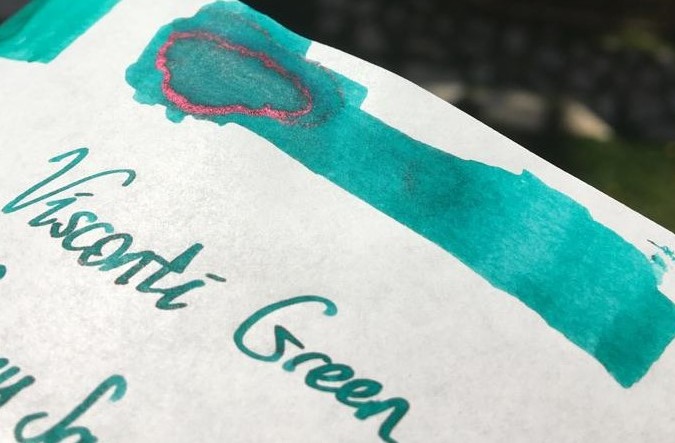
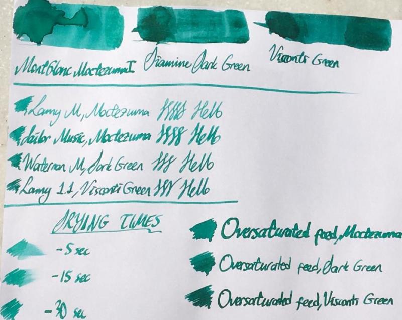
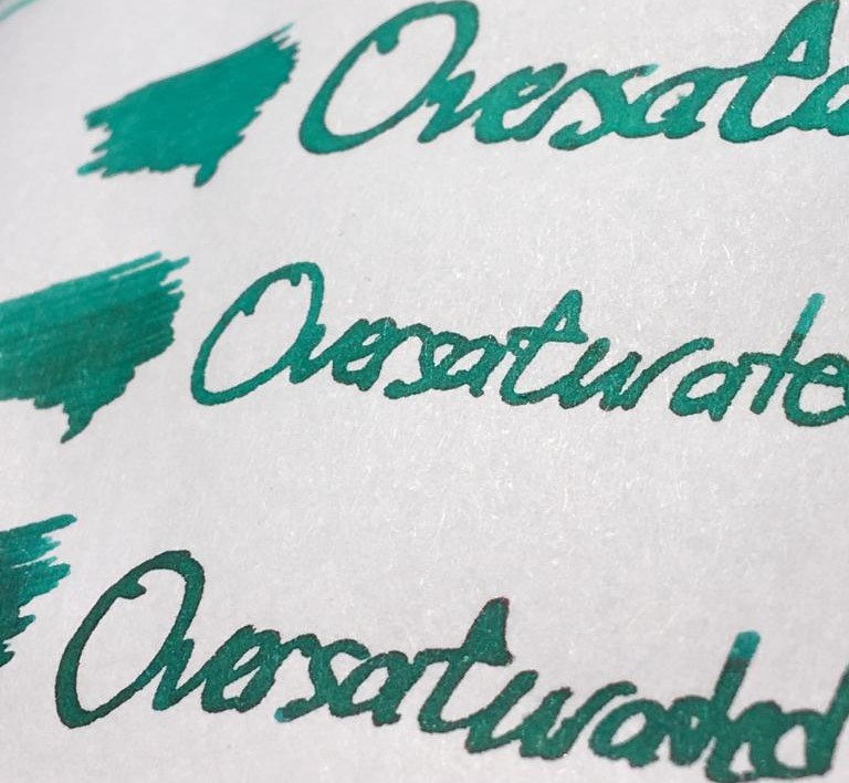
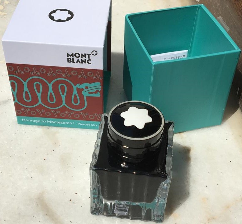
Hello dear FPNers, Today I have something new, something German, something menthol green for you: Moctezuma 1 Pierced Sky is one of the most recent inks released by Montblanc. This ink is a complementary part of new Patron of the Art series: Homage to Moctezuma 1. It is a limited edition ink, and it has a 50 ml cube shaped bottle, which is a pretty standard bottle shape of Montblanc. I suppose this ink is very close to J. Herbin Vert Reseda, but a tad darker than it. Another similar ink is Edelstein Jade. Unfortunately, I have neither of them, because this cannot be called as my favourite shade of turquoise. However, I have Diamine Dark Green and Visconti Green, both of which are also pretty close to Moctezuma, I suppose. Here is a comparison of three inks on white Tomoe paper: They are very close indeed. But before describing the differences between 3 inks' colours, maybe I should mention about some important ink properties: Saturation: Moctezuma has a medium-to-low saturation. It is not as washed out as Herbin Vert Reseda, but still lacks some saturation in my opinion. Sheen: There is definitely no sheen with this ink. Maybe only if you pour down huge amounts on Tomoe, you may see a little bit of sheen. Shading: It has a high shading capacity, I loved it. Obviously not as much as a KWZ Honey, but still very nice shading. Wetness: Moctezuma is a dry ink, as most of you could easily guess, because most Montblanc inks tend to be so (except Elixir line, they are the wettest inks I have ever seen). It is not the driest ink in the world either; not as dry as a Pelikan 4001, but definitely on the dry side of the spectrum. Unless you have a vintage pen with an ebonite feed, or a modern pen which is tuned to write wet, most people wouldn't like this dryness combined with medium-to-low saturation in EF/F nibs I suppose. Check this out again: Lamy Safari M nib's output is not amazingly washed out, but not very legible either. I am more of a BB/OBB guy. I don't use fine nibs very often, but if I do, personally I would like to see a bit darker, or brighter line. The colour choice is already dangerous: it is a pastel menthol green, not most people's first choice of colour to easily read the written, so at least it should have been a bit more saturation in my opinion. About dryness of ink: I suppose both Montblanc and Pelikan specifically keep their nibs' tippings wide, to have them larger surface area when in contact with paper, which makes them smoother. And then they need to adjust their own inks to be a bit more viscous than a regular ink to make it flow slowly through the tines, compensating the thick tipping material's large surface and making the pen write narrower, so keeping the promise of theoretical nib size. I don't know. It is a choice of company. Pilot succeeds in having narrower tippings be smooth, maybe not as smooth as their German counterparts but still quite smooth. And they see no problem in producing a much wetter ink. I suppose most people would trust in Iroshizuku line's fluid properties more than they do for Montblanc inks or Edelstein inks in an indefinite case of which ink to use in an unfamiliar pen. I remember having hard times with some Montblanc and Pelikan inks in my EF/F nibs. Whatever. Note that the pen I used for Moctezuma is Sailor Progear Ocean with 21k Music nib: Mr John Mottishaw cut its tip into a beauuuutiful cursive italic, smooth and crisp, and tuned it to be quite a wet nib: So the wetness of nib would be able to balance the dryness of ink, I thought. Same triple comparison is also done on 80 gr white Rhodia paper, which is the industrial standard of pen world, I suppose.. Let's see the differences between 3 inks above. Here are some close shots of them on Tomoe again: Moctezuma is the lightest of them. Diamine Dark Green is a bit greener than Moctezuma, with a bit more red dye, and it is more saturated. Visconti Green actually has a very similar green-blue ratio compared to Moctezuma, but it is much more saturated. And the red dye content is definitely higher in Visconti, as a result it seems darker with some nice sheen. Sometimes I love writing with over-saturated feeds. They show the full potential of an ink. Also, if you have a moderately wet nib, it gives a clue about how the colour would be seen with a wet nib, especially with a vintage nib. A close shot of writings made with over-saturated feed on Tomoe: Lovely sheen with Visconti Green to be noted. Same thing for Rhodia: It can be said that Moctezuma gives a nice colour with a very wet nib, preferably a vintage one. Some other ink properties: Feathering: Not detected, not likely to feather. In this term, quite a well behaved ink. Bleeding: Not detected, not likely to bleed. In this term, quite a well behaved ink. Showthrough: Some distinct showthrough on Tomoe but every ink has a showthrough on Tomoe, so it shouldn't be a criteria I think: On Rhodia, it has minimal showthrough. Quite well: Note that heavy swabs or parts written with over-saturated feed will of course have showthrough, and even bleedthrough. It is normal. The concentration on normal writing should be the way in judging showthrough/bleedthrough. Water Resistance: Meh. Not so much, but who cares?? Not me, definitely.. Before water test on Tomoe: And after water test: It cannot be said that the writings have gone completely, but they are not legible either. But this situation does not bother me. Actually, I like inks which are not resistant to water. In my experience, they are much easier to clean than water-proof inks. And considering that I am obsessive while cleaning pens until water comes out completely crystal clear, this ink is a nice choice for me. I haven't tried to clean it from my pens, but I am sure it will be cleaned quite fast. CONCLUDING REMARKS If you are into menthol green colour, you will definitely like this ink. Note that it is a bit pale, pastel colour, not very vivid.With very wet nibs, it has a lovely hue of an exotic lagoon at its best. I live in an inland location, but I felt like I am in Maldives.Doesn't have sheen or shimmer, but has a nice shading.Montblanc Moctezuma 1 is not the most unique colour in the world. There are some similar colours like J. Herbin Vert Reseda, Pelikan Edelstein Jade, Diamine Dark Green, Visconti Green, etc.. You may consider them also.Price is about 35 Euros, same as Montblanc Petrol Blue. It is definitely not a cheap ink, but not the most expensive one either. I am not sure if it deserves this price. I would buy it anyway since I am an ink nerd, but I may not buy the second bottle. Besides, alternatives are much cheaper, and this ink does not have amazing specifications in terms of colour.With over-saturated feed, it provides a much more distinct, vivid colour, which means if you are likely to buy it, consider using it in your wet pens, preferably gushers or vintage pens. No need to afraid of cleaning from vintage pens. Hope you enjoyed. Thank you..
-
In keeping with my theme of doing things because I was told I can't... Parker Superchrome Jade Green! Yes, the slightly LESS deadly ink invented to replace Parker "51" ink! If you are not familiar with Parker "51" ink and the story behind it, please feel free to see my reviewsTunis Blue: https://www.fountainpennetwork.com/forum/topic/354212-parker-51-tunis-blue/?hl=%2Btunis+%2BbluePan American Green: https://www.fountainpennetwork.com/forum/topic/353661-parker-51-pan-american-green/?hl=%2Btunis+%2Bblue So, now that everyone knows why "51" ink had to go the way of the dinosaurs, let's take a look at its replacement!Launched around the same time as the new Aero-Metric (1948ish) version of the Parker "51" pen, the advertising for Superchrome was VERY bright and vibrantIt even went as far as to explain how this magical ink would soak into the paper and dry nearly instantly, instead of by evaporation!Here's the patent: https://patents.google.com/patent/US2528390NEAT! Ok, so what happened then? Why is this called the "slightly less deadly" ink? and why can't i find it in stores!? Because it was discontinued in 1956 ok, but WHY!? Well, Parker started getting warrantee claims on their new Aero-metric "51"s... a lot of them... seems the alkalinity of Superchrome was actually eating up breather tubes!And they were made of STERLING SILVER... eventually, replacing them starts to get expensive ya know! you can read more about "51" and Superchrome here:http://www.richardspens.com/ref/care/51_ink.htm My Bottle is a slightly later bottle, the first ones came in a cool metal tin! According to the Parker "51" book, my box was designed around 1949And was awarded an honourable mention by the Folding Box Association of America! Wow... really!? the FBAoA!? no way! Yes way! it says so on page 145 of the Parker "51" book! here is my box and bottle pictured with my green Parker "51" Special Demi There was some sedimentation in the bottle, much like the Tunis Blue bottle, but much less of it, and not stuck to the bottom of the bottle.As with the Pan American Green, don't worry, I shook the bottle excessively in order to try and get those precious dyes back into suspension (not solution)! ok, but what does it look like on paper you ask? well I'm glad you asked, cause that's the whole point of this shindig! (Typed Text follows for search-ability, and because my handwriting is atrocious!) Rhodia Webnotebook, paper is slightly off white in real life 15 Jul 20Parker Superchrome JadeGreen. Bought 3oz bottleon eBay Jun-ish 2020. Thisis the second deadliest inkin history. Only the inkit replaced (Parker "51") isworse! Meant to "dry" nearly instantly it was designedto soak into the paper. Toobad it also ate sterlingsilver breather tubes...More teal than Green, buthat may be due to the age of the bottle. Some dryout when left over night in a pen(Dry times in a Wing Sung 601 and a TWSBI Eco 1.1)Would buy Again?N/A Parker SuperchromeJade GreenEco 1.1mmWing Sung 601Shading: Good/Very GoodSaturation: GoodFeathering: NilSpread: NilBleed: NilCleaning: Easy/Medium (Water tests, dripped and dabbed vs rubbed with a wet Q-tip) Notes: Colour is very close to Diamine Marine. FlowsOK. Pan American Greenis much greener.*Leaves a white crust/residue! (On the feed and nib, Seen well after cleaning and drying the Eco. So that white residue on "51" Feeds? yeah... probably from this ink!) Clairefontaine Notebook paper, paper is VERY white Parker SuperchromeJade GreenTwsbi Eco 1.1 mm stubThe quick brown fox jumps over the lazy dog.1234567890Clairefontaine PaperDry Times 30 25 20 15 10 5 1Wing Sung 601Drytimes: 30 25 20 15 10 5 1 The quick brown fox jumps over the lazy dog1234567890 Parker SuperchromeJade GreenDiamine MarineJade Green Marine So that's it. That's Parker Superchrome Jade Green. It's a lot like Diamine Marine, except you know, super expensive, hard to find, and will kill your pen!While also leaving a weird white residue on your nib and feed... yay!
-
I'm on a quest to find the perfect ink for each of many different color and other categories. Here's what I have for greens thus far For greens, I'm looking for two different types of greens: Light green - a beautiful vibrant light tea green with lots of shading.Green - a solid green with some shading and/or sheen, not too blue or yellow, and not dark or olive green. For this review, I've done a comparison of the following inks thus far: Diamine - Emerald Ink sample vialNagasawa Kobe - #19 Minatogawa Lime Ink sample vialVinta Inks - Sea Kelp Leyte 1944 Ink sample vialColorverse - Albert Ink sample vialPenBBS - #159 Bitter Herb Ink sample vialPilot Iroshizuku - Chiku-rin 15 mL ink bottleDiamine Inkvent - Mistletoe 7 mL ink bottleColorverse - Sea of Tranquility Ink sample vialMonteverde - Olivine Ink sample vialI'll update with PenBBS Forgive Green, Diamine Elf, Diamine Holly, and Diamine Sherwood Green once I get all of those inked up in every pen. For each ink, I test on CD Apica notebook, Life Noble notebook, Rhodia dot paper, Tomoe River paper, and HP Premium32 paper. I accidentally bought the cream-colored Life Noble Notebook to use for this, so the colors come out different on that. The pens I'm using are a flex pen (Waterman or Noodler's Creaper with a Waterman nib), Pilot Metropolitan, Lamy Safari, and 2 Nemosine stub pens. Please ignore my "Green" and "Light Green" headings for pages. That was to help me space out the ink samples in my notebooks, but I didn't always categorize inks properly based on what color I guessed they'd be. I also had to start over on the Chiku-rin because I didn't clean the pen out properly, which made it come out way more yellow than the ink actually is. There are also a few drips and smears from other inks because I'm not super careful about stacking paper. I'm not particularly concerned with water resistance in general, so I didn't intentionally review that aspect of any ink. I accidentally spilled some water on Diamine Emerald on TR. As you can see, it's not super water resistant, lol. I had a hard time taking images that looked properly lit and accurately captured the ink colors. Mad props to all those lovely reviews on FPN with beautiful images. If anyone has any tips/suggestions about how they do their ink review photos and uploads, please let me know.
-
Mont Blanc - Jungle Green (Writer's Edition 2019 - Homage to R. Kipling) The 2019 Mont Blanc Writer's Edition pen pays homage to Rudyard Kipling, the English author who's probably most remembered for his tales centering on Mowgli and the wolf pack. But Kipling was also a poet, best known for the 1910 poem "If—". When a Writer's Edition pen appears, you can be sure that there is an LE ink in its wake. Accompanying this Writer's Edition pen comes the aptly named corresponding LE ink "Jungle Green." The ink's packaging looks lovely, with a design inspired by the famous poem "If—" and images of the wolf pack. The colour of the ink is inspired by the cover of the Jungle book's first U.S. Edition. In the box you'll find a very nice 50ml bottle of Jungle Green. Jungle Green is a blue-leaning green ink that manages to perfectly ride the dangerous edge between blue and green. Not yet a teal, definitely a green ink, but the blue undertones are there simmering just beneath the surface. And this is also toned down green with some grey in it, which gives the ink a faded look and a definite vintage character. This ink immediately charmed me, and made a great first impression... I really like the way it looks. The ink is well-saturated, and looks great in all nib sizes. With really fine nibs, I noticed a bit of a subpar lubrication, resulting in more feedback from pen on paper. With broader nibs or wetter pens, the ink behaved perfectly. Jungle Green's faded grey-green look also fits well in the workplace, and can perfectly replace blue & black inks in a more business-type setting. A great everyday writing ink. Shading is very prominent, due to the ink's wide colour range. A bit strong for my taste, but still tolerable. Jungle Green has quite a broad dynamic colour span. To illustrate this, I did a swab on Tomoe River paper where I really saturated portions of the paper with ink. This beautifully illustrates the ink's really wide colour range. The ink moves from a wispy light blue-green to a very dark green-black. The broad saturation spectrum explains the heavy shading demonstrated by this ink. On the smudge test - rubbing text with a moist Q-tip cotton swab - the ink behaved quite well. There is some smudging, but the text itself remains perfectly readable. Water resistance is remarkably good. The green colour disappears completely, but you are left with a grey ghost image that is still readable without too much effort. This is also apparent from the lower part of the chromatography, which shows that the grey components of the ink remain on the paper. Drying times are close to the 5-second mark, making Jungle Green a relatively fast-drying ink. The fast drying time, combined with the relatively good water resistance make this Mont Blanc ink really well-suited for the workplace. And by deviating from the standard blue & black, your writing will be guaranteed to draw some attention. I've tested the ink on a wide variety of paper - from crappy Moleskine to high-end Tomoe River. On each scrap of paper I show you: An ink swab, made with a cotton Q-tip 1-2-3 pass swab, to show increasing saturation An ink scribble made with a Lamy Safari M-nib fountain pen The name of the paper used, written with a Lamy Safari B-nib A small text sample, written with an M-nib Drying times of the ink on the paper (with the M-nib) Jungle Green looks really nice on all my test papers. This is an ink that looks good on any type of paper, both the white and more yellow ones. The ink behaved perfectly. Only with the fountain-pen unfriendly Moleskine did I notice a tiny amount of feathering, and quite some see-through and bleed-through. Writing with different nib sizes The picture below shows the effect of nib sizes on the writing. All samples were written with a Lamy Safari, which is typically a dry pen. I also added a visiting pen - a wet Pelikan M405 Stresemann with an F cursive-italic nib (from fpnibs.com). Here the ink leaves a much more saturated dark-green line with less pronounced shading. I quite like the faded green character of Jungle Green, and the way the blue undertones remain just below the surface. Mont Blanc created a great writing ink with this release! The ink works well with all nib sizes, and shows off a subdued & serious colour. Combine this with good water resistance and relatively fast drying times, and you have an ink that is quite suited for office-related note taking. Related inks To compare Jungle Green with related inks, I use a nine-grid format with the currently reviewed ink at the center. This format shows the name of related inks, a saturation sample, a 1-2-3 swab and a water resistance test - all in a very compact format. The grid format makes it easy for you to compare the Mont Blanc ink with similarly coloured inks. Inkxperiment – Eye of the Tiger As a personal experiment, I try to produce interesting drawings using only the ink I'm reviewing, keeping things simple and more-or-less abstract. Crafting these single-ink mini-pieces allows me to stretch my drawing skills, while showing what the ink is capable of in a more artistic context. Inspiration for this drawing comes from Rudyard Kipling's Jungle Book. The villain of the story is Shere Khan, who's usually found sneaking through the jungle with its mind set on catching the young wolf-boy Mowgli. I started with an empty sheet of 300 gsm watercolour paper on which I painted a background with heavily water-diluted Jungle Green. I then added the flowers and Shere Khan's eyes, and painted in the jungle with different mixtures of ink&water, applied with a Q-tip cotton swab. Finally I added the palm trees on the horizon line, and added some texture to the jungle with a B-nibbed Lamy Safari and pure Jungle Green. The resulting drawing shows quite well what can be achieved with Jungle Green as a drawing ink. Conclusion Mont Blanc's Homage to Rudyard Kipling is a very nice-looking faded green with blue undertones that has a vintage feel reflecting the time period (early 1900's). Jungle Green works well with all types of nibs and all types of paper. This is an ink fitting my tastes: faded looking, vintage vibes, and very nice for both writing and drawing. And as a welcome bonus: fast-drying and fairly water-resistant. In my opinion, one of the better Mont Blanc inks. Just be aware that this is a Limited Edition ink, so if you like it, grab it while it's still out there. Technical test results on Rhodia N° 16 notepad paper, written with Lamy Safari, M-nib Backside of writing samples on different paper types
-
TAG Kyoto – kyo-no-oto – moegiiro TAG is a stationary shop in Kyoto (Japan) that produces some interesting soft watercolour-style inks. With the kyo-no-oto series they produce a line of inks that replicates traditional Japanese dye colours. According to available only info, the manufacturing process of the kyo-no-oto inks follows traditional dying techniques dating back to the Heian era between the years 794 and 1185. The inks come in 40 ml bottles, packaged in luxurious thick paper with a texture that feels like heavy watercolour paper. In this review I take a closer look at moegiiro. This is a great-looking yellow-green ink, beautiful colour and shading, well-saturated in all nib sizes and on top of that... a happy colour that makes you almost smell the fresh sprouting leaves on spring trees. I guess you can already feel that I'm smitten with this ink ;-) Inspiration for this ink's colour comes from fresh green sprouts in early spring: the Japanese word moegiiro derives from the words "moe" (to sprout) and "negi" (onion). During the Heian era, this fresh yellow-green colour was particularly fashionable as the colour of youngsters. In the tales of Heike, the famous kyudo (Japanese archery) master Nasuno Yoichi wears armour painted in the moegiiro colour as a symbol for the young warrior. The ink writes with good lubrication in my Safari test pens, not at all dry like some other kyo-no-oto inks. The colour is simply wonderful ... I personally like yellow-greens a lot: fresh looking, spring feeling, happy, feel-good. This moegiiro ticks all my boxes, and I immediately took a liking to it. A prime candidate for my 2020 top 3 of inks. I've tried a number of TAG Kyoto inks to date, and love them all. These inks totally fit my tastes. I'm so glad I tried them. The ink feels at home with a broad spectrum of pens, nibs and paper. It writes with good lubrication, even with dry pens like my Safari. The line it produces is nicely saturated, even with fine nibs. Shading is great, without too much contrast between the light and darker parts - just as I like it. And this elegant shading is even present in finer nibs! To show you the impact of saturation on the ink's look & feel on paper, I made some scribbles where I really saturated portions of the Tomoe River paper with ink. This gives you a good idea of what the ink is capable of in terms of colour range. As you can see, moegiiro has a medium colour range. The ink moves from a light yellow-green to a much darker light-green, without a sharp contrast between these extremes. In writing, this translates to subtle shading which is aesthetically very pleasing. The ink's chromatography shows a wonderful complexity with light-blue, yellow and the resulting light-green in the mix. The light-blue dyes fix more readily to the paper, while the yellow dyes are much less water-resistant. The bottom part of the chromatography seems to indicate a small measure of water-resistance. In practice, a very faint light-blue ghost of your writing remains when the ink comes into contact with water. It can still be read when you put some effort to it, but this is definitely not a water-resistant ink. I have tested the ink on a wide variety of paper - from crappy Moleskine to high-end Tomoe River. On every small band of paper I show you: An ink swab, made with a cotton Q-tip 1-2-3 pass swab, to show increasing saturation An ink scribble made with an M-nib Lamy Safari The name of the paper used, written with a B-nib Lamy Safari A small text sample, written with the M-nib Safari Source of the quote, with a Pelikan M120 with F nib Drying times of the ink on the paper (with the M-nib Safari) Moegiiro looks great on all my test papers, with no visible feathering. With the lower-quality papers there is some bleed-through present. Drying times were mostly just above the 5 second mark with the Lamy Safari M-nib. The ink looks great on both white and more yellow paper, and behaves well across all my test papers. Writing with different nib sizes The picture below shows the effect of nib sizes on the writing. Kyo-no-oto moegiiro can handle all nib sizes without a problem. With the EF nib, you still get a nicely saturated line with even a touch of just-visible shading. Shading is elegantly present starting with the F-nib, and looks beautiful in broader nibs. Because of moegiiro's medium colour span, shading is never harsh and looks very eye-pleasing. Related inks To compare the yellow-green moegiiro with related inks, I use my nine-grid format with the currently reviewed ink at the center. This format shows the name of related inks, a saturation sample, a 1-2-3 swab and a water resistance test - all in a very compact format. This kyo-no-oto ink is different from my other light greens, although Diamine Kelly Green and Meadow come close (the Diamine inks have a touch more yellow in them than this TAG Kyoto ink). Inkxperiment - the Ellcrys With every review, I try to create an inkxperiment using only the ink I'm working on. Such a one-ink drawing is a great way to show off the colour-range nuances that are present in the ink. These inkxperiments are the favourite part of my reviews: always great fun and a good way to stretch my creativity and drawing skills. The yellow-green freshness of moegiiro is reflected by the springtime leaves on the trees outside my window. This inspired me to use a tree as the subject of this inkxperiment. I love the Shannara fantasy novels of Terry Brooks. In the "Elfstones of Shanarra" the Elven princess Amberle Elessedil melts with the Elcryss - the magic sapient tree that protects the border with the Forbidding where the demons reside. I started with a quick outline sketch of the drawing I wanted to make. I then used a piece of 300 gsm rough watercolour paper, on which I drew a background with Q-tips using water-diluted ink in a number of different ratios. Next I drew in the Ellcrys tree with my Safari M-nib fountain pen. The three circles represent the three incarnations of the Ellcrys. The first Ellcrys was born of Aleia Omarosian, the second Ellcrys arose with Amberle Elessedil, and the third incarnation appears in the NexFlix Shannara Chronicles when Arlingfant Elessedil merges with it. The foliage of the tree was stamped in with a piece of dishwashing sponge and different water/ink ratios. Final highlights were added with a brush and pure moegiiro. The resulting picture shows quite well the colour-range nuances that can be achieved with kyo-no-oto moegiiro as a drawing ink. Conclusion TAG kyo-no-oto moegiiro is an awesome yellow-green! A fresh happy colour that is a pleasure to write and draw with. This ink works great with any combination of pen/nib/paper: lovely fresh colour, great shading, good saturation. I really enjoyed using it. If you like yellow-greens, you owe it yourself to get a bottle of this! Technical test results on Rhodia N° 16 notepad paper, written with Lamy Safari, M-nib Back-side of writing samples on different paper types
-
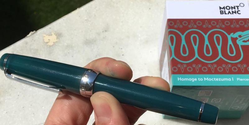
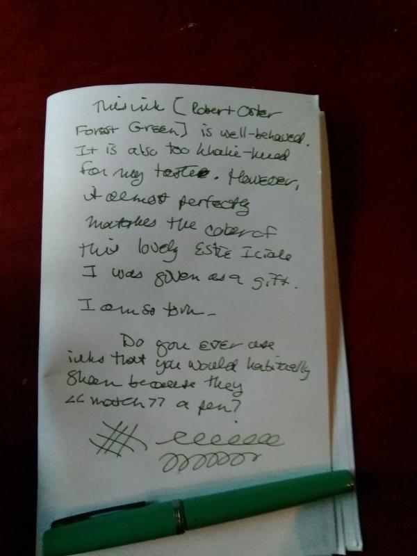
Has anyone else had difficulty deciding whether or not to hold onto an ink because the ink works for a pen but not for personal aesthetic value? I was lucky enough to be given the Estie Icicle pen shown below; I inked it up with a sample Robert Oster that looked close to the pen color. I am pleased with the pairing of ink color to pen color (see attached photo), but not with the ink color itself; I tend to prefer deep rather than smoky colors of my ink. Now I'm at my wits end deciding whether to keep this nice pen inked with a color that suits it, or change it to a color that suits me. I do realize this is a rather superficial problem to have, but it irks me nonetheless. Anyone else similarly torn?


desaturated.thumb.gif.5cb70ef1e977aa313d11eea3616aba7d.gif)