Search the Community
Showing results for tags 'graf von faber-castell'.
-
desaturated.thumb.gif.5cb70ef1e977aa313d11eea3616aba7d.gif)
How-to: Set, or change, personal info that others can see about me
A Smug Dill posted a blog entry in Sus Minervam docet
It helps to explore this yourself, revisiting once in a while if need be, and keep in mind where each of those personal info fields are entered. Don't leave it until the urge to change something specific to come upon you, and only then bother to ask the question! Invest the time surveying upfront, instead of waste it later waiting for an answer from nobody in particular. Most of the fields shown above are self-evident as to what they are. I think the only ones that could do with explanation are: Security and Privacy: There is only one setting under there, and that is a toggle for whether your online status (including ‘last active’ date or time) is visible to others Content View Behavior: That has nothing to do with what others can see about you, but only where you would like to start reading when accessing content Enable status updates: This toggle enables/disables the public feed on your profile page; if you disable it, then nobody (including you) can post publicly visible ‘status updates’ or any other message against your profile, but if you enable it, then anyone — friend, foe, or complete stranger — can post something there whenever, without waiting for you to initiate and then only reply to what you wrote Notification Settings have nothing to do with what others can see about you, and so is out of scope for this article, and I'm not going to delve into those right now. (You can look here, here, and here to wrap your head around how notifications work with respect to followed content.) N.B. There is a possibility that some of the above settings and data fields may not be available to Bronze members and/or Silver members, but I have no way of testing that or scoping it out. — • — Another way of getting to the Edit Profile dialog, and the way to change your profile photo (or ‘avatar’), is here: — • — Freeform, custom member titles that one enters for oneself are long gone, and have not been a thing since FPN came back from a long hiatus and platform upgrade late in 2020. -
-
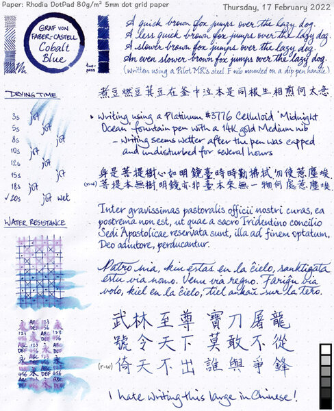
GvFC Cobalt Blue ink review - shading and sheen
A Smug Dill posted a gallery image in FPN Image Albums

-
Opened bottles of ink with no place in my desk as of 5Feb2022
A Smug Dill posted a gallery image in FPN Image Albums

From the album: Odds and ends
150 opened bottles of inks now have no place in my (wife's work-from-home) desk's main storage space, which is absolutely chockers, so most of these now live inside clear, stackable Daiso plastic storage boxes under the spare bed in the same room. Then there are also the 25 Diamine Inkvent Red Edition inks, although technically I can squeeze this into one of the desk's shallow drawers:© A Smug Dill
- 0 B
- x
-
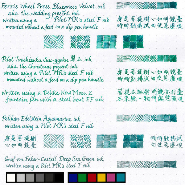
From the album: Shades of colour
Since I just did this for my wife to select ink colours with which to fill her pens, I may as well scan and post it.© A Smug Dill
- 0 B
- x
-
Poorly written minuscule n on GvFC ink bottle labels
A Smug Dill posted a gallery image in Premium Account Albums
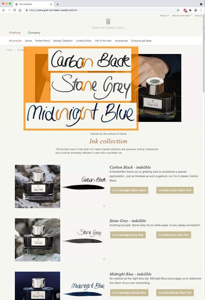
From the album: ~Nothing to see here, move along
Image source: Screenshot of https://www.graf-von-faber-castell.com/ink In reply to: https://www.fountainpennetwork.com/forum/topic/266387-graf-von-faber-castell-carbon-black-ink-review/#comment-4498066
- 0 B
- x
-
Matching inks to Pelikan Classic M20x pens - shortlist
A Smug Dill posted a gallery image in FPN Image Albums
From the album: Shades of colour
Shortlist of inks with which to fill some of my Pelikan M20x pens© A Smug Dill
- 0 B
- x
-

From the album: Chinese pens
The Schmidt steel F nibs on Moonman M100 and M200 pens, as well as the rebranded version on Kaco Edge pens, are just so consistent in how they put down befittingly narrow lines of ink. The cap seal effectiveness of the Moonman M200 pens aren't half bad, either. I filled these pens five weeks ago, and it seems only roughly 10% of the ink in the converters have evaporated in the meantime.© A Smug Dill
- 0 B
- x
-
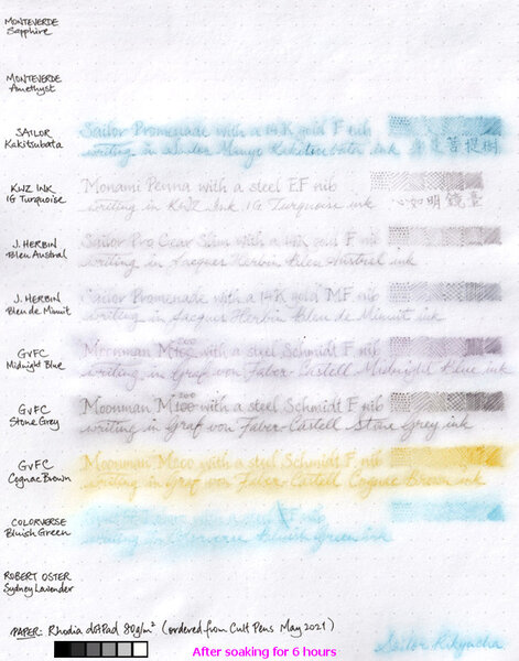
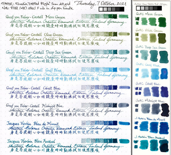
From the album: Ink performance testing
I didn't really set out to test the water resistance of these inks; I'd wanted to compare the paper in two different Rhodia dotPad No.16 notepads ordered a couple of years apart, and these inks just happen to be in pens that are on hand and ready to write. Graf von Faber-Castell claims its inks are indelible. Well, I guess the water resistance of the three I tested here aren't bad. Even though it'd be a struggle to read what was written in GvFC Cognac Brown after a long soak, I must say what's left of the marks on the page are distinct enough to make the text legible if one really tries. I am pleasantly surprised by the water resistance of the two Jacques Herbin inks, even if they aren't are good in that regard as GvFC. I'm disappointed to the same extent that the two Monteverde inks were washed away without leaving a trace.© A Smug Dill
- 0 B
- x
-
The main event is the site-wide discount(s): 10% off the total for orders of value £40 or more¹, and 15% off the total for orders of value £75 or more². The respective discount codes expire on 26 May. Then there are selected items specially discounted, including Faber-Castell Essentio Carbon fountain pens (all nib sizes) for £13.33 ex VAT each — before applying a site-wide discount code! They're probably worth buying at that price for the excellent steel nib alone, never mind whether you may be apprehensive about (numerous) anecdotal reports that their gripping sections cracking. Buy three or more of them, or two pens and a handful of Faber-Castell (‘international standard’) converters, and qualify³ to get, free of charge⁴, a Faber-Castell pencil case filled with a Pitt Artists Drawing Pen, a 2B pencil, an Apollo mechanical pencil, an eraser-tipped Grip pencil, a fineliner and a kneadable eraser as well. 75ml bottles of Graf von Faber-Castell ink are also £13.33 ex VAT each. I think the pens are regularly priced at £25 ex VAT, and the inks £20.83 ex VAT. — ¹ The actual eligibility criterion is order total value of £33.33 or more excluding VAT and shipping. Apply discount code BIRTHDAY10. ² The actual eligibility criterion is order total value of £62.50 or more excluding VAT and shipping. Apply discount code BIRTHDAY15. ³ With eligible Faber-Castell (not GvFC) products in the shopping cart totalling £33.33 or more excluding VAT. ⁴ If the item is in stock at the time for you to add, and you in deed (remember to) add it to your shopping cart before checking out.
-
I won't add much to previous fantastic reviews of this ink, such as the ones here: https://www.fountainpennetwork.com/forum/topic/335816-gulf-blue-graf-von-faber-castell/ But I will add my subjective impressions of using this ink and some more scans and photographs. Graf von Faber-Castell makes a luxury line of inks in beautiful, heavy glass bottles that will decorate any writing desk and will draw the eye. Despite the high price, the bottles contain 75ml of ink, so price per ml is actually reasonable. Considering other brands that sell in 20-30ml bottles for lower prices, but you get 2-3 times less ink. The packaging overall is top notch quality (personal note: I love the scent of the thick paper the box is made with, or maybe it's the ink used to print the graphics on the box). In my experience with 10 colors of GvFC ink, all are a varying degree of low lubrication and dryness. Some might be "liquidy" coming off the nib, but the overall ink flow will not be high. Colors like Moss Green, Cobalt Blue, and Hazelnut Brown are more saturated and a bit more lubricated. Deep Sea Green and Gulf Blue have little to no lubrication and are very dry, and so they benefit from juicy pens with smooth nibs. Or else you will feel every imperfection of your nib and texture of the paper you write on. Recently I have come to appreciate dry inks for the look they can provide if they are made of different hues of constituent dyes. This is the same type of dry flow and lack of lubrication one might find with certain translucent, multi-hue Sailor Manyo, Sailor Ink Studio, Troublemaker, and other inks of that nature. I am guessing the lack of surfactants, low saturation, and low lubrication are necessary to achieve color separation within a line, because some dyes flow farther than others, thus separating into gradients. Graf von Faber-Castell Gulf Blue is a multi-hue powder blue ink. It reminds me of blue hydrangea flowers, with areas of pale aqua-sky blue in dry areas and shifting to lavender in more saturated areas. It has a similar idea to Troublemaker Milky Ocean, but Milky Ocean is comparatively more purple-shifted and slightly more saturated. I highly recommend broad or cursive italic/stub nibs for this ink to get the most of the color gradient effect. The wetter your pen, the better, both for the smoother writing experience and for the ink to be more prominent on paper. Here is a scan of a mini-review sheet, paper is ivory-toned Fabriano Bioprima 85g with 4mm dot grid: Graf von Faber-Castell claims their inks are indelible. You can go back and forth about the ISO standard the brand uses, but in practical terms, the ink has some but low water resistance. The purplish line remains behind if you dab the wet writing with a paper towel quickly, and you might be able to read the original writing if the lines were thick enough, as you can see on the scan above (the grid lines are very faint compared to the cursive italic writing). The ink is pale to begin with, and the remaining lines are even more so. Here's a scan of some blue-turquoise inks next to Gulf Blue on ivory-toned Nakabayashi Logical Prime notebook paper: Photographs: On Tomoe River 52g "white" in a Hobonichi Cousin planner: Fabriano Bioprima 85g, using water brushes: Comparison with Troublemaker Milky Ocean: Milky Ocean: Milky Ocean:
-
Disclaimer: I enjoy doing mini ink reviews for my personal reference, and I'd like to share them with others if they might be of help to gain an insight into the ink's appearance and performance. I generally don't have time to put together super comprehensive reviews, like some of our fantastic reviewers here do (thank you so much for your hard work!), but hopefully these mini reviews will still be useful as another point of reference. Graf von Faber-Castell - Deep Sea Green Recently I became interested in GvFC inks. They seemed overpriced before, and I was severely disappointed with my first encounter with Deep Sea Green. I had bought a set of DSG cartridges for a trip, and when I popped one into a pen in my hotel room and saw the watery, pale tealy green, I thought "This is not what I expected". This is a very dry ink with low lubrication, so that did not predispose me toward it either. I went to a local fountain pen shop next day, bought a set of Visconti Sepia cartridges, and did not look back. That was over a year ago. Fast forward to a few months back. I kept looking at the writing made with this ink as well as at reviews. I have also since become more enamored with inks that 1. have a kind of watercolor look with color complexity (can see constituent dyes separate a bit) and 2. inks that are not so wet that they can provide high line definition with very thin hairlines. To that extent, high lubrication and wet flow are generally exclusive of good line definition and are more synonymous with increased line thickness. There was a good sale on GvFC inks around Black Friday, and so I ended up with 5 bottles of various colors, including this one. I'm very happy to own this ink and other Graf von Faber-Castell inks. It is true: the bottles are absolutely luxurious--the best I have experienced to date of any brand. The way the bottle cap opens so smoothly and is very heavy is just so pleasant. I even love the scent of color print dyes in the cardboard packaging. It's all just perfectly appealing and tactile. The inks themselves tend to be dry, with varying degrees of lubrication depending on color. Deep Sea Green in particular is not well lubricated. However, it is a sacrifice I am now willing to make given the aforementioned conditions. What's cool about this ink is that it is not monochromatic, and it really does look like watercolor. It can be more or less gray or blue, or green depending on concentration, paper, and illumination. Drying time is very fast to super slow--depends on whether you've let it sit and concentrate in a pen. At the end of this review, I am attaching a photograph of how this ink looks once it sits in a pen for a month and becomes fairly concentrated. The periods take close to half an hour to dry at that point (or even longer), until they stop smearing easily. That's an extreme case, but some inks do this more than others. Another ink that behaves like this in concentrated form is J. Herbin Lie de The, which can take multiple hours to fully dry in the dotted spots. Water resistance is quite good: well-defined gray line remains. This ink is an excellent candidate for watercolor-type drawings. While Deep Sea Green can look somewhat similar to J. Herbin Vert de Gris, the two are very different in details. Vert de Gris has a very chalky pastel finish with some watercolor wash, Deep Sea Green looks like watercolor with more in-line hue variation. Bottom line: A+ art and specialty ink. Beautiful and soothing for personal journaling for those who appreciate nuances of color and finish on good paper. I would not recommend it for note taking or professional environment due to lack of lubrication, dry flow, and rather pale appearance when fresh. If you let it concentrate, you will encounter long drying times, which is also not good on-the-go. Papers used in this review are: Fabriano Bioprima 4mm dot grid - a kind of ivory color, lightly textured, uncoated Kokuyo loose leaf A5 - lightly coated white Japanese paper Nakabayashi Logical Prime notebook - coated and super smooth ivory-toned Japanese paper, shows things like sheen and hue variation pretty well Photographs: Scans: Fabriano Bioprima, ivory: Highly concentrated version that took forever to dry in the "dots"; paper is Kokuyo Loose Leaf A5. Ignore the comment about using this for notes and professional environment -- that's before I realized just how long it takes to dry like this..
-

Interview With Count Charles Alexander Von Faber-Castell
Appelboompen posted a topic in Other Brands - Europe
Hi fellow Graf von Faber-Castell enthusiasts, We made an interview with the Count von Faber-Castell and perhaps you find it interesting: https://www.youtube.com/watch?v=eSMiGR6cFqQ P.s. don't forget to subscribe to the channel for more cool videos regarding writing instruments! -
I was recently looking at my profile and debating whether I should add a favorite ink. One of my favorites when using cartridges has always been Graf von Faber-Castell's Hazelnut Brown. Graf's inks no longer seem to be available at the U.S. stores I normally order from (Goulet, Pen Chalet). The manufacturer's site doesn't seem to have a direct-to-consumer sales option. The ink does still appear to be in production, and is available at JetPens, but it seems slightly ridiculous to order a European ink from Japan to go the Americas. Does anyone know the status of these inks in North America? Thanks.
-
I'm curious about a few colors in the GvFC line, but have not decided if I want to "pull the trigger" yet, so to speak. Seems like they are well-respected inks, but I can't tell if it's more because of the general impression of a high-end product due to the heavy-duty glass designer bottle, or if the inks themselves stand out in some way. (I must admit, it bothers me that they label their inks as "indelible", but the water resistance part of that is not near-100% like a true permanent ink would have. Almost all of their inks wash off significantly, but do leave something behind. People then give recommendations of GvFC inks for those who want permanence, and it's misleading. Other than trying to avoid having a document tampered with, I imagine vast majority of people who want high water resistance just want it for low susceptibility of their writing to, say, picking up a written page and smearing the writing if one's hands are not perfectly dry, or an accidental flooding of an area where a journal is kept, or any number of sub-optimal long-term storage conditions that involve water or dampness. indelible: (of ink or a pen) making marks that cannot be removed. synonyms: ineradicable, inerasable, ineffaceable, unexpungeable, indestructible, permanent, lasting, persisting, enduring, stubborn, ingrained, unfading, imperishable; More ) That said, I can forgive some semantics, if the product is good otherwise, and I'm curious about the inks themselves. For those here who use the GvFC inks--what do you like about them that makes them stand out? Or else, if not stand out, what do you like about their behavior? Would you get them again if you found other brands' inks in similar enough colors?
-
My second CRV ever. Thank you, amberleadavis! I'm glad I got to see so many inks. I had never seen any of them on paper in person. These are not all the pages, I'm trying to come up with things to doodle in the other pages. Seitz-Kreuznach Palm Green and Pelikan 4001 Dark Green. Seitz-Kreuznach Palm Green + Rohrer & Klingner Verdigris
-

First Look: Graf Von Faber-Castell Tamitio Calligraphy Set
dms525 posted a topic in Fountain Pen Reviews
I am always on the lookout for new fountain pens with italic/calligraphy nibs. I had recently bought two Graf von Faber-Castell pens and had their nibs ground to cursive italic by Mike Masuyama at the San Francisco Pen Show in August. I was enormously pleased with how these nibs performed. So, when I got an email from La Couronne du Comte in September announcing a new GvF-C Tamitio Calligraphy Fountain Pen set with 3 italic nibs, I didn’t hesitate to order. Actually, it turned out to be a pre-order. The pens had not yet been produced. Then there was a further delay due to production or quality control problems with one of the nibs. I finally received the pen and nib set yesterday. It was worth waiting for. Faber-Castell has two lines of pens, each with several models. Their more expensive series is called “Graf von Faber-Castell” and ranges from the famous “Pen of the Year” (POTY) luxury pens to the Tamitio at a much lower cost. The Tamitio is the only model in the GvF-C range with a steel nib; the other models have 18Kt gold nibs. It also has a different clip and is a shorter pen, although the “Classic” series pens are more slender. The Calligraphy set includes a black Tamitio pen and three italic nibs. The pen is also available with a single round nib in several widths. The barrel is enameled brass and feels substantially weighty. The cap and sections are plated - I have read they are plated with rhodium and elsewhere that the plating is platinum. The nibs are 1.1, 1.4 and 1.8 mm wide respectively. The pen and nibs seem to be of the same high quality as the other GvF-C pens I own. The nibs are rather stubbish, but do write with enough line variation for use in italic or gothic calligraphy. Of course, they can't be compared to the GvF-C gold nibs that were custom-ground for me by Michael Masuyama, but the whole set costs much less that either of the other pens. Most of the Graf von Faber-Castell pens have a form recalling the company’s origin as a maker of lead pencils. They have straight barrels and generally are smaller in diameter than most pens. This concerned me before my first purchases of this make, but I found the Intuition Platino very comfortable and the thinner Snakewood LE in the Classic model quite usable, albeit rather thinner than my personal ideal. The Tamitio’s diameter is between that of the Classic and Platino pens. It is missing the slight flair at the nib end and has a very short metal piece for the section. This makes for a mildly uncomfortable grip. In fact, I am not sure just how I will end up holding this pen. GvF-C pens for size comparison. L to R: Classic (Snakewood LE); Intuition Platino; Tamitio All in all, I am happy with this set. I expect I will accommodate to the ergonomics of the barrel. I’m thinking about getting another Tamitio, so I can use two of the italic nibs at once. David -

Graf Von Faber-Castell - Spring In Converter?
The Phoenix 924 posted a topic in Other Brands - Europe
I just received a very beautiful Graf von Faber-Castell Classic in the mail today and I noticed that there was a spring in the converter (picture attached to show detail). Any idea how it might have gotten there and what I might do to remove it? Or would it just be easier to contact GvFC's warranty service and ask for a replacement converter? Thank you!
-
Graf von Faber-Castell was founded in 1761 and developed into the major manufacturer of wood-cased pencils. With time they started to offer much broader range of products. Few years ago company's introduced six inks. Last year they've added three new colors to the line. This year they've done the same. Three new GvFC colors hit the shelfs. Burned Orange Carbon Black Cobalt Blue Deep Sea Green Electric Pink Garnet Red Hazelnut Brown Midnight Blue Moss Green Royal Blue Stone Grey Turquoise Violet Blue Burned Orange is nice orange ink with rich shading. Probably it's not the best orange ever created but if you like the brand and look for some new orange this one is more than decent. The flow is very good, lubrication satisfying, there's almost no feathering or bleedthrough. Drops of ink on kitchen towel Software ID Color range No-name notebook, Baoer 388, IPG Leuchtturm1917, Faber-Castell Ambition, M Moleskine, Faber-Castell Ambition, B Water resistance
-
Graf von Faber-Castell was founded in 1761 and developed into the major manufacturer of wood-cased pencils. With time they started to offer much broader range of products. Few years ago company's introduced six inks. Last year they've added three new colors to the line. This year they've done the same. Three new GvFC colors hit the shelfs. Burned Orange Carbon Black Cobalt Blue Deep Sea Green Electric Pink Garnet Red Hazelnut Brown Midnight Blue Moss Green Royal Blue Stone Grey Turquoise Violet Blue Electric Pink is quite cool.Not as cool as Rohrer & Klingner Solferino but it has some character. The ink behaves well, doesn't cause feathering (unless you use really bad paper) The flow is agood, close to J. Herbin inks. The ink feels rather wet. In wet nibs it can offer nice shading. Drops of ink on kitchen towel Software ID Color range Rhodia, FC Ambition, M Leuchtturm1917, Faber-Castell Ambition, M Moleskine, Faber-Castell Ambition, B Water resistance Mini-comparison
-
Graf von Faber-Castell was founded in 1761 and developed into the major manufacturer of wood-cased pencils. With time they started to offer much broader range of products. Few years ago company's introduced six inks. Last year they've added three new colors to the line. This year they've done the same. Three new GvFC colors hit the shelfs. Burned Orange Carbon Black Cobalt Blue Deep Sea Green Electric Pink Garnet Red Hazelnut Brown Midnight Blue Moss Green Royal Blue Stone Grey Turquoise Violet Blue Turquoise is one of three new additions to the line. As many of you know I'm not a turquoise fan. There are turquoises that are tolerable but GvFC ink is more on a dreadful side. It has it all that makes me clench the teeth. Aargh. Apart from being ugly, there's nothing wrong with it. The flow is average, maybe closer to Pelikan 4001 than J. Herbin but I would be surprised to hear it felt to dry. There's practically no feathering and bleedthrough. The ink lacks saturation a bit. Drops of ink on kitchen towel Software ID Color range Rhodia, FC Ambition, B Discovery 70 mgsm copy paper, Waterman Hemisphere, F Rhodia, Graf von Faber-Castell Guilloche, F Moleskine, Faber-Castell Ambition, B Water resistance Mini-comparison Rhodia, GvFC Guilloche, F
-

Graf Von Faber-Castell Pen Of The Year 2010 - Caucasian Walnut Wood
visvamitra posted a topic in Fountain Pen Reviews
This review will be very similar to Graf von Faber-Castell Pen of the Year 2003 review. The reason is simple – these pens are very similar – materiał and finish are different but the construction andinternal are practically the same. As I’ve mentioned in previous review I find Faber-Castell / Graf von Faber-Castell design compelling and I enjoy most of their creations (except Basic – this pen writes well but is ugly). While I always thought GvFC series of POTY (Pen of the Year) looked intriguing, I haven’t expected I would ever try one. These pens aren’t cheap and unless you own your own oil refinery you wouldn’t buy one on impulse. I’m sure I wouldn’t. I’m not THAT spontaneous. One of polish collectioners (wodnik_olszynek on piorawieczneforum.pl and forumopiorach.net andvodnikvolsovecek on FPN) sent me a few high-end pens to try and review. It may happen I will help some of you to blow through a significant portion of pen-pleasure budget. Or maybe I’ll help you in making decisions they’re not worth it. Pen of the Year 2010 was made from Caucasian walnut wood – this wood is tough and not particularly elastic yet it does not warp or splinter. It also better withstands compression and flexing forces than oak. In short, it is the ideal wood for the stock of a gun – and for very special writing implements. It possesses a beautiful figuring, with fine but marked patterns. The hand-carved ‘fish scales’ pattern rounds off the overall impression of the barrel. Overall impresions This pen looks great. Not as good as Poty 2003 but as it combines my favourite materials – wood and metal I find it hard to resist. Nothing compares to the feel of wood in the hand. I do realise it’s not the most durable material for making fountain pens but for me it’s a joy to write with wooden pen. This pen may be considered by some as rather ornate but I feel the design is balanced and not as gaudy as new additions to the POTY line. Let’s look at some of it’s elements: One of the most characteristic feautures is a beautiful platinum-plated cap with a spring-loaded clip that is easy to operate.The metal cap is substantial and heavy. If you enjoy industrial design, you will probably enjoy this one as much as I do. The clip is hinged and it has little grooves under the clip where it would be able to grip a shirt or pen case. Basically it’s a similar design as on their Classic line of pens, but, definitely, larger. The blind cap unscrews to reveal the piston knob. The knob itself is large and easy to turn. It has a metal plate on the end with engravings indicating it is a pen of the year and the number of the pen. Metal section is smooth and due to material it can get slippery if your hands sweat, but I believe in this case plating works fine to prevent it. This metal has different feel to it than Lamy Studio section. As POTY is a piston-filler there’s also grey tinted ink window composed into section that alllows to see the ink level. My preference would be to have it lighter so that ink color is clearly seen. Other thing that is interesting about this model is the use of the case-hardened metal parts and the fine engravings. Until the late 19th century, case hardening was the sign of a high-quality gun, with the inimitable shimmering coloration it provides. For centuries, the technique was handed down by word of mouth and was something of a secret art. The metal parts are usually packed in carbonized leather and heated to convert the surface into steel; the colours appear on cooling. Some 20 parameters contribute to the beautiful visual effect, including the thickness of the metal, the temperature, and the rate of cooling. Before the case hardening, the engraver cuts a groove with a dovetail cross-section, which the 24-carat gold inlay work is later set into and then polished. In other words the embellishes on this one may look simple but it’s good to appreciate doing them and making them last requires a lot of skill and time. Filling System The POTY pens are the only ones in GvFC line that use the piston system. This piston-filler feels well made and is efficient and holds reasonable volume of ink – 0,8 ml. POTY pens can be send to GvFC in Germany once a year for a free servicing in case something unexpected and / or disturbning happens to the pen. Nib (Kyonooto’s Kokeiro on Rhodia) While GvFC doesn’t offer wide variety of exciting nibs, the ones you can have are not only nice, they also perform very well. You can have Pen of the Year with either fine, medium or broad nib. POTY 2010 has a fine nib that writes smoothly and glides across the paper the way I like it most – without too much of a feedback. The nib is rather rigid and I wouldn’t risk trying to press it too differentiate line width. Dimensions Closed: 135 mm Open: 130 mm Barrel diameter: 15 mm Weight: 81 g (yes, it’s heavier than POTY 2003) Summary Pen of the Year 2010 is an interesting and well made pen. It’s more a collector’s / discriminate user’s pen than every day cary choice for everyone. The price of this model can reach 3 000 euros (usually it’s sold for 2000-2800 euros). It’s crazy expensive. Sure, I guess sometimes it’s possible to make good deal but even 25 % of MSRP is a significant amount of money most of us could use in a different, probably more mondaine way. While I enjoy the feel of caucasian walnut in the hand I find POTY 2003 more appealing. On the other hand I appreciate the skills used the creatye this pen. -
Graf Von Faber-Castell Pen Of The Year 2003 – Snakewood
visvamitra posted a topic in Fountain Pen Reviews
I have an inexplicable weakness for Faber-Castell / Graf von Faber-Castell fountain pens design. I enjoy their creations more than a bit. While I always thought GvFC series of POTY (Pen of the Year) looked intriguing, I haven’t expected I would ever try one. These pens aren’t cheap and unless you own your own oil refinery you wouldn’t buy one on impulse. I’m sure I wouldn’t. I’m not THAT spontaneous. Happily one of polish collectioners (wodnik_olszynek on piorawieczneforum.pl andforumopiorach.net) sent me few high-end pens to try and review. It may happen I will help some of you to burn through a significant portion of pen-pleasure budget. Or maybe I’ll help you in making decisions it’s not worth it. I’ll start with GvFC Pen of the Year 2003. Graf von Faber-Castell introduced first Pen of the Year in 2003 and that’s the one I had a chance to try. The first GvFC pen of the year was produced from snakewood, one of the densest and hardest types of wood in the world. A relatively rare wood found in Suriname, South America, it get its name from the black blots and splotches which looks like the skin of a snake. Typically used for luxury umbrella handles, walking sticks and violin bows, the eye-catching barrel of the pen is accentuated by the platinised metal fittings. The 18 carat solid gold nib (available in fine, medium and broad widths) is ‘run-in’ by hand before leaving the workshop. Each pen is individually numbered on the mechanism of the magnum-sized plunger (the part of the pen which holds the ink reservoir). Overall impresions I’ll be honest. Graf von Favber-Castell design appeals to me. I enjoy most of their pens. This one isn’t an exception. It combines my favourite materials: wood and metal in elegant and interesting way. Visually I find this pen stunning. In hand it feels heavy and well manufactured. The metal cap is substantial and looks great. If you enjoy industrial design, you will probably enjoy this one as much as I do. The clip is hinged and it has little grooves under the clip where it would be able to grip a shirt or pen case. Basically it’s a similar design as on their Classic line of pens, but, definitely, larger. The thing that bothers me in this pen is plastic inner cap - it feels cheap. The blind cap unscrews to reveal the piston knob. The knob itself is large and easy to turn. It has a metal plate on the end with engravings indicating it is a pen of the year and the number of the pen. Metal section is smooth and due to material it can get slippery if your hands sweat, but I believe in this case plating works fine to prevent it. This metal has different feel to it than Lamy Studio section. As POTY is a piston-filler there’s also grey tinted ink window composed into section that alllows to see the ink level. My preference would be to have it lighter so that ink color is clearly seen. As I’ve mentioned it’s a heavy open, not everyone will enjoy using it. Filling System The POTY pens are the only ones in GvFC line that use the piston system. This piston-filler feels well made and is efficient and holds reasonable volume of ink – 0,8 ml. POTY pens can be send to GvFC in Germany once a year for a free servicing in case something unexpected and / or disturbning happens to the pen. Nib New LE KWZI ink - Northern Twilight While GvFC doesn’t offer wide variety of exciting nibs, the ones you can have are not only nice, they also perform very well. You can have Pen of the Year with either fine, medium or broad nib. The one I tried has medium nib that can be described as medium + (as seen on comparison), rigid nib that is very smooth. The nib is very wet and enjoyable. It does justice to inks that are allowed to run through it’s regal feed. Dimensions Closed: 135 mm Open: 130 mm Barrel diameter: 15 mm Weight: 72 g Summary What can I say – this pen looks stunning. It’s more a collector’s / discriminate user’s pen than every day cary choice for everyone. The price of this model can reach 3 000 euros and more (although usually it’s sold for 2000-2800 euros). It’s crazy expensive. Sure, I guess sometimes it’s possible to make good deal but even 25 % of MSRP is a significant amount of money most of us could use in a different, probably more mondaine way. If I could afford this pen though, I would buy it. For its classy look and the feel in my hand. -
Graf von Faber-Castell was founded in 1761 and developed into the major manufacturer of wood-cased pencils. With time they started to offer much broader range of products. Few years ago company’s introduced six inks. Recently they’ve added three new colors to the line Carbon Black Cobalt Blue Deep Sea Green Garnet Red Hazelnut Brown Midnight Blue Moss Green Royal Blue Stone Grey Violet Blue is the newest addition to Graf von Faber-Castell line of inks. I was disappointed by last three inks (Deep Sea Green, Royal Blue, Midnight Blue) and always thought that they lack solid violet/purple in the line. Once I saw pictures of new Violet Blue on La Couronne du Comte websiite I was interested to try it, however after reading reviews of the ink I’ve decided to buy cartridges, not a bottle to try it and see how bad it really is. Well, I thought I would hate this ink but it’s not the case. It’s subdued and subtle. In really wet nibs or broader ones it can have some charm, especially for people who enjoys all kind of shades of Lavender leaning weak Violet. I don’t so I qwon’t use this ink after posting this review. What I can say to help you make chouice if it’s worth the money? Well, the flow is decent but not very good, it offers some shading but because the ink isn’t saturated it won’t be prominent / exciting in drier pens. In theory it’s water resistant but In my opinion the faint greyish trace left after soaking the paper isn’t perfectly ligible. In other words – I’m again disappointed by new GvFC ink offering. It’s sad because when they’ve entered the market with first six colors I was in awe. I liked them all (except Garnet Red for everything and black – for color). The last four addtions are average at best. I hope they’ll offer something as good as Moss Green again (we can discuss the color but this ink behaves perfectly well on all pens, in my experience). Be sure to check Lapis review of this ink. He's done great job presenting and describing it, probably in much more objective way than I have done it Drops of ink on kitchen towel Software ID Tomoe River, Kaweco Classic Sport, B Leuchtturm 1917, Kaweco Classic Sport, B Oxford, Hero 5028, stub 1,9 No-name copy-paper – Faber-Castell Ondoro, M Water resistance
-
Graf von Faber-Castell has launched a new limited edition series, called the Limited Edition Heritage with two striking fountain pens. One called Ottilie with the barrel in a nice violet shade, one called Alexander in a green barrel. Both barrels are inspired by the designs used by Bruno Paul in Alexander´s study and Ottilie´s ladies lounge. The smallest movement or change of lighting allows individual segments of the pattern to stand out amidst finest shading effects. The metal parts of the fountain pens are made of solid silver. The nibs are made of 18-K gold. As usual in the Graf von Faber-Castell fountain pens they are cartridge/converter fillers. Both pens are limited to 1.898 pieces and come with a price tag of € 1.480.- including the German VAT of 19% or € 1.243,70 without the German VAT (for shipments outside the EU). Further information and pictures can be found here: Ottilie: http://www.fritz-schimpf.de/Schreibgeraete/Fuellhalter/Graf-von-Faber-Castell-Limited-Edition-Heritage-Ottilie-Fuellfederhalter.html Alexander: http://www.fritz-schimpf.de/Schreibgeraete/Fuellhalter/Graf-von-Faber-Castell-Limited-Edition-Heritage-Alexander-Fuellfederhalter.html In addition to these new fountain pens Faber-Castell also launches a new ink color: violet http://www.fritz-schimpf.de/Marken/Graf-von-Faber-Castell/Graf-von-Faber-Castell-Tinte-im-Glas-oxid.html Should you have any questions, please feel free to contact us anytime.