Search the Community
Showing results for tags 'gold'.
-
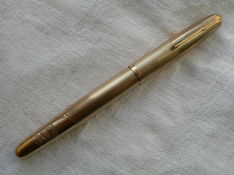
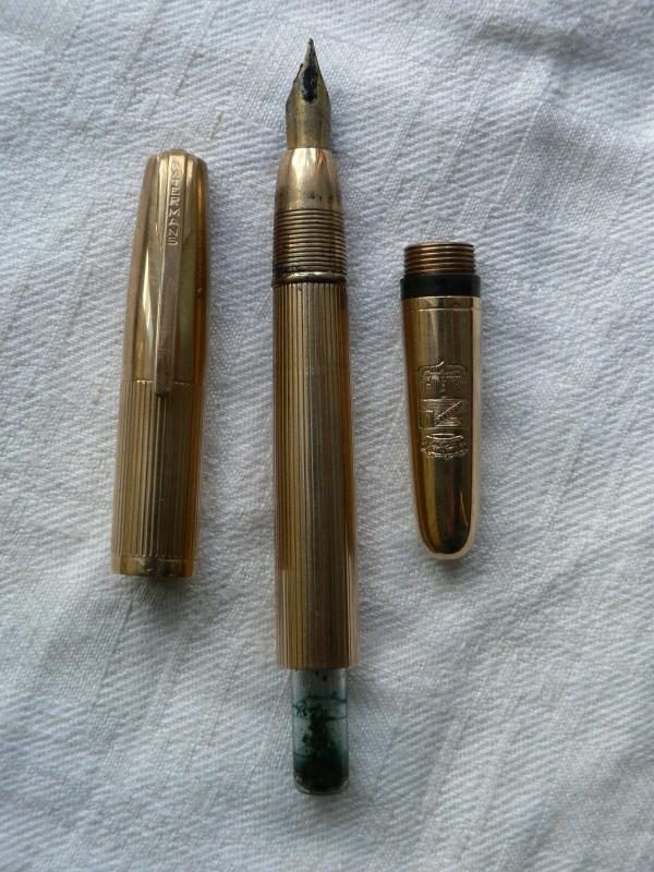
Waterman's Ideal 42 1/2V Gold Overlay:rolled, Filled Or What Else?
drop_m posted a topic in Waterman
Yesterday i've found this little Waterman's Ideal 42 1/2v at a flea market. The only imprint it has - except from the date and the initials which i think were made from the original owner - is "Waterman's Ideal 18 K.R." on the cap and "42 1/2V" on the twisting knob. The nib is a #2 made in USA, so i can suppose the rest of the pen is made in USA too. Can someone tell me more about the kind of gold overlay of the pen? There are no hallmarks of any kind, can i assume it is rolled gold?
-

Cartier Parker 65 In 18Ct 0.75 Gold Wire By Harry Elisha Of Elisha & Harmsworth
azeritrader posted a topic in Market Watch
Anyone have any idea what this is worth on the open-market, and should be insured for ? -
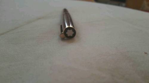
I found this one for a suspiciously good price... it looks like a Burgundy Cruise Collection but the trim is gold, none of the Cruise Collection have gold trim. And yet... here's what looks like a genuine (but vintage) Montblanc burgundy with gold trim that has a similar shape: http://www.ebay.com/itm/EUC-BOX-Montblanc-Classic-Burgundy-Bordeaux-Gold-Ballpoint-Pen-VINTAGE-RARE-/172121724109 So -- what are your thoughts. Is the 'mystery' pen real or fake?
-
Howdy FPers, A new PIF: This will likely be my last PIF for several months. I have a Platinum 3776 Century Bourgogne Fountain Pen. It is considered to be a demonstrator. It's a cartridge/converter, and includes the converter. The specs: 5 1/2 " capped, 24.6 grams with the converter installed. Of course it can use bottled ink or Platinum brand carts. This PIF includes postage paid worldwide . I purchased this Platinum when I first got under the spell of pen, paper and ink Addiction. I'd never bought a pen from the Eastern producers. I didn't know that the nibs were almost a full size smaller than other manufacturers. The nib is in the same condition it was when I bought the pen. I'm not sure why, but I simply don't care for Fine ( or smaller ) nibs. GUIDELINES : You must be a Gold Level Member for at least 6 months, going by the "Joined " date under your Avatar, You cannot have won a PIF from me in the past six months, Note: Please, since this is done on the honor system ~~~ if you have a Platinum Century 3776 ( or similar ) of any color, nib size, nib type or any pen like this ~~~ exclude yourself. As there is no way to monitor whether or not you do indeed have a pen like this one, just let your conscience be your guide !!! As members ask to be considered, a number will be assigned. At the end of the PIF, my Number Generator will be used to define the new owner of this very nice Platinum #3776, Bourgogne, Fine, 14kt nib fountain pen. One more thing I want to share with you: The reason I do this is that I simply want to share back to the FPN Community. This PIF is not a joke - I have done PIFs for other quite valuable pens in the past. On March 17 I will conduct the drawing. Now, have fun and good luck to all that hope to be the new owner of the Platinum #3776. aggie
-
While examining a recent acquisition - a Conklin ringtop - I noticed a crack beginning across the breather hole. Mr. Minuskin informed me that with use, the tines will eventually fall off unless someone repaired it...him, for instance. So I began to look around for a replacement nib, and saw one on the Five-Star site, which had a very similar crack. This, I thought, was interesting: that a cracked nib would still be saleable. I wondered if the quality of these nibs was sufficiently special that we'd want to keep them in use. Has anyone had this sort of experience with Conklin nibs? Are they great, flawed Greek heroes of nibs? Or is there a tendency for these things to be purchased by gorillas?
-
Can you help ID this pen? Found it in the study the other day... Sorry about the bad pictures.
-
It will be nice if this gets pinned... hoping for a kind Mod to help out. This thread will be used to update the list as necessary. Swatches will follow. SWATCHES...... (up to 63 for now) C.
-
I'm trying to find a value on a cross gold pen with Mickey Mouse on the clip. I appreciate any assistance.
-
Montblanc White Lacquer Solitaire Classique: Does The Plating Wear Off?
LuckyKate posted a topic in Montblanc
Hi all! This is my first post on the Montblanc forum. I'm interested in the white lacquer Solitaire Classique in either the rose gold or rhodium finish. However, as I've read that rose gold is not sturdy and wears easily, I'm concerned that the pen would lose its plating, not just on the nib but on the entire section. Is this something I should be concerned about given how expensive the pen is? And would the rhodium/platinum plating be sturdier and less prone to wear? I really love this pen's finish, but am concerned about how well it would hold up. Thanks for your help! -
I have happened across, what I have discovered to be a #35 Lucky Curve, with gold-plated floral relief. I have been unable to find its orginal cost and have only been able to find pictures of it (fortunately!), to determine what it is. It was purchased in 1907, as indicated by the engraving on the indecia states: "Glennie Biggs Feb 12, 07". I have not been able to find any relevant current values, despite it, on other sites, being referred to as "very rare". The nib is broken but other than that the pen has very little wear. Kind people please help me!
-
I got this old Sheaffer from my mom. I cant find this pen anywhere om the webs. It is gold plated, the lower part is gold plated silver and top is gold plated brass. The ring says: SHEAFFER "Crown" U.S.A. D.L. My mom got about 40 years ago.
-
My dad gave me this Parker 45 Insignia and its a very good writer,i know its a rare pen but i want to know more about it. Also i want to know what is the best ink tho use in it,i use Parker Quink Solv-X and it good but i know that there are better inks out there.
-
Having had samples of some of these amazing inks since May, it has taken a lot self-control not to leak any images of them. So it was great to get the go-ahead from Diamine earlier this week, and we're allowed to put up some more detailed information on Friday 28th August, 2015. That's TODAY! Now, there have some changes over the last few months and some colours have been altered and decisions made about whether there should be gold or silver particles in any particular one but the people at Diamine did listen to those of us who passed comments and opinions and the resultant ten colours are the ones that will be on the shelves soon. I'm sure Chrissy and the others who've been looking at them, will do much better and in-depth reviews than I tend to do but there is a reason for my brevity. That is that I believe all opinions about a particular ink (no pun intended) are subjective. There really isn't any way of communicating something link ink/paper/pen correlation on a computer screen. For all the best will in the world, monitor calibration; a person's eyesight and so on, have a vast impact on how someone might perceive an ink's qualities and characteristics. So I don't tend to do that. My scanner and computer are pretty accurate in terms of colour reproduction but I just point out that the rest of you could quite possibly comment that the inks are different that the images I've uploaded. Well' that's just the way it is. We all know about the differences between nibs of the same make, width etc, not to mention paper batches, so all I want to show is a brief introduction to this new range of colours and let you all make up your own minds when you've tried them out. The written examples were done with a Sailor Sapporo, Broad nib (that tends much more to a Western Medium) and on Rhodia 80gsm dot paper. There were no problems with the pen: nib; feed and converter all came out of the tests totally unscathed. I decided to use the Sailor and not my usual Safaris, to try to put those of you with doubts about using this type of ink in a 'good' pen, at ease. However I will say that as I don't soo my using this sort of 'effect' ink in the course of normal daily writing, I don't imagine using them in a piston-filling pen - purely for reason of volume and nothing to do with perceived value of that any writing instrument. So take a look and ENJOY! Finally, these last two pics were sent from Diamine and are 'photos' rather than scans. They certainly give an idea how things might look with indirect lighting. To sum up, these are a great lot of inks that can only go on to expand Diamine's involvement in the market place and it's nice to see the awareness of the necessary diversity, to stay up there at the top! Well done!
-
There is a wise catch-phrase coined by the seminal 90s British sitcom Spaced. "Skip to the end." And so I will: This is the single best pen I have ever owned, ever held, ever used. It is so good that it has made me believe - maybe just a little bit - in the old, oft-told myth of The One Pen. There. Good. I uttered the sacrilegious words. Now that they are free and I am free too we can backtrack a bit (as I take a deep breath) and I can attempt to explain how this little cylinder of rosewood, ebonite and gold caused the furnaces of hell to freeze to ice. As some of you will remember, this is not my first Hakase. The first - a rather fetching buffalo horn torpedo - confused initially, before wrapping its tentacles firmly around my heart. This pen too came as something of a shock (no, slow down - I am getting ahead of myself), but even then there were no, even fleeting, feelings of disappointment. I had long wanted a wooden pen and after being gently guided through the options by Hakase's Mr. Ryo Yamamoto, I slowly narrowed my choices to the shape (flat-top), size (large) and wood (rosewood). I paid my deposit and began my wait. The photographs I recieved from Mr. Yamamoto in answer to my questions - 1. l-r: buffalo horn torpedo, RW15C, RW10C; 2. l-r: ebony, rosewood, cocobolo http://farm9.staticflickr.com/8245/8453562872_0895dd1ae4_c.jpg http://farm9.staticflickr.com/8374/8454014328_d5e5fd7e28_c.jpg The pen arrived with little fanfare as all Hakases do: a small wooden box wrapped in the company's steel-grey wrapping paper. Open the paper, pull the lid off the perfectly-fitting box and there was the pen. It was, and is, absolutely gorgeous. http://farm6.staticflickr.com/5332/9291677875_14717ca64c_c.jpg http://farm4.staticflickr.com/3742/9294461724_e30aaa18ab_c.jpg http://farm6.staticflickr.com/5451/9291690423_71cb73d81f_c.jpg The shape is highly unusual but deceptively simple - a large cap worked to a slightly conical summit allied to a voluptuous barrel that narrows to an abrupt end (where the signature Hakase production date is carved into the wood). This allows the cap to post comfortably and securely. The pen, though large, is light and comfortable, and is is perfectly balance whether the cap is posted or not. Only the gold roll-stopper breaks the clean, unadorned lines. http://farm4.staticflickr.com/3669/9294417512_51ffeb0247_c.jpg Although the pen is exactly what I expected, some details still manage to surprised. Google translate being what it is, I intended to ask Mr. Yamamoto how one could possibly fill, empty, clean and care for a pen constructed entirely from wood but could not reduce the question to sufficiently simple syntax. Not that it would have been necessary, for the apparently wooden section turned out to be the most glorious, warm, sensual ebonite, polished to a lustre that would make even the old vintage gods of yore weep. http://farm8.staticflickr.com/7322/9294426386_d224a96b57_c.jpg The wood itself as I wished: it smells deep and sweet and organic and is pockmarked with veins and crevices and seams. It feels as I expected the buffalo horn to feel: rough and intimate; perfectly flawed as only a once-living, experiencing thing can be. It has been masterfully worked, from the hand-carved threads that screw on and off with the faint rubbing sound of rope being fed through an old loom, to the nearly imperceptible join where the cap's hollow section and rounded top meet. http://farm3.staticflickr.com/2831/9291638983_01167814e7_c.jpg The furniture is as to be expected of Hakase: solid, hand-beaten 14k gold. I understand from Mr. Yamamoto that white gold and sterling silver are now options but I cannot think of a single Hakase model that would benefit from a more monochromatic palette. As my buffalo pen had a circular nipple roll-stopper, I chose a pyramid for variety, and I am glad I did for it seems to catch the light and gleam in a more three-dimensional, more dramatic, way. Hugged lovingly within its trough, the band is neither loose nor tight and I find myself absentmindedly rotating it around the barrel as one would a wedding-ring on a fleshy finger: smooth as olive oil and hypnotically satisfying. Reassuring even. http://farm4.staticflickr.com/3686/9291648137_16a2a0c5f8_c.jpg Nib, converter, feed: all Pilot. Off-the-shelf, yes, but of the highest quality nonetheless and perfectly integrated. For this pen I requested a fine nib and once again Hakase delivered. It is without a shadow of a doubt the single best nib for me and my illegibly cramped style of writing that I have ever used. Even by Japanese standards its line is fine, but it is so consistent and predictable, so smooth and forgiving of angle and pressure, that I have not been able to put it down. http://farm8.staticflickr.com/7351/9291640201_2457222466_c.jpg http://farm8.staticflickr.com/7309/9291637557_c24549a04a_c.jpg http://farm3.staticflickr.com/2840/9299899748_67982fbe0e_c.jpg I have an obsessive methodology that governs my writing. Ever since I began work on the second first draft of Unpublished Novel #1 I have changed both pen and ink every day. This was not only an excuse to amass and horde, it had at its root a practical purpose. Not all writing days are created equal, and altering the visible signature simplifies the thankless transcribing process months later. General rule: if a colour (day) begins eloquently, it will most likely remain eloquent. If not, skip ahead to the next colour (day) and fill in the blanks later. This simple regimen has remained unbroken for nearly five years, through two and a half novels and countless edits and rewrites. Until now. Since I received this pen, held it in my hands and first filled it with Iroshizuku Shin Kai, I have used no other. This is not out of necessity - I am not currently travelling (even then I carry between three and seven pens) and I have over a hundred pens and probably a good deal more inks easily to hand. No. I have, quite simply, not wished to use another pen. Size comparison - MB149, RW15C, Buffalo Horn Torpedo http://farm8.staticflickr.com/7382/9294428972_69eaea5cae_c.jpg To add insult to injury, the price is also shockingly resonable. No, you're right - calling a pen that retails for ¥162,000 (~$1,600) good value is a sure sign of insanity, but stay with me. First, because of the lack of embellishments (read: gold), this pen is several magnitudes cheaper than most of Hakase's creations. Then, when we remove immediate family from the contest and look at alternatives based upon price, all are big brand variations on a mass produced theme. And so the question becomes: would you rather pay for a fancy finish (raden on an M1000 for instance), elaborate gratuitous embellishments (MB POA 4810s, themselves 30%+ more expensive), or a unique, handmade product of singular skill and obsession where your fingers can sense the love and attention in every touch? Before we reach the foregone conclusion, allow me a brief addendum, for I bought a Hakase case with my pen and must include at least a mention in this review. Outsourced to these people, it is constructed of the most beautiful fragrant leather and is crafted as immaculately (and with the same methods, last and all) as hand-made shoes. Although I ordered it as a separate entity, it has been custom-made (without me asking) to fit this pen and this pen only. There is no strip for a clip (visible on the website here), and a little hole has been cut at exactly the height of the roll-stopper. It holds my pen, and my pen only, perfectly and it is impossible to appropriately describe how lovely it feels to have the pyramid slide into place and to see it poking out through its rabbit-hole into the light. http://farm4.staticflickr.com/3767/9294445330_4ee178e111_c.jpg http://farm6.staticflickr.com/5460/9291636735_d11edc8c2c_c.jpg But forgive my brief digression, for now we've returned full-circle back to where we began. This is the single best pen I have ever owned, held or used. It is so good that it has made me believe, maybe just a little bit, in the old myth of The One Pen. Perhaps now you will understand why.
-
We read a lot about gold nibs being more flexible, but a steel nib can be just as flexible as a gold nib, if it's thin. Flex: It's true that 18k gold metal is about half as stiff as steel. So for identical dimensions an 18k gold nib is about twice as flexible as steel. But dimensions are very important too. For a given metal, the nib stiffness is proportional to width multiplied times the cube of thickness. The cube here means than reducing thickness by only twenty percent will double the flexibility of the nib. In other words, a steel nib can have the same flex as a gold nib, if it's 20% thinner. Line width: Furthermore, why do you want flexibility in a nib? If your answer is to increase the line width when you press, we need to consider the arch of the nib. The amount of spread is influenced by the amount of arch. You can approximate the arch with angles as indicated by the dashed lines in this sketch. The greater the arch, the greater the angle and thus the greater the separation as the nib flexes. So, variable line width is determined by more than nib metal. Thickness and arch play a big role. Durability: Of course you want the nib to spring back to its original shape after you press down. In this regard thinner steel is a better choice than thicker gold. There is less danger of it taking a permanent bend. So while we associate gold with quality and value, it's not always the best metal for the job. Steel is obviously a better metal than gold for your car's springs. It can be better for your nibs too, when properly designed.
-
Having had samples of some of these amazing inks since May, it has taken a lot self-control not to leak any images of them. So it was great to get the go-ahead from Diamine earlier this week, and we're allowed to put up some more detailed information on Friday 28th August, 2015. That's TODAY! Now, there have some changes over the last few months and some colours have been altered and decisions made about whether there should be gold or silver particles in any particular one but the people at Diamine did listen to those of us who passed comments and opinions and the resultant ten colours are the ones that will be on the shelves soon. I'm sure Chrissy and the others who've been looking at them, will do much better and in-depth reviews than I tend to do but there is a reason for my brevity. That is that I believe all opinions about a particular ink (no pun intended) are subjective. There really isn't any way of communicating something link ink/paper/pen correlation on a computer screen. For all the best will in the world, monitor calibration; a person's eyesight and so on, have a vast impact on how someone might perceive an ink's qualities and characteristics. So I don't tend to do that. My scanner and computer are pretty accurate in terms of colour reproduction but I just point out that the rest of you could quite possibly comment that the inks are different that the images I've uploaded. Well' that's just the way it is. We all know about the differences between nibs of the same make, width etc, not to mention paper batches, so all I want to show is a brief introduction to this new range of colours and let you all make up your own minds when you've tried them out. The written examples were done with a Sailor Sapporo, Broad nib (that tends much more to a Western Medium) and on Rhodia 80gsm dot paper. There were no problems with the pen: nib; feed and converter all came out of the tests totally unscathed. I decided to use the Sailor and not my usual Safaris, to try to put those of you with doubts about using this type of ink in a 'good' pen, at ease. However I will say that as I don't soo my using this sort of 'effect' ink in the course of normal daily writing, I don't imagine using them in a piston-filling pen - purely for reason of volume and nothing to do with perceived value of that any writing instrument. So take a look and ENJOY! Finally, these last two pics were sent from Diamine and are 'photos' rather than scans. They certainly give an idea how things might look with indirect lighting. To sum up, these are a great lot of inks that can only go on to expand Diamine's involvement in the market place and it's nice to see the awareness of the necessary diversity, to stay up there at the top! Well done!
-
I've got a number of vintage Watermans, and I notice that the nibs labeled "New York" (and one "Canada") are turning rainbow-colored. This doesn't seem to have happened with the newer nibs, but I wondered if anyone's seen this before. More importantly, would a scrub with baking soda restore the color? I'm mostly using Sailor Bungbox Eel in these pens - it's a great color. I'd hate to have to abandon it.
-
Hi everyone, I am looking for a gold toned ink that won't be too light on paper. I have seen someone using a nice golden metallic-looking ink but I wasn't courageous enough to ask I have seen the swatches for golden brown by Noodler's and Diamine and love these colors! But I was wondering if you could recommend some gold inks that are not so brown, and maybe easily available? Any thoughts? Thanks!
-
Hi Guys, I'd like to start playing around with some "home-made maki-e", i.e., experimenting with shellac lacquer and some metal dust to see if I can get some basic maki-e style patterns. Problem is, I have no idea where to get metal powder. A google search gives only providers of metal powders for industries. It's especially hard to find reliable sites that sell gold dust. But I'd like to experiment with silver, copper and bronze dust as well. Any ideas? thanks, Fabio
-
I am returning to fountain pens after a thirty year absence and have just fallen for a Parker Sonnet with a gold plated nib. It is smooth and easy straight off the bat whereas the solid gold nib Sonnet I tried was somewhat scratchy on first blush. I’m still thinking of getting the solid gold nib as I’m under the impression that after some use the solid gold will write smoother than the gold plated. Am I mistaken thinking that fountain pens like shoes where the best shoe is a little more uncomfortable at the beginning (a pair that fits just right at the beginning will be too large once they are broken in). After a hypothetical ten or twenty hours of writing with each nib would a solid gold nib feel much better than the gold plated nib?
-
First, If this is in the wrong forum or considered advertising, please, by all means remove it. I have no affiliation with the seller, I was just wondering if anybody had found any pen with a solid gold nib for cheaper. Anyway, the pen is a Hero 711 with a 10k solid gold nib. Yes, it is only 10k, but still, it is solid gold. And the price??? $16. $16!!!!!!! Has anybody seen a solid gold nibbed pen for cheaper than this one? Ebay link: http://www.ebay.com/itm/Hero-711-Black-Chrome-Cap-Fountain-Pen-New-In-Box-10kt-Solid-Gold-Nib-/230799200250?pt=LH_DefaultDomain_0&hash=item35bcb44ffa Thanks, Phillieskjk
-

How Rare Is This Waterman Hemisphere Finish?
DominikIsAdictedToFountainPens posted a topic in Waterman
Not long ago as a present, my grandfather gave me his old(at least 12 years old) Waterman Hemisphere fountain pen.After doing some research I found out that the finish I got is unenviable on the official site.The pen's barrel and cap are a dark blue colour and the clip and other finishes are golden.In addition on the box it says Leganza. Can someone tell me more about how rare the finish is and a bit of backup information?
-
One of my favorite inks is R&K Alt Goldgruen. It is a moderately wet ink, but even though it is wet, I found that it does not have good lubrication and does not seem to flow freely. I generally use Japanese and Indian F and M nibs on generic paper and notebooks (75 gsm). I have cleaned the pens and found the problem in a few other pens. I want to ask whether others face the same problem or whether it happens only to me
-
Hello , Can you help me to identify this french model in massive gold ? greetings from France.
-
I'm somewhat new to non-student fountain pens, so I had done a bit of research before hand before picking a 'vintage' pen to go with, and as per the recommendation of two friends of mine (one of which being the one that restored mine) I went with a Sheaffer Snorkel. It's a nice American made pen that's older than either of my parents. The one I got here is a Sheaffer Snorkel Admiral (circa 1953 based on some of the insides), won it for $41 when there was only a minute left and I was already annoyed at being out bidded for all the other snorkels (I wanted to get something like the burgundy red or forest green body, but this is nice ), and then I had it restored by Sean (Write on Time) to like-new condition. I was pleasantly surprised by the result, a nice lightweight pen that's easy to feel, writes smoothly and just feels classy. http://static.karlblessing.com/pens/intro/sheaffer_snorkel_close.jpghttp://static.karlblessing.com/pens/intro/sheaffer_snorkel_full.jpghttp://static.karlblessing.com/pens/intro/sheaffer_snorkel_extend.jpg I love it, I keep it with me most of the time when I go out, just wish I could find a nice single-pen case that I can slip it into for some more protection.