Search the Community
Showing results for tags 'gold'.
-
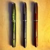
Francesco Rubinato Glass Dipping Pen Green & Gold Exquisite Glass Pens handcrafted in Italy in your choice of color. An elegant desk accessory, but even more fun to use! The pens are approximately 7" in length and can be used with any fine writing ink. Easy to use and clean, just wipe off the ink with a soft cloth or towel when finished. This lovely Green Glass Fountain Pen comes with a matching Ink Well making it a great gift for any occasion! Due to the age of the pen, the ink has evaporated to less than half of the bottle. The pen is complemented with a gold overlay. View this Item on our Ebay Site, Don't like the price? Make us an offer! http://www.ebay.com/itm/Francesco-Rubinato-Glass-Dipping-Pen-Green-Gold-w-Ink-Well-/222481428208

-
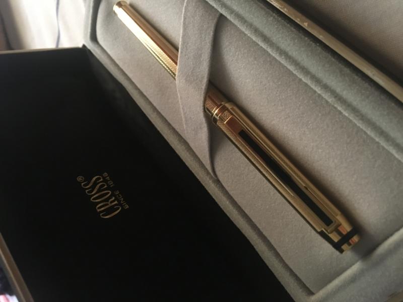
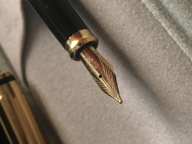
The pen was given to me by someone recently and i want to identify the model. The nib has "CROSS 18K 750" written on it. Thanks in advance.
-
Micheal's Fatboy - 5 Yr. Anv. Silencer Gold Fountain Pen Only 188 Fountain Pens with 18K Gold Two-Tone Nibs (F, M) * Screw-In Converter Fill Or Cartrdige (International Standard Short or Long) * Drill Holes Light Up By Reflecting Light * Aircraft-grade Aluminum Barrel & Cap * Laser Engraved Numbering * Cushy Black Rubber Rings give a Firm Grip * Steel Spring Clip * Well Balanced for Effortless Writing * Cap Screws on Front & Back when posting * Diameter of Barrel Same as FatBoy Pens * Length is 6 1/2" with Cap Posted on the end * Made in U.S.A. https://www.airlineintl.com/product/5-yr-anv-silencer-gold-fountain-pen
-
The National seems to be rather an obscure German brand, not often mentioned on fountain pen forums. As far as I can say their pens were of good quality but that's it; of no spectacular design and lacking far reaching innovation. Probably the most comprehensive historical account can be found on the already defunct Collectible Stars web page: http://www.collectiblestars.de/Angloamer.html I have a feeling that there is more to this brief history. Meanwhile, one of my few Nationals: http://i.imgur.com/bR4agvL.jpg National Favorit (74), F, ?1930s
-
Sailor is my favourite ink maker (ex-aeque with J. Herbin). Sadly their most interesting inks are available only in Japan or from internet retailers. There are few japanese shops famous for their wide and interesting range of Sailor inks. One of most well-known is Bung Box. A lot of people were taken by interesting bottles and intriguing colors. It seems however that recently many ink enthusiasts started to shy away from this line since Bung Box inks became much more bitterly expensive than other Sailor inks. The line consists of quite a few colors. My list is incomplete and most of the names aren't translated well. If you have full list of BB inks and/or could help me with correcting english names, help me sort this out 4B Blue/Black BB Espresso Dandyism Ebisu Gold Emerald Enshu Black First Love Sapphire Fresh Oranges of Lake Hamana Fuyiyama Blue Hamanako Eel Imperial Purple Ink of the Witch L’Amant Luminous Green Melancholic Gray Mocha Music Black Nostalgia Oamezaki Sunset Omaezaki Ocean Omaezaki Blue Orange Pink Ruby Sapphire Silent Night Soleil Tears of Clown Tortoise Shell Brown Before I write few words about the ink allow me to start by saying thank you mmg122 for sending me samples of different inks. It seems Ebisu Gold isn't amazingly popular. After trying it, I'm not really surprised. It's not good ink. It's not terribly bad either. The main issue I have with this ink is the fact it lacks saturation and lubrication. It felt somewhat dry in Lamy fine nib. Using it was rather unplesant. I do believe that in very wet pens the line may appear richer. In this particular pens/nibs combos though this ink was dissapointing. Drops of ink on kitchen towel Software ID Color range Rhodia, Lamy AL-Star, broad nib Leuchtturm1917, Lamy AL-Star, fine nib Tsubame, Lamy AL-Star, medium nib Water resistance
-
After buying a bottle of Diamine Sparkling Shadows, I had a quick thought before using it.. Before using inks like this with gold glitter, you are supposed to shake the bottle to evenly displace the glitter, but how does this apply to the ink when it's IN the pen? At some point the ink will settle once again in the pen, so will I need to somehow mix up the glitter again, or not? If so, how should I do it?
-
Howdy y'all, this beauty caught my eye while accepting donations at a thrift store. I knew nothing about fountain pens at the time other than loving the way it felt around my neck and except for exploring the Caren line of pens I'm at the same level of ignorance. I'm aware that I need something to deliver ink and would appreciate suggs on which vendor I should use. I would also be very grateful for any additional information I can use to brag about my sweet pen. I opened the pin in the parking lot where I got it and I'm almost positive the small piece fell out that I could never find. I might be mistaken because I found a similar one online and didn't see any additional pieces in the pictures that were posted. It says Caran D'Ache Swiss gold plated ,,g,, and a symbol. Does it have a name or style type? Minus a case of some type and an ink vessel is this pen complete? Thanks in advance to anybody who's got a second to holler back
-
Untipped Gold Nibs -- How Long Do They Last?
spaceink posted a topic in Fountain & Dip Pens - First Stop
Sometimes I see pen auctions with 14k nibs that appear as if the usual iridium tipping has been worn down to nothing. The cost of retipping is often more than the cost of the pen, so am unlikely to pursue the better option for cheaper pens. With an untipped steel nib, I can pretty much grind it to a stub and expect it to last a long while. With more delicate gold, however, I'm not sure how long an untipped nib will be good for. Does anyone have experience with this? Will an untipped gold nib likely last a good while? -
http://kephost.com/images/2015/07/23/370e744c3944c0f5d895c4916ba3b3c6.jpg I was lucky to receive a sample of the coming J.Herbin Emerald of Civor from Bureau Direct (UK)! Thank you so much for the chance to try this amazing thing! http://kephost.com/images/2015/07/23/fd647a72e524b34242c990854cfa216c.jpg http://kephost.com/images/2015/07/23/f9037bf64160cdc716cd61f9ed592190.jpg ^Tomoe River paper The process of filling up pens with this and the Stormy Grey is pretty much the same. Shake the bottle till you can't see any gold at the bottom, and then quikly fill your pen. This is the best was to get a good amount of gold in your pen. Many people only use these inks in their cheaper pens, because of the particles. I could clean the Stormy Grey pretty easily, but I haven't tried to clean the Chivor yet. So, even though I had no issues, please use these inks carefully. Here we go with some shading, sheen and gold! http://kephost.com/images/2015/07/23/9549b6700fd3883ec8d502657e32e0ce.jpg ^Tomoe River above, Canson Satin tracing paper below. http://kephost.com/images/2015/07/23/9d36565bf073c41462821780246313fe.jpg ^Sheen on Tomoe River http://kephost.com/images/2015/07/23/0269cabf3bd75ccc7c04754e1aa261c8.jpg http://kephost.com/images/2015/07/23/56fc27a198fdf816f8be3454d6602b66.jpg http://kephost.com/images/2015/07/23/c4cd841a35972011b1f69cecc816c96b.jpg http://kephost.com/images/2015/07/23/159cc57287494cce8ffd17a43c71eb28.jpg ^80g printer paper, Safari 1.5 http://kephost.com/images/2015/07/23/377a29ce537291b328d05e0f6756cab1.jpg ^ 80g printer paper, Pelikan M600 medium. No sheen on this paper, but you still have the gold! Even this was it looks pretty sweet! http://kephost.com/images/2015/07/23/27e143156a125c2be67faa698046123d.jpg ^90g Clairefontaine paper http://kephost.com/images/2015/07/23/8d9172c0c0dd709ffc713f0fa4b9b20c.jpg ^Tomoe River http://kephost.com/images/2015/07/23/413b8d413f42bd9869edd3c624c6ba1b.jpg ^Tomoe River This ink is simply amazing! It needs a good paper to come alive, but be warned that you might fall in deep love with it!
-
Nibs are traditionally made of gold. But the gold is typically alloyed to give it more springiness. Experts like Richard Binder and John Mottishaw usually state that the best nib alloy is 14K gold, which is, in fact, only 58% gold. This makes the nib more springy than a purer-gold nib... but there's a price, in that the nib is now more susceptible to corrosion than, say, a 21K gold nib. Gold may be a noble metal, but the copper that alloys it down to 14K is not. I just stumbled over an interesting tidbit in Wikipedia, on its page for Titanium: if you alloy gold with a very small amount of titanium -- 1% titanium, which means the material is still considered 24K gold -- you get an alloy which is as hard as 14K gold! But, of course, unlike 14K gold, the 24K Au/Ti alloy is almost entirely gold, so it ought to be much more resistant to corrosion and time. And the remaining 1% is pretty resistant to corrosion, itself. Furthermore, as the wikipedia entry points out, Au/Ti alloy is the exact same material that Tony Stark uses for the Iron Man suit, so that seems like the final word on the material's cool factor. Pure titanium is the current trendy material for nibs. But I'd love to see nibs made of 24K Au/Ti alloy. The wikipedia article seems to indicate that they might be fantastic. Why doesn't Sailor do this? They're obviously a bunch of engineering nerds who have a love affair with (1) unusual nibs and (2) high-carat gold. E.K. P.S. Having more or less invited it, I'd like to request, pre-emptively, that this thread not diverge off into a detailed investigation of how suitable Vibranium would be as a nib material. Even when in a 99%/1% alloy with Adamantium. Marvel Universe nibs can be discussed in a separate thread. OK, they would, of course, rock.
-
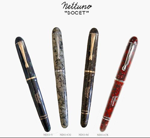
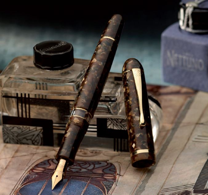
DOCET 100 ANNIVERSARY PEN SET This is a four pen matching number set 038/100, only one available and the only complete matching number set on the market and we have it! The price is $2,988.00 but we will consider reasonable offers. To make a offer email us at orders@airlineintl.com and subscribe to our newsletter to get exclusive releases and special pricing http://airlineintl.us15.list-manage2.com/subscribe?u=1908cbad44d5ccfc5298e36d2&id=d8d8657a47 For its 100th anniversary, Nettuno presents a re-edition of the wellknown Docet, one of the first piston filled fountain pens made in '40s. The new Nettuno Docet is made in a very limited edition, in four wonderful colors of marbled resin, turned from solid bar, hand-refined and hand- polished: Brown : deep brown background, with orange/terracotta details, and golden finishing:Green : deep green with blue/violet and bright green details, golden trimsGrey, with black and sand details, silver finishingBurgundy, with red and black details, silver finishingThe clip is engraved with geometric designs enhancing the romantic and vintage look of the pen; its brand and name, as well as the serial number, are clearly engraved on the barrel.Piston filling system, with ebonite feeder. 14 Kt gold nib, similar to the original nib of early Docet, with F, M, B grades. The pen comes in an elegant package with an ink bottle included.
-
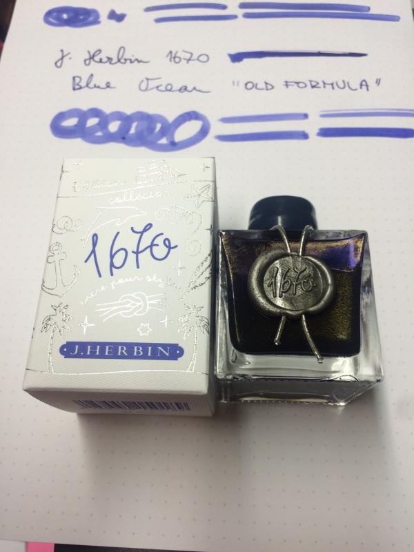
Hi folks, I don't know about you, but I have heard some rumours that J Herbin was reformulating Ocean Blue ink...must have been Stormy Grey's success So, I was expecting blue ink with silver particles...but it looks like they have opted out for gold... No indication on the bottle (of course) Here are few quick snaps of their very last batch:
-
Hi, I'm getting a Montblanc Meisterstück Classique pen in either gold or platinum (can't decide!) and would be grateful for any advice regarding my concerns with Montblanc's leather pouches. I already have a Montblanc Meisterstück 1 pen leather pouch but having read through some threads on this site I'm concerned about the risk of scratching the pen (especially as the 'precious resin' appears to be vulnerable to surface marks) and possible long-term corrosion to the gold plated parts such as the clip caused by the chrome tanned leather. I checked Montblanc's website which does not disclose whether chrome tanned leather is used for the Meisterstück 1 pen pouch. However, a search on Google showed that chrome tanned leather may be used for the Boheme pouch and chrome tanned leather is used for belts. I understand that a pen won't stay mark free forever, but I wouldn't expect a protective product like a £105 pouch to inflict damage. Could the jacquard lining scratch precious resin? Has anyone noticed marks appear on an otherwise brand new pen simply from being inserted into or removed from a pouch? It's entirely possible that damage referred to in other threads may have been caused by other factors and the threads are quite old. I've looked at alternative leather pouches and whilst Lucrin's look promising they don't mention the tannage used. Similarly, Onoto's case has a felt lining but Montblanc pens may not fit. Is there any real advantage to choosing platinum over gold? Are these concerns groundless? Any feedback would be appreciated. Thanks, Martyn
-
Hi friends, I am hoping for some help identifying this Sailor pen that I got as a graduation gift last year. It seems to be made from resin and has the 1911 14k nib. I'm not familiar with Sailor pens at all. This was bought in Japan (if it makes a difference). I currently don't have a converter in this pen, and I'm wondering which Sailor converter to use with this pen as it's quite short in length. Thanks in advance!
-
I've just completed my simple review of the latest twelve new inks in the Shimmer range, from Diamine. Six with gold particles and six with silver. Although I don't like 'particle' inks, per se, this new release is actually superb. Let's be honest though; it's purely my opinion and I don't really think that any judgement should be made before trying them out for yourselves. As with any ink/pen/paper combination. But, we should all know and respect that... There are a dozen new colours as I mentioned and I will just post a simple scan of my test. I've recently had to get a new phone but it has a rather better camera than my last one, so pictures, rather than scans, will follow tomorrow. However I will say, that the particular distribution shows up with this batch, better than the first one, even with a flat-bed scan, so I think there has been a real improvement. I decided to use the Sailor Sapporo B nib for the tests, as before, and have to say that there was NO problem in cleaning out the pen between inks. After each fill I used the converter to rinse out the nib section eight times, under a running tap - not TOO much due to the water meter! - and even before the end of that cycle, there wasn't a hint of any metallic particles. I then just checked the converter, and gave it a flush. Then I used a rubber bulb to flush through the nib and section. Only after all twelve inks, did I finally take the section apart and there wasn't a hint of metallic or dye residue at all. I'm impressed. So now to the colours. All I have to add to my comments, is that I may have made different notes to the writing of a particular ink. The differences are purely due to distractions - there are no differences with any of these colours. They all perform very well with the pen and paper I used for the tests. First, the gold particle inks. <img src='https://www.fountainpennetwork.com/forum/uploads/imgs/fpn_1475100387__golden_oasisshimmer_2_gold_0006.jpg' alt='Golden Oasisshimmer 2 gold_0006.jpg' /> And now the silver particles! I will post pictures of some of these, to try to show the particles but, in the meantime; enjoy!
-
Hello everyone, just recently I somehow discovered the fact that I own a few nice pens. I am not an expert of any kind when it comes to pens, but I have a general love of handwriting and of beautifully crafted things, amongst those also fountain pens, especially piston fillers. In the age of computers not much work is left to accomplish by handwriting. Some cards, some signatures... Nevertheless I rediscovered some of my old pens and gave them a good simple cleaning (no disassembling). The little black OMAS belongs to the ones I used to write with a lot, simply because writing with this pen is a really pleasant experience, as it is soft and rich in writing and moreover a real lightweight. (A nice counterpart to the much heavier Waterman MAN 100 Opera with broad nib that I mainly use for signatures, cards or short letters ) The OMAS. I think I bought it new sometime in the 80s or early 90s. The way I remember it I was told that it is made of celluloid. But now I think I might be mistaken there. Or maybe not. I think I just gather what can be said about the pen, maybe this will ring a bell with somebody: - I think it is clear that the pen belongs to the "Arte Italiana" series. - It is a piston filler of black colour with gold trimming and 12 facetted barrel and cap. - It has only one Greek decor band, the cap band, no second one on the barrel like the "Paragon". - "OMAS Extra" is engraved on the barrel. - The length is 120 mm capped, 110 mm uncapped. - The nib is made of 18 Kt. gold, without twotone inlay. It displays the arrow design. One tine has engraved the letter "M" for the nib grade, the other tine bears an oval stamp. Inside the oval stamp is something that looks like a fir tree (or maybe arrows) accompanied by two letters. Left of the "tree" is a "T" engraved (or sth. looking similar). The right side of the "tree" has engraved "F". Does someone recognize the pen by the totality of this description? I very much hope so! I have done quite some search on OMAS, but it seems difficult. I do not even know if Milford e.g. is the name for a model or for a size... It seems it is never mentioned as anyone knows it anyway... Looking at the catalogues posted here (great, thanks!) I can add the following to the above description: The pen does look very similar to the "Gentlemen" pen in the 80s catalogue (see here) - only one Greek decor band, no twotone nib. But on the other hand mine has engraved "OMAS Extra" instead of "Gentlemen". And moreover the "Gentlemen" pen does not appear to be smaller than the "Paragon", while mine is certainly not a big pen. Second possibility: The pen looks also exactly like the 8201 - 556/F (medium) and the 8211 - 555/F (small) pens in the 1991 catalogue (if you care to open the pdf-file in this thread). But as far as I can see, nothing is said about the actual sizes. So I would guess mine might be the medium pen or even more probably the small one? (If my understanding is correct, the old pre 1950 "OMAS Extra" also came in three sizes, the smallest one being "Dama". Has there been a change of models and/or sizes between the two catalogues of the 80es and of 1991? Apart from identifiying the model I wish I knew what the engraving "OMAS Extra" does signify. Is it a separate model or does it stand for something else? Maybe someone knows? I would also be happy to find out if the pen is made from "resin" or celluloid. Right now I have no photographs of the pen, but believe me, it is looking exactly like the mentioned models in the catalogues. I still might add photos later, although the pen is not looking as impressive as many of the coloured resin and celluloid varieties. Nonetheless it is an elegant non-spectacular beauty with impressive writing characteristics. Thank you for your help! Amelie
-
This is a pen i waited for long to get it,its part of a set with a mechanical pencil, i got it NOS but decided to ink it and try it, the only ink that i thought will be a match to this pen is the legendary Parker Penman Sapphire, here are few pictures: http://s5.postimg.org/osw6sa6sn/P7514_Ka.jpg http://s5.postimg.org/v7zt2p2w7/P7514_Kb.jpg http://s5.postimg.org/9zm4l9ofb/P7514_Kc.jpg http://s5.postimg.org/sggjc34dj/P7514_Kd.jpg http://s5.postimg.org/qd644f4kn/P7514_Kf.jpg
-
I bought this pen from a dear friend sometimes back, but it was delievered to me last week, I was not able to find much information about this pen online, so wanted to share few pictures with all of you, if anyone got some information about this pen I will appreciate. http://s5.postimg.org/mhzgmoycn/Pelikan100a.jpg http://s5.postimg.org/k1xn8ug9z/Pelikan100b.jpg http://s5.postimg.org/mxaqfpk9z/Pelikan100c.jpg http://s5.postimg.org/xy5vkqciv/Pelikan100d.jpg http://s5.postimg.org/q6p5m68dj/Pelikan100e.jpg http://s5.postimg.org/wlo6iuf3b/Pelikan100f.jpg http://s5.postimg.org/74adczmqv/Pelikan100g.jpg Best regards.
-
http://i900.photobucket.com/albums/ac209/jasonchickerson/image_3.jpeg http://i900.photobucket.com/albums/ac209/jasonchickerson/image_2.jpeg http://i900.photobucket.com/albums/ac209/jasonchickerson/image_5.jpeg http://i900.photobucket.com/albums/ac209/jasonchickerson/image_4.jpeg This is an ink I did not expect to like or get much use. I primarily use the 1670 inks as watercolors when painting with my daughter. She likes the gold flecks, and they do make for some interesting effects, so I purchased all of the line save Stormy Grey (which is one of the worst inks I have every personally tried) for this purpose. I put it in my daily carry pen to test for this review and it didn't come out for two weeks. So, not too bad. The gold shows up readily on high quality paper and almost not at all on the cheap stuff, so I didn't get any questions at work about my sparkly ink. Hue is identical to Herbin's own Terre de Feu, but Caroube is much wetter and a bit darker. In the end, I like it quite a bit. While not as exciting as Rouge Hematite or Emeraude de Chivor, it is much better behaved and much more useable on a daily basis. In case you missed it in the written review, I left the cap off my pen for four hours with Caroube inside and it started right up again. Cleaning it out of the pen took about three flushes. Brilliant. Paper is Rhodia dotpad no. 16. An attempt was made toward color accuracy.
-
New Montegrappa Hemingway "the Soldier" Limited Edition
Iguana Sell posted a topic in Italy - Europe
The new Montegrappa Hemingway Limited Edition is out! Montegrappa plays tribute to the American author and journalist Ernest Hemingway. The collection is composed by three different editions that reflect the novelist's life and journey. The first of the editions "The Soldier" is already available at Iguana Sell. Its green celluloid body creates the perfect contrast with sterling silver trims. The 18K nib shows Hemingway's signature while cap and clip are decorated with engraved details of the author's life. This edition is available in fountain pen, F-M-B, limited to only 100 pieces! Fountain pen: https://www.iguanasell.com/products/montegrappa-hemingway-the-soldier-fountain-pen-925-silver Should you need additional information please do not hesitate but contact us through info@iguanasell.com Enjoy more pictures of this piece, which is perfect for collectors and novel lovers, in our site.
-
I came across this in an antique shop on Maine. Overall in really good condition, probably a new sac and some polishing. I did take the opportunity to dip it and play and the nib is awesome; think, paint brush with ink, incredible. I just don know what it is. Any help is appreciated. Here is what I know: Stamp on barrel states 1/40. Pat Pend. Nib has 14K warranted. Made in USA. I've never had a noodle in my hand, but the unrestored nib flexes out extremely easily with some dipped ink. I haven't been able tobidentify the pattern, but it is consistent on both pieces. The box I bought it in was non-descript silk lined with felt "holder." My initial post had the matching mechanical pencil but the picture was too large.. Any help is appreciated. Thank you in advance.
-
Here are some of June harvest of Kilk Custom Pen Studio. All ebonites are German. Nib units are Jowo #6 18k Solid Gold with exception of Blue ebonite; Bock #6 Titanium SemFlex. Finials and bands are silver, exception is reddish ebonite, it has 24k gold plated bands and clip. Clipless cigar like pen has an abalone inlay at the back.. For further information, please refer to our website: www.kilk.ist http://i392.photobucket.com/albums/pp3/KilkPens/Blueripple_01_zpszpwi8vqg.jpg http://i392.photobucket.com/albums/pp3/KilkPens/Sefahan_3_zpsgtbws5nx.jpg http://i392.photobucket.com/albums/pp3/KilkPens/Sefahan_1_zpseanzdiak.jpg http://i392.photobucket.com/albums/pp3/KilkPens/Blueripple_04_zpskcxottek.jpg http://i392.photobucket.com/albums/pp3/KilkPens/Kerem3_zpsggi0wxo0.jpg http://i392.photobucket.com/albums/pp3/KilkPens/Keremabalone_zpsmmzhuluz.jpg http://i392.photobucket.com/albums/pp3/KilkPens/Ulvi_3_zpstdw0f2f8.jpg http://i392.photobucket.com/albums/pp3/KilkPens/Ulvi_4_zpsr2j421qu.jpg
-
Below latest harverst from our studio Ivorish Fountain Pen Combination of compressed bone&ivory dust and Alternate Alabaster Resin. Ruthenium/Rhodium Plated Jowo #6 18k Solid Gold nib. 975k Silver bands and Special Edition Kilk Cap Finial. Convertor and cartridge compitable. By using silicon grease you may fill with eyedropper. Dimensions: Length:142mm Capped, 130mm uncapped Dia:13mm barrel threads, 15mm thickest point of barrel, 16.2mm Cap Retroscript Instrument Indian Ebonite with 24k gold plated brass rings, 24k gold plated steel clip. Jowo #6 Twotone Nib unit. Converter and cartridge compitable. Sealing with grease possible to use with eyedropper. Dimensions: Length: 142mm Capped, 130mm uncapped Dia: 13mm barrel threads, 13,75mm thickest point of barrel, 15,6mm Cap Smokey Horn Semi-translucent AA-Resin with smokey oak horn sample. Filling with a screwed in international converter. Jowo #6 Gold Plated Nib Unit and 24 Gold plated bands and clip. Please note that cap is not postable. This Pen can be filled with eyedropper by sealing the section threads with clear silicon grease. Compitable with 3mm international cartridges both long and short ones. Dimensions: Length: 145mm Capped, 135mm uncapped Dia: 13mm barrel threads, 15.5mm thickest barrel, 16.5mm cap
-
Review Of Fosfor Rajendran (Aka Desi Kop) With Jowo #8 Gold Nib
Prithwijit posted a topic in Fountain Pen Reviews
Introduction During the early phases of my renewed fascination for all things fountain pens there was one model that reigned supreme amongst my list for grail pens and that was the Sailor King of Pens. Everything about it seemed to be just about perfect – the torpedo shape, the ebonite material and the large sized fabulous Sailor nibs. It was just a matter of time before I got one for myself. Two sailor pens and their less than perfect nibs later, my enthusiasm for the KOP started to wane a bit. I had realized that the tip shape and design of the stock sailor nibs (Naginata Togi or Nagahara special nibs excepted) was something that just didn’t suit my grip. The relatively small sweet spot meant that I quickly ended up in the scratchy zone and calling it feedback wasn’t about to change my opinion. I had also realised that the KOP actually wasn’t a full ebonite what with its plastic feed, plastic section and the section-barrel joint made of metal. When fellow FPNer Sudhir allowed me to write with his stock Broad nibbed Sailor KOP, I seized the opportunity to assess my purchase decision. I decided that while I may still go for a special nib KOP later, right now I would not enjoy a KOP with any stock nib. While that decision was made, I was not about to give up so easily on getting my grail pen even if that meant getting one made to my specs and sourcing everything myself. With unwavering focus, I started procuring everything to get the pen of my dreams – I scoured for the best possible ebonite material available for pen-making and zeroed down on some vintage Italian mottled reddish-brown ebonite from a source in the Europe. For some time I toyed with the idea of going with SEM Cumberland or Eboya, but this one just seemed better.I decided to go with a Jowo #8 nib in western medium with a hand cut ebonite feed from WIN. Rather than going for the stock motifs, I decided to source an absolute plain one so that I can have my own design engraved on it.I wanted a roller clip like on my Omas or Delta rather than the stock KOP clip design. Luckily my pen-maker arranged for gold plated roller clips.In order to make the pen I approached Mr. Manoj Deshmukh of Fosforpens. He had made a few pens for me before and was willing to take up the challenge. I decided to call the pen Rajendran which means King in Sanskrit as a homage to original KOP which inspired it. Design The KOP design is a classic and all of you are well aware of it. So instead of wasting any time typing about it, I will let the pictures do the talking. http://i1097.photobucket.com/albums/g346/prithwijitchakiPrithwijit/Fountain%20Pen%20Reviews/Fosfor%20Rajendran%20Review/IMGP2148_zpsv4kcczjn.jpg http://i1097.photobucket.com/albums/g346/prithwijitchakiPrithwijit/Fountain%20Pen%20Reviews/Fosfor%20Rajendran%20Review/IMGP2142_zpsem9s8tav.jpg Size and Balance At 155mm capped, the KOP/Rajendran is the leader of the oversized pens club. But the ebonite build and absence of metal anywhere other than in the nib and the clip means that the pen is delightfully light. It is nicely balanced and is very comfortable to write for extended periods. Writing with the pen makes you completely forget it’s considerable length and the customized section design adds considerably to the comfort quotient. I don’t write with the cap posted, but it can be done if so desired. But posting such a large pen does result in a slight rearward weight bias. Nib I had looked around for a nib that would be similar in size and stature to the large Sailor nibs used in KOP and finally decided on a #8 sized Jowo nib made of 18K gold material with medium tip. The complete nib unit is sold by WIN through their distributors (Fpnibs and Asapens) and comes with a nicely finned ebonite feed. Unlike most nibs which comes with pre-embossed or engraved motifs, I actively scouted around for a nib that would be absolutely plain with no design. This allowed me to engrave on the nib a small monogram of my own. The design is one that I made myself and it is essentially my initials enclosed inside a tiny shield akin to the coat of arms of yore. http://i1097.photobucket.com/albums/g346/prithwijitchakiPrithwijit/Fountain%20Pen%20Reviews/Fosfor%20Rajendran%20Review/PC20Logo200120JPG_zpsbayvjecq.jpg Image: Monogram design – Initials enclosed inside a shield Manoj doesn’t do engraving himself, but he actually looked around for people who do so and was able to replicate my exact design on the nib. Needless to say, I am elated that my dream has finally been realized and the gamble (of a plain nib) has paid off. http://i1097.photobucket.com/albums/g346/prithwijitchakiPrithwijit/Fountain%20Pen%20Reviews/Fosfor%20Rajendran%20Review/IMGP2138_zpse1q5xpao.jpg Image: Monogram design successfully replicated on the nib – the ultimate customization Filling Mechanism I love cartridge converter pens and that is one of the reasons I like the original KOP as well. The Rajendran beats the stock KOP in this regard by using the standard international system for cartridges and compatible convertors rather than proprietary ones. I like this system better than the original because of the wide compatibility, system life longevity, value and convenience. The ebonite feed of this pen is paired with a Schmidt K5 converter to use bottled inks and it can also accept cartridges from a host of brands. http://i1097.photobucket.com/albums/g346/prithwijitchakiPrithwijit/Fountain%20Pen%20Reviews/Fosfor%20Rajendran%20Review/IMGP2147_zpsiv2mfcoa.jpg Build Quality Manoj has built a reputation for himself as a craftsman with unparalleled focus on quality. He has demonstrated that in all my pens, but has somehow managed to simply surpass all his previous endeavours with this pen. The shape, the fit, the threading, buffing/polishing and the finish are impeccable for a handmade pen. The allowance to tolerances have been kept to a bare minimum and it is obvious that the pen has been made with considerable care to ensure a very high quality product. http://i1097.photobucket.com/albums/g346/prithwijitchakiPrithwijit/Fountain%20Pen%20Reviews/Fosfor%20Rajendran%20Review/IMGP2145_zpsdnklgzno.jpg Writing Experience This where the rubber hits the road. I have always been very happy with Jowo nibs and quite naturally the expectations from this nib was pretty high. I am happy to say that the nib has met its potential and then some. This is a tad wider than #6 Jowo medium nibs but still can comfortably be considered a medium nib. It is smooth, wet and lays down a nice wet line without any skips or false starts. The pen is a superb writer and a better performer than the stock Sailor nibs as far as my grip is concerned. I have been using this pen with Waterman serenity blue for about six weeks now and six fills later, I can safely recommend it to anyone who might be interested. The ebonite feed in this pen was a revelation. There is something about good ebonite feeds that just adds magic to your pens. This feed is very much like those of OMAS and is super wet without being a gusher. The extra lubrication afforded by it makes the writing experience that much more enjoyable. I particularly like the sheen that ebonite feeds seem to exhibit as ink droplets percolate into the fins. The only drawback is that the feed isn’t flight safe like the plastic Jowo feeds and there is some leakage on high altitude flights. Price and Value The Fosfor Rajendran is not a cheap pen. No expenses were spared in procuring the best material, the best nib and the best workmanship and all of this adds to the pens price. I could have bought a few very nice and expensive branded pens for the price I paid for it. But none of them would have been able to offer me the satisfaction and the value that this pens offers. So it is only fair that I make a clear distinction between the value proposition of the pen as made by Fosfor versus the cost of materials that I have procured myself. As a standalone pen shaped like the classic KOP, it is incredibly VFM. I am aware of no other pen maker in India who offers this level of quality and individualization at this price point other than Manoj and Mr. L Subramaniam of ASA Pens. In this particular case, Manoj was simply outstanding in hearing me out, understanding my needs and wishes and what is likely to give me the sense of satisfaction and pleasure. He even went out of his way to procure taps and dies for my special nib. That must have cost him more than what I paid him for4 this pen. Such service and customer orientation remains imprinted in your mind long after the cost is forgotten. Specifications The measurements in this section have not been taken with any precision instrument or laboratory techniques but should suffice to give you a fair idea of the size of the instrument. Length (capped) – 152.5 mm Length (uncapped) – 131 mm Length (cap) – 73.5 mm Length (section) – 20 mm Maximum width – 17.5 mm Maximum section width – 13.7 mm Minimum section width – 12 mm Conclusion Not everyone can understand why I paid substantial amounts on getting a KOP made to my specs rather than getting a stock one. I guess to me the importance of the attributes of the pen far exceeded any brand name it carried. As I look back as to what I have gained over a stock pen by going the custom route, I can safely tabulate quite a few pros - True vintage Italian reddish-brown mottled ebonite rather than stock black or expensive Urushi coated models.A wonderfully wet and nicely finned ebonite feed rather than a plastic one (this may not very important in the overall scheme of things, but would certainly be useful if I ever have to do any heat setting).Complete ebonite body with no plastic or metal parts. This means the pen is very lightweight and supremely balanced despite being oversized.A section that has been designed and sculptured based on my preferences.A nice oversized and dependable (to me) western nib.The “PC Shield” that would not be possible in a normal nib.A nice and smooth roller clip.International standard cartridges and converters instead of proprietary ones.To summarize, I have certainly been able to fulfill my objectives with this pen. It is nice oversized but comfortable and well balanced torpedo shaped pen. The writing is super smooth thanks to the beautiful Jowo nib paired with the wonderful ebonite feed. The roller clip is a wonderful thing to have and Fosfor quality and finishing comes through. This is certainly the right pen for me. Whether it will be the pen for you will depend on what you value in a pen. If you would love a Sailor KOP as a brand then you should certainly go for that instead of this. But of you value your personalization and writing comfort (in such cases where it is applicable), then you can certainly evaluate this option. Useful Links Very good Woodgrain ebonite blanks can be sourced from www.theturnersworkshop.co.uk German nibs of your choice can be sourced from www.beaufortink.co.uk or www.asapens.in Pen made by www.fosforpens.com