Search the Community
Showing results for tags 'fountain pen'.
-

Initial Review of Majohn T6 City Light fountain pen
donnweinberg posted a topic in China, Korea and Others (Far East, Asia)
I am providing an initial review of the Majohn (aka Moonman) model T6 "City Light" fountain pen. The T6 is available in 6 versions, divided into 2 overlay styles. I am showing only the "City Light" overlay style here, but all 6 versions of the T6 have the same size, weight, shape, etc. I purchased the three T6 City Light fountain pens from an Ebay seller in China. I inked up the one with the clear acrylic, illustrated as the right-most of the three shown below and called the "Yu Ye." The amber acrylic one on the left is called the "Deng Huo," and the light blue acrylic one in the middle is called the "Mu Lan." The overlay is stainless steel ("SS"). The pen is a piston-filler and features an iridium-tipped SS nib that I purchased in a Medium width. The pen, full of ink, weighs 54g, and the cap contributes 22g to that total. The length capped is 5.625" and 5.25 uncapped. The cap does not post on the end of the barrel, which has the piston turner there. The piston is an internal piston, which turns very smoothly. I filled it with Diamine Ancient Copper ink, and it wrote immediately, but even better after I set it down for a few minutes to allow the collector and feed to do their work. The nib is firm without audible feedback and feels smooth on good paper. The pen lays down a western medium line. Here are more photos, the first three of which come from Majohn's own marketing materials. I was attracted by this pen because of its unique overlay. As a picture "is worth a thousand words," I won't belabor the point by "using my words" to describe it. Were it not for this unique and attractive overlay, I wouldn't have any particular interest in this pen, as there is nothing truly special about it otherwise. When writing with the pen, I can feel some of the somewhat "rougher" parts of the inside of the overlay on my thumb, but nothing is sharp or likely to cause cuts. Had this been a much more expensive pen, then there likely would have been more rounding/smoothness to the open areas. But at the price paid, I am more than satisfied. My initial impression, thus, is that this is a pen worth having for its unique appearance, but not for its writing characteristics. In my next post, I will tell you what I paid for each of these three pens.
-
Posted a review video for the Kanwrite Desire Marble Red (dual tone steel #6 medium nib with gold plated trims on the cap) on Youtube, available here. You may find the featured pen here: for purchasing in Indian Rupees / for purchasing in US Dollars. A special mention of the ink I use for the writing sample: Sulekha Selam 21. It is a tribute from Sulekha to commemorate the occasion of 21st February, which is observed by UNESCO as the International Mother Language Day to honour the martyrs of this day in 1952 among the student demonstrators of the University of Dacca (now University of Dhaka) who were protesting against policies imposing Urdu as the lingua franca in the Bengali-speaking majority East Pakistan (now Bangladesh). You may find the ink here.
-
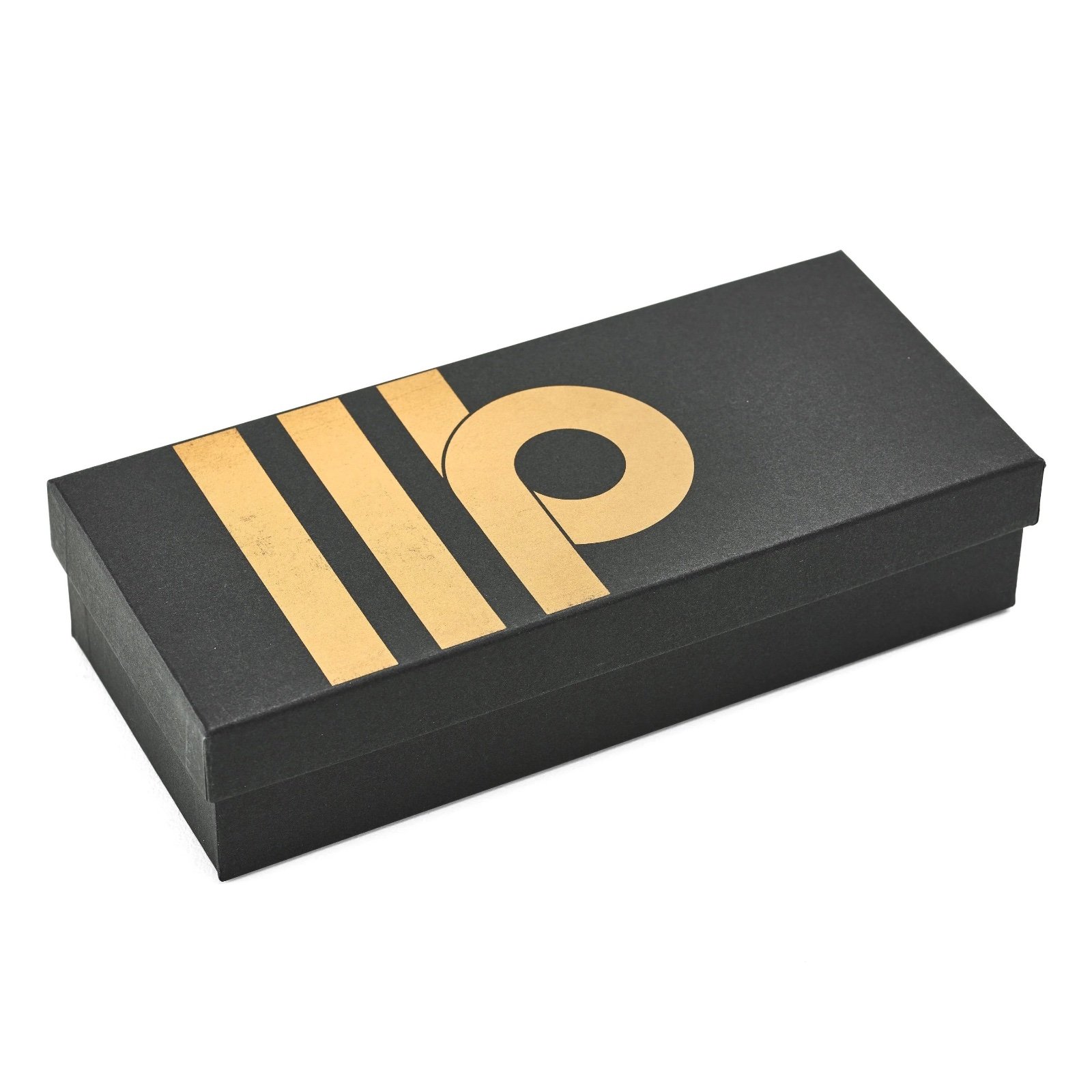
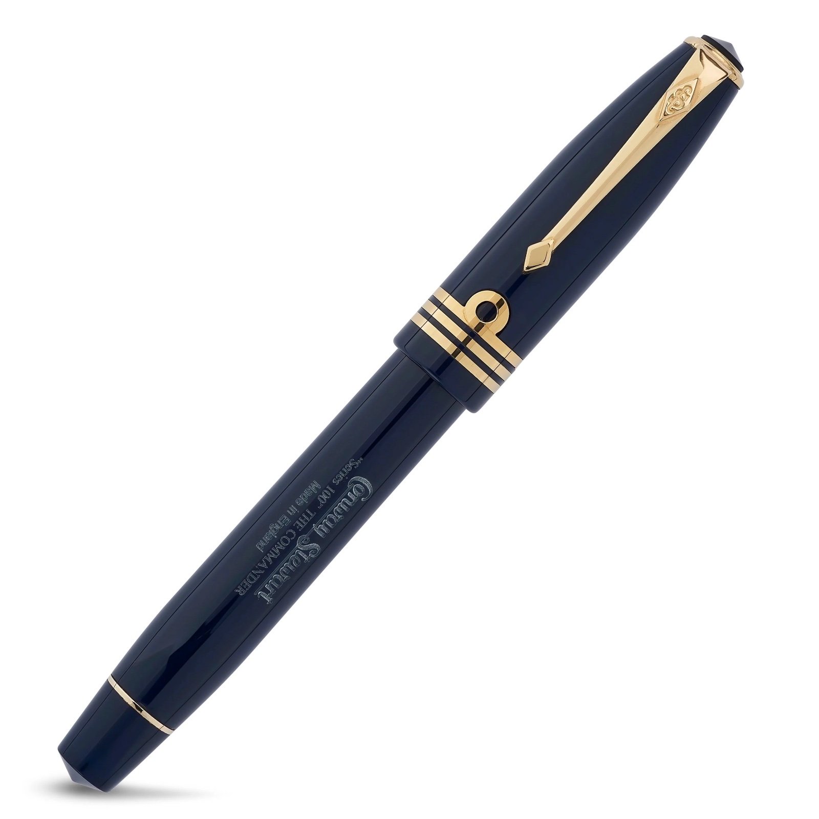
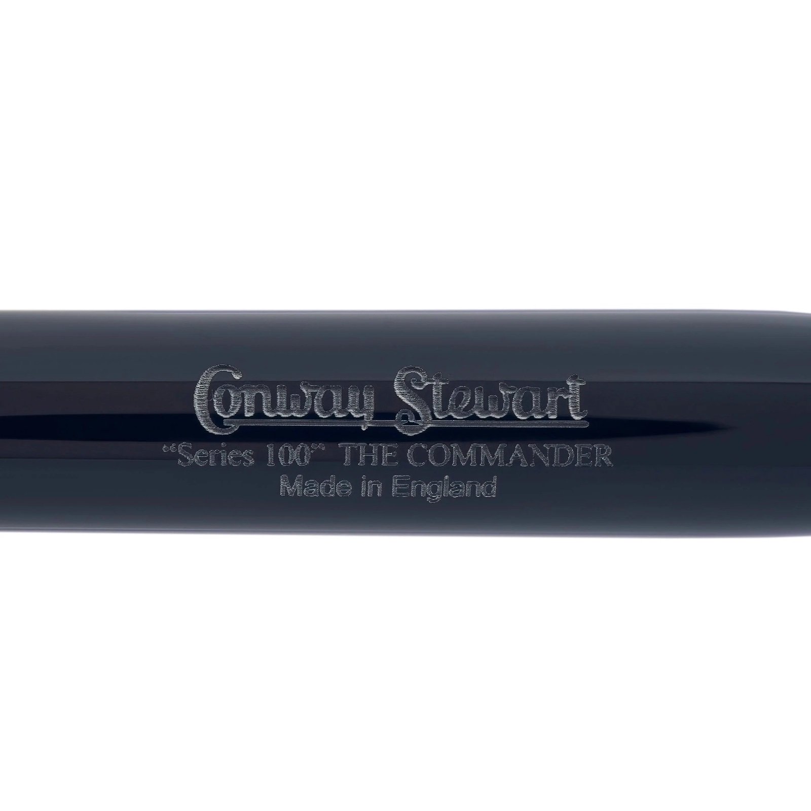
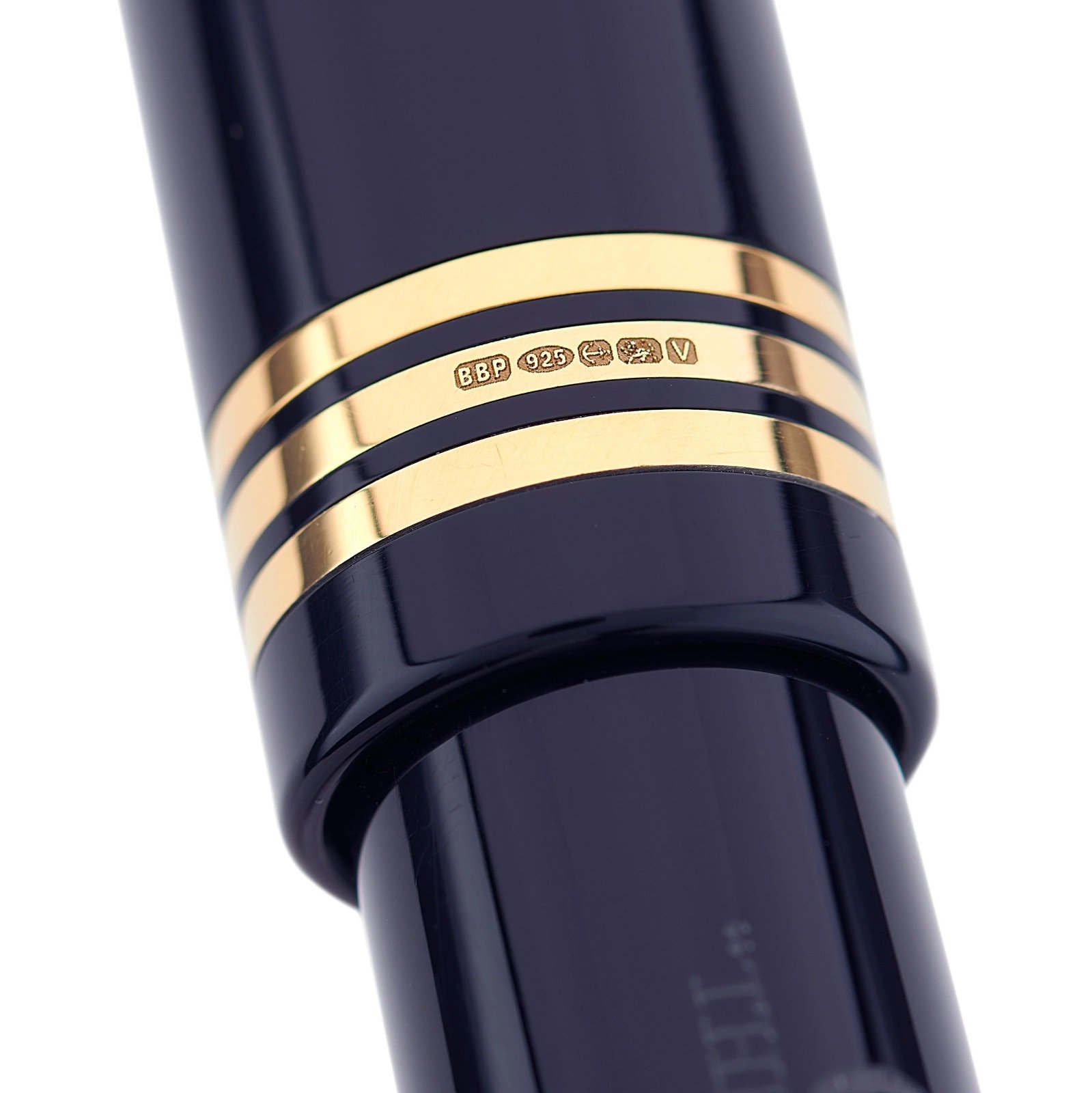
Initial Review: Conway Stewart Series 100 "The Commander" Fountain Pen
donnweinberg posted a topic in Great Britain & Ireland - Europe
This is a review of a brand new Conway Stewart Series 100 - The Commander, in a Navy Blue color with Gold trim and an 18K CS Broad Nib. It fills either with an included screw-in converter or International Standard cartridges. Here are ten photos of the pen and its packaging, from the CS site, as the CS photos are far superior to the ones I took: I filled the pen with Birmingham Pen Co. "Cold-Steel" ink, a blue-black, by injecting the ink into the converter with a hypodermic needle, screwing the converter into the section, and moving some ink into the section with the screw converter. Then, I dipped the nib in some Fountain Pen Flush to get the flow going. After writing with the pen for a few lines, the ink began to darken. This process is cleaner than dipping the nib and part of the section in the ink and then wiping off the excess. Here's my initial writing sample: I am very impressed with this pen. It is beautiful to look at, wonderful to hold because of its relative lightness and balance (I never post the cap on the barrel), and has a springy nib that writes a wet, broad line. The objective measurements of the pen, supplied by Conway Stewart, are as follows: LENGTH: Capped 5.42"/137.8mm ; Posted 6.70"/170mm ; Barrel/Section/Nib only 5.08"/129mm ; Cap only 2.48"/63mm. BARREL DIAMETER: 0.52"/13.2mm CAP DIAMETER: 0.61"/15.5mm WEIGHT: 20g/0.71oz I got the pen with a broad nib, but also available for no extra cost are EF, F, M. The 18K gold CS nib was $70. The pen also is available as a Rollerball, with either fine or medium point. The cost of the pen as a RB is $514, so if you get the FP, the cost is $584 (i.e., the extra $70 for the 18K nib). Options I didn't get are as follows: Special Nib Options ($56), such as stub, italic, oblique. Special Engraving ($25) (name or initials) After putting this nice pen through the paces some more, I'll report back on its longer-term performance. So far, so very good.
-
Posted a review video for the Kanwrite Heritage Marble Swirl (dual tone steel no. 6 medium nib with gold plated trims on the cap and barrels) on Youtube, available here. You may find the featured pen here: for purchasing in Indian Rupees / for purchase in US Dollars. You may find the ink featured here. Part 2 of this video reviewing the Kanwrite Desire Marble Red I bought along with this to be out soon.
-
Posted a review video for the Kanwrite Heritage Marble Swirl (dual tone steel #6 medium nib with gold plated trims on the cap and barrels) on Youtube, available here. You may find the featured pen here: for purchasing in Indian Rupees / for purchase in US Dollars. You may find the ink featured here. Part 2 of this video reviewing the Kanwrite Desire Marble Red I bought along with this to be out soon.
-
My biggest complaint about the Scribo Feel is that it doesn't post. Does anyone know if Scribo's Piuma model posts? There is another model called the La Dotta that looks (and is priced) similar to the Feel. What's the difference? Thanks!
-
PRELUDE In the search of suitable replacements for a Meisterstuck Doue FP 145 My meticulously planned fountain pen hiatuses are occasionally disrupted by the well-meaning members of my family. Instead of appreciating my carefully timed fountain pen acquisitions, they enthusiastically offer advice on investments, the time value of money, and everything in between. To add a twist to the tale, they threw me a curveball last year by gifting a Meisterstück Doue FP 145 LE, even though I had only bought a total of three fountain pens in the last three years. If we exclude the Opus 88, then it's just two. The Doue 145 is undeniably a beautiful pen, but I found myself wondering if I could ever use it with its slim metal section and rather shortish nib. Determined to find a more suitable replacement, I revisited the local MB Boutique. While Montblanc's customer service remains top-notch for pens within the two-year warranty period, they seem to derive more delight from pens outside the warranty period than their customers do. Faced with the task of choosing two pens to match the value of the pricier Doue, I was drawn to a Naruto LeGrand 146. Then, the salesperson revealed his secret NOS drawer, housing various pens, including a Great Characters Walt Disney FP. Opting for the Montblanc M, not only because its 2018 price, combined with the Naruto, matched the total credit value for the Doue, but also because it simply looked nicer. And here goes the review.... If you like a pictorial blogger view, here is the link: A Review of the Montblanc M in Red PRESENTATION (6/6) Usual MB The usual MB single pen box. The standard Montblanc single pen box with no customisation, with the only variation being the red cardboard sleeve that encases the box. The RED collection boasts a charitable initiative, contributing less than 1% (€5) towards fighting HIV/AIDS programs. It's almost as if Montblanc is tackling HIV/AIDS single-handedly, making minuscule donations of €5 at a time, all while charging the end customer a whopping €540+. As Master Yoda famously said, “Do or do not. There is no try”. The pen securely nestles within a cushioned and somewhat snug slot inside the box, accompanied by a complimentary cartridge filled with black ink. However, it seems that most of the ink inside the cartridge had evaporated during its 5 years of shelf-living. DESIGN (6/6) From the likes of the Apple Watch The Montblanc M, available today in three finishes—Ultra Black, RED, and RED Signature—has been designed by Marc Newson, renowned for his work on the Apple Watch. Newson has successfully blended functionality with elegance, anchoring the design firmly outside the tradition for Montblanc. The shape of the pen is particularly appealing in modern pen terms. It boasts a perfect cylindrical shape with zero taper and rounded ends, except for the flat section, commonly referred to as the “plateau” at the end of the barrel. The platinized clip is a personal favourite; it avoids the cheap look of the Safari, perhaps because it's not oversized and doesn't unlawfully occupy a third of the cap's surface area. The glossy and bright red finish mirrors background lights and hues effectively. Upon uncapping, one notable feature is the novel use of magnets to secure the cap. The snap cap rotates itself to align its magnetic poles perfectly, ensuring the clip and plateau on the barrel are perfectly aligned on a plane. A soft snap securely seals the cap, earning full marks here. According to Red Dot Project award records, the snowflake emblem made of white resin is ultrasonically welded onto the plateau and then milled with a diamond tool to maintain flatness. The design reflects a harmonious flow and is truly eye-catching. The cap, adorned with the snowflake emblem on top like regular Montblanc pens, exhibits impeccable overall quality of work. In certain lighting conditions, the magnetic insert is faintly visible inside the cap. The knurled platinized metal section adds enough weight to balance an otherwise light barrel. Due to the flat plateau on the barrel, the cap cannot be posted. The section, embossed with the MONTBLANC brand name five times on the visible rear ring where the cap snaps on, is somewhat short and not ideal for longer writing sessions. More on that later. FILLING & CLEANING SYSTEMS (4/6) Cartridge & No Converter This is where, like many other fountain pen users, I express my concerns. It's worth noting that this pen only supports standard international short cartridges, and none of the available converters are compatible due to the featured plateau on the barrel. On the positive side, the pen accepts short international cartridges or proprietary MB cartridges, limiting its cartridge capacity to 0.5 ml. The form of the pen, while aesthetically pleasing, somewhat restricts its functionality as part of the design. Perhaps because the pen was conceived in this digital age, the designer didn't anticipate it being used extensively. Additionally, cleaning the section with running tap water is an easy process. NIB - ALL THAT MATTERS (6/6) The two toned rhodium ruthenium stunner The 14k nib is claimed to be handcrafted by Montblanc in a series of 30 steps. Rhodium-coated with a dark grey ruthenium-coated inlay, this nib is a stunner. I particularly love the shape of the nib, which comes in two widths - Fine and Medium, as far as I know. A dazzling cylindrical flow of silvery rhodium bounds the dark grey ruthenium inlay with well-defined contours. Just below the circular breather hole, the 'M' logo rests within an encircled star. The tail end specifies the composition 'Au585' of the gold-alloy, and the brand name 'MONTBLANC' rests just above the tail. Between those, a hallmark of 'StOD' inside a crossed ellipse adds a touch of elegance. As always, the nib itself doesn't mention the width explicitly, but a sticker at the piston end of the barrel provides all the necessary details. Once you turn the nib, you'll behold a somewhat unconventionally shaped black glossy feed that seamlessly matches the curvature of the pen. Apart from an air hole, there is nothing else in the feed, although the nib runs almost medium wet. PHYSICS OF IT (5/6) – RELATIVELY SPEAKING The Newtonian Laws The overall capped length is around 14 cm. As perhaps mandated by Mr. Newson, I have to use the pen un-posted. Although the section has a somewhat comfortable girth, the shortest length of the section of around 2 cm with a step from the barrel does make it less than ideal to use it as a workhorse. The metallic section balances the weight of 19g pretty well. Below are the pictures along with a Conid Minimalistica for a comparative reference. The Minimalistica is super comfortable for me, here are the dimensions for the Montblanc M. Uncapped Length ~ 12.5 cm Total Length ~ 14 cm Exposed Nib Leverage ~ 1.6 cm (A #6 nib has typically 2.4 cm) The weight of the pen is comforting even without the cap. Overall Max Weight ~ 27 g (with a cartridge, without cap ~18.75 g) ECONOMIC VALUE (0/0) FOC for me No comments. No rating, as I paid nothing WRITING & FINAL COMMENTS (5.4/6) Writes well The writing experience is quite pleasant, albeit with a relatively stiff nib. It does possess a hint of tooth and precisely the kind of control you'd expect from a well-tuned nib. There is a certain degree of softness in the nib, though minimal line variation occurs with pressure. Lines dry in 30 seconds with MB Toffee brown ink on Endless Regalia 80 GSM paper, and the line width is sufficient to display some shading. The nib skipped on the black cartridges (the salesman included a couple of cartridge packs), but it performs flawlessly on the brown ones, offering a steady ink flow with no drying issues. However, the length of the section, along with the step, leaves something to be desired in an otherwise excellently designed fountain pen. The nib leverage is minimal, so you inevitably touch the step from the barrel. With sweat, the knurling on the grip loses efficiency, unlike a Conid Kingsize with a titanium section. The weight, balance, and aesthetics of the Montblanc M surpass present standards. I believe Montblanc has successfully created a modern pen. Thank you for going through the review. You can find other pen and paraphernalia reviews here. REFERENCES Mark Newson - M Red Red Dot Project PS. I am posting a fountain pen review after 4 long years and my 2 year old keeps me totally occupied.
-
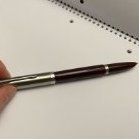
Hi FPN, I have a Lamy Lx and have noticed that the nib <M> is particularly scratchy, and I am a beginner and have had it for just 4 days. In comparison to another Lx, mine is really scratchy to the point where it picks up fibres on the tip of the nib, and feels like it is dragging along the paper on some strokes (it sounds like a pencil, very much so! I notice that a downwards, upwards and right to left strokes are alright, but a left to right stroke is very scratchy. It is also scratchy for a left to right diagonal stroke. This leads me to believed that it is a misaligned nib, though I don’t know how to fix that (and what the left to right stroke being scratchy means [i.e, left tine backwards, towards, etc.] Another thing to note is that when comparing mine to another Lx, the space in between the tines on mine is smaller than that of the other one. I have sent Lamy a support message, I hope that they respond. Is it worth trying to fix it myself, as it will end my warranty (I believe). Perhaps the warranty will allow me to get a completely new nib (pen can’t be returned as it was a sale item)? Any advice on this would be greatly appreciated!
-

Resting a Fountain Pen at the Correct Angle
Easigraf posted a topic in Fountain & Dip Pens - First Stop
Fountain pen beginner here! I just wanted to get the assurance of more advanced fountain pen users to affirm whether this is a good angle to rest my fountain pen at (I believe it is around the 40 degree range).
-

What is the most amount of pens you clip to your t-shirt neckline at once?
Wash Wash posted a topic in Fountain & Dip Pens - First Stop
Hi, I usually like to always have a pen on my person when I go out, run errands, or whatever and I usually keep a pen or two or on occasion even three clipped to my shirt neckline. I was just wondering what the most amount that y'all do. -

Fritz Schimpf by Scribo Limited Edition Piuma Passione fountain pen
Fritz Schimpf posted a topic in The Mall
Fritz Schimpf by Scribo Limited Edition Piuma Passione cartridge/converter fountain pens exemplify the Italian word for passion. This passion for the designs, colours and nibs of the highest quality writing instruments, is shared by Scribo and Fritz Schimpf, resulting in the Piuma Passione. The elegance of form is reinforced by the gracefully shaped, silver-coloured clip and the subtle Scribo logo on the cap. Crafted using a refined acrylic resin, the contours of the Piuma Passione provide a fascinating depth effect with harmoniously warm reddish tones. The flexible nib is fully rhodium-plated, crafted from 14-K gold in nib size "F" (fine), which has received the widely respected Fritz Schimpf Italic grind. The combination of nib flexibility with our Italic grind results in exceptional writing characteristics. Due to the exquisite rounding of the writing edge and the lateral corners, the pen’s comfort zone is wide, therefore rapid writing is accomplished with ease. When written without pressure, the nib offers a vertical stroke width of approx. 0.60 mm and a horizontal stroke width of approx. 0.20 mm. With pressure, the vertical stroke width may be increased to a stroke width of approx. 1.20 mm. Flexible italic nibs are ideal due to their ability to make emotions visible, expanding handwriting, conveying a writer’s passion with visual flair. Engraved on the nib’s upper surface is our historic Fritz Schimpf Tübingen (FST) seal logo. This seal was used daily in our shop from the early 1950s until 2010 to officially seal insured letters, parcels and love letters, before they were delivered to the local post office to begin their journeys to those in all corners of the world. We are deeply grateful to Scribo for their magnificent cooperation and shared dedication to the highest quality. The Fritz Schimpf by Scribo Limited Edition Piuma Passione fountain pens are limited to 50 pieces worldwide, which are exclusively available from us, Fritz Schimpf in Tübingen. https://www.fritz-schimpf.de/Neuheiten/Fritz-Schimpf-by-SCRIBO-Limited-Edition-Piuma-Passione-Patronenfuellhalter.html
-
I have recently purchased a Vazir Patriot 4 from their website. For those who are not acquainted with Vazir, it is a handmade fountain pen brand from India. As the name of the pen suggests, there have been three preceding versions of the Vazir Patriot, all of whose design elements have alluded to the Indian Tricolour flag. The Patriot 4 is no exception, but with an added point of distinction that it is a limited edition of 75 units only - commemorating 75 years of Indian independence from British colonial rule. The pen I purchased sports a Schmidt no. 5 medium gold-plated steel nib, but also comes in fine and broad nib variants. The website offers the pen at INR 3000/- (for those who would purchase it with Indian currency) / USD 42. I have recently posted a full review video of the pen on my Youtube channel, which can be viewed here. (Image credit: http://www.vazirfountainpens.com/product-page/vazir-patriot-4-0 https://www.vazirfountainpens.co.in/product-page/vazir-patriot-4)
-

Recommendation for resistence
Afonso Metello de Napoles posted a topic in Fountain & Dip Pens - First Stop
From a new buyer, Can you help me find a pen? So Christmas is coming. Kinda. And then my birthday. Some months later. And I am looking for something resistant to be carried around and (unfortunately) occasionally sometimes fall from the desk, light (I really like a light pen), with a small point (I like the size M I have been using) (are measures uniform around companies?) and the two most important aspects: cheap and rechargeable, instead of cartridges. To compare with what I have been using for the last 3 years: Mostly use the cheapest plastic Parker fountain pen available(Jotter fountain pen), slightly cracked on the side, https://www.parkerpen.com/collections/essential/jotter/jotter-fountain-pen/SAP_2030947.html, https://www.worten.pt/produtos/caneta-de-aparo-parker-jotter-originals-tinta-preta-azul-mrkean-3026980964306?gclid=CjwKCAjwgsqoBhBNEiwAwe5w0ynTjEQUsu4jkmZa4LxeM1uPHLGBfatO--PJsEYRWwFX7oCW14zMRxoCbMYQAvD_BwE. No complains, I like how light and small it is and the size of the point (size M). Although I'd rather if it was slightly longer, my fingers are big. Occasionally, I use a (I think it is) knockoff pen that someone gave me. Bigger point, always discompensating on the nib and not being usable with temperature and pressure differences (even slight ones). Thanks in advance for all the help! -
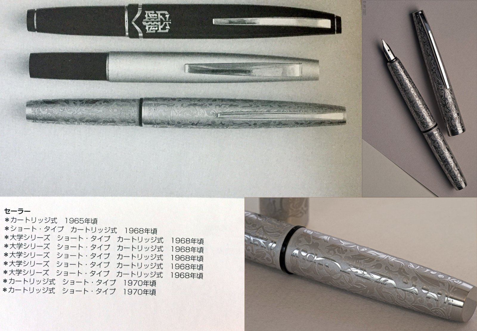
I've never seen this fountain pen in person, first hand. I saw it appear on-line only once. It was in a small sale that Stan used to run of vintage fountain pens... and Laura (Phthalo) managed to buy it. Those two embedded photos on the right were lifted from her old blog. I'm curious if anyone here has ever seen one in the wild, or owns one. I've been looking on auction sites for years... and have still yet to spot it.
-
-
14k gold means only the tip of the nib, right?
Fountain PenDa posted a topic in Fountain & Dip Pens - First Stop
Still my favourite pen after 25 years. It is tiny but I like it. (Not that I do not like to try my hand on an 149) But after so many years, I am still not sure (probably yes for this MB pen) what it usually means when you see 14k on the nib and wonder if it is only the very tip of it is made of 14k gold or the whole metal bit of the nib... Do you guys also have MB hommage a Mozart like in other variation of colour, materials etc.?
-
Hello! I l've already posted this on the Far East section but I figured this is a better place to post this. I need help identifying these Pilot pens as I've searched everywhere with no luck. Also, sorry that the pictires are too lowres and have a watermark, couldn't do anything about that
-
-
Hi, I am justin and I am from a small town called leesburg Texas, I have formed a pen club for individuals from around the area. Called the East Texas Pen Club if anyone is interested, we would love to have several new members. We meet on the first Saturday of every month in Longview, although this one is being rescheduled due to the severe weather we had. You can message me or you can find us on Facebook if you would like some more information. As I said we are new and have only had one meeting so far. https://www.facebook.com/groups/1073648183520263/?ref=share_group_link
-
This is my first Santini fountain pen and it's the one I like more till now. I'm a fountain pen lover and my favourite ones are my ebonites. They are all hand crafted by artisans. The one I introduce you now is the Santini Libra Voyager with the superflexy nib. It's a bit special because it's made with care and love by Italian craftsmen who know well their work. These are my first impressions more than a review. Appearance & Design (10) In my view, it's appearance is beautiful. The swirls among blue, turquoise, green, magenta and black in the ebonite are always very nice to watch, it's mesmerising if you turn the pen. The material is precious (rubber with sulfur, badly named as hard rubber); it's name comes from it's similarly with ebony. The design is very well thought-out. It is uncapped in one and a quarter turn. The clip is long but is very tight (too much). The section is long and very comfortable to hold and it tappers up at the end a bit preventing your fingers to meet the nib. It's gurthy enough for my liking. The Santini 18 kt gold nib (superflexy in this piece) has one advantage: you can interchange with other Santini nibs. It can be posted very securely but I do not recommend you to do it because with time you can damage the surface of the ebonite (if you like posting, do it with care). The pen is exquisitely beautiful and the workmanship is top notch. The ebonite warms to my hand and the pen is a comfortable writer. Construction & Quality (9) Outstanding construction and quality. The pen is beautifully made. Ebonite is a precious material for me. The fountain pen is handcrafted (I give a high value to pens made with experienced hands more than inyected plastic, for example). This pen is made by artisans and well engineered. The quality of the threading is outstanding. It has very comfortable long section. Perfect and beautiful cap band. The clip is very tight, it's a pity. It's the only bad detail and that's the reason to have a 9 instead of a 10. The polishing is very good and the pen is full of well made details. I remember that Da Vinci said "details make perfection and perfection is not any detail". Weight & Dimensions(10) Weight: 31g Length: 145mm. 135mm uncapped Cap length: 68mm Cap diameter: 17mm Body diameter: 15mm (max) It has a perfect balance. It is a not very lightweight nor heavy and comfortable pen. It's a gurthy pen but not too much, I feel that dimensions like the perfect ones. The grip is 11.4mm at its narrowest and is very comfortable between your fingers. It's slightly hour-glass shaped and flares out closest to the nib so your fingers won't slip. Nib & Performance (10) The nib is a Santini 18kt gold extra fine and flexy (they call it superflexy but it's really a nice and very good semi flex), so it's performance is assured. It does not require a lot of pressure to flex but it doesn't open like a wet noodle. It writes beautifully and with very good and nice line variation if you want and very good snap back. You can choose among plenty of different nibs with different sizes (it's one of the best companies if not the best in the world about offering diferent nib options) and plating. Mine has a bit of feedback (I prefer that characteristic better tgan the glassy nibs) and it's juicy, without being a gusher. The nib comes with an ebonite feeder to keep a well flow. Santini makes their nibs and I really appreciate that. I think in Italy only Aurora and Santini make their own nibs. Filling System (10) I like piston filling systems. The pen encapsulates a Schmidt piston component with a ratcheting sound that alerts you when you've filled the pen completely. It has a ink capacity around 1.1~1.2 ml. Schmidt is a well-known German quality brand and their piston component is reliable and as sturdy as a classic piston filling system. If you have any problem, Santini has a repair service that if it is like their fabulous customer support and service, I wouldn't think about that. I know you have to store the pen with care and without light and to dry it well after washing but I prefer the feeling of ebonite when you touch it and it looks beautiful. Cost & Value (10) The quality/price ratio is very good. 369 € including shipping is a fair price. But the good point is it's value, it's a fountain pen made by hand, if you take only that into account, it's real value is very high. Beside that it's made with care and love and perfectly engineered. Katrina (customer service) is so kind and professional. The way she supports and deals with you is outstanding and they send you the pen very fast. Conclusion (Score, 59/60) I feel very happy with this fountain pen. It is beautiful and very well made, with love by artisans. Very well engineered and thought-out. I am also very satisfied with their customer kindness. I think we do well to support handcrafted fountain pens. I am perhaps a bit viassed because I do love ebonite. The price is more than right if you consider the artisan work. They are all craftsmen. They also package the fountain pen beautifully. Santini does not appear to invest in marketing and I think they sell most of their products directly to the end customer. I think that their pens are of perhaps superior material and quality than the better known Italian brands. This pen will remain one of my best. I have become a fan of Santini. I would like to give my congrats to all Santini team, they are great. Best regards to everybody. Take care Miguel Ángel.
-
desaturated.thumb.gif.5cb70ef1e977aa313d11eea3616aba7d.gif)
Platinum President fountain pen in blue PTB-20000P#59 still officially listed
A Smug Dill posted a gallery image in FPN Image Albums

From the album: Translated third-party content
In reply to: https://www.fountainpennetwork.com/forum/topic/368207-platinum-president-in-bluewhen-was-it-made/© Platinum Pen Co.
- 0 B
- x
-
This isn't my first Ranga fountain pen but it's the one I like more till now. I'm a fountain pen lover and my favourite ones are my ebonites. They are all hand crafted by artisans. The one I introduce you now is the new Ranga Markandeya. It's a bit special because it's not the typical "jumbo" sized pen (I like big pens but also medium sized ones), although it's gurthy externally (not too much). It's special because it's made with care and love by Indian craftsmen who know well their work. Appearance & Design (10) In my view, it's appearance is beautiful. The swirls between teal blu and orange brown in the ebonite are always very nice to watch, it's mesmerising if you turn the pen. The material is precious (rubber with sulfur, badly named as hard rubber); it's name comes from it's similarly with ebony. The design is very well thought-out. It is uncapped in one and a quarter turn. The clip is long and springy. The section is long and old fashioned in the best way because it's very comfortable to hold and it tappers up at the end preventing your fingers to meet the nib. I like the cap meets the body with the same width and it's gurthy enough for my liking. The Jowo nib (B in this piece) has one advantage: you can interchange with other Jowo nibs I'm sure you have and, if you haven't any, it's very easy and cheap to find one. It can be posted very securely but I do not recommend you to do it because with time you can damage the surface of the ebonite (if you like posting, do it with care). Construction & Quality (9) Ebonite is a precious material for me. The fountain pen is handcrafted (I give a high value to pens made with experienced hands more than inyected plastic, for example). This pen is made by artisans and well engineered. The quality of the threading is outstanding. It has long section threading to be well eyedroppered if you prefer that system with huge ink capacity. Why I don't give a "10"? Because of the micro scratches from the lathe (almost imperceptible but they could be completely eliminated). The polishing is good but not perfect. I remember that Da Vinci said "details make perfection and perfection is not any detail". Weight & Dimensions(10) It's weight is 24 grams capped and 15 uncapped, with perfect balance. It is a lightweight and comfortable pen. It measures 134 mm capped but the good point consists of it's long enough uncapped, 122 mm, very good, well done. The nib goes close to the end of the cap. I appreciate that because you can have a long enough uncapped fountain pen without sacrificing the total length in order to get relative restrained length. It's a gurthy pen but not too much, 16 mm in the middle. It tappers down in the cap to 13,5 mm and to 12 mm in the body. I feel that dimensions like the perfect ones. Nib & Performance (9) The nib is a standard broad Jowo stainless steel one, so it's performance is assured. But you can choose a Ranga or Bock if you want, even gold or titanium with different sizes and plating. Mine is very smooth and juicy, without being a gusher. Filling System & Maintenance (9) The filling system is possible in three ways, cartridge, converter and it also can be used with eyedropper. It comes with a standard Schmidt converter. The maintenance is very simple to realise due to the converter system. I like piston filling systems and eyedropper and vacuum systems with shut off valve to avoid burping but using that kind of systems you increase the price and the maintenance is not so easy. I know you have to store the pen with care and without light and to dry it well after washing but I prefer the feeling of ebonite when you touch it and it looks beautiful. Cost & Value (10) The quality/price ratio is outstanding. In my pen 79 $ including postage (64 without it). But the good point is it's value, it's a fountain pen made by hand, if you take only that into account only, it's real value is very high. Beside that it's made with care and love and perfectly engineered. I got the pen in a group buy directly with mr. Kandan M. P. He is so kind and professional and they send you the pen very fast although I don't mind to wait if they use Indian post because it's cheaper. He has told me they are going to use this way to offer free shipping. Conclusion (Final score, 57/60) I feel very happy with this fountain pen. It is beautiful and very well made, with love by artisans. Very well engineered and thought-out. I am also very satisfied with their customer kindness. I think we do well to support handcrafted fountain pens. I am perhaps a bit viassed because I do love ebonite. The price is more than right if you consider the artisan work. They are all craftsmen. They even give you one free fountain pen. It is a modest but functional one and I really appreciate that gift because it's a nice detail and remember Da Vinci... Best regards to everybody. Take care Miguel Ángel.
-
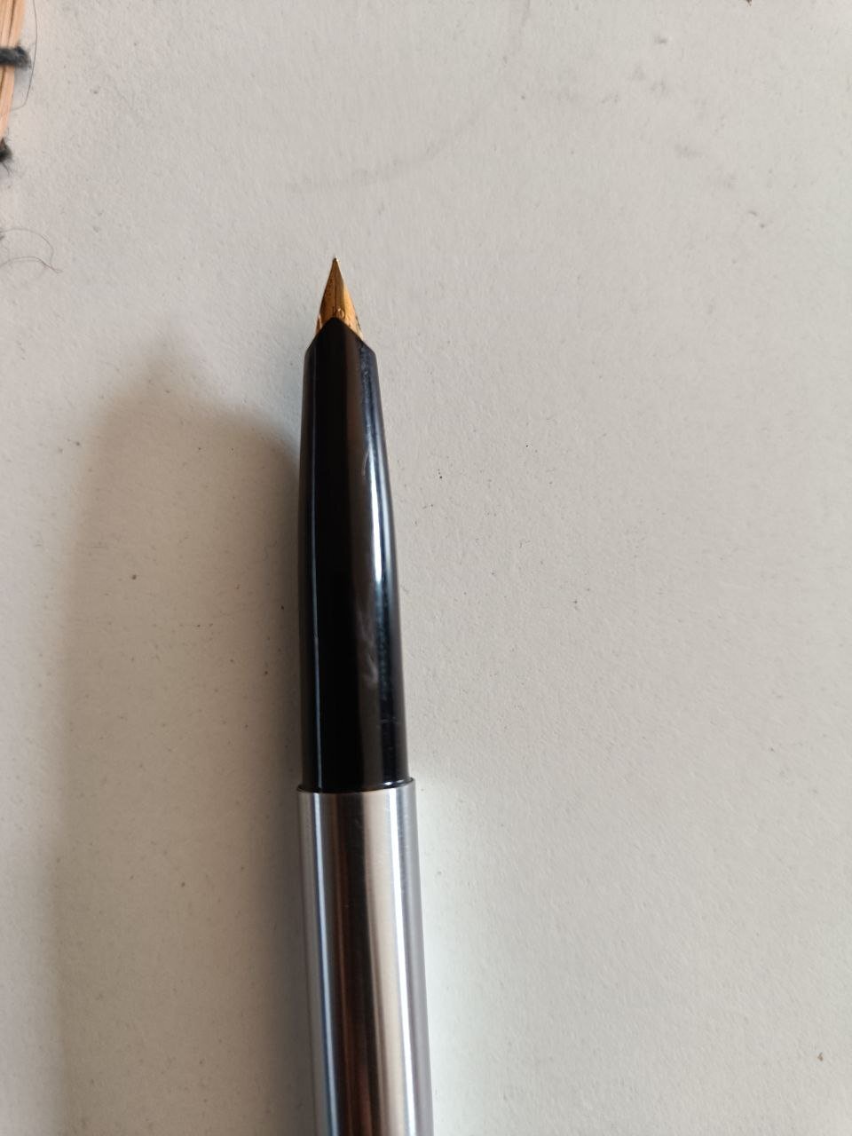
Picked this PILOT fountain pen with PILOT 9007 converter from a flea market. Could not able to find the model of it. Any information would be appreciated.
-
Waterford Powerscourt Fountain Pen early review
donnweinberg posted a topic in Other Brands - Europe
I recently purchased on Ebay for USD$150 a gold-plated Waterford Powerscourt fountain pen with a fine 18K/750 nib and have used it for a week, writing with it at least twice each day. Here are photos, to be followed by my impressions at this relatively early stage. The pen is very attractive and feels nice in the hand. It has a solid feel and nice weight; the pen is of average length and weighs 41 grams. It fills easily with its included converter. I used Noodlers Green ink. It took awhile for the pen to write consistently; at first, it skipped a bit. The fine nib writes with a relatively dry line. The nib is on the firm side and makes an easily audible sound when writing on decent quality paper. My "gut" feeling is that the Powerscourt is an attractive pen that feels nice in the hand but writes in an uninspiring manner. I gather that for my tastes, a medium or broad nib (which I generally prefer) would feel better. However, my guess is that the Waterford line is more about looks than about the writing experience. What are the experiences and impressions of others who have written with this pen or other Waterford pens? Am I being unfair to this pen and brand?