Search the Community
Showing results for tags 'fountain pen sailor'.
Found 1 result
-
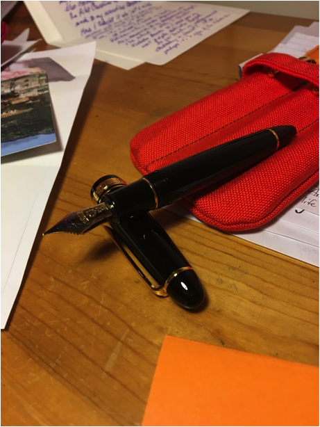
Sailor King of Pen PROFIT Sailor fountain pens owe their company name to an American sailor who first showed his fountain pen to the company’s founder. A lovely story whose reliability I have not confirmed. As Sailor is the name of the FP brand, I would have thought a maritime rank would be a more suitable name for the company’s flagship pen. For example, instead of the King, what about the Sailor Admiral? Regarding the regal title, King of Pen, the name makes me cringe. On Sailor’s website, this line of pens is titled ‘The King of Pens’. Yet the pen is engraved with ‘The King of Pen’. Grammatically, this results in a visceral reaction from even the most liberal grammar national socialist German worker’s party member. The ‘Sailor King of Pens’ sounds more refined, and is what Sailor ought to have engraved on the cap band on their flagship. They could easily have left off the ‘THE’ on the band for the inclusion of the ‘s’ and the end of ‘pen’. The ‘King of Pen’ grates my nerves to a Parmesan cheese dust as effectively as sentences such as: ‘They are all lovely gentleman.’ ‘Our chicken is fresh and responsibility sourced.’ That said, or at least, written, the Sailor KOP is a satisfying acronym, as is SKOP. Within a week. The SKOP has assumed leadership of the populace of my other writing instruments. I think it is worthy of the praise sung by the peasantry who have applauded it prior to this review. First impressions of the SKOP Profit: It’s a very nicely weighted pen. I don’t know how many units, measured in metric or imperial quantities correspond to ‘nice’, yet the pen is pleasantly balanced. It’s almost exactly a larger version of the 1911 Sailor fountain pen; the key differences being the heavier section, flexible nib, and a superfluous ‘ink window’. Olfactory Impressions: The box stank of Urushi, like the Urushi King of Pen(s) that I tried in a local pen store a few weeks before I bought my SKOP Profit. The Urushi scent is not unlike tired tyres. Fortunately the PROFIT is scentless. Given that the box reeks of Urushi, I assume Sailor’s factories must also stink of it, and that someone ought to tell Urushi to wear deodorant. The SKOP Nib: The nib is broad shouldered, two-toned, (the two tones being b-flat and g-sharp) gold and rhodium-plated piece of art. It compliments the size of the SKOP. It is the shiniest nib I own, the debossed lettering on the nib contributing to the glossy, glassy reflection of the gold and rhodium. The gloss may be attributed to the few litres of transparent grease that the pen feed and section were filled with when it left the factory; there was as much grease in the pen as there is in the business ‘invaginations’ of life-size Japanese coitus robots that, as collectibles, make us pen-o-philes seem positively mundane and sensible. Transported to our hero via aeroplane, I think that the pressure changes the pen was exposed to may have sucked a lot of the grease out of the nib and section and into the inner cap. When I unscrewed the pen for the first time, or unthreaded it, for it lacks any screws, the grease formed a seal that held the cap to the pen even though the cap was spinning in my hands as I continued to ‘unthread’ it. There are still a few viscous droplets in the inner cap, which makes me think the nib may be coated in the stuff. The broad nib writes like a Western F-M. It’s very smooth, with much less feedback on the paper then the B 1911 midsize, and the Z 1911 full size nibs. The nib is NOT as smooth as writing with butter on a hot pane of liquid mercury held in suspension by an electromagnetic field. Of the reviewers who describe pens as writing ‘like butter on hot glass’ I challenge them to a) actually write with butter on hot glass, c) under go a drug test, and c) the third letter of the alphabet. The SKOP nib is as smooth as a plastic computer stylus when I write on Rhodia paper, and smoother still on the sheeny sheets of Clairefontaine. It has enough flex to have character, though I’m limited to the 26 characters of the English alphabet, and the line it produces when unflexed is thin enough that it could be used for everyday writing. That is, if you are wealthy enough to be able to risk taking such a pen to work daily. The nib is moderately wet. All my Sailors, and all my Sailor pens, write smoothly with a wet line- whilst this is the wettest of all three. The feed is almost as large as the nib, ½ the size of the distal phalanx of my smallest finger, halved in the coronal plane when standing in the anatomical position. Section: Like all the other sailor Profit pens (if you don’t have one, this description is tremendously helpful), only larger. Or so it seems! The section, internally (internally to the barrel) is very long. And ornate. It resembles a rotor mechanism on a miniature steampunk rendition of a submarine. It’s also very heavy due to the addition of metal to the otherwise plastic component. Having decorations inside the pen is not quite as bad for your health as drinking cocktails laced with precious stones, but equally superfluous. At the height of superfluousness is the ‘ink window’ inside the section; a tic-tac shaped hiatus that enables one to view the ink supply remaining in the pen. Provided that you remove the section from the barrel, and have not depressed the plunger less than 50%. In which case (and in which section), you would know that the pen is otherwise practically full of ink, and the remaining ink volume doesn’t require checking. Filling System: Plunge nib and section into a bottle of ink and screw the converter plunger upwards. That’s the system of filling required to fill this pen, unless you are a blasphemous fiend who is so unimaginative as to only use Sailor ink in Sailor ink cartridges. I feel that Sailor have missed the boat with this filling system. Indeed, I think they have missed all boats by not naming their pen lines after various ships and maritime technology, but I dig the ress. Incidentally, at this point in the first draft of my review that I was writing with my SKOP, the ink ran out. After writing only four A4 pages. Thus emphasising the point that I was about to make; that Sailor have missed the opportunity to make this a truly incredible pen by endowing it with a jumbo converter. A large wet nib, with a feed that could easily feed a small nation, it REQUIRES a large converter. The extra space in the barrel is not utilised, nor is the opportunity to make the pen weightier. This makes the larger ink capacities of the Pelikan M1000 and Mont Blanc 149 much more attractive in the same price bracket. And the Lamy 2000 unmissable in a lower price bracket. Threads: Are what you are currently reading as you try to decide which pen to purchase with that little bit of extra income you pretend you can afford to spend on pens. The threads on this pen are what I have come to expect from Sailor. Fine, smooth to touch (when writing with this pen, the threads feel like another gold band around the section, rather than the terrain where JEEP would film an advertisement for their shoddy vehicles). When threading the cap onto the pen, there is a reassuring ‘grabbiness’ at the end of the thread ‘coil’. Unlike the M1000 that abruptly stops after 1.5 full rotations of the cap, and which 1/10 of a rotation in the reverse direction will sufficiently loosen the cap. Cap: A very large cap that posts as efficiently as the Australia Post company does; it can post, but why bother? It’s fraught with disaster. I have more faith that a letter will reach my correspondent if I set it alight and flush it down the toilet than if I affix a stamp to it and place it in an Auspost box. The SKOP cap perches on the end of the pen, the inner cap just fitting the tip of the pen, and the slightest pressure from the abducens policis (the flesh pad or muscle that secures your thumb to your first metacarpal and allows you to adduct your thumb as you do when holding a pen) will knock it off. The pen is absurdly large with the cap (barely) posted, although it doesn’t seem to affect the weight of the pen when I’m writing with it. Fortunately it’s such a large pen that it’s not necessary to post it. Clip: For the pen with the highest royal ranking, or title of King, the clip is as ordinary and common as Henry the VIII’s carnal desires. The Sailor’s traditional three tiered clip is featured on this pen. Whilst it looks the same as the clips on the other pens, it’s much springier. Not spring loaded, but with more flex at the angle where the clip bends and runs parallel to the shaft of the cap. It’s so springy that I had to double check, for the sake of this review, and triple check, to ensure my ocular organs were functioning, to confirm that the clip wasn’t spring loaded. It’s a suitably broad clip that I would trust it in a suit’s breast pocket, but unlike the Lamy Safari’s clip, I wouldn’t trust it to hold the pen in the back pocket of my jeans whilst skateboarding. My criticism of the clip is that, for the price, and for their flagship, I think that Sailor could have designed a more attractive, more regal clip. Even if it were more angular at the tip, so as to denote the angles of a royal crown (I don’t suggest they make the clip as kitschy as stamping a golden crown to the clip). I simply, or complexly, think it could be made more impressive. Barrel: A large, broad shape like the eponymous cousin of the cigarette and distant relative of the ever more popular VAPE device. The cigar shape is more bulbous than the Midsize and Large 1911 pens I own, which in turn makes the ends of the pen blunter rather than pointed. The blunter tips of the pen make the pen seem larger than it is, and strengthens the association between size, design, and higher quality of the more expensive flagship. The plastic is the same high quality plastic of all Sailor pens (all the plastic ones, that is) in the 1911 series. It’s light, but doesn’t feel too thin, and doesn’t feel tacky like the ABS plastic from which Lamy Safari’s are made (Lamy lovers can put down their base ball bats and pistols; I still love Lamy Safari’s and have a lot of them, I use the adjective tacky to describe the feel, and not the quality of the Safari, which remains one of the toughest FP’s I own). The only negative I have noticed with the Sailor plastic is that the threads tend to collect skin and oils from my hands, and this accumulates as a clay coloured jam in the sulci. Perhaps it’s simply that the plastic is so shiny it’s more noticeable. Not at all significant or a problem, but collectors who obsess over keeping their pens as clean and polished as onyx mirrors may find they are required to give their Sailors more happy-endings than their other FPs. This is a beautiful, subtle flagship of a pen. I chose the profit SKOP because it was the cheapest of the SKOP f-ships available online. If I was to invest a significant sum of money into an Urushi pen, I would rather buy a Nakayama or Namiki Urushi pen, for I think that these are more attractive and unique than the Sailor KOP Urushi’s. For the price, I think the pen is excellent. It’s very comfortable to write with, the nib performance is as profound, and not as short-lived as Heath Ledger’s JOKER in Batman the Dark Knight. The only improvement Sailor could make would be to their clip designs (at least, on their URUSHI line), and to create a larger converter for this pen (surely that isn’t too hard to do? If there is a Sailor representative out there reading this, please consider this for the sake of the overly invested fountain pen collector who actually uses flagship pens to write with!) The KOP is a worthy addition I can see myself using lots, and see myself in the barrel’s reflection, and keeps my Pelikan M1000 from monopolising my collection, forcing it to play other board games with pens of lesser value in my collection. If you can afford one, they are brilliant pens. If you can’t, the 1911 Large, and 1911 Mid-size are excellent pens also. For my reviews of the pens compared in this review, the Pelikan M400, Pilot Custom 823, and Lamy 2000, and Laban Mento, please see the links below: Lamy 2000 https://www.fountainpennetwork.com/forum/topic/191060-lamy-2000-story-review/?hl=%2Blamy+%2B2000+%2Breview Pelikan m400 https://www.fountainpennetwork.com/forum/topic/190262-pelikan-m400-review/?hl=pelikan Custom 823 https://www.fountainpennetwork.com/forum/topic/189405-pilot-custom-823-rantview/ Laban Mento https://www.fountainpennetwork.com/forum/topic/189668-laban-mento-electric-yellow/