Search the Community
Showing results for tags 'flex'.
-

Does Anyone Know If It Is Safe To Flex These Pens?
kalum posted a topic in Fountain & Dip Pens - First Stop
Dear all, Thank you for your time. I have a few fountain pens that I have collected over the years and I have become interested in script generated through flex. I know there are dedicated flex pens available but I just wanted to find out if any of the following pens that I own are safe to try flexing. Caran d`ache ecridor (steel nib with rhodium plating) Pelikan m400 (gold nib) Waterman carenne (gold nib) Pilot vanishing point (gold nib) I love the namiki falcon but rather than buy this, I was wondering if I could utilise my pens for this line variation. Many thanks Also if anybody has not seen this demonstration of flex script, it is an inspiring watch. Search YouTube for `custom namiki falcon, part 2` by TheImmovableMovers. All the best -
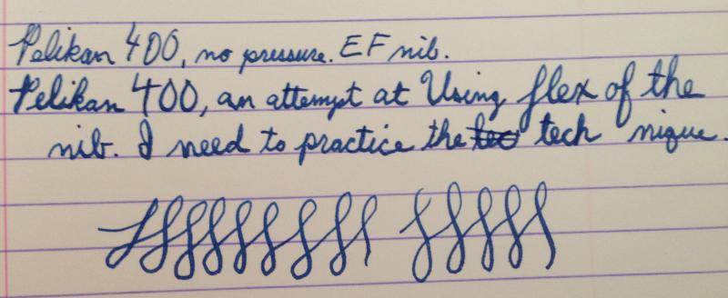
Here are my thoughts on the Vintage Pelikan 400 EF Tortoise I recently received. For comparison, I'll rely heavily on my experience with a modern Pelikan M600 Souveran and a Lamy 2000. First Impressions (10) The Pelikan 400 is absolutely gorgeous with the tortoise finish! I love the color variations. http://farm4.staticflickr.com/3818/9689506858_0e1703f821_b.jpg Vintage Pelikan 400 & Modern Pelikan M600 Souveran by astrophoenix, on Flickr Appearance and Design (10) On first glance, the 400 looks just like a modern Pelikan Souveran, only missing some gold bands (which I personally think are a bit over the top anyway). The piston-turning knob, the barrel, the cap, and the section are pretty much exactly the same shape as the modern pens. http://farm8.staticflickr.com/7313/9686271465_00018c3127_b.jpgVintage Pelikan 400 & Modern Pelikan M600 Souveran by astrophoenix, on Flickr as you look a bit closer, you can start to pick out some differences: the piston-turning knob on a modern Souveran has much "sharper" edges than on the vintage 400, and lacks the marking of the nib line width. The nibs look quite a bit different, even though both are 14K gold nibs. The emblem on the top of the cap is probably the most pronounced difference to the casual observer, with the modern gold emblem which relies on texture for contrast, versus the simpler etched design of the vintage 400: http://farm4.staticflickr.com/3767/9688991580_0d232c738c_b.jpgPelikan 400 Tortoise by astrophoenix, on Flickr In general, I would never think to myself, "I want to add a pen in the color brown to my collection". but there is brown, and then there is this: http://farm3.staticflickr.com/2871/9685752267_29efd694db_b.jpgPelikan 400 Tortoise by astrophoenix, on Flickr http://farm4.staticflickr.com/3680/9685751943_3659824876_b.jpgPelikan 400 Tortoise by astrophoenix, on Flickr This type of brown made me lose my mind with desire. I'm only exaggerating a little bit, here. I love the way different lighting brings out different elements of the stripes. There are some red patches in there. there are a few stripes which look like marble. and of course there are darker smoky-looking patches, as well as honey and yellow. The non-tortoise parts of the pen actually are a dark brown, so dark they almost look black (difficult to pick out in most of the photos). so ok, yes, I did add a brown pen to my collection! Another big difference between the vintage 400 and a modern Pelikan M600 is the material the pens are made from. The modern pen feels like sturdy and smooth plastic in the hand. the 400 feels much more textured. the smoothness of the M600's material makes the stripes on the barrel seem flatter; my mind says "a material that smooth can't have stripes, they must be under the surface somehow". The subtle texture of the 400, on the other hand, makes the tortoise stripes come alive, as if they are part of the "skin" of the pen. I think it could be best summed up as, the M600 feels modern, static, cold; the 400 feels dynamic, organic, and living, almost like it should be breathing. Construction and Quality (9) This Pelikan 400 is somewhere between 59 and 64 years old at the time of this writing (2013-09-06), so I think its construction and quality are very high. The Piston turns easily and smoothly. I was a little shocked at how smoothly it turned. I'd give it a 10, but the piston seal did leak a little bit when I was flushing all the old ink out of it. (inky water came out at the top, near the piston-filling knob) I need to pull the piston out and probably lubricate the seals or possibly re-cork it. This requires a special tool though, which I don't have yet. The modern pelikans' piston can be removed with the wrench TWSBI ships with their pens, which is a really nice bonus. http://farm3.staticflickr.com/2812/9685753045_f3e5a19417_b.jpgPelikan 400 Tortoise by astrophoenix, on Flickr Weight and Dimensions (8) The Pelikan 400 is a somewhat light pen, but heavier than I remember the Pelikan M200 Souveran being, which is good, since the M200 was too light for me. when I hold the 400 in one hand and the modern Pelikan M600 Souveran in the other, I think the M600 is just perceptibly heavier. which makes sense: the M600 has a larger nib, a larger section, a larger cap, a larger piston-turning knob, and the barrel of the pen has a slightly higher diameter than that of the 400. The barrels (at least the colored parts) of the 400 and the M600 seem to be the same length. The Pelikan 400 is noticeably lighter than my Lamy 2000 (again holding each in opposite hands). I can write comfortably with my M600 unposted, but I prefer it posted. the 400, on the other hand, was just slightly shorter enough to keep me from writing unposted. I'd probably be happier if the 400 were the size of the M600, but I don't mind its very slightly smaller size too much. Nib & Performance (8) This 400 has an EF nib. One of the reasons I wanted a vintage pelikan was to try out a flexible nib. Wow, does this nib deliver! I'm a total n00b at varying pressure to vary line size, but here is a shot of one of my first attempts, applying pressure on the downstroke, and no pressure on upstrokes: The ink is Noodler's Luxury Blue. the paper is a Clairefontaine spiral notebook. One of the loops in that picture looks like a skip; the pen didn't skip, I was trying to vary pressure and went so light that I wasn't touching the paper anymore. Here's a writing sample, trying to apply the same effect, with my M600 (F) ... I mainly tried it on the swooshy loops, not on the words themselves: The 400 nib has a readily-noticable springiness to it. apply some pressure, the tines spring apart. with no pressure, I get a very precise, thin line, certainly worthy of the EF marking on the piston-turning knob. the Modern M600 is much wetter but has no spring whatsoever to it. in the loops above, I can see some line width variation but it doesn't feel like the nib is flexing to me, certainly not the same way as the spring of the 400. I can't really explain the line variation I see with the M600. comparing to the flexiness of my Lamy 2000: when I apply pressure to the 2000, I can feel the nib changing shape a bit, but not with a spring like the 400. it feels like the 2000's nib is a bit softer, so it has some give to it. (The Lamy 2000 also has a 14K gold nib) The 400 nib doesn't feel soft, it's almost like it has two settings: tines together, or tines apart, with a spring to go from one to the other. http://farm8.staticflickr.com/7371/9685751525_4db30550b5_b.jpgPelikan 400 Tortoise by astrophoenix, on Flickr the feed is ebonite, not plastic, and is impeccable. I've never had it skip or railroad on me, even though at least half the writing I've done so far is while applying pressure to play with the flex. http://farm4.staticflickr.com/3724/9685751059_8787631957_b.jpgPelikan 400 Tortoise by astrophoenix, on Flickr When it comes to smoothness, the 400 is fairly smooth. as it goes across the paper, it sings the whole time. at first I thought it was a scratchy noise, but it's not. the only time it gets scratchy is when I apply pressure, then try to switch from downstroke to upstroke; at that point, it feels like the nib is trying to dig into the paper. in reality, I shouldn't apply pressure on the upstroke at all, so the "digging in" might just be my lack of experience. The M600, on the other hand, is super smooth and wet. the 400 is not a dry writer, but the M600 is much wetter. I think the 400 nib has a decently-size sweet spot for such a fine line, but once a word or so I can "snag" it on the paper. also, I have a pocket notebook made by dodo case: http://www.dodocase.com/products/dodocase-notes-for-iphone-5 I think the paper is comparable to moleskine paper. even though the M600 is much wetter, it doesn't feather on the dodocase notebook, whereas the 400 feathers like crazy. (Note, a TWSBI 580 M also feathers on this paper, but not as much as the 400 does) One thing I did notice is that after I wrote a bit with the 400, then switched to the M600, was that anytime I wrote the letter e, the loop to make the e was filled in. My handwriting is naturally small, and getting used to the M600's wetness meant I was forcing myself to write larger. once I started writing with the extra-fine line of the 400, my handwriting snapped back to small, and if I didn't adjust back when writing with the M600, all my letters and loops were getting run together by the bigger line. The nib on the 400 is a lot of fun, when you try to vary the line width by applying pressure, but it's also hard work to use the line variation properly. and when applying low pressure, it's not as smooth as a modern nib. it probably needs a bit of tuning or alignment; I might send it off someday. Conclusion (9/10) I'm really thrilled with this 400 Tortoise. It's going to be the pen I use the most for quite some time. I'm a little concerned about the occasional snags I get with the nib, and I'm definitely going to investigate the piston leak, but since it's over half a century old, and not restored, I'd say this is to be expected. The 400 looks good, feels good in the hand, and is exciting to write with. for everyday writing, I can write softly and the pen lays down a nice thin wet line. and when I want to play with line variation, the 400 instantly responds.

-
I have owned a 21st century Pelikan M600 Souveran for a couple years now, and I recently received a first-generation, 1950s-era Pelikan 400 tortoise. (I posted a review of the 400: https://www.fountainpennetwork.com/forum/index.php/topic/252129-pelikan-400-ef-tortoise-1950-1954-review/) anyone have experience with both a vintage 400 flex nib and the modern M1000? I've heard the M1000 is the only modern pelikan with a flexible nib. With my fresh vintage nib experience, I'm wondering how the modern M1000's nib stacks up! thanks in advance for your thoughts.
-
Hi, After seeing some very nice penmanship video here and on the Internet I decided to try my first video. I tried it with my Esterbrook J with 9128 flex nib. Hope you enjoy... comments are welcome [video=youtube] Original post at my blog
-

Modern Soft/flex/semiflex Pen Reccos? (Please Dont Say The Falcon! :)
jameskachan posted a topic in Fountain & Dip Pens - First Stop
I have both a Fine Nib, Metal Pilot/Namiki Falcon, as well as a Stipula Model T ( It's a Titanium Nib, sorta Medium in size, and with some pressure it is semi flex/soft) Everyone and their brother talks about Flex and either Vintage or the Falcon. I'd like to hear some pen nerds feedback on other options, what else is out there?, and what are they like? I was checking out the new flex nibs at Edison, featured here: http://edisonpen.com/index.cfm/2013/6/27/Edison-Offering-Richard-Binder-14k-Full-Flex-Nibs These look promising, however I really dont care for the look of most Edison pens they would go on. I much prefer the look of say, a Mont Blanc, or the metal Falcon - sleek, and modern. I'd love to be surprised by a pen I've never heard of or researched! Anyone have any recommendations? -
Hi, I am new here. Although I have been using fountain pens since my childhood, haven't come across ones with really flexible nibs...so am looking for one. Currently I live in Berlin, Germany. Can anyone recommend a pen, with a really flexible nib, preferably with a piston filler, and a classic traditional look (say, like Pelikan M200) that I can find somewhere in Berlin, within a price range of 120 EUR? It would be great if you could direct me to the particular shop(s) in Berlin as well. Also, since I don't speak German, is it also called "flex fountain pen" here? (in case there is a problem in communicating with the shopkeeper). Thanks!
-
Hello all, A while back I purchased a NOS M100 (the white and black version). It had an M nib, but was EXTREMELY broad so I quickly sold it. I normally use EF pens and have started getting into flex pens just a bit for some special writing (they can't ALL be daily writers, right? ). Anyway... I recently purchased an M205 in black and chrome and I absolutely LOVE everything about the pen (size, weight, color, etc.), but the nib is driving me CRAZY. It's VERY broad. The Pelikan EF is significantly broader than any of my other EF nibs (I've included a photo comparing it to a Lamy, Edison and TWSBI because they are all steel nibs and are all German, like the Pelikan) and is actually more similar to my wife's Lamy Broad nibs. Is it normal for Pelikan nibs to be this much more broad than their other German counterparts? It also exhibits a surprising amount of flex with just slight pressure (which is where the broad line is coming from, I think). I'm wondering if I should just part with it and get something else or if I should maybe send it to a nibmeister and see if I can't get it ground to an actual EF. Since I don't have other Pelikans to compare it to, I'd love your input here. If this doesn't seem to be normal, then I may contact Pelikan and see what they suggest (I've heard they have great customer service so I'm hoping maybe I can just swap the nib or something). Thanks in advance for any insight you can offer. I want to love this pen, but if it's going to write this broad, I don't think I'll be able to make a spot for it in the case. Best, Matthew http://farm8.staticflickr.com/7398/9584235179_ac29b5d37d_h.jpg
-
Hello All, I have been consumed by the fountain pen world for about a year now after a lifelong obsession with pens, paper, notebooks, stationery and anything related. Why it took me so long to discover fountain pens is beyond me, but I'm very glad that I did. I've so far not invested more than $110.00 on a pen, but I know it's just a matter of time. My query is about Waterman Pens which I've heard mentioned over and over as beautiful writers with a rich history. I am particularly interested in a vintage flex pen although it may be more practical to stick with a conventional nib, which I am partial to italics, stubs and bold writers. Is there any advice that might be helpful and what kind of $$$ should I expect to spend. I hope this is the appropriate place to post this topic. I am still trying to find my way around. Thank you, David
-
I found the Noodler's nib creaper for 13 dollars shipped and the Serwex 162 with flex nib for 12 dollars shipped. Which one do you guys think is better? I've heard that Serwex pens are less fussy, but the video here: shows the creaper has way more flex.
-
Hello! I'm a self-taught calligrapher from Russia and I specialize in dipping nibs. However, I want to find a pen for everyday usage (I'm a student and have to write a lot). I need your help as we don't have a large selection of fountain pens in Russia (only Parker and Waterman), so I cannot try other pens. I want a pen with flexible (or semi-flex) nib (something very near to copperplate) that is cheaper then 50$. Also it would be better if a pen would be made of metall, but this is not obligatory. Thanks for your help. PS Now I'm trying to modificate a cheap parker by changing standard nib with the dip one, but it is much more scratchy, then a good pen should be)
-
Hi all! This is my small collection of pens so far: - Marble-like semi flex pocket fountain pen (Unknown manufacture with modified FPR flexible nib) - Namiki Falcon (resin) with Spencerian cut - Reform 1745 with nib reworked to add flex (actually it opens up to 1.5mm) - Lamy Logo with 1.1 strub and EF nibs - TWSBI Vac 700 with reworked cursive italic nib from EF and reworked oblique italic from B - Youngseng 016 The pictures were taken with a D90 and 18-105 lenses and YN465 flash light. Cheers
-
I recently found my grandpa's old sheaffer 550 F nib fountain pen sitting in his basement. I inked it up and tried it out and absolutely LOVED it. It wrote super fine and dry, but it was buttery smooth. Additionally, it appears to be a pretty springy, soft nib, as I can squeeze some fun line variation. However, it is my grandpa's pen and I intend to return it soon. I was wondering if anyone had tried a sheaffer 550 F nib and knew another pen that was similarly fine and dry, yet buttery smooth and has similar flex AND is hopefully cheaper than a normal sheaffer 550. I would like <$30 and prefer a metal body, but the metal body isn't as important.
-
A while ago I discovered this pen thrown around a draw... It was a cheap Chinese pen with a marble-like body and oak cap finished with chromed fittings. The nib was damaged and tines blended apart. Moreover the ink cartridge was damaged and it leaked blocking off the feed and leaving horrible strains in the body. so yesterday I decided to dive the body into a weak bleached solution and restore the feed. As the nib was completely damaged and I had a spare semi-flex steel nib from fountainpenrevolution I decided to try a swap... First attempt was a completely fail. The nib´s body diameter was just too big to generate enough pressure against the feed so the ink didn´t flow at all... Then I decided to cut part of the body of an old falcon nib from a drip pen and press it between the pen´s nib holder and the nib so it created extra pressure... And voilá! after converting it into an eyedropper, the pen works perfectly! Some work needs to be done in the feed to allow more flow as the previous nib was extra fine and this is medium. Also as the nib has some flex, the feed can´t just deliver enough ink so this weekend I´ll do some work around it. After 20 mins of work and 7 pounds spent on a nib and some silicon grease, I have a semi-flex pen that behaves very well for everyday use This morning as I had to do some work with the feed, I also decided to tweek a little bit the nib and give it some polish...
-
There are lots of very good fountain pens available today and you certainly don't have to pay a fortune for one you can enjoy. But there is a certain feeling to a really nice handmade pen - something that inspires you to write. I've been using fountain pens since I was a wee lad but it has not been until lately that I started paying more attention to the pens I use. I'm no longer looking at them as a utility instrument for writing. FPN has generated a mountain of useful information for me and at this point in my life I want something that is comfortable to hold and a joy to write with. This is true of the Romillo Essential Writer. It is an exquisite pen that is the first new pen I have purchased that writes like a refinement of an older Waterman or Swan with a flexible nib. You might think "why spend all this on one pen?" The answer is quite simple - the effortless writing, the way it feels in your hand, and the knowledge that it is something that will last a lifetime (if not more). Some info - Romillo Essential Writer Ebonite in blue/black K flex nib (Fine - Broad) 18k Eyedropper fill No clip The packaging is extraordinary and includes a wooden case, a felt pen wrap, a bottle of Romillo ink, a dropper, a wood pen rest, and written instructions on filling and care. The nib is very smooth and ink flow could not be better - just the right amount of wetness for whatever style of writing you need to do. When I first talked to Álvaro about obtaining one of his pens I had it in the back of my mind I would be using this to for creative writing. this would not be my pen to "write checks" with but the versatility of the nib has negated that line of thinking. This is the kind of pen you can use for everything. All in all this is a work of art that just so happens to write - and that it does in the most beautiful way. I could not be more pleased with it.
-

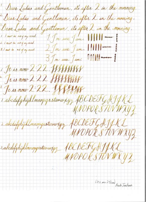
"blind" Comparison Of 5 Different Pens Using Noodler's Golden Brown
PrestoTenebroso posted a topic in Paper & Pen Paraphernalia Reviews and Articles
In a panicked, nervous state and unable to sleep, I thought I'd calm myself by trying out a few pens. I've been torn with the idea of which pens I want to keep and which I want to sell. I have a few vintage pens and though they are all nice in their own ways, I've been looking for a low cost, high quality way of getting the most out of the inks I love. I like an ink that gives strong shading characteristics. So, the ideal pen for me is a flex pen that actually doesn't write too wetly. My Noodler's Ahab (which I've modified as described here) gives nice flex, but it doesn't really "do" anything like hairlines, returns are a bit slow for my tastes, and it writes so wetly that you don't get a chance to really do any shading. You just get a fat, wet line. Anyhow, these are 5 different samples I did with Noodler's Golden Brown (sample 1 must have had a little leftover blue in it). I'd like to know what you think of each pen and why specifically. Note: Please excuse the overall sad quality of the scan and the handwriting. This is my first post! I think I'll take a note from everybody else and just do a photograph in the future for this sort of thing.
-
I have a great (possibly stupid) idea of getting a Waterman 52V pen for the flex goodness, but can't get over the lever filler system, which really does not ring well with me. Ideally I'd like to somehow modify it to take the Pilot CON 70 for the awesome capacity, but I don't know where to start with that. Can the nib and feed of a Waterman 52 1/2 V, for example, be fitted to any modern Waterman model? I am really unfamiliar with Waterman pens so I would have no idea where to look. If so, what model or line of models?
-
Just saw this new video on noodler's web site about how to use speedball nibs in noodler's pens, as well as some new pens / new colors / non-flex Konrad nibs. Man I do love all the noodler's videos! I'd love to be able to get those new ebonite Konrad colors, I'm trying to get all of them and have been successful so far, but not being able to go to the Boston show may put a wrench in the works. Anywho, thought you all would wanna watch! -Nick
-
My Noodler's 12/25 Ahab just came in the mail. I highly recommend Isellpens for online orders. The pen shipped VERY quickly and Todd included a courteous thank you note with the package. I am not a calligraphist, but I'll attempt calligraphy sometime soon for letter writing and pure fun. So feel free to make fun of my awkward line variations in the writing sample. Actually, many of those jumps between thick and thin lines were unintentional since I'm getting used to this pen. Before I get to the pen itself, I have to say that the pen's box is really really cool! I love the whole whaling theme! Maybe someday soon I'll get around to reading Moby Dick while taking notes with the Ahab. Aesthetics: Dark red with swirls of dark dark dark green striations. This will be a pen I'll especially use for the winter holiday seasons. Honestly, I can't help but think of Christmas decorations when I stare at this pen. I like the silver cap ring and clip. There's nothing overly fancy about them, they're labeled "NOODLER'S INK" and nothing else. The steel nib has the same labeling. Contrary to the many review I've read about the Ahab's clip, I actually like the clip's whale themed design. Here is a picture of the pen with my other "Christmas color" pens (is blue a holiday color? oh well) http://24.media.tumblr.com/265229da2827e979312d382a015a0b2f/tumblr_mnomnnBu0m1r4c920o1_1280.jpg Weight: Feathery light. Functionality: The cap clip is springy and won't fray the material it's clipped onto. The vegetal resin certainly doesn't feel as durable as my stainless steel pens, my acrylic pen, or my plastic Lamy Safari. I read on a review somewhere that the material is dentable with a fingernail. I tested this by pressing my fingernail against the pen with plenty of pressure and did find a dent, but the dent was very shallow. Actually, I'm looking at my pen now and I cannot find the dent. Perhaps I cut into some dust or overlaying oils (I touched the pen after eating some chips, forgive my slobbiness). This pen is definitely wide and thick. This may turn off people with small hands, but the pen's girth really isn't a problem when you account for this pen's nearly non-existent weight. I heard about Noodler pens leaking so I did a "leak test". I put the pen nib-facing-down in my pocket and walked around my neighborhood and ran up and down the stairs of my house while doing some chores. The pen did not leak for some reason, this gives me some confidence in using this pen as a daily writer without having to worry about getting ink all over my clothes. The pen will cough up a few drops of ink if you shake it a few times with your hand, but you have to shake the pen with a conscious effort. I think this is normal behavior for many pens. My Japanese Sailor-Sheaffer and USA Sheaffer 440 pens will spill a few drops of ink when shaken vigorously up and down. I wouldn't worry about using the Ahab as an edc pen. The ink won't spill if you're walking around town. Just don't do any activities that involve shaking a lot like mechanical bull riding or jumping jacks. Writing performance!: Oh boy, this is where all the calligraphists shake their heads at me. I was expecting some scratchiness with the nib. After all (I think), this pen was designed for flex and not daily writing. To my delight, the Ahab's nib is actually very smooth! Flexing wasn't an issue for me, I actually ended up flexing the nib on accident quite a few times. I guess I don't have a light writing hand after all. Well, it's either that or this nib is easy to flex. I wouldn't classify this nib as "rigid" or a "nail." I did 30 short downstrokes with this pen to test for railroading instances. Only 2 out of the 30 instances expressed railroading. (not the most scientific way of testing a flex pen, but I'm new to these kinds of pens) http://24.media.tumblr.com/6a0d7bf13cdcf38b39ac60e27ce2009b/tumblr_mnon4y6jlY1r4c920o1_1280.jpg Since this pen doesn't have serious leaking problems, I wondered if I could use this pen for note taking and math scribbling. I wrote with less pressure to achieve a fine line and compared the Ahab's fine line width capability with my Japanese Sailor-Sheaffer's fine nib. http://24.media.tumblr.com/14b04b0f1bffa2dcdd9eb515f7239327/tumblr_mnon4y6jlY1r4c920o2_1280.jpg I enjoy smooth and wet medium nibs for notetaking outside of the lecture hall. I love sitting back, listening to music, and taking my time with my studies (even if I find my studies to be BORING, at least fountain pens make studying pleasurable). I compared the Ahab's thicker line capabilities (requires very little pressure, no strain on the hand was felt) to my medium nib pens. http://24.media.tumblr.com/8c70d0210b5306d5c0aa55aa006f1885/tumblr_mnomnnBu0m1r4c920o4_1280.jpg Here is a picture of the pens altogether, just for the heck of it. http://25.media.tumblr.com/77fe16a7dc0bf6a245f37bffccb478c5/tumblr_mnomnnBu0m1r4c920o5_1280.jpg Verdict/Summary: This pen does require patience. I spent a loooong half-hour setting the nib and feed to my liking. However, the time spent getting to know this pen is worth it. After tinkering with this pen you'll gain some knowledge on nib/feed setting, eyedropper conversion,and nib swapping. If you're seeking a cheap daily writer and you don't care about line variation, then at this price point I recommend NOT buying this pen. If you're like me and you're looking for a cheap gateway to flex pens, then I highly recommend buying this pen. If you care about line variation but at the same time desire a daily writer, then this pen is suitable but you'll have to be careful to not vigorously shake it. And by vigorous, I mean shaking the pen in the same way mad dictators shake whatever is in their hands when making violent gesticulations during rants. I love this pen. My desire for more pens has diminished greatly ever since I got a hold of this beauty. I have my workhorse pens and a pen with enough flex for my preferences that can also double as a daily workhorse.
-
Hey guys, i have come across this pen and the seller nor do I, have an idea about this pen. It has an eversharp 14k gold nib on the top, and some kind of ring top fountain pen maybe? anyways, i would like your expertise on the topic. Pics below.
-
As it says above. Looking to get a flex nib and a pelikan so I thought get then together. I also very much appreciate Richard binder. All that being said. I have no idea wether to get a F or XF. Any suggestions? Thanks!
-
Hello All, I have recently purchased a Waterman 52 1/2V fountain pen with a flexible nib and have restored it to good condition. However, I find the flow to the nib to much too wet. Both the hairlines and the broad lines pool with ink, and sometimes the broad lines will be nearly black when using my diamine midnight ink. The pen is practically incapable of writing on cheap paper due to excessive feathering. Is there a way to reduce the flow? I am sorry if there were other resources with this information, but I could only find information relating to reducing the ink flow to a firm nib, which included adjusting the tine gap. Obviously, this would not prove very effective when the tines flex. Also, another minor question. I have aligned the tines on the nib when the nib is off the pen, but when placed into the section with the feed, the feed pushes unevenly on one tine, slightly misaligning it. It still writes, as the issue is small, but will I need to sand the feed down to be more even if I want this problem alleviated? Thanks for the help, Allan