Search the Community
Showing results for tags 'flex'.
-
This is one of my first threads so I hope I put this in the right place. I just got another five Jinhaos, and I've been wondering whether it's possible to get a flex nib to put on one of them. I got a 992, X159 I think and a few others. So I've looked at FPR nibs, and Noodler's, but shipping is prohibitive because of where I am. It's like $45 for a $1 nib or something. I have a few cheap low quality copperplate nibs, but they're scratchy and not too durable. I'd like something smooth, and very fine. I don't need much flex. As long as some variation is visible, I'm happy. Any suggestions would be much appreciated. 🙏
-
I was hoping to show you a picture of this new, very sleek looking pen, but it seems that's not an option right now. Lightly brushed, matte back body, gloss, transparent red section and ink window, designed around the Zebra G flex nib with a purpose-designed ebonite feed, but can take any screw-in #6 nib unit. Clipless. Handmade in America by me. Limited run. Please have a look at the full story at the link above.
-

Modern inexpensive flex nibs: Bluedew Flex vs FPR Ultra Flex
ParkerBeta posted a topic in Fountain Pen Reviews
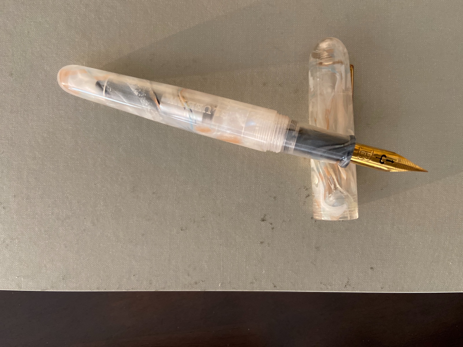
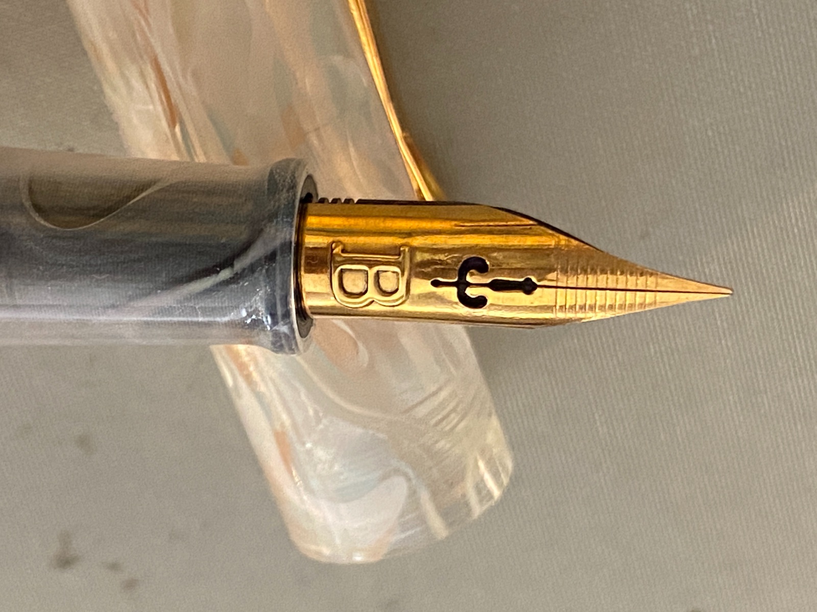
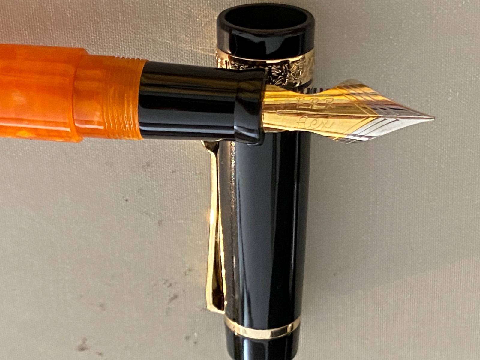
We often hear that there is no modern equivalent to the vintage "wet noodle" flex nibs of 80-90 years ago. In recent years, some pen makers are making a concerted effort to create flex nibs that do achieve the line width variation, snapback, and lack-of-railroading of those fabled vintage flex nibs. Some are expensive gold nibs mounted on expensive bodies (Aurora, Montblanc 149 Calligraphy, Scribo Feel), with the pen and nib together costing between $500 and $1000. I approached the "modern flex" question out of curiosity, and my curiosity does not extend to spending several hundreds of dollars to investigate the question. Instead, let us take a look at two reasonably priced (even if not quite "inexpensive", notwithstanding the title of this post) flex-nibbed pens, starting with the Bluedew. This is a pen created by a Singaporean inventor named Jeffrey, and it is all about the flex nib. Indeed, he founded the company to sell the nib, with a pen around it. The pen sells for USD88, ships worldwide for an additional USD12, and as you can imagine for that price you get a stainless steel nib and not a gold one, although you do get a very nice faux-leather single-pen case that can hold a good-sized pen (and is in fact the only packaging for the Bluedew pen itself during transit). Kudos for no-waste packaging! Now, about the nib itself, it has long narrow tines and a very interesting pattern in place of a simple breather hole. If you read the FAQ on bluedewpens.com you will see that everything about the nib was designed in order to extract maximum flex from it, even the embossed "B" on the nib (which is supposed to trap a small amount of excess ink under the raised "B"). The Bluedew flex-nib pen. Multiple body colors are available, including (obviously) a blue colorway, but at the time I went to the website this translucent finish was the best-looking option they had in stock. It has faint pink swirls in the resin, and there is a "BLUEDEW" engraved on the barrel. The cap is unmarked. The pen is 140mm capped, 125mm uncapped, and the grip section is between 10mm and 11mm in diameter. The fit and finish of the pen are definitely in the uppermost range of what is available at this price point. The barrel threads are precise and the pen can be easily eyedroppered (maybe with a little silicone grease applied to the threads for peace of mind), although I have only used the pen with the converter and a cartridge. Ink flow does seem to be wetter with the converter, by the way. Unfortunately, the converter looks like a proprietary design even though the cartridges it takes are the standard international size. Here you get a closer look at the details of the nib. Unlike several other flex nibs that are created from stock steel nibs by cutting out scoops from the sides, this nib was designed from scratch, according to the Bluedew inventor Jeffrey, and the interesting breather hole pattern, the two cuts (parallel to the slit) on the two sides of the slit, and the horizontal ribbing above the breather hole all testify to a novel design. Remarkably, the feed is plastic and not ebonite, and there is an explanation for this choice in the FAQ on the site. Next, let's take a look at the other modern flex-nib contender, the FPR "Ultra Flex" nib from Fountain Pen Revolution (FPR), a company headquartered in Texas that made its reputation by commissioning inexpensive but reliable fountain pens from manufacturers in India and offering sales and warranty support right here in the USA, together with excellent and responsive customer service. (Like Bluedew, FPR is also essentially a one-person company. It is inspiring that small companies founded by individual enthusiasts are bringing the innovation to this century-old space that the big pen-manufacturing corporations have chosen not to address.) Now, this FPR Ultra Flex nib is available mounted on a variety of pens sold by FPR, but I opted for the somewhat expensive (relative to the rest of the FPR lineup) model called the "Tanoshii." This is also a departure for FPR in that this pen is made in collaboration not with an Indian manufacturer but a Japanese manufacturer. There is a thread elsewhere on FPN speculating as to whether the pen is actually made in Japan or made in Taiwan by a Taiwanese subcontractor to said Japanese manufacturer, but wherever it is made, it is made very well. This body costs around $70 and the Ultra Flex nib is an additional $14, bringing the total almost to the same amount as the Bluedew. As you can see, the pen is strongly influenced by the Delta Dolce Vita down to the black cap with orange body and gold plated trim. The thick cap band (obscured in this picture, but visible in the close-up photograph of the nib below) is also decorated with a motif just like the no-longer-made Dolce Vita by the now-defunct Delta. The clip seems to have a little roller but the roller appears to be fixed and does not actually roll. In contrast to the Bluedew pen, the Tanoshii design is a flat-top and slightly shorter (135mm capped) but the section is slightly girthier (10.5mm). Again, fit and finish are in the 90th percentile for a pen in this price range (although unlike in the Bluedew, the barrel threads do not screw into the section with such tight tolerance that I would be entirely comfortable with eyedroppering it), and the orange resin looks lovely. You can also get it in black, or with a light blue barrel, or with a red barrel and a white cap (the only option without a black cap). It is also a C/C filler that accepts standard international sized cartridges, but the included converter is not as "premium" feeling as the one on the Bluedew. Here you can see the cap band design and more importantly, a close-up of the nib. This nib, also made of stainless steel, is of a more conventional design for a modern flex nib, being cut by hand (by Kevin, the founder/owner of FPR) from a stock steel nib. Note the very deep slit and the two cut-out scoops on the two sides. If purchased on its own, this nib can be acquired paired with an ebonite feed, but when acquired as an upgrade option with the Tanoshii, the Ultra Flex nib comes with a plastic feed. Kevin says it keeps up with flow requirements pretty well and the writing sample below will confirm that. Now, on to the writing test(s). I have previously written a couple of converter-fulls with both of these pens, but for the tests today I took the lazy route and used a "mystery" cartridge (that I think is Monteverde Purple Reign) on a Doane Paper Utility Notebook with the Boxcar ruling. This paper offers a great textured surface suitable for all nibs, but it is absorbent and has severe bleed through with most inks. Clearly, the FPR nib is much, much wetter than the Bluedew nib. On the other hand, the Bluedew nib, maybe because it is drier, actually shows the line-width variation one expects, although it railroads before hitting the 1.5mm BB limit as claimed by its manufacturer (I did get close to that limit using the converter, though, but I don't have evidence of that today). The FPR nib actually dumps so much ink on the page that it caused severe feathering (clearly visible above in the figure-eights) and bleed through (not shown), while also obscuring the full range of line-width variation possible with this nib. My experience with both cartridge and converter is that the FPR Ultra Flex nib does not actually get down to EF thinness while the Bluedew can. On the other hand, the FPR nib gets to BB thickness easier than the Bluedew nib does. As for the pressure required to get flex, this is where I think we are finally approaching parity with the vintage flex nibs, and this is great news. Both nibs flex under little to light pressure, though I would say that the Bluedew nib flexes even easier than the FPR -- to be expected, I suppose, from a nib that was designed as a flex nib from scratch. I must say that I have not tried the expensive gold flex nibs on Aurora, Scribo, or the Montblanc 149 Calligraphy pen, but I have tried (once, briefly) the 14kt "quill" nib on a Pineider, and from my recollection, both of these steel nibs (Bluedew and FPR) flex more easily and with lighter pressure than that (significantly more expensive) Pineider nib. This is genuinely impressive and cause for celebration. In short, you won't go wrong with either one if you want to explore a modern-day flex nib without breaking the bank. The FPR Ultra Flex requires a bit more pressure to begin flexing than the Bluedew, so if you want to only occasionally flex in your normal, everyday writing, the FPR nib may be a better option. On the other hand, the Bluedew nib exists for one, and only one purpose, so you had better be prepared to flex with every letter you write with it. The good news is that it will do so pretty much on its own if you just write with normal pressure as you would with a non-flex nib.
-
Hello everyone, I recently bought a vintage Pelikan 100N and the pen writes really wet and smooth. It has a full flex nib. But I have a problem, the tip of the pen is unfortunately not springy enough and the tip is not thin enough. Even when I don't apply any pressure it writes like a medium. My question to you is, can the nib be thinned with a nibmeister? Can it be converted to F or EF nib? Thank you very much in advance.
-

astonishing flex nib : Arrowflex
Bill Steamshovel posted a topic in Fountain & Dip Pens - First Stop
Bumped into this on Youtube. Seems to be a clever diy sort of person with various ideas regarding flex nibs. Biggest range of line width I have ever seen worth a look -

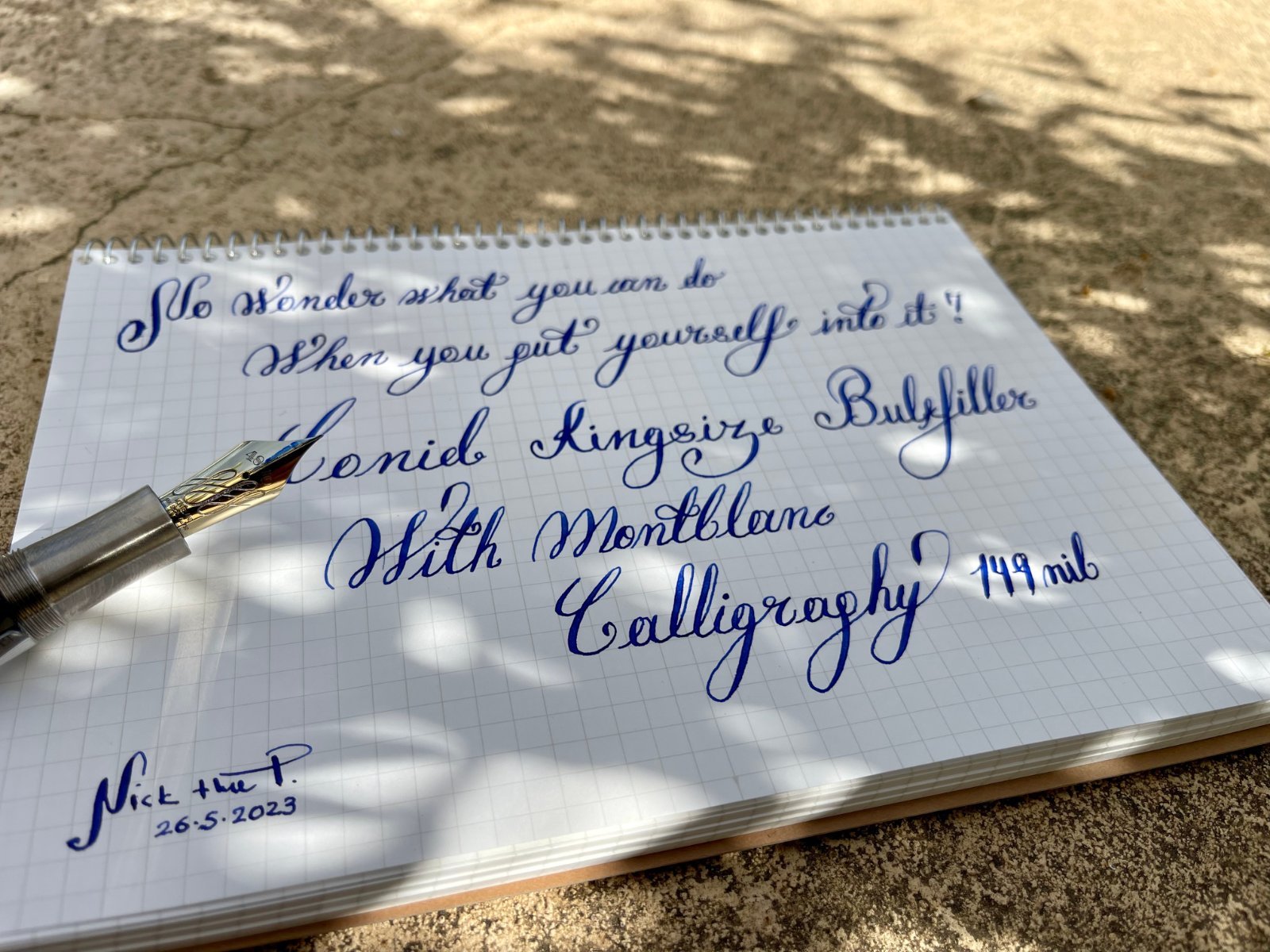
Conid Kingsize Bulkfiller with Montblanc 149 Calligraphy nib
mywatchgr posted a topic in Other Brands - Europe
My favorite modern flex nib, on my favorite pen...my grail combo, after 3 years of waiting, I was able to finally put everything together... and today they got married 🥰 What do you think? Pardon my calligraphy I am at an infant stage, but I am working on it...! Ink: Pilot Iroshizuku ASA-GAO Paper: Maruman A5 Spiral Notebook (Made in Japan) Not the ideal paper for the combo but it's inexpensive for everyday workout ☺️ @fpupulin@como
-
I just reviewed the new Fountain Pen Revolution 14k Ultra Flex nib on my YouTube Drawing with Fountain Pens channel. I really am impressed with the nib. I compare it to the steel version and it is an improvement. It bounces back quickly and really draws beautifully. I was able to use it to get very fine lines and lines that approach broad. But what is wonderful is how well the ebonite feed keeps up. When I draw with it there is no skipping. However, it is a bit scratchy as a pen for writing because it is a true extra-fine and like the Pilot Falcon extra-fine, it has a lot of feedback when writing. It might be great for calligraphy, but I don't do calligraphy. It doesn't come cheap, but FPR often has sales with at least 20% off. The pen itself--an ebonite Himalaya V1, is not particularly great. It is reasonably comfortable but a little rough in its finish, particularly at the edge of the cap. An the converter is a cheap plunger type that I don't like. But the nib is outstanding!! I have attached two drawings that I think shows the versatility of the nib. It is hard to describe, but this is the first flex pen that I have used that I feel really feel does subtle cross-hatching. Keep in mind that I have two Waterman vintage pens and several of the Pilot flex pens (912 FA, 743 FA, and the Falcon SEF). When I use it without pressure the line seems as fine at the Platinum 3776 extra ultra fine nib, which is really fine, and yet it also does lines that are broad and there is no skipping with drawing. I cannot judge its performance for doing Spencerian or Copperplate writing. You can see my review at
-
Making Gold Flex Nibs; From A Victorian Pen Catalogue
Lunoxmos posted a topic in Fountain & Dip Pens - First Stop
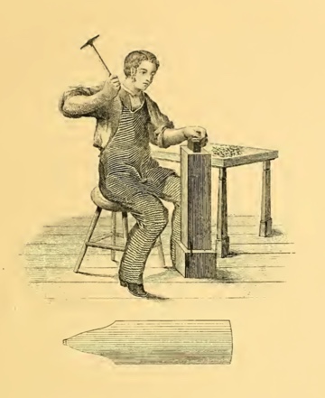
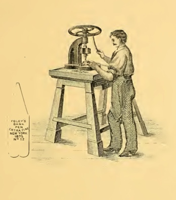
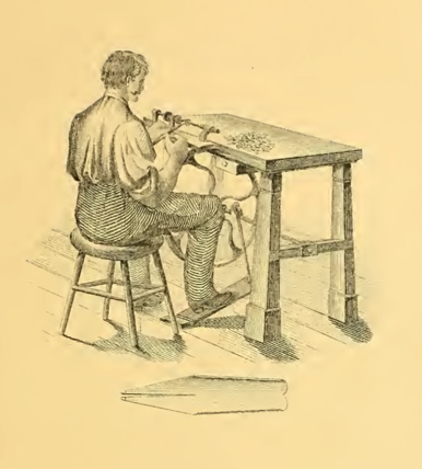
Credit given to David Armstrong from The Restorers Art Original article found here Copy of the catalogue found here Recently I came across a Victorian Era pen catalogue called the: "History of the invention and illustrated process of making Foley's diamond pointed gold pens" It starts off with a catalogue of the various products that the company offered, such as gold dip pens, and mechanical pencils, along with other bizarre combinations such as an instrument with a toothpick on one end and an ear spoon on the other. The main interest of the document, however, is that in the second half it details the history of the development of the Gold pen (or nib, as we would say these days), as well as the process in how these pens were made. After reading the catalogue myself, I along with David Armstrong and probably many other people as well, have concluded that the level of modern nib manufacturing is, though in my opinion, not exactly plagued by poor workmanship (a good nail nib is still a good nail nib), but has instead become complacent, perhaps unaware of the potential profits which could be obtained from the enthusiastic, albeit rather niche consumer group. (have a look at some of the prices that vintage flex fetches on eBay!) We have not really lost the technology or the method of producing flexible gold nibs. If you read the below copy-and-paste of the text, you can see that the only thing that was required to make the gold "flexible" was to hammer it; something that I believe with a little bit of will and determination we can replicate in a mechanical form, using machinery instead of a blacksmith, to make each one as precisely and accurately manufactured as the one before. "The nib of each Pen, as shown above, is hammered on a small anvil or stake, of curved surface, until the required spring or elasticity is secured, so that the nib of the Pen will bend almost double and again return to its proper position." Of course there are many things in the detailed process which can be automated due to our large advances in technology. For example, I believe that we have improved our tipping process, compared to when the Victorians were still figuring it out. Much of the tipping of the period was liable to falling out. In addition, we have automated much of the process of making nibs, the only part requiring human expertise being possibly the grinding, smoothing and inspecting, making the process faster and more consistent. I believe that if those high end companies, which probably have the money to invest in these sorts of things, decide to produce machinery which can hammer the nibs (tines), and strike upon the certain points with an exact pressure to produce the flexibility, then it is very possible that we will be able to produce modern flex nibs which will rival, or even better the flex nibs of the past. Here is a copy of the text which you may read at your own leisure. I have linked to the catalogue at the top of the post ( it's a big file so I recommend you look at it on a reasonably powerful device). (note that the use of the word "pens" is the Victorian equivalent of our "nibs", and the word "nibs" is the Victorian equivalent of our "tines") FORGE FOR MELTING THE GOLD. In this the Alloyed Gold is melted. It is fine Bar Gold (see page 43), and the quantity of alloy added is prepared with much care, and consists of pure Copper and Silver. A small quantity of each is added to the fine bar of gold. Pure Gold being too soft, the alloy is added to make it hard and durable and of a uniform elasticity. The alloyed gold is put into a sand crucible and placed in a charcoal fire, melted to a liquid and then poured into an iron ingot which produces a bar of the required width and thickness according to the size of Pen it is intended for, generally about half inch thick, 20 inches long, 1&1/2 inches in width (see E). After the bar is cooled it is removed from the ingot, the rough edge is filed smooth and hammered, and it is then ready for the ROLLING MILL, OR STOCK ROLLS. This machine rolls or stretches the bar of gold to perhaps ten times its original length, reducing it to a ribbon about 1/32 of an inch thick. Its width ought to be just enough to cut out two blank Pens. The machine is propelled by steam or hand power. It is complicated, very heavy, made and finished in the finest and most expensive manner, and regulated by two screws on each end. Each time the bar passes through the screws are turned down, until the required thickness is attained, and it is then ready for the BLANK PRESS AND DIE. After the bar of gold is rolled into a long thin ribbon, the blank Pen " C " is cut from it in two rows. One long strip or ribbon will cut from five hundred to a thousand blanks. The cutter is a lever press — with die set. The blank as it is cut drops through into a drawer underneath. This blank Pen is now ready for the BURRING MACHINE. This is used to mill out a recess across the point end of the blank "D" to receive the " Iridium " which is the celebrated Diamond Point of the Gold Pen. This done, the blank is now ready to have the Iridium set in, as is shown in the next Engraving. SELECTING AND PUTTING ON THE DIAMOND POINTS. This is done by placing a number of blanks in a row on a strip of wood made for that purpose. The diamond points being carefully selected, a small pencil brush is dipped into liquid borax and with it the points are picked up and set into the recess. The workman uses a microscope to enable him to place the points properly. When this is done, the " blank " is sent to the next man, who fixes the points permanently : SWEATING ON THE DIAMOND POINTS. A lot of blank Pens are placed in rows as above, on a flat piece of charcoal ; the blow pipe is then applied to the gas burner and a flame is directed steadily upon the point of the blank until the gold is thoroughly melted around the diamond or Iridium point. This is the " sweating" process (no solder being used) in making Foley's Pens. Hence it is that the points never come off. It requires much care and experience, for if the heat is applied a moment too long the whole Pen is melted and made useless. The point is now applied to the copper lathe (see 73) and brought to a square even face upon both sides and end. It is then ready for the blank rolls. The fine quality of Gold, over 16-karat fine, used in the manufacture of FOLEY'S Solid Gold Pens cannot be affected in the slightest degree by the strong acid with which most of the good inks are now made. Many of the Pens in the market at the present time are made of 10, 12 and 14-karat Gold and the points are put on with solder. The acid of the ink will turn the cheap Pens black and separate the points, which will soon fall off, and make the Pen worthless. Again, many Pens are made so light, being almost as thin as paper, that they soon wear out. A poorly made Gold Pen, no matter how cheap, is the most expensive in the end. THE BLANK ROLLS. With this machine the blank Pen is rolled down or stretched to the length shown above. This is done by placing the blank between the two rolls. The under roll has a recess in which the point is protected, and the pen is passed through the rolls several times until the required length is attained. The blank as shown above is now ready to have the Springiness or Elasticity hammered into it. HAMMERING TO PRODUCE THE SPRING OR ELASTICITY. The nib of each Pen, as shown above, is hammered on a small anvil or stake, of curved surface, until the required spring or elasticity is secured, so that the nib of the Pen will bend almost double and again return to its proper position. It is now in a rough and uneven shape and prepared for the second cut to give the Pen its proper form; by the SECOND CUTTING DIE AND PRESS. This operation takes off a narrow strip all around except at the point, and gives the Pen its proper even form in the flat state as above shown and it is then ready for the STAMPING PRESS. This is a screw press. The name stamp is set, and the pen, still flat, is placed on a hard steel plate with a guide to slide the pen into, so that every Pen is lettered uniformly and in exact position. Nearly one thousand Pens can be stamped in an hour. The Pen as above shown is now ready to have the sides raised up into shape, which is done in the RAISING UP MACHINE. This is a screw press of great power. With this, the Pen from its flat shape is bent into the round or partially cylindrical form. To insure perfect shape and per- manent set to the new curve, only a press of great power and dies of extreme exactness can be used successfully. This press is very heavy and complicated with many parts and very expensive fittings. The principal parts are the half round bed on which the flat Pen rests ; and the plunger, half round also, to fit exactly, which is struck down with great force by the action of the screw. This blow rounds the back and sides of the Pen. The plunger is brought up by an excentric and lever acting on two jaws, one on each side of the machine. This completes the perfect shape of the Pen as above shown in its well known form. This machine was invented by an ingenious Frenchman, John Countis, a machinist, while employed in Mr. Foley's factory. It is the most perfect and successful Raising Machine ever devised for Gold Pen making, and is capable of raising and shaping fifty Pens an hour. The next operation is to cut or divide the point in the Point, Cutting Lathe. CUTTING THE DIAMOND POINT. With this Point Cutting Lathe, after the Pen is carefully adjusted in a swing frame, the diamond or Iridium point is brought centrally upon the edge of a thin copper disk, about three inches in diameter, kept in rapid motion. The edge of the disk is charged with fine emeiy and oil. The Iridium is soon slit into two points, and thus is laid the foundation for the slit of the Pen. The Pen is next placed in a pen holder and passed over to the SLITTING LATHE. With this the slit is extended from the points to the full length of the nib. A very fine circular steel saw is used, and the skillful workman uses no guide. He simply places the Pen in a holder and with both hands and an experienced eye will slit, perfect and straight, one hundred Pens an hour. A fine hand-saw is used to perfect the end of the slit, which must end exactly perpendicular to both sides. This prevents the slit or Pen from cracking further up, and destroying the Pen. After slitting as above, the Pen is ready for BURNISHING THE NIBS. This is done with a hammer, burnisher and stake. Slitting the Pen removes more or less of the gold. The two edges must now be brought together again by hammering the outer edges of the nibs on the stake. The Pen is burnished on both sides to remove all unevenness ; and the nibs are set even by the fingers. After leaving the burnisher the Pen is ready to receive the most important part of its construction — from the GRINDING LATHE. This consists of one large and two or three smaller copper wheels and one tin slitter fitted on a steel spindle, running on true centers and finely finished. The tin slitter is charged with fine emery and oil. Now begins the most important work. After the Pen leaves the hand of the burnisher it goes at once into the hands of the GRINDER who should be not only an experienced workman and a good mechanic, but a man of intelligence, for he must understand thoroughly and practically what is necessary to finish a perfect Pen. The Grinder at once applies the Pen to the slitter so as to make the inside surfaces of the slit and points exactly flat, and set them easy together. Unless this is well understood by the workman and carefully done, a perfect writing Pen is impossible, for he will leave it with a crooked or an uneven slit. The great object in having the inside edges of the slit square and flat is to prevent the nibs from crossing or slipping by each other. The slit being made straight and perfect, the Pen is next fitted into the grinding holder, made of steel, with the diamond point alone projecting. It is then applied to the copper wheel (as shown in the cut which gives the exact operation), and the points are ground on the sides, back and end, while on the small copper wheels the face of the point is ground until the proper shape is secured. Here the skill and brains of the grinder are displayed, for if the correct shape is not given to the point it would be impossible to smooth and make it a good writing Pen. This is the most difficult part of Gold Pen making. A good workman cannot grind and smooth over two hundred good Pens in a week, though the men employed by the cheap manufactories claim to do as many in 7 or 8 hours. There are only a few excellent Pen grinders in the trade, and during the great demand for Gold Pens at the commencement of the war in 1861, and to 1865, the supply was not at ail equal to the demand. While grinding, the Pen is carefully examined with a strong lens, and finally fitted into a desk-holder and applied to paper and ink and thoroughly tested. Thus every defect is removed by the judgment and experience of the grinder. When that is done the Pen goes to THE POLISHING LATHE. This lathe consists of four wheels, two broad ones for polishing and rougeing the Pen on the back, and two very narrow ones for polishing the Pen on the inside. The wheels are covered with cloth of felt charged with rotten stone or tripoli ; and for the rougeing buckskin is used. The Pen is now " nibbed" on the inside of the nibs, with Scotch stone. This roughens the nibs so as to hold ink and prevent it from flowing too freely. This done the Pen goes again to the grinder — who re-adjusts and carefully examines it to see if any injury was done while in the hands of Polisher. The points are delicately touched up; the nibs carefully adjusted so that they will not cross or lap over; and the Pens are then placed in strong alcohol which removes the oil and other polishing materials and makes the Pen perfectly clean. After drying them in line box-wood sawdust, the Pens are put up in boxes and sent to the office, where the Manufacturer personally examines every Pen thoroughly, not only as to its writing qualities, but every part of the work and finish is carefully examined with the aid of a strong lens. If the slightest imperfection is discovered the Pen is returned to the Factory. The perfect Pens are finally counted and weighed and entered upon the stock book and are then ready for sale and delivery. [edited post to add pictures and to change some wording]
-
I recently spent a few hours working on my good ole' ebonite Noodlers Konrad. I hadn't used this pen for quite a while and wanted to spice things up a bit. The changes I made (and highly recommend) are as follows: 1) the "easy my flex" mod, were you grind a portion off the sides of the nib as seen in the picture. 2) I doubled the depth/width of the feed channel, which managed to eliminate almost all railroading except on very aggressive downstrokes. and 3) I reground the tip to an XXXF needlepoint. I don't know how to measure the actual degree of fineness I achieved with this grind, but ill tell you it is so sharp that I may just use it to sew some new underpants. I don't by any means consider myself an experienced nib-alter-er-er, but it wasn't too difficult to shave the sides and smooth the tip with 8000, 12000 and 16000 grit polishing sandpaper. Anyways, here are some pictures of my work (and first attempt calligraphy); please comment if you have any questions, suggestions or have tried the same thing during your nib-related adventures. Enjoy.
-
Hi, I just got two BlueDew Flex Nibs and feeds for my Lorelei 691 pen. I had seen Inkquring Minds video that said the BlueDew pen was a augmented version of the Lorelei 391. I initially bought the Lorelei because it looked lovely, and he said it had some flex. I was really surprised by how much I liked the stock nib which has a bit of flex. I reviewed in on my own channel which you can see below. I like the pen so much I bought another one in white. Out of curiosity, I finally decided to order the BlueDew Nib unit which you can get independently of the pen. You get two nib units for $50.00 including shipping, which if you combine it with two Lorelie pens that you order yourself brings down the price of each pen to around $50.00, a considerable savings off the BlueDew price. Anyway, the nib fits perfectly in the pen, but unfortunately, I found it way too scratchy and too given to railroading to use as a drawing pen, and certainly not as an everyday writer. It might be useful for people who do calligraphy. One thing I feel is deceptive is the way the company claims how much more flexible it is than a Pilot Falcon. Yes, that is true, but the Falcon Pilot is not advertised as a Flex pen--it has a 14k nib that is very reliable and works well for drawing because it doesn't constantly skip (although I find the extra fine point to be a bit scratchy). It also is perfectly fine to write with if you want to use it that way in a journal--particularly if you write with a tiny hand. The BueDew nib works for very very slow writing, not for journaling. I also suspect the reason that sell replacement nibs in pairs is that the untipped nib does not last very long--its almost like a "G" nib. I think the Fountain Revolution Ultra Flex is a much better choice, and also, much cheaper. Of course, everything I say here has to do with the way I use pens mostly for drawing or journaling, not for calligraphy. Which brings me back to the Lorelei 391--it is a beautiful pen, and I think the stock nib that comes with it has a bit of flex which is nice for sketching and yet it is not so scratchy you can't write with it. The pen itself is a love blue resin, and my guess is that if you want to you can change the stock nib for Jowo 6, although I have yet to do it. As anyone any experiences with these nibs?
-
As most of you would know, Pelikan is a 180 year old maker of fountain pens and paraphernalia. It had launched its first fountain pen in 1929. Prior to that Pelikan manufactured dyes, inks and office-supplies. This Swiss-incorporated German pen maker is also credited with the genesis of piston filling mechanism with a differential spindle gear, which endeavoured to address the problem of limited ink capacity in fountain pens of that period. Here, the piston knob is also threaded so that it is able to unscrew itself automatically, when the piston is unscrewed, in an outward direction, thus delivering a greater and efficient ink-suction. Hungarian engineer Theodor Kovacs is credited with the invention of the original filling mechanism before selling off the patent to Günther Wagner (the man who established the company) in 1927. By the way, here goes the review of an M1000 on my blog: The M1000 Review In the earlier years, Montblanc is said to have manufactured nibs (especially the one with a heart shaped breather hole in 1929/30) for Pelikan, while Pelikan made inks for MB. Pelikan had already built a brand awareness in the writer’s mind, being one of the major ink suppliers (starting with Iron Galls Inks) in Europe. They eventually launched the 4001 line (non-Iron Gall) line of inks in 1898, which is still produced today. I was introduced to Pelikan with a m200 model pen long back. And yes, I am heavily biased towards two of my Pelikans - one is the M400 white tortoise, other is the blue striated M805. The M1XXX is considered to be the next step to M6XX/8XX, once most of your cerebral logic is destroyed! As with the model numbers, there is a general increase in nib size, dimensions and price of course, when you move from M4XX to M1XXX. Again, I do love the Souverän M 625 with dazzling sterling silver trims (Ag 92.5%). Having said that, the serene green-striated M1000 reflects and adorns the 1929 classical green-striped design. The green "transparent Pelikan fountain pen" was launched in 1929 by Wagner. It was named so, to reference the transparent ink window. The logos have changed over the years starting from a mother pelican with four chicks to a mother-single chick combination from 2003 onwards. I have learnt something form FPNer sirach’s excellent review of the m805. Incidentally, both of us had posted reviews of our m805s the same day, around the same time on FPN . The mother pelican and chick logo is symbolic of Christ, as when there is no food, the mother pelican is believed to pierce its own breast with its beak, to feed its young of its blood. It is symbolic of Christ sacrificing himself for Man, and is often represented in Christian art. I have taken the liberty to share the picture used by sirach in his review. DESIGN - THE STRIPED TRANSLUCENCY (6/6) The M1000 comes in two standard gold-trims - Green Striped and Classic Black (Green Ink Window), across four different nib widths - EF, F, M and B. The M1005 also came in silver trims of Black/Green Ink Window design, albeit with a dual tone nib. There is nothing like the allure of the M1005 demonstrator, but then there are Raden Sunlight & Starlight models too. The pen hints at a subtle piece of craftsmanship associated with building this writing instrument. Its balance somehow ensures all the necessary weight and nib leverage for comfortable writing. My hand sometimes varies from a light to moderate touch and the m1000 adapts to the change with deft, compared to a m800, partly perhaps because of a more responsive nib. The barrel is made up of highly polished pelikan famed ‘cellulose acetate’ with its diamond cut contours, which partially reveal the necessities like the piston end or ink level, while concealing the unnecessary ones. I feel that this green stripes reveal the ink levels quite well. The pinstripe pattern in the Souverän series is nicknamed Stresemann derived from Gustav Stresemann, the Chancellor of Germany for his famous striped trousers. The green stripes innately reflect both light and dark while preserving a formal appearance of the souverän as the gold plated trims continue to stand out. The translucency is subtle but useful at the same time to note ink levels. The dazzling green stripes reflect back greens between pine & emerald with ambient light, soothingly to your eyes.. The barrel is silky smooth. The golden gleam is matched throughout the pen starting from the famed finial and the clip, through those concentric bands in the cap, before finally converging with the dual piston rings. While the white tortoise plays with light with phenomenal efficiency, the green & blue stripes seem to have held their own conservative thoughts. The cap feels quite substantial and unscrews with a single turn, revealing a dazzling two-tone nib. The grip reveals another knot of golden glitter, towards the section end, where the big dazzling nib unit is screwed in. Two concentric golden bands with a gold plated crown embossed with the pelikan logo, adorn the cap with a signature pelican beak-shaped clip. The thicker bottom band carries the brand imprint of PELIKAN SOUVERÄN GERMANY. The logo on the finial is the one embraced by Pelikan post 2003, that of a mother pelican and one chick, gleaming in brushed gold. The staged pillars of M400, 605, 805 & 1000 glitter with light. FILLING SYSTEM (6/6) A piston filler with a sturdy knob is embellished with two concentric golden loops. Like any other pelikan, it’s imbibed with a system which is usually hassle-free and needs minimal maintenance. The piston end unscrews with three to four rotations and ink is drawn into the pen with remarkable efficiency without any fuss, once the piston is screwed back on. And of course, you can observe some of the live action through the striped windows. A brass spindle connector in the M1XXX provides weight and balance. Everything is glistening gold as you can see the connector nut in the picture. M1XXX fills upto 1.9-2 mL (similar to M800) of ink. These brass piston mechanisms can be dismantled using a 7mm wrench (TWSBI wrench would fit) on the connector nut, in a clockwise direction. On finding the piston mechanism quite snug while filling ink, I did dismantle it to lubricate the piston lip/seal. Although for any other problem, it is advisable to send the pen to Pelikan Germany/Country Authorized Service Center. Also, Pelikan International is quite responsive to facebook messages. NIB - ALL THAT MATTERS (5/6) The nib/feed section is screw-fit and comes in a standard 18k two-tone design across four stock widths - EF, F, M & B. It has the standard pelikan design with the usual convenience of a screw-fit section. Like the cousins, the tall & slender nib is efficient. With a big feed, and a spread out nib it looks forward to propel your writing imaginations and moods. The silver of two-tone finish does converge with the golden trims in terms of glitter and glimmer. The tail end specifies the nib-width and composition (18 C, 75% Au) of the gold-alloy used. Three arabesques diverge along the shoulders of the nib with two of them converging near the circular breather hole. The third curve runs across the tines towards the shoulders ending with the tail end of the nib, outside of which a golden decor runs along the shoulders across the tines, before converging onto the iridium tip. There is of-course the dazzling golden mother-baby pelikan logo, resting above the tail. This one in the picture is a Extra Fine nib and writes smooth and is decently wet. No complaints for this piece on out of the box performance. A big black plastic feed (earlier ones had ebonite feeds) with closely spaced fins ensures a good ink buffer and promises wet and even smoother starts. Even with a dipped nib section, it would write a page. In my experience with Pelikan nibs (both with earlier Bock & now in-sourced), the good nibs usually after running 80 pages of my usual B5 notebook, break in to my liking. This nib being a little different with a characteristic spring and a bit of flex, did break in within a month to fit my writing style. I feel that these days these nibs have started to lay a finer line, owing to user recommendation of the Pelikan community. Fortunately some of the mylars & buff-sticks are saved, thanks to these birds. PHYSICS OF IT (5/6) – RELATIVELY SPEAKING The pen has got the heft in it and I use it without posting. The overall capped length is around 14.6 cm. The total weight of M100X has slightly less than a third of contribution from the cap. The grip diameter is around 1.2 cm and the bit of tapering renders comfort to the fingers. The cap threads are higher up on the section and are non-intrusive for me, since I do not hold the pen very high. It is not a light & small pen and may not comfortable to you at first, I gradually became used to it. The motivation if not anything else, was the Kingsized #8 nib. Uncapped Length ~ 13.5 cmPosted Length ~ 17.7 cmNib Leverage ~ 2.8 cmOverall Weight ~ 35 g (Cap ~ 10 g) Capped and uncapped comparisons with a few of the flock go below for your reference. Top to bottom (m1000, m805, m605 & m400) With an MB149 And an Emperor with the Entire Flock ECONOMIC VALUE (4/6) The M1000 retails these days at around GBP 380 (discounted), although it might be available at lower street prices. I strongly feel that this acquisition was a result of an impulse driven bid on the bay, since I had a low expectation of winning the bid in the first place. Even though it’s one of the phenomenally efficient pens with a high degree of nib appeal, I would still value it as a standardised-good value buy. A part of me which loves Pelikan for the great pens they make, rationally feels that the m1000 being a flagship pen, they need to build up its image akin to an Meisterstück 149, to command a high price and appeal, for it sells much below its RRP across internet/offline shops. May be Pelikan can start with a body/barrel combination solely made for m1000 with a custom designed nib. Then again, I would not be able to buy it OVERALL (5.2/6) Historically for me, I did not like the weight/balance of the M1000 pen. However, with frequent use, I found the balance acceptable and then comfortable!! These 18k nibs have a smooth and wet flow. The m1000 nib has a fair bit of flex (modern bit!) with an inherent softness, since with the bigger size of the nib, there is more room for it to move. Being nice and wet writers out of the box, the Extra-Fine nib puts down a fine line, which takes around 35 seconds to dry Visconti Blue Ink on MD Paper. The pen feels balanced for my hands both with or without pressure and given the tapered profile of the section, it has a good grip. This nib runs a tad finer than say a #3776 medium nib, and with some pressure it leaves a wider line. I have used single fills of Sailor Sky High (now Souten), Montblanc Toffee Brown, Visconti Blue, Iroshizuku Yama Budo/Tsuki Yo inks in rotation, and the pen has performed gracefully with all these inks. Thank you for going through the review. You can find some more pen and paraphernalia reviews here and in the below links section. Comments & feedback are welcome. So, what is your favourite Pelikan? REVIEWS & LINKS Pelikan M1000 Pelikan M805 Pelikan M605 Marine Pelikan M625 Pelikan M4XX Pelikan M200 Cognac Pelikan Nibs Patent Ink Capacities
-
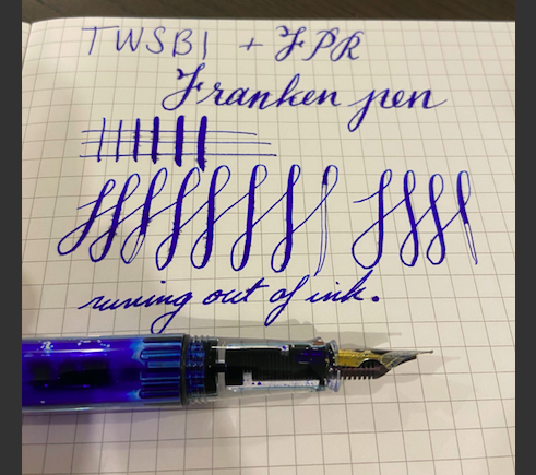
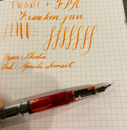
TWSBI FRANKENPEN Flex Hi all I've been in search of a twsbi with a flex nib and with some work I was able to tinker with a TWSBI Eco and an FPR Ultraflex to create a flexy TWSBI Eco and I wanted to share what I did and how it turned out. I have heard of Fountain pen revolution and recently I have had the pleasure of purchasing a few of their pens. Great pens and seamless experience. One of the pens that I purchased from FPR was the Indus pen. Comparing the feeds of the TWSBI Eco and the Indus, the feeds looked to be the same size. 1. The first thing I tried was straight swapping the nib/feed from the Indus pen into the TWSBI Eco. This wasn't successful because the feed while of a similar size was not exactly the same and didn't seat well into the Eco. 2. My next attempt was to take the feed from the Eco and put the FPR nib on it. At first glance there was a gap between the nib and the feed. When searching through fpn history I found that there were two possible solutions. Either to bend the nib to meet the feed or to somehow bend the feed to meet the nib. The recommendation was to whenever possible bend the feed. Bending the nib may result in tines too close together. 3. The solution is not recommended and not for the faint of heart but did work YMMV. Its common knowledge that you can heat set an ebonite feed, however the TWSBI feed is plastic. Per suggestions I boiled a cup of water and held part of the feed under water for 10 seconds. Then I slowly and little by little pressed the feed against a solid counter to force the feed to bend upwards (repeat as necessary, better safe than sorry). 4. At this point I put the FPR Nib + TWSBI feed and section together and ended up with a pen that wrote. Another problem arose while I fiddled with the nib. It was super loose ( no effort to remove the nib ). Back to FPN I went for suggestions. I found a few solutions, either to use shellac to create a wedging effect or to bend the nib at the base (furthest part of the nib away from the writing tip) by flattening it a bit. Also risky and not recommended for the faint of heart. Little by little I got the feed nib and section to play well together. I've attached some shots of the writing (first image I was running low on ink which caused the railroading)
-
How do the JoWo omniflex and JoWo (leonardo) elastic nib compare in terms of flex, feed keeping up, smoothness and overall performance?
-
I'm back after a long hiatus, so I figured it would be a good idea to introduce myself again. I live in rural Donegal, Ireland. I've been into fountain pens for well over a decade now. My workhorse pen is a Sailor Heritage with a soft fine nib. I've recently become more adventurous with modifications, and with coloured inks. I've installed full flex nibs (from fpnibs.com) into a bunch of TWSBIs and an Opus 88. I also have a couple of vintage pens. I also have a Leonardo Momento Zero with the elastic fine nib. I gave away most of my non-flex pens. I'm not into calligraphy (yet?), but I love a flexible nib for the character it gives my writing, and because it forces my hand to relax. I was active on this forum until about 2009, when I went back to school. Finished up my PhD in 2017 at age 57. I am a researcher, mostly in Artificial Intelligence, Artificial Life, and Mathematics. I've been working from home ever since the pandemic started, and plan to continue to do so. It suits me well, because I can concentrate better. It also means that I can make better use of multiple fountain pens and an array of inks. (I didn't want to take an entire collection to the office!) Writing is a big part of my thought process. I'm often wrestling with complex ideas that are too big to hold in my brain at once. As I come to grips with some little part of an idea, I write it down -- not so much to remember the thought as to "solidify" it in my mind, to mark it as promising. I do most of my writing in a single journal that functions as a research journal, commonplace book, diary, cartoon sketchbook, and more.
-
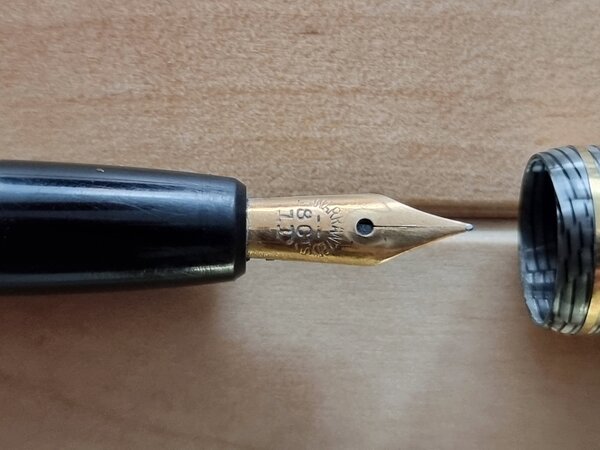
FP Akkerman 18K F nib 03 Unpack upward.jpg
OldTravelingShoe posted a gallery image in FPN Image Albums
From the album: OldTravelingShoe's Random Pics of European Fountain Pens
© (c) 2022 OldTravelingShoe
- 0 B
- x
-
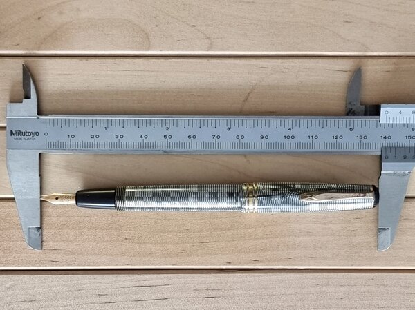
FP Akkerman 18K F nib 01c Size Comparison.jpg
OldTravelingShoe posted a gallery image in FPN Image Albums
From the album: OldTravelingShoe's Random Pics of European Fountain Pens
© (c) 2022 OldTravelingShoe
- 0 B
- x
-
From the album: OldTravelingShoe's Random Pics of European Fountain Pens
© (c) 2022 OldTravelingShoe
- 0 B
- x
-
FP Akkerman 18K F nib 04 Body Engraving.jpg
OldTravelingShoe posted a gallery image in FPN Image Albums
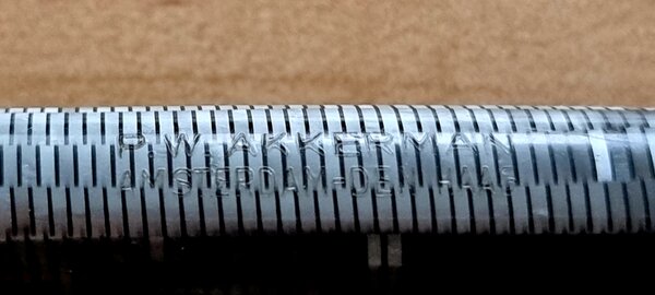
From the album: OldTravelingShoe's Random Pics of European Fountain Pens
© (c) 2022 OldTravelingShoe
- 0 B
- x
-
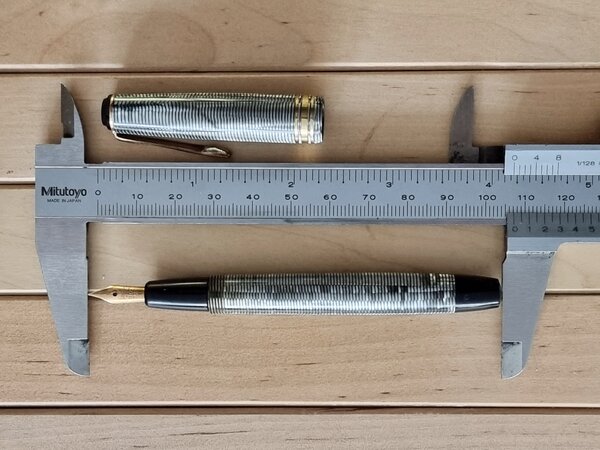
FP Akkerman 18K F nib 01b Size Posted.jpg
OldTravelingShoe posted a gallery image in FPN Image Albums
From the album: OldTravelingShoe's Random Pics of European Fountain Pens
© (c) 2022 OldTravelingShoe
- 0 B
- x
-
From the album: OldTravelingShoe's Random Pics of European Fountain Pens
© (c) 2022 OldTravelingShoe
- 0 B
- x
-
I love everything about the Triple Tail. The largeness. The clearness. The non-smellyness. The plunger filling system. The 308 cartridges I can use. Everything, that is, but the nib itself. It's just too darn much for me. It's finicky, which is bad enough. But even when it does work after heat setting, etc -- and even with an ink as simple as 4001 Royal Blue or Waterman Serenity Blue -- it's like writing with a paint brush. And that's before flexing! Before I return it for a partial refund, I thought I would see if anyone has managed to trade it out for a #6 nib? And it not a basic #6, then something else? I saw someone asked Goulet, and the answer was: "Maybe". Have you done it? How'd it go?
-

Beginner flex nibs and FPR Ultra flex combinations?
IanP2303 posted a topic in Fountain & Dip Pens - First Stop
Hello, I am looking to buy a flex pen for beginners, I have already read some of the threads here regarding beginner flex pens, but I am not sure whether some new, quality and affordable flex pens are released recently. Therefore, I started this topic and I hope that you blokes can help me with it. I also heard that Fountain Pen Revolution has a great Ultra Flex nib, are there any pens that are suitable for this nib, as I would love to try it out. Thanks, Ian -
I just aquired an old pen. Changed the sac and filled it up. A nice ex fine flex nib. The pen has the inscription "registered Fascio pen" and "R14K Fascio". I tried to find some information about it on the net, but in vain. Anyone here who knows anythong about this pen?
-
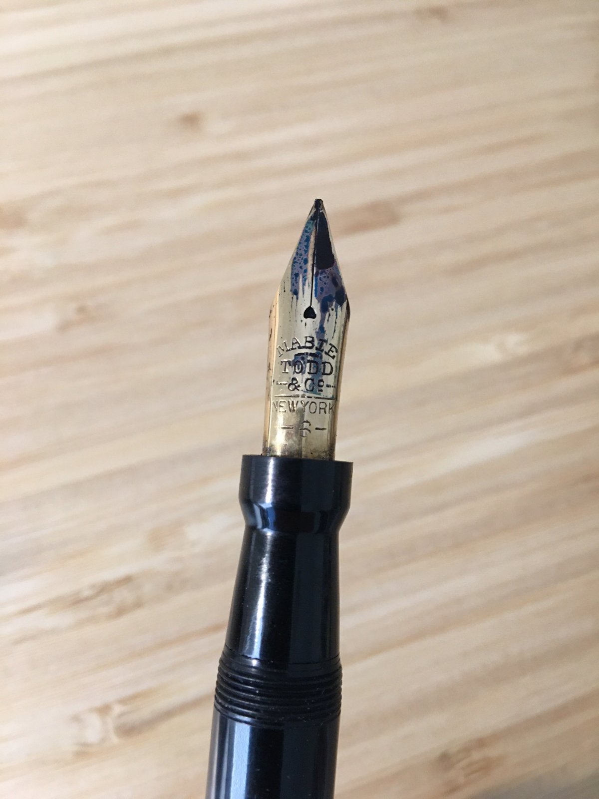
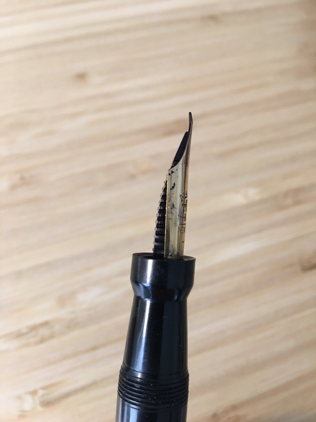
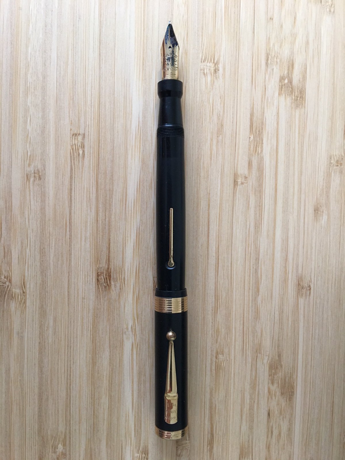
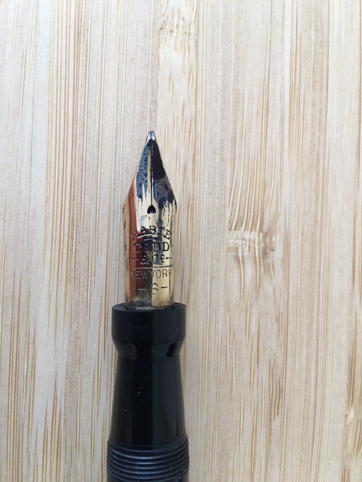
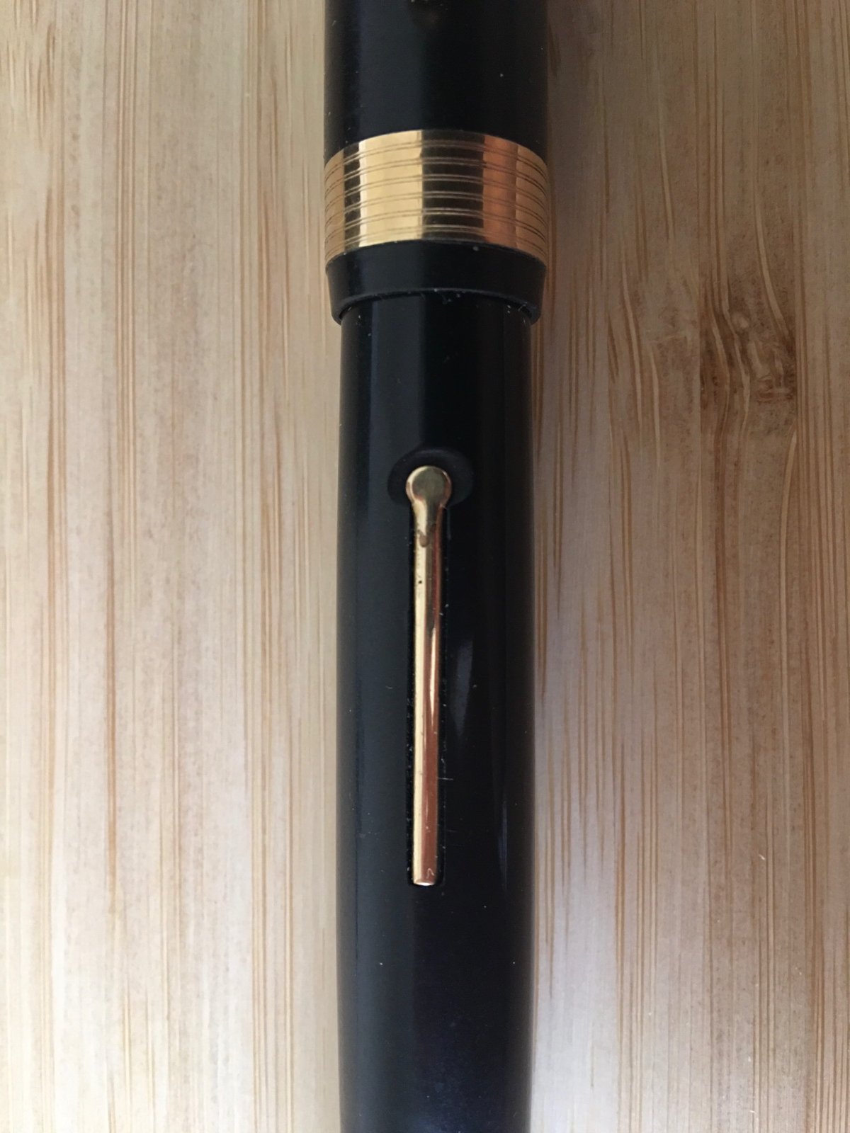
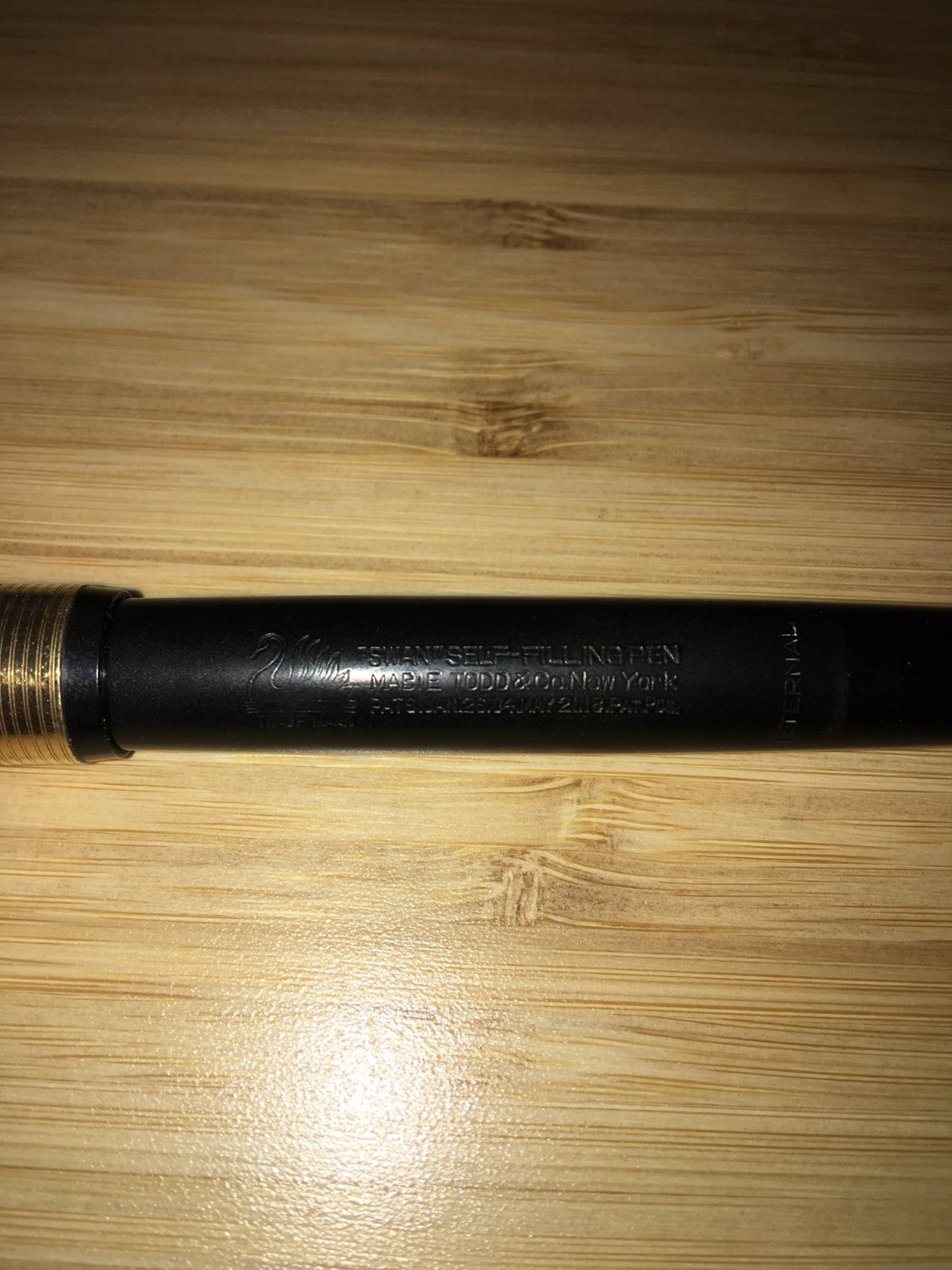
 Disclaimer: I am new to vintage fountain pens. I recently acquired a Mabie Todd Swan (photos of the pen and some scribbles below) and would appreciate assistance with the following items: I know very little about this pen and would like to learn about its provenance, approximate age, model and comparison with other Swan models, etc. The body of the pen is marked "Eternal" but the nib is not. Does this mean that the current nib replaced the original? The pen is a very nice writer once the ink is flowing; it can feel very smooth, provides nice line-width variation as the nib is flexible and I think stub-ish, and it lays down a lot of ink. At the same time, it's prone to hard starts and occasionally skips. It also looks like the feed might not be properly aligned with the nib. I would like to have the nib examined and tuned by a professional and was thinking of sending it to Mike Masuyama. Does this seem appropriate, or are there other nib experts I should consider? I would like to have the body of the pen cleaned up and restored prior to getting the nib worked on, but I have no idea who to send it to. Any recommendations? In particular, I would like to have some luster restored to the body, have the fins of the feed looked at as they seem to have some minor damage, and have it cleaned up (the pen has a bit of a smell which, although gradually dissipating, remains pretty strong inside the cap). The tip of the nib looks a bit slanted to me. I know only so much is possible with photos, but can anyone tell if it's because this nib has an oblique grind or if it's some sort of alignment issue?
-
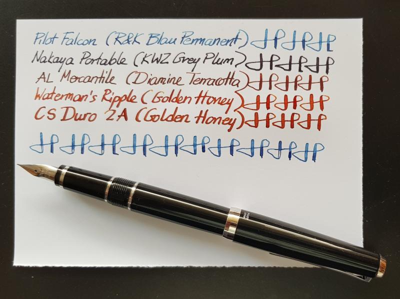
This wasn't my first Pilot Falcon. Years ago I had another, one with a metal body and a soft medium nib. It wasn't a success. I couldn't manage the flexibility of the nib and even less the ink flow. In the end, I gave up and passed it on. It wasn't my first or last failure with fountain pens but in this case I was left with the niggling suspicion that the main issue was the rather too generous flow, not the flex. So, when a few weeks ago a Pilot Falcon was advertised for sale at the local digital marketplace, I jumped at the opportunity and bought a nice, practically new Falcon with a soft fine nib from a hobbyist with an impressive collection. The new Falcon was made of resin, so it felt much lighter than the metal one but not uncomfortably so. Being large enough and well balanced, it rested safely and stably in my hand (always unposted), while the rather toothy nib sled effortlessly on paper. Unlike the medium nib of the old pen, the new fine nib remained under control without surprising me with gushes of ink, even with Rohrer and Klingner's Blau Permanent, a wet ink with the tendency to feather on 80 gr copy paper. From the very first day I knew this Falcon was a keeper. I believe that the main reason for that was that in the intervening years between my first and second Falcon I had more exposure to various kinds of flex. With the experience gained, I had become more patient and controlled with semiflex nibs like the one on the new Falcon. Above all, however, my hunch was proved right: even though I preferred broader nibs, the soft medium on the Falcon was too much for my writing habits. The soft fine worked much better, similarly to most of my vintage flexy nibs, which seldom go above medium. Finally, how about comparing the soft fine Falcon nib to modern and vintage flex? Having no modern flexy nib inked at the moment, I compared it to a Nakaya Portable with a non-elastic medium nib. The Falcon was clearly softer and more responsive with a bit more line variation. A vintage semiflex, the Aikin Lambert Mercantile, was not much softer than the Falcon but more responsive. Flexible nibs, such as those on a Waterman's Ripple and a Conway Stewart Duro 2A were much softer and allowed for more line variation. The biggest difference, however, was that the vintage nibs were quit immune to railroading. By contrast, a fast or poorly controlled stroke with the Falcon resulted into railroading, which can be seen in the photograph. The conclusion is a happy one: the soft medium nib made all the difference and the new Falcon became one of the frequently used pens at my desk, especially as it brought out more shading in Blau Permanent than the two Sailors in which the ink has been used previously.