Search the Community
Showing results for tags 'fine nib'.
-
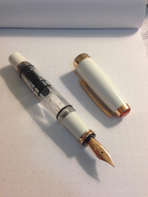
The Charleston is the least expensive fountain pen offered today by Waterman which has a gold nib, and it`s placed in the middle of the range. The question is: is the Charleston a compromise or a universal soldier? Let`s find out. 1. Design and appearance: 4/5. They say that the Charleston design was inspired by an 1930s model, therefore having some art-deco design features, most noticeable being that middle metallic ring. I personally would have placed it near the cap ring, but nonetheless, it does offer a note of distinction to the pen. What I like more about it is the clip design and the fact that it has a screw-on cap, which is pretty uncommon for a modern pen. I also like the fact that the section threads are made from metal. http://i57.tinypic.com/288zj0h.jpg http://i62.tinypic.com/5k10jn.jpg The nib is rather small and uninteresting, which is a shame in terms of design, but we`il see how it performs. Another sign that this is a cheaper pen are the lines which remain from the production process and which can be felt along the cap and section, and on the lower half of the barrel. The cap comes with a metal ring, which is good. About the color: mine is the worst version, blue with silver accents. If I had a choice, I would have gone with the white version with gold trim, which looks fabulous. 2. Size and weight: 4.5/5. The pen is 13.cm long and around 1.2 cm in diameter, and weights around 25 grams. In my book, these are near-perfect proportions for a medium sized hand. It sits comfortably in the hand, and it can be used both capped and uncapped. The cap posts very well, and the weight is evenly distributed. 25 grams is average in terms of weight, but the pen feels solid. The clip is rigid, but usable. 3. Writing: 4.5/5. I have tried both the fine and medium sized nibs available with the Charleston, and I can safely say that this looks like a solid performer. The short, 18k nibs are really smooth(9/10), even the fine nib performs very well. Ink flow is average, but constant from the first try, and I could see myself using this pen on a daily basis. The nib has a pretty large sweet spot, and it`s tolerant, meaning it will write using several angles and hand positions- just the way I like it, since i`m a sloppy writer. The pen came with a standard converter which works well, although i`m not a fan of the twist type converters. The good news is that Waterman pen also accept(in theory at least) standard international ink cartridges. http://i62.tinypic.com/15ewde.jpg 4. Cost and packaging: 4/5. I paid less the 100 dollars for a Charleston set, and at that price pont, it`s safe to say that I got a bargain. In general, I would say that the fair price for a Charleston would be around 100 dollars. The box in which it came looks nice, but it`s fairly standard. Conclusion. Although Waterman made some compromises on the Charleston(short, plain looking nib, less than perfect finish, pretty high mrsp price), this is a rather nice pen. It`s comfortable during use, thanks to the smooth nib and good proportions, the design has a classic inspiration and with a bit of luck, you can pick one of these for a really good price.
-
Hello everyone! I bought a Platinum Century 3776 in a medium nib and I am really liking the size of the nib. I found it to be much finer than my other japanese mediums though, such as the Pilot Metropolitan and the Pilot Kakuno. I also quite like the nib on Hero 616. However, I found the Century 3776 nib to be a bit toothy for my liking, while my 616 is fairly smooth I would say. How do the fine Pilot fine nibs compare? I was thinking of buying a Metropolitan in a fine nib but just wanted to check in, before I regret a purchase that will simply lie on my desk!
-
Hi, I have some questions about the smoothness and fineness of nibs between Pilot Vanishing Point and Pilot Custom Heritage 92/Custom 74. I have Pilot Decimo with a fine nib and I like the smoothness and fineness of this nib, but it is little heavy for long writing. While I was searching for a smooth, lightweight, and fine fountain pen for long writing, someone has recommended me Pilot Custom Heritage 92. I see it has pretty good reputation in this forum. Thus, I would like to know more about the nibs of this pen. As I said, I like the fineness and smoothness of my Decimo fine nib. How is Pilot Custom Heritage 92 nib like comparing to Decimo nib? I see they have F, FM, M, and B nibs. I wonder if I should get F nib or FM nib for Pilot Custom Heritage 92. Also, is there any place to purchase Pilot #5 nib separately? I am asking this in case that I may not like the nib I order, and I am also interested in trying SF nib. Thanks,
-
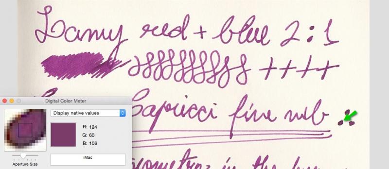
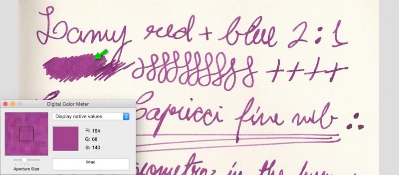
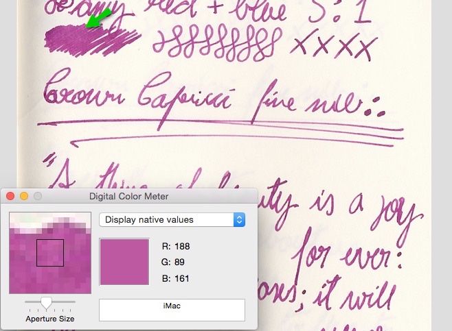
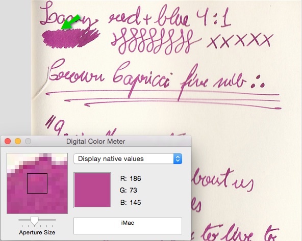
So I’ve got a small bottle of Lamy Red and about three boxes of Lamy Blue cartridges. As I’ll probably never use those blue cartridges, I decided to have some fun mixing those inks together. This is the 2:1 Red/Blue mix, plus RGB indexes for the darkest and lightest areas: Now the 3:1 Red/Blue mix + RGB: …aaand the 4:1 Red/Blue mix + RGB: Method: Lamy explicitly says in their website not to mix their inks, so I left each concoction sitting quietly for 24 hours in a drawer in a sample container before putting a little bit of ink on the pen (I used a regional brand pen with a fine nib made in Taiwan). I didn’t feel any difference in writing with any of the mixes compared to the pure blue or red, except for a little bit of spread, but so slight that I only noticed it in the scans. Also, I forgot to add paper information: the tests were made on a 70 g/m² acid-free "Ivory-colored" paper from a Moleskine pocket notebook. There was no bleed-through, even on the ∴ (where I let the nib rest); ghosting/echoing was as noticeable as the pure Blue and more noticeable than the pure Red on the same notebook. My conclusions: I liked the 2:1 mix a lot. Didn’t care much for the rosy tint of the other two mixes (that’s why I stopped and didn’t add red any further). I was surprised that the orange of the Lamy Red didn't appear on the 4:1 mix (if you dilute Lamy Red you get a "Vitamin C orange"). Also, I gotta say that 3:1 and 4:1 look very similar to me. I'm going to wait 24 more hours before fully inking a pen with the Lamy Beetroot (2:1 mix) and carrying it around. What do youse think?

-

Free Fountain Pen: Pilot Petit1 (Nib: Fine / Color: Black)
rappard posted a topic in Pay It Forward, Loaner Programs & Group Buys
Picked this up from JetPens but it's just not for my chubby little paws: writing with it feels cramped, and I much prefer my Platinum Preppy. So it's off to a good home soon, hopefully! First person to send their postal address to rappard [aat] gmail [doot] com gets it. In exchange, it'd be great if you could: * Make a donation (however small) to a charity of my choice or * Send me a Platinum cartridge(s) (black ink) But if not, no problem. Since I'm fairly new here: I have immaculate feedback on Discogs, eBay and Head-Fi (my username on all sites is the same as the one here). --Martin -

Hero 336 - Hooded Nib - Buttery Smooth
mehandiratta posted a topic in China, Korea and Others (Far East, Asia)
HERO - 336 Over the period of past 4-5 months i have started collecting Chinese Fountain pens which i will be reviewing one by one. This review is about the pen which was recommended to me by Mr. Subramaniam of ASA Pens after i have collected lot of Chinese Fountain Pens from local market of Old Delhi (Nai Sadak & Sadar Bazaar). And I am surely not disappointed at all. Hero 336 I have review the pen here in detail .....https://mehandiratta.wordpress.com/2015/02/20/pen-review-hero-336-hooded-nib/ I LOVE THE PEN -
TWSBI Mini in Rose Gold Review First Impression (10/10) So, there are two reasons why I got this pen. First is that I really wanted a piston filler, the second being that I wanted a shiny white pen. The pen is nicely packaged as any other TWSBI pen, with the cardboard box and plastic shell, completed with wrench and silicon grease. This pen looked beautiful out of the box, it is a little smaller than I expected, but I do like smaller pens so it’s a plus for me. Appearance and Design (8/10) Again, the Mini is a really beautiful pen when empty. However, it does look somewhat worse when it is filled with dark black ink, but it still looks good nevertheless. I would warn you that it does give off a feminine feel, which may turn off those who prefer manly-man, black on black stealth pens. The design is excellent; I especially enjoy the ability to take it apart for cleaning and maintenance. Weight and Dimensions (10/10) The pen is small, and since I have smaller hands it is perfect for me. The pen does post pretty well with the screw on cap, so it’ll fit those with larger hands as well. Nib and performance (6/10) As a student, I always go with the fine nib for best performance on cheap paper. The nib is beautifully coated with rose gold. The nib did not start off being the smoothest, but got much better after a little bit of adjustments with my writing angle (small sweet spot). I do have a big complaint with how dry this pen is. This pen is beyond just causing a little bit of hard start: it completely stops working when kept in an upright position, causing a lot of frustration for me needing to prime it each time. Now I keep the pen flat on my desk and keep it half full to make sure it works every time when I pick it up. This is not best choice for use as a student pen. Filling system & Maintenance (10/10) The filling system is easy to use, and holds a lot of ink. Maintenance is superior because I can take apart the pen easily to clean out the pen really quickly. Cost & Value (6/10) Ok, this pen looks nice, but you can get an identical pen with just a different color (the regular TWSBI Mini) for $15 less. So if you’re not looking for a white and gold pen, getting this pen is low in value. Reliability wise it is disappointing for the dryness mentioned above, thus obviously lower in value than other pens like Lamy Safari as a work pen. Conclusion (8/10) This pen looks really nice and writes smoothly now, which is why I’m sure to be keeping it. I do have complaints of its dryness, but it is nothing that I can’t overlook easily, just problematic for taking notes. Overall I like this pen and accept its flaws.
-

My New Faber Castell (Carbon Fiber) Basic W/ F Nib :p
KBeezie posted a topic in Other Brands - Europe
Received this pen today. http://static.karlblessing.com/pens/fabercastell_basic/capped.jpg http://static.karlblessing.com/pens/fabercastell_basic/uncapped.jpg http://static.karlblessing.com/pens/fabercastell_basic/nibsection.jpg Got it with the Fine Nib (seems pretty close to medium on my Sheaffer Snorkel, and just a hair larger than a Goulet Extra Fine Nib, which makes some sense as both nibs [Goulet/Jowo and Faber-Castell] are German if I am not mistaken). Also in the Carbon Fiber Finish which is under a clear shiny coat. Using a waterman intense black cartridge in it currently since none of my standard international converters work in it (too thick for the barrel of the pen). Feels nice, not too heavy, cap is a little odd though (and not something would want to post). If I didn't get this one, it was going to be the leather one. That nib is smoooooooooth though, with a good flow to it, will have to see if it starts right back up tomorrow or not, this one might be my carry-everywhere pen. Quick write sample comparing the nib's width next to my other inked pens. http://static.karlblessing.com/pens/rhodia_april_2_2014.jpg -
http://i966.photobucket.com/albums/ae149/thefancyman/027dc5a5-680d-4d35-abdb-c831786df228_zps8d6b4c5f.jpg http://i966.photobucket.com/albums/ae149/thefancyman/8a5e9841-297e-4197-b159-5ed73e751804_zps1b300add.jpg http://i966.photobucket.com/albums/ae149/thefancyman/87d4afc7-4765-4e30-a381-3482bc4c4863_zpsb17feb33.jpg http://i966.photobucket.com/albums/ae149/thefancyman/8990b6d2-4068-4b2d-b3de-fd97cf059911_zps2cf3c107.jpg The nib can go from a fine to about a BB with minimal pressure. I don't normally write this way, but it is quite pretty when you take the time to do it. A 2013 m400 next to the earlier (1982-1990) m400. http://i966.photobucket.com/albums/ae149/thefancyman/DSCF0936_zpsed3ce440.jpg Older cap logo vs. modern. http://i966.photobucket.com/albums/ae149/thefancyman/DSCF0949_zps0978f0dc.jpg The pen on its own. http://i966.photobucket.com/albums/ae149/thefancyman/DSCF0956_zpsc63bef6a.jpg My flock of Pelikan nibs: Modern m400 B, vintage 140 OBB, m100 1.0 calligraphy and vintage m400 F. http://i966.photobucket.com/albums/ae149/thefancyman/DSCF0927_zps6a65d8c5.jpg
-
I just received my Visconti Homo Sapien Silver with Fine Nib. I filled the brand new FP with Pelikan Edelstein Onyx black ink and did so with the Visconti Travel Ink Well. From other posts on FPN, I had surmised that Visconti FPs tend to run wet. So I ordered it in Fine hoping to achieve medium nib result of a Pilot. This is my 3rd fountain pen and only have 2 other pens to compare with Pilot Namiki Vanishing Point in Fine Pilot Metropolitan Medium Nib From what I can tell, the Visconti HS fine nib writes finer than the pilot VP fine. Did I receive a faulty pen? Is it the ink? I've included writing sample Of note, I did not flush the pen since it is brand new. Will the pen gradually adjust with more use?
-
Hi, I recently bought this lovely fountain pen with wooden barrel and fine nib. I found its picture on internet as well but I have no idea about the brand. It takes international cartridges and it rights only 'iridium point Germany' on the nib. I would be happy if you can help me find the brand. http://justwrite.com.au/justwrite8/images/products/rosewoodfpbpwc_3.jpg
-
Well, there comes a time in everyone's life when they are ready for some color. I have thus far played with black, black and ooh, you guessed it, black. My current pens are all fine nibs, non-flex. They tend to be dry. I have found some reasonably good paper, and mostly use my pens to sketch, though I'm starting to work on Chancery italic hand too. I think tones in the brownish, sepia, red, (maybe orangish, if not too orange) might be a nice alternative. I saw this one as a possibility: https://www.fountainpennetwork.com/forum/index.php?/topic/222032-diamine-ochre/ One criteria that is important for my sketching is relatively fast drying time. I have a Waterman intense black that is too slow to dry, I find myself smearing it -- I sketch on my lunch hour would prefer not having to wait 20 seconds for the ink to dry so I can work a different part of the picture. Noodler's black doesn't have this problem. If you know off the top of your head of an ink that might be suitable, I'd be eternally grateful for a suggestion! Cheers, Jeff