Search the Community
Showing results for tags 'diamine'.
-
Diamine Vivaldi Thanks for @Lithium466 for the sample. This review is in three parts: Feel free to jump to your preferred part. In a nutshell: a gorgeous dark purple, which is almost black with EF nibs. It doesn’t appreciate cheap paper. It’s wet, well lubricated. It’s Diamine. Chroma: What’s in a name? I’m confused by the Diamine Music set. It’s composed of 3 baroque composers: Bach, Vivaldi and Handel. 2 Classical era composers: Mozart and Beethoven. (Cancelling Poor Haydn) And 5 romantics. Schubert and Chopin, Wagner, Tchaikovsky and Strauss. Though technically you can argue that Schubert is early romantic, and Tchaikovsky late romantic. And then there is Strauss which I’m assuming it's Richard and not one of the Johann's . I don’t understand the logic behind the names. Diamine could have chosen some fabulous English composers, granted they would be mostly renaissance, baroque, and then jump to early 20th century, Byrd, Tallis, Dowland, Hume, Purcell, Sullivan, Elgar, Delius, William, Britten etc.. Or they could have chosen one composer per European country. This is just a mishmash of composers, with no rhyme or reason. Vivaldi’s micro bio and music (1678 - 1741) Now a bit about Antonio Vivaldi. Vivaldi is one of the pillars of the Baroque era and codified the concerto form. He was the musical director of Ospedale della Pietà an orphanage. He was admired by Bach who transposed some of his concertos for Harpsichord, died in poverty and his work was promptly forgotten until the early 20th century, until his work was re-discovered. He composed some 500 concertos about 50 odds opera, religious music etc. His nicknamed was il Prete Rosso, the Red Priest. (He was ordained a priest) The Four Seasons his most famous fiery tempo, dynamics contrasts with the colour of the ink: Or his lovely Lovely lute or Mandolin concertos. Here is the slow movement of his Lute Concerto RV 93. Or If you’re an opera fan, and have 3 hours or such to spend you can try his opera Orlando furioso, don't ask me the story, it's a medieval fantasy story Ink review: Now for the ink, again I don’t understand why would any one would choose this dark purple for Vivaldi, who's nicknamed the Red Priest, thanks to his reddish hair, and his passionate music. This one is not an ink for a Vivaldi over. Writing Samples: I used a Pilot F3A for the Japanese Ef and is it semi-flexible, I flexed it at the end to give you an idea of "flex". Photo: Comparison: Water test: Decent water resistance. and finally An art work. I had a bit of difficulty. While I appreciate his music, he's not one of my favourites composers. 😛 Anyway here's is one of Vivaldi's cats playing one of his concertos on an imaginary gondola I used a bit of of Octopus Grey Merkat and the brownish ink was created by mixing the purple with De Atramentis Artist Orange: · Pens used: Pilot F3A (JEf /Semiflex)Lamy (EF/F/M/B, BB) · What I liked: Colour, Doing washes. · What I did not like: Name didn’t correspond to the fieriness of composer nor his music · What some might not like: It doesn’t like copy paper. · Shading: Only with wide nib. · Ghosting: Yes, on cheap paper. · Bleed through: Yes, on cheap paper. · Flow Rate: Wet · Lubrication: Well lubricated. · Nib Dry-out: Did not notice. · Start-up: Ok · Saturation: Dark · Shading Potential: Not so much. · Sheen: No. · Spread / Feathering / Woolly Line: Did not notice. · Nib Creep / “Crud”: Did not notice. · Staining (pen): Did not notice. · Clogging: Did not notice. · Cleaning: Easy. Though as a purple ink it might stain · Water resistance: Not bad. · Availability: 30 ml bottles. Please don't hesitate to share your experience, writing samples or any other comments. The more the merrier
-
Diamine Dark Forest Many thanks @Lithium466 for the sample. 🙏 This is a dependable dark green/ teal, part of Diamine's 150th anniversary inks It’s a very well-behaved dark green, especially with a Japanese Ef nib, which was quite pleasant. From M onwards the colour changes from a dark green to a dark teal (shading appears also from M nibs onwards, despite what the scan wants you to believe. And it doesn’t like copy paper. It's a great ink to do washes, surprisingly creating a teal effect, even though I don't see any blue in the chroma: Writing Samples: My apologies for the misspelling. I must have been thinking of another Forrest I couldn’t fill the Nib creaper, so it is not a real representative of a flex nib, and finally I stumbled on my Tomoe River notebook (don’t ask) hence the major smudging, which I believe shows the range of the ink Photo: Comparison: Water test: and finally an art work. As you saw with the quotes, the name of the ink, conjured the Enchanted Wood, by Enid Blyton. This is a rendition of the Magic Farway tree, by my child's mind. Noodler's Polar Brown Sailor Kiwa-guro Octopus White Polar Bear J Herbin Éclat de Saphir · Pens used: Pilot Kakuno Ef, Lamy (EF/F/M/B, BB, 1.1), Nib creaper dipped · What I liked: Writing with M/ B nibs. Doing washes. · What I did not like: Nothing much. · What some might not like: If you use copy paper, it’s not for you. · Shading: M nibs onwards. · Ghosting: Yes, on cheap paper. · Bleed through: Yes, on cheap paper. · Flow Rate: Nice and wet. · Lubrication: Generous. · Nib Dry-out: Did not notice. · Start-up: I had some difficulties when switching nibs. · Saturation: Nice and dark. · Shading Potential: M /B nibs. · Sheen: Did not notice. · Spread / Feathering / Woolly Line: Did not notice. · Nib Creep / “Crud”: Did not notice. · Staining (pen): No. · Clogging: Did not notice. · Cleaning: Easy · Water resistance: Inexistant. · Availability: 40 ml bottles / Cartridges Please don't hesitate to share your experience, writing samples or any other comments. The more the merrier
-
Diamine Blood Orange (150th Anniversary II) The ink maker from Liverpool is one of the staple brands in ink-land. They consistently produce solid inks for a very reasonable price. In 2017, Diamine released their second ink series to commemorate their 150th Anniversary. I obtained my set shortly thereafter, but more or less forgot about them when my attention drifted to Japanese inks. About time to finish the reviews. Fortunately, these anniversary inks are still easily obtainable, so if you like what you see you can still get them. Blood Orange is a nicely saturated dark red that looks quite lovely. It’s muted and subdued, not a screaming red that jumps from the page. Quite suited for marking up papers, or correcting a pupil’s homework – it won’t scream “You made a mistake!”, but is more subtle “Look, this is not what I expected… here a some pointers to learn more about the topic, and to improve your test next time.” With this ink, it’s definitely the fruit that is referred to, no orange colour that I can see in this ink. Diamine might just as well have called it Vampire Juice. As we are used to from Diamine, the ink performs well, and writes a saturated line in all nib sizes. Shading is present with M nibs and above, but fairly unobtrusive – there is not a lot of contrast between the light and darker parts. The ink itself is on the wet side: combine it with wet pens, and you get a deeply saturated red-black line that accentuates the shading. I simply love the way my Yard-o-Led with F-nib makes the most of this Diamine ink – see the nib-size sample below. Blood Orange plays well with both white and cream paper. Personally, I like it a touch better with the yellow papers in my test set… they soften up the ink a bit more. The ink easily handles low-quality paper, with only a tiny amount of feathering on Moleskine. Expect some show-through and even a little bit of bleed-through – not a lot, but too much to use low-quality paper on both sides. To illustrate the colour span of Blood Orange, I did a swab on 52 gsm Tomoe River paper where I really saturated portions of the paper with ink. Blood Orange has a fairly narrow colour span, with not much contrast between the light and darker parts. This translates to soft shading when writing. Shading is definitely there (starting with M nibs and above) but remains fairly unobtrusive. Just enough to accentuate that you’re writing with a fountain pen. On the smudge test – rubbing text with a moist Q-tip cotton swab – the ink showed only a limited amount of smearing, with the written word remaining crisp and clear. Water resistance is totally absent – most colour disappears from the page, leaving only some red-purple smudges. Not an ink to use if water-resistance is high on your list. This is also evident from the bottom part of the chromatography. I’ve tested the ink on a wide variety of paper – from crappy Moleskine to high-end Tomoe River. On each scrap of paper I show you: An ink swab, made with a cotton Q-tip 1-2-3 pass swab, to show increasing saturation An ink scribble made with a Lamy Safari M-nib fountain pen The name of the paper used, written with a Lamy Safari B-nib A small text sample, written with the Lamy Safari M-nib Source of the quote, written with a wet F-nib Yard-o-Led Drying times of the ink on the paper (with the M-nib Safari) The multi-paper writing test shows that Blood Orange handles all papers well, looking good on both white and cream paper. There is a small amount of feathering on the worst-quality paper (Moleskine), but nothing really extreme. With cheap paper, you do get a lot of see-through and some bleed-through, making it nigh impossible to use the backside of the paper. Drying times with the Lamy Safari M-nib varied widely, depending on the absorption characteristics of the paper (from 5 seconds on absorbent paper, to more than 20 seconds on hard Japanese paper). Because scans don't always capture an ink's colour and contrast with good precision, I also add a photo to give you an alternative look on this Diamine ink. To my eye, both scan and photo capture the colour quite well. Writing with different nib sizes The picture below shows the effect of nib sizes on the writing (written on Rhodia N°16 80 gsm paper). All samples were written with a Lamy Safari. I also added a couple of visiting pens: a Pelikan M600 with M-nib, and my wet Yard-o-Led with F-nib. Blood Orange looks good in all pens, but really shines in the wet F-nib on the Yard-o-Led with some awesome-looking shading that looks almost 3-dimensional. Related inks To compare Diamine Blood Orange with related inks, I use my nine-grid format with the currently reviewed ink at the center. This format shows the name of related inks, a saturation sample, a 1-2-3 swab and a water resistance test – all in a very compact format. Blood Orange looks like a slightly darker version of TACCIA benitsuchi. Oh – and by the way – while writing this review I noticed that I selected benitsuchi twice (apparently I had two sample cards of this ink, and I just selected on colour without paying attention to the ink names). Inkxperiment – Jack the Ripper As a personal challenge, I try to create interesting drawings using only the ink I’m reviewing. I consider this a fun extension of the hobby, and these single-ink drawings are great for exploring the colour-range nuances that are present in the ink. I love doing them! Inspiration for this drawing comes from the book “A Sympony of Echoes” by Jodi Taylor (one of the books in the Chronicles of St Mary’s series – highly recommended for a light and enjoyable read). The book chronicles the adventures of a group of time-traveling historians documenting major events in our history. In this novel, our historians travel to London of 1888, where they have a nasty encounter with a wraith-like Jack the Ripper. I tried to capture this particular moment in my drawing. I started with an A4 piece of HP photo paper to which I added a background of squares representing the city blocks and winding streets of London. I then added some city elements (Big Ben and city lights) to set the scene and painted in our brave historians. I then used a fine brush to add the wraith-like figure of Jack the Ripper, roaming the streets in London’s Whitechapel district, ready to slay and maim his victims. I got carried away a bit while drawing the figure of Jack the Ripper resulting in too much clutter in the drawing. But still, you get a good feeling of what can be achieved with this Diamine ink in a more artsy context. For a red ink, there’s quite some potential there. Inkxpired – computational art I love experimenting with pen/ink/paper, and have added another layer as part of the hobby. I’m exploring computational art, inspired by the ink drawings I do during ink reviews. Another fun offshoot of the hobby… and all that starting with a few drops of dye-coloured water on paper. Starting from the original drawing, I did a square cut-out and converted the drawing to black-and-white. Next I used a negative filter with gives a more ghost-like Jack the Ripper. I finally used an art filter to add some colour, and applied a radial blur filter that centered on the killer’s victim. Conclusion Diamine Blood Orange is a good-looking dark red – muted and with lots of character. What makes this ink stand out for me is the way it looks in my wet F-nib Yard-o-Led … simply amazing: an almost red-black with tons of shading and a 3-dimensional feel. The ink works well with both white and cream paper, and writes wet and well-saturated in all nib sizes. I enjoyed experimenting with it – both for writing and drawing - and can definitely recommend it if you like dark red inks. Technical test results on Rhodia N° 16 notepad paper, written with Lamy Safari, M-nib Backside of writing samples on different paper types
-
Diamine Golden Honey (150th Anniversary II) The ink maker from Liverpool is one of the staple brands in ink-land. They consistently produce solid inks for a very reasonable price. In 2017, Diamine released the second ink series to commemorate their 150th Anniversary. I obtained my set shortly thereafter, but more or less forgot about them when my attention drifted to Japanese inks. About time to do the reviews. Fortunately, these anniversary inks are still easily obtainable, so if you like what you see you can still get them. Golden Honey has a name that fits the colour: a really nice yellow-orange that looks great on paper. Beware that you need to choose your pens/nibs wisely: the ink’s lubrication is fairly bad in dry writers with finer nibs. But that’s easily solved using a wet pen or a broader nib – in my case, the ink is a perfect match for my Pelikan M600 Vibrant Orange with F-nib. Shading becomes really prominent in M-nibs and above, but with really broad stubs it’s a bit too much for me. For me, the ink works best with M-B-1.1 nibs, where it presents its best side. The ink writes nicely wet (but beware of that lubrication issue in fine-nibbed dry pens), and leaves a well-saturated line, even with the EF nib. The colour is definitely an orange, but leaning to yellow in low-saturated parts. Colourwise, it’s almost an exact match for Papier Plume Sazerac, but in a one-on-one fight this Diamine Golden Honey turns out to be the better ink. The ink works well with both white and cream paper, but the white papers do enhance the looks of the ink’s beautiful shading. With low-quality paper, there’s a tiny bit of feathering and you can expect a fair amount of show-through and bleed-through. To illustrate the colour span of Golden Honey, I did a swab on 52 gsm Tomoe River paper, where I really saturated portions of the paper with ink. Golden Honey has a broad dynamic range, evolving from a wispy almost yellow to a nicely saturated orange. This translates to strong shading when writing, but because the contrast between light and dark parts is nicely balanced, the shading never becomes too harsh. Nice! On the smudge test – rubbing text with a moist Q-tip cotton swab – the ink showed some – mostly yellow – smearing, but the text itself remains crips and clear. Water resistance is totally absent – some residue is left on the page, and with some detective work you might be able to reconstruct your writing (but don’t depend on it). Looking at the bottom part of the chromatography, I had expected better water resistance - but no. I’ve tested the ink on a wide variety of paper – from crappy Moleskine to high-end Tomoe River. On each scrap of paper I show you: An ink swab, made with a cotton Q-tip 1-2-3 pass swab, to show increasing saturation An ink scribble made with a Lamy Safari M-nib fountain pen The name of the paper used, written with a Lamy Safari B-nib A small text sample, written with the Lamy Safari M-nib Source of the quote, written with an F-nib Pelikan M600 Drying times of the ink on the paper (with the M-nib Safari) The multi-paper writing test shows that Golden Honey handles most papers well, looking good on both white and cream paper. There is a small amount of feathering on low-quality paper, but nothing really extreme. With cheap paper, you do get a lot of see-through and some bleed-through, making it nigh impossible to use the backside of the paper. Drying times were about 5 seconds on absorbent paper, and about 15 seconds on most other papers (with my M-nib Lamy Safari). Because scans don't always capture an ink's colour and contrast with good precision, I also add a photo to give you an alternative look on this Diamine ink. To my eye, both scan and photo capture the colour well, but the scans definitely exaggerate the shading (too much contrast between the light and dark parts). Writing with different nib sizes The picture below shows the effect of nib sizes on the writing (written on Rhodia N°16 80 gsm paper). All samples were written with a Lamy Safari. I also added a couple of visiting pens: a Pelikan M600 with F-nib, and an Esterbrook Estie with Journaler nib. Golden Honey looks definitely better in the wetter-writing visiting pens. My Pelikan M600 Vibrant Orange with F-nib captures its sweet spot: nicely saturated and just the right amount of shading. Related inks To compare Diamine Golden Honey with related inks, I use my nine-grid format with the currently reviewed ink at the center. This format shows the name of related inks, a saturation sample, a 1-2-3 swab and a water resistance test – all in a very compact format. Papier Plume Sazerac is almost identical, and Super 5 Delhi Orange comes close (and has the advantage of being waterproof). Inkxperiment – The Doors of Eden As a personal challenge, I try to create interesting drawings using only the ink I’m reviewing. I find this to be a fun extension of the hobby, and these single-ink drawings are great for exploring the colour-range nuances that are present in the ink. I love doing them! Inspiration for this drawing comes from Adrian Tchaikovsky’s “The Doors of Eden” – an SF masterpiece that explores the concept of parallel Earths. In each world, evolution took a slightly different path, with species other than homo sapiens coming out as top predator. And now these worlds are touching and merging… which shouldn’t happen and threatens the fabric of existence. I started with an A4 piece of watercolour paper that I divided in panels representing the parallel worlds. Each section gets a mini drawing, identical in theme but slightly different – referring to the diverging paths evolution took on these worlds. Our own Earth gets slightly bigger panes. The painting builds up from heavily water-diluted Golden Honey, and then adds layers with more and more ink added to the mix. Final details were made with a fountain pen and pure Golden Honey. The resulting drawing shows the broad range of tones that can be extracted from this Diamine ink – simply great! You might also notice that on the absorbent watercolour paper, the colour in the panels gets a fairly one-dimensional, almost cartoony look. Overall, I really like this Golden Honey for this artsy type of activity. Inkxpired – computational art I love experimenting with pen/ink/paper, and have added another layer as part of the hobby. I’m exploring computational art, inspired by the ink drawings I do during ink reviews. Another fun offshoot of the hobby… and all that starting with a few drops of dye-coloured water on paper. Starting from the original “The Doors of Eden” drawing, I first converted it to a black-and-white picture with exaggerated contrast. I then applied an “old photo” filter, and added a sepia-toned gradient to the result. Finally, I used a “pixel sort” filter to blur the boundaries between the different worlds. Conclusion Diamine Golden Honey is a lovely-looking yellow-orange, that I can recommend for both writing and painting. A happy colour, that is the perfect match for my Pelikan M600 Vibrant Orange with F-nib. Just be aware that it doesn’t like dry writers, and you’ll be good. If you enjoy orange inks, this one is most certainly a must-have. Technical test results on Rhodia N° 16 notepad paper, written with Lamy Safari, M-nib Backside of writing samples on different paper types
-
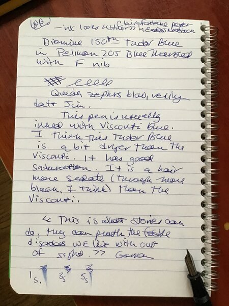
Diamine Tudor Blue (150th Anniversary II) The ink maker from Liverpool is one of the staple brands in ink-land. They consistently produce solid inks for a very reasonable price. In 2017, Diamine released a second ink series to commemorate their 150th Anniversary. I obtained my set shortly thereafter, but more or less forgot about them when my attention drifted to Japanese inks. About time to do the reviews. Fortunately, these anniversary inks are still easily obtainable, so if you like what you see you can still get them. At first sight, this Diamine ink looks like a fairly classic Royal Blue. On second sight, it definitely is a bit softer and darker, with a hint of purple undertones. For my personal taste though, it is too close to a standard blue to pique my interest. But it still is a solid performer, and a worthwhile workhorse ink. As can be expected from Diamine, the ink performs well, and writes a saturated line in all nib sizes. With F-nibs and above a fairly pronounced shading makes its appearance. Not too bad. The ink itself is fairly saturated. It can get quite a dark shade of blue when using wet pens. Also, wet pens tend to drown out the shading in this ink. I like it best in my drier pens – really nice in the Lamy Safari with 1.1 nib. Tudor Blue prefers good quality paper. On print/copy paper, I noticed a tiny bit of feathering (especially with a wet pen), and a fair amount of show-through and little points of bleed-through. Not an ink for the cheap copy paper in the workplace. To illustrate the colour span of this Diamine ink, I did a swab on 52 gsm Tomoe River paper, where I really saturated portions of the paper with ink. Tudor Blue has a rather low dynamic range, and quickly saturates. Dry pens tend to match with the left part of the saturation range – and you will get nice and soft shading. Wet pens match with the right side: here the ink is really saturated, with little difference between light and dark parts. So don’t expect much in the shading department with wet writers. On the smudge test – rubbing text with a moist Q-tip cotton swab – the ink behaved well. There is smearing, but the text itself remains crips and clear. Water resistance is non-existent though. All the blue dyes quickly disappear, leaving only some red-purple smudges behind. This can easily be deduced from the bottom part of the chromatography below - almost no ink remains in place. I’ve tested the ink on a wide variety of paper – from crappy Moleskine to high-end Tomoe River. On each scrap of paper I show you: An ink swab, made with a cotton Q-tip 1-2-3 pass swab, to show increasing saturation An ink scribble made with a Lamy Safari M-nib fountain pen The name of the paper used, written with a Lamy Safari B-nib A small text sample, written with the Lamy Safari M-nib Source of the quote, written with an Edison Collier 1.1 stub Drying times of the ink on the paper (with the M-nib Safari) The multi-paper writing test shows Tudor Blue’s preference for good quality paper. With cheaper copy/print paper there is a tiny bit of feathering, and you also get lots of see-through and bits of bleed-through. It’s best to use this ink with high quality hard-surface paper – that’s the paper eco-system that it prefers. In my opinion, this is a white-paper ink. On cream paper it looks a bit sickly – the yellow shining through doesn’t combine well with the blue tones of the ink. Drying times for this ink are mostly in the 5-10 second range with a Lamy Safari M-nib. Because scans don't always capture an ink's colour and contrast with good precision, I also add a photo to give you an alternative look on this Diamine ink. In this case, the phote gives the closest match. The scans show too bright a blue, but still give you a good feel of the differences in behaviour across multiple types of paper. Writing with different nib sizes The picture below shows the effect of nib sizes on the writing (written on Rhodia N°16 80 gsm paper). All samples were written with a Lamy Safari. I also added a couple of visiting pens: a Pelikan M120 with M-nib, and an Edison Collier with 1.1. stub. I personally like this Tudor Blue best with the dry-writing Safari pens. Related inks To compare Diamine Tudor Blue with related inks, I use my nine-grid format with the currently reviewed ink at the center. This format shows the name of related inks, a saturation sample, a 1-2-3 swab and a water resistance test – all in a very compact format. The ink is fairly similar to others in the grid – if you already have a blue in this range, there’s really no need to acquire this one. Inkxperiment – Singin' in the Rain As a personal challenge, I always try to draw an interesting little painting using only the ink I’m reviewing. This part of the review literally guarantees a moment of joy and creative challenge – I simply love exploring inks this way. A little while before doing this review I had a song that got stuck in my head. Everyone knows that silly tune from the 1952 musical “Singin’ in the Rain”, with Gene Kelly dancing through puddles on the street. I have no idea how that tune wormed its way into my head, but it definitely was annoying – a real earworm. Anyway… my inspiration for this inkxperiment is obvious now. I started with an A4 piece of HP photo paper. I taped out the tree trunk with washi tape, and then used a sponge with water-diluted ink to draw in the background. Next I used a paintbrush to add the cloud and rain puddles on the ground. I then used the rough end of a kitchen sponge to stamp in the foliage on the tree. After removing the washi tape, I used a plastic card with pure Tudor Blue to draw the tree trunk. The mother and child were drawn in using my B-nib Safari. To finish the painting, I used a toothpick dipped in ink to draw the raindrops. The resulting drawing is not too bad composition-wise, but Tudor Blue did not really succeed to bring the drawing to life… there is not enough contrast, which makes the drawing a bit flat-looking. On the positive side, this little picture shows what can be achieved with this Diamine ink in a more artistic context (not much, I’m afraid 😉 Inkxpired – computational art I love experimenting with pen/ink/paper, and have added another layer as part of the hobby. I’m exploring computational art, inspired by the ink drawings I do during ink reviews. Another fun offshoot of the hobby… and all that starting with a few drops of dye-coloured water on paper. I first used Irfanview with its Metallic Ice filter to create more or less a negative of the original drawing. Next, I used a PicsArt color filter to extend the colour range. A Photoleap Urban Art filter added the red & yellow tones – but I kept the blue in the umbrellas and tree trunk. I finally retouched the little girl to add more yellow to her dress. I like the thunderstorm atmosphere of the end result and the final colour palette that works quite well. Conclusion Diamine Tudor Blue is a fairly standard blue – a bit softer and darker than your run-of-the-mill royal blue. Not an exciting ink colour – my opinion of course. Not a bad ink, but also not a must-have. If you have other blues that are close, there’s no real reason to obtain this one. Technical test results on Rhodia N° 16 notepad paper, written with Lamy Safari, M-nib Backside of writing samples on different paper types
-
.jpg.cc15b0c2544de11aa2bf7ea21437bb7e.jpg)
-

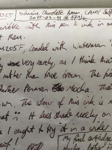
Waterman Havana (aka Absolute Brown) and Diamine Chocolate Brown.jpeg
Mercian posted a gallery image in FPN Image Albums
From the album: Some of Mercian’s inks
A photo of the scrawl in my ink-testing book. This is a comparison of Diamine Chocolate Brown (top) with Waterman Havana (nowadays sold as Absolute Brown) underneath. At the bottom of the frame is some text in Parker Penman Mocha. My intent in this photo is to illustrate how ‘maroon’ the Havana appears to be.
- 0 B
- x
-
Diamine Espresso (150th Anniversary II) The ink maker from Liverpool is one of the staple brands in ink-land. They consistently produce solid inks for a very reasonable price. In 2017, Diamine released their second ink series to commemorate their 150th Anniversary. I obtained my set shortly thereafter, but more or less forgot about them when my attention drifted to Japanese inks. About time to do the reviews. Fortunately, these anniversary inks are still easily obtainable, so if you like what you see you can still get them. The ink’s name was well chosen – Diamine Espresso is a fairly dark cool brown, definitely not a latté. Espresso can handle all types of papers and all nib sizes equally well. Good flow and lubrication – in that respect a typical Diamine ink. Being a dark brown, the ink shows good contrast even with the extra-fine nibs. It also looks quite serious and businesslike, which makes it a perfect choice for use at the office. Nothing exceptional, but more of an all-round workhorse that you can depend on. The ink itself is on the wet side: combine it with wet pens, and you get a deeply saturated line of very dark – almost black - brown. With dry pens, lighter brown tones appear, and you also get that subtle shading that gives some extra punch to your writing. Personally, I prefer this Espresso in combination with a dry pen – it just looks better. Espresso can handle all types of paper, even the lower quality ones. That’s a good thing for use at the office, where you usually need to cope with that lower-quality copy & printing paper. To illustrate the colour span of this Diamine ink, I did a swab on 52 gsm Tomoe River paper, where I really saturated portions of the paper with ink. Espresso has a fairly small colour span, with low contrast between the light and darker parts. This translates to soft shading when writing with dry pens. With wet pens, the increased saturation means that you lose most of the shading – there is just not enough distinction left between light & dark parts on the strokes. On the smudge test – rubbing text with a moist Q-tip cotton swab – the ink behaved well. There is smearing, but the text itself remains crips and clear. Water resistance is only so-so: most of the dyes disappear, but a faint-brown ghost image of your original writing remains, which is still readable with some effort. I’ve tested the ink on a wide variety of paper – from crappy Moleskine to high-end Tomoe River. On each scrap of paper I show you: An ink swab, made with a cotton Q-tip 1-2-3 pass swab, to show increasing saturation An ink scribble made with a Lamy Safari M-nib fountain pen The name of the paper used, written with a Lamy Safari B-nib A small text sample, written with the Lamy Safari M-nib Source of the quote, written with a wet Gazing Far tm2 pen with M-nib Drying times of the ink on the paper (with the M-nib Safari) The multi-paper writing test shows that Diamine Espresso interacts well with all paper types. It’s surprisingly good with crappy paper – like Moleskine – with only minimal feathering, and just a tiny amount of bleed-through. Use it with a fine-nib EDC pen (like a Kaweco), and you’ve got a great office ink. Drying times are mostly in the 10-15 second range, with some increases to 25 seconds on very hard-surfaced paper (like the Tomoe River and Kobeha GRAPHILO). Because scans don't always capture an ink's colour and contrast with good precision, I also add a photo to give you an alternative look on this Diamine ink. In this case, both scan & photo capture the ink well. The photo seems to give the best colour indication. Writing with different nib sizes The picture below shows the effect of nib sizes on the writing (written on Rhodia N°16 80 gsm paper). All samples were written with a Lamy Safari. I also added a couple of visiting pens: a TWSBI Micarta v2 with F-nib, and a Pelikan M800 with F-nib. As you can see: not much shading going on. It’s mostly with the calligraphy nibs that the whole saturation spectrum is used, ranging from light to dark brown, with some expressive shading as the result. Related inks To compare Diamine Espresso with related inks, I use my nine-grid format with the currently reviewed ink at the center. This format shows the name of related inks, a saturation sample, a 1-2-3 swab and a water resistance test – all in a very compact format. Espresso manages to look different from my other browns of the same style. It sits somewhere between iroshizuku yama-guru (more gray) and Pelikan Edelstein Smoky Quartz (more yellow). Inkxperiment – a Day at the Races As a personal challenge, I try to create interesting drawings using only the ink I’m reviewing. For me, that’s where the fun starts: I really like playing and experimenting with my inks in a more creative context. These little one-ink drawings are always a great way to push my creativity. I love doing them! A major news event this week was the passing away of Queen Elizabeth of England. During her life, she got to experience the rapid technological progress of the past century. Which, if you think about it, has been truly amazing. Elizabeth also loved her horses, and especially the Royal Ascot Races. A horse race drawing would have been awesome, but that’s beyond my capabilities. But cars I can draw, so that’s what you’ll get. I started with an A4 piece of 300 gsm watercoulor paper. I penciled in the outlines of the drawing, and used water diluted ink for the background. I then used Q-tips and multiple water-ink ratios to draw the grandstand, and added the audience with my fountain pen. Finally I used a piece of cardboard dipped in pure Espresso to draw the checkered flag pattern. Final touches to the drawing were done with my B-nib Lamy Safari. Espresso worked better than expected in this more artistic context. I had not expected that much variation in contrast, but with some water added you can coax a lot of brown tones from this Diamine ink. Inkxpired – computational art I love experimenting with pen/ink/paper, and have added another layer as part of the hobby. I’m exploring computational art, inspired by the ink drawings I do during ink reviews. Another fun offshoot of the hobby… and all that starting with a few drops of dye-coloured water on paper. Starting from the car race inkxperiment, I cropped the drawing to a square form, and applied a filter that adds some green/red tones to the drawing. The resulting colours work well for this racing theme, and the result is a bit more expressive than the original inkxperiment. Conclusion Diamine Espresso is a saturated cool & dark brown, that works well with all nib sizes and with all types of papers. Not a very expressive writing ink (my opinion), but a good all-round workhorse that is a very fine choice for an EDC pen that sits in your pocket. In a more artistic context, it worked much better than expected. With some water dilution, you can coax a wide range of brown tones from Espresso, that combine really well together. Technical test results on Rhodia N° 16 notepad paper, written with Lamy Safari, M-nib Backside of writing samples on different paper types
-
I’ve just read a note from my wife, written using Diamine Monboddo’s Hat. It looked black to me, so we had a discussion and she is still only using Monboddo to ink that pen. Further investigation showed this: (The contrast has been heavily reduced to show the effect on-camera, but the original is merely a more intense version of this) Horizontal lines come out as purple-ish, but the vertical ones - and cursive writing - show as totally black. Is this merely an example of extreme shading? The pen is a Jinhao clone (with Arrow clip) of the Parker Sonnet Silver Fougere, with bi-tone coated steel Jinhao F nib.

-
Ink Shoot-Out : Diamine Safari vs Super5 Dublin Green In 2014, Diamine surprised us with a series of six inks to commemorate their 150th Anniversary. Within this set, Safari is one of my favourites. Some two years ago, I discovered the Super5 inks from papierlabor.de which are waterproof inks. One of them – Dublin Green – looks very similar to Safari in written text. That of course piqued my interest … time do a detailed comparison and find out which of these inks I like the most. Enter... the Ink Shoot-Out. A brutal fight spanning five rounds, where two inks engage in all-out battle to determine who is the winner. Today the billboard announces the exciting fight between two middle-weight female fighters. In the left corner – from Liverpool, England – the reigning champion Denise “the Dancer”. In the right corner the challenger from Darmstadt, Germany: Hildegarde “the Hook”. Both champions are evenly matched, so this promises to be an exciting fight! Tension in the boxing hall is building up... when the fighters enter the arena, they are welcomed to a thunderous applause. The bell rings, signaling the start of the first round. May the best ink win… Round 1 – First Impressions Both inks make a great first impression on me: murky, dirty greyish greens with a touch of yellow. Really nice-looking on all kinds of paper. This is the type of colour that appeals to me. Even though these are muted inks, they provide excellent contrast with the paper even in the finest nibs, leaving a well-saturated line on the Rhodia N°16 notepad paper. Both inks exhibit strong and elegant shading, without too much contrast between the light and darker parts. This immediately elevates the aesthetics of your writing. The inks look nearly identical in writing, but there are some differences: Safari has a broader colour span, and shows more elegant moves. They don’t call her “the Dancer” for nothing. This is clearly illustrated in the saturation sample. Both inks shade nicely, but Dublin Green is a lot more subtle. Due to its narrower colour range, the shading is more subdued, and looks a bit more elegant to me. Dublin Green is a bit greyer, with no yellow in its dye composition. Both inks make a superb first impression – a choreography of dancing moves, circling their opponent and exchanging probing flurries of strikes and counter-strikes. And the public agrees – encouraging their champions with roaring approval and deafening applause. At the end of this first round, it really shows that these fighters are evenly matched. No clear winner emerges, and this round ends with a draw. Round 2 – Writing Sample The writing sample was done on Rhodia N°16 Notepad with 80 gsm paper. Both inks behaved flawlessly, with no feathering and no show-through or bleed-through. With the EF nib, Safari shows its strength, and looks much more saturated. Dublin Green feels less lubricated and leaves a less saturated line with the EF nib. With broader nibs, the Super5 ink no longer has lubrication issues, and both inks write equally well. Colourwise both inks look similar in writing, although there is definitely more of a grey undertone in the Dublin Green ink. Both inks also shade nicely, without too much contrast between light and dark parts. This aesthetically pleasing shading gives more character to your writing, and shows up even with the finer nibs. For this round, the focus is on writing, and here both inks are strong performers. At the beginning of the round, the Dancer from Liverpool broke through the defences of the German ink, delivering a powerful punch. But the Super5 ink recovered nicely, and for the rest of the round both champions were evenly matched. Almost a draw, but that initial punch counts, and so this round goes to Safari on points. Round 3 – Pen on Paper This round allows the batlling inks to show how they behave on a range of fine writing papers. From top to bottom, we have : Midori notebook paper, Paperblanks 120 gsm paper, Tomoe River 52 gsm, Fantasticpaper, Original Crown Mill cotton paper and Clairefontaine Triomphe 90 gsm. All scribbling and writing was done with a Lamy Safari M-nib. Both champions did really well, with no show-through nor bleed-through. But this round is not about technicalities, it is about aesthetics and beauty. Are the fighters able to make the paper shine ? One thing is immediately apparent: these inks are at home on a wide range of papers, both white and off-white ones. On white paper, Dublin Green clearly shows its greyer nature – on cream paper, both inks look more or less the same. The Diamine ink is a bit more expressive and complex-looking in the swabs. Dublin Green, on the other hand, looks more subtle in the shading. Overall, really strong inks with only minimal differences in style. Both inks are on par with each other, with neither of the champions giving any ground. Both fighters gave their all, providing quite a spectacle. The crowd is loving it! But in the end, neither ink could score a solid hit, and as such the third round ends with a draw. The tension in the hall is now going up by the minute. Are both fighters really each other’s equal ? Will one of them show some weakness ? Let’s continue the fight to find out. Round 4 – Ink Properties With the ring of the bell that announces the fourth round, Safari immediately dances to her opponent ready to bring more action to the fight. But wait… what’s happening? The German ink breaks through the defenses with a solid left hook… wham! Oh my god! Safari goes down and hits the canvas! The crowd is shocked into silence, then roars its approval! 10… 9… 8… 7… Oh no… this is a disaster… Safari is groaning, and struggles to right itself … 6… 5… finally Denise “the Dancer” scrambles to her feet, groggily shaking her head. But the round is lost! The referee rightfully grants this round to the German fighter. In this round, the biggest difference between Safari and Dublin Green emerges. The Super5 ink is designed to be water-resistant, and it shows: no smudging, and the ink effortlessly survives a 15-minute soak in water. For the smudge test, I let both inks dry for 30 seconds, and then rubbed a moist Q-tip cotton swab over the text. For the droplet test, I dripped water on the grid and let it sit there for 15 minutes. The difference is clear: Super5 Dublin Green definitely is very water-resistant, making it a good ink for use at the office. Round 5 – The Fun Factor Welcome to the final round. Here I give you a purely personal impression of both inks, where I judge which of them I like most when doing some fun stuff like doodling and drawing. Both inks do well, and show off a lovely colour spectrum, ranging from very light grey- and yellow-green to a really dark and saturated green. I really enjoyed using them. The drawing was done on a piece of 10x15cm HP photo paper. Personally I prefer the slightly greyer looks of Dublin Green. This ink also feels a bit more complex, with more character in the drawing. Safari looks soft and restrained – an ink with a joyous appearance but not too wild. Dublin Green on the other hand is more of a bad girl showing more temparement. In my opinion, the Super5 ink definitely looks better in this drawing. For this round, both champions are again well matched. But for this judge, Dublin Green showed the best moves, and wins this round on points. Mind… this is a relative comparison. Standing on its own, Diamine Safari is still a terrific ink to play around with. But side by side, I definitely prefer the Dublin Green from Super5. The Verdict Both inks are real jewels, that work on all types of paper. These are real champions, that both deserve a place in your ink collection. But counting the points, it’s clear that the challenger from Germany proved to be stronger. Even if you ignore the whopping win in round 4 (i.e. you don’t care about water resistance), Dublin Green still manages to be the slightly better ink. So for this judge, the conclusion is clear: Super5 Dublin Green is the winner of this exciting fight.
-
I've recently purchased a bottle of Diamine Dark Forest, which I was hoping would be more of a fir-tree green, but is, in fact, close to olive. What blue ink (presumably Diamine) should I blend with it to create a more beautiful, less olive, color? Thanks! Gary
-
Diamine Purple Dream (150th Anniversary II) The ink maker from Liverpool is one of the staple brands in ink-land. They consistently produce solid inks for a very reasonable price. In 2017, Diamine released their second ink series to commemorate their 150th Anniversary. I obtained my set shortly thereafter, but more or less forgot about them when my attention drifted to Japanese inks. About time to do the reviews. Fortunately, these anniversary inks are still easily obtainable, so if you like what you see you can still get them. Purple Dream is a nicely saturated purple that looks quite lovely. This is what I consider a “standard” purple – not too blue, not too red – but just bang in the middle. It’s a colour that works great for daily journaling, but is a bit too colourful for me to use at work. As we are used to from Diamine, the ink performs well and writes a saturated line in all nib sizes. Shading is present with F nibs and above, but fairly unobtrusive – there is not a lot of contrast between the light and darker parts. The ink itself is on the wet side: combine it with wet pens, and you get a deeply saturated purple line that almost – but not totally – drowns out the shading. With dry pens shading is more prominently visible, and can look quite stunning. Purple Dream works well with both white and cream paper. With low-quality paper, there is a tiny bit of feathering, and you can expect a fair amount of show-through and bleed-through. This Purple Dream is one of three purple colours in the 150 Anniversary II Series. Its siblings are Lilac Night and Burgundy Royale. Lilac Night is a beautiful muted blue-grey-purple that I really enjoy. Burgundy Royale is a reddish purple that has an old-rose quality to it – usually not my type of colour, but for some reason I find this Diamine implementation really attractive. I’m definitely going to explore this one in the near future. To illustrate the colour span of Purple Dream, I did a swab on 52 gsm Tomoe River paper, where I really saturated portions of the paper with ink. This Purple Dream has a fairly narrow colour span, with not much contrast between the light and darker parts. This translates to unobtrusive shading when writing. Shading is definitely there (starting with F nibs and above) but remains fairly low. Just enough to accentuate that you’re writing with a fountain pen. On the smudge test – rubbing text with a moist Q-tip cotton swab – the ink showed lots of smearing, but the text itself remains crips and clear. Water resistance is totally absent – most colour disappears from the page, leaving only some purple smudges. From the chroma, I expected a bit more water resistance, but that is not the case. I’ve tested the ink on a wide variety of paper – from crappy Moleskine to high-end Tomoe River. On each scrap of paper I show you: An ink swab, made with a cotton Q-tip 1-2-3 pass swab, to show increasing saturation An ink scribble made with a Lamy Safari M-nib fountain pen The name of the paper used, written with a Lamy Safari B-nib A small text sample, written with the Lamy Safari M-nib Source of the quote, written with an F-nib Pelikan M600 Drying times of the ink on the paper (with the M-nib Safari) The multi-paper writing test shows that Purple Dream can handle most papers well, looking good on both white and cream paper. There is a small amount of feathering on low-quality paper, but nothing really extreme. With cheap paper, you do get a lot of see-through and some bleed-through, making it nigh impossible to use the backside of the paper. Drying times were mostly around the 10 second mark with the Lamy Safari M-nib. Because scans don't always capture an ink's colour and contrast with good precision, I also add a few photos to give you an alternative look on this Diamine ink. To my eye, the scans show the ink a bit too light, the photos a bit too dark – reality is a bit in between. Writing with different nib sizes The picture below shows the effect of nib sizes on the writing (written on Rhodia N°16 80 gsm paper). All samples were written with a Lamy Safari. I also added a couple of visiting pens: a Pelikan M605 with F-nib, and an Edison Collier with M-nib. Purple Dream looks good in all pens, but shading is most visible with the dry-writing Lamy pen. Related inks To compare Diamine Purple Dream with related inks, I use my nine-grid format with the currently reviewed ink at the center. This format shows the name of related inks, a saturation sample, a 1-2-3 swab and a water resistance test – all in a very compact format. This Purple Dream seems to occupy the central space between more blue- and red-leaning purples. Perfectly mixed, and a pleasure to the eye! Inkxperiment – event horizon As a personal challenge, I try to create interesting drawings using only the ink I’m reviewing. I find this to be a fun extension of the hobby, and these single-ink drawings are great for exploring the colour-range nuances that are present in the ink. I love doing them! Inspiration for this drawing comes from the Sagitarius A* black-hole picture, released to the world on May 12, 2022. Astronomers, using the Event Horizon Telescope, released the first image of the accretion disk around the event horizon of Sagitarius A*, the supermassive black hole sitting at the center of our own galaxy. I used the concept of an “event horizon” as central theme in the inkxperiment drawing. I started with an A5 piece of 300 gsm watercolour paper. I wetted two circular rings surrounding the top-left and bottom-right corners of the paper, and applied some pure ink using a brush. These circular areas constitute the event horizon. I then used cotton Q-tips to draw in the houses within the horizon – these are elongated and being drawn into the singularity present in the corners of the page. Between the two singularities, a distorted starry background appears, drawn with Q-tips and different water-ink ratios. The stars were added with a B-nibbed fountain pen. I finally did a final pass over the drawing, adding some finishing touches. Purple Dream turns out to be a really nice ink to draw with. It’s easy and fun to use, and the resulting drawing gives you a good idea of what can be achieved with this Diamine ink in a more artsy context. Inkxpired – computational art I love experimenting with pen/ink/paper, and am now adding another layer as part of the hobby. I’m exploring computational art, inspired by the ink drawings I do during ink reviews. Another fun offshoot of the hobby… and all that starting with a few drops of dye-coloured water on paper. Starting from the “event horizon” drawing, I applied some filters to the drawing (using the Oilist app on iPad), and then stitched two mirrored copies of the result together. What you get is a picture of a Yoda statue, sitting in its Jedi Shrine. Cool! Conclusion Diamine Purple Dream is a lovely-looking purple, that for me embodies the concept of a “standard” purple. The ink works well with both white and cream paper, and writes fairly wet and well-saturated in all nib sizes. I enjoyed experimenting with it – both for writing and drawing - and can definitely recommend it if you enjoy purple inks. Technical test results on Rhodia N° 16 notepad paper, written with Lamy Safari, M-nib Backside of writing samples on different paper types
-
-
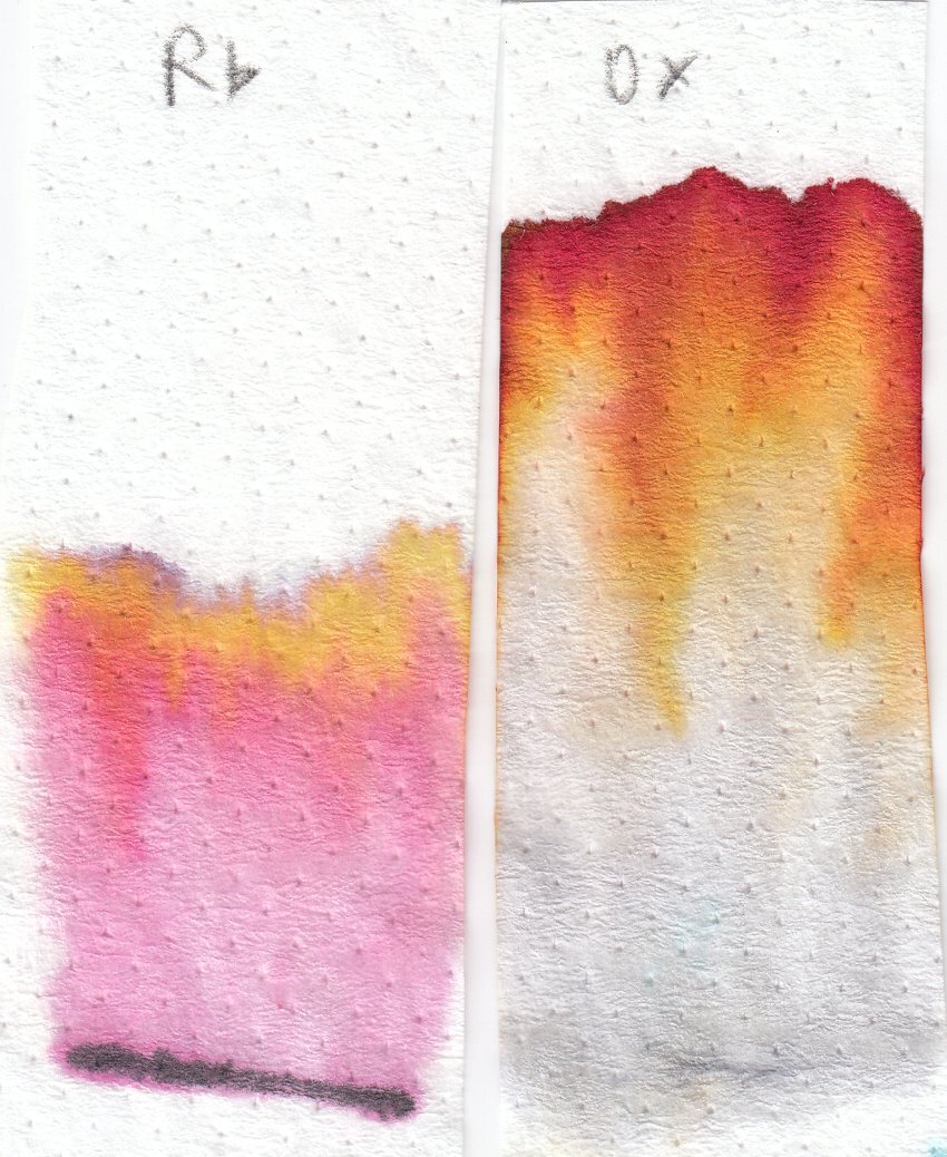
I recently got a couple of inks from PurePens, Noodler's Red-Black and J. Herbin Vert de Gris. Also a random ink sample which turned out to be Dominant Industry Royal Azalea (cute pink on it's lighter shades, a bit too much for me on the darker ones). One of the main reasons I had for getting Red-Black was my liking for Oxblood, but wishing it didn't get destroyed by any water droplets (as it already did a few times on my work notes). Here's a slightly not scientific comparison between the two. I'm still experimenting on which types of nibs I like Red-Black the best, but I love it already. The bottles: Comparison sheet (Rhodia 80 g/m²): Red black shows some good resistance to water and bleach since it's at least partially bulletproof. The dry times are long, but that might be because of the nibs I used. The Ahab is very wet even when not flexing, and the Kaweco Sport used is a broad nib. I've seen reviews with lower drying times, so I'll keep an eye out for that as I use this ink more. Both inks look great, but Red-Black has more tone variation and shading, while Oxblood is more homogeneous. Chromatographies: Both inks seem to be formulated in a similar way, having a darker component, a red component, and a yellow. Noodler's red black also has a pink-ish side that shows up along with the red component. When I first inked up a pen with Red-Black, it came out as a bright red, since I had not shaken the bottle and I assume the dark and yellow tones had separated.
-
From the album: Ink review
Photographed to better represent the colour, as the scans by both my Brother MFC-L2710DW and my CanonScan LiDE 300 came out pretty much pink with very little orange.© A Smug Dill
- 0 B
- x
-
From the album: Ink review
I did this mainly just to test certain aspects of the two named pens; otherwise, I wouldn't have bothered using two different writing instruments that are both not dip pens, just the purpose of reviewing an ink.© A Smug Dill
- 0 B
- x
-
-
-
-
Diamine Dark Forest (150th Anniversary II) The ink maker from Liverpool is one of the staple brands in ink-land. They consistently produce solid inks for a very reasonable price. In 2017, Diamine released their second ink series to commemorate their 150th Anniversary. I obtained my set shortly thereafter, but more or less forgot about them when my attention drifted to Japanese inks. About time to do the reviews. Fortunately, these anniversary inks are still easily obtainable, so if you like what you see you can still get them. Diamine Dark Forest is another lovely ink in this Anniversary series. A dark & saturated green with strong blue undertones. My first reaction when seeing the ink was “definitely a dark green”. And then I got like “hmm… maybe a dark teal… lots of blue in there”. And after preparing the review material, I got to “well… not a teal yet, but going there.” I love it when inks leave the well-trodden path, and meander between the colour lines. More often then not they gain in complexity and beauty. Dark Forest is no exception – I find it to be a very interesting ink with lots of depth. This Diamine ink is very saturated and lays down a dark blue-green line when writing. With a wet-writing pen, the colour can almost turn black. Where the ink gets overly saturated, you can often glimpse a reddish sheen. I like it that the ink looks totally different, depending on the wetness of the nib/pen combination. Teal-leaning in drier pens, and going dark green to green-black in wetter pens. To illustrate the colour span of this Diamine ink, I did a swab on 52 gsm Tomoe River paper, where I really saturated portions of the paper with ink. Dark Forest has a broad colour span, with a substantial difference between the light and darker parts. This translates to strong (even harsh) shading when writing. Shading is present in all nib sizes, even the finer ones. Personally, my preferences go to soft & muted inks, and this Dark Forest is quite the opposite. But still, I like the complexity of its character. On the smudge test – rubbing text with a moist Q-tip cotton swab – the ink behaved badly. Tons of smudges, although the text itself remains very readable. Water resistance is almost zero in practice – from the bottom part of the chromatography, I had expected a better result. But no, this ink is very prone to watery accidents. This makes it - for me at least - unsuited for use in the workplace. I’ve tested the ink on a wide variety of paper – from crappy Moleskine to high-end Tomoe River. On each scrap of paper I show you: An ink swab, made with a cotton Q-tip 1-2-3 pass swab, to show increasing saturation An ink scribble made with a Lamy Safari M-nib fountain pen The name of the paper used, written with a Lamy Safari B-nib A small text sample, written with the Lamy Safari M-nib Source of the quote, written with my Yard-o-Led Viceroy Standard with F-nib Drying times of the ink on the paper (with the M-nib Safari) The multi-paper writing test shows that Dark Forest can cope with a wide range of papers. With the lower-quality papers (Moleskine, copy paper) there is just a tiny bit of feathering, and a small amount of bleed-through. Drying times are in the 10-15 second range on harder paper, and around 5 seconds on the more absorbent low-quality papers (with the Lamy Safari M-nib). This dark blue-leaning green works well with both white and creamy paper. Because scans don't always capture an ink's colour and contrast with good precision, I also add a few photos to give you an alternative look on this Diamine ink. In this case, the real colour seems to sit a bit between the two. Writing with different nib sizes The picture below shows the effect of nib sizes on the writing (written on Rhodia N°16 80 gsm paper). All samples were written with a Lamy Safari. I also added a couple of visiting pens: a wet-writing Yard-o-Led Viceroy Standard Victorian, and a Pelikan M120 (which writes quite dry for a Pelikan). As you can see, the ink can look quite different depending on nib/pen combination – almost a teal in the 1.9 calligraphy nib, almost black in the Yard-o-Led. But in all cases quite saturated and with heavy shading. Related inks To compare Diamine Dark Forest with related inks, I use my nine-grid format with the currently reviewed ink at the center. This format shows the name of related inks, a saturation sample, a 1-2-3 swab and a water resistance test – all in a very compact format. The ink that comes closest in comparison is the 2017 LE ink Lamy Petrol, which has just a touch more blue. With Lamy Petrol being unobtanium these days, this Dark Forest could be the replacement you were looking for. Inkxperiment – excalibur With each review, I try to create an interesting drawing using only the ink I’m reviewing. This is often quite challenging, but it has the advantage of showing the ink’s colour range in a more artistic setting. I enjoy doing these little drawings immensely – it’s quite a fun extension of the ink hobby. Always good for a fun couple of hours. For this inkxperiment, I had zero inspiration. So I started with word associations to get me going: English ink, dark forest… medieval woods… runes and druids… Avalon… King Arthur… Excalibur. OK - good enough to get the drawing started... I used an A4 piece of HP photo paper, that I covered with a paper towel on which I dripped water-diluted ink to create the textured background. Next I used pure Dark Forest to paint in some darker patches for the stone & sword, and as a background for the runes. With the side of a piece of cardboard dipped in ink, I added the branches of the medieval forest. Finally, I used cotton Q-tips with bleach to draw in the runes and Excalibur. The result is not a masterpiece, but it gives you an idea of what can be achieved with this Diamine ink in a more artistic context. Conclusion Diamine Dark Forest is a saturated blue-leaning dark green that can look substantially different depending on your nib/pen combination – it can span the whole range from green-leaning teal to dark green black. A heavy shader that shows a bit of a reddish sheen in heavily saturated areas. For me personally, this Dark Forest is a bit too dark & harsh, but it’s certainly a complex and interesting ink. I enjoyed playing around with it. Technical test results on Rhodia N° 16 notepad paper, written with Lamy Safari, M-nib Backside of writing samples on different paper types
-
desaturated.thumb.gif.5cb70ef1e977aa313d11eea3616aba7d.gif)
Opened bottles of ink with no place in my desk as of 5Feb2022
A Smug Dill posted a gallery image in FPN Image Albums

From the album: Odds and ends
150 opened bottles of inks now have no place in my (wife's work-from-home) desk's main storage space, which is absolutely chockers, so most of these now live inside clear, stackable Daiso plastic storage boxes under the spare bed in the same room. Then there are also the 25 Diamine Inkvent Red Edition inks, although technically I can squeeze this into one of the desk's shallow drawers:© A Smug Dill
- 0 B
- x
-
The very first orchid I ever received, which I have managed to rebloom a few times, is having a banner year. I am so happy that I wanted to pair it with a sample of Diamine Shimmering Frosted Orchid, as I think that is almost spot on one of the colors in the blooms, but there was too little remaining in my sample bottle. I came up with this Vinta instead:
-
Diamine Lilac Night (150th Anniversary II) The ink maker from Liverpool is one of the staple brands in ink-land. They consistently produce solid inks for a very reasonable price. In 2017, Diamine released a second ink series to commemorate their 150th Anniversary. I obtained my set shortly thereafter, but more or less forgot about it when my attention drifted to Japanese inks. So, it's about time to do the reviews. Fortunately, these anniversary inks are still easily obtainable, so if you like what you see you can still get them. My first reaction when seeing the ink was loudly cursing Diamine… the colour shown on the box suggests a rather boring purple, which has nothing to do with the actual ink that sits within. What comes out of the bottle is a beautiful dusty grey-purple that simply looks wonderful. Curse them threefold! This treasure has been sitting in my cabinet for over 3 years, hidden away behind that bland box picture. Lilac Night has a lovely colour, reminiscent of the summer night sky some time after sunset. Dusty grey-purple with strong blue undertones. Lilacs are often delicate and playful inks, but in this case the grey tones create an aura of seriousness that makes Lilac Night very suitable for the workplace – a good replacement for more traditional blue-blacks. As can be expected from Diamine, the ink performs well, and writes a saturated line in all nib sizes. Lilac Night also exhibits fairly strong and aesthetically pleasing shading The ink itself is on the wet side: combine it with wet pens, and you get a deeply saturated line of very dark grey-purple. With dry pens the blue-lilac comes more to the front. Lilac Night prefers good quality paper. On print/copy paper it has a tendency to feather, and exhibits a fair amount of show-through and bleed-through. To illustrate the colour span of this Diamine ink, I did a swab on 52 gsm Tomoe River paper, where I really saturated portions of the paper with ink. Lilac Night has a medium colour span, with moderate contrast between the light and darker parts. This translates to soft shading when writing. Shading is prominently there, starting with F nibs and above. Really nice! On the smudge test – rubbing text with a moist Q-tip cotton swab – the ink behaved well. There is smearing, but the text itself remains crips and clear. Water resistance is only so-so: most of the dyes disappear, but a faint-puple ghost image of your original writing remains, which is still more or less readable. I’ve tested the ink on a wide variety of paper – from crappy Moleskine to high-end Tomoe River. On each scrap of paper I show you: An ink swab, made with a cotton Q-tip 1-2-3 pass swab, to show increasing saturation An ink scribble made with a Lamy Safari M-nib fountain pen The name of the paper used, written with a Lamy Safari B-nib A small text sample, written with the Lamy Safari M-nib Source of the quote, written with an Esterbrook Estie with jounaler nib Drying times of the ink on the paper (with the M-nib Safari) The multi-paper writing test shows Lilac Night’s preference for good quality paper. With cheaper copy/print paper there is visible feathering, and you also get lots of see-through and bleed-through. It’s best to use this ink with high quality hard-surface paper – that’s the paper eco-system that it prefers. Drying times for this ink are mostly in the 5-10 second range with a Lamy Safari M-nib. Because scans don't always capture an ink's colour and contrast with good precision, I also add a few photos to give you an alternative look on this Diamine ink. In this case, the scans do a better job – in the photos the ink appears too blue. Writing with different nib sizes The picture below shows the effect of nib sizes on the writing (written on Rhodia N°16 80 gsm paper). All samples were written with a Lamy Safari. I also added a couple of visiting pens: a TWSBI VAC Mini with M-nib, and an Esterbrook Estie with a journaler nib. I especially like the way Lilac Night looks with the Esterbrook: a dark grey-purple line with really nice low-contrast shading. Add the stubby nature of that nib, and you get some true eye-candy! Related inks To compare Diamine Lilac Night with related inks, I use my nine-grid format with the currently reviewed ink at the center. This format shows the name of related inks, a saturation sample, a 1-2-3 swab and a water resistance test – all in a very compact format. I have no other ink like it. The closest I have is TACCIA aomurasaki, which is a darker grey-purple with less blue in the mix. Inkxperiment – shattered As a personal challenge, I try to create interesting drawings using only the ink I’m reviewing. I find this to be a fun extension of the hobby, and these single-ink drawings always push my creativity. These inkxperiments are great for exploring the colour-range nuances that are present in the ink. I love doing them! Inspiration for this drawing comes from the COVID19 pandemic that has been defining our lives for way too long. At work, I have colleagues that have been screen images in video calls for almost 2 years now, instead of human beings of flesh and blood. And looking around at our society, I can’t help but notice that we are rapidly losing empathy for our neighbours. The lack of direct contact shatters and distorts our view of the world – we get irritated way too quickly, blow out of proportion the smallest mistakes or differences of opinion… I am convinced that we absolutely need to make a conscious effort to interact more positively with each other. So start today… and look behind the shattered glass. I tried to capture this feeling in my inkxperiment. I started with an A4 piece of HP photo paper. I dripped some ink in different water/ink ratios on the paper, and spread it out using a piece of cardboard. This produced the patterned background. Next I drew in the people figures with a brush and slightly diluted Lilac Night. I finally used my B-nibbed Safari to add the shattered glass foreground. Using Lilac Night in this artsy context was pure pleasure. The ink looks great in drawings, and the HP photo paper definitely enhanced the soft lilac tones. Conclusion Diamine Lilac Night is a dusty grey-purple that not only looks beautiful, but also writes well with good saturation and pleasing shading. And if you enjoy drawing with your inks, you’re in for a treat – this Lilac Night can produce stunning tones in inky paintings. I really enjoyed this one, and I can definitely recommend you to try it. Technical test results on Rhodia N° 16 notepad paper, written with Lamy Safari, M-nib Backside of writing samples on different paper types
-
I am thinking about using lubricating ink on a 14k M nib 1911s model and Diamine inks is in my budget. What's your opinion? What about the shimmering inks Diamine offers?
-
Robert Oster's Fizzy Lime vs. Diamine's Neon Lime: