Search the Community
Showing results for tags 'diamine'.
-
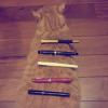
So It seems that my favourite inks estabilished for now as follows: 1. Sailor Yama Dori 2. Diamine Schubert 3. Diamine Eau De Nil 4. Diamine Steel Blue (which is actually greenest of the bunch) 5. Lamy Petrol Blue Who else is into Blue-Greens? I'd love to hear some advice on professional BGs, what other good ones are out there?
-
Hi everyone! I've got a chance to review some of Diamine's new Shimmering inks line! Huge thanks to Bureau Direct and Diamine! http://www.cultpens.com/files/cp/imagelibrary/brands/product/diamine.jpg I could choose what I wanted to try, so I chose what interested me the most. 5 out of 10. Hopefully there will be separate reviews by me too! The pen I used is a Cerruti 1881 Zoom, with a really wet stub nib. If the photos wouldn't show up, take a try here. Prepare for the photo-flood! First of all, here is a scan: Tomoe River http://kephost.com/images/2015/09/22/433dd91fa4cb551203d58c0397bf5269.jpg Sorry for the mistakes there ^ http://kephost.com/images/2015/09/22/8f81e02515d4962efca72df14123969d.jpg http://kephost.com/images/2015/09/22/6d5382135564c6e2fe555ea6aaa6f1e2.jpg Separate close-ups: Blue Pearl http://kephost.com/images/2015/09/22/415f84cfbfd2c552b3f7733ffbe3d5bd.jpg http://kephost.com/images/2015/09/22/f73ad7ceaf5322d2864e72bd3e14ce87.jpg Shimmering Seas http://kephost.com/images/2015/09/22/6cf099e7fb50573678aa039ba95bb6a1.jpg http://kephost.com/images/2015/09/22/538b46ca95c9e6ebdba5f9f550408ca9.jpg Brandy Dazzle http://kephost.com/images/2015/09/22/e4555cf958e892eba9bf9a3c9e5e14c4.jpg http://kephost.com/images/2015/09/22/f5ba0402d5d5a7e6a1a479be17a201ba.jpg Pazzazz http://kephost.com/images/2015/09/22/ebf0e43ae35bd310c6182e75acb1db42.jpg http://kephost.com/images/2015/09/22/f39a065c1fe303d75ee47f45192d6d40.jpg Blue Lightning http://kephost.com/images/2015/09/22/29538a9acc9d87d4f8211c9a0083fd1a.jpg http://kephost.com/images/2015/09/22/f66f7457d6b2eb86ab9b48eeeb95e3b5.jpg http://kephost.com/images/2015/09/22/959ca25d8b0a807d95bd6703b5736da3.jpg http://kephost.com/images/2015/09/22/bce72415782a055b0fd38d595e848c80.jpg My personal favorites are the Brandy and the Lightning Thank you so much for looking!
-
Manufacturers since 1864, Diamine Inks relocated to this purpose built 'state of the art' factory in Liverpool in 1925, where they successfully carried on using the traditional methods and formulas for ink production. Over the years the company has changed hands and are now located close to the world famous Aintree Race Course http://www.diamineinks.co.uk/images/DimaineFactory.gif http://www.diaminein...uk/AboutUs.aspx Bilberry is a heavily saturated ink that runs smooth as silk. I haven't observed any feathering, bleedthrough or ghosting on paper I used. Dry time is rather long - it can easily go as far as 20 seconds on some papers. We may discuss if it's blue with strong purple accents or vice-versa. For me it has more purple than "classic" blue. Drops of ink on kitchen towel Software ID Color range Tomoe River - Kaweco Classic Sport, broad nib Leuchtturm 1917 - Kaweco AL Sport, broad nib Rhodia, Kaweco Classic, broad nib
-
Hi folks, We have just heard from lovely Diamine people that they are working day and night on 10 new Shimmer inks Which Diamine colours would you like to see in Shimmering form? Mishka ps: I am still rooting for Soft Mint with silver/gold/rainbow
-
Greetings fellow stationary nerds. I come to you from the far north, the land of Lego, pastries and wind power, with this, my first pen review. The subject in question, the Jinhao Y3. This is an interesting one, because I literally couldn't find anything resembling a review of this pen prior to my purchase, so it was a bit of a jump into nothingness, but it looked good and it was only about 8 bucks on Aliexpress. The pen came in the most luxurious and decadent cheap, gray, foam padded cardboard box, as with most pens of AX. Oh well, waddya expect. Appearance/Design: The pen is really a looker. Flat, and cylindrical in design with only few tasteful appointments. The cap features a black gloss laquer/paint and is made of brass as well a the body of the barrel. The outside of the barrel is covered in a machined piece of rosewood which really astonished me, because CITES has just this January banned the international trade and sale of all types of rosewood, since it is an endangered species (much to the dismay of musicians as myself, who enjoy rosewood used in musical instruments). It made it through customs, but I dont think I'll try my luck again. The clip is medium stiff, and very useable. The chrome appointments are very nicely done, and the branding is stamped very deeply into the metal, and looks great. The section is a matte metal finish and has the Jinhao chariot logo stamped into it. Again, very nice and tastefully done. Overall, I feel that the pen has a cool asian vibe to it. I like it. Oh, and it comes with a nice standard Jinhao converter. Length: Capped: 13,9 cm Uncapped: 12,4 cm (against a TWSBI ECO for scale) The weight (Take a load off Fanny) is a healthy 19g uncapped and a rather heavy 32g capped. This means that a lot of the weight is in the cap, and by far most of it is in the very heavy end cap beyond the clip, making it very unbalanced when using it posted. And very unsatisfyingly when posted it doesn't post all the way down to the chrome ring at the end, making it look pretty goofy (as seen above). Construction/Quality: All in all, I'm very impressed. No gaps to be found. The rosewood is beautiful. The clip is sturdy but not too hard. The gloss finish has no imperfections, and the cap sits securely when on, but is not a two man job to take off (like my X450). I have no complaints. Nib/Performance: The nib in this pen seems to be a #5, and it does indeed say "5" on the back of the feed, but I have no replacement nibs to try, so this is a guestimation. It is a nice glossy steel, and features the jinhao logo, but it also features a stamped "F", indicating, that this indeed is a fine nib. First time I've seen this on a Jinhao nib. It arrived reasonably smooth with a bit of feedback. A bit too much feedback to my tastes, so I smoothed it a bit, and now it has the perfect feel for me, which is just enough feedback, so I feel the connection with the page and it isn't slipping and sliding (yes, to me a nib can be too smooth). Not much in the way of line variation and flex, but just a tiny bit. Here the writing is compared to my much broader and wetter X450: Cost and Value: It's amazing what you can get for $8 with free world wide shipping. As with my other (but cheaper) Jinhaos, this pen is sure a kick above it's price range, and i don't regret the purchase one bit. Conclusion: It's just great. It's stylish, writes well, looks great, is relatively cheap, is stunning in appearance, is a bit of a naughty one because of the forbidden wood (no boner jokes please) and did I mention how good i think it looks? Has become one of my new daily note takers. - Haun
-
Two weeks ago I bought my first fountain pen and now I am looking for a good ink to use it with at school during the upcoming year. My requirements for the ink are: -easily readable(for long essays, ext.) -reasonable drying time (I am a lefty) -preferably Diamine Ink, but other brands available in the UK are also fine. -little to no bleed through with notebook paper (not using the cheapest and thinnest paper, but certainly not Rhodia like)
-
Manufacturers since 1864, Diamine Inks relocated to this purpose built 'state of the art' factory in Liverpool in 1925, where they successfully carried on using the traditional methods and formulas for ink production. Over the years the company has changed hands and are now located close to the world famous Aintree Race Course http://www.diamineinks.co.uk/images/DimaineFactory.gif http://www.diaminein...uk/AboutUs.aspx Macassar is rich brown that doesn't lean too strong towards red. It has great flow and no start-up problems even after leaving it in my pen for several days untouched. I haven't noticed any bleed-through or feathering. Ink splash http://imageshack.com/a/img907/3025/PriOc9.jpg Drops of ink on kitchen towel http://imageshack.com/a/img537/1719/FaL227.jpg Software ID http://imageshack.com/a/img661/3359/BcTMr8.jpg http://imageshack.com/a/img537/1241/8XcaXz.jpg Oxford Recycled - Kaweco Sport Classic, zakraplacz, B http://imageshack.com/a/img540/4853/3Atvja.jpg http://imageshack.com/a/img538/7899/kPxVKf.jpg http://imageshack.com/a/img901/6479/TW8x75.jpg http://imageshack.com/a/img538/1200/eRmHFV.jpg http://imageshack.com/a/img911/9338/ppQH0P.jpg Comparison http://imageshack.com/a/img912/807/qrqgpZ.jpg
-
Manufacturers since 1864, Diamine Inks relocated to this purpose built 'state of the art' factory in Liverpool in 1925, where they successfully carried on using the traditional methods and formulas for ink production. Over the years the company has changed hands and are now located close to the world famous Aintree Race Course http://www.diamineinks.co.uk/images/DimaineFactory.gif http://www.diaminein...uk/AboutUs.aspx Sapphire Blue was one of my first Diamine inks and I still believe it to be one of their best creations in terms of behaviour. This ink is well behaved. Always. In all pens I've ever filled with it. On every paper I've tried. In past I had some issues with other Diamine inks but never with this one. It is a very standard looking medium blue with a hint of purple. There are other similar colors such as Waterman Florida Blue, J. Herbin Eclat de Saphir and Quink Washable Blue. Personally I prefer J. Herbin EdS but Sapphire Blue shouldn't disappoint anyone looking for standard / almost standard blue with increased saturation and some purple accents. It won't feather. It won't cause bleedthrough. The flow is great and the ink lubricates the nib in pleasant way. Drying time is average. Drops of ink on kitchen towel Software ID Tomoe River - Kaweco Sport Classic, eyedropper, B Leuchtturm 1917 - Kaweco Sport Classic, eyedropper, B Oxford - Kaweco Sport Classic, eyedropper, B Rhodia - Kaweco Sport Classic, eyedropper, B
-
Manufacturers since 1864, Diamine Inks relocated to this purpose built 'state of the art' factory in Liverpool in 1925, where they successfully carried on using the traditional methods and formulas for ink production. Over the years the company has changed hands and are now located close to the world famous Aintree Race Course http://www.diamineinks.co.uk/images/DimaineFactory.gif http://www.diaminein...uk/AboutUs.aspx Diamine Vermillion isn't Diamine most popular ink.I think the color is quite interesting but the ink isn't that thrilling. It feels dryish. It lacks saturation. Lubrication is unsatisfying. Drying time is good. Drops of ink on kitchen towel Software ID Color range Oxford optic, Pelikan M205, broad nb Leuchtturm 1917 - Kaweco AL Sport, broad nib Moleskine, Kaweco Classic Sport, broad nib
-
Greentings! MB Irish Green is my absolutely favorite green ink. However, the surplus of this ink in local boutiques is unstable and they often don’t have it available. On the other hand, the famous international store, where I frequently make purchases doesn’t carry MB inks. Could you please advice an ink similar in color and shading to the subject? In the first place from the range of Diamine, J.Herbin and other major brands present in Europe and the UK. (no Noodlers though! these inks are out of my reach) Thanks!
-
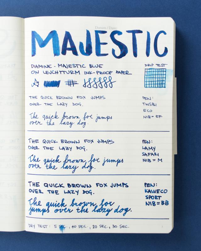
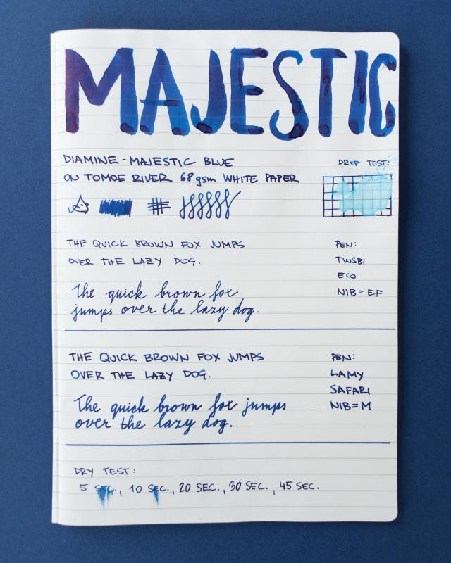
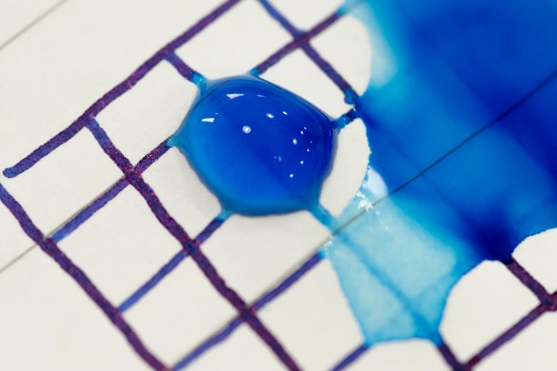
Hi folks, Diamine Majestic Blue is one of those inks that sheens like a champion Why did no one tell me about this ink earlier? The colour is a true blue, it flows very nicely even with the finest nibs. Sheen does take over and often covers the entire letter. Tomoe River is the best paper to display sheen, but this ink does show on other papers too. Majestic Blue is not waterproof; it does not wash away completely, so I would happily use it to address envelopes. It would make a perfect every day ink. Strange coming from teal/green/orange person but I really do like this one. What do you think? Enjoy, Mishka (^_~)

-
Last year, I was zealously searching for a perfect olive/musk/dark/umber/you-name-it green ink. I gathered almost 20 samples, and in the end decided that Safari, one of Diamine's 150th anniversary line, is that one ink. On Paperholic paper, with G dip pen. Green inks tend to go a bit "off" on this paper. Is it sheen, or is it not? The texture kinda reminds me of 2H pencil. I'd call this a mauve ink. Same paper, with different fountain pens. The pens I used here. By now they all sunk to the bottom of the Meuse, I guess... (weep) On copy paper, with G dip pen. On copy paper, with the fountain pens metioned above. On Tomoe-kawa paper (creamy). All the smudges were caused by my clumsy fingers. Comparison with 14 other similar inks. You can see that Safari looks browner on one paper and greener on the other.In some circumstances it is very similar to Montblanc Daniel Defoe or Diamine Salamander. On cheaper notebooks, it looks darker, almost black. No bleed-through or feathering. Some doodle on Tomoe-kawa paper. I only used a fountain pen, but the excellent flow and shading made it seem as if it was done with watercolor and paintbrush. Added water with a Chinese calligraphy pen. Close-up: How the color dissolved in to yellow and blue gray. Chromatography on tissue paper. Comparison It turned more umber-ish when dried. How it looks in the pen. Only the parts where I heavily applied water bled through a bit. 【Thoughts in general】 Color:A color with complexity (which I like). Varies from burnt sienna to dark green depending on different pen/paper combination. Dark enough for daily use, yet still an interesting and enjoyable color. Performance:Good. No bleed through or feathering. Water resistance:A little. Water washes away the color but leaves the strokes gray and still legible. Flow: Average~nice. Lubrication slightly less than Sailor inks, but still pleasant. Price:Cheap~Average. Accessibility:Average (Special but not limited edition) Other: Lovely bottle and package design. For the color itself I like Sailor Rikyu-cha and Montblanc Daniel Defoe the most, but they are just waaaaay to hard to acquire (limited edition & so pricy). R&K Alt-goldgreen and Sailor Tokiwa-matsu are also great inks with excellence performance, but the color is a bit "too simple" for my taste.Therefore, in the end I declared Safari the winner and got one full bottle P.S. Other inks that were also on my list: 1. Diamine Wegner (didn't get a sample)2. Sailor Waka-uguisu (didn't get a sample)3. Papier Plume Moss green (got one bottle after I did this review)4. J. Herbin Olive green (crossed it out because I've had enough of this brand)5. Pilot Iroshizuku Chiku-rin (too light)6. Pilot Iroshizuku Ina-ho (not green enough)7. Kyonooto Kokeiro (didn't get a sample) Mandarin version of this review:http://chingdamosaic.blogspot.nl/2016/07/diamine-150safari.html
-
I have been looking to develop my "Warm Earth" tones in general and my red earths in particular. Diamine seemed to have some good options (I have my "Cold Stone" colors from De Atramentis). I couldn't really find a good comparison so I narrowed it down to the few that I was most interested in and plumped for 30ml bottles rather than samples. It's neither scientific nor thorough, but I thought I would post my initial impressions as I couldn't find anything similar. . . . . which is a scan but the colors for Ochre and Rustic Brown are not true at all. I tried taking a photo, which is a much more fiddly process, but the colors seem truer: Two more bricks that I didn't like on the first page - I thought the Copper was rather strong! The Monaco Red might be a bit too pink in that one? Anyway it seems I have added the following to my "Sub-Tertiary Color Circle": Yellow Earths: Sepia and Ochre Orange Earths: Burnt Sienna and Ancient Copper Red Earths: Oxblood & Monaco Red (both still tending to orange - which is what I was looking for!) I don't have any "True Reds"! Rustic Brown I would count as a Rose - it's really on the purple end (where my sample of Morinda seemed to fit too). On the Orange front I also have Autumn Oak, a decent Coral (house blend!) and an Orange with a cute elephant on the label, but as these aren't anywhere near "brick" they did not seem relevant here. Hmmm, the only thing I might add is that this is my "cheap scribbling" paper (Daiso - great cheap paper for ink work!) rather than anything fancy, so the colors are a bit flatter than they might be elsewhere.
-
Manufacturers since 1864, Diamine Inks relocated to this purpose built 'state of the art' factory in Liverpool in 1925, where they successfully carried on using the traditional methods and formulas for ink production. Over the years the company has changed hands and are now located close to the world famous Aintree Race Course http://www.diamineinks.co.uk/images/DimaineFactory.gif http://www.diaminein...uk/AboutUs.aspx I think that Diamine Chocolate Brown is rather enjoyed among pen & inks users. What's not to like? It's saturated, well lubricated, the flow is good and the writing experience is enjoyable. It's not safest ink for vintage sac pens and it tends to cause some nib creep (but ONLY after long time of not using the pen, like two months). If you clean pens rehularly, it won't cause any issues. There's no useful water resistance to this ink. Personally I don't care but if you do, look elsewhere. All in all, I think this is good ink worth trying. Drops of ink on kitchen towel Software ID Color range Maruman - Kaweco Classic Sport, broad nib Tomoe River, Pelikan M805, medium nib Leuchtturm 1917 - Kaweco AL Sport, broad nib Maruman, Hero 5028, stub 1.9 Water - resistance
-
I really like this one:
-
Recently, I became obsessed with light blue inks especially if they are turquoise, whatever that means. Turquoise is described as greenish blue but most inks with that name are basically blue with one or very few dyes. Chromatography with these inks is not very exciting. Many of them are, however, very beautiful (to me at least) and have uncommonly good writing properties perhaps because of their simplicity and relatively low dye content. Sheen is possible with some of these ink, at least on Tomoe River paper, but water resistance is uniformly not good. That said Pelikan 4001 Turkis Turquoise, Noodler's Midway Blue (ok, not a turquoise for sure), Noodler's American Eel Turquoise, and of course, KWZ IG (iron gall) Turquoise hold up surprisingly well to water. Diamine Shimmertastic Tropical Glow, Diamine Marine, and Noodler's Turquoise are probably closest to dictionary greenish blues strictly considered turquoise. Noodler's Turquoise is a little over saturated to have much fun with though. Both Shimmertastic inks are really fabulous inks to write with and look incredible. The glitter really does not seem to hamper performance nor harm the pen. Amazing inks even if not shaken to get max glitter effect. Would love to see glitter free versions of these inks made available. Some standouts at this time for me are Pelikan 4001 Turkis Turquoise for its beautiful color, versatility, sheen potential, and moderate water resistance. Lamy Turquoise is great too, good writing performance, some shading, and maybe some sheen. J. Herbin Bleu Pervenche is really nice too. I need more time to really study these inks....the differences between many are subtle. Platinum Mix Free Aqua Blue is really pure cerulean - ish blue. It's also somewhat dilute and I really did not like it at first but now I kinda like it some. Levenger Blue Bahama looks quite nice but feathers some on everything but Tomoe River paper. Let me know your thoughts. From top to bottom: Pelikan 4001 Turkis Turquoise Noodler's Midway Blue Levenger Blue Bahama KWZ IG Turquoise Diamine Turquoise J. Herbin Bleu Pervenche Diamine Havasu Turquoise Diamine Marine Robert Oster Signature Australian Sky Blue Diamine Eau de Nil Diamine Shimmertastic Blue Lighting De Atramentis Forget-me-not Diamine Aqua Blue Noodler's American Eel Turquoise Lamy Turquoise Noodler's Turquoise Platinum Mix Free Aqua Blue Noodler's Navajo Turquoise Diamine Shimmertastic Tropical Glow Sailor Jentle Ink Sky High Sailor Jentle Ink Souten Paper is Tomoe River Turquoise inks reduced size by Jon Andresen, on Flickr Turquoise inks wash reduced size by Jon Andresen, on Flickr
-
Manufacturers since 1864, Diamine Inks relocated to this purpose built 'state of the art' factory in Liverpool in 1925, where they successfully carried on using the traditional methods and formulas for ink production. Over the years the company has changed hands and are now located close to the world famous Aintree Race Course http://www.diamineinks.co.uk/images/DimaineFactory.gif http://www.diaminein...uk/AboutUs.aspx Apple Glory is a rather straightforward ink, I haven't noticed any particular behavioral concerns (no staining, nib creep/crud). Ink Splash http://imageshack.com/a/img540/2784/3AHZ4U.jpg Software ID: http://imageshack.com/a/img673/6503/PJGqFc.jpg Color range http://imageshack.com/a/img540/505/nHy1S6.jpg Oxford recycled - Kaweco Sport Classic, eyedropper, B http://imageshack.com/a/img661/5073/edR0M5.jpg http://imageshack.com/a/img537/1850/gHQDBF.jpg http://imageshack.com/a/img910/9217/seF9Go.jpg http://imageshack.com/a/img540/4639/ahrrlr.jpg Comparison http://imageshack.com/a/img909/6132/p3WHD9.jpg
-
As you will have already seen, Diamine have brought out another eight new inks for their 150th Anniversary range. Great colours and I'm just posting a quick note showing them. They should be available in about three weeks. Just simple notes and my usual method - Rhodia 80gsm dot paper and Lamy Vista M nib. My favourites are Tudor Blue, Purple Dream, Dark Forest, Lilac Night and Espresso, BUT Burgundy Royale and Blood Orange could have their uses! Enjoy.
-
Manufacturers since 1864, Diamine Inks relocated to this purpose built 'state of the art' factory in Liverpool in 1925, where they successfully carried on using the traditional methods and formulas for ink production. Over the years the company has changed hands and are now located close to the world famous Aintree Race Course http://www.diamineinks.co.uk/images/DimaineFactory.gif http://www.diaminein...uk/AboutUs.aspx Diamine Prussian Blue is a timeless classic. This color will fit most situations and uses. While I'm not crazy about it, I reckon it's more than decent ink. It's reliable, well behaved and nicely performing everyday ink.It has muted tone that I find pleasing, the flow is satisfying and the line is smooth. I remember I experienced some bleedthrough on Moleskine but, frankly, it's crappy paper and almost every ink ever crated will cause bleedthrough or feathering on it. Drops of ink on kitchen towel Software ID Color range Tomoe River, Sheaffer Prelude Signature, fine nib Leuchtturm 1917, Sheaffer Prelude Signature, fine nib No-name notebook, Montblanc 146, medium nib
-
Manufacturers since 1864, Diamine Inks relocated to this purpose built 'state of the art' factory in Liverpool in 1925, where they successfully carried on using the traditional methods and formulas for ink production. Over the years the company has changed hands and are now located close to the world famous Aintree Race Course http://www.diamineinks.co.uk/images/DimaineFactory.gif Monaco Red is interesting earthy red ink. After reading some other reviews one could expect more vibrant red but in my experience this ink is a little subdued. I like it. It has a lot of shading and allow you to get result with more or less depth depending on the pen and nib you use. Software ID Color range Tomoe River - Caran d'Ache Leman, medium nib Leuchtturm 1917 - Kaweco AL Sport, broad nib
-
I'm currently reviewing some of my favourite Diamine inks. This one is the red ink from the latest Diamine 150th Anniversary collection: Carnival. Bearing in mind the paper I use is very smooth, this ink dries reasonably quickly.It flows quite wet and lubricates the nib very well. No start-up problems noticed. No skipping noticed.It didn't dry out when I left the cap off the pen while I did the swabs and the comparison inks.It is currently available in wedge shaped 40ml glass bottles that don't have ink wells.Water test on the review form shows this isn't a waterproof ink. It washes off skin very easily.It's reasonably similar to Diamine Matador.Diamine sell it directly to end-users on their web-site.
-
I have decided to review some of my inks. These aren't necessarily in any particular order. I wanted to review Twilight and Midnight consecutively to see their differences or similarities. This one is Diamine Midnight. I would call it a dark blue ink. It leans more towards the blue-red portion of the colour spectrum than Twilight and Prussian Blue. It's quite similar to Tchaikovsky although it seems to contain slightly less red, and is lighter than Regency Blue It's a well behaved, saturated ink with not much shading. I found it flowed smoothly across the page, and had no problems with lubrication in the Pilot Custom 74 M nib pen I used. This ink exhibits showthrough and a little bleedthrough on my thick paper, so I tried it on Rhodia dot pad paper. Showthrough and bleedthrough are both noticeable. The water test on the review form shows this isn't a waterproof ink. Bearing in mind the paper I use is very smooth, and the nib used at that time was a M, this ink took 16-18 secs to dry. It flows through the pen well and lubricates the nib well. I saw no skips or hard starts while I did swabs and comparisons with other inks. It is currently available in 80ml glass bottles, 30ml plastic refill bottles or cartridges. Diamine sell it directly to end-users on their web-site. It's a reasonable price
-
Has anyone ever purchased or used this? I was looking at this product and was curious whether it was safe for the rest of the barrel as well. Or why it was marketed as only for the nib and feed...? Was also curious about the viability of this cleaning solution for vintage pens (thinking of using it on Montblanc 22/24/31/342/Monte Rosa)
-
Here is my first attempt at the art of CRVs with the starter set from amberleadavis. if that doesn't work: http://s960.photobucket.com/user/milo1119/media/2017-04-28%2020-49-page-005_zps3wi9qfe1.jpg.html Hope that all works out correctly.
-
Ink Review : Diamine Chopin (Music Collection) Pen : Lamy AL-star, M-nib Paper : Rhodia N°16 notepad 80 gsm Review Paris, winter of 1839 Winter... and I'm cold to the bone. The river Seine shines a dull grey, the leaden sky a blue-grey carpet of monotony. I feel really depressed, this atmosphere suffocates me with a feeling of despair. But this setting inspires my muse - I'll capture this dreary moment in the 4th prelude of my Opus 28. In 2015 Diamine released the Music Collection, a set of 10 subdued ink colours named after well-known composers. In this review, we take a look at Chopin. After the above introduction, you're sure to remember that this is a blue-grey ink. Diamine Chopin is a really nice blue-grey - I place it right in the middle between those two colours. The colour is subdued, and has a vintage feeling. It's a colour that really appeals to me, and one that can be used in all circumstances, both at work and for personal use. It's not a festive colour though - more an ink to use when you're in a serious mood. There is some subtle shading going on, which gives your writing extra character. Chopin exhibits good flow and performs well on a wide variety of paper. I really like this ink ! Rhodia N°16 notepad 80 gsm - drying time 15-20 seconds, no feathering, no show-through nor bleed-through.Paperblanks journal paper - drying time ~15 seconds, no feathering, no show-through and no bleed-through. Nice vintage look on this off-white paper.Generic notepad paper 70 gsm - drying time ~15 seconds, no feathering, a hint of show-through, no bleed-through.Moleskine journal - drying time ~5 seconds ! No feathering, significant show-through, minimal bleed-through. Impressive !Tomoe River paper - drying time ~25 seconds, no feathering, minimal show-through, no bleed-through.Original Crown Mill cotton paper - drying time 15-20 seconds, no feathering, no show-through nor bleed-through. Very nice vintage look.Impressive behaviour ! Even on the lower-quality paper. This is an ink you can use on the cheaper paper in the workplace. There is no avoiding comparison of this ink with Vivaldi, also from the Music Collection. Vivaldi is a purple-grey, and also a really nice ink. I like the colour of Chopin a bit better, but Vivaldi beats Chopin solidly on the water-resistance front. Chopin has almost zero water resistance - after water has touched the ink, the text remaining requires effort to decipher (there is a readable residue, but not what I would call easily readable text). Conclusion Diamine Chopin is a very vintage-y blue-grey colour that looks great in all nib sizes and on all types of paper. It behaves surprisingly well on cheaper paper, which is a big plus at the office. Chopin has an aesthetically pleasing colour that I enjoy very much. In my opinion, this is one of the better inks in the Music Collection. A pity though that the ink has really low water resistance. If you like greys and blues, this definitely is an ink to consider. I think you will like it ! my overall score: A