Search the Community
Showing results for tags 'diamine'.
-
what is the most efficient ways to test all the fountain pen inks available and to make a like for like comparison? For instance i have tested Waterman, Herbin, Viscontini and Diamine but the shade of colour vary a great deal i like Visconti Bordeuax as a red but on other days i may like Diamine Oxblood but i like the wetness of a waterman red ink. I aim to reduce to a set number of of inks, so a maximum of two for each of the colours Red, Green, Blue, Black.for daily use. 1 unique colour such as an orange/brown/purple for journal writing. let me know your ideas thanks
-
-
Initial impression. This is a really cool ink! My test pen is my favorite Omas. A Ludovico Einaudi Signature Paragon with a broad nib. The ink is a highly saturated dark metallic blue on Rhodia paper but doesnt seem to dry out very fast. Ebonite feeds actually turn an iridescent red after a short time in air! The feed regulator fins turn red while the lower portions remain a metallic blue. Its a very unique effect. The pen kept writing though after being uncapped for a few minutes. The color of the metallic at the bottom of the jar looks a lot like Diamine Tropical Glow but the base ink is much darker blue so on paper they are very different inks. Its a silver tone and not gold. I have a good amount of Diamine inks from the shimmering collection but none are like this one for saturation and color variation. If you wait for a minute with the pen uncapped, the first letter written has an awesome red sheen and then the rest of the writing fades into a gradient metallic blue with red edges. With the broad nib I saw some shading as well. Its not a very wet nib but does flow pretty good so the shading and color could be a mechanism of the feed on this pen. A wet nib might not have the safe effect. In any event, it looks great with a fair flowing broad nib. It ran great and didnt clog the feed. There was no dried ink left on the nib. Seems like a well behaved ink despite the saturation and shimmering effect. The flow on paper is very nice and fluid. It never dried out, with reasonable time un capped, on the pen even with the high saturation. Overall a very interesting and well writing ink. I highly recommend picking up a bottle. I think it has unseated Blue Lightning as my favorite shimmering ink! Theres more depth to the Arctic Blue and its very different from the other inks I have had. I can see this one being restocked as I quickly run out! I hope the pictures convey what Im trying to describe.
-
Ink Review : Diamine Bach (Music Collection) Pen: Lamy AL-star, M-nib Paper: Rhodia N°16 notepad 90 gsm Leipzig, a late afternoon in November 1726“I have left the busy city for a quiet walk in the woods. It’s cold and dark and somber – the gloomy mood intensified by the dark brown towering oaks that resemble an open-air cathedral. This setting inspires my muse. I hear in my mind a grand baroque piece commemorating the Death of Christ, ideally suited for a performance in my beloved St Thomas Church (Thomaskirche). I think I will name it the Matthäeus-Passion.” In 2015 Diamine released the Music Collection, a set of 10 subdued ink colours named after well-known composers. In this review, we take a look at Bach. After the above introduction, you're sure to remember that this is a dark-brown ink. Diamine Bach is a dark-brown ink, which to my eye is close to a true brown, with very little red in the undertones. This is also evident from the chromatography. Bach is a well lubricated ink with excellent contrast to the paper. An ink that easily tolerates even the finest nibs. With broader nibs, it starts to show some really nice subdued shading, without too much contrast between the light and darker parts of the text. Nicely done! The ink behaved perfectly on all the papers I tested – with only a touch of bleed-through on the notoriously bad Moleskine paper. Drying times are mostly in the 10-15 second range, but tend to increase on more glossy paper (all with M-nib). The ink’s look & feel is fairly consistent across paper types, and the result looks good on both white and more yellow paper. The ink has no water resistance to speak of – even short exposure to water will obliterate your writing. Technically a very good ink, but for some reason it fails to speak to me. I tried to like it… but nope… didn’t work. I’m sure though that there are others out there that will appreciate this incarnation of brown. Inkxperiment – Heron at a PondI’ve recently started to experiment with ink drawings, keeping things simple and more-or-less abstract. I find it to be a fun extension of the hobby, and have found single-ink drawings a nice challenge. It also gives you an idea of what the ink is capable of in a more artistic setting. For this drawing I used 90 gsm sketch paper. I used a piece of cardboard dipped in ink to create the background together with the trees. For the pond I applied ink with a dip pen, and used a water brush to spread it out. I then added in the heron and the rest of the plants. The end result gives you a good idea of the colour span that Bach is capable of (which is limited – Bach is more at home as a writing ink). ConclusionDiamine Bach is a nice dark-brown writing ink that works well with any combination of nib and paper. The ink has a limited colour range though, which makes it less suited for drawing. Also of note is its complete lack of water resistance. Bach is technically an excellent ink, but I find it hard to get excited about it. A decent ink, but – for me personally – not a keeper. My overall score : B Technical test results on Rhodia N°16 notepad paper using a Lamy Safari
-
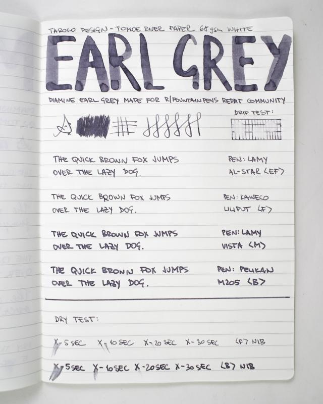
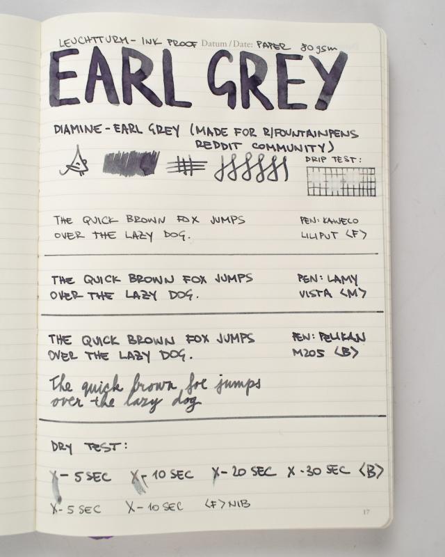
Diamine have informed me that a new ink, EARL GREY will soon be available as part of their general range, but ONLY in 80ml bottles. This will not worry me at all! By way of explanation, I've included a comment from Phil Davies at Diamine who said the following: "This ink colour was chosen by the members of r/fountainpens, a wonderful Reddit community of fountain pen enthusiasts. If you aren't a part of the community, join in - www.reddit.com/r/fountainpens! "The EARL GREY will become part of our standard line but only available in 80ml." My short review below was done using a Lamy Vista with M nib and on the usual Rhodia dot 80gsm paper. However, I think that this ink could well benefit from being used with finer nibs so I have included two other examples. A Lamy Vista with F nib and a Sailor Sapporo, also with F nib. Although never having used many grey inks, I have shown comparisons with the only other three I have. I found Earl Grey to be a nice mid to dark neutral colour, whereas Graphite has green undertones and Chopin, blue. That's of course a personal opinion. Silver Fox is too 'light' for my liking, and eyesight/legibility. It has no waterproof qualities at all. I will be using this ink as a frequent addition to my rotation, and unlike Graphite, there's no 'interesting' smell - which we all know is just a factor in the dye components of that ink. Also, Earl Grey is dark enough to be easily distinguished from some of the 'pale' black inks that are knocking about. I have no idea when it will be available but it's certainly worth considering.
-
I'm looking for a good red for my husband to use at work. He loves the color of Diamine Red Dragon, but it feathers like a molting peacock on standard copy paper while also clogging up his pen (a Jinhao x750). I've read the red thread, but the shear amount of information is overwhelming. He's after a dark bloody red that is obviously red. If it has to lean he's okay with a bit of brown, but the purer the better. I already have BSER (too brown, but a possibility if nothing better can be found) and Oku-Yama (as close to red as I go, and I love it, but he doesn't find it bloody enough), but that's about it. I'd like to avoid other Diamine inks since I'm after something that is low-to-no maintenance and I've generally found Diamine to be rather demanding. Some possibilities based off Anderson and Goulet Swabs: De Atrementis Oriental Red Montblanc Shakespeare Noodler's Tiananmen Red Kobe #4 KWZ Standard Red #1 I'd appreciate your thoughts and comments on both color and performance of these or other inks.
-
Hi, friends. I've got my new Custom Urushi with astonishing vermilion finish. It came with CON-70 converter, and I inked it up with Diamine Red Dragon which is one of my favorite red. The problem is that, the combination of CON-70 and Red Dragon seems to not working well. Red Dragon makes an air burble in the converter about after I write a few sentences. I tried an empty Pilot cartridge, but it doesn't help a lot. I think I should find more thinner ink rather than Diamine Red Dragon to use with CON-70. I don't consider other converters from Pilot because CON-20 uses exposed rubber sac, and CON-40 and CON-50 have so limited ink capacity. I've already flushed both the pen and converter, but it barely helped. Have you guys used this combination without any flow issue? If then, I'd buy another CON-70 to test it. If you have had some problems, I think I should find another ink with dark red color and thinner than Diamine Red Dragon. Do you have any suggestion for my case?
-
http://i.imgur.com/bZd3SgC.jpg
-
I'm not really a purple fan. I do think this ink looks fantastic though, especially the green sheen and the texture from my Pilot Parallel 6mm. http://2.bp.blogspot.com/-4IujqLCENIk/UtrBCchdV8I/AAAAAAAABR0/MeIXGI3DKIA/s1600/purple+2.jpg http://4.bp.blogspot.com/-7Ow0aBk5fBI/UtrBBfo4g-I/AAAAAAAABRo/_IQxuVQwhfU/s1600/purple+1.jpg No complaints with flow or lubrication. Water resistance is not great, but could leave something legible behind. Time will tell whether it's a pain to clean... Images from my blog.
-
-
-
-
Close but not the same. Look at the chromo's! J Herbin Vert Pre Diamine Spring Green
-
-
-
-
I'd been meaning to do this comparison for some time, but either didn't have the time, some pens wouldn't cooperate, or the inks wouldn't come out as I thought they should. Missing are Vert Empire and Perle Noire, orphaned by an uncooperating Kaweco Sport and a Penmanship's converter I gave away. I have learned a lot on these forums so I hope this also helps others, particularly when comparing specific inks, like blue greens, blue purples, reds and oranges. The paper is HP 32 lbs, which all pens glide on, except for the Waterman le Man 100 with Mandarin which doesn't like this paper and sometimes stops flowing - there is always one! Oh and a Platinum Cool only starts reliably upside down, on any paper, I thought I'd cured it but nope. The differences between Souten, Kon Peki and Équinoxe 6 are subtle, and depend greatly on the nib and paper, and even on the pen and the time of day, as evaporation will change their colour drastically; but to my eye they clearly go from more blue to more green; they are all spectacular, Souten does have a funky smell, luckily I have a cold so I can't smell it as much right now, none of my other inks smell of anything. Some inks just make their pens glide, particularly Verde Muschiato and Verdigris. Some inks took a long time to show their true tone, like Myosotis (can look too dark, turns into a blue black), Lie de Thé (can look like milk chocolate), Orange Indien looks spectacular in this nib, a lot more boring with finer.
-
Manufacturers since 1864, Diamine Inks relocated to this purpose built 'state of the art' factory in Liverpool in 1925, where they successfully carried on using the traditional methods and formulas for ink production. Over the years the company has changed hands and are now located close to the world famous Aintree Race Course Diamine Woodland Green looks fresh, but, truth be told, I don't like the color. The ink behavior is nice. It has average+ flow, good level of lubrication and doesn't cause feathering on copy paper. It's not the ink I'll ever use again though, unless I do some comparison. Drops of ink on kitchen towel Software ID Color range Rhodia, Jinhao 866, medium nib Leuchtturm 1917 - Jinhao 866, medium nib Water resistance
-
The good people of r/fountainpens - a fountain pen community on Reddit - reached out to our friends at Diamine if they would be up for a challenge. Could they make an ink purely voted for by the community? Long story short - Reddit asked and Diamine delivered Voting and comments got pretty heated - as you can imagine ink discussions do. After submitting the name, colour & shade Diamine got to work and provided few swatches which we voted for again...few weeks later Diamine Earl Grey was born Grey is a fantastic ink to use - you won't find a regular ballpoint/rollerball in such colour. Earl Grey ink is not too loud, so it can be used for almost everything. Very universal, slightly understated, but certainly not boring. Those purple accents are really eye catchy, especially on white paper They do take a while to come out - we had to re-take the photographs because the colour has changed over night. The flow is very good, it is certainly not dry. Earl Grey shades extremely well. This ink is not waterproof or water resistant. We could only see a little bit of sheen on ink drops which were done on Tomoe River paper. This ink will be available soon in Diamine's 80ml bottles. The packaging has a secret message printed inside the box regarding the Reddit community.

-
Hello Friends, I have had the pleasure of reviewing Diamine's latest series of Shimmer inks, a set of 10 with 5x silver particled and 5x gold particled inks. I have tried out reviews in the Breeze Notebook containing Tomoe paper in contract to using my trusted Black n Red Quad. The results are quite something, however, capturing them hasn't been easy. I look forward, as always to your thoughts and feedback. The set will be available in the next few weeks. The swatches were done on BlacknRed, Breeze Notebook and Rhodia respectively
-
First Impressions. We have already seen the colours but here is one of my 'first impression' reviews, including written examples. As usual, all of my written tests have been done using a Sailor Sapporo pen with B nib, so roughly equivalent to a Western M, and the standard Rhodia 80gsm white grid paper. I chose the Sailor for the simple reason that the pen is very easy to clean out, even taking the nib apart should it become necessary. It wasn't! Although I used a rubber bulb to speed up the flushing process between colours (just for time's sake) all the inks were easy to remove from the pen by simply using the converter for a relatively short period of time. Firstly I used cotton wool buds to give an example of just the colours. I let the bottles stand for a while and hopefully didn't have as many particles in those samples. Obviously, the bottles need to be agitated before filling a pen and to keep the suspension 'going' a gentle shake while writing is recommended. Firstly I sampled the inks with the gold particles: Firefly, Wine Divine, Cobalt Jazz and Golden Ivy. They are a very pleasant set of colours and I’m sure they will be very popular. Although hues like Firefly are not generally in my list of favourites, I’m actually quite ‘warming’ to this ink! Next, here come the written samples. I’m impressed with the whole of the ‘golden’ range and will definitely be buying Cobalt Jazz and Golden Ivy. Now, the inks with the silver particles: Citrus Ice, Electric Pink, Frosted Orchid, Arabian Nights, Arctic Blue and Spearmint Diva. I like almost all of these as well. Citrus Ice could be a little pale for some; Electric Pink just isn’t my colour(!) and Spearmint Diva is also a little pale. The colours are good though. And the written samples. Again, I’m impressed with most of the range and will be getting Arctic Blue. To sum up, this is another range that will contain favourites for many of you. Likewise, some that people will not like, but that’s the nature of the ink business. AND - it's 14th October in Helsinki!
-
It seems Diamine enjoys celebrating its anniversary. This year they added another eight inks to their line of 150th anniversary inks. The inks are sold in nice and quitye comfortable in use triangular bottles. It's rather nice. It behaves well on most papers. The flow is good and the ink feels wet - just as I like it. It has zero water resistance. Drops of ink on kitchen towel Software ID Color range Low quality notebook, Wing Sung 6359, EF Midori, Wing Sung 63569, EF Tomoe River, Pelikan M205, medium
-
Could some one who owns Diamine Sapphire Blue ink go and smell your bottle of ink for me please? I just ordered a few bottles of ink directly from Diamine UK, and among them is a 30ml plastic bottle of Sapphire Blue. As soon as I opened the cap, I noticed the unmistakable mouldy smell. Very strongly. If you have this ink, can you tell me if your Sapphire Blue smells differently from other Diamine inks you own? I have 20 odd other Diamine inks and most of them don't have any smell, or some of them have just a faint solvent type of smell. But this bottle just stinks! And I know what mould smells like. When you lived in an old house with mould in the wall for 12 months, you just know. I may have even developed some allergy to the smell of mould because I get teary eyes and sneezy when I smell such strong mouldy smell now. Thank goodness we have our new house built and everything is fresh these days. After I smelt the mould in Sapphire Blue, I went and opened every bottle of Diamine inks I own and sniffed all of them one by one. I noticed a faint hint of mouldy smell in Sargasso Sea as well, interestingly, another bottle from this new batch of inks I ordered. Both of these smelly 30ml ink bottles have the silver tape on top of the cap with the black text to show the name of the ink as usual, but the black font used on these is a little bolder or larger than my other older bottles. First of all do you think this mouldy smell is normal? Have you noticed anything like this from your recent Diamine order? I haven't contacted Diamine yet, because I wanted to check with you to see if this smell is normal for these particular inks i.e. Sapphire Blue, and maybe Sargasso Sea as well. Thanks for your input! Even if it is normal, I can't use these because just the smell gives me stuffy nose and headache. SNAK Eddited to add: I do love my Diamine inks, and I am not badmouthing them or anything, I am sure if this turns out to be a contaminated ink they will happily take them back and exchange for good ones. I will continue to be their customer too.
-
It seems Diamine enjoys celebrating its anniversary. This year they added another eight inks to their line of 150th anniversary inks. The inks are sold in nice and quitye comfortable in use triangular bottles. Espresso is a generic brown ink. It doesn't offer anything new in the genre. For me it lacks character although if you use very wet and broad nibs the line will be strong and dark. In regular nibs the ink is rather boring. On some paper (Tomoe River) sheen is visible. The flow is good but not superb. Drying time is reasonable. The ink is easy to clean. It doesn't clog the pen. Drops of ink on kitchen towel Software ID Color ID Discovery copy paper 70 mgsm, Kaweco Classic Sport, medium nib Field Notes, Kaweco Classic Sport, medium nib Midori, Kaweco Classic Sport, medium nib Tomoe River, Kaweco Classic Sport, medium nib Water resistance
-
It seems Diamine enjoys celebrating its anniversary. This year they added another eight inks to their line of 150th anniversary inks. The inks are sold in nice and quitye comfortable in use triangular bottles. Dark Forest is an interesting ink. While I'm not sure if I enjoy this particular hue, it's deffinitely not your usual green or blue/green. The ink has good properties although if you seek for a water resistant writing fluif, it's not the one. Look elsewhere. The flow is good in both fine abd broad nibs. Level of lubrication and saturation is satisfying. On some paper (Tomoe River) sheen is visible. Drops of ink on kitchen towel Software ID Color ID Oxford Opic, Wing Sung 698, fine nib Oxford Opic, Lamy Al-Star, broad nib Midori, Lamy Al-Star, broad nib Mini - comparison Water resistance